

A night color palette is built on deep neutrals (ink, navy, charcoal) plus moody accents that glow against dark surfaces. It’s a go-to choice for modern UI, cinematic posters, and premium branding because it feels focused, polished, and intentional.
Below are 20 night color palette ideas with HEX codes, plus practical pairing tips and AI prompts you can use to generate matching visuals in minutes.
In this article
- Why Night Palettes Work So Well
-
- lunar asphalt
- velvet observatory
- neon dusk alley
- stormy harbor
- ink & silver
- galaxy orchid
- pine shadow
- noir café
- sapphire smoke
- ember afterhours
- raincoat reflections
- cosmic denim
- plum eclipse
- charcoal & clay
- aurora minimal
- night market signage
- studio monochrome
- vintage film noir
- deep sea console
- candlelit library
- What Colors Go Well with Night?
- How to Use a Night Color Palette in Real Designs
- Create Night Palette Visuals with AI
Why Night Palettes Work So Well
Night palettes create instant contrast and hierarchy. Dark bases push backgrounds away while light type and small highlights pop forward, making layouts easier to scan and helping key actions stand out.
They also feel emotionally “designed.” Midnight tones suggest calm, luxury, mystery, or high-tech energy depending on the accent color you choose—cyan reads futuristic, gold reads cinematic, and warm beige reads cozy.
Finally, night color schemes are flexible across mediums. The same dark foundation can support UI (reduced glare), print (premium mood), and branding systems (consistent, memorable silhouettes).
20+ Night Color Palette Ideas (with HEX Codes)
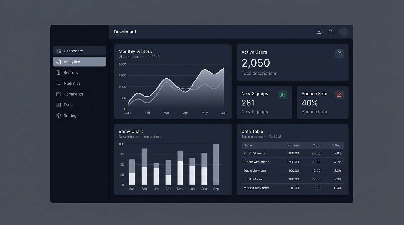
1) Lunar Asphalt
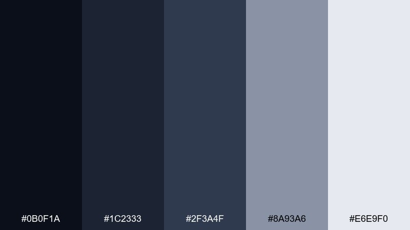
HEX: #0b0f1a #1c2333 #2f3a4f #8a93a6 #e6e9f0
Mood: cool, urban, minimal
Best for: SaaS dashboard UI
Cool and quiet like streetlights on wet pavement, these tones feel modern and controlled. The deep navy bases keep screens restful while the pale gray adds clear hierarchy for text and cards. Use the darker trio for navigation and surfaces, then reserve #e6e9f0 for content backgrounds and key spacing. For a crisp night color palette, keep contrast high and limit the lightest shade to primary reading areas.
Image example of lunar asphalt generated using media.io
Media.io is an online AI studio for creating and editing video, image, and audio in your browser.

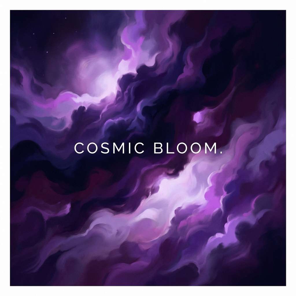
2) Velvet Observatory
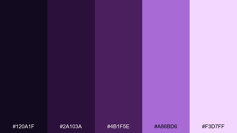
HEX: #120a1f #2a103a #4b1f5e #a86bd6 #f3d7ff
Mood: lush, cosmic, romantic
Best for: album cover artwork
Lush purples and soft lavender glow like a telescope view of distant nebulae. The dark violet foundation brings drama, while the bright orchid tones add a dreamy focal point. Pair it with minimal typography and plenty of negative space so the gradients feel intentional, not busy. Use #a86bd6 as the hero accent and keep #f3d7ff for small highlights and light effects.
Image example of velvet observatory generated using media.io
3) Neon Dusk Alley
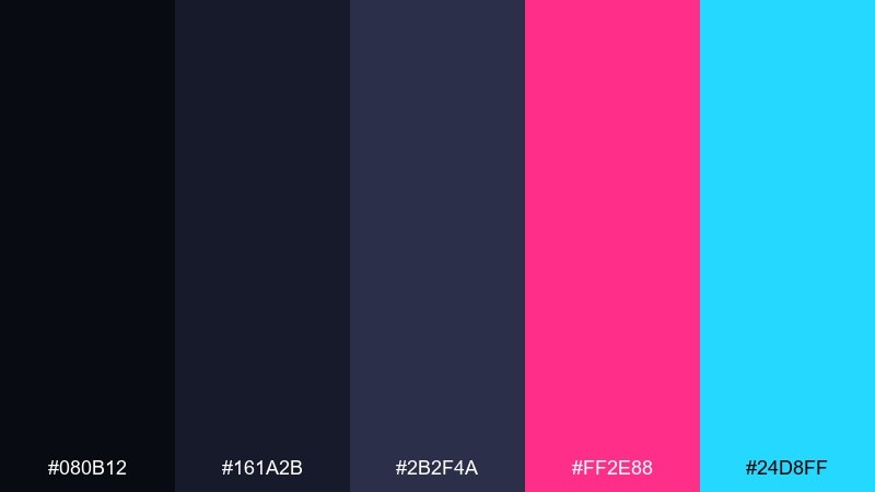
HEX: #080b12 #161a2b #2b2f4a #ff2e88 #24d8ff
Mood: electric, nightlife, cyber
Best for: club event poster
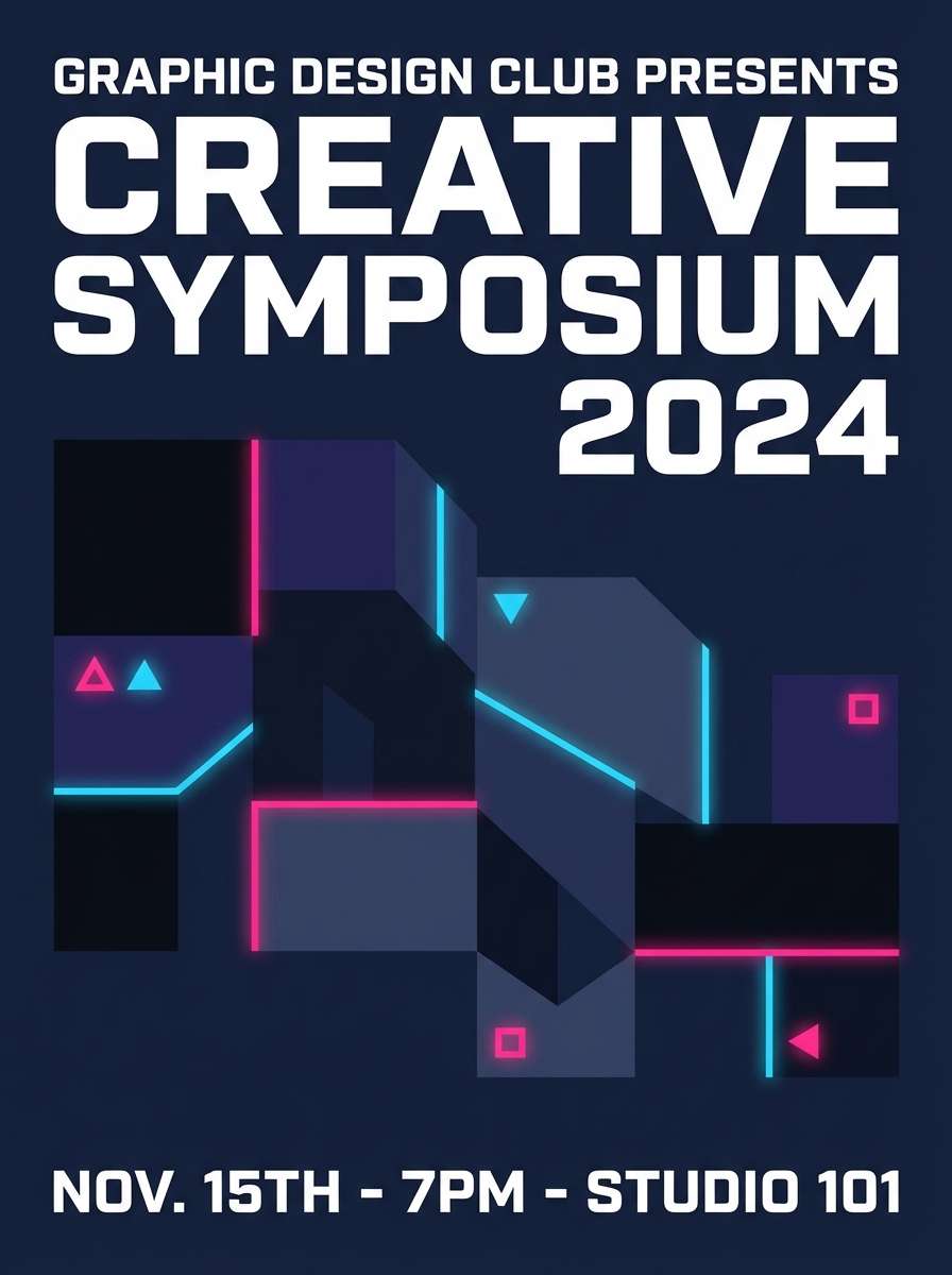
Electric and punchy, this set reads like neon signage bouncing off dark concrete. The inky blues keep the layout grounded while cerise and cyan create instant energy for headlines and callouts. These night color combinations work best with bold type, simple shapes, and strong spacing. Tip: use the neon shades sparingly for dates and key info so the poster stays legible from a distance.
Image example of neon dusk alley generated using media.io
4) Stormy Harbor
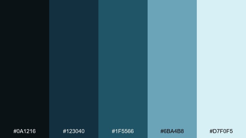
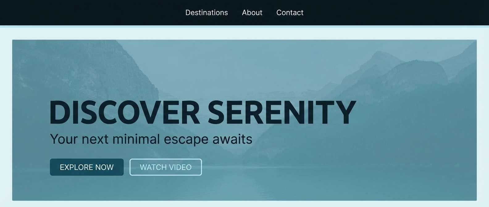
HEX: #0a1216 #123040 #1f5566 #6ba4b8 #d7f0f5
Mood: coastal, calm, misty
Best for: travel website hero section
Misty blues and sea-glass teals evoke a harbor at dawn with fog rolling in. The darker shades make great overlays for photography, while the pale aqua keeps buttons and headings fresh. Pair with clean sans-serif type and airy spacing to maintain the coastal calm. For accessibility, place text on #0a1216 or #123040 and use #d7f0f5 as a soft background wash.
Image example of stormy harbor generated using media.io
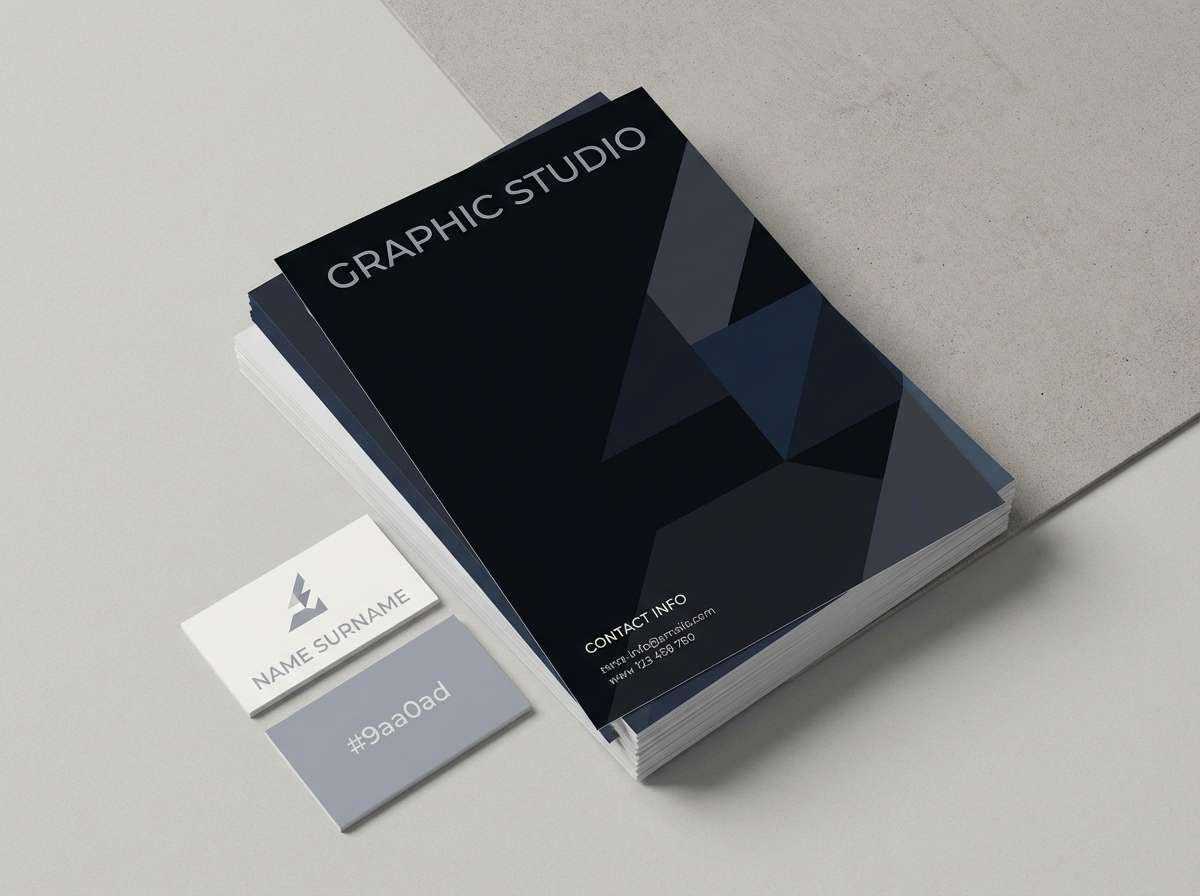
5) Ink & Silver
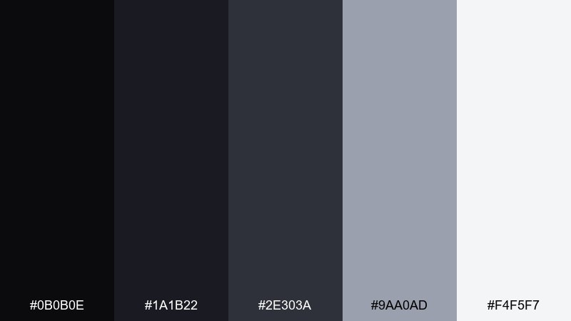
HEX: #0b0b0e #1a1b22 #2e303a #9aa0ad #f4f5f7
Mood: sleek, professional, understated
Best for: law firm branding
Sleek charcoals with cool silver highlights feel tailored, confident, and quietly premium. The near-black shades build a strong base for logos, stationery, and web headers without looking harsh. Pair with a single metallic foil or spot gloss to elevate the gray midtones. Tip: keep #f4f5f7 for margins and paper-like space so the brand never feels heavy.
Image example of ink & silver generated using media.io
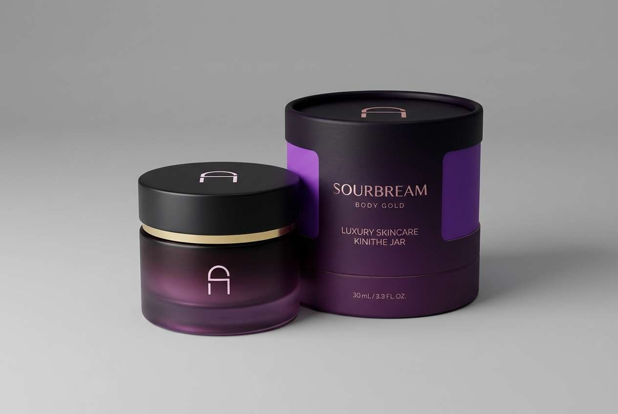
6) Galaxy Orchid
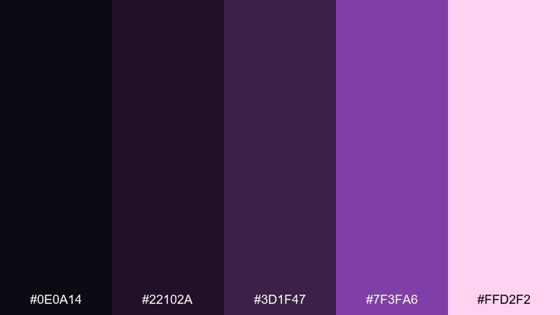
HEX: #0e0a14 #22102a #3d1f47 #7f3fa6 #ffd2f2
Mood: mystical, floral, bold
Best for: beauty product packaging
Mystical violet depths with a soft pink glow feel like petals lit by moonlight. The palette supports premium beauty packaging where you want richness without going full black. Pair with embossed patterns or subtle gradients to bring out the orchid tones. Use #ffd2f2 in small doses for shine lines and product highlights to keep it elegant.
Image example of galaxy orchid generated using media.io
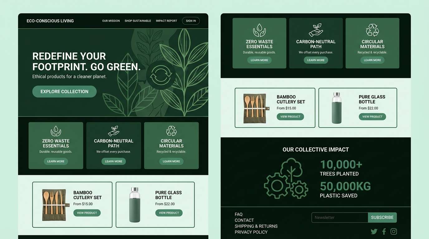
7) Pine Shadow
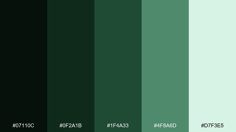
HEX: #07110c #0f2a1b #1f4a33 #4f8a6d #d7f3e5
Mood: earthy, quiet, outdoorsy
Best for: eco brand website
Earthy greens suggest pine needles, shaded trails, and fresh air after rain. The deep forest tones make strong headers and footers, while the minty light green keeps sections feeling breathable. Pair with natural textures like recycled paper and subtle grain in supporting graphics. Tip: use #4f8a6d for links and icons so calls to action feel organic instead of loud.
Image example of pine shadow generated using media.io
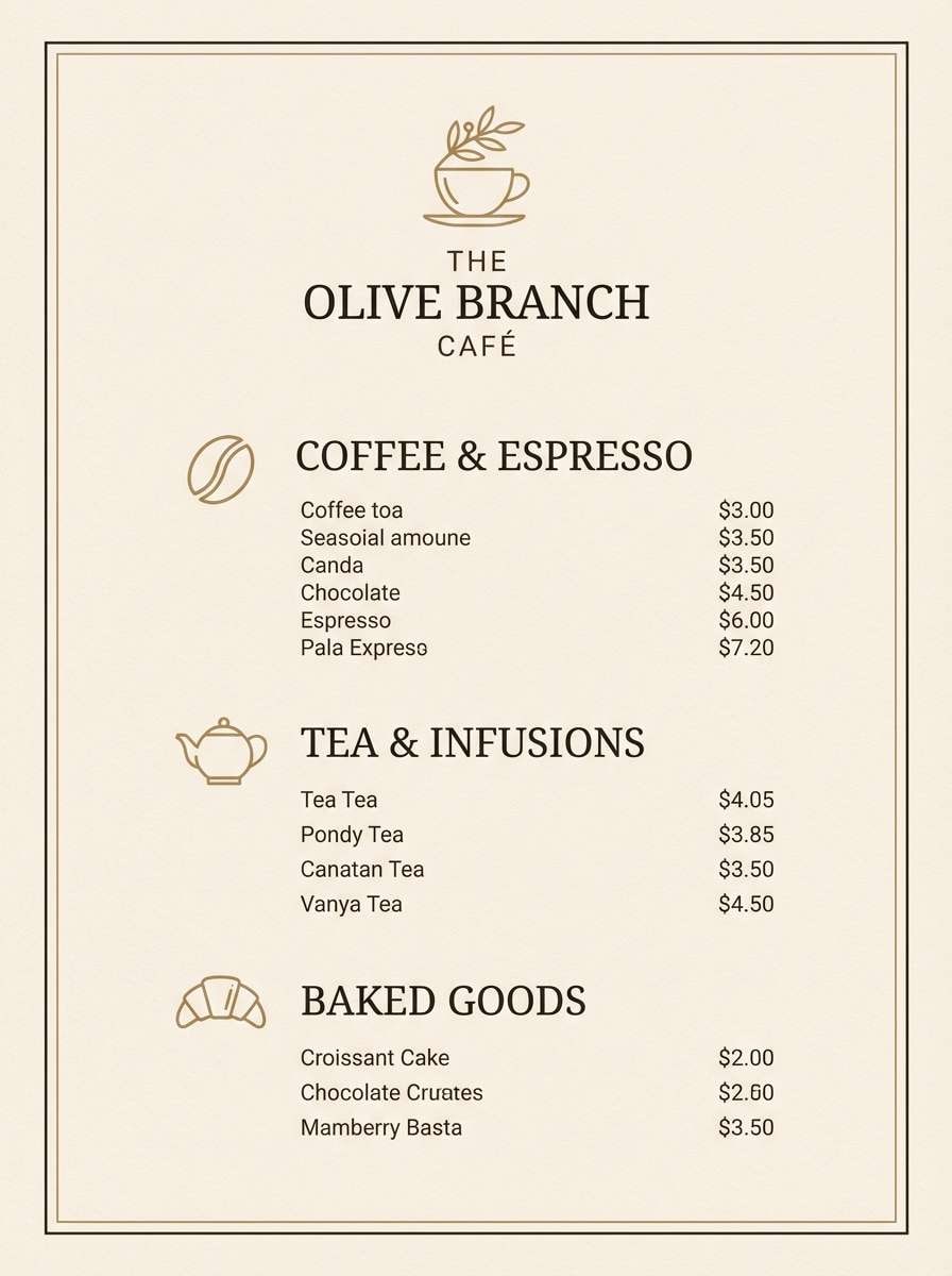
8) Noir Café
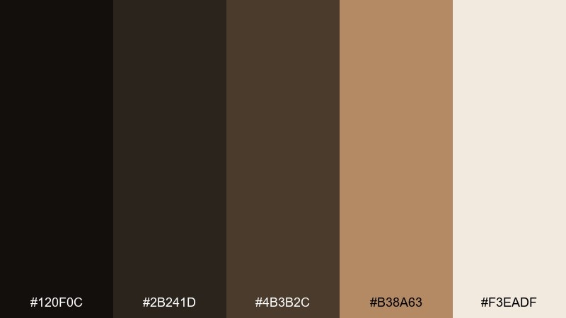
HEX: #120f0c #2b241d #4b3b2c #b38a63 #f3eadf
Mood: warm, vintage, intimate
Best for: coffee shop menu
Warm browns and creamy beige feel like espresso crema under low pendant lights. The darker tones hold body text well, while the caramel accent adds a friendly, handcrafted touch. Pair with serif type or classic script for a cozy, old-world vibe. Tip: reserve #b38a63 for prices and section dividers to guide scanning without clutter.
Image example of noir café generated using media.io
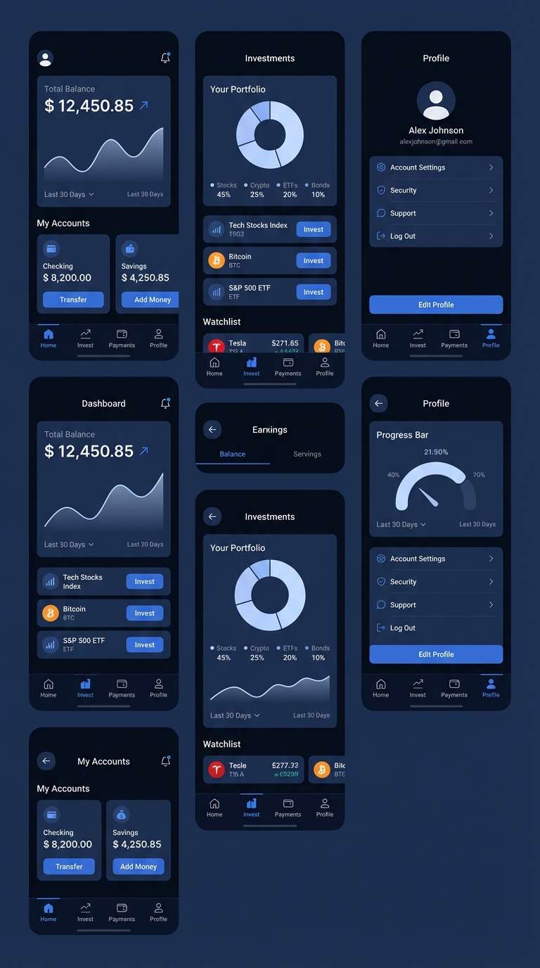
9) Sapphire Smoke
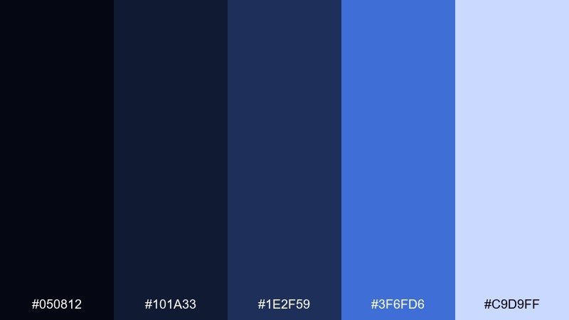
HEX: #050812 #101a33 #1e2f59 #3f6fd6 #c9d9ff
Mood: clean, techy, confident
Best for: fintech app UI
Deep sapphire with bright blue highlights feels crisp, secure, and modern. The darker base shades make great containers for charts and balances, while the lighter blue supports clear states and active elements. Pair with white space and thin line icons to keep it sharp. Tip: use #3f6fd6 for primary buttons and #c9d9ff for subtle hover fills.
Image example of sapphire smoke generated using media.io
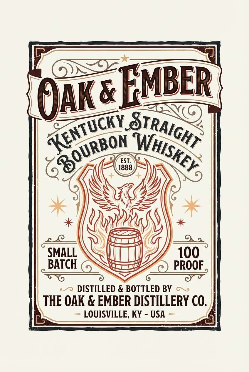
10) Ember Afterhours
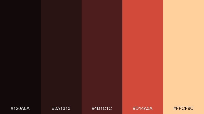
HEX: #120a0a #2a1313 #4d1c1c #d14a3a #ffcf9c
Mood: smoky, spicy, dramatic
Best for: whiskey label design
Smoky reds and ember orange glow like coals in a late-night lounge. The dark maroons create instant heritage, while the warm highlights bring appetite appeal and a premium feel. This night color combination shines on labels with textured paper and minimal illustration. Tip: keep #ffcf9c for small linework and type highlights so the design reads clearly on shelves.
Image example of ember afterhours generated using media.io
11) Raincoat Reflections
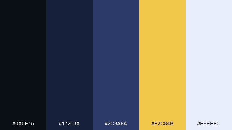
HEX: #0a0e15 #17203a #2c3a6a #f2c84b #e9eefc
Mood: moody, cinematic, high-contrast
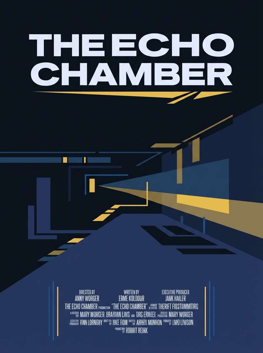
Best for: movie poster layout
Cinematic navy shadows with a sharp yellow pop feel like city rain and street reflections. The blues provide depth for imagery and credits, while the golden accent grabs attention for titles and awards. Pair with condensed type and strong alignment for that theatrical poster energy. Tip: use the yellow as a single focal stripe or badge rather than spreading it across the whole layout.
Image example of raincoat reflections generated using media.io
12) Cosmic Denim
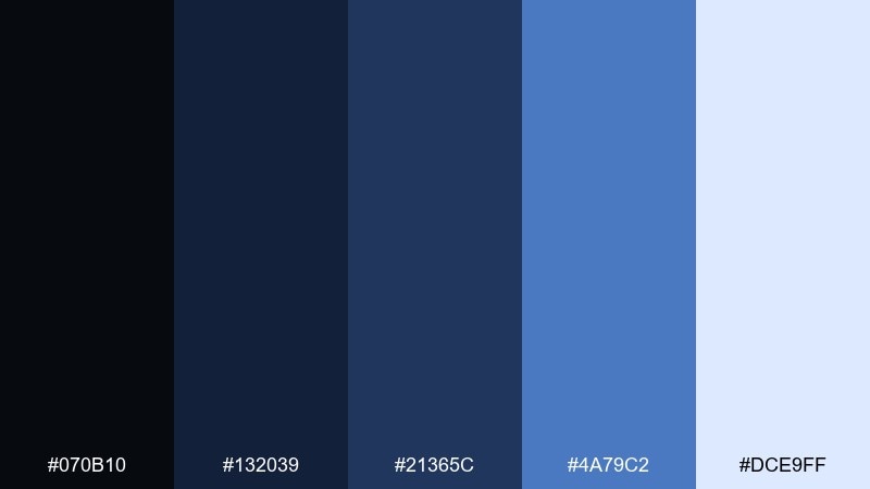
HEX: #070b10 #132039 #21365c #4a79c2 #dce9ff
Mood: relaxed, modern, friendly
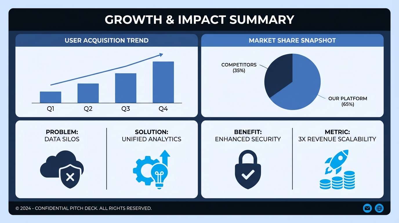
Best for: startup pitch deck
Denim blues with a soft sky tint feel approachable while still polished. The dark shades build trustworthy slide headers, and the brighter blue brings clarity to charts and icons. Pair with simple data viz and minimal gradients to keep it contemporary. Tip: set most body text on the pale blue background for easy reading in presentations.
Image example of cosmic denim generated using media.io
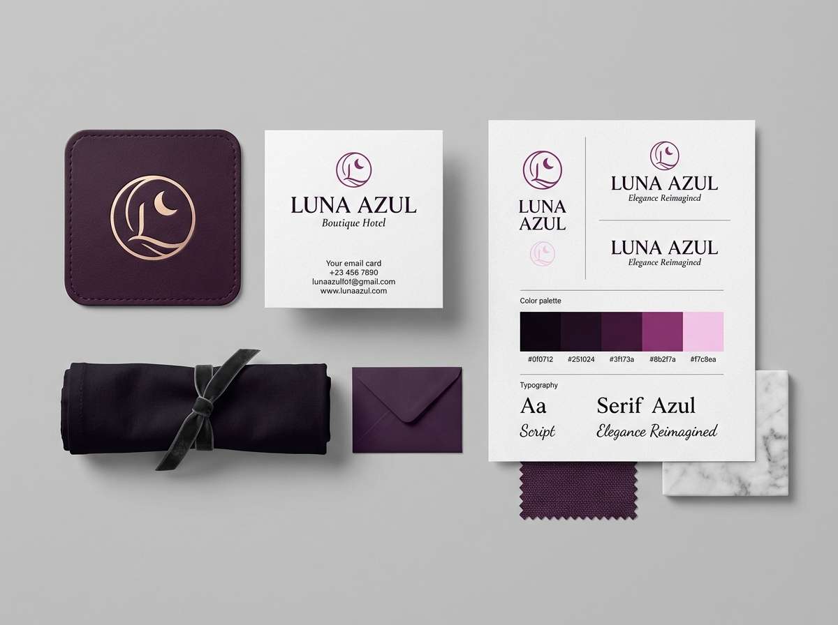
13) Plum Eclipse
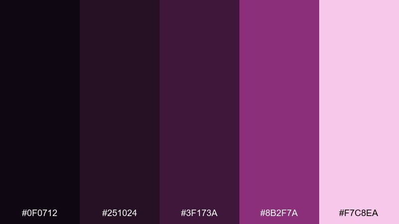
HEX: #0f0712 #251024 #3f173a #8b2f7a #f7c8ea
Mood: moody, artistic, luxe
Best for: boutique hotel branding
Dark plum and berry tones evoke velvet curtains and a soft, romantic glow. The deeper shades give logos and signage a high-end presence, while the pink tint adds warmth without turning sweet. Pair with brass, cream, or marble textures to reinforce the boutique vibe. Tip: use #8b2f7a for wayfinding accents and keep #f7c8ea for subtle background patterns.
Image example of plum eclipse generated using media.io
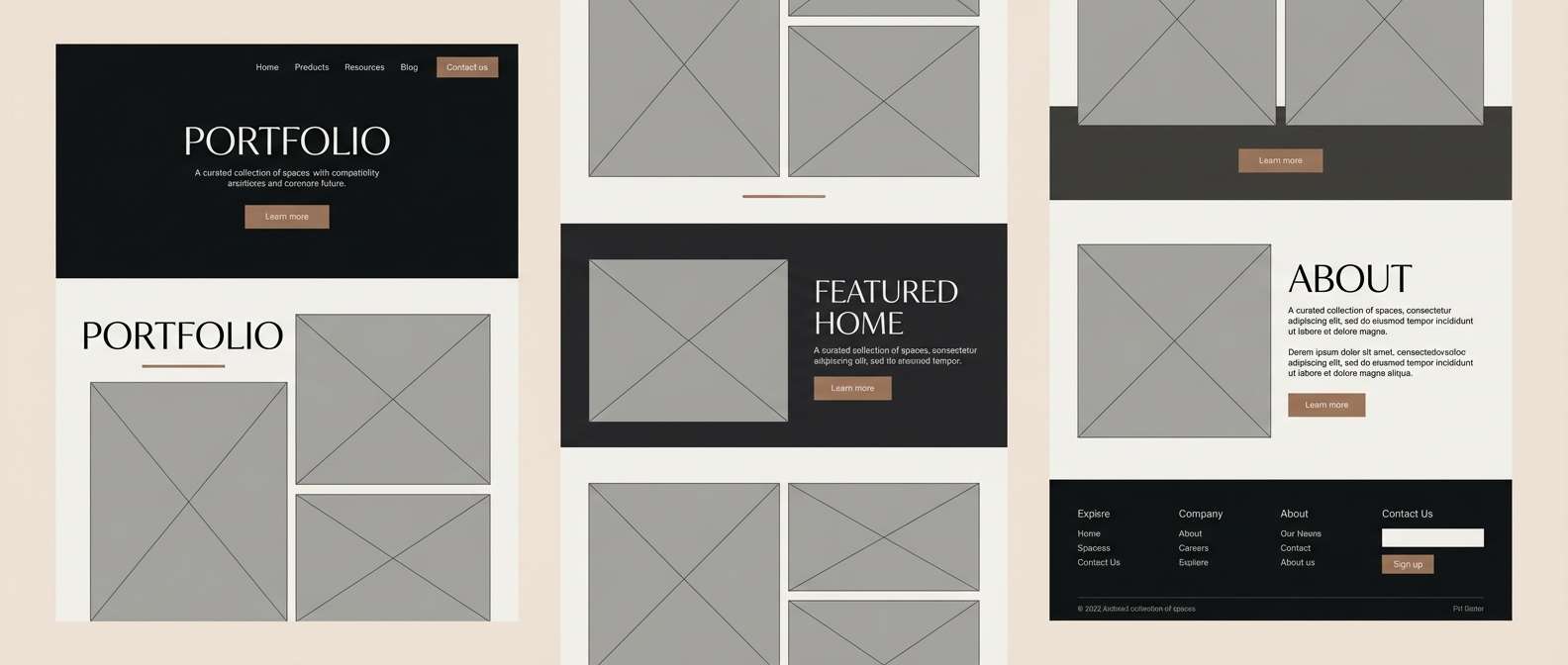
14) Charcoal & Clay
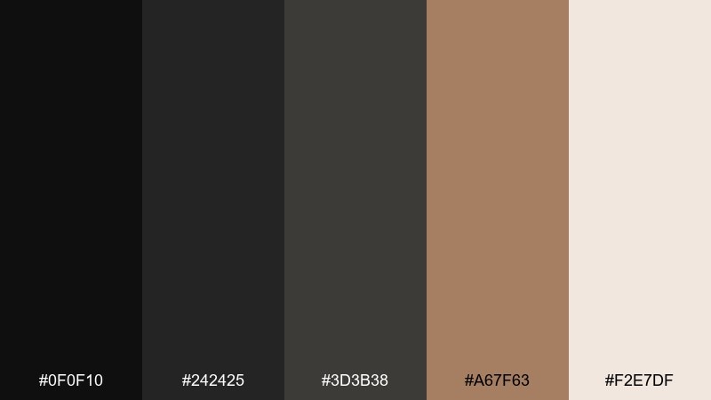
HEX: #0f0f10 #242425 #3d3b38 #a67f63 #f2e7df
Mood: modern, grounded, architectural
Best for: interior design portfolio
Charcoal neutrals with a clay accent feel like concrete, leather, and warm wood under gallery lighting. The grays keep layouts sophisticated, and the earthy tan brings just enough human warmth. Pair with high-quality photography and minimal captions for an editorial look. Tip: use #a67f63 for section labels and small UI highlights so the portfolio stays calm.
Image example of charcoal & clay generated using media.io
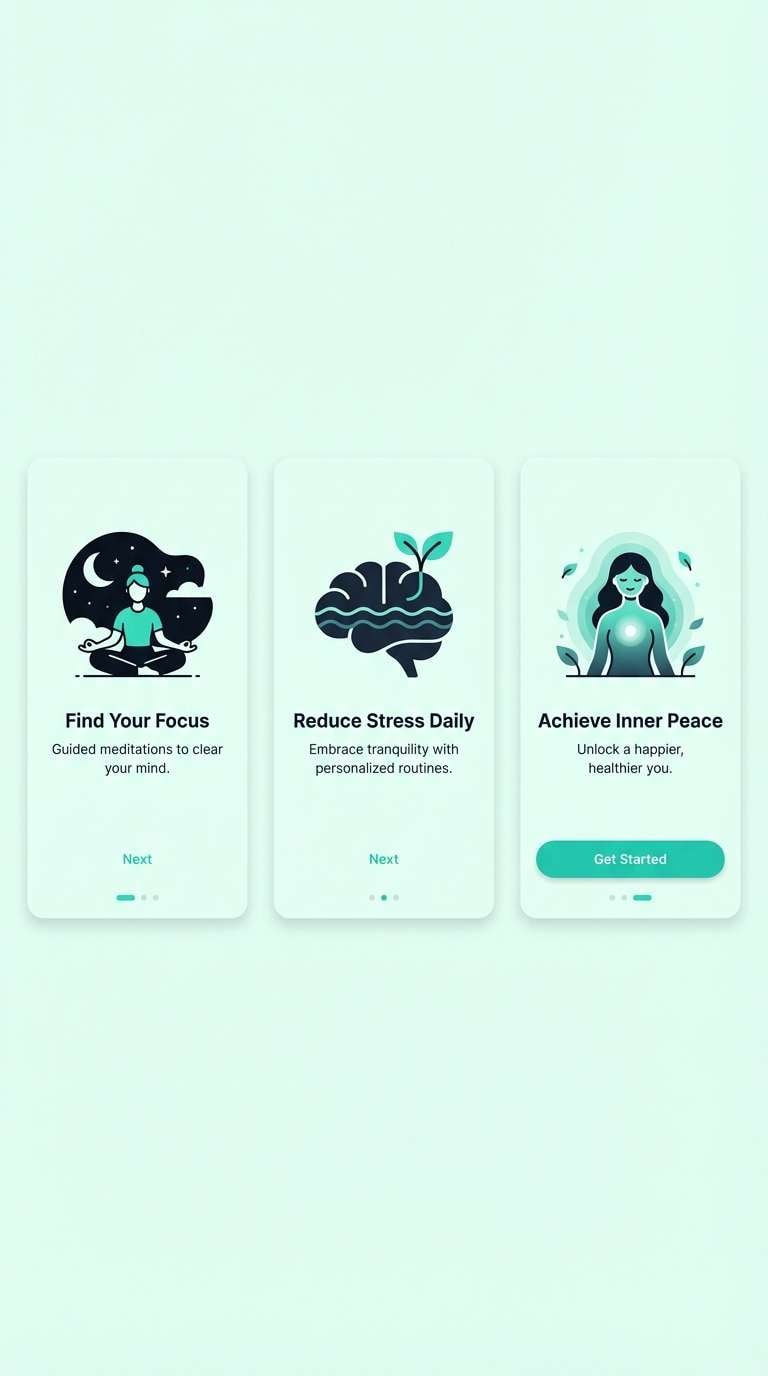
15) Aurora Minimal
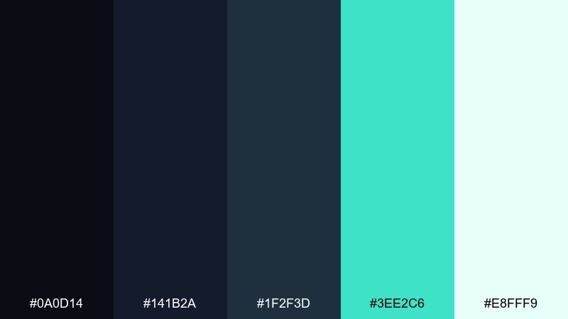
HEX: #0a0d14 #141b2a #1f2f3d #3ee2c6 #e8fff9
Mood: fresh, airy, futuristic
Best for: meditation app onboarding
Fresh teal on deep blue feels like an aurora cutting through a calm sky. The dark foundation keeps onboarding screens soothing, while the mint accent adds gentle optimism for progress states. Pair with rounded typography and simple illustrations to keep it approachable. Tip: reserve #3ee2c6 for one primary action per screen to avoid visual noise.
Image example of aurora minimal generated using media.io
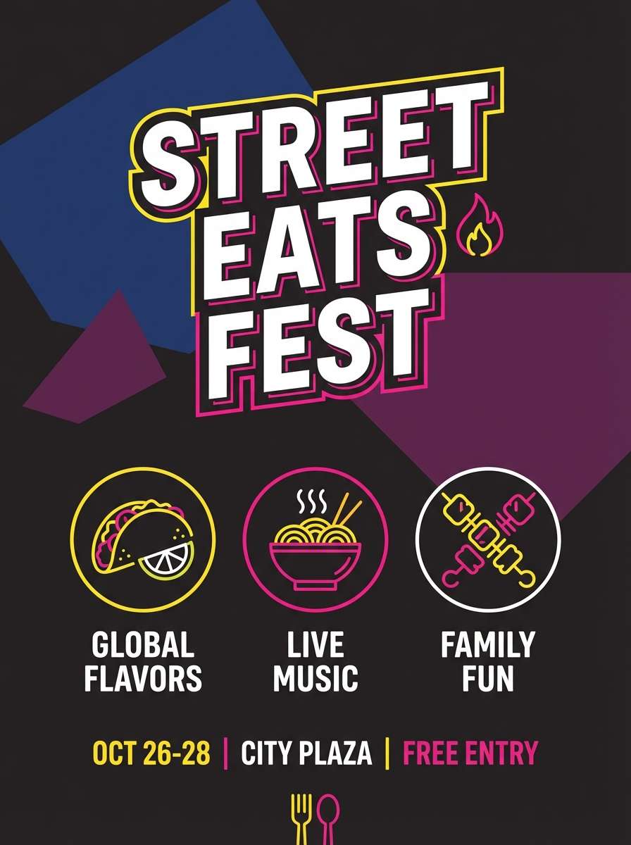
16) Night Market Signage
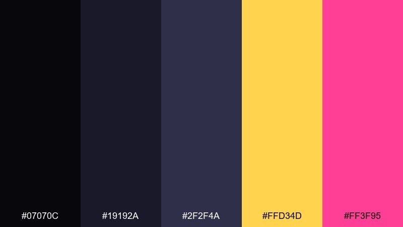
HEX: #07070c #19192a #2f2f4a #ffd34d #ff3f95
Mood: playful, bold, energetic
Best for: street food flyer
Bold and lively, these tones feel like glowing stalls and handwritten menus after dark. The deep indigos keep the layout punchy, while the yellow and hot pink act like attention magnets for offers and locations. Night color combinations like this work best with chunky type and simple iconography. Tip: put the yellow behind the key callout and use pink only for secondary highlights to balance the energy.
Image example of night market signage generated using media.io
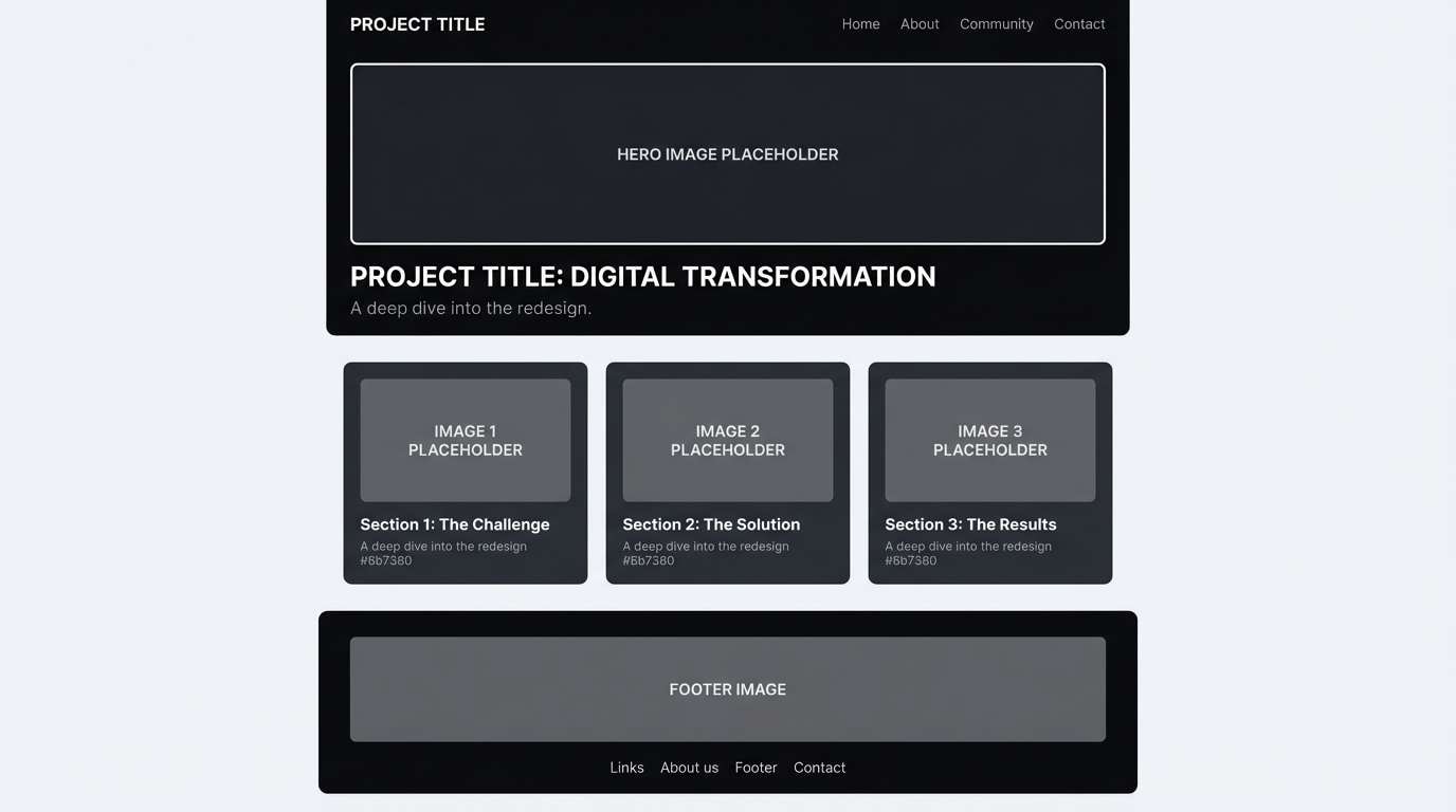
17) Studio Monochrome
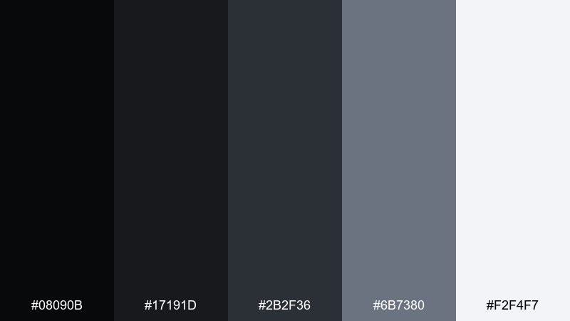
HEX: #08090b #17191d #2b2f36 #6b7380 #f2f4f7
Mood: neutral, modern, high-contrast
Best for: portfolio case study page
Neutral grays feel like a studio backdrop that lets content do the talking. The dark steps create clear structure for headings and sidebars, while the near-white keeps long reads comfortable. Pair with one bold accent color from your brand if you need extra punch for links. Tip: use #6b7380 for secondary text so hierarchy stays subtle and refined.
Image example of studio monochrome generated using media.io
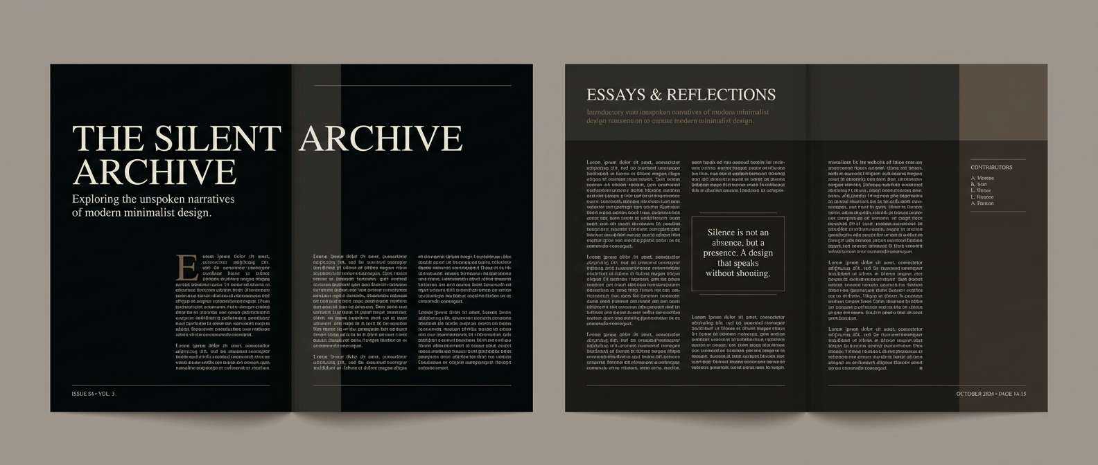
18) Vintage Film Noir
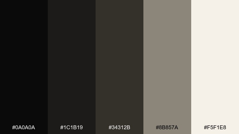
HEX: #0a0a0a #1c1b19 #34312b #8b857a #f5f1e8
Mood: classic, cinematic, nostalgic
Best for: editorial magazine spread
Classic noir neutrals evoke grainy film, soft shadows, and paper aged to perfection. The warm grays keep it timeless, and the ivory gives breathing room for long-form typography. Pair with serif headlines and thin rules for an old-school editorial rhythm. Tip: let #0a0a0a carry the main titles and keep body text slightly softened in #1c1b19 for comfort.
Image example of vintage film noir generated using media.io
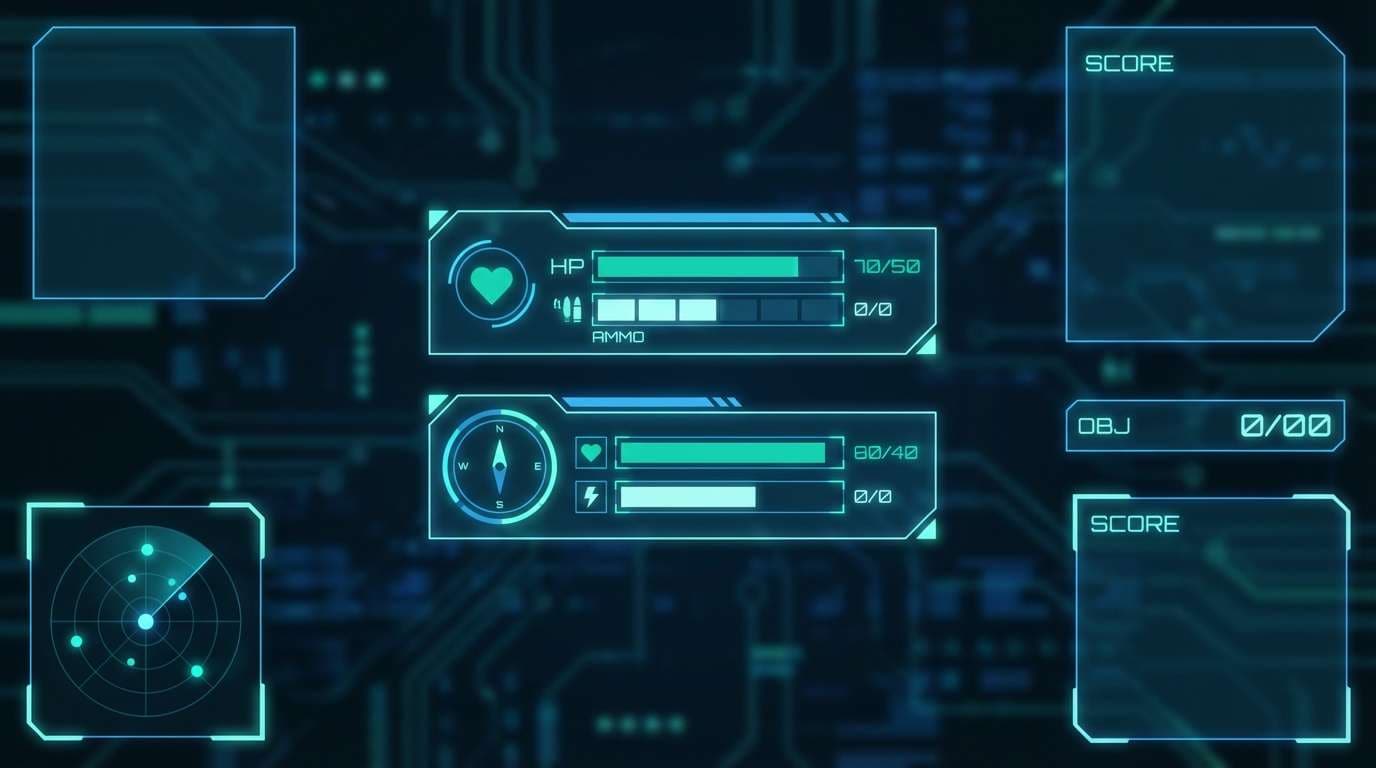
19) Deep Sea Console
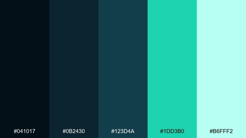
HEX: #041017 #0b2430 #123d4a #1dd3b0 #b6fff2
Mood: sleek, aquatic, tech
Best for: gaming HUD UI
Sleek oceanic darks with a neon seafoam accent feel like instruments glowing underwater. The deep teal base works perfectly for HUD panels, while the bright mint reads as status, health, and interactive feedback. Pair with thin lines, subtle glows, and compact typography to keep it functional. Tip: keep the brightest shades for critical indicators only, so the interface stays readable in motion.
Image example of deep sea console generated using media.io
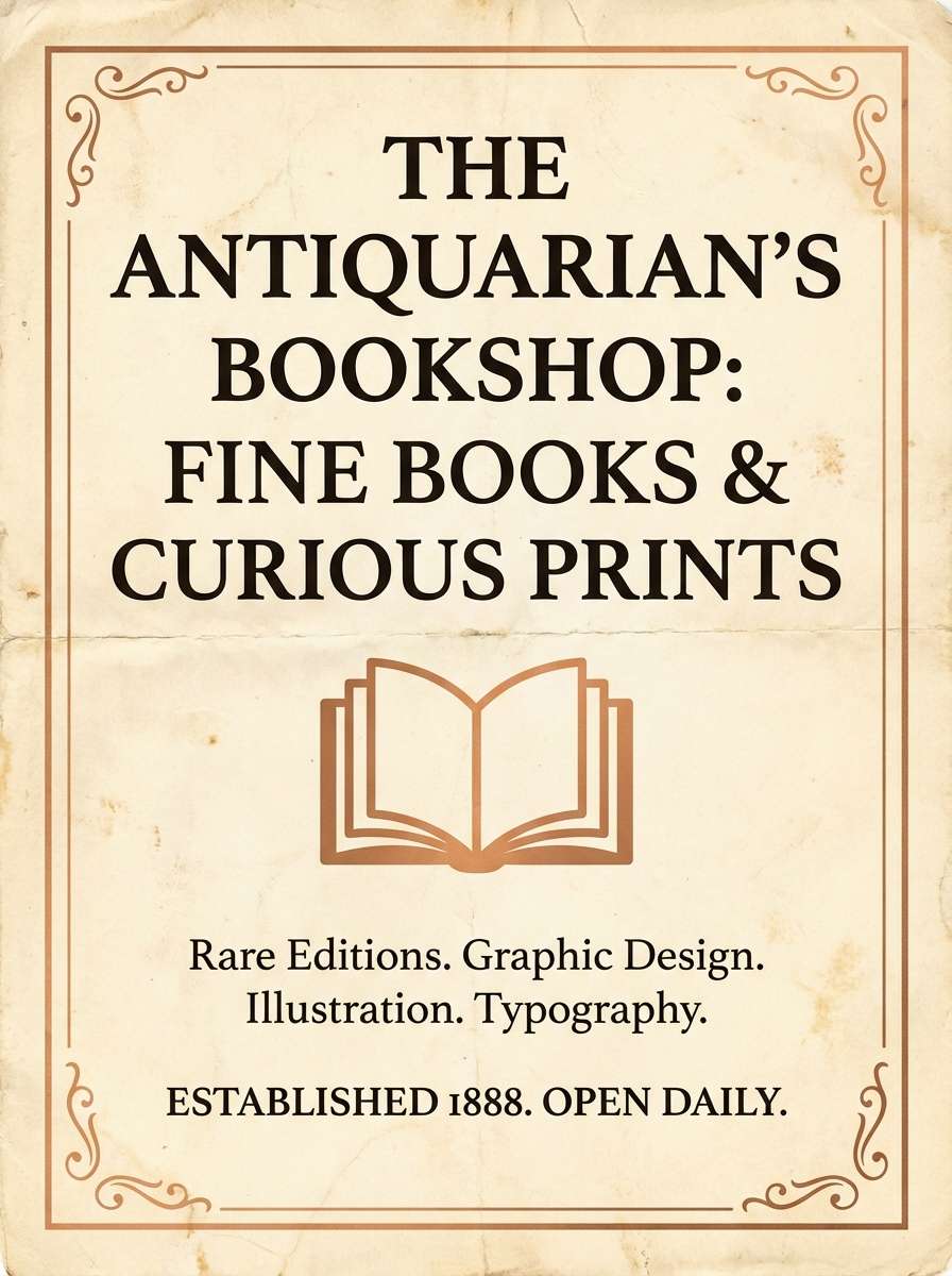
20) Candlelit Library
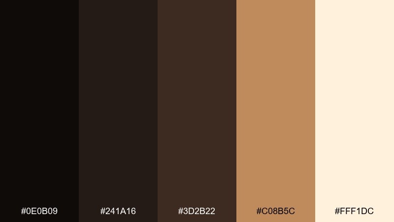
HEX: #0e0b09 #241a16 #3d2b22 #c08b5c #fff1dc
Mood: cozy, scholarly, warm
Best for: bookstore promo poster
Cozy browns and soft cream feel like worn book covers under candlelight. The dark bases bring a classic, literary tone, while the amber accent adds warmth for badges and headlines. Pair with textured backgrounds or subtle paper grain to enhance the nostalgic mood. Tip: set key text on #fff1dc for clarity and use #c08b5c to highlight dates and locations.
Image example of candlelit library generated using media.io
What Colors Go Well with Night?
Night tones pair best with clean, high-clarity lights: cool whites, pale grays, and icy tints that keep typography readable and interfaces calm. These help your darkest shades stay rich instead of muddy.
For accents, choose one “glow” color and keep it consistent. Cyan and teal feel futuristic, cerise and orchid feel nightlife and pop, while gold and amber feel cinematic and premium.
If you want warmth without losing the night mood, add a single sand, cream, or clay tone. It makes dark color palettes feel more human—especially for food, hospitality, and lifestyle brands.
How to Use a Night Color Palette in Real Designs
Start with roles, not just colors: pick a base background, a raised surface color, a border/shadow color, and two text colors (primary and secondary). Then assign one accent for actions like buttons, links, and badges.
Control contrast by limiting how often you use the lightest shade. A common night color scheme pattern is dark navigation + dark cards + light content areas, so attention naturally moves to what matters.
For posters and branding, make the accent do the work. Keep backgrounds simple and let a single neon, gold, or lavender highlight carry the focal point in headlines, logos, or key callouts.
Create Night Palette Visuals with AI
If you already have HEX codes, you can generate matching UI mockups, posters, labels, and brand boards by describing the layout and specifying your palette. This makes it easy to test multiple night color combinations before committing to a final direction.
Reuse the prompts above and swap in your product type, typography style, and aspect ratio. Keeping the prompt explicit (dominant colors vs. accent colors) helps the output stay on-brand and readable.
When you find a look you like, generate a few variations with different lighting (soft glow vs. high contrast) to see what best matches your mood: minimal, cinematic, cozy, or cyber.
Night Color Palette FAQs
-
What is a night color palette?
A night color palette is a set of dark base colors (like navy, charcoal, or near-black) combined with lighter neutrals for text and one or two accent shades for emphasis, creating a moody, high-contrast look. -
Are night color schemes good for UI design?
Yes—night palettes work well for dashboards, apps, and HUD-style interfaces because they reduce perceived glare and make key UI states (active, hover, alerts) stand out with minimal accents. -
How do I keep text readable on dark backgrounds?
Use an off-white or very light gray for primary text (instead of pure white), reserve true white for small highlights, and ensure sufficient contrast between your background and typography—especially for body text. -
What accent colors look best with midnight tones?
Neon cyan/teal gives a futuristic vibe, cerise/magenta feels nightlife and bold, and gold/amber looks cinematic and premium. Pick one main accent and use it consistently. -
Can a night palette still feel warm and inviting?
Absolutely—add warm browns, caramel, cream, or clay accents (like Noir Café or Candlelit Library). These keep the night mood while making the design feel cozy and approachable. -
How many colors should I use in a dark color palette?
Five is a practical starting point: 2–3 dark foundations, 1 mid-tone for secondary text/borders, 1 light tone for reading surfaces, and 1 accent for actions or focal points. -
How can I quickly preview night color combinations?
Generate a few mockups with AI using your HEX codes in the prompt (dominant vs. accent). It’s a fast way to test whether the palette reads cleanly in real layouts like posters, app screens, or packaging.
Next: Cerise Color Palette


