

Teal lime green palettes blend cool clarity with high-energy freshness, making them ideal for modern digital design and vibrant seasonal graphics.
Below are 20+ curated teal lime green color palette ideas with HEX codes, plus practical tips for pairing and using them across UI, branding, print, and social content.
In this article
- Why Teal Lime Green Palettes Work So Well
-
- lagoon zest
- coastal citrus
- modern mint grid
- neon jungle pop
- spa leaf calm
- retro surf shop
- techno tropic ui
- botanical poster fresh
- urban concrete sprout
- sunlit aquarium
- sporty energy stripe
- minimal lime accent
- eco packaging clean
- festival glow night
- classroom chalkboard bright
- wedding garden punch
- fintech fresh trust
- summer app onboarding
- artisan soap label
- museum wayfinding
- fresh market labels
- crystal pool party
- What Colors Go Well with Teal Lime Green?
- How to Use a Teal Lime Green Color Palette in Real Designs
- Create Teal Lime Green Palette Visuals with AI
Why Teal Lime Green Palettes Work So Well
Teal brings stability and clarity, while lime green adds instant visibility and momentum. Together, they create a contrast that feels both trustworthy and lively—perfect for designs that need to look modern without becoming cold.
This pairing also supports strong hierarchy. Teal can handle large surfaces (headers, backgrounds, navigation), and lime can be reserved for micro-emphasis (CTAs, badges, highlights) so users know exactly where to look.
Because both colors sit in the fresh, nature-adjacent range, teal lime green palettes naturally communicate cleanliness, energy, and “newness,” which is why they show up so often in wellness, SaaS, eco branding, and summer campaigns.
20+ Teal Lime Green Color Palette Ideas (with HEX Codes)
1) Lagoon Zest
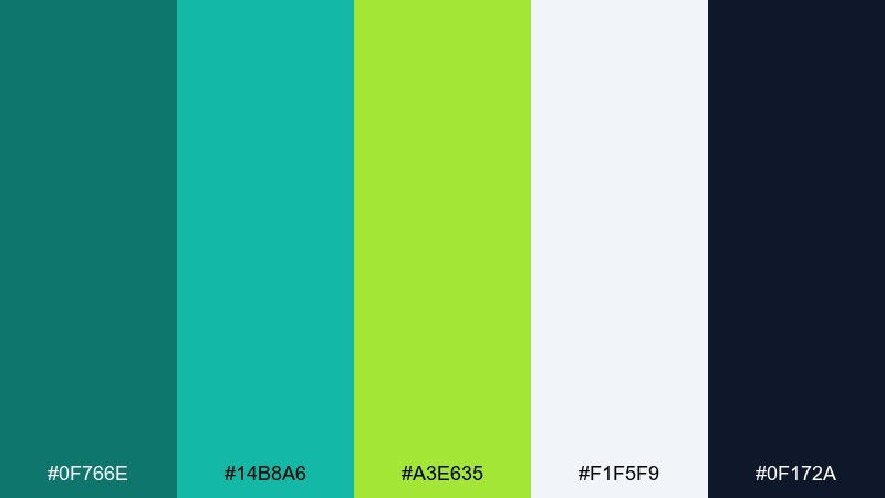
HEX: #0F766E #14B8A6 #A3E635 #F1F5F9 #0F172A
Mood: fresh and punchy
Best for: brand hero sections
Fresh lagoon air with a citrus twist gives this mix a clean, optimistic kick. Use it for landing pages, wellness brands, and summer campaigns where clarity matters. Pair the teal bases with slate text for readability, and let lime do the attention work on CTAs. Tip: keep lime to small UI hotspots to avoid visual fatigue.
Image example of lagoon zest generated using media.io

Media.io is an online AI studio for creating and editing video, image, and audio in your browser.

2) Coastal Citrus
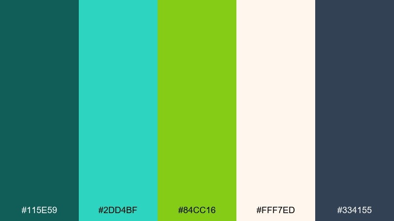
HEX: #115E59 #2DD4BF #84CC16 #FFF7ED #334155
Mood: sunny coastal
Best for: travel posters
Sunny shoreline vibes meet sharp citrus highlights for a breezy, upbeat feel. It works beautifully on destination posters, tour flyers, and social ads with lots of whitespace. Balance the bright greens with warm cream backgrounds and grounded slate type. Tip: use teal for large shapes and reserve lime for route markers or price tags.
Image example of coastal citrus generated using media.io
3) Modern Mint Grid
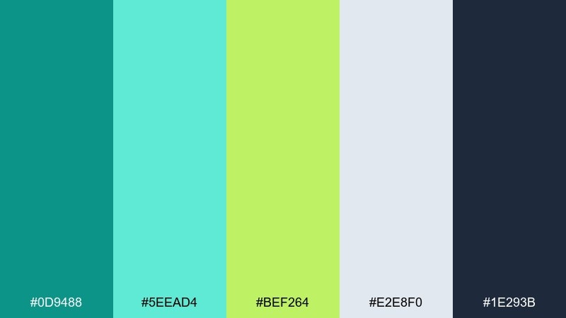
HEX: #0D9488 #5EEAD4 #BEF264 #E2E8F0 #1E293B
Mood: modern and tidy
Best for: dashboard UI
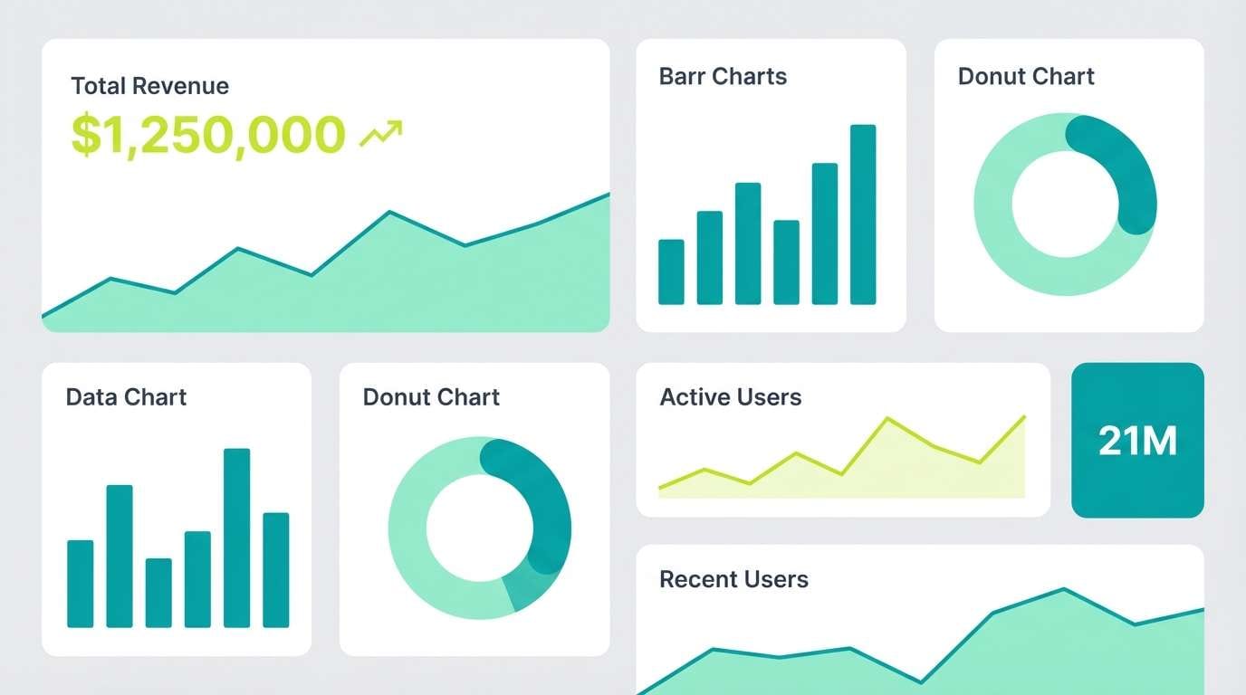
Crisp mint tones and structured neutrals create a tidy, modern rhythm. These colors suit analytics dashboards, admin panels, and SaaS navigation where hierarchy is key. Keep the pale mint as surfaces, use deep teal for active states, and let lime highlight metrics. Tip: set charts to teal families and use lime only for the top KPI.
Image example of modern mint grid generated using media.io
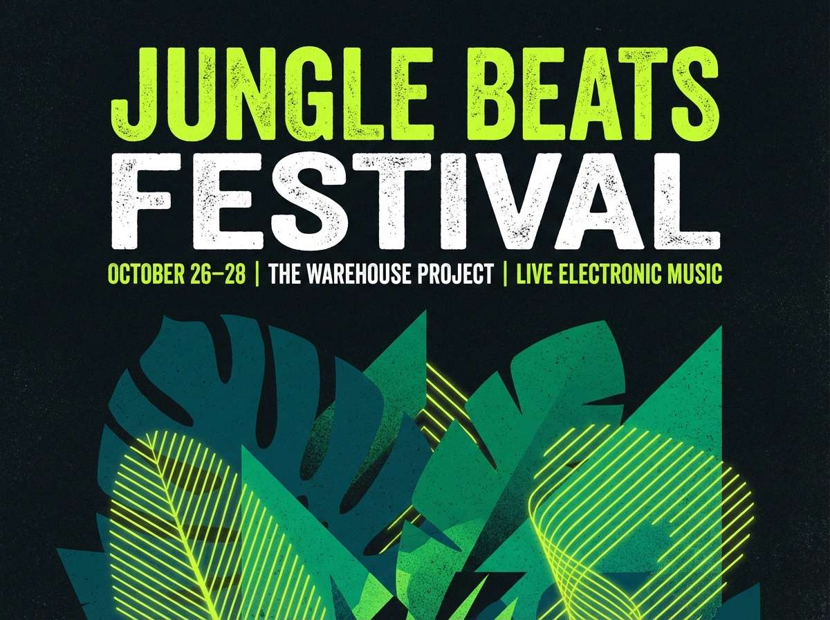
4) Neon Jungle Pop
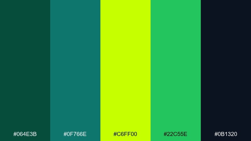
HEX: #064E3B #0F766E #C6FF00 #22C55E #0B1320
Mood: bold and electric
Best for: music event flyers
Electric jungle energy feels loud, nocturnal, and a little rebellious. It is ideal for club flyers, gig posters, and punchy social promos that need instant contrast. Use the deep greens as the stage and drop lime as headline glow or key dates. Tip: add a subtle grain texture to avoid flat neon banding in large areas.
Image example of neon jungle pop generated using media.io
5) Spa Leaf Calm
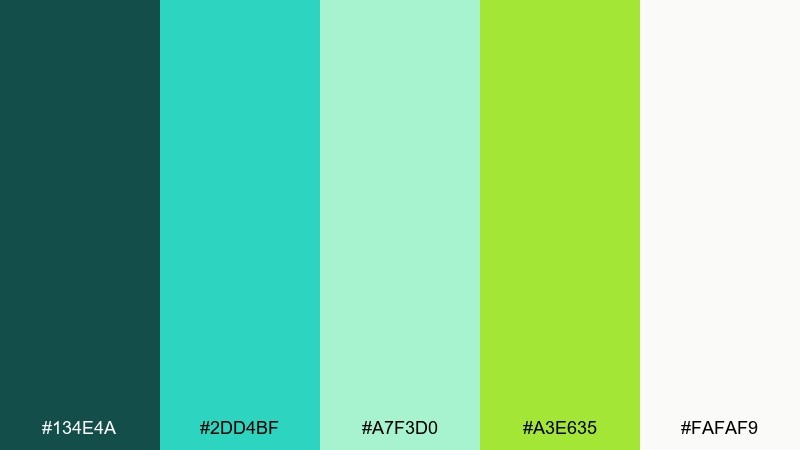
HEX: #134E4A #2DD4BF #A7F3D0 #A3E635 #FAFAF9
Mood: calm and restorative
Best for: wellness branding
Soft spa calm with leafy freshness makes everything feel clean and cared for. Use it for skincare branding, yoga studios, and appointment booking pages where trust matters. Pair the pale aqua with warm white space, then let lime act as a gentle accent, not a shout. Tip: choose rounded icons and thin lines to match the soothing tone.
Image example of spa leaf calm generated using media.io
6) Retro Surf Shop
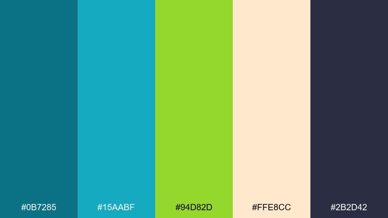
HEX: #0B7285 #15AABF #94D82D #FFE8CC #2B2D42
Mood: retro and playful
Best for: t-shirt graphics
Retro surf nostalgia comes through with bright greens and breezy teal. It fits tees, stickers, and merch where you want a friendly, throwback vibe. Use the peachy cream as a base to keep the set warm and wearable. Tip: limit gradients and lean into flat, screen-print style blocks for a true vintage look.
Image example of retro surf shop generated using media.io

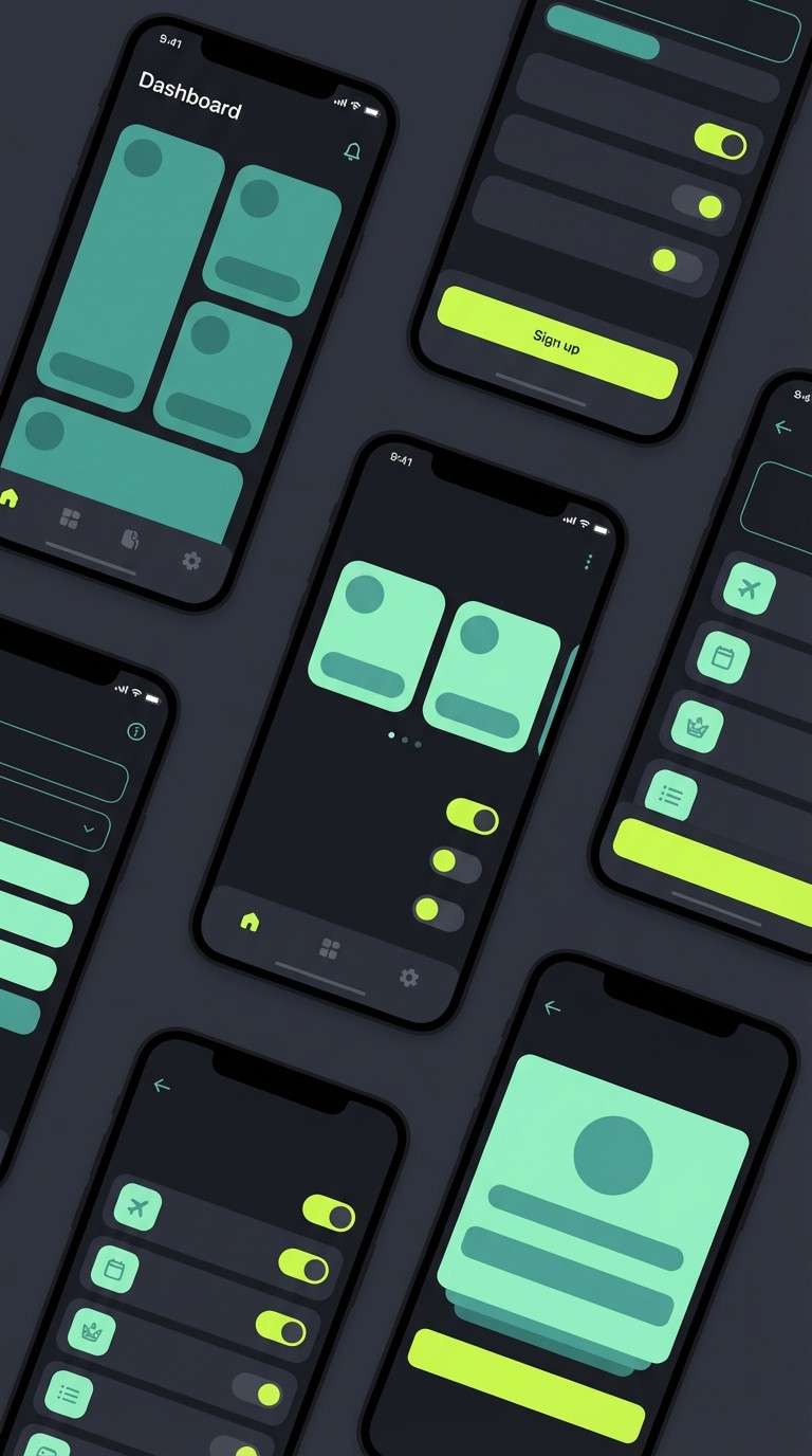
7) Techno Tropic UI
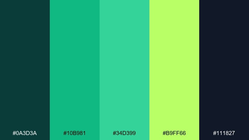
HEX: #0A3D3A #10B981 #34D399 #B9FF66 #111827
Mood: sleek and energetic
Best for: app UI dark mode
Sleek tropical tech feels fast, clean, and slightly futuristic. This teal lime green color combination shines in dark mode apps, fintech widgets, and data visualizations. Let the near-black ground the interface while mint and lime guide attention to toggles and badges. Tip: keep body text in soft gray to avoid harsh contrast on OLED screens.
Image example of techno tropic ui generated using media.io
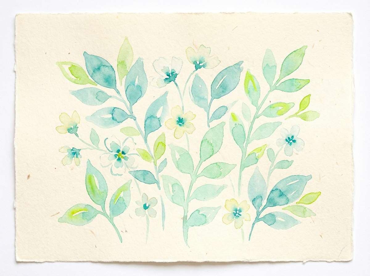
8) Botanical Poster Fresh
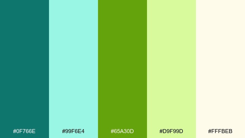
HEX: #0F766E #99F6E4 #65A30D #D9F99D #FFFBEB
Mood: airy and botanical
Best for: spring illustrations
Airy botanical freshness feels like new leaves after rain. Perfect for watercolor florals, garden event promos, and eco blog headers. Use creamy backgrounds and soft mint washes for most of the canvas, then add lime sparingly to suggest sunlight. Tip: keep edges slightly imperfect to preserve the hand-painted warmth.
Image example of botanical poster fresh generated using media.io
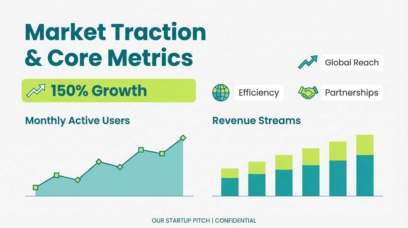
9) Urban Concrete Sprout
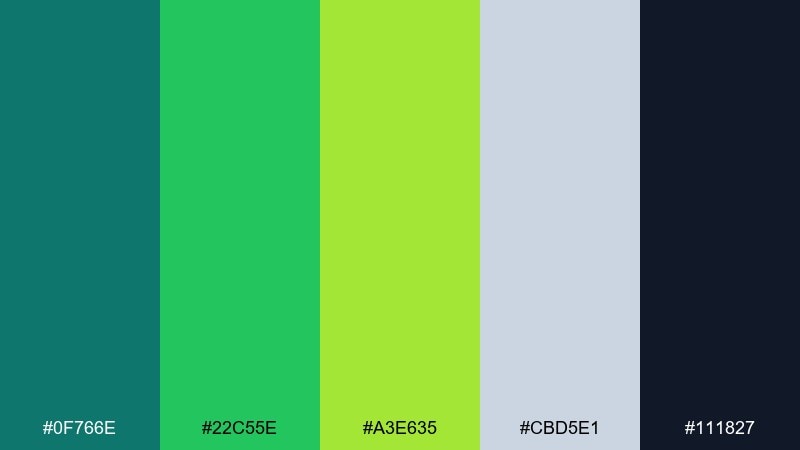
HEX: #0F766E #22C55E #A3E635 #CBD5E1 #111827
Mood: urban and optimistic
Best for: startup pitch decks
Concrete neutrals with a green sprout accent feel practical yet hopeful. Great for pitch decks, sustainability reports, and modern corporate slides. Use gray as the structure, teal for headings and charts, and lime to emphasize traction or impact stats. Tip: keep icons monochrome teal for consistency, then highlight only the key number in lime.
Image example of urban concrete sprout generated using media.io
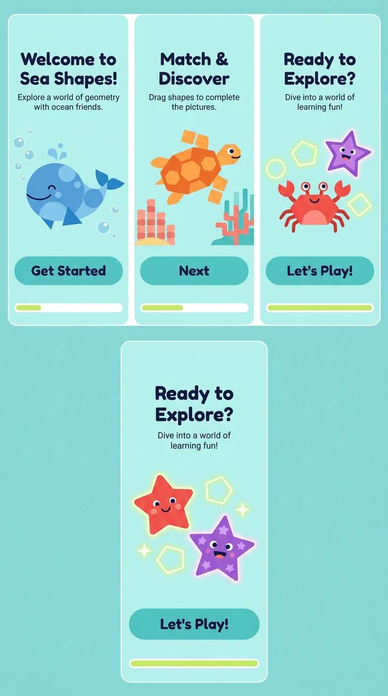
10) Sunlit Aquarium
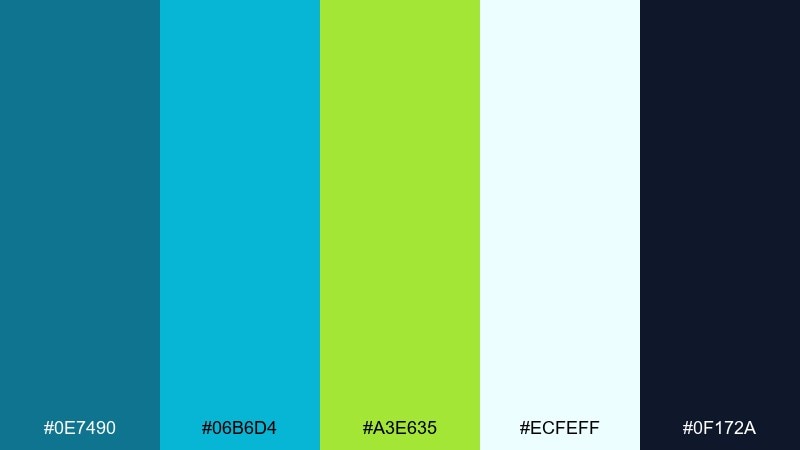
HEX: #0E7490 #06B6D4 #A3E635 #ECFEFF #0F172A
Mood: bright and aquatic
Best for: kids learning apps
Bright aquarium light feels bubbly, curious, and friendly. Use it for kids learning apps, playful onboarding, and educational illustrations. Let cyan-teal carry large backgrounds and panels while lime signals progress and rewards. Tip: keep contrast high for accessibility by pairing dark navy text with the lightest aqua.
Image example of sunlit aquarium generated using media.io
11) Sporty Energy Stripe
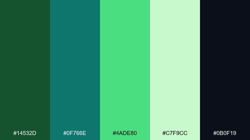
HEX: #14532D #0F766E #4ADE80 #C7F9CC #0B0F19
Mood: sporty and driven
Best for: fitness product ads
Sporty energy with crisp greens feels fast, focused, and competitive. It works for fitness product ads, gym promos, and performance gear graphics. Use dark green and near-black to anchor the layout, then punch in bright teal and lime as motion stripes. Tip: keep typography condensed and bold to match the athletic pace.
Image example of sporty energy stripe generated using media.io
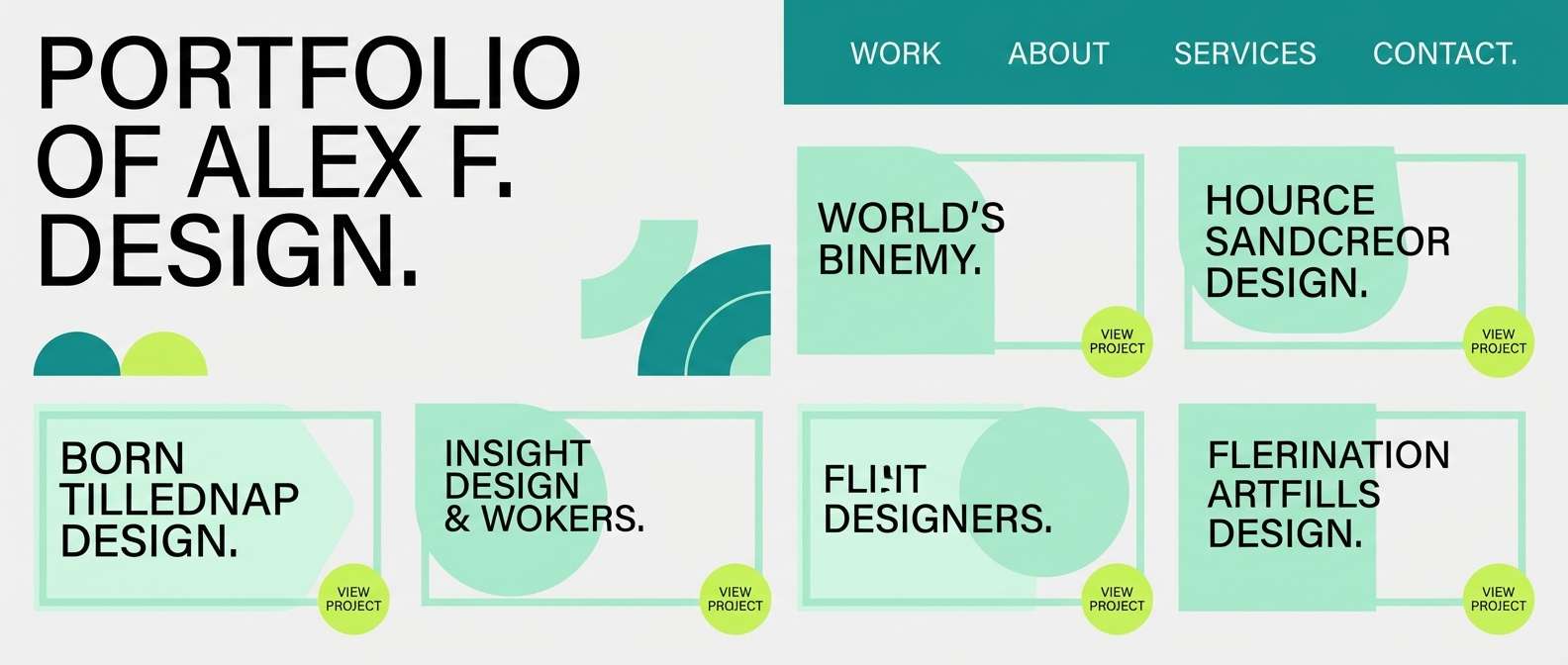
12) Minimal Lime Accent
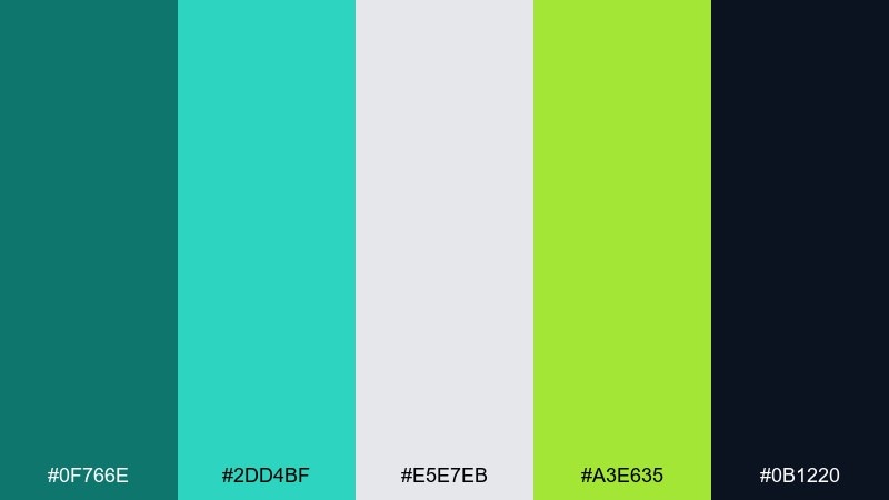
HEX: #0F766E #2DD4BF #E5E7EB #A3E635 #0B1220
Mood: minimal with a spark
Best for: portfolio websites
Minimal calm with one bright spark feels confident and editorial. Ideal for portfolios, case study pages, and simple product sites that need a memorable accent. Keep surfaces light gray, use teal for links and sections, and deploy lime only for hover states or key badges. Tip: repeat the lime accent in one small detail per section for visual rhythm.
Image example of minimal lime accent generated using media.io
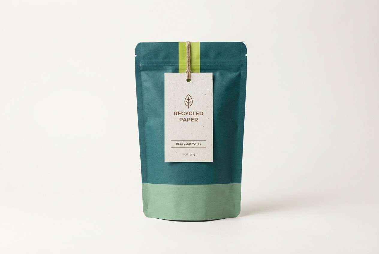
13) Eco Packaging Clean
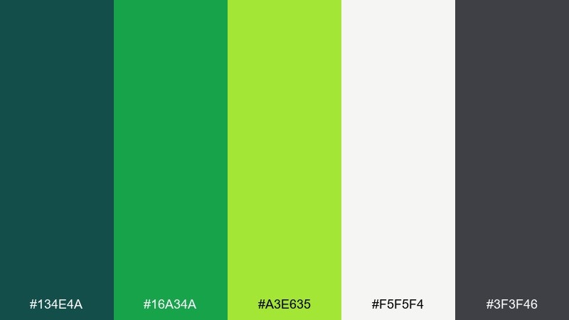
HEX: #134E4A #16A34A #A3E635 #F5F5F4 #3F3F46
Mood: clean and eco-minded
Best for: sustainable packaging
Clean eco cues feel honest, modern, and responsibly made. This teal lime green color palette suits refill pouches, organic supplements, and minimalist labels. Pair the off-white base with charcoal type for legibility, then use lime as a seal or flavor band. Tip: add a matte paper texture to keep the colors from feeling overly digital.
Image example of eco packaging clean generated using media.io
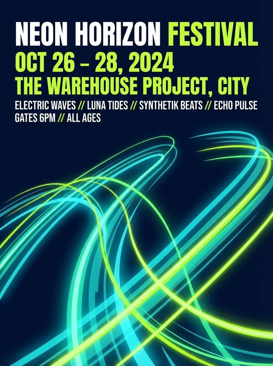
14) Festival Glow Night
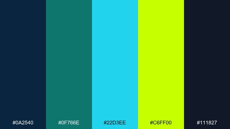
HEX: #0A2540 #0F766E #22D3EE #C6FF00 #111827
Mood: night glow
Best for: concert posters
Nighttime glow with electric highlights evokes lights, bass, and motion. Use it for concert posters, DJ lineups, and night market promos where contrast sells the vibe. Keep the background deep and cool, then layer teal gradients with lime for the loudest details. Tip: outline small text in light cyan to keep it readable on dark fields.
Image example of festival glow night generated using media.io
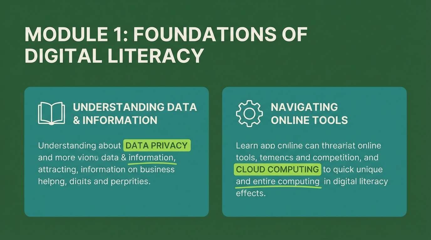
15) Classroom Chalkboard Bright
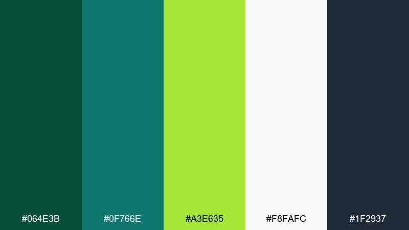
HEX: #064E3B #0F766E #A3E635 #F8FAFC #1F2937
Mood: smart and upbeat
Best for: e-learning slides
Chalkboard depth with bright highlights feels studious but lively. Great for e-learning slides, course thumbnails, and classroom infographics. Use dark green as a board-like base, write main points in soft white, and spotlight key terms in lime. Tip: keep icons simple and line-based so the color accents do the teaching emphasis.
Image example of classroom chalkboard bright generated using media.io
16) Wedding Garden Punch
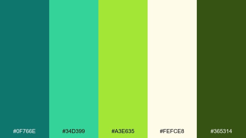
HEX: #0F766E #34D399 #A3E635 #FEFCE8 #365314
Mood: joyful garden
Best for: wedding invitations
Joyful garden tones feel bright, modern, and full of life. Use it for contemporary wedding invites, save-the-dates, and reception signage with a fresh twist. Creamy paper tones soften the palette, while teal and lime handle florals and monograms. Tip: keep lime in small botanical highlights so the design stays elegant.
Image example of wedding garden punch generated using media.io

17) Fintech Fresh Trust
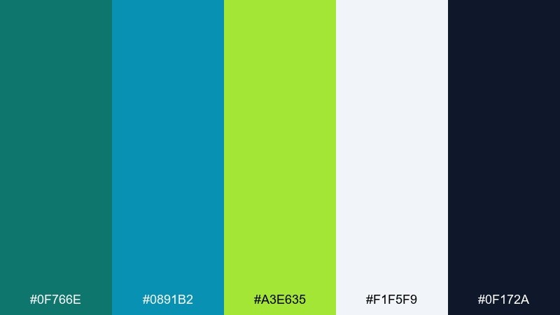
HEX: #0F766E #0891B2 #A3E635 #F1F5F9 #0F172A
Mood: trustworthy and fresh
Best for: fintech landing pages
Fresh trust tones feel secure, current, and easy to navigate. These teal lime green color combinations work well for fintech landing pages, feature grids, and pricing sections. Use teal and cyan for structure and charts, then let lime guide conversion moments like buttons and plan highlights. Tip: keep backgrounds light and avoid too many saturated blocks to maintain a premium feel.
Image example of fintech fresh trust generated using media.io
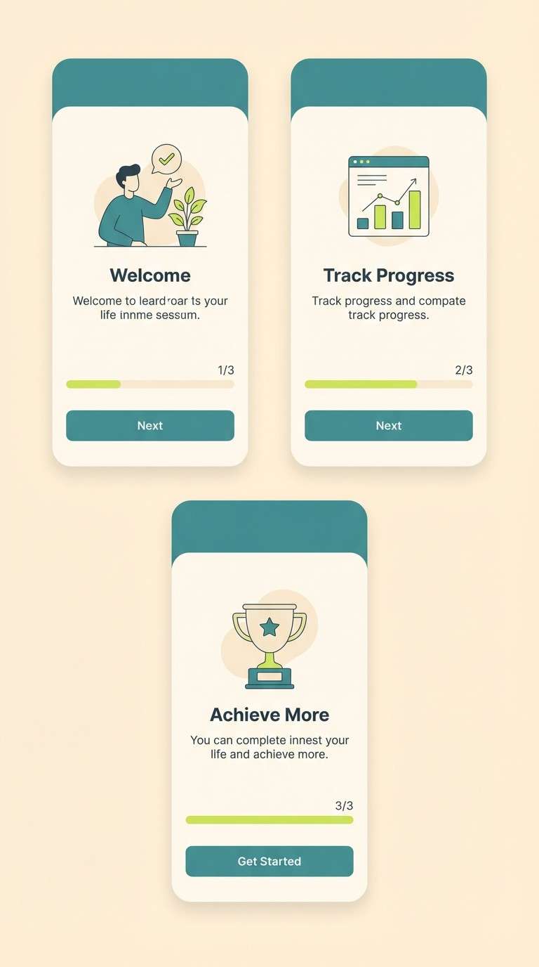
18) Summer App Onboarding
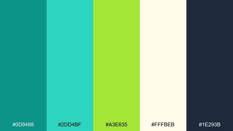
HEX: #0D9488 #2DD4BF #A3E635 #FFFBEB #1E293B
Mood: sunny and friendly
Best for: mobile onboarding UI
Sunny friendliness feels welcoming, simple, and easy to follow. Use it for onboarding flows, habit trackers, and travel apps that need cheerful guidance. Let warm cream be the base, build components in teal, and use lime for progress dots and confirmations. Tip: reserve the darkest slate for text only to keep the interface light.
Image example of summer app onboarding generated using media.io
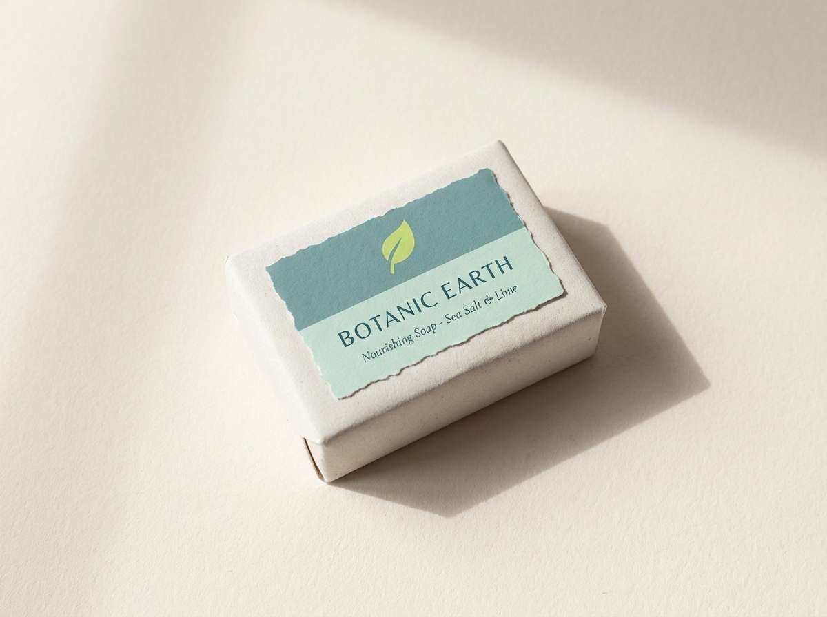
19) Artisan Soap Label
HEX: #115E59 #14B8A6 #84CC16 #FAF7F2 #404040
Mood: handcrafted and clean
Best for: soap and skincare labels
Handcrafted cleanliness feels gentle, natural, and boutique-ready. This teal lime green color palette is a strong fit for artisan soap labels, ingredient panels, and small-batch skincare. Use the warm off-white as label stock, teal for the brand mark, and lime to call out scent notes like citrus or herb. Tip: print lime slightly muted to keep the label looking premium under warm store lighting.
Image example of artisan soap label generated using media.io
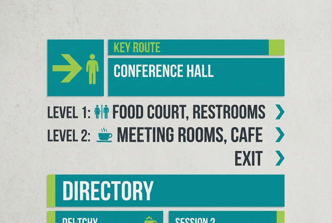
20) Museum Wayfinding
HEX: #0F766E #0EA5A4 #A3E635 #E7E5E4 #18181B
Mood: clear and directional
Best for: wayfinding signage
Clear directional tones feel organized, calm, and easy to scan. Use it for museum wayfinding, transit maps, and venue signage where fast comprehension matters. Teal works as the primary system color, with lime reserved for priority routes or alerts against stone neutrals. Tip: test the lime on print stock and lower its saturation slightly for comfortable long-distance reading.
Image example of museum wayfinding generated using media.io
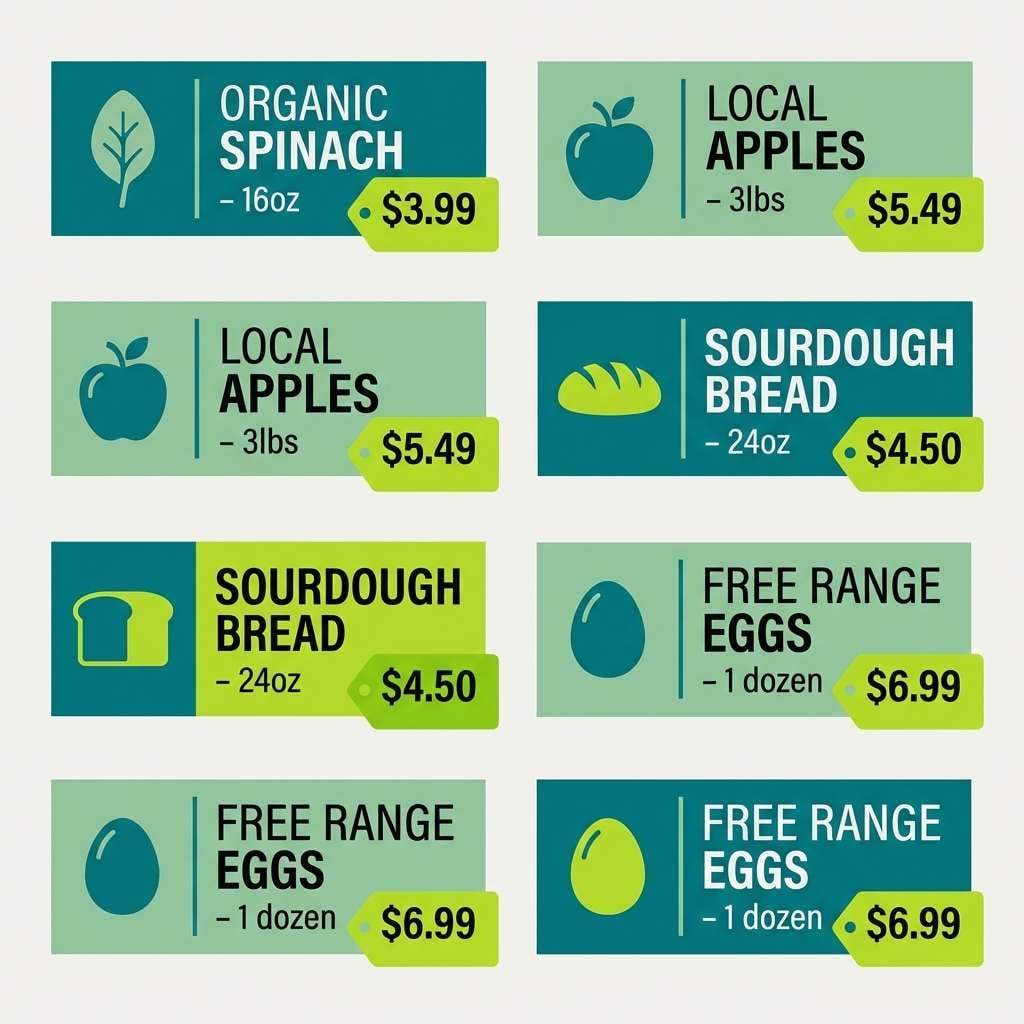
21) Fresh Market Labels
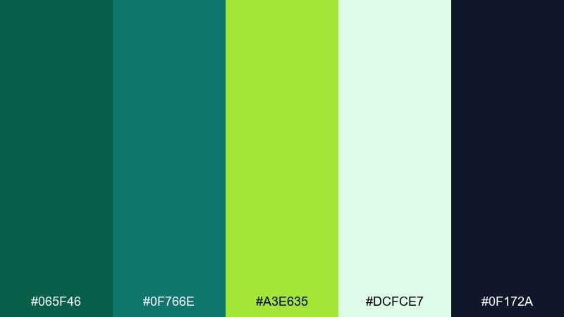
HEX: #065F46 #0F766E #A3E635 #DCFCE7 #0F172A
Mood: crisp and organic
Best for: grocery label systems
Crisp market freshness evokes herbs, produce bins, and clean nutrition cues. These teal lime green color combinations are great for grocery labels, category tags, and shelf talkers. Use minty greens for the base, deep teal for category headers, and lime to flag deals or new arrivals. Tip: keep the typography bold and simple so color does the sorting work at a glance.
Image example of fresh market labels generated using media.io
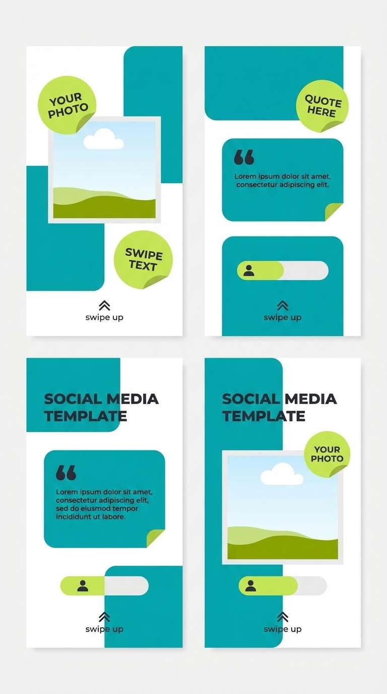
22) Crystal Pool Party
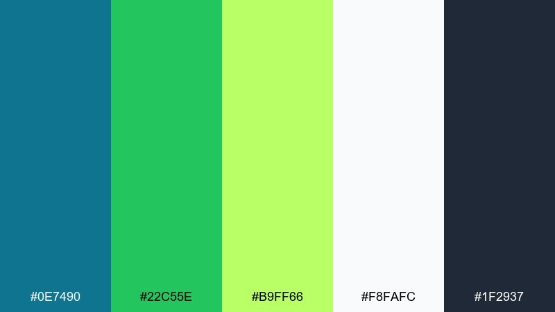
HEX: #0E7490 #22C55E #B9FF66 #F8FAFC #1F2937
Mood: playful and bright
Best for: social media templates
Playful pool-party brightness feels splashy, social, and summer-ready. A teal lime green color palette like this works for IG story templates, promo tiles, and quick announcements. Use white space for breathability, then layer teal shapes with lime stickers for the most clickable elements. Tip: repeat one lime element per slide to keep a cohesive sequence.
Image example of crystal pool party generated using media.io
What Colors Go Well with Teal Lime Green?
Neutrals are the easiest “glue” for teal and lime. Try warm off-whites and creams for a friendly feel, or cool light grays for a more tech-forward look. For typography, deep navy or charcoal keeps contrast high without competing with the accent.
For richer, moodier pairings, add near-black, deep forest, or dark slate to let lime pop cleanly. If you want extra brightness, a touch of cyan or mint can extend the teal family while keeping the palette cohesive.
When you need a warmer counterbalance, muted peach, sand, or soft beige can temper the coolness of teal and keep lime from feeling too sharp—especially in print or lifestyle branding.
How to Use a Teal Lime Green Color Palette in Real Designs
Assign roles, not equal weight. Use teal as your primary brand/UI color (navigation, cards, sections), keep backgrounds light and breathable, and treat lime as a conversion-only accent for buttons, toggles, and important status signals.
In data viz and dashboards, stick to teal shades for most series and reserve lime for a single “hero metric” (top KPI, goal line, or best-performing segment). This prevents charts from looking noisy and preserves meaning.
For print, packaging, and signage, test lime saturation on the real substrate. Slightly muting lime can improve readability and reduce glare, while a matte texture helps the palette feel more premium and less digital.
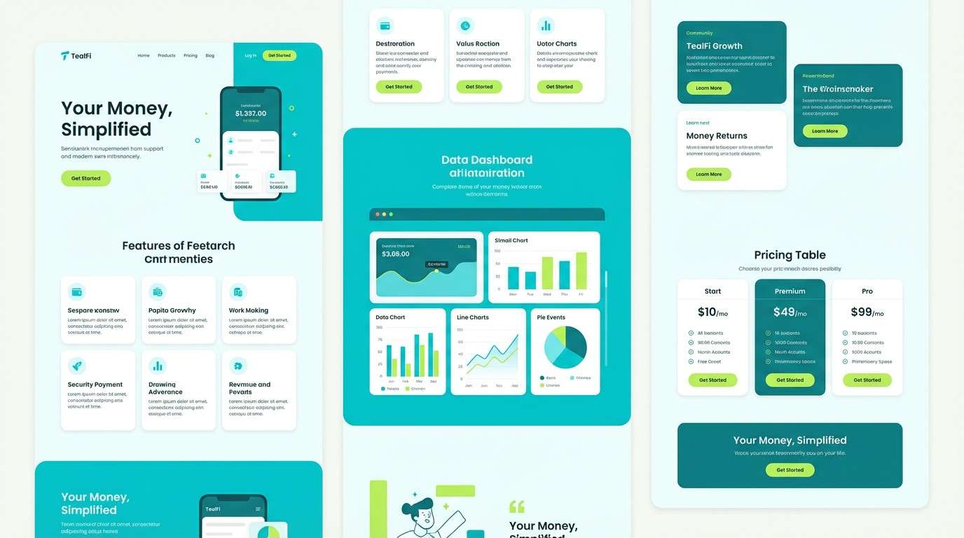
Create Teal Lime Green Palette Visuals with AI
If you already have HEX codes you like, you can turn them into ready-to-present visuals—hero sections, posters, packaging mockups, and UI screens—without starting from a blank canvas.
Use Media.io’s text-to-image tool to generate consistent examples, then iterate by adjusting prompts for layout, lighting, and style while keeping teal as the base and lime as the highlight.
Once you find a direction, create a small set of variations (light mode, dark mode, and print-friendly) so your teal lime green color scheme stays consistent across channels.
Teal Lime Green Color Palette FAQs
-
What does a teal lime green color palette communicate?
It usually signals freshness, clarity, and energy. Teal reads as calm and dependable, while lime green feels lively and attention-grabbing—great for modern brands and UI accents. -
Is teal and lime green a good combination for UI design?
Yes, especially when teal is used for primary structure (navigation, surfaces) and lime is reserved for key actions (CTAs, highlights). This keeps the interface clean and prevents accent overuse. -
What neutral colors pair best with teal lime green?
Off-white/cream, light gray, charcoal, and deep navy work extremely well. They stabilize the palette and keep text readable while letting lime remain a controlled accent. -
How do I keep lime green from overwhelming a design?
Use lime in small percentages (buttons, badges, icons, emphasis) and rely on teal plus neutrals for most large areas. If needed, slightly desaturate lime for long-form pages or print. -
Are teal lime green palettes good for branding?
They’re strong for wellness, eco, SaaS, fintech, and summer campaigns because they feel clean, modern, and optimistic. Add a dark anchor (navy/charcoal) for a more premium tone. -
What’s the best text color on teal or lime backgrounds?
On teal, white or very light gray often works well; on lime, deep navy/charcoal is usually safer for contrast. Always verify with accessibility contrast checks for your exact HEX values. -
Can I generate teal lime green palette mockups with AI?
Yes. With Media.io, you can generate posters, UI screens, and brand scenes using prompts that specify teal bases and lime accents, then iterate quickly until the composition matches your use case.
Next: Dreamy Color Palette


