

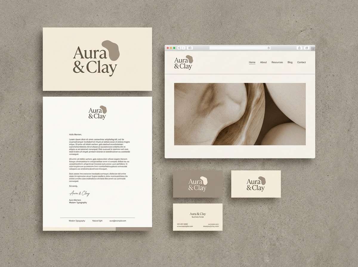
A dreamy color palette blends soft pastels, muted neutrals, and gentle contrasts to create visuals that feel calm, romantic, and modern. It’s a favorite for branding, UI, invitations, and lifestyle content because it reads as intentional without looking loud.
Below are 20 curated dreamy color palette ideas with HEX codes, plus practical pairing tips and AI prompts you can use to generate matching visuals.
In this article
Why Dreamy Palettes Work So Well
Dreamy palettes feel “easy on the eyes” because they typically use low-to-medium saturation, softened tints, and gentle value steps. That makes layouts look calmer and more premium, even when the design is simple.
They also give you built-in flexibility: light tones can act as backgrounds, mid tones can carry UI states or graphic shapes, and the darkest shade can anchor typography and icons without turning the whole design high-contrast.
Most importantly, dreamy color schemes support storytelling. Whether you’re building a wellness brand, a wedding suite, or a clean app interface, the softness helps viewers associate your visuals with comfort, care, and intention.
20+ Dreamy Color Palette Ideas (with HEX Codes)
1) Cloud Milk
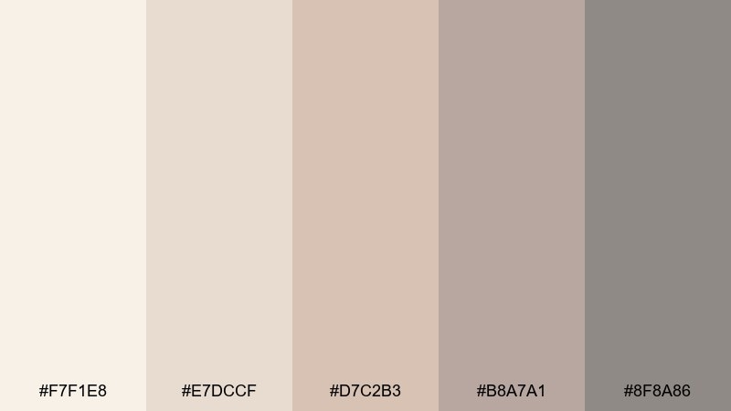
HEX: #f7f1e8 #e7dccf #d7c2b3 #b8a7a1 #8f8a86
Mood: airy, cozy, minimal
Best for: minimal brand identity and web headers
Airy creams and warm taupes feel like morning light on linen. Use these tones for clean brand systems, calm landing pages, or premium wellness visuals. Pair with crisp white space and a single charcoal type color for contrast. Usage tip: keep the darkest shade for text only to preserve the softness.
Image example of cloud milk generated using media.io
Media.io is an online AI studio for creating and editing video, image, and audio in your browser.

2) Rosewater Whisper
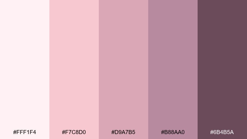
HEX: #fff1f4 #f7c8d0 #d9a7b5 #b88aa0 #6b4b5a
Mood: romantic, soft, elegant
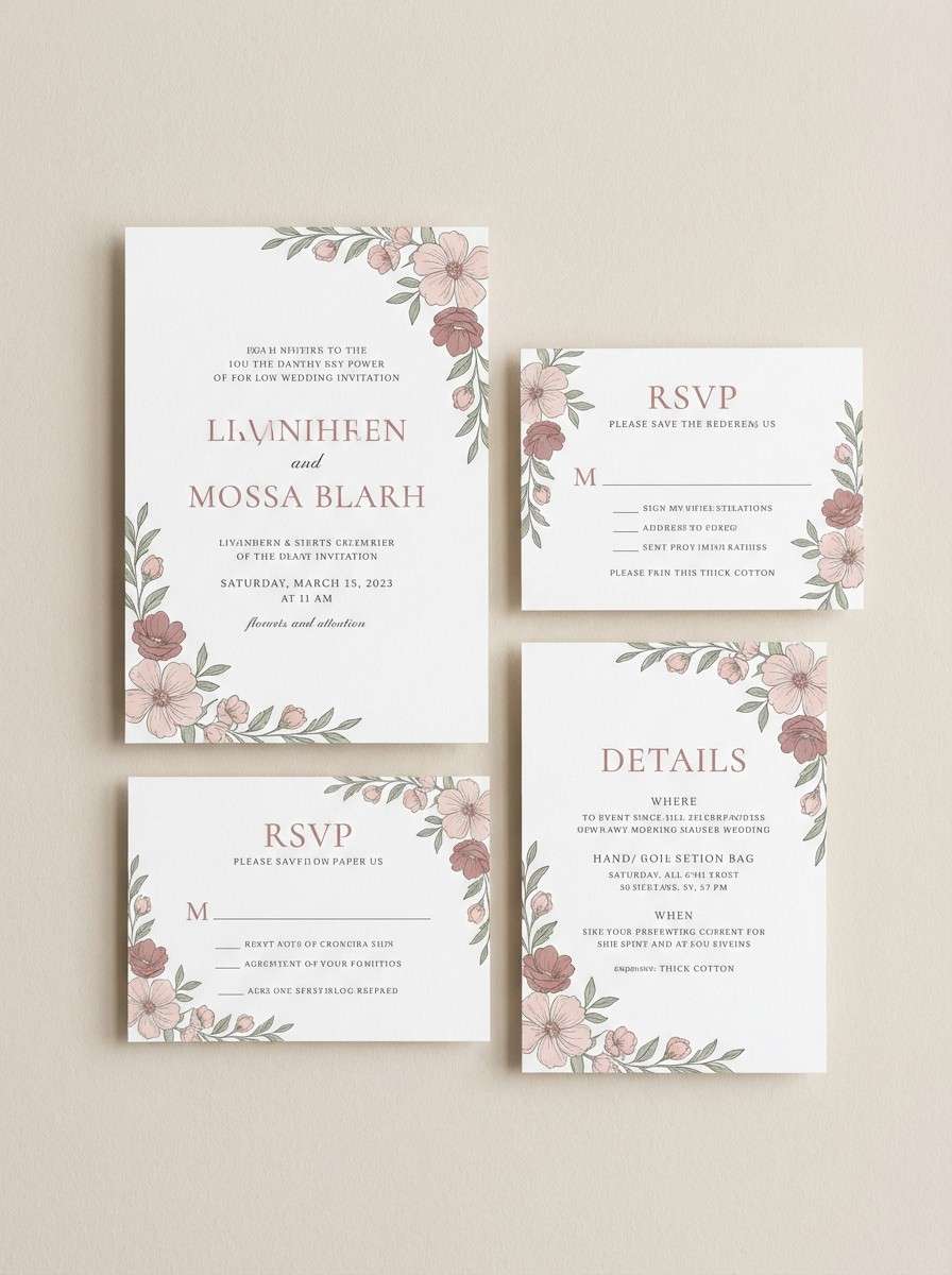
Best for: wedding invitation suite and RSVP cards
Romantic blushes and berry-rose shadows evoke pressed petals and satin ribbons. These hues work beautifully for wedding stationery, beauty branding, and heartfelt announcements. Balance the sweetness with plenty of off-white and a deep plum accent for readability. Usage tip: foil effects look best when reserved for names or headings, not body text.
Image example of rosewater whisper generated using media.io
3) Lavender Veil
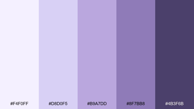
HEX: #f4f0ff #d8d0f5 #b9a7dd #8f7bb8 #4b3f6b
Mood: ethereal, calm, poetic
Best for: skincare product packaging and labels
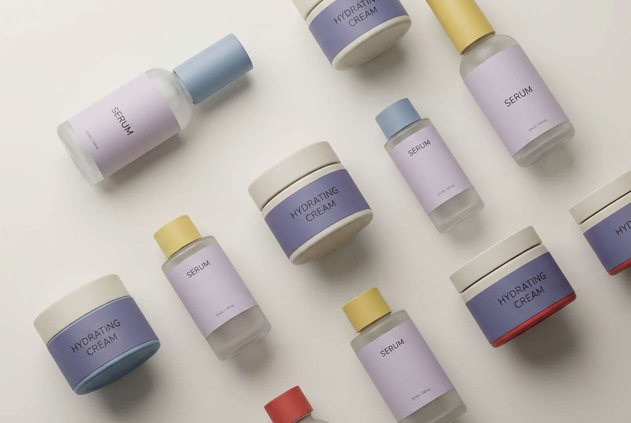
Hushed lilacs and violet ink notes feel like twilight fog over lavender fields. This dreamy color palette suits skincare packaging, candle labels, and boutique product lines that want a gentle luxury edge. Pair with warm cream paper stock and minimal line icons to keep it modern. Usage tip: use the darkest purple for ingredient text to avoid low-contrast printing.
Image example of lavender veil generated using media.io
4) Sea Glass Daydream
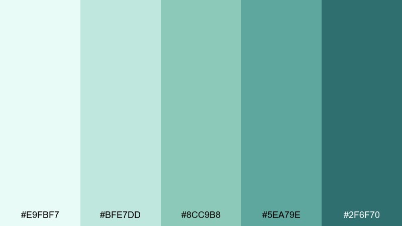
HEX: #e9fbf7 #bfe7dd #8cc9b8 #5ea79e #2f6f70
Mood: fresh, coastal, restorative
Best for: wellness app UI and onboarding screens
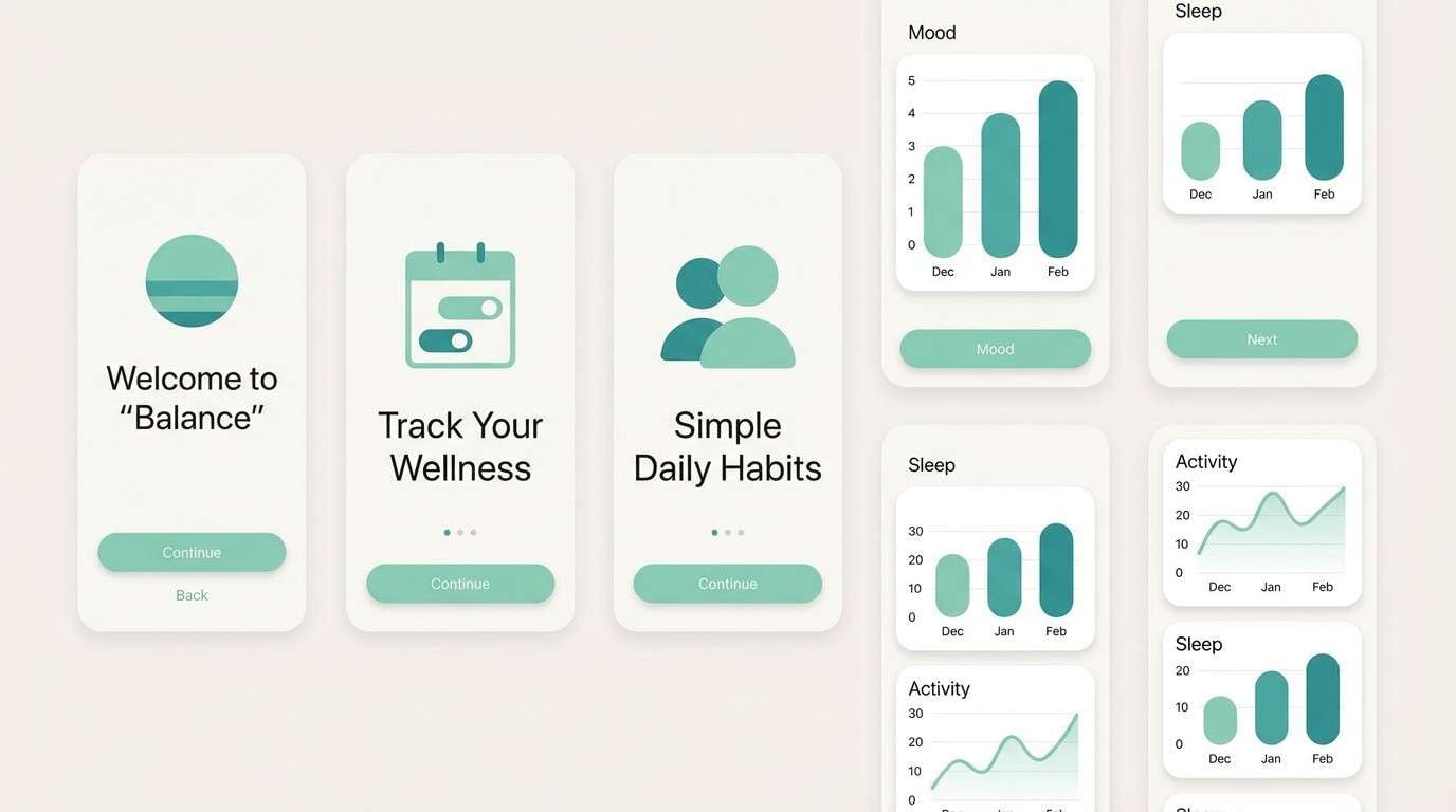
Cool seafoam and deep teal feel like polished glass on a quiet shore. The mix is ideal for wellness UI, spa landing pages, and calming dashboards. Add a warm neutral for cards and keep teal for key actions to guide the eye. Usage tip: reserve the darkest tone for icons and headings so the interface stays light.
Image example of sea glass daydream generated using media.io
5) Peach Haze
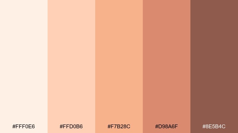
HEX: #fff0e6 #ffd0b6 #f7b28c #d98a6f #8e5b4c
Mood: sunlit, friendly, appetizing
Best for: cafe menu design and food promos
Soft peach and toasted caramel tones evoke warm pastries and late-afternoon sunshine. Use this set for cafe menus, seasonal food promos, or cozy lifestyle posts. Pair with creamy backgrounds and a cocoa-brown type color for an inviting, readable layout. Usage tip: make the lightest peach your negative space and let the mid-peach drive highlights.
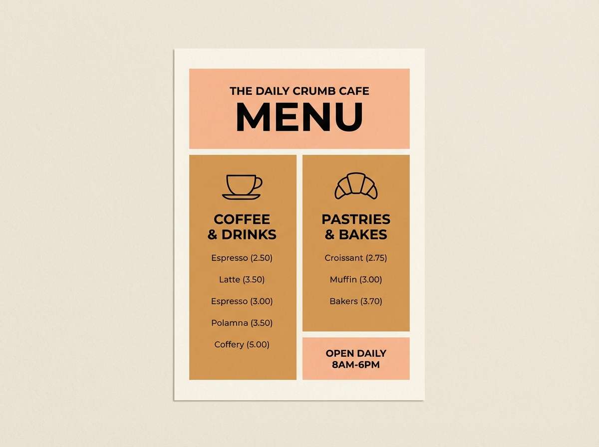
Image example of peach haze generated using media.io
6) Sage Moon
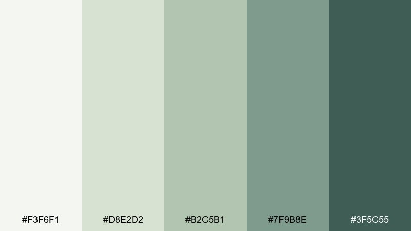
HEX: #f3f6f1 #d8e2d2 #b2c5b1 #7f9b8e #3f5c55
Mood: grounded, airy, natural
Best for: modern bedroom interior styling concepts
Gentle sage and misty greens create a quiet, breathable mood like moonlight on leaves. These tones shine in interior moodboards, slow-living branding, and eco-minded product visuals. Pair with light oak textures and matte black accents for a modern finish. Usage tip: keep the darkest green as a small accent so the room feels open.
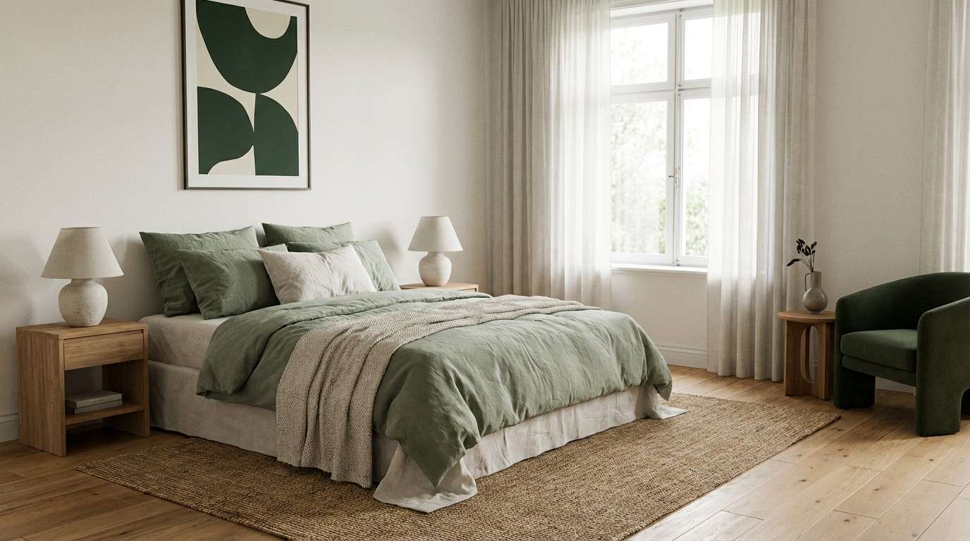
Image example of sage moon generated using media.io
7) Buttercream Drift
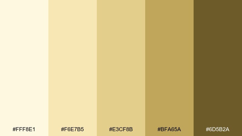
HEX: #fff8e1 #f6e7b5 #e3cf8b #bfa65a #6d5b2a
Mood: cheerful, nostalgic, warm
Best for: bakery product ads and seasonal promos
Buttercream yellows and honeyed browns feel like a cozy kitchen and fresh bakes. These dreamy color combinations are perfect for bakery ads, limited-edition launches, or playful packaging inserts. Pair with soft shadows and simple props so the palette stays the hero. Usage tip: use the deepest brown sparingly for price tags and key calls to action.
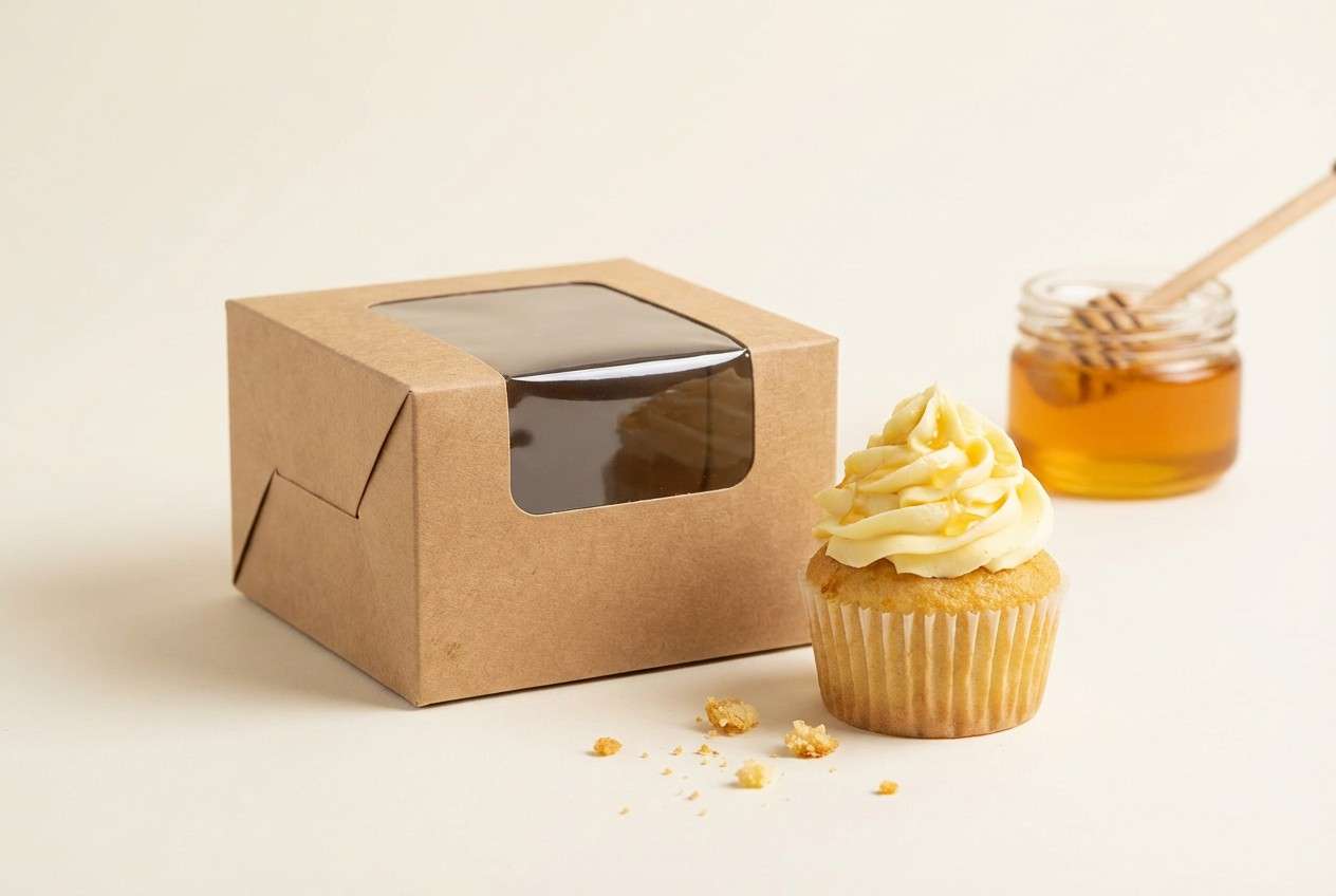
Image example of buttercream drift generated using media.io
8) Opal Sky
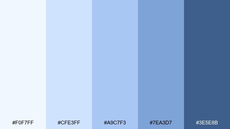
HEX: #f0f7ff #cfe3ff #a9c7f3 #7ea3d7 #3e5e8b
Mood: open, optimistic, crisp
Best for: travel blog hero banners and thumbnails
Pale sky blues and steady denim tones bring a clear, breezy feeling like high-altitude air. Great for travel headers, clean editorial thumbnails, and tech content that wants a gentle lift. Pair with white backgrounds and a navy headline for structure. Usage tip: keep gradients subtle so text remains sharp on top.
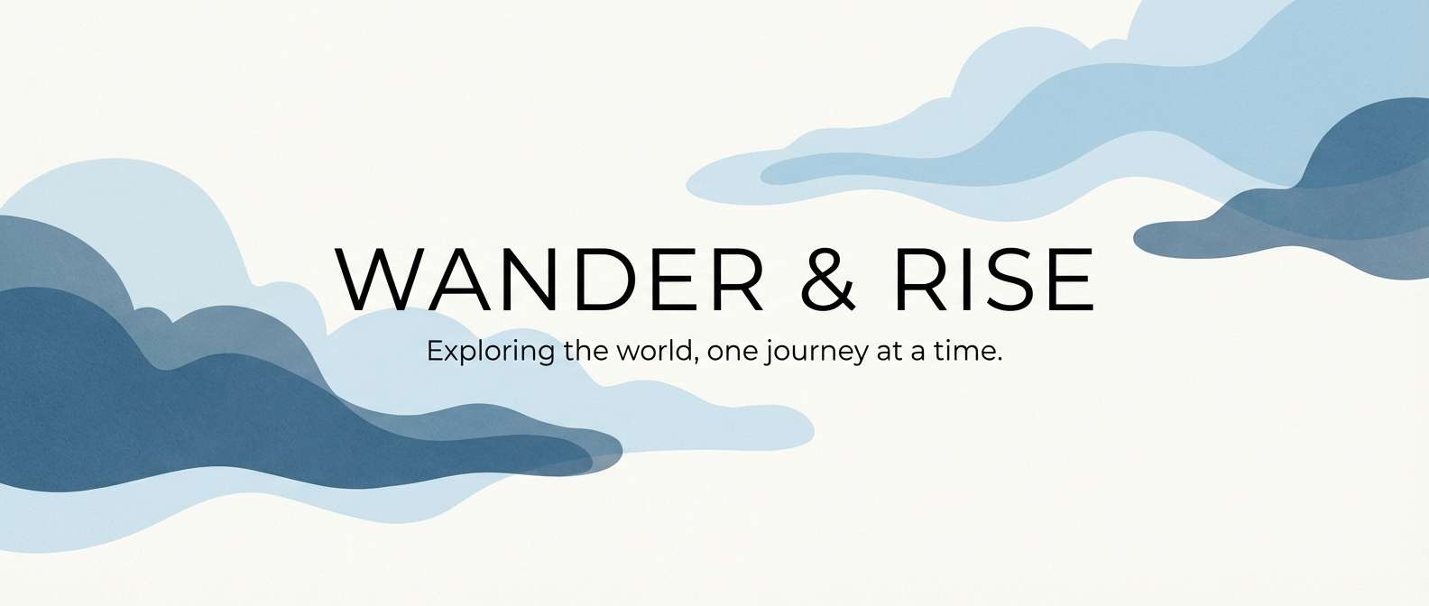
Image example of opal sky generated using media.io
9) Misty Mauve
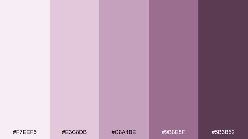
HEX: #f7eef5 #e3c8db #c6a1be #9b6e8f #5b3b52
Mood: artful, vintage, intimate
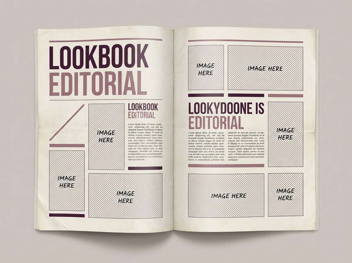
Best for: fashion lookbook editorial layouts
Powdery mauves and deep raisin shades evoke vintage silk and soft studio light. Use them for fashion editorials, boutique lookbooks, or album artwork that needs quiet drama. Pair with warm cream margins and thin rules for a refined print feel. Usage tip: set body copy in the dark raisin and keep pinks for section headers and pull quotes.
Image example of misty mauve generated using media.io
10) Dusty Iris
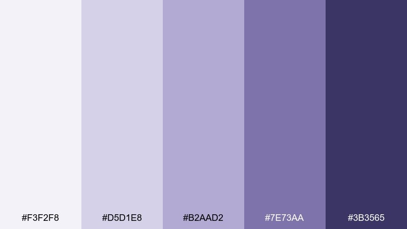
HEX: #f3f2f8 #d5d1e8 #b2aad2 #7e73aa #3b3565
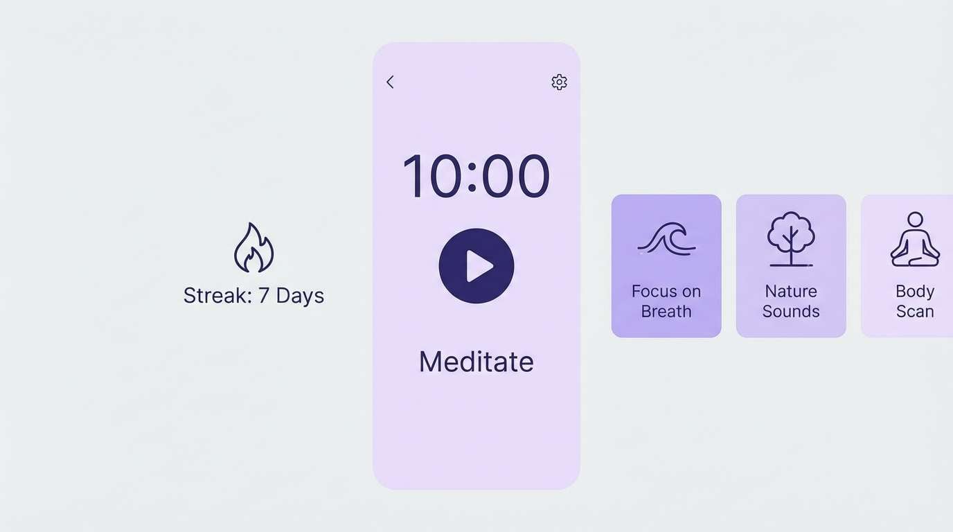
Mood: thoughtful, soothing, modern
Best for: meditation app UI and habit trackers
Soft iris and inky indigo create a gentle, focused atmosphere like evening journaling. This dreamy color scheme works well for meditation apps, habit trackers, and calm productivity tools. Pair with rounded cards and lots of spacing to prevent the purples from feeling heavy. Usage tip: use the mid-lavender for active states and keep indigo for navigation labels.
Image example of dusty iris generated using media.io
11) Sandalwood Blush
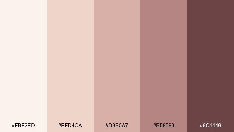
HEX: #fbf2ed #efd4ca #d8b0a7 #b58583 #6c4446
Mood: cozy, refined, handcrafted
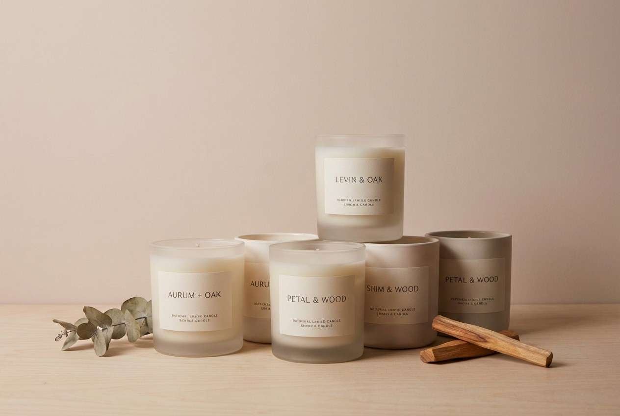
Best for: boutique candle packaging and labels
Soft blush clay and sandalwood browns feel like warm ceramics and slow evenings. Ideal for candle labels, handmade goods, and boutique packaging with a tactile vibe. Pair with kraft textures, embossed details, or a simple monogram mark. Usage tip: keep label backgrounds light and use the deeper brown for scent names to boost legibility.
Image example of sandalwood blush generated using media.io
12) Celestial Mint
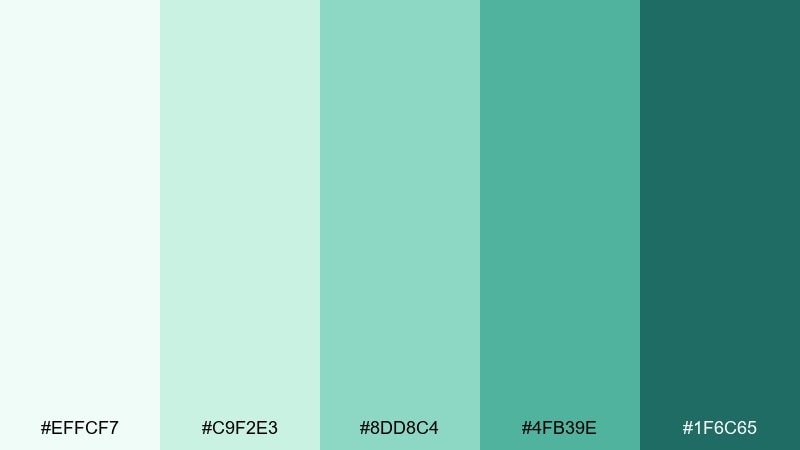
HEX: #effcf7 #c9f2e3 #8dd8c4 #4fb39e #1f6c65
Mood: fresh, uplifting, clean
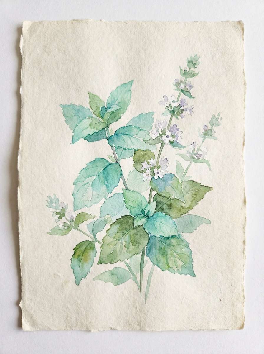
Best for: spring botanical illustration and posters
Bright mint and teal greens suggest new growth and clear spring air. Use these tones in watercolor botanicals, eco posters, and lighthearted seasonal campaigns. Pair with soft paper textures and delicate linework for an airy finish. Usage tip: let mint dominate large washes and use deep teal for stems, titles, and fine details.
Image example of celestial mint generated using media.io
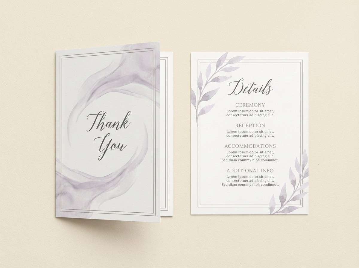
13) Linen & Lilies
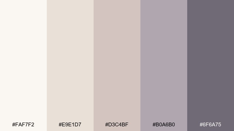
HEX: #faf7f2 #e9e1d7 #d3c4bf #b0a6b0 #6f6a75
Mood: serene, airy, understated
Best for: event stationery and thank-you cards
Cream linen and quiet lilac-gray tones evoke pressed lilies and soft paper grain. They fit beautifully for thank-you cards, minimalist invitations, and elegant packaging inserts. Pair with charcoal typography and a simple border to keep the design crisp. Usage tip: use the gray-lilac as a subtle background panel behind key details.
Image example of linen & lilies generated using media.io
14) Apricot Cloud
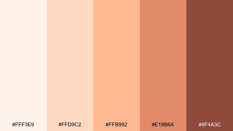
HEX: #fff3e9 #ffd9c2 #ffb992 #e18b6a #8f4a3c
Mood: playful, sunny, modern
Best for: summer social media post templates
Apricot creams and coral warmth feel like golden hour on a breezy terrace. These dreamy color combinations work great for social templates, creator kits, and upbeat brand announcements. Pair with bold sans-serif type and simple geometric shapes to keep the look contemporary. Usage tip: set CTAs in the deeper terracotta so buttons pop without turning neon.
Image example of apricot cloud generated using media.io

15) Pearl Gray Dream
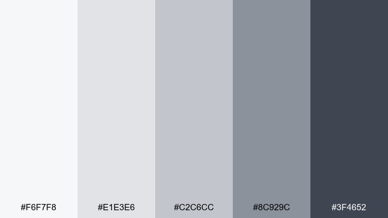
HEX: #f6f7f8 #e1e3e6 #c2c6cc #8c929c #3f4652
Mood: polished, calm, professional
Best for: SaaS dashboard UI and data cards
Pearl grays and steel shadows create a clean, modern feel like brushed metal in soft light. Use it for dashboards, analytics views, and product pages that need clarity without harsh contrast. Pair with a single muted accent color for status indicators and keep neutrals dominant. Usage tip: separate sections with light gray panels instead of heavy borders.
Image example of pearl gray dream generated using media.io
16) Moonstone Blue
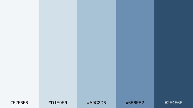
HEX: #f2f6f8 #d1e0e9 #a9c3d6 #6b8fb2 #2f4f6f
Mood: trustworthy, calm, airy
Best for: corporate presentation slides and reports
Cool blue-grays and navy depth feel like quiet confidence and clear thinking. The tones suit presentations, proposal decks, and report covers that aim for modern credibility. Pair with white space and simple iconography for a polished look. Usage tip: keep charts in the mid-blue and save navy for headings and key numbers.
Image example of moonstone blue generated using media.io

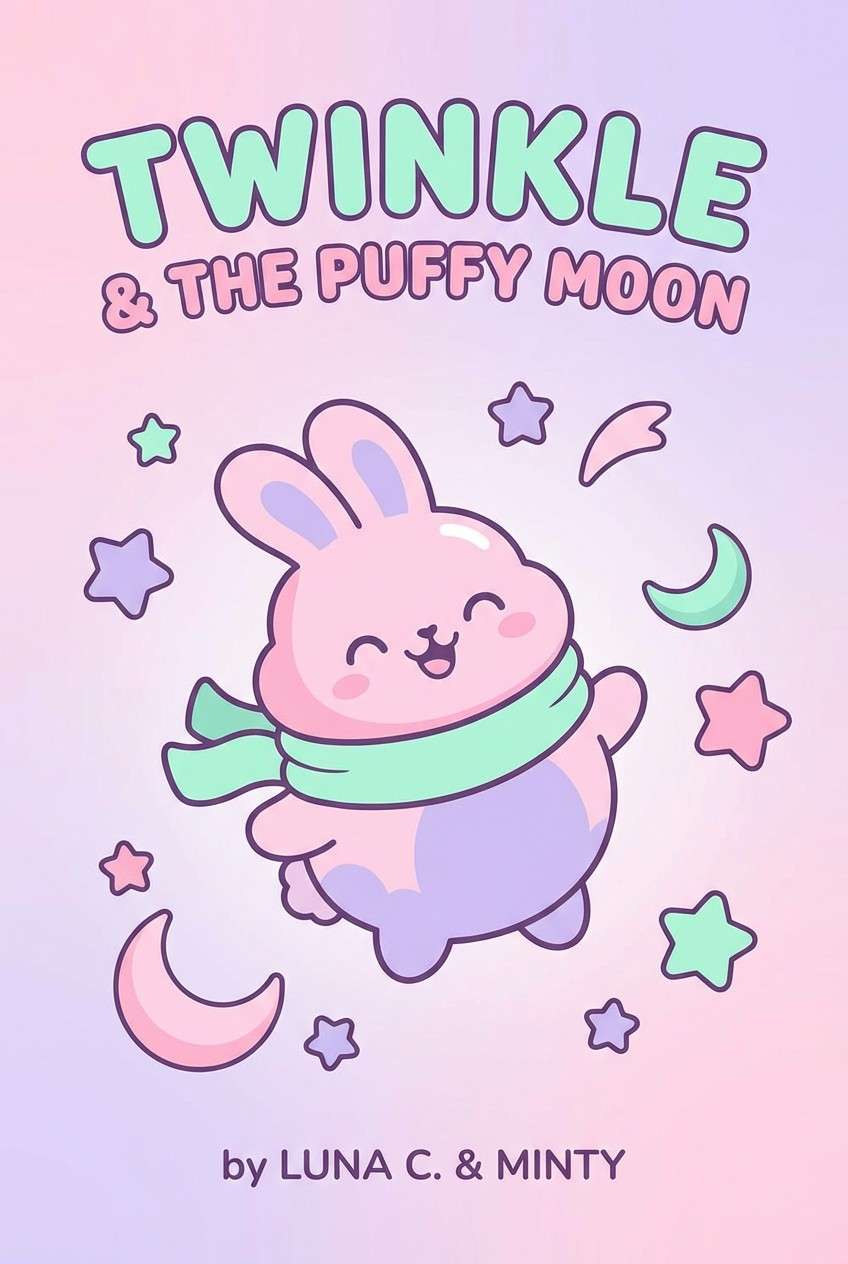
17) Wildflower Pastels
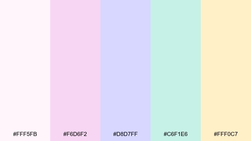
HEX: #fff5fb #f6d6f2 #d8d7ff #c6f1e6 #fff0c7
Mood: whimsical, light, joyful
Best for: kids book cover illustration and merch
Cotton-candy pastels and soft butter tones bring a playful, storybook glow. This dreamy color palette fits kids covers, sticker packs, and cheerful merch where you want gentle energy. Pair with rounded lettering and simple character shapes so the colors stay readable. Usage tip: choose one pastel as the dominant background and use the rest as small pops for balance.
Image example of wildflower pastels generated using media.io
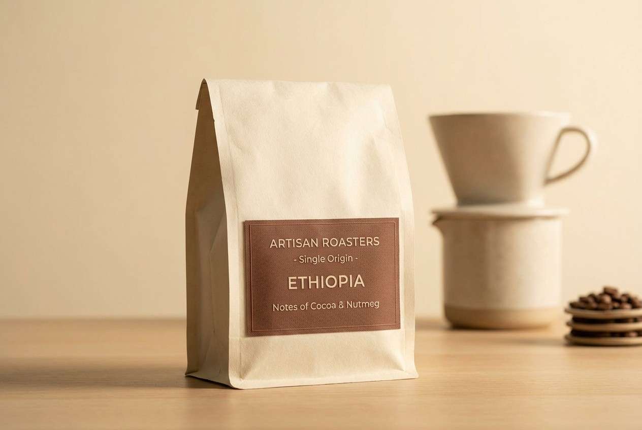
18) Cocoa Cream Calm
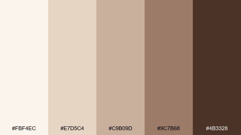
HEX: #fbf4ec #e7d5c4 #c9b09d #9c7b68 #4b3328
Mood: comforting, grounded, artisanal
Best for: artisan coffee packaging and labels
Creamy latte shades and cocoa browns evoke slow mornings and roasted warmth. Great for coffee packaging, café merch, and product photography that leans cozy and handcrafted. Pair with simple stamp graphics and uncoated paper textures for authenticity. Usage tip: use the mid-brown for label panels and keep the darkest tone for small text and barcodes.
Image example of cocoa cream calm generated using media.io
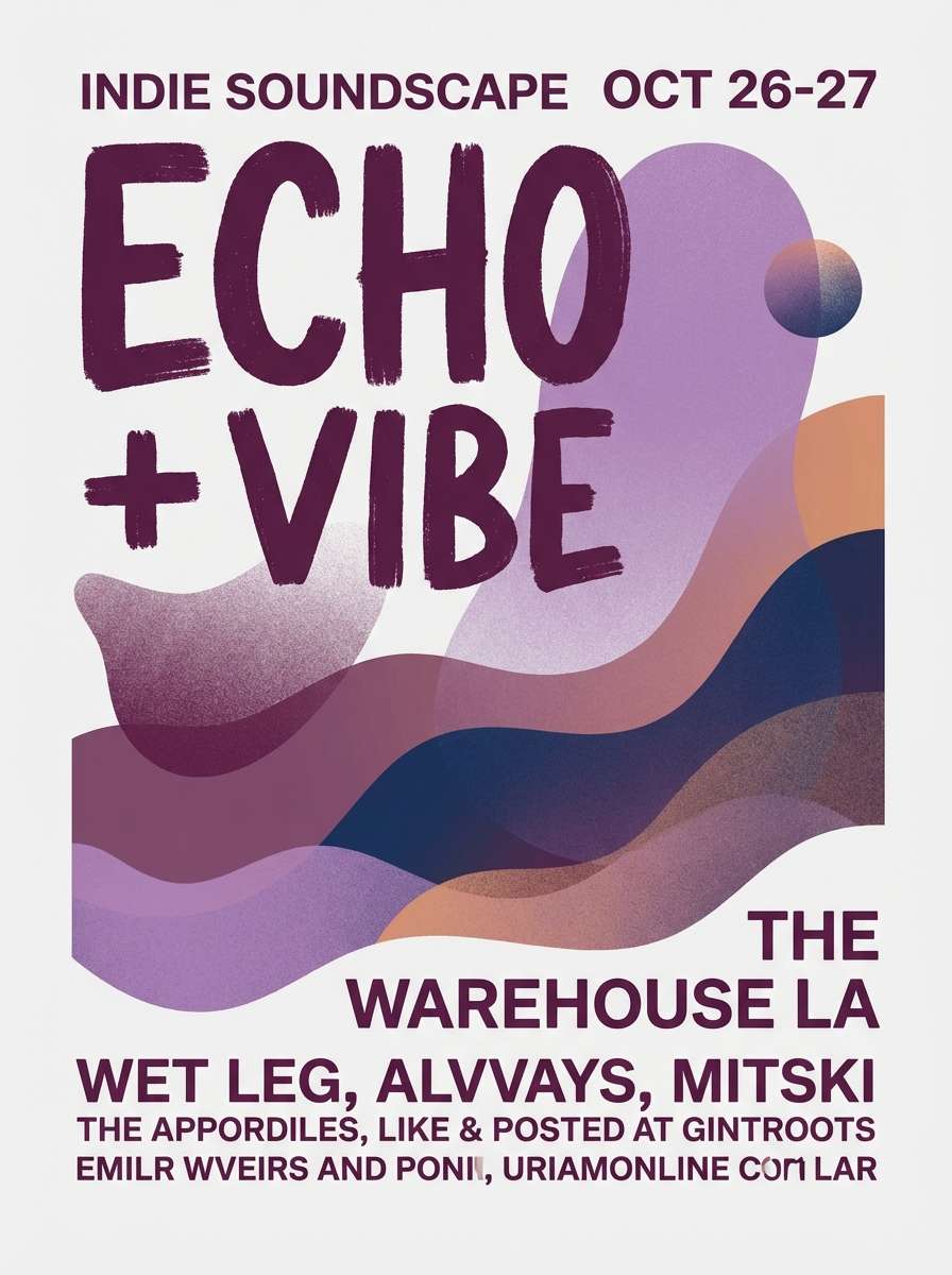
19) Twilight Plum
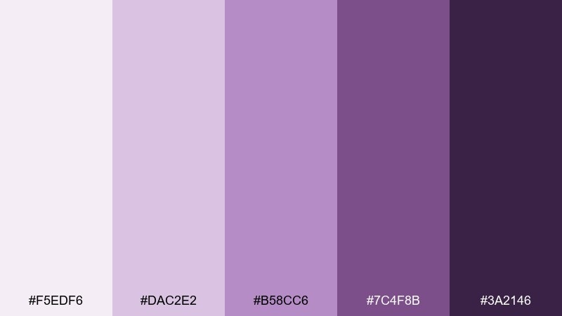
HEX: #f5edf6 #dac2e2 #b58cc6 #7c4f8b #3a2146
Mood: moody, dreamy, artistic
Best for: music poster design and event promos
Plum shadows and lavender glow feel like neon fading into nightfall. Use this set for concert posters, playlist covers, and creative promos with an indie edge. Pair with high-contrast type in deep aubergine and keep gradients smooth for atmosphere. Usage tip: highlight dates and venue info in the lightest lavender so it reads from a distance.
Image example of twilight plum generated using media.io
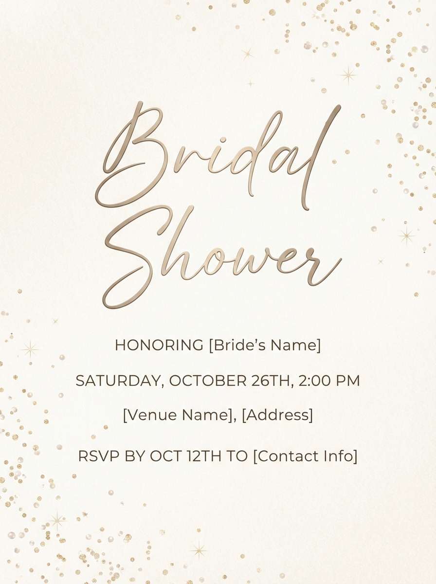
20) Champagne Stardust
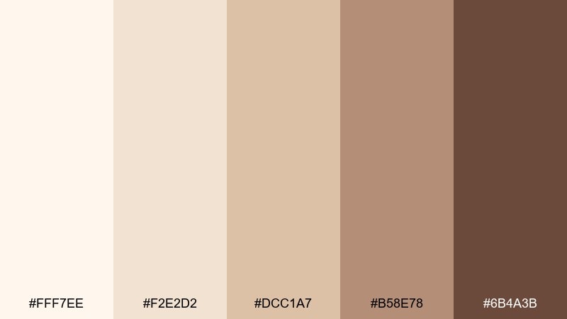
HEX: #fff7ee #f2e2d2 #dcc1a7 #b58e78 #6b4a3b
Mood: glowing, celebratory, refined
Best for: bridal shower flyer design and party signage
Champagne creams and toasted beige-browns shimmer like candlelight on satin. These dreamy color combinations suit bridal shower flyers, elegant party signage, and classy social announcements. Pair with delicate script for names and a clean sans-serif for details to keep it readable. Usage tip: use the mid-beige for borders and separators instead of heavy lines.
Image example of champagne stardust generated using media.io
What Colors Go Well with Dreamy?
Dreamy palettes pair best with softened neutrals (cream, warm gray, greige) because they keep saturation in check and give your design breathing room. If your main colors are pastel, let the neutral do the heavy lifting for backgrounds and spacing.
For contrast, use one deep anchor color—charcoal, aubergine, deep teal, or navy—mainly for text, icons, and key dividers. This keeps readability high while preserving the ethereal vibe.
If you want a modern twist, add one “quiet accent” like muted gold, terracotta, or dusty denim. Use it sparingly for CTAs, badges, or highlights so the overall look stays soft.
How to Use a Dreamy Color Palette in Real Designs
Start by assigning roles: pick a light shade as the primary background, a mid shade for surfaces (cards, panels, shapes), and the darkest shade for typography. This simple system prevents a dreamy color scheme from looking washed out.
In UI, keep interactions clear: use one mid-to-deep color for primary buttons and reserve the softest tints for hover, selected, and background states. In print, test contrast early—dreamy colors can shift on paper, especially in low-ink areas.
Textures matter. Paper grain, subtle gradients, and soft shadows amplify the dreamy feel, but keep them minimal so they don’t compete with your palette or reduce legibility.
Create Dreamy Palette Visuals with AI
If you already have HEX codes, you can generate on-style mockups faster by describing the scene (packaging, UI, poster, stationery) and specifying the palette mood (airy, calm, romantic). Keeping the prompt “clean” and focused often produces more consistent results.
Use the included prompts under each palette as a starting point, then swap the subject (for example, “wedding invitation” to “brand guideline cover”) while keeping the lighting and typography notes for the same dreamy tone.
When you like an output, iterate with small changes—one layout adjustment, one prop change, or one lighting tweak—so your visuals stay cohesive across a full set.
Dreamy Color Palette FAQs
-
What makes a color palette look “dreamy”?
Dreamy palettes usually use soft tints, muted mid-tones, and gentle contrast. Think pastel hues mixed with warm neutrals and one deeper anchor shade for readability. -
Are dreamy color schemes good for branding?
Yes—dreamy color schemes can feel premium, calm, and approachable. They work especially well for wellness, beauty, lifestyle, wedding, and boutique product brands. -
How do I keep a dreamy palette from looking washed out?
Assign roles: light for backgrounds, mid for UI surfaces or shapes, and a dark shade for text/icons. If needed, introduce a single deeper accent (navy, plum, charcoal) for structure. -
What is the best text color for dreamy backgrounds?
Charcoal, deep plum, deep teal, or navy usually performs better than pure black while still meeting contrast needs. Always check contrast for accessibility, especially on pastel backgrounds. -
Can I use dreamy colors in a SaaS or business dashboard?
Absolutely—use dreamy neutrals for backgrounds and panels, then keep actions and status colors consistent. A palette like Pearl Gray Dream or Moonstone Blue can feel professional and calm. -
How many colors should a dreamy palette include?
Five is a practical sweet spot: 1–2 lights, 2 mid-tones, and 1 dark anchor. You can extend it with extra tints for UI states, but keep saturation consistent. -
How can I generate dreamy visuals that match my HEX codes?
Use an AI text-to-image tool and write prompts that specify the design type (packaging, UI, stationery), lighting (soft, diffused), and the overall mood (airy, ethereal). Then iterate using the same style notes for a cohesive set.


