

Gold bronze tones sit right at the sweet spot between earthy neutrals and luxury metallics. They feel premium without being loud, which makes them a reliable choice for modern branding, packaging, and interiors.
Below are 20 gold bronze color palette ideas with HEX codes, plus quick tips for where each set shines and how to visualize the look with AI.
In this article
Why Gold Bronze Palettes Work So Well
Gold bronze palettes feel instantly elevated because they mimic materials we already read as valuable: brushed metal, leather, wood stain, and warm stone. Even when used as flat colors (not metallic finishes), they still carry that “crafted” signal.
They’re also versatile neutrals. Bronze can act like a softened brown, gold can behave like a warm highlight, and creamy off-whites keep layouts breathable—so you can scale from minimal to dramatic without changing the family of colors.
Finally, these tones pair naturally with both modern and heritage aesthetics. The same range can support sleek UI accents, artisanal packaging, editorial spreads, and classic emblems, depending on how much contrast and texture you introduce.
20+ Gold Bronze Color Palette Ideas (with HEX Codes)
1) Gilded Dune
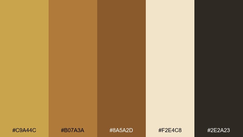
HEX: #C9A44C #B07A3A #8A5A2D #F2E4C8 #2E2A23
Mood: sun-warmed, elegant, grounded
Best for: luxury skincare packaging
Sunlit dunes and brushed metal warmth give this mix a premium, grounded feel. Use the deep brown as your anchor, then let the gold lead on logos, caps, and small highlights. Cream keeps layouts breathable while the mid bronze reads naturally on paper stocks. Tip: add a soft matte finish so the palette looks rich without turning flashy.
Image example of gilded dune generated using media.io
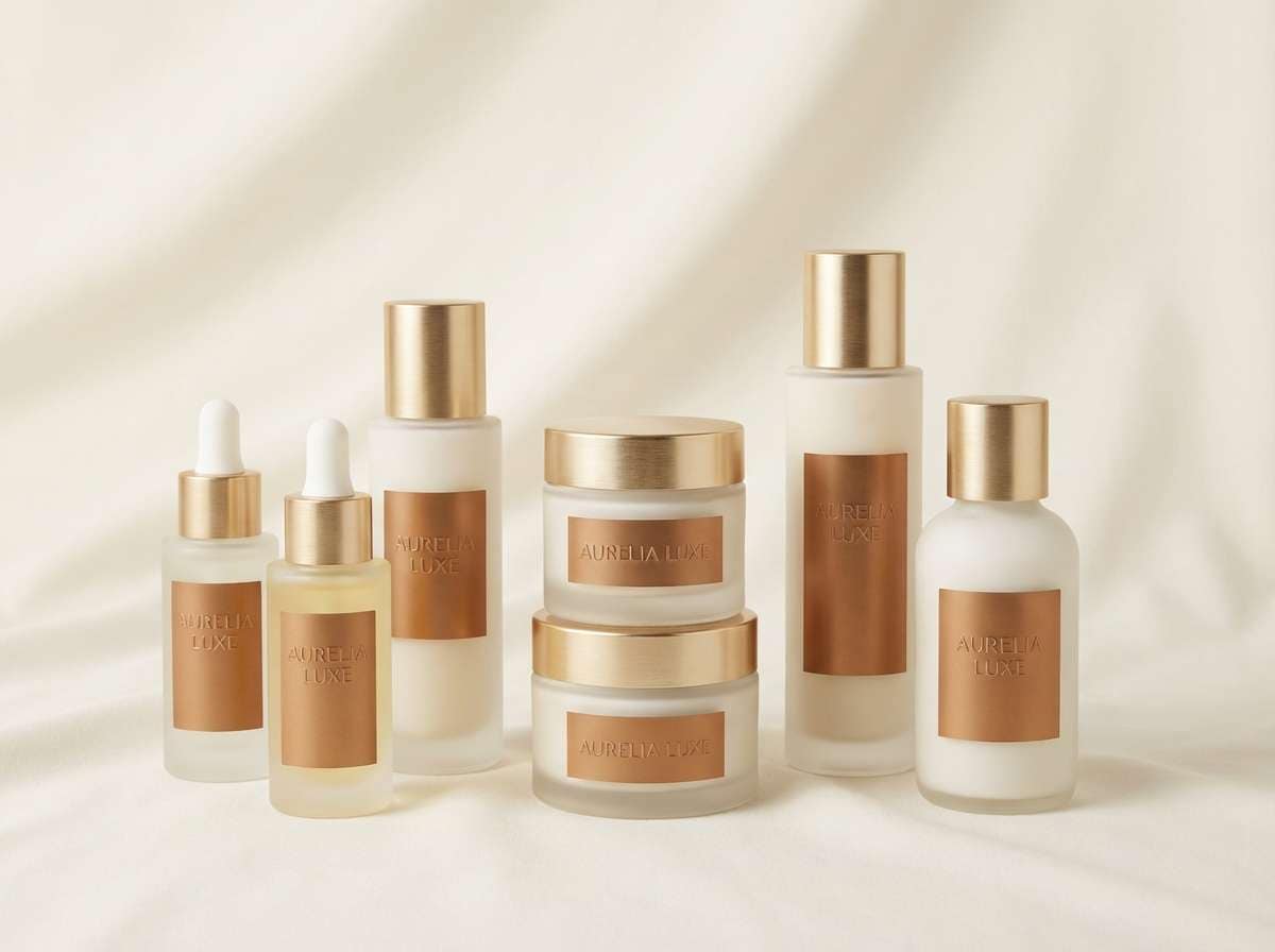
Media.io is an online AI studio for creating and editing video, image, and audio in your browser.

2) Bronze Lantern
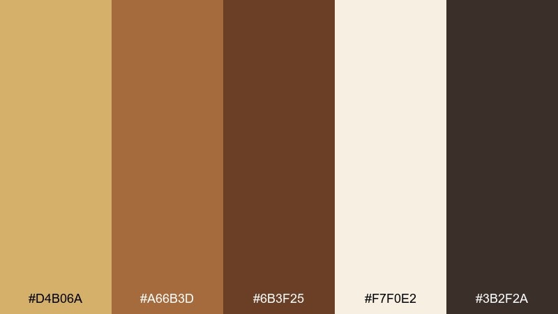
HEX: #D4B06A #A66B3D #6B3F25 #F7F0E2 #3B2F2A
Mood: cozy, inviting, intimate
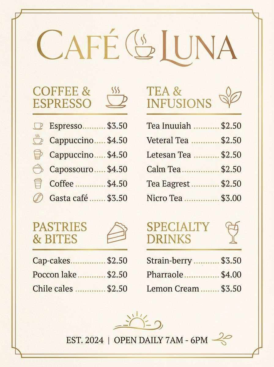
Best for: cafe menu poster
Lantern light at dusk is the vibe here: warm, welcoming, and a little nostalgic. Let the creamy tone carry the background, then bring in bronze for headings and dividers to keep type readable. The darker brown works great for body text and small icons. Tip: keep gold to 10 to 15 percent of the layout so it feels like a glow, not a block of color.
Image example of bronze lantern generated using media.io
3) Antique Coin
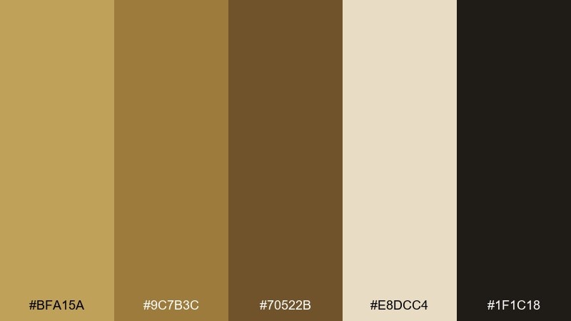
HEX: #BFA15A #9C7B3C #70522B #E8DCC4 #1F1C18
Mood: heritage, refined, archival
Best for: jewelry brand logo and stationery
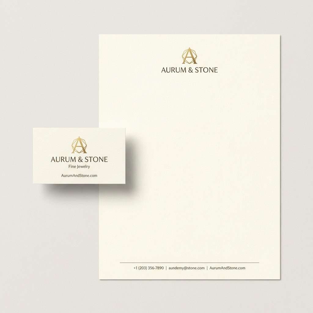
Old-world metalwork and museum displays come to mind, with tones that feel collected and curated. Pair the near-black with the antique gold for a crisp logo lockup that still feels warm. Use the parchment shade for stationery to soften contrast and avoid harsh white. Tip: choose one metallic-like tone for emphasis and keep the rest flat to prevent visual noise.
Image example of antique coin generated using media.io
4) Honeyed Oak
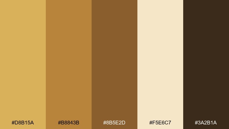
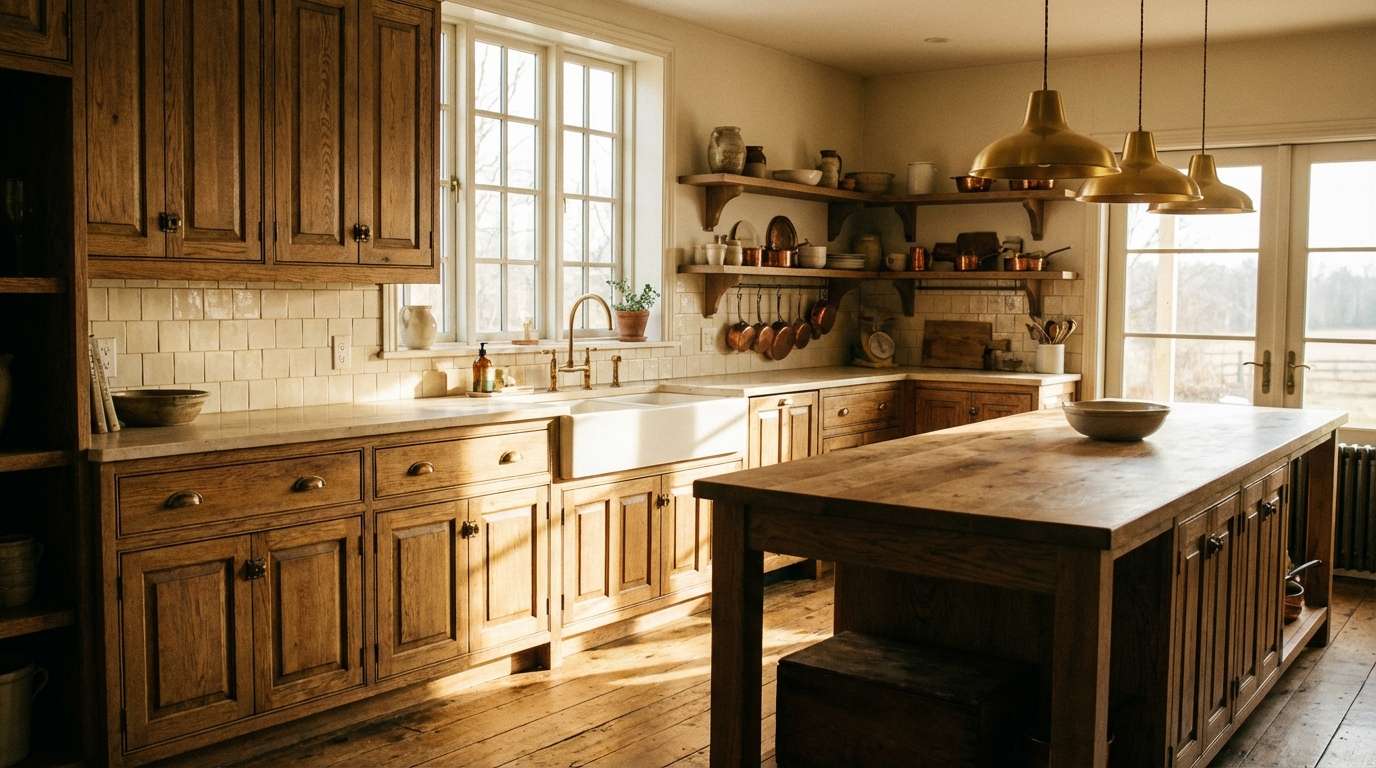
HEX: #D8B15A #B8843B #8B5E2D #F5E6C7 #3A2B1A
Mood: rustic, hearty, comforting
Best for: kitchen interior accents
Honeyed wood grain and burnished hardware make this feel like a lived-in, sunlit home. In a gold bronze color palette like this, use the cream on walls or backsplash to keep the room bright, then layer bronze through fixtures and shelving brackets. The darker brown is ideal for contrast on island bases or trim. Tip: repeat the gold tone in two spots only, such as handles and a pendant, for a cohesive look.
Image example of honeyed oak generated using media.io
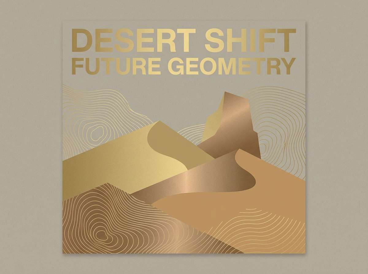
5) Desert Patina
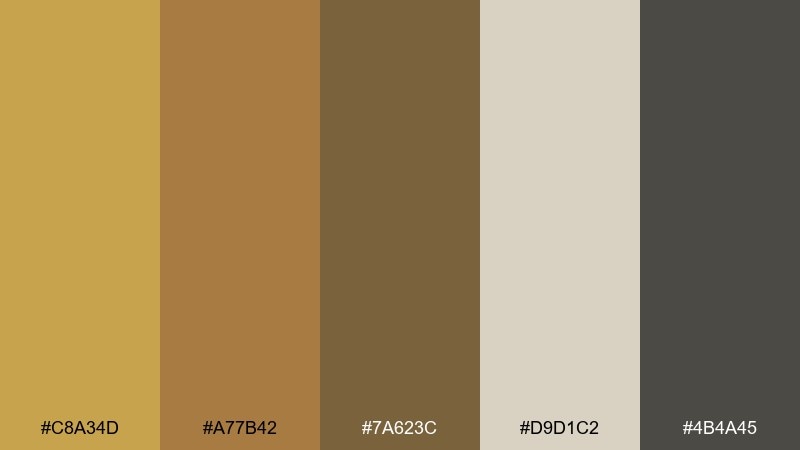
HEX: #C8A34D #A77B42 #7A623C #D9D1C2 #4B4A45
Mood: earthy, weathered, modern
Best for: outdoor brand social graphic
Wind-worn stone and sun-baked trails show up in these muted metallic-leaning tones. Build your layout on the soft greige, then use the gold as a spotlight color for key words and badges. The charcoal-brown adds strength for type and outlines without turning stark black. Tip: keep shapes simple and chunky so the palette reads clearly on small screens.
Image example of desert patina generated using media.io
6) Copper Silk
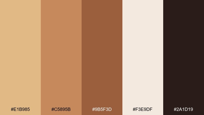
HEX: #E1B985 #C5895B #9B5F3D #F3E9DF #2A1D19
Mood: romantic, soft, polished
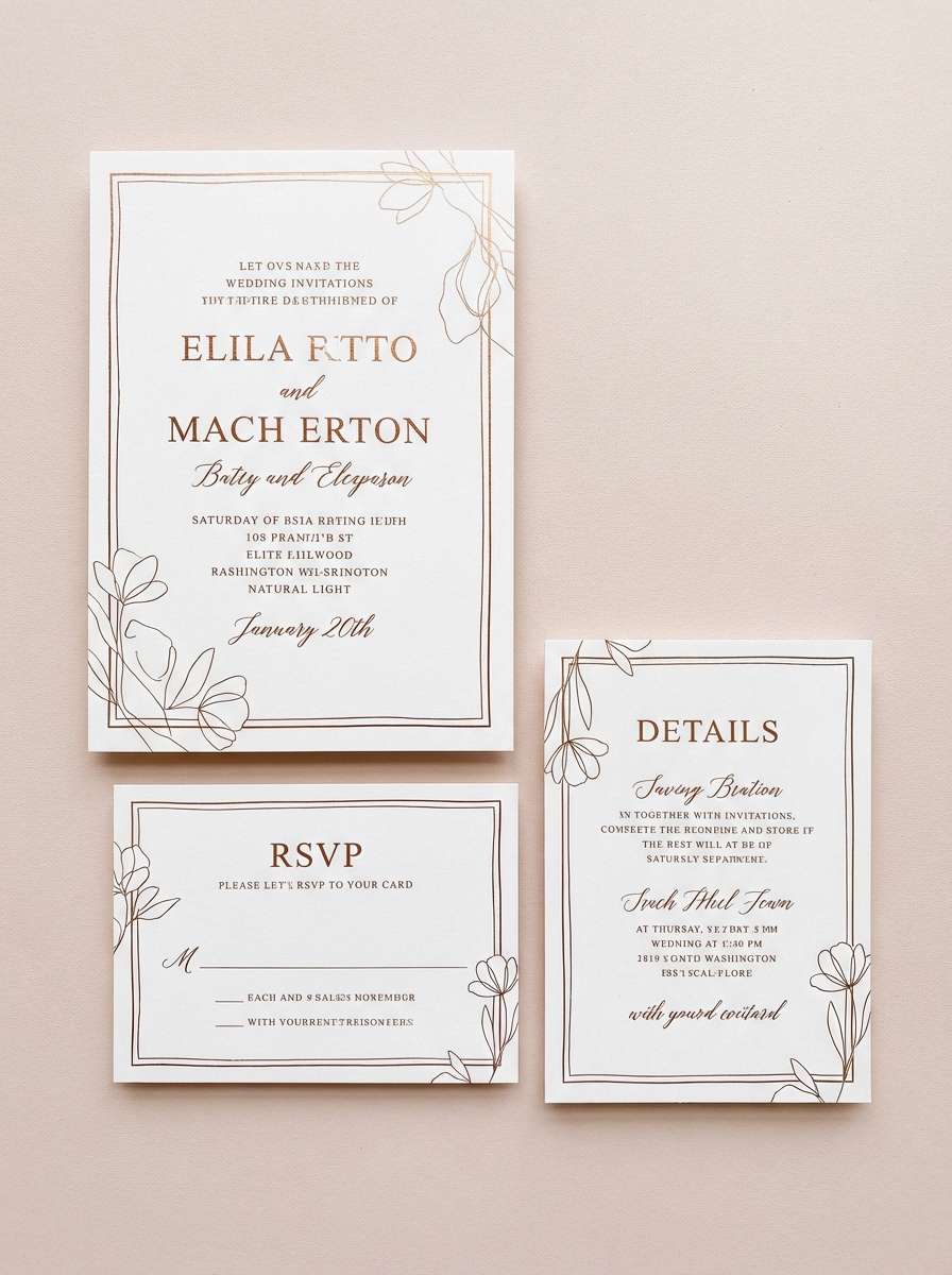
Best for: wedding invitation suite
Silky copper highlights and blushy neutrals create a candlelit, romantic mood. Use the pale blush-cream as the paper tone, then bring copper into headings, monograms, and thin borders. The deep espresso gives your typography legibility while staying warm. Tip: choose a slightly textured background to make the metallic tones feel more tactile.
Image example of copper silk generated using media.io
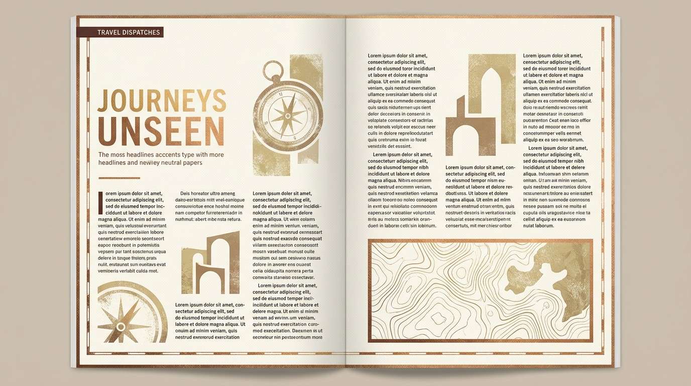
7) Sunlit Relic
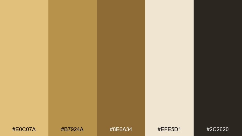
HEX: #E0C07A #B7924A #8E6A34 #EFE5D1 #2C2620
Mood: adventurous, cultured, timeless
Best for: travel magazine spread
Golden-hour ruins and worn leather journals are the story behind these tones. Put the light neutral to work as your page base, then reserve the richer golds for pull quotes and section headers. The deep brown reads like ink and keeps photos from feeling washed out. Tip: add generous margins so the warm accents feel intentional and editorial.
Image example of sunlit relic generated using media.io
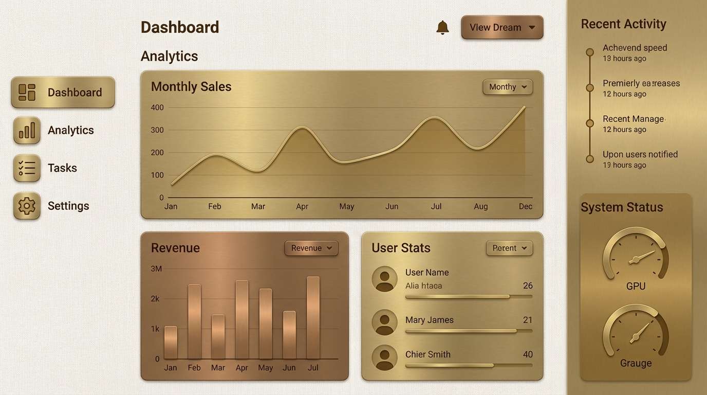
8) Brass Linen
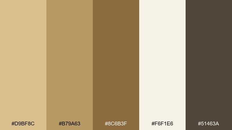
HEX: #D9BF8C #B79A63 #8C6B3F #F6F1E6 #51463A
Mood: calm, clean, understated
Best for: minimal dashboard UI
Brushed brass against linen fabric is the mood: quiet luxury without the shine. Use the off-white for surfaces, then apply brass tones to buttons, badges, and progress states. Keep the darkest shade for primary text to maintain accessibility. Tip: limit gradients and rely on spacing and typography for hierarchy.
Image example of brass linen generated using media.io
9) Amber Hearth
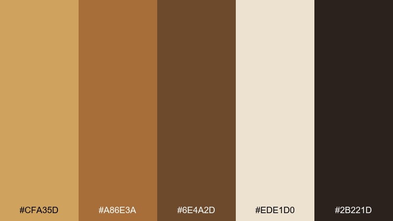
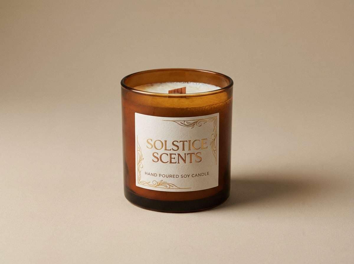
HEX: #CFA35D #A86E3A #6E4A2D #EDE1D0 #2B221D
Mood: warm, homey, artisanal
Best for: candle product ad
A crackling hearth and amber glass glow through these cozy tones. Make the creamy neutral your backdrop, then spotlight the gold on label marks and small seals. The mid bronze is perfect for secondary text and ingredient details. Tip: keep highlights concentrated around the product to guide the eye like candlelight.
Image example of amber hearth generated using media.io
10) Royal Plated
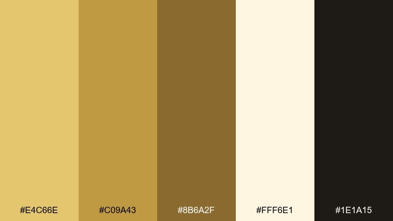
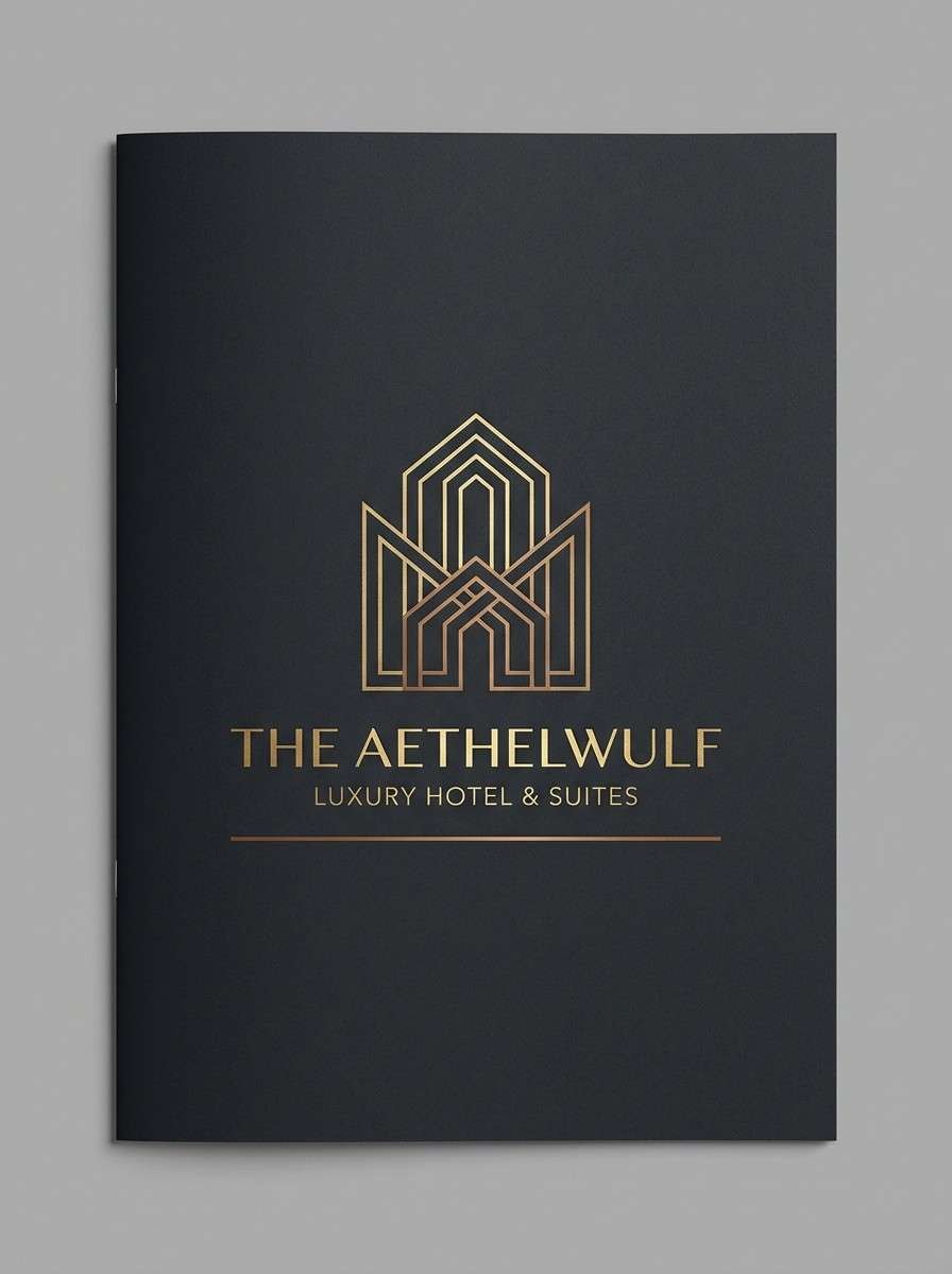
HEX: #E4C66E #C09A43 #8B6A2F #FFF6E1 #1E1A15
Mood: regal, bold, high-contrast
Best for: hotel brochure cover
Polished brass and velvet shadows create a regal, high-contrast feel. Use the near-black for backgrounds and let the bright gold carry headlines and key amenities. The creamy off-white keeps body copy readable without cooling down the palette. Tip: add thin linework in the mid gold to evoke engraved luxury details.
Image example of royal plated generated using media.io
11) Canyon Alloy
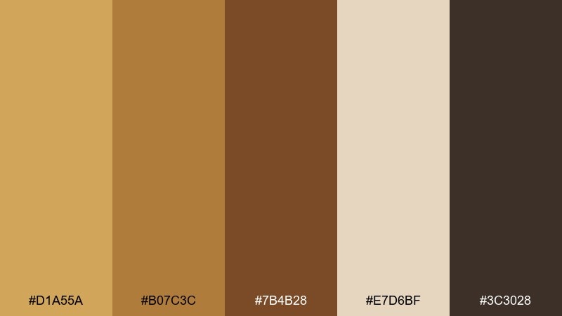
HEX: #D1A55A #B07C3C #7B4B28 #E7D6BF #3C3028
Mood: rugged, confident, outdoorsy
Best for: fashion lookbook layout
Canyon rock and sunlit leather give this mix a rugged confidence. A gold bronze color palette like this works best when you balance the warm metals with plenty of light neutral space. Use the darker browns for captions and grid lines so imagery stays the hero. Tip: keep the brightest gold for section openers to create a strong rhythm across pages.
Image example of canyon alloy generated using media.io
12) Vintage Trophy
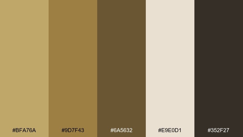
HEX: #BFA76A #9D7F43 #6A5632 #E9E0D1 #352F27
Mood: classic, proud, collegiate
Best for: sports club emblem and banner
Trophy cases and old pennants inspired these classic, slightly muted tones. Use the deep brown for outlines and typography, then add the gold for crests, stripes, and key dates. The soft neutral keeps banners from feeling heavy when printed large. Tip: stick to two fill colors in the emblem and save the rest for borders and text.
Image example of vintage trophy generated using media.io

13) Molten Maple
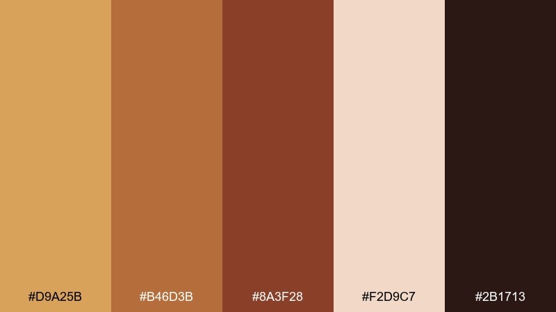
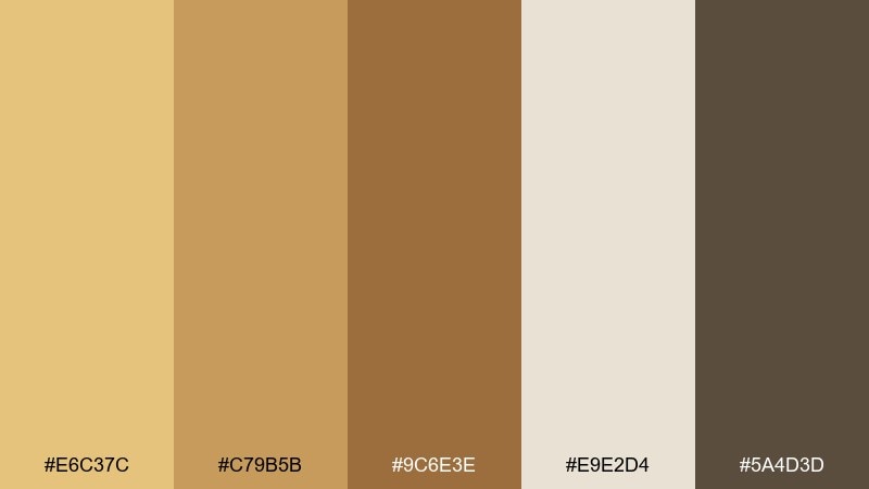
HEX: #D9A25B #B46D3B #8A3F28 #F2D9C7 #2B1713
Mood: bold, spicy, autumnal
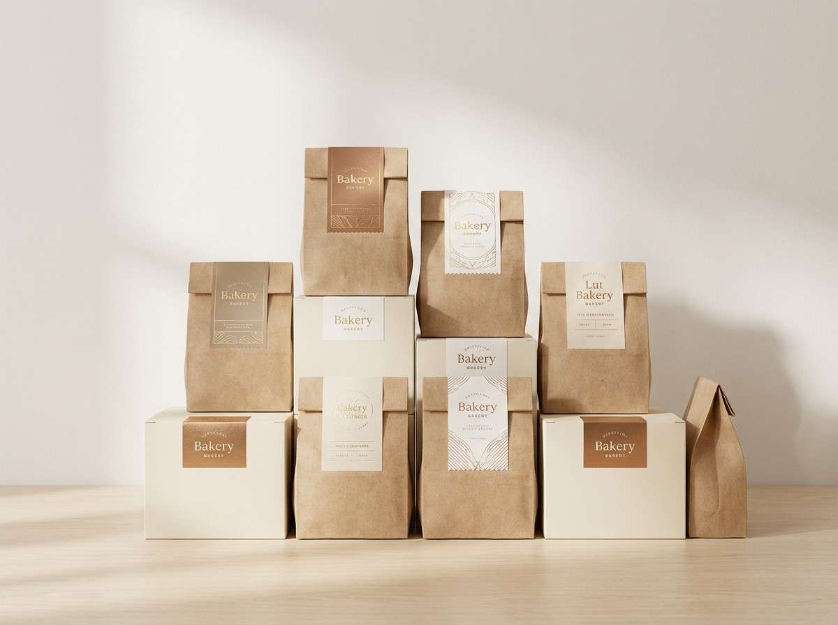
Best for: bakery packaging
Molten caramel and toasted maple bring a bold, autumn-ready warmth. Pair the light peachy neutral with the richer bronze for labels that feel handcrafted but modern. The deepest brown is perfect for stamps, small icons, and ingredient lists. Tip: use the brightest gold on one focal element only, like a quality seal, to avoid a busy look.
Image example of molten maple generated using media.io
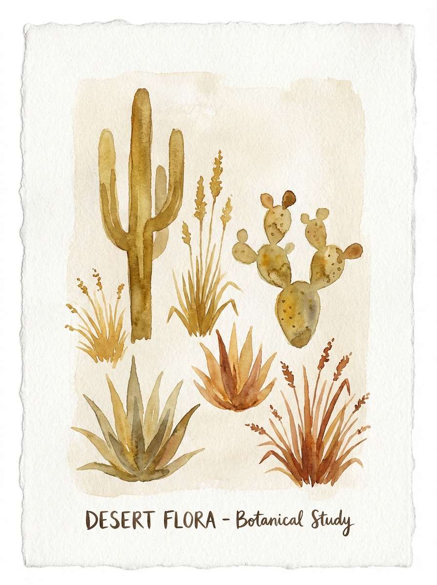
14) Sahara Muse
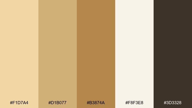
HEX: #E6C37C #C79B5B #9C6E3E #E9E2D4 #5A4D3D
Mood: airy, artistic, sunlit
Best for: watercolor botanical poster
Soft desert light and drifting sand tones make this feel airy and artistic. Use the pale neutral as the paper wash, then layer golden botanicals with bronze shadows for depth. The smoky brown works well for titles without overpowering the illustration. Tip: keep edges slightly imperfect to match the watercolor character.
Image example of sahara muse generated using media.io
15) Champagne Forge
HEX: #F1D7A4 #D1B077 #B3874A #F8F3E8 #3D3328
Mood: celebratory, sleek, professional
Best for: conference badge design
Champagne shimmer meets industrial polish for a sleek, professional vibe. Use the soft off-white for the base, then place gold accents on name highlights and track ribbons. The darker brown is strong enough for QR codes and small text while staying warmer than black. Tip: keep color blocks large and simple so badges read clearly from a distance.
Image example of champagne forge generated using media.io
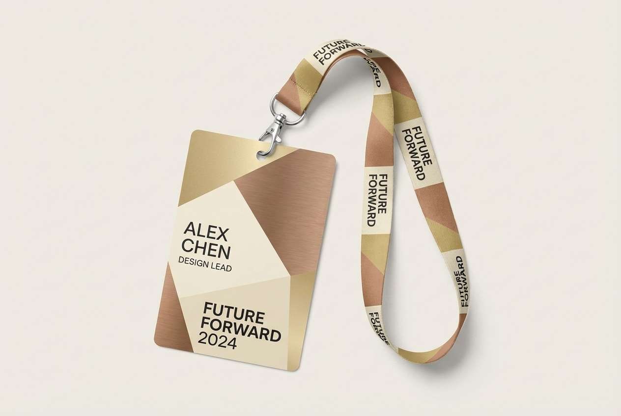
16) Citrine Workshop
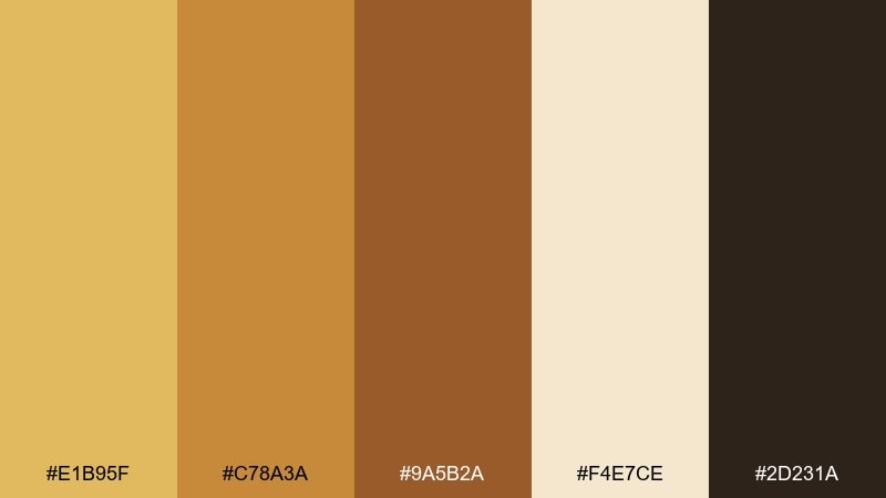
HEX: #E1B95F #C78A3A #9A5B2A #F4E7CE #2D231A
Mood: energetic, crafty, modern
Best for: artisan workshop website hero
Citrine spark and kiln-fired clay create an energetic, maker-friendly mood. These gold bronze color combinations shine in web design when you keep the background light and use the deeper bronze for strong CTA contrast. Pair with clean sans-serif type and simple geometric shapes for a modern craft feel. Tip: test button states using the two mid tones so hover effects stay on-brand.
Image example of citrine workshop generated using media.io
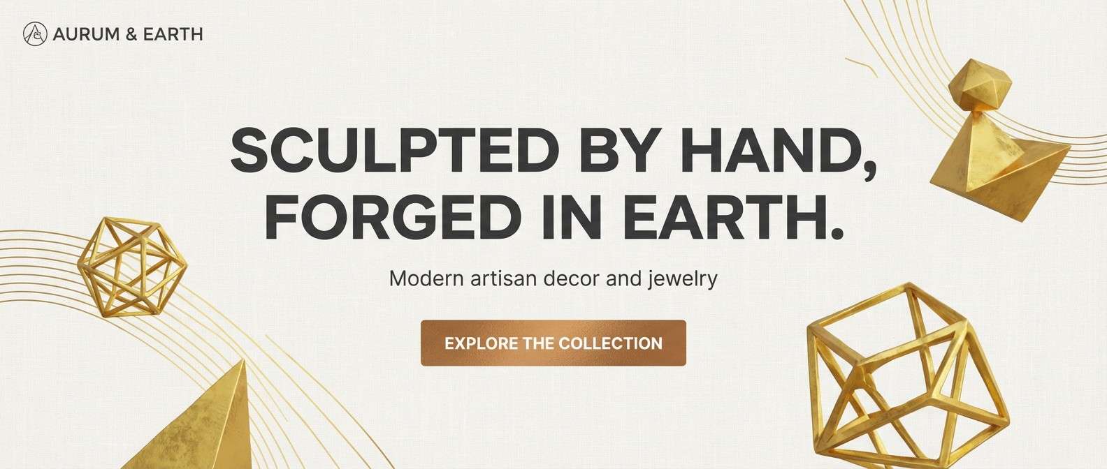
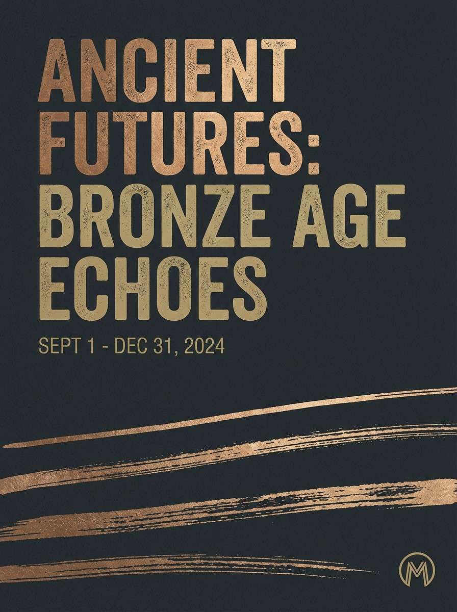
17) Museum Bronze
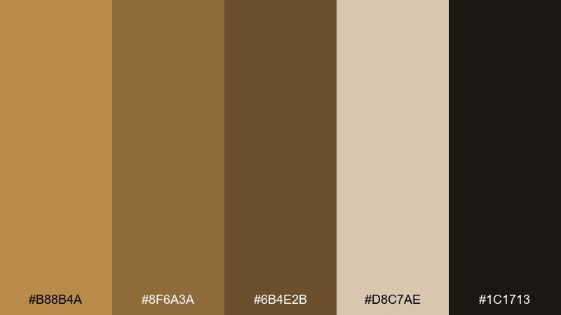
HEX: #B88B4A #8F6A3A #6B4E2B #D8C7AE #1C1713
Mood: scholarly, dramatic, curated
Best for: museum exhibition poster
Dim gallery lighting and aged bronze sculptures give this palette a curated, dramatic edge. Use the deep near-black for a strong background and let bronze typography carry the main title. The soft tan works well for dates and venue details without breaking the mood. Tip: add subtle grain in the background to mimic printed poster stock.
Image example of museum bronze generated using media.io
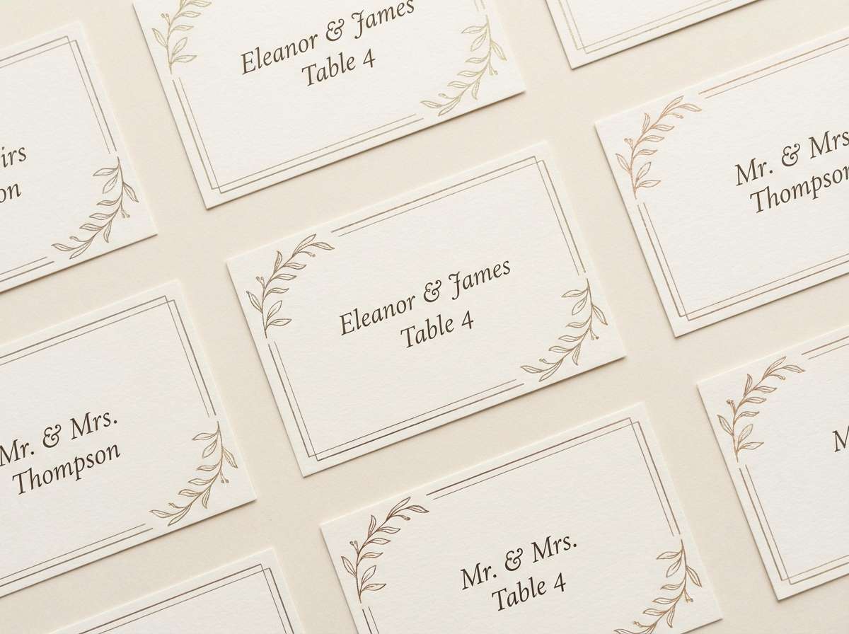
18) Autumn Medal
HEX: #D6A75A #B3773D #7A4C2A #F1E3CD #43362C
Mood: seasonal, warm, welcoming
Best for: wedding place cards
Fallen leaves and polished medals set a warm, seasonal tone. Use the creamy neutral for card stock, then bring the gold into names or small monograms. The darker brown is great for table numbers and keeps everything legible in low evening light. Tip: repeat the mid bronze in one decorative element only, like a border or tiny icon, for a tidy look.
Image example of autumn medal generated using media.io
19) Art Deco Ingot
HEX: #E6C75D #C6A14A #9B7A34 #F4EBD5 #15120F
Mood: glam, geometric, night-out
Best for: bar branding and menu
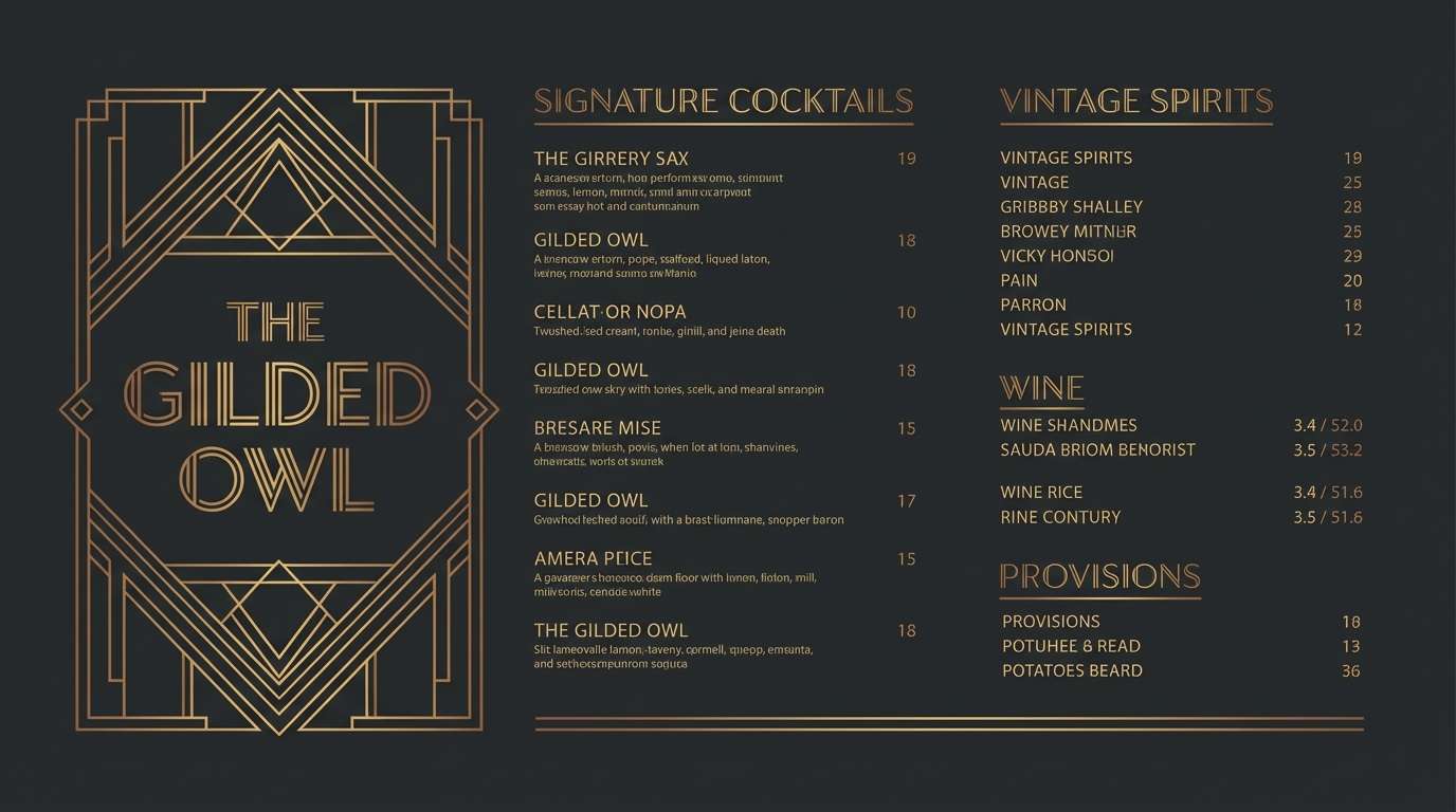
Glamorous night lighting and geometric metalwork define this art deco mood. A gold bronze color combination like this pops when you set it against deep black and keep shapes angular. Use the light cream sparingly for menu sections so the design stays moody, not bright. Tip: turn the mid gold into thin divider lines to get that classic deco sparkle without clutter.
Image example of art deco ingot generated using media.io
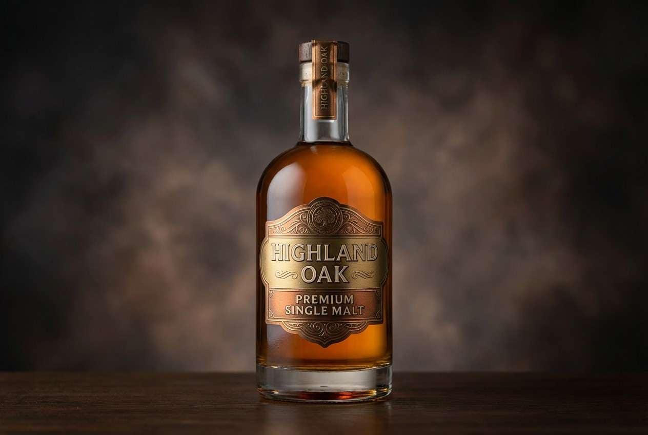
20) Smoked Goldleaf
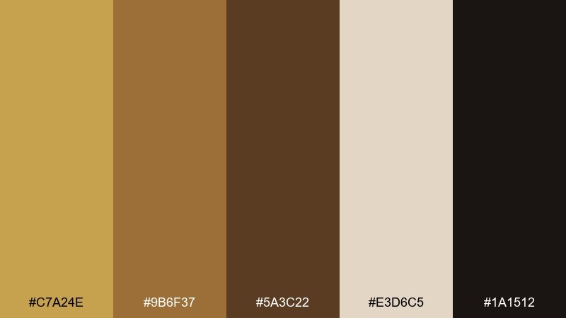
HEX: #C7A24E #9B6F37 #5A3C22 #E3D6C5 #1A1512
Mood: moody, luxurious, mature
Best for: whiskey label packaging
Smoked oak barrels and goldleaf details create a moody, mature luxury feel. Use the darkest shade for the label base, then bring in gold for type and small crests to signal premium quality. The warm neutral works as a secondary paper band or neck tag to add contrast. Tip: keep metallic-like highlights small and sharp so the design feels refined, not noisy.
Image example of smoked goldleaf generated using media.io
What Colors Go Well with Gold Bronze?
Gold bronze pairs especially well with warm neutrals like cream, parchment, greige, and taupe—these keep the palette sophisticated and let the metallic-leaning shades read as accents rather than heavy blocks.
For contrast, lean into near-black espresso, deep charcoal-brown, or smoky walnut. They make gold feel brighter and more premium while staying warmer than true black.
If you want a modern twist, add a restrained cool counterpoint: muted slate, deep teal, or dusty blue. Keep it desaturated so the bronze still feels like the hero.
How to Use a Gold Bronze Color Palette in Real Designs
Use gold like a highlighter, not a base paint. In most layouts, it works best on logos, dividers, icons, seals, and small UI states—while creams and tans carry the background and spacing.
Pick one “ink” shade (a deep brown or near-black) for typography and core shapes. This gives you consistent readability and avoids the washed-out look that can happen when mid bronzes are used for long text.
To keep the look modern, prioritize flat fills and strong hierarchy. Then add texture through materials (paper stock, grain, emboss/deboss) rather than relying on gradients everywhere.
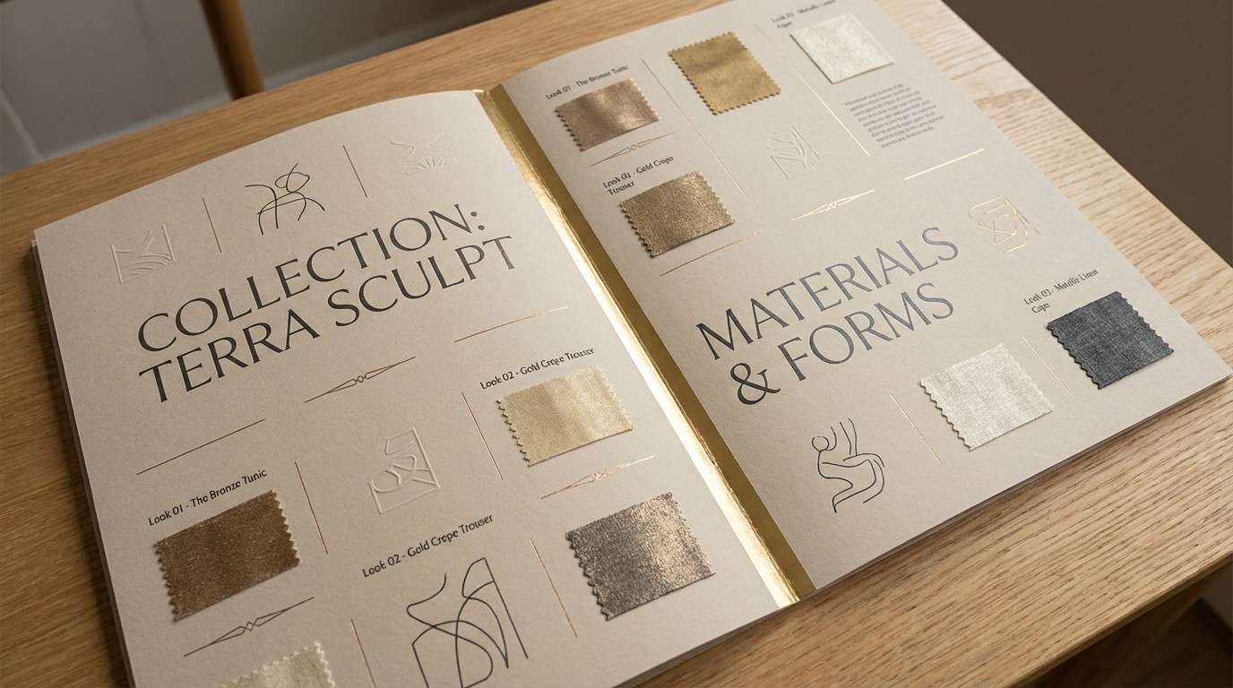
Create Gold Bronze Palette Visuals with AI
If you’re pitching a brand direction or building a moodboard, AI visuals help you test how gold bronze tones behave in real scenes—packaging, menus, posters, interiors, and UI—before you commit to production.
Start with one palette, describe the scene, and include lighting and surface cues (matte paper, brushed metal, warm studio light). Small prompt tweaks can quickly shift the feel from artisanal to regal or editorial.
To generate matching examples fast, try Media.io and reuse the prompts above as a starting point.
Gold Bronze Color Palette FAQs
-
What is a gold bronze color palette?
A gold bronze color palette is a set of warm metallic-leaning neutrals built around gold and bronze hues, usually supported by creams, tans, and deep browns for contrast and readability. -
Is gold bronze better used as a primary or accent color?
Most designs use gold bronze as an accent (logos, trims, badges, dividers, buttons) while a light neutral handles backgrounds and a dark brown handles text. This keeps the look refined instead of overly “shiny.” -
What background colors make gold bronze stand out?
Deep espresso/near-black backgrounds create dramatic luxury contrast, while creamy off-whites and parchment tones create a softer premium feel that works well for packaging and editorial layouts. -
Which font colors are readable on bronze and gold tones?
For accessibility, use very dark brown (or near-black) text on light gold/cream areas, and use off-white/cream text on the darkest bronze-brown shades. Avoid using mid bronze for small body text. -
Do gold bronze palettes work for modern UI design?
Yes—when used sparingly. Keep surfaces off-white or warm gray, use bronze for buttons/badges, and reserve bright gold for key states (highlights, progress, premium tags) so the interface stays clean. -
How do I make gold bronze look less “flashy” in branding?
Choose muted, slightly dusty golds, pair them with paper-like neutrals, and limit the bright gold to small percentages. Matte finishes and minimal gradients also help keep the tone modern and grounded. -
Can I generate gold bronze palette mockups with AI?
Yes. Use a text-to-image tool, include your intended application (label, poster, UI, interior), specify warm lighting and materials (brushed metal, linen, paper grain), and then iterate by adjusting contrast and accent usage.


