

Skin-tone palettes sit right in the sweet spot between “neutral” and “alive.” They bring warmth, softness, and realism without demanding attention the way brights do.
Below are modern skin color palette ideas (including #E7D7C9) you can use for UI, branding, and illustration—each with HEX codes and an AI image prompt you can recreate on Media.io.
In this article
Why Skin Palettes Work So Well
Skin palettes are built on warm-to-cool neutrals with gentle value steps, so they naturally feel “balanced.” That makes them ideal when you want a design to feel human, premium, and calm without looking sterile.
They also pair easily with accents—from soft blush to deep espresso—because the base colors already sit close to each other on the spectrum. You can create hierarchy through contrast (light cream vs. cocoa) without introducing loud hues.
In digital products, these tones reduce glare and fatigue compared to pure white/black interfaces, while still letting typography, photos, and CTAs stand out when you reserve the darkest shade for key UI moments.
20+ Skin Color Palette Ideas (with HEX Codes)
1) Porcelain Blush
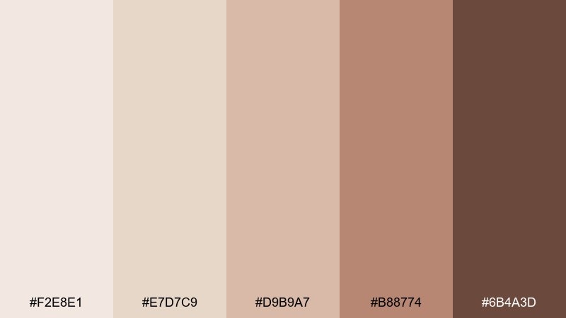
HEX: #F2E8E1 #E7D7C9 #D9B9A7 #B88774 #6B4A3D
Mood: airy, gentle, clean
Best for: minimalist skincare product packaging
Airy and tender, these tones feel like soft morning light on porcelain with a quiet blush. They work beautifully for minimalist skincare packaging, where clarity and calm matter. Pair the light creams with the warm mid-tans, then anchor type with the deep cocoa for contrast. Usage tip: keep the darkest shade for small details like batch numbers and icons so the label stays refined.
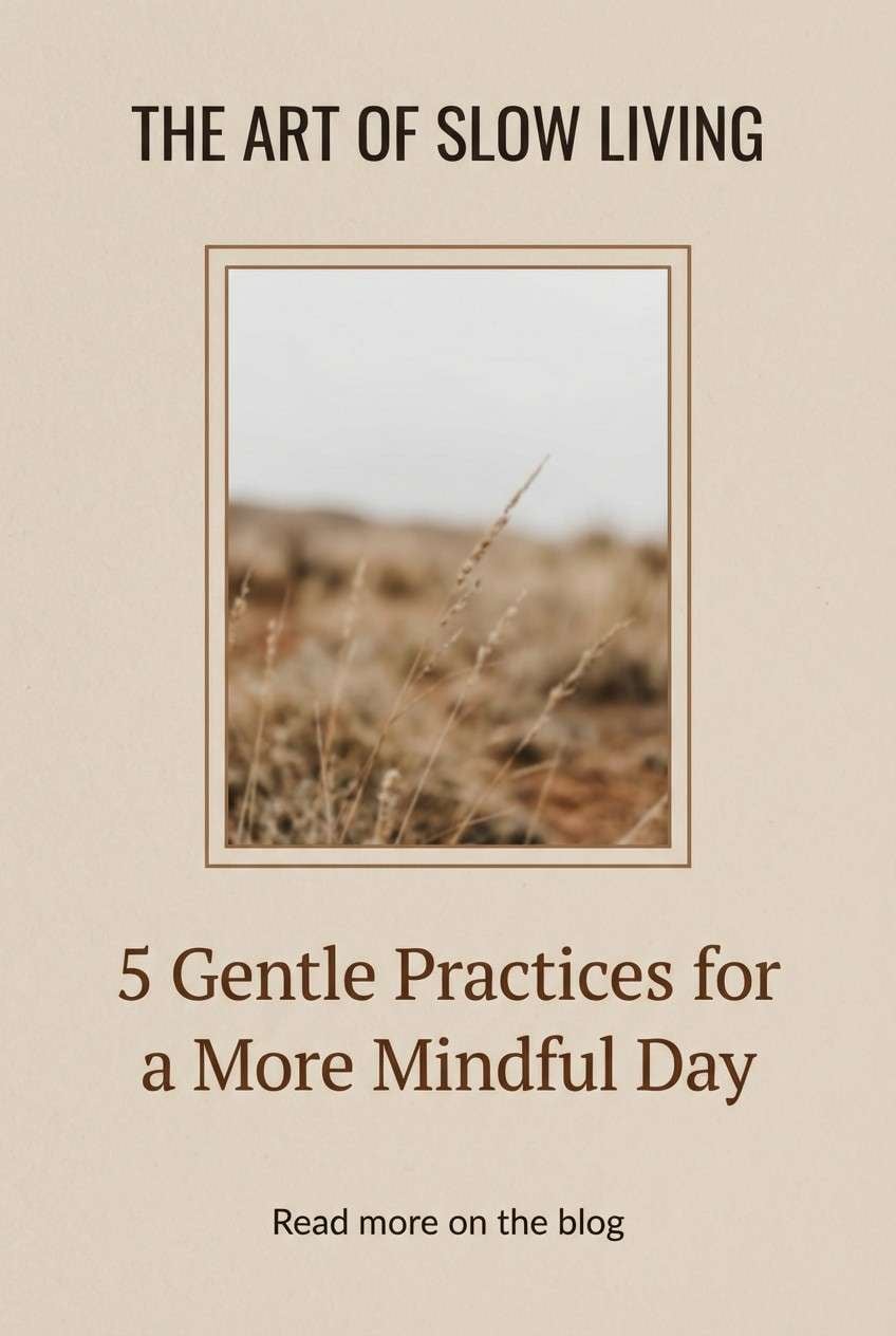
Image example of porcelain blush generated using media.io
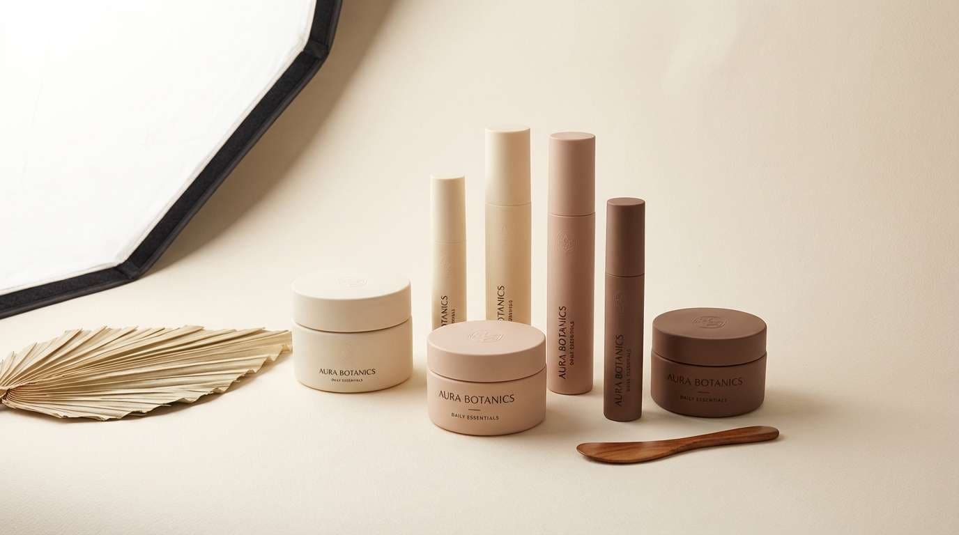
Media.io is an online AI studio for creating and editing video, image, and audio in your browser.

2) Sandstone Glow
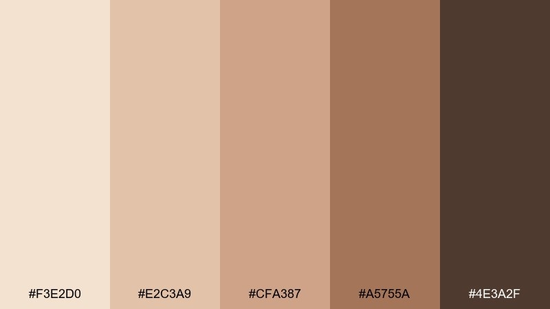
HEX: #F3E2D0 #E2C3A9 #CFA387 #A5755A #4E3A2F
Mood: sun-warmed, grounded, friendly
Best for: lifestyle blog hero banner
Sun-warmed and grounded, this set reads like sandstone at golden hour with a friendly, natural vibe. It suits lifestyle blog hero banners where you want warmth without shouting. Pair the pale sand as the backdrop, use the mid caramel for shapes, and reserve the deep brown for headlines. Usage tip: add subtle grain or a soft gradient between the first two colors to keep the banner from looking flat.
Image example of sandstone glow generated using media.io
3) Rosewood Nude
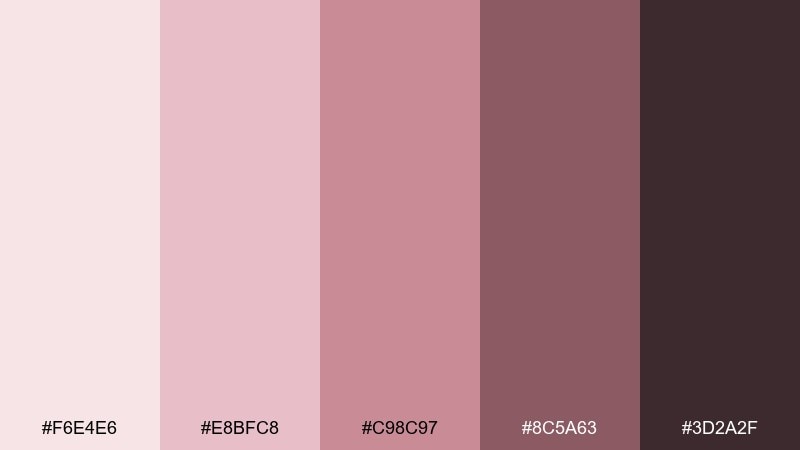
HEX: #F6E4E6 #E8BFC8 #C98C97 #8C5A63 #3D2A2F
Mood: romantic, polished, modern
Best for: beauty brand identity design
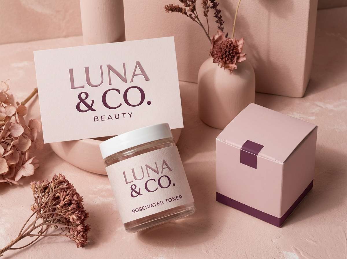
Romantic and polished, these rosewood hues evoke velvet petals and a modern vanity mirror. A skin color palette like this is ideal for beauty brand identity work that needs warmth, softness, and confidence. Let the pale pink act as negative space, bring in mauve for supporting blocks, and use the plum-brown for logos and fine lines. Usage tip: print tests matter here, so check the mid mauves on uncoated stock to avoid dulling.
Image example of rosewood nude generated using media.io
4) Honey Almond
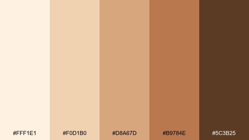
HEX: #FFF1E1 #F0D1B0 #D8A67D #B9784E #5C3B25
Mood: sweet, cozy, inviting
Best for: cafe menu design
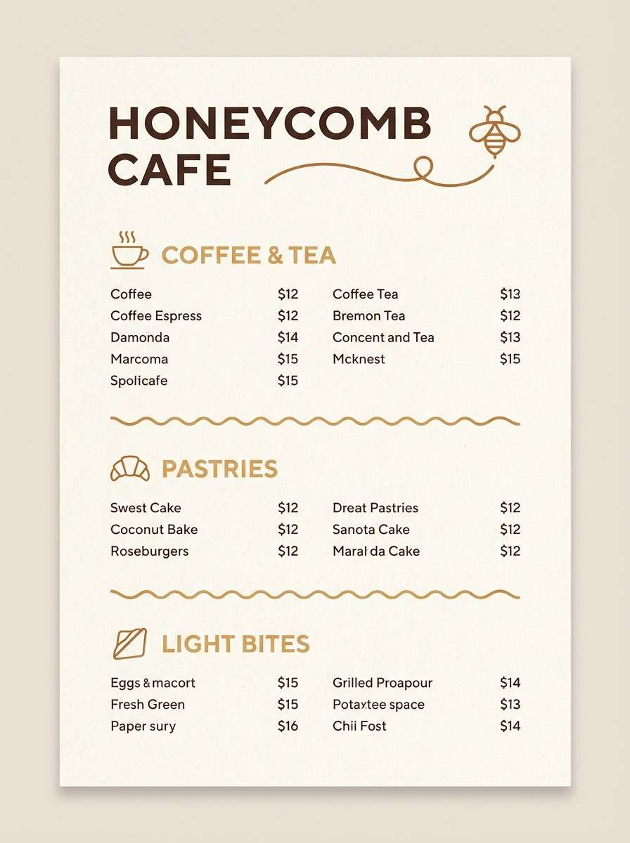
Sweet and cozy, these honeyed neutrals feel like almond pastries and warm milk foam. They fit cafe menu design where readability and comfort should lead. Use the light cream for the menu base, the golden tan for section headers, and the deep brown for prices and body text. Usage tip: keep contrast strong by placing text only on the first two light shades, not on the mid caramel.
Image example of honey almond generated using media.io
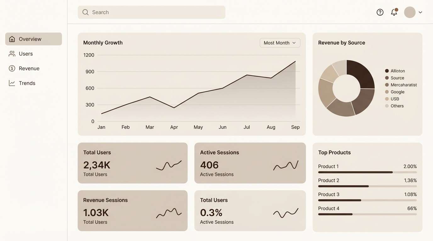
5) Cocoa Cream
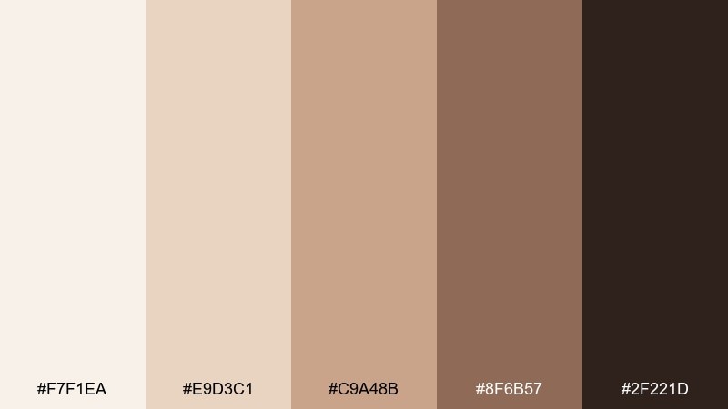
HEX: #F7F1EA #E9D3C1 #C9A48B #8F6B57 #2F221D
Mood: calm, premium, dependable
Best for: modern UI dashboard theme
Calm and premium, this mix brings to mind whipped cream stirred into cocoa with a dependable, professional finish. It works well for a modern UI dashboard theme that needs warmth without losing clarity. Use the off-white for panels, the beige for dividers and cards, and the deep espresso for navigation and key metrics. Usage tip: add a subtle shadow in the taupe shade to separate layers instead of using harsh borders.
Image example of cocoa cream generated using media.io
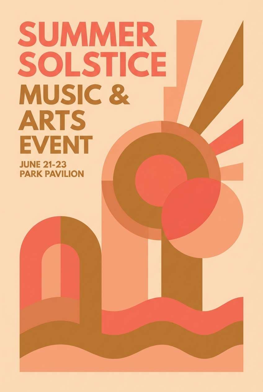
6) Peach Fuzz
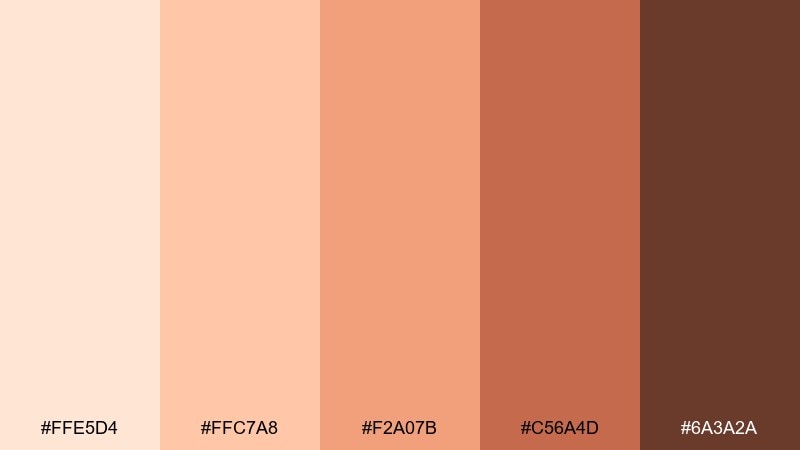
HEX: #FFE5D4 #FFC7A8 #F2A07B #C56A4D #6A3A2A
Mood: playful, sunny, energetic
Best for: summer event poster design
Playful and sunny, these peachy hues feel like a late-afternoon picnic with a bright, friendly glow. They shine on summer event posters where you want energy while keeping the look approachable. Pair the pale peach background with coral blocks for emphasis, then use the warm brown for headings and sponsor lines. Usage tip: keep accent shapes chunky and simple so the mid-tone coral does the heavy lifting.
Image example of peach fuzz generated using media.io
7) Taupe Veil
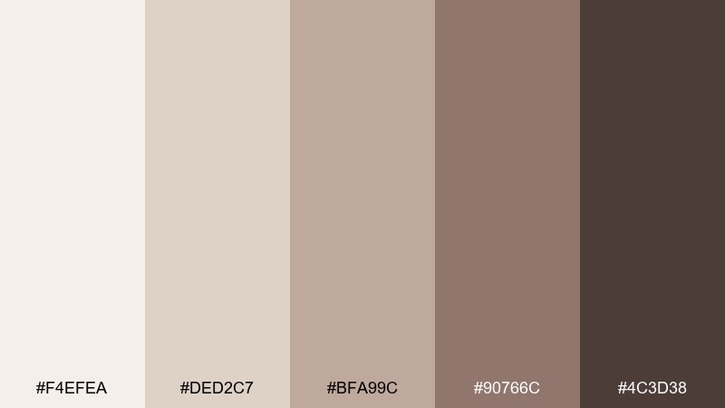
HEX: #F4EFEA #DED2C7 #BFA99C #90766C #4C3D38
Mood: quiet, modern, balanced
Best for: interior design mood board layout
Quiet and modern, these taupes look like linen, clay, and soft shadow layered together. They suit interior design mood boards where texture and restraint carry the story. Pair the pale stone as the base, then stack mid taupes for swatches and labels, saving the charcoal-brown for titles. Usage tip: use thin linework in the darkest tone to keep the board crisp without over-contrasting.
Image example of taupe veil generated using media.io
8) Bronze Ember
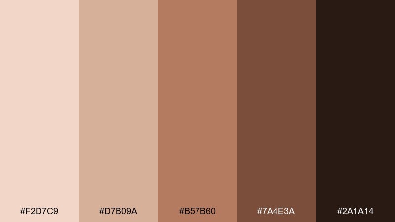
HEX: #F2D7C9 #D7B09A #B57B60 #7A4E3A #2A1A14
Mood: smoky, dramatic, cinematic
Best for: photo preset landing page UI
Smoky and cinematic, these bronze embers evoke backstage lighting and warm shadows on film. A skin color scheme like this fits a photo preset landing page that needs drama while staying elegant. Use the pale peach for sections, bronze for buttons and highlights, and the near-black brown for navigation and pricing emphasis. Usage tip: keep one accent color for CTAs only, so the page feels intentional rather than muddy.
Image example of bronze ember generated using media.io
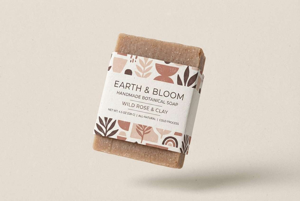
9) Clay Satin
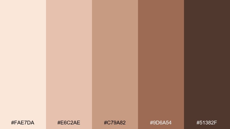
HEX: #FAE7DA #E6C2AE #C79A82 #9D6A54 #51382F
Mood: soft, artisanal, comforting
Best for: handmade soap label design
Soft and artisanal, these clay-satin tones feel like hand-thrown pottery with a gentle sheen. They work especially well on handmade soap labels where authenticity is part of the appeal. Pair the light blush base with the dusty clay midtones for patterning, then set key info in the deep brown for legibility. Usage tip: use a simple repeating motif in the third shade to add craft texture without clutter.
Image example of clay satin generated using media.io
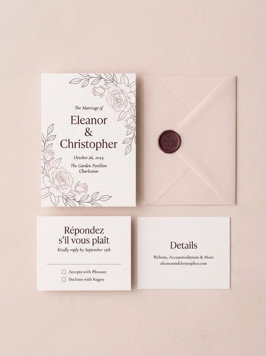
10) Mocha Rose
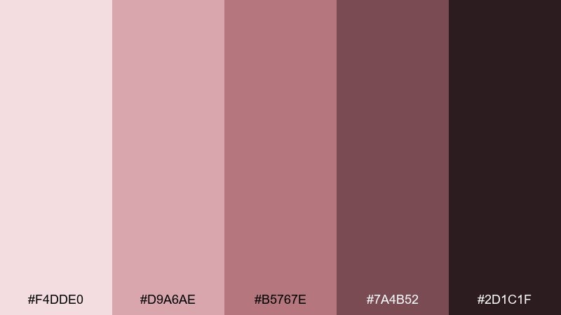
HEX: #F4DDE0 #D9A6AE #B5767E #7A4B52 #2D1C1F
Mood: intimate, elegant, vintage-leaning
Best for: wedding invitation suite
Intimate and elegant, these mocha-rose shades suggest pressed florals and candlelit ink. They are a strong fit for wedding invitation suites where romance should still feel modern. Pair the pale blush paper tone with muted rose typography, then use the deep wine-brown for monograms and details. Usage tip: foil or letterpress looks best when applied to the two darkest shades for crisp edges.
Image example of mocha rose generated using media.io
11) Ivory Latte
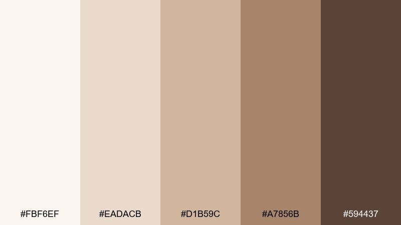
HEX: #FBF6EF #EADACB #D1B59C #A7856B #594437
Mood: smooth, tidy, reassuring
Best for: ecommerce product page UI
Smooth and tidy, this set feels like ivory ceramic and a latte crema swirl. It helps ecommerce product pages look reassuring and polished, especially for wellness or home goods. Use the ivory for background, the warm beige for cards, and the deeper latte brown for primary buttons and price highlights. Usage tip: keep link text in the darker two shades to maintain accessibility on the soft base.
Image example of ivory latte generated using media.io
12) Apricot Tan
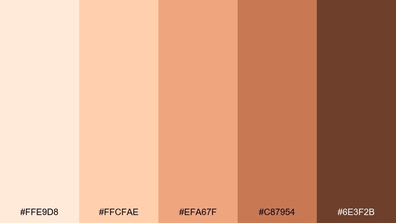
HEX: #FFE9D8 #FFCFAE #EFA67F #C87954 #6E3F2B
Mood: cheerful, storybook, warm
Best for: children book illustration color guide
Cheerful and storybook-warm, these apricot tans evoke watercolor washes and friendly character shading. They are great for children book illustration guides when you want expressive warmth without harsh contrast. Use the two lightest tones for highlights and paper-like fill, then build form with the peach and terracotta shades. Usage tip: limit the darkest brown to tiny features like eyes and outlines so faces stay soft.
Image example of apricot tan generated using media.io
13) Sienna Suede
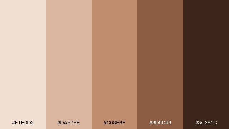
HEX: #F1E0D2 #DAB79E #C08E6F #8D5D43 #3C261C
Mood: editorial, earthy, confident
Best for: fashion lookbook editorial layout
Editorial and confident, these suede siennas feel like warm studio lighting over textured fabric. They fit fashion lookbook layouts where earthiness should still read premium. Pair the pale neutral for margins and captions, then use the mid sienna for blocks and dividers, with espresso for headlines. Usage tip: keep photos warm-toned and desaturated so the layout colors feel cohesive, not competing.
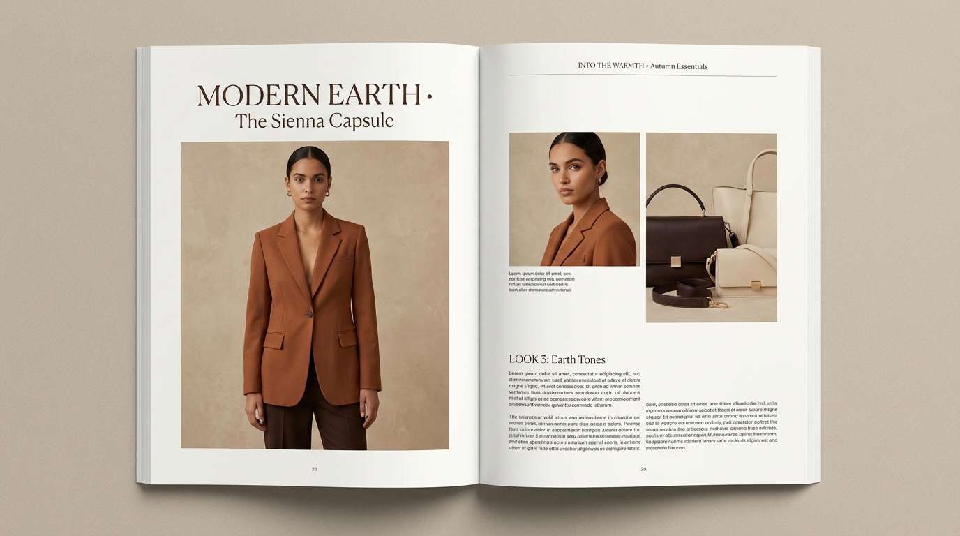
Image example of sienna suede generated using media.io
14) Blush Beige
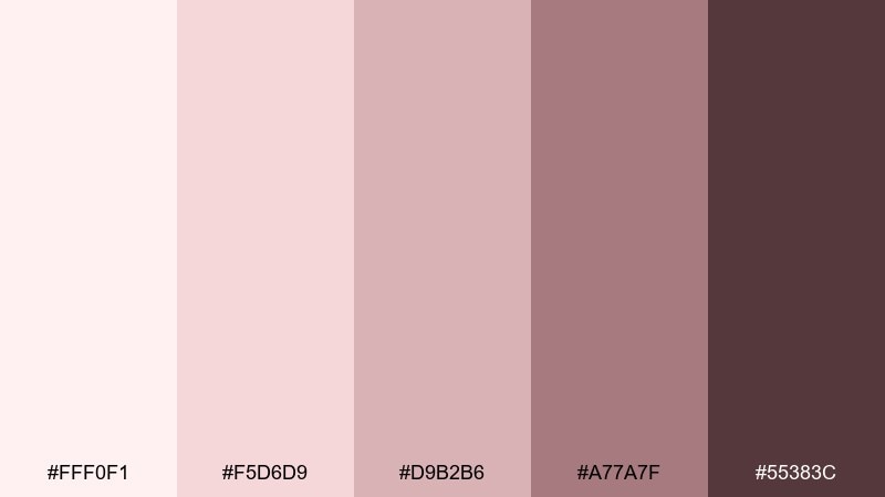
HEX: #FFF0F1 #F5D6D9 #D9B2B6 #A77A7F #55383C
Mood: soft, sweet, contemporary
Best for: social media quote template
Soft and sweet, these blush-beige tones evoke cotton candy haze with a contemporary, grown-up edge. They are ideal for social media quote templates where you want warmth and readability. Pair the palest pink as the canvas, the dusty rose for shapes, and the deep berry-brown for text. Usage tip: stick to one font weight and let color blocks create hierarchy instead of extra decorations.
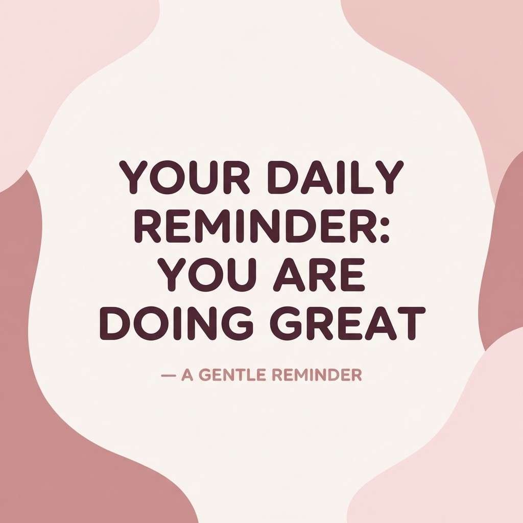
Image example of blush beige generated using media.io
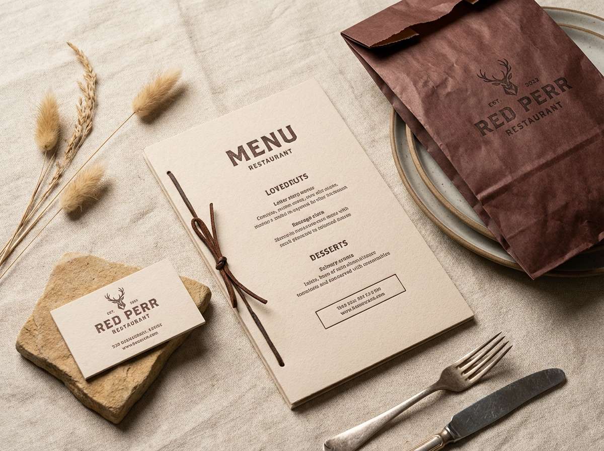
15) Desert Nougat
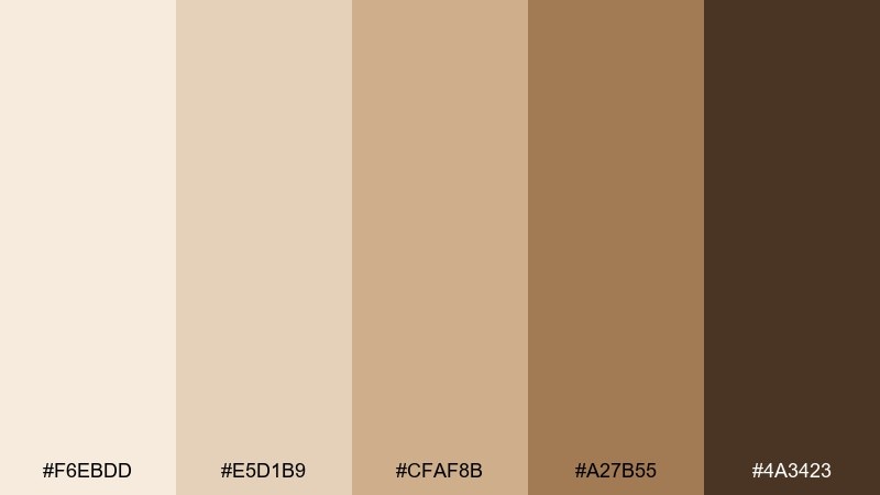
HEX: #F6EBDD #E5D1B9 #CFAF8B #A27B55 #4A3423
Mood: rustic, warm, appetizing
Best for: rustic restaurant branding mockup
Rustic and appetizing, these nougat-and-desert tones recall toasted sugar, burlap texture, and warm wood. They suit restaurant branding that wants to feel handcrafted yet clean. Pair the light nougat for backgrounds and menus, use the mid tan for badges, and bring in the deep brown for marks and stamps. Usage tip: combine with a simple line illustration style so the palette stays the hero.
Image example of desert nougat generated using media.io
16) Warm Shell
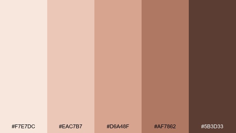
HEX: #F7E7DC #EAC7B7 #D6A48F #AF7862 #5B3D33
Mood: natural, soft, illustrative
Best for: portrait illustration shading chart
Natural and soft, these warm shell tones feel like beach shells and gentle shadow transitions. A skin color palette in this range is useful for portrait illustration shading charts because the steps blend smoothly. Pair the first two shades for highlight zones, then move through the mid tones for cheeks and noses, finishing with the deep brown for occlusion shadows. Usage tip: place the swatches in a value gradient, not just hue order, to make shading decisions faster.
Image example of warm shell generated using media.io
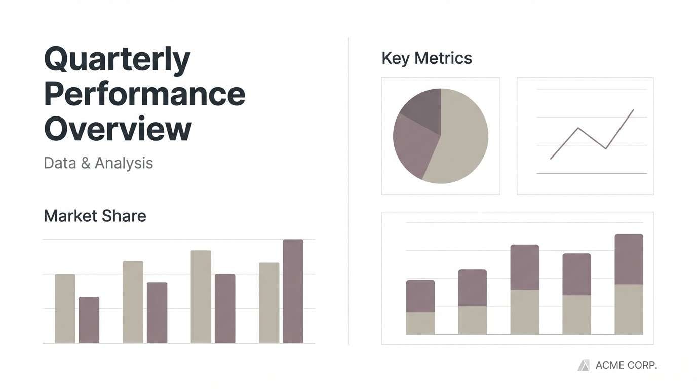
17) Cool Biscuit
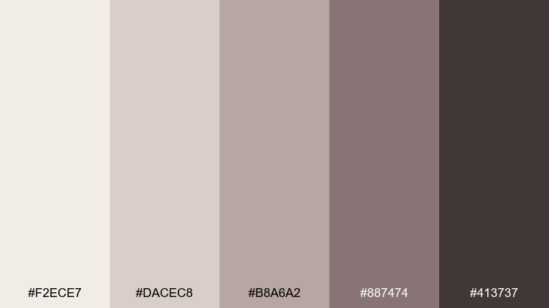
HEX: #F2ECE7 #DACEC8 #B8A6A2 #887474 #413737
Mood: muted, cool-leaning, minimal
Best for: minimalist presentation template
Muted and cool-leaning, these biscuit grays feel like stoneware and cashmere with a minimal sensibility. They work well for presentation templates where you want restraint and clear hierarchy. Pair the lightest neutral for slides, the mid mauve-gray for section panels, and the darkest shade for headings. Usage tip: use the fourth color sparingly for charts so data stands out without turning loud.
Image example of cool biscuit generated using media.io
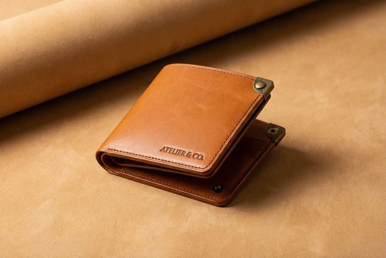
18) Caramel Bronze
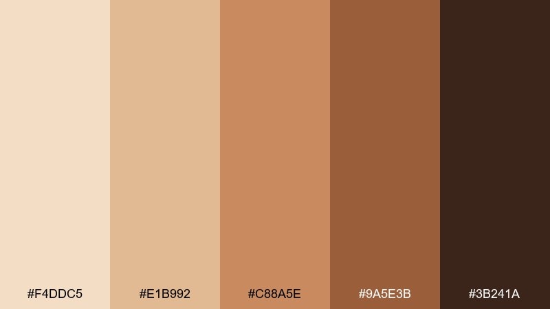
HEX: #F4DDC5 #E1B992 #C88A5E #9A5E3B #3B241A
Mood: rich, bold, luxe
Best for: leather goods product ad
Rich and luxe, these caramel bronzes evoke polished leather and warm metal hardware. They are a strong fit for leather goods ads where texture and depth should feel premium. Pair the pale tan as a backdrop, use bronze for highlights and callouts, and anchor the composition with the deep brown for logos. Usage tip: add a tight spotlight gradient behind the product to emphasize the material without adding new colors.
Image example of caramel bronze generated using media.io
19) Candlelit Umber
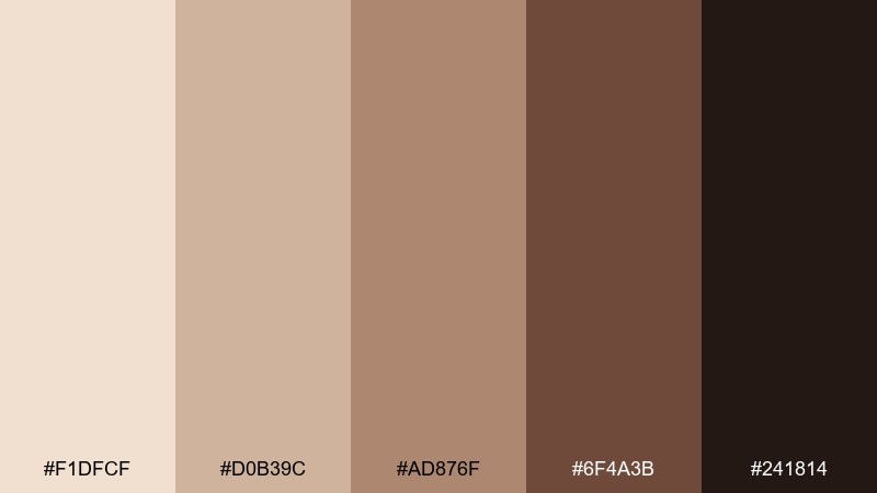
HEX: #F1DFCF #D0B39C #AD876F #6F4A3B #241814
Mood: cozy, nostalgic, intimate
Best for: home decor blog pin graphic
Cozy and nostalgic, these candlelit umbers feel like warm lamplight on wood and linen. A skin color palette with this much depth works well for home decor blog graphics that need a comforting, curated mood. Pair the light beige for the canvas, then set headline blocks in the deeper browns for instant readability. Usage tip: keep photography muted and warm so the text overlay looks intentional rather than pasted on.
Image example of candlelit umber generated using media.io
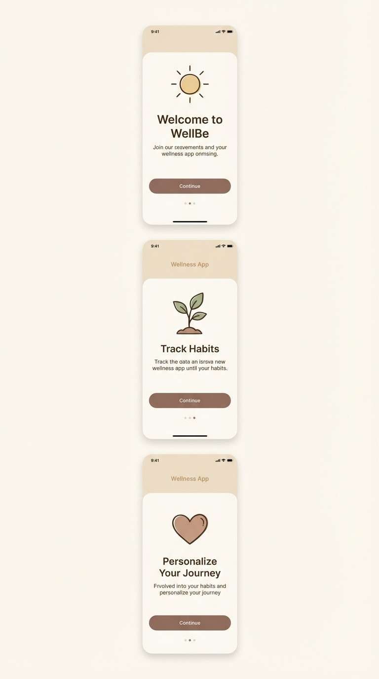
20) Barely There
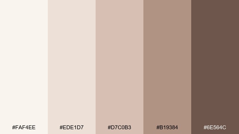
HEX: #FAF4EE #EDE1D7 #D7C0B3 #B19384 #6E564C
Mood: calming, airy, supportive
Best for: wellness app onboarding screens
Calming and airy, these barely-there neutrals evoke quiet mornings and soft fabric textures. They are great for wellness app onboarding screens where users should feel supported, not overwhelmed. Pair the pale background with warm beige cards, and use the deeper brown only for primary actions and key headings. Usage tip: add generous spacing and rounded corners so the gentle tones read as intentional minimalism.
Image example of barely there generated using media.io
What Colors Go Well with Skin?
Skin-tone neutrals pair best with colors that either deepen contrast (espresso, charcoal, inky navy) or add a controlled “flush” (dusty rose, muted coral, terracotta). These combinations keep the overall look natural while still creating hierarchy.
For a modern, editorial feel, add cool counterpoints like stone gray or soft mauve-gray. For a warmer lifestyle vibe, use honey golds and cinnamon browns—especially when you want the palette to feel sunlit and appetizing.
If you need a single accent, choose one saturated color and use it sparingly (buttons, highlights, badges). That restraint prevents a skin color scheme from turning muddy and keeps the neutrals doing the heavy lifting.
How to Use a Skin Color Palette in Real Designs
Start by mapping roles: use the lightest shade for backgrounds, the mid tones for surfaces (cards, blocks, shapes), and the darkest shade for text and critical UI elements. This keeps readability high while preserving the soft, modern mood.
In branding and packaging, test contrast on real materials. Warm midtones can shift on uncoated paper, so reserve deeper browns for fine lines, small type, and logos that must remain crisp.
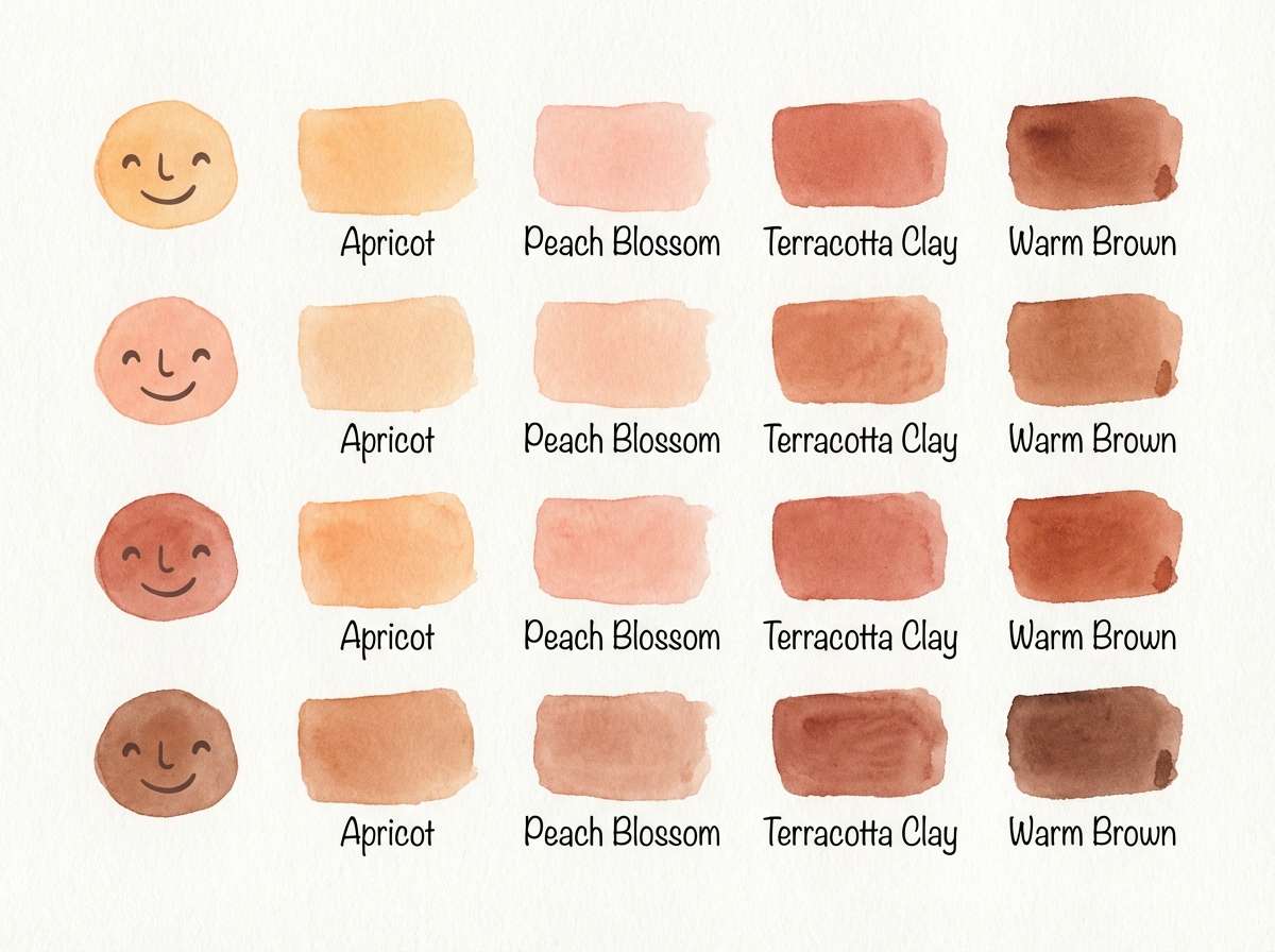
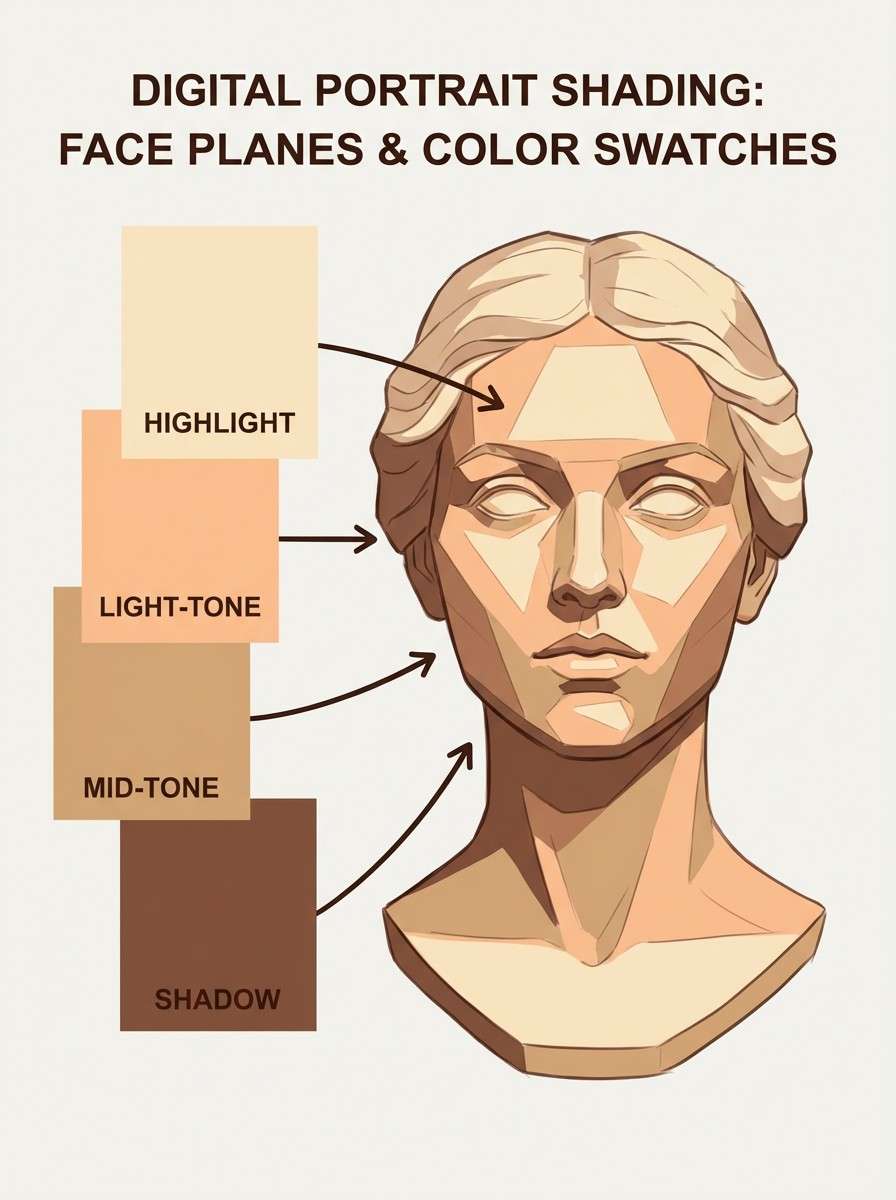
For illustration, treat the five swatches as a value ladder rather than “five different colors.” Use the two lightest for highlights, the middle for local tone, and the darkest for occlusion shadows—especially around eyes, noses, and under chins.
Create Skin Palette Visuals with AI
If you want to preview how a skin tone palette will look in a real layout, generate quick mockups with AI. This helps you validate warmth, contrast, and the overall vibe before committing to a full design.
Pick one palette above, copy the prompt, and then adjust the scene (product type, layout ratio, typography style) while keeping the same color family. You’ll get consistent, on-brand visuals fast.
Once you have a few options, compare them side by side to see which palette keeps text readable, photos cohesive, and accents intentional.
Skin Color Palette FAQs
-
What is a skin color palette?
A skin color palette is a set of warm-to-cool neutrals (often 4–6 swatches) designed to mimic natural skin highlights, midtones, and shadows. Designers use it for portraits, beauty branding, UI themes, and any layout that needs a soft, human feel. -
Is #E7D7C9 a warm or cool skin tone?
#E7D7C9 is a light, warm-leaning neutral with a subtle peach-beige undertone. It works well as a background, highlight, or “base” shade in modern skin-tone palettes. -
What accent colors go best with skin-tone neutrals?
Muted rose, terracotta, cocoa, and latte browns are the easiest accents. For a modern contrast, add slate/charcoal or a deep navy; for a fresh lift, try soft sage or dusty teal in small doses. -
How do I keep text readable on skin-tone backgrounds?
Use the darkest swatch for body text and key labels, and keep text off midtone backgrounds unless you’ve checked contrast. If you need text on a midtone card, add a lighter overlay or move the text to the lightest two shades. -
How can I choose highlights and shadows for portrait illustration?
Arrange the palette by value: lightest two for highlights, middle for local tone, and the last two for shadows/occlusion. Using value steps (not just hue changes) keeps faces dimensional and natural. -
Do skin-tone palettes work for UI design?
Yes—skin-tone palettes are great for calm dashboards, wellness apps, and ecommerce layouts. Use the lightest shades for surfaces, keep borders subtle, and reserve deep browns for navigation, headings, and primary actions. -
How do I generate matching palette images with AI?
Use a consistent prompt structure (scene + style + lighting + layout ratio), then describe the dominant colors using your swatches (e.g., ivory, beige, cocoa). Generate a few variations and keep the best composition while maintaining the same color family.
Next: Bone Color Palette


