

A bone color palette sits in that sweet spot between crisp white and warm beige—clean enough for modern design, but soft enough to feel lived-in. It’s a go-to neutral for interiors, branding, packaging, and UI when you want calm without coldness.
Below are 20+ bone palette ideas with HEX codes, plus practical tips for pairing, contrast, and creating AI-generated visuals in minutes.
In this article
- Why Bone Palettes Work So Well
-
- desert linen
- clay and cashmere
- gallery greige
- oat milk latte
- fossil stone
- antique bone and brass
- coastal dune
- sage chalk
- cocoa shell
- minimal museum
- warm shadow
- dusty rose porcelain
- pine and parchment
- midnight ink contrast
- terracotta whisper
- olive grove neutral
- lavender ash
- pearl smoke
- sandstorm gradient
- winter bone
- sepia studio
- What Colors Go Well with Bone?
- How to Use a Bone Color Palette in Real Designs
- Create Bone Palette Visuals with AI
Why Bone Palettes Work So Well
Bone tones feel naturally balanced: they carry enough warmth to soften a layout, but still read “bright” and minimal compared with deeper beiges. That makes them especially useful when you want neutral backgrounds that don’t look stark.
They’re also extremely flexible across materials and screens. Bone works with paper textures, wood, stone, ceramics, and modern UI surfaces—helping brands look calm, premium, and approachable.
Finally, bone palettes make contrast planning easier. You can build clear hierarchy by pairing bone highlights with mid greiges and one deep espresso/near-black for titles, CTAs, and key numbers.
20+ Bone Color Palette Ideas (with HEX Codes)
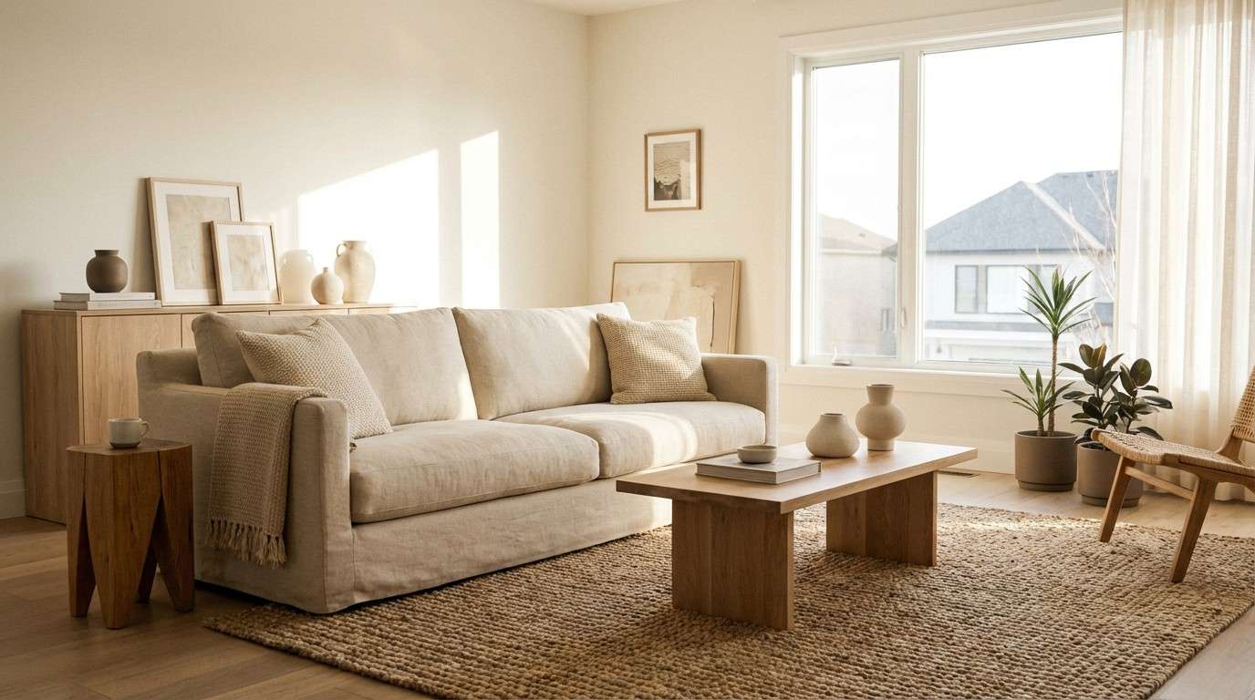
1) Desert Linen
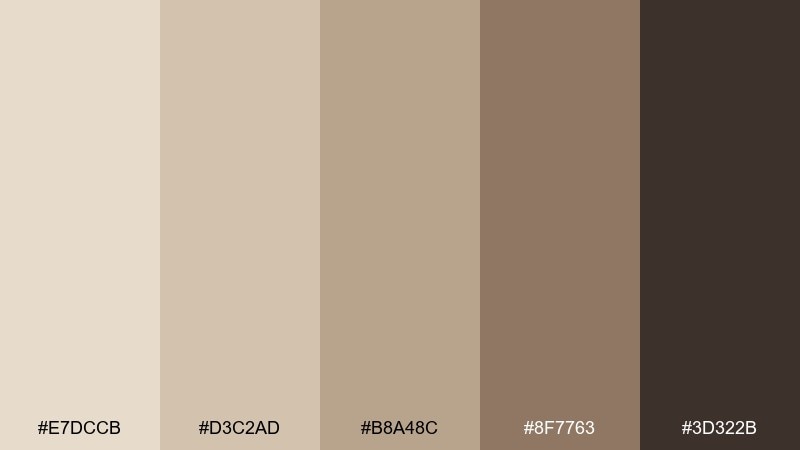
HEX: #e7dccb #d3c2ad #b8a48c #8f7763 #3d322b
Mood: airy, grounded, sun-warmed
Best for: living room interiors and home staging
Airy and sun-warmed like linen curtains in late afternoon light. These soft neutrals work beautifully on walls, upholstery, and natural wood, keeping a room calm without feeling flat. Pair with matte black hardware or aged oak to add structure. Usage tip: repeat the darkest tone in small touches like frames or lamp bases to anchor the space.
Image example of desert linen generated using media.io
Media.io is an online AI studio for creating and editing video, image, and audio in your browser.

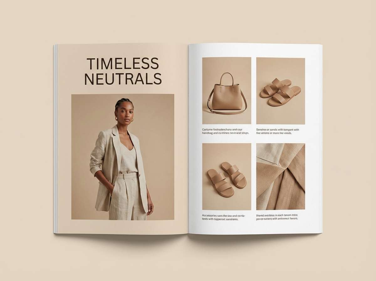
2) Clay and Cashmere
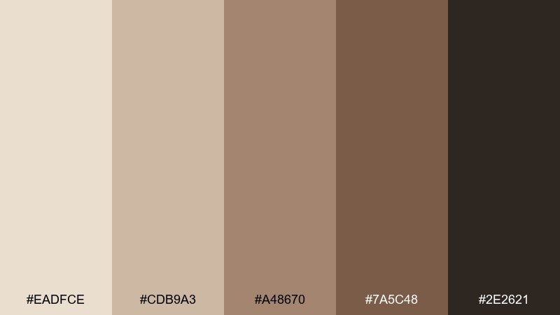
HEX: #eadfce #cdb9a3 #a48670 #7a5c48 #2e2621
Mood: cozy, tactile, understated
Best for: fashion lookbook layouts and styling boards
Cozy and tactile, like cashmere against soft clay ceramics. The warm midtones flatter product shots and portraits, while the deep brown adds editorial polish. Pair with cream paper textures and simple serif typography for a premium feel. Usage tip: keep backgrounds light and use the darkest shade for headlines to maintain contrast.
Image example of clay and cashmere generated using media.io
3) Gallery Greige
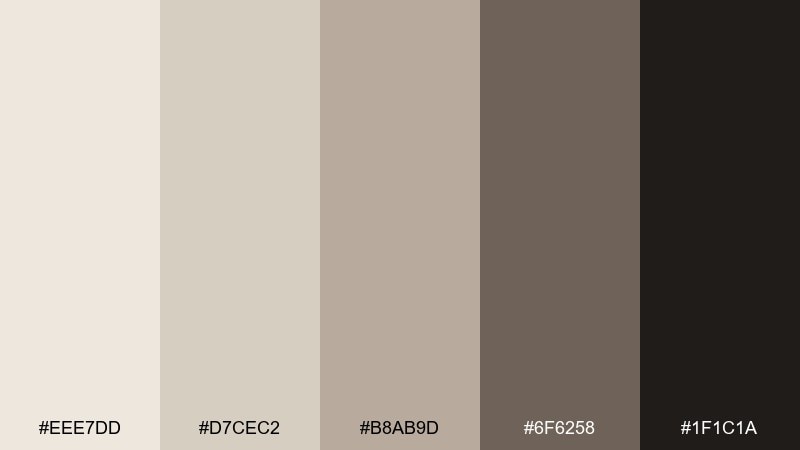
HEX: #eee7dd #d7cec2 #b8ab9d #6f6258 #1f1c1a
Mood: modern, calm, curated
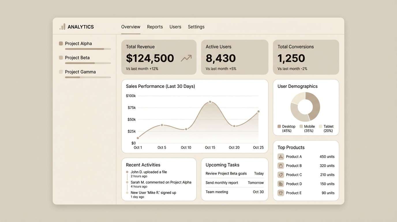
Best for: dashboard UI and data-heavy interfaces
Modern and curated, like a quiet gallery wall with soft greige paint. These bone color combinations keep charts, tables, and cards readable while still feeling warm and human. Pair with a single muted accent color for status states and highlights. Usage tip: reserve the near-black for key numbers and primary buttons to guide scanning.
Image example of gallery greige generated using media.io
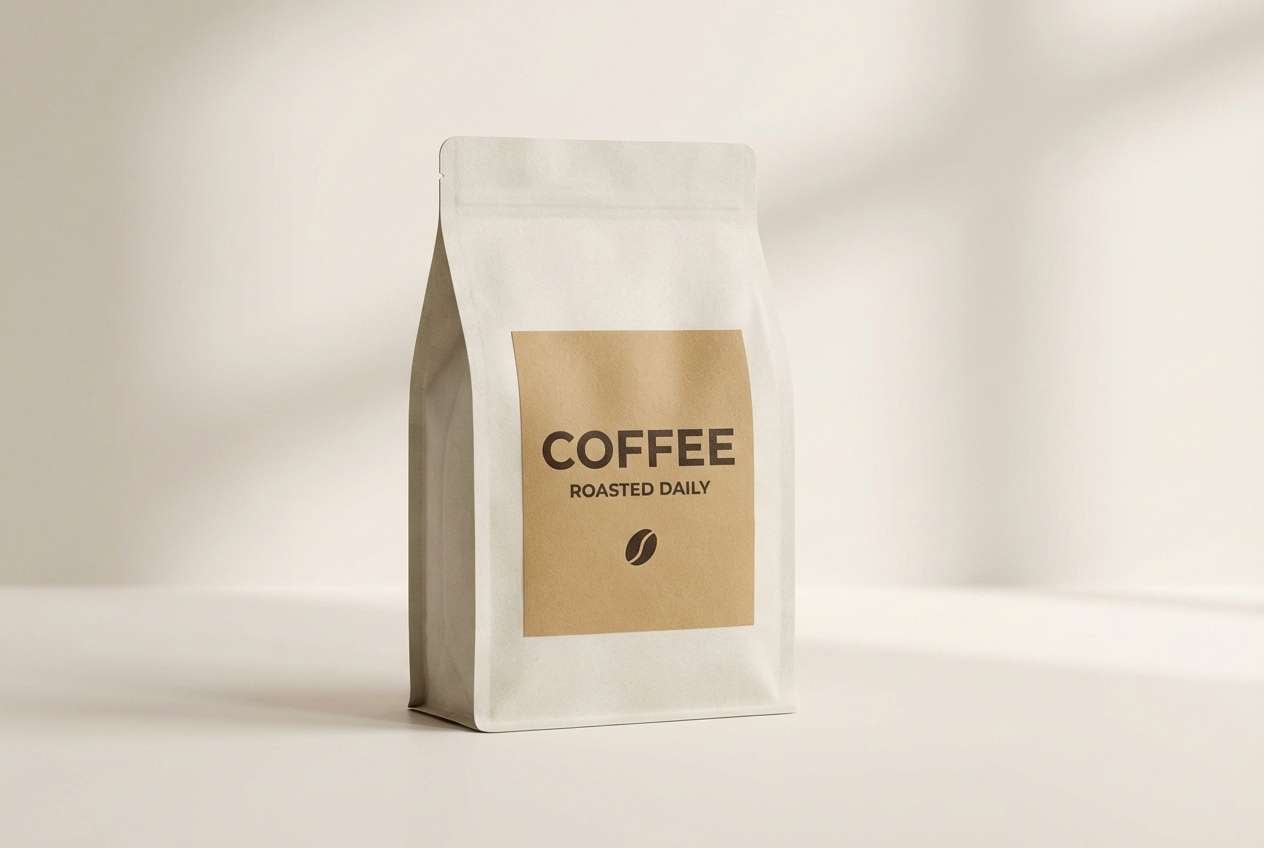
4) Oat Milk Latte
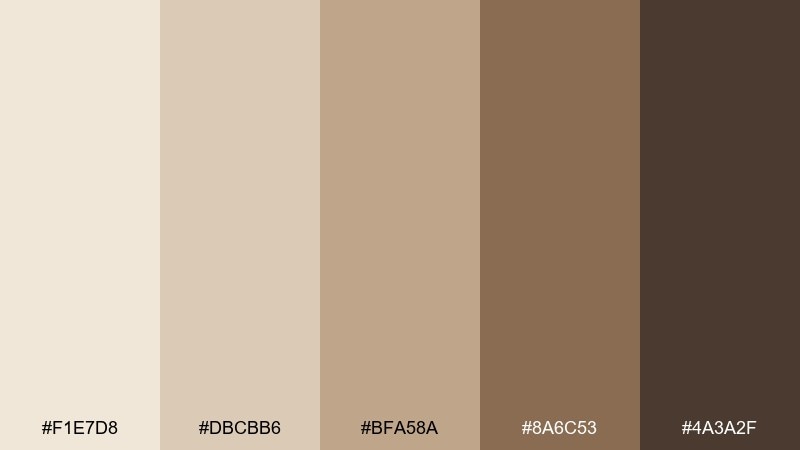
HEX: #f1e7d8 #dbcbb6 #bfa58a #8a6c53 #4a3a2f
Mood: soft, friendly, comforting
Best for: coffee packaging and cafe brand assets
Soft and comforting, like foam swirling into a latte. The creamy highlights feel approachable, while the caramel browns add appetite appeal for food and drink packaging. Pair with kraft paper textures and minimal icons for a modern cafe look. Usage tip: keep the label mostly light and use the darkest shade for roast level or flavor notes.
Image example of oat milk latte generated using media.io
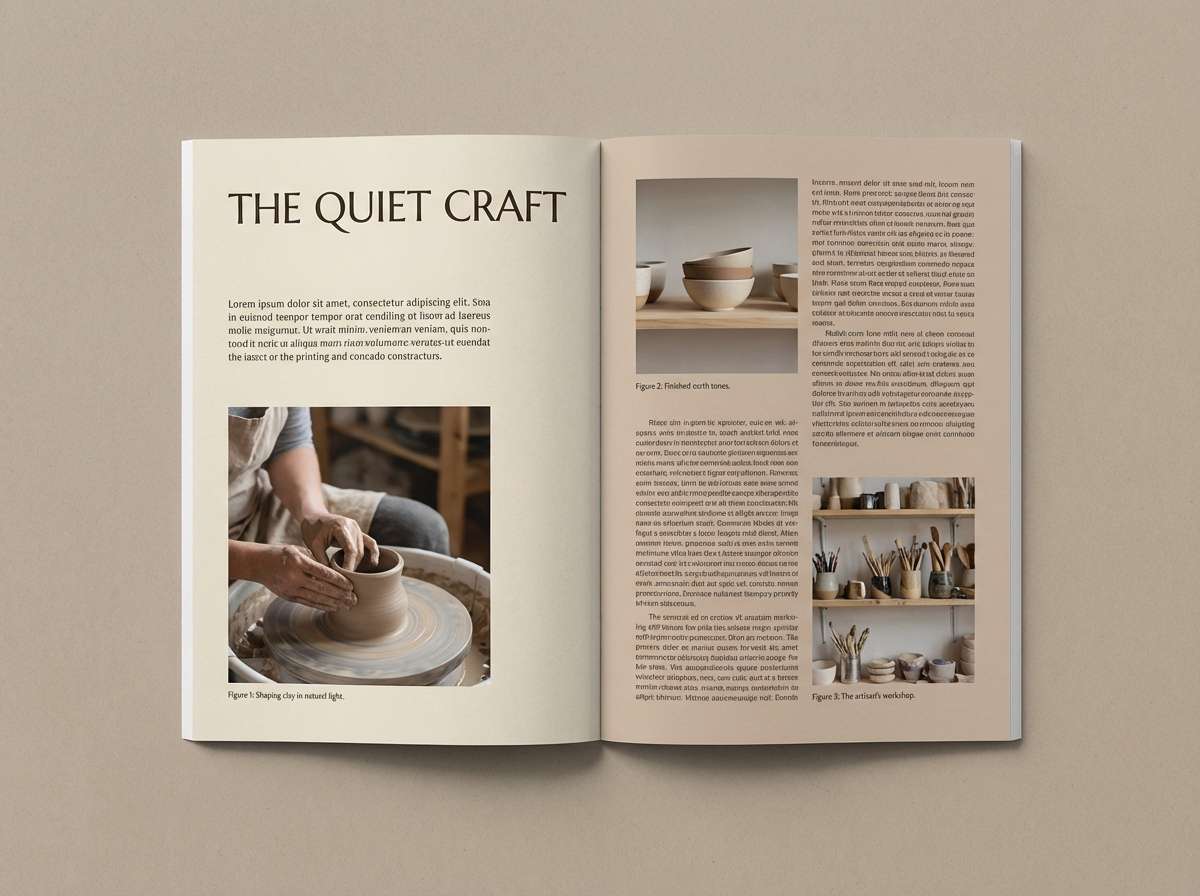
5) Fossil Stone
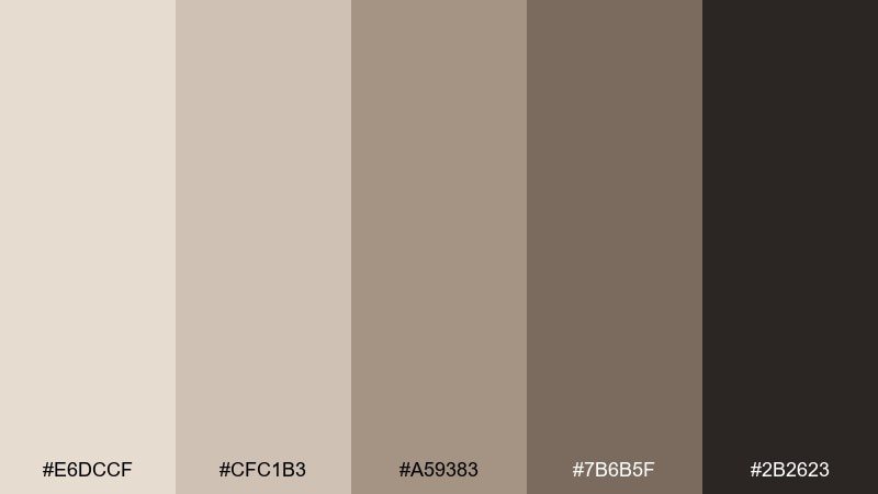
HEX: #e6dccf #cfc1b3 #a59383 #7b6b5f #2b2623
Mood: earthy, steady, archival
Best for: magazine features and long-form editorial design
Earthy and archival, like fossils pressed into stone and paper. The midtones read as trustworthy and timeless, making them ideal for long articles and photo captions. Pair with warm grayscale photography and subtle rules to keep layouts structured. Usage tip: use the lightest shade for margins and pull quotes to create breathing room.
Image example of fossil stone generated using media.io
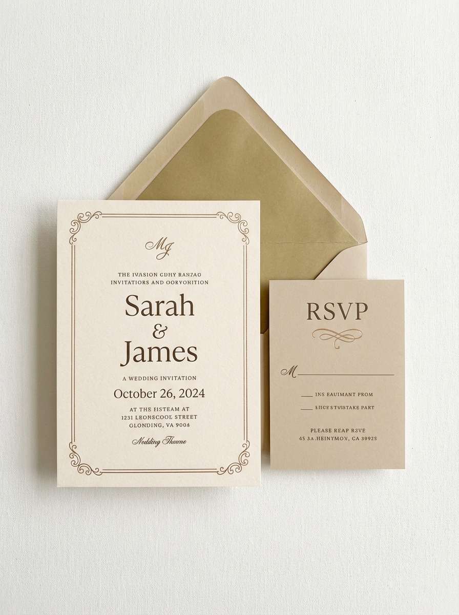
6) Antique Bone and Brass
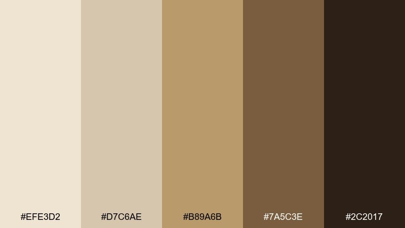
HEX: #efe3d2 #d7c6ae #b89a6b #7a5c3e #2c2017
Mood: elegant, classic, celebratory
Best for: wedding invitations and formal stationery
Elegant and celebratory, like antique paper with a brass glint. The warm gold note elevates the neutrals without becoming flashy, perfect for classic stationery. Pair with letterpress textures and a refined serif for an heirloom feel. Usage tip: keep metallic accents minimal and let whitespace do the luxury work.
Image example of antique bone and brass generated using media.io
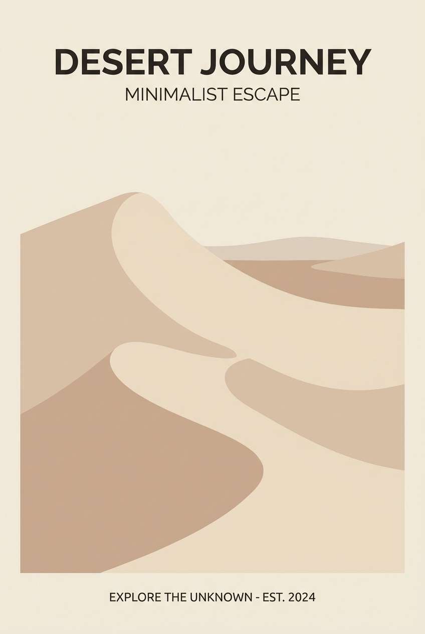
7) Coastal Dune
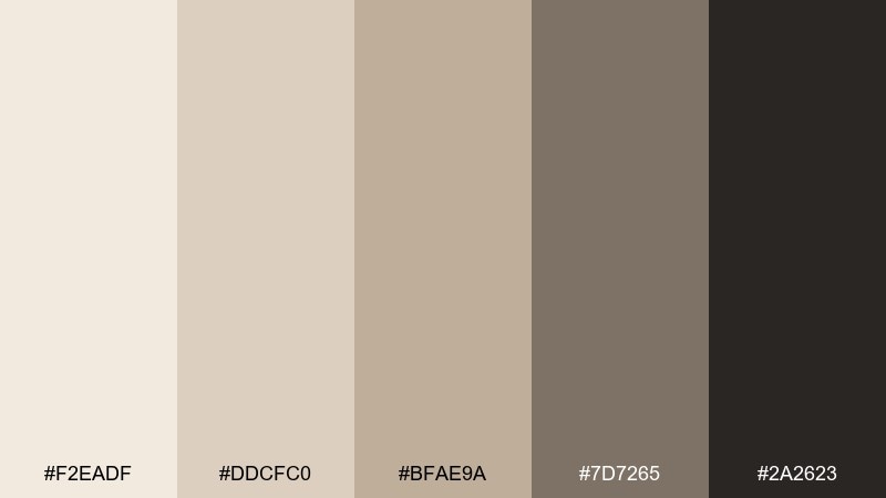
HEX: #f2eadf #ddcfc0 #bfae9a #7d7265 #2a2623
Mood: fresh, open, breezy
Best for: travel posters and lifestyle flyers
Fresh and breezy, like dunes under a pale sky. The quiet contrast keeps typography clear, while the sandy midtones feel relaxed and approachable. Pair with airy photography and thin-line icons for a modern travel look. Usage tip: use the darker gray-brown for titles and keep body copy in a softer tone to avoid harshness.
Image example of coastal dune generated using media.io
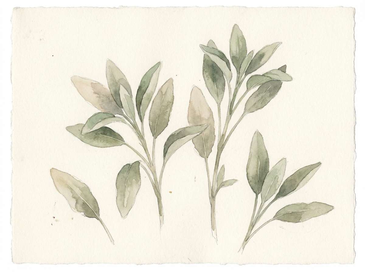
8) Sage Chalk
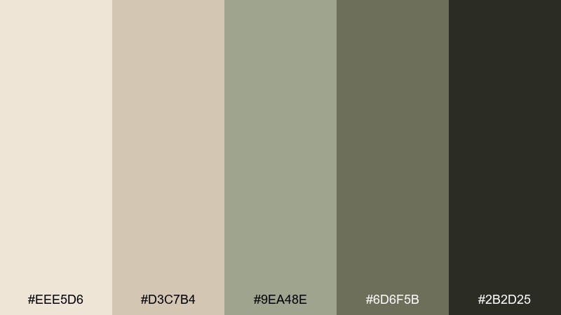
HEX: #eee5d6 #d3c7b4 #9ea48e #6d6f5b #2b2d25
Mood: calm, herbal, restorative
Best for: botanical illustrations and spring-themed prints
Calm and restorative, like sage leaves dusted with chalk. The muted green reads natural and modern, ideal for wellness brands and botanical prints. Pair with watercolor textures and plenty of negative space to keep it airy. Usage tip: let the green be the accent and keep the background in creamy neutrals for balance.
Image example of sage chalk generated using media.io
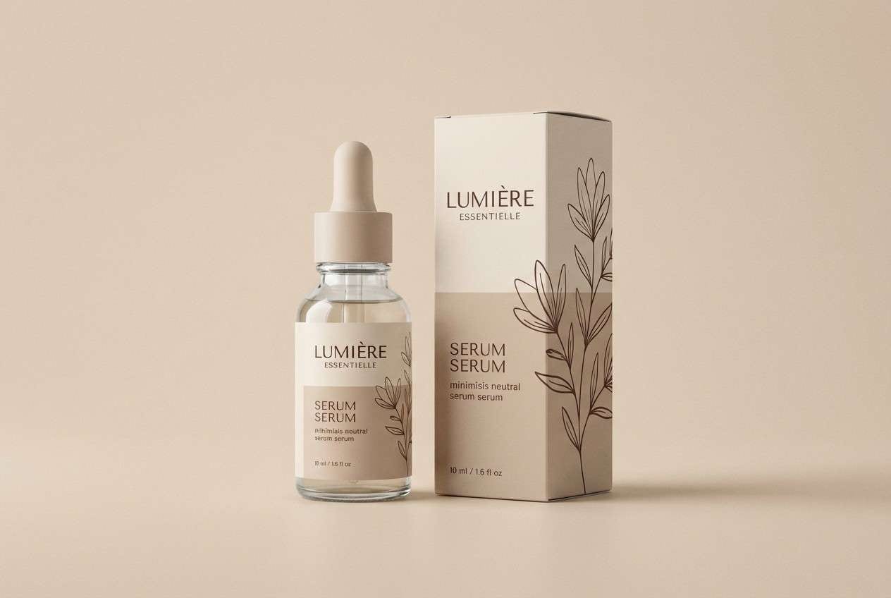
9) Cocoa Shell
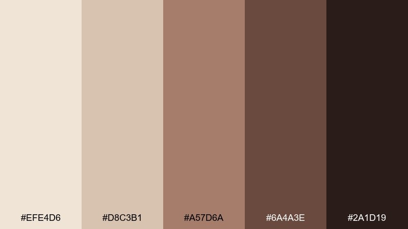
HEX: #efe4d6 #d8c3b1 #a57d6a #6a4a3e #2a1d19
Mood: rich, inviting, boutique
Best for: skincare product ads and beauty packaging
Rich and inviting, like cocoa shells and warm porcelain. The rosy-brown midtone adds a flattering, human warmth that works well for beauty. Pair with soft gradients and minimal typography to keep it premium. Usage tip: place product names in the darkest tone and use the blush shade for subtle callouts.
Image example of cocoa shell generated using media.io
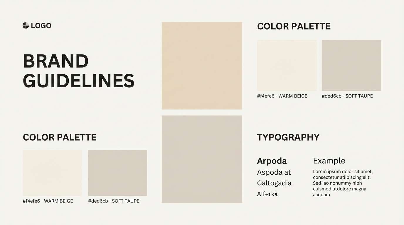
10) Minimal Museum
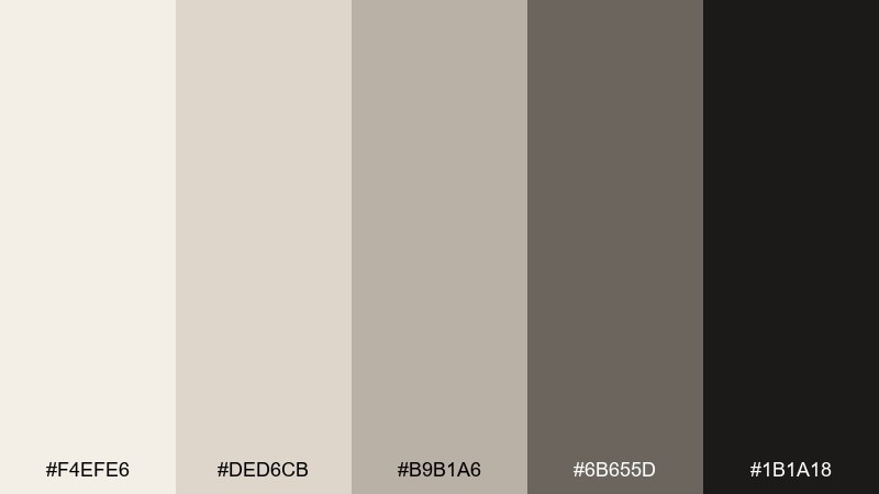
HEX: #f4efe6 #ded6cb #b9b1a6 #6b655d #1b1a18
Mood: quiet, refined, minimalist
Best for: brand guidelines and identity presentations
Quiet and refined, like a museum placard set on creamy paper. The grayscale warmth keeps presentations looking modern without turning cold. Pair with sharp typography, generous margins, and a single accent line weight. Usage tip: use the darkest tone only for key headings so the overall page stays light.
Image example of minimal museum generated using media.io
11) Warm Shadow
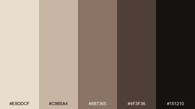
HEX: #e9ddcf #c9b5a4 #8b7365 #4f3f36 #151210
Mood: moody, cinematic, dramatic
Best for: film posters and dramatic campaign creatives
Moody and cinematic, like warm shadows across plaster walls. The deeper browns bring drama without leaning into harsh black, great for posters and hero banners. Pair with high-contrast photography and simple, bold type. Usage tip: keep body text off-white and reserve the darkest shade for the title block.
Image example of warm shadow generated using media.io

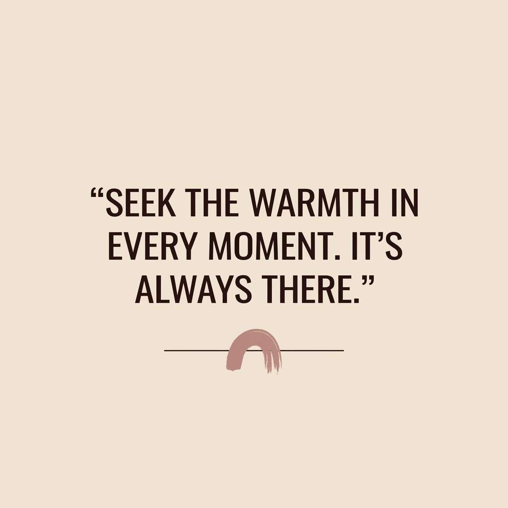
12) Dusty Rose Porcelain
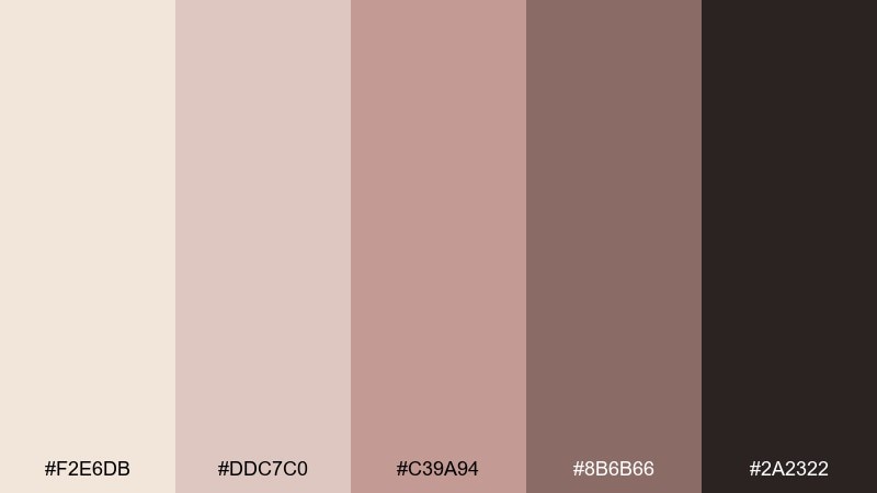
HEX: #f2e6db #ddc7c0 #c39a94 #8b6b66 #2a2322
Mood: soft, romantic, modern
Best for: social media post templates and creator kits
Soft and romantic, like porcelain with a dusty rose tint. The blush tones add warmth to quotes, promos, and lifestyle posts without feeling overly sweet. Pair with light paper textures and clean sans-serif type for a modern look. Usage tip: use the mid-rose for buttons or highlights and keep the background creamy for readability.
Image example of dusty rose porcelain generated using media.io
13) Pine and Parchment
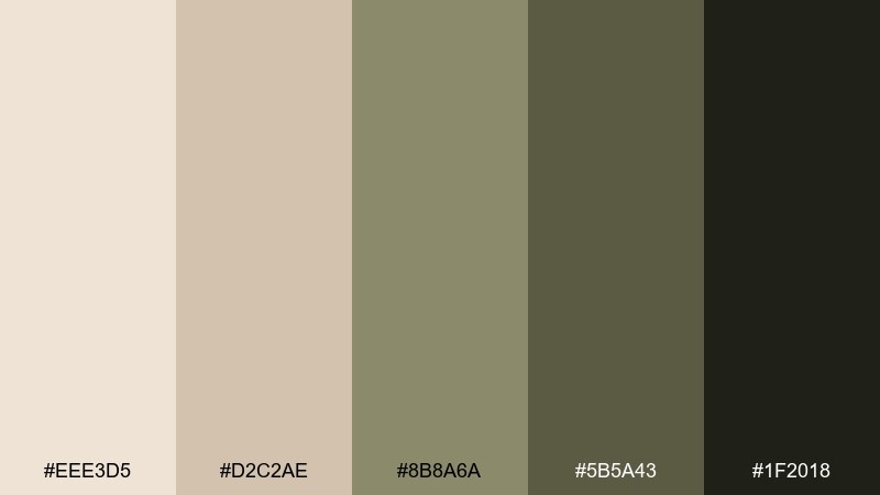
HEX: #eee3d5 #d2c2ae #8b8a6a #5b5a43 #1f2018
Mood: rustic, natural, grounded
Best for: restaurant menus and artisan food branding
Rustic and grounded, like pine needles on parchment paper. The earthy green gives menus and labels a farm-to-table personality without overpowering the neutrals. Pair with woodcut-style illustrations and simple section dividers. Usage tip: keep the green for headings and icons, and use the darker neutral for body copy.
Image example of pine and parchment generated using media.io
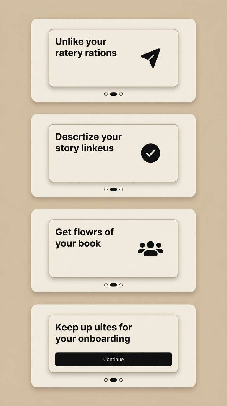
14) Midnight Ink Contrast
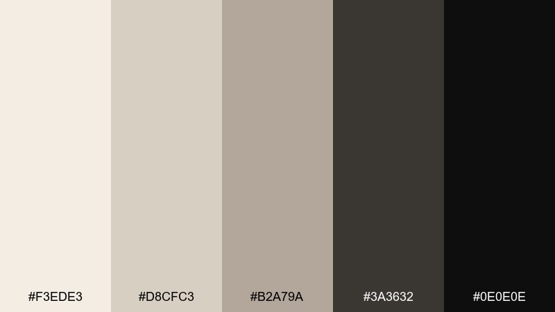
HEX: #f3ede3 #d8cfc3 #b2a79a #3a3632 #0e0e0e
Mood: sleek, high-contrast, modern
Best for: app onboarding screens and product UI
Sleek and high-contrast, like ink on creamy paper. The near-black adds crisp hierarchy for onboarding steps, while the warm neutrals keep the interface from feeling sterile. Pair with subtle shadows and rounded components for a modern, approachable finish. Usage tip: test accessibility early and push primary CTAs into the darkest tones for clear focus.
Image example of midnight ink contrast generated using media.io
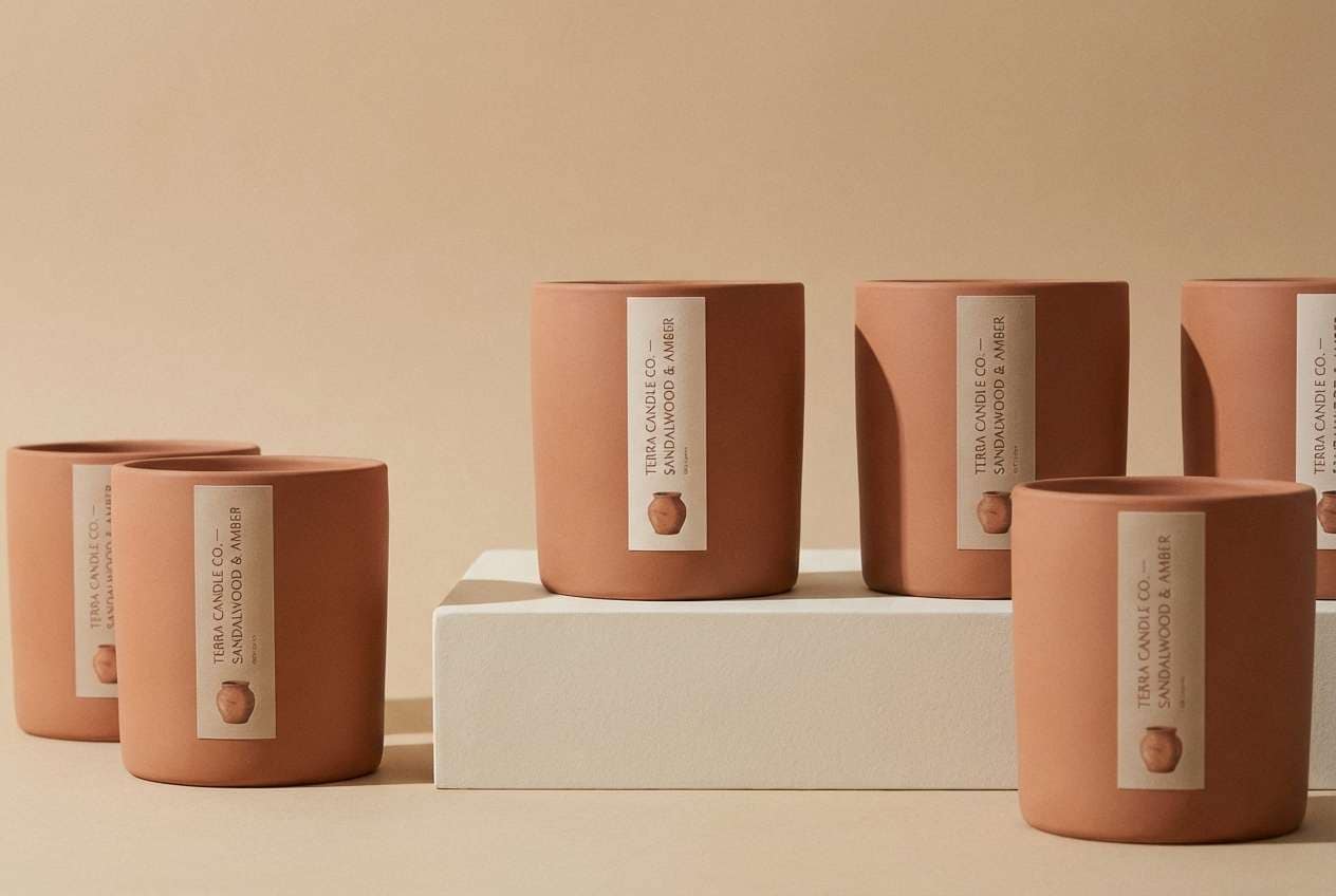
15) Terracotta Whisper
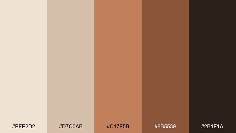
HEX: #efe2d2 #d7c0ab #c17f5b #8b5539 #2b1f1a
Mood: sunbaked, creative, artisan
Best for: ceramic packaging and craft product labels
Sunbaked and artisan, like terracotta dust on a studio floor. The clay accent brings energy to neutral packaging and makes handmade goods feel authentic. Pair with simple stamps, serif labels, and uncoated paper textures. Usage tip: use the terracotta as a single bold block and keep supporting elements muted.
Image example of terracotta whisper generated using media.io
16) Olive Grove Neutral
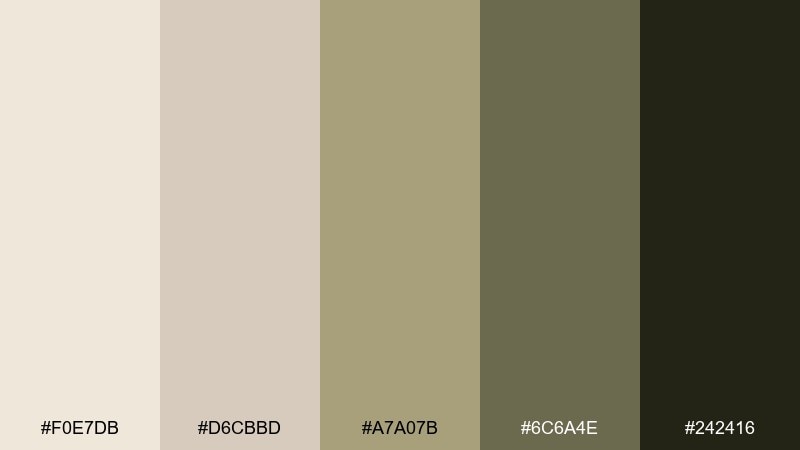
HEX: #f0e7db #d6cbbd #a7a07b #6c6a4e #242416
Mood: organic, calm, sustainable
Best for: eco labels and natural product packaging
Organic and calm, like olive leaves against creamy stone. This bone color scheme fits sustainable brands that want warmth without the usual beige monotony. Pair with recycled-paper textures and minimal line icons for ingredients and certifications. Usage tip: keep the olive tones for seals and headings, and leave plenty of light space for clarity.
Image example of olive grove neutral generated using media.io
17) Lavender Ash
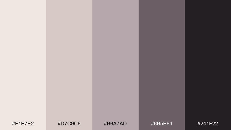
HEX: #f1e7e2 #d7c9c6 #b6a7ad #6b5e64 #241f22
Mood: dreamy, soft, quietly artistic
Best for: spring stationery and event invitations
Dreamy and quietly artistic, like lavender shadows on handmade paper. The muted mauve-gray feels modern for spring events and small brands that want gentle color. Pair with thin strokes, delicate patterns, and lots of breathing room. Usage tip: use the deepest shade for names and dates, and keep decorative elements in the soft midtones.
Image example of lavender ash generated using media.io
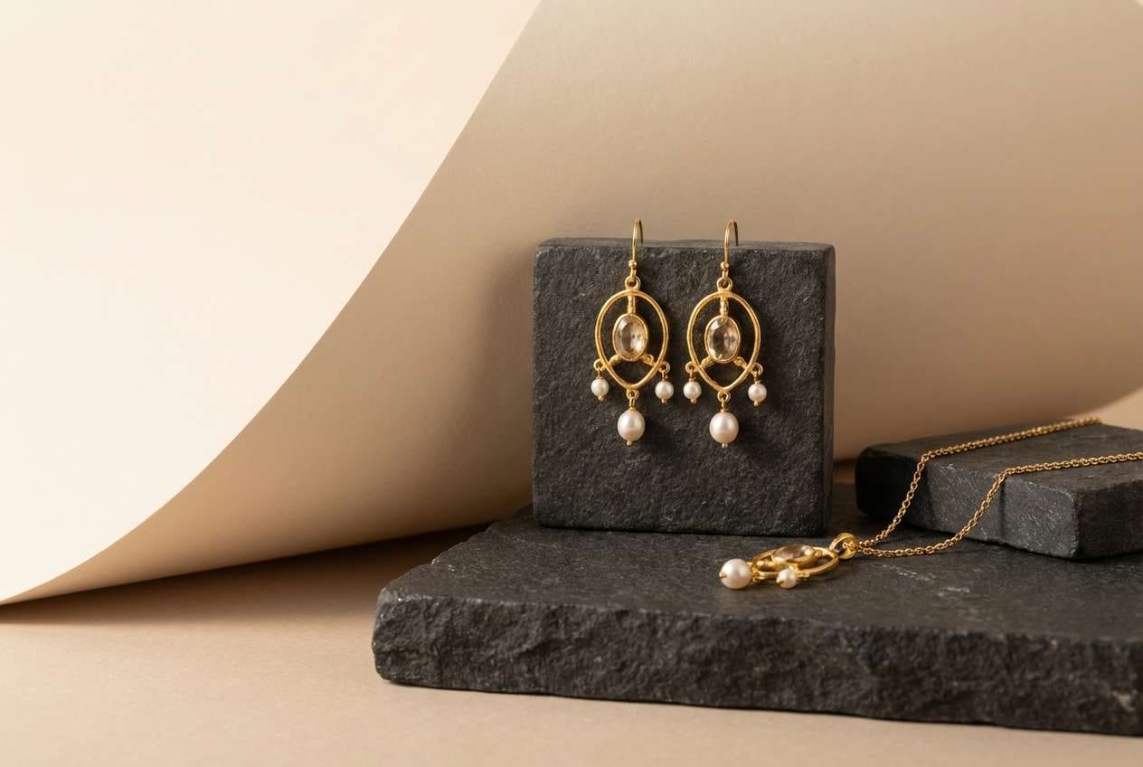
18) Pearl Smoke
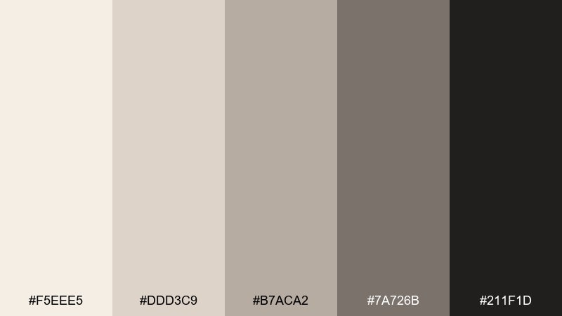
HEX: #f5eee5 #ddd3c9 #b7aca2 #7a726b #211f1d
Mood: polished, soft-luxe, timeless
Best for: jewelry product ads and premium ecommerce
Polished and soft-luxe, like pearl light in a smoky studio. The balanced neutrals help metal and gemstones stand out while keeping the overall look elevated. Pair with macro photography and minimal captions for a premium ecommerce feel. Usage tip: use the darker gray-brown for price and CTA text so it reads clearly on the creamy base.
Image example of pearl smoke generated using media.io
19) Sandstorm Gradient
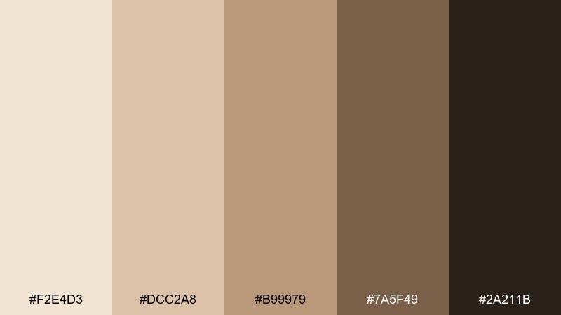
HEX: #f2e4d3 #dcc2a8 #b99979 #7a5f49 #2a211b
Mood: energetic, warm, modern
Best for: slide decks and presentation templates
Energetic and warm, like windblown sand shifting in layers. The stepped tones are ideal for gradients, section dividers, and clear hierarchy in slides. Pair with bold headlines and simple data visuals to keep it sharp. Usage tip: build two gradient ramps and reuse them consistently for titles and background panels.
Image example of sandstorm gradient generated using media.io
20) Winter Bone
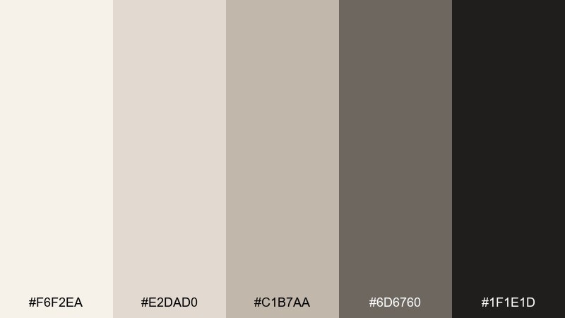
HEX: #f6f2ea #e2dad0 #c1b7aa #6d6760 #1f1e1d
Mood: crisp, quiet, light-filled
Best for: winter interior styling and minimalist home content
Crisp and quiet, like winter light on pale stone. These cool-warm neutrals keep spaces bright while still adding depth through the mid grays. Pair with black metal accents and textured knits to avoid a flat look. Usage tip: layer three light tones in large surfaces and save the darkest shade for a single focal detail.
Image example of winter bone generated using media.io
21) Sepia Studio
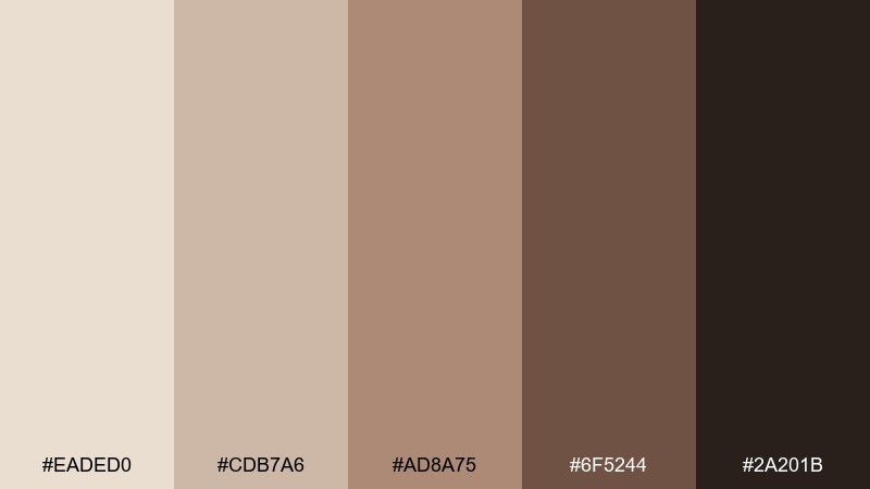
HEX: #eaded0 #cdb7a6 #ad8a75 #6f5244 #2a201b
Mood: nostalgic, warm, handcrafted
Best for: photography portfolios and creative landing pages
Nostalgic and handcrafted, like sepia prints drying in a studio. The warm range makes galleries and portfolios feel personal while still polished. Pair with large imagery, thin dividers, and simple navigation. Usage tip: keep backgrounds in the lightest tone and let thumbnails carry the richer mid-browns.
Image example of sepia studio generated using media.io
What Colors Go Well with Bone?
Bone pairs beautifully with grounded browns (espresso, walnut, cocoa) to create clear contrast and a premium, editorial feel. For softer hierarchy, add warm greige or taupe midtones between your light background and dark text.
For accents, muted botanicals (sage, olive) and clay tones (terracotta, cinnamon) bring warmth without overpowering the neutral base. If you need a cooler direction, dusty mauves and smoke grays keep things calm and modern.
In digital design, bone also works well with a single “utility” accent (muted teal, desaturated blue, or rust) for links, states, and charts—keeping UI readable while still human.
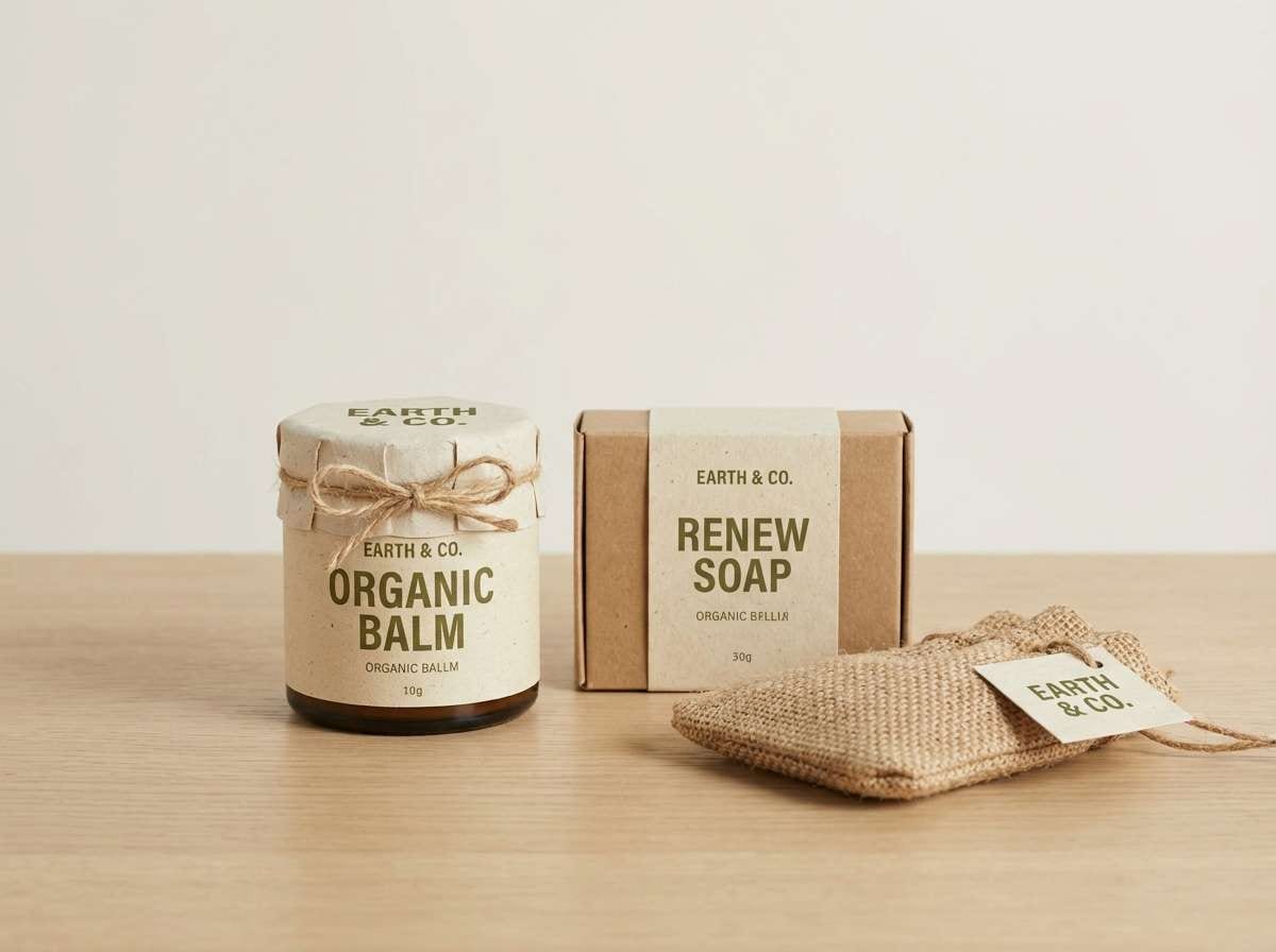
How to Use a Bone Color Palette in Real Designs
Start with bone as your main background, then pick one midtone for surfaces (cards, panels, secondary blocks) and one deep shade for text and primary CTAs. This three-level structure keeps layouts airy but still scannable.
For interiors and packaging, lean on texture: linen, uncoated paper, ceramics, oak, and stone make bone palettes feel intentional instead of “plain.” Use your darkest shade sparingly as an anchor—hardware, frames, labels, or logo marks.
When mixing warm and cool bone tones, keep the undertone consistent across large areas (walls/backgrounds) and use contrasting undertones only in small accents to avoid a muddy look.
Create Bone Palette Visuals with AI
If you want to preview how a bone palette will look in a room scene, UI mockup, poster, or product shot, generating a few variations quickly helps you choose the best direction before you design.
With Media.io Text-to-Image, you can paste a prompt, include your HEX codes, and generate on-brand visuals for moodboards, client presentations, or creative testing—right in the browser.
Try multiple aspect ratios and small prompt tweaks (materials, lighting, typography style) to explore warmer or cooler bone interpretations while keeping the same neutral foundation.
Bone Color Palette FAQs
-
What is the HEX code for bone color?
“Bone” doesn’t have a single universal HEX value, but it typically sits between warm off-white and light beige. In the palettes above, common bone-like bases include #f6f2ea, #f4efe6, #f3ede3, and #eee7dd. -
Is bone the same as ivory or beige?
Not exactly. Ivory often reads cleaner and slightly more yellow, while beige can be deeper and more saturated. Bone usually lands in the middle—soft, muted, and slightly warm with a subtle gray or sand undertone. -
What colors complement bone best?
Deep browns/near-black for contrast, warm greige midtones for softness, and earthy accents like sage, olive, terracotta, or dusty rose. These keep the palette natural while adding personality. -
How do I make a bone palette work for UI design?
Use bone as the page background, a slightly darker neutral for cards/dividers, and a near-black for text and primary buttons. Keep one accent color for links and status states, and always check contrast accessibility. -
Does bone color look too plain for branding?
It can if you use only light neutrals. Add one anchor shade (espresso/charcoal), introduce texture (paper grain, emboss, matte finishes), and use a single muted accent to create recognizable brand cues. -
What finishes and materials match bone tones in packaging?
Uncoated or recycled paper, soft-touch matte laminates, kraft textures, and subtle metallics (warm brass/gold) pair especially well with bone because they enhance the warm, premium feel without strong color noise. -
How can I generate bone palette images for moodboards quickly?
Use Media.io’s Text-to-Image tool: add a clear scene description (interior/UI/packaging), list your HEX codes, and set an aspect ratio. Generate a few variations and keep the best outputs for your board.


