

Prussian blue is a deep, inky classic that instantly adds credibility, calm, and structure to modern design. It reads more sophisticated than a typical navy, while still feeling familiar and usable across industries.
Below are 20 prussian blue color palette ideas (with HEX codes), plus practical pairing guidance and AI prompts you can reuse to generate matching visuals.
In this article
Why Prussian Blue Palettes Work So Well
Prussian blue sits in a sweet spot: dark enough to feel stable and premium, but not as flat or harsh as pure black. That makes it ideal for interfaces, branding, and editorial layouts where hierarchy and focus matter.
Because it’s a cool, deep anchor color, it pairs cleanly with both crisp neutrals (white, gray, silver) and warm accents (gold, ochre, terracotta). You can push it toward modern minimalism or classic heritage without changing the base.
It’s also practical: prussian blue supports high-contrast typography, creates strong navigation/CTA states, and keeps large backgrounds comfortable to look at for longer sessions.
20+ Prussian Blue Color Palette Ideas (with HEX Codes)
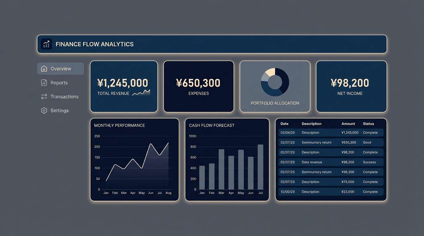
1) Midnight Harbor
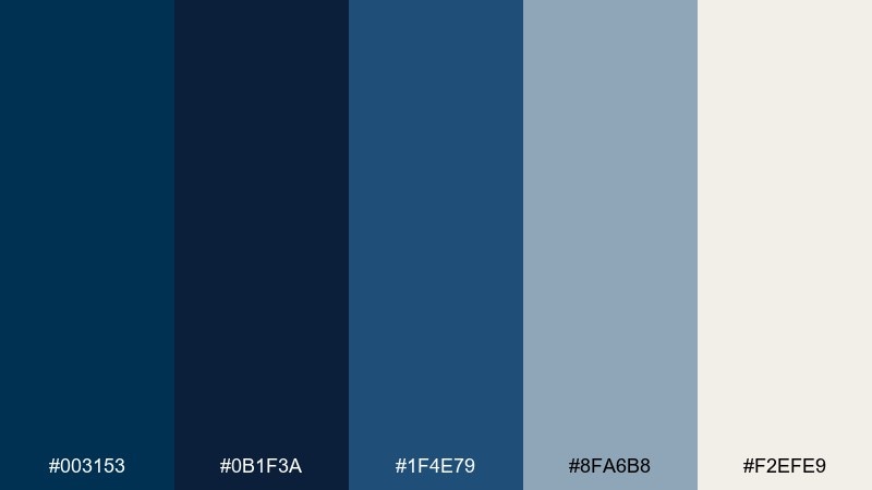
HEX: #003153 #0b1f3a #1f4e79 #8fa6b8 #f2efe9
Mood: moody, nautical, refined
Best for: finance dashboard UI
Moody harbor tones feel like deep water under dock lights, calm and focused. Use it for dashboards where hierarchy matters and contrast must stay comfortable for long sessions. Pair the dark blues with soft slate and warm off-white to keep tables and charts readable. Tip: reserve the light cream for key KPIs and alerts to avoid washing out the interface.
Image example of midnight harbor generated using media.io
Media.io is an online AI studio for creating and editing video, image, and audio in your browser.

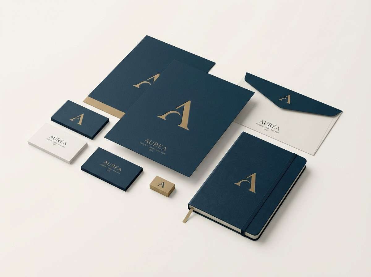
2) Museum Gold
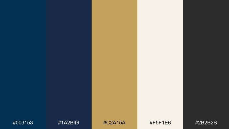
HEX: #003153 #1a2b49 #c2a15a #f5f1e6 #2b2b2b
Mood: classic, curated, premium
Best for: luxury brand identity
Classic and curated, it evokes gallery walls, gilt frames, and quiet confidence. This prussian blue color palette shines in luxury logos and stationery when you want heritage without feeling old-fashioned. Pair the gold with off-white for breathing room, and keep charcoal for typography and fine lines. Tip: use gold sparingly as a foil stamp or micro-accent to maintain a premium feel.
Image example of museum gold generated using media.io
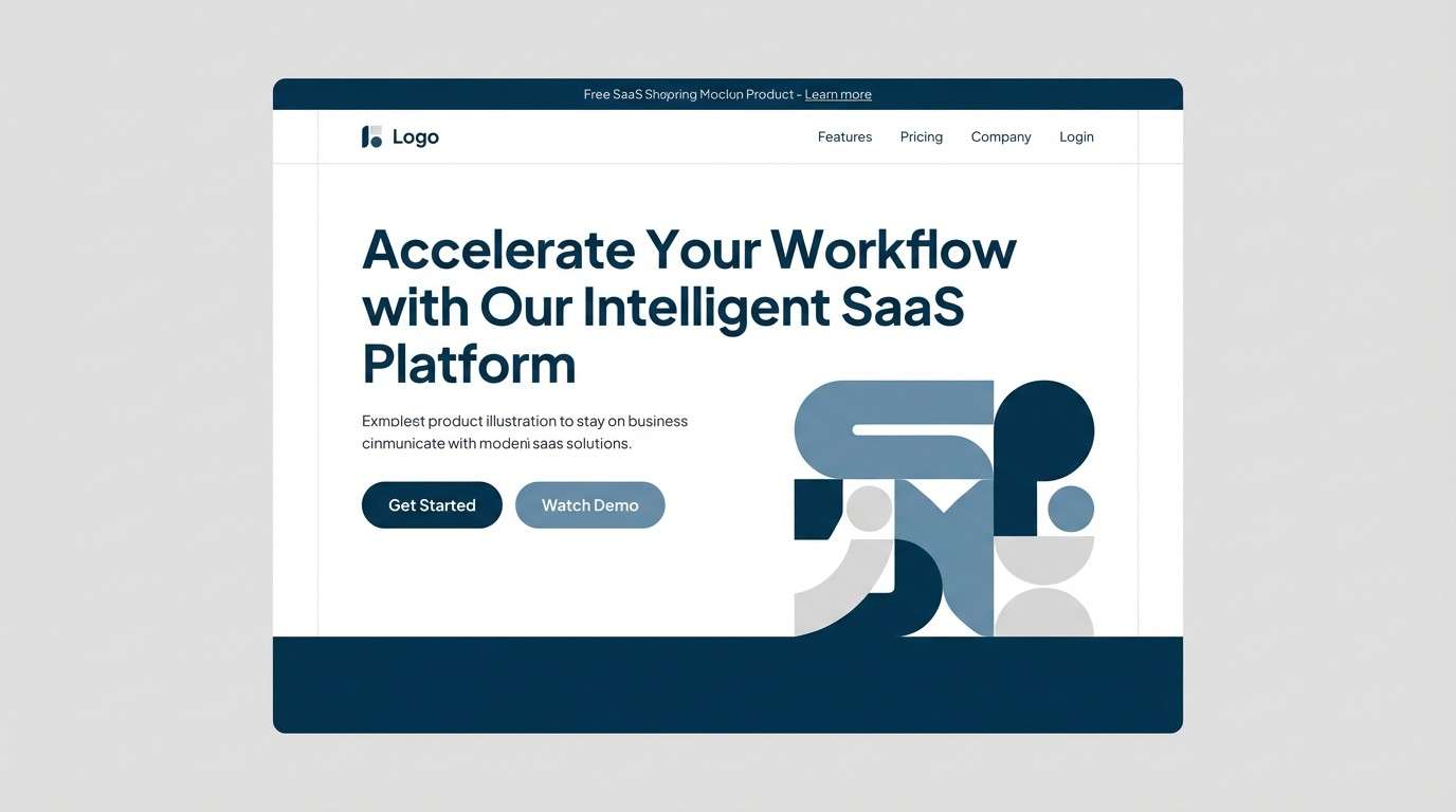
3) Frosted Steel
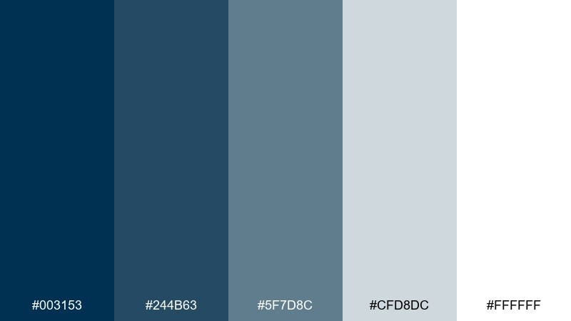
HEX: #003153 #244b63 #5f7d8c #cfd8dc #ffffff
Mood: cool, crisp, technical
Best for: SaaS landing page
Cool and crisp, these tones feel like brushed metal and winter air. They work especially well for SaaS sites that need clarity and a trustworthy edge. Pair the deep blue with steel-blue gradients and plenty of white space for a clean, scalable system. Tip: use the darkest shade for headings and primary buttons to anchor the page.
Image example of frosted steel generated using media.io
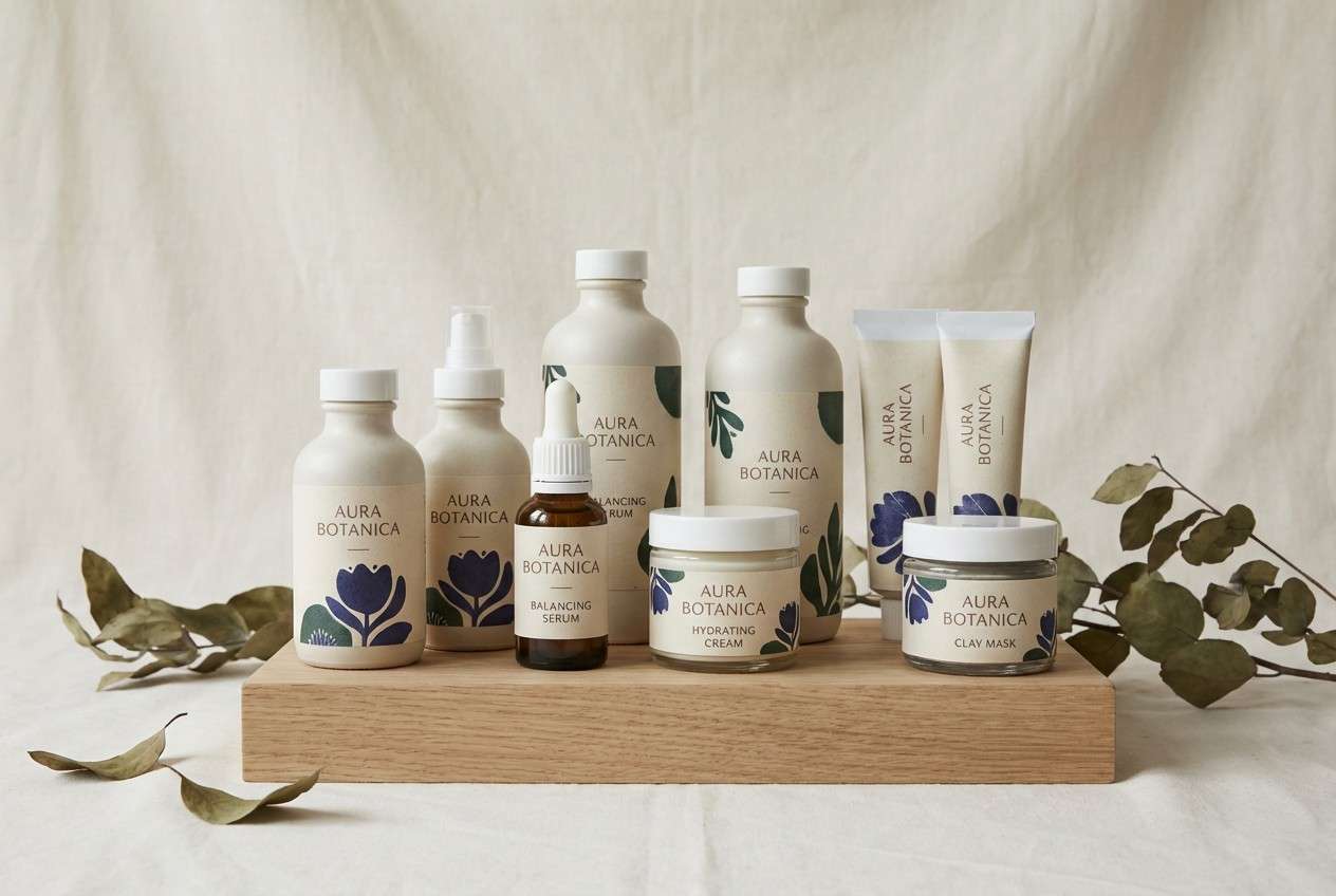
4) Botanical Ink
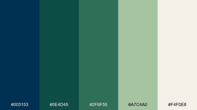
HEX: #003153 #0e4d45 #2f6f55 #a7c4a0 #f4f0e8
Mood: earthy, calming, botanical
Best for: natural skincare packaging
Earthy ink blues and leafy greens suggest apothecary labels and greenhouse calm. Use it on skincare packaging to signal clean ingredients while staying sophisticated. Pair the cream base with the muted greens for panels and ingredient lists, then let the deep blue carry the brand mark. Tip: keep finishes matte and use subtle texture to enhance the organic vibe.
Image example of botanical ink generated using media.io
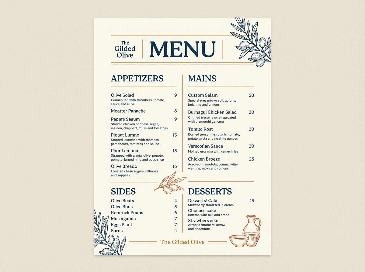
5) Sunset Ochre
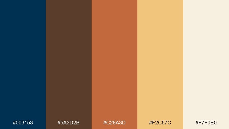
HEX: #003153 #5a3d2b #c26a3d #f2c57c #f7f0e0
Mood: warm, rustic, welcoming
Best for: restaurant menu design
Warm sunset ochres against deep blue feel like candlelight in a cozy dining room. This mix suits menus that want to feel artisanal, grounded, and inviting. Pair the blue for headings with ochre blocks for section dividers, and use the pale cream for legibility. Tip: keep body text dark brown to avoid harsh contrast while still reading clearly.
Image example of sunset ochre generated using media.io
6) Neon Signal
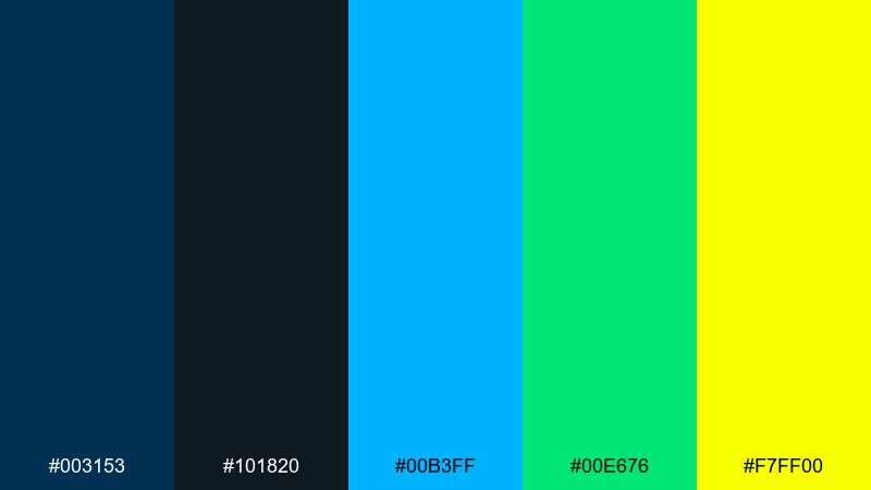
HEX: #003153 #101820 #00b3ff #00e676 #f7ff00
Mood: energetic, futuristic, bold
Best for: gaming poster
Electric highlights on a midnight base evoke arcade glow and fast-paced play. It is a strong choice for gaming creatives that need instant pop without losing depth. Pair cyan and neon green for key UI-like elements, then keep yellow as a rare hit for calls to action. Tip: use large dark areas so the brights feel intentional, not noisy.
Image example of neon signal generated using media.io

7) Velvet Plum
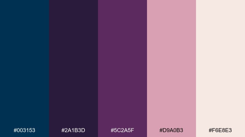
HEX: #003153 #2a1b3d #5c2a5f #d9a0b3 #f6e8e3
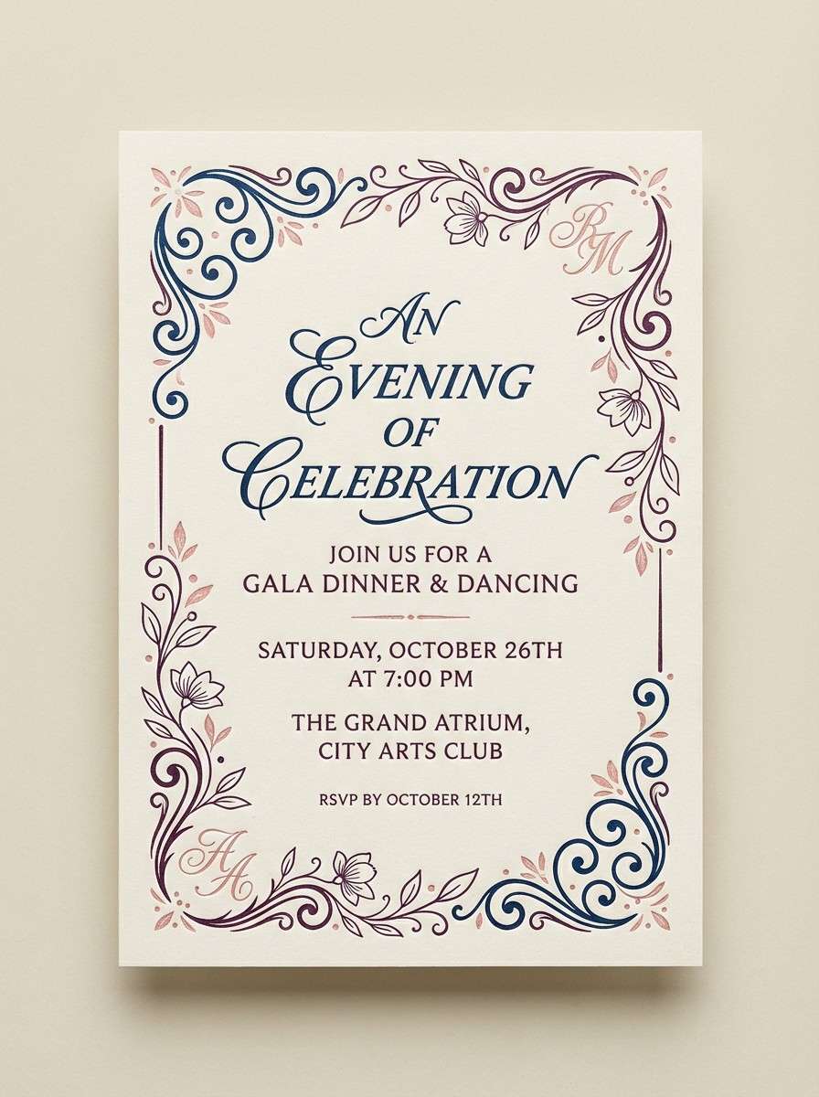
Mood: romantic, luxe, dramatic
Best for: evening event invitation
Romantic and luxe, it brings to mind velvet curtains and late-night cocktails. These prussian blue color combinations pair beautifully with plum for dramatic invitations and RSVP cards. Use blush as a soft counterbalance, and keep the light cream for margins and fine print. Tip: choose elegant serif type in the darkest tones to preserve the moody atmosphere.
Image example of velvet plum generated using media.io
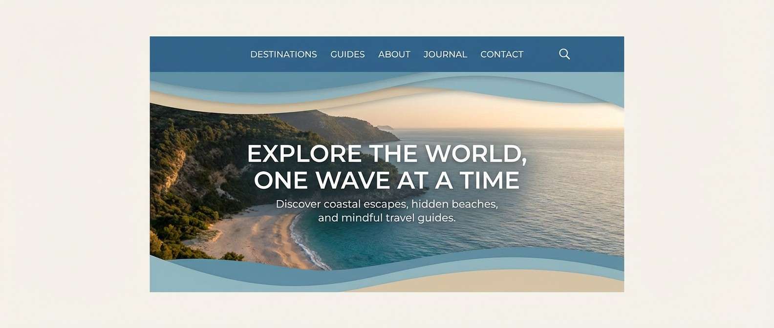
8) Coastal Sand
HEX: #003153 #1b365d #4a6fa5 #d9c7a3 #faf6ed
Mood: relaxed, breezy, coastal
Best for: travel blog header
Breezy blues with sandy neutrals feel like sea air and sun-bleached boardwalks. Use it for travel headers and section banners where you want calm optimism and clear structure. Pair the sand tone for backgrounds and buttons, letting the deeper blues handle titles and navigation. Tip: keep imagery consistent by choosing photos with cool shadows and warm highlights.
Image example of coastal sand generated using media.io
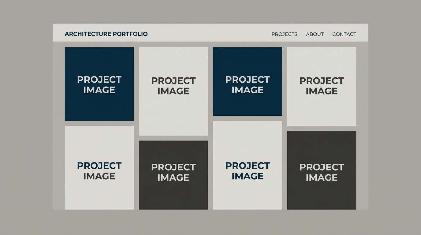
9) Concrete Loft
HEX: #003153 #2e3a44 #6c7a89 #b0bec5 #eceff1
Mood: industrial, modern, understated
Best for: architecture portfolio site
Understated and industrial, it recalls concrete, steel beams, and crisp blueprints. It fits architecture portfolios that need restraint while still feeling premium. Pair the darker tones for navigation and captions, and lean on the pale grays for airy galleries. Tip: add generous spacing so the cool palette never feels heavy.
Image example of concrete loft generated using media.io
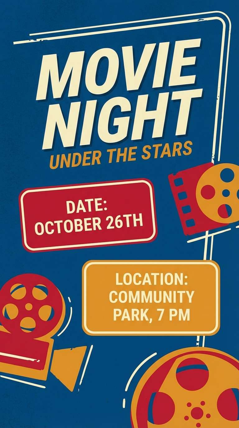
10) Cherry Ember
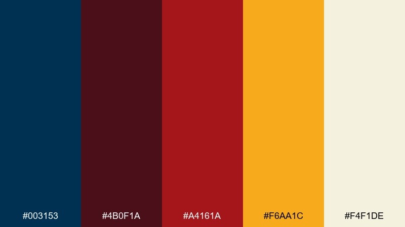
HEX: #003153 #4b0f1a #a4161a #f6aa1c #f4f1de
Mood: bold, cinematic, high contrast
Best for: movie night flyer
Cinematic contrast makes it feel like velvet seats, marquee lights, and a late show. Use it for flyers when you want energy and clear calls to action. Pair red as the attention color for dates and ticket info, while deep blue stabilizes the layout. Tip: keep the yellow to one or two elements so it reads like a spotlight, not clutter.
Image example of cherry ember generated using media.io
11) Arctic Aurora
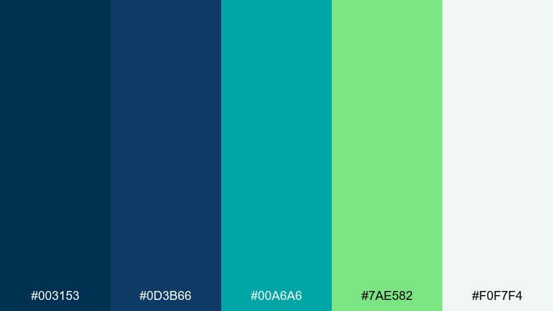
HEX: #003153 #0d3b66 #00a6a6 #7ae582 #f0f7f4
Mood: fresh, optimistic, airy
Best for: wellness app onboarding
Fresh and airy, it brings to mind aurora streaks over a clear winter sky. It works well for wellness onboarding screens where you want reassurance and gentle momentum. Pair teal and mint for progress indicators, and keep the deep blue for primary actions and labels. Tip: use soft gradients between teal and mint to keep transitions smooth.
Image example of arctic aurora generated using media.io
12) Paper and Ink
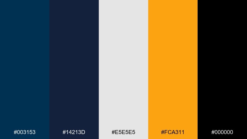
HEX: #003153 #14213d #e5e5e5 #fca311 #000000
Mood: editorial, punchy, modern
Best for: magazine layout
Editorial and punchy, it feels like fresh ink on clean paper with a bold pop of amber. This prussian blue color scheme is ideal for magazine spreads that need strong typography and sharp sectioning. Pair the amber for pull quotes and small badges, while gray and white keep columns airy. Tip: set body copy in near-black and reserve the deepest blue for headlines only.
Image example of paper and ink generated using media.io
13) Terracotta Studio
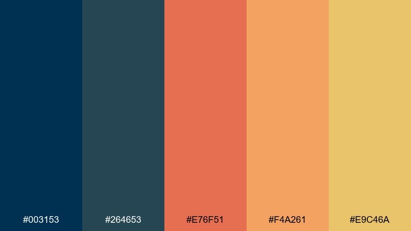
HEX: #003153 #264653 #e76f51 #f4a261 #e9c46a
Mood: creative, warm, contemporary
Best for: artist portfolio branding
Creative warmth meets deep blue structure, like clay on a studio shelf against painted walls. It is great for artist branding that wants personality without losing polish. Pair terracotta for highlights and buttons, and let the blue-green tones support backgrounds and headers. Tip: choose one warm color as the signature accent and keep the rest as supporting tones.
Image example of terracotta studio generated using media.io
14) Orchid Mist
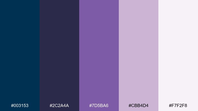
HEX: #003153 #2c2a4a #7d5ba6 #cbb4d4 #f7f2f8
Mood: soft, dreamy, modern romantic
Best for: beauty product ad
Dreamy purples and inky blues feel like a soft-focus evening and sheer fabric. Use it for beauty ads when you want romance that still reads modern and clean. Pair the pale lavender as a background wash and keep prussian depth for the product name and claims. Tip: add a single strong contrast element, like a deep button or badge, to improve scannability.
Image example of orchid mist generated using media.io
15) Rainy Boulevard
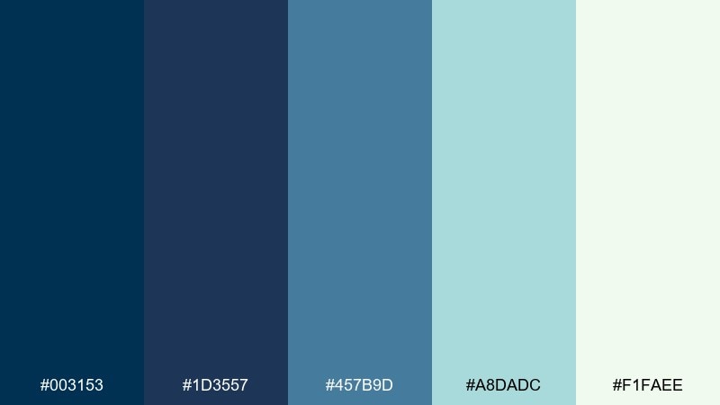
HEX: #003153 #1d3557 #457b9d #a8dadc #f1faee
Mood: fresh, urban, contemplative
Best for: news app UI
Fresh and contemplative, it suggests rain on city pavement with bright reflections. This prussian blue color palette works for news apps where credibility and readability are non-negotiable. Pair the lighter aqua for tags and secondary states, and keep the deepest shades for headers and nav. Tip: maintain consistent contrast ratios by using the off-white for article backgrounds instead of pure white.
Image example of rainy boulevard generated using media.io
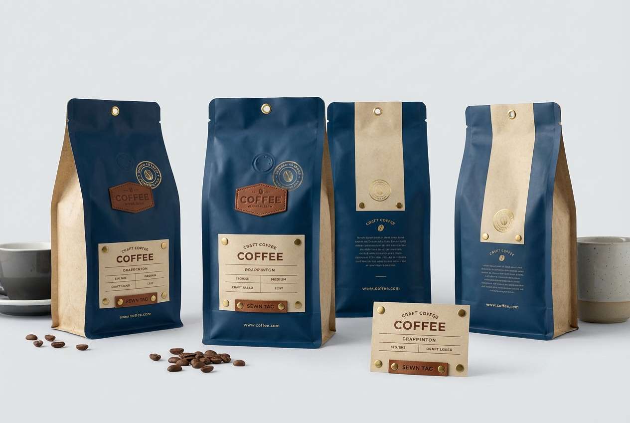
16) Brass and Leather
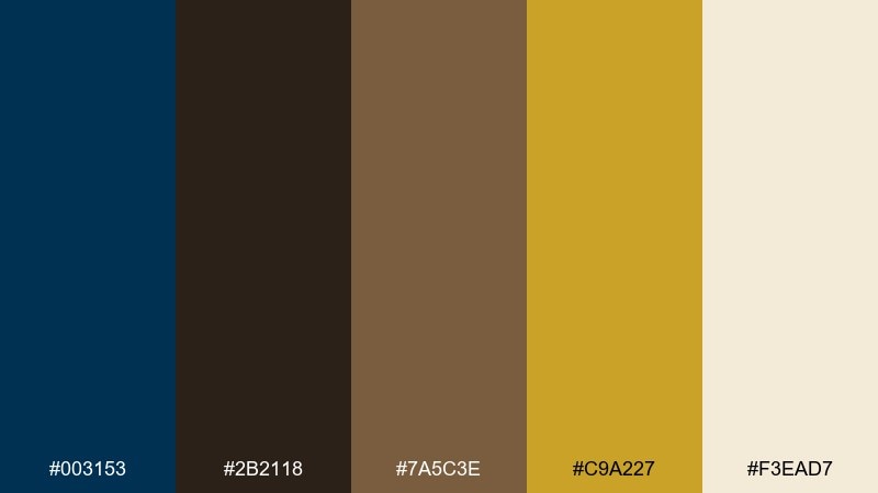
HEX: #003153 #2b2118 #7a5c3e #c9a227 #f3ead7
Mood: heritage, masculine, crafted
Best for: coffee packaging
Heritage tones bring to mind a leather-bound journal beside warm brass hardware. It suits coffee packaging that wants craft credibility and a slightly vintage edge. Pair the gold for seals and small icons, while deep blue and espresso browns hold the brand name and roast notes. Tip: keep textures subtle and let the color contrast do the storytelling.
Image example of brass and leather generated using media.io
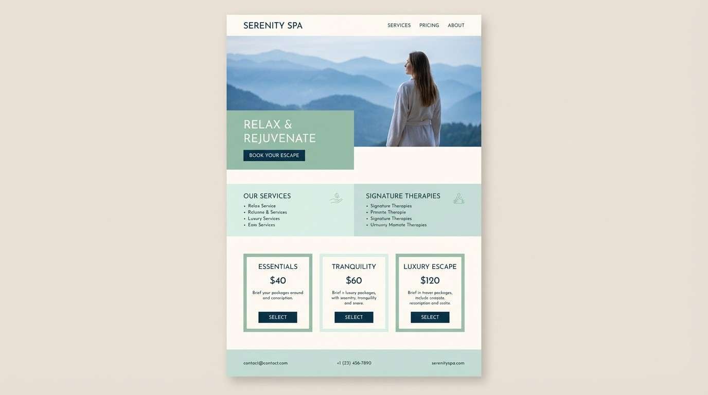
17) Celadon Calm
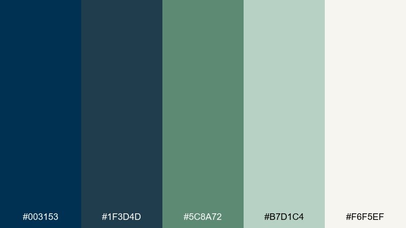
HEX: #003153 #1f3d4d #5c8a72 #b7d1c4 #f6f5ef
Mood: balanced, soothing, natural
Best for: spa website
Soothing and balanced, it feels like steam, eucalyptus, and quiet tile. Use it for spa sites where visitors should slow down and trust the experience. Pair celadon backgrounds with deep blue CTAs, and let the off-white carry long-form text. Tip: use rounded UI elements and thin dividers to keep the calm, airy rhythm.
Image example of celadon calm generated using media.io
18) Citrus Note
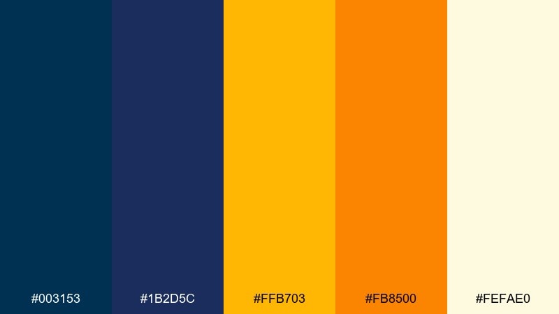
HEX: #003153 #1b2d5c #ffb703 #fb8500 #fefae0
Mood: bright, confident, modern
Best for: podcast cover art
Bright citrus on a deep blue base feels like a clean beat drop and a burst of energy. It is excellent for podcast covers that need to stand out at thumbnail size. Pair orange for the title block and keep yellow for small sparks, icons, or episode numbers. Tip: use bold sans-serif type and thick shapes so the contrast reads instantly.
Image example of citrus note generated using media.io

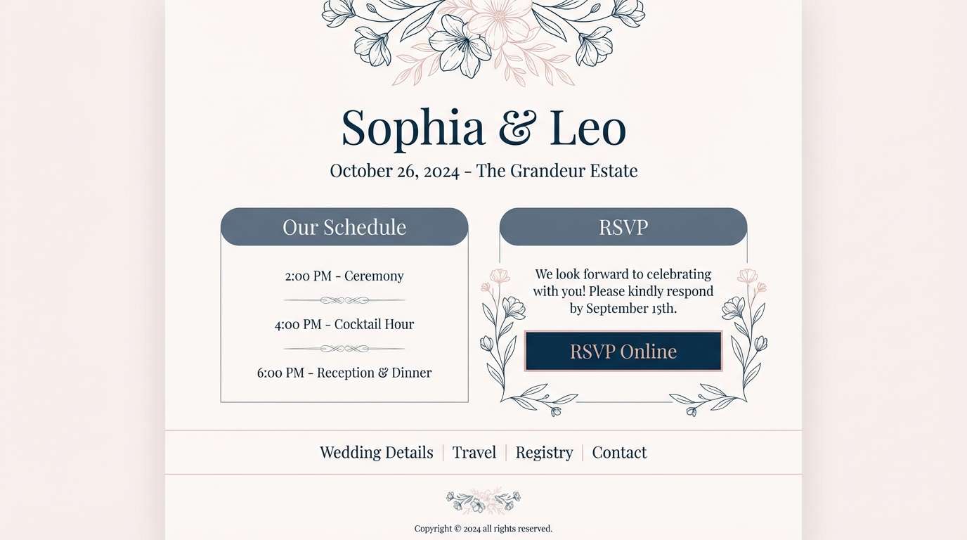
19) Rose Slate
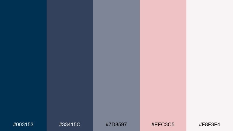
HEX: #003153 #33415c #7d8597 #efc3c5 #f8f3f4
Mood: soft, mature, contemporary
Best for: wedding website
Soft slate and rose feel like pressed flowers tucked into a modern envelope. These prussian blue color combination options add sophistication to wedding pages without going overly traditional. Pair the blush for highlights and section headers, and use the deep blue for navigation and RSVP buttons. Tip: keep backgrounds pale and let the darker tones carry structure and accessibility.
Image example of rose slate generated using media.io
20) Galaxy Chalk
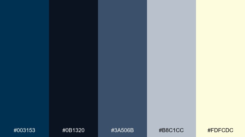
HEX: #003153 #0b1320 #3a506b #b8c1cc #fdfcdc
Mood: academic, thoughtful, modern
Best for: online course slides
Thoughtful and academic, it suggests a chalkboard night sky and neat lecture notes. Use it for course slides where clarity and rhythm matter more than decoration. Pair the soft yellow for key takeaways and the pale gray for diagrams and captions, keeping the darkest tones for titles. Tip: limit each slide to one accent color so the content stays the hero.
Image example of galaxy chalk generated using media.io

What Colors Go Well with Prussian Blue?
Prussian blue pairs effortlessly with clean neutrals like off-white, warm cream, light gray, and charcoal. These combinations keep layouts readable and let the blue carry structure in headers, navigation, and primary buttons.
For a premium look, add metallic-inspired accents such as muted gold, brass, or copper tones. For a more playful, modern edge, introduce bright signals like cyan, citrus yellow, or orange—just keep them limited so the palette stays refined.
It also blends well with nature-leaning hues: celadon, sage, deep teal, and dusty rose. These soften the intensity of the blue and are great for wellness, beauty, and lifestyle designs.
How to Use a Prussian Blue Color Palette in Real Designs
Use prussian blue as your anchor: backgrounds, hero blocks, nav bars, or strong headline color. Then choose one light neutral (off-white/cream) to protect readability for long-form text and dense UI components.
Pick one accent role and stick to it: either a warm highlight (gold/ochre/terracotta) for CTA moments, or a cool highlight (teal/cyan/mint) for status states and secondary emphasis. Consistency helps the design feel intentional.
When in doubt, scale by contrast: darkest tones for titles and primary actions, mid tones for panels and borders, and light tones for surfaces. This keeps hierarchy clear without needing too many extra decorative elements.
Create Prussian Blue Palette Visuals with AI
If you already have HEX codes, you can generate matching mockups quickly by describing the layout and letting the palette drive the mood. Reuse the prompts above to create consistent visuals for branding boards, UI screens, packaging, and posters.
With Media.io, you can turn a prussian blue color scheme into polished images in minutes—then iterate by swapping accents (gold, terracotta, mint) while keeping the same deep-blue foundation.
Start with one palette, generate a few variations, and keep the best-performing look for your brand system or campaign creative.
Prussian Blue Color Palette FAQs
-
What is the HEX code for prussian blue?
A commonly used prussian blue HEX is #003153. It’s a deep, cool blue that works well as an anchor color for UI, branding, and editorial designs. -
Is prussian blue closer to navy or royal blue?
Prussian blue is closer to navy, but it typically looks inkier and slightly greener/steelier than many standard navies, which makes it feel more refined and “museum-like.” -
What accent colors work best with prussian blue?
Warm accents like muted gold, ochre, terracotta, and amber create premium contrast, while cool accents like teal, mint, and cyan give a modern, technical feel. -
Can I use prussian blue for backgrounds in web design?
Yes—use prussian blue for hero sections, nav, or dark-mode surfaces, then pair it with off-white/cream cards and accessible text contrast to avoid eye strain. -
What’s a good prussian blue palette for a luxury brand?
Try a prussian blue + muted gold + warm off-white combination (like “Museum Gold”) with charcoal typography for a classic, premium identity. -
What’s a good prussian blue palette for wellness or spa design?
Pair prussian blue with celadon or mint greens and soft off-whites (like “Celadon Calm” or “Arctic Aurora”) to keep the mood calm, airy, and trustworthy. -
How do I keep bright accents from overpowering prussian blue?
Use bright colors (cyan, neon green, yellow, orange) sparingly as micro-accents or CTA highlights, and leave plenty of dark negative space so the palette stays controlled.
Next: Lava Color Palette


