

Scarlet is bold without being harsh: it brings instant focus, emotion, and premium energy to branding, UI, and print. When it’s balanced with the right neutrals, metals, and deep greens, scarlet feels intentional—not overwhelming.
Below are 20 curated scarlet color palette ideas with HEX codes, mood notes, and practical pairing tips you can apply to real layouts, labels, posters, and interfaces.
In this article
Why Scarlet Color Combinations Work So Well
Scarlet sits in a “high-attention” zone of the spectrum, so it naturally guides the eye to key UI actions, headlines, price points, and hero visuals. That makes it ideal when you need clarity and urgency without relying on heavy effects.
It’s also a flexible red: scarlet can read modern and energetic when paired with crisp whites and charcoal, or classic and luxurious when balanced with creams, wine tones, and metallics. The supporting colors determine whether scarlet feels playful, cinematic, or refined.
Most importantly, scarlet rewards restraint. When you treat it as an accent (rather than a full-page fill), your layouts keep contrast clean, printing stays predictable, and your brand color feels premium instead of noisy.
20+ Scarlet Color Palette Ideas (with HEX Codes)
1) Crimson Atelier
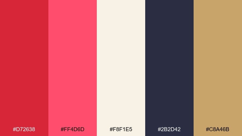
HEX: #d72638 #ff4d6d #f8f1e5 #2b2d42 #c8a46b
Mood: artful, confident, gallery-chic
Best for: premium branding and lookbooks
Artful and confident, this scarlet mix feels like a modern gallery opening with velvet accents and warm spotlighting. Use it for premium branding, editorials, and refined packaging where you want scarlet to read polished, not loud. Pair the deep charcoal with the soft cream for legibility, then reserve the gold as a subtle highlight. Tip: keep the pink-rose as a secondary accent for headlines or small tags to avoid oversaturation.
Image example of crimson atelier generated using media.io
Media.io is an online AI studio for creating and editing video, image, and audio in your browser.

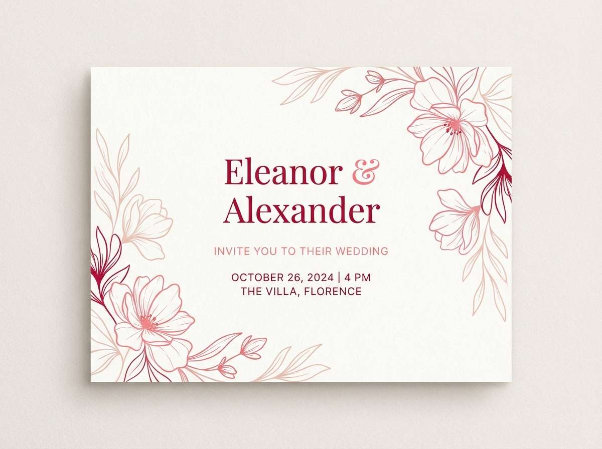
2) Poppy Porcelain
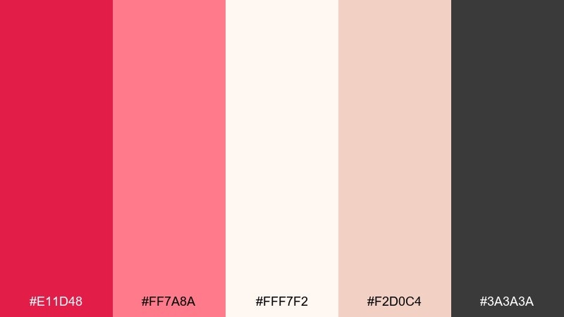
HEX: #e11d48 #ff7a8a #fff7f2 #f2d0c4 #3a3a3a
Mood: soft, romantic, airy
Best for: wedding invitations and beauty flyers
Soft and romantic, it evokes porcelain blush, fresh petals, and a bright morning glow. this scarlet color palette works beautifully for invitations, beauty promos, and delicate stationery where the red feels friendly rather than intense. Let the warm off-white carry most of the background, then use the poppy hue for names, dates, or a single hero element. Tip: keep body text in the charcoal to preserve contrast on pastel areas.
Image example of poppy porcelain generated using media.io
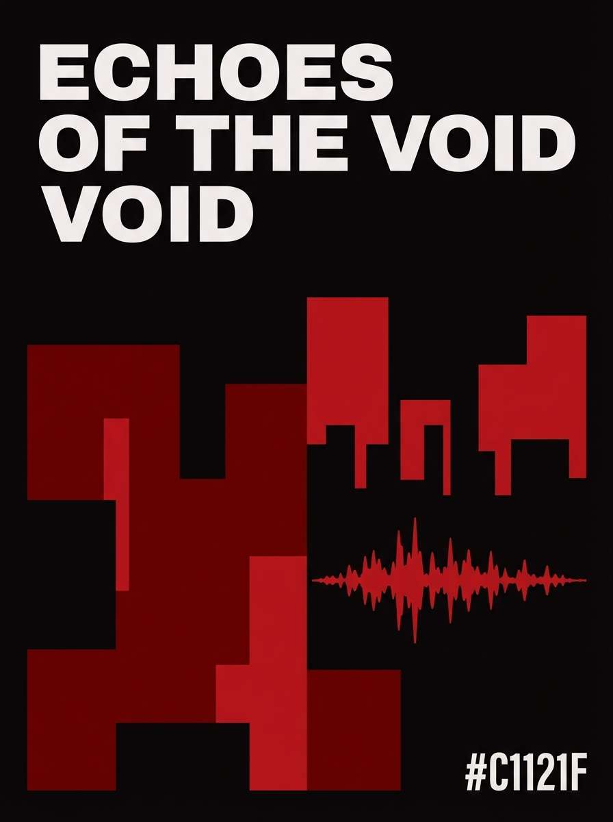
3) Scarlet Noir
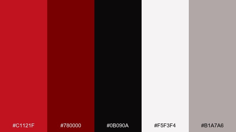
HEX: #c1121f #780000 #0b090a #f5f3f4 #b1a7a6
Mood: dramatic, cinematic, luxe
Best for: posters and night-mode UI accents
Dramatic and cinematic, it feels like velvet curtains, dim lights, and a sharp red spotlight. Use it for posters, album art, or dark UI accents where contrast needs to be crisp. The near-black and deep maroon should carry most surfaces, while the bright scarlet is best saved for calls to action. Tip: add the cool gray as a divider color to keep layouts from feeling heavy.
Image example of scarlet noir generated using media.io
4) Terracotta Sunset
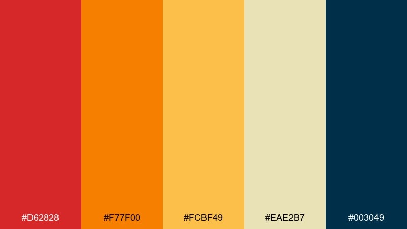
HEX: #d62828 #f77f00 #fcbf49 #eae2b7 #003049
Mood: warm, energetic, outdoorsy
Best for: travel ads and event posters
Warm and energetic, it brings to mind sunbaked walls, citrus skies, and a late-day horizon. This scarlet color palette shines in travel promos, summer events, and bold social graphics where warmth should dominate. Use the navy as a grounding counterweight for headlines or icons, and keep the pale sand for breathing room. Tip: limit the orange to supportive shapes so the red stays the hero.
Image example of terracotta sunset generated using media.io

5) Berry Rosewood
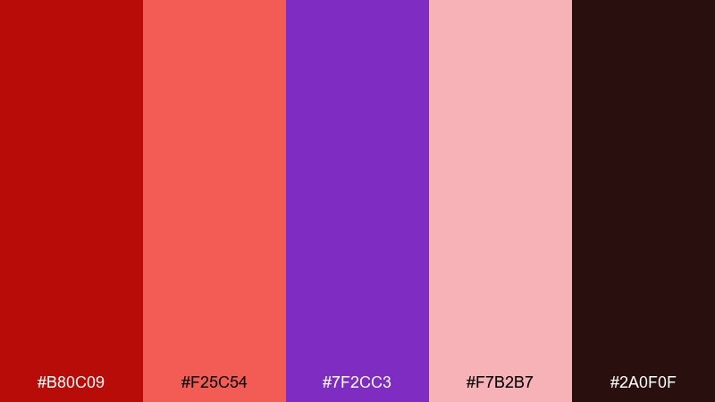
HEX: #b80c09 #f25c54 #7f2cc3 #f7b2b7 #2a0f0f
Mood: bold, playful, nightlife
Best for: music festival graphics and merch
Bold and playful, it feels like neon signs bouncing off berry-toned lipstick and dark wood bars. It works well for nightlife promotions, festival graphics, and merch that needs punchy contrast. Let the near-black brown carry the base, then pop the bright coral for titles and badges. Tip: use the purple sparingly as a surprise accent on icons or small patterns.
Image example of berry rosewood generated using media.io
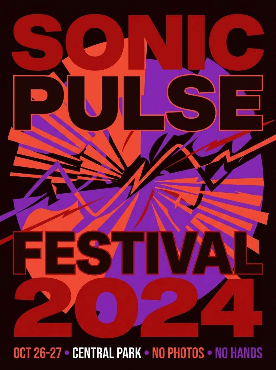
6) Carnival Ribbon
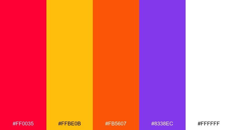
HEX: #ff0035 #ffbe0b #fb5607 #8338ec #ffffff
Mood: festive, loud, youthful
Best for: social banners and playful app onboarding
Festive and loud, it evokes confetti, prize ribbons, and a bright weekend street fair. Use it for youth-focused social banners, playful onboarding screens, or campaign graphics that need instant energy. Keep the white as the main breathing space so the saturated hues do not clash. Tip: choose one dominant warm color and let the purple serve as a small counter-accent for buttons or stickers.
Image example of carnival ribbon generated using media.io
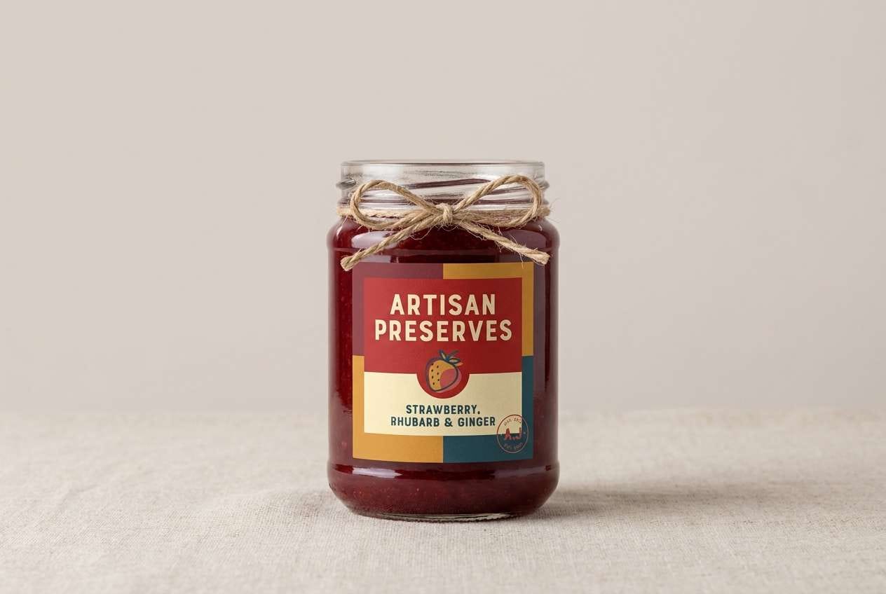
7) Autumn Market
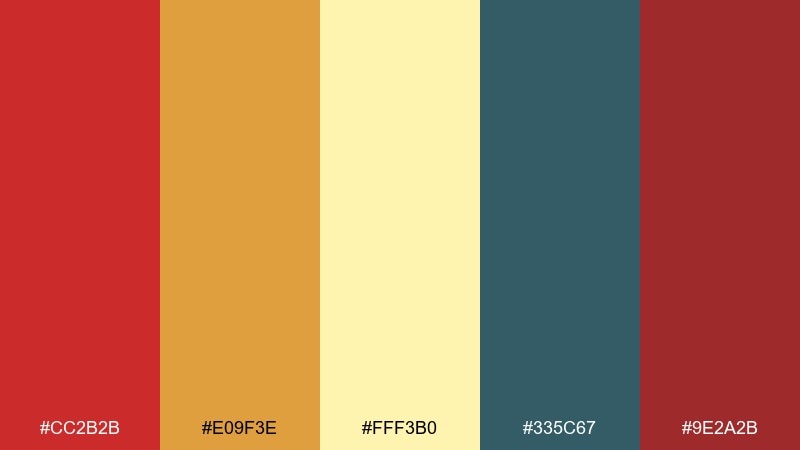
HEX: #cc2b2b #e09f3e #fff3b0 #335c67 #9e2a2b
Mood: rustic, cozy, artisan
Best for: food packaging and farmers market signage
Rustic and cozy, it suggests spice jars, harvest baskets, and handwritten labels on kraft paper. These scarlet color combinations fit food packaging, cafe menus, and farmers market signage where warmth and trust matter. Balance the reds with the buttery yellow for openness, and use the muted teal for contrast on small callouts. Tip: print tests help here, since the two reds can merge if over-inked.
Image example of autumn market generated using media.io
8) Cherry Blossom Ink
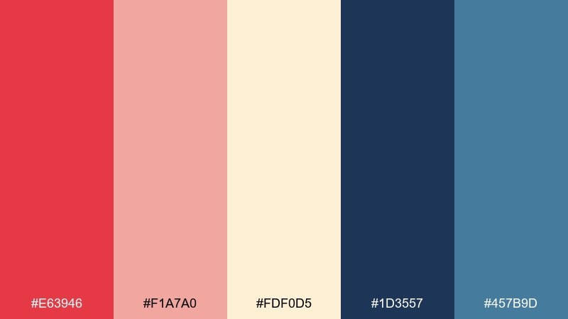
HEX: #e63946 #f1a7a0 #fdf0d5 #1d3557 #457b9d
Mood: fresh, elegant, modern classic
Best for: editorial layouts and book covers
Fresh and elegant, it feels like petals drifting across crisp paper with a splash of ink. It suits editorial spreads, book covers, and cultural event programs where you want refined contrast. Use the navy for structure and typography, then let the cherry red appear in titles or section markers. Tip: keep the dusty pink as a soft background wash to reduce harsh transitions.
Image example of cherry blossom ink generated using media.io
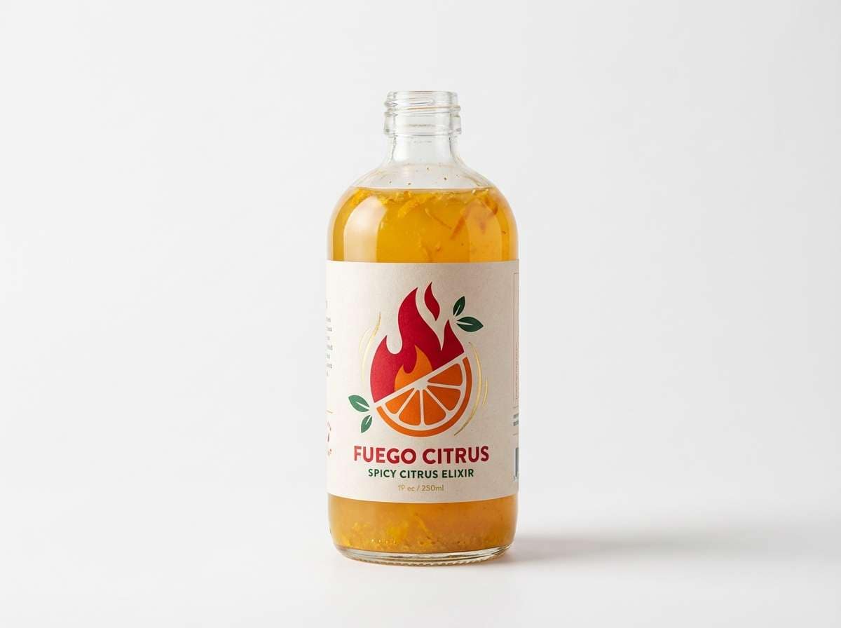
9) Spiced Citrus
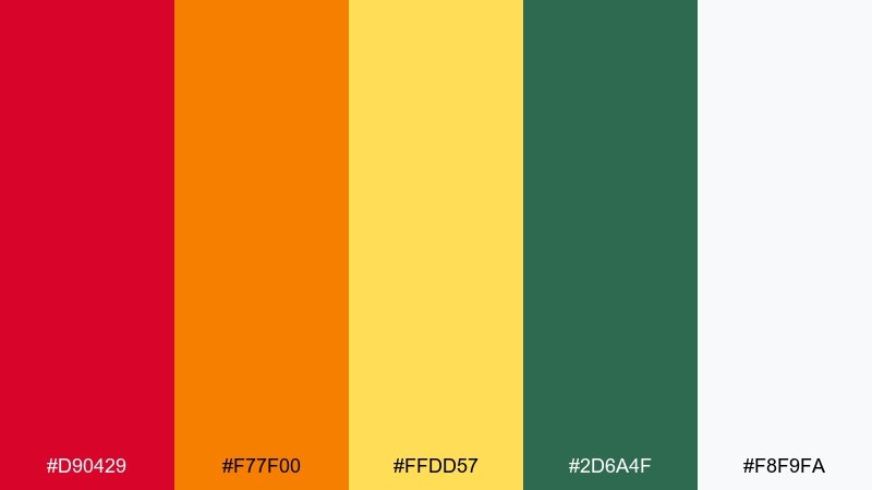
HEX: #d90429 #f77f00 #ffdd57 #2d6a4f #f8f9fa
Mood: zesty, bright, appetizing
Best for: restaurant promos and product ads
Zesty and appetizing, it recalls chili heat, orange peel, and herb garnish. It is ideal for restaurant promos, beverage ads, and punchy product banners that need to feel fresh. Let the scarlet lead the headline area, then use the green as a contrasting cue for natural or spicy notes. Tip: keep the yellow for highlights and price tags so it does not overpower the main red.
Image example of spiced citrus generated using media.io
10) Modern Heritage
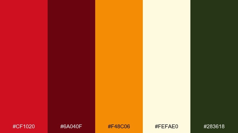
HEX: #cf1020 #6a040f #f48c06 #fefae0 #283618
Mood: classic, grounded, upscale rustic
Best for: heritage brands and boutique hotels
Classic and grounded, it suggests old-world signage, leather details, and a warm lobby glow. Use it for heritage branding, boutique hotel collateral, or packaging that needs a timeless feel. Keep the cream as the primary background, then layer the deep wine and forest for typography and borders. Tip: the orange works best as a small badge color for offers or section labels.
Image example of modern heritage generated using media.io
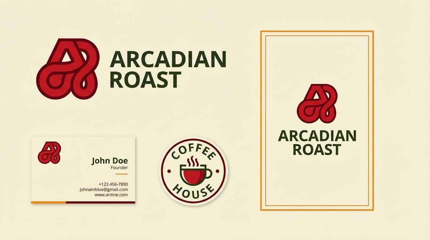
11) Garnet Sage
HEX: #b31312 #e85d75 #d8f3dc #40916c #2d2a32
Mood: balanced, botanical, sophisticated
Best for: wellness branding and spa menus
Balanced and botanical, it feels like fresh herbs against a rich berry glaze. These scarlet color combinations work for wellness branding, spa menus, and natural skincare where you want warmth plus calm. Use the minty green as the dominant background and bring in garnet for key actions and section headers. Tip: keep the charcoal for body text so the softer greens stay readable.
Image example of garnet sage generated using media.io
12) Studio Spotlight
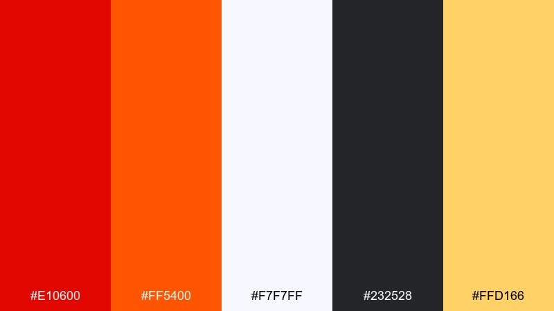
HEX: #e10600 #ff5400 #f7f7ff #232528 #ffd166
Mood: high-impact, modern, punchy
Best for: landing pages and campaign hero sections
High-impact and modern, it reads like stage lights on a clean set with crisp shadows. It is perfect for landing pages and campaign hero sections where you need attention fast. Anchor the layout in off-white and charcoal, then let the scarlet and orange drive buttons and key stats. Tip: use the warm yellow only for micro-highlights, such as icons or notification dots.
Image example of studio spotlight generated using media.io
13) Vintage Postcard
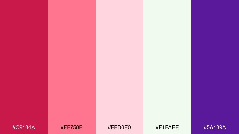
HEX: #c9184a #ff758f #ffd6e0 #f1faee #5a189a
Mood: nostalgic, playful, dreamy
Best for: valentine cards and retro posters
Nostalgic and dreamy, it feels like faded ink, love notes, and a hint of candy-shop charm. Use it for valentine campaigns, retro posters, or playful stationery with a modern twist. Keep the pale pinks as the backdrop, then bring in the purple for punchy contrast in type or icons. Tip: the deeper magenta works best on small elements like stamps, seals, and price bursts.
Image example of vintage postcard generated using media.io

14) Ruby Minimal
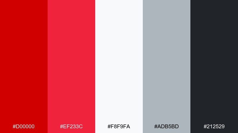
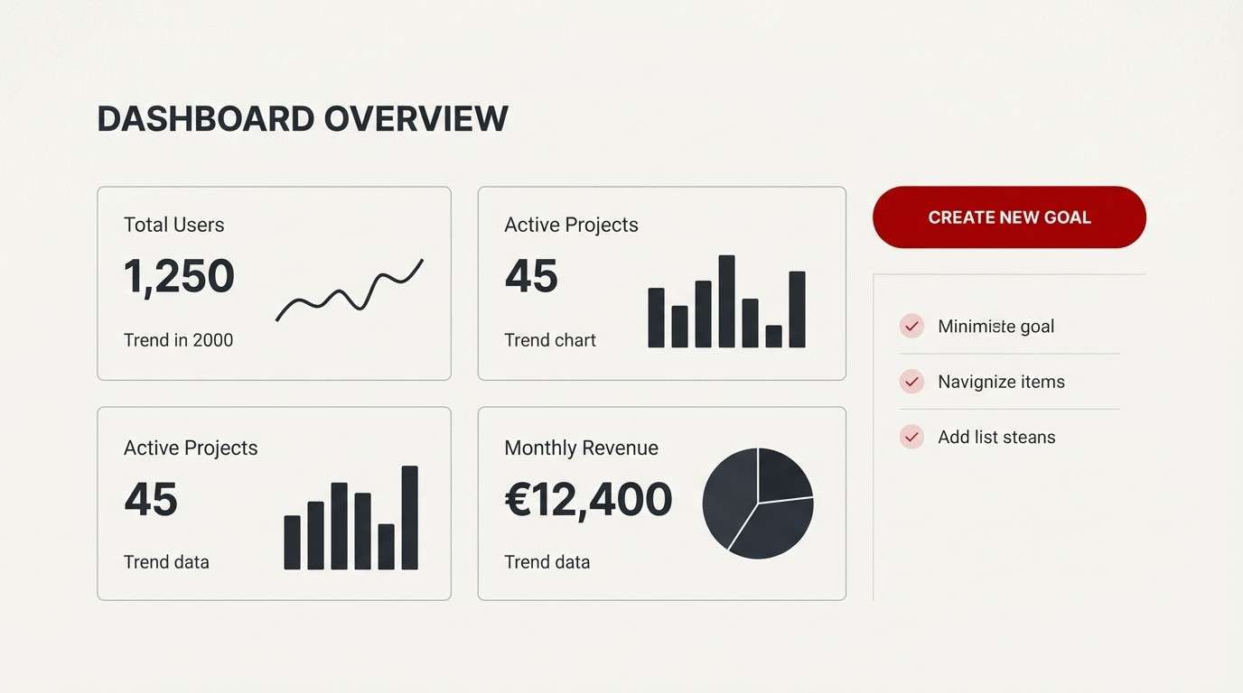
HEX: #d00000 #ef233c #f8f9fa #adb5bd #212529
Mood: clean, bold, minimalist
Best for: startup UI and brand guidelines
Clean and bold, it evokes a crisp white canvas with a decisive red mark. This scarlet color palette is great for startup UI, brand guidelines, and product pages that need clear hierarchy. Use the near-black for primary text and the lighter gray for borders, then reserve ruby for one primary button style. Tip: pick a single red for UI states to keep accessibility testing straightforward.
Image example of ruby minimal generated using media.io
15) Brick Linen
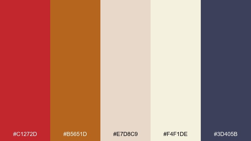
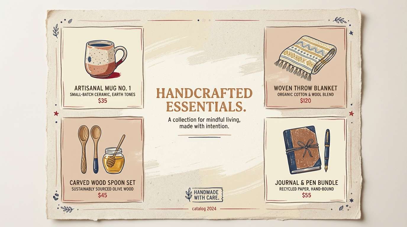
HEX: #c1272d #b5651d #e7d8c9 #f4f1de #3d405b
Mood: earthy, calm, handcrafted
Best for: home decor brands and catalog pages
Earthy and calm, it suggests brick walls, linen fabric, and vintage ceramics. It is ideal for home decor brands, catalogs, and lifestyle blogs that want warmth without shouting. Let the linens dominate large areas, then use brick red for small focal points like labels, icons, or featured prices. Tip: the muted navy works well for headings to keep the page feeling structured and calm.
Image example of brick linen generated using media.io
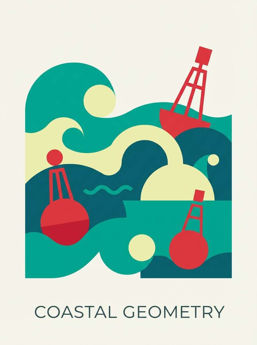
16) Scarlet Lagoon
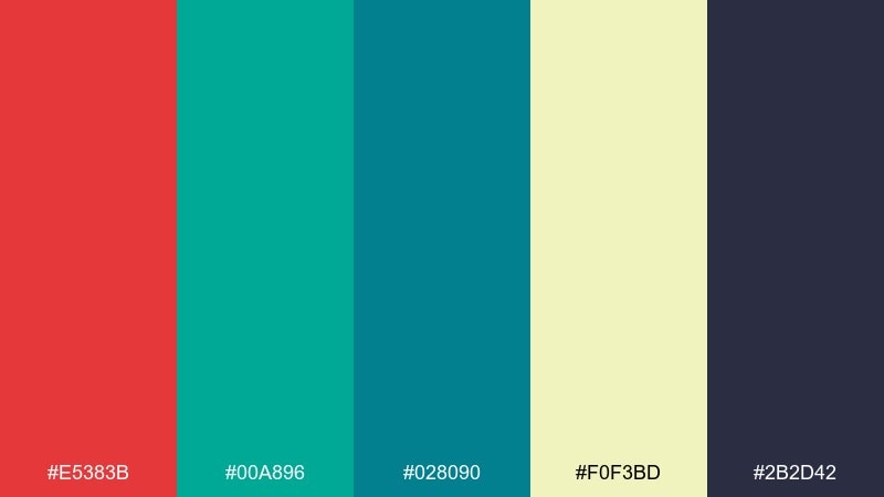
HEX: #e5383b #00a896 #028090 #f0f3bd #2b2d42
Mood: fresh, modern, coastal
Best for: summer campaigns and app illustrations
Fresh and modern, it feels like a bright buoy against clear water and sunny sand. It works well for summer campaigns, app illustrations, and sporty branding that needs clean contrast. Use teal as the main field color, then add scarlet for key highlights, badges, or calls to action. Tip: keep the pale yellow-green as a soft background so the red and teal stay vibrant.
Image example of scarlet lagoon generated using media.io
17) Festival Lanterns
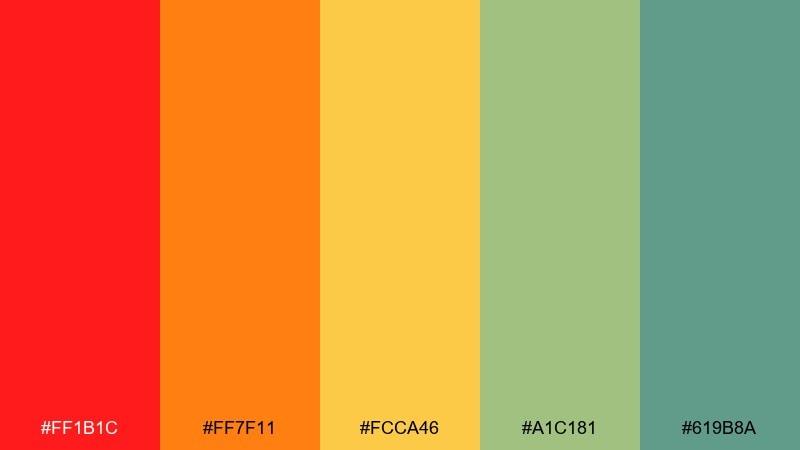
HEX: #ff1b1c #ff7f11 #fcca46 #a1c181 #619b8a
Mood: joyful, bright, community
Best for: cultural event posters and banners
Joyful and bright, it evokes paper lanterns, street food, and music drifting through warm air. Use it for cultural event posters, community banners, and playful campaigns that need friendly energy. Keep the reds and oranges as the main focal colors, then bring in the greens for balance in secondary shapes and icons. Tip: apply the yellow to spotlight dates and key details so they pop from a distance.
Image example of festival lanterns generated using media.io

18) Wine Copper
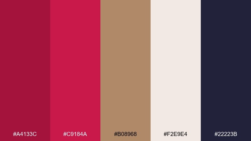
HEX: #a4133c #c9184a #b08968 #f2e9e4 #22223b
Mood: luxurious, warm, intimate
Best for: wine labels and premium product ads
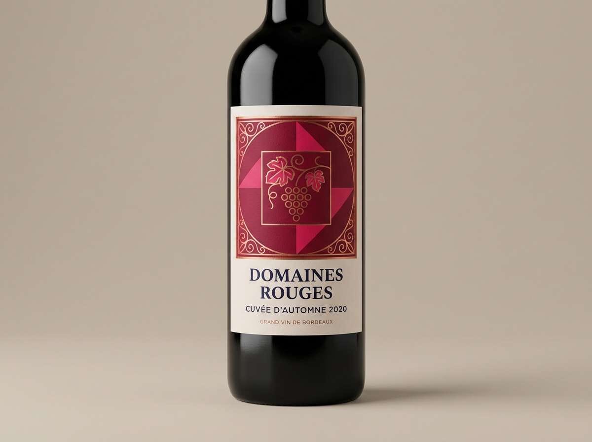
Luxurious and intimate, it brings to mind candlelit dinners, silk ribbons, and copper foil on textured paper. These scarlet color combinations are a strong match for wine labels, premium ads, and upscale packaging. Use the creamy off-white for negative space, then treat copper as a foil-like accent for borders or seals. Tip: keep the darkest navy for small type so the rich reds stay clean and elegant.
Image example of wine copper generated using media.io
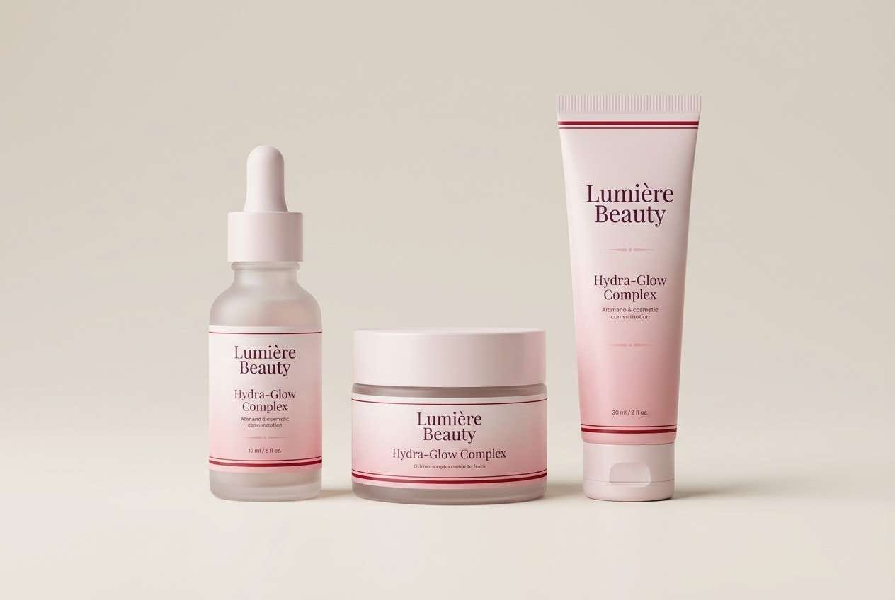
19) Petal Plum
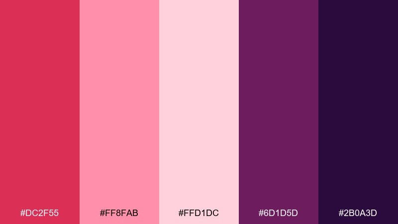
HEX: #dc2f55 #ff8fab #ffd1dc #6d1d5d #2b0a3d
Mood: romantic, moody, stylish
Best for: cosmetics branding and social ads
Romantic yet moody, it feels like satin petals against deep plum velvet. It is a strong fit for cosmetics branding, social ads, and fashion drops where you want sweetness with edge. Use the pale pinks for background and spacing, then push plum for typography and framing. Tip: reserve the bright rose for a single focal element like a product name or promo badge.
Image example of petal plum generated using media.io
20) Firelight Cabin
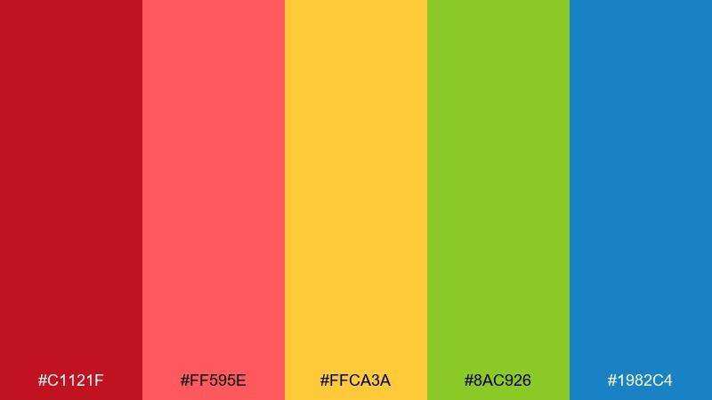
HEX: #c1121f #ff595e #ffca3a #8ac926 #1982c4
Mood: adventurous, playful, outdoors
Best for: camping promos and youth branding
Adventurous and playful, it suggests campfire glow, trail markers, and a clear sky at dusk. It works well for camping promos, youth branding, and energetic event graphics that need a friendly punch. Let the scarlet and coral drive the focal areas, while the yellow supports highlights and the green signals outdoorsy cues. Tip: use the blue sparingly for icons or small headings so it stays a crisp contrast instead of taking over.
Image example of firelight cabin generated using media.io

What Colors Go Well with Scarlet?
Scarlet pairs best with steady neutrals that control intensity: warm cream and off-white soften it, while charcoal and near-black make it feel modern and high-contrast. If you want a classic, print-friendly look, start with scarlet + cream + deep navy or charcoal.
For richer, more premium mixes, add metallics like gold or copper (as thin lines, icons, or foil-like accents). For natural and sophisticated contrast, deep greens (forest, sage, or mint) help scarlet feel botanical and balanced rather than purely “alert” or “sale” energy.
If you’re building a bright campaign palette, keep one saturated companion (like orange, teal, or purple) and let the rest be light neutrals. This keeps scarlet as the hero while preventing visual clutter.
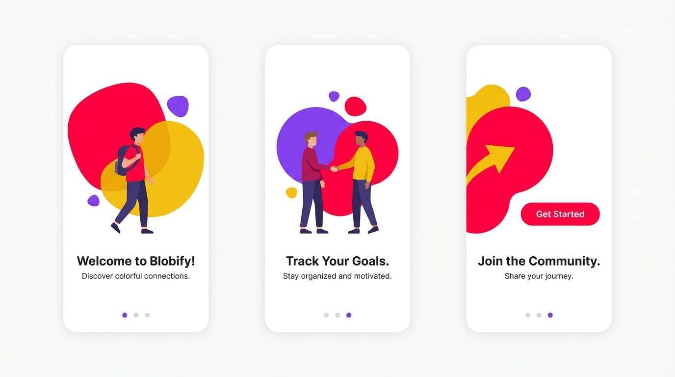
How to Use a Scarlet Color Palette in Real Designs
In UI, treat scarlet as a priority color: primary buttons, active states, key badges, and important alerts. Then rely on grays and off-whites for surfaces, borders, and long-form reading so accessibility and hierarchy stay clean.
In branding and packaging, scarlet works best when it has “room to breathe.” Use large neutral fields (cream, soft white, pale sand) and add scarlet in confident blocks, seals, or typographic hits—then reserve metallics for trims and premium cues.
For posters and social graphics, use scarlet to anchor the focal area (headline zone or date block), and choose one contrasting dark (navy/charcoal) for legibility. This keeps the message readable even from a distance.
Create Scarlet Palette Visuals with AI
If you want to preview how your scarlet palette looks in a landing page, label, poster, or onboarding screen, generating quick mock visuals can help you choose proportions and contrast before production.
With Media.io’s text-to-image tool, you can paste a ready-made prompt, swap HEX codes, and instantly produce multiple style directions—minimal, editorial, cinematic, or playful—without rebuilding layouts from scratch.
Scarlet Color Palette FAQs
-
What HEX code is “scarlet”?
Scarlet doesn’t have a single universal HEX value. Common scarlet-like picks include #d72638, #e10600, #ff0035, and #c1121f, depending on whether you want a warmer, punchier, or deeper scarlet. -
Is scarlet the same as crimson?
They’re close, but not identical. Scarlet usually looks brighter and slightly more orange-leaning, while crimson often feels deeper and more blue-leaning. In practice, both can work in a red color palette—your neutrals and contrast colors decide the final vibe. -
What colors complement scarlet?
Charcoal/near-black, cream/off-white, deep navy, and forest or sage greens are reliable complements. Metallic gold or copper can elevate scarlet for luxury branding when used as subtle accents. -
How do I keep a scarlet palette from looking too loud?
Use scarlet as an accent (10–20% of the layout), give it plenty of neutral space, and avoid stacking multiple saturated warm colors at equal weight. Keep typography mostly in charcoal, navy, or deep neutral tones for balance. -
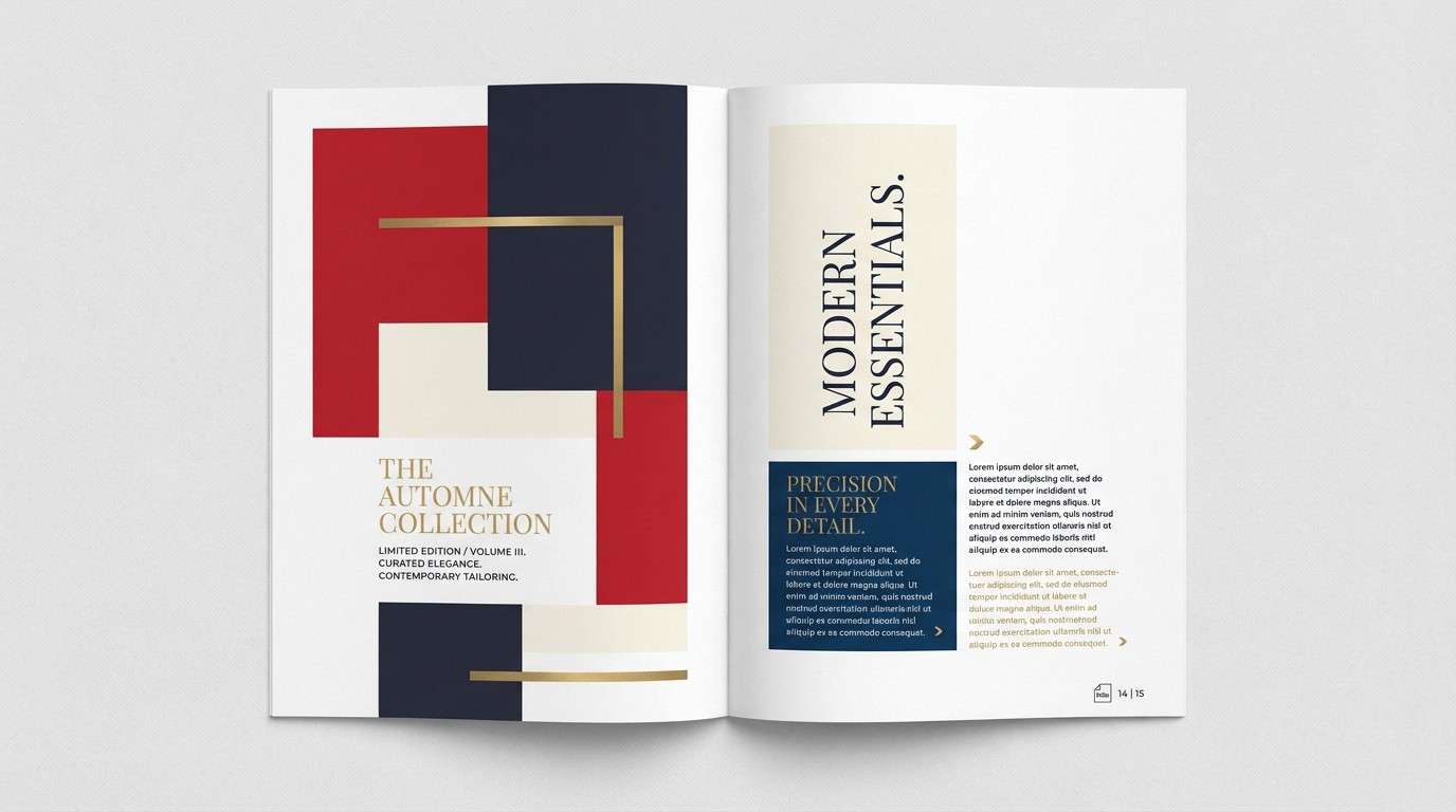
Does scarlet work for professional brands?
Yes—when paired with structured neutrals like cream + charcoal or cream + deep wine tones. Palettes like Crimson Atelier, Modern Heritage, and Wine Copper help scarlet read premium and intentional rather than aggressive. -
What’s a good scarlet palette for dark mode UI?
Use near-black or deep maroon for surfaces, soft off-white for text, and reserve scarlet for CTAs and active states. Scarlet Noir is a strong starting point because it keeps contrast crisp and prevents the UI from feeling heavy. -
How can I preview scarlet palettes in real layouts quickly?
Generate mock visuals (posters, labels, UI screens, brand boards) with an AI text-to-image workflow, then iterate on proportions and contrast using your exact HEX codes before you commit to production files.
Next: Blue Mauve Color Palette


