

Blue mauve sits in that sweet spot between calm blue and romantic purple, giving designs a modern softness without feeling childish or overly pastel.
Below are 20+ blue mauve color palette ideas with HEX codes, plus practical pairing tips for UI, branding, weddings, and interiors.
In this article
- Why Blue Mauve Palettes Work So Well
-
- lavender twilight
- dusty orchid denim
- misty periwinkle mauve
- velvet plum haze
- rose quartz nightfall
- coastal lilac blue
- soft mauve minimal
- grape smoke studio
- moonlit heather
- vintage mauve tea
- modern mauve ui
- bridal mauve blue
- mauve botanical spring
- electric mauve accent
- clay mauve cozy
- mauve marble luxury
- mauve denim street
- mauve sunset gradient
- mauve art editorial
- mauve kids nursery
- steel blue mauve balance
- orchid blue night market
- What Colors Go Well with Blue Mauve?
- How to Use a Blue Mauve Color Palette in Real Designs
- Create Blue Mauve Palette Visuals with AI
Why Blue Mauve Palettes Work So Well
Blue mauve palettes blend the reliability of blue with the softness of mauve, which makes them feel both professional and approachable. That balance is especially useful when you want a calm tone without looking cold.
Because the hues are naturally muted, they support typography and layout rather than competing with them. You can build contrast using deep indigo/navy for structure and pale lilac tints for breathing room.
Blue mauve also pairs easily with modern neutrals and metallic accents, so it adapts well across UI, branding, print, and interiors without needing extreme saturation.
20+ Blue Mauve Color Palette Ideas (with HEX Codes)
1) Lavender Twilight
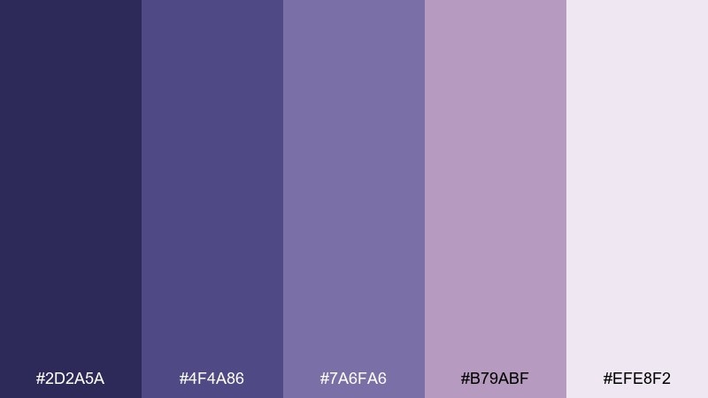
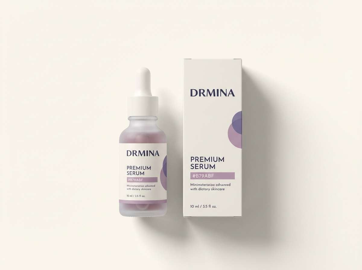
HEX: #2D2A5A #4F4A86 #7A6FA6 #B79ABF #EFE8F2
Mood: dreamy, calm, nocturnal
Best for: branding for wellness and skincare
Dreamy twilight purples and cool blues feel like dusk settling over a quiet city. Use it for wellness, skincare, or boutique branding where calm matters more than contrast. Pair with soft ivory backgrounds and minimal line icons to keep the look airy. Tip: reserve the darkest indigo for headlines and use the pale lilac as negative space.
Image example of lavender twilight generated using media.io
Media.io is an online AI studio for creating and editing video, image, and audio in your browser.

2) Dusty Orchid Denim
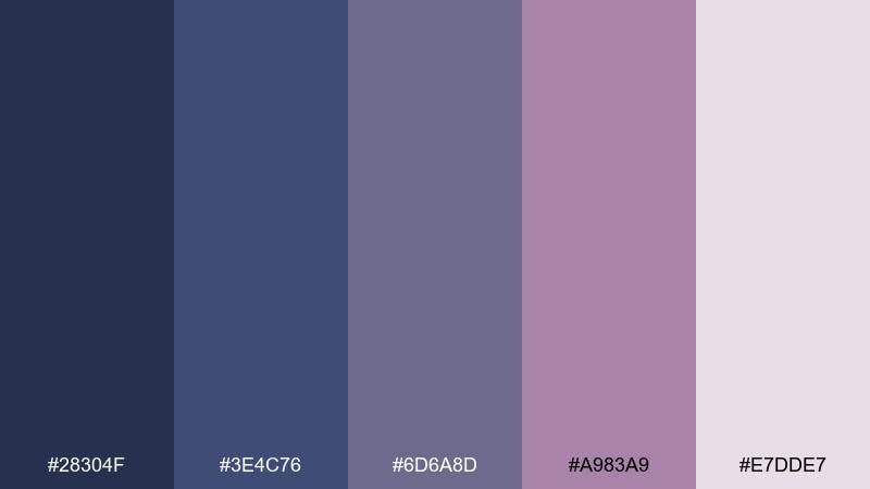
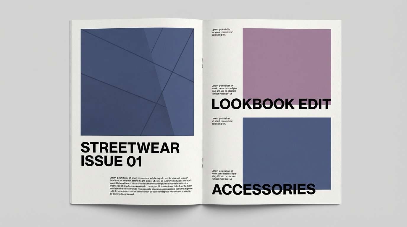
HEX: #28304F #3E4C76 #6D6A8D #A983A9 #E7DDE7
Mood: modern, muted, confident
Best for: streetwear lookbooks and catalog layouts
Muted denim blues with dusty orchid accents give a confident, editorial edge. It works beautifully for lookbooks, catalogs, and product pages that need a cool, stylish tone. Add crisp white margins and charcoal body text to keep readability high. Tip: use the orchid midtone for callouts and price tags so they pop without feeling loud.
Image example of dusty orchid denim generated using media.io
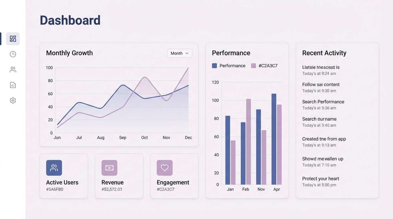
3) Misty Periwinkle Mauve
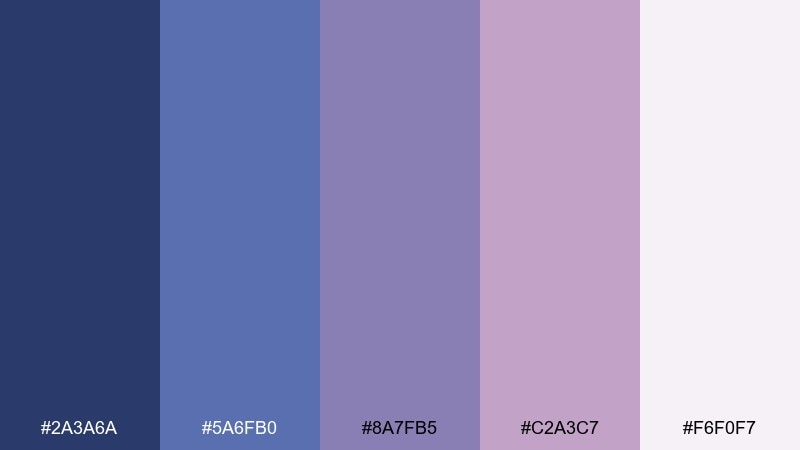
HEX: #2A3A6A #5A6FB0 #8A7FB5 #C2A3C7 #F6F0F7
Mood: fresh, airy, uplifting
Best for: app UI and SaaS dashboards
Airy periwinkle and mauve feel like morning fog lifting over soft hills. This blue mauve color palette is ideal for dashboards and mobile apps where clarity and friendliness matter. Pair it with neutral grays for dividers and keep shadows subtle for a clean, modern feel. Tip: use the periwinkle as the primary button color and the light lilac as a hover state.
Image example of misty periwinkle mauve generated using media.io
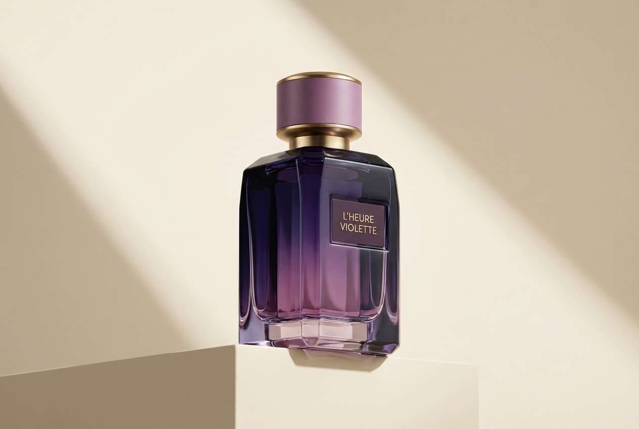
4) Velvet Plum Haze
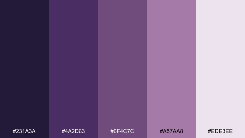
HEX: #231A3A #4A2D63 #6F4C7C #A57AA8 #EDE3EE
Mood: luxurious, moody, dramatic
Best for: perfume ads and premium product visuals
Velvet plum and smoky mauve evoke candlelit lounges and rich fabric textures. Use it for premium fragrance ads, jewelry promos, or any brand that leans into drama. Pair with warm cream highlights and a touch of matte black for sophistication. Tip: keep gradients gentle so the deep plum feels plush rather than harsh.
Image example of velvet plum haze generated using media.io
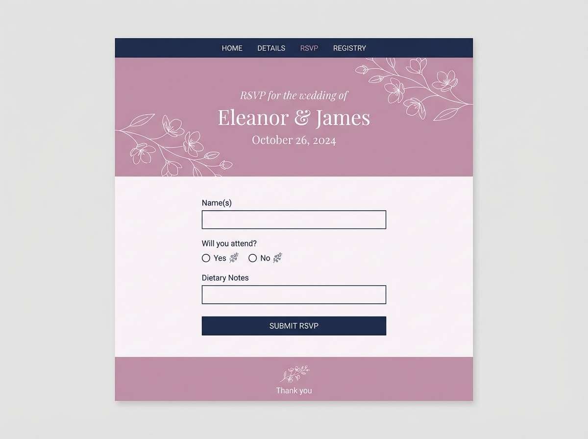
5) Rose Quartz Nightfall
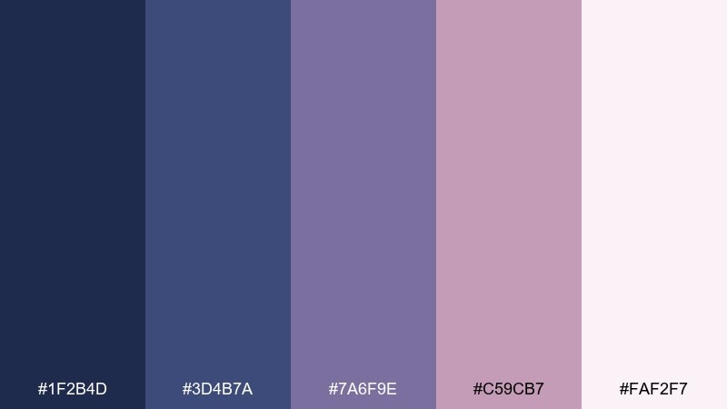
HEX: #1F2B4D #3D4B7A #7A6F9E #C59CB7 #FAF2F7
Mood: romantic, serene, polished
Best for: wedding websites and RSVP pages
Romantic rose quartz meets night-sky blue for an elegant, modern love-story vibe. It shines on wedding websites, RSVP pages, and digital stationery where softness still needs structure. Pair with delicate serif headings and plenty of white space to keep it timeless. Tip: use the blush-mauve as the main background and the navy for navigation and form labels.
Image example of rose quartz nightfall generated using media.io
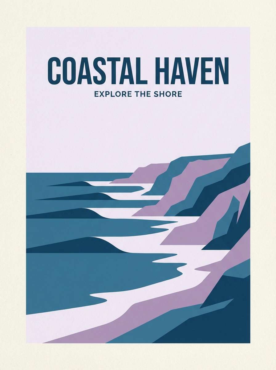
6) Coastal Lilac Blue
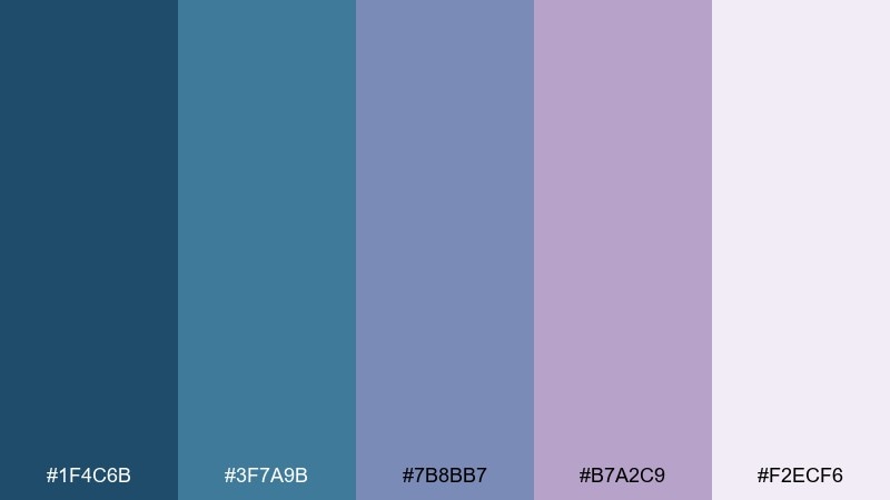
HEX: #1F4C6B #3F7A9B #7B8BB7 #B7A2C9 #F2ECF6
Mood: breezy, coastal, relaxed
Best for: travel posters and hotel promos
Breezy coastal blues with lilac haze feel like sea air and pastel sunsets. These blue mauve color combinations work well for travel posters, hotel promos, and lifestyle banners. Pair with sandy beige or off-white as a buffer so the colors stay light and inviting. Tip: keep type in the deepest teal for contrast on pale backgrounds.
Image example of coastal lilac blue generated using media.io
7) Soft Mauve Minimal
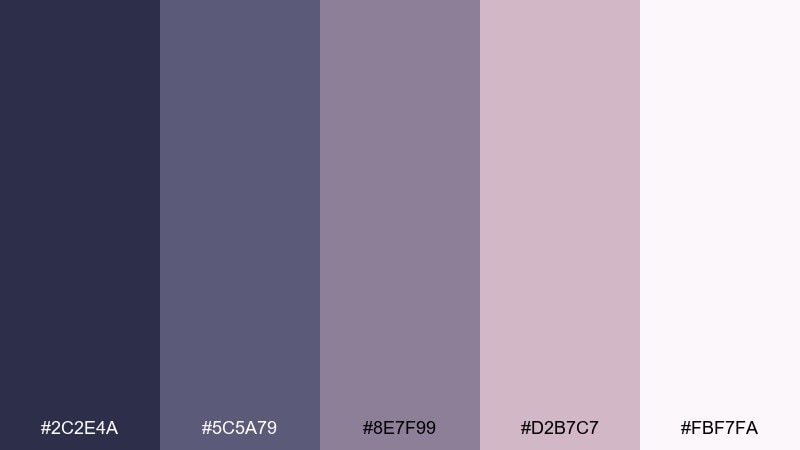
HEX: #2C2E4A #5C5A79 #8E7F99 #D2B7C7 #FBF7FA
Mood: minimal, gentle, airy
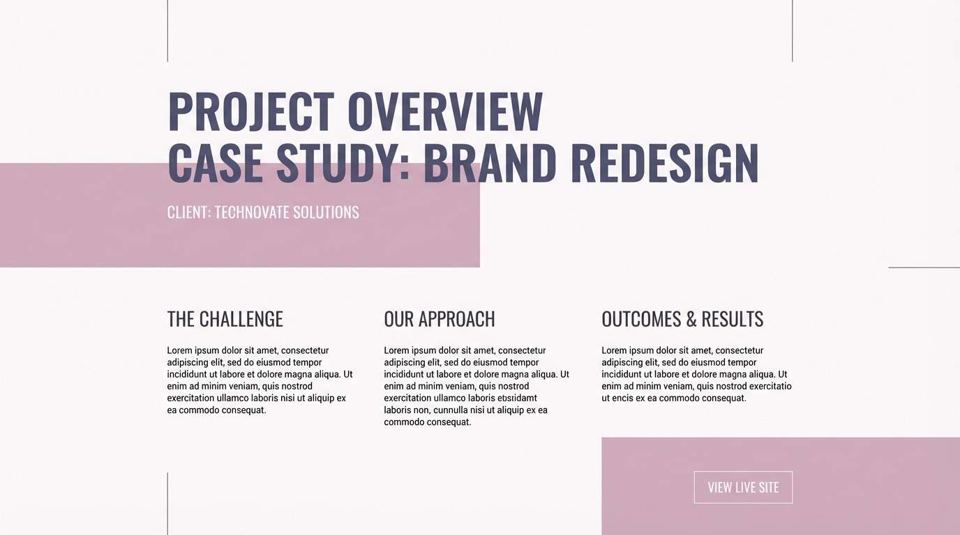
Best for: portfolio sites and case studies
Soft mauve neutrals feel like clean linen, quiet studios, and gentle light. Use this set for portfolios and case-study pages where content needs to breathe. Pair with simple black icons and a single accent button color for focus. Tip: apply the palest tint as the page background and keep the deeper slate for headings only.
Image example of soft mauve minimal generated using media.io
8) Grape Smoke Studio
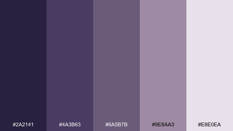
HEX: #2A2141 #4A3B63 #6A5B7B #9E8AA3 #E8E0EA
Mood: artistic, smoky, intimate
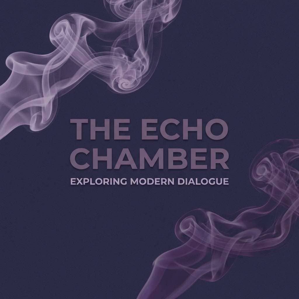
Best for: music covers and podcast artwork
Smoky grape and muted mauve suggest late-night studio sessions and velvet curtains. It fits podcast covers, album art, and social headers that want depth without neon. Pair with grain textures and simple geometric shapes for a modern edge. Tip: keep titles in the lightest tint and use the darkest shade for background blocks.
Image example of grape smoke studio generated using media.io
9) Moonlit Heather
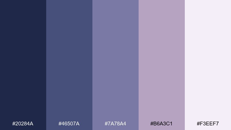
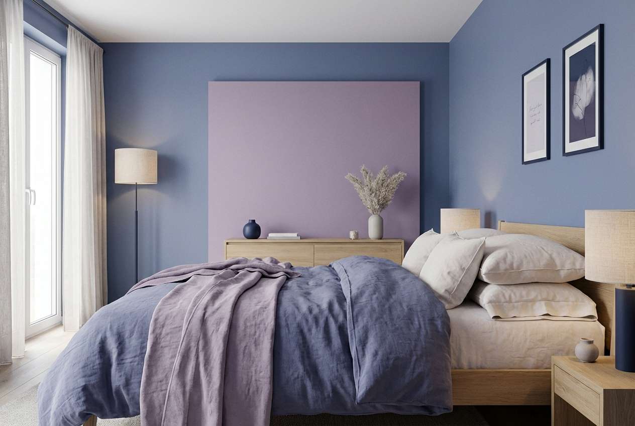
HEX: #20284A #46507A #7A78A4 #B6A3C1 #F3EEF7
Mood: soft, romantic, night-sky
Best for: bedroom interiors and mood boards
Moonlit blues and heather mauves feel like quiet evenings and soft knit textures. Use it for bedroom mood boards, calming interior palettes, and gentle lifestyle content. Pair with light oak wood, brushed nickel, and creamy textiles to keep it cozy. Tip: choose one darker shade for contrast and let the midtones carry the room.
Image example of moonlit heather generated using media.io
10) Vintage Mauve Tea
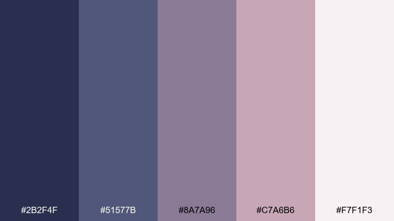
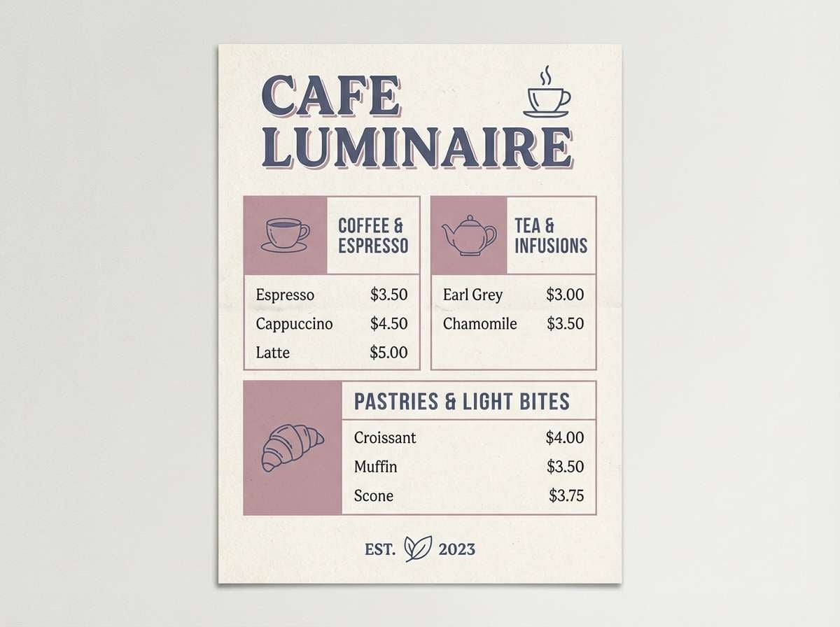
HEX: #2B2F4F #51577B #8A7A96 #C7A6B6 #F7F1F3
Mood: vintage, cozy, nostalgic
Best for: cafe menus and packaging labels
Nostalgic mauve and dusty blue feel like porcelain teacups and handwritten recipes. It is great for cafe menus, bakery labels, and cozy brand identities. Pair with kraft-paper textures or off-white stock for an artisan look. Tip: use the dusty blue for section headers and the pink-mauve for small highlights like icons or stamps.
Image example of vintage mauve tea generated using media.io
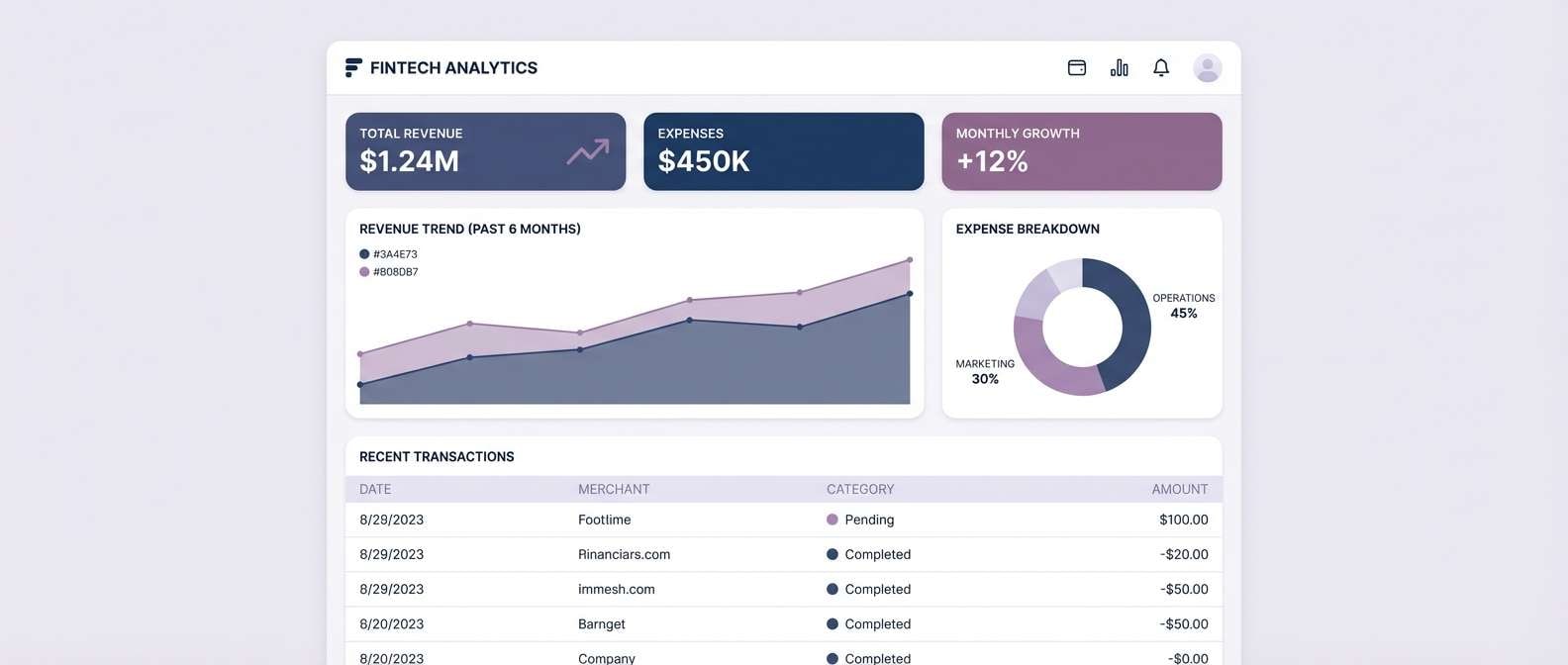
11) Modern Mauve UI
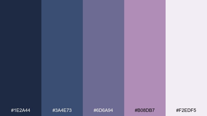
HEX: #1E2A44 #3A4E73 #6D6A94 #B08DB7 #F2EDF5
Mood: sleek, balanced, tech-forward
Best for: fintech UI and data-heavy products
Sleek indigo and mauve feel polished, like glass panels and crisp typography. This blue mauve color scheme works especially well for fintech UI where trust and warmth need to coexist. Pair with cool grays for tables and use clear spacing to avoid visual clutter. Tip: apply mauve only to key actions so the interface stays calm and professional.
Image example of modern mauve ui generated using media.io
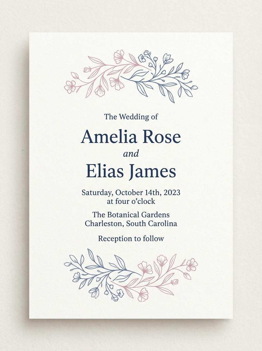
12) Bridal Mauve Blue
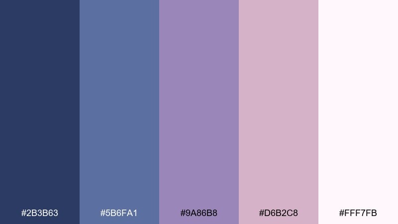
HEX: #2B3B63 #5B6FA1 #9A86B8 #D6B2C8 #FFF7FB
Mood: romantic, soft, celebratory
Best for: wedding invitations and save the dates
Soft mauve petals against cool blue tones evoke bouquets, satin ribbons, and gentle candlelight. Use it for wedding invitations, save-the-date cards, and event signage with a modern romantic feel. Pair with warm white paper and subtle foil effects for an elevated finish. Tip: keep body copy in the deep blue and use the blush shade for borders and flourishes.
Image example of bridal mauve blue generated using media.io
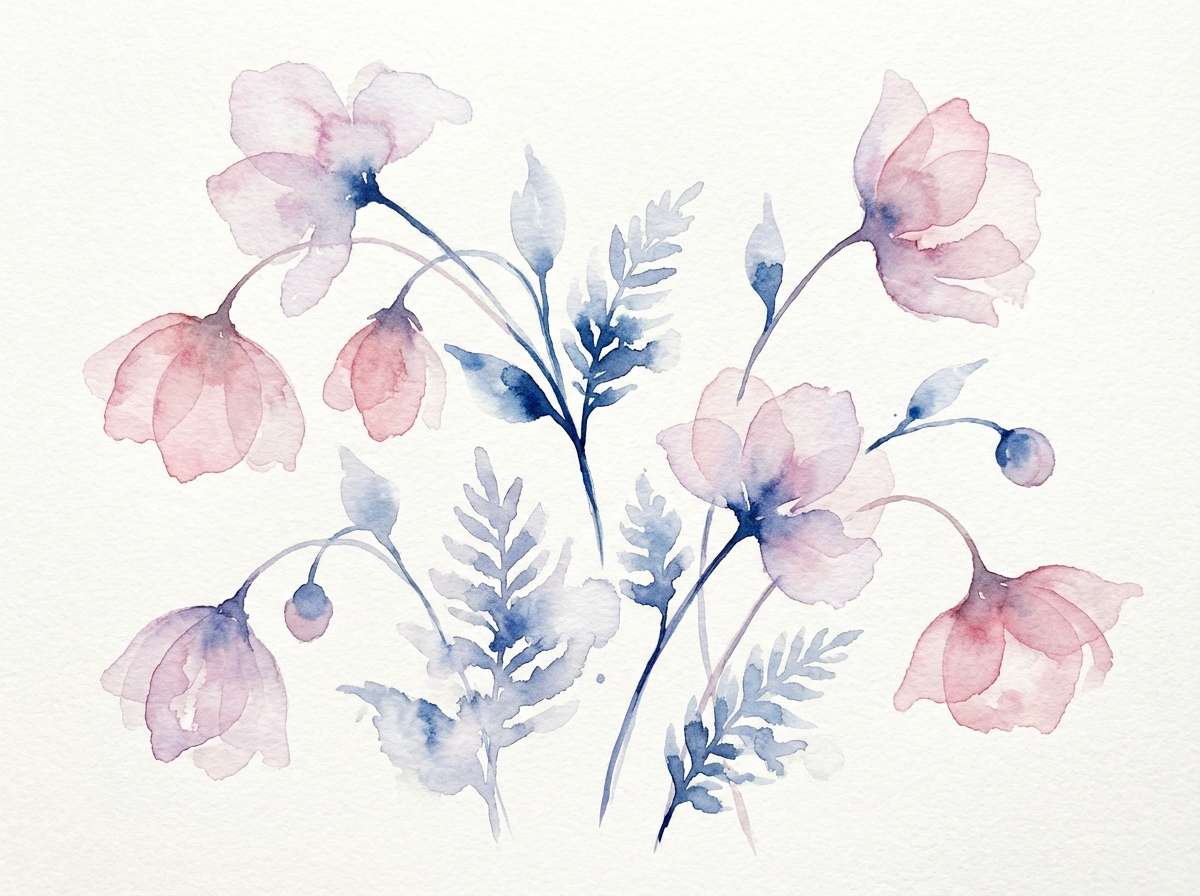
13) Mauve Botanical Spring
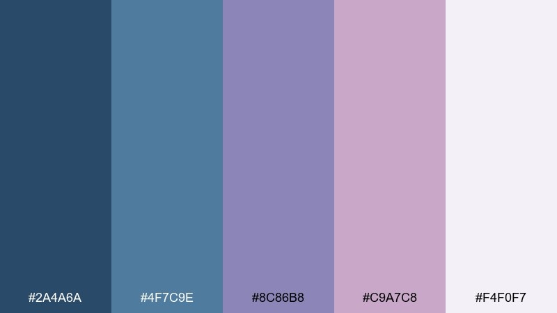
HEX: #2A4A6A #4F7C9E #8C86B8 #C9A7C8 #F4F0F7
Mood: fresh, botanical, gentle
Best for: spring illustrations and stationery
Fresh blue tones and mauve blossoms feel like watercolor florals on a bright spring morning. These blue mauve color combinations are lovely for stationery, journals, and seasonal marketing. Pair with soft sage accents only if you keep them muted, and let the paper white do the heavy lifting. Tip: use the pale lilac as wash layers and reserve the deeper blue for stems and outlines.
Image example of mauve botanical spring generated using media.io
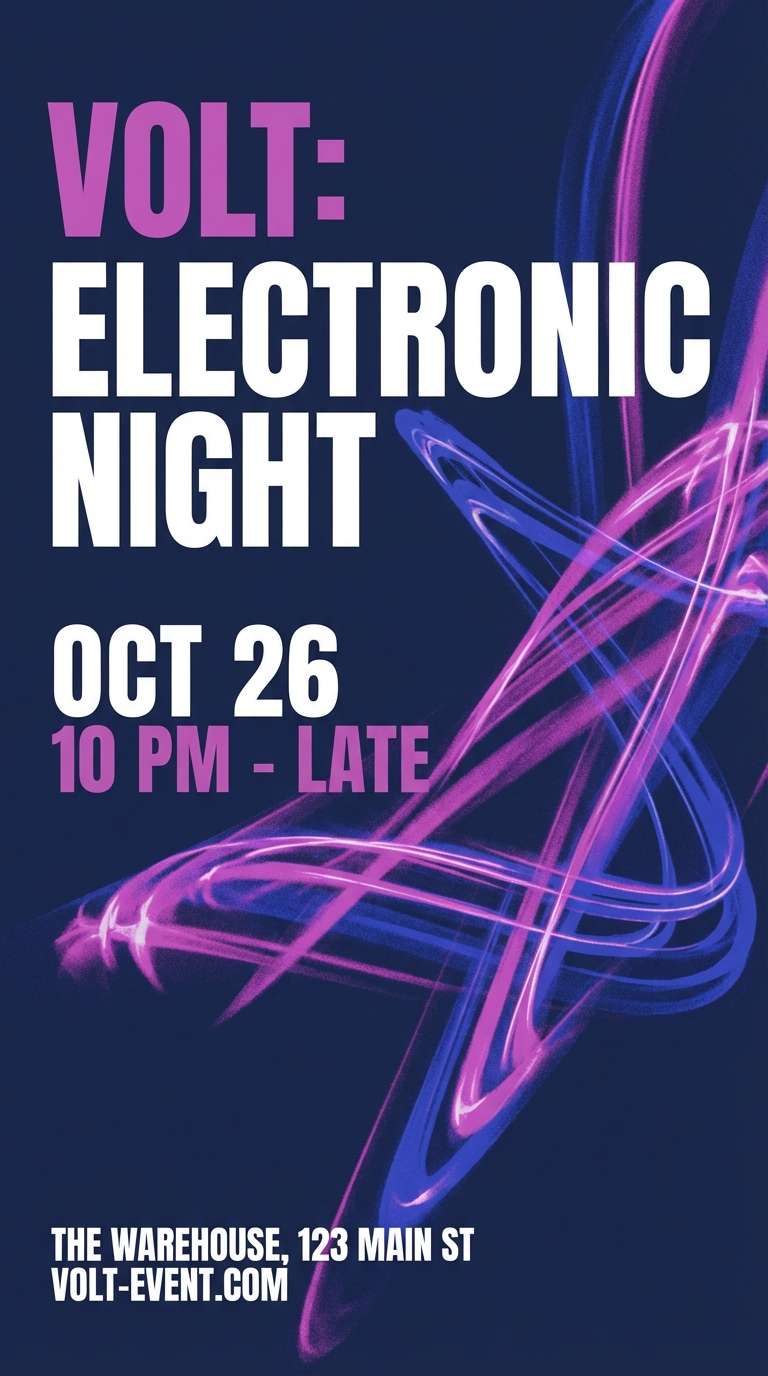
14) Electric Mauve Accent
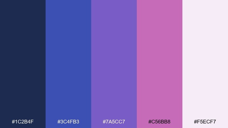
HEX: #1C2B4F #3C4FB3 #7A5CC7 #C56BB8 #F5ECF7
Mood: bold, energetic, modern
Best for: event flyers and nightlife promos
Electric mauve accents over deep blue feel like club lights cutting through smoke. Use it for event flyers, nightlife promos, or streaming thumbnails that need punch without going full neon rainbow. Pair with black or deep navy backgrounds and keep typography chunky for legibility. Tip: limit the hot mauve to one or two elements, like the date badge or headline underline.
Image example of electric mauve accent generated using media.io
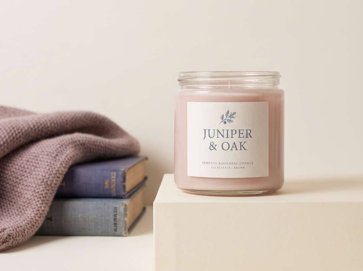
15) Clay Mauve Cozy
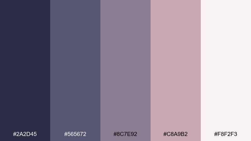
HEX: #2A2D45 #565672 #8C7E92 #C8A9B2 #F8F2F3
Mood: cozy, grounded, soft
Best for: home decor branding and candles
Grounded clay-mauve and muted blue-gray feel like soft throws and warm tea on a rainy day. It suits home decor brands, candle labels, and cozy ecommerce storefronts. Pair with warm cream and subtle paper textures for a handmade feel. Tip: use the mid mauve for secondary buttons and keep product photos bright to avoid heaviness.
Image example of clay mauve cozy generated using media.io
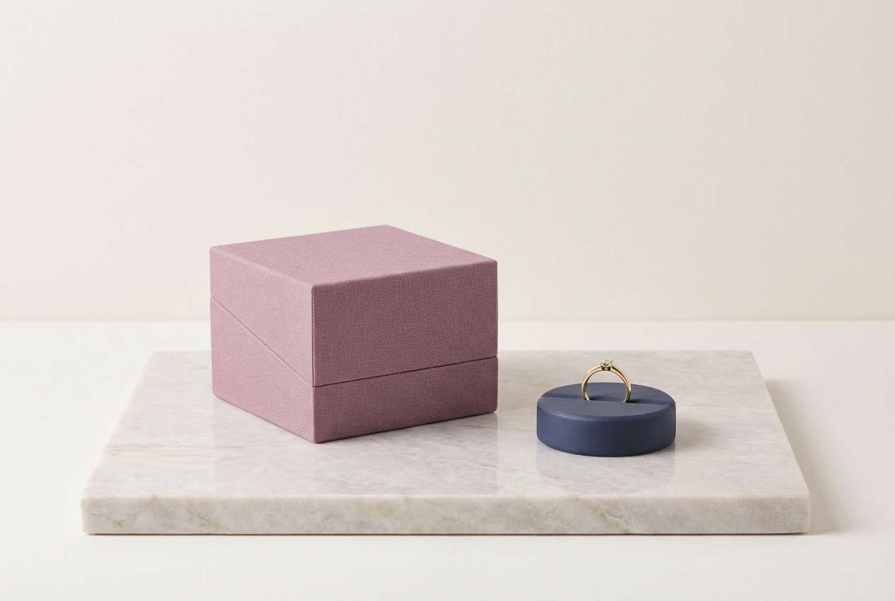
16) Mauve Marble Luxury
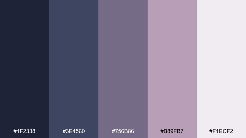
HEX: #1F2338 #3E4560 #756B86 #B89FB7 #F1ECF2
Mood: luxury, refined, calm
Best for: jewelry branding and premium web design
Refined mauve and slate blues feel like polished marble and satin-lined boxes. Use it for jewelry branding, premium landing pages, and elegant product grids. Pair with thin gold lines or subtle metallic gradients for a luxe touch. Tip: keep the darkest slate for navigation and use the pale tint to mimic marble highlights.
Image example of mauve marble luxury generated using media.io
17) Mauve Denim Street
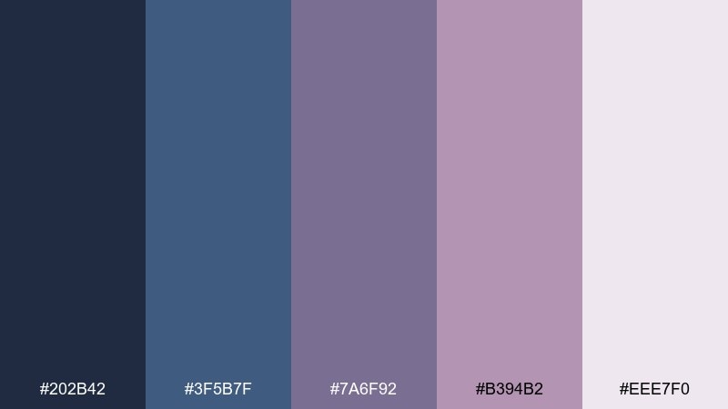
HEX: #202B42 #3F5B7F #7A6F92 #B394B2 #EEE7F0
Mood: urban, cool, relaxed
Best for: social media templates for fashion
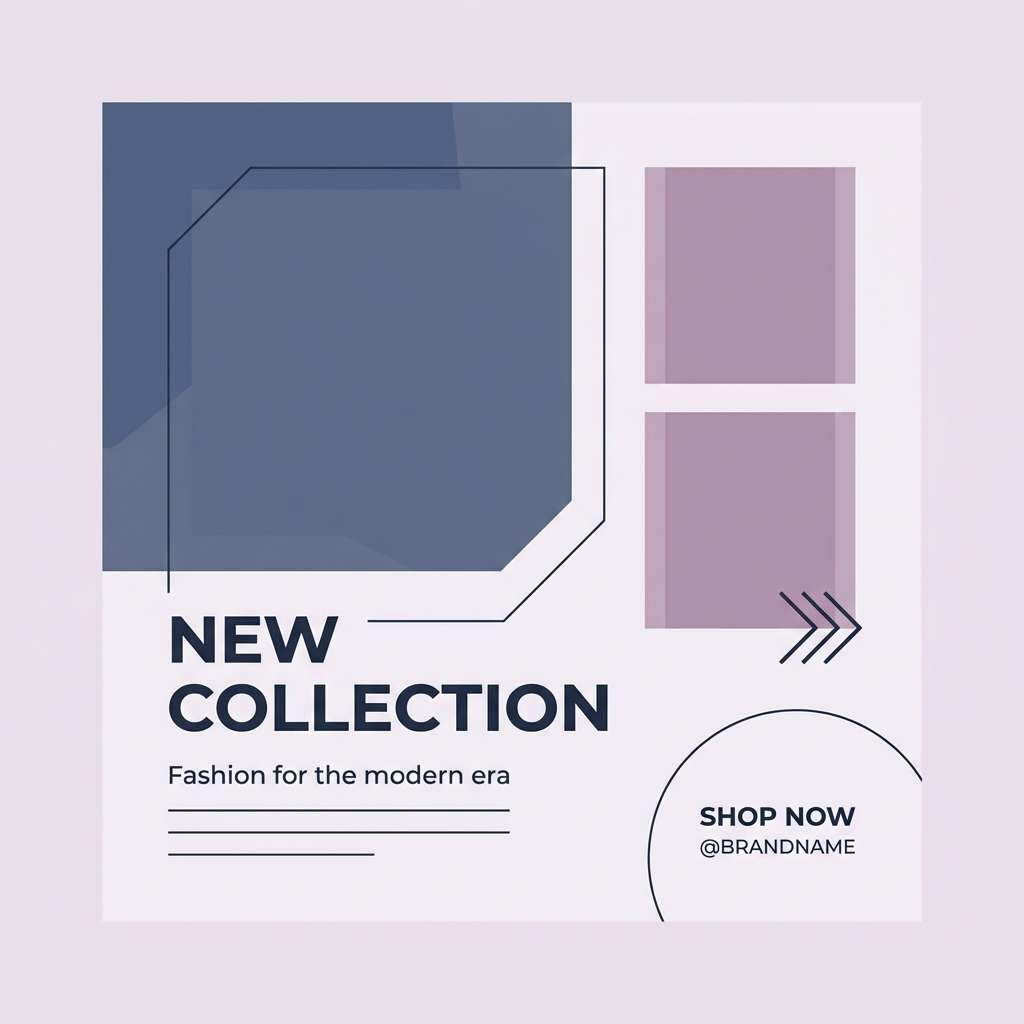
Urban denim blues with mauve highlights feel like street murals and late-night cafés. This blue mauve color palette is great for fashion social templates that need a cool, shareable look. Pair with bold sans-serif type and simple blocks to frame photos. Tip: use the mauve as a sticker-style accent behind key words to guide the eye.
Image example of mauve denim street generated using media.io
18) Mauve Sunset Gradient
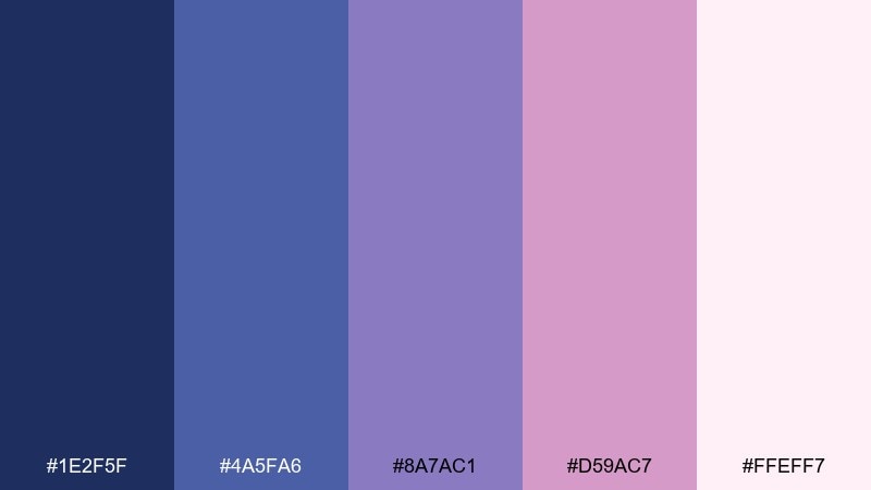
HEX: #1E2F5F #4A5FA6 #8A7AC1 #D59AC7 #FFEFF7
Mood: glowy, romantic, optimistic
Best for: hero banners and landing pages
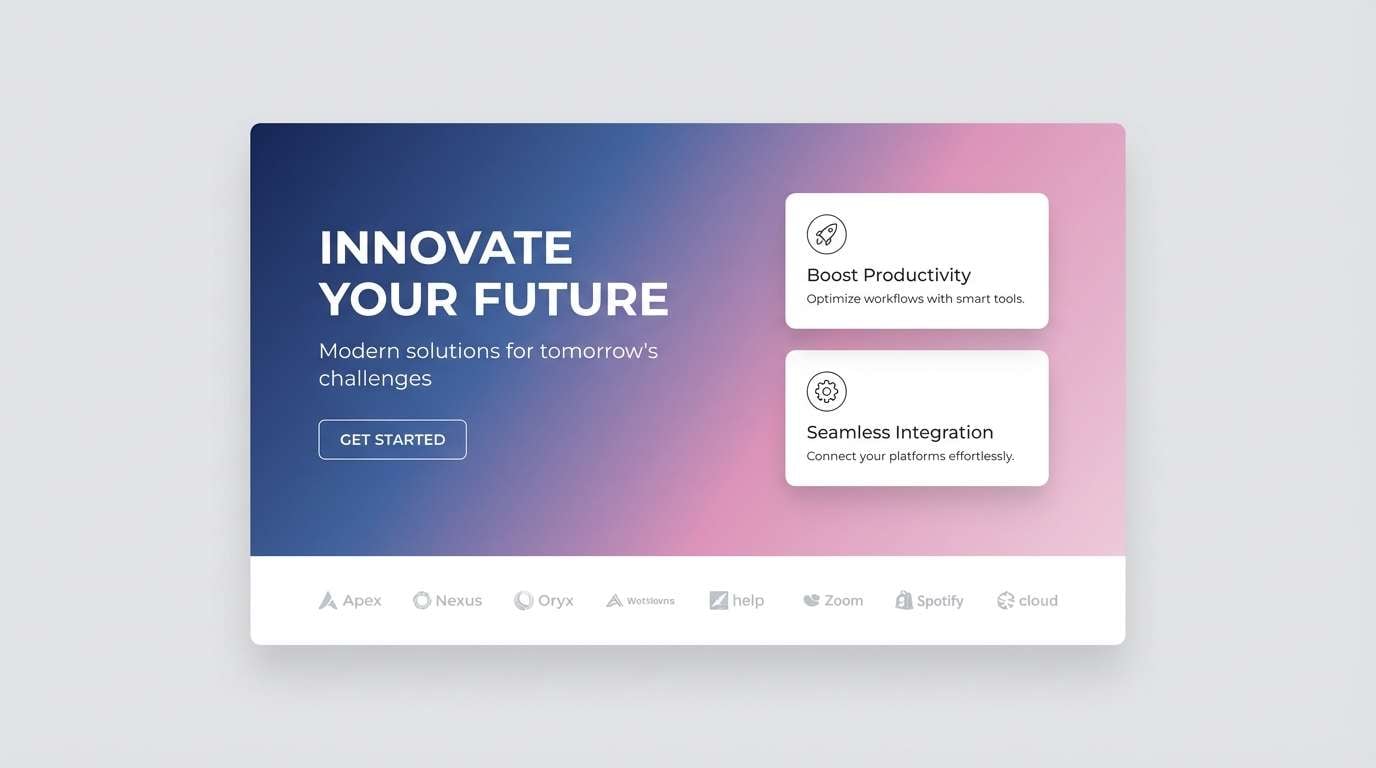
Glowy blues fading into mauve feel like a pastel sunset stretching across the horizon. It is perfect for hero banners, landing pages, and email headers where gradients can shine. Pair with white UI elements and keep icons thin so the background stays the star. Tip: build a diagonal gradient from deep blue to blush and place text on the darker side for readability.
Image example of mauve sunset gradient generated using media.io
19) Mauve Art Editorial
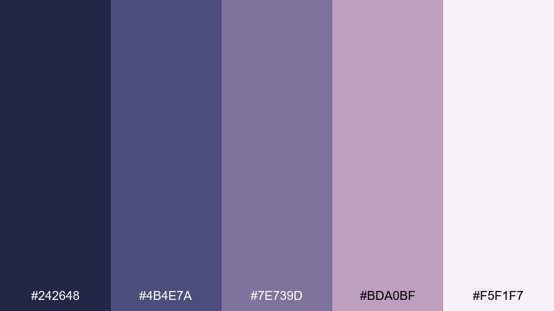
HEX: #242648 #4B4E7A #7E739D #BDA0BF #F5F1F7
Mood: editorial, cultured, soft
Best for: magazine features and art catalogs
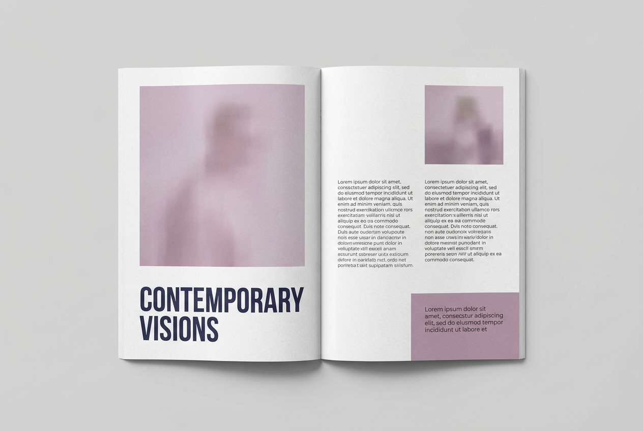
Cultured blue-mauve tones feel like gallery walls, matte paper, and quiet conversations. Use it for magazine features, art catalogs, and editorial layouts that need sophistication without stiffness. Pair with a strong typographic hierarchy and generous margins. Tip: let the lightest tint dominate the page and use the mauve midtone for pull quotes.
Image example of mauve art editorial generated using media.io
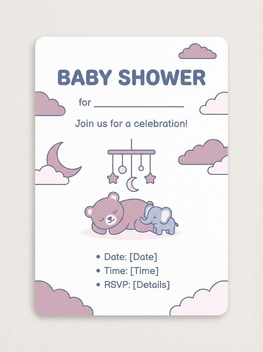
20) Mauve Kids Nursery
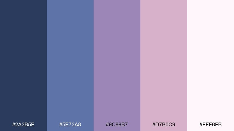
HEX: #2A3B5E #5E73A8 #9C86B7 #D7B0C9 #FFF6FB
Mood: sweet, soothing, playful
Best for: nursery decor and baby shower invites
Soothing blues and sweet mauves feel like bedtime stories and soft cotton blankets. It works for nursery decor, baby shower invitations, and gentle parenting content. Pair with rounded type, simple illustrations, and lots of warm white to keep it cheerful. Tip: keep the deeper blue for small anchors like headers and use the blush for large shapes.
Image example of mauve kids nursery generated using media.io
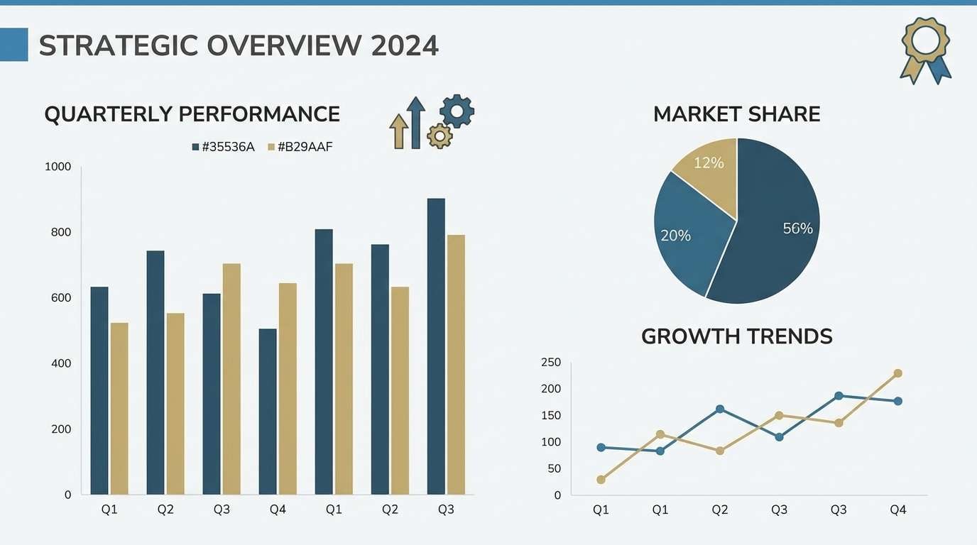
21) Steel Blue Mauve Balance
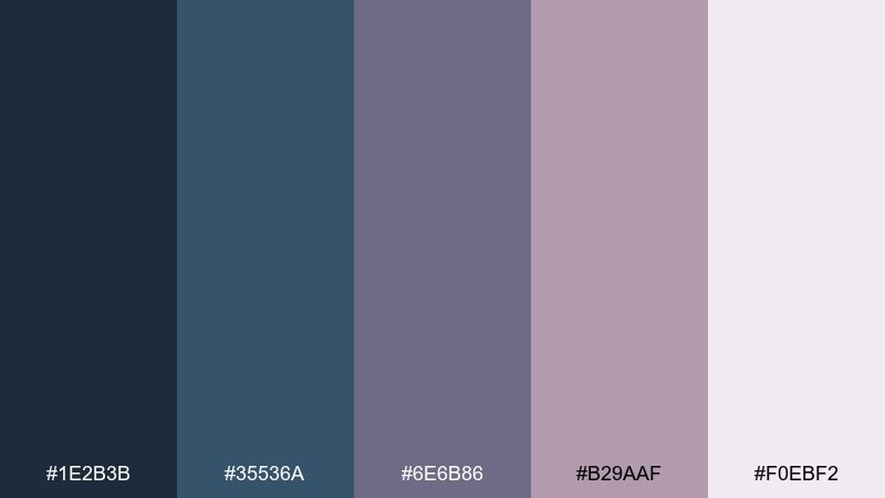
HEX: #1E2B3B #35536A #6E6B86 #B29AAF #F0EBF2
Mood: balanced, professional, understated
Best for: corporate presentations and reports
Steel blue and muted mauve create a steady, credible vibe like tailored suits and matte stationery. It is a strong fit for corporate presentations, reports, and B2B one-pagers. Pair with neutral grays and consistent icon weights for a polished system. Tip: use the mauve for highlights on charts while keeping axes and labels in the darker steel.
Image example of steel blue mauve balance generated using media.io
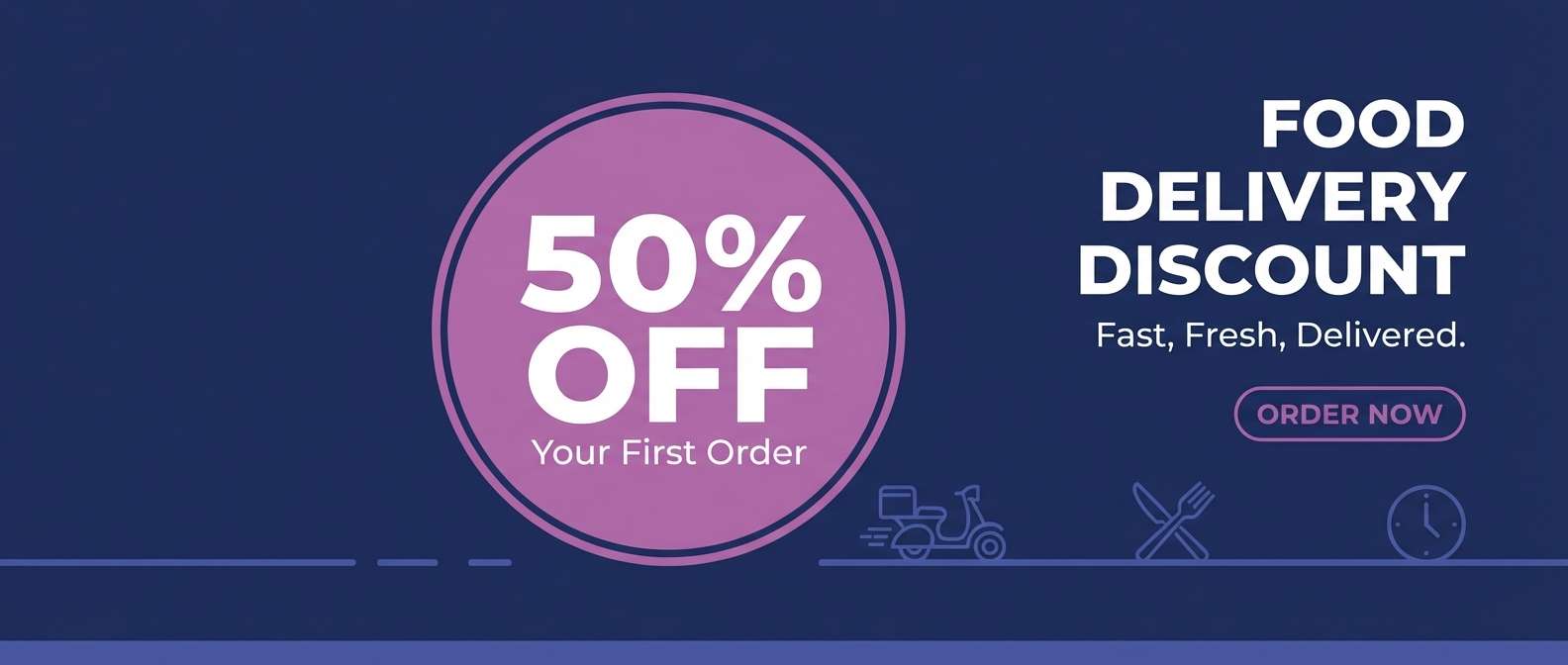
22) Orchid Blue Night Market
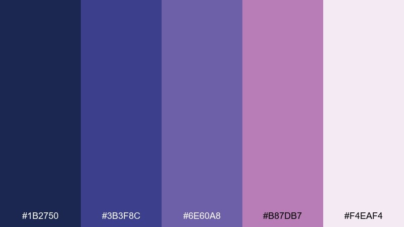
HEX: #1B2750 #3B3F8C #6E60A8 #B87DB7 #F4EAF4
Mood: vibrant, urban, cinematic
Best for: food delivery app promos and ads
Cinematic orchid and deep blue feel like neon signs at a night market. These blue mauve color combinations are great for app promos, food delivery ads, and bold banner campaigns. Pair with high-contrast photography and keep UI elements simple so the colors frame the message. Tip: use orchid for promo badges and the deep blue for the background to make offers readable.
Image example of orchid blue night market generated using media.io
What Colors Go Well with Blue Mauve?
Blue mauve pairs best with clean neutrals that keep it modern: soft ivory, warm white, dove gray, and cool light gray. These help maintain readability while letting the mauve tint feel intentional rather than “purple haze.”
For contrast, add deep anchors like navy, charcoal, or inky indigo. If you want a more premium finish, try metallic accents (champagne gold, brushed silver) in small amounts.
As a bolder complementary direction, warm accents like muted peach, terracotta, or dusty coral can create a lively push-pull against the cool blue mauve base.
How to Use a Blue Mauve Color Palette in Real Designs
Start by assigning roles: choose one darkest shade for text/navigation, one mid blue or periwinkle for primary UI elements, and one pale lilac as your background surface. This keeps the system consistent across pages and components.
In branding, blue mauve works well when you keep saturation controlled and rely on spacing, typography, and subtle texture (paper grain, soft gradients) to create personality. Use mauve as an accent on key moments—badges, highlights, or secondary buttons.
For interiors and event styling, combine blue mauve with warm whites and natural materials (light oak, linen) to avoid a chilly result. A single dark accent (navy or plum) can add depth without making the palette heavy.
Create Blue Mauve Palette Visuals with AI
If you already have HEX codes, you can turn them into on-brand visuals faster by generating mockups and background concepts in the same mood. This is especially handy for hero sections, packaging scenes, invitations, and ad layouts.
With Media.io’s text-to-image tool, describe your design scenario (e.g., “fintech dashboard,” “wedding invite,” “candle label”) and include your key shades to guide the output toward consistent blue mauve tones.
Once you get a result you like, iterate by adjusting lighting (soft vs dramatic), materials (paper, glass, marble), and composition (minimal vs editorial) to match your brand style.
Blue Mauve Color Palette FAQs
-
What is “blue mauve” exactly?
Blue mauve is a muted blend of cool blue and soft mauve/purple. It typically reads as a dusty periwinkle-to-mauve range, with low-to-medium saturation and a calm, modern feel. -
Is blue mauve warm or cool?
Most blue mauve shades are cool because they lean toward blue and violet. You can warm them slightly by pairing with cream, beige, or dusty peach accents. -
What neutral colors match a blue mauve palette?
Great neutrals include ivory, warm white, light gray, dove gray, and charcoal. These keep layouts readable and let blue mauve accents feel refined rather than overpowering. -
Can I use blue mauve in UI design without hurting contrast?
Yes—use the darkest indigo/navy from the palette for text and key UI structure, and reserve pale lilacs for backgrounds. Always check contrast ratios for buttons, labels, and small text. -
What accent colors pop with blue mauve?
Muted warm accents like dusty coral, terracotta, and soft peach create pleasing contrast. For a luxe look, use small gold/champagne highlights; for a bolder tech vibe, try a brighter periwinkle or orchid accent. -
Is blue mauve good for wedding palettes?
Blue mauve is a popular wedding choice because it feels romantic but still modern. Pair it with warm whites, soft blush tones, and subtle metallics for invitations, florals, and signage. -
How do I keep a blue mauve design from looking too purple?
Let blue or slate tones dominate the base, keep mauve as an accent, and use clean neutrals for negative space. Reducing saturation and adding charcoal/indigo structure also helps.


