

Salmon pink (#FA8072) sits in the sweet spot between coral warmth and soft blush charm. It feels friendly and modern, making it a versatile anchor for branding, UI, invites, and content templates.
Below are 20+ salmon pink color palette ideas with HEX codes, mood notes, and real-world pairing tips—plus AI prompts you can use to generate matching visuals fast.
In this article
- Why Salmon Pink Palettes Work So Well
-
- seaside salmon
- rose clay neutrals
- citrus sorbet
- vintage blush
- copper bloom
- nordic pastel
- terracotta dessert
- peony latte
- sunset melon
- minimal warmth
- coral linen
- apricot studio
- botanical pink
- satin ribbon
- modern retro pop
- dusty coral drift
- champagne petal
- soft neon accent
- autumn salmon
- wedding whisper
- city coral contrast
- What Colors Go Well with Salmon Pink?
- How to Use a Salmon Pink Color Palette in Real Designs
- Create Salmon Pink Palette Visuals with AI
Why Salmon Pink Palettes Work So Well
Salmon pink is warm enough to feel inviting, but muted enough to stay sophisticated. That balance makes it easier to use across large areas (backgrounds, cards, packaging) without overwhelming a layout.
It also pairs naturally with both cool contrasts (teal, slate, navy) and warm companions (peach, apricot, beige). That flexibility helps you keep a consistent brand tone while still creating clear hierarchy for buttons, headers, and accents.
In digital design, salmon pink reads as human and optimistic—useful for modern UI, lifestyle branding, and campaigns that need a friendly “approachable premium” look.
20+ Salmon Pink Color Palette Ideas (with HEX Codes)
1) Seaside Salmon
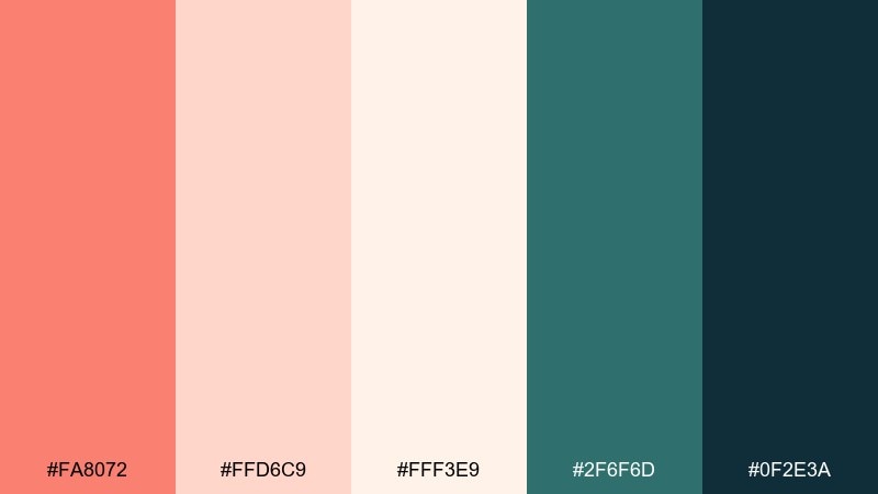
HEX: #FA8072 #FFD6C9 #FFF3E9 #2F6F6D #0F2E3A
Mood: airy, coastal, refreshing
Best for: resort branding, summer promos, travel social posts
Airy and coastal, these tones feel like warm sun on skin with a cool ocean breeze nearby. Use the soft peach and cream as spacious backgrounds, then anchor layouts with deep teal and navy for contrast. It works beautifully for travel brands, seasonal launches, and friendly lifestyle content. Tip: keep text in the dark navy and reserve teal for buttons or key icons so the salmon stays inviting, not loud.
Image example of seaside salmon generated using media.io
Media.io is an online AI studio for creating and editing video, image, and audio in your browser.

2) Rose Clay Neutrals
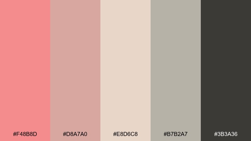
HEX: #F48B8D #D8A7A0 #E8D6C8 #B7B2A7 #3B3A36
Mood: grounded, calm, organic
Best for: boutique skincare branding, packaging systems, minimalist websites
Grounded and calm, the mix reads like rose clay, warm sand, and a soft stone finish. Let the taupe and beige handle most surfaces, then bring in the pink as a gentle highlight for labels and callouts. It suits skincare, wellness studios, and quiet luxury product pages. Tip: use the charcoal for typography to keep accessibility high against the lighter neutrals.
Image example of rose clay neutrals generated using media.io
3) Citrus Sorbet
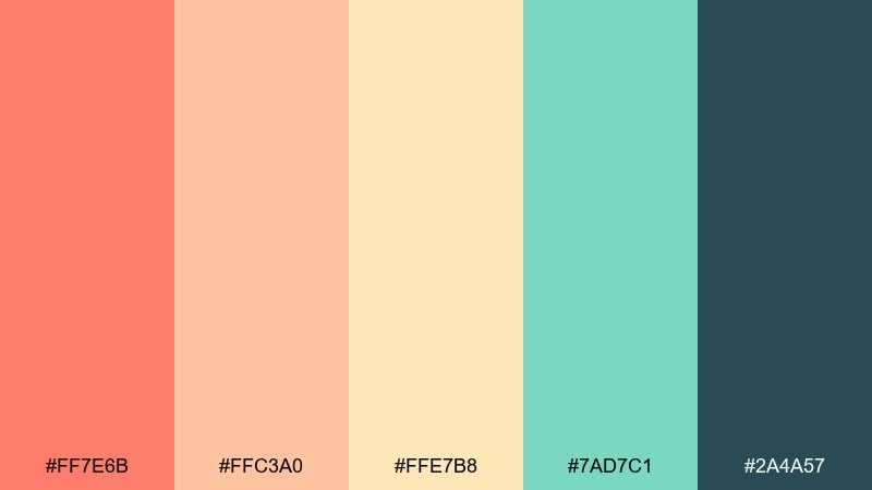
HEX: #FF7E6B #FFC3A0 #FFE7B8 #7AD7C1 #2A4A57
Mood: playful, bright, juicy
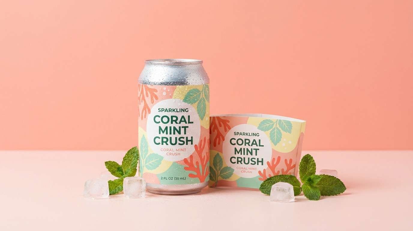
Best for: summer campaign graphics, beverage ads, energetic landing pages
Playful and juicy, it evokes sorbet swirls and bright afternoon light. These salmon pink color combinations feel freshest when the coral and mint share the spotlight, with deep slate used sparingly for structure. Great for summer promotions, DTC beverage brands, and bold hero sections. Tip: keep backgrounds warm and light, then place the darkest color only on headlines and price points for punch.
Image example of citrus sorbet generated using media.io
4) Vintage Blush
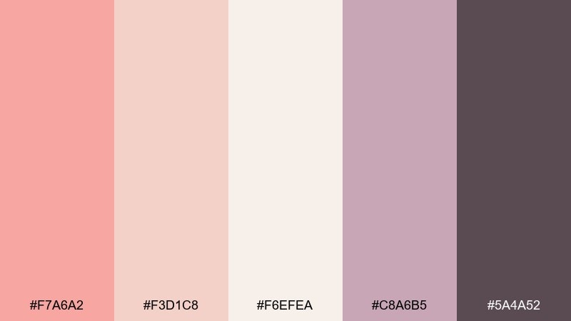
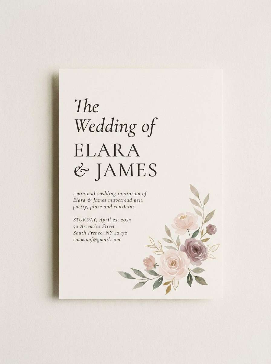
HEX: #F7A6A2 #F3D1C8 #F6EFEA #C8A6B5 #5A4A52
Mood: romantic, nostalgic, soft
Best for: wedding stationery, boutique lookbooks, feminine editorial design
Romantic and nostalgic, these blush tones feel like pressed petals and satin fabric. Pair the pale cream with dusty mauve for a vintage print vibe, then use the plum-gray for elegant type. It shines in wedding stationery, lookbooks, and gentle editorial layouts. Tip: add subtle grain or paper texture to make the pastels feel richer on screen.
Image example of vintage blush generated using media.io
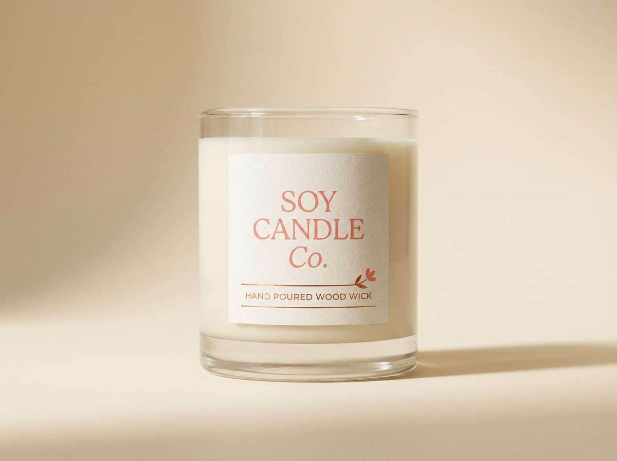
5) Copper Bloom
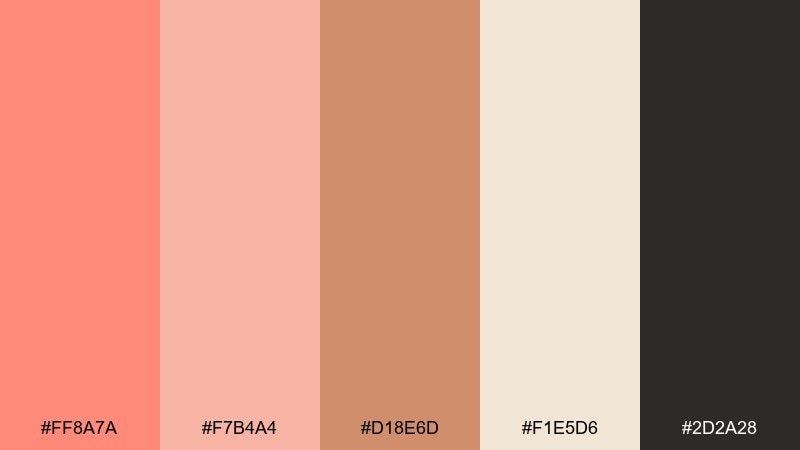
HEX: #FF8A7A #F7B4A4 #D18E6D #F1E5D6 #2D2A28
Mood: warm, artisanal, handcrafted
Best for: candle labels, artisan food packaging, cozy ecommerce banners
Warm and artisanal, it suggests copper pots, baked spices, and a soft glow at dusk. Use the caramel copper as a secondary accent to keep the pink lively without becoming too sugary. Ideal for candles, small-batch foods, and handmade marketplaces. Tip: print designs look best when the cream stays dominant and the darkest tone is used for a single strong brand mark.
Image example of copper bloom generated using media.io
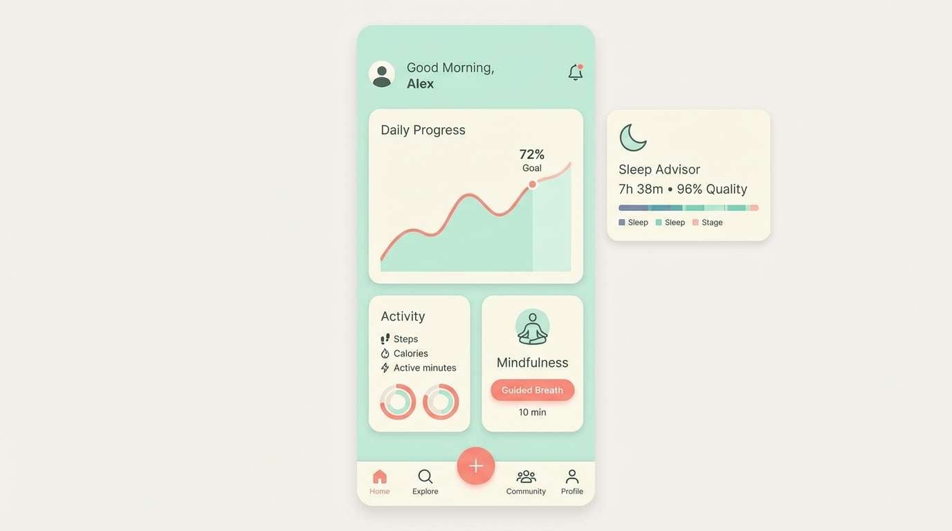
6) Nordic Pastel
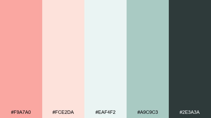
HEX: #F9A7A0 #FCE2DA #EAF4F2 #A9C9C3 #2E3A3A
Mood: clean, modern, airy
Best for: wellness apps, modern UI kits, calm dashboard themes
Clean and airy, it feels like a bright studio with linen curtains and pale ceramics. The minty light neutral keeps screens breathable while the salmon provides friendly emphasis for highlights and states. It works well for wellness apps, calm dashboards, and modern UI kits. Tip: use the dark gray-green for text and navigation, and keep the salmon for primary actions only.
Image example of nordic pastel generated using media.io
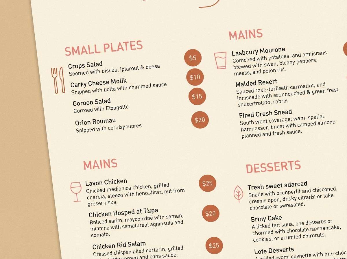
7) Terracotta Dessert
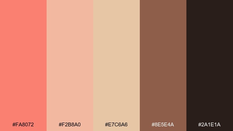
HEX: #FA8072 #F2B8A0 #E7C6A6 #8E5E4A #2A1E1A
Mood: toasty, rustic, comforting
Best for: restaurant menus, cafe branding, food photography overlays
Toasty and comforting, it brings to mind baked terracotta, caramel drizzle, and warm café lighting. This salmon pink color scheme pairs best with deep cocoa browns for headers and dividers, keeping the overall look appetizing and grounded. Use it on menus, loyalty cards, and social templates for bakeries or brunch spots. Tip: choose one warm mid-tone for background blocks and keep salmon for badges like new, seasonal, or chef's pick.
Image example of terracotta dessert generated using media.io
8) Peony Latte
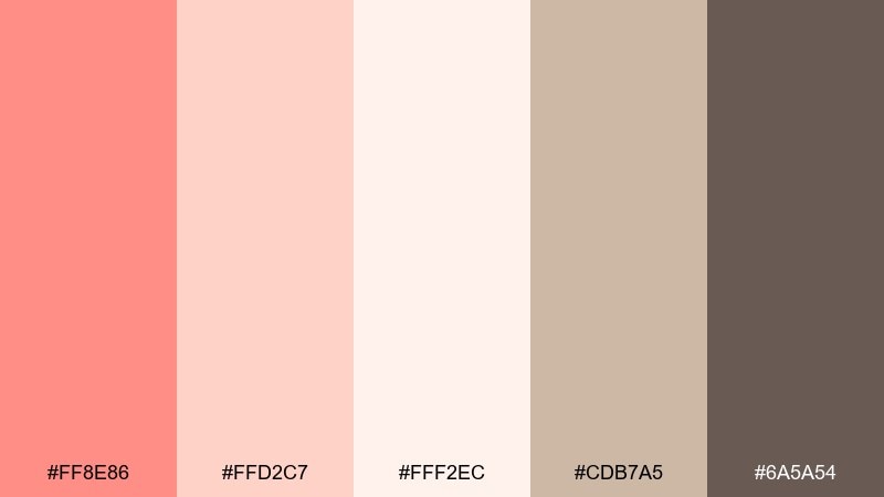
HEX: #FF8E86 #FFD2C7 #FFF2EC #CDB7A5 #6A5A54
Mood: soft, cozy, elegant
Best for: beauty landing pages, lifestyle blogs, gentle brand refreshes
Soft and cozy, it feels like peonies on a breakfast table with a milky latte nearby. The warm beige and mocha tones keep the pink refined, especially for long-form pages and hero banners. Perfect for beauty sites, lifestyle blogs, and calm product storytelling. Tip: add thin mocha rules and plenty of whitespace to give the pastels a polished, editorial rhythm.
Image example of peony latte generated using media.io
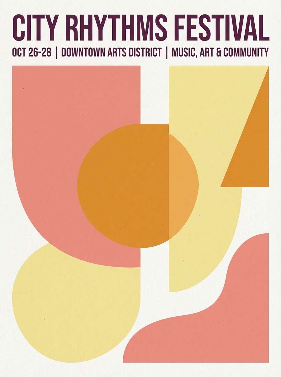
9) Sunset Melon
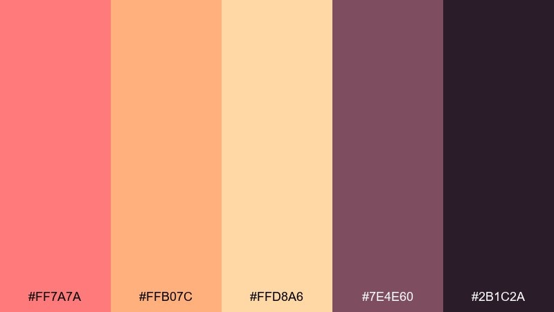
HEX: #FF7A7A #FFB07C #FFD8A6 #7E4E60 #2B1C2A
Mood: bold, warm, sunset-lit
Best for: event posters, music promos, energetic brand campaigns
Bold and sunset-lit, it suggests melon slices, neon signs warming up, and a late-summer sky. Use the orange and butter tones for big shapes, then let the deep plum shades deliver dramatic contrast. Great for event posters, music promos, and punchy campaign graphics. Tip: limit small text to the dark tones and keep the bright colors in large blocks to avoid visual noise.
Image example of sunset melon generated using media.io
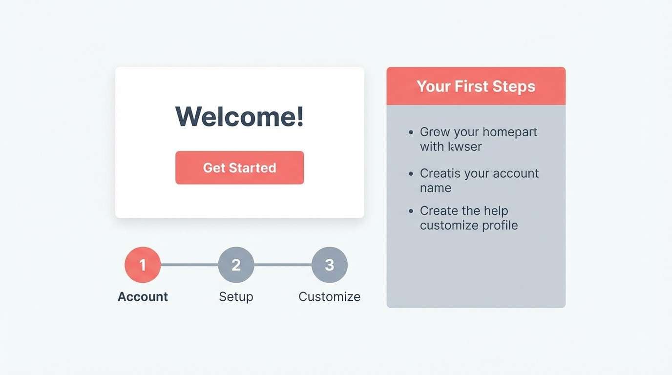
10) Minimal Warmth
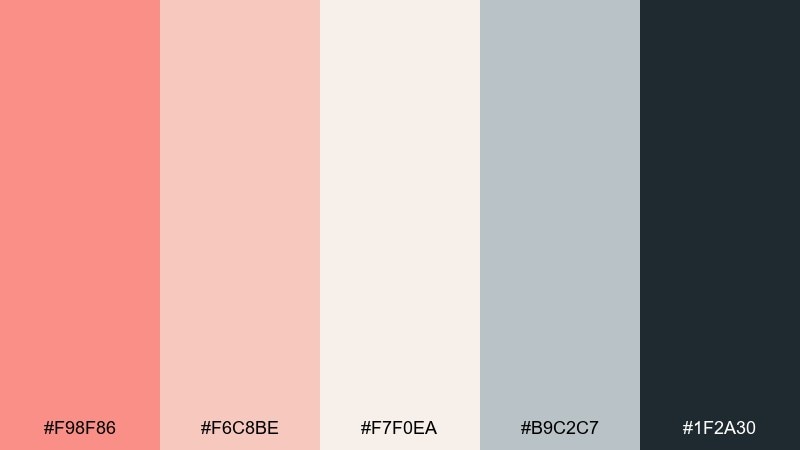
HEX: #F98F86 #F6C8BE #F7F0EA #B9C2C7 #1F2A30
Mood: minimal, balanced, professional
Best for: SaaS onboarding, presentation decks, modern corporate sites
Minimal and balanced, the palette feels like warm light against cool steel and clean paper. Let the off-white carry most of the layout, then use salmon for progress states and friendly highlights. It fits SaaS onboarding, pitch decks, and modern corporate sites that want warmth without losing clarity. Tip: pair salmon buttons with the deep blue-gray for hover states and maintain a consistent, restrained accent ratio.
Image example of minimal warmth generated using media.io
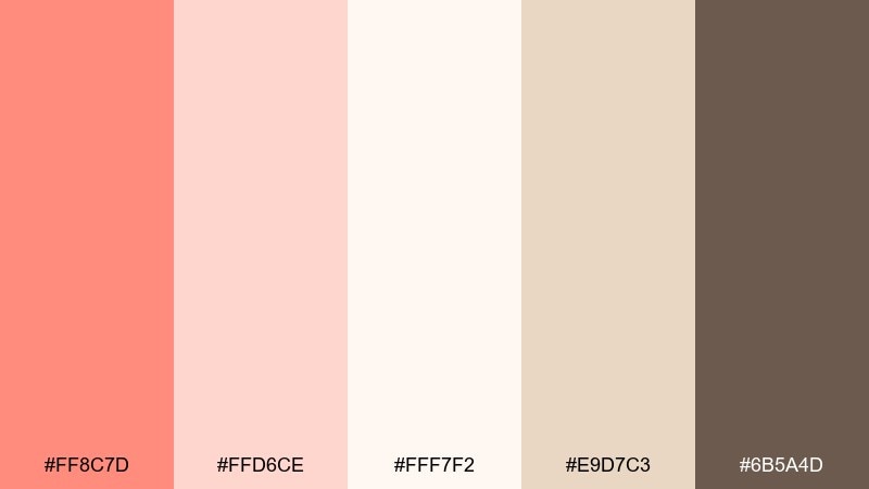
11) Coral Linen
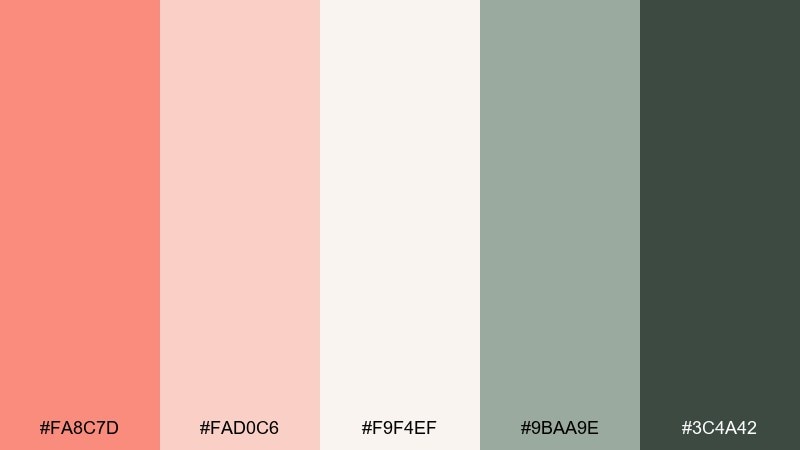
HEX: #FA8C7D #FAD0C6 #F9F4EF #9BAA9E #3C4A42
Mood: fresh, natural, relaxed
Best for: eco branding, packaging for home goods, sustainable web design
Fresh and relaxed, it reads like coral-dyed linen with a hint of garden green. The soft blushes keep things approachable while the sage notes bring a natural, eco-forward cue. Ideal for home goods, sustainable brands, and clean product pages. Tip: use sage for secondary buttons and icons so the warm tones stay the emotional lead.
Image example of coral linen generated using media.io
12) Apricot Studio
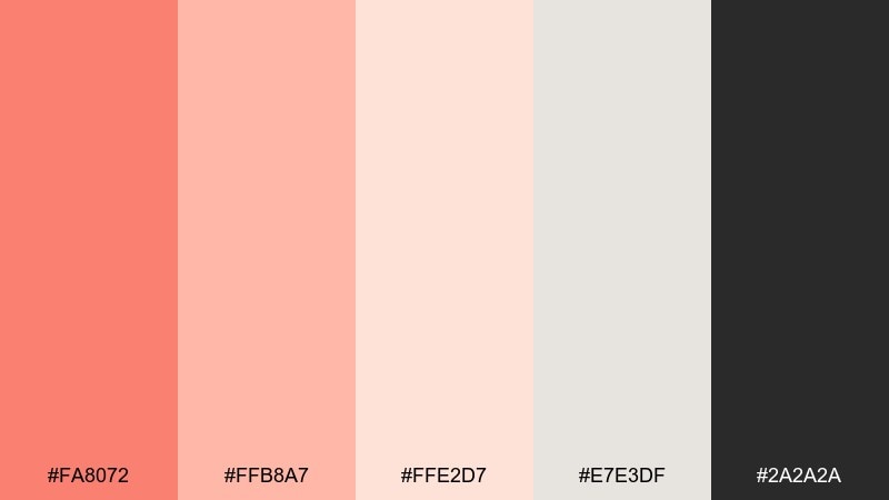
HEX: #FA8072 #FFB8A7 #FFE2D7 #E7E3DF #2A2A2A
Mood: creative, light, studio-clean
Best for: creator portfolios, design agencies, mood boards
Creative and studio-clean, it feels like apricot paper, paint swatches, and bright desk light. The light grays keep layouts neutral so the salmon and apricot shades can guide attention naturally. This salmon pink color palette is a strong fit for agency sites, portfolios, and mood boards where you want warmth without clutter. Tip: use the near-black for crisp grid lines and captions to maintain a sharp, modern finish.
Image example of apricot studio generated using media.io
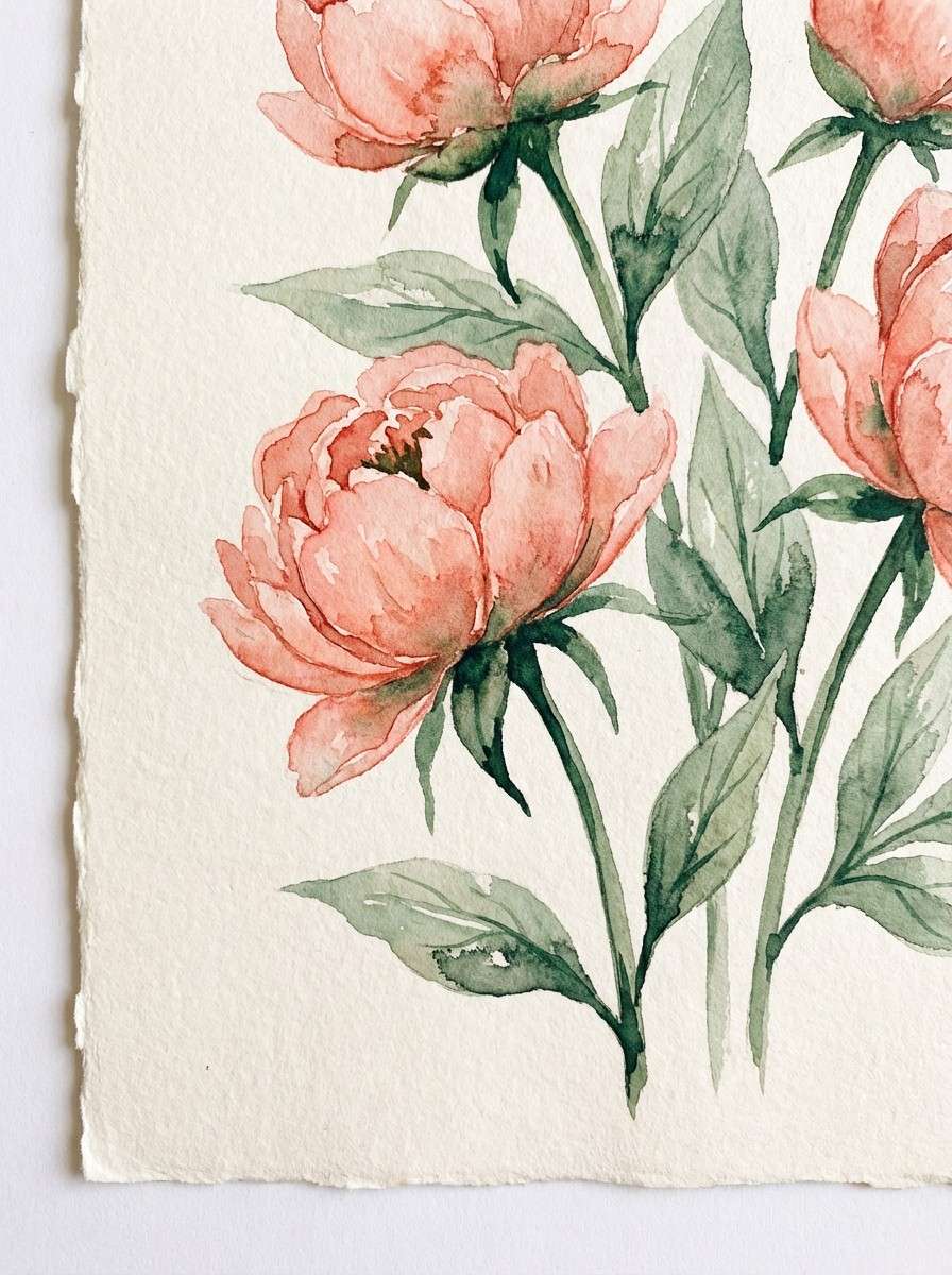
13) Botanical Pink
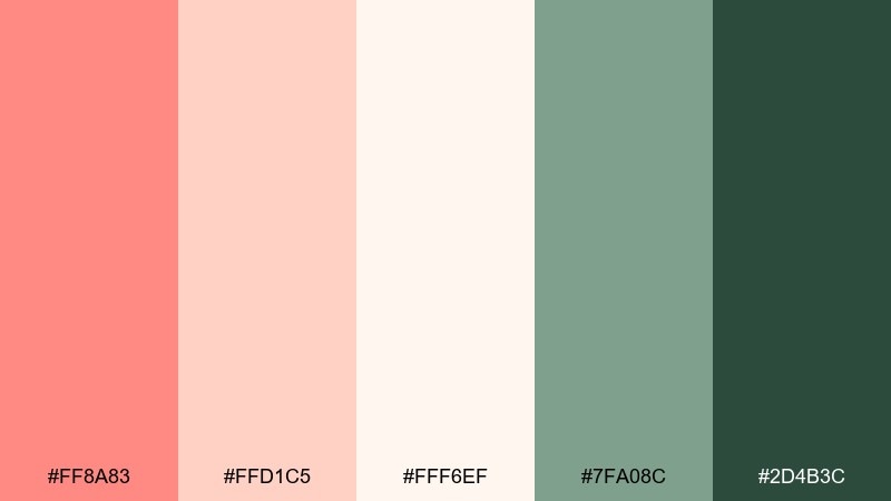
HEX: #FF8A83 #FFD1C5 #FFF6EF #7FA08C #2D4B3C
Mood: botanical, gentle, springlike
Best for: floral illustrations, garden brands, seasonal cards
Botanical and springlike, it calls up new leaves, soft petals, and dewy mornings. The greens give structure and freshness, while the pinks keep the mood sweet and welcoming. Use it for garden brands, seasonal cards, and botanical illustration sets. Tip: keep the darkest green for stems and typography, and let the lighter greens do the background washes.
Image example of botanical pink generated using media.io
14) Satin Ribbon
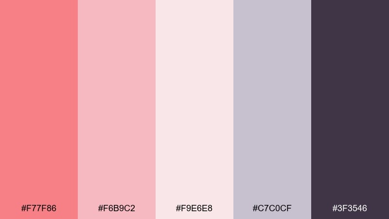
HEX: #F77F86 #F6B9C2 #F9E6E8 #C7C0CF #3F3546
Mood: glam, silky, romantic
Best for: beauty promos, gift packaging, boutique social ads
Glam and silky, it feels like satin ribbon, soft blush makeup, and a hint of lavender dusk. Use the pale pink as a luminous base and bring in the deeper plum for a luxe focal point. It works well for beauty promos, gift packaging, and boutique social ads. Tip: add subtle gradients between the pinks to mimic fabric sheen without needing heavy textures.
Image example of satin ribbon generated using media.io

15) Modern Retro Pop
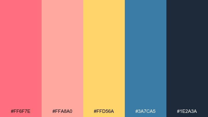
HEX: #FF6F7E #FFA8A0 #FFD56A #3A7CA5 #1E2A3A
Mood: retro, punchy, confident
Best for: social reels covers, startup launches, playful posters
Retro and punchy, it channels arcade posters, bold headlines, and sunny accent pops. Let the deep navy ground the layout while salmon and yellow do the fun, high-energy work. Great for startup launches, playful posters, and social covers that need instant scroll-stopping contrast. Tip: keep the blue as a single large block or header bar so the warm colors stay vibrant and legible.
Image example of modern retro pop generated using media.io

16) Dusty Coral Drift
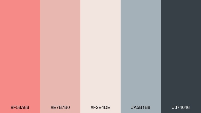
HEX: #F58A86 #E7B7B0 #F2E4DE #A5B1B8 #374046
Mood: muted, airy, contemporary
Best for: interior mood boards, architecture portfolios, calm presentations
Muted and contemporary, it looks like dusty coral paint against soft concrete and foggy skies. The blue-gray notes cool the warmth, making it easy to use across large surfaces without feeling overly sweet. Ideal for interior mood boards, architecture portfolios, and calm presentations. Tip: let the neutrals dominate and use coral only for section headers or key pins in a layout.
Image example of dusty coral drift generated using media.io
17) Champagne Petal
HEX: #FF8C7D #FFD6CE #FFF7F2 #E9D7C3 #6B5A4D
Mood: celebratory, soft, refined
Best for: bridal branding, champagne bars, elegant flyers
Celebratory and refined, it feels like clinking glasses and soft petals scattered on linen. Champagne beige and cream create an upscale base, while salmon adds warmth that photographs well in print. Use it for bridal branding, elegant flyers, and premium service pages. Tip: choose metallic foil or subtle gloss on the beige tones to elevate the overall finish without overpowering the pink.
Image example of champagne petal generated using media.io
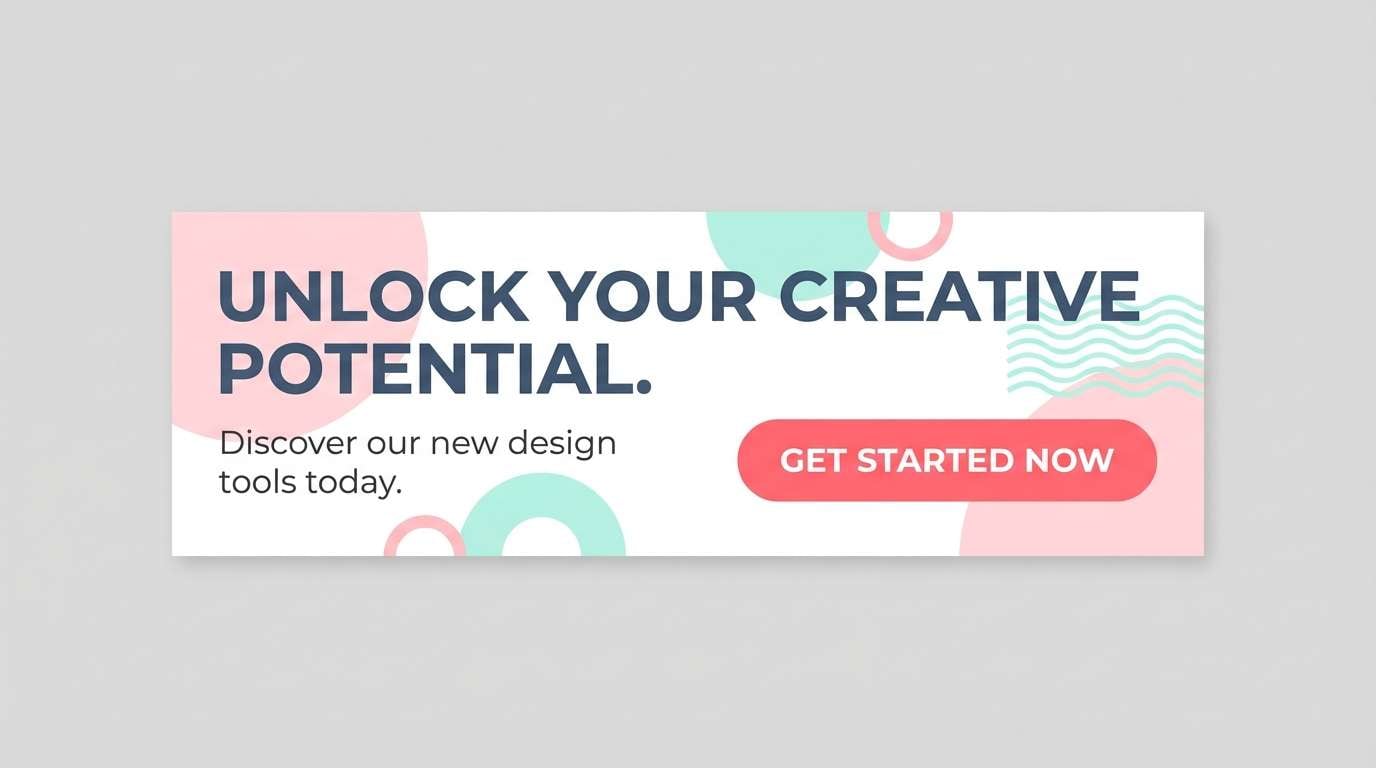
18) Soft Neon Accent
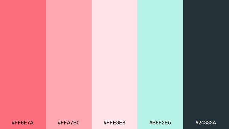
HEX: #FF6E7A #FFA7B0 #FFE3E8 #B6F2E5 #24333A
Mood: modern, lively, high-contrast
Best for: app marketing graphics, CTA sections, youth-oriented branding
Modern and lively, it feels like a soft neon sign glowing through mist. The minty aqua keeps the palette energized, while the deep slate prevents the bright pinks from becoming too candy-like. It excels in app marketing graphics, CTA sections, and youth-oriented brand moments. Tip: use the neon pink only for one primary action per screen and rely on the softer pink for secondary highlights.
Image example of soft neon accent generated using media.io
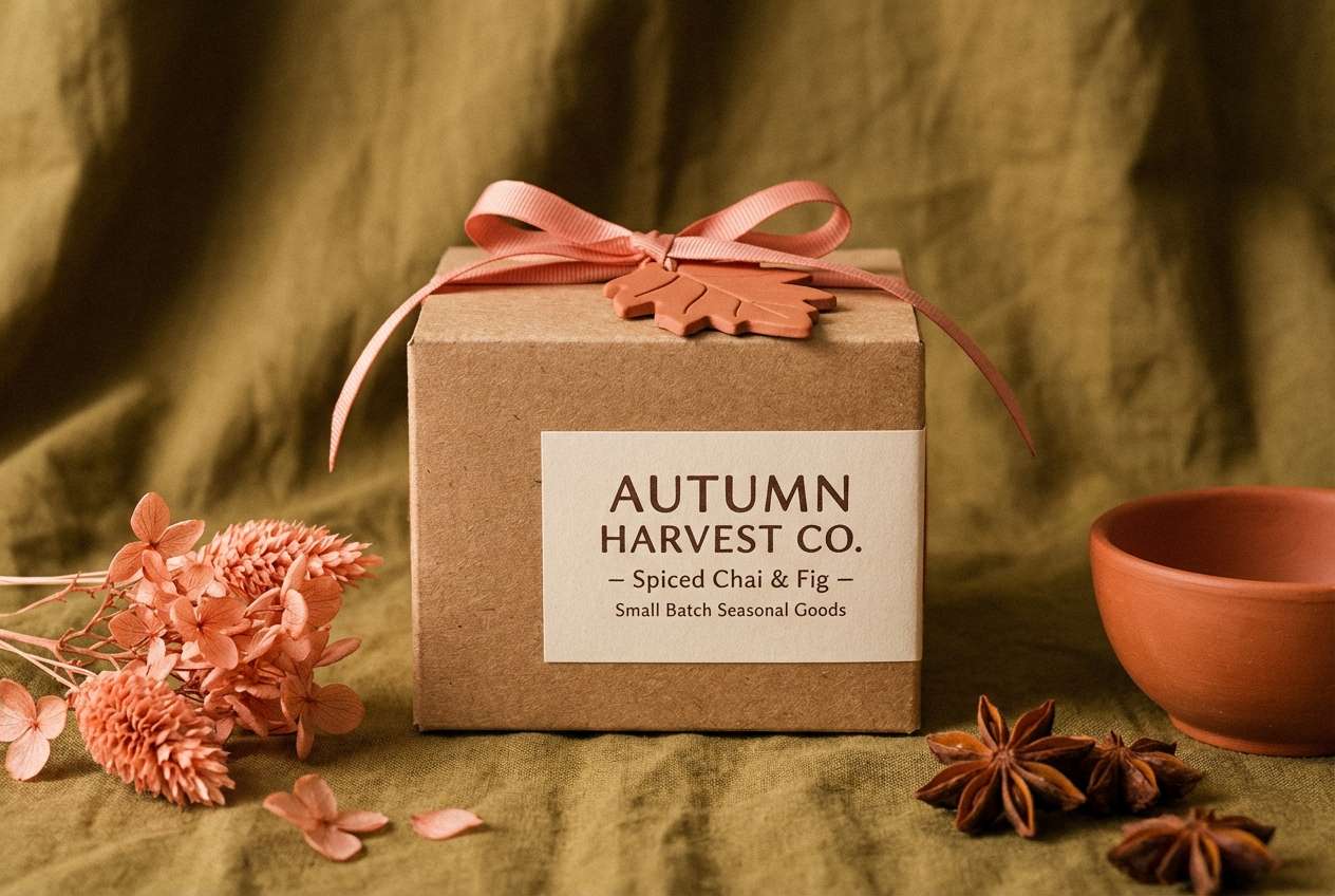
19) Autumn Salmon
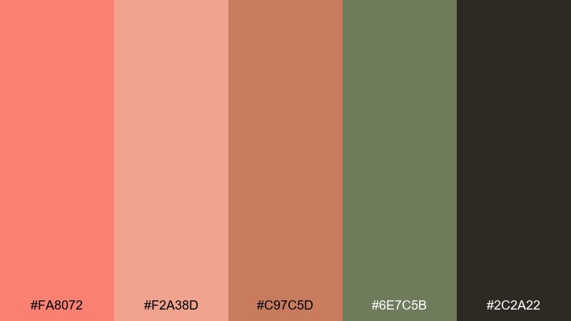
HEX: #FA8072 #F2A38D #C97C5D #6E7C5B #2C2A22
Mood: earthy, seasonal, cozy
Best for: fall campaigns, craft markets, seasonal product launches
Earthy and seasonal, it evokes fallen leaves, knit textures, and warm market lights. The olive green and deep brown make the pink feel more mature, perfect for autumn campaigns and rustic branding. This salmon pink color palette works especially well for craft markets, seasonal product launches, and packaging that needs a natural vibe. Tip: keep the olive as the main background tone and use salmon for stamps, stickers, or sale bursts.
Image example of autumn salmon generated using media.io
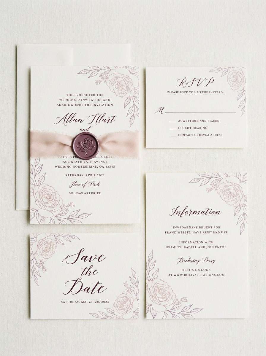
20) Wedding Whisper
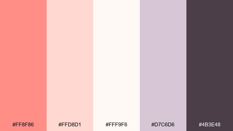
HEX: #FF8F86 #FFD8D1 #FFF9F6 #D7C6D6 #4B3E48
Mood: delicate, romantic, timeless
Best for: wedding suites, save-the-dates, elegant invitations
Delicate and timeless, it suggests whispered vows, soft tulle, and candlelit reception tables. The pale blush and near-white keep layouts airy, while muted lilac and plum add a refined frame. Ideal for wedding suites, save-the-dates, and premium invite designs. Tip: print on uncoated paper and use the dark plum for monograms to keep everything crisp and readable.
Image example of wedding whisper generated using media.io
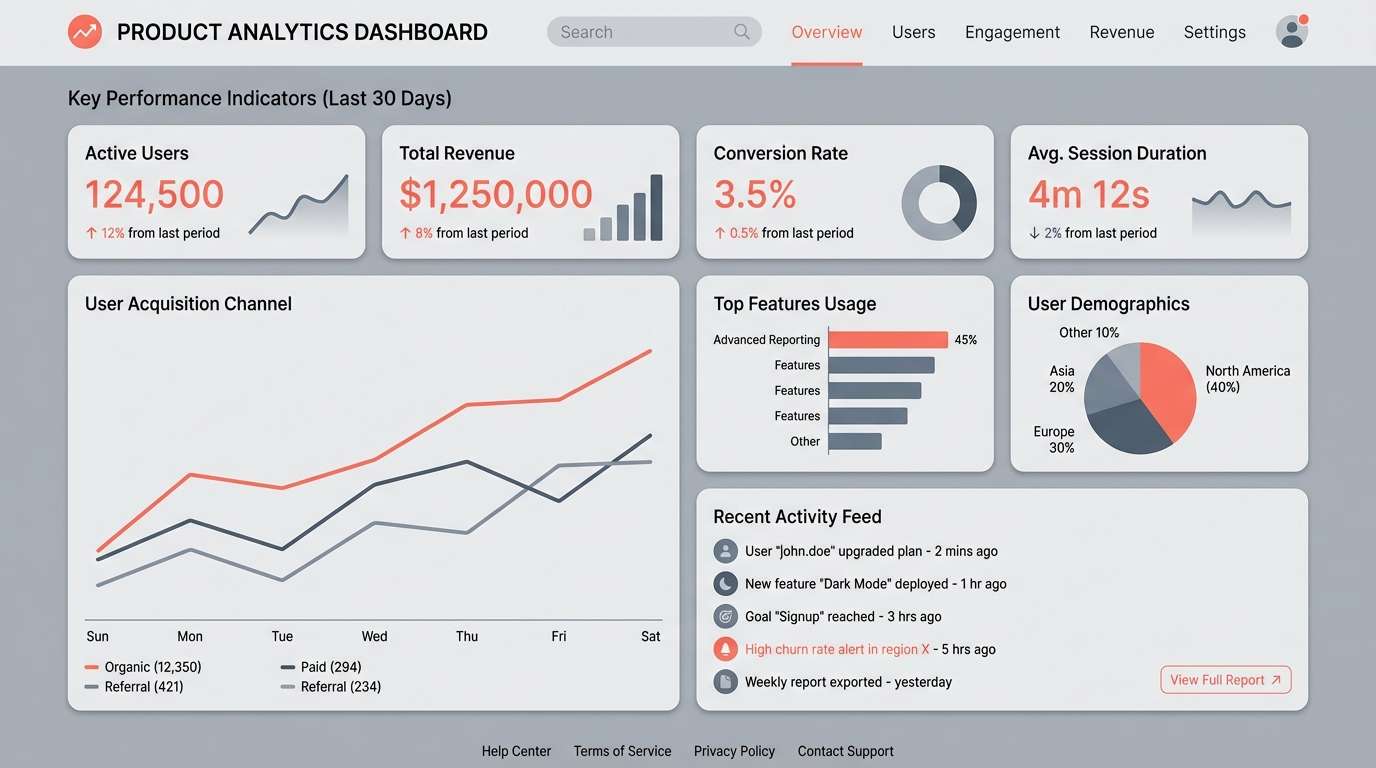
21) City Coral Contrast
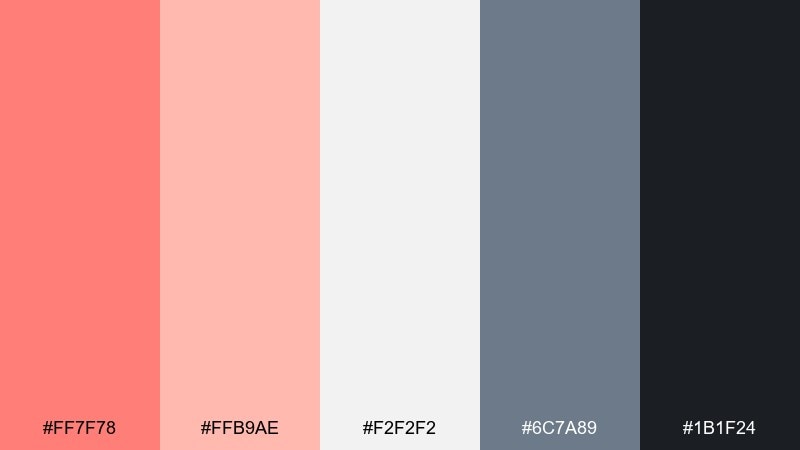
HEX: #FF7F78 #FFB9AE #F2F2F2 #6C7A89 #1B1F24
Mood: urban, crisp, modern
Best for: tech branding, pitch decks, clean product UI
Urban and crisp, it feels like coral accents against concrete, glass, and night signage. The grays give you a strong structure for grids and data, while the warm pinks add human energy. This salmon pink color palette is a smart choice for tech branding, pitch decks, and clean product UI. Tip: treat coral as a status color for highlights and keep most surfaces neutral to preserve a premium feel.
Image example of city coral contrast generated using media.io
What Colors Go Well with Salmon Pink?
Salmon pink pairs beautifully with cool contrasts like teal, deep navy, slate, and blue-gray—these shades sharpen readability and make salmon accents feel intentional rather than sugary.
For softer, romantic combinations, lean into warm neutrals like cream, champagne beige, warm taupe, and mocha. These keep layouts calm and premium, especially on packaging and editorial pages.
If you want playful energy, add sunlit tones (butter yellow, apricot, peach) or a clean mint/aqua. Use the brights in larger shapes and keep dark text for legibility.
How to Use a Salmon Pink Color Palette in Real Designs
Start with role-based color assignments: one light neutral for backgrounds, one dark tone for text, salmon pink for primary emphasis, and one supporting accent (often green/blue) for secondary actions or data states.
In UI, keep salmon for key actions (primary buttons, active states, highlights) and let neutrals do most of the surface work. This improves consistency and helps the interface feel modern instead of overly cute.
For print and branding, salmon works best when balanced by texture and restraint—use it as a label highlight, stamp, or header band, then anchor the system with charcoal/navy typography.
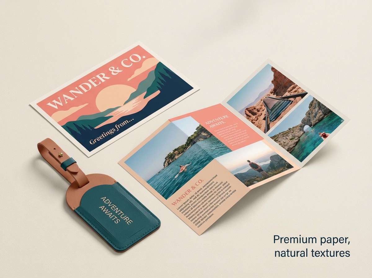
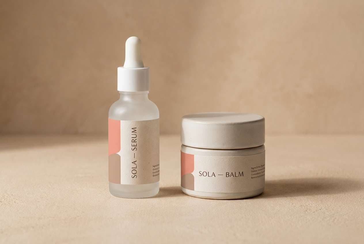
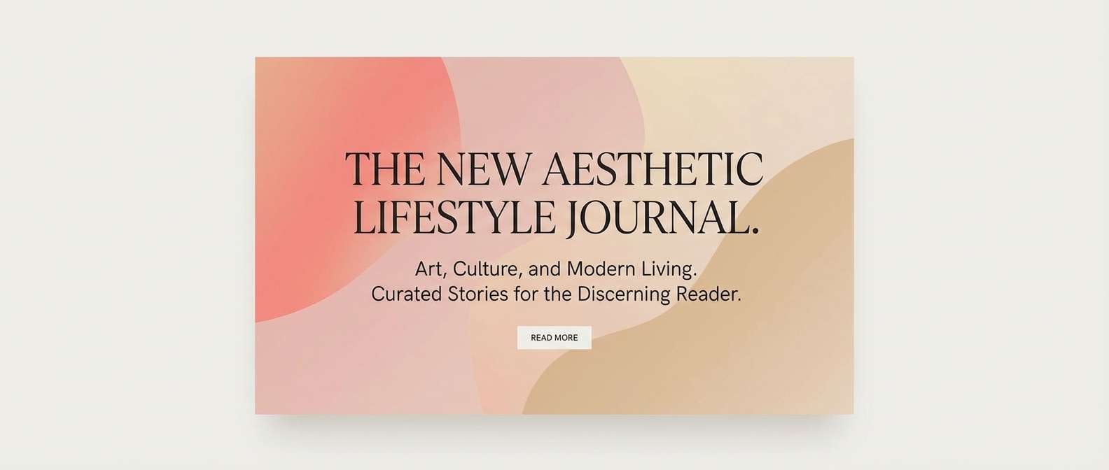
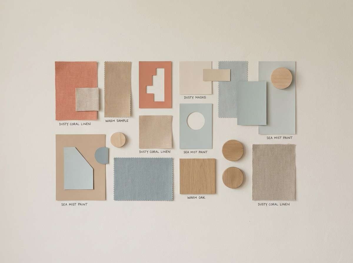
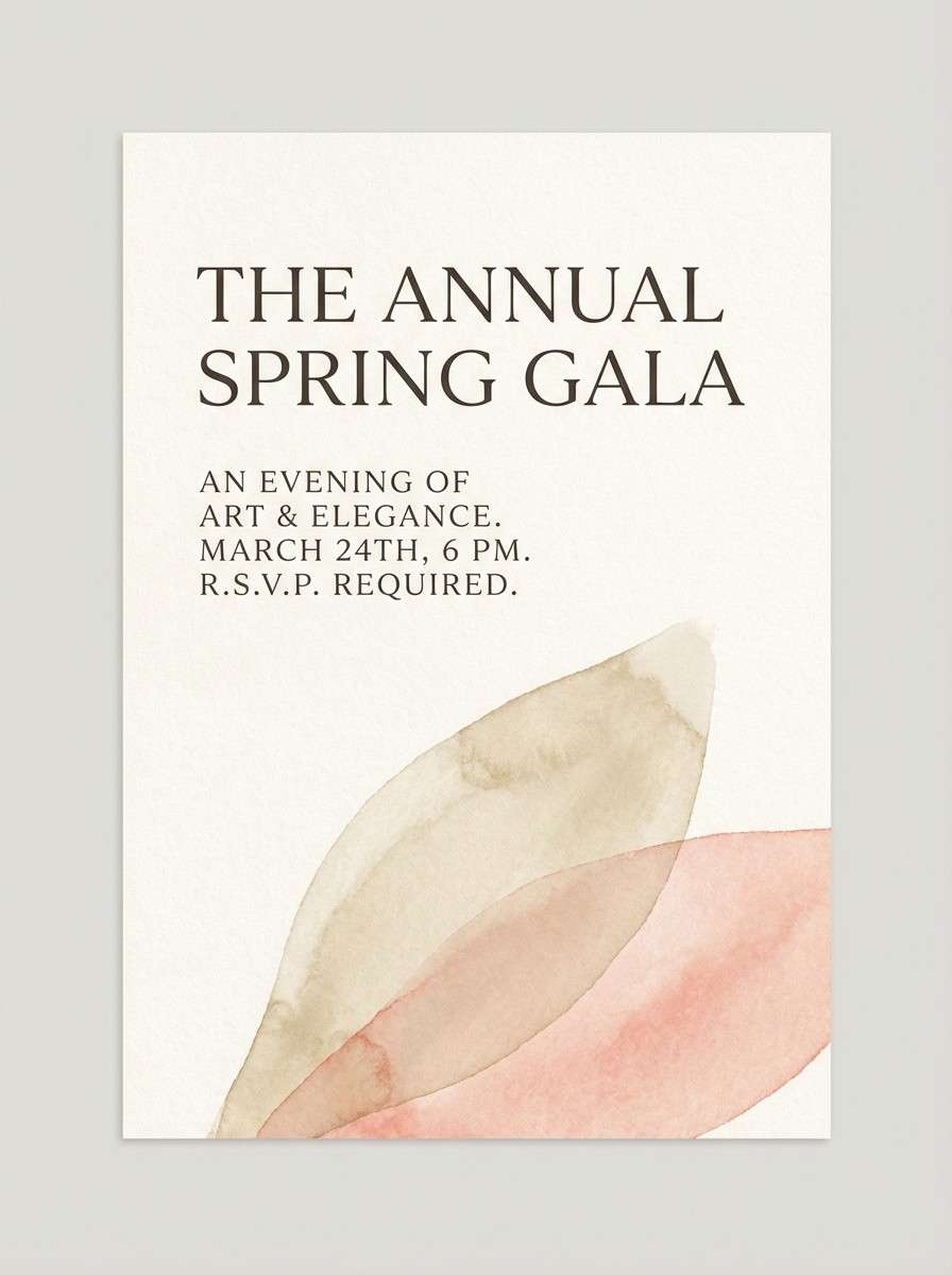
Create Salmon Pink Palette Visuals with AI
If you already have HEX codes, you can turn them into on-brand mockups quickly by generating product scenes, posters, dashboards, and flatlays that match your palette.
Pick a palette above, copy the prompt, and adjust the subject (packaging, UI, invite, banner) while keeping the color cues intact. This is a fast way to test brand directions before committing to a full design system.
With Media.io, you can create multiple variations in minutes and keep the look consistent across campaigns, landing pages, and social graphics.
Salmon Pink Color Palette FAQs
-
What is the HEX code for salmon pink?
The classic salmon pink HEX code is #FA8072. Many “salmon” variations shift slightly warmer (more orange) or softer (more blush), but #FA8072 is the most recognized baseline. -
Is salmon pink warm or cool?
Salmon pink is typically a warm color because it blends red/pink with orange undertones. You can make it feel cooler by pairing it with teal, navy, or blue-gray. -
What colors complement salmon pink best?
High-impact complements include teal, deep navy, and slate. For a softer look, pair salmon pink with cream, champagne beige, warm taupe, or sage. -
Can I use salmon pink for a modern UI design?
Yes—use salmon as an accent (buttons, highlights, badges) and rely on off-white/gray surfaces plus dark text for structure. This keeps the interface clean, readable, and contemporary. -
How do I keep salmon pink from looking too “sweet”?
Balance it with grounded tones like charcoal, mocha, olive, or blue-gray, and avoid using salmon as the only saturated color across large areas. -
Does salmon pink print well on invitations and packaging?
Salmon pink generally prints well, especially on uncoated or lightly textured stock. For best results, pair it with a dark ink for typography and test a proof if you’re using specialty finishes like foil or spot gloss. -
How can I generate salmon pink palette visuals quickly?
Use an AI image generator with a clear prompt that mentions your salmon tone plus 1–2 supporting accents (like teal or beige). With Media.io text-to-image, you can create multiple matching mockups and iterate fast.
Next: Daffodil Color Palette


