

Daffodil yellow brings instant optimism—bright enough to grab attention, but warm enough to feel friendly. It’s a go-to hue for spring visuals, modern branding, and UI accents that need clear hierarchy.
Below are ready-to-use daffodil color palette ideas with HEX codes, plus practical pairing and usage tips for real designs.
In this article
Why Daffodil Palettes Work So Well
Daffodil yellow sits in a “high-visibility” zone: it reads quickly at a glance, which makes it ideal for headlines, icons, and key UI states. Used with restraint, it feels premium rather than loud.
It’s also emotionally versatile. Pair it with greens for a natural spring look, with navy for confident contrast, or with blush tones for romantic, editorial warmth.
Most importantly, daffodil plays well with both warm and cool neutrals—creams, grays, and charcoals—so you can build layouts that stay readable while still feeling sunny.
20+ Daffodil Color Palette Ideas (with HEX Codes)
1) Sunlit Meadow
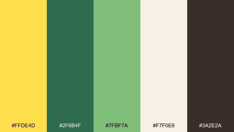
HEX: #FFDE4D #2F6B4F #7FBF7A #F7F0E6 #3A2E2A
Mood: cheerful and pastoral
Best for: spring botanical illustrations and eco branding
Cheerful and pastoral, it feels like bright petals against fresh grass and warm soil. The daffodil color palette shines as a headline yellow, balanced by grounded greens and a cozy cream. Use it for nature-forward packaging, farmers market signage, or spring campaign graphics. Tip: keep the yellow to 10 to 20 percent of the layout for a crisp, premium look.
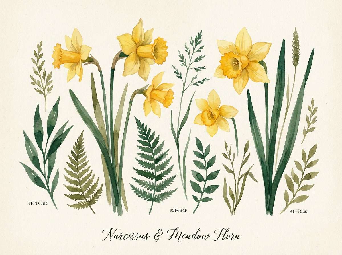
Image example of sunlit meadow generated using media.io
Media.io is an online AI studio for creating and editing video, image, and audio in your browser.

2) Buttercream Minimal
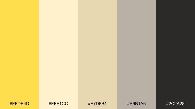
HEX: #FFDE4D #FFF1CC #E7D8B1 #B9B1A6 #2C2A28
Mood: soft and minimalist
Best for: ui dashboards and wellness landing pages
Soft and minimalist, these tones evoke buttery light, linen, and quiet confidence. The warm yellow works best as a focused accent for buttons, badges, or key metrics. Pair it with the darker charcoal for text to keep accessibility strong. Tip: use the creams as large background panels to avoid visual noise.
Image example of buttercream minimal generated using media.io
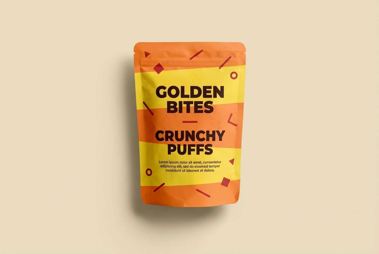
3) Citrus Pop
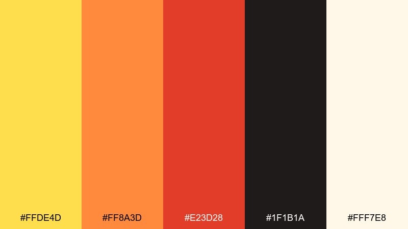
HEX: #FFDE4D #FF8A3D #E23D28 #1F1B1A #FFF7E8
Mood: bold and energetic
Best for: product ads and snack packaging
Bold and energetic, it reads like citrus zest, spicy peel, and late-summer heat. The bright yellow and orange carry the spotlight, while near-black keeps typography sharp. Use it for punchy CTAs, limited-edition labels, or social ads that need instant impact. Tip: reserve the red for small bursts so the palette stays fresh, not overwhelming.
Image example of citrus pop generated using media.io
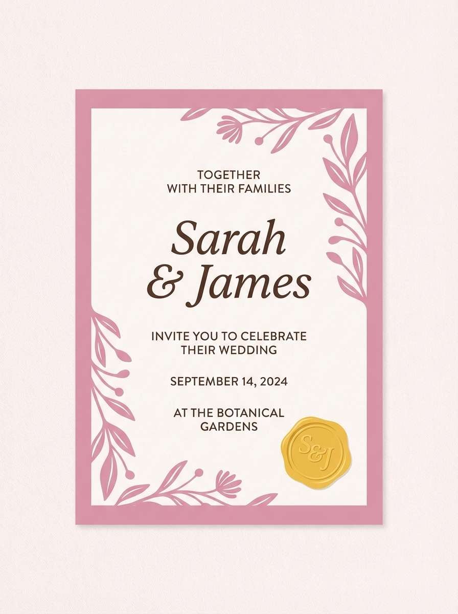
4) Dawn Blush
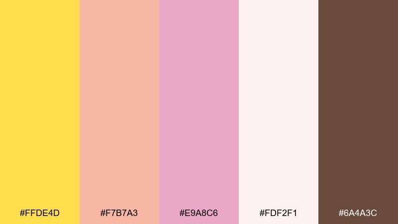
HEX: #FFDE4D #F7B7A3 #E9A8C6 #FDF2F1 #6A4A3C
Mood: romantic and airy
Best for: wedding invitations and beauty promos
Romantic and airy, it feels like sunrise glow with soft petals and blush silk. The yellow adds a surprising spark against gentle pinks, ideal for highlights and seals. Use it for invitation suites, boutique lookbooks, or feminine landing pages. Tip: keep body text in the cocoa brown for a warmer, more elegant contrast than pure black.
Image example of dawn blush generated using media.io
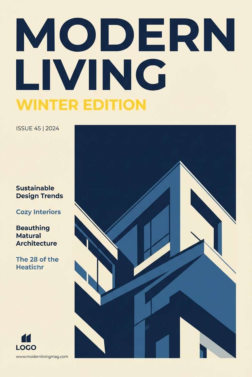
5) Navy Contrast
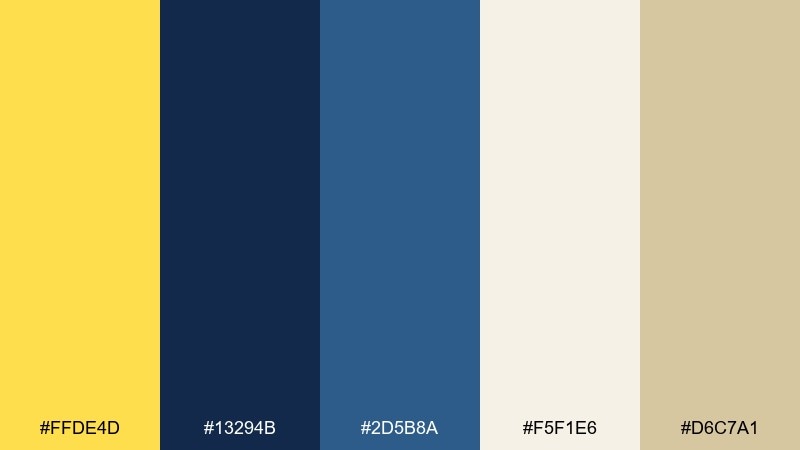
HEX: #FFDE4D #13294B #2D5B8A #F5F1E6 #D6C7A1
Mood: confident and crisp
Best for: editorial covers and corporate reports
Confident and crisp, it evokes deep evening sky with a bright sunbeam cutting through. These daffodil color combinations work especially well for charts, callouts, and navigation states that need clarity. Pair the navy with the cream for large reading areas, then use yellow sparingly for emphasis. Tip: keep the mid-blue as a supportive link color so the layout feels cohesive.
Image example of navy contrast generated using media.io
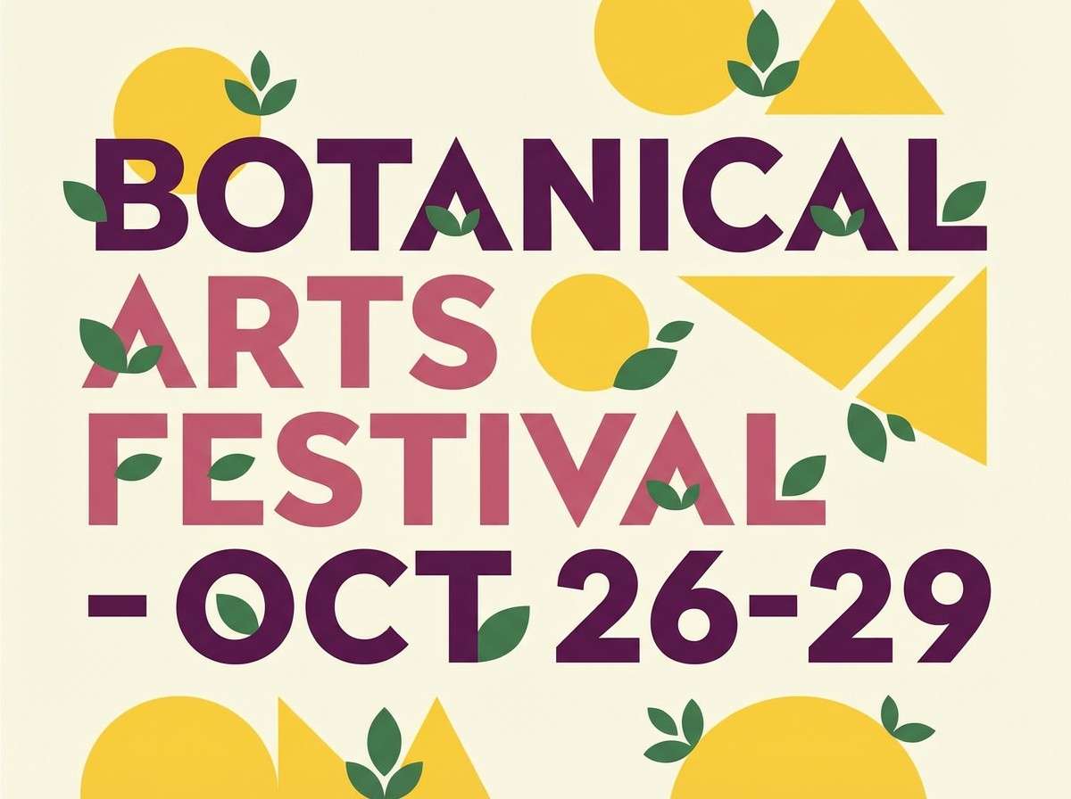
6) Garden Party
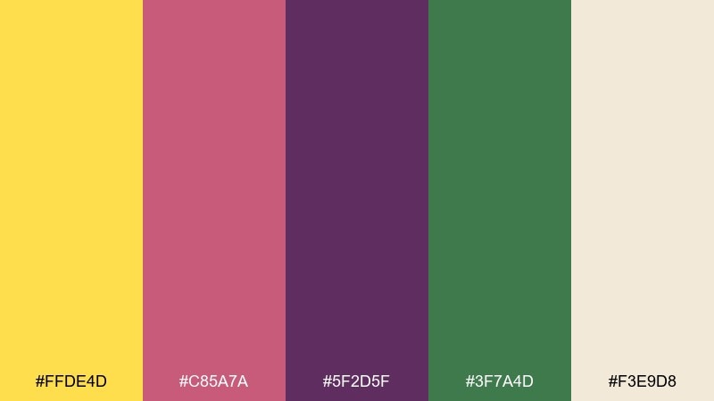
HEX: #FFDE4D #C85A7A #5F2D5F #3F7A4D #F3E9D8
Mood: playful and festive
Best for: event posters and boutique branding
Playful and festive, it feels like flower garlands, berry punch, and a sunny lawn. The yellow lifts the deeper purple and magenta so the whole mix stays upbeat. Use it for spring events, pop-up markets, or cheerful storefront posters. Tip: keep the cream as negative space to stop the saturated tones from competing.
Image example of garden party generated using media.io
7) Vintage Paper
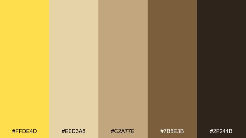
HEX: #FFDE4D #E6D3A8 #C2A77E #7B5E3B #2F241B
Mood: nostalgic and warm
Best for: stationery sets and heritage packaging
Nostalgic and warm, it recalls aged paper, book spines, and sun-faded postcards. The yellow reads like a golden highlight rather than a neon pop, especially next to the tan and brown steps. Use it for labels, craft products, or artisanal coffee branding. Tip: print textures look best when the darkest brown is used for fine linework and type.
Image example of vintage paper generated using media.io

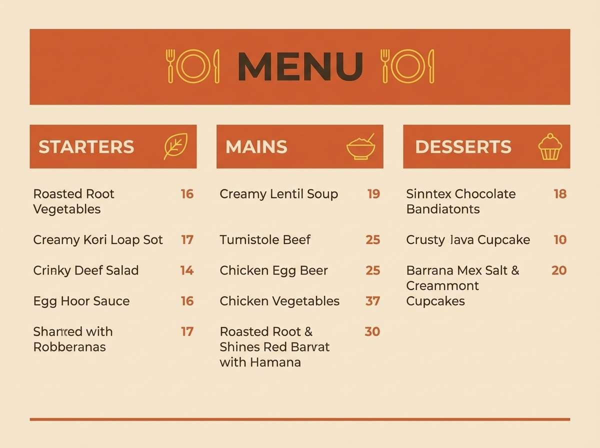
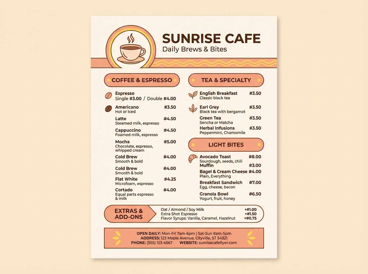
8) Modern Terra
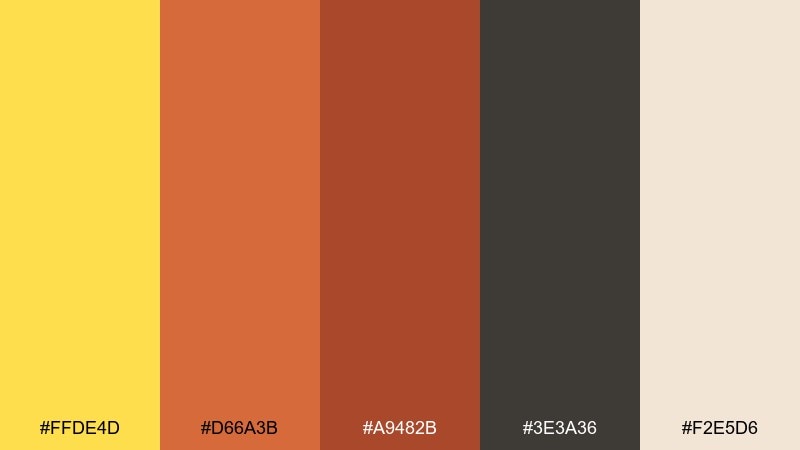
HEX: #FFDE4D #D66A3B #A9482B #3E3A36 #F2E5D6
Mood: earthy and modern
Best for: cafe branding and menu design
Earthy and modern, it suggests terracotta pots warmed by a bright afternoon beam. The charcoal gives structure, while the oranges add appetite and energy. Use it for coffee packaging, seasonal menus, or lifestyle photography overlays. Tip: treat yellow as a small stamp or icon color so the warm oranges remain the main visual field.
Image example of modern terra generated using media.io
9) Cool Gray Lift
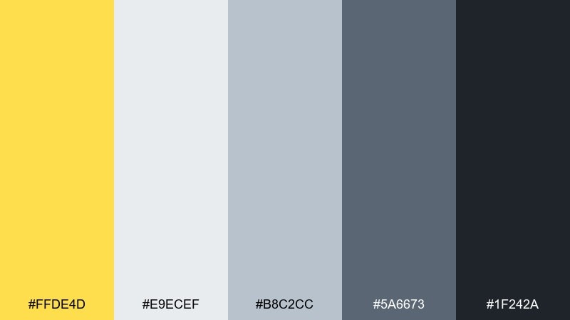
HEX: #FFDE4D #E9ECEF #B8C2CC #5A6673 #1F242A
Mood: clean and techy
Best for: saas ui and data-heavy interfaces
Clean and techy, it feels like polished metal with a confident yellow highlighter streak. The grays create a reliable base for dense content, while the yellow pulls attention to key actions. Use it for dashboards, onboarding modals, or pricing tables. Tip: keep the mid-gray for borders and dividers so the interface stays lightweight.
Image example of cool gray lift generated using media.io

10) Coastal Sand
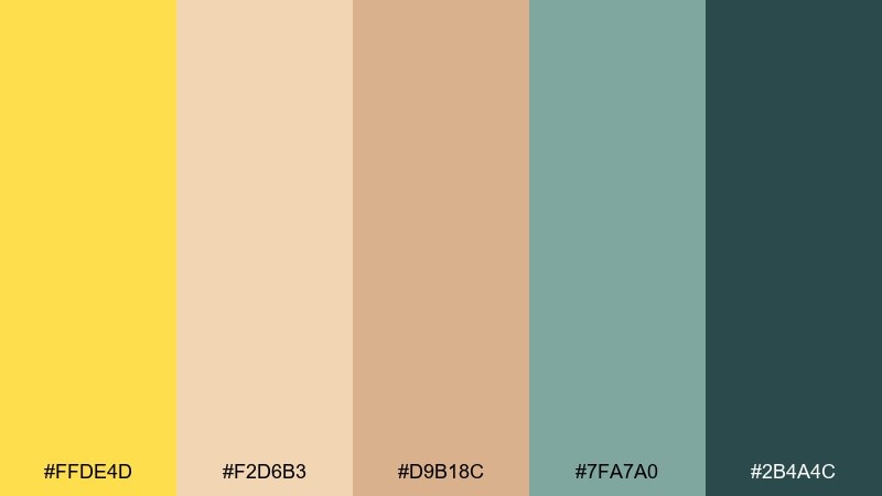
HEX: #FFDE4D #F2D6B3 #D9B18C #7FA7A0 #2B4A4C
Mood: relaxed and sun-washed
Best for: travel brochures and resort campaigns
Relaxed and sun-washed, it brings to mind sandy paths, sea glass, and warm sunshine. The muted teal keeps the palette calm, while the yellow adds sparkle without feeling loud. Use it for destination guides, hotel branding, or seasonal email headers. Tip: set the warm sand tones as backgrounds and reserve teal for headings and navigation.
Image example of coastal sand generated using media.io

11) Lavender Field
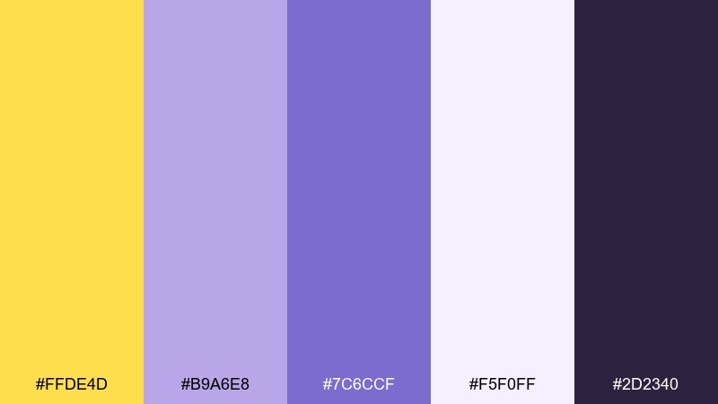
HEX: #FFDE4D #B9A6E8 #7C6CCF #F5F0FF #2D2340
Mood: dreamy and creative
Best for: beauty packaging and creator branding
Dreamy and creative, it feels like soft lavender haze with a bright yellow glint. The purple range gives depth for logos and headers, while the pale lilac keeps layouts airy. Use it for skincare labels, subscription boxes, or playful brand kits. Tip: place yellow next to the darkest purple to make icons and badges pop instantly.
Image example of lavender field generated using media.io
12) Golden Hour Film
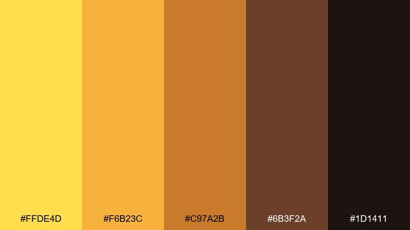
HEX: #FFDE4D #F6B23C #C97A2B #6B3F2A #1D1411
Mood: cinematic and warm
Best for: photography presets and social graphics
Cinematic and warm, it captures the glow of late afternoon and the richness of film grain. This daffodil color palette leans amber, so it flatters lifestyle imagery and food shots. Pair it with deep espresso tones for captions and subtle frames. Tip: use gradients from yellow to caramel for backgrounds that feel premium and dimensional.
Image example of golden hour film generated using media.io

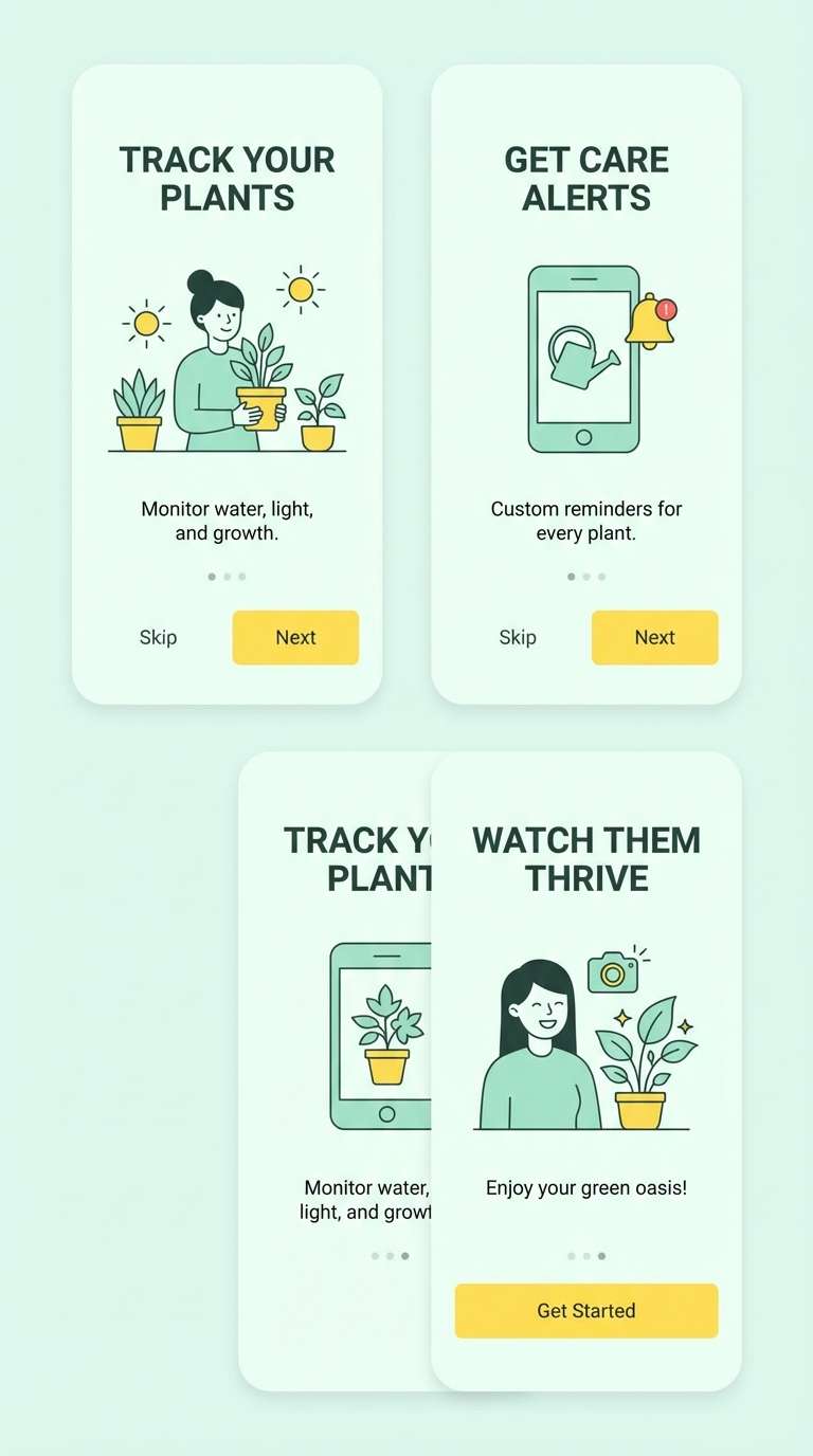
13) Fresh Mint
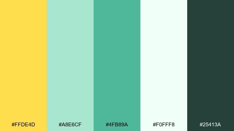
HEX: #FFDE4D #A8E6CF #4FB89A #F0FFF8 #25413A
Mood: fresh and optimistic
Best for: app onboarding and health tech
Fresh and optimistic, it feels like chilled mint water with a sunny slice of lemon. The minty greens calm the eye, making the yellow a perfect signal for progress states and highlights. Use it for onboarding flows, habit trackers, or clean brand guidelines. Tip: keep the darkest green for headings to maintain contrast on the pale background.
Image example of fresh mint generated using media.io
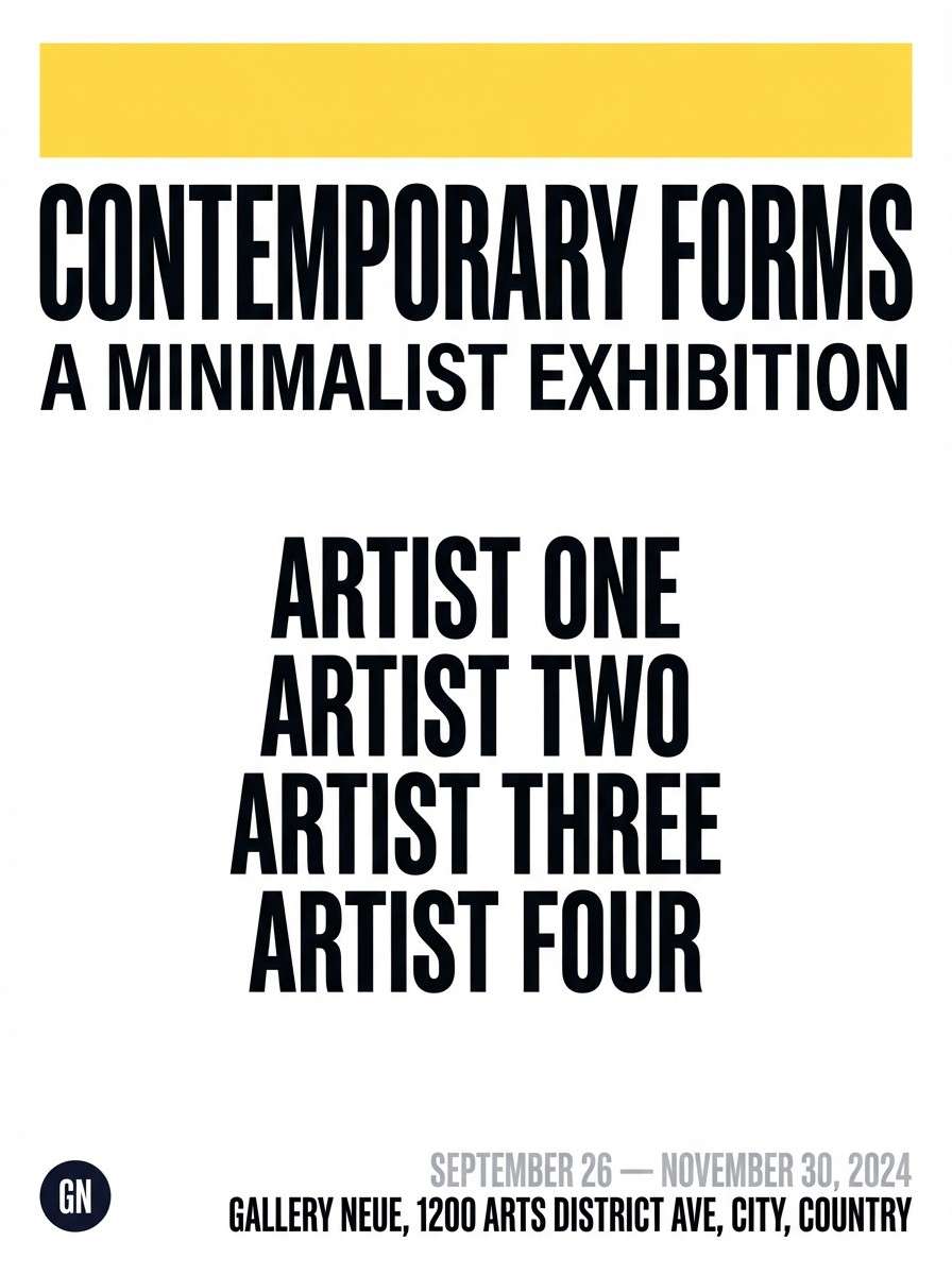
14) Black Tie Yellow
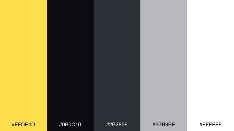
HEX: #FFDE4D #0B0C10 #2B2F36 #B7B9BE #FFFFFF
Mood: sleek and high-contrast
Best for: luxury branding and gallery posters
Sleek and high-contrast, it resembles a spotlight hitting satin in a dark room. The yellow becomes a confident accent against near-black, ideal for premium labels and bold headlines. Use it for fashion launches, exhibit posters, or minimalist hero sections. Tip: keep the white for breathing space and let gray handle secondary text to reduce glare.
Image example of black tie yellow generated using media.io
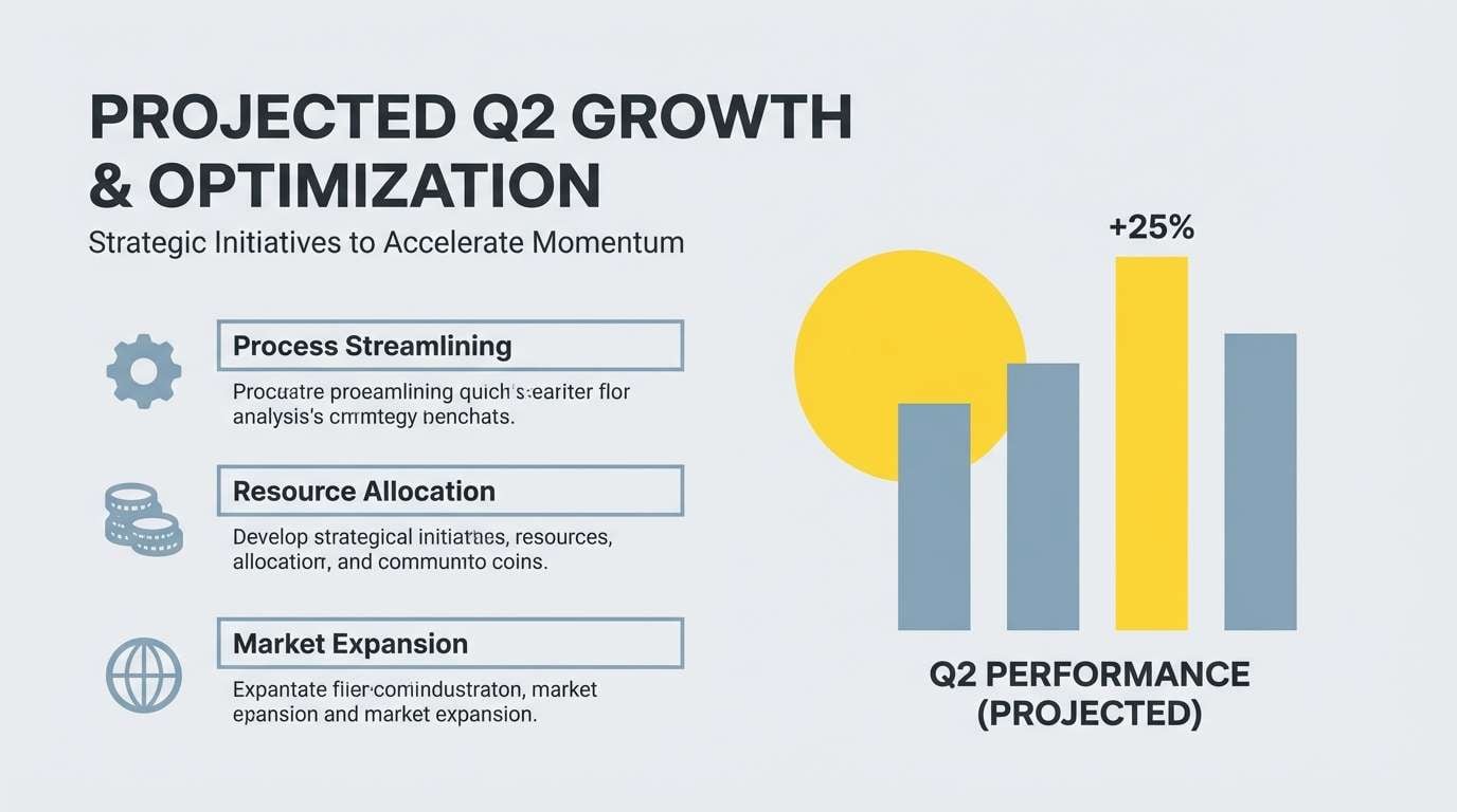
15) Rainy Day Cheer
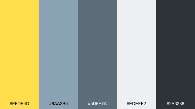
HEX: #FFDE4D #8AA3B5 #5D6E7A #EDEFF2 #2E3338
Mood: calm and uplifting
Best for: presentation templates and reports
Calm and uplifting, it feels like a yellow umbrella on a misty street. The blue-grays are professional and steady, letting the yellow bring clarity to key points. Use it for slide decks, infographics, or internal dashboards. Tip: apply yellow to one element per slide, such as a number badge or a single chart series.
Image example of rainy day cheer generated using media.io
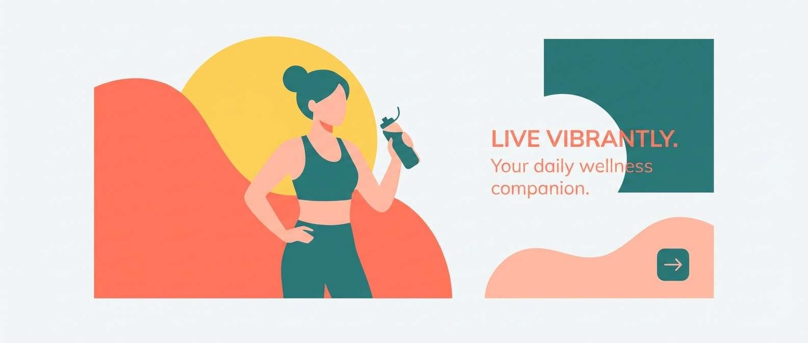
16) Coral Reef
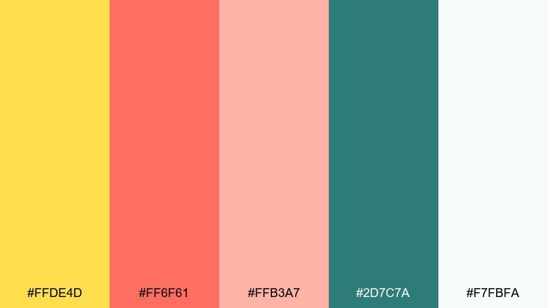
HEX: #FFDE4D #FF6F61 #FFB3A7 #2D7C7A #F7FBFA
Mood: bright and summery
Best for: seasonal campaigns and lifestyle ads
Bright and summery, it reads like coral fruit, pool tiles, and sunlit foam. The teal grounds the warm coral range so the overall look stays modern. Use it for summer promos, splashy banners, or creator thumbnails that need warmth and freshness. Tip: keep backgrounds nearly white and let coral and yellow do the heavy lifting in shapes and headlines.
Image example of coral reef generated using media.io
17) Plum Accent
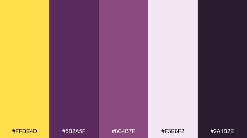
HEX: #FFDE4D #5B2A5F #8C4B7F #F3E6F2 #2A1B2E
Mood: moody and vibrant
Best for: festival flyers and nightlife branding
Moody and vibrant, it feels like velvet curtains with a sharp yellow spotlight. These daffodil color combinations are great when you want drama without going full neon. Use it for late-night event flyers, DJ lineups, or bold merch graphics. Tip: set the background in the darkest plum and keep yellow for dates, icons, and key calls to action.
Image example of plum accent generated using media.io

18) Forest Trail
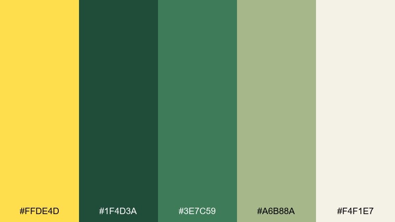
HEX: #FFDE4D #1F4D3A #3E7C59 #A6B88A #F4F1E7
Mood: grounded and outdoorsy
Best for: outdoor gear packaging and nature blogs
Grounded and outdoorsy, it suggests sun through trees, mossy stones, and well-worn canvas. The yellow acts like a safety highlight while the greens keep everything practical and rugged. Use it for trail products, camping checklists, or conservation campaigns. Tip: pair the cream with the deepest green for readable copy blocks that still feel natural.
Image example of forest trail generated using media.io
19) Soft Peach Tea
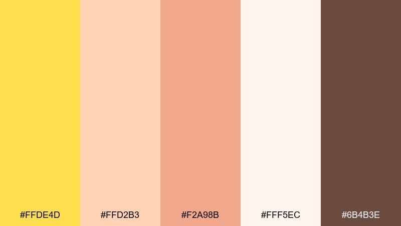
HEX: #FFDE4D #FFD2B3 #F2A98B #FFF5EC #6B4B3E
Mood: cozy and welcoming
Best for: cafe menus and handmade goods
Cozy and welcoming, it feels like peach tea, warm pastries, and morning light on a counter. The creamy peach tones soften the yellow so it reads friendly rather than loud. Use it for cafe menus, bakery labels, or small-business Instagram templates. Tip: keep the brown for prices and headings to anchor the sweetness with legible contrast.
Image example of soft peach tea generated using media.io
20) Arctic Clean
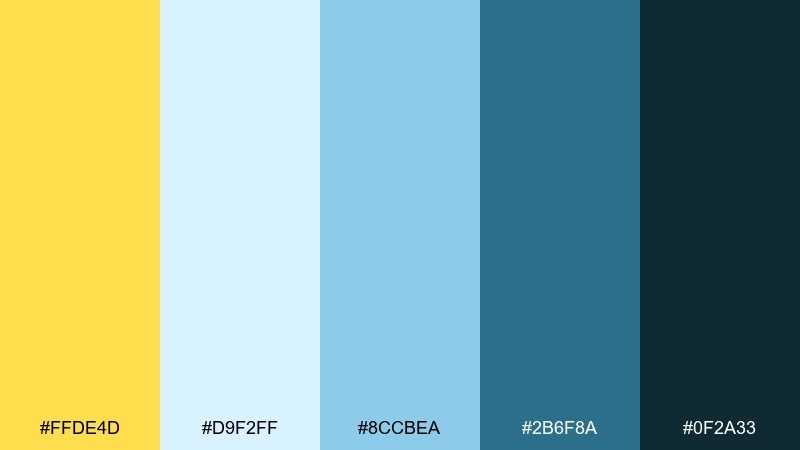
HEX: #FFDE4D #D9F2FF #8CCBEA #2B6F8A #0F2A33
Mood: crisp and modern
Best for: tech hero banners and product pages
Crisp and modern, it brings icy air, clear water, and a bright yellow beacon. The cool blues make the yellow feel even sunnier, ideal for buttons and top-level navigation. Use it for SaaS hero sections, feature callouts, or product launch pages. Tip: keep the darkest teal for headlines and let the pale blue act as large, calming background panels.
Image example of arctic clean generated using media.io

What Colors Go Well with Daffodil?
Daffodil pairs naturally with greens (sage, forest, mint) for spring and eco themes. This combo feels “alive” and works well for wellness, outdoors, and botanical branding.
For strong contrast, combine daffodil with deep navy, charcoal, or near-black. These dark anchors keep typography crisp and make yellow feel more intentional—perfect for editorial layouts and premium packaging.
If you want softer harmony, use creams, sand tones, blush pink, or pale lilac. These lighter companions let daffodil act as a gentle highlight rather than the full background color.
How to Use a Daffodil Color Palette in Real Designs
Use daffodil as an accent first. In UI, it’s great for primary buttons, active states, progress indicators, and key metrics—then rely on neutrals for readable surfaces and text.
In branding and print, treat daffodil like “sunlight”: apply it to seals, labels, icons, borders, or short headlines. This keeps the design modern and avoids the muddy look that can happen when yellow covers large areas.
When accessibility matters, test contrast carefully. Yellow often needs a dark text color (navy/charcoal) and should be balanced with enough white/cream space to keep layouts calm.
Create Daffodil Palette Visuals with AI
If you already have HEX codes, you can quickly generate on-brand mockups—posters, packaging, UI screens, or hero banners—by describing your layout and pasting the palette into the prompt.
Start with one clear subject (e.g., “menu design,” “SaaS dashboard,” “beauty packaging”) and specify which colors are dominant vs. accent. Keeping “no extra colors” in the prompt helps maintain palette accuracy.
With Media.io, you can iterate fast: try multiple moods (minimal, editorial, playful) while keeping your daffodil tone consistent across assets.
Daffodil Color Palette FAQs
-
What HEX code is closest to “daffodil yellow”?
A common daffodil-like yellow is #FFDE4D. It’s bright, warm, and works well as an accent with dark neutrals for contrast. -
Is daffodil yellow good for branding?
Yes—daffodil signals optimism and clarity. Use it as an accent (logos, badges, highlights) and pair it with navy/charcoal or soft creams to keep the brand looking polished. -
What colors complement daffodil yellow?
Deep navy, charcoal, forest green, teal, plum, and warm browns complement daffodil well. Soft companions like cream, sand, blush, and lilac also create balanced, modern palettes. -
How do I keep a daffodil palette from looking too loud?
Limit daffodil to small areas (around 10–20% of the layout), give it plenty of neutral space, and avoid pairing it with too many saturated warm colors at once. -
Can I use daffodil yellow in UI design without hurting readability?
Yes—use it for CTAs, active states, and highlights, then keep body text in dark colors (navy/charcoal). Always check contrast, since yellow on white is usually not readable for text. -
What’s a modern, high-contrast daffodil combination?
Try daffodil with near-black and white (e.g., #FFDE4D, #0B0C10, #FFFFFF) plus a mid-gray for secondary text. This feels sleek and editorial. -
How can I generate daffodil palette images for presentations or ads?
Use an AI text-to-image tool and specify your HEX colors as dominant vs. accents. Add constraints like “flat graphic design only” and “no extra colors” to keep results consistent.
Next: Bisque Color Palette


