

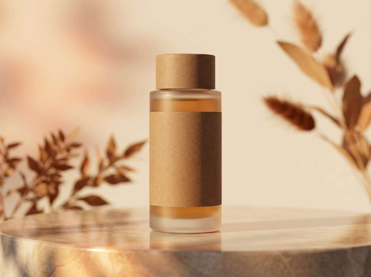
Saddle brown (#8B4513) is a timeless warm brown that instantly adds grounded, trustworthy energy to a design. It’s the color of leather, wood, coffee, and autumn—natural cues that feel familiar across branding, UI, and interiors.
Below are 20+ saddle brown color palette ideas with HEX codes, plus practical pairing tips and AI prompts you can use to generate matching visuals in minutes.
In this article
- Why Saddle Brown Palettes Work So Well
-
- desert leather cream
- rustic cabin neutrals
- autumn orchard tones
- espresso sage balance
- vintage bookshop warmth
- clay pottery studio
- cocoa blush comfort
- western sunset contrast
- copper denim utility
- warm neutral ui kit
- botanical terracotta garden
- heritage logo suite
- night market luxe
- sandstone wedding paper
- coffeehouse poster mix
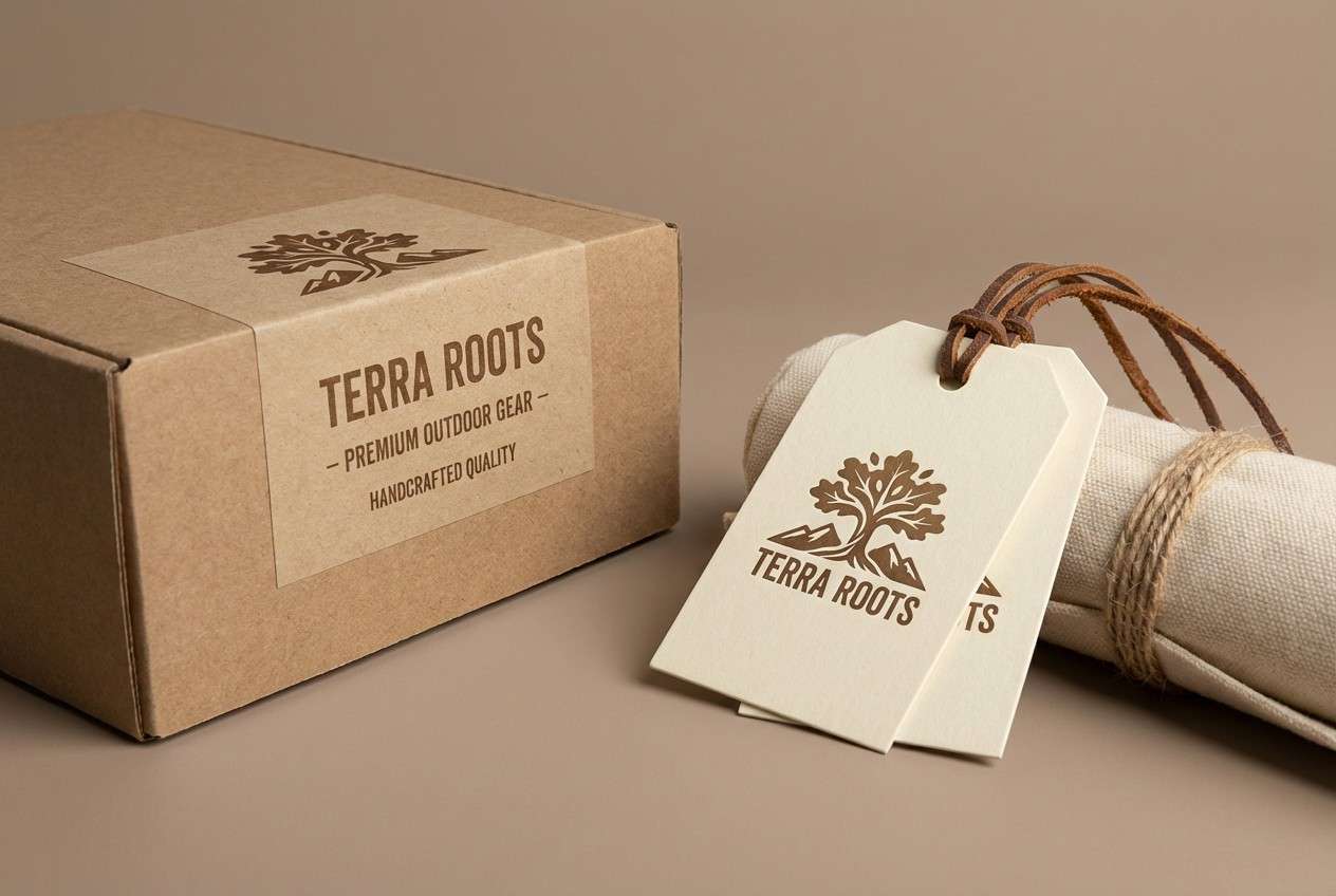
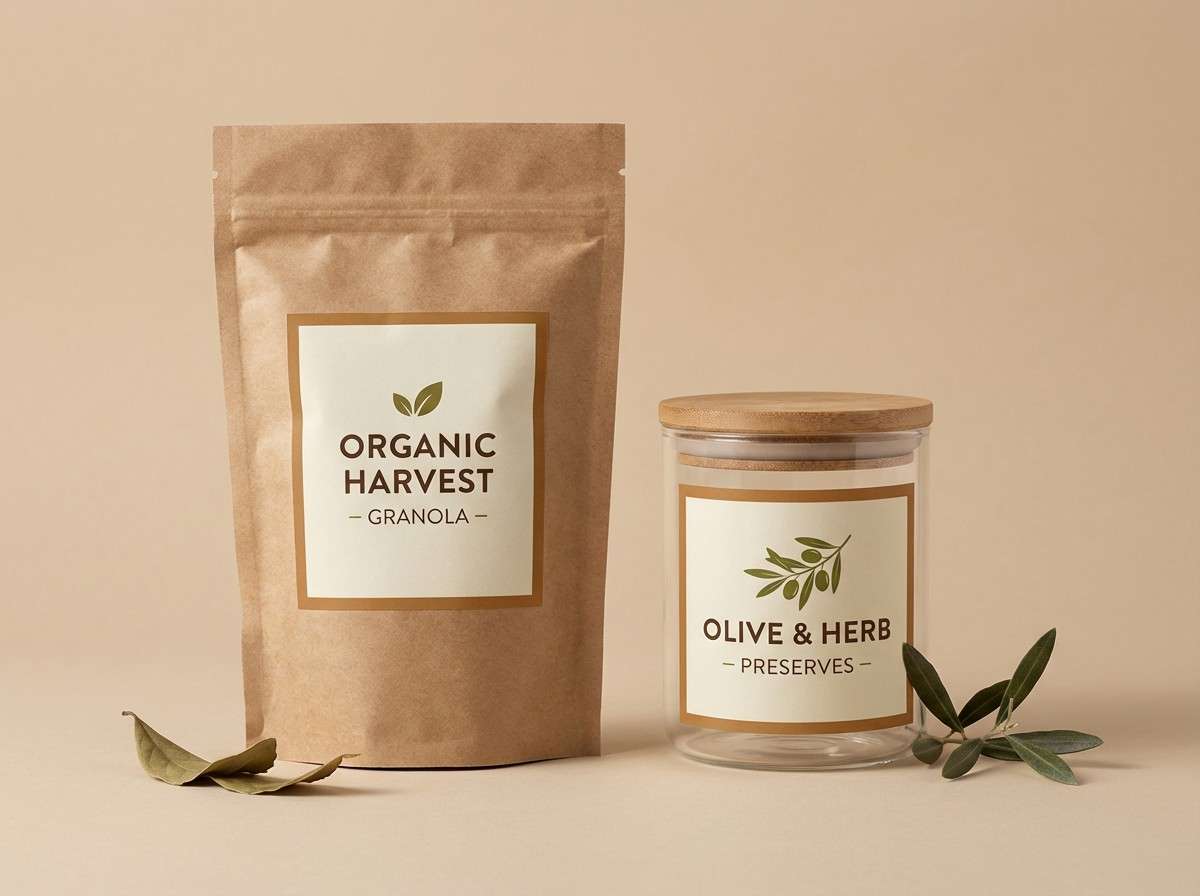
- craft packaging contrast
- cozy knit editorial
- modern lodge interior
- earthy kids illustration
- golden hour product ad
- museum exhibit wayfinding
- spiced chocolate branding
- What Colors Go Well with Saddle Brown?
- How to Use a Saddle Brown Color Palette in Real Designs
- Create Saddle Brown Palette Visuals with AI
Why Saddle Brown Palettes Work So Well
Saddle brown sits in a sweet spot: warm enough to feel inviting, but deep enough to provide visual weight. That makes it a reliable anchor color for layouts that need hierarchy—headlines, buttons, frames, and key brand marks.
It also pairs naturally with both neutrals (cream, beige, greige) and contrast accents (sage, navy, teal, muted reds). This flexibility lets you keep designs cohesive while still adding variety and depth.
Because it references real materials like leather and wood, saddle brown often reads as premium and authentic. Used thoughtfully, it can make modern work feel human without looking dated.
20+ Saddle Brown Color Palette Ideas (with HEX Codes)
1) Desert Leather Cream
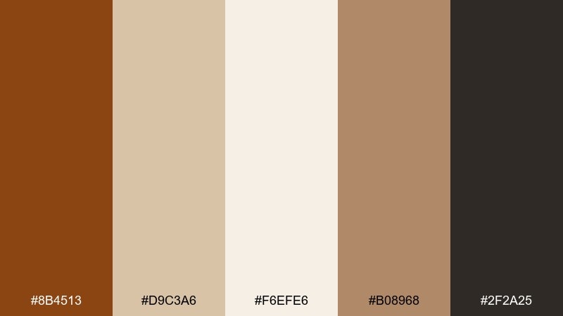
HEX: #8B4513 #D9C3A6 #F6EFE6 #B08968 #2F2A25
Mood: sunbaked, grounded, welcoming
Best for: branding for outdoor goods
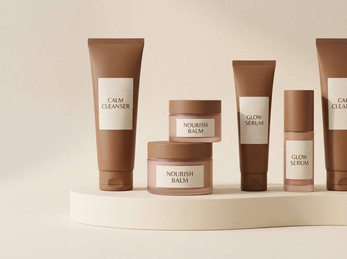
Sunbaked and grounded, it brings to mind worn leather, dry sand, and a campfire at dusk. Use it for rugged branding where warmth and trust matter, like outdoor gear, coffee, or handmade goods. Pair the deep brown with cream for readability, then let tan and camel carry backgrounds and secondary blocks. Tip: keep the dark espresso shade for logos and headlines so the lighter tones can breathe.
Image example of desert leather cream generated using media.io
Media.io is an online AI studio for creating and editing video, image, and audio in your browser.

2) Rustic Cabin Neutrals
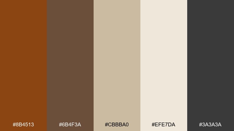
HEX: #8B4513 #6B4F3A #CBBBA0 #EFE7DA #3A3A3A
Mood: cozy, rustic, calm
Best for: lodge interior moodboards
Cozy and rustic, these tones feel like cedar beams, wool throws, and warm lamplight. They work beautifully for interior moodboards, hospitality branding, and seasonal campaigns that need comfort without looking dated. Balance the darker woods with oatmeal and cream to keep layouts bright. Tip: use the charcoal as a thin outline or type color to sharpen the softer neutrals.
Image example of rustic cabin neutrals generated using media.io
3) Autumn Orchard Tones
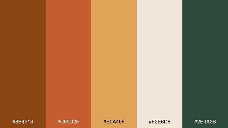
HEX: #8B4513 #C65D2E #E0A458 #F2E6D8 #2E4A3B
Mood: harvest, vibrant, earthy
Best for: seasonal social graphics
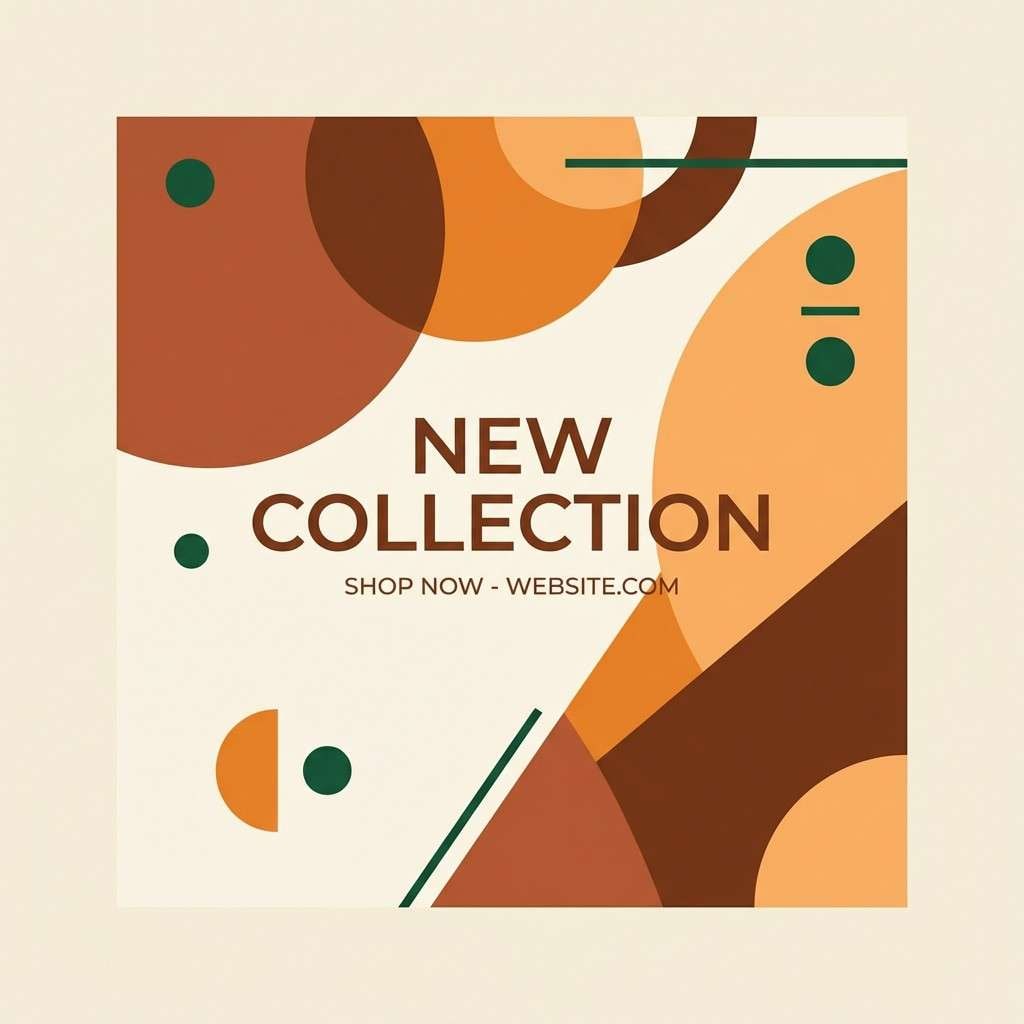
Harvest-bright and earthy, it evokes orchard crates, cinnamon spice, and late-afternoon sunlight. These saddle brown color combinations shine in fall social graphics, event promos, and food content where warmth sells the story. Keep the orange and apricot as energetic accents, while cream holds negative space for text. Tip: add the deep green sparingly for contrast and to keep the palette from skewing too monochrome.
Image example of autumn orchard tones generated using media.io
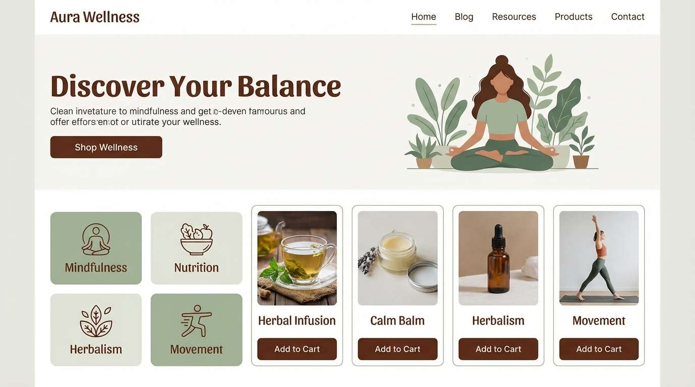
4) Espresso Sage Balance
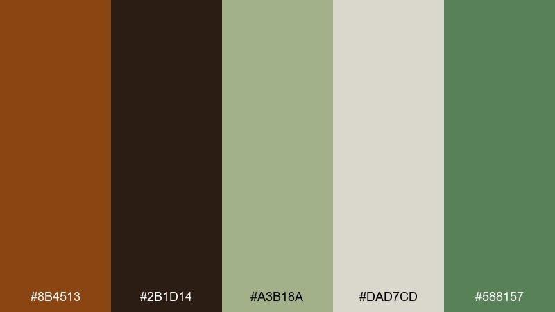
HEX: #8B4513 #2B1D14 #A3B18A #DAD7CD #588157
Mood: grounded, botanical, modern
Best for: wellness website UI
Grounded and botanical, it feels like espresso crema beside fresh-cut herbs. Use it for wellness or lifestyle UI where you want warmth without losing a clean, modern edge. Let sage and off-white handle the main surfaces, then reserve the darkest brown for navigation and key actions. Tip: keep greens slightly muted so the browns stay the visual anchor.
Image example of espresso sage balance generated using media.io
5) Vintage Bookshop Warmth

HEX: #8B4513 #A67C52 #D6C2A8 #F7F1E8 #4B3621
Mood: nostalgic, soft, literary
Best for: editorial layouts
Nostalgic and soft, these shades recall aged paper, leather bindings, and quiet reading corners. They suit editorial layouts, long-form blog design, and packaging that leans heritage rather than minimal. Use the warm cream as the page base, then layer mid browns for dividers and pull quotes. Tip: keep the darkest brown for small type so it reads like ink without going fully black.
Image example of vintage bookshop warmth generated using media.io
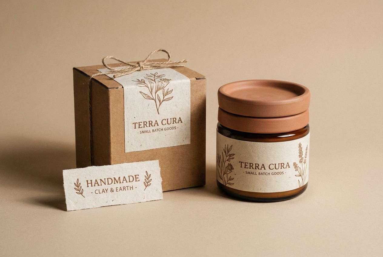
6) Clay Pottery Studio
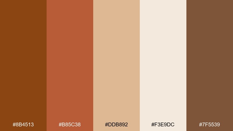
HEX: #8B4513 #B85C38 #DDB892 #F3E9DC #7F5539
Mood: handmade, earthy, tactile
Best for: artisan shop packaging
Handmade and tactile, it suggests clay dust, kiln heat, and glazed ceramics. It fits artisan shop packaging, craft markets, and small-batch products that need an earthy, human feel. Pair the terracotta and saddle tones for labels, then use the light beige as a calm backdrop. Tip: add subtle paper texture in print to make the warm browns feel even richer.
Image example of clay pottery studio generated using media.io
7) Cocoa Blush Comfort
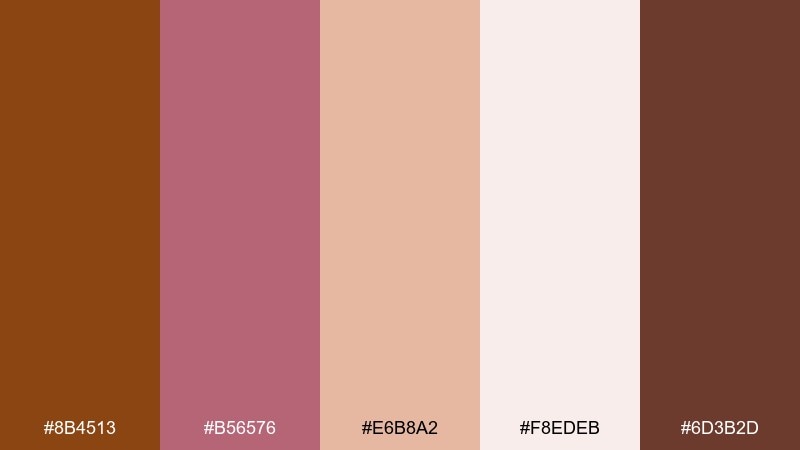
HEX: #8B4513 #B56576 #E6B8A2 #F8EDEB #6D3B2D
Mood: soft, romantic, cozy
Best for: beauty brand visuals
Soft and cozy, it feels like hot cocoa with a blush of rose powder. This pairing works well for beauty visuals, boutique skincare, or creator brand kits where warmth should still feel polished. Let blush and cream handle backgrounds and highlights, while browns define typography and product callouts. Tip: keep pink accents minimal so the overall look stays refined, not candy-like.
Image example of cocoa blush comfort generated using media.io
8) Western Sunset Contrast
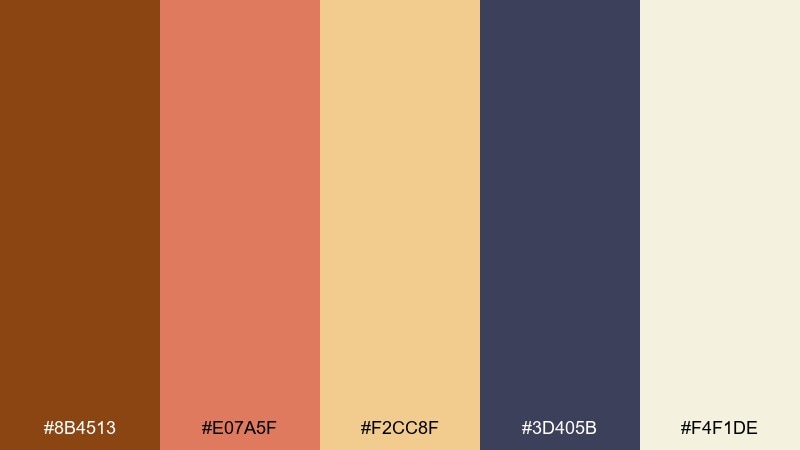
HEX: #8B4513 #E07A5F #F2CC8F #3D405B #F4F1DE
Mood: bold, cinematic, adventurous
Best for: event poster design
Bold and cinematic, it reads like a desert sunset with a cool night horizon. A saddle brown color combination like this is ideal for posters, music events, and bold campaigns that need warmth plus a surprising cool counterpoint. Use the navy for strong type blocks and the cream for breathing room. Tip: keep the peach as a highlight color for dates, prices, or calls to action.
Image example of western sunset contrast generated using media.io

9) Copper Denim Utility
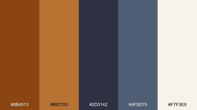
HEX: #8B4513 #B87333 #2D3142 #4F5D75 #F7F3E9
Mood: workwear, sturdy, contemporary
Best for: product landing pages
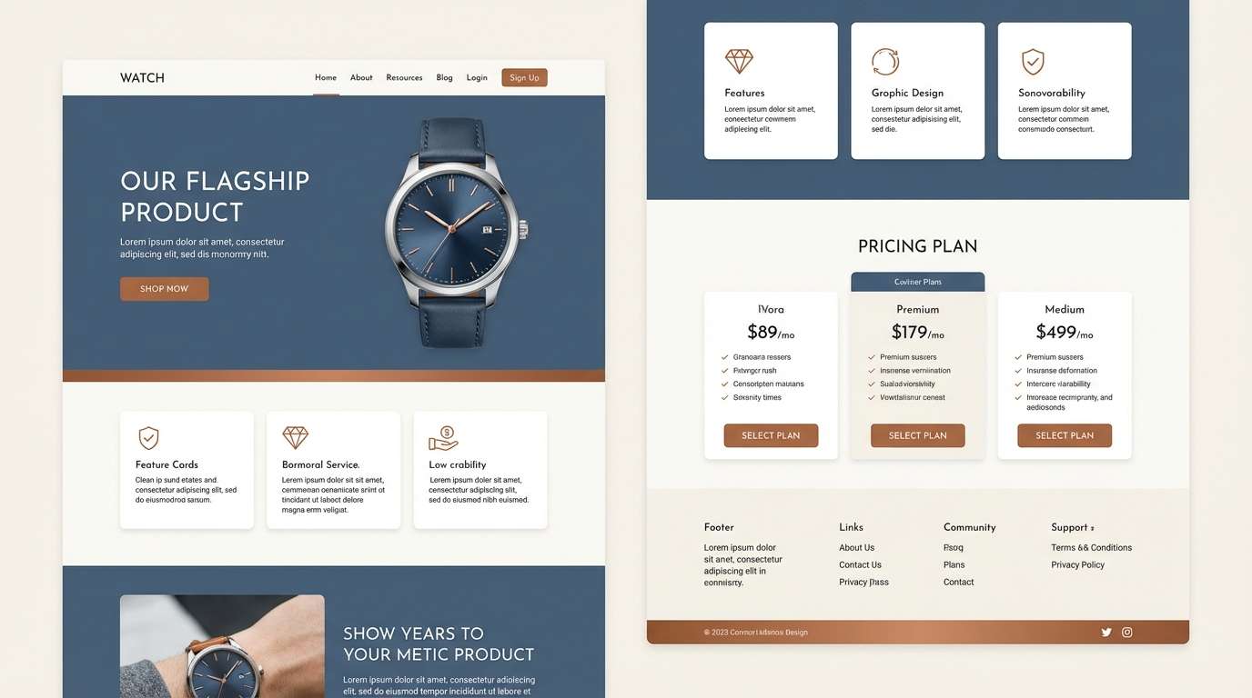
Sturdy and contemporary, it channels copper hardware against dark denim. It suits product landing pages, DTC storefronts, and tech accessories that need a rugged-but-clean edge. Use off-white for the main canvas, then lean on slate blues for sections and icons. Tip: reserve copper and brown for buttons and badges to create a clear hierarchy.
Image example of copper denim utility generated using media.io
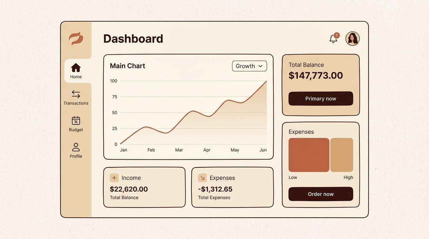
10) Warm Neutral UI Kit
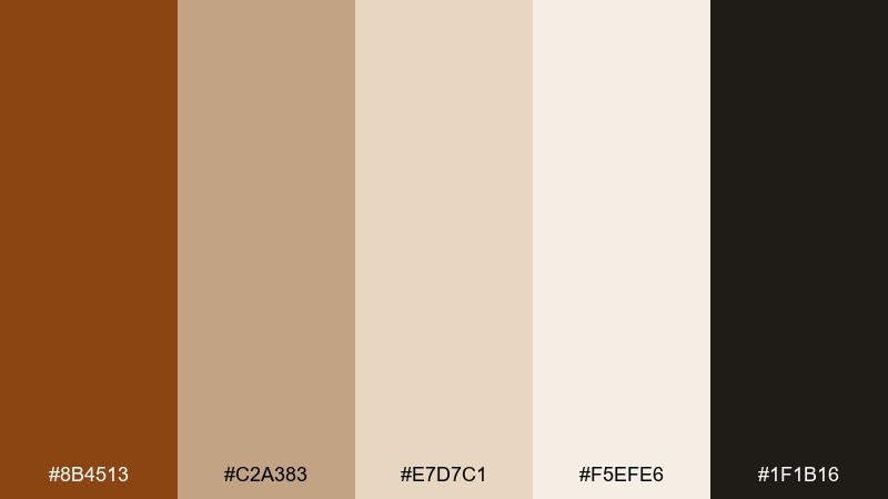
HEX: #8B4513 #C2A383 #E7D7C1 #F5EFE6 #1F1B16
Mood: minimal, warm, trustworthy
Best for: finance app UI
Minimal and trustworthy, it feels like a leather wallet paired with clean stationery. This saddle brown color palette is great for finance or account dashboards where you want calm confidence rather than icy corporate blues. Use the cream and sand tones for surfaces, then apply the near-black for text to keep contrast accessible. Tip: make the brown a single, consistent primary action color so the UI stays disciplined.
Image example of warm neutral ui kit generated using media.io
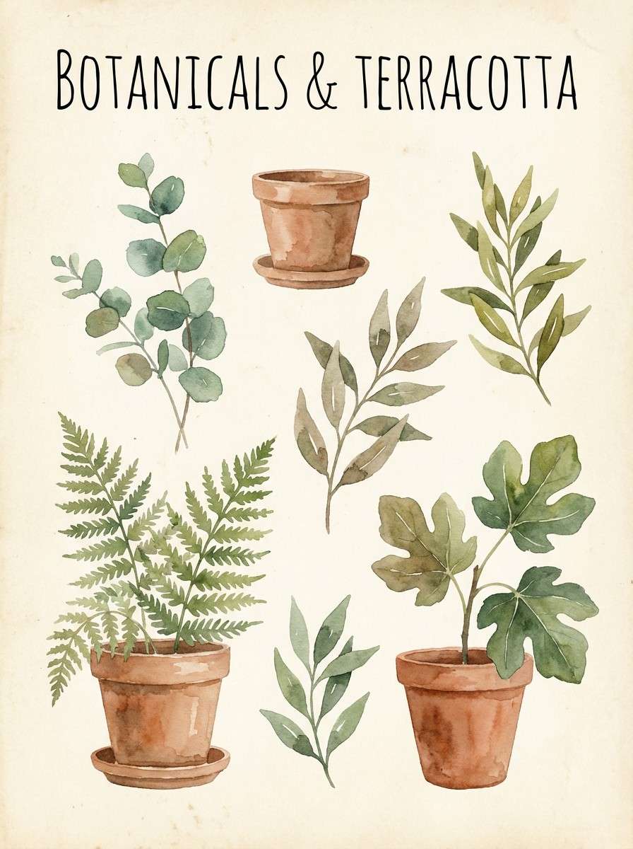
11) Botanical Terracotta Garden
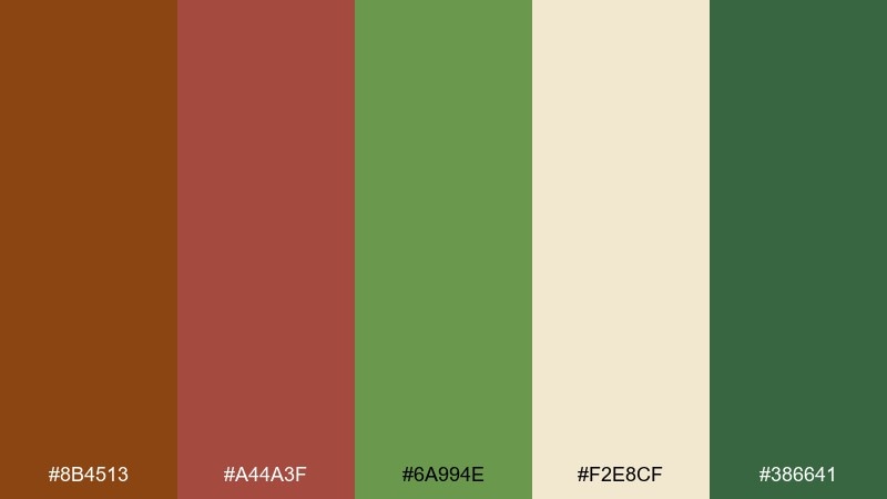
HEX: #8B4513 #A44A3F #6A994E #F2E8CF #386641
Mood: fresh, earthy, lively
Best for: watercolor botanical prints
Fresh and earthy, it brings together terracotta pots and leafy greenhouse greens. These tones are a natural fit for botanical prints, springtime collections, and eco-focused storytelling. Let cream act as paper, then build depth with layered greens and a grounded brown. Tip: keep brush textures visible so the palette feels organic rather than flat.
Image example of botanical terracotta garden generated using media.io
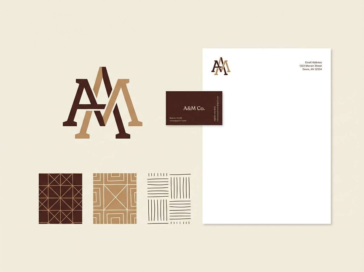
12) Heritage Logo Suite
HEX: #8B4513 #5E3023 #C9A66B #F4EBD0 #2B2118
Mood: heritage, premium, dependable
Best for: logo and brand identity
Heritage and premium, it suggests stamped leather, brass plaques, and old-world craftsmanship. These saddle brown color combinations work especially well for logo systems, monograms, and identity sets for barbershops, cafes, or menswear. Pair the gold-tan with dark brown for a classic two-color lockup, then use cream for stationery. Tip: try foil or spot varnish on the tan shade for a subtle luxury lift.
Image example of heritage logo suite generated using media.io
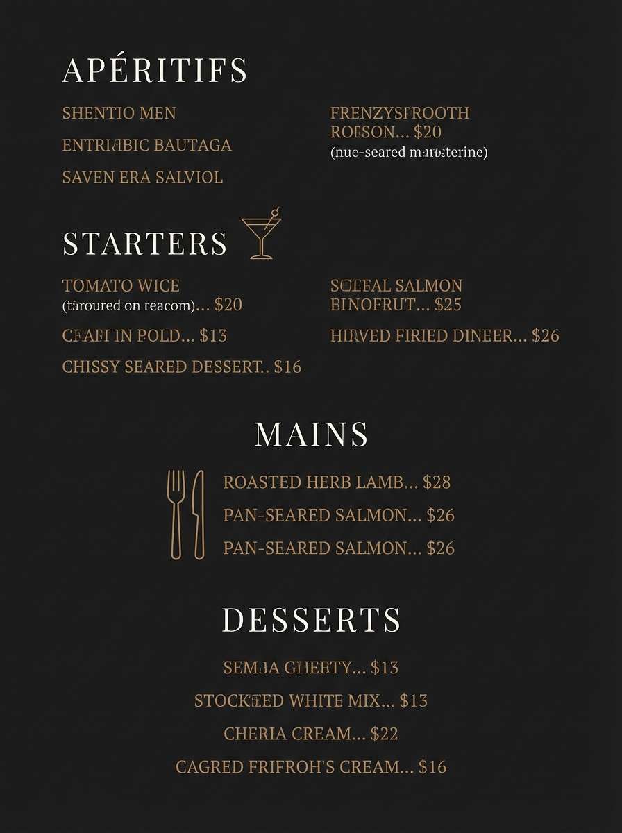
13) Night Market Luxe
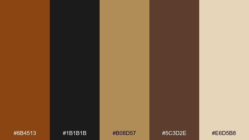
HEX: #8B4513 #1B1B1B #B08D57 #5C3D2E #E6D5B8
Mood: luxe, moody, dramatic
Best for: restaurant menu design
Moody and luxe, it feels like candlelight reflecting off dark wood and brass. It is ideal for restaurant menus, cocktail bars, and premium service brands that want warmth with drama. Use near-black as the base, then bring in tan and cream for readable type and highlights. Tip: keep the lighter tones for pricing and headings to guide the eye across the layout.
Image example of night market luxe generated using media.io
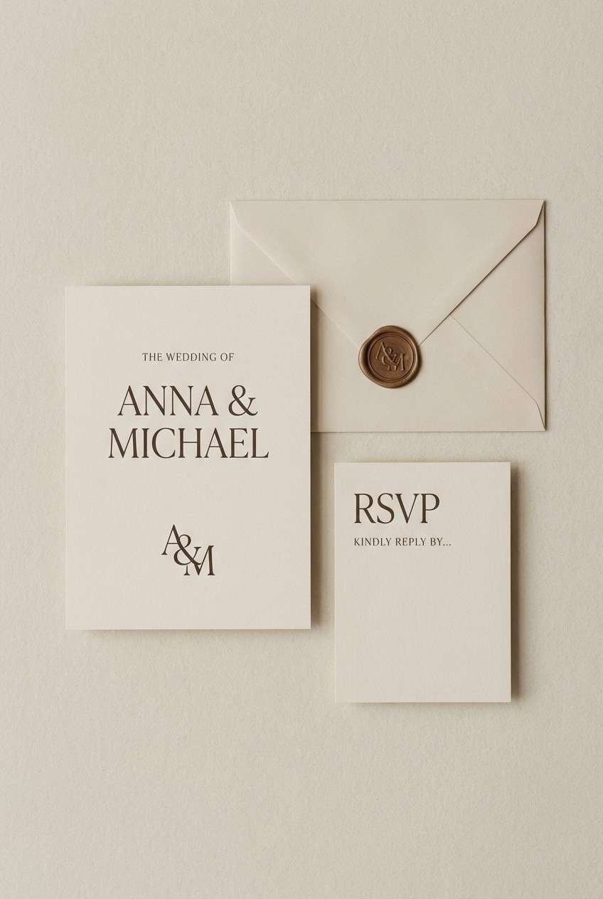
14) Sandstone Wedding Paper
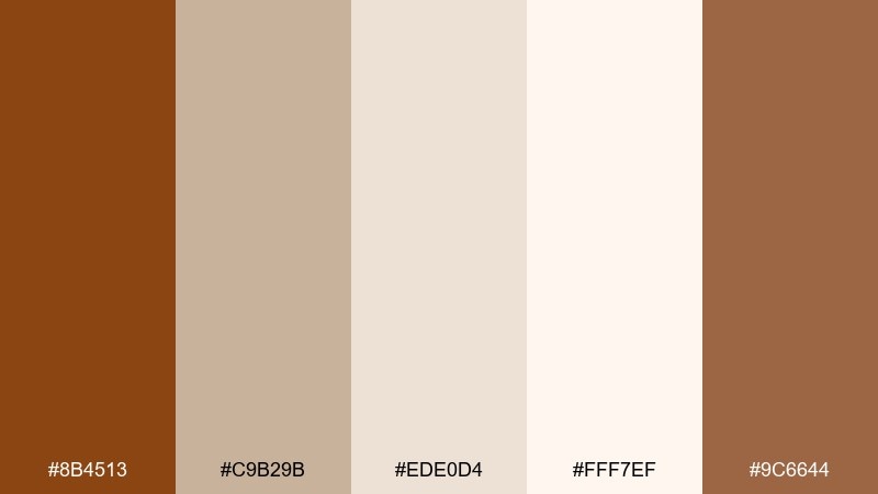
HEX: #8B4513 #C9B29B #EDE0D4 #FFF7EF #9C6644
Mood: soft, elegant, timeless
Best for: wedding invitation design
Soft and timeless, it looks like sandstone, vellum, and warm ink on cotton paper. It suits wedding invitations, stationery suites, and refined event collateral that needs romance without heavy florals. Let the lightest cream dominate, then use the deeper browns for monograms and key details. Tip: choose a classic serif and keep line weights thin so the palette stays airy.
Image example of sandstone wedding paper generated using media.io
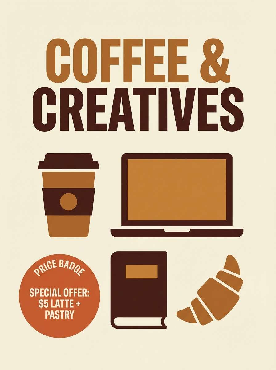
15) Coffeehouse Poster Mix
HEX: #8B4513 #C68C53 #F2D0A7 #2C1A12 #F9F3EA
Mood: inviting, energetic, friendly
Best for: cafe promotional posters
Inviting and friendly, it feels like espresso shots and steamed milk swirling into crema. It works well for cafe posters, loyalty cards, and small promos where you want warmth that reads instantly from a distance. Use the darkest roast shade for bold headlines, then support with caramel and cream blocks. Tip: add simple stamp-style icons in brown to reinforce the handcrafted vibe.
Image example of coffeehouse poster mix generated using media.io
16) Craft Packaging Contrast
HEX: #8B4513 #D4A373 #FAEDCD #283618 #606C38
Mood: natural, crafted, eco-minded
Best for: organic food packaging
Natural and eco-minded, it suggests kraft paper, pantry staples, and dried herbs. The warm browns paired with olive greens make a strong fit for organic food packaging and sustainable product lines. Use the pale cream for the label field, then anchor with brown typography and green seals. Tip: keep the green to accents and quality marks so the design stays clean and premium.
Image example of craft packaging contrast generated using media.io
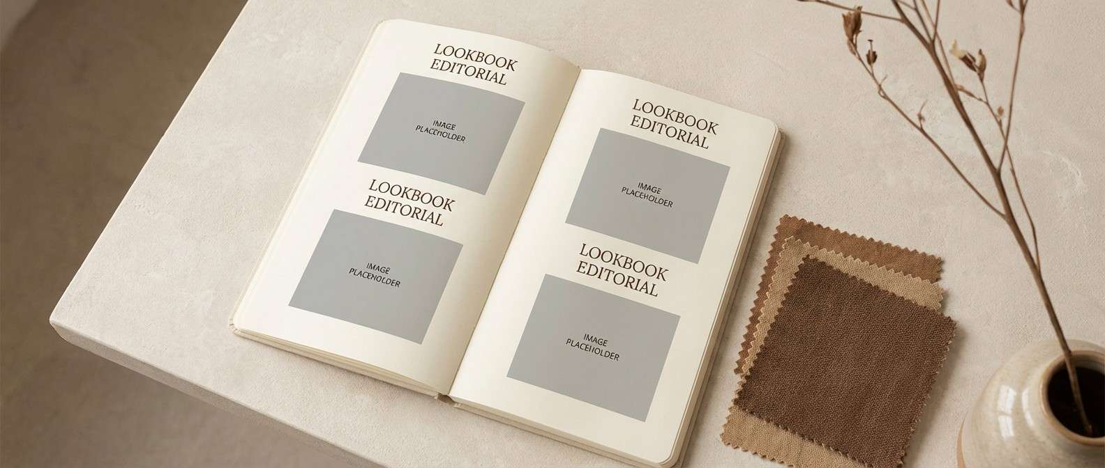
17) Cozy Knit Editorial
HEX: #8B4513 #A98467 #DDBEA9 #FFE8D6 #6C584C
Mood: cozy, soft, lifestyle
Best for: fashion lookbook pages
Cozy and soft, it brings to mind knitted scarves, suede boots, and warm indoor light. It is a strong choice for fashion lookbooks and lifestyle editorial pages that need gentle warmth. Use peachy beige for backgrounds and the richer browns for headings and section labels. Tip: keep photo treatments slightly warm so the palette and imagery feel unified.
Image example of cozy knit editorial generated using media.io
18) Modern Lodge Interior
HEX: #8B4513 #3C2F2F #B7B7A4 #F0EFEB #A5A58D
Mood: calm, architectural, refined
Best for: interior design presentations
Calm and architectural, it feels like smooth plaster walls against dark timber. This saddle brown color palette fits modern lodge interiors, real estate decks, and design presentations that need warmth without visual noise. Let off-white and greige take up most of the canvas, then use brown sparingly for anchors and key callouts. Tip: avoid overly saturated accents so the refined neutrals stay in control.
Image example of modern lodge interior generated using media.io
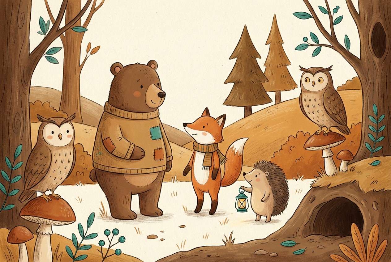
19) Earthy Kids Illustration
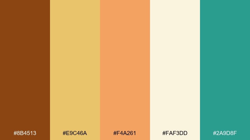
HEX: #8B4513 #E9C46A #F4A261 #FAF3DD #2A9D8F
Mood: playful, warm, friendly
Best for: storybook illustrations
Playful and warm, it feels like sunlit paper cutouts and friendly woodland characters. It works for storybook illustrations and educational graphics that need soft warmth with a pop of teal. Use cream as the page base, then let ochre and orange carry the main shapes. Tip: keep the teal as a small accent for eyes, buttons, or key learning highlights.
Image example of earthy kids illustration generated using media.io
20) Golden Hour Product Ad
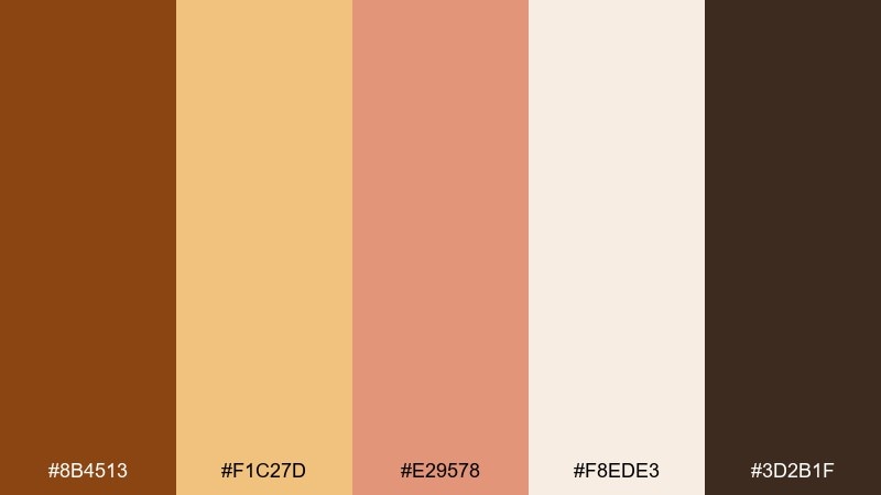
HEX: #8B4513 #F1C27D #E29578 #F8EDE3 #3D2B1F
Mood: glowy, warm, premium
Best for: cosmetic product ads
Glowy and premium, it resembles golden-hour light on glass and soft skin tones. It suits cosmetic ads and product hero images where warmth should feel expensive rather than heavy. Use the pale cream for negative space, and let caramel and brown shape the product and shadow contrast. Tip: keep the peach tone for subtle highlights so the scene stays softly lit, not overly saturated.
Image example of golden hour product ad generated using media.io
21) Museum Exhibit Wayfinding
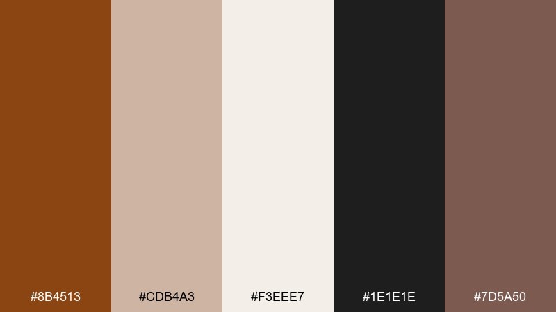
HEX: #8B4513 #CDB4A3 #F3EEE7 #1E1E1E #7D5A50
Mood: quiet, curated, sophisticated
Best for: wayfinding signage systems
Quiet and curated, it calls up gallery walls, archival materials, and understated signage. The tones work well for wayfinding systems, exhibition collateral, and cultural institution branding that needs warmth without distraction. Use off-white as the primary field, then set type in near-black for clarity. Tip: apply the brown as an accent stripe or icon fill to guide navigation without overwhelming the space.
Image example of museum exhibit wayfinding generated using media.io
22) Spiced Chocolate Branding
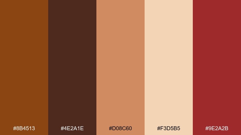
HEX: #8B4513 #4E2A1E #D08C60 #F3D5B5 #9E2A2B
Mood: rich, bold, appetizing
Best for: food brand identity
Rich and appetizing, it feels like dark chocolate with a hint of spice. For food identities, this mix creates strong contrast and a memorable shelf presence while staying warm and inviting. Use caramel and cream for label backgrounds, then bring in deep browns for type and frames. Tip: the muted red is best as a tiny accent for seals or heat indicators, not as a full background.
Image example of spiced chocolate branding generated using media.io
What Colors Go Well with Saddle Brown?
Saddle brown pairs effortlessly with warm neutrals like cream, sand, oatmeal, and greige for a classic, calm foundation. This combination is ideal for packaging, editorial layouts, and UI surfaces where readability and softness matter.
For contrast, lean into muted greens (sage, olive, forest) and deep blues (navy, slate) to balance warmth with cool structure. If you want a modern accent, try teal in small doses; for a richer, heritage feel, use brass/gold tans and near-black.
For seasonal or energetic work, saddle brown also plays well with apricot, terracotta, and muted reds—just keep saturation controlled so the palette stays refined instead of overly rustic.
How to Use a Saddle Brown Color Palette in Real Designs
Start by choosing saddle brown as your “anchor” (logos, headings, button fills, borders), then let lighter creams and beiges do most of the background work. This keeps pages bright and prevents the palette from feeling heavy.
Maintain hierarchy with disciplined usage: one primary action color (often #8B4513), one dark text color (near-black or espresso), and one accent (sage, navy, or blush). This simple system is especially effective for dashboards, landing pages, and menus.
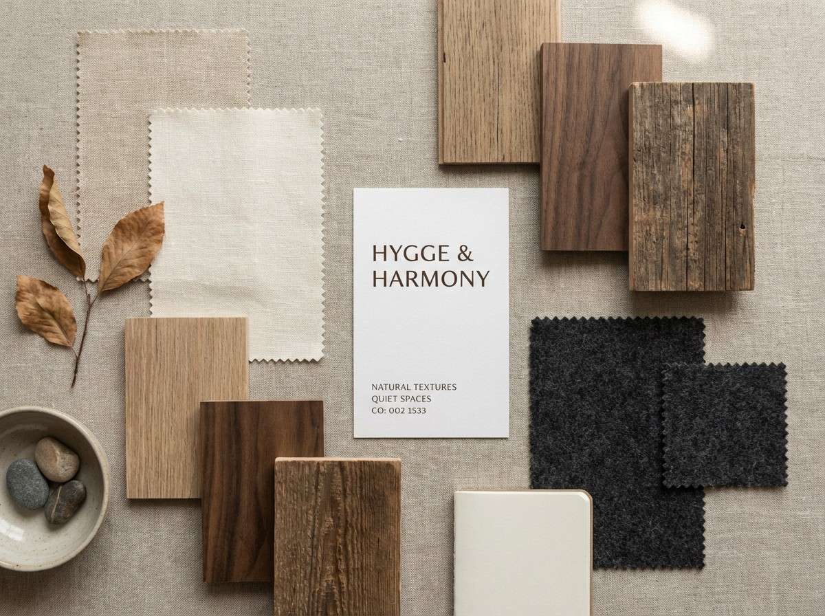
In print and packaging, saddle brown shines with tactile finishes—kraft stock, embossing, foil on tan, or subtle paper textures. These material cues amplify the “authentic” feeling the color already suggests.
Create Saddle Brown Palette Visuals with AI
If you already have a palette, the fastest way to test it is by generating mockups that match the mood—menus, posters, packaging, or UI screens. That way you can validate contrast, vibe, and brand fit before committing to production.
Use the prompts above as a starting point, then customize the subject (your product type), composition (flat lay, hero shot, UI), and aspect ratio. Keep the palette names and HEX codes nearby so your iterations stay consistent.
Saddle Brown Color Palette FAQs
-
What is the HEX code for saddle brown?
The most common web HEX code for saddle brown is #8B4513. -
Is saddle brown considered warm or cool?
Saddle brown is a warm brown with orange/red undertones, so it tends to feel cozy, grounded, and inviting. -
What colors pair best with saddle brown for modern design?
Muted greens (sage/olive), slate or navy blues, and soft off-whites pair especially well. They add contrast while keeping the overall look refined. -
Can I use saddle brown in UI and app design?
Yes—use it as a primary action color or navigation anchor, then rely on cream/off-white surfaces and near-black text to maintain accessible contrast. -
How do I keep a brown palette from feeling too dark or heavy?
Let light neutrals (cream, beige) take up most of the canvas, and reserve deep browns for small, high-impact elements like headings, icons, and key frames. -
What is a good accent color for saddle brown in branding?
Sage green, muted terracotta, blush pink, or a tiny touch of teal can work as accents—choose one accent and keep it limited for a clean hierarchy. -
Does saddle brown work for premium or luxury branding?
It can—pair it with near-black and brass/tan highlights, and consider print finishes like foil, embossing, or spot varnish to elevate the look.
Next: Rose Red Color Palette


