

Rose red is a confident, romantic hue that can read modern, vintage, playful, or premium depending on what you pair it with.
Below are 20 rose red color palette ideas with HEX codes—plus practical tips to balance warmth, contrast, and accessibility in real projects.
In this article
- Why Rose Red Palettes Work So Well
-
- velvet rose
- rosewood glow
- blush brick
- cabernet petal
- vintage bouquet
- desert rose
- neon rose punch
- rose sage balance
- minimal rose red
- charcoal rose red
- wedding rose red
- sunset rose red
- cranberry cream
- garnet garden
- ruby terracotta
- pop art rose red
- editorial rose red
- light ui rose red
- studio packaging rose red
- holiday rose red
- What Colors Go Well with Rose Red?
- How to Use a Rose Red Color Palette in Real Designs
- Create Rose Red Palette Visuals with AI
Why Rose Red Palettes Work So Well
Rose red sits in a sweet spot between classic red and pink, so it can feel bold without turning aggressive. That makes it a reliable hero color for branding, packaging, and campaigns that need warmth and emotion.
It also pairs smoothly with both cool and warm families—charcoal and sage for modern contrast, or cream and gold for romantic elegance. With the right neutrals, rose red remains the focal point without overpowering the layout.
From an accessibility standpoint, rose red often benefits from darker anchors (espresso, plum, charcoal) for text and UI states. Used as an accent rather than a background, it delivers impact while keeping readability strong.
20+ Rose Red Color Palette Ideas (with HEX Codes)
1) Velvet Rose
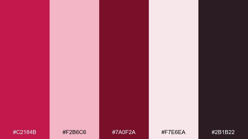
HEX: #c2184b #f2b6c6 #7a0f2a #f7e6ea #2b1b22
Mood: romantic and rich
Best for: brand identity and packaging
Plush and romantic, these tones evoke velvet petals under warm evening light. Use it for beauty, boutique, or artisan brands that want confidence without shouting. Pair the deep wine shade with airy blush and a soft off-white to keep layouts breathable. Tip: reserve the near-black as a small accent for type and borders so the reds stay the star.
Image example of velvet rose generated using media.io
Media.io is an online AI studio for creating and editing video, image, and audio in your browser.

2) Rosewood Glow
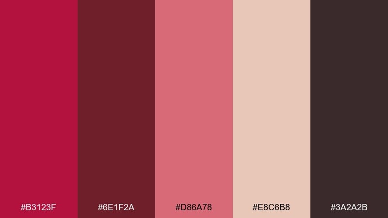
HEX: #b3123f #6e1f2a #d86a78 #e8c6b8 #3a2a2b
Mood: warm and grounded
Best for: cozy interiors and decor accents
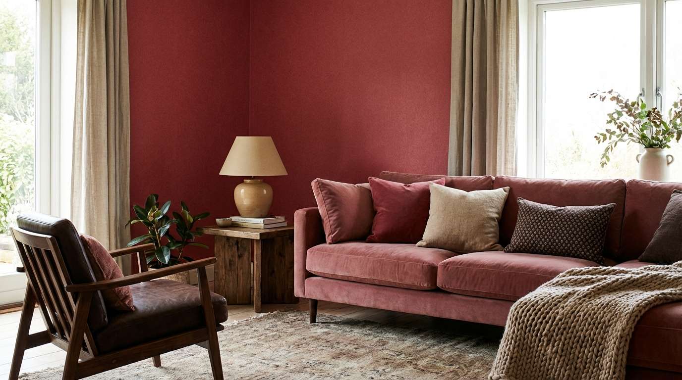
Warm and grounded, rosewood glow feels like polished wood, dried roses, and candlelit corners. It works beautifully for accent walls, textiles, and moodier living spaces where you want warmth without harsh contrast. Balance the deeper maroon with the dusty pink and beige for a layered, livable look. Tip: repeat the dark brown in hardware or frames to unify the room.
Image example of rosewood glow generated using media.io
3) Blush Brick
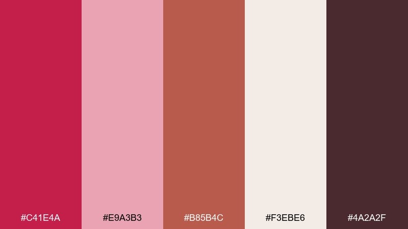
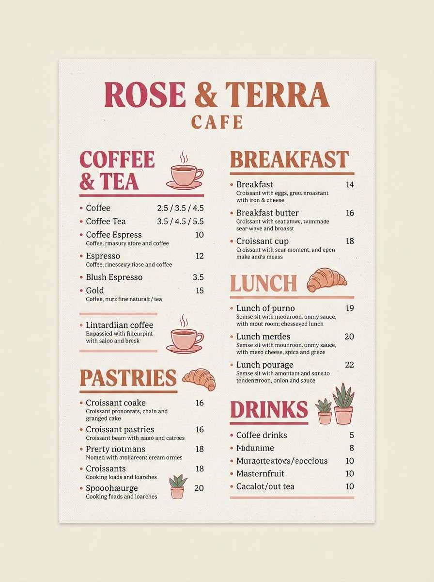
HEX: #c41e4a #e9a3b3 #b85b4c #f3ebe6 #4a2a2f
Mood: modern and inviting
Best for: cafe menus and lifestyle flyers
Modern and inviting, blush brick brings to mind fresh pastries, warm ovens, and rosy terracotta walls. Use it for cafe menus, seasonal promos, or community flyers that need friendly energy. Let the cream background carry most of the space, then punch in rose and brick for headings and highlights. Tip: keep body text in the deep cocoa tone for readability.
Image example of blush brick generated using media.io
4) Cabernet Petal
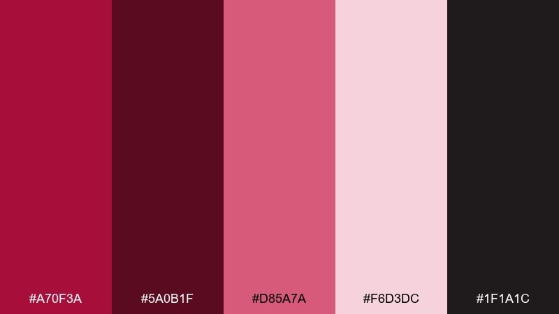
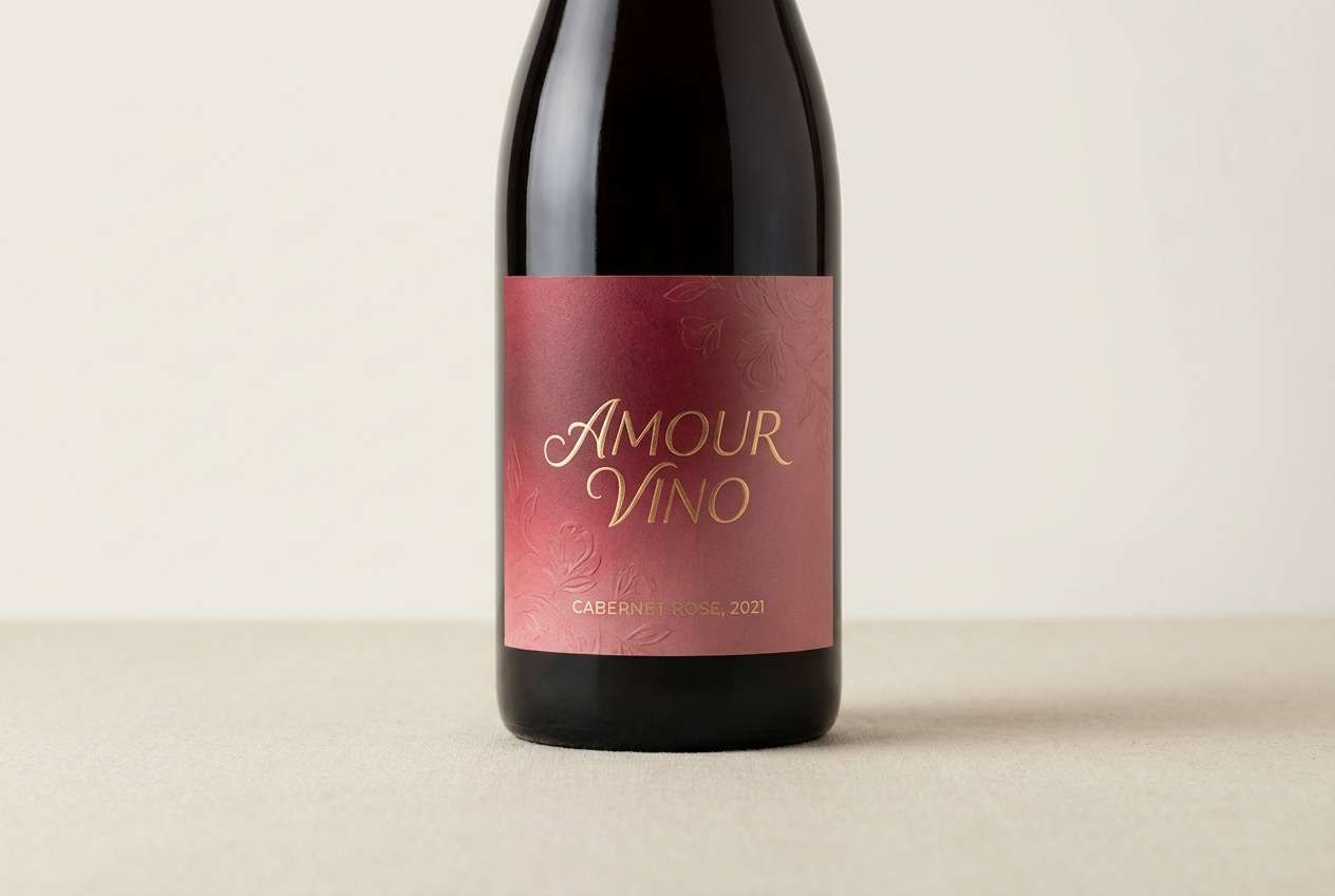
HEX: #a70f3a #5a0b1f #d85a7a #f6d3dc #1f1a1c
Mood: dramatic and elegant
Best for: wine labels and premium tags
Dramatic and elegant, cabernet petal feels like a dark pour with a pink floral finish. It is ideal for premium labels, hang tags, and boutique product ranges that lean classic. Use the pale petal tone as negative space so the deep reds do not overwhelm. Tip: foil-like highlights translate well by using the light pink sparingly on key details.
Image example of cabernet petal generated using media.io
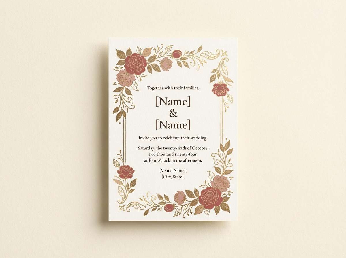
5) Vintage Bouquet
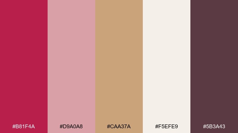
HEX: #b81f4a #d9a0a8 #caa37a #f5efe9 #5b3a43
Mood: soft and nostalgic
Best for: wedding stationery and invitations
Soft and nostalgic, vintage bouquet looks like faded florals tucked into an old book. It suits invitations, save-the-dates, and romantic stationery that wants warmth rather than stark white. Mix the rosy red with antique gold and creamy paper tones for an heirloom feel. Tip: keep typography in the muted plum so the palette stays gentle.
Image example of vintage bouquet generated using media.io
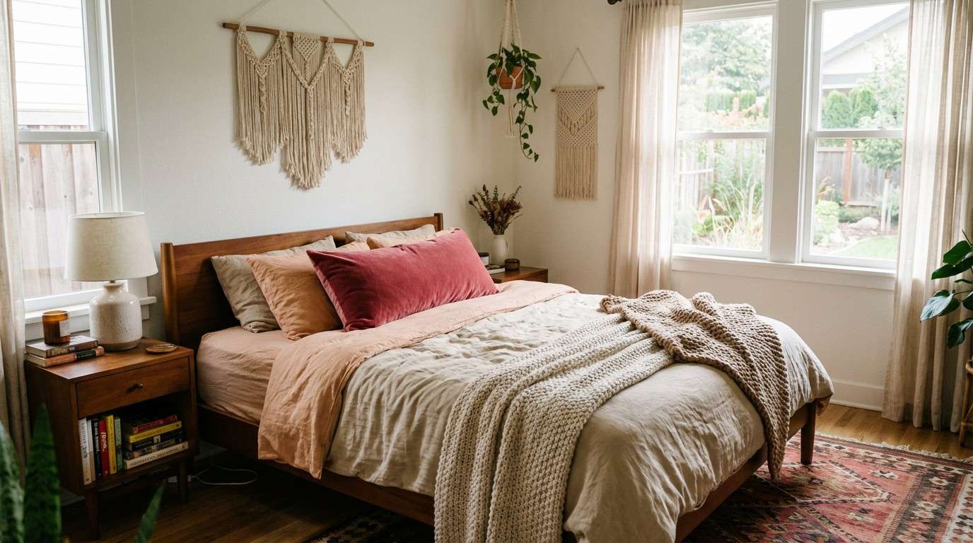
6) Desert Rose
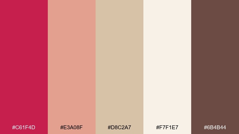
HEX: #c61f4d #e3a08f #d8c2a7 #f7f1e7 #6b4b44
Mood: sunbaked and calm
Best for: boho bedroom styling and textiles
Sunbaked and calm, desert rose evokes clay pottery, warm sand, and a rosy sunset haze. Use it in textiles, throws, and wall art for bedrooms that need softness without going pastel. Pair the bold rose with sandy neutrals and a warm brown to anchor the space. Tip: repeat the peach tone in smaller decor pieces to create a cohesive flow.
Image example of desert rose generated using media.io
7) Neon Rose Punch
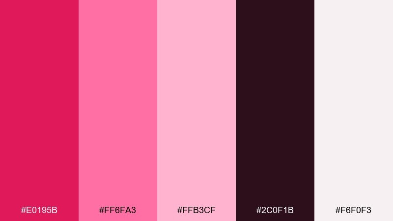
HEX: #e0195b #ff6fa3 #ffb3cf #2c0f1b #f6f0f3
Mood: bold and playful
Best for: social media ads and launch graphics
Bold and playful, neon rose punch feels like glossy lip tint and night-city signage. These rose red color combinations shine in short-form ads, reels covers, and launch announcements where you need instant impact. Let the near-black carry the contrast and keep backgrounds light so the pinks pop. Tip: limit the brightest pink to buttons or price callouts to avoid visual fatigue.
Image example of neon rose punch generated using media.io

8) Rose Sage Balance
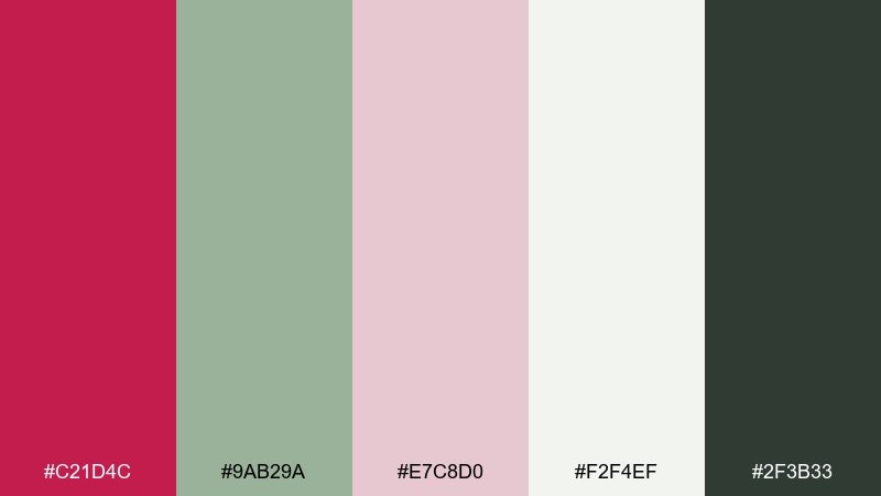
HEX: #c21d4c #9ab29a #e7c8d0 #f2f4ef #2f3b33
Mood: fresh and natural
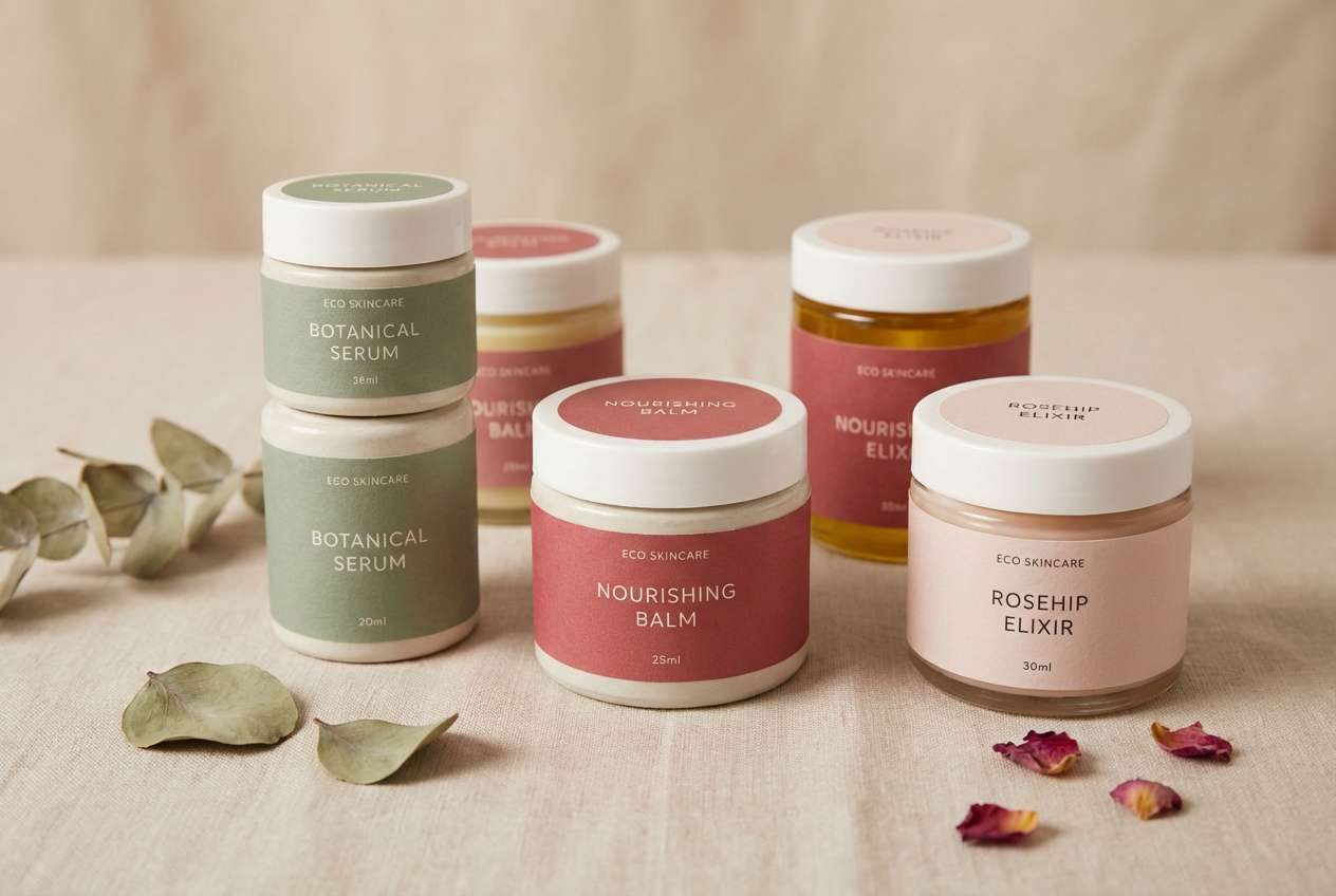
Best for: eco skincare branding
Fresh and natural, this mix suggests pressed roses, garden herbs, and clean apothecary jars. It is a smart rose red color scheme for wellness brands that want warmth tempered by calm greens. Use sage as the primary field color, then bring in the red for logos and key badges. Tip: keep the dark green for type to maintain an organic, premium tone.
Image example of rose sage balance generated using media.io
9) Minimal Rose Red
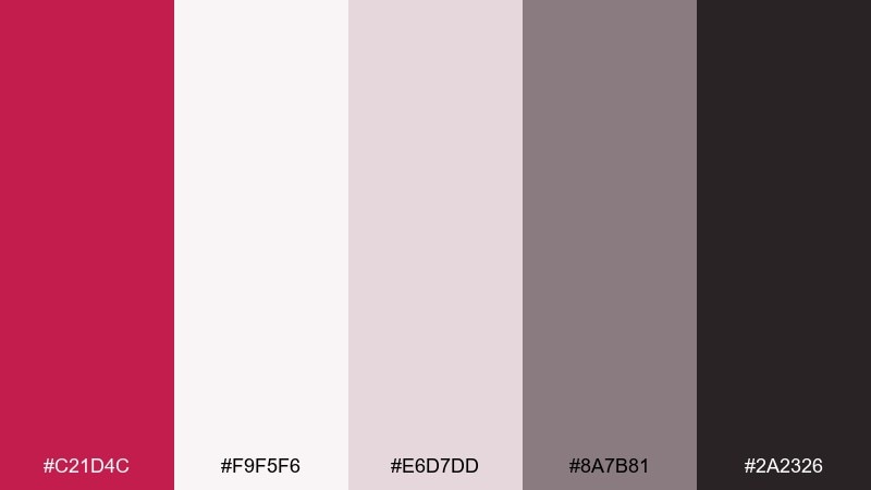
HEX: #c21d4c #f9f5f6 #e6d7dd #8a7b81 #2a2326
Mood: clean and modern
Best for: minimal app interfaces
Clean and modern, minimal rose red feels like soft paper, subtle shadows, and a precise accent mark. It works well for finance, wellness, and productivity apps that need a gentle highlight color. Use the reds only for primary actions and states, while neutrals handle most surfaces. Tip: test contrast on the gray text layer to keep accessibility strong.
Image example of minimal rose red generated using media.io
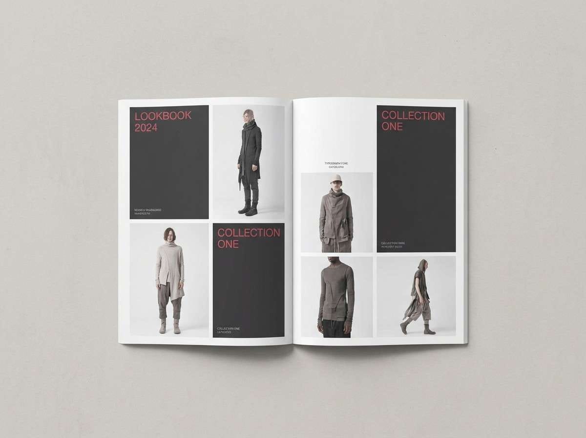
10) Charcoal Rose Red
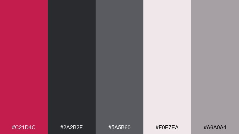
HEX: #c21d4c #2a2b2f #5a5b60 #f0e7ea #a6a0a4
Mood: sleek and confident
Best for: fashion branding and lookbooks
Sleek and confident, charcoal rose red reads like a tailored coat with a satin lining. It is great for fashion lookbooks, premium services, and portfolios that want a strong focal hue. Keep charcoal as the base for pages and let the rose red carry headlines or section dividers. Tip: add the pale blush as breathing room between dense image blocks.
Image example of charcoal rose red generated using media.io
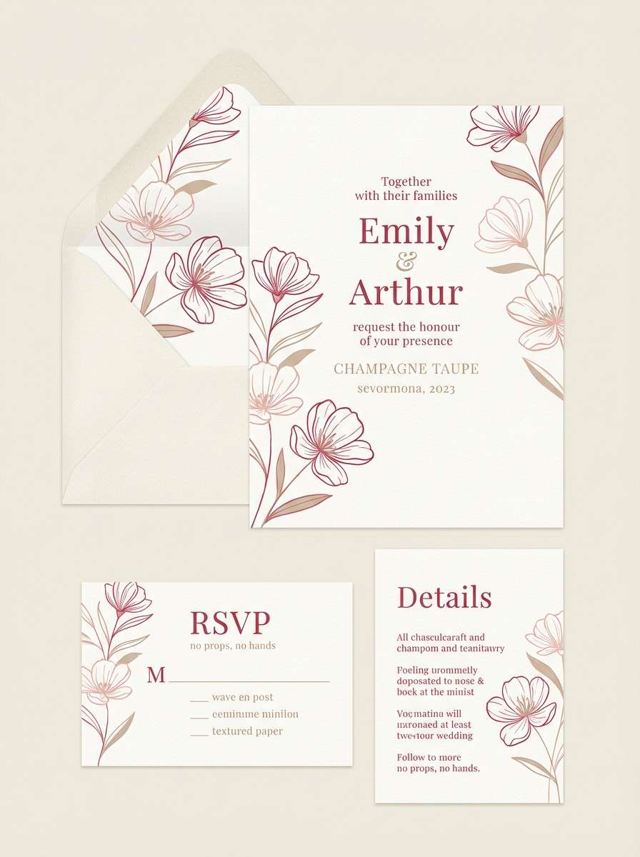
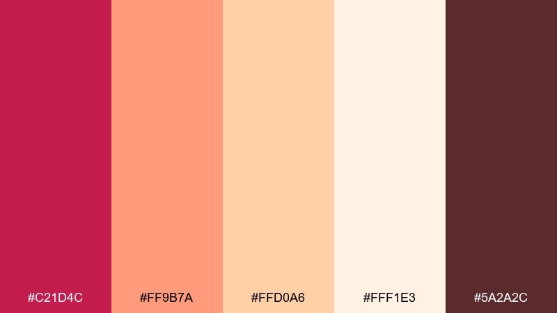
11) Wedding Rose Red
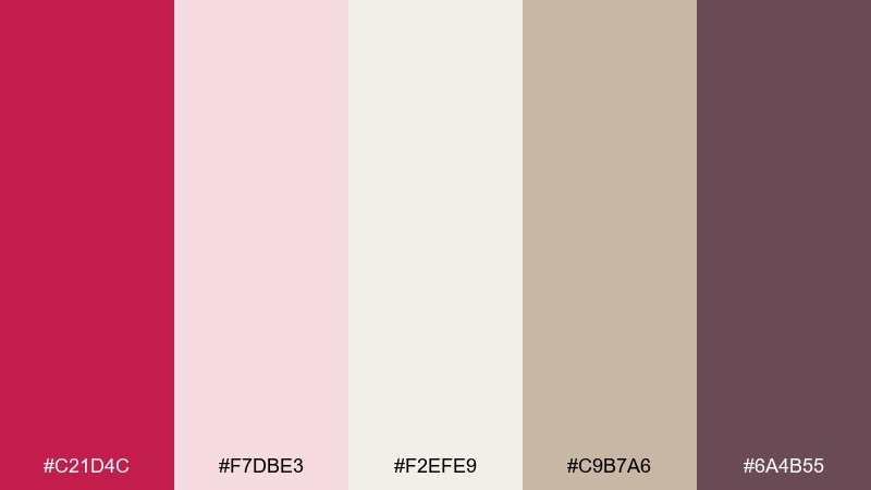
HEX: #c21d4c #f7dbe3 #f2efe9 #c9b7a6 #6a4b55
Mood: romantic and refined
Best for: wedding invitation suites
Romantic and refined, these shades feel like silk ribbons, blush blooms, and champagne toasts. The rose red color palette is perfect for formal invites, RSVP cards, and day-of signage that needs a clear focal color. Combine the bright rose with creamy paper tones and a warm taupe for a timeless finish. Tip: keep the darkest plum for names and dates so details stay crisp.
Image example of wedding rose red generated using media.io
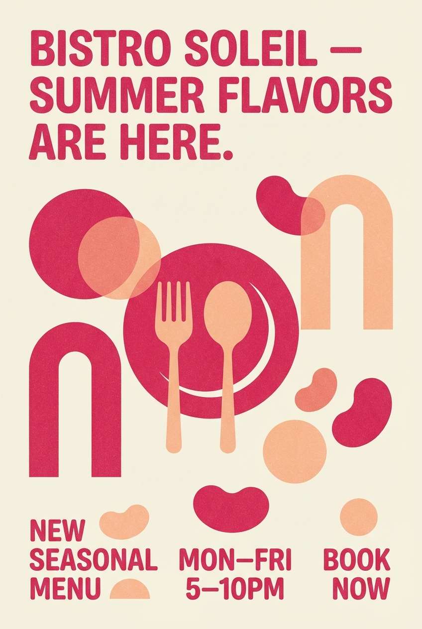
12) Sunset Rose Red
HEX: #c21d4c #ff9b7a #ffd0a6 #fff1e3 #5a2a2c
Mood: warm and uplifting
Best for: restaurant posters and promos
Warm and uplifting, sunset rose red looks like a late golden hour glow with a berry tint. It is ideal for restaurant specials, seasonal posters, and food promos that need appetite appeal. Use the peach and cream as the main canvas, then push rose red into headlines and key badges. Tip: keep the dark cocoa for small text so the warm tones stay vibrant.
Image example of sunset rose red generated using media.io
13) Cranberry Cream
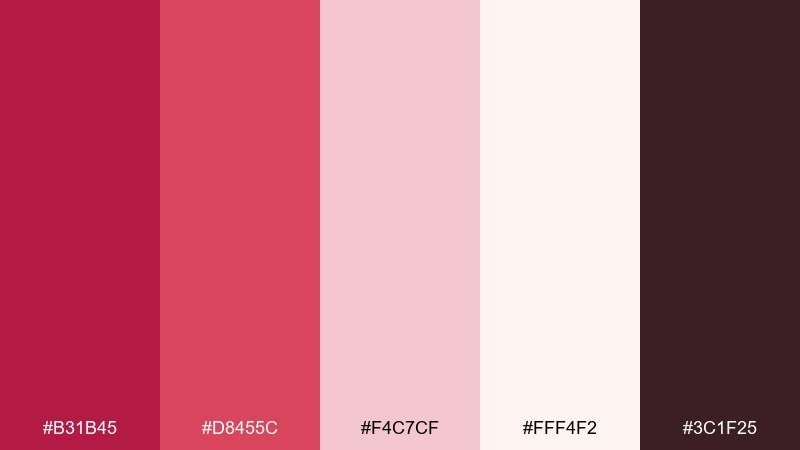
HEX: #b31b45 #d8455c #f4c7cf #fff4f2 #3c1f25
Mood: sweet and cozy
Best for: bakery packaging and labels
Sweet and cozy, cranberry cream feels like berry filling swirled into whipped frosting. Use it for bakery boxes, jam labels, and small-batch food branding where warmth matters. Let the cream background do the heavy lifting, then layer cranberry and pink for stamps and patterns. Tip: use the deep cocoa tone for ingredients and nutrition copy to keep it legible.
Image example of cranberry cream generated using media.io
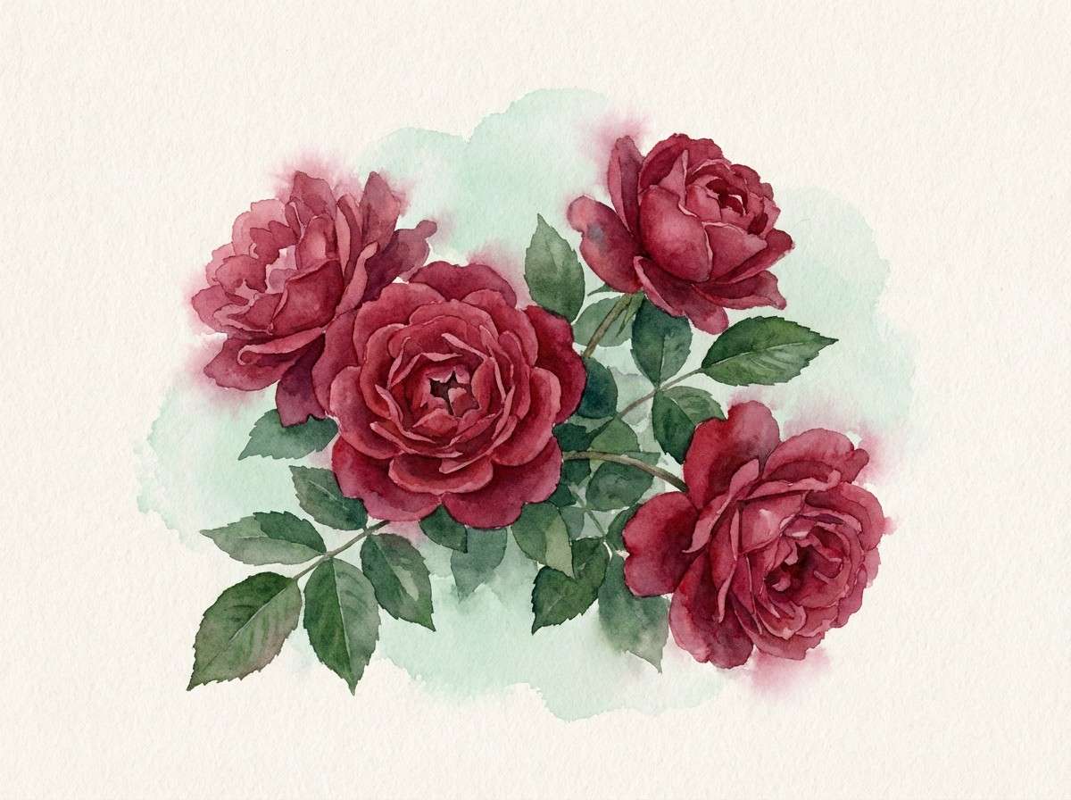
14) Garnet Garden
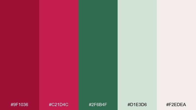
HEX: #9f1036 #c21d4c #2f6b4f #d1e3d6 #f2edea
Mood: lush and botanical
Best for: botanical prints and spring illustrations
Lush and botanical, garnet garden suggests rose petals against deep leaves after rain. It is a great fit for watercolor florals, plant shop prints, and seasonal artwork. Keep green and pale mint as the field, then punctuate with garnet for blooms and focal details. Tip: soften transitions by blending through the creamy neutral instead of hard edges.
Image example of garnet garden generated using media.io
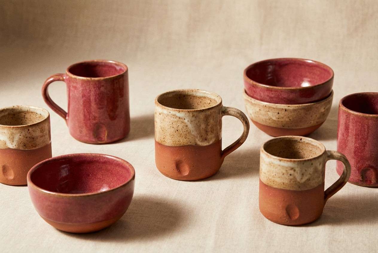
15) Ruby Terracotta
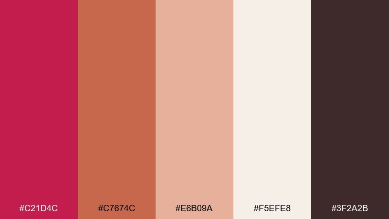
HEX: #c21d4c #c7674c #e6b09a #f5efe8 #3f2a2b
Mood: artisan and warm
Best for: ceramics and handmade product lines
Artisan and warm, ruby terracotta brings to mind kiln-fired clay with a rosy glaze. Use it for handmade goods, pottery shops, and craft brands that want an earthy but modern palette. Pair the rose with terracotta for a layered warm spectrum, then add cream to prevent heaviness. Tip: use the darkest brown for logo marks so the warm hues stay clean and friendly.
Image example of ruby terracotta generated using media.io
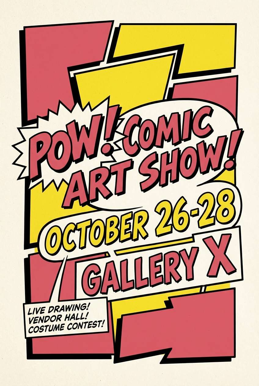
16) Pop Art Rose Red
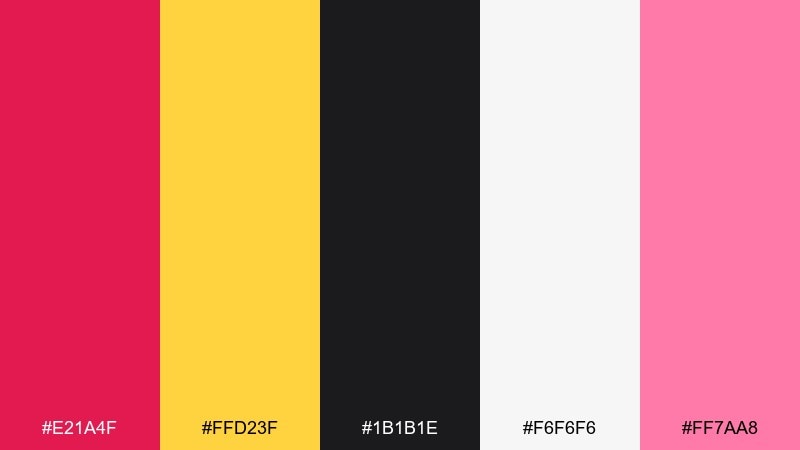
HEX: #e21a4f #ffd23f #1b1b1e #f6f6f6 #ff7aa8
Mood: energetic and graphic
Best for: event flyers and bold posters
Energetic and graphic, pop art rose red feels like punchy headlines and comic-style flair. These rose red color combinations are perfect for event flyers, music nights, and promo posters that need immediate contrast. Use off-white as a clean base, then alternate rose and yellow for blocks, stickers, or CTA shapes. Tip: keep black for outlines and type to preserve the pop-art snap.
Image example of pop art rose red generated using media.io
17) Editorial Rose Red
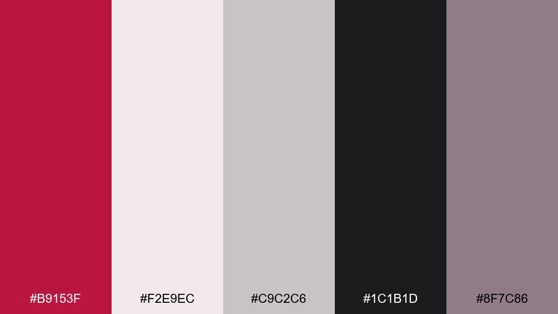
HEX: #b9153f #f2e9ec #c9c2c6 #1c1b1d #8f7c86
Mood: polished and editorial
Best for: magazine layouts and portfolios
Polished and editorial, these tones feel like matte paper, black ink, and a rose-tinted spotlight. Use it for magazine spreads, portfolios, or case-study pages where hierarchy matters. Keep backgrounds soft and airy, then apply the rose red as section markers and pull quotes. Tip: stick to one accent element per page to maintain a high-end rhythm.
Image example of editorial rose red generated using media.io
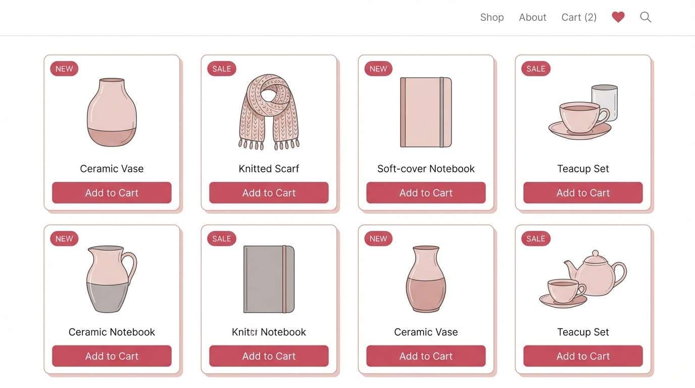
18) Light UI Rose Red
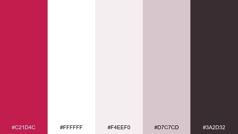
HEX: #c21d4c #ffffff #f4eef0 #d7c7cd #3a2d32
Mood: airy and friendly
Best for: ecommerce UI and product pages
Airy and friendly, this set reads like clean whitespace with a rosy notification glow. The rose red color palette works well for ecommerce UI where you need clear buttons and subtle highlights. Use white and blush as the surface layer, then keep rose red for primary actions and key sale tags. Tip: apply the dark plum for text and icons to keep contrast consistent across screens.
Image example of light ui rose red generated using media.io
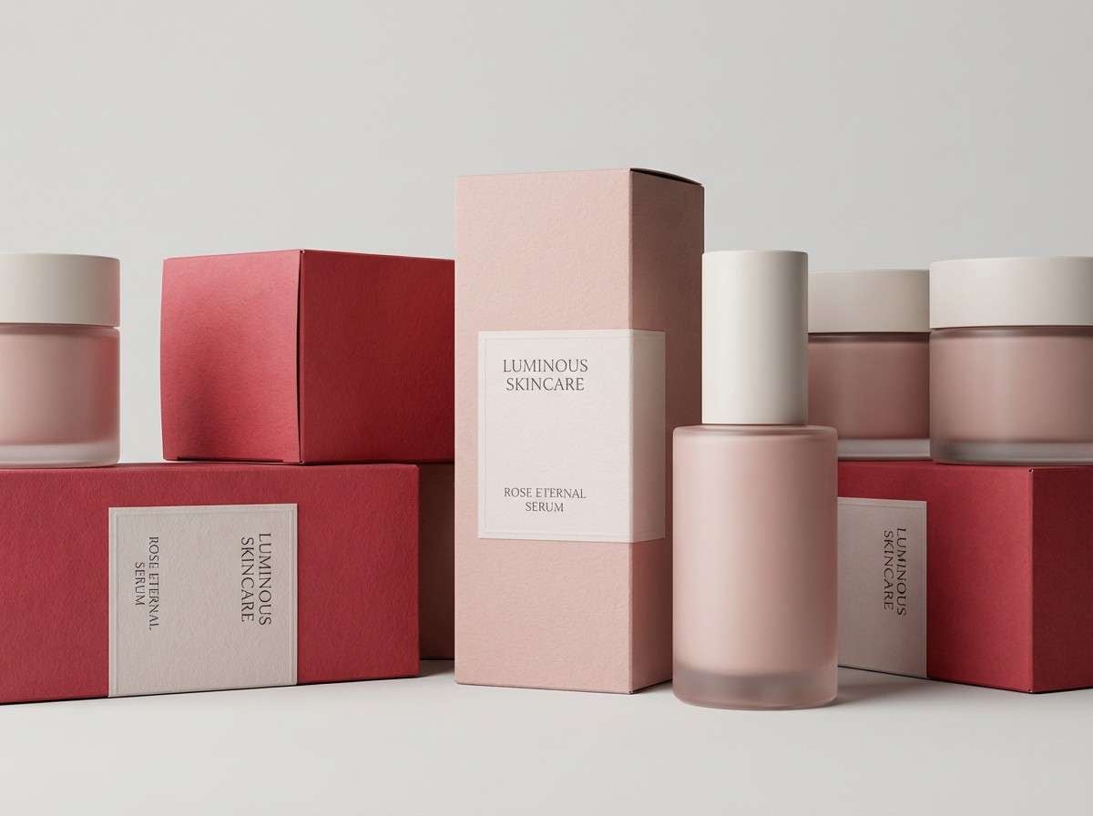
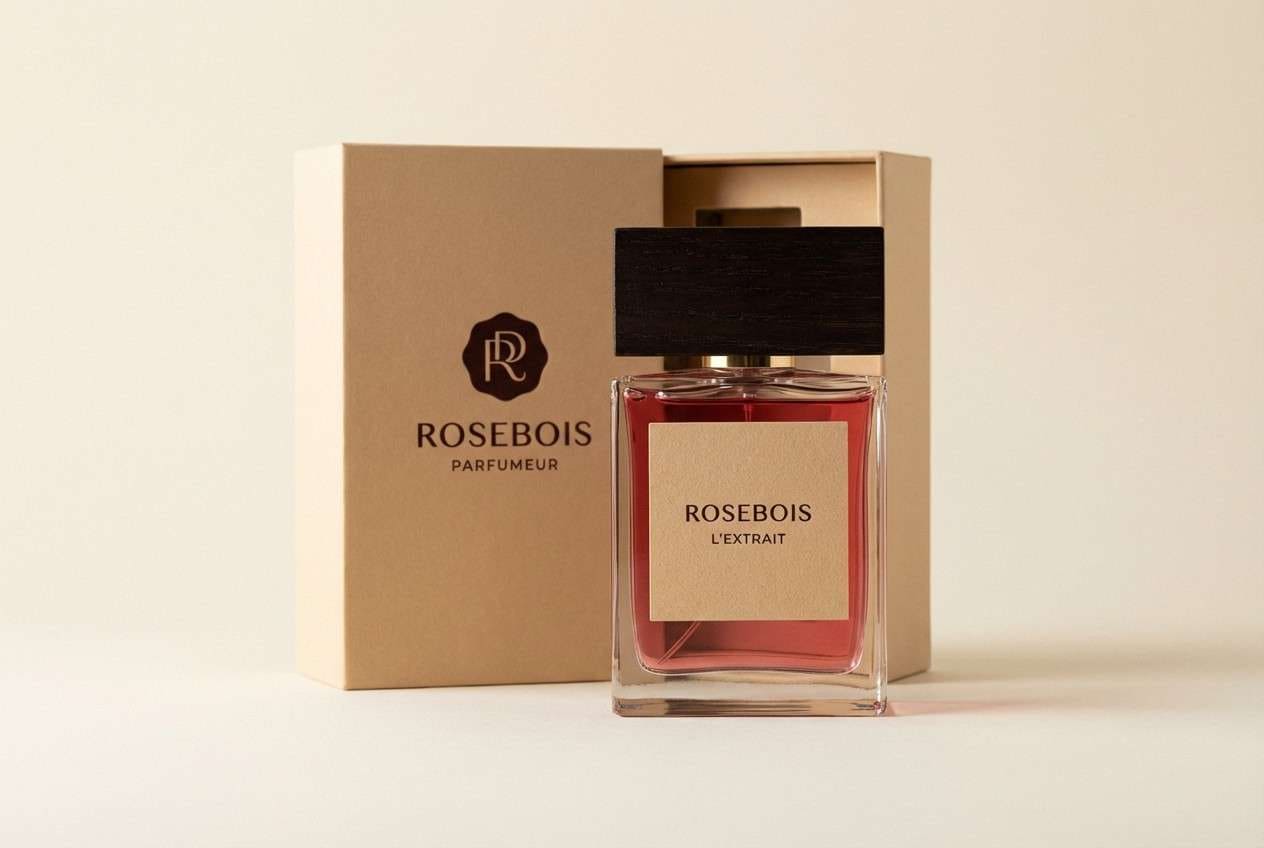
19) Studio Packaging Rose Red
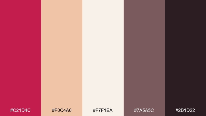
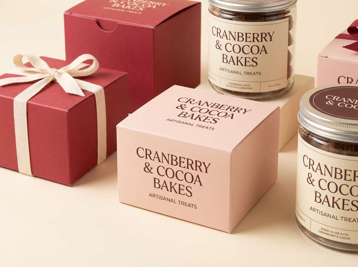
HEX: #c21d4c #f0c4a6 #f7f1ea #7a5a5c #2b1d22
Mood: premium and warm
Best for: perfume packaging and product ads
Premium and warm, studio packaging rose red feels like satin ribbon against creamy paper stock. It is made for perfume boxes, candle labels, and small luxury ads that rely on tactile warmth. Pair the bold rose with peachy beige to soften the contrast, then ground it with deep espresso details. Tip: use the mid mauve for secondary panels so your layout keeps depth without clutter.
Image example of studio packaging rose red generated using media.io
20) Holiday Rose Red
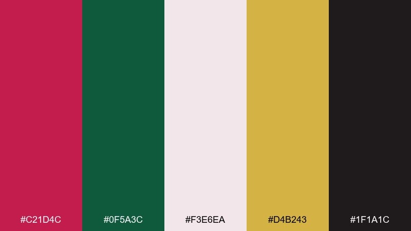
HEX: #c21d4c #0f5a3c #f3e6ea #d4b243 #1f1a1c
Mood: festive and classic
Best for: holiday cards and seasonal banners
Festive and classic, holiday rose red brings cranberry warmth with evergreen depth and a hint of gold. It is ideal for greeting cards, seasonal email headers, and storefront banners that need instant holiday cues. Use the pale blush as background, then layer rose and green in balanced blocks for a polished look. Tip: keep gold to small highlights like stars or borders so it reads as elegant, not noisy.
Image example of holiday rose red generated using media.io

What Colors Go Well with Rose Red?
Rose red pairs effortlessly with soft neutrals like ivory, warm cream, and blush—these keep the look romantic and breathable while letting rose red stay prominent.
For stronger contrast, try charcoal, espresso brown, or near-black. These darker anchors improve readability in UI and editorial layouts, especially for small type and iconography.
If you want a fresher, modern twist, add muted greens (sage, eucalyptus) or deep botanical tones. Green complements rose red naturally and helps the palette feel balanced rather than overly sweet.
How to Use a Rose Red Color Palette in Real Designs
Use rose red as a focal accent: logos, primary buttons, price tags, section dividers, or key highlights. Let light neutrals or soft pinks carry the background so the page doesn’t feel heavy.
Build hierarchy with a dark text color (plum, charcoal, espresso) and reserve bright pinks for limited, high-importance elements. This keeps both brand tone and accessibility consistent.
When printing (invitations, packaging, posters), add depth by layering rose red with one deeper wine shade plus a paper-like neutral. That combination tends to look premium and avoids flat, “too red” results.
Create Rose Red Palette Visuals with AI
If you already have HEX codes, you can turn them into ready-to-share visuals by generating mockups, posters, UI screens, or packaging scenes that match your palette’s vibe.
Start with a short prompt that names the design context (e.g., “wedding invitation suite” or “minimal ecommerce UI”) and call out your dominant and accent colors. Then iterate by adjusting lighting, background, and typography style.
Media.io makes it simple to generate multiple palette-based concepts quickly, so you can compare directions before committing to a final design system.
Rose Red Color Palette FAQs
-
What HEX code is considered “rose red”?
A common rose red reference is #c21d4c, which sits between classic red and pink and works well as an accent in branding and UI. -
Is rose red closer to pink or red?
Rose red is essentially a red with a noticeable pink/magenta influence. It reads warmer and more romantic than pure red, but stronger and deeper than blush pink. -
What colors complement rose red best?
Great complements include sage/leaf greens, charcoal or near-black, warm creams/ivories, and muted golds. Pick neutrals for balance, then add one contrasting anchor for readability. -
How do I keep a rose red palette from looking too “sweet”?
Introduce darker anchors like charcoal, espresso, or deep plum, and use rose red in smaller doses (headlines, CTAs, dividers) rather than full backgrounds. -
Can rose red work for modern UI design?
Yes. Use rose red for primary actions and status highlights, then rely on whites and soft grays for surfaces. Pair with a dark plum/charcoal for text to maintain contrast. -
What’s a good rose red palette for weddings?
Try rose red with blush, warm ivory, and champagne taupe for a timeless look. Keep typography in a deep plum/espresso to make names and dates crisp. -
How can I generate rose red palette images quickly?
Use Media.io’s text-to-image tool: describe the scene (packaging, invitation, UI), specify rose red as the dominant accent, and iterate on lighting and background until it matches your brand.


