

Rosy brown sits in the sweet spot between dusty rose and warm neutral—soft enough for lifestyle visuals, but grounded enough for modern branding and UI.
Below are 20 curated rosy brown color palette ideas with HEX codes, plus quick guidance on pairing and using them across real designs.
In this article
Why Rosy Brown Palettes Work So Well
Rosy brown (#BC8F8F) blends warmth with restraint, so it reads cozy and human without feeling overly pink. That makes it versatile across industries—from cafés and skincare to editorial layouts.
It also pairs easily with both light neutrals (creams, off-whites, soft grays) and deeper anchors (espresso browns, near-black, wine tones). The result is a palette that stays modern while still feeling inviting.
Because it’s naturally muted, rosy brown supports legible typography and calm backgrounds—especially useful for UI, print templates, and social graphics where contrast and clarity matter.
20+ Rosy Brown Color Palette Ideas (with HEX Codes)
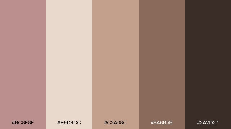
1) Rosewood Latte
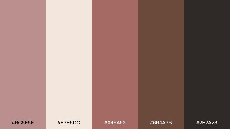
HEX: #BC8F8F #F3E6DC #A46A63 #6B4A3B #2F2A28
Mood: warm, grounded, cozy
Best for: coffee shop branding and menu graphics
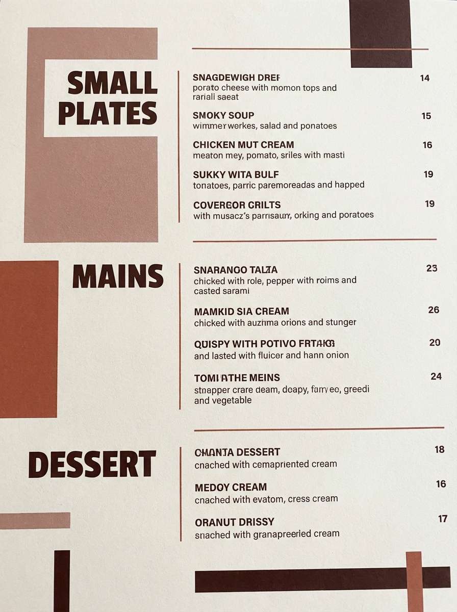
Warm and grounded like a latte foam swirl on a rainy morning, these tones feel instantly welcoming. Use the light cream for breathing room, then anchor layouts with cocoa and charcoal. This rosy brown color palette shines on menus, loyalty cards, and storefront signage. Tip: keep rosewood as the hero color and reserve the darkest shade for small, high-contrast type.
Image example of rosewood latte generated using media.io
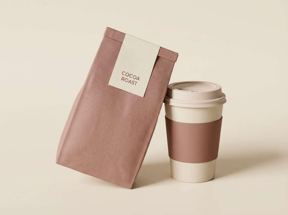
Media.io is an online AI studio for creating and editing video, image, and audio in your browser.

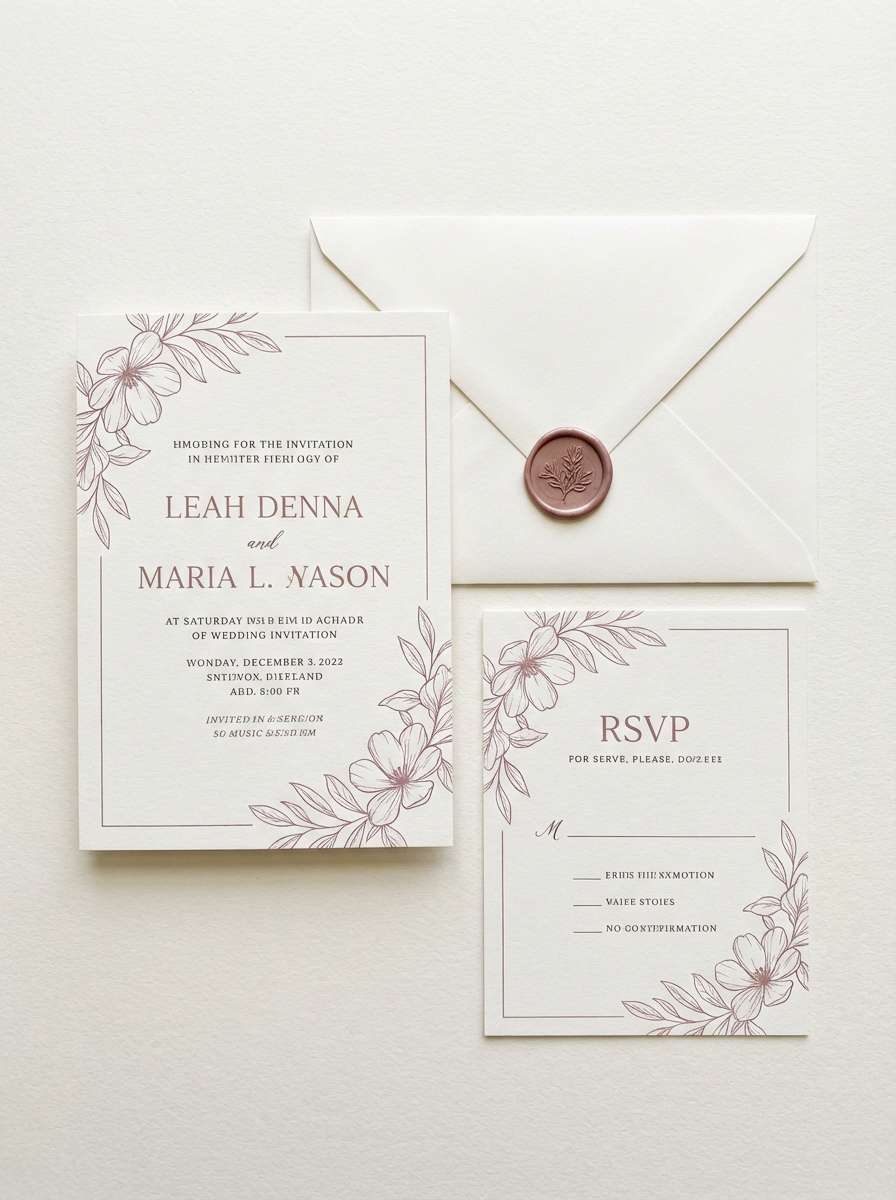
2) Dusty Petal
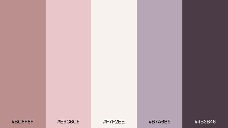
HEX: #BC8F8F #E9C6C9 #F7F2EE #B7A6B5 #4B3B46
Mood: romantic, airy, elegant
Best for: wedding invitation suites and RSVP cards
Romantic and airy like pressed petals in a keepsake book, this mix feels soft without turning sugary. Let the off-white carry most of the page, then use mauve gray for typography and structure. Deep plum works best as a sparing accent for monograms or small borders. Tip: print on textured stock to make the blush tones look richer and more dimensional.
Image example of dusty petal generated using media.io
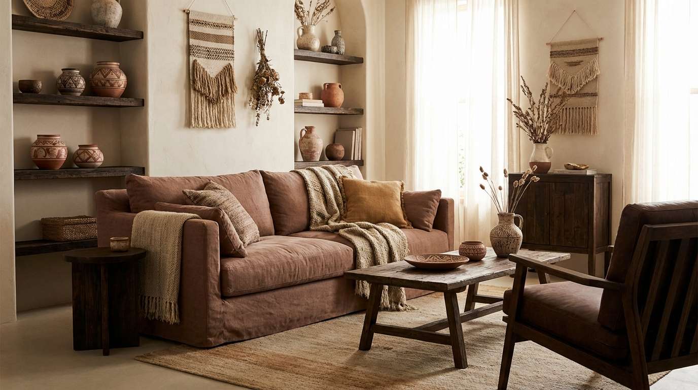
3) Terracotta Linen
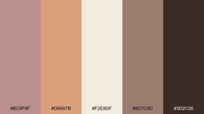
HEX: #BC8F8F #D9A07B #F2E9DF #9C7C6D #3D2C26
Mood: sunbaked, relaxed, earthy
Best for: boho living room interior styling
Sunbaked and relaxed, it evokes clay pots, linen throws, and late-afternoon light. This rosy brown color combination works beautifully on walls or large textiles, while terracotta brings the energy. Pair with natural wood, matte black hardware, and woven textures to keep it grounded. Tip: repeat the darkest brown in small decor pieces to create visual rhythm without heaviness.
Image example of terracotta linen generated using media.io
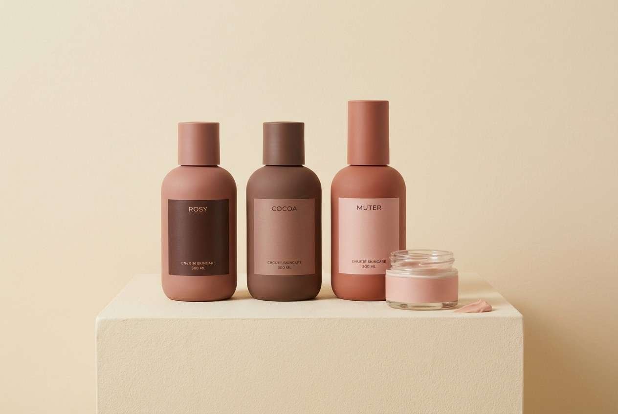
4) Cocoa Blush
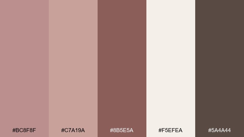
HEX: #BC8F8F #C7A19A #8B5E5A #F5EFEA #5A4A44
Mood: cozy, intimate, modern
Best for: beauty product ads and skincare promos
Cozy and intimate, these shades feel like a cashmere robe and a mug of hot cocoa. The creamy neutral keeps product shots clean while the deeper cocoa adds premium contrast. Use the mid rosy tones for backgrounds, gradient overlays, or soft shadows behind copy. Tip: choose one dark tone for text and stick to it to avoid a muddy, low-contrast look.
Image example of cocoa blush generated using media.io
5) Mauve Stone
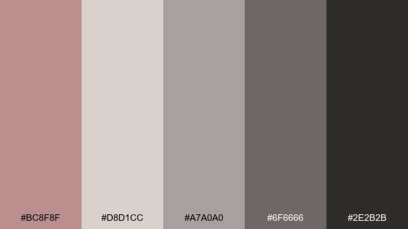
HEX: #BC8F8F #D8D1CC #A7A0A0 #6F6666 #2E2B2B
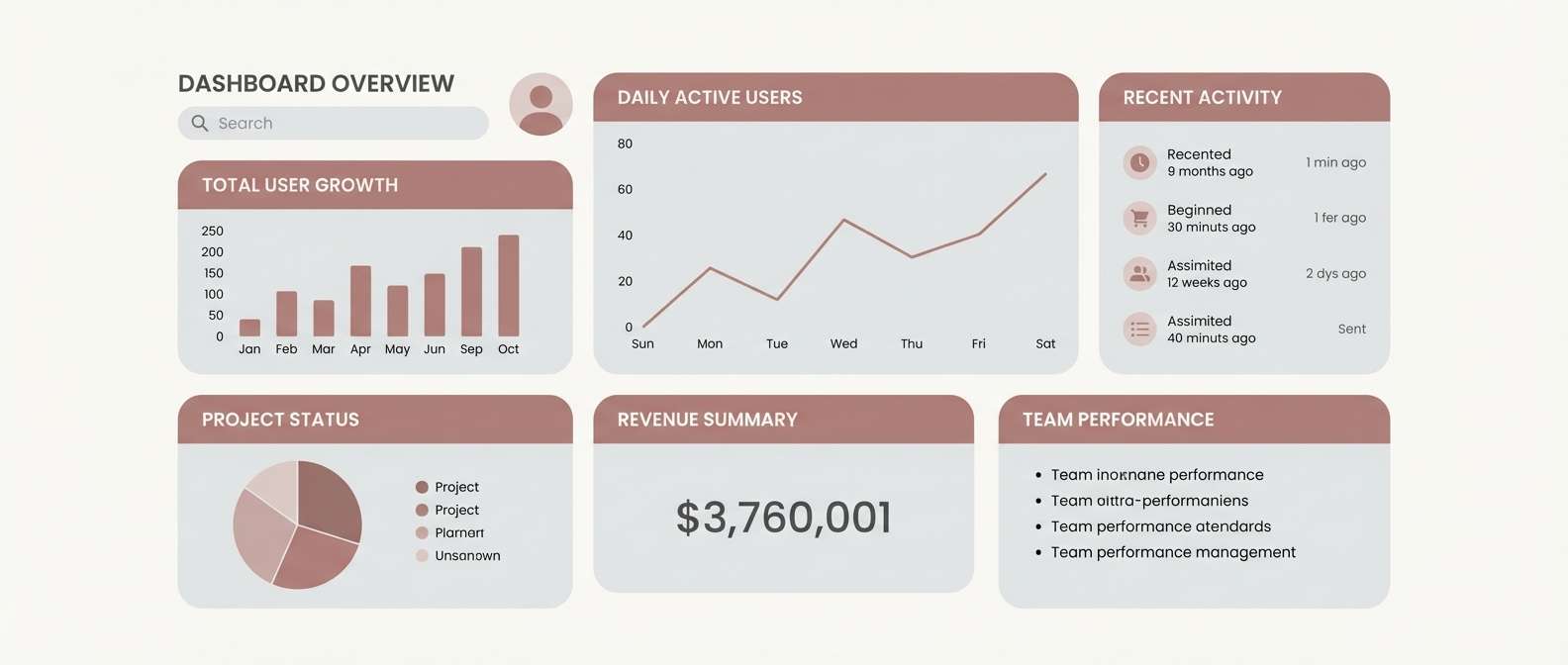
Mood: minimal, calm, tech-friendly
Best for: SaaS dashboards and analytics UI
Minimal and calm, it feels like smooth river stone with a mauve tint. This rosy brown color scheme is a strong choice for dashboards because it stays quiet behind data. Use the light grays for panels, then bring in rosy brown for active states and highlights. Tip: reserve the near-black for key numbers and primary buttons to keep accessibility solid.
Image example of mauve stone generated using media.io
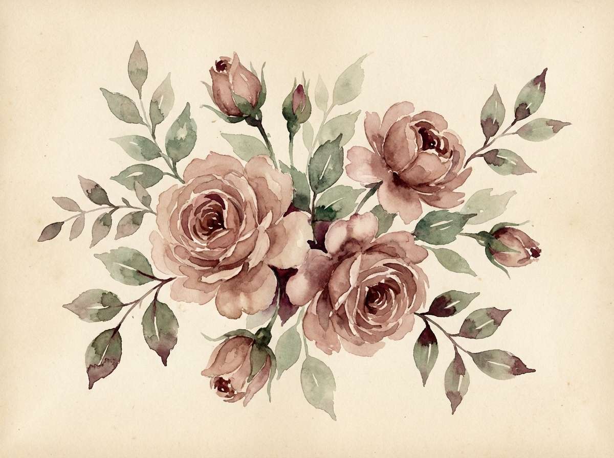
6) Vintage Bouquet
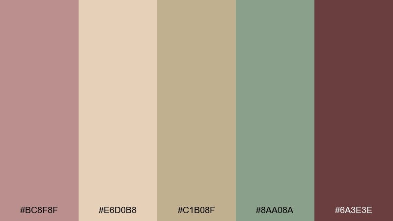
HEX: #BC8F8F #E6D0B8 #C1B08F #8AA08A #6A3E3E
Mood: nostalgic, soft, botanical
Best for: watercolor floral illustrations and stationery
Nostalgic and soft, it brings to mind dried florals and antique paper. The muted sage keeps the warmth from feeling too pink, while deep wine adds a vintage focal point. Use the beige as your paper tone and paint rosy accents in gentle washes. Tip: limit the darkest shade to flower centers or small text for a refined finish.
Image example of vintage bouquet generated using media.io
7) Cozy Cabin
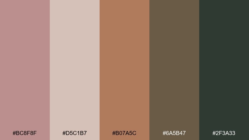
HEX: #BC8F8F #D5C1B7 #B07A5C #6A5B47 #2F3A33
Mood: rustic, outdoorsy, comforting
Best for: lifestyle blog headers and hero banners
Rustic and comforting, it feels like a cabin blanket, cedar wood, and a crackling fire. The warm clay tone pairs naturally with rosy brown, while the pine-dark shade adds a rugged edge. This rosy brown color palette works well for blog headers, travel stories, and cozy recipe content. Tip: set headings in the darkest green-gray and keep body text on the lightest neutral for clarity.
Image example of cozy cabin generated using media.io
8) Desert Rose
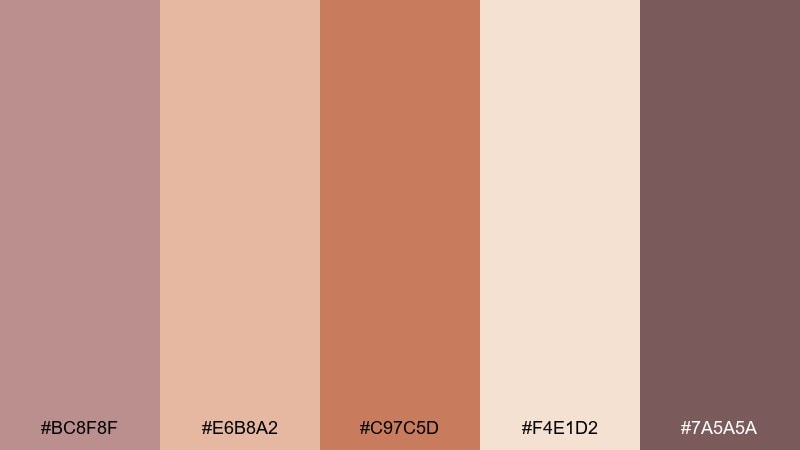
HEX: #BC8F8F #E6B8A2 #C97C5D #F4E1D2 #7A5A5A
Mood: adventurous, warm, sunlit
Best for: travel posters and destination prints
Adventurous and sunlit, it suggests desert dunes, sandstone, and dusty sunsets. Use the pale sand tone as the background to keep the composition light and airy. Let terracotta lead for titles and shapes, then deepen contrast with the muted plum-brown. Tip: flat graphic shapes look best here, with minimal gradients to maintain a crisp poster style.
Image example of desert rose generated using media.io
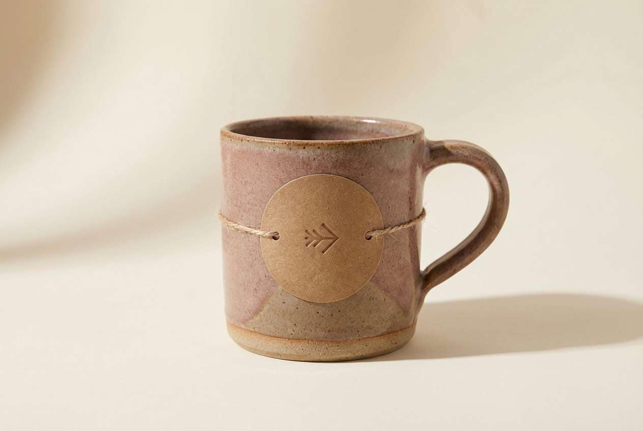
9) Clay And Cream
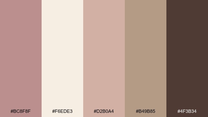
HEX: #BC8F8F #F6EDE3 #D2B0A4 #B49B85 #4F3B34
Mood: soft, artisanal, understated
Best for: handmade goods branding and pottery logos
Soft and artisanal, it evokes hand-thrown clay, creamy glaze, and sun-warmed studio shelves. These rosy brown color combinations feel especially natural on kraft labels, stamped logos, and minimal packaging. Pair with simple line icons and lots of negative space to keep the craft vibe modern. Tip: use the dark brown sparingly for seals or small marks so the palette stays airy.
Image example of clay and cream generated using media.io
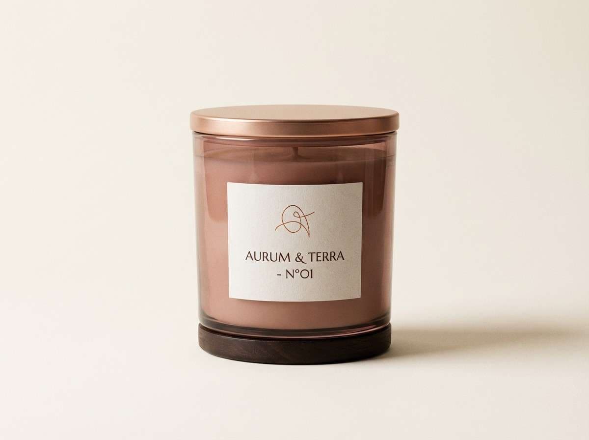
10) Soft Copper
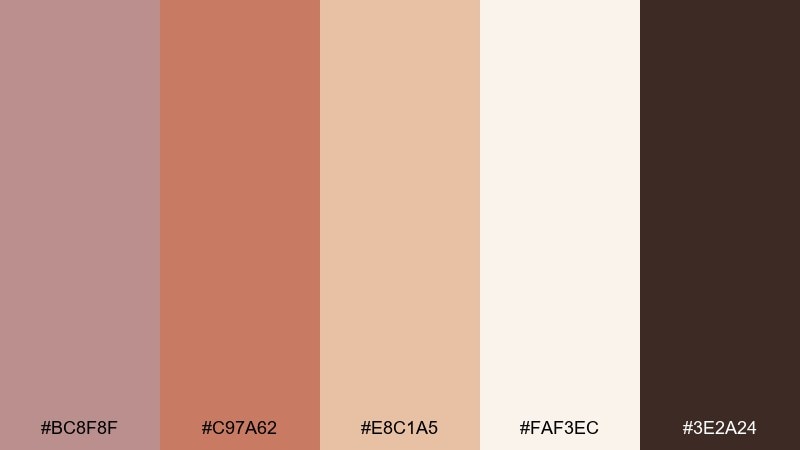
HEX: #BC8F8F #C97A62 #E8C1A5 #FAF3EC #3E2A24
Mood: glowy, polished, inviting
Best for: product packaging for candles and fragrances
Glowy and polished, it brings to mind copper foil, warm light, and a quiet evening glow. The pale ivory keeps labels readable, while copper and rosy tones add an upscale warmth. Pair with thin serif type and subtle foil accents for a premium finish. Tip: use copper for trims and borders rather than full backgrounds to avoid overpowering the layout.
Image example of soft copper generated using media.io
11) Rose Taupe Minimal
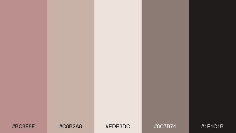
HEX: #BC8F8F #C8B2A8 #EDE3DC #8C7B74 #1F1C1B
Mood: sleek, modern, refined
Best for: minimalist portfolio websites
Sleek and refined, it feels like matte stone, brushed fabric, and clean architecture. Use the light neutral for wide margins and sections, then bring taupe for navigation and dividers. The near-black reads as elegant rather than harsh against the warm base. Tip: keep accent usage minimal and let typography do the heavy lifting.
Image example of rose taupe minimal generated using media.io
12) Autumn Rosy
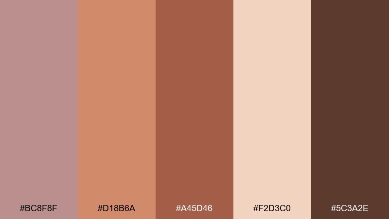
HEX: #BC8F8F #D18B6A #A45D46 #F2D3C0 #5C3A2E
Mood: seasonal, bold, cozy
Best for: fall sale social media templates
Seasonal and bold, it captures falling leaves, baked spice, and cozy knitwear. Use the peachy highlight for badges and price callouts, and let the deeper brick tone carry headers. Pair with grainy textures or simple leaf icons for an autumnal look that still feels clean. Tip: keep backgrounds light so the rich browns do not swallow small text.
Image example of autumn rosy generated using media.io

13) Blush And Sage
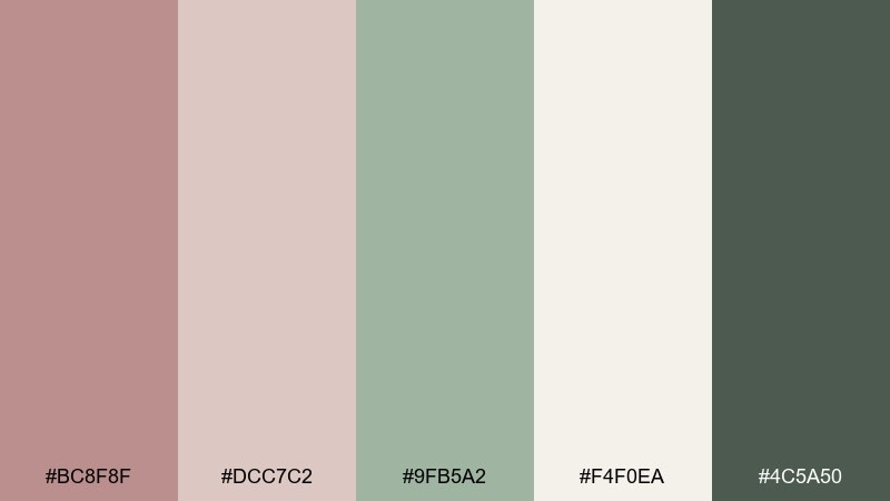
HEX: #BC8F8F #DCC7C2 #9FB5A2 #F4F0EA #4C5A50
Mood: calming, fresh, balanced
Best for: wellness branding and spa brochures
Calming and fresh, it feels like herbal steam, soft towels, and a blush of warmth. Sage green brings balance to the rosy neutrals, making the look soothing rather than overly sweet. Use the light cream for background space and keep the dark green-gray for small text and icons. Tip: add natural materials like linen and light wood to reinforce the spa mood.
Image example of blush and sage generated using media.io
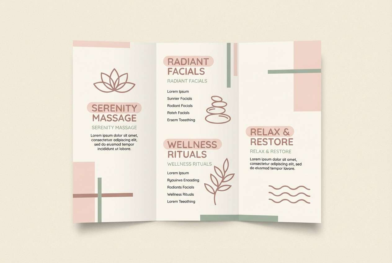
14) Warm Neutral Studio
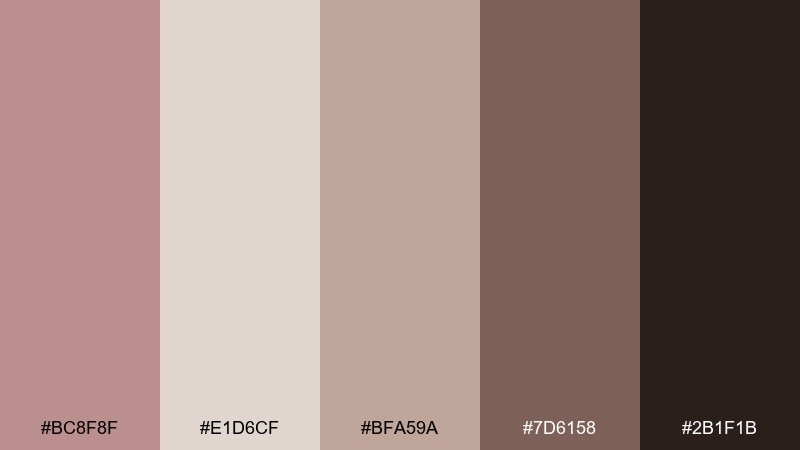
HEX: #BC8F8F #E1D6CF #BFA59A #7D6158 #2B1F1B
Mood: clean, professional, warm
Best for: editorial product photography backdrops
Clean and professional, it looks like a studio cyclorama warmed by evening light. The pale neutral makes a great backdrop, while mid tones add depth through props and shadows. Use the deep espresso as a crisp contrast for logos or small labels. Tip: keep the set minimal so the subtle warmth stays the star.
Image example of warm neutral studio generated using media.io
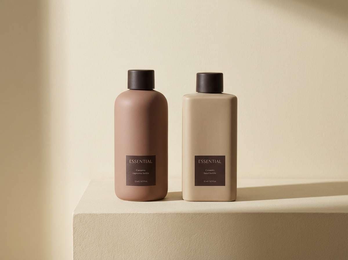
15) Sunset Brick
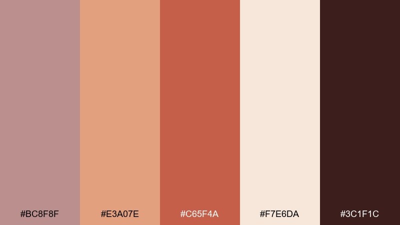
HEX: #BC8F8F #E3A07E #C65F4A #F7E6DA #3C1F1C
Mood: energetic, warm, appetizing
Best for: restaurant menus and food flyers
Energetic and appetizing, it recalls sunset brick walls and oven heat. Use the creamy shade for menu readability, then layer terracotta and brick for section headers. The deep brown creates strong contrast for prices and small details. Tip: keep photos warm-toned so they blend naturally with the palette instead of clashing.
Image example of sunset brick generated using media.io
16) Botanical Rose
HEX: #BC8F8F #F2E8E2 #C8D2C3 #8F9C88 #6B2F2F
Mood: fresh, natural, gently romantic
Best for: spring botanical prints and labels
Fresh and natural, it feels like spring leaves against a blush-tinted sky. The green range keeps the rosy tones grounded and gives plenty of room for botanical details. Use the pale blush as paper, then build foliage with the two greens for depth. Tip: add the deep wine only for tiny accents like stamps or signature marks.
Image example of botanical rose generated using media.io
17) Modern Editorial
HEX: #BC8F8F #F5F1EE #B9B0AE #6C6160 #1B1A1A
Mood: editorial, confident, sophisticated
Best for: magazine layouts and lookbooks
Editorial and confident, it reads like a high-end lookbook with warm undertones. The off-white and mid gray set a crisp grid, while rosy brown adds human warmth to headings and pull quotes. Keep contrast high by using near-black for body copy and fine rules. Tip: limit accent color to one or two elements per spread for a premium feel.
Image example of modern editorial generated using media.io

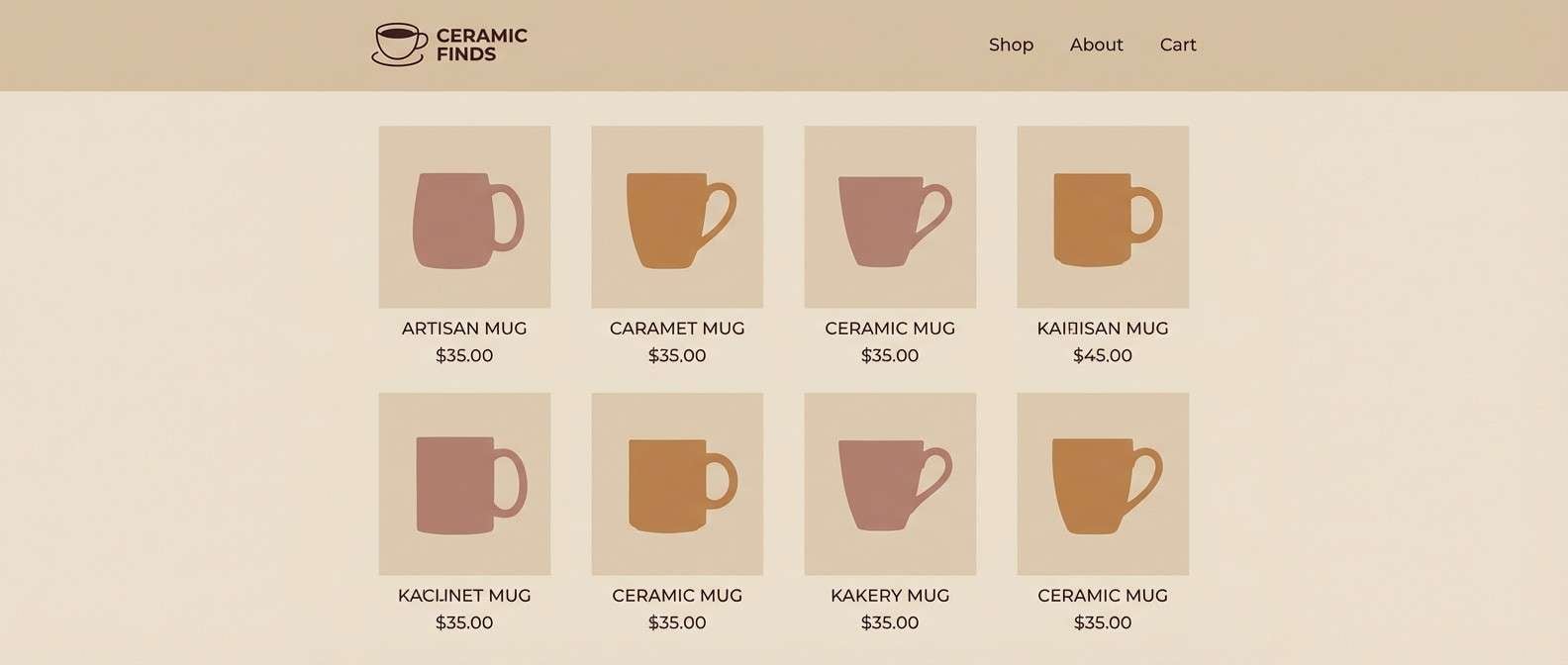
18) Café Ceramic
HEX: #BC8F8F #E9D9CC #C3A08C #8A6B5B #3A2D27
Mood: artisanal, warm, tactile
Best for: ceramics shop ecommerce UI
Artisanal and tactile, it suggests glazed mugs, café tables, and warm clay dust. Use the light beige for backgrounds and product grids, then apply rosy brown for key buttons and hover states. The mid caramel tones are great for tags like handmade or limited run. Tip: keep photography softly lit and warm to match the palette temperature.
Image example of café ceramic generated using media.io
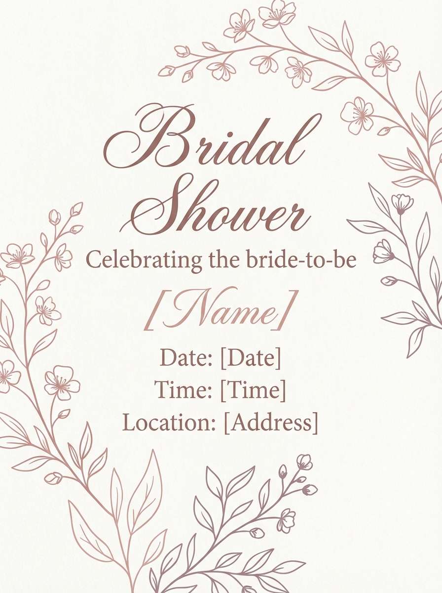
19) Bridal Rosé
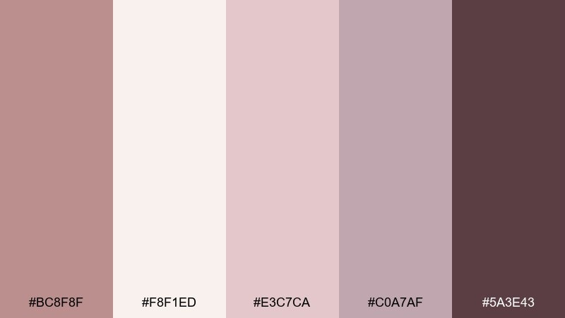
HEX: #BC8F8F #F8F1ED #E3C7CA #C0A7AF #5A3E43
Mood: delicate, celebratory, polished
Best for: bridal shower flyers and event signage
Delicate and celebratory, it feels like silk ribbons and soft candlelight. Use the lightest shade as your base, then layer blush for large shapes and panels. The deeper berry tone adds definition to names, dates, and key details without feeling harsh. Tip: pair with subtle floral line art and keep margins generous for an elevated look.
Image example of bridal rosé generated using media.io
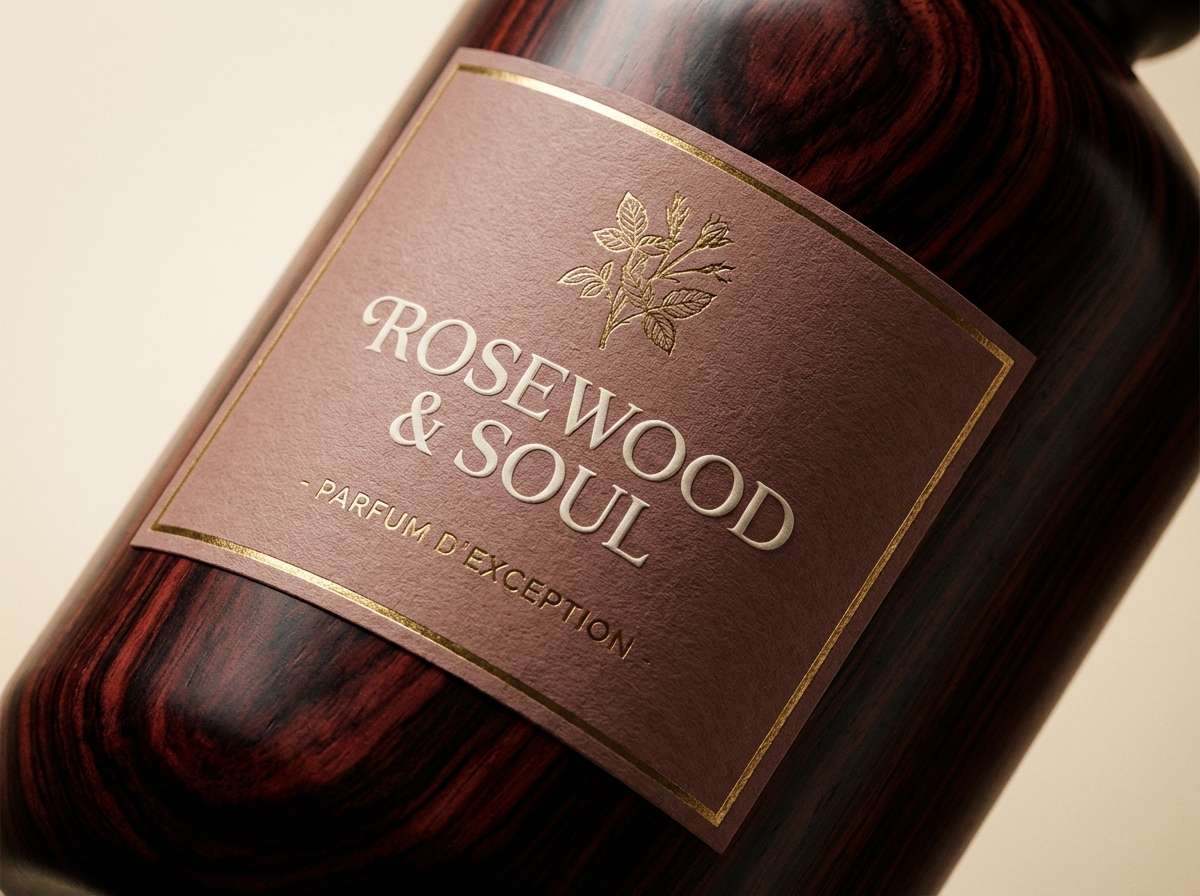
20) Nightfall Rosewood
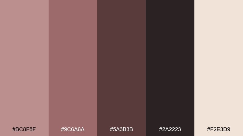
HEX: #BC8F8F #9C6A6A #5A3B3B #2A2223 #F2E3D9
Mood: dramatic, luxe, moody
Best for: luxury branding and premium labels
Dramatic and luxe, it brings to mind rosewood lacquer, velvet shadows, and dim gallery lighting. The warm cream keeps the palette from feeling heavy and helps fine details pop. Use the darkest tone for monograms and the mid rosewood for background blocks or label wraps. Tip: add subtle embossing or spot gloss to make the moody tones feel even richer.
Image example of nightfall rosewood generated using media.io
What Colors Go Well with Rosy Brown?
Rosy brown pairs best with warm off-whites, creams, and soft greiges when you want an airy, minimal look. These neutrals keep layouts clean while letting rosy undertones show through.
For contrast, add espresso brown, charcoal, or near-black to sharpen typography and UI states. If you want a more nature-forward direction, muted sage and olive greens balance rosy brown and keep it from leaning too pink.
To make it feel more premium, introduce copper, terracotta, or deep wine accents in small doses—borders, icons, badges, or headline highlights.
How to Use a Rosy Brown Color Palette in Real Designs
Start with a light neutral as the main background, then use rosy brown for the “brand tone” layer—headers, cards, highlights, or soft section fills. This keeps the palette warm without lowering readability.
Choose one dark anchor (charcoal/espresso) for text and key UI elements, and stick to it consistently to avoid a muddy look. If you’re working with photos, keep them warm-toned and softly lit so the palette feels cohesive.
For print and packaging, rosy brown looks especially rich on textured stocks and matte finishes. Reserve the darkest shade for small details like monograms, price text, or thin rules.
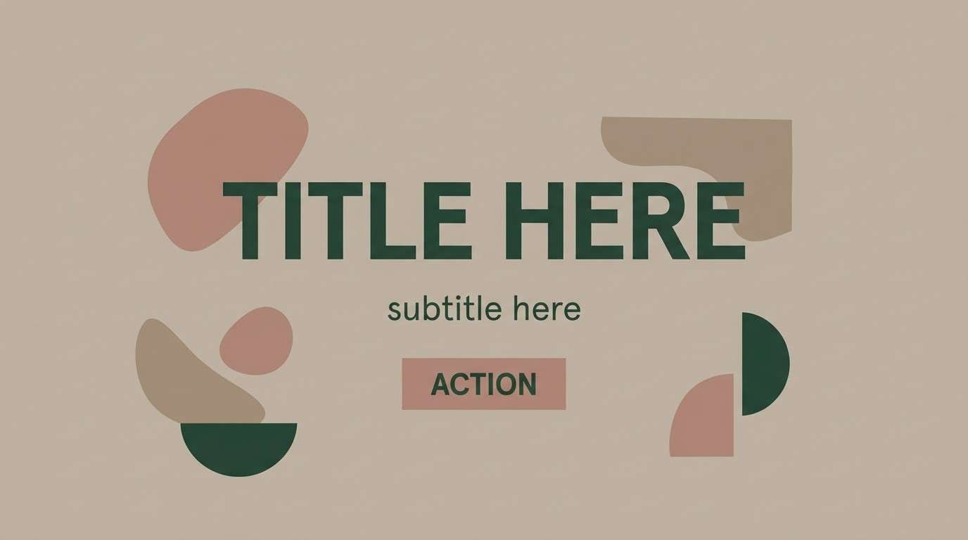
Create Rosy Brown Palette Visuals with AI
If you already have HEX codes, you can turn them into on-brand visuals fast by generating product mockups, posters, UI screens, and social templates with consistent color temperature.
Reuse the prompts above as a starting point, then swap subjects (e.g., “candle jar” to “coffee can”) while keeping lighting and background consistent for a cohesive set.
When generating, specify “dominant colors dusty rosy brown and warm cream” (or your chosen mix) and include a simple background to reduce random color contamination.
Rosy Brown Color Palette FAQs
-
What is the HEX code for rosy brown?
The commonly used rosy brown HEX code is #BC8F8F. It’s a muted, warm pink-brown that works well as a soft brand color or background tone. -
Is rosy brown more pink or more brown?
Rosy brown is balanced, but it typically reads as a brown-leaning dusty rose. Surrounding colors can push it warmer (with creams/terracotta) or cooler (with grays/mauves). -
What colors complement rosy brown?
Great complements include cream/off-white, taupe, charcoal, espresso brown, sage green, and deep wine for accent contrast. -
Does rosy brown work for UI and dashboards?
Yes—rosy brown works especially well in neutral-first UI when paired with light grays and a near-black text color. Use rosy brown for active states, highlights, and subtle emphasis. -
How do I keep rosy brown palettes from looking “muddy”?
Use one dark anchor for text, keep backgrounds light and warm, and avoid stacking too many mid-tone browns together. Adding a clean off-white improves contrast instantly. -
What’s a good accent color for rosy brown branding?
For modern warmth, try terracotta or soft copper. For a fresher feel, use muted sage. For luxury, add a tiny amount of deep wine or near-black. -
Can I generate rosy brown palette images with AI?
Yes. In your prompt, specify the dominant colors (rosy brown + your neutrals/accents), keep the scene minimal, and set consistent lighting (e.g., “soft diffused light”) to maintain palette accuracy.
Next: Vineyard Color Palette


