

Rosewood is a deep, reddish-brown family that sits between wine, cocoa, and warm wood. It instantly adds richness while still feeling grounded and usable in modern design.
Below you’ll find 20 rosewood color palette combinations with HEX codes, plus practical tips for branding, interiors, UI, and social graphics.
In this article
- Why Rosewood Palettes Work So Well
-
- velvet rosewood
- copper ember
- cocoa merlot
- smoky mauve wood
- autumn bark
- rosewood sage
- berry cream
- espresso blush
- clay terracotta
- midnight rosewood
- dusty cedar
- plum walnut
- sandalwood linen
- garnet gold
- rosewood teal accent
- brick olive
- mocha mist
- vintage burgundy
- rosewood monochrome
- warm neutral rosewood
- What Colors Go Well with Rosewood?
- How to Use a Rosewood Color Palette in Real Designs
- Create Rosewood Palette Visuals with AI
Why Rosewood Palettes Work So Well
Rosewood tones feel premium because they naturally carry depth—like stained wood, aged wine, or dark cherries. That built-in richness helps designs look intentional without relying on loud saturation.
They also pair easily with warm neutrals (cream, sand, taupe) for balance, giving you strong contrast options for typography, UI components, and packaging layouts.
Finally, rosewood reads as both modern and timeless: it can be moody and dramatic for luxury, or softened with blush and linen shades for calm, lifestyle-driven visuals.
20+ Rosewood Color Palette Ideas (with HEX Codes)
1) Velvet Rosewood
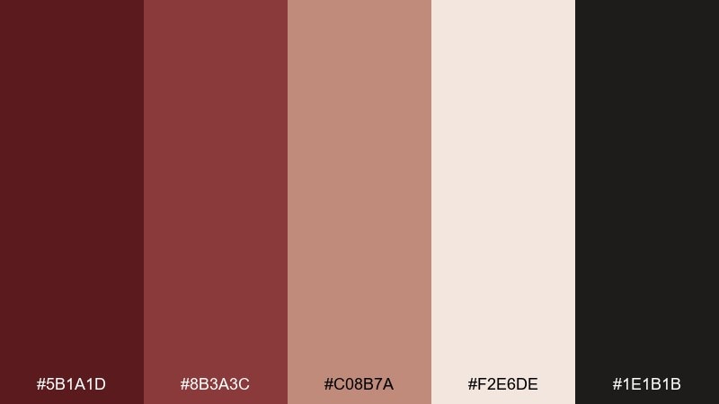
HEX: #5b1a1d #8b3a3c #c08b7a #f2e6de #1e1b1b
Mood: luxurious, intimate, dramatic
Best for: premium branding and packaging
Luxurious and intimate, this rosewood color scheme feels like velvet drapes, dark cherries, and candlelit rooms. Use it for premium labels, fragrance boxes, or boutique identity systems where depth matters. Pair the rosewood core with the soft cream for breathing room, and let the near-black anchor type and logos. Usage tip: keep the darkest tone for small accents so the palette stays rich, not heavy.
Image example of velvet rosewood generated using media.io
Media.io is an online AI studio for creating and editing video, image, and audio in your browser.

2) Copper Ember
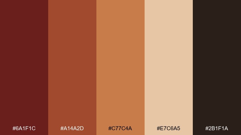
HEX: #6a1f1c #a14a2d #c77c4a #e7c6a5 #2b1f1a
Mood: warm, energetic, rustic
Best for: restaurant menus and signage
Warm and energetic, it evokes glowing embers, copper cookware, and brick ovens. It works beautifully for menus, café signage, and food photography overlays where warmth sells the story. Balance the copper and caramel notes with the creamy tan, and reserve the espresso-brown for headers. Usage tip: use the lightest swatch as your background to keep text crisp and readable.
Image example of copper ember generated using media.io
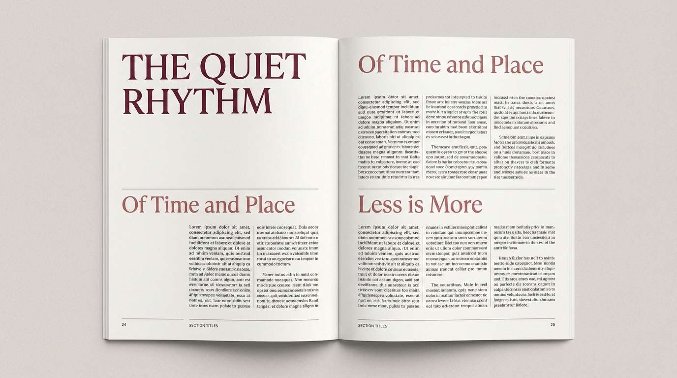
3) Cocoa Merlot
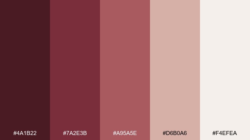
HEX: #4a1b22 #7a2e3b #a95a5e #d6b0a6 #f4efea
Mood: moody, refined, romantic
Best for: editorial layouts and book covers
Moody and refined, these tones feel like merlot stains, cocoa powder, and vintage paper. They suit editorial spreads, book covers, and poetry zines that need emotion without loud color. Let the pale paper shade carry the page, then layer merlot and dusty rose for headings and pull quotes. Usage tip: keep body text in a deep brown-black to avoid muddy contrast.
Image example of cocoa merlot generated using media.io
4) Smoky Mauve Wood
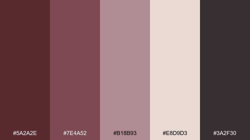
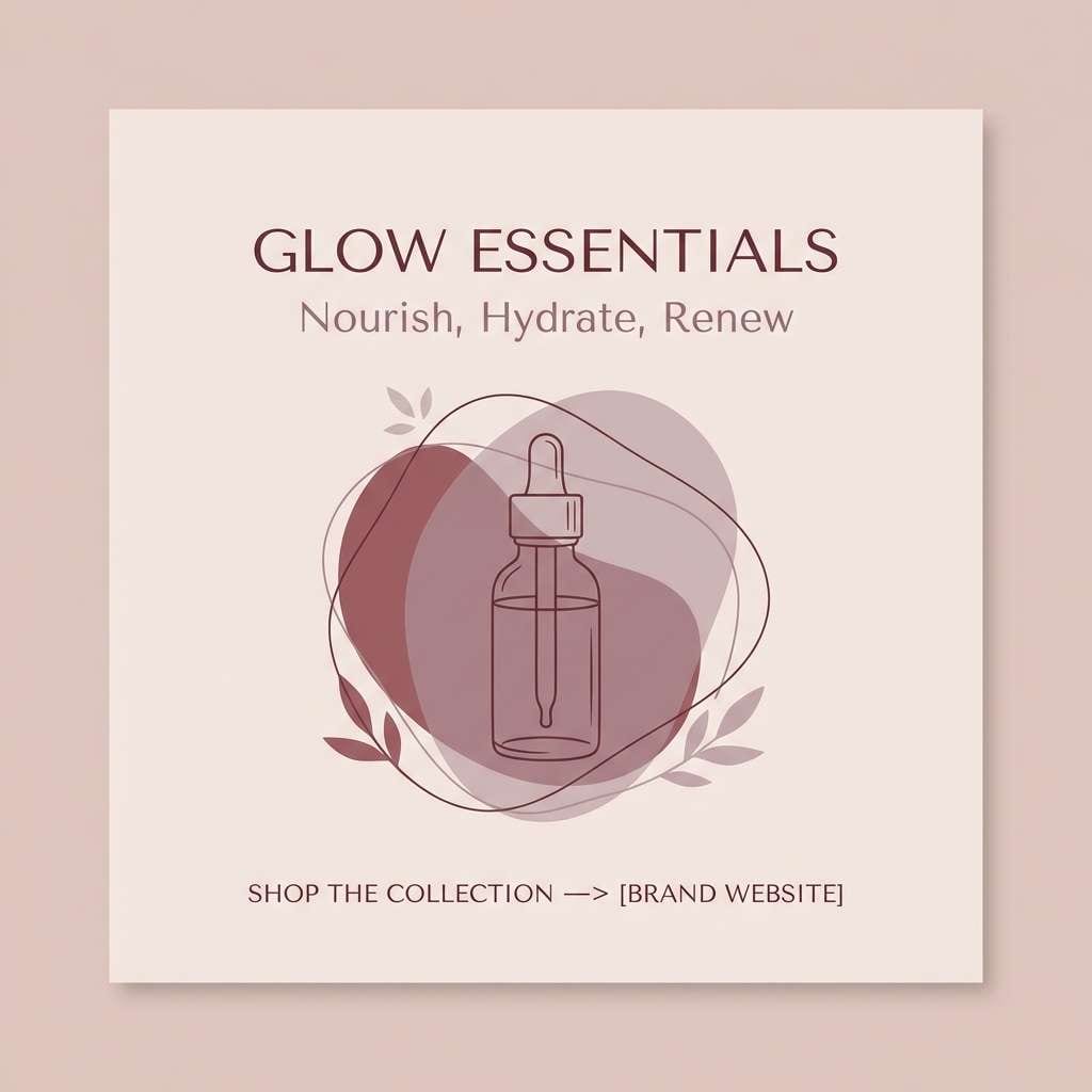
HEX: #5a2a2e #7e4a52 #b18b93 #e8d9d3 #3a2f30
Mood: soft, smoky, modern
Best for: beauty brand identity and social posts
Soft and smoky, it brings to mind mauve haze, dried petals, and matte suede. A rosewood color palette like this shines in beauty branding, skincare socials, and gentle product storytelling. Pair the dusty mauves with the pale blush-beige for backgrounds, then add the deepest tone for clean type and icons. Usage tip: apply a subtle grain texture to the light swatch to make the muted colors feel intentional, not flat.
Image example of smoky mauve wood generated using media.io
5) Autumn Bark
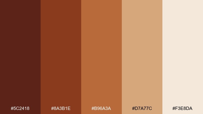
HEX: #5c2418 #8a3b1e #b96a3a #d7a77c #f3e8da
Mood: cozy, earthy, seasonal
Best for: fall campaign posters and banners
Cozy and earthy, it feels like fallen leaves, cider spices, and sunlit wood grain. Use it for autumn campaign banners, seasonal promos, and outdoor event posters that need warmth at a glance. Pair the bark brown with the toasted terracotta for bold titles, and keep the light cream for margins and spacing. Usage tip: add a single large headline in the darkest tone to create instant hierarchy.
Image example of autumn bark generated using media.io

6) Rosewood Sage
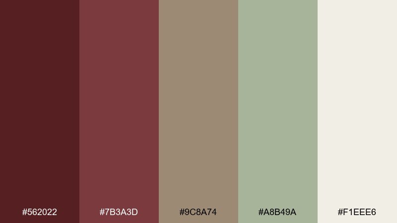
HEX: #562022 #7b3a3d #9c8a74 #a8b49a #f1eee6
Mood: grounded, calm, natural
Best for: wellness websites and blog UI
Grounded and calm, these rosewood colors suggest forest walks, herbal tea, and warm pottery. They work well for wellness sites, coaching brands, and blog UI where you want quiet confidence. Let sage handle buttons or highlights, and keep rosewood tones for headings and key calls to action. Usage tip: avoid using both mid-browns in the same text block; pick one for clarity.
Image example of rosewood sage generated using media.io
7) Berry Cream
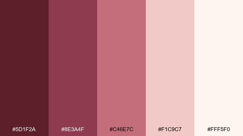
HEX: #5d1f2a #8e3a4f #c46e7c #f1c9c7 #fff5f0
Mood: sweet, playful, romantic
Best for: wedding invitations and RSVP sets
Sweet and romantic, it reads like berry compote, whipped cream, and soft blush ribbons. It is perfect for wedding invitations, bridal shower stationery, or boutique event RSVP suites. Pair the deep berry with the airy blush for contrast, and use the lightest tint as your paper base. Usage tip: keep metallic foiling minimal so the berry tones stay the hero.
Image example of berry cream generated using media.io

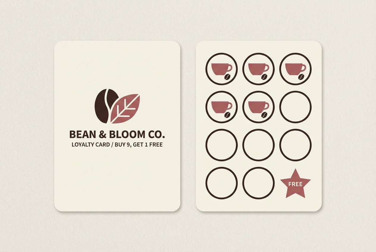
8) Espresso Blush
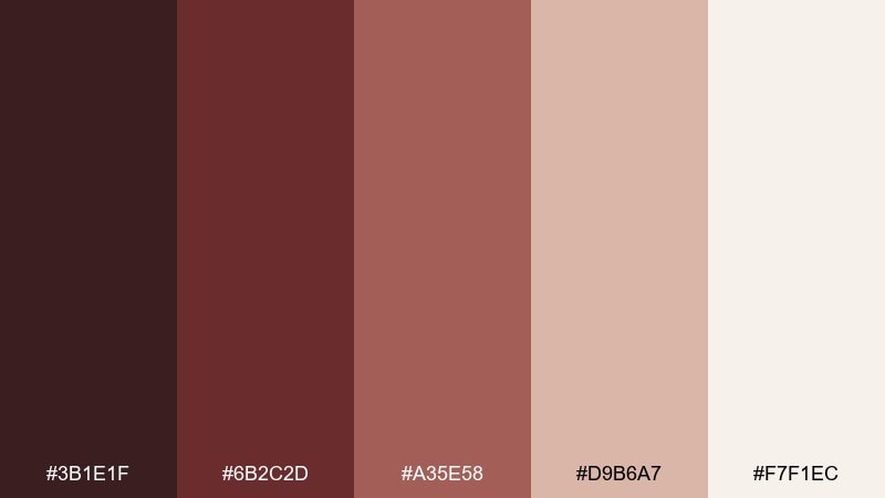
HEX: #3b1e1f #6b2c2d #a35e58 #d9b6a7 #f7f1ec
Mood: cozy, sophisticated, minimalist
Best for: coffee shop branding and loyalty cards
Cozy and sophisticated, it brings espresso crema, baked cinnamon, and warm stone to mind. Use it for café branding, loyalty cards, and small-format print where contrast needs to be strong but not harsh. The blush-beige keeps layouts airy, while the darkest espresso shade makes logos and stamps look crisp. Usage tip: set body copy on the lightest background and save mid-tones for illustration and borders.
Image example of espresso blush generated using media.io
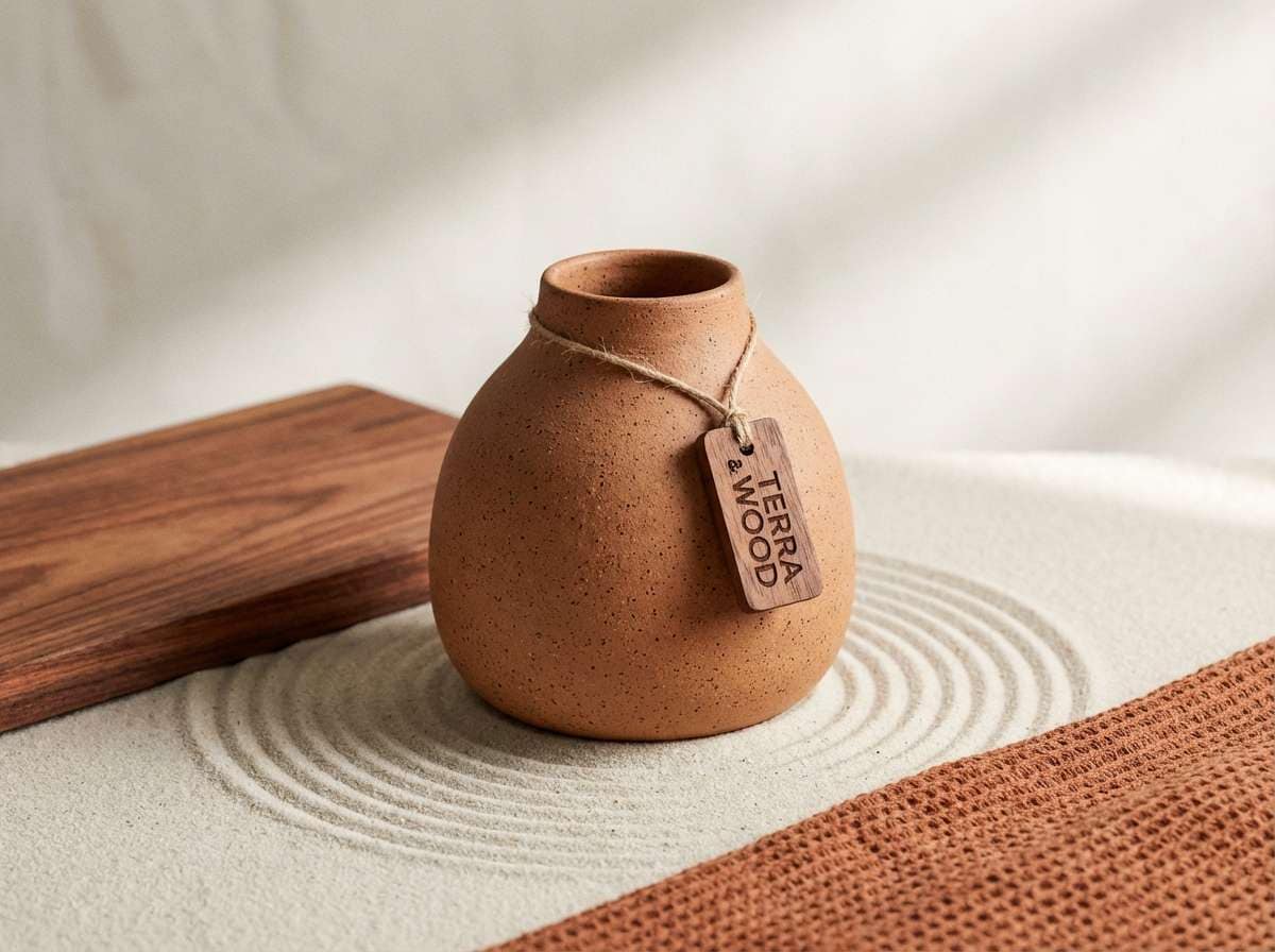
9) Clay Terracotta
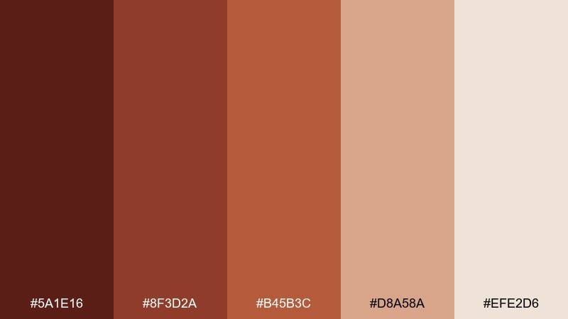
HEX: #5a1e16 #8f3d2a #b45b3c #d8a58a #efe2d6
Mood: sunbaked, artisanal, welcoming
Best for: home decor product ads
Sunbaked and artisanal, it feels like clay pots, terracotta tiles, and warm desert air. These rosewood color combinations are ideal for home decor ads, ceramic brands, and handcrafted product promos. Pair the mid terracotta with the soft sand tone for broad surfaces, then use the deep brown-red for logos and price tags. Usage tip: keep shadows neutral and soft so the palette stays earthy, not muddy.
Image example of clay terracotta generated using media.io
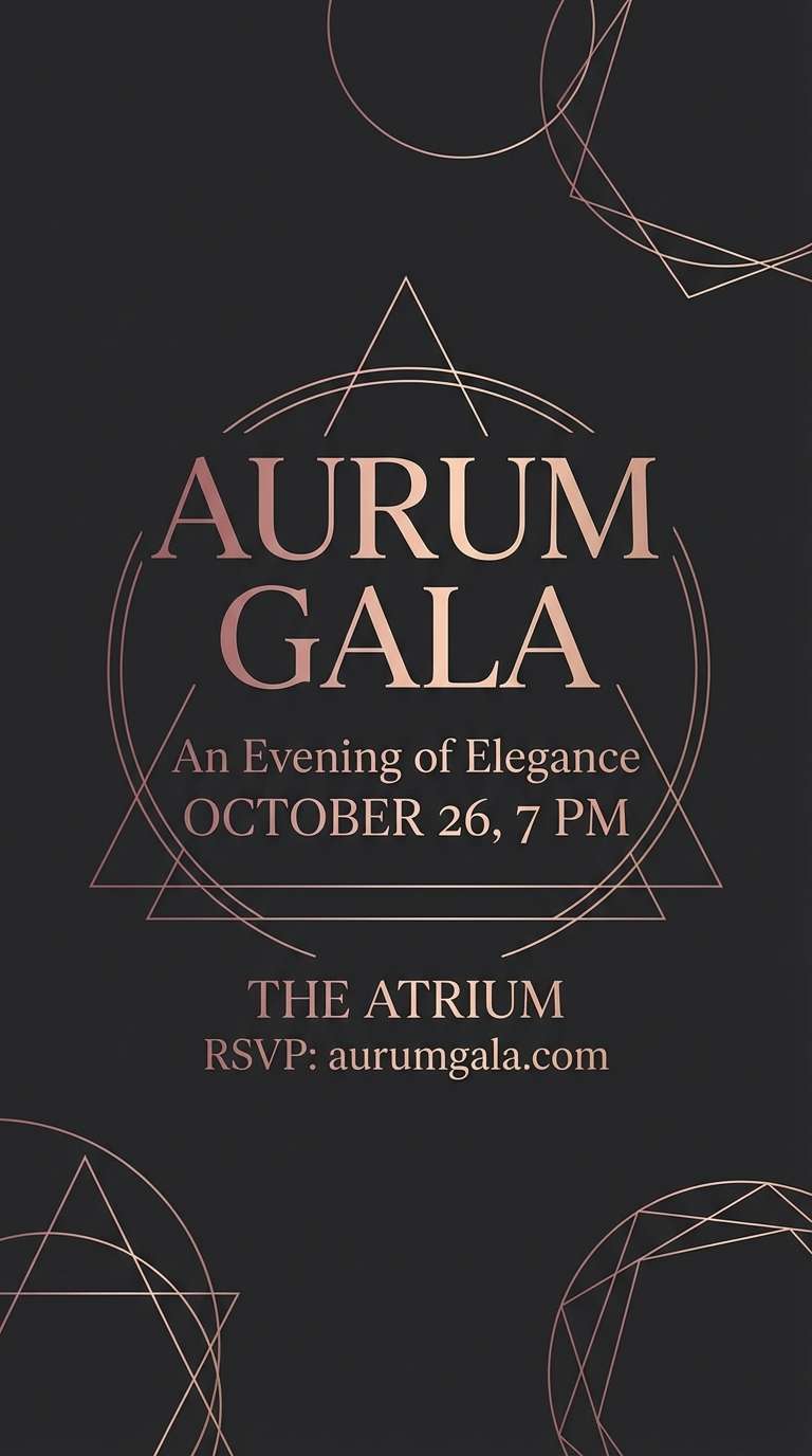
10) Midnight Rosewood
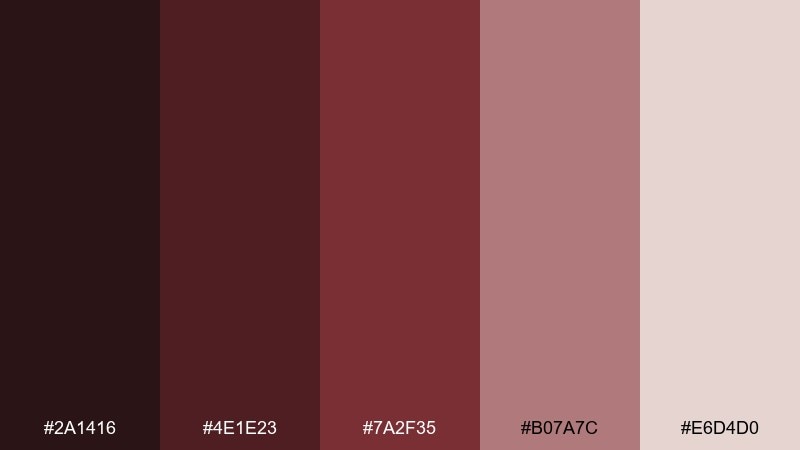
HEX: #2a1416 #4e1e23 #7a2f35 #b07a7c #e6d4d0
Mood: dramatic, elegant, nocturnal
Best for: luxury event flyers
Dramatic and nocturnal, it evokes city lights, dark florals, and satin eveningwear. Use this rosewood color palette for luxury event flyers, cocktail party promos, and moody announcements that need instant intrigue. Pair the near-black base with dusty rose for readable details, and reserve the light blush for small spotlight areas. Usage tip: choose one bold accent shape per layout to keep the dark tones feeling polished.
Image example of midnight rosewood generated using media.io
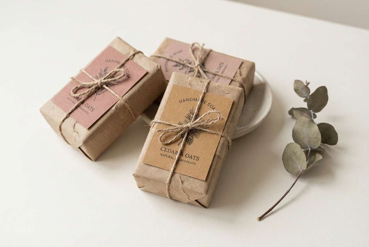
11) Dusty Cedar
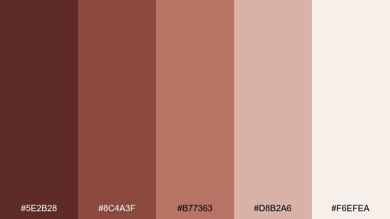
HEX: #5e2b28 #8c4a3f #b77363 #d8b2a6 #f6efea
Mood: warm, approachable, vintage
Best for: handmade goods packaging and labels
Warm and approachable, these shades feel like cedar shavings, vintage leather, and linen tags. They suit handmade goods packaging, soap labels, and craft market signage where a human touch matters. Use the creamy off-white for label stock, then layer cedar and tan for borders and small icons. Usage tip: print tests matter here; slightly warm paper will make the browns look richer.
Image example of dusty cedar generated using media.io
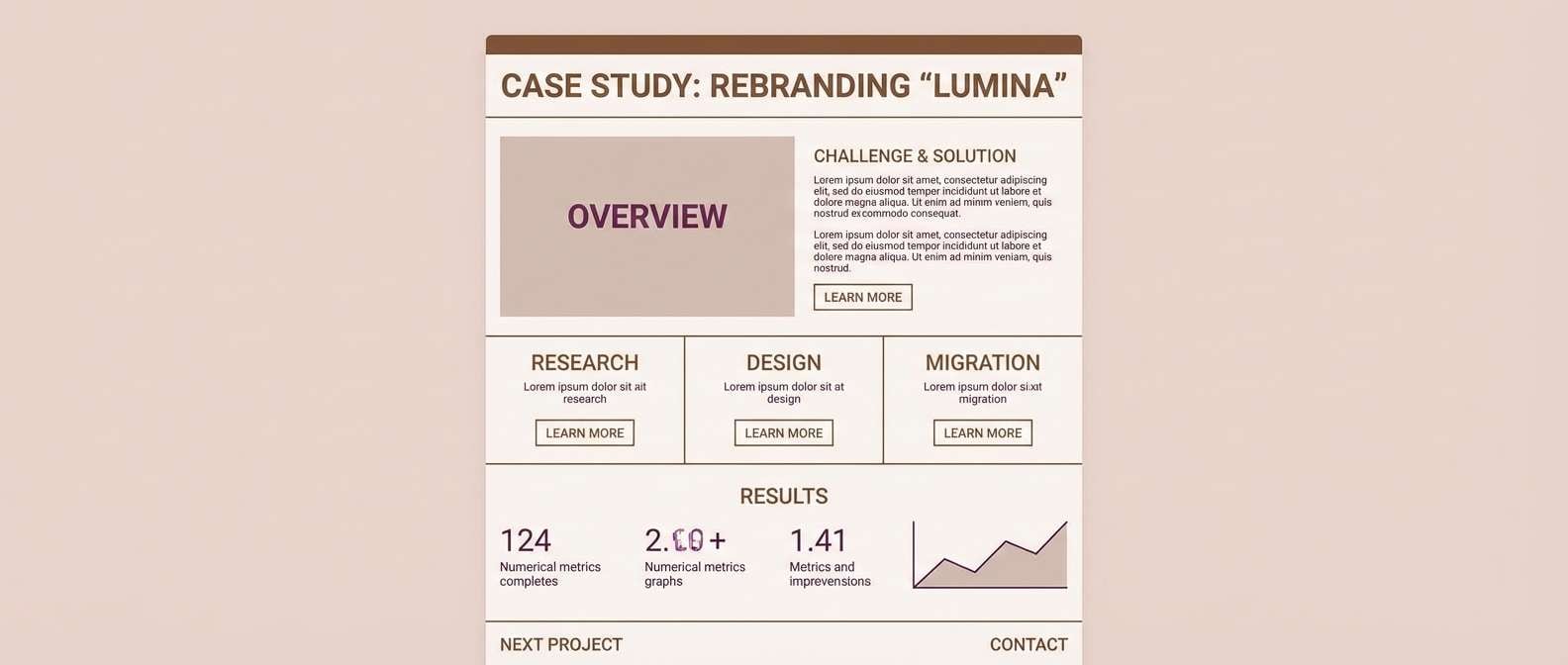
12) Plum Walnut
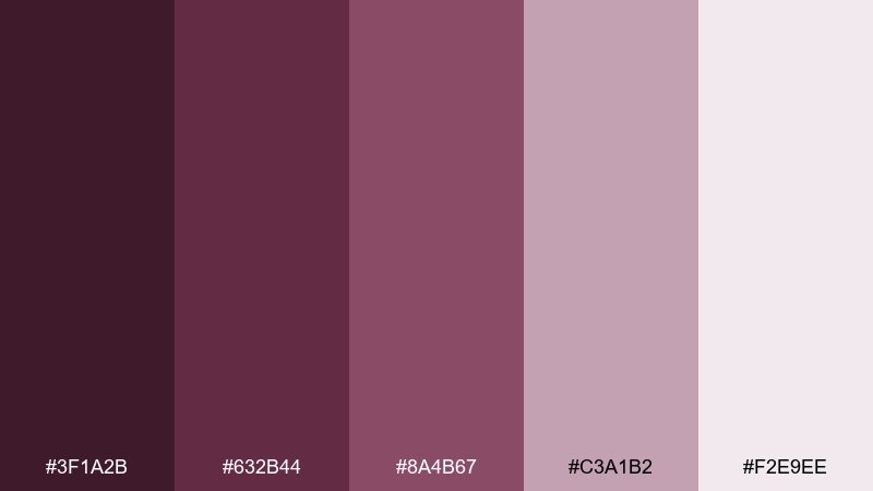
HEX: #3f1a2b #632b44 #8a4b67 #c3a1b2 #f2e9ee
Mood: artsy, elegant, expressive
Best for: creative portfolios and case studies
Artsy and expressive, this blend suggests plum ink, walnut shells, and soft watercolor washes. It works well for creative portfolios, agency case studies, and personal brands that want a refined edge. Keep the light lilac blush for sections and cards, then use plum for links and highlight moments. Usage tip: for accessibility, pair plum text with the palest background rather than mid-tones.
Image example of plum walnut generated using media.io
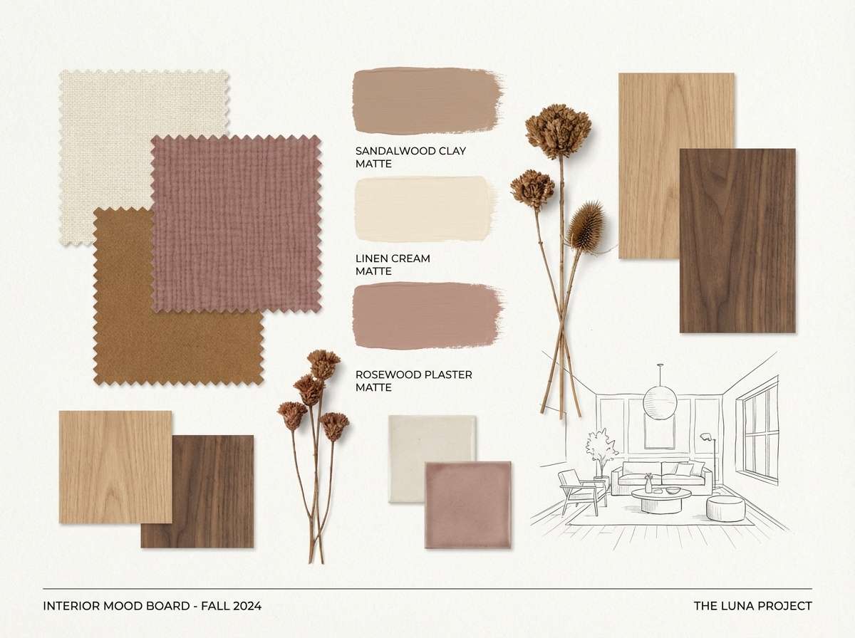
13) Sandalwood Linen
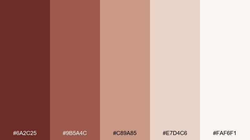
HEX: #6a2c25 #9b5a4c #c89a85 #e7d4c6 #faf6f1
Mood: soft, natural, airy
Best for: interior mood boards
Soft and airy, this rosewood color scheme evokes sandalwood, sunlit linen, and warm plaster walls. Use it for interior mood boards, home styling guides, and lifestyle lookbooks where neutrals need depth. Pair the mid sand tone with the creamy whites for large surfaces, and add rosewood as a thin line or small swatch to ground the story. Usage tip: mix matte textures (paper, fabric) so the subtle shifts read clearly.
Image example of sandalwood linen generated using media.io
14) Garnet Gold
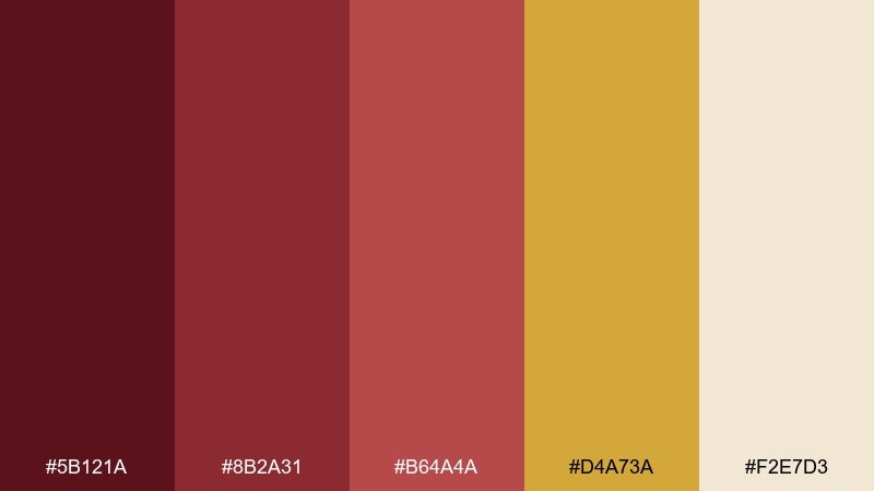
HEX: #5b121a #8b2a31 #b64a4a #d4a73a #f2e7d3
Mood: opulent, festive, bold
Best for: holiday promos and premium offers
Opulent and festive, it recalls garnet jewelry, antique gold, and warm candle glow. This rosewood color palette is strong for holiday promos, premium offers, and bold callouts that still feel classic. Let gold be the accent, not the base, and keep the cream for negative space and readability. Usage tip: use gold for icons and thin rules so it looks like metal, not mustard.
Image example of garnet gold generated using media.io

15) Rosewood Teal Accent
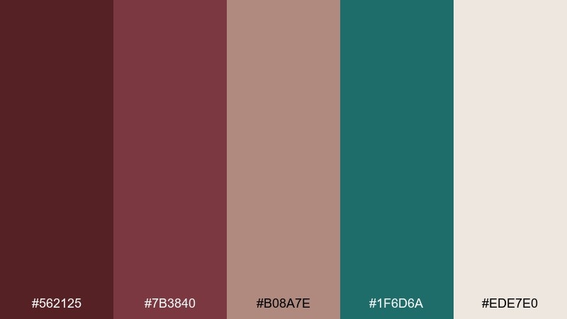
HEX: #562125 #7b3840 #b08a7e #1f6d6a #ede7e0
Mood: modern, confident, balanced
Best for: app UI and dashboard highlights
Modern and confident, it feels like dark wood paired with cool sea-glass details. Use it for app UI, dashboards, and product pages where you want warmth without losing clarity. Teal works best as the interactive accent, while rosewood and taupe carry structure and hierarchy. Usage tip: limit teal to one button style and key charts for a clean, intentional system.
Image example of rosewood teal accent generated using media.io

16) Brick Olive
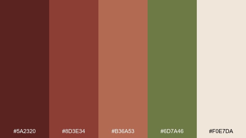
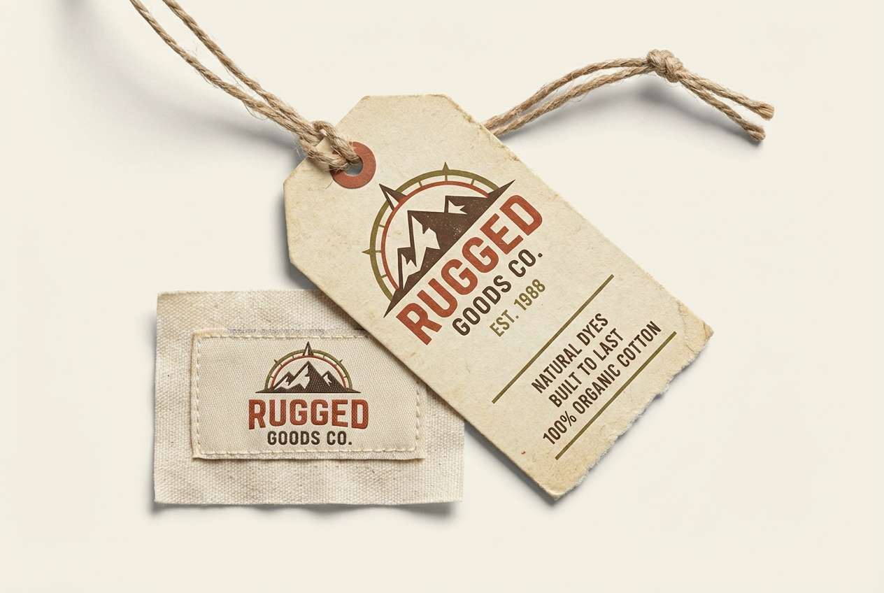
HEX: #5a2320 #8d3e34 #b36a53 #6d7a46 #f0e7da
Mood: heritage, outdoorsy, grounded
Best for: outdoor brands and apparel tags
Heritage and grounded, it suggests brick storefronts, worn canvas, and olive foliage. It fits outdoor brands, workwear apparel tags, and rugged product catalogs. Pair the olive as a supporting accent with brick and clay for the main story, and use the warm cream for clean spacing. Usage tip: for prints, choose uncoated stock to enhance the natural vibe.
Image example of brick olive generated using media.io
17) Mocha Mist
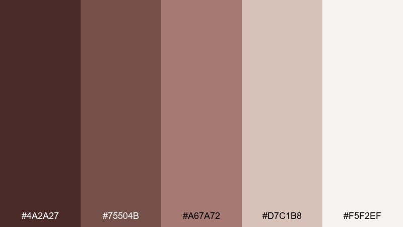
HEX: #4a2a27 #75504b #a67a72 #d7c1b8 #f5f2ef
Mood: calm, cozy, understated
Best for: minimalist presentations
Calm and understated, it reads like mocha foam, soft wool, and misty mornings. Use it for minimalist slide decks, reports, and calm storytelling where you want warmth without distraction. Pair the lightest shade with mocha for strong type, and use the mid tones for charts and dividers. Usage tip: stick to one accent (the warm mid brown) for data highlights so the deck stays cohesive.
Image example of mocha mist generated using media.io

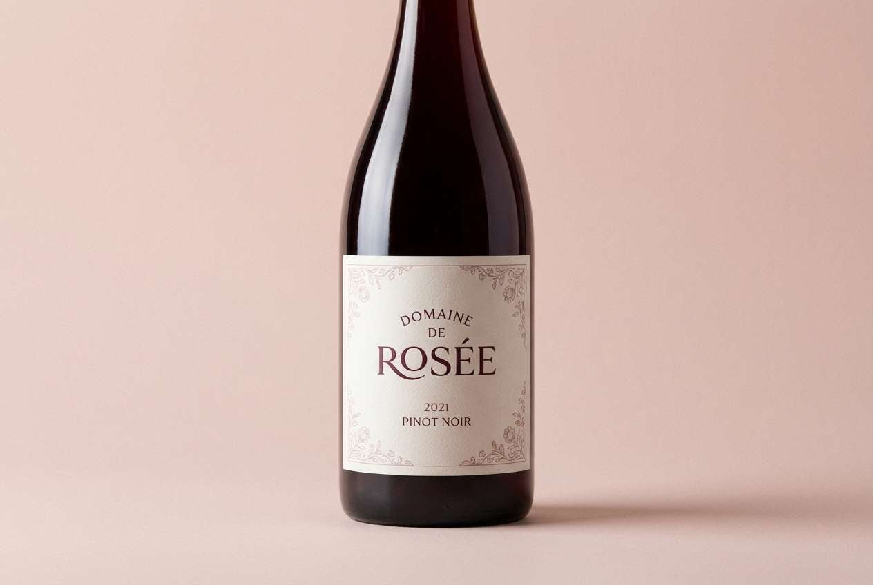
18) Vintage Burgundy
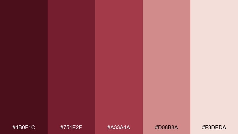
HEX: #4b0f1c #751e2f #a33a4a #d08b8a #f3deda
Mood: nostalgic, bold, romantic
Best for: boutique wine labels
Nostalgic and bold, it feels like aged burgundy wine, wax seals, and soft blush paper. A rosewood color palette in this family works well for boutique wine labels or artisanal beverage branding. Pair the deepest burgundy with blush for contrast, and use the mid red-brown for ornaments and borders. Usage tip: keep typography simple and let the color carry the vintage mood.
Image example of vintage burgundy generated using media.io
19) Rosewood Monochrome
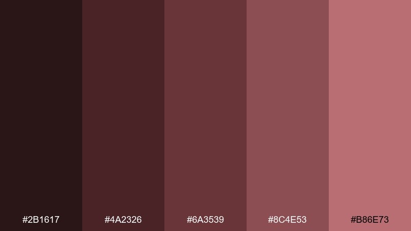
HEX: #2b1617 #4a2326 #6a3539 #8c4e53 #b86e73
Mood: sleek, tonal, confident
Best for: logo studies and brand systems
Sleek and tonal, it evokes stained wood, berry leather, and a minimalist studio. This rosewood set is excellent for logo exploration, brand systems, and design audits where you want one hue family with range. Use the darkest two shades for marks and type, then step up the lighter tones for backgrounds and secondary panels. Usage tip: add whitespace generously so the monochrome look feels intentional and premium.
Image example of rosewood monochrome generated using media.io
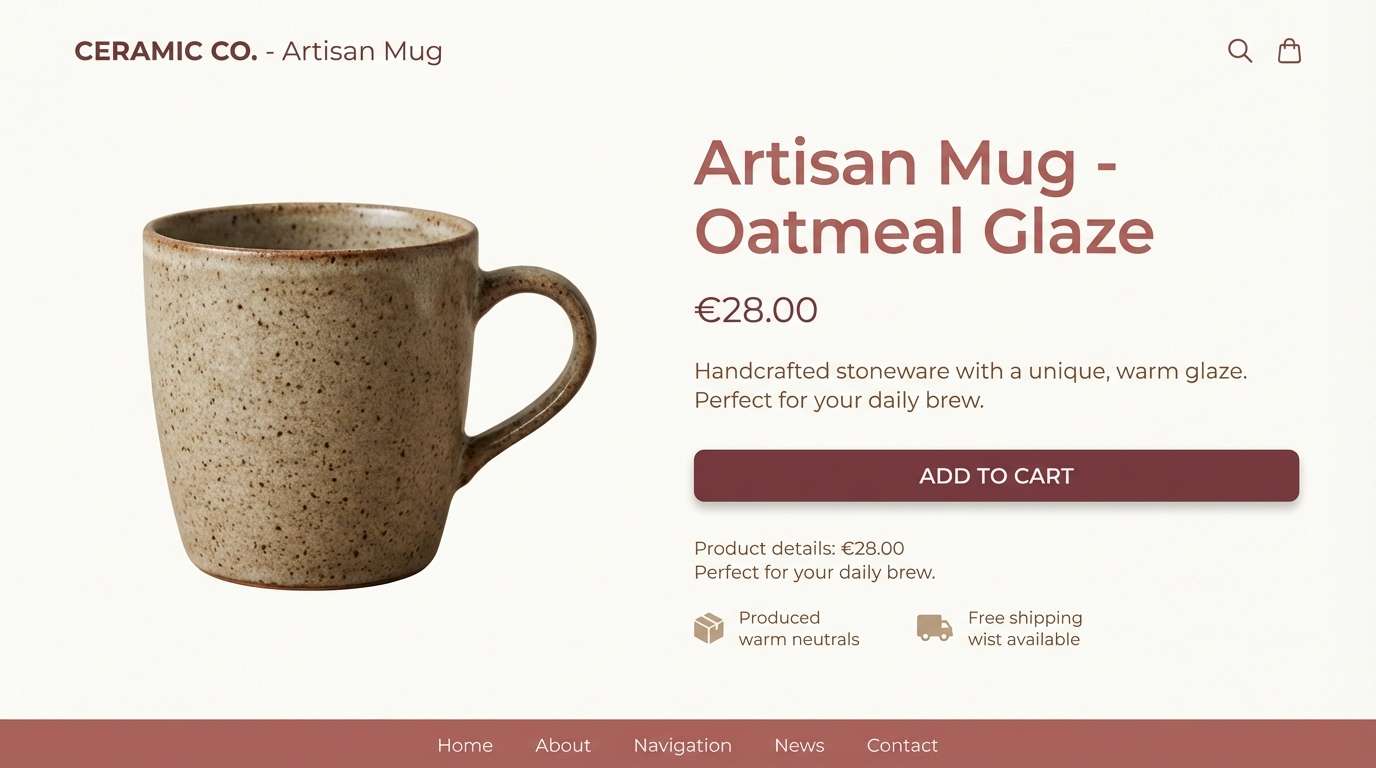
20) Warm Neutral Rosewood
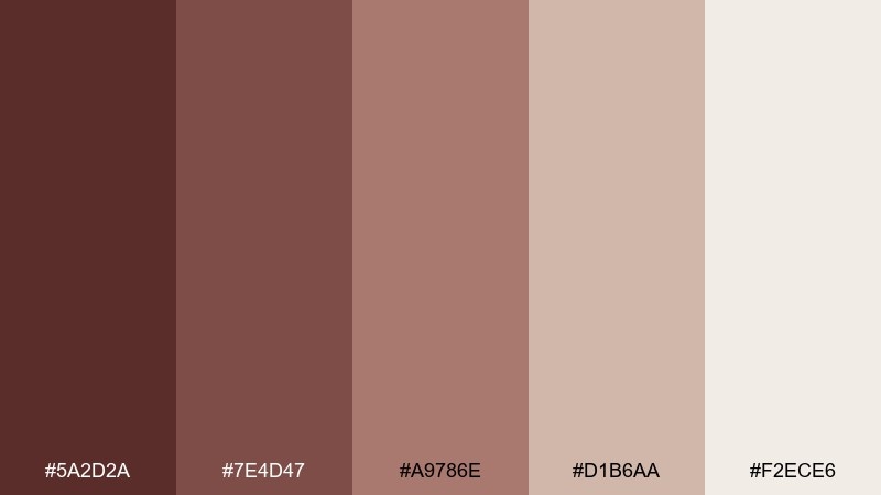
HEX: #5a2d2a #7e4d47 #a9786e #d1b6aa #f2ece6
Mood: welcoming, versatile, modern
Best for: ecommerce product pages
Welcoming and versatile, it suggests warm neutrals, soft clay, and clean daylight. It is a flexible rosewood color combination for ecommerce pages that need warmth while keeping products front and center. Use the palest tone for page backgrounds, the mid taupe for cards, and the deepest shade for headings and price emphasis. Usage tip: keep product photography neutral so the interface colors do not fight the items.
Image example of warm neutral rosewood generated using media.io
What Colors Go Well with Rosewood?
Rosewood pairs beautifully with warm neutrals like cream, sand, and linen because they highlight its depth without making layouts feel too dark. This is one of the easiest routes for modern branding and interior mood boards.
For a fresher, more contemporary contrast, try cool accents like teal, sage, or muted blue-green. The temperature shift helps rosewood feel cleaner and more “UI-ready.”
If you want a more celebratory or premium feel, metallic-inspired tones (gold, brass, copper) work as small accents—great for icons, borders, and callouts.
How to Use a Rosewood Color Palette in Real Designs
Start with a light neutral as the base, then assign rosewood to hierarchy: headlines, key buttons, price emphasis, or brand marks. This keeps the palette readable and prevents the reddish-brown from overpowering the layout.
Use mid-tones (dusty mauves, terracotta, taupe) for secondary UI surfaces like cards, dividers, and illustrations. Save the darkest swatch for typography and small high-contrast elements.
In print, rosewood is especially sensitive to paper and finishes—uncoated stock and warm whites tend to make it look richer, while bright white can make it look slightly cooler and flatter.
Create Rosewood Palette Visuals with AI
If you have HEX codes but need real-looking visuals (packaging mockups, posters, menus, or UI screens), generating on-theme examples can speed up approvals and help stakeholders “see” the palette.
With Media.io Text to Image, you can turn a short prompt into consistent design scenes, then iterate quickly by swapping keywords like “luxury,” “rustic,” “minimal,” or “editorial.”
Rosewood Color Palette FAQs
-
What is the HEX code for rosewood?
Rosewood doesn’t have one universal HEX value, but common rosewood bases include deep wine-browns like #5b1a1d, #562022, or #5a2d2a depending on how red, brown, or dark you want it. -
Is rosewood more brown or more red?
Most rosewood tones are brown-first with a noticeable red or burgundy undertone. In bright light they read warmer and redder; in low light they can look closer to espresso or near-black. -
What colors complement rosewood best?
Cream and warm off-whites are the easiest complements for contrast and softness. For modern accents, teal and sage work well; for premium looks, gold/copper accents are popular. -
Can I use rosewood in UI design without hurting readability?
Yes—use the lightest neutral as the main background and reserve the darkest rosewood/espresso shades for headings and key actions. Avoid placing mid rosewood text on mid taupe backgrounds to prevent low contrast. -
What’s a good rosewood palette for weddings?
Try berry-and-blush combinations like Berry Cream (#5d1f2a, #8e3a4f, #c46e7c, #f1c9c7, #fff5f0) for romantic stationery, or deeper tones like Vintage Burgundy for a moodier, classic feel. -
What’s the difference between rosewood and burgundy?
Burgundy is typically a deeper red/purple wine tone, while rosewood leans more brown and earthy—like stained wood or cocoa with a red tint. Many palettes mix both for depth. -
How do I keep rosewood palettes from looking too dark?
Increase negative space with warm creams, limit the darkest swatch to small accents, and use mid-tones for surfaces instead of filling large areas with the deepest rosewood.


