

Brown copper is a warm, grounded hue that blends rustic comfort with a polished metallic edge. It’s one of those color families that instantly makes designs feel handcrafted, premium, and approachable.
Below are 20 brown copper color palette ideas with HEX codes, plus practical ways to pair and apply them for branding, packaging, interiors, and modern UI.
In this article
- Why Brown Copper Palettes Work So Well
-
- copper clay & cream
- smoked cacao neutral
- autumn copper orchard
- burnished penny slate
- desert copper dusk
- copper espresso ui
- vintage copper poster
- rosewood copper bloom
- copper sage calm
- industrial copper concrete
- cinnamon copper latte
- copper canyon sunrise
- dark copper teal contrast
- minimal copper ink
- copper spice market
- copper nightfall luxe
- soft copper bridal
- copper hearth navy
- copper terracotta garden
- copper clay monochrome
- What Colors Go Well with Brown Copper?
- How to Use a Brown Copper Color Palette in Real Designs
- Create Brown Copper Palette Visuals with AI
Why Brown Copper Palettes Work So Well
Brown copper sits in the sweet spot between earthy browns and metallic warmth, so it feels both natural and elevated. That dual personality makes it perfect for brands that want “craft” without looking unfinished.
It also plays nicely with neutrals: creams, charcoals, and soft grays help copper look richer while keeping layouts readable. Even small copper accents can create a premium highlight effect in packaging and UI.
Because copper hues have strong emotional associations (heat, hearth, spice, clay, wood), they’re great for cozy interiors, food and beverage design, and heritage-style storytelling.
20+ Brown Copper Color Palette Ideas (with HEX Codes)
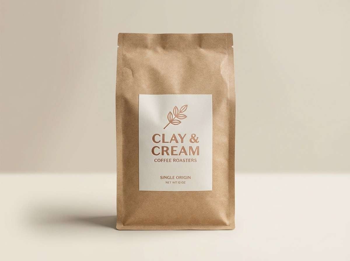
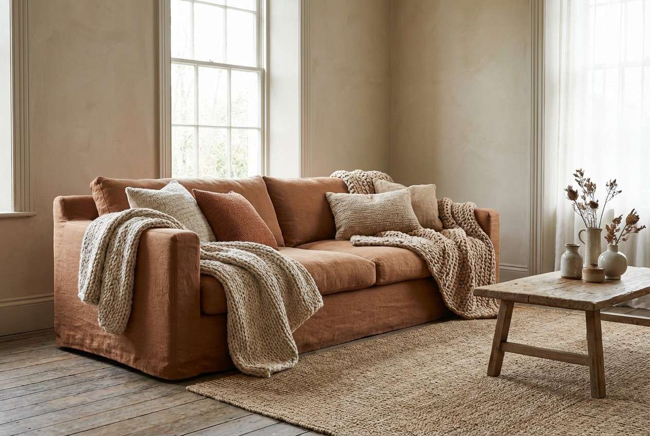
1) Copper Clay & Cream
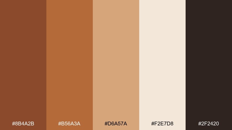
HEX: #8b4a2b #b56a3a #d6a57a #f2e7d8 #2f2420
Mood: warm, handcrafted, welcoming
Best for: cafe branding, food packaging, cozy interiors
Warm and handcrafted, it feels like sun-baked clay, café woodwork, and steamed milk foam. This brown copper color palette shines on kraft textures, menu designs, and small-batch labels where warmth matters. Pair the creams with charcoal type for readability, then let copper lead on badges and icons. Usage tip: keep the darkest tone for text and outlines so the light cream stays clean and premium.
Image example of copper clay & cream generated using media.io
Media.io is an online AI studio for creating and editing video, image, and audio in your browser.

2) Smoked Cacao Neutral
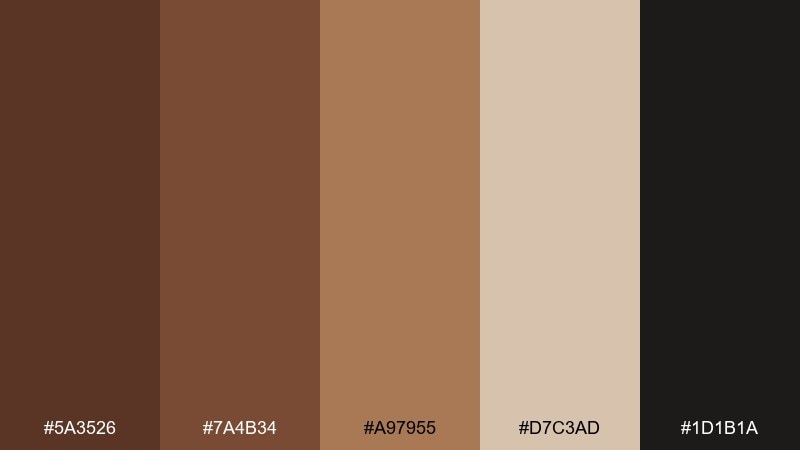
HEX: #5a3526 #7a4b34 #a97955 #d7c3ad #1d1b1a
Mood: moody, grounded, elegant
Best for: premium branding, editorial layouts, dark mode UI
Moody and grounded, these tones evoke cacao husks, worn leather, and candlelit corners. The deep browns and near-black create a confident base for luxury branding or high-contrast editorial spreads. Balance the heaviness with the warm beige for whitespace and breathing room. Usage tip: reserve the lightest shade for small highlights so the palette keeps its rich, smoky feel.
Image example of smoked cacao neutral generated using media.io
3) Autumn Copper Orchard
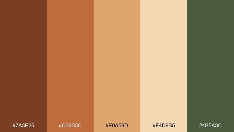
HEX: #7a3e25 #c06b3c #e0a56d #f4d9b5 #4b5a3c
Mood: earthy, seasonal, lively
Best for: fall campaigns, farmers market posters, lifestyle branding
Earthy and seasonal, it brings to mind apple skins, dried leaves, and orchard crates. Use the copper midtones for headlines, then ground the layout with the muted olive for a natural counterpoint. The pale wheat shade works well as a soft background that still feels warm. Usage tip: keep olive to 10–15% of the design so the copper stays the star.
Image example of autumn copper orchard generated using media.io

4) Burnished Penny Slate
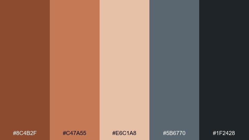
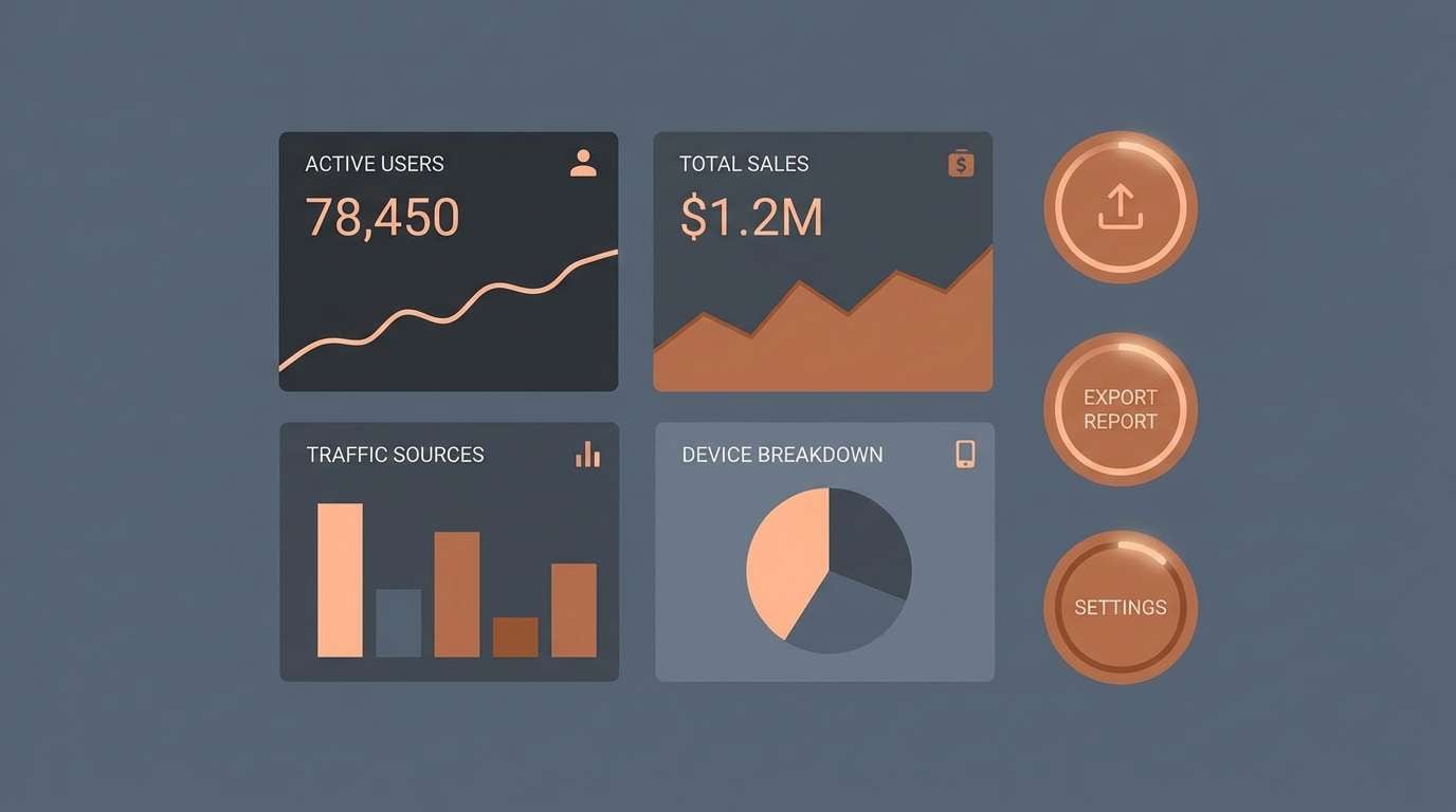
HEX: #8c4b2f #c47a55 #e6c1a8 #5b6770 #1f2428
Mood: modern, balanced, architectural
Best for: product UI, tech branding, presentation decks
Modern and architectural, it feels like burnished metal against cool stone. Copper warms up the slate tones, making it a strong fit for product interfaces and brand systems that need both friendliness and structure. Use slate for navigation and panels, then bring copper into calls-to-action and key metrics. Usage tip: keep the peachy tint for hover states and subtle charts to avoid visual noise.
Image example of burnished penny slate generated using media.io
5) Desert Copper Dusk
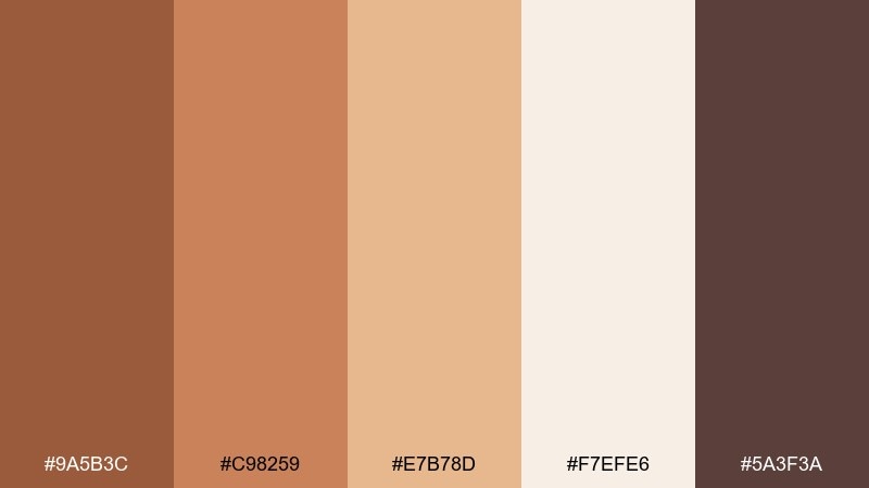
HEX: #9a5b3c #c98259 #e7b78d #f7efe6 #5a3f3a
Mood: soft, sun-warmed, relaxed
Best for: interior mood boards, wellness brands, travel content
Soft and sun-warmed, it suggests desert dunes fading into dusk. These tones work beautifully in interior mood boards, especially when layered with linen textures and light wood. Pair with matte black hardware or deep espresso accents for definition. Usage tip: use the off-white as the main wall or canvas color and bring copper in through textiles and decorative details.
Image example of desert copper dusk generated using media.io
6) Copper Espresso UI
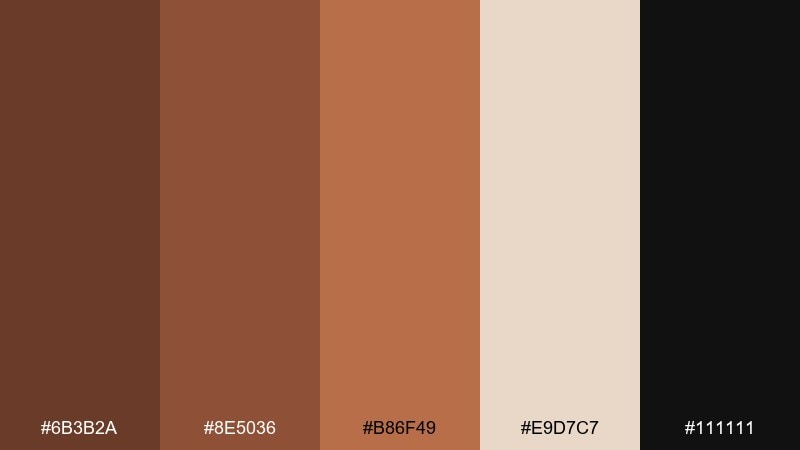
HEX: #6b3b2a #8e5036 #b86f49 #e9d7c7 #111111
Mood: bold, high-contrast, confident
Best for: dark mode apps, fintech UI, data dashboards
Bold and high-contrast, it feels like espresso crema against a midnight counter. The near-black gives you instant depth for dark mode, while copper tones keep the interface approachable. Pair the warm beige with thin dividers and form fields for clarity. Usage tip: use copper for primary buttons and reserve the darkest shade for backgrounds to reduce eye strain.
Image example of copper espresso ui generated using media.io

7) Vintage Copper Poster
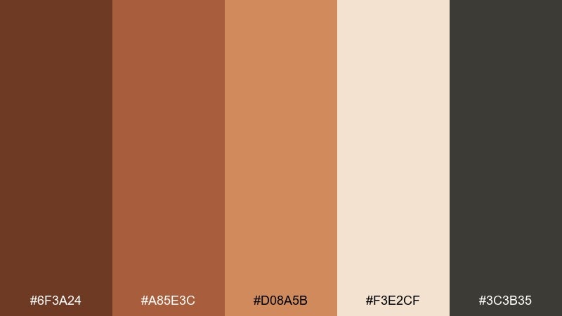
HEX: #6f3a24 #a85e3c #d08a5b #f3e2cf #3c3b35
Mood: nostalgic, printed, artisanal
Best for: event posters, retro packaging, brand storytelling
Nostalgic and printed, it evokes letterpress ink, aged paper, and vintage signage. These brown copper color combinations look especially convincing with grain, halftone textures, and simple illustration. Pair with off-white backgrounds and keep the deepest brown for type to maintain that classic poster contrast. Usage tip: add subtle paper texture and limit gradients so the design stays authentically retro.
Image example of vintage copper poster generated using media.io
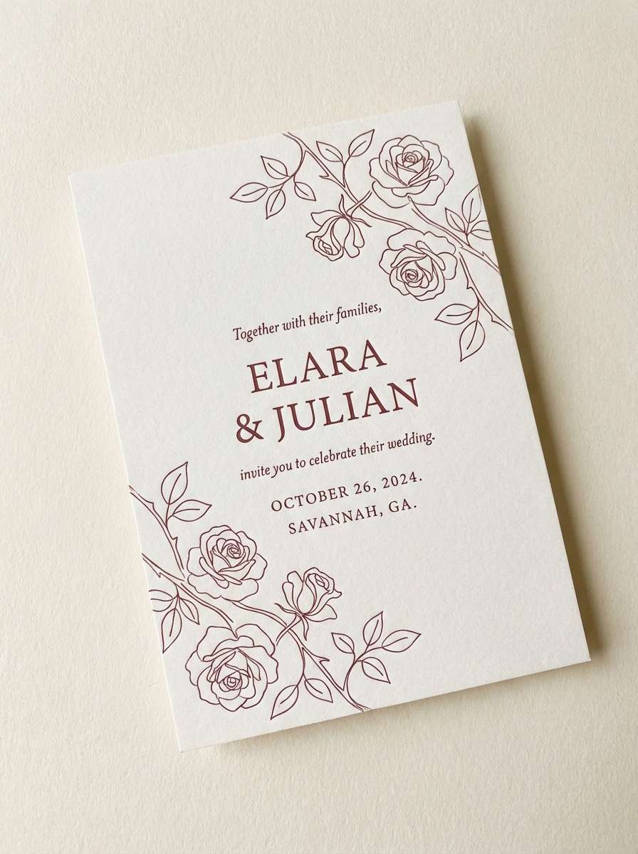
8) Rosewood Copper Bloom
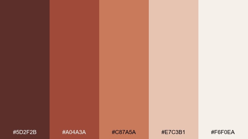
HEX: #5d2f2b #a04a3a #c87a5a #e7c3b1 #f6f0ea
Mood: romantic, soft, refined
Best for: beauty branding, wedding stationery, lifestyle social posts
Romantic and soft, it feels like rosewood furniture and warm blush petals. The lighter tints are perfect for airy layouts, while the deeper rose-brown adds sophistication to headings and monograms. Pair with warm white paper and minimal line art for a refined look. Usage tip: keep contrast high by using the deepest shade for text and the pale blush for large blocks.
Image example of rosewood copper bloom generated using media.io
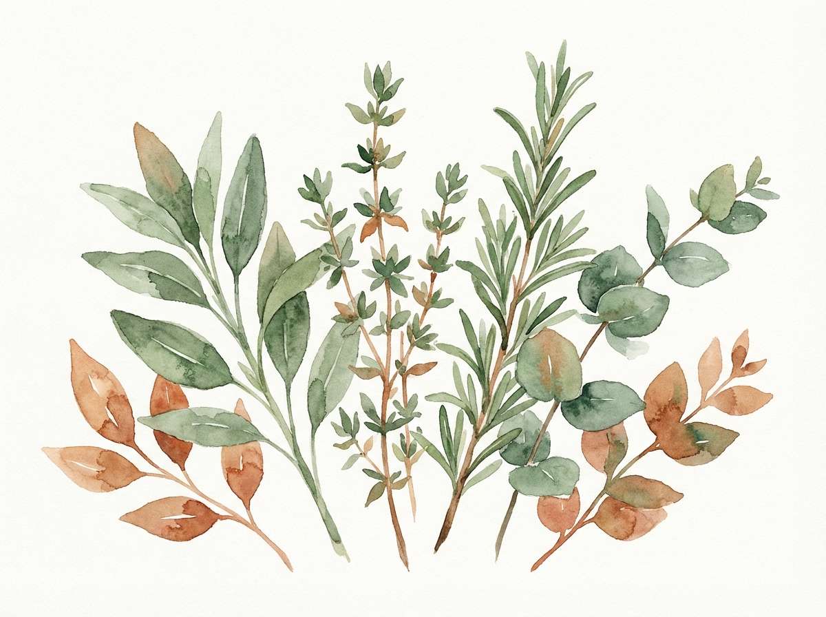
9) Copper Sage Calm
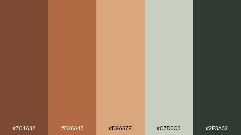
HEX: #7c4a32 #b26a45 #d9a67e #c7d0c0 #2f3a32
Mood: calm, natural, balanced
Best for: wellness packaging, botanical brands, calm interiors
Calm and natural, it brings together baked earth and quiet sage leaves. The green-gray adds freshness without turning the palette cool, making it ideal for wellness packaging and botanical branding. Pair with uncoated paper, soft photography, and minimal icons. Usage tip: use sage as the background and copper as the accent to keep everything serene.
Image example of copper sage calm generated using media.io
10) Industrial Copper Concrete
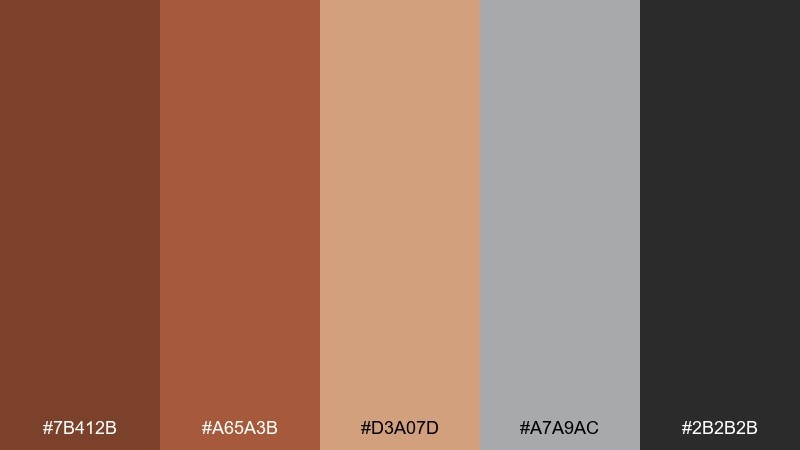
HEX: #7b412b #a65a3b #d3a07d #a7a9ac #2b2b2b
Mood: urban, sturdy, modern
Best for: architecture portfolios, construction branding, product ads
Urban and sturdy, it feels like copper piping against cool concrete. The gray and charcoal tones make layouts feel engineered, while the copper shades add a human touch. Pair with bold sans-serif typography and plenty of grid alignment for a clean industrial finish. Usage tip: use the warm tan for feature callouts so the gray never looks flat.
Image example of industrial copper concrete generated using media.io
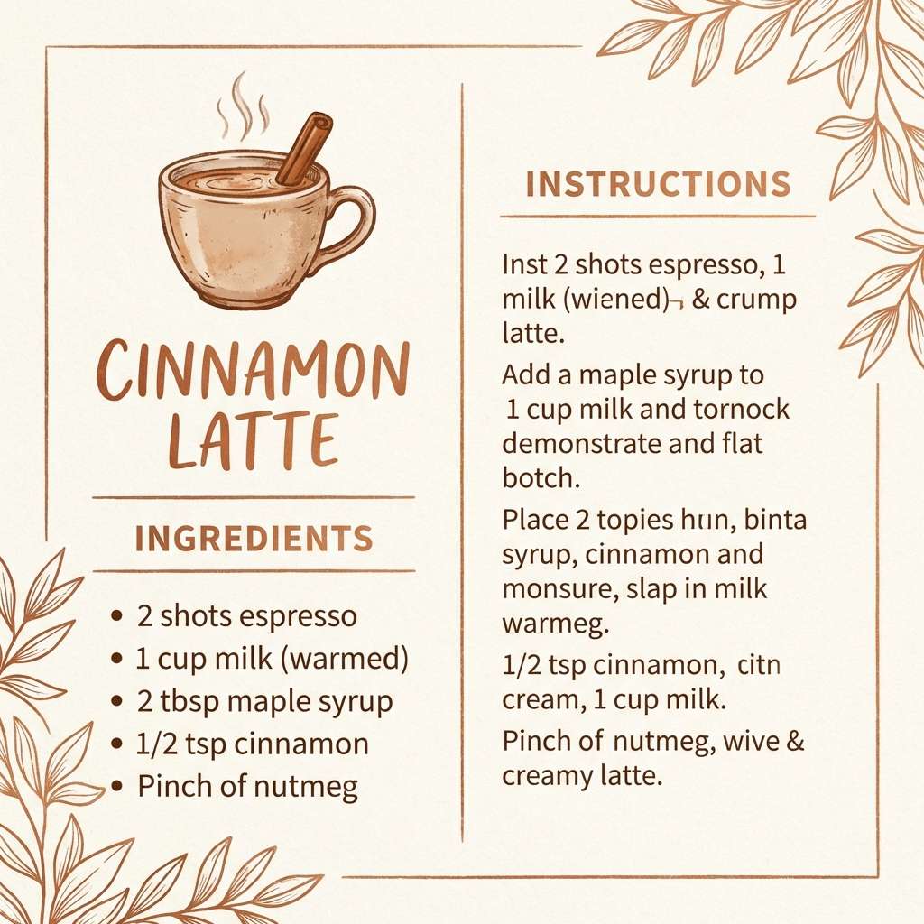
11) Cinnamon Copper Latte
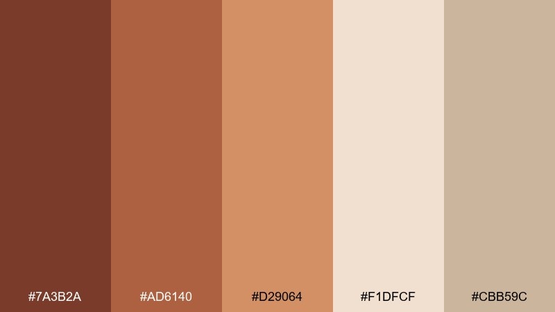
HEX: #7a3b2a #ad6140 #d29064 #f1dfcf #cbb59c
Mood: cozy, sweet, approachable
Best for: bakery branding, recipe blogs, warm social graphics
Cozy and sweet, it reads like cinnamon dust and frothy lattes. The creamy tones give you an easy background for recipes, menus, and lifestyle posts. Pair with hand-drawn icons or rounded typography to keep the vibe friendly. Usage tip: use the medium copper for buttons or price tags so key details pop without looking harsh.
Image example of cinnamon copper latte generated using media.io
12) Copper Canyon Sunrise
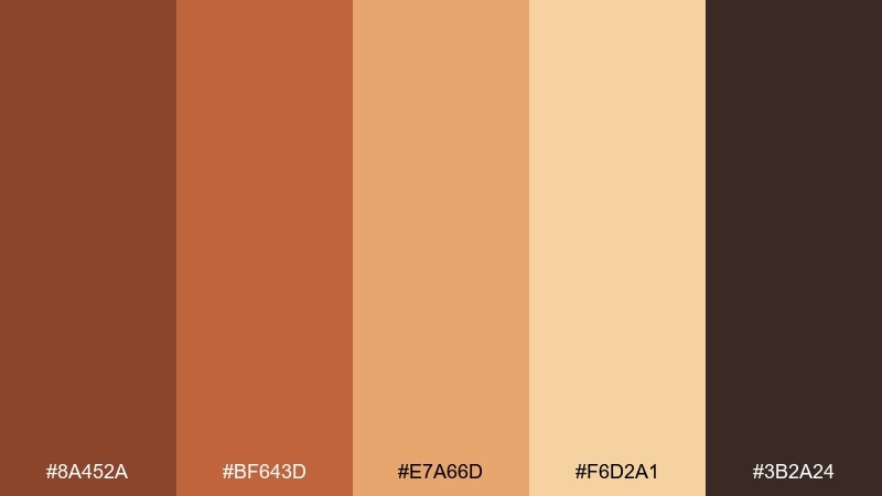
HEX: #8a452a #bf643d #e7a66d #f6d2a1 #3b2a24
Mood: bright, adventurous, energetic
Best for: travel posters, outdoor brands, seasonal campaigns
Bright and adventurous, it feels like sunrise hitting canyon walls. The warm gradient of copper to sand works well for travel posters and bold campaign headers. Pair with dark brown typography for stability and clean readability. Usage tip: use the light sand tone as a halo behind key text to mimic glowing morning light.
Image example of copper canyon sunrise generated using media.io
13) Dark Copper Teal Contrast
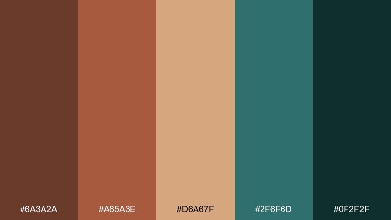
HEX: #6a3a2a #a85a3e #d6a67f #2f6f6d #0f2f2f
Mood: dramatic, modern, striking
Best for: brand identities, album covers, bold web sections
Dramatic and modern, it mixes warm metal with deep coastal water. For a brown copper color combination that feels fresh, let teal handle large blocks while copper highlights the focal points. Pair with off-white type where needed, but keep backgrounds dark for impact. Usage tip: test accessibility by using the pale tan only for icons and secondary accents on teal fields.
Image example of dark copper teal contrast generated using media.io
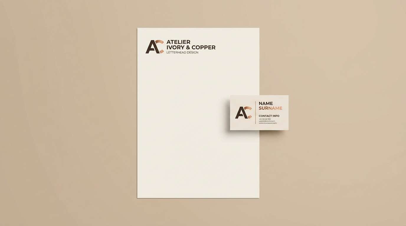
14) Minimal Copper Ink
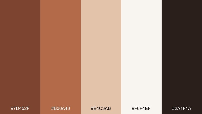
HEX: #7d452f #b36a48 #e4c3ab #f8f4ef #2a1f1a
Mood: clean, minimal, editorial
Best for: portfolio sites, minimalist branding, stationery
Clean and editorial, it looks like copper ink on warm ivory paper. Use the pale tones as spacious backgrounds, then bring in copper for headlines and dividers. Pair with thin serif fonts or elegant sans-serif for a modern-but-timeless feel. Usage tip: keep accent elements small and consistent so the minimal vibe stays intentional.
Image example of minimal copper ink generated using media.io
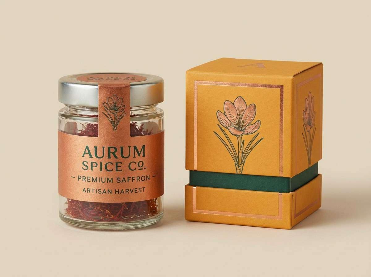
15) Copper Spice Market
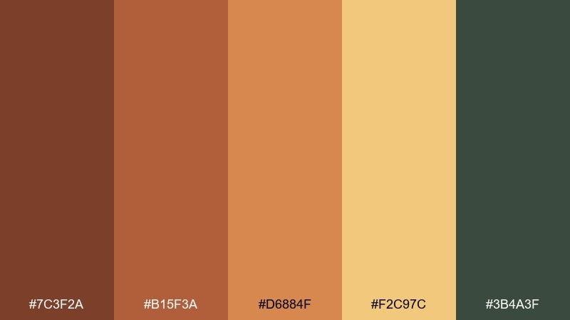
HEX: #7c3f2a #b15f3a #d6884f #f2c97c #3b4a3f
Mood: vibrant, earthy, festive
Best for: food labels, restaurant menus, artisan product ads
Vibrant and earthy, it calls up spice jars, toasted seeds, and market stalls at golden hour. The warm amber and saffron tones make food photography feel richer and more appetizing. Pair with deep green for a grounded contrast that still feels natural. Usage tip: use saffron for small highlights like price bubbles or flavor notes to avoid overpowering the layout.
Image example of copper spice market generated using media.io
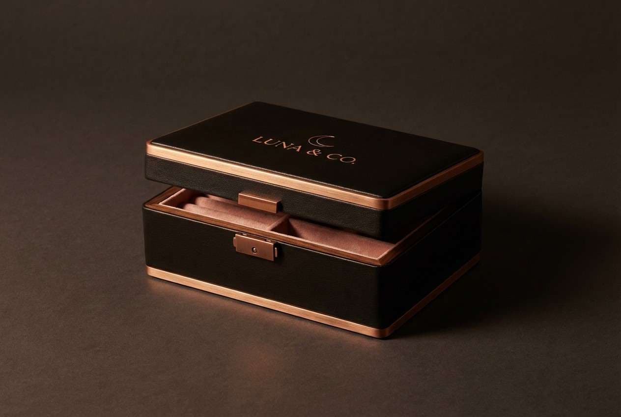
16) Copper Nightfall Luxe
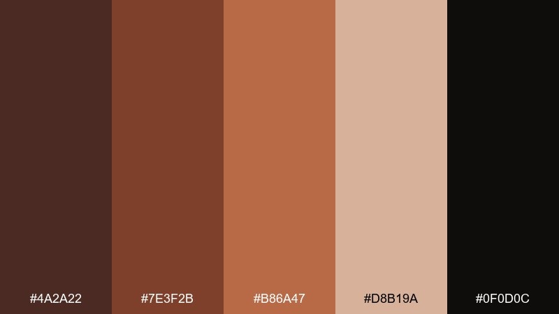
HEX: #4a2a22 #7e3f2b #b86a47 #d8b19a #0f0d0c
Mood: luxurious, intimate, dramatic
Best for: jewelry ads, premium packaging, nightlife branding
Luxurious and intimate, it feels like candlelight catching polished metal in a dark room. This brown copper color palette is ideal for premium packaging where contrast and glow sell the story. Pair with matte black backgrounds and minimal typography, then let the copper midtone do most of the work. Usage tip: add subtle specular highlights in the light blush tone to mimic metallic shine without using gradients everywhere.
Image example of copper nightfall luxe generated using media.io
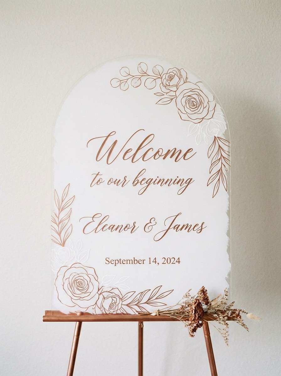
17) Soft Copper Bridal
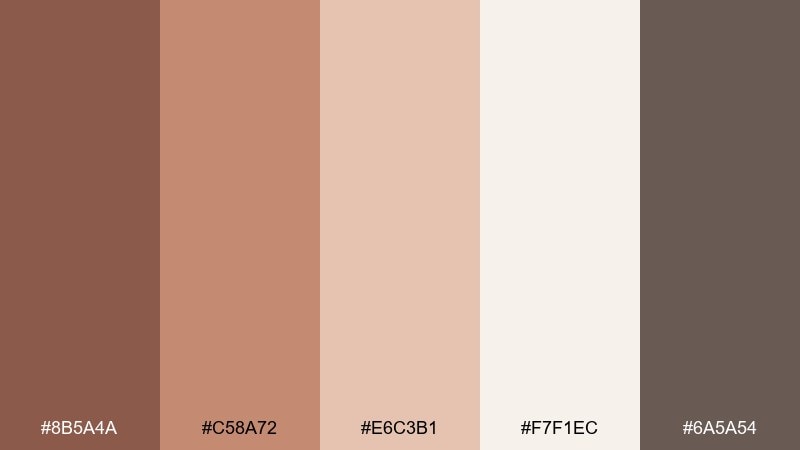
HEX: #8b5a4a #c58a72 #e6c3b1 #f7f1ec #6a5a54
Mood: soft, elegant, romantic
Best for: bridal branding, wedding invites, event signage
Soft and elegant, it suggests satin ribbons, blush florals, and warm candle glow. The muted copper tones feel flattering and timeless for wedding suites and event signage. Pair with warm white paper and subtle gray typography for a refined finish. Usage tip: keep the deepest gray-brown for names and dates to maintain crisp readability.
Image example of soft copper bridal generated using media.io
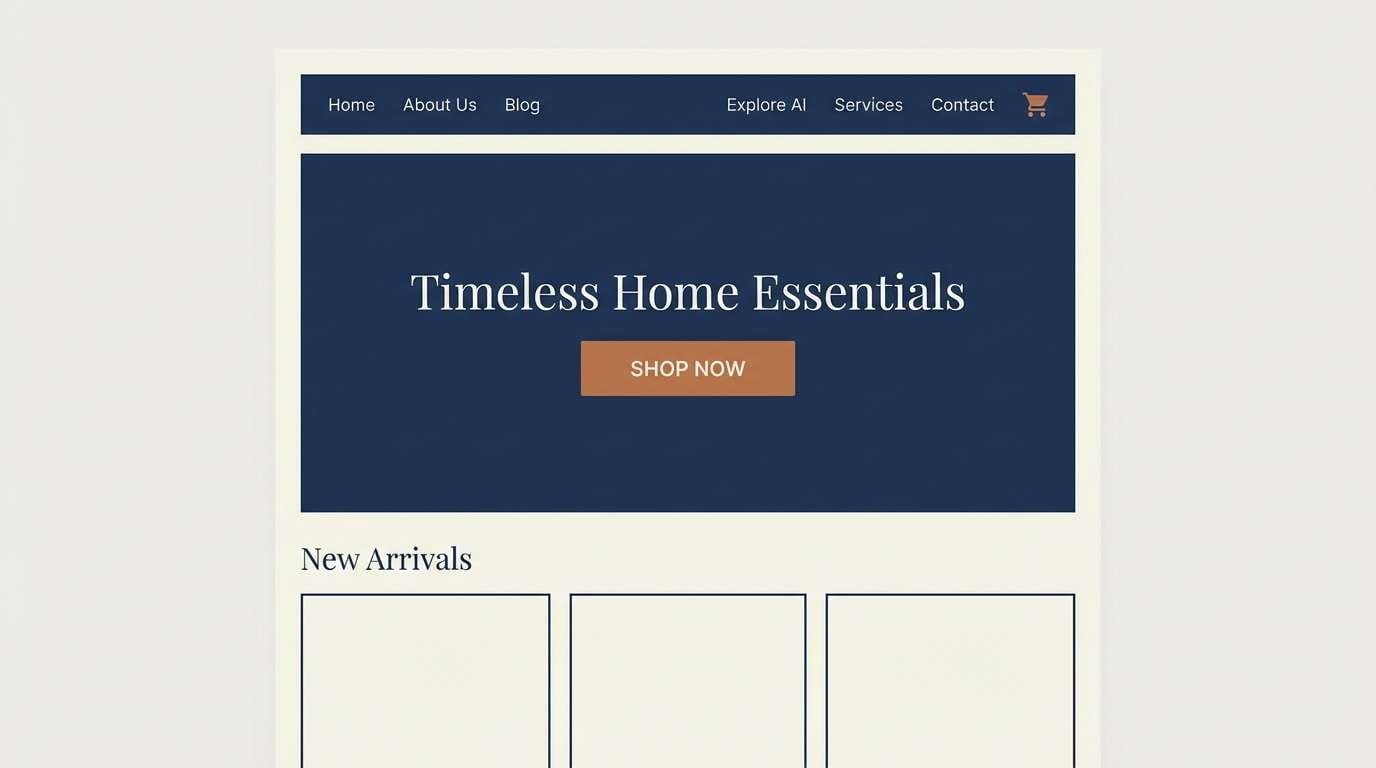
18) Copper Hearth Navy
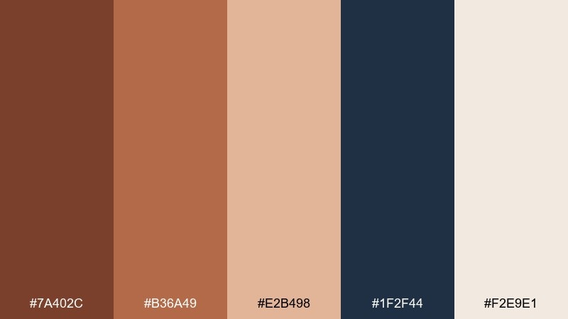
HEX: #7a402c #b36a49 #e2b498 #1f2f44 #f2e9e1
Mood: cozy, classic, trustworthy
Best for: heritage brands, home goods, seasonal landing pages
Cozy and classic, it feels like a fireplace glow paired with crisp evening air. Navy adds trust and structure, while the copper shades keep the palette inviting and human. Pair with cream backgrounds and restrained patterns like checks or thin stripes. Usage tip: use navy for navigation and footers, then copper for buttons and featured offers.
Image example of copper hearth navy generated using media.io
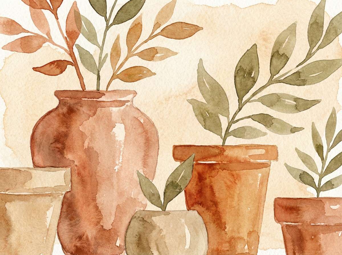
19) Copper Terracotta Garden
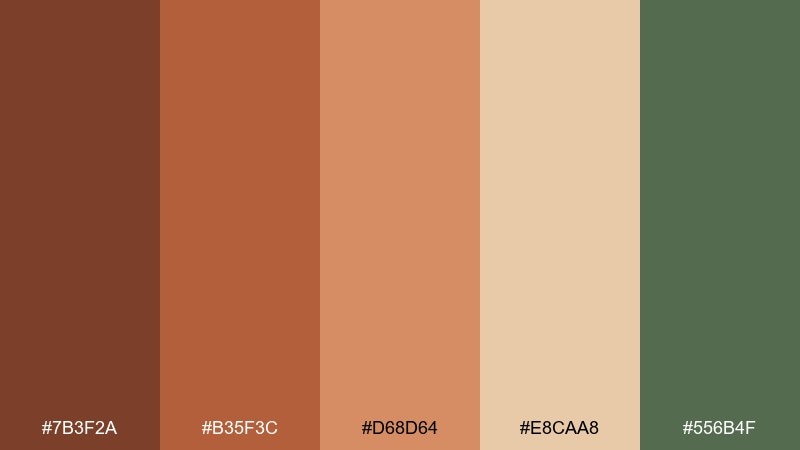
HEX: #7b3f2a #b35f3c #d68d64 #e8caa8 #556b4f
Mood: natural, sunlit, botanical
Best for: garden brands, plant packaging, seasonal illustrations
Natural and sunlit, it looks like terracotta pots, warm soil, and leafy stems. The copper-to-sand range makes a great base for plant packaging, especially with hand-drawn labels. Pair with the muted green for icons and borders to reinforce the botanical mood. Usage tip: keep the background light and let green appear in small, intentional touches for balance.
Image example of copper terracotta garden generated using media.io
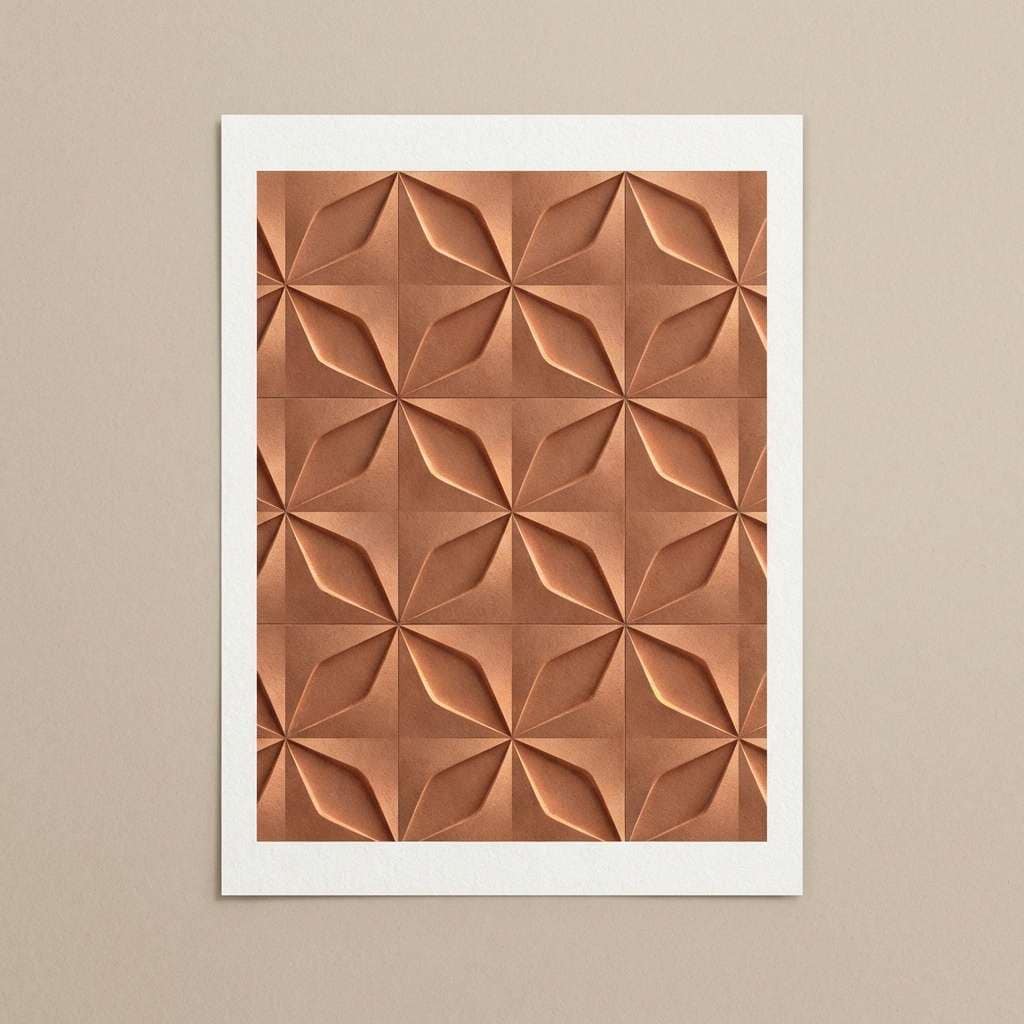
20) Copper Clay Monochrome
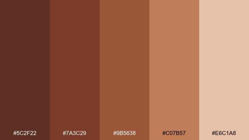
HEX: #5c2f22 #7a3c29 #9b5638 #c07b57 #e6c1a8
Mood: cohesive, warm, understated
Best for: brand systems, pattern design, product collections
Cohesive and understated, it feels like layered clay swatches in a design studio. The tonal steps make it easy to build depth without needing extra hues. Pair with clean whites or soft neutrals for breathing room, and add texture through patterns rather than more colors. Usage tip: assign each shade a role (background, surface, accent, highlight) to keep the system consistent across pages.
Image example of copper clay monochrome generated using media.io
What Colors Go Well with Brown Copper?
Brown copper pairs beautifully with warm neutrals like cream, oatmeal, and sand, which help it feel bright, modern, and usable as a primary brand color. Deep espresso and charcoal provide contrast for typography and layouts that need clarity.
For a fresher twist, add muted greens (sage, olive, forest) to echo natural materials and keep copper from feeling overly “autumn.” If you want something bolder, teal and navy create a high-end complementary contrast that still feels grounded.
In print and packaging, copper also works well alongside textured surfaces (kraft paper, uncoated stocks) and subtle grays, which make the copper tones look more metallic and intentional.
How to Use a Brown Copper Color Palette in Real Designs
Start by assigning roles to each shade: pick one dark tone for text, one mid copper for accents (buttons, badges, icons), and one light cream for backgrounds. This keeps the palette consistent across pages, screens, and packaging sizes.
Use copper strategically as a “highlight” color. Small copper areas can look premium, while too much can feel heavy—especially if the design already has warm photography or textured backgrounds.
When building UI, test contrast early. Dark copper backgrounds often need off-white text, and lighter copper shades work best for hover states, chips, and secondary buttons instead of body text.
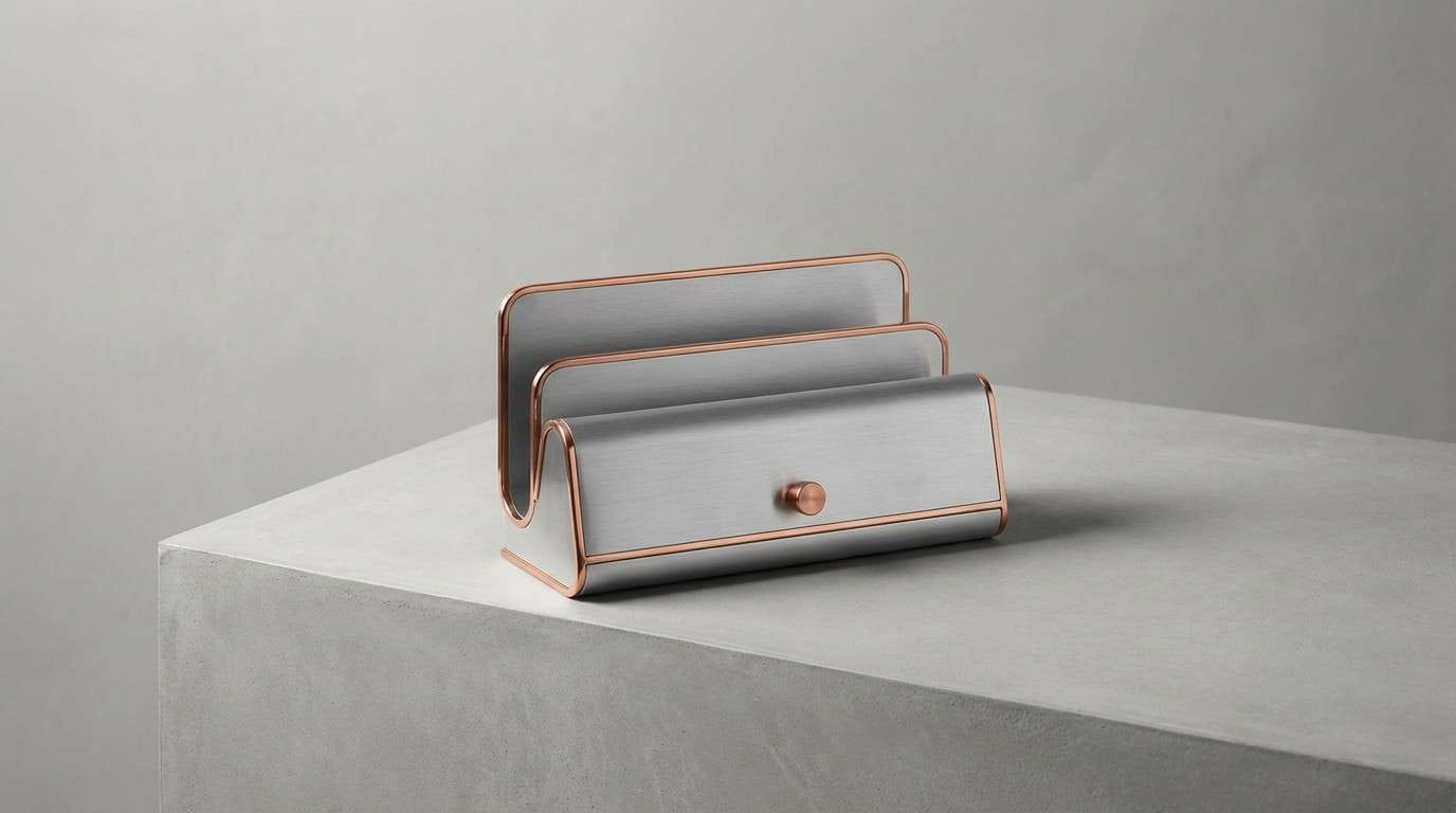
Create Brown Copper Palette Visuals with AI
If you’re pitching a concept or building a mood board, generating quick visuals helps you validate how brown copper reads across materials like paper, fabric, metal, and UI surfaces. The same HEX palette can feel rustic, modern, or luxurious depending on lighting and texture.
Use prompts that mention your medium (packaging, poster, interior, app UI) and your finish (matte, foil, uncoated paper, concrete) to get more realistic results. Then iterate by swapping one supporting color (sage, navy, charcoal) to explore different brand directions.
To create on-brand mockups fast, turn any palette above into images in seconds:
Brown Copper Color Palette FAQs
-
What is a brown copper color palette?
A brown copper color palette is a set of warm, copper-leaning browns (often paired with cream, charcoal, gray, or muted greens) designed to create an earthy, metallic, and cozy look in branding or interiors. -
Is brown copper better as a main color or an accent?
It can work as either, but it’s often strongest as an accent (buttons, icons, foil details, headings). For large backgrounds, balance it with cream or off-white to keep the design feeling light and readable. -
What neutral colors match brown copper best?
Cream, warm ivory, sand, greige, charcoal, and near-black pair well with brown copper. They help copper look richer while keeping text and UI elements clear. -
What are good contrasting colors for brown copper?
Navy and deep teal are top contrasts because they add cool depth without clashing. Muted greens like sage or olive also contrast gently while staying natural. -
Does brown copper work for modern UI and dark mode?
Yes. Use near-black or charcoal as the base, then apply copper for primary actions and key highlights. Add a warm beige for form fields and dividers to improve usability and reduce harsh contrast. -
How do I keep a brown copper palette from looking too “rustic”?
Pair copper with cool grays or slate, use clean typography, and reduce texture. Keeping backgrounds light and accents minimal also shifts the vibe from rustic to modern and editorial. -
Can I generate brown copper palette mockups with AI?
Yes—use a text-to-image tool and specify the product or scene (packaging, living room, UI), then mention “brown copper tones” plus materials like kraft paper, concrete, linen, or copper foil for more realistic results.
Next: Zen Color Palette


