

Eggshell is a warm, soft off-white that feels cleaner than beige and gentler than pure white. It’s an easy foundation for modern branding, interiors, and UI—especially when you want calm contrast and a premium, minimal look.
Below are 20 curated eggshell color palette combinations with HEX codes, plus AI-ready prompt examples you can use to generate matching visuals in seconds.
In this article
Why Eggshell Palettes Work So Well
Eggshell sits in the sweet spot between crisp white and creamy beige, so it keeps designs bright while still feeling warm and human. That balance makes it a reliable base for modern minimal aesthetics across print, web, and product.
Because eggshell is slightly muted, it helps accent colors look more intentional—whether you’re adding a dusty rose, an herbal green, or a deep charcoal. It also reduces glare on screens compared to pure white backgrounds.
Most importantly, eggshell supports readable contrast when paired with deep browns, mossy greens, teals, or near-black. You can build an entire system (backgrounds, surfaces, borders, text) without the palette feeling sterile.
20+ Eggshell Color Palette Ideas (with HEX Codes)
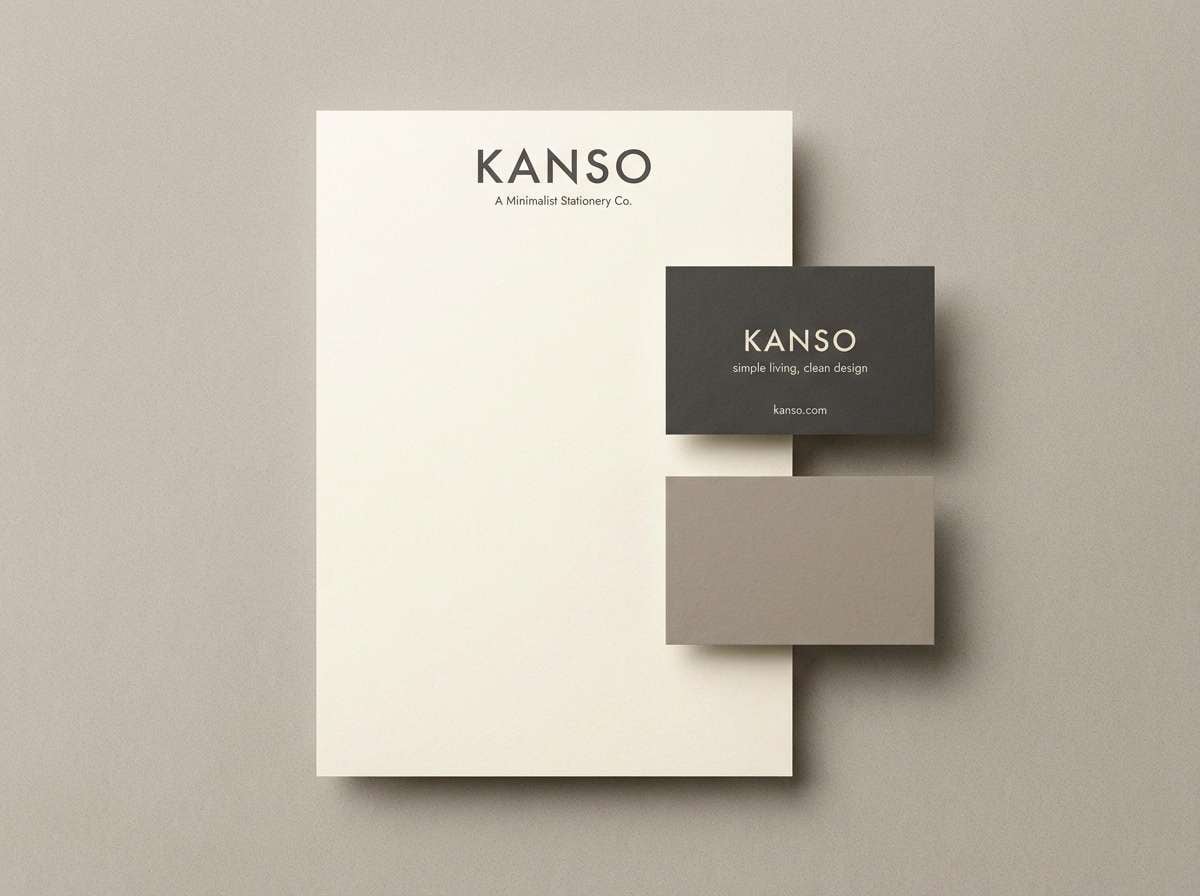
1) Porcelain Morning
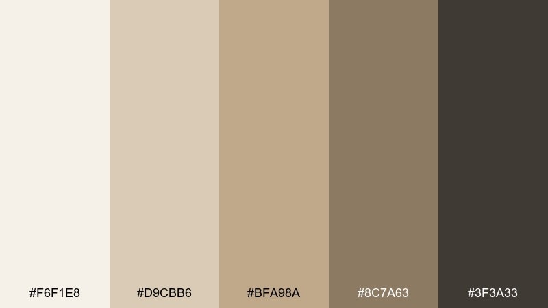
HEX: #F6F1E8 #D9CBB6 #BFA98A #8C7A63 #3F3A33
Mood: airy, calm, minimalist
Best for: minimalist brand identity and stationery
Airy and calm like first light on porcelain, these tones feel clean without turning cold. Use the light cream as your base, then bring in warm taupe for body copy and the deep charcoal for logos. Pair it with simple line icons, uncoated paper textures, and plenty of whitespace for a premium feel. Tip: keep contrast high by reserving the darkest shade for headings and marks only.
Image example of porcelain morning generated using media.io
Media.io is an online AI studio for creating and editing video, image, and audio in your browser.

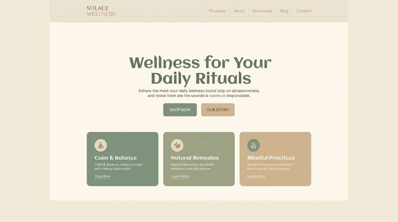
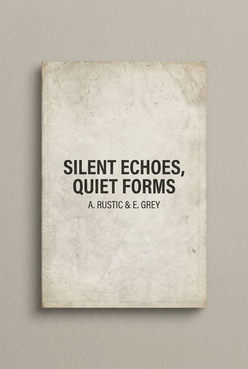
2) Linen and Sage
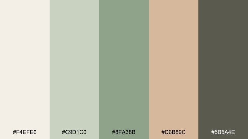
HEX: #F4EFE6 #C9D1C0 #8FA38B #D6B89C #5B5A4E
Mood: fresh, organic, grounded
Best for: wellness website UI
Fresh and herbal, like linen curtains drifting by a kitchen garden window. This eggshell color scheme works beautifully for wellness UIs when you keep the sage greens for navigation and highlights, and the warm sand tone for friendly accents. Pair with soft rounded components and subtle shadows to avoid a clinical look. Tip: use the deep moss as your primary text color for a calmer contrast than pure black.
Image example of linen and sage generated using media.io
3) Warm Bakery
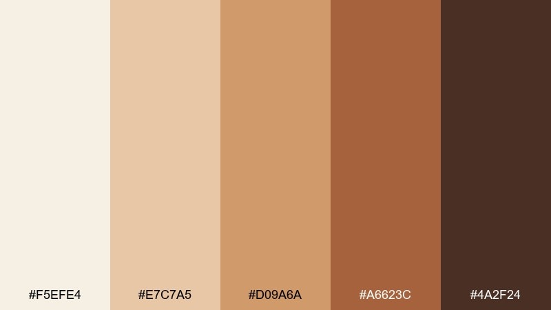
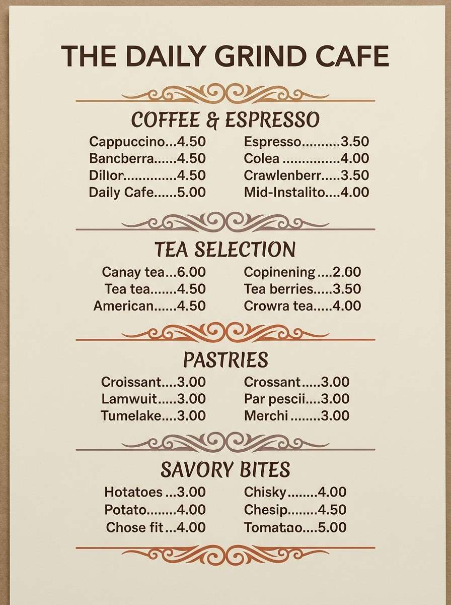
HEX: #F5EFE4 #E7C7A5 #D09A6A #A6623C #4A2F24
Mood: cozy, nostalgic, appetizing
Best for: cafe menu design
Cozy and nostalgic, it reads like fresh pastry crust and toasted sugar. Use the creamy base for the menu background, then layer caramel and cinnamon tones for section headers and callouts. Pair with serif headlines and simple food icons to keep it classic and legible. Tip: reserve the darkest cocoa shade for prices and key labels so the layout stays easy to scan.
Image example of warm bakery generated using media.io
4) Coastal Shell
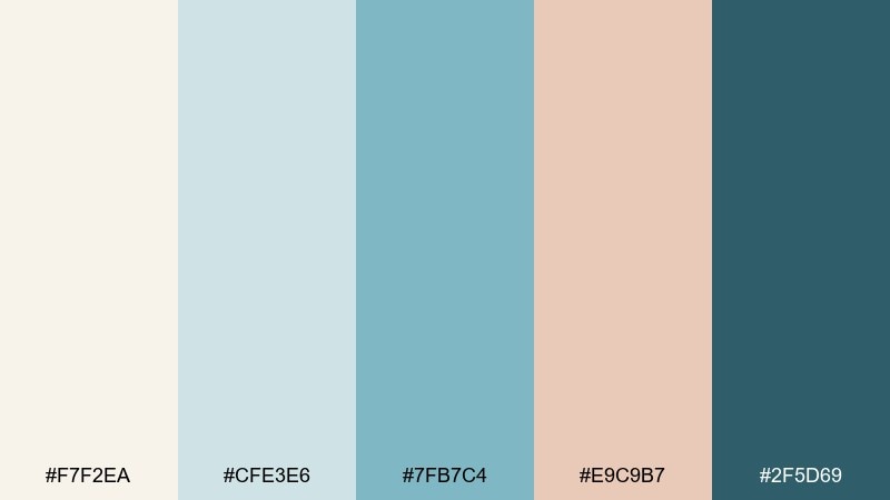
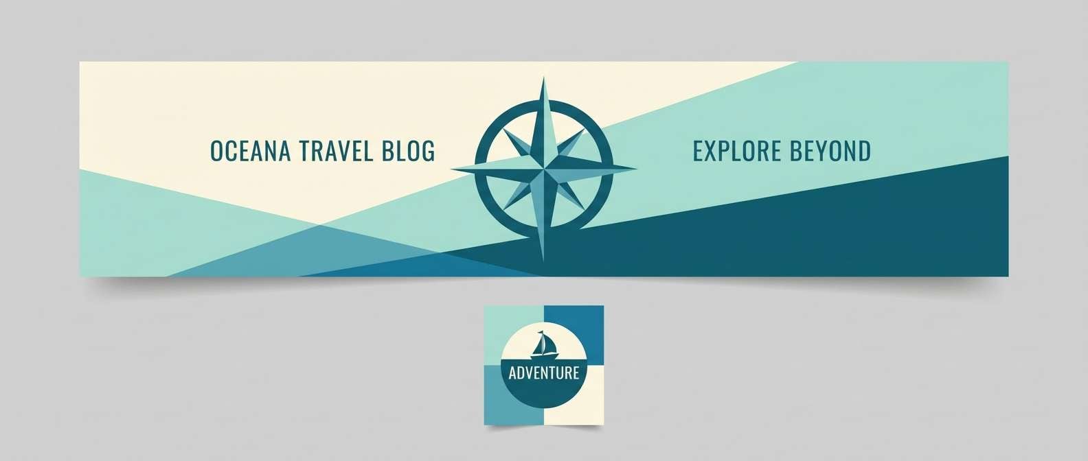
HEX: #F7F2EA #CFE3E6 #7FB7C4 #E9C9B7 #2F5D69
Mood: breezy, clean, seaside
Best for: travel blog header and thumbnails
Breezy and coastal, it evokes seafoam glass, sun-bleached shells, and cool ocean air. These eggshell color combinations shine when the cream stays dominant and the aqua shades are used for buttons, tags, and icons. Pair with airy photography and thin sans-serif type for a modern travel vibe. Tip: keep the deep teal for small, high-impact elements like CTAs so the palette stays light.
Image example of coastal shell generated using media.io
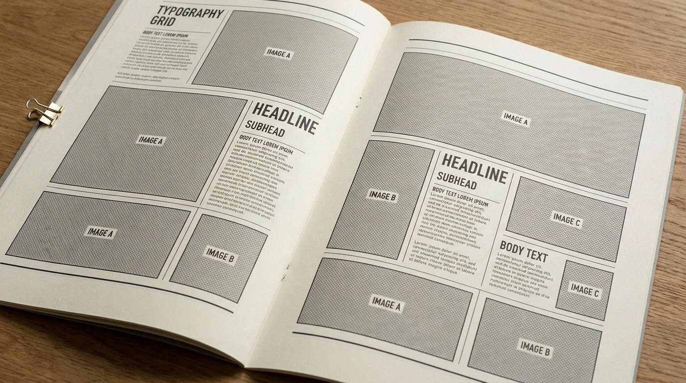
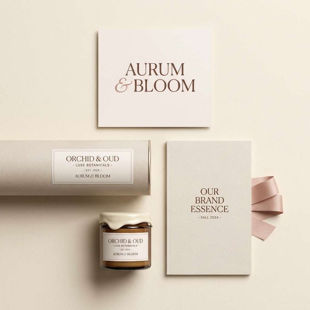
5) Museum Neutral
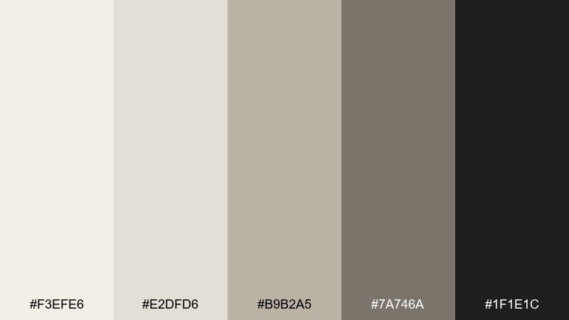
HEX: #F3EFE6 #E2DFD6 #B9B2A5 #7A746A #1F1E1C
Mood: refined, quiet, archival
Best for: editorial magazine layout
Refined and quiet, like a gallery wall under soft track lighting. Let the off-white and pale stone handle the negative space, then bring in mid-gray for captions and UI-like rules. Pair with black-and-white imagery and a strong typographic grid for an archival look. Tip: use the near-black sparingly to keep the page feeling premium rather than harsh.
Image example of museum neutral generated using media.io
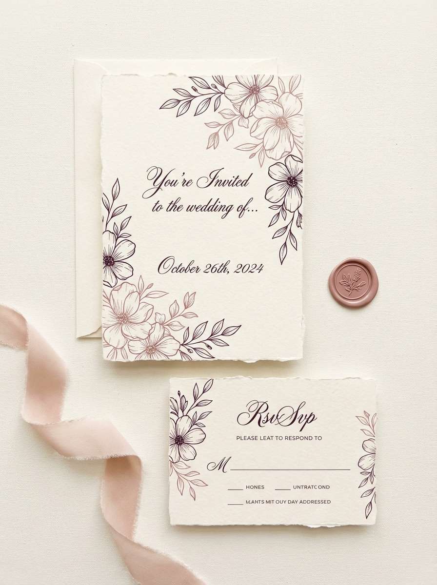
6) Vintage Lace
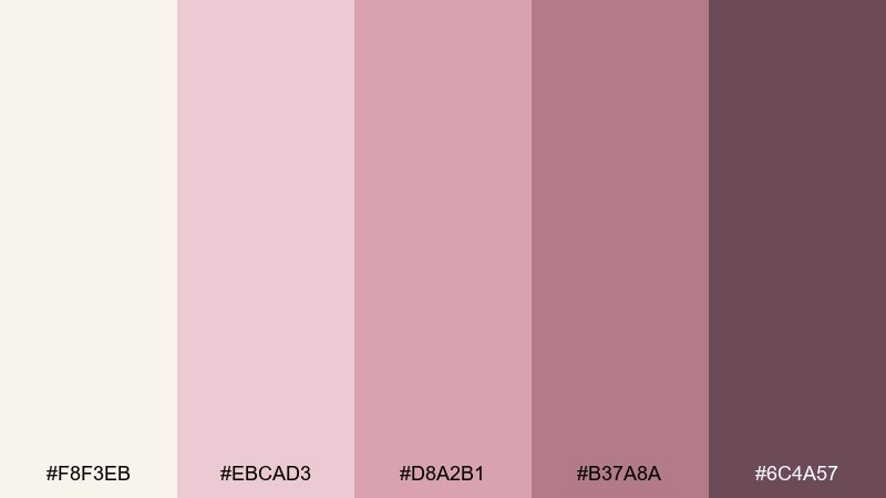
HEX: #F8F3EB #EBCAD3 #D8A2B1 #B37A8A #6C4A57
Mood: romantic, soft, vintage
Best for: wedding invitation suite
Romantic and delicate, it feels like vintage lace, pressed petals, and handwritten notes. Use the pale cream as the paper tone, then bring in blush for flourishes and dusty rose for names and monograms. Pair with script accents and thin borders to keep it airy, not sugary. Tip: use the plum shade for the RSVP details to boost readability without losing softness.
Image example of vintage lace generated using media.io
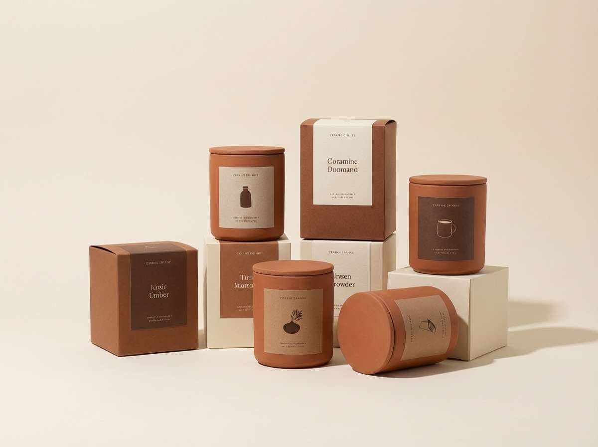
7) Clay Studio
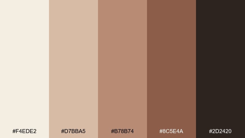
HEX: #F4EDE2 #D7BBA5 #B78B74 #8C5E4A #2D2420
Mood: earthy, tactile, artisanal
Best for: ceramics product packaging
Earthy and tactile, it brings to mind clay dust, kiln warmth, and handmade glaze. Build the label around the pale cream base, then use terracotta and umber for brand blocks and product names. Pair with uncoated stock, subtle embossing, and simple iconography for an artisanal finish. Tip: keep the darkest brown for barcodes and small type so the front stays warm and inviting.
Image example of clay studio generated using media.io
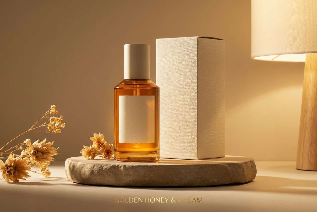
8) Golden Hour Cream
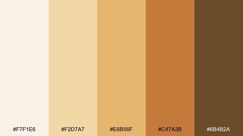
HEX: #F7F1E6 #F2D7A7 #E6B56F #C47A3B #6B4B2A
Mood: sunlit, warm, optimistic
Best for: skincare product ad
Sunlit and optimistic, it looks like golden hour spilling over sand-colored stone. Use the cream and pale honey as the backdrop, then push the amber tones into headline highlights and ingredient badges. Pair with glossy product renders and minimal copy for a high-end feel. Tip: add depth by using the darkest brown only in small typography and shadows, not large blocks.
Image example of golden hour cream generated using media.io
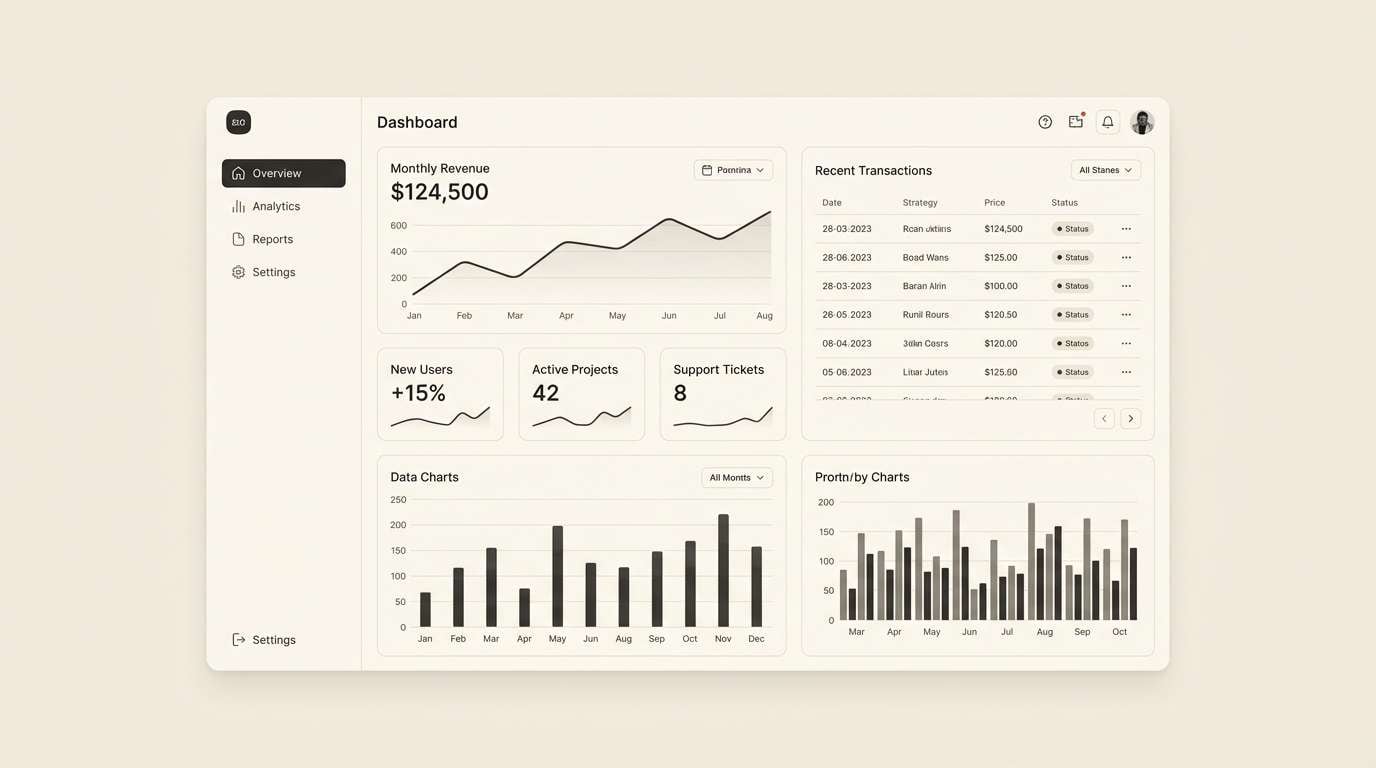
9) Graphite Contrast
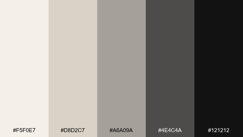
HEX: #F5F0E7 #D8D2C7 #A6A09A #4E4C4A #121212
Mood: sleek, modern, high-contrast
Best for: SaaS dashboard UI
Sleek and modern, it feels like matte paper against graphite and ink. An eggshell color palette like this keeps dashboards readable when the light tones handle surfaces and the darks are reserved for charts and key metrics. Pair with crisp sans-serif type and structured spacing for a product-led look. Tip: use the mid-gray for secondary borders so the interface does not get visually noisy.
Image example of graphite contrast generated using media.io
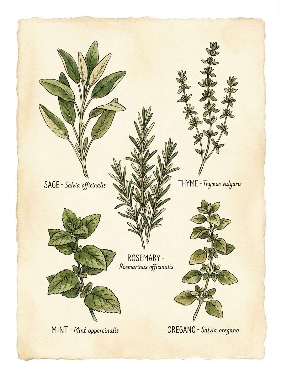
10) Herb Garden Note
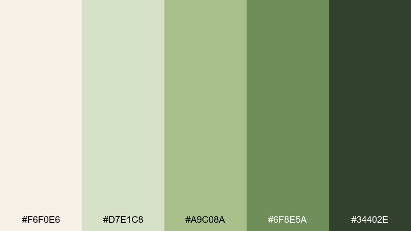
HEX: #F6F0E6 #D7E1C8 #A9C08A #6F8E5A #34402E
Mood: botanical, gentle, outdoorsy
Best for: watercolor botanical poster
Botanical and gentle, it suggests fresh herbs, garden shade, and handwritten recipe cards. Let the creamy tone stay open and paper-like, while the greens form leaves, stems, and titles. Pair with watercolor textures and light ink outlines for a natural, airy finish. Tip: keep the darkest green limited to small linework so the illustration stays soft.
Image example of herb garden note generated using media.io
11) Autumn Paper
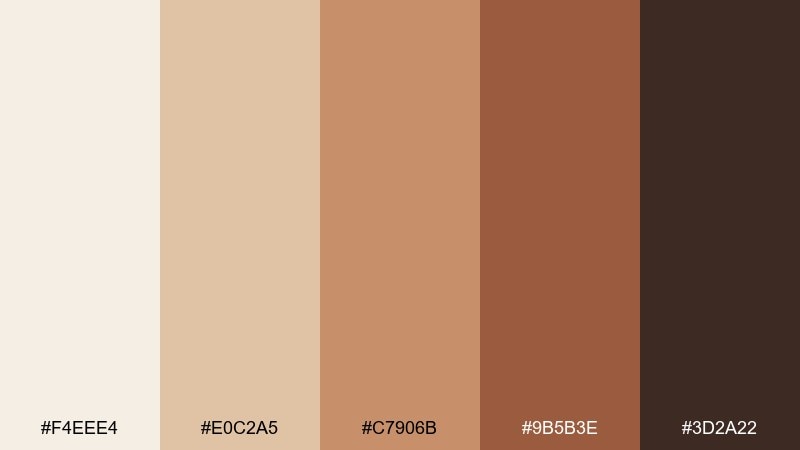
HEX: #F4EEE4 #E0C2A5 #C7906B #9B5B3E #3D2A22
Mood: rustic, seasonal, warm
Best for: fall event flyer
Rustic and seasonal, it feels like dried leaves on textured paper. Use the pale cream for breathing room, then add warm tan and spiced brown for headings and dividers. Pair with simple illustrated motifs like wheat, pumpkins, or leaves to reinforce the mood. Tip: set body text in the deepest brown so it stays readable on the lighter warm tones.
Image example of autumn paper generated using media.io

12) Soft Monochrome
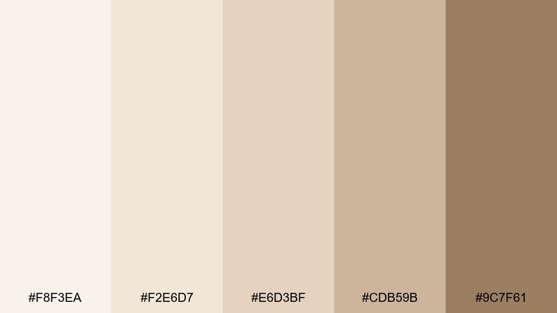
HEX: #F8F3EA #F2E6D7 #E6D3BF #CDB59B #9C7F61
Mood: subtle, serene, tonal
Best for: interior paint mood board
Subtle and serene, it reads like layered plaster, oatmeal fabric, and sunlit walls. Build your mood board with the lightest shades as primary wall options and the deeper tan as a grounding trim or furniture tone. Pair with natural woods and brushed brass for warmth without visual clutter. Tip: test the darkest color on small surfaces first, like a niche or cabinet, to keep the room airy.
Image example of soft monochrome generated using media.io
13) Blush and Cocoa
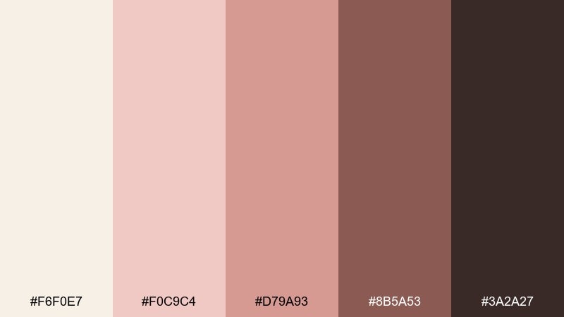
HEX: #F6F0E7 #F0C9C4 #D79A93 #8B5A53 #3A2A27
Mood: cozy, intimate, modern romantic
Best for: boutique branding
Cozy and intimate, it feels like warm cafe light with a soft blush tint. Use cream and pale pink as your packaging base, then bring in cocoa for logos, patterns, and premium details. Pair with minimalist photography and a little texture, like linen or kraft, to keep it grounded. Tip: for social graphics, set the headline in dark cocoa and keep blush as a subtle background wash.
Image example of blush and cocoa generated using media.io
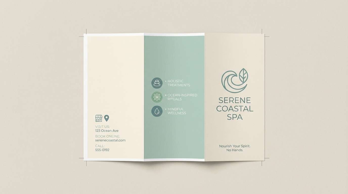
14) Sea Glass Calm
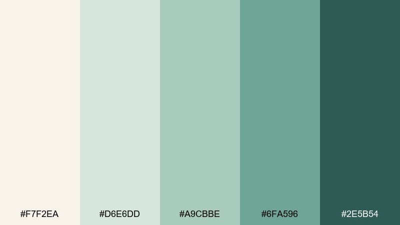
HEX: #F7F2EA #D6E6DD #A9CBBE #6FA596 #2E5B54
Mood: tranquil, spa-like, refreshing
Best for: spa brochure
Tranquil and spa-like, it suggests sea glass, eucalyptus steam, and quiet mornings. Let the soft cream support roomy margins, while the mint and teal shades guide sections and highlights. Pair with light photography and plenty of leading to keep the brochure breathable. Tip: use the deep teal only for headings and icons so the layout stays soothing.
Image example of sea glass calm generated using media.io
15) Ink and Ivory
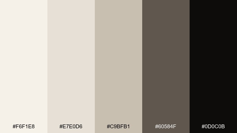
HEX: #F6F1E8 #E7E0D6 #C9BFB1 #60584F #0D0C0B
Mood: classic, literary, confident
Best for: book cover design
Classic and literary, it brings to mind deckled pages, fountain pen ink, and quiet bookstores. These eggshell color combinations are ideal when you want a soft background but still need strong type contrast. Pair with serif display fonts and subtle grain to keep the cover tactile and timeless. Tip: use the near-black for the title and keep the mid-brown for author name and small details.
Image example of ink and ivory generated using media.io
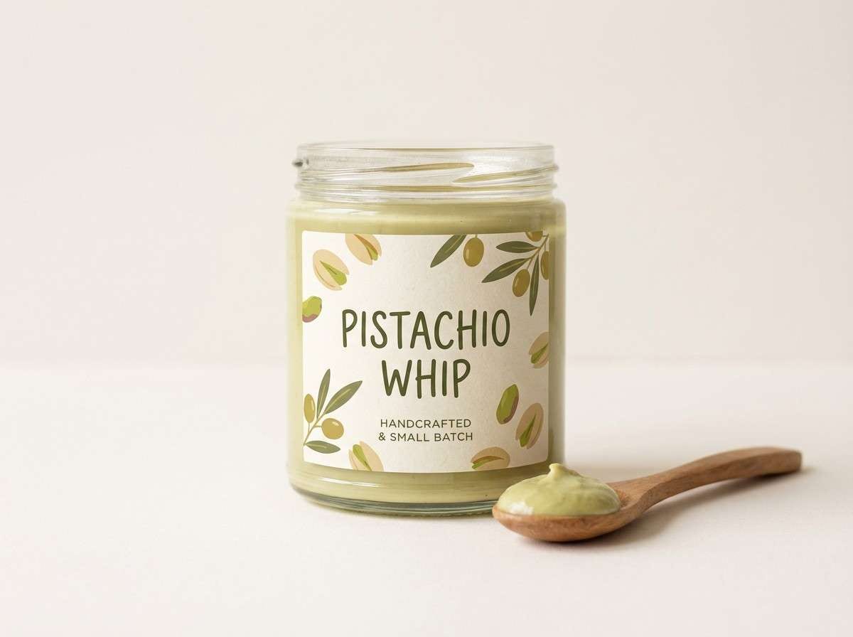
16) Pistachio Cream
HEX: #F5EFE6 #E1E8D1 #B9C99A #8FA76D #4B5A35
Mood: playful, fresh, light
Best for: food packaging label
Playful and fresh, it feels like pistachio gelato on a warm wafer. Use the cream base to keep labels readable, then add pistachio and olive tones for flavor callouts and badges. Pair with simple illustrations and rounded type to lean into a modern, friendly look. Tip: keep the darkest green for regulatory text and barcodes so the front stays bright.
Image example of pistachio cream generated using media.io
17) Desert Bloom
HEX: #F4EEE4 #E9C5B3 #D49B84 #B56A52 #5C3A2E
Mood: warm, artistic, sun-baked
Best for: Instagram post template
Warm and artistic, it evokes sun-baked adobe and a soft desert sunset. Use the cream for the canvas, then layer peach and terracotta blocks to frame text and imagery. Pair with minimal icons and a consistent grid so the feed looks cohesive. Tip: set your headline in the deep brown to avoid low-contrast text on the warm mid-tones.
Image example of desert bloom generated using media.io
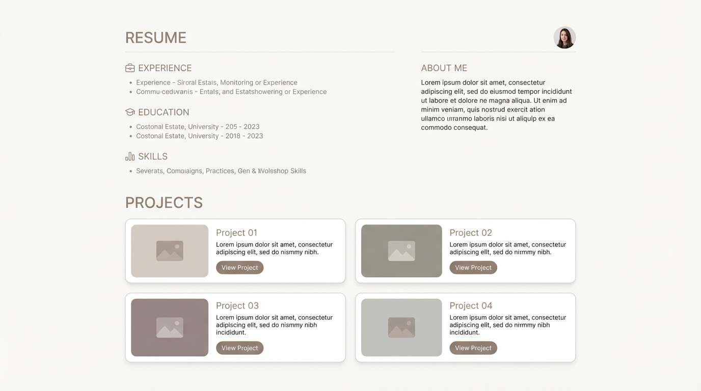
18) Snowy Minimal
HEX: #FAF6EF #F1ECE4 #DDD6CC #B9B0A4 #6E655B
Mood: clean, soft, professional
Best for: resume and portfolio website
Clean and soft, it looks like fresh snow on stone with just enough warmth to feel human. An eggshell color palette like this is perfect for resumes when you need gentle sections, subtle dividers, and calm hierarchy. Pair with one strong accent (like a single underline or icon color) and keep typography crisp. Tip: use the darkest taupe for headings only, and let body text sit one step lighter for a modern feel.
Image example of snowy minimal generated using media.io
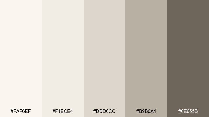
19) Nightfall Sand
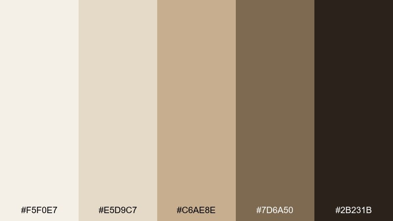
HEX: #F5F0E7 #E5D9C7 #C6AE8E #7D6A50 #2B231B
Mood: moody, cinematic, grounded
Best for: cinematic title card poster
Moody and cinematic, it recalls desert sand after dusk and the glow of old film. Use the light cream as the negative space, then build depth with sand and brown gradients for shapes and typography. Pair with bold type and minimal composition to keep the message strong. Tip: add a subtle grain layer and keep the darkest shade for the title to lock in contrast.
Image example of nightfall sand generated using media.io

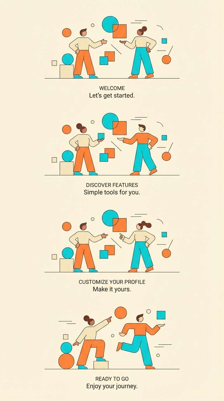
20) Citrus Peel Pop
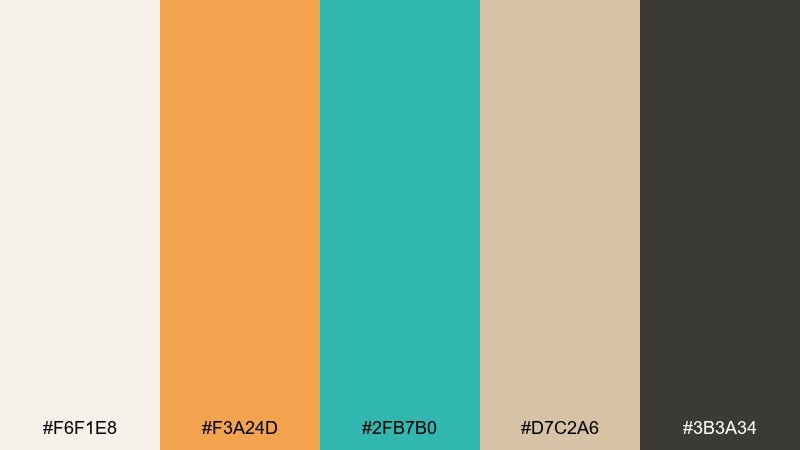
HEX: #F6F1E8 #F3A24D #2FB7B0 #D7C2A6 #3B3A34
Mood: energetic, modern, upbeat
Best for: app onboarding illustration
Energetic and modern, it feels like citrus peel against cool sea-glass highlights. This eggshell color combination works best when cream and sand stay dominant, and the orange and cyan appear as small, punchy moments for icons and progress steps. Pair with simple vector shapes and lots of breathing room to keep it friendly, not loud. Tip: limit the bright accents to one per screen to maintain visual rhythm across onboarding.
Image example of citrus peel pop generated using media.io
What Colors Go Well with Eggshell?
Eggshell pairs naturally with warm neutrals like sand, taupe, camel, and cocoa—ideal when you want tonal depth without sharp transitions. These combinations look especially polished in editorial layouts, packaging, and interior palettes.
For cooler balance, try sea-glass greens, sage, misty aqua, or deep teal. Eggshell keeps those hues from feeling too icy, while the cool accents add clarity to UI states, icons, and section breaks.
If you want higher contrast, use near-black, graphite, or deep brown for type and key UI elements. Eggshell makes dark text feel less stark than on pure white, while still staying highly readable.
How to Use a Eggshell Color Palette in Real Designs
Start by treating eggshell as your main background and surface color (cards, paper, sections). Then assign one mid-tone (taupe/stone/sage) to borders, dividers, and secondary UI so the layout gains structure without looking busy.
Keep your darkest shade for functional contrast: headings, logos, primary text, or CTAs. This helps you maintain a calm, premium feel while still meeting accessibility needs in interfaces.
Finally, add one accent color (blush, amber, teal, or citrus) in small doses for highlights, badges, and active states. On eggshell, a little accent goes a long way—so consistency matters more than quantity.
Create Eggshell Palette Visuals with AI
If you have HEX codes but need real mockups—like brand boards, UI screens, packaging, or posters—AI can turn your eggshell palette into cohesive visuals fast. The key is to describe the layout, lighting, and material feel (paper grain, uncoated stock, soft studio light) alongside your color intent.
Reuse the prompts above as templates, then swap the design type (menu, brochure, dashboard) to match your project. You’ll get consistent outputs that still feel tailored to your palette’s mood.
Generate multiple variations, choose the strongest composition, and refine with small prompt edits (contrast, spacing, texture) until it matches your brand system.
Eggshell Color Palette FAQs
-
What is an eggshell color in design terms?
Eggshell is a warm off-white with subtle beige/yellow undertones. It’s commonly used as a softer alternative to pure white for backgrounds, paper-like surfaces, and calming UI themes. -
Is eggshell closer to white or beige?
Eggshell is closer to white in brightness, but it leans warm like a very light beige. That’s why it reads clean while still feeling cozy. -
What text color works best on an eggshell background?
Deep charcoal, near-black, or dark cocoa typically look best. They maintain strong readability while matching eggshell’s warm character better than pure black. -
Does eggshell work for modern UI design?
Yes. Eggshell reduces the harshness of stark white screens and pairs well with graphite grays, sage/teal accents, and subtle borders—great for dashboards, portfolios, and wellness sites. -
What accent colors pair well with eggshell?
Sage and sea-glass greens, teal, dusty rose, amber/honey, terracotta, and muted cyan/orange accents all work well. Keep accents small so the palette stays airy. -
How do I keep an eggshell palette from looking flat?
Use a clear value range: eggshell for the base, a mid-tone for structure (borders, captions, secondary surfaces), and a dark anchor for typography. Add texture (grain, uncoated paper, soft shadow) to create depth. -
Can I generate eggshell palette mockups with AI?
Yes—use a text-to-image tool and describe the format (UI, packaging, poster), lighting (soft studio), and materials (paper texture), then keep your palette consistent across prompts for a cohesive set.


