

Blue and rose gold is one of those rare pairings that feels both modern and timeless. Cool blues bring clarity and trust, while rose gold adds a warm, premium glow that elevates everything from UI to invitations.
Below are 20+ blue rose gold color palette ideas with HEX codes, plus practical tips for using them in branding, print, and digital design.
In this article
- Why Blue Rose Gold Palettes Work So Well
-
- midnight rose glow
- coastal blush
- dusty sapphire satin
- coppery twilight ui
- frosted petal night
- velvet marina
- aurora champagne
- rose gold circuit
- soft denim bouquet
- stargazer blush
- ink blue rosette
- moonlit copper marble
- glacier rose
- antique rose harbor
- royal navy petal
- blush steel minimal
- rose gold espresso
- misty blue luster
- nightfall nocturne
- porcelain rose quartz
- sapphire champagne gradients
- rose gold blueprint
- What Colors Go Well with Blue Rose Gold?
- How to Use a Blue Rose Gold Color Palette in Real Designs
- Create Blue Rose Gold Palette Visuals with AI
Why Blue Rose Gold Palettes Work So Well
Blue rose gold palettes balance temperature in a way that feels instantly intentional: blue delivers structure, calm, and legibility, while rose gold adds a soft metallic warmth that reads as elevated and human.
This pairing is also flexible across styles. You can push it dramatic with navy and cream, keep it airy with pastels, or make it tech-forward with steel blues and rose gold CTA accents.
Most importantly, it supports hierarchy. Deep blues make excellent backgrounds and text colors, and rose gold naturally draws attention for buttons, highlights, dividers, and focal details.
20+ Blue Rose Gold Color Palette Ideas (with HEX Codes)
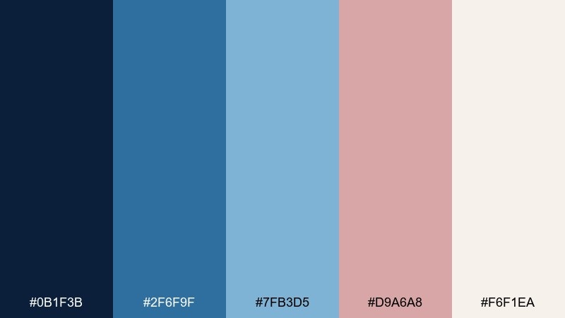
1) Midnight Rose Glow
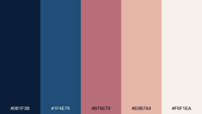
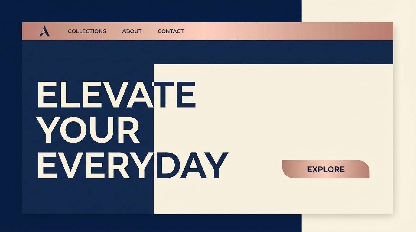
HEX: #0B1F3B #1F4E79 #B76E79 #E6B7A9 #F6F1EA
Mood: luxe and cinematic
Best for: luxury brand landing page hero
Luxe and cinematic like city lights reflecting on deep water, these tones feel dramatic yet polished. The blue rose gold color palette shines when navy leads and rose gold is reserved for buttons, dividers, and micro-accents. Pair it with generous whitespace and a clean serif for a premium vibe. Usage tip: keep rose gold highlights under 10 percent so the page stays elegant, not rosy.
Image example of midnight rose glow generated using media.io
Media.io is an online AI studio for creating and editing video, image, and audio in your browser.

2) Coastal Blush
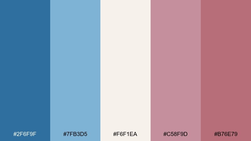
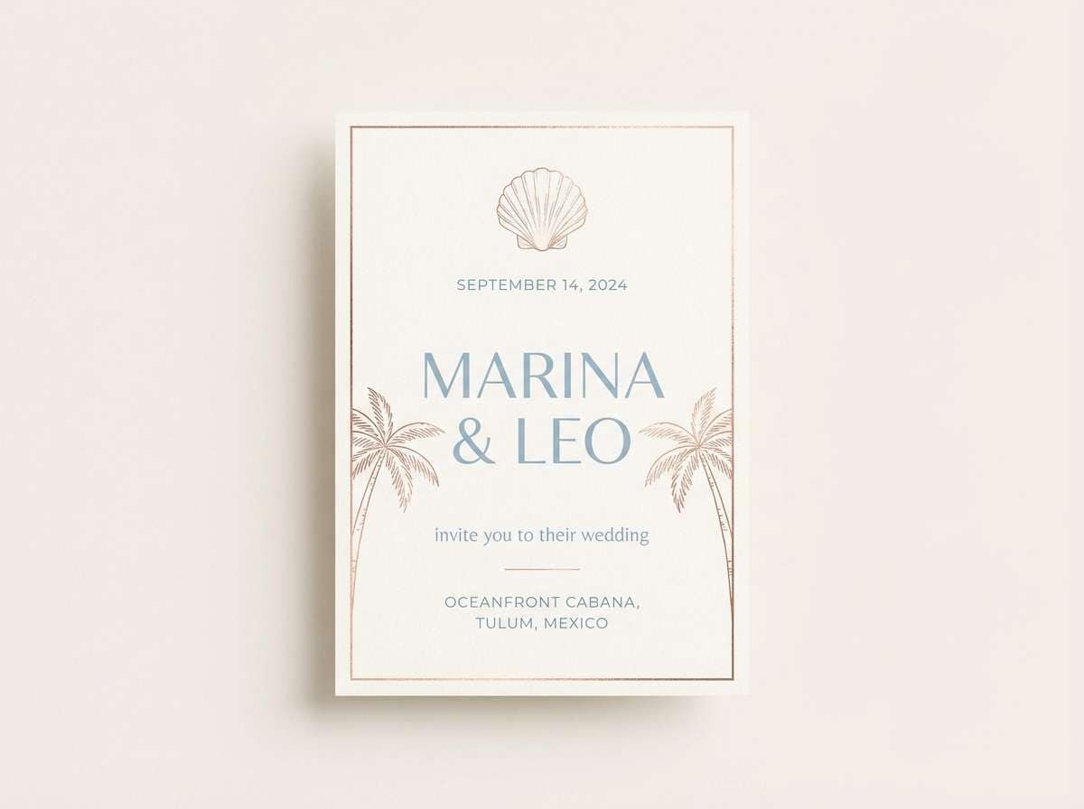
HEX: #2F6F9F #7FB3D5 #F6F1EA #C58F9D #B76E79
Mood: airy and romantic
Best for: beach wedding invitation
Airy and romantic, it feels like sea glass, sun-bleached sand, and a soft blush bouquet. These blue rose gold color combinations work beautifully for coastal weddings where you want elegance without heaviness. Add warm off-white paper stock and a delicate script, then ground it with a medium blue for readability. Usage tip: use the dusty rose for names and headings, and keep body text in the deeper blue.
Image example of coastal blush generated using media.io
3) Dusty Sapphire Satin

HEX: #22324A #3D6A8A #9DB4C8 #B76E79 #F3E5DF
Mood: soft editorial chic
Best for: fashion lookbook spread
Soft editorial chic, like satin fabric against cool sapphire shadows. The muted blues keep layouts modern, while the rose gold adds a flattering warmth that suits portraits and product details. Pair with high-contrast photography and calm, grid-based typography. Usage tip: place rose gold only on pull quotes or section titles so the spread stays sophisticated.
Image example of dusty sapphire satin generated using media.io
4) Coppery Twilight UI
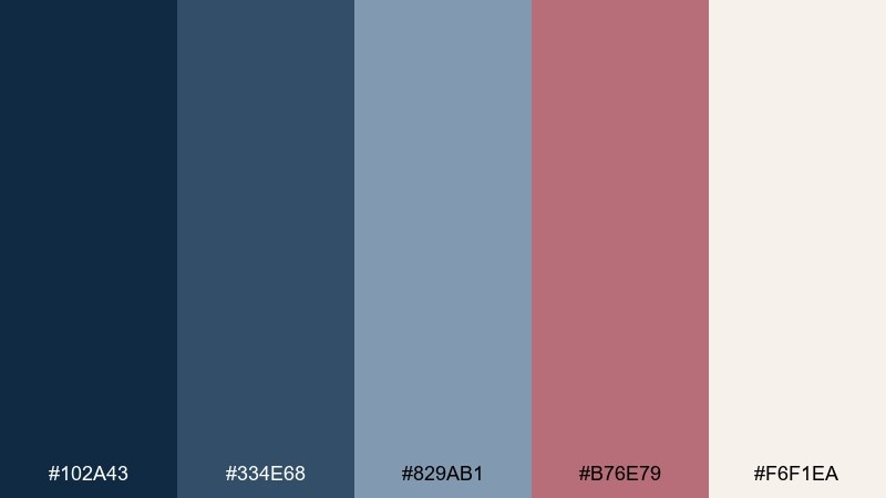
HEX: #102A43 #334E68 #829AB1 #B76E79 #F6F1EA
Mood: confident and technical
Best for: fintech dashboard UI
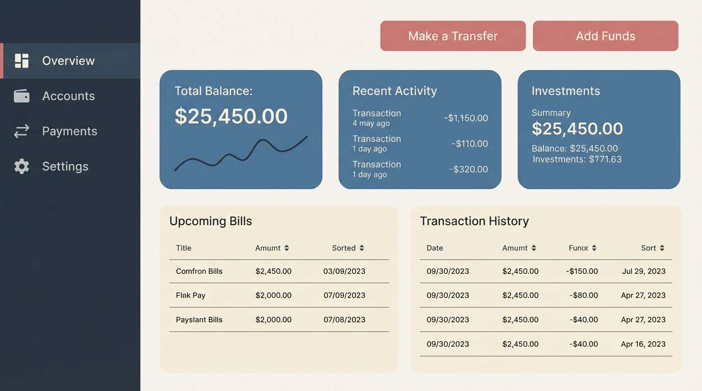
Confident and technical, it evokes a twilight skyline with copper highlights on steel-blue glass. The contrast between deep slate and warm metallic blush makes data-heavy screens feel more human. Pair it with neutral charts and simple icons to keep metrics readable. Usage tip: reserve the rose tone for primary CTAs and active states to guide the eye.
Image example of coppery twilight ui generated using media.io
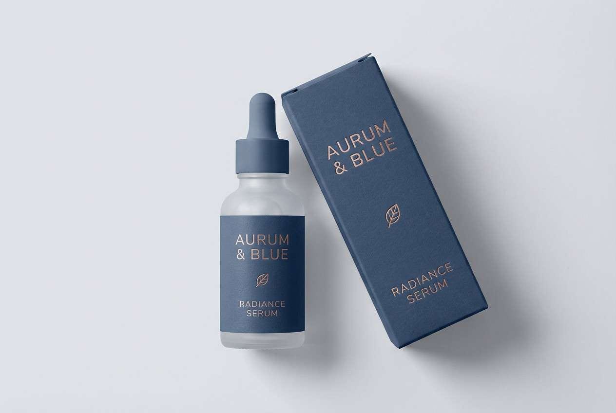
5) Frosted Petal Night
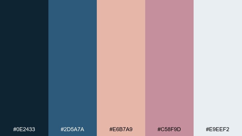
HEX: #0E2433 #2D5A7A #E6B7A9 #C58F9D #E9EEF2
Mood: calm and premium
Best for: skincare product packaging
Calm and premium, like frosted glass with a faint blush glow in evening light. The deep blue keeps it clinical and trustworthy, while the rosy notes soften the look for self-care. Pair with minimal labeling and matte textures to avoid visual noise. Usage tip: print the rose shade as a subtle gradient band rather than a solid block for a refined finish.
Image example of frosted petal night generated using media.io
6) Velvet Marina
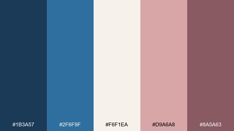
HEX: #1B3A57 #2F6F9F #F6F1EA #D9A6A8 #8A5A63
Mood: inviting and upscale
Best for: seafood restaurant menu
Inviting and upscale, it feels like velvet booths, maritime blues, and a rosy copper lamp glow. The creamy neutral keeps the menu readable while the darker shades create structure for sections and pricing. Pair with a classic serif headline and simple line icons for dishes. Usage tip: highlight chef specials using the deeper rose tone to avoid overpowering the page.
Image example of velvet marina generated using media.io
7) Aurora Champagne
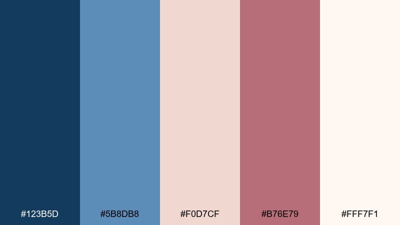
HEX: #123B5D #5B8DB8 #F0D7CF #B76E79 #FFF7F1
Mood: celebratory and soft
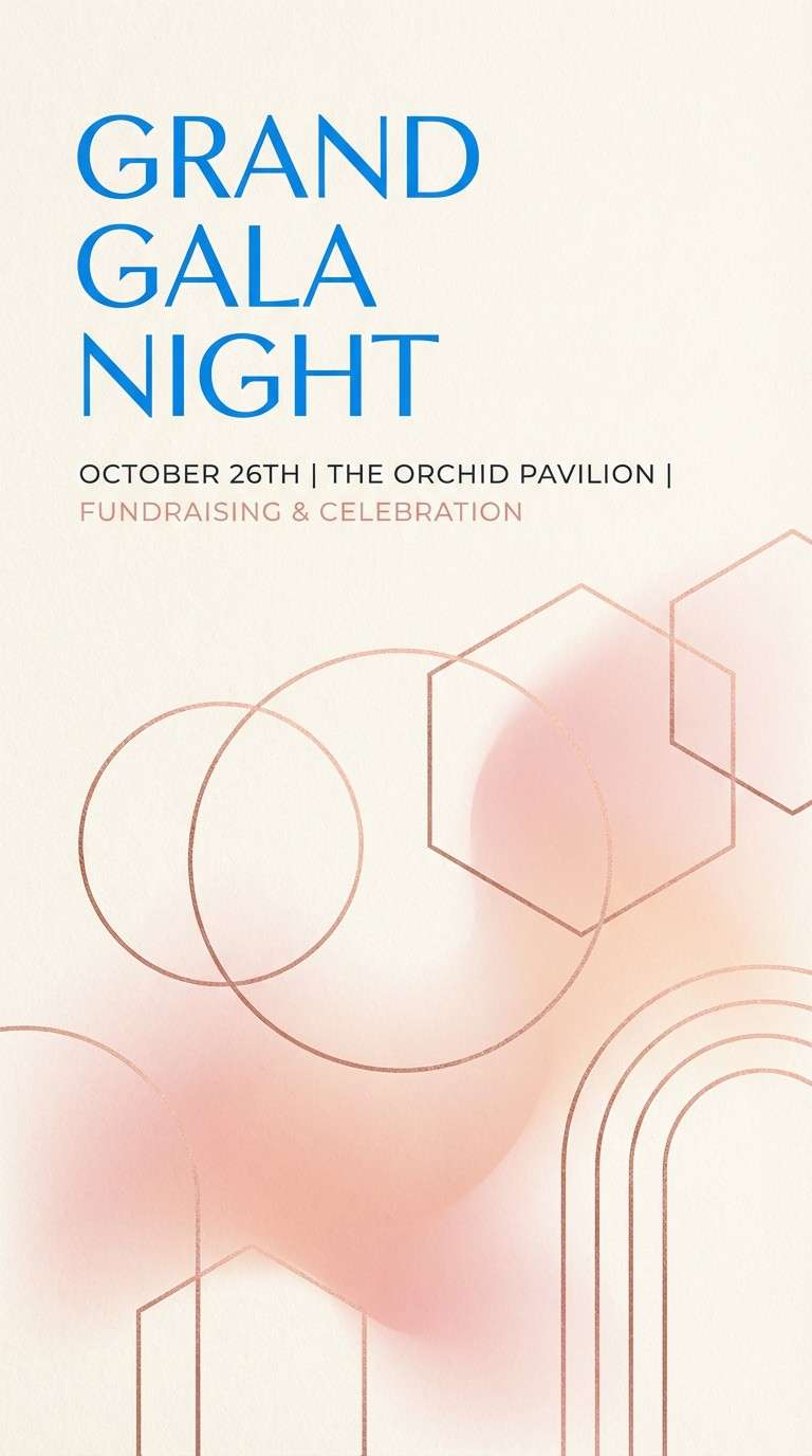
Best for: gala event poster
Celebratory and soft, like champagne bubbles under an aurora-tinted sky. The brighter blue adds energy, while the blush and rose gold tones keep it elegant for formal events. Pair with bold typography and plenty of breathing room so the poster reads from a distance. Usage tip: use the warm cream as the main background and let the blue frame key details.
Image example of aurora champagne generated using media.io
8) Rose Gold Circuit
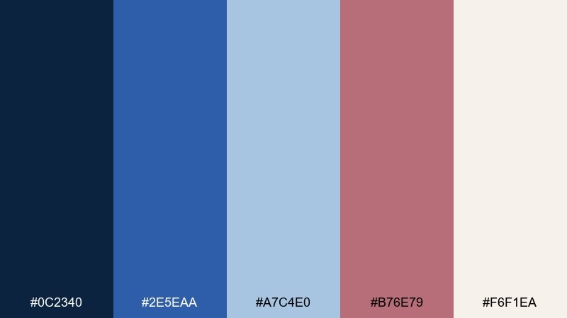
HEX: #0C2340 #2E5EAA #A7C4E0 #B76E79 #F6F1EA
Mood: modern and energetic
Best for: tech conference badge design
Modern and energetic, it suggests circuit traces lit by a warm metallic shimmer. These blue rose gold color combinations feel sharp for tech while still approachable for networking and community. Pair with geometric patterns and a bold sans-serif to keep it contemporary. Usage tip: keep the light blue for secondary info blocks so the name remains high-contrast on navy.
Image example of rose gold circuit generated using media.io

9) Soft Denim Bouquet
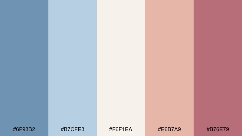
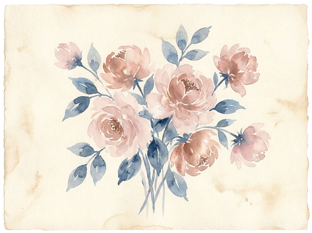
HEX: #6F93B2 #B7CFE3 #F6F1EA #E6B7A9 #B76E79
Mood: gentle and springlike
Best for: watercolor floral illustration
Gentle and springlike, it brings to mind faded denim, creamy petals, and a rosy sunrise. The lighter blues keep the composition airy, while the warm pinks add a natural focal point in blooms. Pair with soft paper texture and loose brush edges for an authentic feel. Usage tip: concentrate the deepest rose in the flower centers to create depth without harsh outlines.
Image example of soft denim bouquet generated using media.io
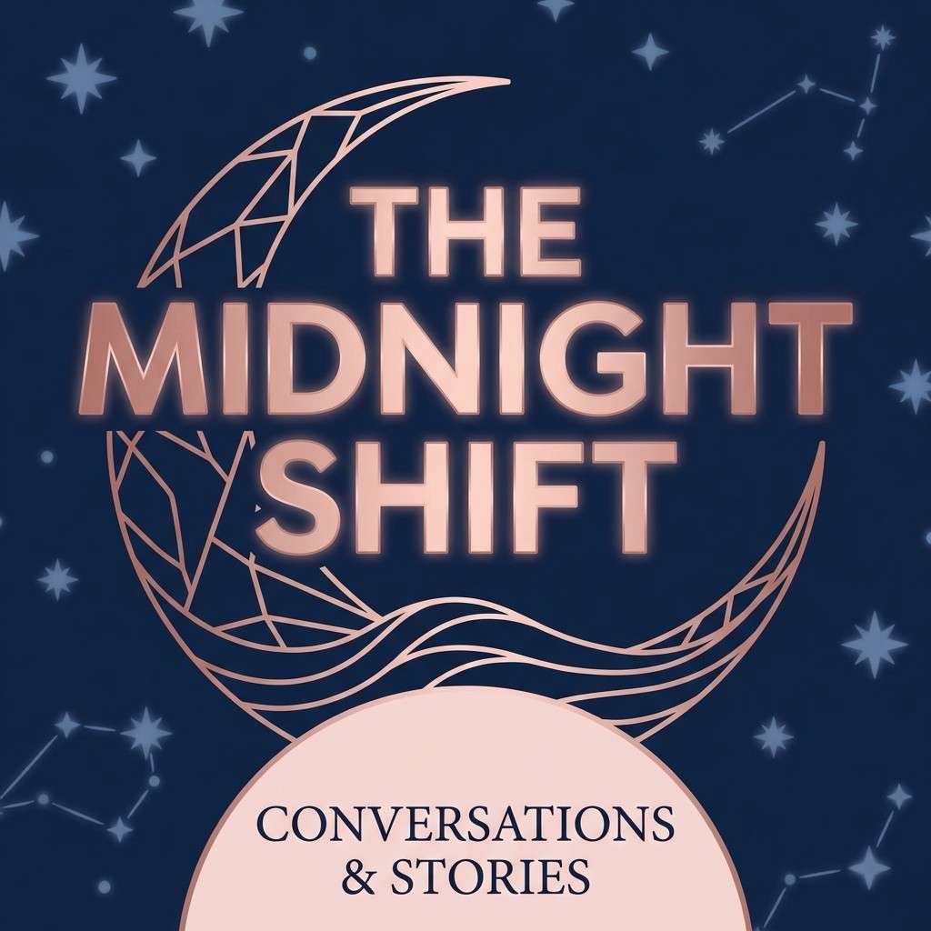
10) Stargazer Blush
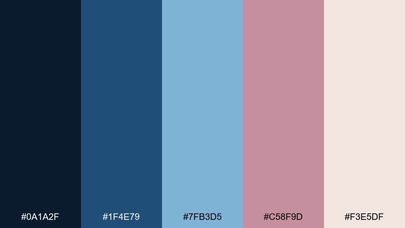
HEX: #0A1A2F #1F4E79 #7FB3D5 #C58F9D #F3E5DF
Mood: dreamy and nocturnal
Best for: podcast cover art
Dreamy and nocturnal, it feels like stargazing with a warm blush glow on the horizon. The dark base gives strong contrast for a title, while the airy blue and rose soften the mood for lifestyle content. Pair with subtle grain and simple iconography so it stays legible at thumbnail size. Usage tip: limit gradients to one area and keep the rest flat for crisp readability.
Image example of stargazer blush generated using media.io
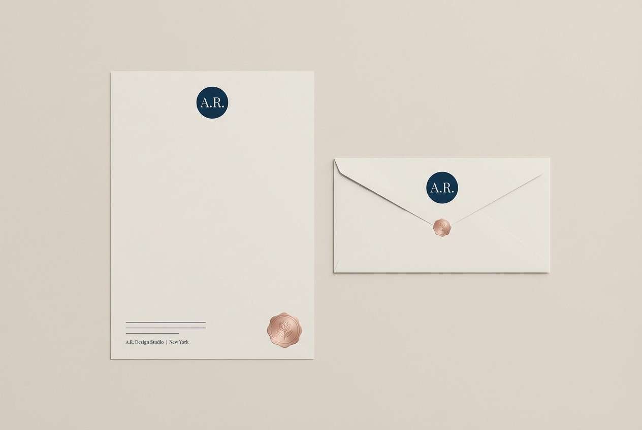
11) Ink Blue Rosette
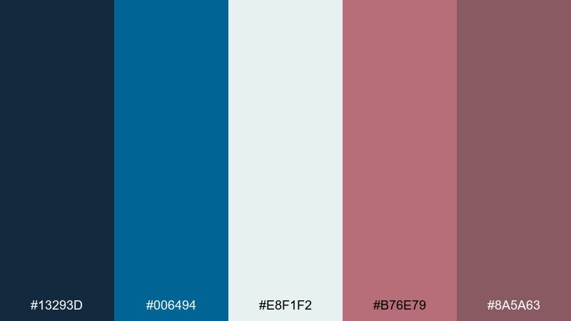
HEX: #13293D #006494 #E8F1F2 #B76E79 #8A5A63
Mood: classic and refined
Best for: monogram stationery set
Classic and refined, it reads like ink on crisp paper with a wax-seal blush. The strong blue anchors monograms and borders, while the rose tones add a personal, handcrafted warmth. Pair with thick margins and subtle embossing effects in the design. Usage tip: use the darkest rose for a monogram mark and keep supporting details in the lighter neutral.
Image example of ink blue rosette generated using media.io
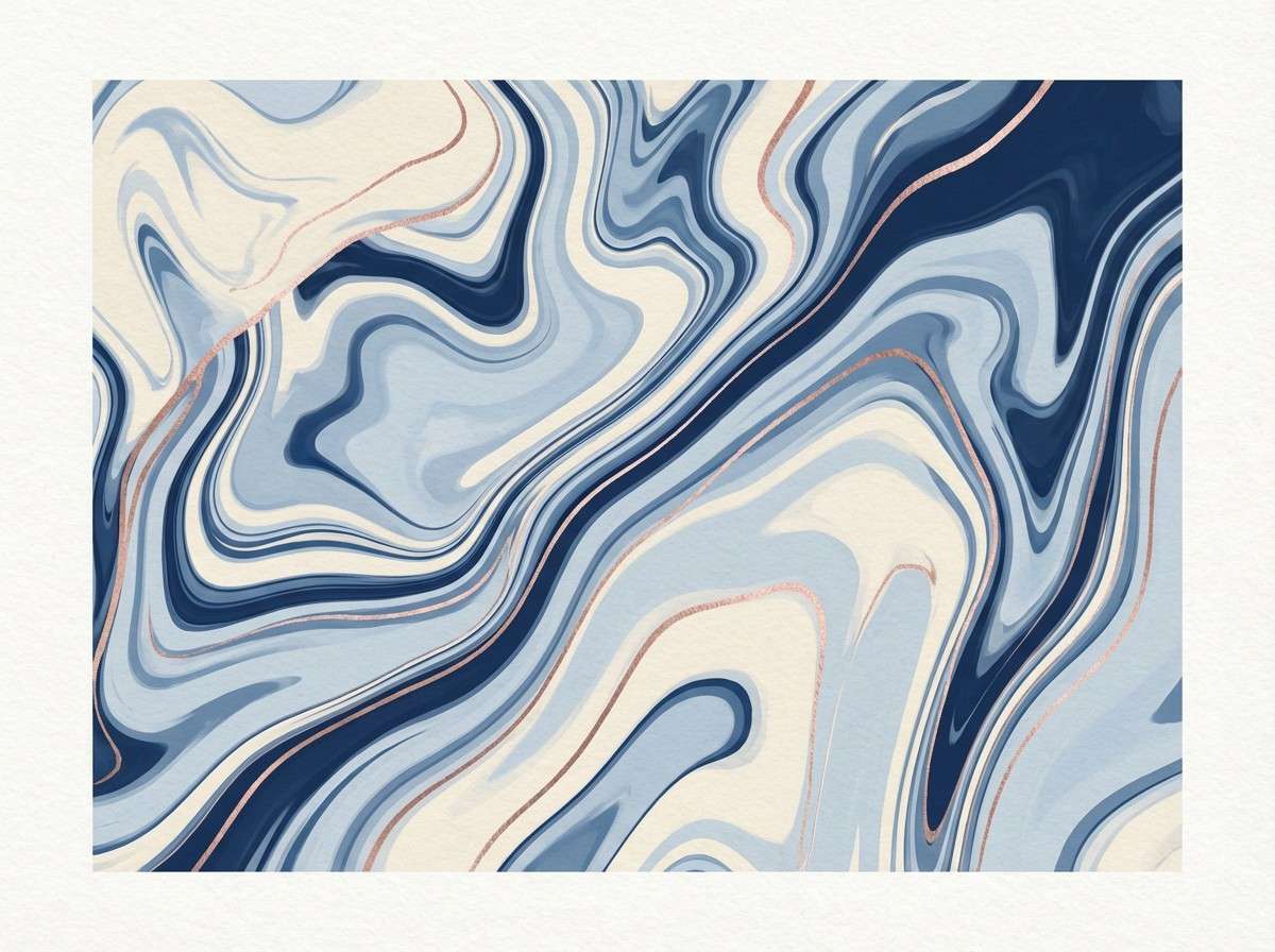
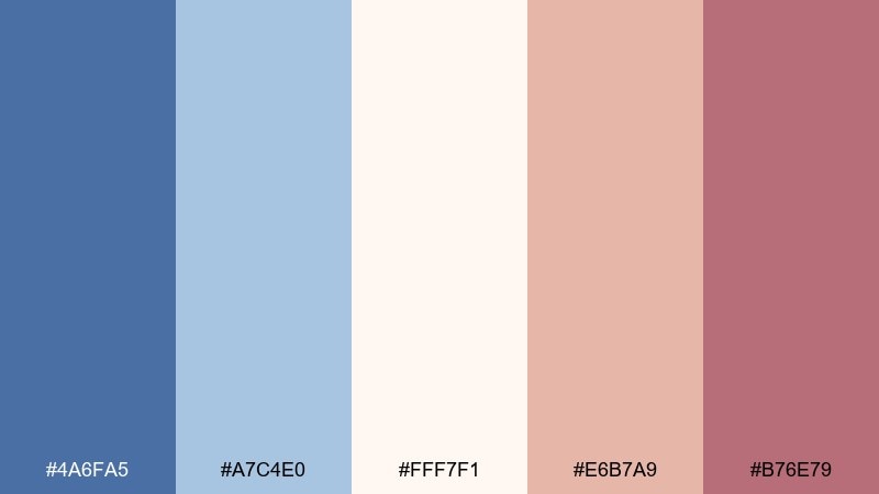
12) Moonlit Copper Marble
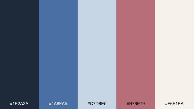
HEX: #1E2A3A #4A6FA5 #C7D6E5 #B76E79 #F6F1EA
Mood: artful and polished
Best for: abstract wall art print
Artful and polished, it evokes moonlit marble veining with a coppery blush running through it. The cool blues make the print feel contemporary, while the warm accent keeps it from looking sterile. Pair with minimal frames in black or brushed metal for a gallery finish. Usage tip: keep the rose gold in thin, organic lines so the composition stays airy.
Image example of moonlit copper marble generated using media.io
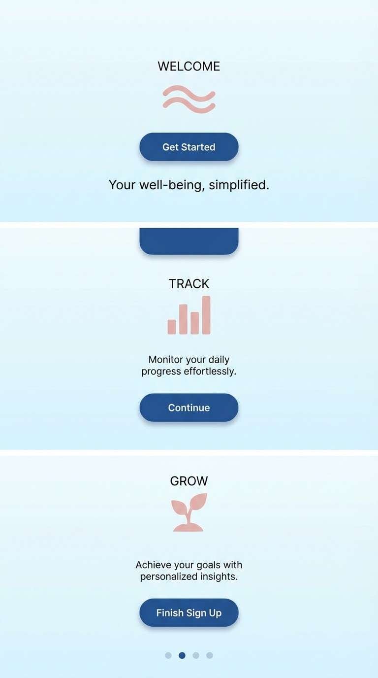
13) Glacier Rose
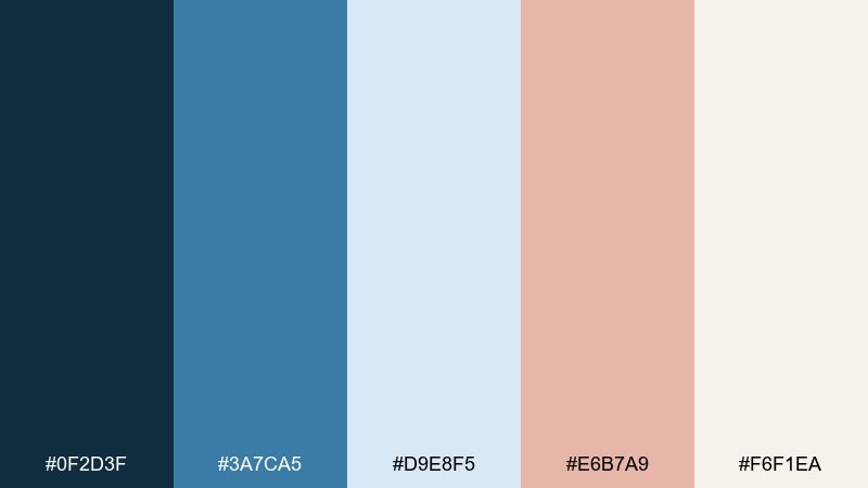
HEX: #0F2D3F #3A7CA5 #D9E8F5 #E6B7A9 #F6F1EA
Mood: clean and uplifting
Best for: mobile app onboarding screens
Clean and uplifting, it feels like crisp glacier air warmed by a soft blush sunrise. The light blue makes interfaces feel open, while the rose tones keep onboarding friendly and calm. Pair with rounded cards and simple illustrations for a welcoming first-run experience. Usage tip: set your main CTA in the deeper blue and use blush only for supportive highlights to preserve contrast.
Image example of glacier rose generated using media.io
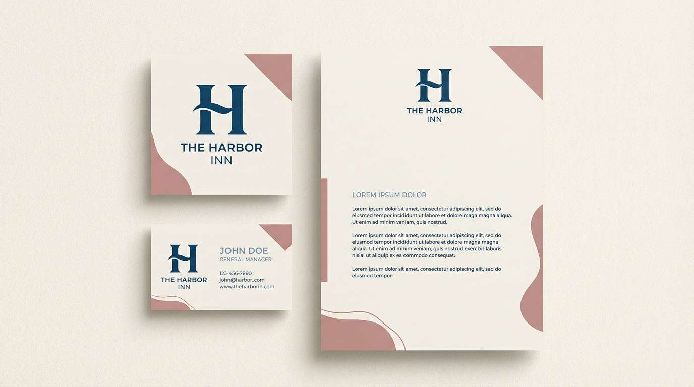
14) Antique Rose Harbor
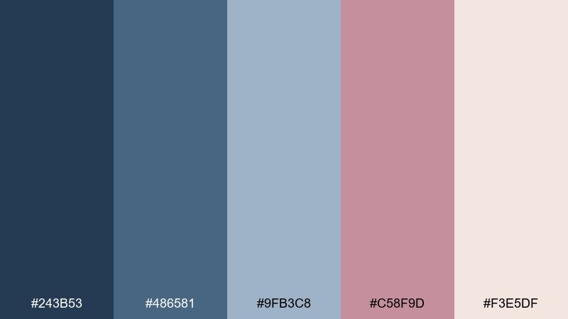
HEX: #243B53 #486581 #9FB3C8 #C58F9D #F3E5DF
Mood: heritage and welcoming
Best for: boutique hotel branding kit
Heritage and welcoming, like a harbor town at dusk with antique rose details on signage. The layered blues create trust and stability, while the dusty pink adds warmth for hospitality. Pair with tactile finishes like linen textures and understated icon sets. Usage tip: keep the dusty rose for secondary marks and use the dark blue for your primary logo lockup.
Image example of antique rose harbor generated using media.io
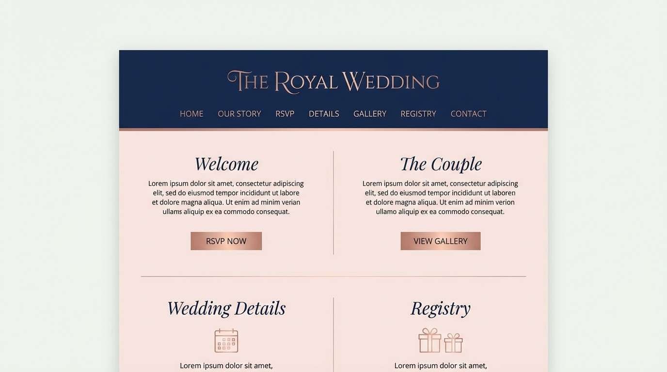
15) Royal Navy Petal
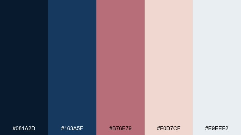
HEX: #081A2D #163A5F #B76E79 #F0D7CF #E9EEF2
Mood: formal and romantic
Best for: wedding website design
Formal and romantic, it feels like a navy tux with a rose boutonniere. This blue rose gold color combination works especially well for wedding sites where you want elegance and strong readability. Pair it with a refined serif for headings and a modern sans for body text. Usage tip: use blush backgrounds for RSVP sections, and keep navigation in solid navy for clarity.
Image example of royal navy petal generated using media.io
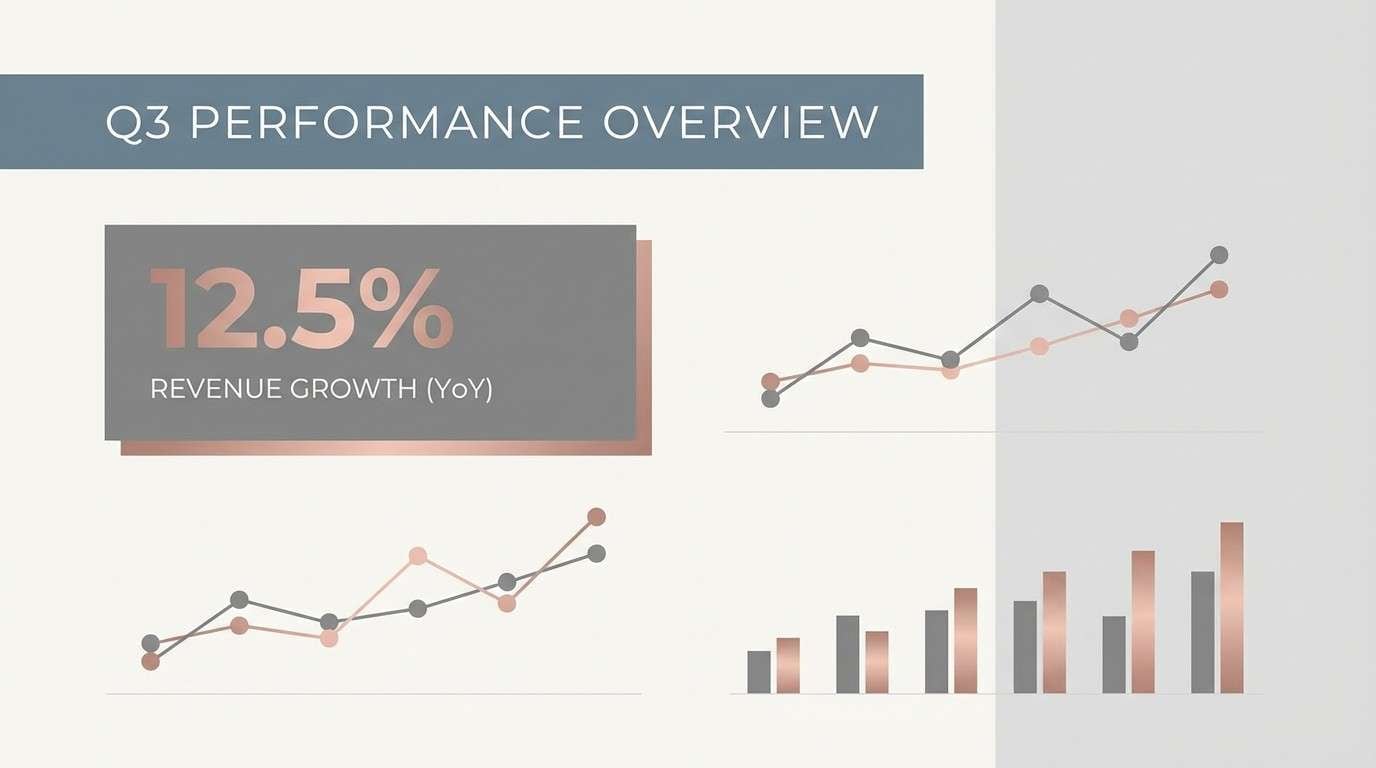
16) Blush Steel Minimal
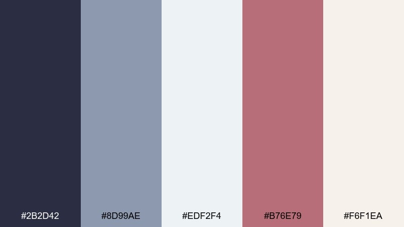
HEX: #2B2D42 #8D99AE #EDF2F4 #B76E79 #F6F1EA
Mood: minimal and corporate-calm
Best for: business presentation template
Minimal and corporate-calm, it resembles brushed steel with a quiet blush highlight. The cool grays keep slides professional, while the rose tone adds personality without looking playful. Pair with simple bar charts and strong typographic hierarchy. Usage tip: use rose only for key numbers and callouts so the deck stays clean.
Image example of blush steel minimal generated using media.io
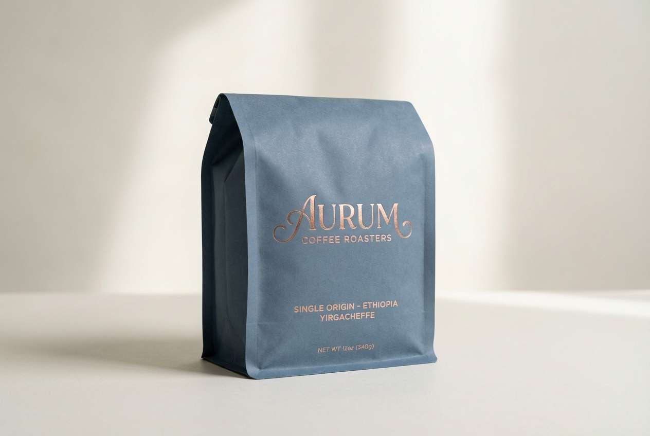
17) Rose Gold Espresso
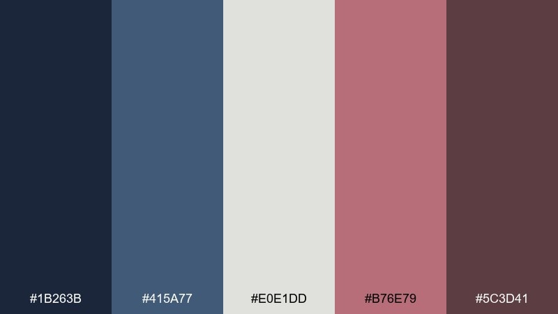
HEX: #1B263B #415A77 #E0E1DD #B76E79 #5C3D41
Mood: cozy and upscale
Best for: coffee bag packaging
Cozy and upscale, it brings espresso shadows together with a rose gold sheen on foil. The blue-gray base feels modern for specialty coffee, while the warmer tones nod to roasted depth. Pair with minimal labels and a single bold mark for shelf impact. Usage tip: use the blue-gray as the bag color and apply rose gold only as a stamped logo for a premium touch.
Image example of rose gold espresso generated using media.io
18) Misty Blue Luster
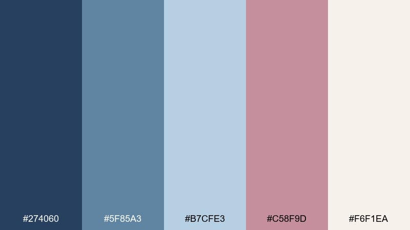
HEX: #274060 #5F85A3 #B7CFE3 #C58F9D #F6F1EA
Mood: delicate and luminous
Best for: jewelry product ad
Delicate and luminous, it feels like misty mornings and a soft metallic sparkle on skin. The layered blues create a calm backdrop that lets warm rose tones hint at luxury. Pair with macro product photography and minimal copy to keep the focus on shine. Usage tip: use the palest blue as the background and reserve rose gold for the product highlight and CTA.
Image example of misty blue luster generated using media.io
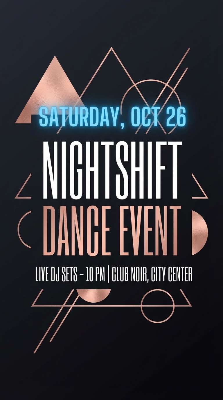
19) Nightfall Nocturne
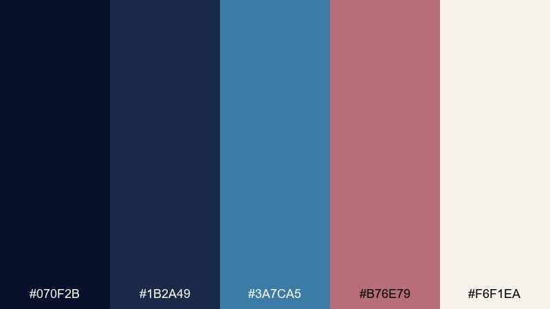
HEX: #070F2B #1B2A49 #3A7CA5 #B76E79 #F6F1EA
Mood: bold and atmospheric
Best for: nightclub event flyer
Bold and atmospheric, it reads like a late-night venue with a warm metallic glint on signage. The deep blues create instant mood, while the rose accent keeps the design stylish rather than harsh. Pair with condensed typography and minimal geometric shapes for high impact. Usage tip: keep the background nearly black-blue and use the brighter blue for dates so details pop.
Image example of nightfall nocturne generated using media.io
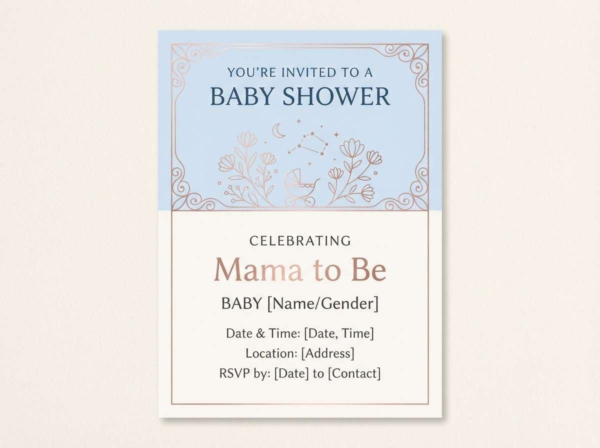
20) Porcelain Rose Quartz
HEX: #4A6FA5 #A7C4E0 #FFF7F1 #E6B7A9 #B76E79
Mood: sweet and elegant
Best for: baby shower invitation
Sweet and elegant, it feels like porcelain teacups and rose quartz crystals in soft daylight. The gentle blues keep the look airy, while the warm pinks add tenderness for a celebration theme. Pair with simple line illustrations and rounded corners for a friendly finish. Usage tip: use the cream as the background and apply rose only for the baby name to keep it delicate.
Image example of porcelain rose quartz generated using media.io
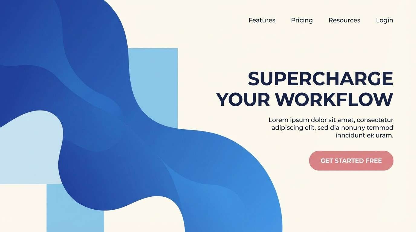
21) Sapphire Champagne Gradients
HEX: #0B1F3B #2F6F9F #7FB3D5 #D9A6A8 #F6F1EA
Mood: fresh and glossy
Best for: SaaS marketing header
Fresh and glossy, it suggests sapphire gel lighting with a champagne blush glow. Use these hues for a modern SaaS feel: crisp blues for trust, warm rose for friendly conversion moments. Pair with light gradients and sharp vector illustrations for a clean tech look. Usage tip: keep gradients subtle and place your CTA in solid color for accessibility.
Image example of sapphire champagne gradients generated using media.io
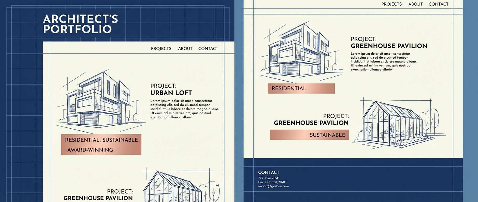
22) Rose Gold Blueprint
HEX: #0C2340 #1F4E79 #9FB3C8 #B76E79 #F6F1EA
Mood: structured and stylish
Best for: architect portfolio website
Structured and stylish, it feels like a blueprint page with a warm metallic mark over the plan. The deeper blues give an architectural seriousness, while the rose hint adds personality for personal branding. Pair with clean grids, thin rules, and lots of white space for a gallery-forward layout. Usage tip: use rose gold for hover states and project tags to keep the interface calm.
Image example of rose gold blueprint generated using media.io
What Colors Go Well with Blue Rose Gold?
Neutrals are the easiest wins: warm creams, off-whites, and soft grays help rose gold read metallic while keeping blues crisp. If you want extra contrast, try charcoal or near-black navy for a high-end finish.
For accent colors, muted greens (sage, eucalyptus) add a natural counterpoint, while lavender or dusty mauve can extend the romantic side without fighting the rose gold.
If you’re designing for digital, consider a light blue or blue-gray as a “buffer” between navy and rose gold. It smooths transitions and makes gradients, cards, and sections feel more cohesive.
How to Use a Blue Rose Gold Color Palette in Real Designs
Start with role assignment: use deep blue for text or primary surfaces, a mid blue for secondary UI or section blocks, and a warm neutral as your background. Then treat rose gold like a spotlight for CTAs, icons, thin rules, and key highlights.
For print (invitations, menus, packaging), rose gold works best as a foil or simulated metallic accent rather than large flat fills. On screen, keep rose gold saturation controlled so it doesn’t drift into “pink” unless that’s the goal.
Always check contrast for accessibility, especially when pairing rose gold text on light backgrounds. When in doubt, set body copy in navy/charcoal and save rose gold for short labels or decorative moments.
Create Blue Rose Gold Palette Visuals with AI
Want to preview how your blue rose gold palette will look in a landing page, invitation, poster, or packaging mockup? Generate fast concept visuals and iterate on mood, lighting, and layout before committing to a final design.
With Media.io’s text-to-image tool, you can paste a prompt (like the ones above), refine style and aspect ratio, and create multiple variations in minutes—ideal for mood boards, client pitches, and A/B testing.
Blue Rose Gold Color Palette FAQs
-
What is a blue rose gold color palette?
A blue rose gold color palette combines one or more blues (often navy, steel blue, or pastel blue) with rose gold tones (warm pink-copper hues) plus supporting neutrals like cream or light gray. -
Is rose gold better as a main color or an accent with blue?
In most designs, rose gold works best as an accent. Let blue carry the layout (backgrounds, typography, navigation), and use rose gold for CTAs, dividers, icons, or foil-like highlights to avoid an overly pink result. -
What blue goes best with rose gold?
Navy and deep slate blues create the most “luxe” contrast with rose gold. For a softer look, use dusty sapphire, denim blue, or light icy blues paired with cream. -
Are blue and rose gold good wedding colors?
Yes. Blue brings formality and readability (great for text), while rose gold adds romance and a premium feel. It’s especially popular for invitations, wedding websites, and reception signage. -
How do I keep a blue and rose gold palette looking modern?
Use plenty of whitespace, limit metallic accents, and choose clean typography. Add a blue-gray bridge color for UI cards/sections, and keep gradients subtle for a contemporary finish. -
What background color should I use with blue rose gold?
Warm off-white/cream is the safest background because it makes both navy and rose gold look richer. Light cool gray also works well for corporate or UI-heavy layouts. -
Can I use blue rose gold palettes in UI design without hurting accessibility?
Yes—set body text in dark blue/charcoal on light backgrounds, and use rose gold for small accents rather than long text. Always verify contrast ratios for buttons and key UI states.
Next: Halloween Color Palette


