

Rose gold pink is the sweet spot between warm metallic luxury and soft blush comfort. It flatters skin tones, photographs beautifully, and instantly adds a polished, romantic feel.
Below are curated rose gold pink color palette ideas with HEX codes you can use for branding, UI, weddings, packaging, and more—plus AI prompts to generate matching visuals.
In this article
- Why Rose Gold Pink Palettes Work So Well
-
- satin blush
- champagne petal
- copper rosé glow
- dusty rose quartz
- ballet slipper
- mauve metallic
- peach rosé
- nude rose studio
- rosewater silk
- antique pink foil
- sunset blush
- soft terracotta pink
- creamy rose latte
- pink champagne fizz
- warm pearl rose
- vintage vanity
- minimal rosé grid
- petal botanical
- bridal glow
- modern rose gold ui
- rosé clay contrast
- rose gold nightfall
- What Colors Go Well with Rose Gold Pink?
- How to Use a Rose Gold Pink Color Palette in Real Designs
- Create Rose Gold Pink Palette Visuals with AI
Why Rose Gold Pink Palettes Work So Well
Rose gold pink combines the warmth of coppery metals with the softness of blush, so it feels both premium and approachable. That balance makes it a reliable choice for everything from wedding suites to modern product UI.
These palettes also play nicely with neutrals like cream, ivory, taupe, and espresso—colors that keep layouts breathable and help rose tones look refined instead of overly sweet.
Because rose gold pink naturally suggests sheen and glow, it’s ideal for gradients, highlights, and subtle accents that elevate a design without overwhelming it.
20+ Rose Gold Pink Color Palette Ideas (with HEX Codes)
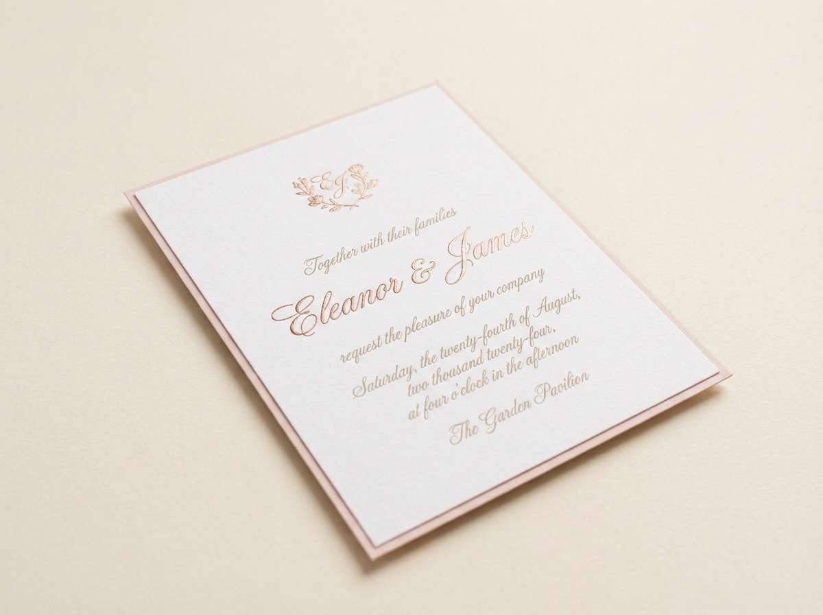
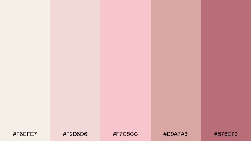
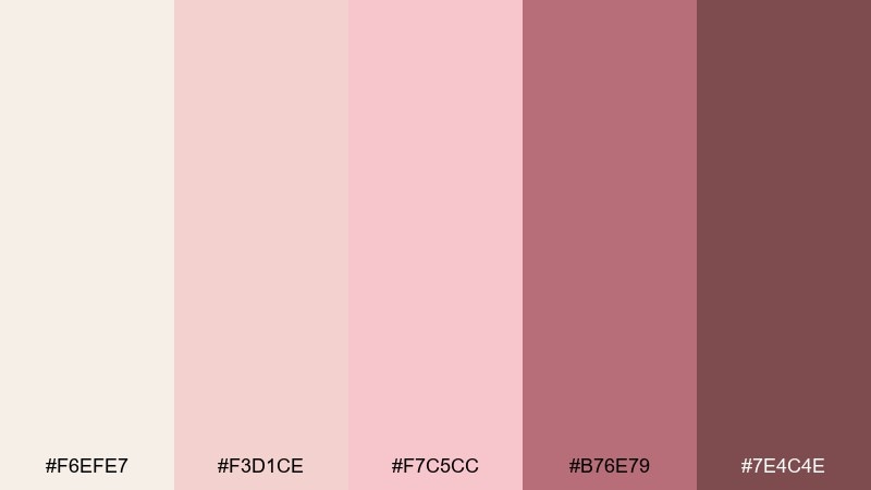
1) Satin Blush
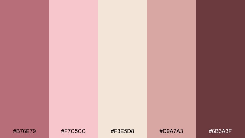
HEX: #B76E79 #F7C5CC #F3E5D8 #D9A7A3 #6B3A3F
Mood: soft, romantic, polished
Best for: wedding stationery and invitations
Soft, romantic, polished tones that feel like satin ribbons and candlelight. Use the blush and champagne shades for backgrounds, then bring in the deeper berry for names and section headers. Pair it with warm ivory paper textures and a thin metallic-ink line for a refined finish. Tip: keep contrast readable by reserving the darkest swatch for body text and key details.
Image example of satin blush generated using media.io
Media.io is an online AI studio for creating and editing video, image, and audio in your browser.

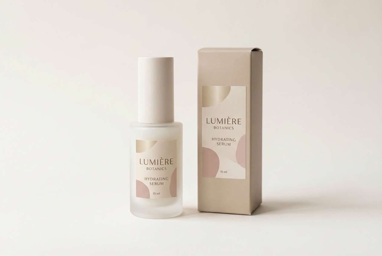
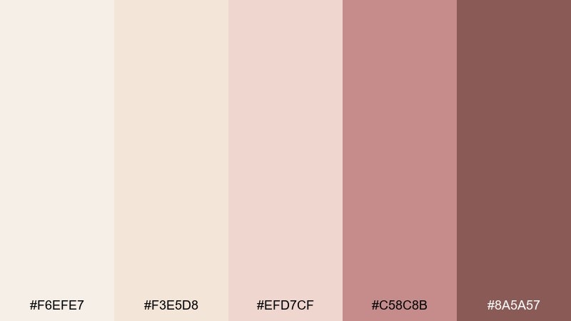
2) Champagne Petal
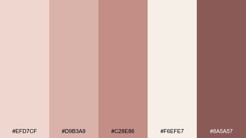
HEX: #EFD7CF #D9B3A9 #C28E86 #F6EFE7 #8A5A57
Mood: airy, gentle, upscale
Best for: skincare packaging and labels
Airy, gentle, upscale hues that read like champagne foam with a pink petal tint. The creamy off-white keeps the look clean while the mid roses add a premium warmth. Pair with soft matte finishes, rounded sans-serif type, and minimal icons for a modern shelf-ready vibe. Tip: use the deepest rose only for ingredient headings so the label stays calm and luxurious.
Image example of champagne petal generated using media.io
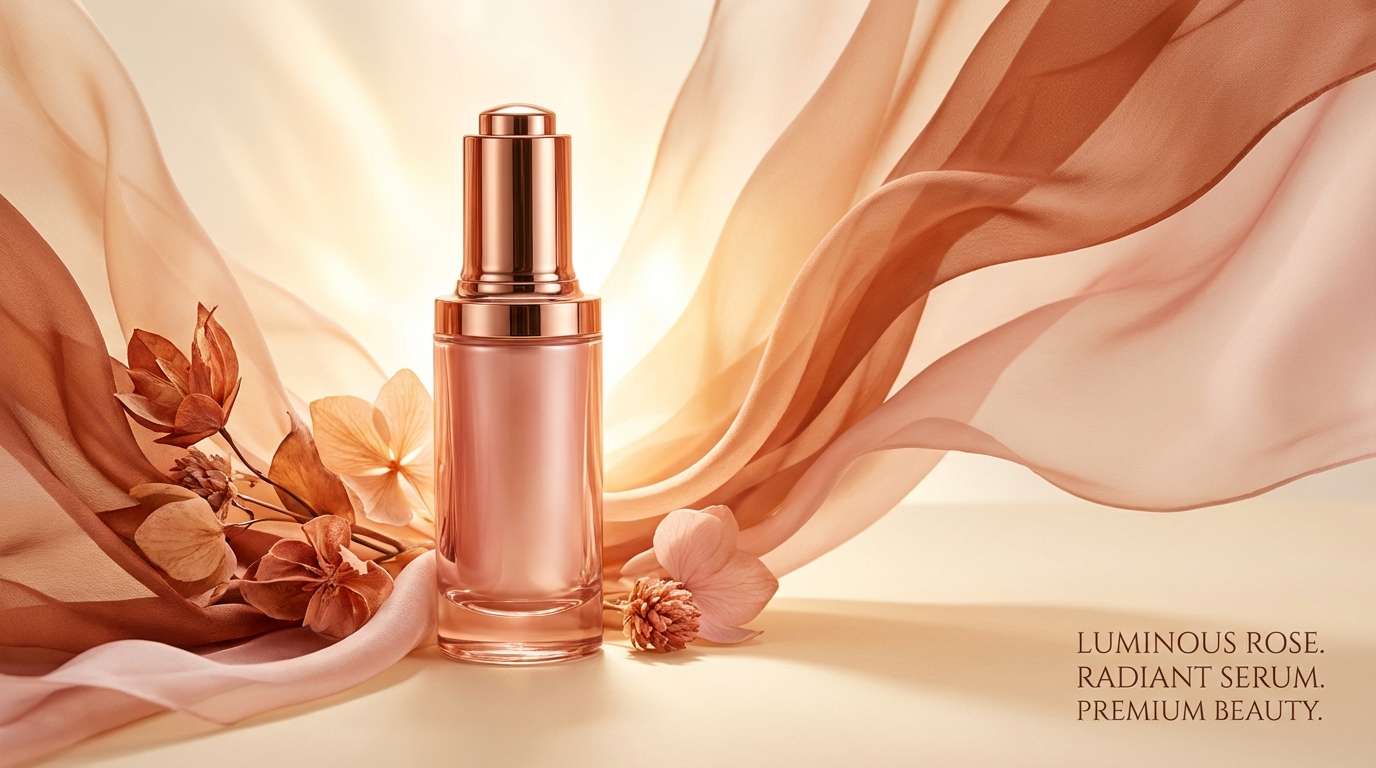
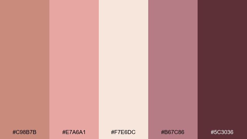
3) Copper Rosé Glow
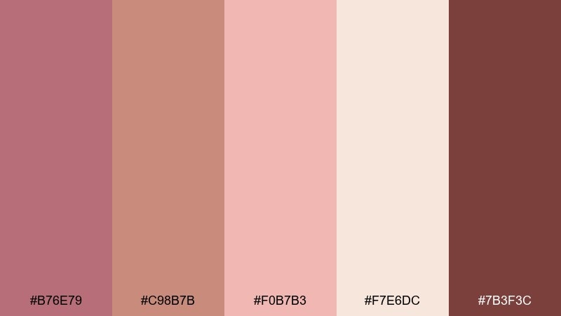
HEX: #B76E79 #C98B7B #F0B7B3 #F7E6DC #7B3F3C
Mood: warm, radiant, celebratory
Best for: beauty ads and product hero banners
Warm, radiant, celebratory tones that look like copper light hitting a rosé drink at golden hour. These rose gold pink color combinations work best when copper is the hero and blush supports gradients and glow effects. Pair with clean white space and a single serif headline to keep it editorial, not busy. Tip: add a subtle grain overlay to make metallic tones feel more realistic on screen.
Image example of copper rosé glow generated using media.io
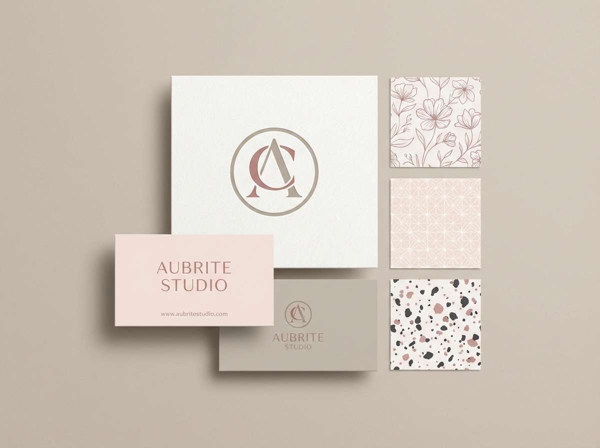
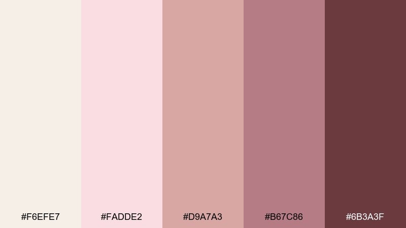
4) Dusty Rose Quartz
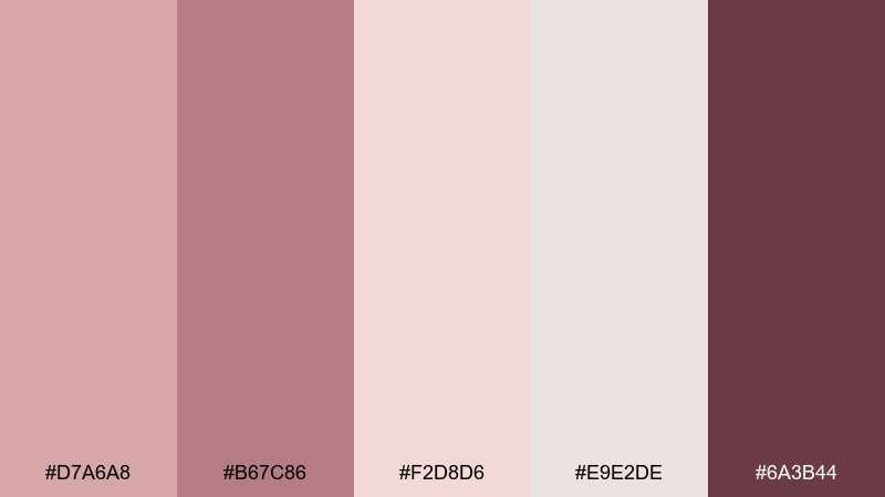
HEX: #D7A6A8 #B67C86 #F2D8D6 #E9E2DE #6A3B44
Mood: grounded, calm, modern
Best for: brand identity for wellness studios
Grounded, calm, modern shades that feel like rose quartz stone and soft linen. For a cohesive rose gold pink color scheme, lean on the dusty mid-tones for logos and set the pale neutrals as generous breathing room. Pair with natural materials like kraft, cotton textures, and minimal line art. Tip: keep saturation low across photos so the palette stays serene rather than sugary.
Image example of dusty rose quartz generated using media.io
5) Ballet Slipper
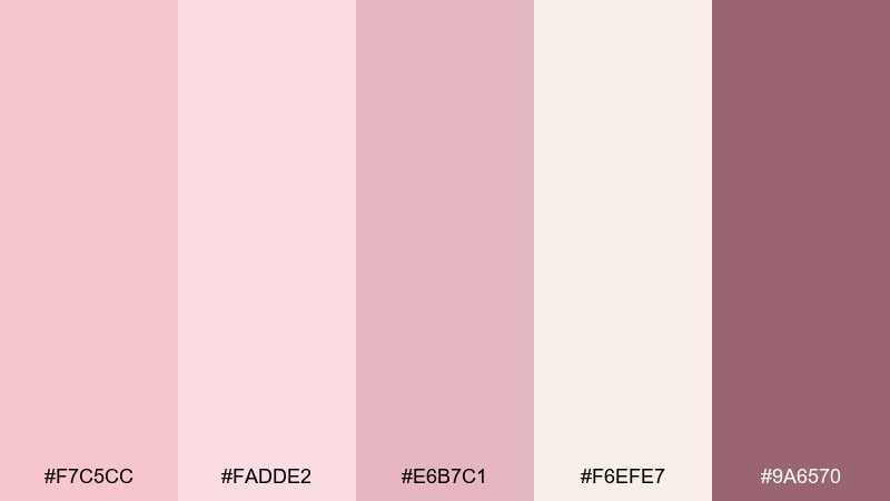
HEX: #F7C5CC #FADDE2 #E6B7C1 #F6EFE7 #9A6570
Mood: sweet, airy, delicate
Best for: baby shower invites and announcements
Sweet, airy, delicate tones that resemble tulle skirts and soft powder blush. Keep the lightest pinks as the base, then use the mauve-rose for names, dates, and important highlights. Pair with gentle illustrations, rounded corners, and lots of whitespace to avoid clutter. Tip: if printing, choose uncoated paper so the pale shades stay soft rather than shiny.
Image example of ballet slipper generated using media.io

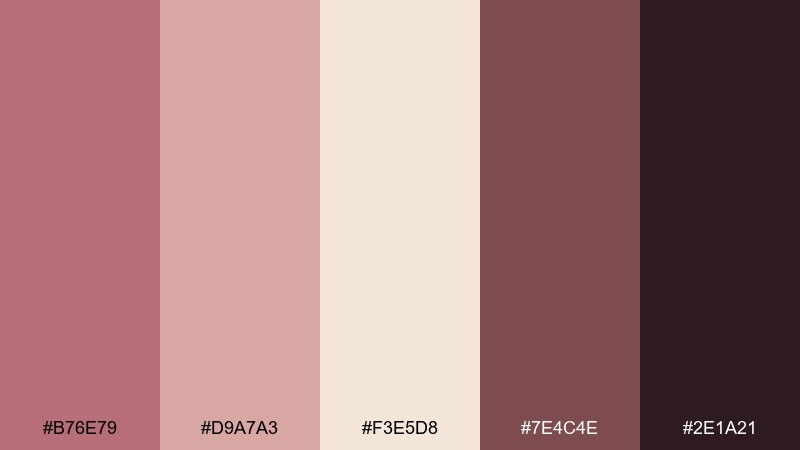
6) Mauve Metallic
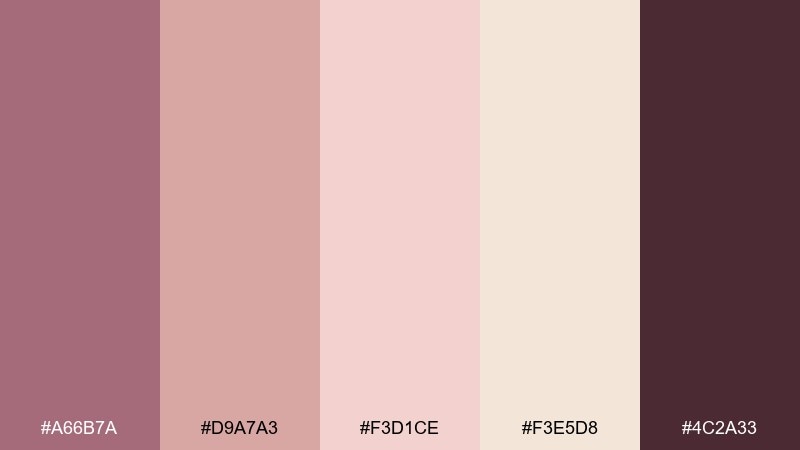
HEX: #A66B7A #D9A7A3 #F3D1CE #F3E5D8 #4C2A33
Mood: moody, luxe, fashion-forward
Best for: editorial covers and lookbooks
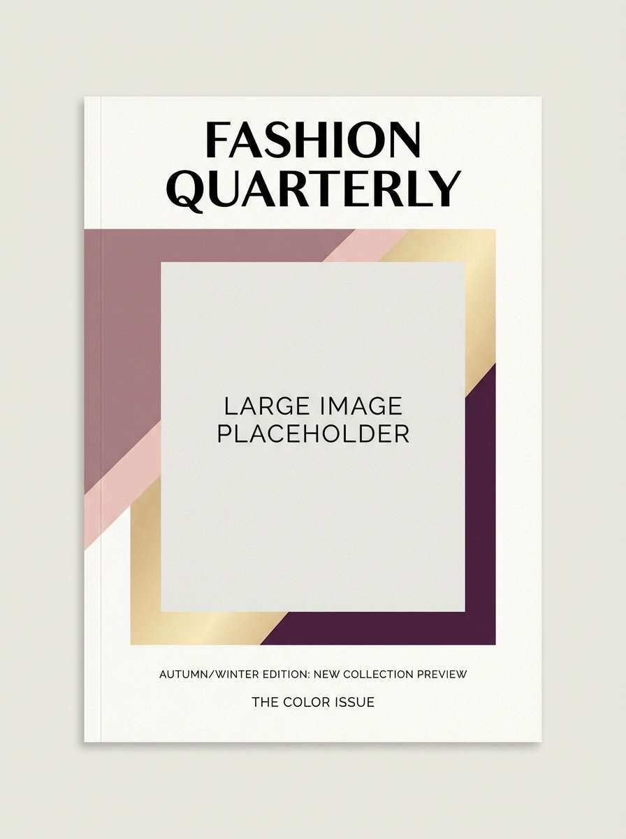
Moody, luxe, fashion-forward hues that feel like mauve velvet with a metallic sheen. Use the deep plum for mastheads and strong type, then soften the layout with champagne and blush blocks. Pair with high-contrast photography and minimalist grids for a runway-ready look. Tip: add a thin rose-gold rule line to separate sections without adding visual noise.
Image example of mauve metallic generated using media.io
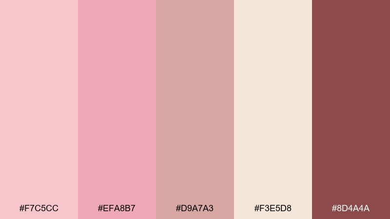
7) Peach Rosé
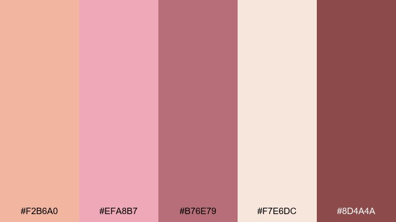
HEX: #F2B6A0 #EFA8B7 #B76E79 #F7E6DC #8D4A4A
Mood: sunlit, playful, warm
Best for: social posts for cafes and bakeries
Sunlit, playful, warm tones that evoke peach macarons and a chilled rosé on a patio. Let peach lead for appetizing warmth, while rose gold anchors headlines and stickers. Pair with creamy backgrounds and simple food photography to keep the feed cohesive. Tip: reserve the darkest shade for prices and calls to action so they pop in small mobile views.
Image example of peach rosé generated using media.io
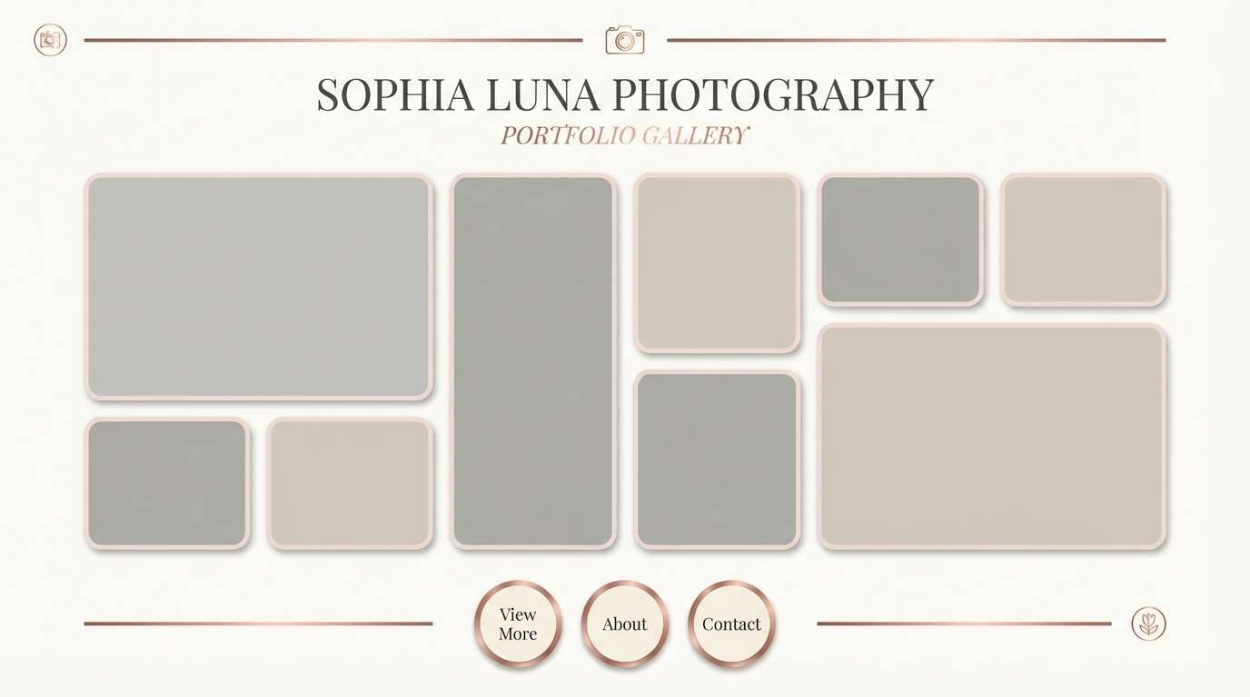
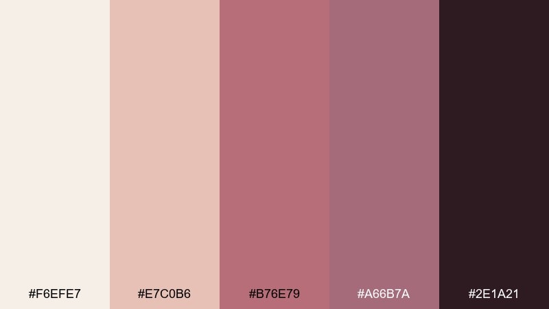
8) Nude Rose Studio
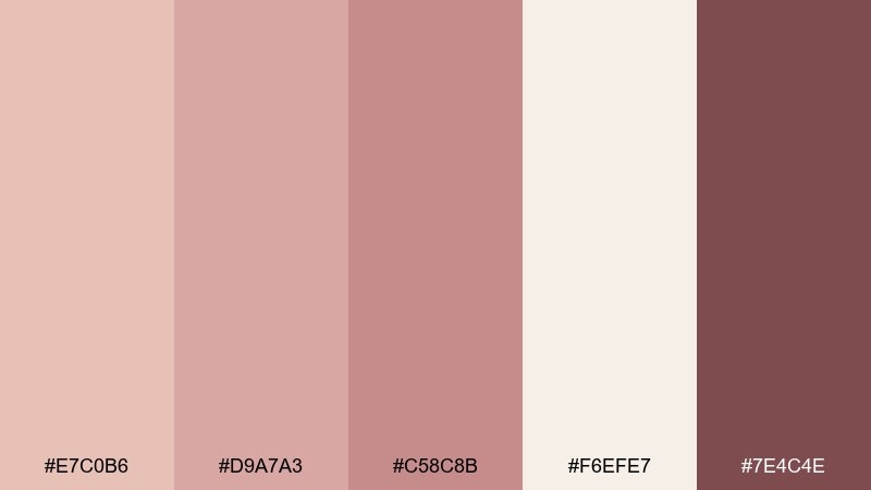
HEX: #E7C0B6 #D9A7A3 #C58C8B #F6EFE7 #7E4C4E
Mood: minimal, warm, professional
Best for: portfolio websites and case studies
Minimal, warm, professional tones that feel like a tidy studio desk and soft daylight. Use nude rose for section backgrounds, then bring in the deeper rose for links and hover states. Pair with black or deep-brown typography for legibility and a calm, premium finish. Tip: keep accent usage under 10 percent so the site reads clean and intentional.
Image example of nude rose studio generated using media.io
9) Rosewater Silk
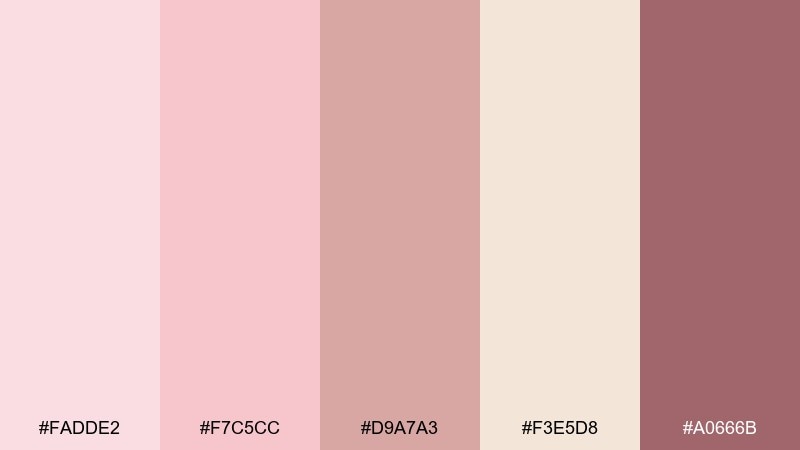
HEX: #FADDE2 #F7C5CC #D9A7A3 #F3E5D8 #A0666B
Mood: fresh, feminine, soothing
Best for: spa menus and service brochures
Fresh, feminine, soothing hues that resemble rosewater, steam, and silky towels. The pale pinks create a gentle base, while the muted rose adds structure to headings and price lists. Pair with thin dividers, airy line icons, and plenty of spacing for a relaxed read. Tip: use the champagne tone behind text blocks to reduce glare on glossy prints.
Image example of rosewater silk generated using media.io
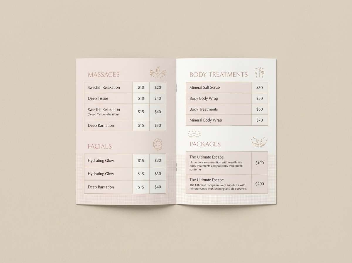
10) Antique Pink Foil
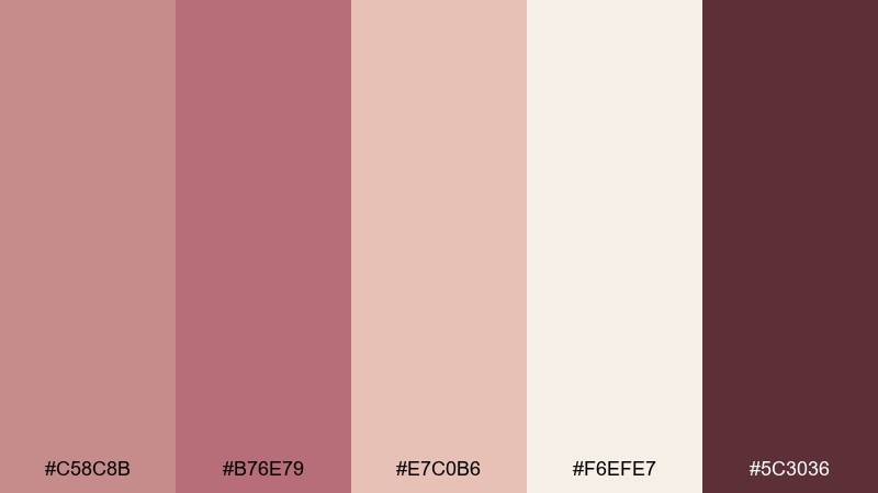
HEX: #C58C8B #B76E79 #E7C0B6 #F6EFE7 #5C3036
Mood: classic, ornate, intimate
Best for: event posters for galleries and salons
Classic, ornate, intimate tones that bring to mind antique frames and soft foil stamping. Use the deeper wine shade for titles and dates, then layer blush and cream for vintage-inspired panels. Pair with serif typography and subtle flourishes, but keep margins generous to avoid feeling dated. Tip: add a single metallic accent element, not multiple, to preserve the antique mood.
Image example of antique pink foil generated using media.io
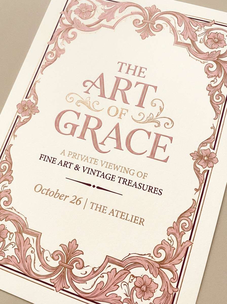
11) Sunset Blush
HEX: #F2B6A0 #EFA8B7 #D9848F #F7E6DC #7B3F3C
Mood: glowy, optimistic, energetic
Best for: seasonal campaigns and landing pages
Glowy, optimistic, energetic shades that feel like a sunset fading into blush clouds. Use the coral-peach as the main hero color for banners and buttons, then soften sections with warm cream. Pair with rounded UI elements and bold, friendly typography for an upbeat conversion-focused look. Tip: test button contrast against the cream background to keep CTAs accessible.
Image example of sunset blush generated using media.io

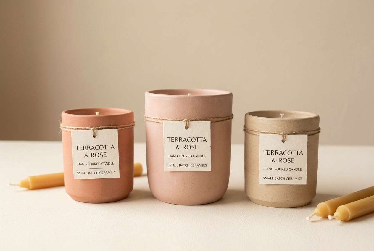
12) Soft Terracotta Pink
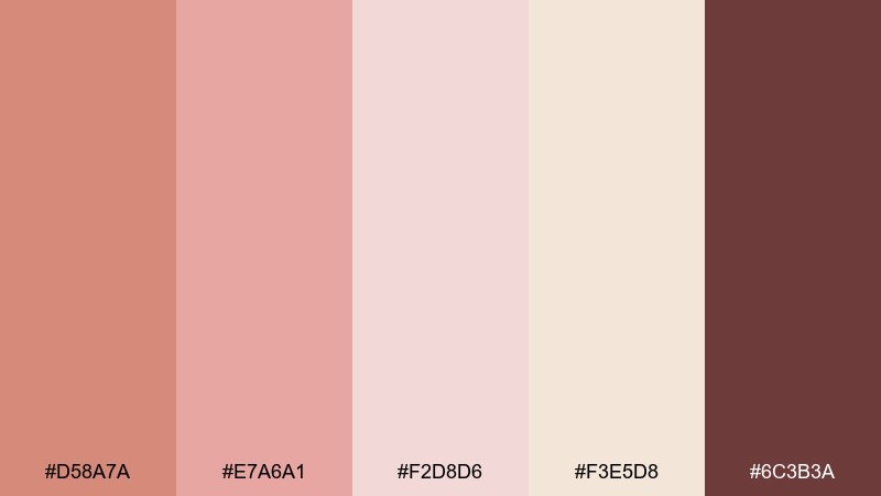
HEX: #D58A7A #E7A6A1 #F2D8D6 #F3E5D8 #6C3B3A
Mood: earthy, cozy, artisanal
Best for: ceramic and handmade product branding
Earthy, cozy, artisanal tones that evoke clay, glazed pottery, and warm studio light. Let terracotta lead on logos and packaging panels, then balance with blush and cream for a friendly handmade feel. Pair with textured paper, stamped marks, and simple geometric patterns. Tip: keep photography warm and slightly desaturated so the earthy swatches stay true.
Image example of soft terracotta pink generated using media.io
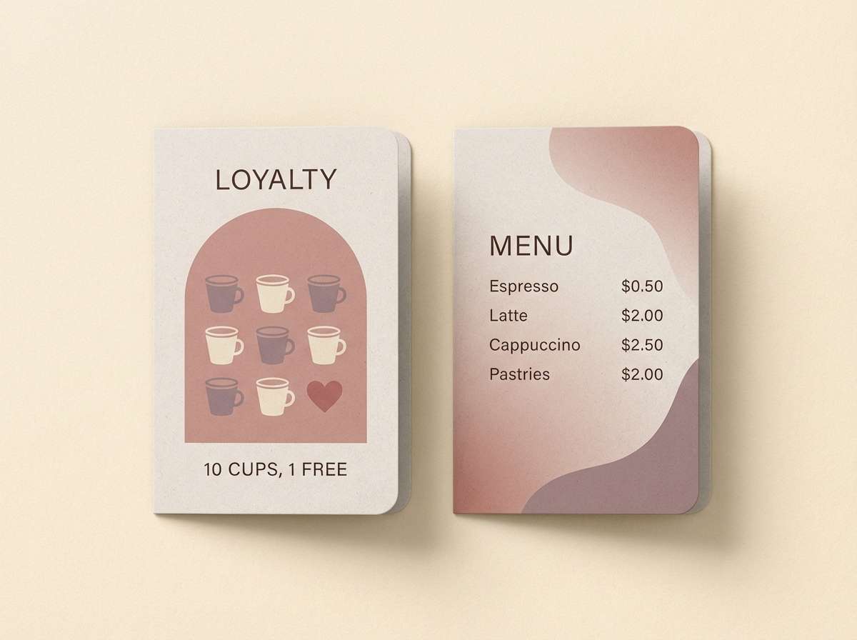
13) Creamy Rose Latte
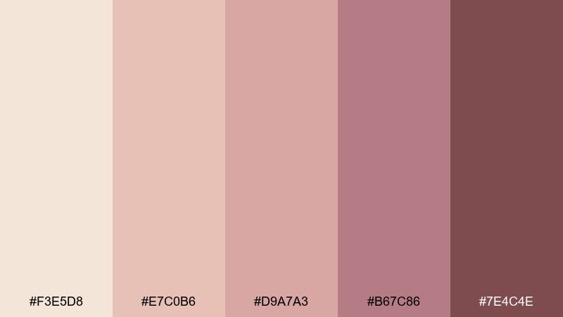
HEX: #F3E5D8 #E7C0B6 #D9A7A3 #B67C86 #7E4C4E
Mood: comforting, warm, understated
Best for: coffee shop menus and loyalty cards
Comforting, warm, understated shades that feel like a latte topped with rose foam. Use the creamy beige for menus and cards, then add the mid rose tones for categories and badges. Pair with clean icons and a muted photo style for a consistent counter-top experience. Tip: print the darkest shade slightly larger for tiny text so it stays crisp.
Image example of creamy rose latte generated using media.io
14) Pink Champagne Fizz
HEX: #F6EFE7 #F2D8D6 #F7C5CC #D9A7A3 #B76E79
Mood: sparkly, light, celebratory
Best for: party invitations and birthday flyers
Sparkly, light, celebratory colors that suggest bubbly champagne and confetti glow. Build the layout with soft cream and pale blush, then use rose gold for key text like time and venue. Pair with dot patterns, thin outlines, and playful type pairing to keep it festive but not loud. Tip: limit gradients to one focal area so the invite prints cleanly.
Image example of pink champagne fizz generated using media.io

15) Warm Pearl Rose
HEX: #F6EFE7 #F3E5D8 #EFD7CF #C58C8B #8A5A57
Mood: elegant, calm, timeless
Best for: luxury service websites and consultancies
Elegant, calm, timeless neutrals that read like warm pearls with a rosy undertone. Use the lightest two shades for page backgrounds and cards, then bring in the dusty rose for buttons and subtle highlights. Pair with dark espresso typography and plenty of whitespace for a premium, trustworthy feel. Tip: keep shadows soft and wide so the palette stays airy rather than heavy.
Image example of warm pearl rose generated using media.io
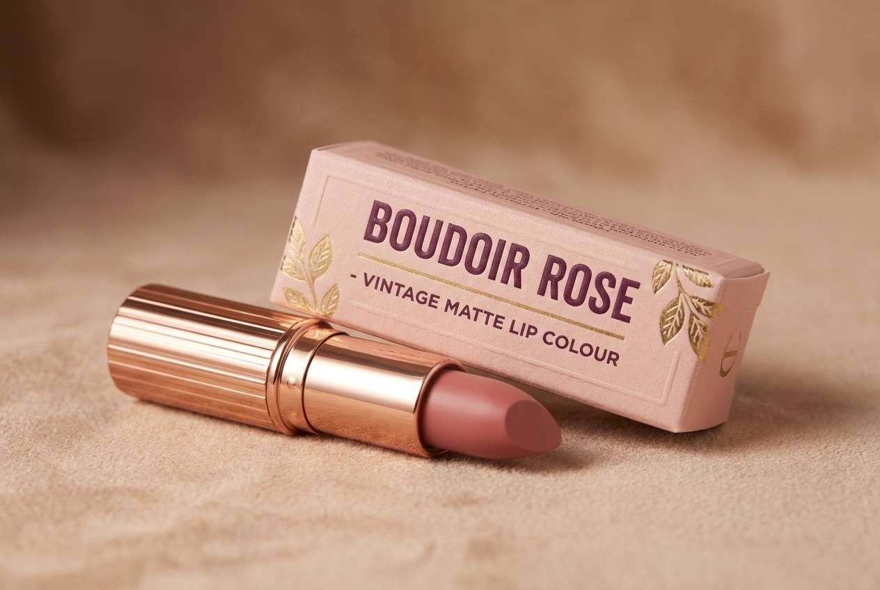
16) Vintage Vanity
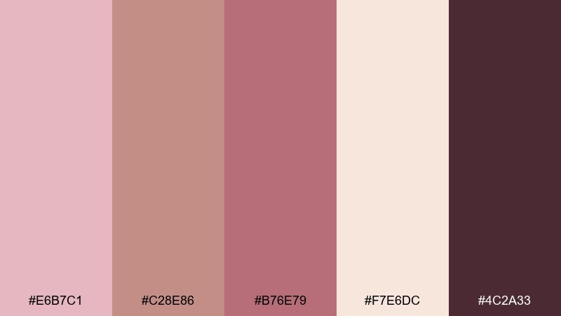
HEX: #E6B7C1 #C28E86 #B76E79 #F7E6DC #4C2A33
Mood: nostalgic, glamorous, dramatic
Best for: cosmetics branding and lipstick packaging
Nostalgic, glamorous, dramatic shades that feel like a vintage vanity mirror under warm bulbs. Make the deep plum the anchor for logos, then let blush and cream soften the overall presentation. Pair with gold-foil details and classic type to lean into old-Hollywood energy. Tip: use the coral-pink sparingly as a pop on seals or shade names.
Image example of vintage vanity generated using media.io
17) Minimal Rosé Grid
HEX: #F6EFE7 #FADDE2 #D9A7A3 #B67C86 #6B3A3F
Mood: clean, balanced, contemporary
Best for: presentation templates and pitch decks
Clean, balanced, contemporary tones that feel like a neatly spaced grid with a soft rosé wash. Use cream for slide backgrounds and apply the muted roses for charts, callouts, and section dividers. Pair with modern sans-serif type and minimal iconography so your content stays the focus. Tip: assign one accent color for data highlights and keep the rest as supporting neutrals.
Image example of minimal rosé grid generated using media.io

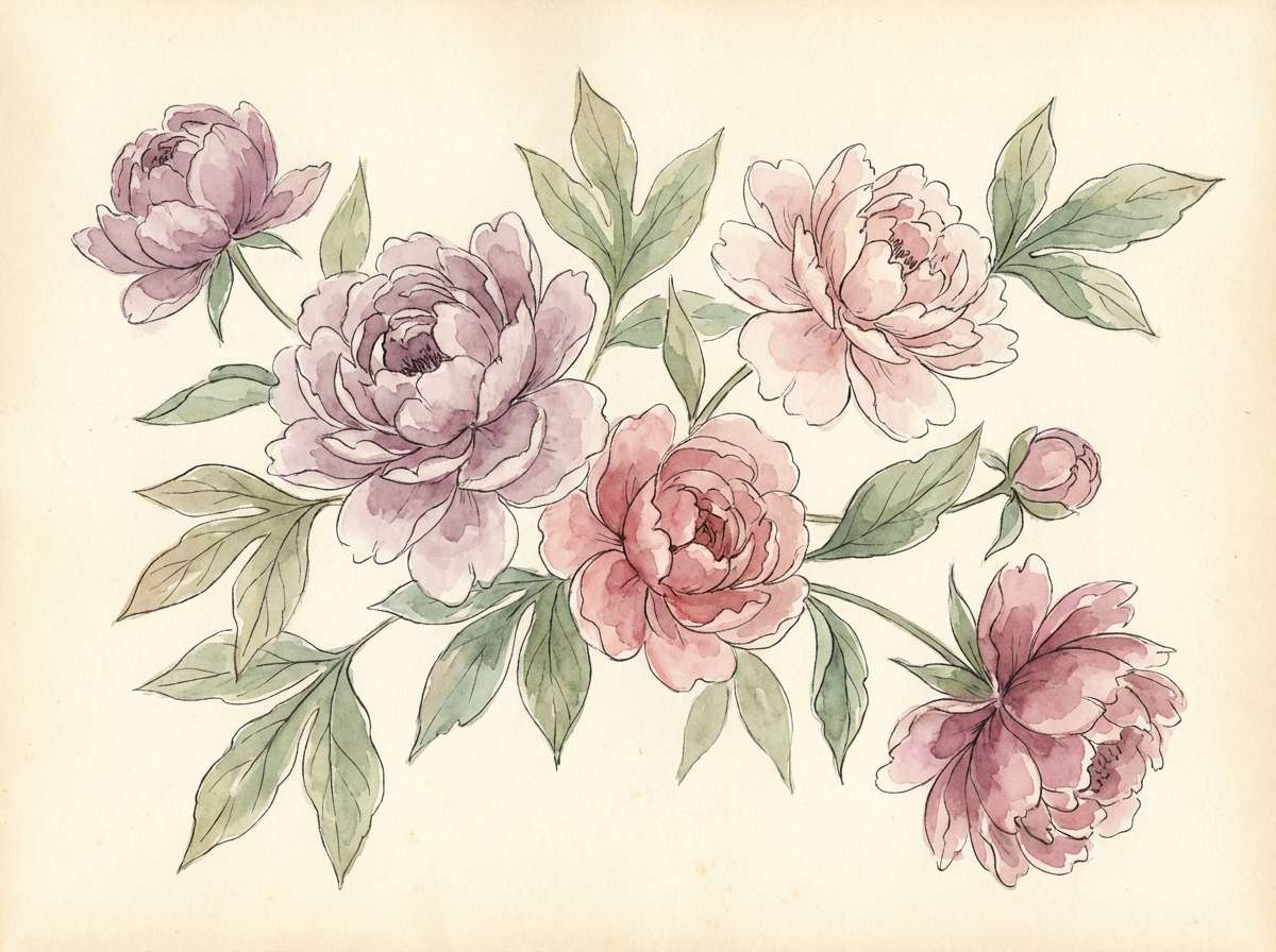
18) Petal Botanical
HEX: #F7C5CC #EFA8B7 #D9A7A3 #F3E5D8 #8D4A4A
Mood: fresh, floral, uplifting
Best for: spring botanical illustrations and prints
Fresh, floral, uplifting shades that look like petals layered over warm parchment. Let blush and rose lead the blooms, and use champagne as the paper tone for a soft spring feel. Pair with loose watercolor textures and fine ink outlines for contrast. Tip: keep the darkest shade for stems and tiny details so the illustration stays airy.
Image example of petal botanical generated using media.io
19) Bridal Glow
HEX: #F6EFE7 #F3D1CE #F7C5CC #B76E79 #7E4C4E
Mood: dreamy, luminous, romantic
Best for: bridal lookbooks and photographer galleries
Dreamy, luminous, romantic tones that feel like veil layers and soft flash glow. Use cream and pale blush as the main canvas, then add rose gold for buttons, highlights, and elegant separators. Pair with warm, film-like photography and plenty of negative space to keep the layout airy. Tip: keep hover and active states on the darker rose so the UI stays usable.
Image example of bridal glow generated using media.io
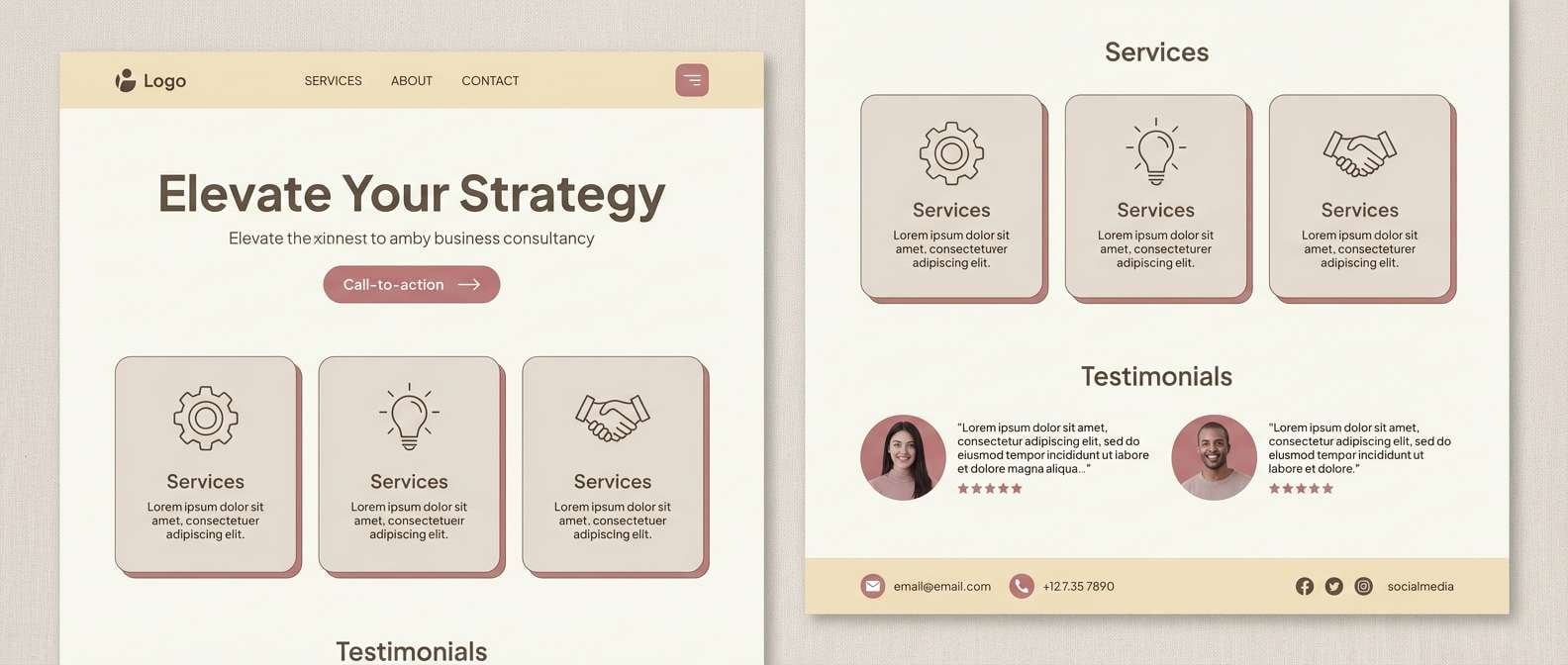
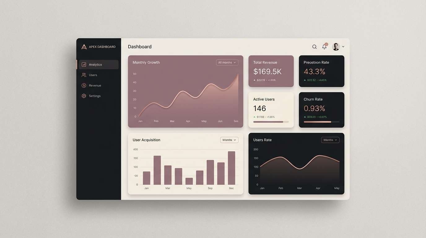
20) Modern Rose Gold UI
HEX: #F6EFE7 #E7C0B6 #B76E79 #A66B7A #2E1A21
Mood: sleek, premium, high-contrast
Best for: dashboard UI and SaaS branding
Sleek, premium, high-contrast tones that feel like polished metal against a dark studio backdrop. This rose gold pink color palette shines in dashboards when you use the near-black for navigation and reserve rose gold for active states. Pair with subtle borders and small-radius cards to keep it modern and readable. Tip: avoid using pink for error states so your UI language stays clear.
Image example of modern rose gold ui generated using media.io
21) Rosé Clay Contrast
HEX: #C98B7B #E7A6A1 #F7E6DC #B67C86 #5C3036
Mood: bold, earthy, confident
Best for: restaurant menus and signage
Bold, earthy, confident shades that bring together clay warmth and a rosy edge. Use the clay-copper tone for large blocks and signage, then balance it with warm cream so the layout does not feel heavy. Pair with condensed type for headings and a clean sans-serif for descriptions. Tip: set menu item names in the deepest shade to improve readability under dim lighting.
Image example of rosé clay contrast generated using media.io
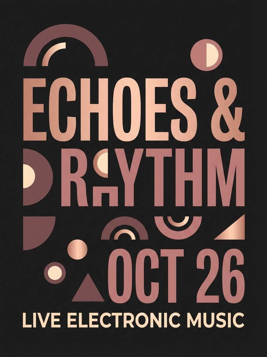
22) Rose Gold Nightfall
HEX: #B76E79 #D9A7A3 #F3E5D8 #7E4C4E #2E1A21
Mood: dramatic, intimate, sophisticated
Best for: music event promos and night launches
Dramatic, intimate, sophisticated tones that feel like nightfall with a rose-gold spotlight. These rose gold pink color combination choices work best with the dark base as the canvas and metallic rose as the highlight. Pair with bold typography and minimal shapes, keeping cream only for tiny contrast elements. Tip: use a soft vignette and subtle grain to make digital posters feel cinematic.
Image example of rose gold nightfall generated using media.io
What Colors Go Well with Rose Gold Pink?
Rose gold pink pairs naturally with warm neutrals like ivory, cream, and champagne beige, which keep the overall look light and elegant. These neutrals also help rose tones feel more “metallic” and less candy-like.
For contrast, reach for deep espresso, plum, or near-black accents—especially for typography, icons, and UI states. This combination keeps readability strong while preserving the romantic vibe.
If you want a fresher direction, add a muted sage or dusty blue in small doses. Cool accents can modernize a rose gold pink color scheme without clashing.
How to Use a Rose Gold Pink Color Palette in Real Designs
Start with a clear hierarchy: use cream or off-white as the base, mid rose tones for surfaces and secondary elements, and the darkest swatch for text and critical UI contrast. This keeps the palette usable across web and print.
Rose gold reads best as an accent, not a flood—think thin lines, separators, icons, hover states, or foil details in print. When you want a “metal” feel digitally, add gentle gradients and a light grain texture.
Before you finalize, test accessibility and printing: check contrast ratios for buttons and body text, and run a proof to ensure pale blush shades don’t disappear on certain papers.
Create Rose Gold Pink Palette Visuals with AI
If you’re building a moodboard, brand deck, or campaign, generating visuals that match your rose gold pink palette can save hours. The prompts above are designed to produce consistent lighting, materials, and composition.
In Media.io, you can tweak the prompt style (minimal, realistic, watercolor, editorial) and iterate quickly until the tones match your HEX direction. Keep one prompt template and swap the scene (packaging, UI, invitation) to stay cohesive.
Once you have your images, use them as hero banners, mockups, or social creatives—then fine-tune with small color corrections to align with your final swatches.
Rose Gold Pink Color Palette FAQs
-
What is the HEX code for classic rose gold pink?
A widely used rose gold pink HEX is #B76E79. It’s a muted pink with warm, coppery undertones that works well for both print and digital accents. -
Is rose gold pink considered warm or cool?
Most rose gold pink tones are warm because they lean toward copper, peach, and champagne beige. Some “dusty rose” variations can feel more neutral when mixed with gray. -
What neutral colors match rose gold pink best?
Warm neutrals like ivory, cream, champagne, and beige are the easiest match. For typography and strong contrast, use espresso brown, plum, or near-black. -
Can I use rose gold pink in a professional brand identity?
Yes—keep the palette minimal and let rose gold pink act as an accent. Pair it with clean typography, generous whitespace, and deeper text colors for a modern, premium look. -
How do I make rose gold look metallic on screens?
Use subtle gradients (light-to-dark within the same hue), soft highlights, and a light grain texture. Avoid flat, fully saturated pink blocks if you want a believable metallic feel. -
What colors should I avoid pairing with rose gold pink?
Very neon hues can overpower it, and using bright red for alerts in a pink-heavy UI can confuse visual meaning. If you need a bold accent, choose deep plum, espresso, or a muted complementary tone instead. -
What’s a good rose gold pink palette for UI accessibility?
Choose a dark anchor (like #2E1A21) for navigation and text, then use rose gold pink for active states and highlights. Always test contrast for buttons and body text on cream backgrounds.
Next: Pastel Color Palette


