

Pastel color palettes are the go-to choice when you want designs to feel light, friendly, and modern without relying on loud saturation. They’re especially popular in branding, UI, weddings, and social templates because they keep the mood upbeat while staying easy on the eyes.
Below you’ll find 20 curated pastel palettes with HEX codes, plus tips on pairing pastels with neutrals and darker accents so your layouts stay readable across web, print, and mobile.
In this article
- Why Pastel Palettes Work So Well
-
- cotton candy haze
- mint macaron
- lavender milk
- peach sorbet
- seafoam mist
- rose quartz glow
- buttercream dream
- powder blue daybreak
- lilac lemonade
- pistachio pearl
- blush sand
- apricot cloud
- icy lilypad
- baby pink minimal
- soft rainbow grid
- vintage nursery
- spring market
- wedding pastels
- kawaii stationery
- calm dashboard
- What Colors Go Well with Pastel?
- How to Use a Pastel Color Palette in Real Designs
- Create Pastel Palette Visuals with AI
Why Pastel Palettes Work So Well
Pastels create a soft visual temperature that feels welcoming, calm, and “safe,” which makes them a strong fit for brands that want approachability. Because they’re tinted with white, they tend to look airy and premium—especially when combined with generous spacing.
In UI design, pastel palettes reduce perceived friction: backgrounds and panels feel gentle, and users can focus on hierarchy and content instead of fighting high-contrast color blocks. The key is pairing pastels with a crisp text color so accessibility doesn’t suffer.
For print and social, pastel color combinations photograph and export well because they avoid harsh clipping. With the right accent (often a deeper neutral), pastels can feel playful or elegant without becoming childish.
20+ Pastel Color Palette Ideas (with HEX Codes)
1) Cotton Candy Haze
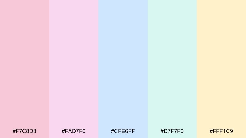
HEX: #F7C8D8 #FAD7F0 #CFE6FF #D7F7F0 #FFF1C9
Mood: dreamy, playful, airy
Best for: social post template
Dreamy and sugary like a fairground sky at sunset, these soft tints feel light without turning flat. Use it for cheerful social templates, beauty promos, and lifestyle quotes where you want warmth and openness. Pair with rounded sans typography and plenty of white space to keep it modern. Tip: make #CFE6FF your background, then use #F7C8D8 for buttons or callouts.
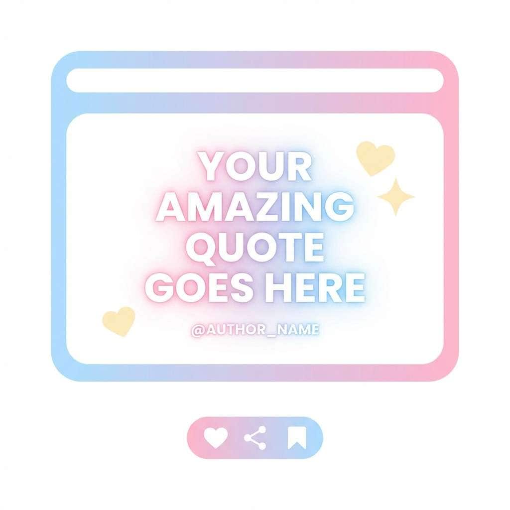
Image example of cotton candy haze generated using media.io
Media.io is an online AI studio for creating and editing video, image, and audio in your browser.

2) Mint Macaron
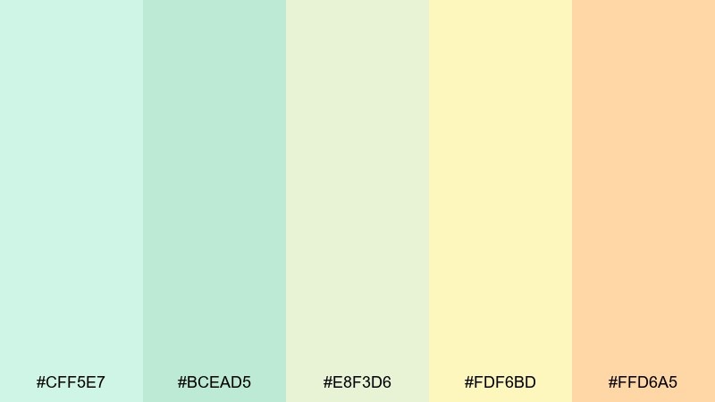
HEX: #CFF5E7 #BCEAD5 #E8F3D6 #FDF6BD #FFD6A5
Mood: fresh, sunny, friendly
Best for: cafe menu flyer
Fresh and snackable like a spring bakery counter, this mix balances cool mint with gentle citrus warmth. It works beautifully for cafe menus, brunch flyers, and lighthearted event signage. Pair with a hand-drawn accent icon set and a clean serif for headings to add charm. Tip: keep #FDF6BD as the main paper tone, then use #BCEAD5 for section blocks.
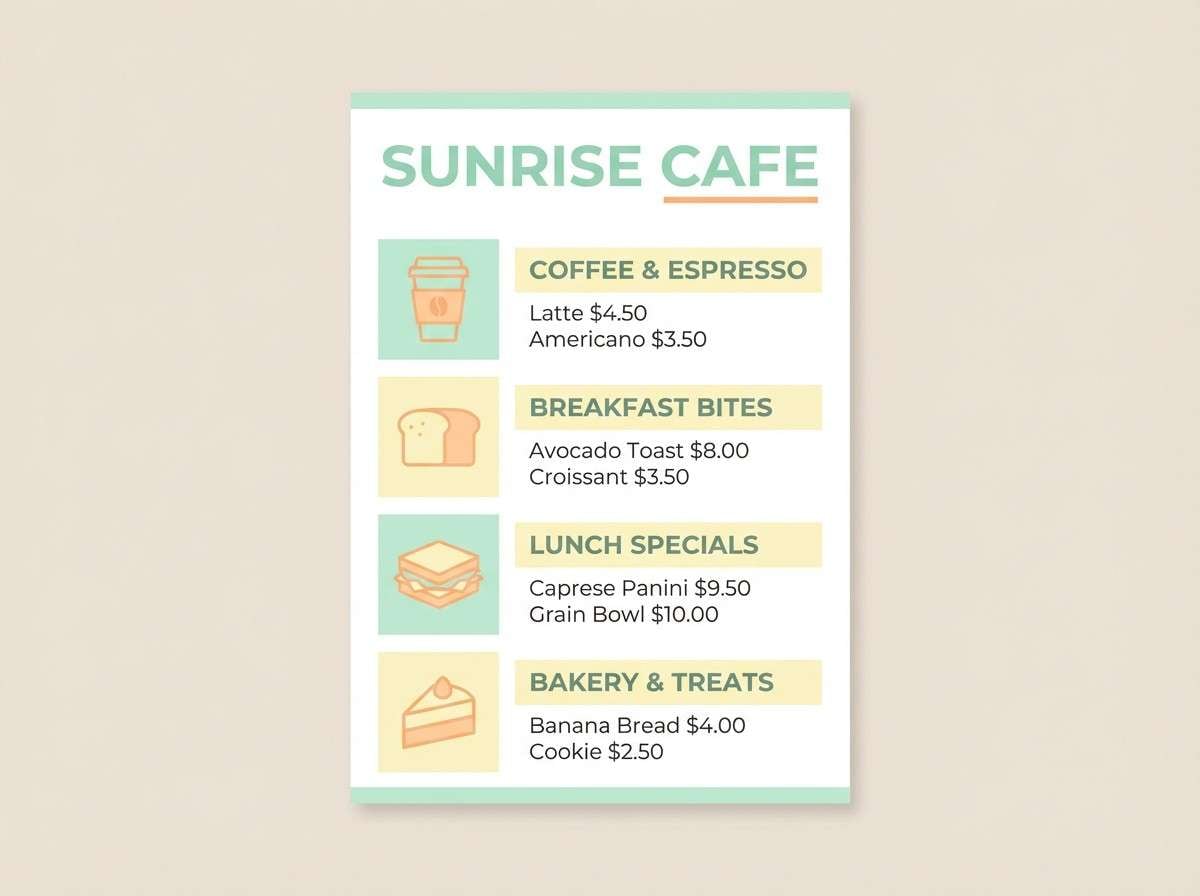
Image example of mint macaron generated using media.io
3) Lavender Milk
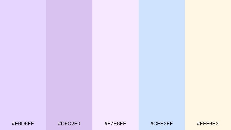
HEX: #E6D6FF #D9C2F0 #F7E8FF #CFE3FF #FFF6E3
Mood: calm, delicate, cozy
Best for: wellness brand identity
Calm and comforting like a warm lavender latte, these tones feel soft but still polished. Use them for wellness branding, sleep products, or gentle self-care packaging where trust and ease matter. Pair with thin line illustrations and a muted charcoal for legibility. Tip: reserve #D9C2F0 for logos or seals and let #F7E8FF carry the background.
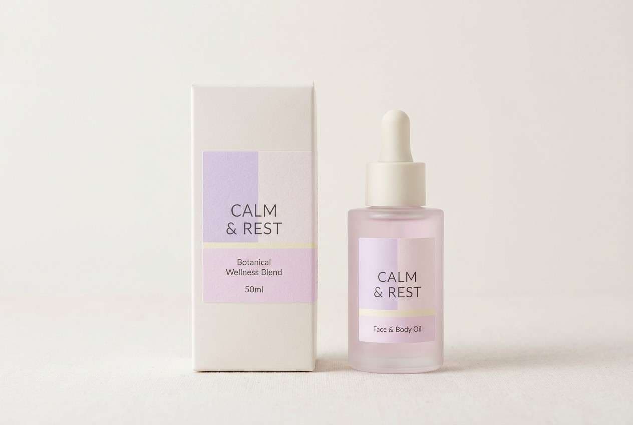
Image example of lavender milk generated using media.io
4) Peach Sorbet
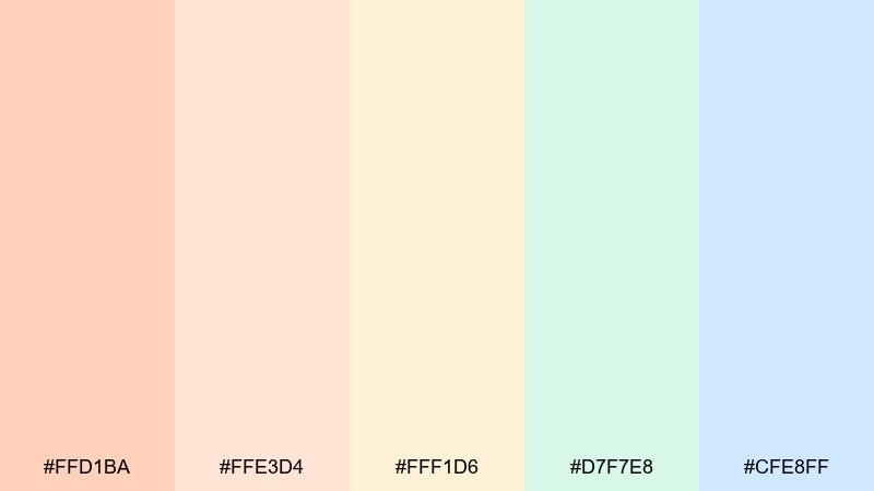
HEX: #FFD1BA #FFE3D4 #FFF1D6 #D7F7E8 #CFE8FF
Mood: warm, welcoming, breezy
Best for: blog hero banner
Warm and breezy like a sunlit kitchen, this blend leans peachy with a cool splash of sky and mint. It is a strong fit for blog hero banners, recipe headers, and creator portfolios that need a friendly first impression. Pair with soft grain textures and minimal icons for a modern editorial feel. Tip: use #FFD1BA as the main color wash and keep text in a deep gray for contrast.
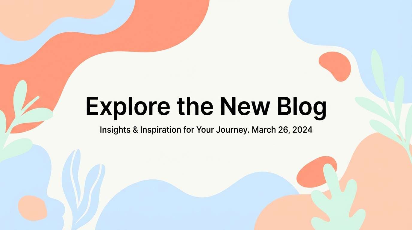
Image example of peach sorbet generated using media.io
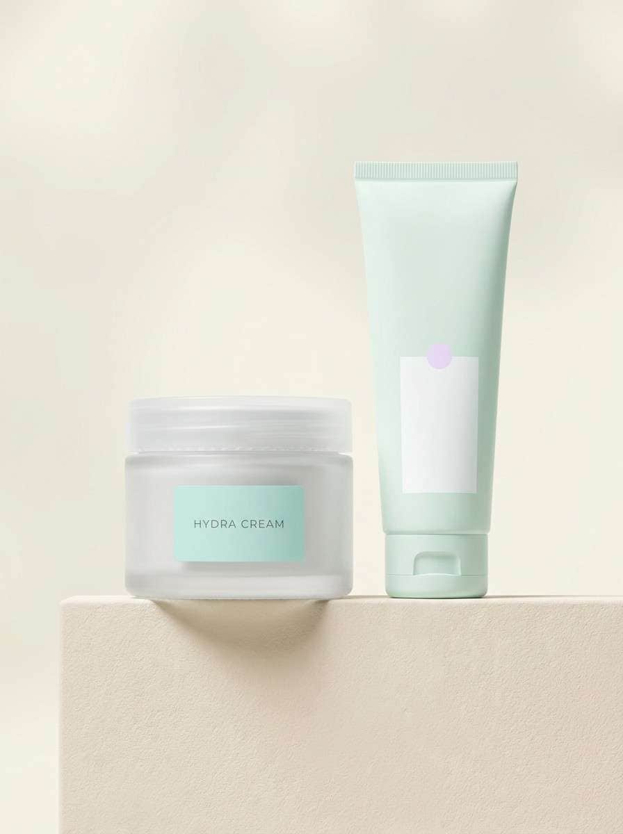
5) Seafoam Mist
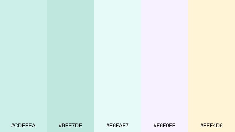
HEX: #CDEFEA #BFE7DE #E6FAF7 #F6F0FF #FFF4D6
Mood: spa-like, clean, soothing
Best for: bath and skincare product ad
Spa-like and coastal, these watery greens and airy lilacs feel like mist rolling over a quiet shore. For brands that want softness without sweetness, these pastel color combinations read clean and premium in ads. Pair with minimalist packaging, gentle gradients, and a single dark accent for copy. Tip: let #E6FAF7 dominate the background and use #BFE7DE for product highlights.
Image example of seafoam mist generated using media.io
6) Rose Quartz Glow
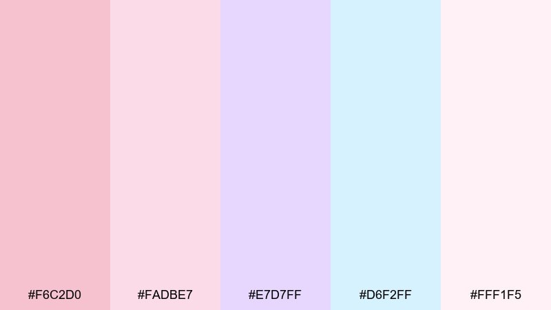
HEX: #F6C2D0 #FADBE7 #E7D7FF #D6F2FF #FFF1F5
Mood: romantic, glossy, gentle
Best for: beauty landing page UI
Romantic and glossy, this set feels like soft-focus makeup lighting with a hint of cool shimmer. It is ideal for a beauty landing page UI where you want delicate color blocks and clear CTAs. Pair with plenty of negative space and subtle drop shadows to keep the interface crisp. Tip: make buttons #F6C2D0 and use #D6F2FF as a calm section divider.
Image example of rose quartz glow generated using media.io

7) Buttercream Dream
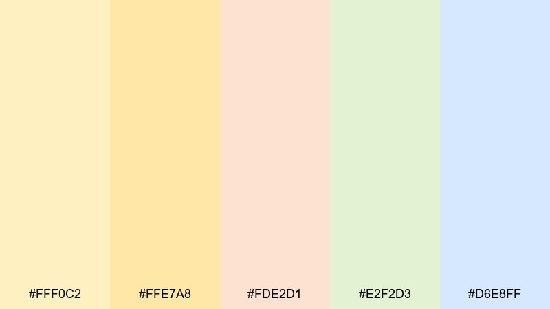
HEX: #FFF0C2 #FFE7A8 #FDE2D1 #E2F2D3 #D6E8FF
Mood: cheerful, soft, optimistic
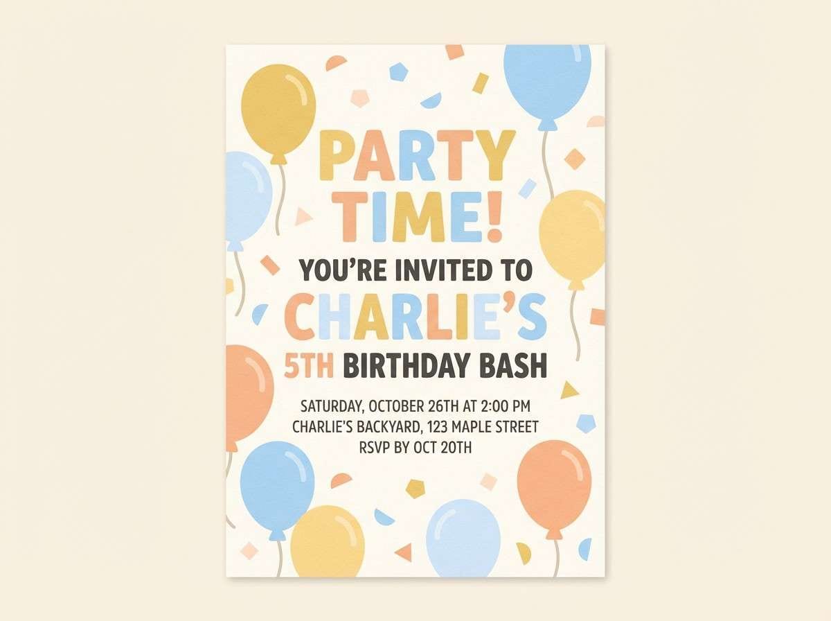
Best for: kids birthday invitation
Cheerful and light like frosted cake, these hues keep things bright without shouting. They suit kids birthday invitations, classroom posters, and playful family event graphics. Pair with chunky type, simple doodles, and a clean cream backdrop so the colors stay readable. Tip: keep text dark and use #FFE7A8 as the main card color for a sunny base.
Image example of buttercream dream generated using media.io
8) Powder Blue Daybreak
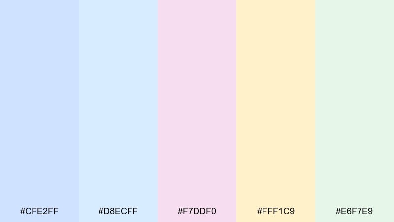
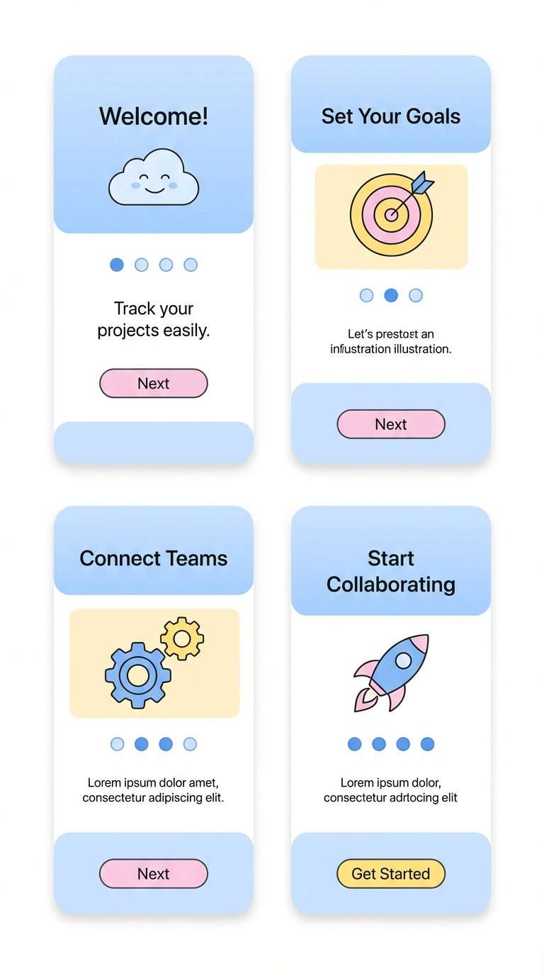
HEX: #CFE2FF #D8ECFF #F7DDF0 #FFF1C9 #E6F7E9
Mood: uplifting, airy, optimistic
Best for: SaaS onboarding screens
Uplifting like a clear morning, this mix combines powder blues with a gentle blush and butter highlight. It works well for SaaS onboarding screens where you want a friendly, low-stress flow. Pair with simple illustrations and one strong accent color for progress indicators. Tip: use #CFE2FF for hero panels and #FFF1C9 to highlight key tips.
Image example of powder blue daybreak generated using media.io
9) Lilac Lemonade
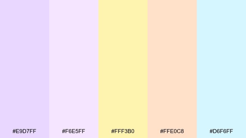
HEX: #E9D7FF #F6E5FF #FFF3B0 #FFE0C8 #D6F6FF
Mood: quirky, bright, upbeat
Best for: summer event poster
Quirky and upbeat, lilac and lemonade yellow create a punchy but still soft contrast. Use it for summer event posters, pop-up announcements, and campus flyers that need to feel fun and approachable. Pair with bold typography and simple geometric shapes to keep the layout energetic. Tip: treat #FFF3B0 as a spotlight color for dates and venue details.
Image example of lilac lemonade generated using media.io

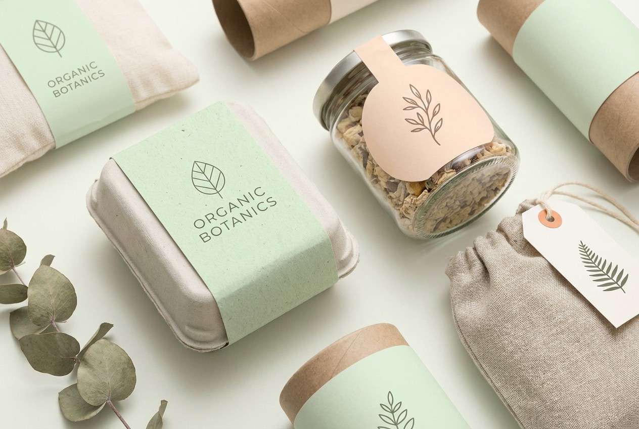
10) Pistachio Pearl
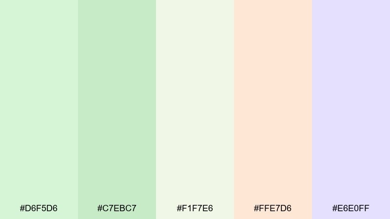
HEX: #D6F5D6 #C7EBC7 #F1F7E6 #FFE7D6 #E6E0FF
Mood: light, natural, refined
Best for: eco packaging design
Light and natural, pistachio greens with creamy neutrals feel fresh and responsibly made. This set is a great match for eco packaging, organic labels, and sustainable product lines. Pair with kraft textures, thin serif type, and minimal icons for ingredients and certifications. Tip: keep the main label area #F1F7E6 and use #C7EBC7 for badges or stamps.
Image example of pistachio pearl generated using media.io
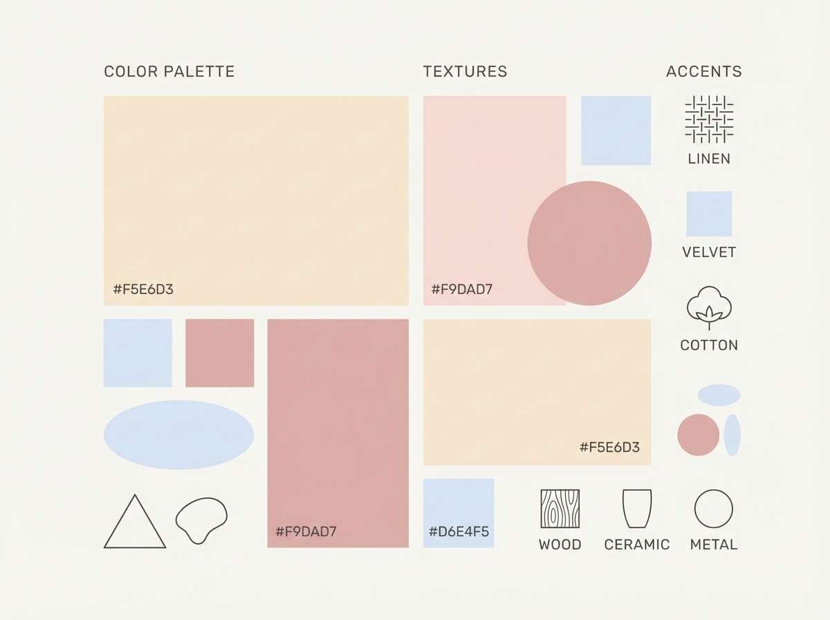
11) Blush Sand
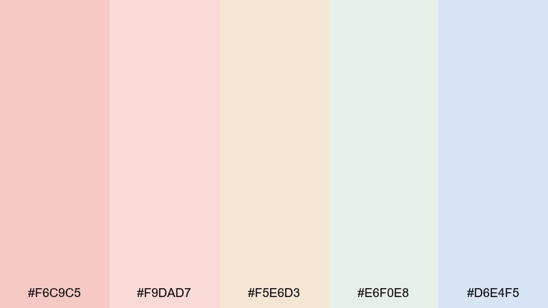
HEX: #F6C9C5 #F9DAD7 #F5E6D3 #E6F0E8 #D6E4F5
Mood: neutral, warm, understated
Best for: interior design mood board
Understated and warm, these tones feel like linen, plaster, and soft morning light. They are perfect for interior design mood boards, minimal lifestyle brands, and calm presentation decks. Pair with natural textures and a single deep brown or charcoal for headings. Tip: use #F5E6D3 as the base, then layer #D6E4F5 in small panels to cool the mix.
Image example of blush sand generated using media.io
12) Apricot Cloud
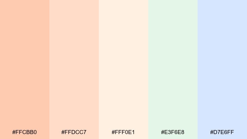
HEX: #FFCBB0 #FFDCC7 #FFF0E1 #E3F6E8 #D7E6FF
Mood: soft, friendly, wholesome
Best for: newsletter header
Soft and wholesome, apricot and cream tones read like a gentle morning email you actually want to open. They work well for newsletter headers, creator updates, and cozy community announcements. Pair with clean grids, generous padding, and subtle dividers for readability. Tip: keep the header block #FFCBB0 and move body sections to #FFF0E1 to reduce fatigue.
Image example of apricot cloud generated using media.io

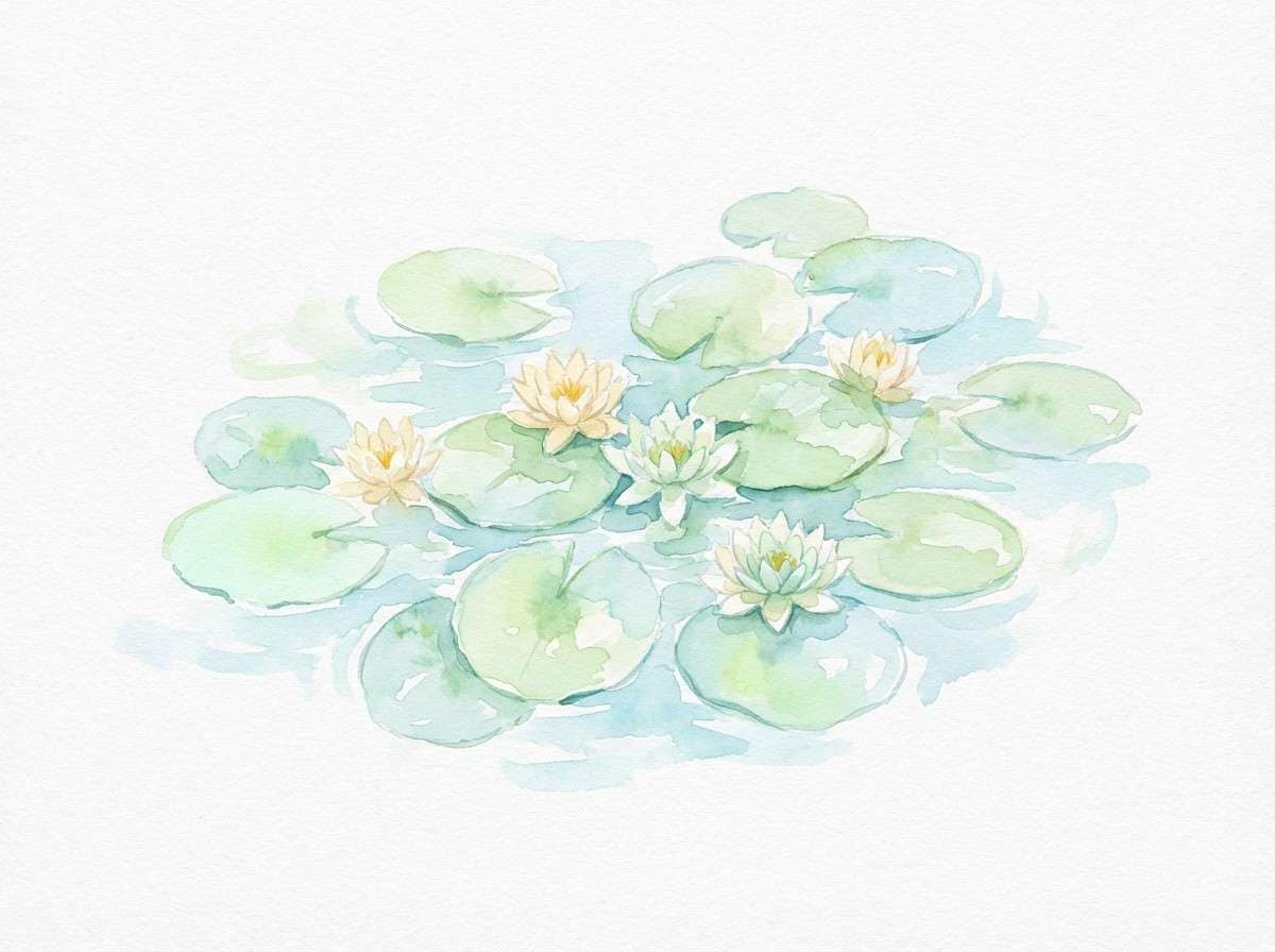
13) Icy Lilypad
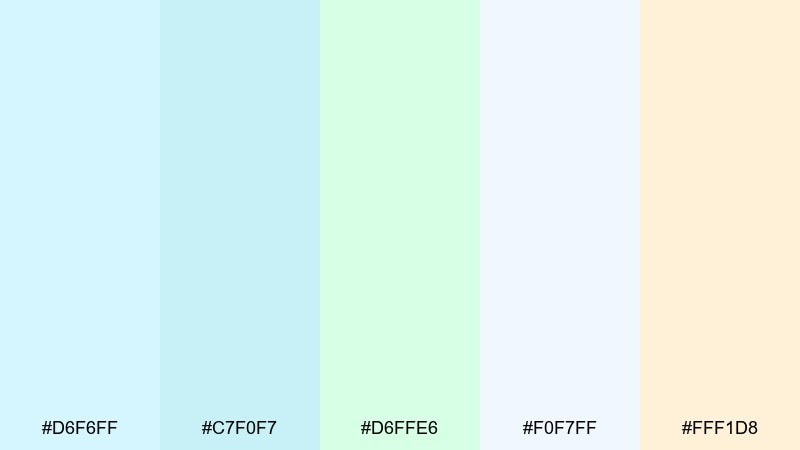
HEX: #D6F6FF #C7F0F7 #D6FFE6 #F0F7FF #FFF1D8
Mood: cool, airy, tranquil
Best for: botanical watercolor illustration
Cool and tranquil, these icy aquas and pale greens feel like water plants floating on a quiet pond. They are ideal for botanical watercolor art, spring stationery, and gentle pattern design. Pair with soft pencil outlines and plenty of blank space so the colors can breathe. Tip: use #F0F7FF as paper tone and keep #D6FFE6 for the main foliage shapes.
Image example of icy lilypad generated using media.io
14) Baby Pink Minimal
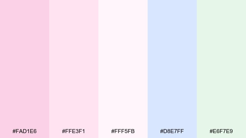
HEX: #FAD1E6 #FFE3F1 #FFF5FB #D8E7FF #E6F7E9
Mood: clean, modern, gentle
Best for: skincare e-commerce UI
Clean and modern, baby pink meets airy off-white with a cool blue edge for clarity. Use it in skincare e-commerce UI where product cards need softness but the layout must stay sharp. Pair with crisp black or deep gray type and thin borders to avoid fading. Tip: keep most surfaces #FFF5FB and save #FAD1E6 for primary actions and price tags.
Image example of baby pink minimal generated using media.io
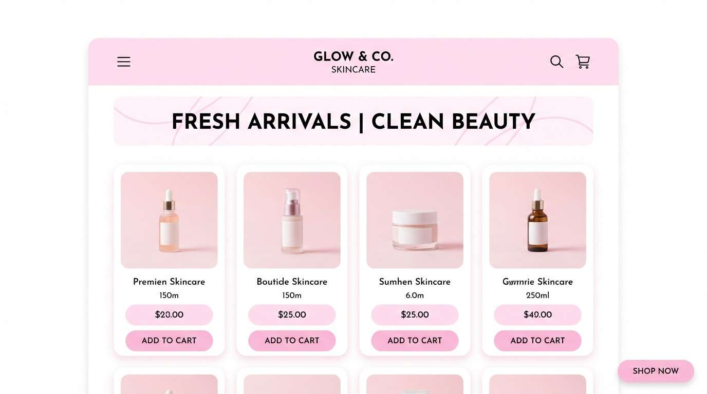
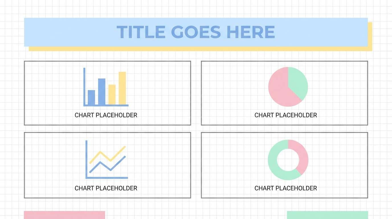
15) Soft Rainbow Grid
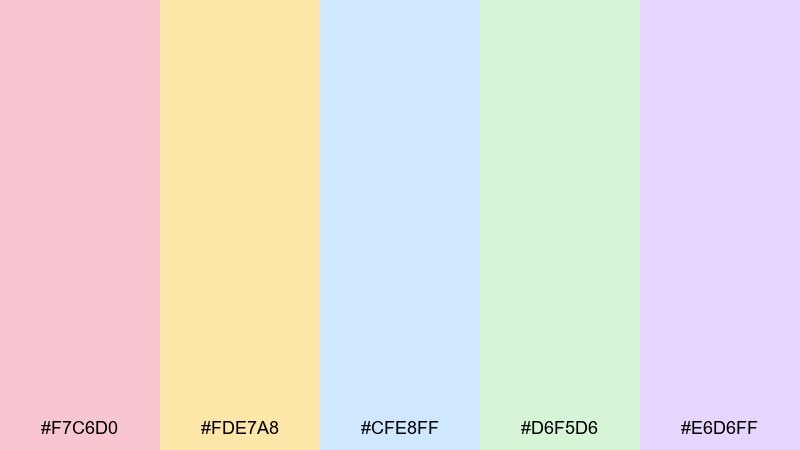
HEX: #F7C6D0 #FDE7A8 #CFE8FF #D6F5D6 #E6D6FF
Mood: playful, bright, balanced
Best for: presentation template
Playful and balanced, this rainbow-leaning set stays tasteful thanks to the gentle saturation. For decks, workshops, and education slides, these pastel color combinations help you color-code sections without overwhelming the eye. Pair with a white canvas, simple charts, and one consistent highlight style. Tip: assign each section a single color, then keep the rest of the slide neutral for focus.
Image example of soft rainbow grid generated using media.io
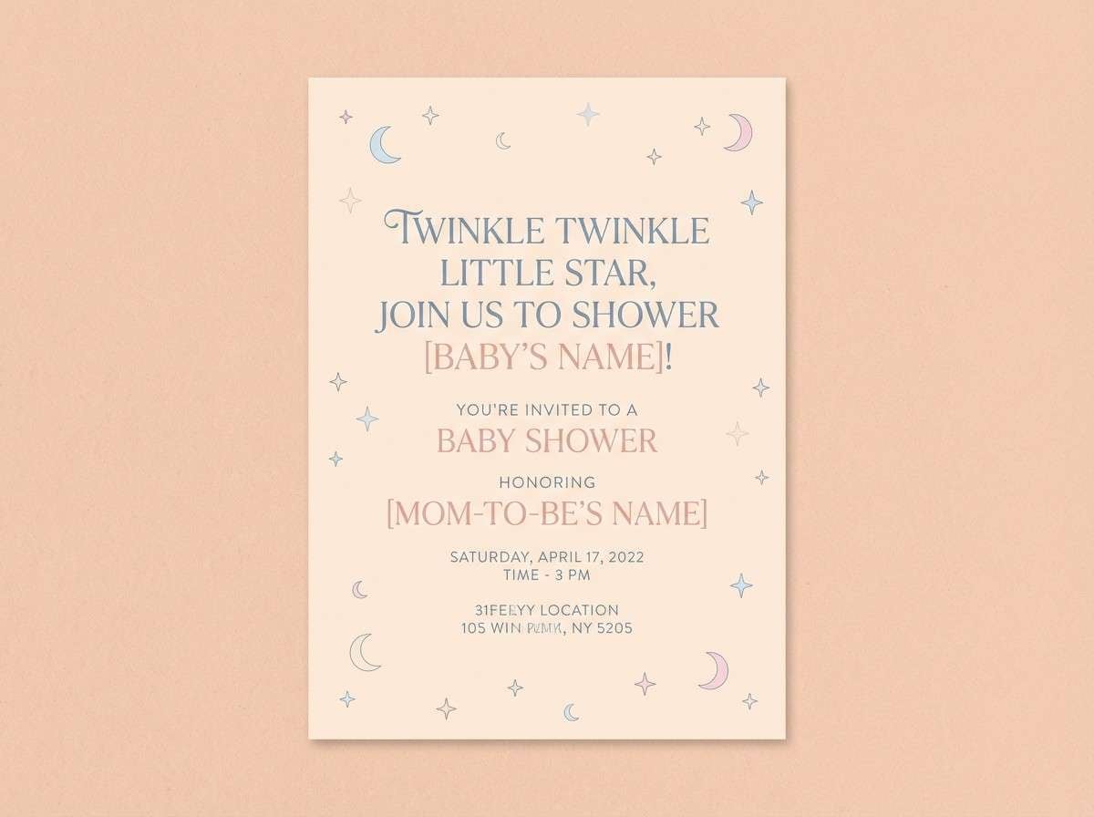
16) Vintage Nursery
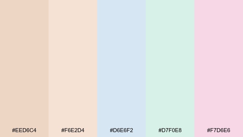
HEX: #EED6C4 #F6E2D4 #D6E6F2 #D7F0E8 #F7D6E6
Mood: nostalgic, tender, comforting
Best for: baby shower invitation
Nostalgic and tender, these tones feel like vintage storybooks and soft cotton blankets. They are a lovely match for baby shower invitations and nursery-themed announcements. Pair with hand-drawn stars, gentle patterns, and a warm neutral background to keep it sweet, not sugary. Tip: set the main card in #F6E2D4 and use #D6E6F2 for headers and icons.
Image example of vintage nursery generated using media.io
17) Spring Market
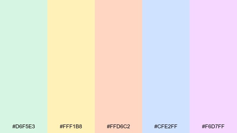
HEX: #D6F5E3 #FFF1B8 #FFD6C2 #CFE2FF #F6D7FF
Mood: lively, sunny, inviting
Best for: farmers market poster
Lively and sunny, this mix brings together fresh greens and warm fruit tones with a hint of lavender. It is great for farmers market posters, community fairs, and seasonal pop-up promos. Pair with bold date blocks, simple produce illustrations, and clear hierarchy for quick scanning. Tip: use #FFF1B8 behind the key info so it pops without harsh contrast.
Image example of spring market generated using media.io
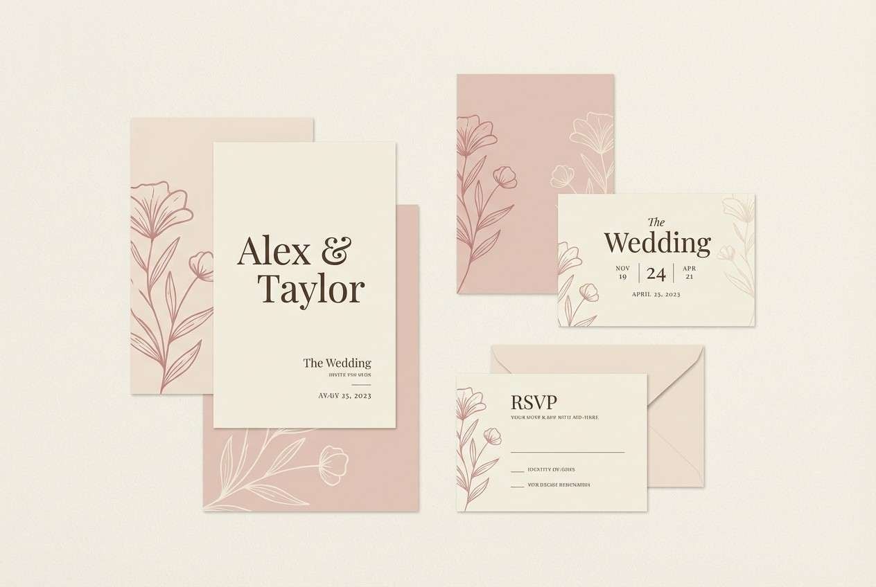
18) Wedding Pastels
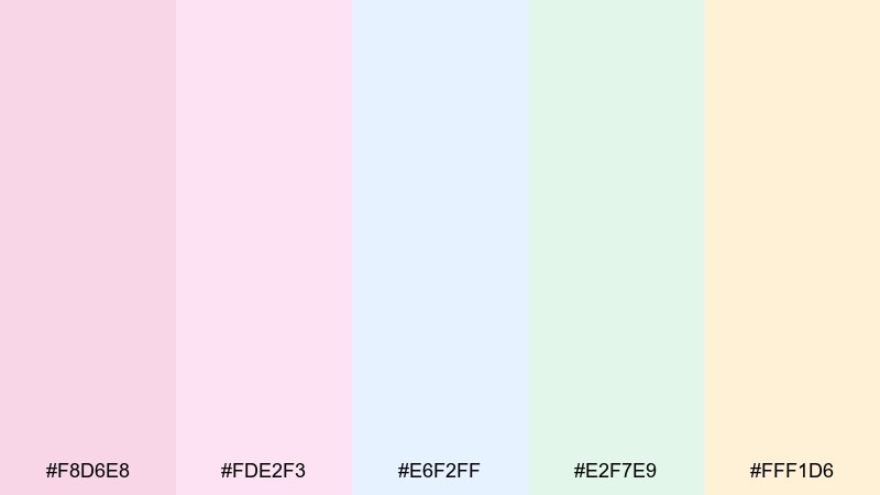
HEX: #F8D6E8 #FDE2F3 #E6F2FF #E2F7E9 #FFF1D6
Mood: romantic, elegant, airy
Best for: wedding invitation suite
Romantic and airy, these blush and cream tones feel like petals scattered on silk. As a pastel color palette for weddings, it suits invitation suites, place cards, and ceremony signage that needs elegance without heaviness. Pair with a refined serif, thin rules, and minimal floral line art. Tip: keep the background #FFF1D6 and use #F8D6E8 for monograms or wax-seal style accents.
Image example of wedding pastels generated using media.io
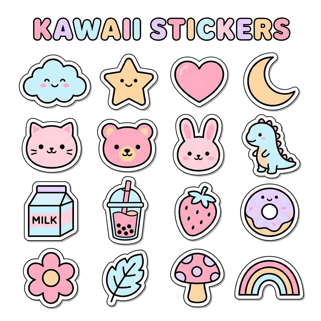
19) Kawaii Stationery
HEX: #FFD6E0 #FFE9B8 #D6F6FF #D6F5D6 #E9D7FF
Mood: cute, bubbly, upbeat
Best for: sticker pack design
Cute and bubbly, this set feels like a desk full of sticky notes and tiny character charms. It is perfect for sticker packs, planner pages, and playful creator merch. Pair with thick outlines, simple faces, and a white margin so the colors stay crisp when printed. Tip: use #D6F6FF for the base sheet and let #FFD6E0 carry the hero stickers.
Image example of kawaii stationery generated using media.io
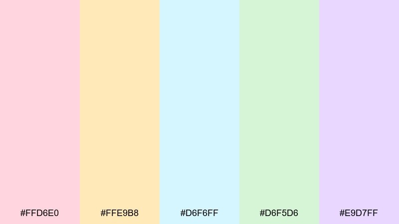
20) Calm Dashboard
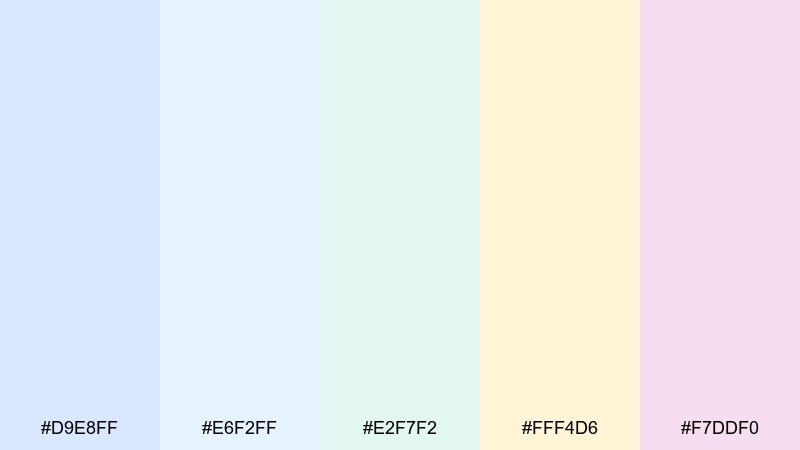
HEX: #D9E8FF #E6F2FF #E2F7F2 #FFF4D6 #F7DDF0
Mood: calm, organized, friendly
Best for: analytics dashboard UI
Calm and organized, these cool blues and soft creams make data feel less intimidating. They work well for analytics dashboards, admin panels, and productivity tools where clarity matters more than flair. Pair with a single high-contrast accent for alerts and keep charts mostly in two tones for consistency. Tip: use #E6F2FF for panels and reserve #FFF4D6 for notifications or highlighted metrics.
Image example of calm dashboard generated using media.io
What Colors Go Well with Pastel?
Pastels pair best with darker neutrals for contrast—think charcoal, ink navy, deep taupe, or espresso brown. These anchors keep pastel UI colors readable and prevent designs from looking washed out.
Warm pastels (peach, butter, blush) look balanced with cool grays and soft blues, while cool pastels (mint, powder blue, lilac) become more premium next to warm creams and off-whites. If you need an energetic accent, use one saturated color sparingly for CTAs.
For print, add texture-friendly neutrals like ivory, linen beige, or light stone. They make muted pastels feel intentional and help avoid that “too sweet” look.
How to Use a Pastel Color Palette in Real Designs
Start by choosing one “base pastel” for large surfaces (backgrounds, section panels), then one “action pastel” for buttons and highlights. Keep the remaining colors as small accents for tags, icons, and illustrations.
Typography does most of the heavy lifting in pastel branding colors. Use high-contrast text (near-black or very dark gray) and reserve thin, light text weights only for large headings to protect legibility.
In social graphics and posters, lock in hierarchy with spacing and bold type, then let pastels provide mood. A simple rule: if your pastel background is light, avoid light text—use dark text and add pastel blocks behind key details instead.
Create Pastel Palette Visuals with AI
If you have HEX codes but need real visuals (posters, UI mockups, packaging, invitations), an AI image generator can turn your pastel palettes into on-brand examples fast. You can paste your colors directly into the prompt to keep results consistent.
With Media.io, you can iterate quickly: generate multiple layout styles, swap a dominant pastel, and keep the same art direction until it matches your brand guidelines. This is especially useful for campaign concepts, mood boards, and rapid A/B testing.
When prompting, specify the dominant colors, where they should appear (background vs. buttons), and the style (flat vector, UI mockup, studio product shot). The clearer the layout instructions, the more “design-ready” the output.
Pastel Color Palette FAQs
-
What is considered a pastel color palette?
A pastel color palette uses light, low-saturation tints (colors mixed with white), such as blush pink, powder blue, mint, and soft lavender, to create a gentle, airy look. -
Are pastel palettes good for UI design?
Yes—pastel UI colors can feel calm and friendly, but you should pair them with high-contrast text (dark gray/charcoal) and clear component boundaries so buttons and inputs remain accessible. -
What neutral colors pair best with pastels?
Off-white, ivory, warm beige, light stone, and cool light gray all work well. For contrast, use charcoal, ink navy, or deep brown for headings and body text. -
How do I keep a pastel design from looking washed out?
Use one darker anchor (text and key UI elements), limit the number of pastels used at once, and add structure with spacing, borders, or subtle shadows to separate sections. -
What are the best pastel color combinations for branding?
Common winners include blush + cream + powder blue for romantic brands, mint + butter yellow for fresh/food brands, and lilac + icy blue for wellness or beauty identities. -
Do pastel palettes print well?
They can, but printing may reduce contrast further. Use a slightly darker neutral for text, avoid tiny light-colored type, and proof colors (CMYK conversions) to keep tints from turning muddy. -
Can I generate pastel-themed visuals using AI?
Yes. Include your HEX codes in the prompt and describe where each color should appear (background, buttons, accents) plus the style (flat vector, UI mockup, studio product photo) for consistent results.
Next: Castle Color Palette


