

Rose gold champagne is the kind of modern neutral that still feels special—soft enough for airy layouts, but warm enough to read as premium.
Below are 20 curated rose gold champagne color palette ideas with HEX codes, plus AI-ready prompts you can use to generate matching visuals in seconds.
In this article
- Why Rose Gold Champagne Palettes Work So Well
-
- champagne dawn
- rosy macaron
- gilded blush ui
- pearl and copper
- vintage toast
- satin sandstone
- petal smoke
- bubbly terrace
- desert rose minimal
- candlelit silk
- blush marble
- opal nectar
- muted sparkler
- champagne rosewood
- creamy rosette
- copper bloom
- dusty radiance
- rose quartz night
- warm metallic neutrals
- golden peony
- What Colors Go Well with Rose Gold Champagne?
- How to Use a Rose Gold Champagne Color Palette in Real Designs
- Create Rose Gold Champagne Palette Visuals with AI
Why Rose Gold Champagne Palettes Work So Well
Rose gold champagne sits in a flattering “warm neutral” zone—light creams and blush beiges feel clean and modern, while coppery undertones add depth and a subtle metallic vibe.
It’s also a highly flexible palette family for branding and UI: pale champagne shades make excellent backgrounds, and deeper mocha/espresso anchors improve readability without turning the design harsh.
Because these tones echo real materials (satin, stone, makeup, wood), they photograph beautifully and translate well across print, packaging, interiors, and digital products.
20+ Rose Gold Champagne Color Palette Ideas (with HEX Codes)
1) Champagne Dawn
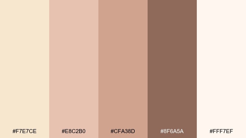
HEX: #F7E7CE #E8C2B0 #CFA38D #8F6A5A #FFF7EF
Mood: airy, romantic, luminous
Best for: wedding invitations and stationery
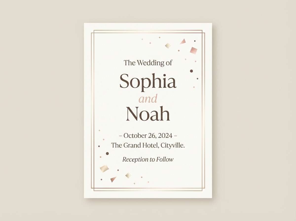
Airy champagne and soft blush evoke sunrise light on satin ribbon and fresh florals. Use the pale tones as the paper base, then bring in the deeper mocha for monograms or wax-seal details. Pair it with delicate serif type and plenty of whitespace for a modern formal feel. Tip: keep metallic effects subtle by reserving the rose gold shade for thin borders and small highlights.
Image example of champagne dawn generated using media.io
Media.io is an online AI studio for creating and editing video, image, and audio in your browser.

2) Rosy Macaron
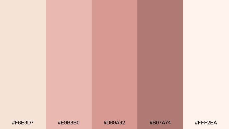
HEX: #F6E3D7 #E9B8B0 #D69A92 #B07A74 #FFF2EA
Mood: sweet, cozy, playful
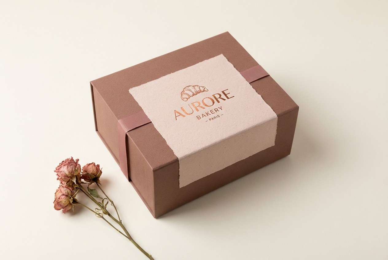
Best for: bakery brand packaging
Sweet blush and creamy champagne feel like macarons in a patisserie window. Let the light cream serve as the main box color, then layer rosy tones for labels, patterns, and flavor bands. Warm brownish rose keeps the set grounded so it does not look overly pastel. Tip: use one bold rosy swatch for the logo mark, and keep everything else soft for a premium dessert vibe.
Image example of rosy macaron generated using media.io
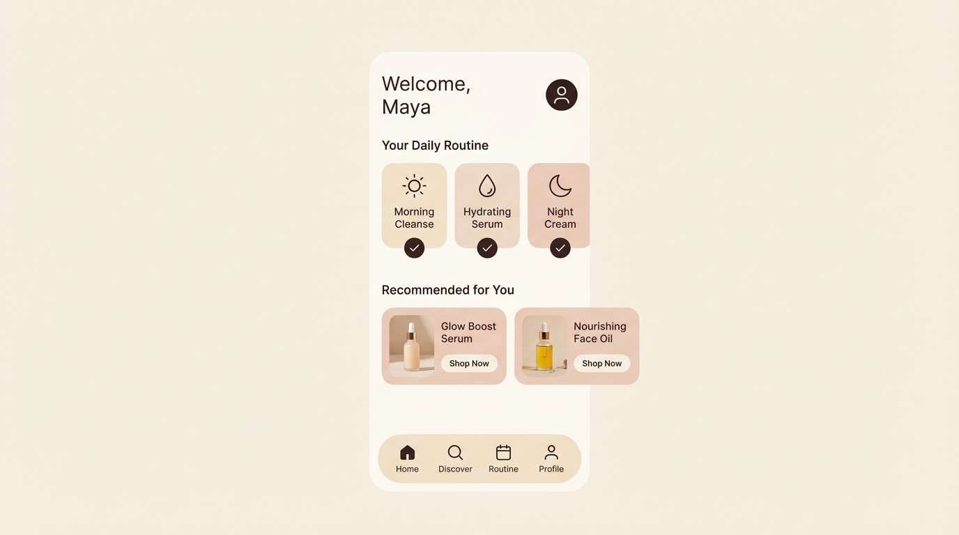
3) Gilded Blush UI
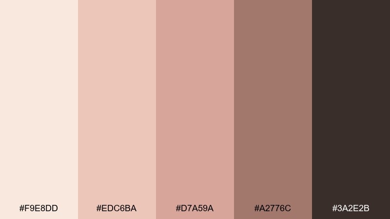
HEX: #F9E8DD #EDC6BA #D7A59A #A2776C #3A2E2B
Mood: polished, modern, calm
Best for: beauty app 2D UI mockup
Polished blush neutrals with a deep espresso anchor feel like a sleek vanity counter under warm lights. These rose gold champagne color combination choices work especially well for beauty dashboards where you want softness without losing contrast. Use the darkest shade for text and icons, and reserve the mid rose tones for buttons, toggles, and cards. Tip: keep large backgrounds in the lightest cream so product photos and charts still pop.
Image example of gilded blush ui generated using media.io
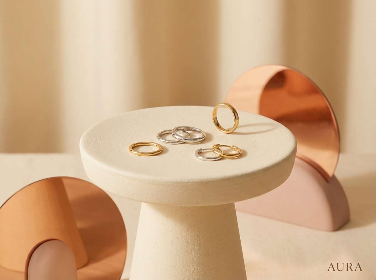
4) Pearl and Copper
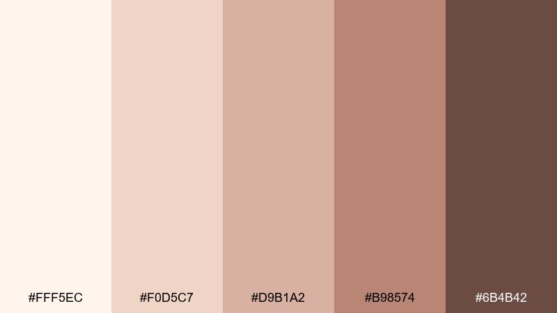
HEX: #FFF5EC #F0D5C7 #D9B1A2 #B98574 #6B4B42
Mood: elegant, warm, refined
Best for: jewelry product ad
Elegant pearl creams and coppery blush read like jewelry catching light in a display case. Use the pale cream as the background, then bring in copper tones for typography, frames, and accent shapes. The deeper warm brown adds contrast for pricing and callouts without feeling harsh. Tip: limit heavy shadows and rely on soft gradients to keep the metallic mood believable.
Image example of pearl and copper generated using media.io
5) Vintage Toast
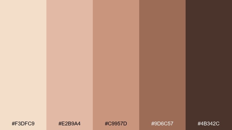
HEX: #F3DFC9 #E2B9A4 #C9957D #9D6C57 #4B342C
Mood: nostalgic, warm, inviting
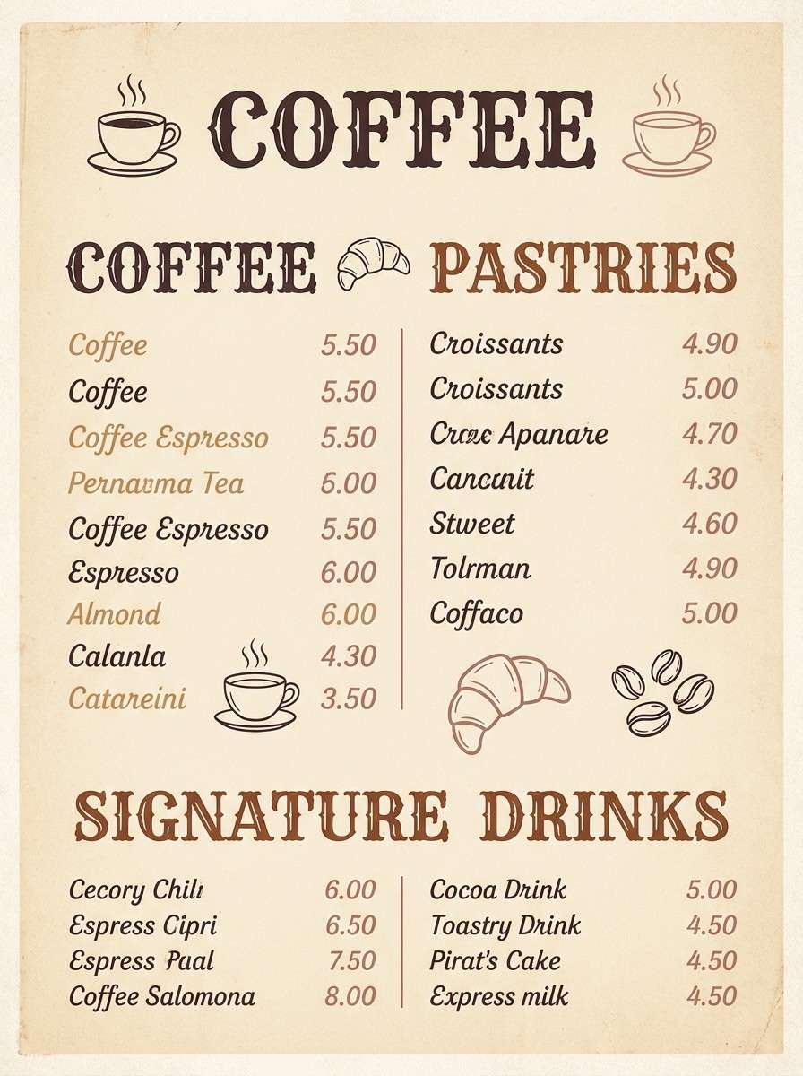
Best for: cafe menu poster
Nostalgic toasted beige and rose-brown tones feel like a cozy cafe at golden hour. A rose gold champagne color palette like this shines on menus when you mix creamy backgrounds with darker cocoa text for legibility. Pair it with vintage-inspired type and simple line icons to keep the layout charming, not cluttered. Tip: use the mid caramel tone for section headers so the hierarchy stays clear.
Image example of vintage toast generated using media.io
6) Satin Sandstone
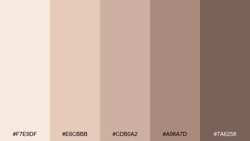
HEX: #F7E9DF #E6CBBB #CDB0A2 #A98A7D #7A6258
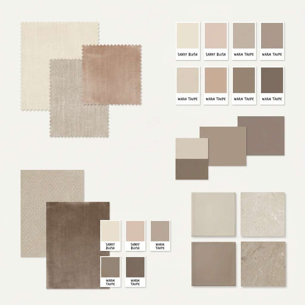
Mood: serene, balanced, natural
Best for: interior design moodboard
Serene satin creams and sandy rose neutrals create a grounded, spa-like calm. Build a moodboard with the lightest shades as wall paint and the mid tones for upholstery, then add the deeper taupe for wood or leather. It pairs beautifully with natural textures like linen, travertine, and matte brass. Tip: repeat one mid tone across multiple materials to make the room feel intentionally layered.
Image example of satin sandstone generated using media.io
7) Petal Smoke
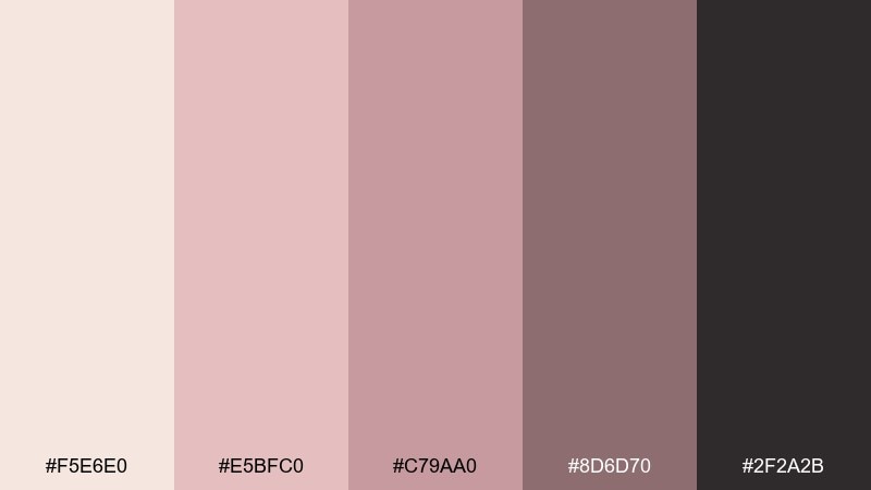
HEX: #F5E6E0 #E5BFC0 #C79AA0 #8D6D70 #2F2A2B
Mood: moody, editorial, chic
Best for: fashion lookbook editorial layout
Moody petal pinks softened by smoky mauves bring a chic, editorial edge. Use the near-black for headings and grid lines, then let blush and mauve blocks frame photos and pull quotes. The muted middle tones keep skin tones flattering while still feeling modern. Tip: keep accent shapes thin and geometric so the palette feels fashion-forward rather than vintage.
Image example of petal smoke generated using media.io
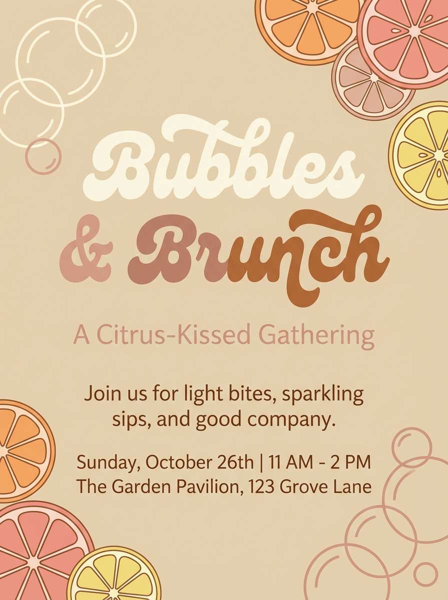
8) Bubbly Terrace
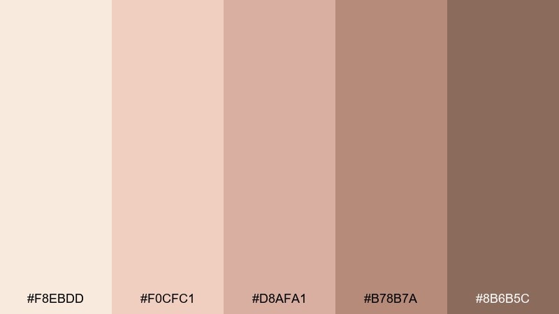
HEX: #F8EBDD #F0CFC1 #D8AFA1 #B78B7A #8B6B5C
Mood: celebratory, sunny, relaxed
Best for: brunch event flyer
Sunny champagne and warm blush feel like sparkling drinks on a bright terrace. Use the lightest shades for the background and photo masks, then apply the deeper tan-rose for key details like date, time, and RSVP. Pair it with playful typography and simple illustrations of citrus or bubbles. Tip: keep contrast high by setting body text in the darkest shade, not mid blush.
Image example of bubbly terrace generated using media.io
9) Desert Rose Minimal
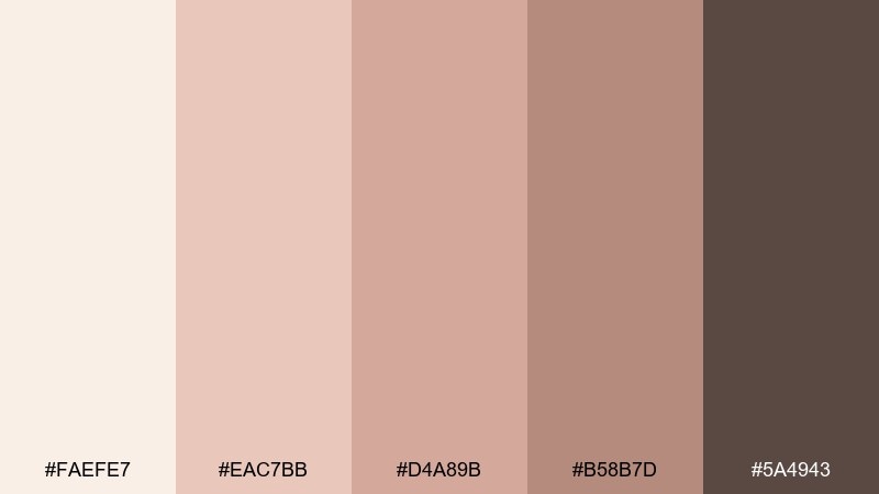
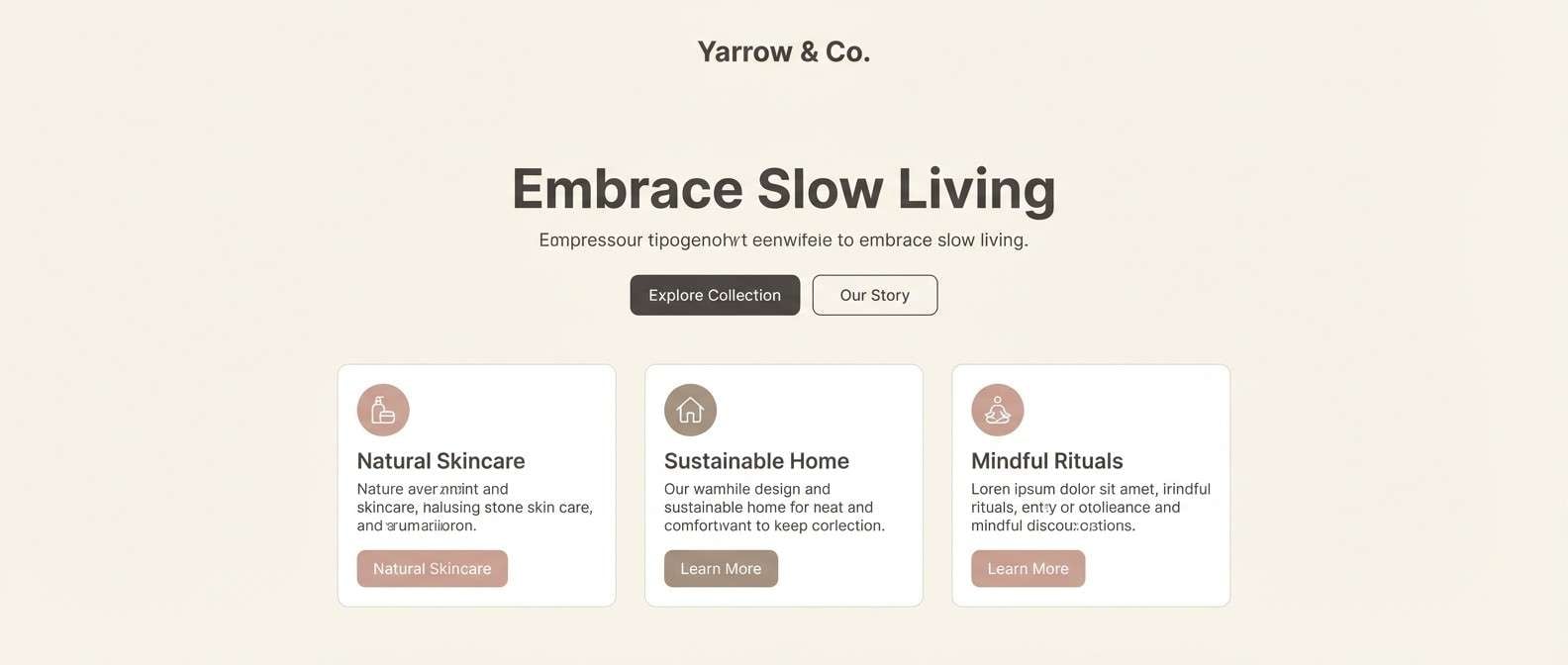
HEX: #FAEFE7 #EAC7BB #D4A89B #B58B7D #5A4943
Mood: minimal, warm, contemporary
Best for: minimal website landing page
Minimal desert blush and warm taupe look clean, calm, and premium. Use the light cream as the page canvas and reserve the muted rose for primary buttons, badges, and highlight cards. Pair it with charcoal-taupe text and plenty of spacing to avoid a washed-out feel. Tip: add a single rose-toned gradient header for depth without introducing new colors.
Image example of desert rose minimal generated using media.io
10) Candlelit Silk
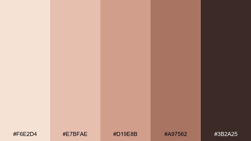
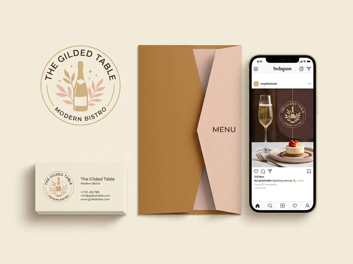
HEX: #F6E2D4 #E7BFAE #D19E8B #A97562 #3B2A25
Mood: luxurious, intimate, warm
Best for: restaurant branding set
Luxurious candlelit blush and toasted caramel tones feel intimate and elevated. For rose gold champagne color combinations in hospitality branding, lean on the deep cocoa for logos and signage, and use the lighter tones for menus, napkins, and social graphics. Pair with matte black or off-white backgrounds to keep everything readable and upscale. Tip: use the mid caramel as a consistent accent stripe across all assets for instant recognition.
Image example of candlelit silk generated using media.io
11) Blush Marble
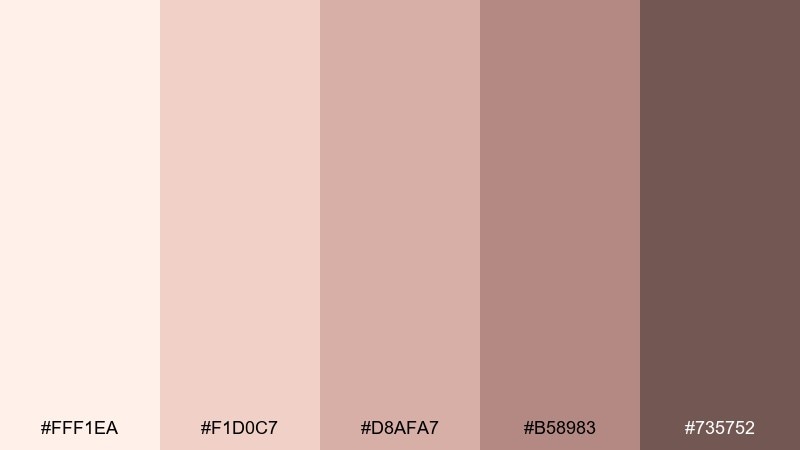
HEX: #FFF1EA #F1D0C7 #D8AFA7 #B58983 #735752
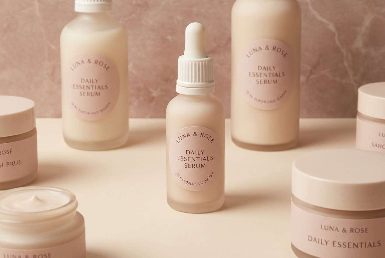
Mood: clean, soft, upscale
Best for: skincare packaging design
Clean blush and creamy neutrals evoke marble countertops and fresh spa towels. Use the palest tone for packaging backgrounds, then layer muted rose for product tiers and subtle patterns. The deeper dusty brown works well for ingredient text and regulatory details without feeling stark. Tip: add a faint marble texture in the lightest two shades to create richness while staying minimal.
Image example of blush marble generated using media.io
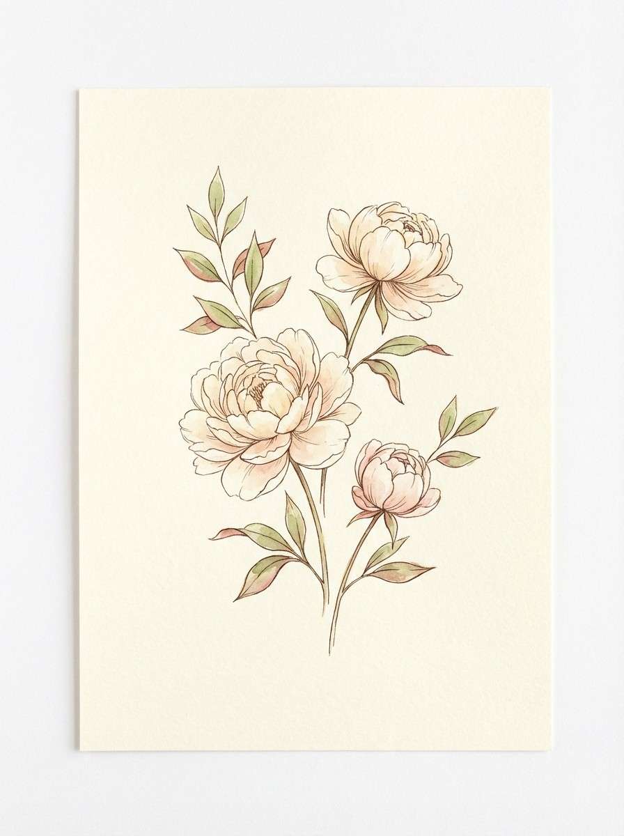
12) Opal Nectar
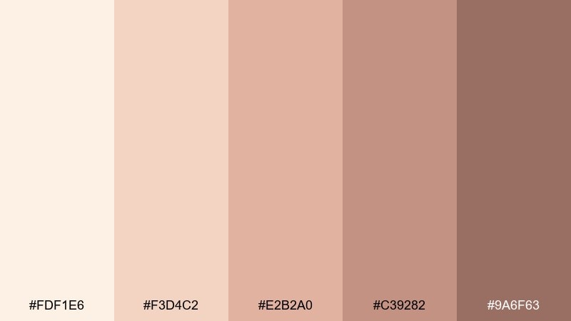
HEX: #FDF1E6 #F3D4C2 #E2B2A0 #C39282 #9A6F63
Mood: fresh, delicate, springlike
Best for: botanical spring illustration
Fresh opal creams and soft nectar pinks feel like petals painted in morning light. Use the lightest shades for paper and highlights, with the warm rose tones for blossoms and gentle shading. It pairs beautifully with fine ink outlines and airy negative space. Tip: keep gradients subtle and let the mid tone do most of the color work for a watercolor look.
Image example of opal nectar generated using media.io
13) Muted Sparkler
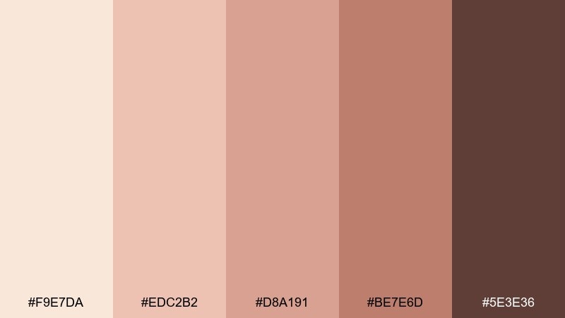
HEX: #F9E7DA #EDC2B2 #D8A191 #BE7E6D #5E3E36
Mood: festive, polished, friendly
Best for: social media ad template
Festive blush and champagne tones suggest soft sparkle without looking flashy. Use the light cream for the canvas, then build your headline block in the mid rose so it reads clearly in a feed. The deeper cocoa is ideal for small-print details and CTA text. Tip: add subtle dot patterns in the lightest two shades to mimic shimmer while staying clean.
Image example of muted sparkler generated using media.io
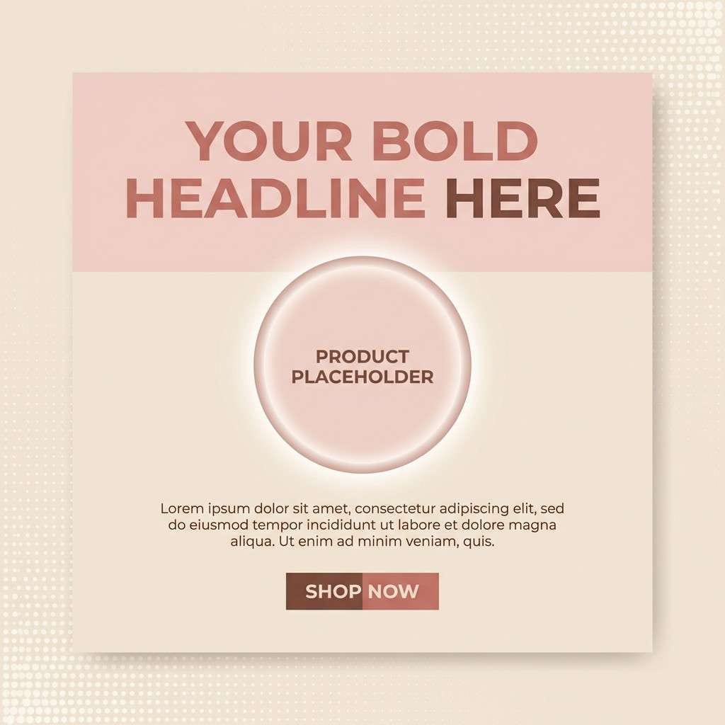
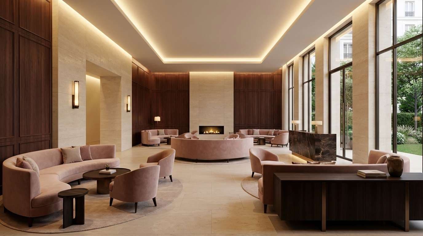
14) Champagne Rosewood
HEX: #F6E8DB #E5C1B0 #CFA08C #9A6A59 #2E2422
Mood: luxury, grounded, dramatic
Best for: luxury hotel lobby concept render
Luxury champagne creams paired with rosewood browns feel like polished stone, leather, and warm ambient lighting. A rose gold champagne color palette like this works best when you anchor the space with deep wood tones and let the lighter shades live on walls and textiles. Pair with brushed brass fixtures and soft, diffuse lighting to keep everything glowing instead of yellow. Tip: repeat the mid rose tone in small decor accents to unify the whole scene.
Image example of champagne rosewood generated using media.io
15) Creamy Rosette
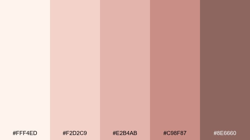
HEX: #FFF4ED #F2D2C9 #E2B4AB #C98F87 #8E6660
Mood: gentle, sweet, comforting
Best for: baby shower invitation
Gentle creamy blush shades feel tender and comforting, like folded linen and fresh roses. Use the lightest cream for the background, then let the softer pinks frame the title and illustration. It pairs well with hand-drawn icons and rounded sans-serif type for an approachable look. Tip: keep the darkest shade only for names and tiny details so the invite stays airy.
Image example of creamy rosette generated using media.io

16) Copper Bloom
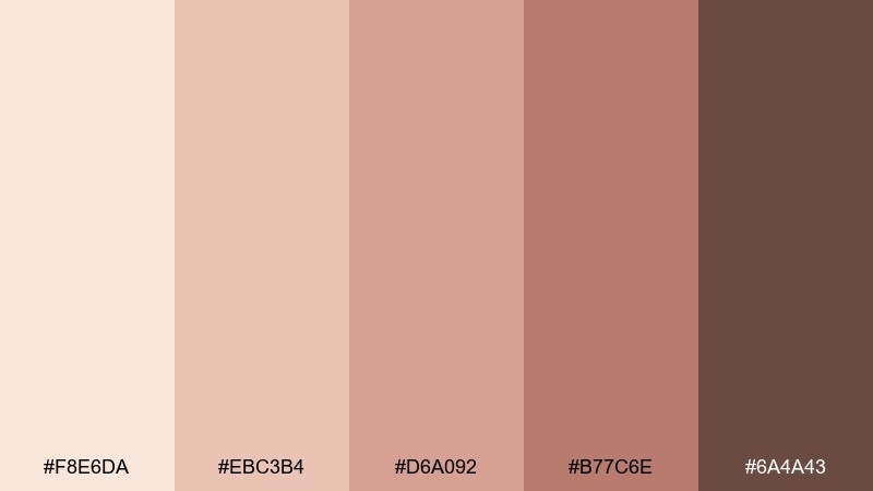
HEX: #F8E6DA #EBC3B4 #D6A092 #B77C6E #6A4A43
Mood: glam, warm, confident
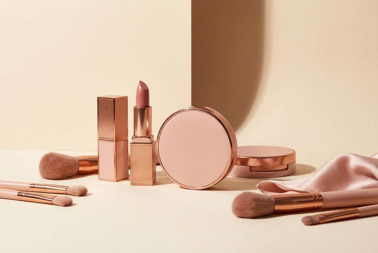
Best for: cosmetics product photography
Glam copper-blush tones bring to mind bronzed makeup and warm studio lights. Use the creamy shade as a seamless background, then let the mid rose and copper tones dominate on packaging and product textures. The darker brown makes a strong shadow color that still feels warm, not harsh. Tip: keep reflective highlights neutral so the color story stays consistent across the shot.
Image example of copper bloom generated using media.io
17) Dusty Radiance
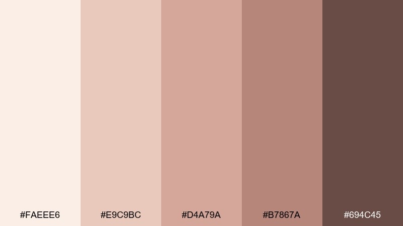
HEX: #FAEEE6 #E9C9BC #D4A79A #B7867A #694C45
Mood: professional, soft, approachable
Best for: presentation slide theme
Professional dusty blush with warm neutrals feels approachable and polished on slides. Use the lightest tone for backgrounds, then build section dividers and charts with the mid rose shades. The deepest brown improves readability for headings and data labels, especially on projectors. Tip: keep charts to two main fills plus one accent so the deck stays cohesive.
Image example of dusty radiance generated using media.io

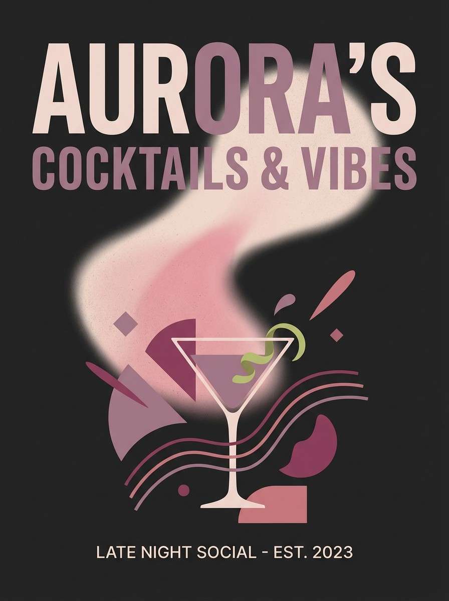
18) Rose Quartz Night
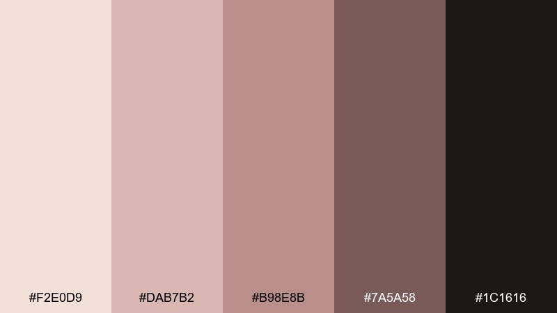
HEX: #F2E0D9 #DAB7B2 #B98E8B #7A5A58 #1C1616
Mood: bold, intimate, after-dark
Best for: cocktail bar poster
After-dark rose quartz tones with near-black create a bold, intimate mood. Use the palest blush as a spotlight effect behind the headline, then set the rest of the typography in deep charcoal for drama. The mid mauves work well for icons, price lists, and subtle gradients. Tip: add a single thick border in the darkest shade to frame the layout and boost contrast.
Image example of rose quartz night generated using media.io
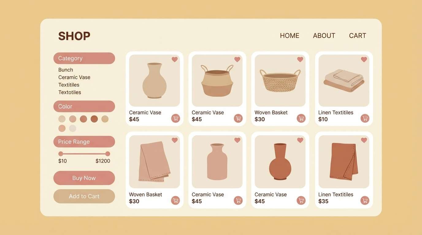
19) Warm Metallic Neutrals
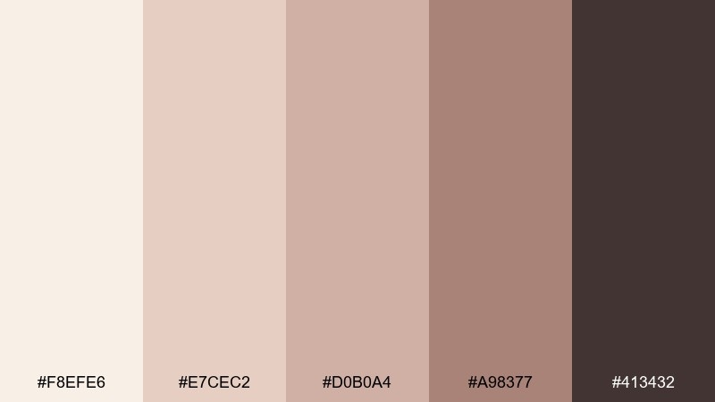
HEX: #F8EFE6 #E7CEC2 #D0B0A4 #A98377 #413432
Mood: trustworthy, premium, clean
Best for: ecommerce product page UI
Premium warm neutrals feel trustworthy, like a boutique storefront with soft lighting. This rose gold champagne color scheme is ideal for ecommerce UI because it keeps product imagery front and center while still looking branded. Use the deep brown for navigation and price text, and reserve the mid tones for buttons, chips, and ratings. Tip: keep borders and dividers in the lightest beige so the page does not look boxed in.
Image example of warm metallic neutrals generated using media.io
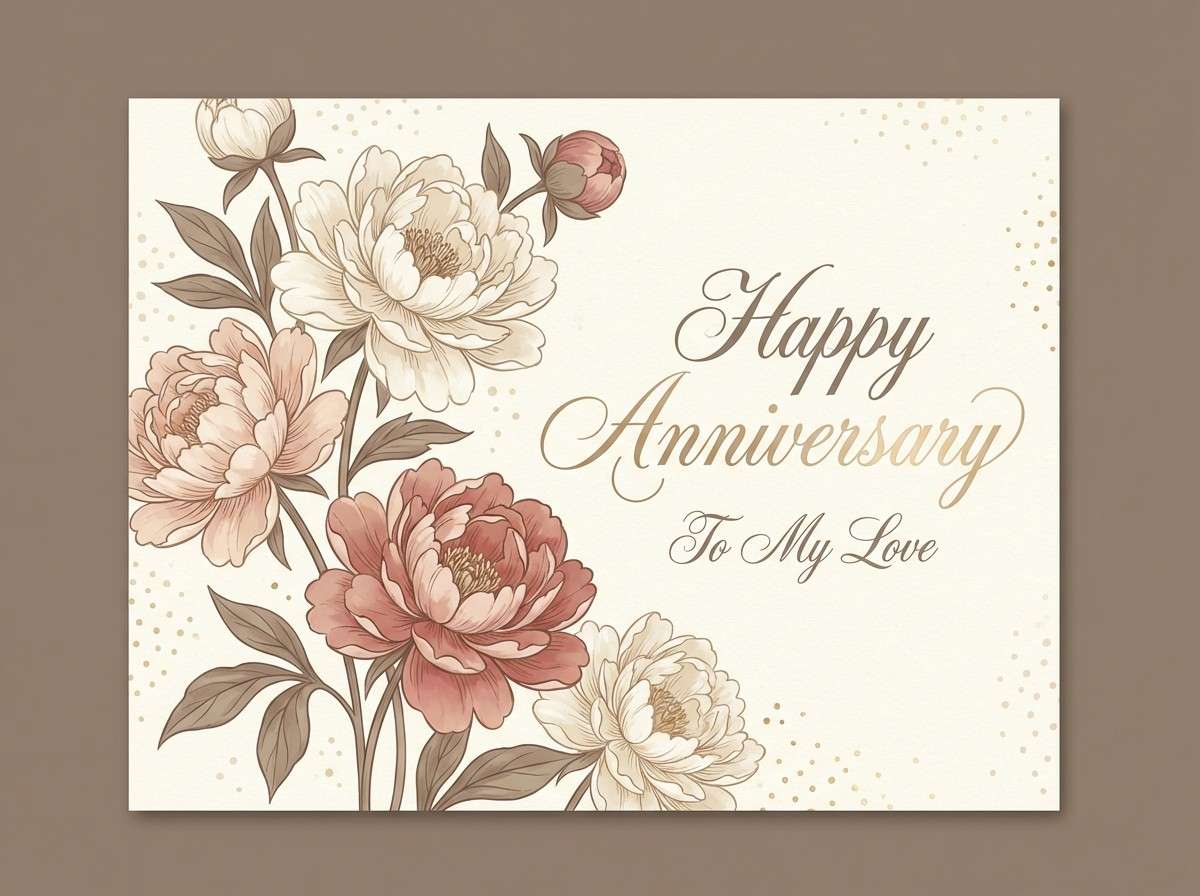
20) Golden Peony
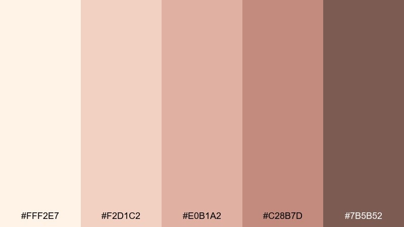
HEX: #FFF2E7 #F2D1C2 #E0B1A2 #C28B7D #7B5B52
Mood: romantic, optimistic, timeless
Best for: anniversary card design
Romantic peony blush and golden cream feel timeless, like a handwritten note tucked in a keepsake box. Use the lightest shade as the card base, then layer floral elements in soft blush and warm rose for depth. The deeper taupe-brown keeps typography readable and elegant. Tip: add tiny foil-like dots in the pale champagne tone to create a celebratory finish without overwhelming the design.
Image example of golden peony generated using media.io
What Colors Go Well with Rose Gold Champagne?
Rose gold champagne pairs naturally with warm whites, soft beiges, taupe, and cocoa browns—these keep the look cohesive while adding enough contrast for text, borders, and UI states.
For a fresher, more modern direction, add muted greens (sage, eucalyptus) or cool anchors like charcoal and near-black to sharpen typography and make blush accents feel intentional.
If you want a bolder pop, use one saturated accent (like crimson red) in small doses for CTAs, stamps, or key highlights while keeping the rest of the palette airy.
How to Use a Rose Gold Champagne Color Palette in Real Designs
Start by assigning roles: use the lightest champagne as the background, mid blushes for surfaces (cards, panels, packaging bands), and the deepest mocha/espresso for readable text and fine details.
To keep the “metallic” feeling without overdoing it, simulate rose gold with thin lines, subtle gradients, and gentle highlights—especially in print, beauty branding, and product shots.
When designing for screens, test contrast early. These palettes can look dreamy, but you’ll get the best results by reserving dark anchors for body text and using blush tones for emphasis rather than paragraphs.
Create Rose Gold Champagne Palette Visuals with AI
If you already have HEX codes, the fastest way to make on-brand mockups is to generate visuals that match your palette—then iterate on composition, lighting, and textures until it feels like your brand.
With Media.io’s text-to-image tool, you can paste a prompt like the examples above, keep the background clean, and specify “dominant tones” so the output stays within your rose gold champagne scheme.
Use the generated images for moodboards, landing page hero concepts, invitation previews, packaging directions, and social templates—without needing a full photoshoot.
Rose Gold Champagne Color Palette FAQs
-
What is a rose gold champagne color palette?
It’s a warm neutral palette built around champagne creams and blush-beige tones, often paired with copper/rose gold accents and deeper mocha or espresso shades for contrast. -
Is rose gold champagne more pink or more beige?
It’s typically beige-first with a soft pink undertone. The exact balance depends on lighting and surrounding colors, which is why adding a dark anchor helps it read consistently. -
What text color works best on champagne and blush backgrounds?
Deep warm browns, espresso, charcoal, or near-black usually provide the cleanest readability. Mid blush tones are better for UI accents than for long text. -
What are good accent colors for rose gold champagne?
Sage/eucalyptus green, muted navy, charcoal, and a single bold red (like crimson) work well. Keep accents limited so the palette stays refined and “metallic-adjacent.” -
Does rose gold champagne work for modern UI and apps?
Yes—especially for beauty, wellness, ecommerce, and lifestyle products. Use light champagne as the canvas, reserve blush for components, and rely on dark anchors for accessibility. -
How do I make rose gold feel metallic in a flat design?
Use thin lines, soft gradients, and restrained highlight shapes rather than heavy shine. Small “foil-like” details on borders, icons, or headings can suggest metal without overwhelming the design. -
Can I generate rose gold champagne mockups with AI?
Yes. Describe the scene and explicitly state “dominant tones in champagne cream, blush, rose gold, and warm brown,” then iterate prompts to control lighting, texture, and contrast.


