

Roman Empire tones feel instantly timeless: marble neutrals, terracotta clays, imperial purples, and gilded golds that signal heritage without looking dated.
Below are 20+ curated Roman Empire color palette ideas (each with HEX codes), plus practical tips for pairing them in branding, UI, and print.
In this article
- Why Roman Empire Palettes Work So Well
-
- marble atrium
- terracotta forum
- laurel courtyard
- imperial amethyst
- gilded mosaic
- parchment scroll
- basalt colonnade
- olive legion
- fresco dust
- rosy aurelia
- bronze shield
- pompeii sunset
- sea trade teal
- vineyard twilight
- sandstone arch
- patina coin
- ceremonial crimson
- temple shade
- saffron market
- night at the circus
- capitoline mist
- aureate basilica
- via appia clay
- What Colors Go Well with Roman Empire?
- How to Use a Roman Empire Color Palette in Real Designs
- Create Roman Empire Palette Visuals with AI
Why Roman Empire Palettes Work So Well
Roman Empire palettes are built on material-first color: stone, clay, metal, ink, and greenery. That makes them feel believable and premium, because the hues already exist in architecture and craft.
They also balance warmth and authority. Creams and sands keep layouts approachable, while charcoals, deep reds, and imperial purples add structure and drama.
Most combinations naturally support strong contrast for typography, especially when you anchor the palette with a near-black or deep brown and reserve gold as a small highlight.
20+ Roman Empire Color Palette Ideas (with HEX Codes)
1) Marble Atrium
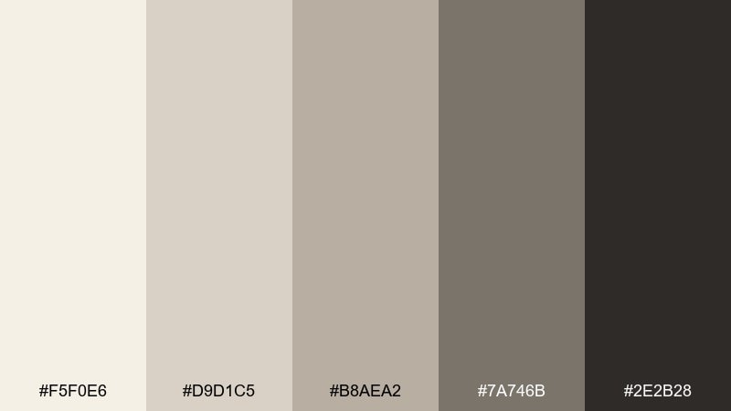
HEX: #F5F0E6 #D9D1C5 #B8AEA2 #7A746B #2E2B28
Mood: calm, classical, refined
Best for: minimal brand identity and museum-style web layouts
Calm and classical, these tones feel like sunlit marble, limestone dust, and shadowed arches. Use it for quiet luxury branding, gallery sites, and typography-led pages where space matters. Pair the deep charcoal with the warm off-white for readable contrast, then let the mid-stones soften dividers and cards. Tip: keep accents minimal and rely on texture (grain, paper, stone) to avoid a flat look.
Image example of marble atrium generated using media.io
Media.io is an online AI studio for creating and editing video, image, and audio in your browser.

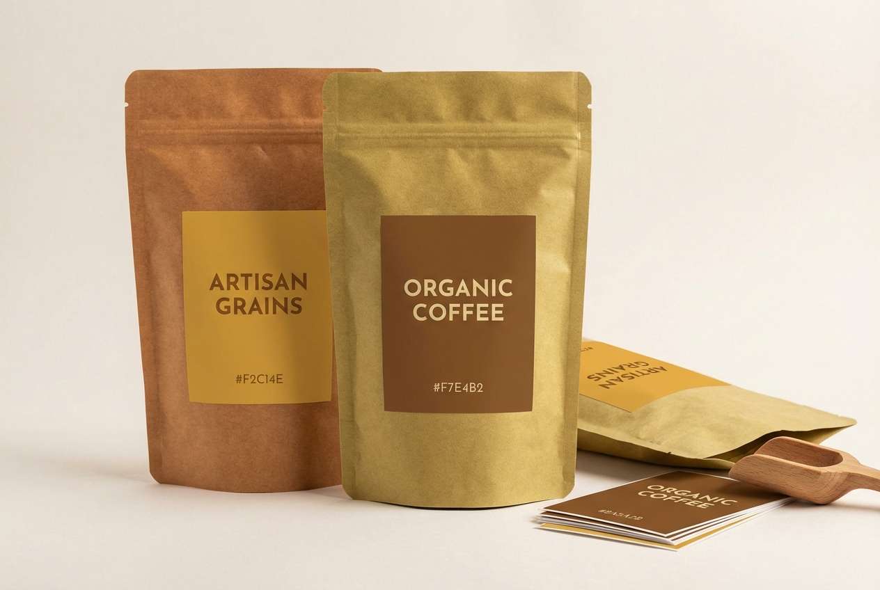
2) Terracotta Forum
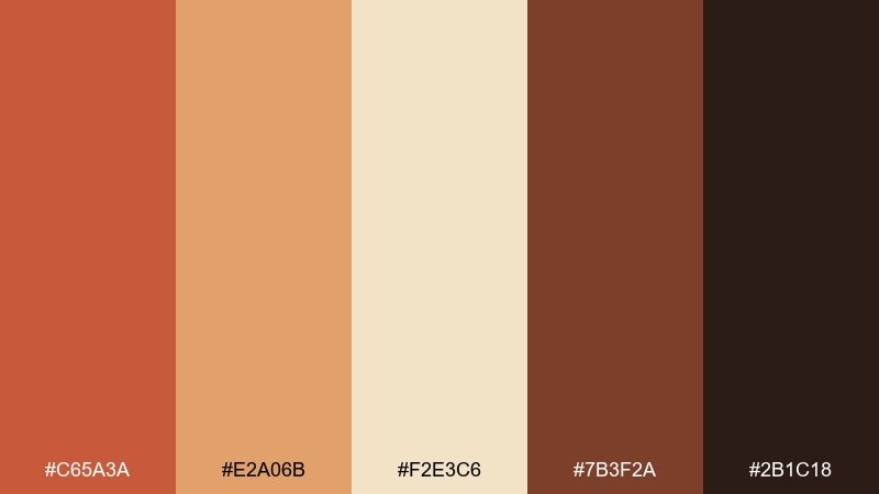
HEX: #C65A3A #E2A06B #F2E3C6 #7B3F2A #2B1C18
Mood: warm, earthy, bustling
Best for: restaurant menus, artisan packaging, and event posters
Warm and bustling, it evokes clay tiles, baked brick, and the glow of late-afternoon markets. It works beautifully for food brands, menus, and posters that need appetite-friendly energy without going neon. Pair the terracotta with creamy parchment for headlines, then ground the layout with the deep espresso brown. Tip: reserve the brightest orange-brown for small calls to action or seals so it reads premium, not loud.
Image example of terracotta forum generated using media.io
3) Laurel Courtyard
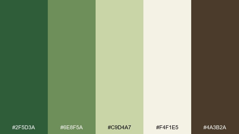
HEX: #2F5D3A #6E8F5A #C9D4A7 #F4F1E5 #4A3B2A
Mood: fresh, grounded, garden-like
Best for: wellness brands, botanical illustrations, and eco labels
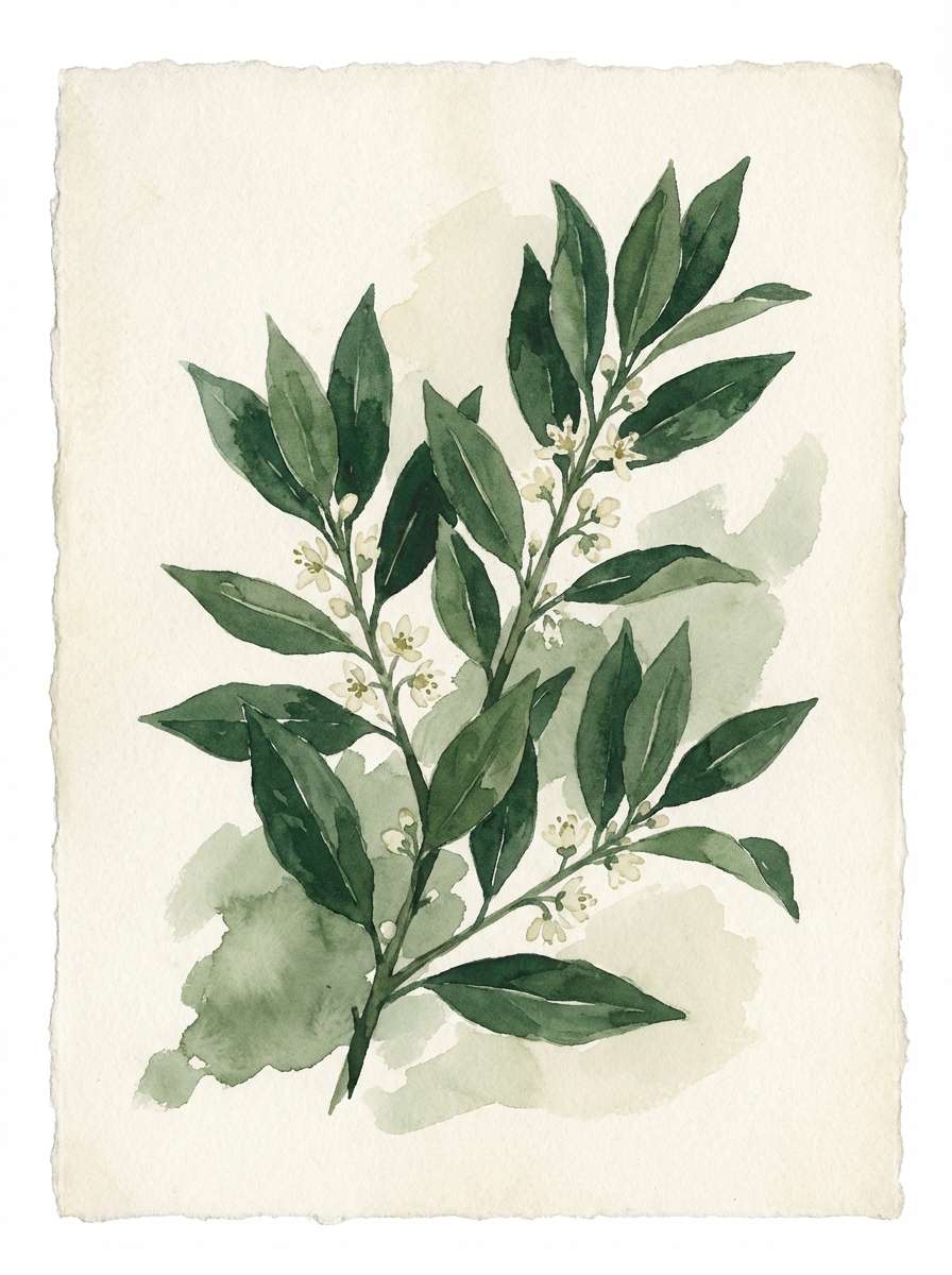
Fresh and grounded, these hues feel like laurel leaves, shaded courtyards, and pale stone pathways. Use them for wellness packaging, eco labels, or calm editorial accents where green should look cultivated, not sporty. Pair the darkest green with the soft stone for strong headers, and use the herb midtone for icons and section highlights. Tip: add subtle leaf line art in the lightest cream to keep the look airy.
Image example of laurel courtyard generated using media.io
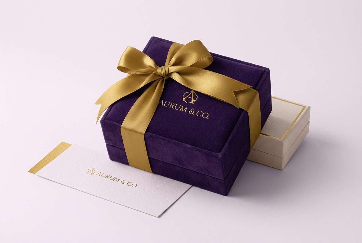
4) Imperial Amethyst
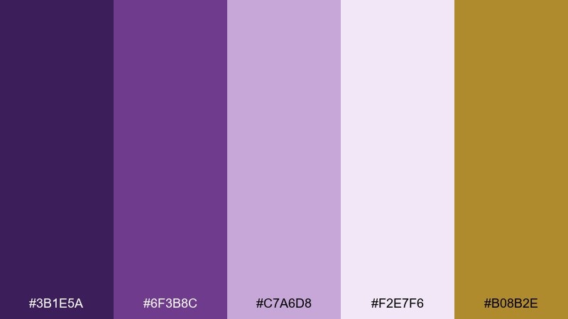
HEX: #3B1E5A #6F3B8C #C7A6D8 #F2E7F6 #B08B2E
Mood: regal, dramatic, ceremonial
Best for: luxury branding, jewelry ads, and campaign landing pages
Regal and ceremonial, it recalls velvet drapery, amethyst gems, and gilded details under torchlight. These tones shine in luxury brand systems and hero sections where a single statement color should carry the story. For a confident roman empire color palette, lead with deep purple, soften transitions with lilac, and finish with restrained gold for highlights. Tip: keep gold to thin rules, icons, or small badges so the purple stays dominant.
Image example of imperial amethyst generated using media.io
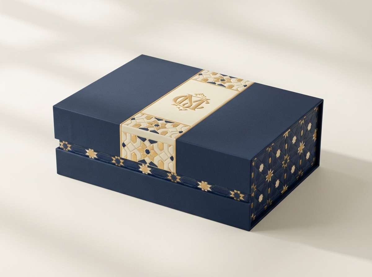
5) Gilded Mosaic
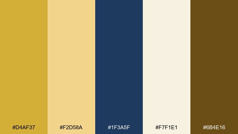
HEX: #D4AF37 #F2D58A #1F3A5F #F7F1E1 #6B4E16
Mood: opulent, crafted, luminous
Best for: premium packaging, book covers, and brand marks
Opulent and crafted, it brings to mind gold tesserae, deep lapis shadows, and candlelit shine. It is ideal for premium packaging and covers where you want a luxurious focal color plus a strong dark anchor. These roman empire color combinations work best when navy carries the background and gold appears as foil-like accents. Tip: use the pale cream as breathing room around logos to keep the palette from feeling heavy.
Image example of gilded mosaic generated using media.io
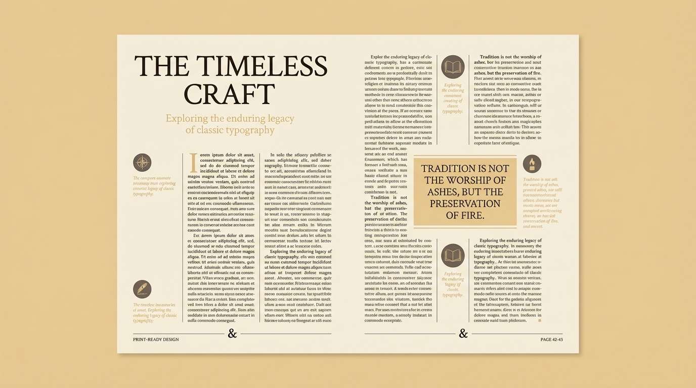
6) Parchment Scroll
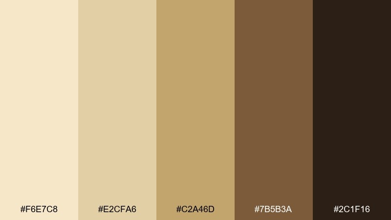
HEX: #F6E7C8 #E2CFA6 #C2A46D #7B5B3A #2C1F16
Mood: scholarly, warm, archival
Best for: editorial layouts, history blogs, and book design
Scholarly and archival, these tones echo aged paper, leather bindings, and inked margins. They suit editorial layouts and long-form reading experiences where warmth reduces eye strain. Pair the darkest brown for body text with the parchment base, then use the honey midtone for pull quotes and section labels. Tip: add generous line spacing and subtle rules to reinforce the old-world, library feel.
Image example of parchment scroll generated using media.io
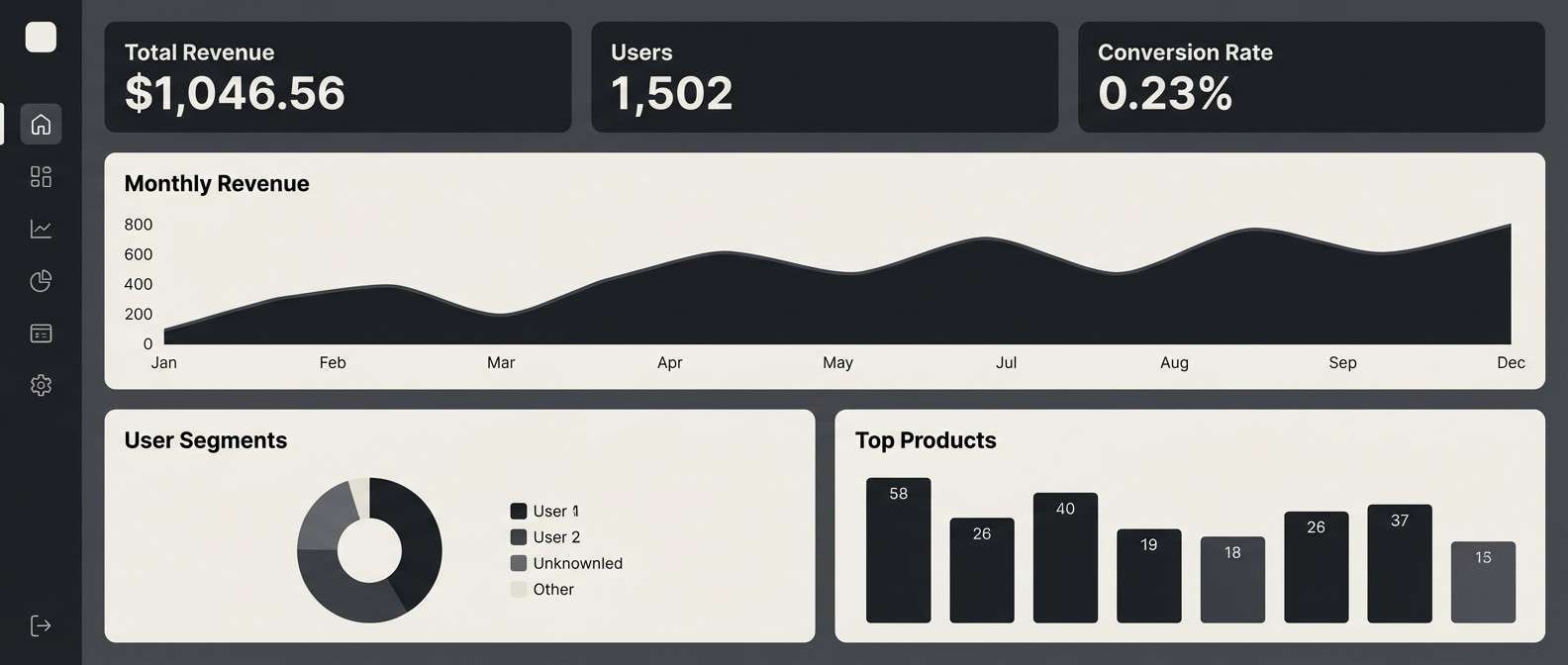
7) Basalt Colonnade
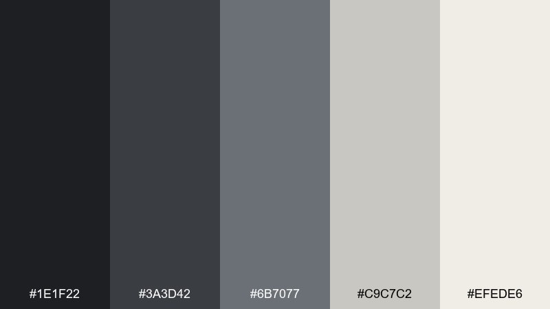
HEX: #1E1F22 #3A3D42 #6B7077 #C9C7C2 #EFEDE6
Mood: stoic, modern, architectural
Best for: dashboard UI, tech branding, and monochrome posters
Stoic and architectural, it feels like basalt steps, iron shadows, and pale stone dust. Use it for dashboards and serious product UI where clarity and hierarchy matter more than decoration. Pair the near-black with the light stone for crisp contrast, then use the mid-grays for states and dividers. Tip: introduce one small warm accent (like a tan icon) only if you need emphasis, otherwise stay monochrome.
Image example of basalt colonnade generated using media.io
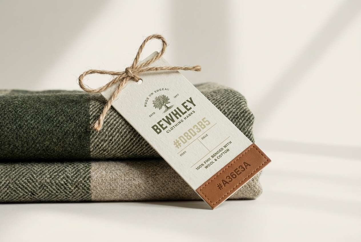
8) Olive Legion
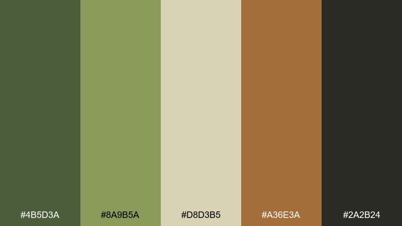
HEX: #4B5D3A #8A9B5A #D8D3B5 #A36E3A #2A2B24
Mood: rugged, utilitarian, outdoorsy
Best for: heritage apparel branding and rugged product tags
Rugged and utilitarian, these colors suggest weathered leather, olive groves, and packed earth roads. They fit heritage apparel brands, workwear tags, and outdoorsy packaging that still wants to feel curated. Pair the deep olive with the warm bone neutral for labels, and use the saddle brown for stitching details and badges. Tip: keep typography bold and simple to match the grounded tone.
Image example of olive legion generated using media.io
9) Fresco Dust
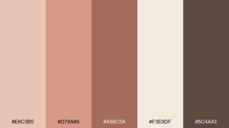
HEX: #E6C3B5 #D79A85 #A56C5A #F3E9DF #5C4A43
Mood: soft, romantic, timeworn
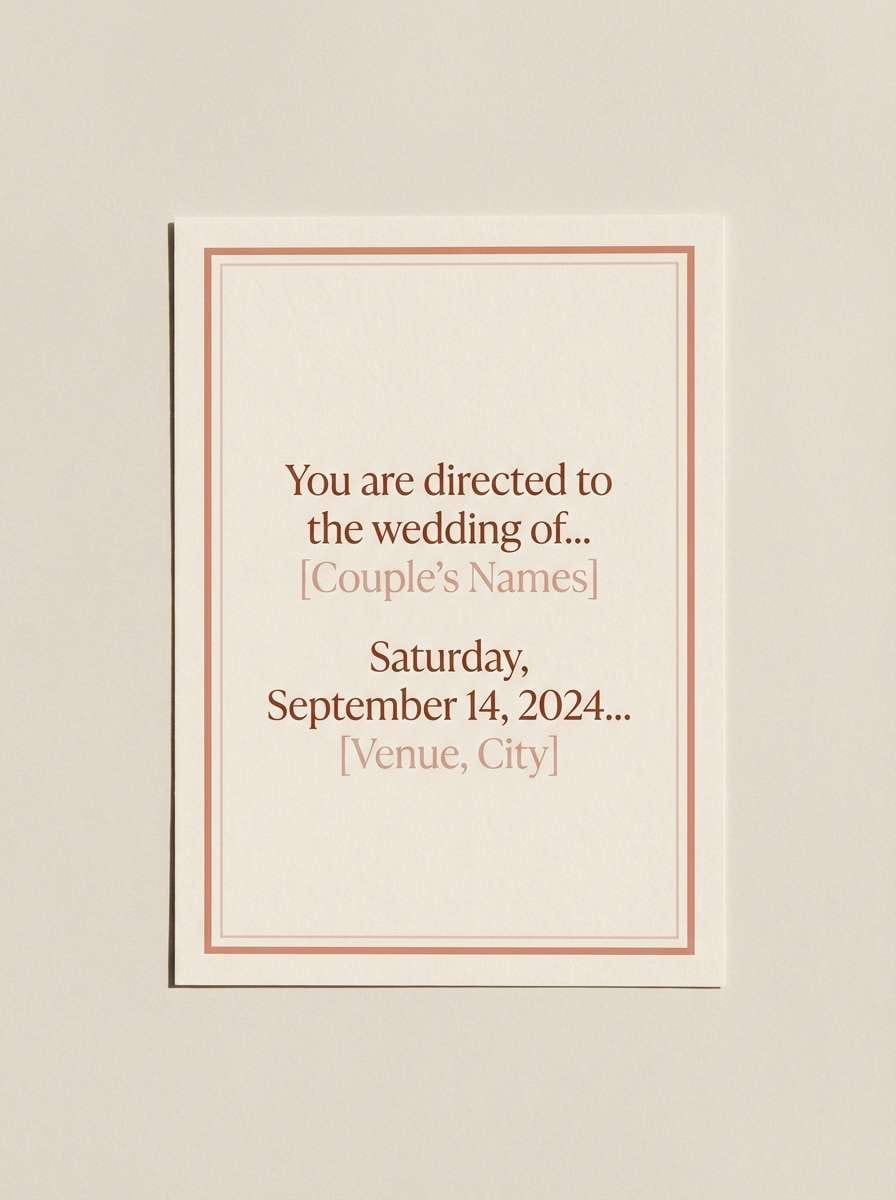
Best for: wedding stationery, lifestyle branding, and soft social templates
Soft and timeworn, it recalls faded fresco walls, powdered pigments, and warm plaster. Use it for wedding stationery, lifestyle brands, and gentle social templates that need warmth without sweetness. Pair the dusty rose with the creamy off-white for invitations, then use the cocoa brown to keep type grounded. Tip: add subtle grain or watercolor edges to enhance the aged mural effect.
Image example of fresco dust generated using media.io
10) Rosy Aurelia
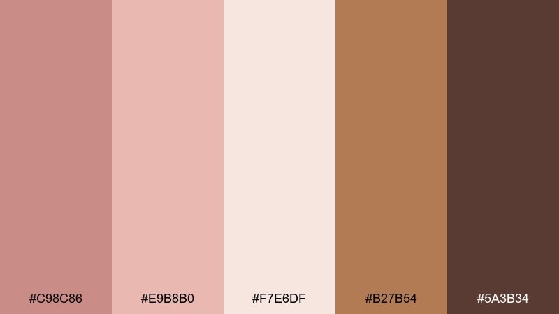
HEX: #C98C86 #E9B8B0 #F7E6DF #B27B54 #5A3B34
Mood: gentle, polished, feminine
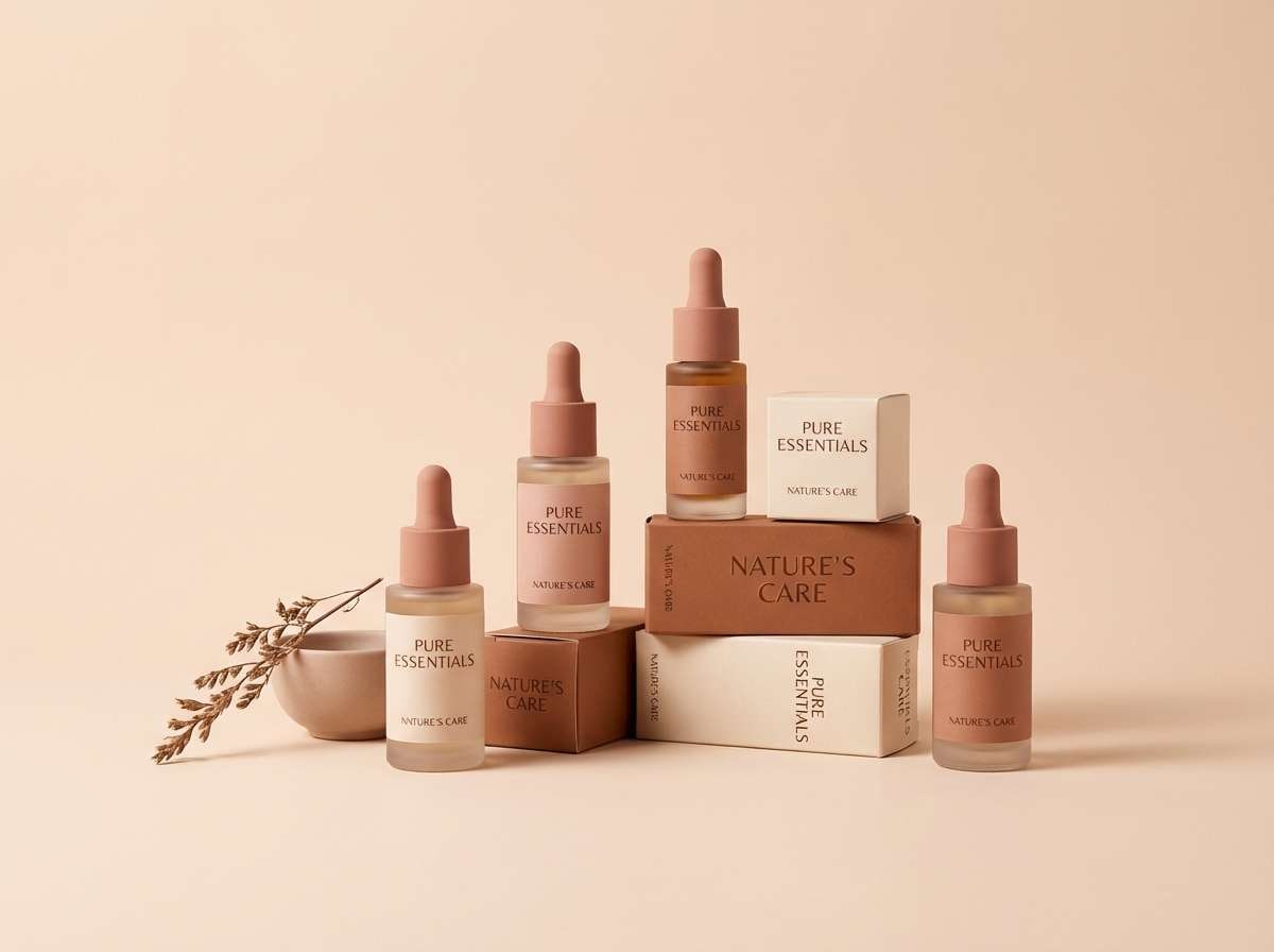
Best for: beauty branding, skincare packaging, and boutique web headers
Gentle and polished, these hues feel like blush stone, warm light, and bronze-tinted details. They are a natural fit for skincare branding, boutique headers, and soft product storytelling. Pair the pale blush with cocoa brown for elegant contrast, then sprinkle the toasted bronze as a premium accent. Tip: keep backgrounds airy and let one deeper tone define structure (buttons, nav, or labels).
Image example of rosy aurelia generated using media.io
11) Bronze Shield
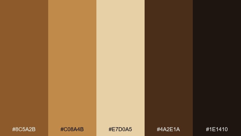
HEX: #8C5A2B #C08A4B #E7D0A5 #4A2E1A #1E1410
Mood: bold, masculine, protective
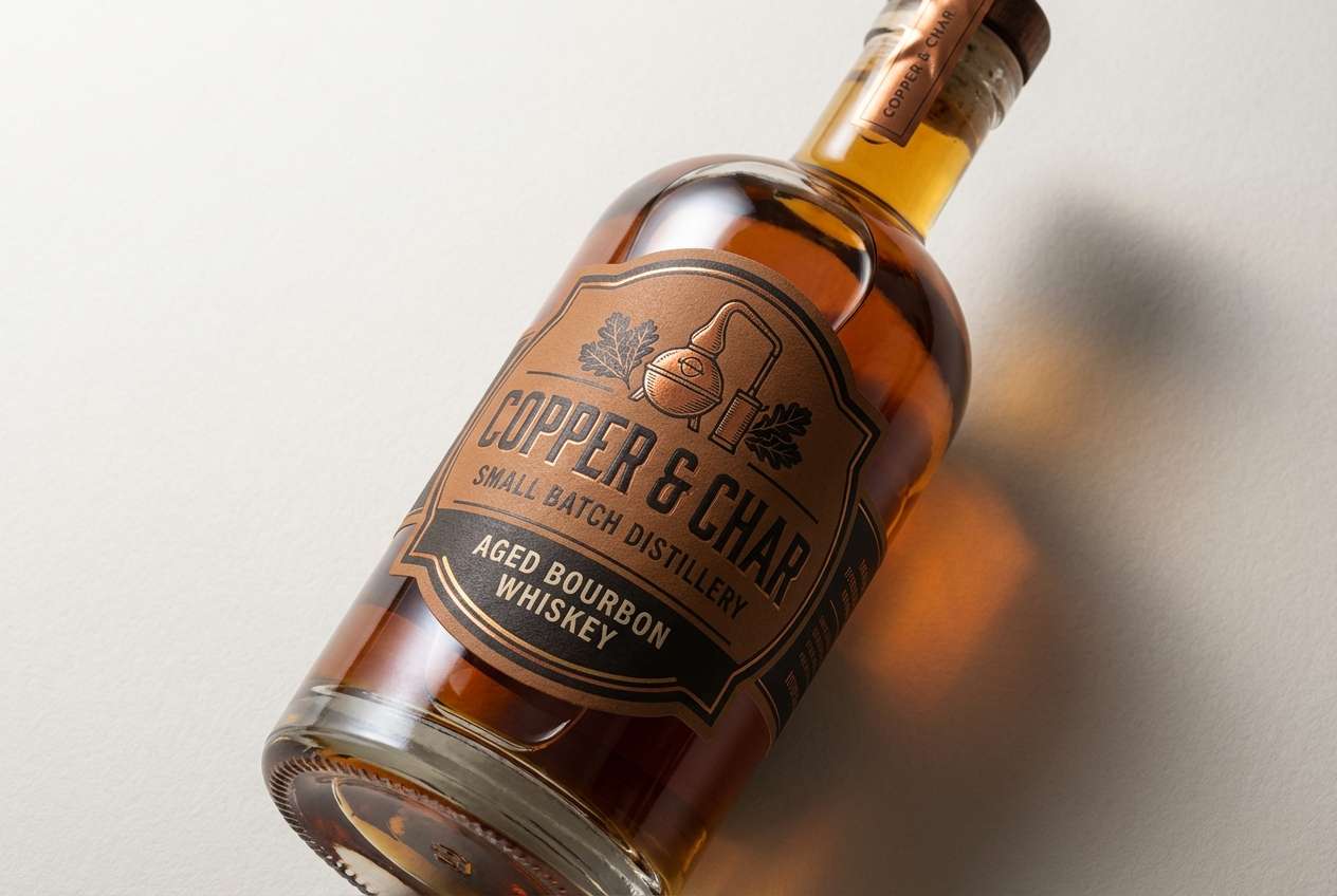
Best for: craft spirits labels, badges, and rugged logos
Bold and protective, it evokes burnished bronze, hammered metal, and smoky workshop air. It is great for craft spirits labels, emblem-style logos, and packaging that needs weight and tradition. Pair the bright bronze with the dark umber for strong marks, and use the pale wheat tone to keep text panels legible. Tip: try embossed or foil finishes so the metallic mood comes through even in flat designs.
Image example of bronze shield generated using media.io
12) Pompeii Sunset
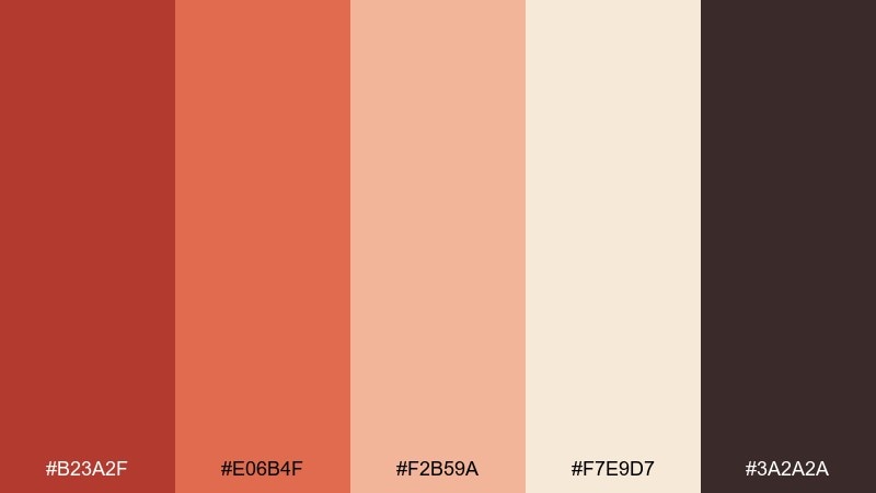
HEX: #B23A2F #E06B4F #F2B59A #F7E9D7 #3A2A2A
Mood: fiery, cinematic, historic
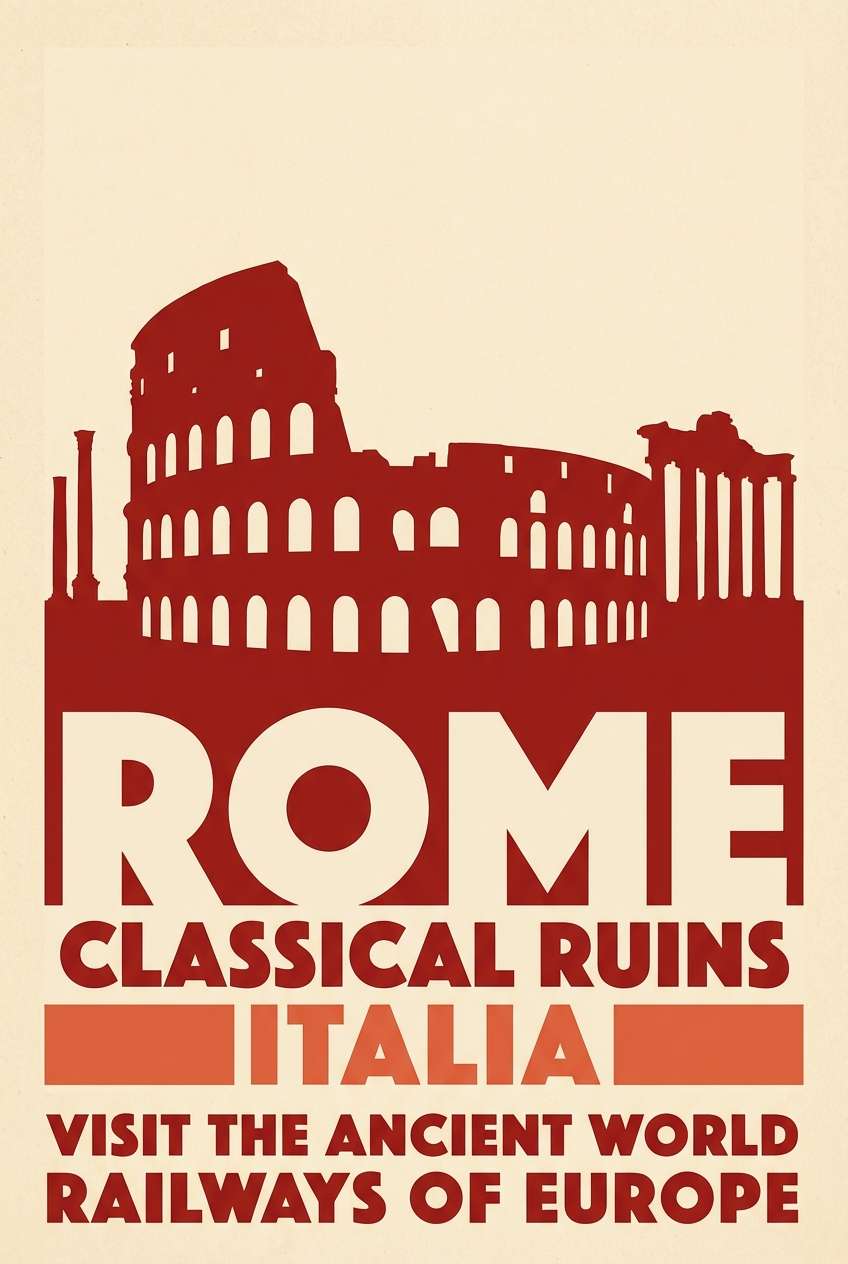
Best for: travel posters, album art, and dramatic hero sections
Fiery and cinematic, these shades feel like sun-warmed stucco, ember skies, and deep street shadows. They work well for travel posters, album art, and hero sections that need a vivid warm gradient. Pair the brick red with the soft sand for readable type, and use the near-black sparingly to frame the layout. Tip: keep saturation concentrated in one focal area so the design stays sophisticated.
Image example of pompeii sunset generated using media.io
13) Sea Trade Teal
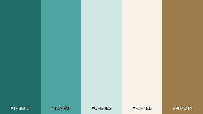
HEX: #1F6E6B #4BA3A0 #CFE8E2 #F5F1E6 #9B7C4A
Mood: breezy, coastal, mercantile
Best for: travel branding, resort websites, and packaging accents
Breezy and coastal, it brings to mind port waters, patinated metal, and sun-bleached stone. Use it for travel branding and resort websites that want calm color with a hint of adventure. Pair the deep teal with the warm cream for navigation and buttons, then add a touch of brass-brown for premium accents. Tip: keep gradients subtle so the teal stays clean and not overly tropical.
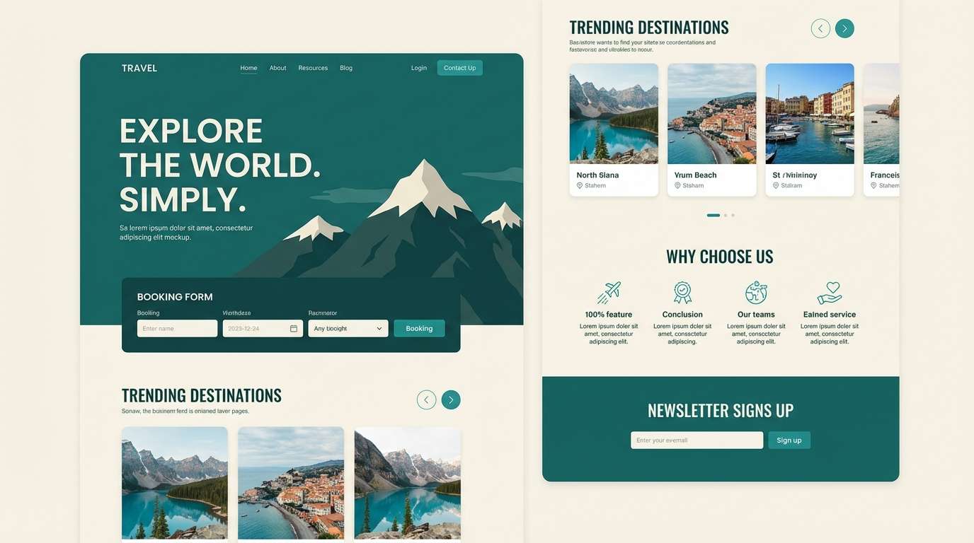
Image example of sea trade teal generated using media.io
14) Vineyard Twilight
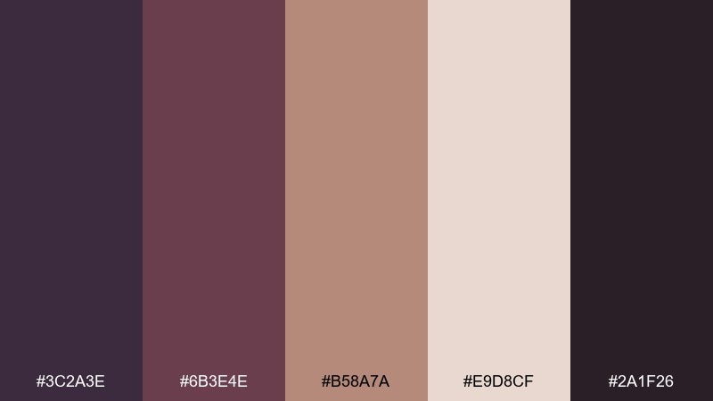
HEX: #3C2A3E #6B3E4E #B58A7A #E9D8CF #2A1F26
Mood: moody, intimate, wine-bar chic
Best for: wine labels, evening event invites, and boutique branding
Moody and intimate, these tones suggest twilight vineyards, aged barrels, and velvet shadows. They suit wine labels and evening invitations where you want warmth with drama. Pair the plum-black with the pale blush-beige for contrast, and use the dusty rose-brown to add softness to borders and ornaments. Tip: keep typography slender and elegant so the palette feels curated rather than gothic.
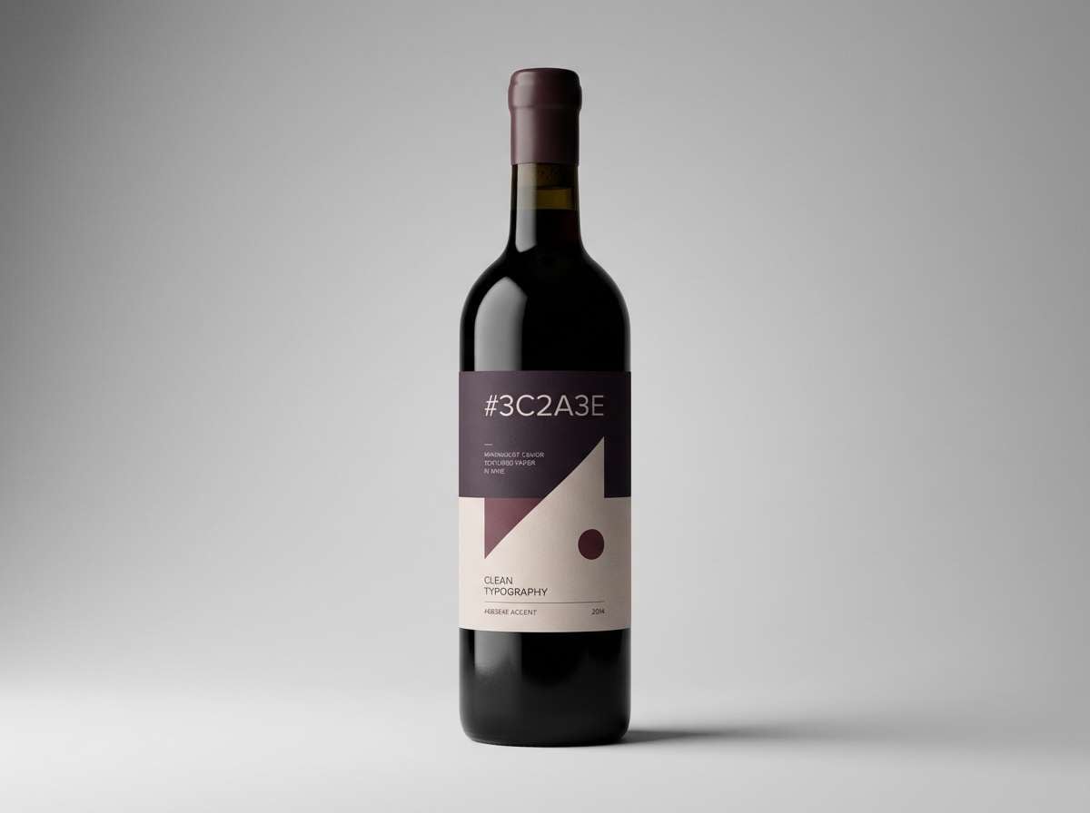
Image example of vineyard twilight generated using media.io
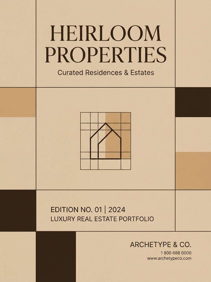
15) Sandstone Arch
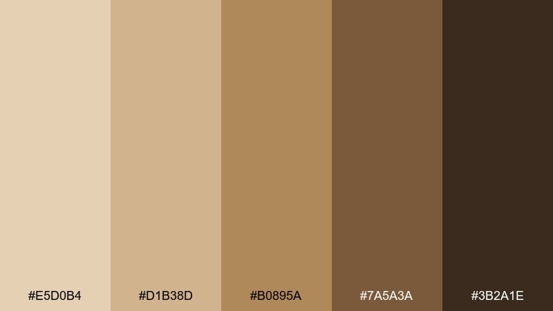
HEX: #E5D0B4 #D1B38D #B0895A #7A5A3A #3B2A1E
Mood: sunlit, grounded, architectural
Best for: interior mood boards, real estate brochures, and landing pages
Sunlit and grounded, it feels like sandstone arches, desert dust, and shaded courtyards. These neutrals are ideal for real estate brochures and interior mood boards where materials do the talking. Pair the light sand with the darkest brown for clean type, and use the caramel midtone to highlight features or pricing. Tip: combine with warm photography and avoid cool grays so the palette stays cohesive.
Image example of sandstone arch generated using media.io
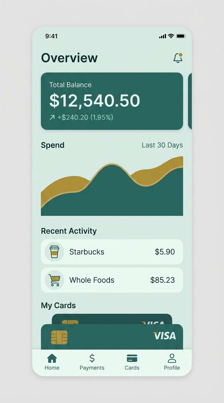
16) Patina Coin
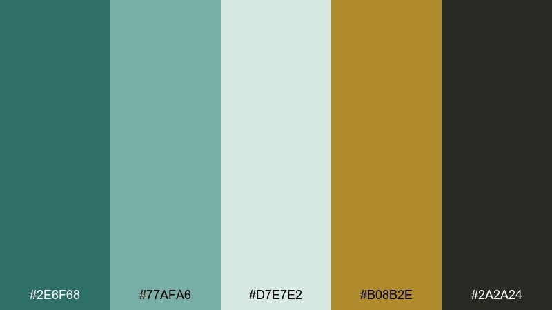
HEX: #2E6F68 #77AFA6 #D7E7E2 #B08B2E #2A2A24
Mood: antique, cool, collectible
Best for: fintech branding, collectible cards, and app accents
Antique and collectible, it hints at oxidized metal, sea-aged coins, and quiet museum glass. It is a strong choice for fintech branding that wants trust with character, especially when you avoid overly bright blues. Pair the dark patina teal with the pale mist for backgrounds, then use the muted gold as a small premium cue. Tip: keep icons simple and geometric so the aged vibe stays modern.
Image example of patina coin generated using media.io
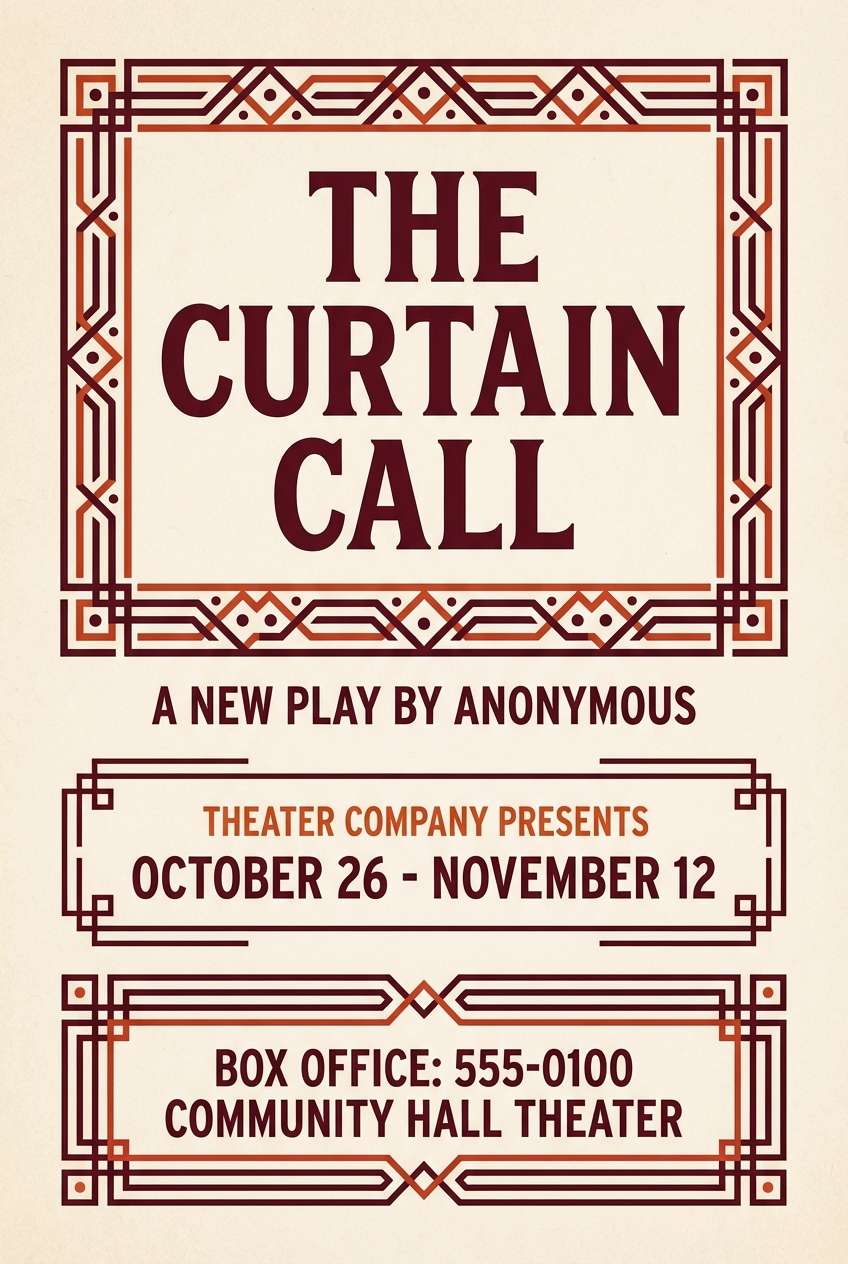
17) Ceremonial Crimson
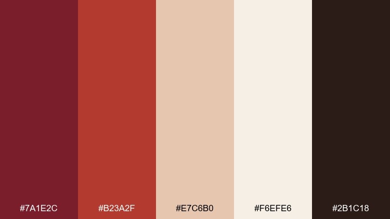
HEX: #7A1E2C #B23A2F #E7C6B0 #F6EFE6 #2B1C18
Mood: solemn, powerful, formal
Best for: theater posters, book covers, and premium announcements
Solemn and powerful, these reds feel like ceremonial cloth, wax seals, and candlelit halls. They are perfect for theater posters and premium announcements that need authority without looking aggressive. Pair the deep crimson with the ivory for maximum readability, and use the warm blush-beige to soften large color blocks. Tip: try a seal motif or stamp-style badge to echo the formal tone.
Image example of ceremonial crimson generated using media.io
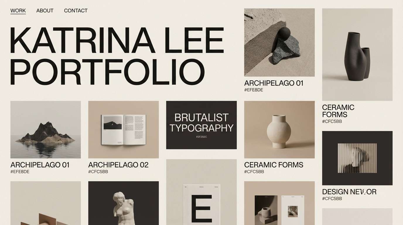
18) Temple Shade
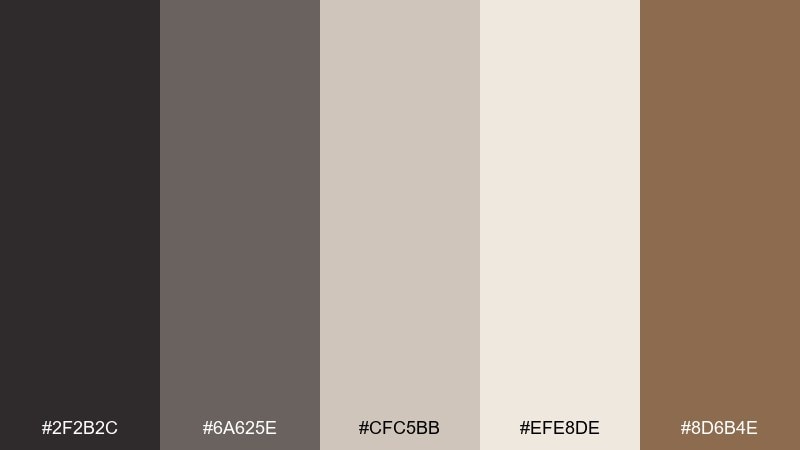
HEX: #2F2B2C #6A625E #CFC5BB #EFE8DE #8D6B4E
Mood: quiet, contemplative, stone-cool
Best for: architecture portfolios and minimalist brand systems
Quiet and contemplative, it suggests cool stone interiors, soft dust, and warm wood details. Use it for architecture portfolios and minimalist identity systems where you want calm confidence. Pair the dark charcoal with the pale plaster for layouts, and let the muted wood-brown appear in small highlights like links or captions. Tip: keep photography desaturated and warm to match the stone-like neutrals.
Image example of temple shade generated using media.io
19) Saffron Market
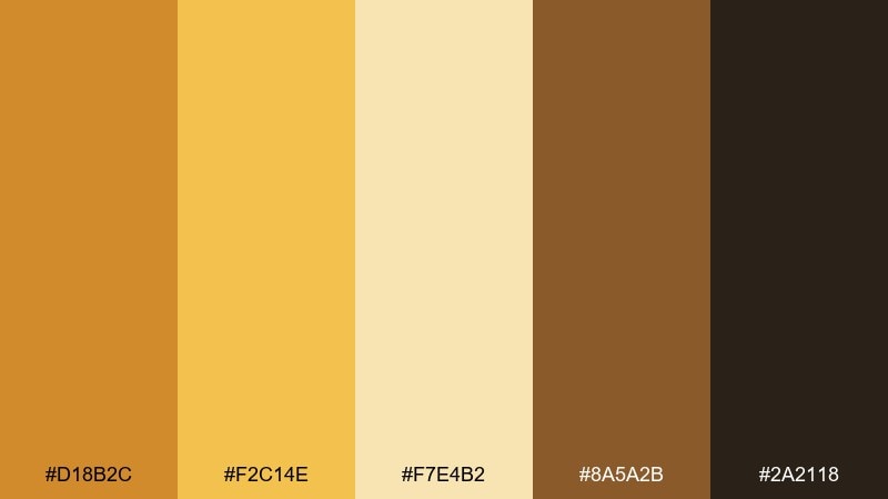
HEX: #D18B2C #F2C14E #F7E4B2 #8A5A2B #2A2118
Mood: spiced, lively, sun-warm
Best for: food packaging, market flyers, and social promos
Spiced and lively, it feels like saffron threads, toasted grain, and sun-warmed stalls. It is great for food packaging and market flyers where you want cheerful warmth that still reads artisanal. Pair the bright saffron with the deep roasted brown to keep contrast strong, then use the pale buttery tone for backgrounds and ingredient callouts. Tip: use simple illustrated icons so the palette stays the star.
Image example of saffron market generated using media.io
20) Night at the Circus
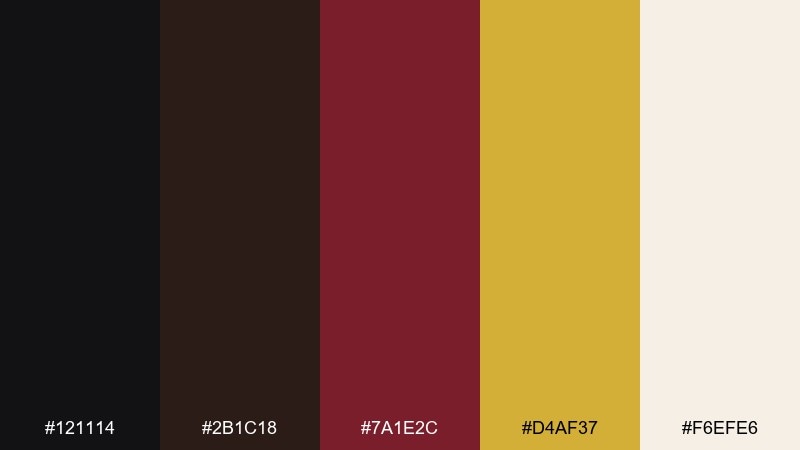
HEX: #121114 #2B1C18 #7A1E2C #D4AF37 #F6EFE6
Mood: dramatic, festive, high-contrast
Best for: campaign graphics, nightlife branding, and bold headers
Dramatic and festive, these tones evoke midnight stands, crimson banners, and flashes of gold under lights. Use them for campaign graphics and nightlife branding where contrast and rhythm matter. For a sharp roman empire color combination, let black lead, use ivory for type, and keep gold as a tiny but bright accent. Tip: avoid adding extra colors and lean into big shapes and strong spacing.
Image example of night at the circus generated using media.io
21) Capitoline Mist
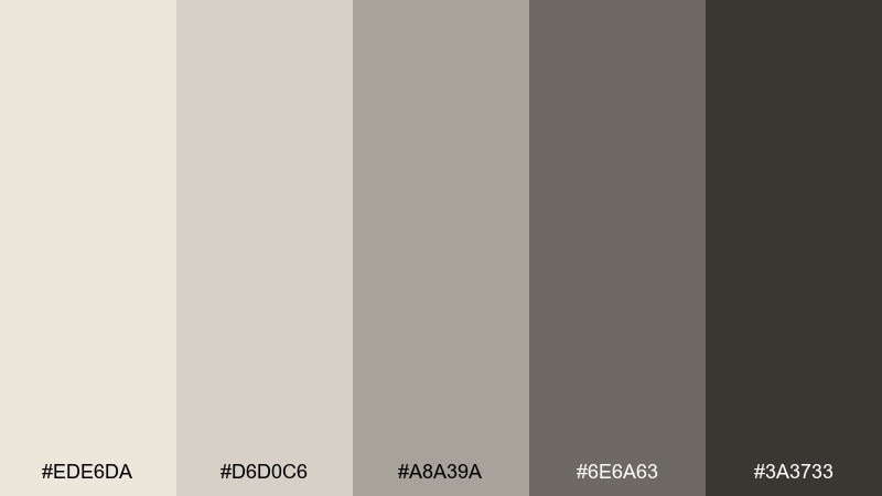
HEX: #EDE6DA #D6D0C6 #A8A39A #6E6A63 #3A3733
Mood: soft, misty, elegant
Best for: corporate presentations and understated web UI
Soft and misty, it suggests morning haze over pale stone and quiet city streets. These neutrals are excellent for corporate decks and understated UI where you want warmth without color noise. Pair the darkest gray for headings with the creamy base, then use the mid-grays for charts and secondary buttons. Tip: add one textured background (paper or stone) to keep the gray family from feeling sterile.
Image example of capitoline mist generated using media.io

22) Aureate Basilica
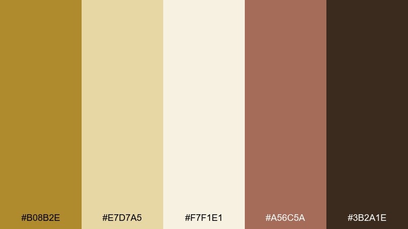
HEX: #B08B2E #E7D7A5 #F7F1E1 #A56C5A #3B2A1E
Mood: warm, sacred, luminous
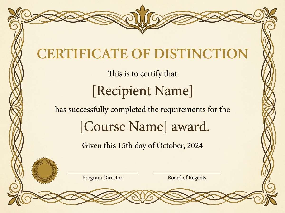
Best for: premium certificates, invitation suites, and brand seals
Warm and luminous, it feels like gilded trim against cream stone and soft terracotta accents. It works well for certificates, invitation suites, and brand seals where gold should look elegant rather than flashy. These roman empire color combinations stay balanced when cream takes the largest area and gold is used for lines, monograms, or small ornaments. Tip: print on uncoated paper to keep the glow subtle and sophisticated.
Image example of aureate basilica generated using media.io
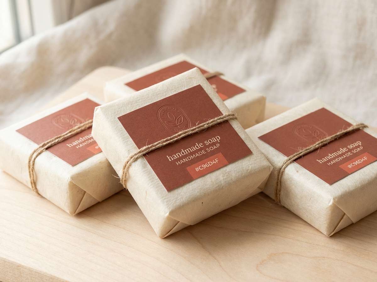
23) Via Appia Clay
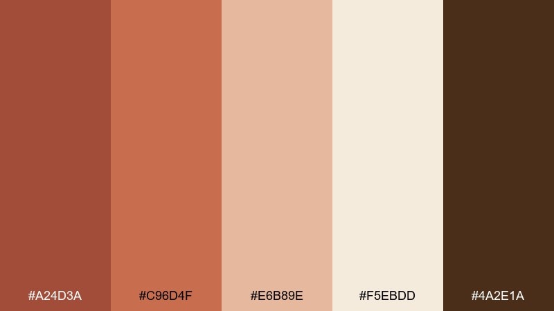
HEX: #A24D3A #C96D4F #E6B89E #F5EBDD #4A2E1A
Mood: dusty, rustic, sunbaked
Best for: handmade goods packaging and rustic brand palettes
Dusty and sunbaked, it recalls clay roads, worn pottery, and warm limestone edges. It is a strong fit for handmade goods packaging and rustic brand identities that still need polish. For a grounded roman empire color palette, build with clay and cream, then use the dark brown for labels and small text. Tip: keep illustrations simple and line-based so the earthy tones do not get muddy.
Image example of via appia clay generated using media.io
What Colors Go Well with Roman Empire?
Roman Empire colors pair best with warm neutrals and grounded darks: marble off-white, parchment cream, sandstone tan, and charcoal or espresso for text and structure.
For accent color, choose one “artifact” tone and keep it small: muted gold, bronze, imperial purple, patina teal, or ceremonial crimson. This keeps the look historic and premium rather than costume-like.
If you need modern freshness, add cultivated greens (laurel/olive) or a coastal teal, but balance them with cream so the palette still feels Mediterranean and architectural.
How to Use a Roman Empire Color Palette in Real Designs
Start with a base + ink rule: pick one light (cream/marble) for backgrounds and one dark (charcoal/brown) for type. Then assign midtones to UI surfaces like cards, borders, and secondary sections.
Use gold, saffron, or bronze only for emphasis: icons, tiny badges, thin rules, or key CTAs. In print, these accents feel especially convincing with foil, emboss, or uncoated stock textures.
To avoid a “theme party” look, keep shapes modern and typography clean. Let the Roman feeling come from material color and restrained ornament, not overloaded motifs.
Create Roman Empire Palette Visuals with AI
If you want to preview these palettes on posters, packaging, or UI screens, generate quick concept visuals first. Seeing color in context helps you fine-tune contrast, hierarchy, and where accents should live.
Media.io Text-to-Image makes it easy to turn a palette into a mockup-style image using a single prompt, so you can iterate fast before committing to production files.
Roman Empire Color Palette FAQs
-
What are the main Roman Empire colors?
Common Roman Empire colors include marble whites and warm stone neutrals, terracotta and brick reds, deep charcoals/browns, laurel/olive greens, and metallic accents like gold or bronze. -
What HEX codes feel “imperial” for modern branding?
Deep purple and muted gold are classic imperial cues. Try #3B1E5A and #B08B2E as a strong base, then soften with light lilac/cream such as #F2E7F6 or #F7F1E1. -
How do I keep a Roman palette from looking too vintage?
Use a modern layout system (grids, generous whitespace) and limit ornament. Keep gold/bronze small, and rely on clean typography and subtle texture rather than heavy decoration. -
Which Roman Empire palettes work best for UI design?
Neutral-forward sets like Marble Atrium, Basalt Colonnade, Temple Shade, and Capitoline Mist are easiest for UI because they support clear hierarchy and accessible contrast. -
What colors pair well with terracotta?
Terracotta pairs well with parchment/cream backgrounds, espresso or charcoal text, and small metallic accents (muted gold/bronze). Avoid cool grays if you want a cohesive sun-warmed look. -
Can I use Roman Empire colors for minimalist branding?
Yes. Choose a stone-like neutral base, add one dark ink tone, and keep a single accent (gold, patina teal, or muted crimson). Minimal palettes often feel more “museum-quality” and premium.


