

Renaissance palettes blend warm earth pigments, parchment lights, and noble blues to create designs that feel crafted, historic, and surprisingly modern.
Below are 20 Renaissance-inspired color palette ideas with HEX codes, plus practical guidance for branding, UI, print, and interiors.
In this article
- Why Renaissance Palettes Work So Well
-
- fresco ochre
- venetian velvet
- ultramarine halo
- gilded manuscript
- tuscan terracotta
- chapel candlelight
- medici garden
- scholars ink
- marble and wine
- saffron tapestry
- cypress shadow
- pearl and pewter
- crimson reliquary
- olive drapery
- sunlit plaster
- rose madder mist
- iron gate patina
- stormy fresco
- lace and lapis
- workshop woodstain
- What Colors Go Well with Renaissance?
- How to Use a Renaissance Color Palette in Real Designs
- Create Renaissance Palette Visuals with AI
Why Renaissance Palettes Work So Well
Renaissance colors feel instantly “designed” because they’re rooted in real materials: ochre plaster, terracotta clay, parchment paper, and deep mineral blues. That material logic makes palettes look coherent even when they include bold accents like crimson or ultramarine.
They also balance warmth and gravity. Creamy neutrals create breathing room, darker inks and browns establish hierarchy, and one noble hue (blue, wine, or gold) adds prestige without looking trendy.
For modern work—branding, UI, editorial, packaging—Renaissance tones help you communicate craftsmanship, tradition, and depth while still staying clean and legible.
20+ Renaissance Color Palette Ideas (with HEX Codes)
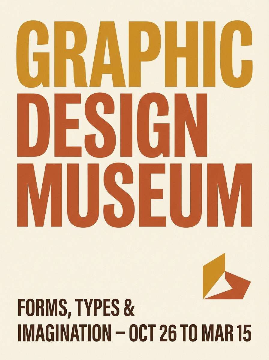
1) Fresco Ochre
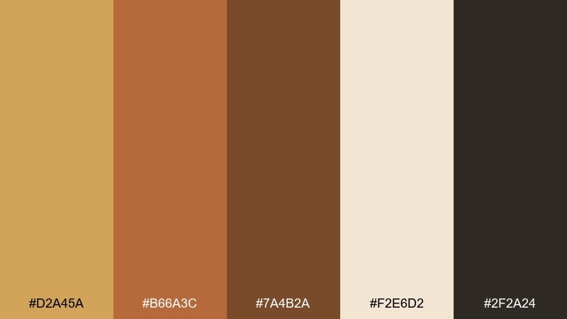
HEX: #d2a45a #b66a3c #7a4b2a #f2e6d2 #2f2a24
Mood: earthy, sun-warmed, timeworn
Best for: museum poster design
Earthy warmth and sun-baked plaster tones evoke painted chapel walls and aged stone. Use it for cultural posters, exhibition signage, and editorial covers that need historical weight without feeling heavy. Pair the cream with the deep near-black for crisp type, then let ochre lead as the hero color. Tip: keep large flat areas in #f2e6d2 to make the darker browns feel intentional, not muddy.
Image example of fresco ochre generated using media.io
Media.io is an online AI studio for creating and editing video, image, and audio in your browser.

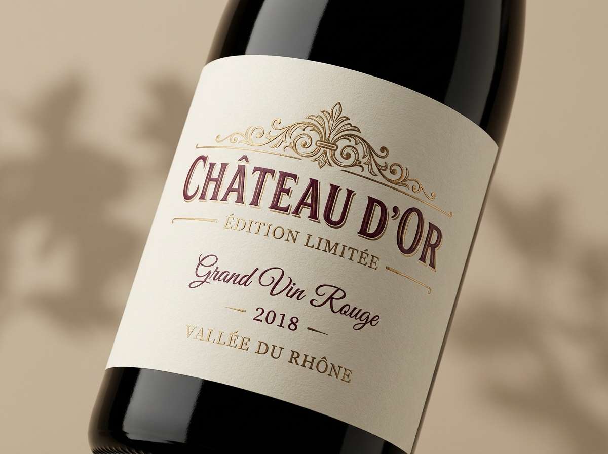
2) Venetian Velvet
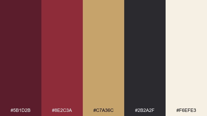
HEX: #5b1d2b #8e2c3a #c7a36c #2b2a2f #f6efe3
Mood: luxurious, candlelit, dramatic
Best for: premium wine label
Luxurious reds and antique gold feel like velvet drapery under candlelight. It shines on wine labels, spirits packaging, and upscale menus where you want depth and restraint. Use the dark charcoal for fine linework and reserve the gold for a single emblem or border. Tip: print tests matter here, so slightly increase contrast between #5b1d2b and #8e2c3a for small text.
Image example of venetian velvet generated using media.io
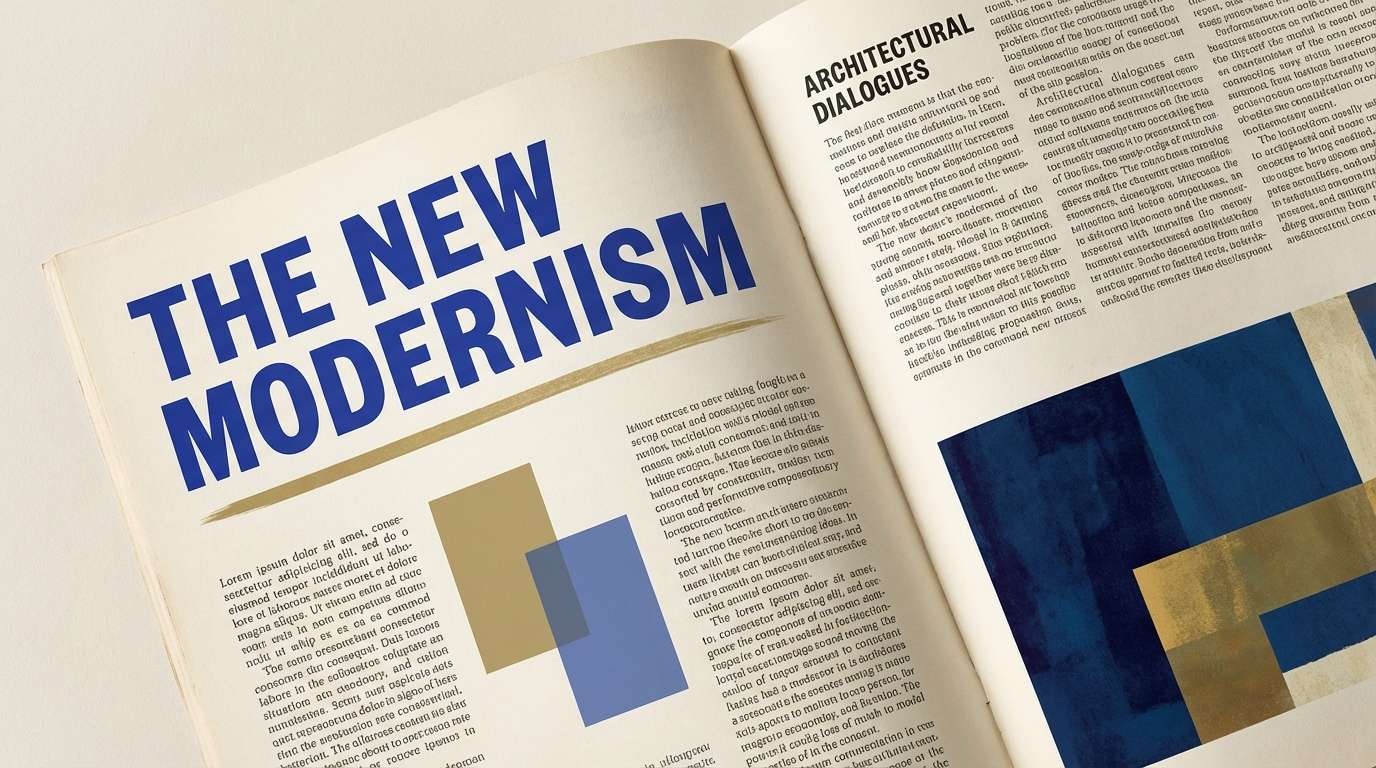
3) Ultramarine Halo
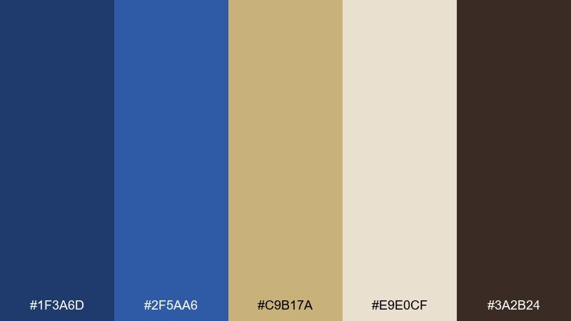
HEX: #1f3a6d #2f5aa6 #c9b17a #e9e0cf #3a2b24
Mood: sacred, luminous, refined
Best for: editorial magazine spread
Sacred blues with a soft gilded glow recall lapis pigment and illuminated margins. These renaissance color combinations work beautifully in magazine spreads, lookbooks, and longform articles where hierarchy matters. Let #e9e0cf carry the page, then use ultramarine for headings and pull quotes while #c9b17a highlights rules and numbers. Tip: keep blue blocks away from body text for easier reading and a calmer rhythm.
Image example of ultramarine halo generated using media.io
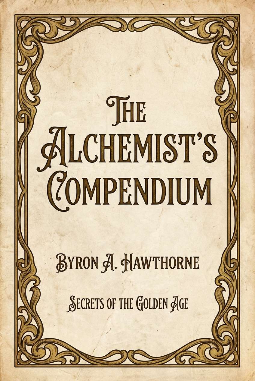
4) Gilded Manuscript
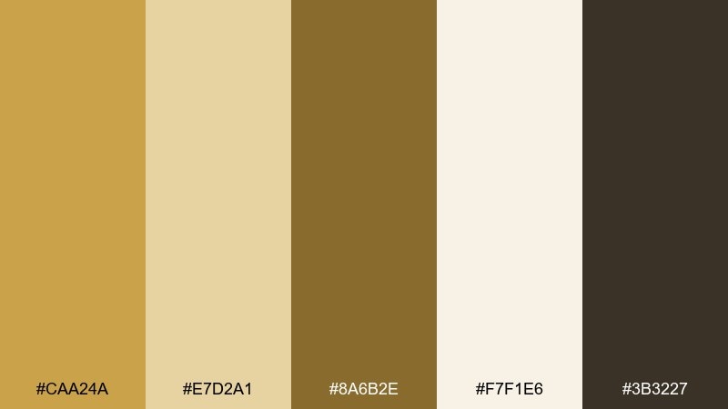
HEX: #caa24a #e7d2a1 #8a6b2e #f7f1e6 #3b3227
Mood: ornate, scholarly, ceremonial
Best for: book cover design
Ornate golds and parchment neutrals bring to mind hand-lettered pages and gilded initials. Use it on book covers, event programs, and heritage branding where detail should feel crafted. Pair #caa24a with #3b3227 for a classic title lockup, and keep #f7f1e6 as the breathing room. Tip: a thin border in #8a6b2e instantly adds structure without looking busy.
Image example of gilded manuscript generated using media.io
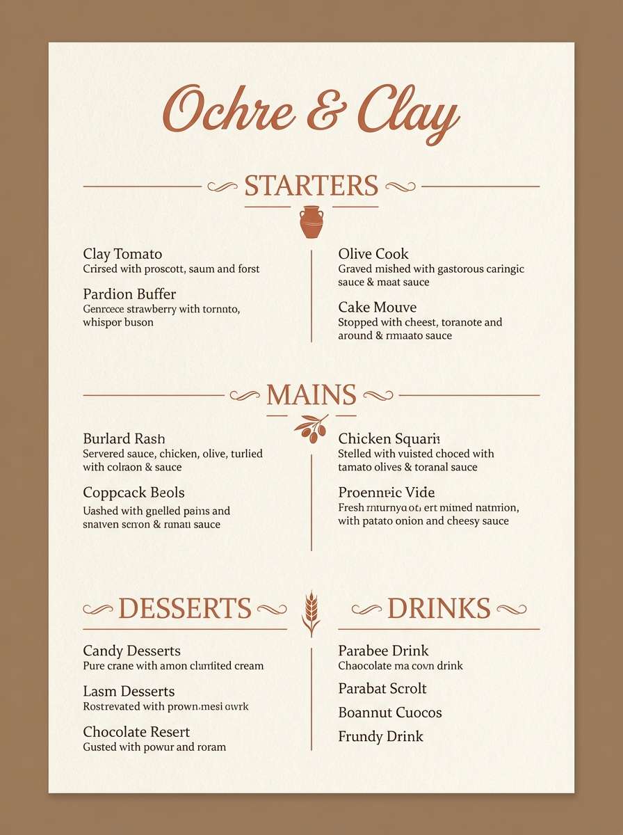
5) Tuscan Terracotta
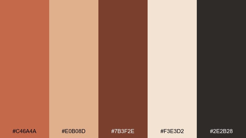
HEX: #c46a4a #e0b08d #7b3f2e #f3e3d2 #2e2b28
Mood: rustic, welcoming, sunlit
Best for: restaurant menu
Rustic terracotta and baked-clay browns feel like hillside villas and warm kitchen light. It fits restaurant menus, cafe branding, and artisanal food packaging that should feel grounded and appetizing. Use #f3e3d2 for the menu base, then set headers in #7b3f2e for strong readability. Tip: a single terracotta block behind specials makes the page feel curated, not crowded.
Image example of tuscan terracotta generated using media.io
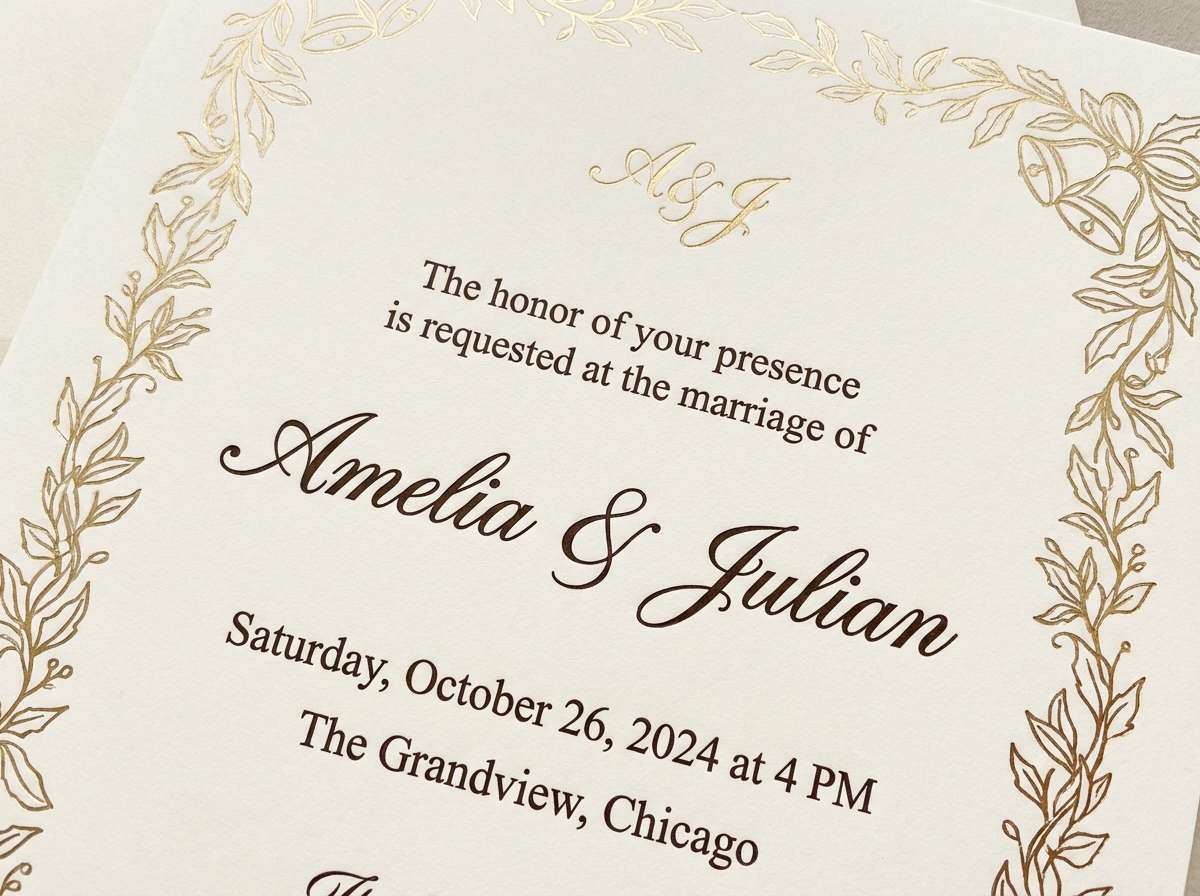
6) Chapel Candlelight
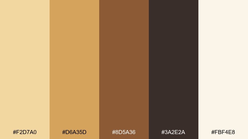
HEX: #f2d7a0 #d6a35d #8d5a36 #3a2e2a #fbf4e8
Mood: glowing, intimate, devotional
Best for: wedding invitation
Glowing amber and soft cream evoke candlelight bouncing off stone and gilding. It is ideal for invitations, ceremony programs, and romantic stationery where warmth matters more than saturation. Keep #fbf4e8 as the paper tone, then use #3a2e2a for type and #d6a35d for a monogram. Tip: embossing or foil looks best when you limit metallic accents to one focal element.
Image example of chapel candlelight generated using media.io
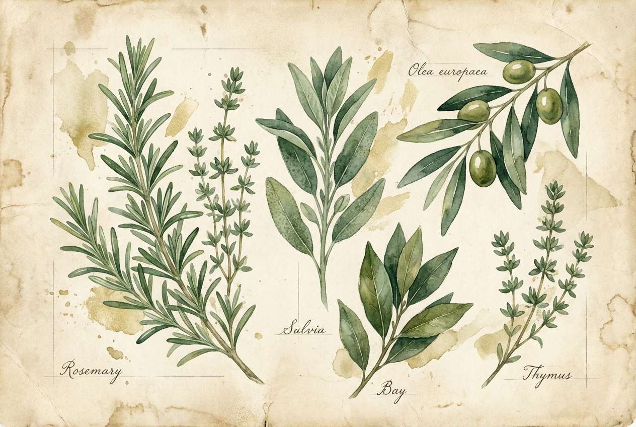
7) Medici Garden
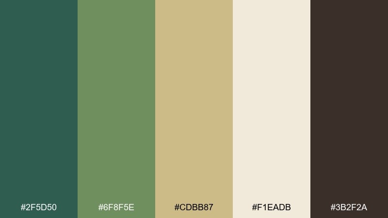
HEX: #2f5d50 #6f8f5e #cdbb87 #f1eadb #3b2f2a
Mood: botanical, balanced, quietly rich
Best for: watercolor botanical illustration
Botanical greens and aged parchment neutrals suggest clipped hedges, herbs, and shaded courtyards. Use it for botanical prints, natural skincare branding, and garden event collateral that needs a refined touch. Pair #2f5d50 with #f1eadb for crisp contrast, then let #cdbb87 soften transitions. Tip: in illustrations, keep the darkest green for stems and shadows so the palette stays airy.
Image example of medici garden generated using media.io
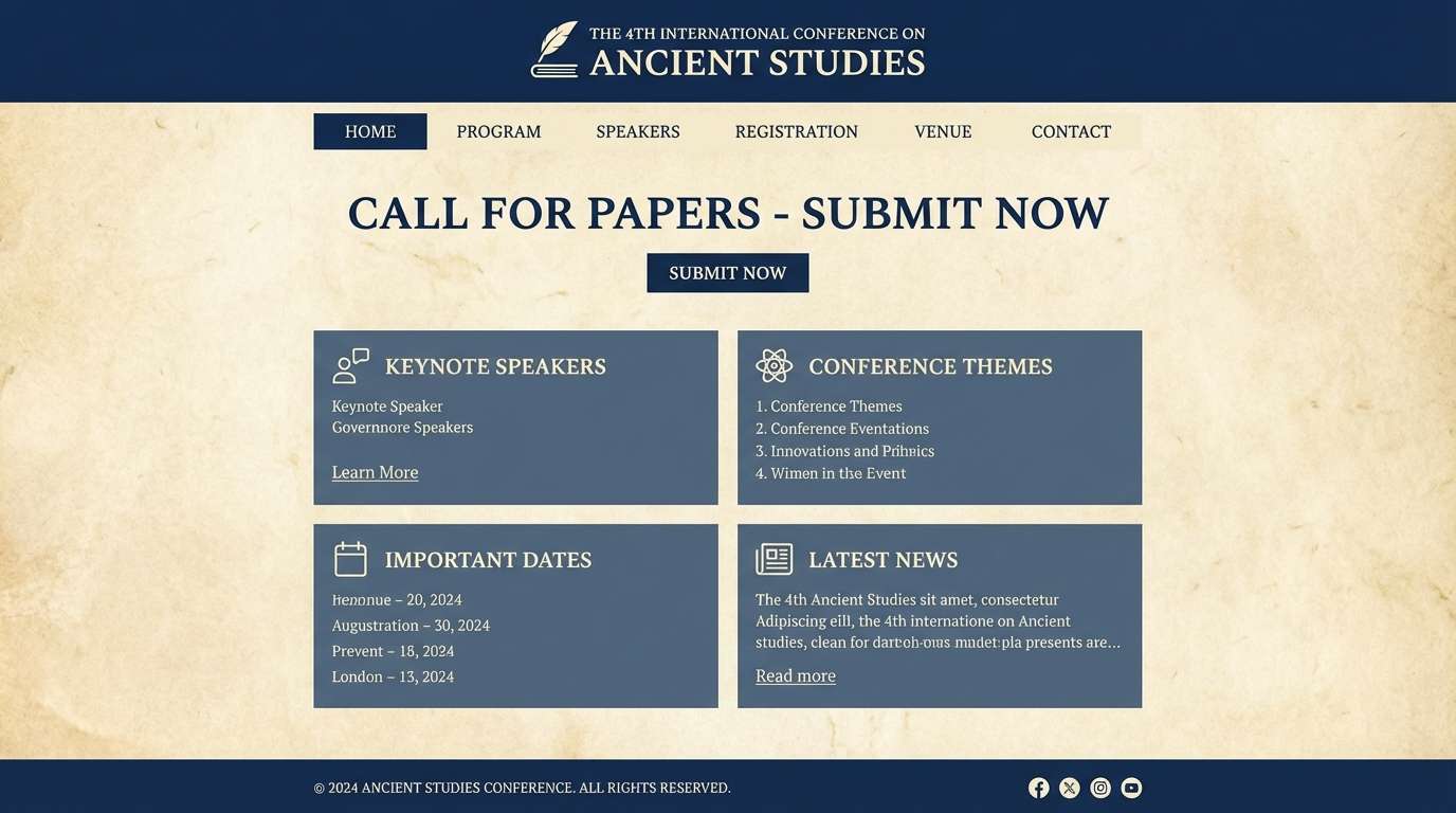
8) Scholars Ink
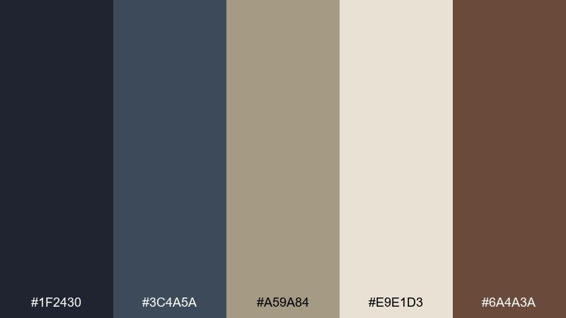
HEX: #1f2430 #3c4a5a #a59a84 #e9e1d3 #6a4a3a
Mood: intellectual, calm, archival
Best for: academic conference website UI
Quiet ink blues and parchment beige feel like marginal notes and well-used notebooks. It is strong for academic conference sites, research dashboards, and documentation where clarity beats flair. Use #e9e1d3 as the background, reserve #1f2430 for text, and pull #6a4a3a into small badges or callouts. Tip: keep link states within the blue range to maintain a serious, trustworthy tone.
Image example of scholars ink generated using media.io
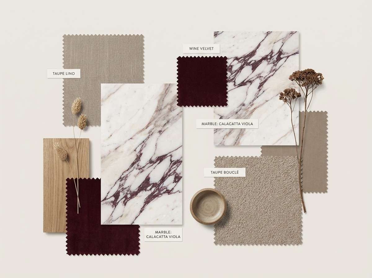
9) Marble and Wine
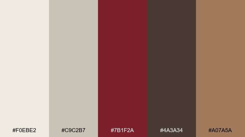
HEX: #f0ebe2 #c9c2b7 #7b1f2a #4a3a34 #a07a5a
Mood: elegant, grounded, gallery-like
Best for: interior mood board
Cool marble neutrals with a deep wine accent feel like gallery floors and a single dramatic drape. Use it for interior mood boards, boutique hotel branding, and minimalist packaging with one rich pop. Keep #f0ebe2 and #c9c2b7 dominant, then use #7b1f2a sparingly for focal points. Tip: treat the wine shade like jewelry, one statement per layout is enough.
Image example of marble and wine generated using media.io
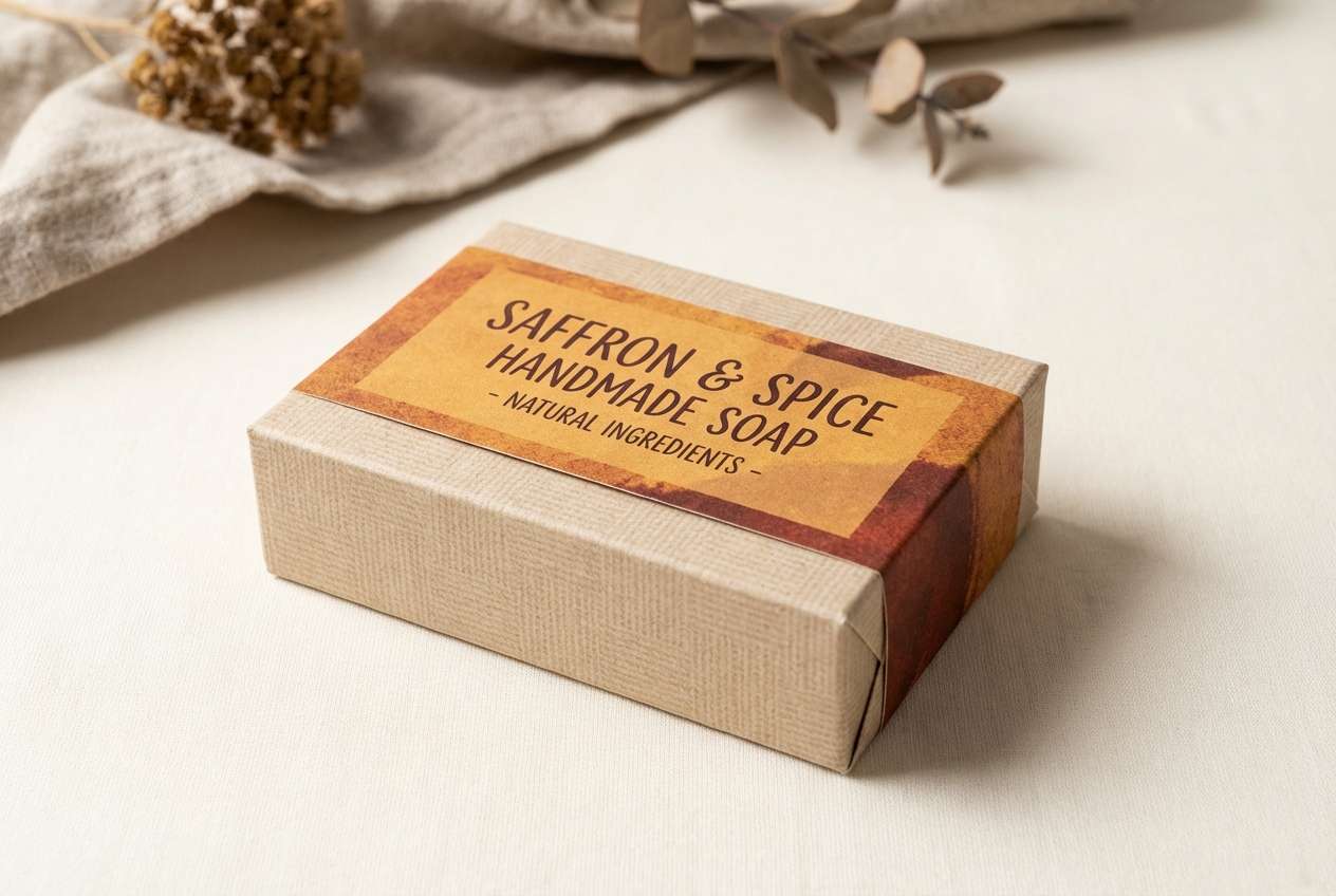
10) Saffron Tapestry
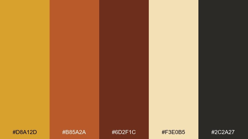
HEX: #d8a12d #b85a2a #6d2f1c #f3e0b5 #2c2a27
Mood: bold, festive, artisan
Best for: handmade goods product ad
Bold saffron and spicy rust recall woven textiles and market-stall color. These renaissance color combinations are great for handmade goods ads, craft fair posters, and small-batch packaging where warmth signals authenticity. Use #d8a12d for big shapes and price tags, then anchor with #2c2a27 for legible copy. Tip: add a subtle textile pattern in #f3e0b5 to tie everything together without stealing attention.
Image example of saffron tapestry generated using media.io
11) Cypress Shadow
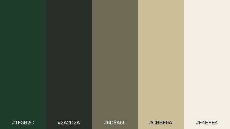
HEX: #1f3b2c #2a2d2a #6d6a55 #cbbf9a #f4efe4
Mood: moody, natural, restrained
Best for: luxury menswear branding
Moody greens and smoky neutrals feel like cypress trees at dusk and worn leather. It is a smart fit for luxury menswear branding, watch ads, and understated packaging where texture does the talking. Let #f4efe4 be the negative space, then build contrast with #2a2d2a and #1f3b2c. Tip: use the olive-taupe #6d6a55 for secondary text to keep the vibe soft, not harsh.
Image example of cypress shadow generated using media.io
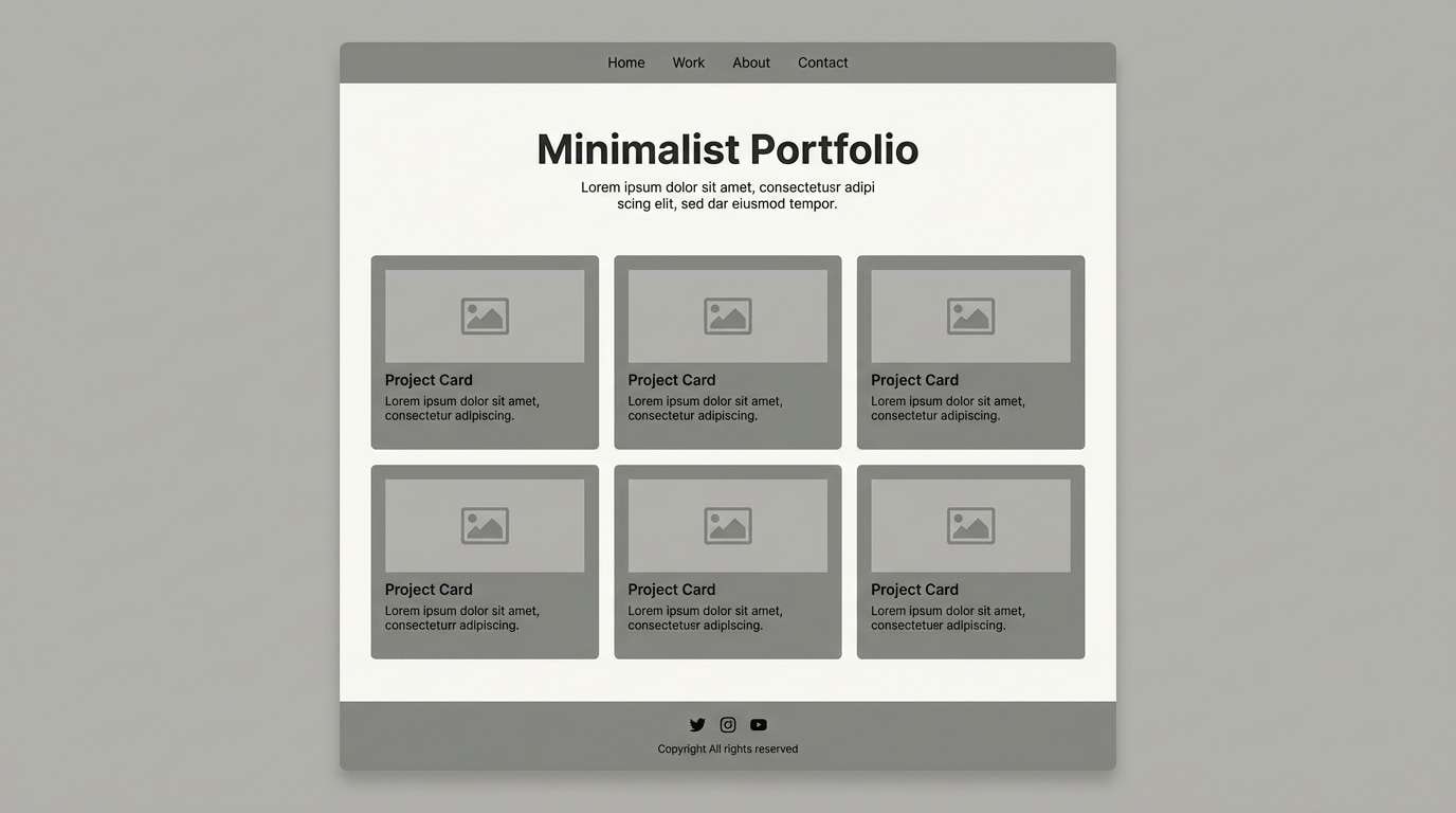
12) Pearl and Pewter
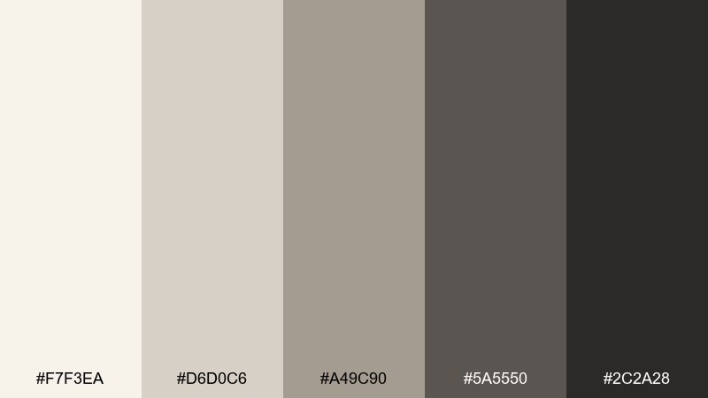
HEX: #f7f3ea #d6d0c6 #a49c90 #5a5550 #2c2a28
Mood: minimal, quiet, sophisticated
Best for: portfolio website UI
Soft pearl whites and pewter grays evoke sculpted marble and muted studio light. Use it for portfolio sites, architecture presentations, and product pages where the work should lead. Keep backgrounds in #f7f3ea and reserve #2c2a28 for type and buttons to maintain crisp hierarchy. Tip: introduce #a49c90 in dividers and UI chips to avoid a flat, lifeless grid.
Image example of pearl and pewter generated using media.io
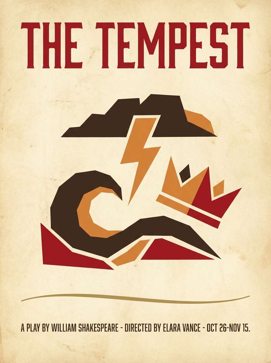
13) Crimson Reliquary
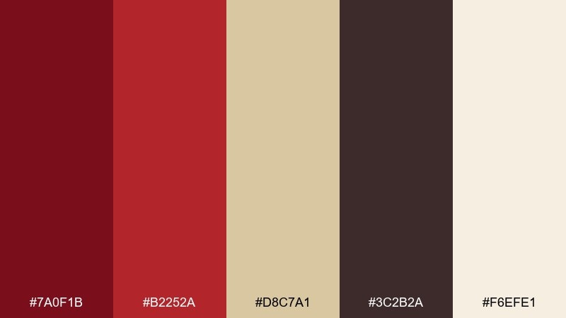
HEX: #7a0f1b #b2252a #d8c7a1 #3c2b2a #f6efe1
Mood: ceremonial, powerful, historic
Best for: theatre poster
Powerful crimson against parchment reads like ceremonial cloth and carved wood. It works for theatre posters, film titles, and album artwork that needs drama without neon intensity. Pair #7a0f1b with #f6efe1 for a striking headline, then use #d8c7a1 for supporting blocks and credits. Tip: keep the darkest brown for small text so the red can stay bold and clean.
Image example of crimson reliquary generated using media.io
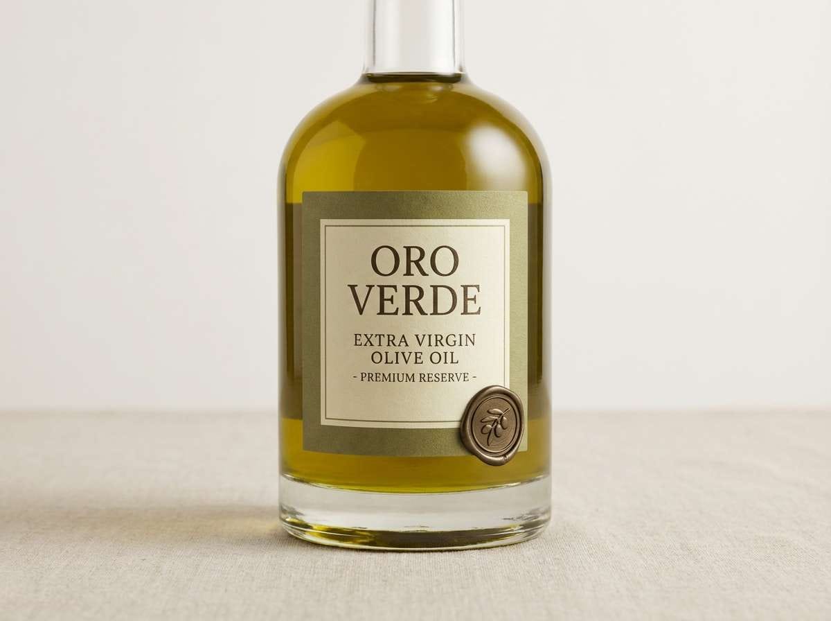
14) Olive Drapery
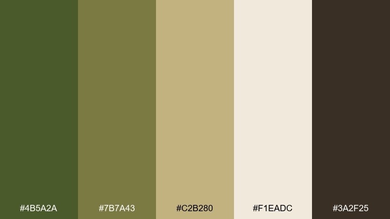
HEX: #4b5a2a #7b7a43 #c2b280 #f1eadc #3a2f25
Mood: heritage, organic, grounded
Best for: olive oil packaging
Heritage olives and sun-faded linen tones bring to mind drapery folds and still-life tables. This renaissance color palette suits olive oil packaging, gourmet labels, and farmers market signage that needs a classic, trustworthy feel. Use #f1eadc as the label base, set typography in #3a2f25, and keep #4b5a2a for a strong brand mark. Tip: a small seal in #c2b280 makes the design feel premium without adding clutter.
Image example of olive drapery generated using media.io
15) Sunlit Plaster
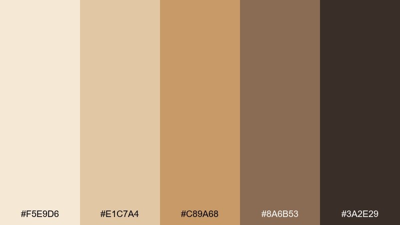
HEX: #f5e9d6 #e1c7a4 #c89a68 #8a6b53 #3a2e29
Mood: warm, airy, architectural
Best for: real estate brochure
Warm plaster neutrals and clay accents feel like sun across stucco and carved stone. It is ideal for real estate brochures, architecture decks, and lifestyle lookbooks where light is the story. Keep #f5e9d6 dominant, then use #3a2e29 for headings and #c89a68 for section highlights. Tip: add plenty of margin so the warm tones read as calm rather than beige-heavy.
Image example of sunlit plaster generated using media.io
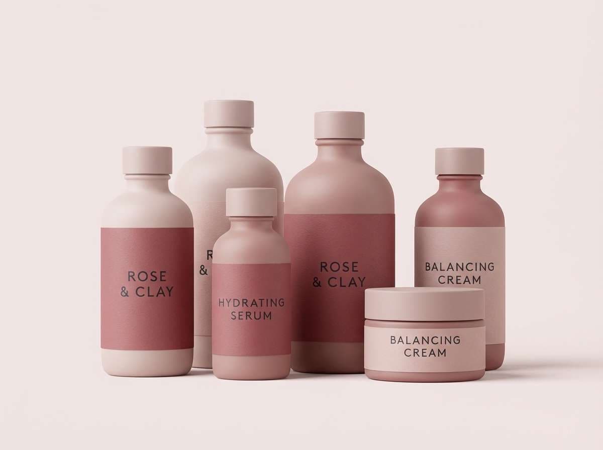
16) Rose Madder Mist
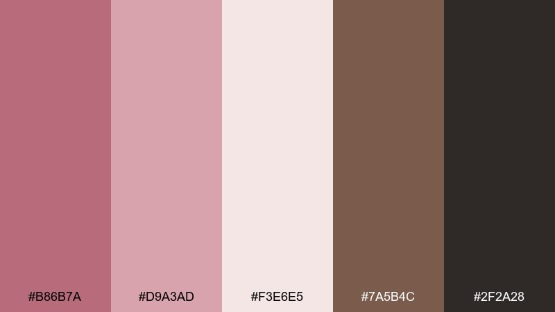
HEX: #b86b7a #d9a3ad #f3e6e5 #7a5b4c #2f2a28
Mood: romantic, soft, painterly
Best for: skincare brand identity
Romantic rose and blush tones feel like a gentle glaze over canvas. Use it for skincare identity, beauty packaging, and boutique social ads where softness signals care. Pair #f3e6e5 with #2f2a28 for clean typography, then use #b86b7a in small blocks for emphasis. Tip: keep gradients subtle and grainy to preserve a painterly, premium finish.
Image example of rose madder mist generated using media.io
17) Iron Gate Patina
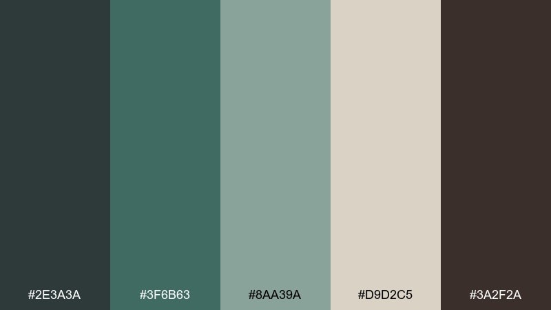
HEX: #2e3a3a #3f6b63 #8aa39a #d9d2c5 #3a2f2a
Mood: aged, cool, architectural
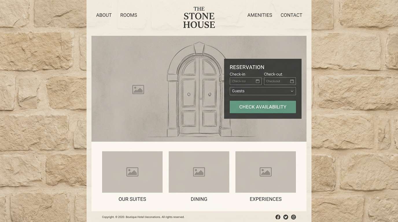
Best for: boutique hotel website UI
Cool patina greens and iron grays evoke oxidized metalwork and shadowy courtyards. It works well for boutique hotel sites, travel landing pages, and reservation flows that should feel curated and calm. Use #d9d2c5 as the canvas, then place CTAs in #3f6b63 for a confident but quiet emphasis. Tip: keep icons and borders in #8aa39a so the interface feels airy instead of industrial.
Image example of iron gate patina generated using media.io
18) Stormy Fresco
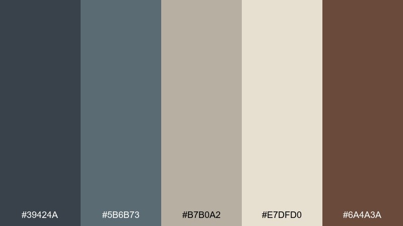
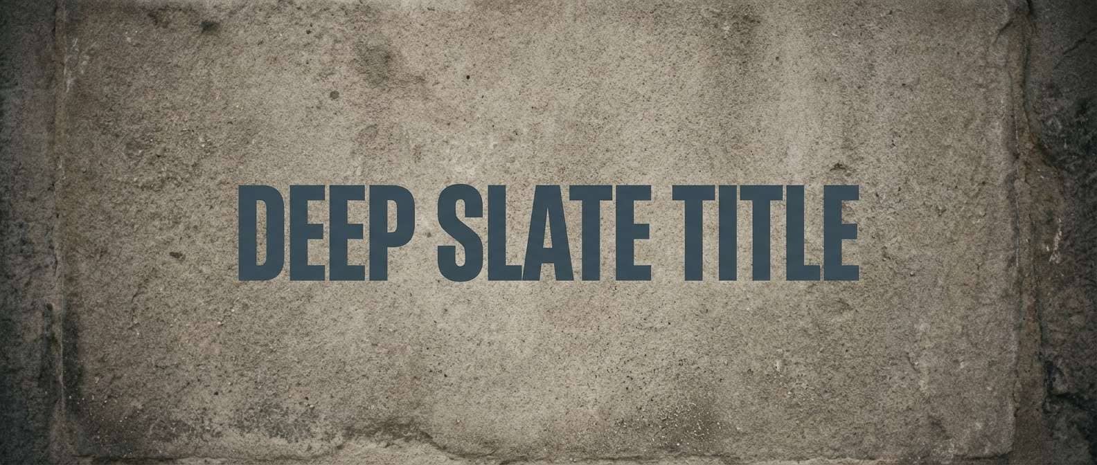
HEX: #39424a #5b6b73 #b7b0a2 #e7dfd0 #6a4a3a
Mood: brooding, refined, atmospheric
Best for: cinematic title card
Brooding slate tones with dusty stone neutrals feel like a fresco before restoration. Use it for cinematic title cards, documentary graphics, and moody presentation covers where subtle contrast sells the story. Pair #39424a with #e7dfd0 for readable type, and bring in #6a4a3a as a warm counterweight. Tip: add light grain and vignetting so the palette feels intentional, not simply gray.
Image example of stormy fresco generated using media.io
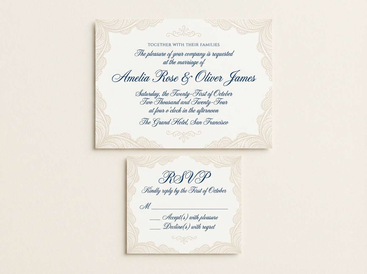
19) Lace and Lapis
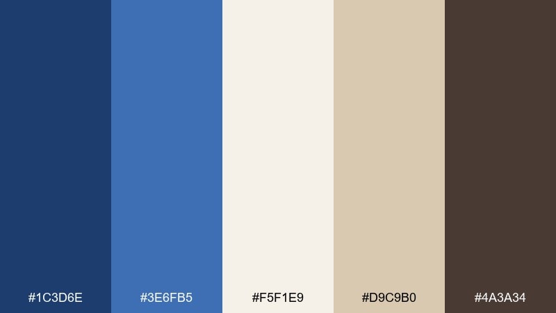
HEX: #1c3d6e #3e6fb5 #f5f1e9 #d9c9b0 #4a3a34
Mood: graceful, bright, artisanal
Best for: wedding stationery suite
Graceful lapis blues with lace-like neutrals feel celebratory yet composed. This renaissance color palette is perfect for a full stationery suite, from invitations to place cards and thank-you notes. Keep #f5f1e9 as the paper base, then use #1c3d6e for names and headings while #d9c9b0 adds soft framing. Tip: for print, choose one blue for type and the other for small motifs to avoid visual noise.
Image example of lace and lapis generated using media.io
20) Workshop Woodstain
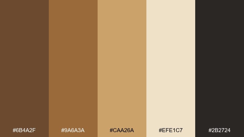
HEX: #6b4a2f #9a6a3a #caa26a #efe1c7 #2b2724
Mood: craft, warm, dependable
Best for: artisan workshop flyer
Craft-forward browns and honeyed tans evoke wood shavings, varnish, and a well-loved workbench. It is a natural fit for artisan workshop flyers, makers market promotions, and small business signage. Use #efe1c7 for the background, set copy in #2b2724, and pull #caa26a into headers or date blocks. Tip: a simple stamp mark in the darkest tone makes the design feel hand-made without looking messy.
Image example of workshop woodstain generated using media.io

What Colors Go Well with Renaissance?
Renaissance palettes pair best with warm neutrals (parchment, plaster, linen) plus grounded earth tones like ochre, umber, terracotta, and wood browns. These shades keep layouts cohesive and give accent colors a natural “paint pigment” context.
For bolder contrast, add noble blues (ultramarine, lapis), wine reds, and antique gold. Use those richer hues for headlines, seals, borders, or key UI actions, while reserving near-black inks and charcoals for body text.
If you want a modern twist, introduce cooler stone grays or patina greens as secondary tones—still historically believable, but cleaner for contemporary interfaces.
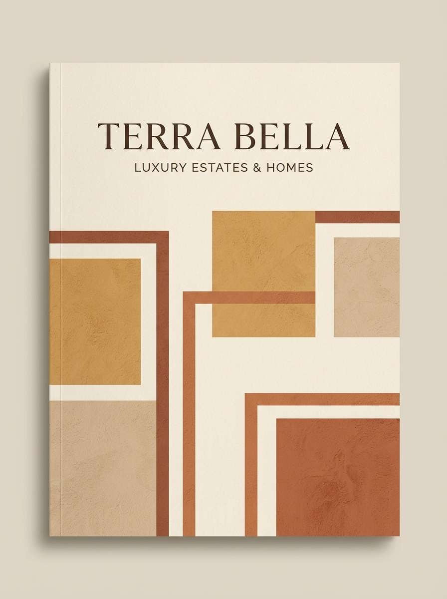
How to Use a Renaissance Color Palette in Real Designs
Start with a light “canvas” color (cream or parchment) and assign one dark ink tone for typography. This mirrors Renaissance materials and prevents warm palettes from becoming muddy or overly sepia.
Then pick one hero color (ultramarine, crimson, or terracotta) and one metallic-like accent (gold, saffron, or muted tan). Keep accents sparse—Renaissance-inspired work looks premium when contrast and hierarchy do most of the heavy lifting.
For print and packaging, test on real paper stocks when possible. Warm neutrals can shift quickly, so a small adjustment in contrast often improves legibility and makes the palette feel intentional.
Create Renaissance Palette Visuals with AI
If you’re building a mood board, label, UI mock, or poster, generating visuals first can help you validate contrast, balance, and texture before final design. A Renaissance palette especially benefits from subtle grain, parchment, plaster, or textile cues.
With Media.io’s text-to-image tool, you can paste a prompt like the examples above and quickly iterate layouts in your chosen tones. This makes it easy to explore multiple directions without starting from scratch.
Renaissance Color Palette FAQs
-
What is a Renaissance color palette?
A Renaissance color palette is typically built from warm earth pigments (ochre, umber, terracotta), parchment-like neutrals, and deep accent hues like ultramarine blue, wine red, and antique gold. -
Which Renaissance colors work best for modern branding?
Start with parchment or plaster neutrals, add a dark ink for type, then choose one signature accent (ultramarine, crimson, or olive). Keeping accents limited helps the brand feel premium rather than costume-like. -
What’s the best Renaissance palette for websites and UI?
Palettes with strong text contrast and calm neutrals work best for UI, such as Scholars Ink, Pearl and Pewter, or Iron Gate Patina. Use light backgrounds, dark typography, and one restrained CTA color. -
How do I keep Renaissance tones from looking too brown or dull?
Use a light neutral as the dominant background, reserve dark browns for small areas, and introduce a clean accent (lapis/ultramarine, patina green, or wine red). Texture like subtle grain can add richness without darkening the layout. -
What’s a good Renaissance-inspired color for a “gold” accent in digital design?
Try antique gold shades like #caa24a or #c7a36c. They read as gilded without the harsh brightness of pure yellow, and they pair well with creams, charcoals, and deep reds. -
Can I use Renaissance palettes for minimalist design?
Yes. Choose a restrained set (pearl, stone, charcoal) and treat one Renaissance hue (wine, lapis, or gold) as a single statement accent across the layout. -
How can I generate Renaissance-style palette visuals quickly?
Use Media.io’s AI text-to-image generator and specify materials (parchment, plaster, velvet), your chosen HEX-inspired colors, and the layout type (poster, label, UI). Iterate prompts until contrast and mood feel right.


