

Red, orange, and yellow are the classic “heat” hues—fast, bright, and attention-grabbing. In modern design, they’re a shortcut to energy, appetite, urgency, and optimism.
Below are 20 red orange yellow color palette ideas with HEX codes, plus practical tips for pairing, contrast, and real-world usage across branding, posters, and UI.
In this article
- Why Red Orange Yellow Palettes Work So Well
-
- sunset market
- citrus pop ui
- desert roadtrip
- spicy logo marks
- honeyed minimal
- autumn classroom
- carnival lights
- retro diner tiles
- solar gradient
- saffron and brick
- tangerine workout
- kinetic warmth
- paprika picnic
- marigold studio
- firelight landing
- golden hour botanicals
- chili and butter
- sunrise infographic
- amber nightclub
- mango sorbet
- What Colors Go Well with Red Orange Yellow?
- How to Use a Red Orange Yellow Color Palette in Real Designs
- Create Red Orange Yellow Palette Visuals with AI
Why Red Orange Yellow Palettes Work So Well
Red orange yellow palettes sit close together on the color wheel, so they naturally feel cohesive. That harmony makes them easy to apply in gradients, bold blocks, and illustration shading without looking “random.”
They also carry strong emotional cues: heat, sunlight, motion, and appetite. This is why warm color palettes dominate food branding, sports promos, and CTA-driven landing pages.
The key is control. Because these hues are high-energy, modern designs usually temper them with a dark anchor (charcoal/navy) and a light neutral (cream) to keep typography readable and layouts breathable.
20+ Red Orange Yellow Color Palette Ideas (with HEX Codes)
1) Sunset Market
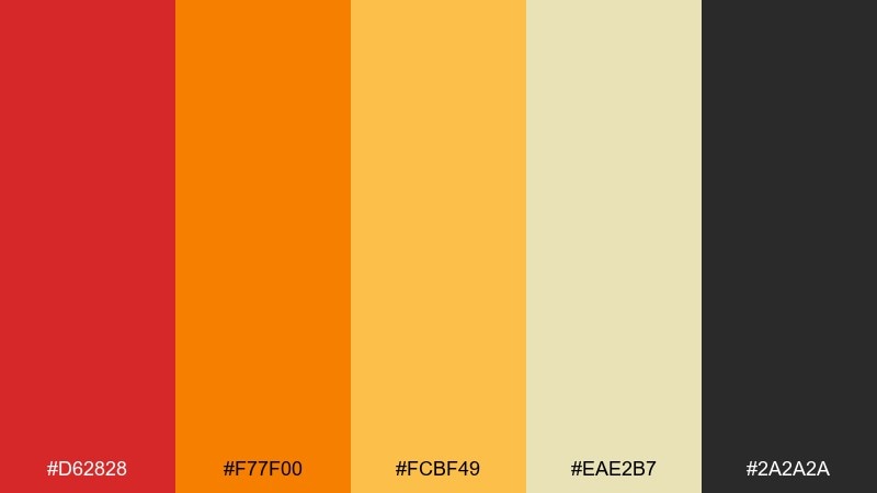
HEX: #D62828 #F77F00 #FCBF49 #EAE2B7 #2A2A2A
Mood: bustling, warm, street-food vibrant
Best for: food festival poster design
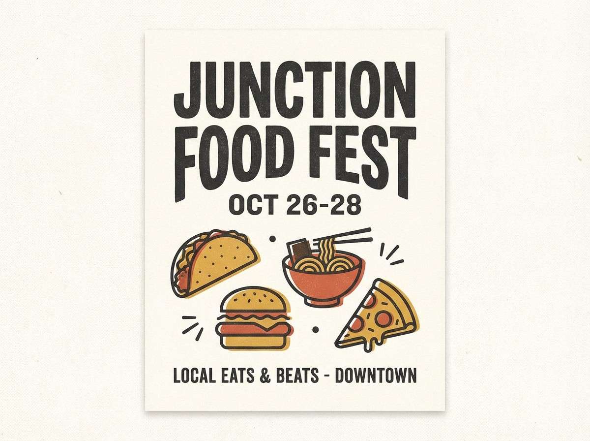
Bustling and sun-soaked, it feels like neon signs and sizzling street carts at golden hour. This red orange yellow color palette pops on posters, menus, and event signage where you need instant appetite appeal. Pair it with cream for breathing room and charcoal for sharp type and icons. Usage tip: reserve the deepest red for headlines and calls to action so the bright yellows do not overpower the layout.
Image example of sunset market generated using media.io
Media.io is an online AI studio for creating and editing video, image, and audio in your browser.

2) Citrus Pop UI
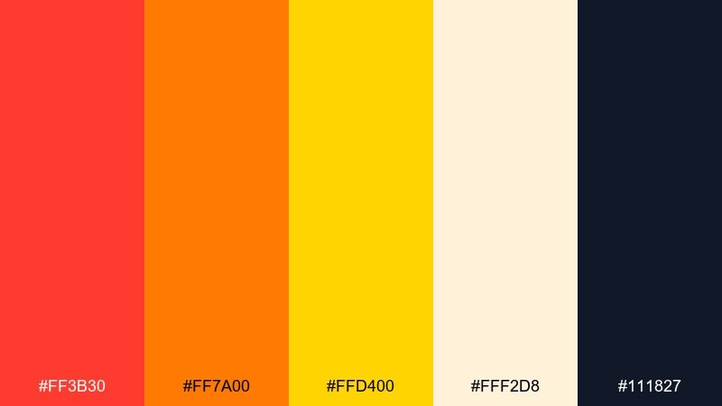
HEX: #FF3B30 #FF7A00 #FFD400 #FFF2D8 #111827
Mood: energetic, crisp, modern
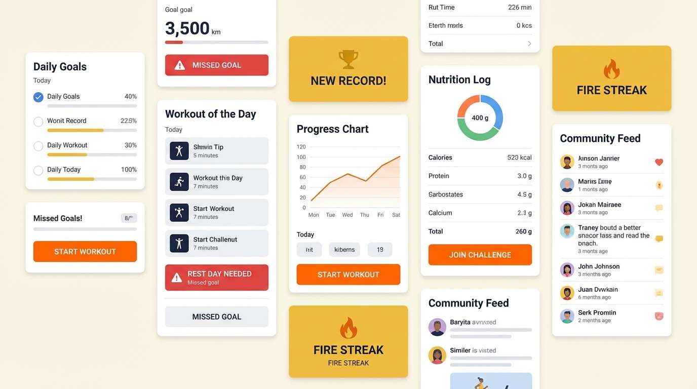
Best for: 2d ui mockup for a fitness app
Energetic and punchy, it reads like fresh citrus squeezed over ice. Use it for UI where you want high contrast buttons, badges, and progress states without drifting into neon chaos. Pair the warm brights with the deep ink tone for accessible text and icons, and keep the pale cream as the main canvas. Usage tip: limit yellow to highlights and micro-interactions so it stays readable on light backgrounds.
Image example of citrus pop ui generated using media.io
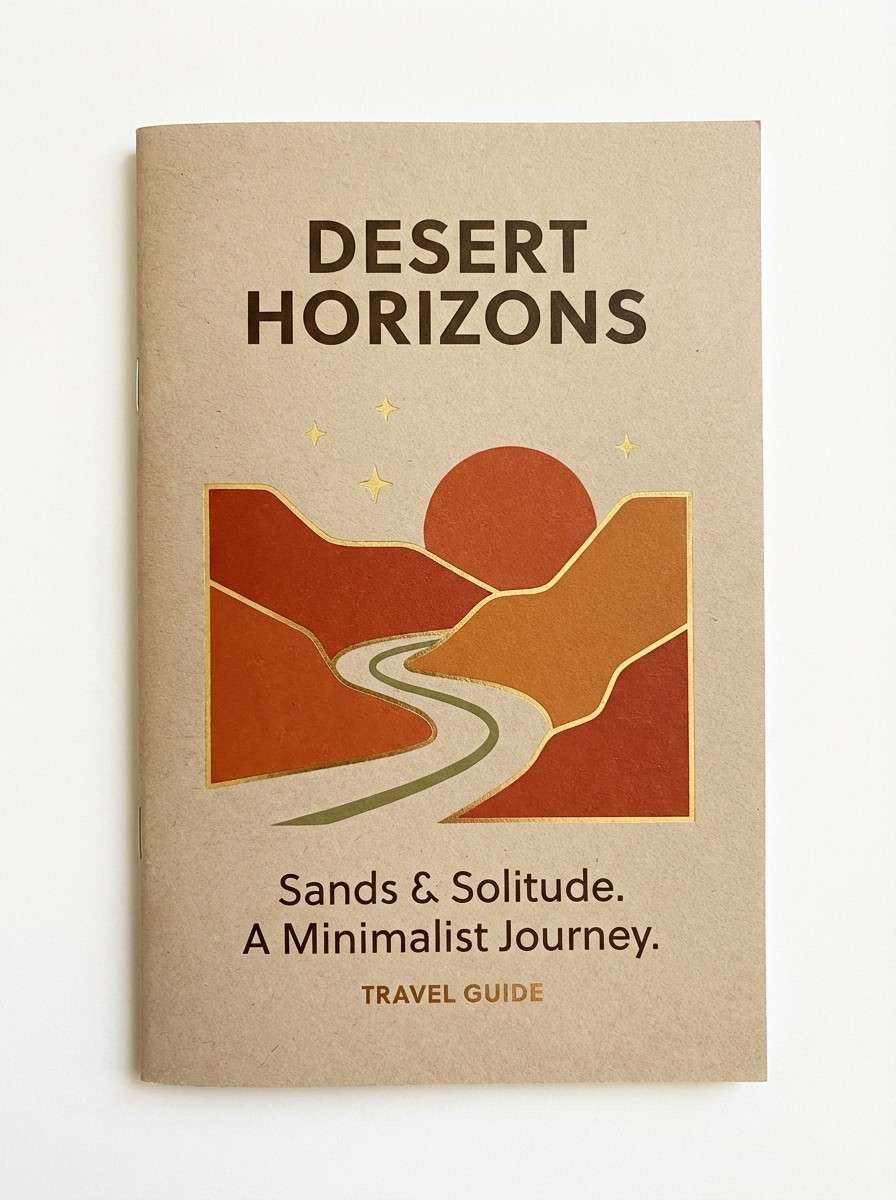
3) Desert Roadtrip
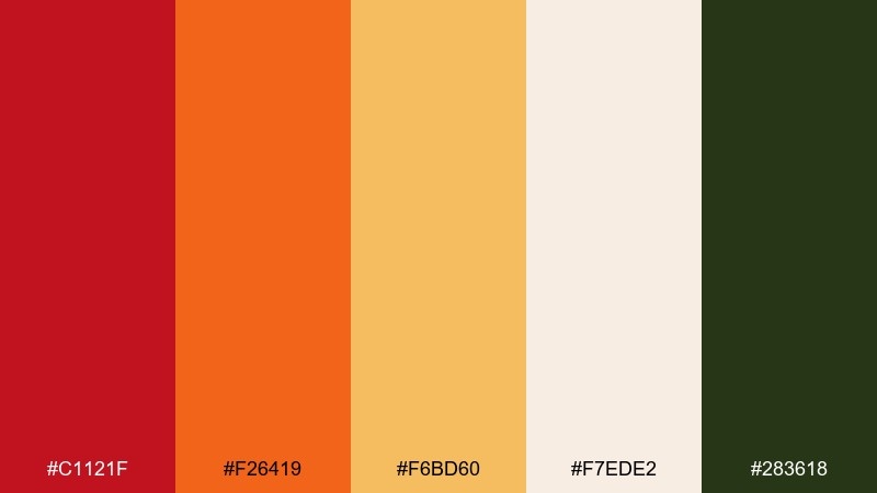
HEX: #C1121F #F26419 #F6BD60 #F7EDE2 #283618
Mood: sunbaked, adventurous, nostalgic
Best for: travel brochure cover
Sunbaked and adventurous, it evokes dusty highways, vintage postcards, and late-afternoon heat. These tones work beautifully for travel brochures, tour covers, and destination landing pages that need warmth without looking childish. Pair with a muted green for grounded contrast and use the soft paper tone as negative space. Usage tip: add a subtle grain texture to the light background for a printed, retro feel.
Image example of desert roadtrip generated using media.io
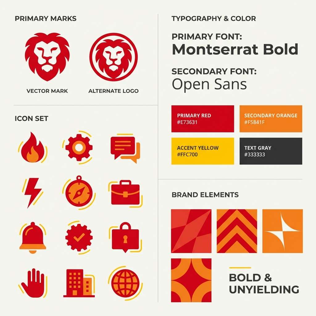
4) Spicy Logo Marks
HEX: #B80C09 #E85D04 #FFBA08 #FAF3DD #3D3D3D
Mood: bold, confident, punchy
Best for: brand identity logo and icons
Bold and confident, it feels like a dash of chili and a burst of sunshine. These red orange yellow color combinations are ideal for logos, app icons, and packaging marks that need to look energetic at small sizes. Pair with warm off-white and a steady dark gray to keep edges clean and legible. Usage tip: test your icon in grayscale too, then bring back yellow only where it adds meaning.
Image example of spicy logo marks generated using media.io
5) Honeyed Minimal
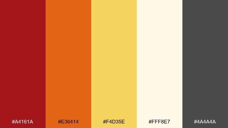
HEX: #A4161A #E36414 #F4D35E #FFF8E7 #4A4A4A
Mood: clean, warm, premium-friendly
Best for: product packaging label
Clean and warm, it suggests honey drizzle over toasted pastry. The mix supports premium packaging where you want friendly heat without looking loud, especially on creams and soft whites. Pair with restrained typography and plenty of margin so the colors feel intentional rather than busy. Usage tip: print a quick proof, because yellow can shift under warm lighting and needs contrast checks.
Image example of honeyed minimal generated using media.io
6) Autumn Classroom
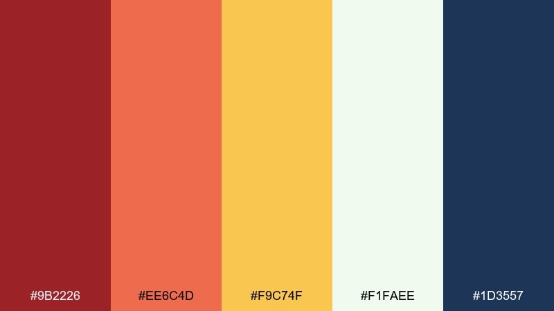
HEX: #9B2226 #EE6C4D #F9C74F #F1FAEE #1D3557
Mood: friendly, studious, approachable
Best for: educational slide deck theme
Friendly and studious, it recalls warm classroom light and colorful sticky notes. Use it for lesson slides, workshop decks, and course graphics where clarity matters as much as personality. Pair the soft near-white with the deep blue for headings and diagrams, and keep orange for callouts. Usage tip: use yellow as a highlight behind short phrases, not long paragraphs, to avoid glare on projectors.
Image example of autumn classroom generated using media.io
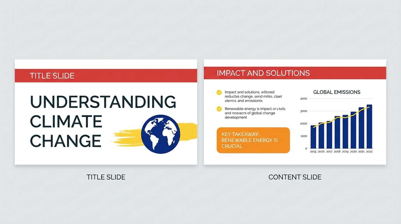
7) Carnival Lights
HEX: #D00000 #FF5400 #FFBD00 #FFF3B0 #001D3D
Mood: playful, bright, night-and-neon
Best for: social media promo ad
Playful and bright, it feels like carnival bulbs glowing against a dark evening sky. It works well for social promos, limited-time offers, and punchy headlines that need instant contrast in feeds. Pair the navy with the pale yellow for readable copy and keep the hottest orange for the main button. Usage tip: use red sparingly as a directional cue so it does not compete with orange for attention.
Image example of carnival lights generated using media.io

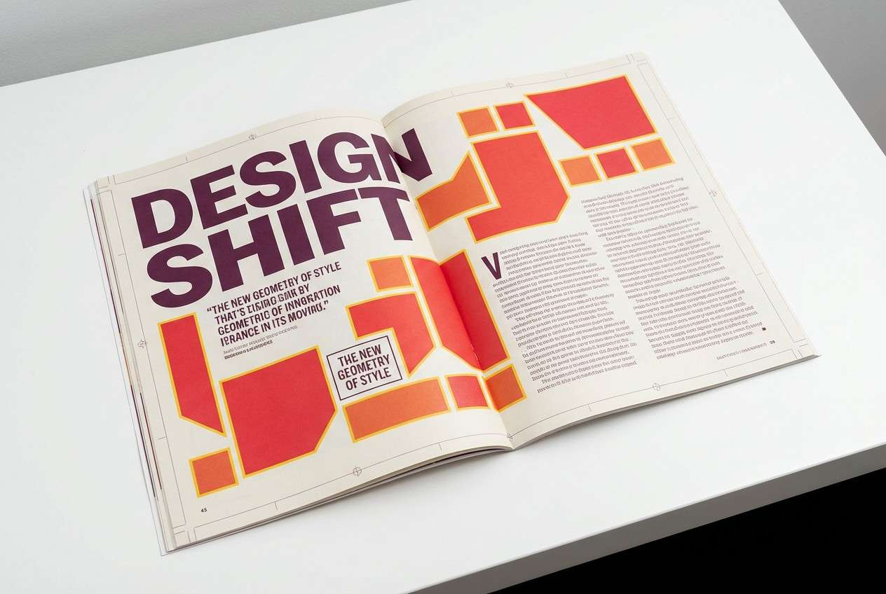
8) Retro Diner Tiles
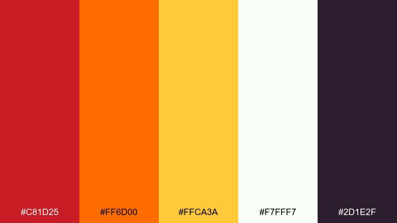
HEX: #C81D25 #FF6D00 #FFCA3A #F7FFF7 #2D1E2F
Mood: retro, cheeky, high-contrast
Best for: editorial magazine spread
Retro and cheeky, it brings to mind diner booths, tile patterns, and vintage signage. Use it in editorial layouts where you want bold section dividers, pull quotes, and energetic infographics. The deep plum makes a strong anchor for type while the pale white keeps pages from feeling heavy. Usage tip: repeat yellow in small motifs or bullets to create rhythm across the spread.
Image example of retro diner tiles generated using media.io
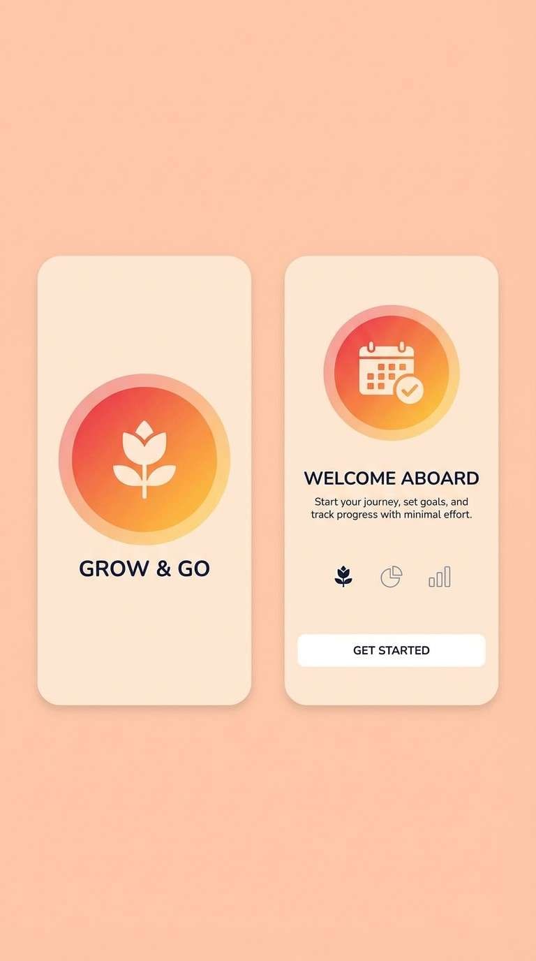
9) Solar Gradient
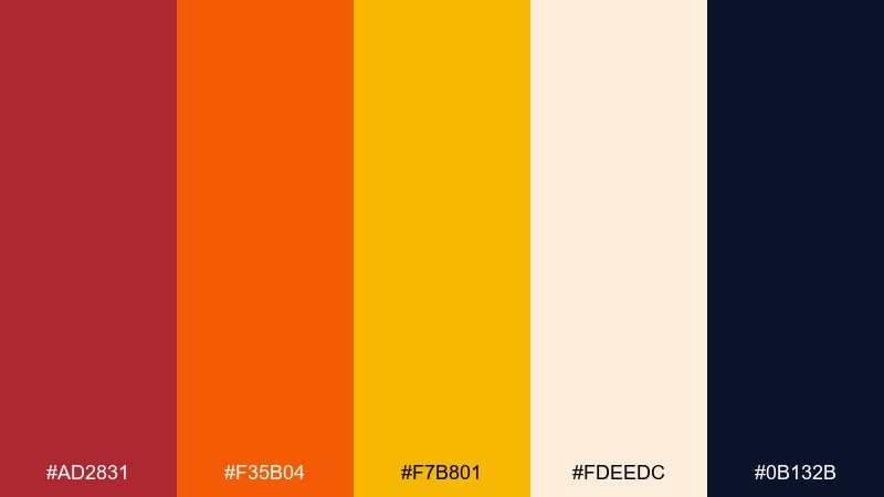
HEX: #AD2831 #F35B04 #F7B801 #FDEEDC #0B132B
Mood: sleek, radiant, tech-forward
Best for: app splash screen and onboarding
Sleek and radiant, it looks like a sun flare fading into a dark horizon. The palette is strong for splash screens, onboarding illustrations, and hero gradients where warmth should feel modern, not rustic. Pair the light peach with the midnight tone for crisp contrast and use orange as the main gradient bridge. Usage tip: keep gradients subtle and add a flat color fallback for accessibility and older displays.
Image example of solar gradient generated using media.io
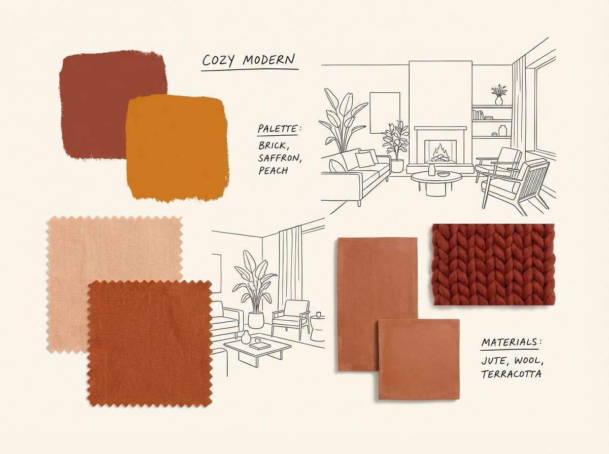
10) Saffron and Brick
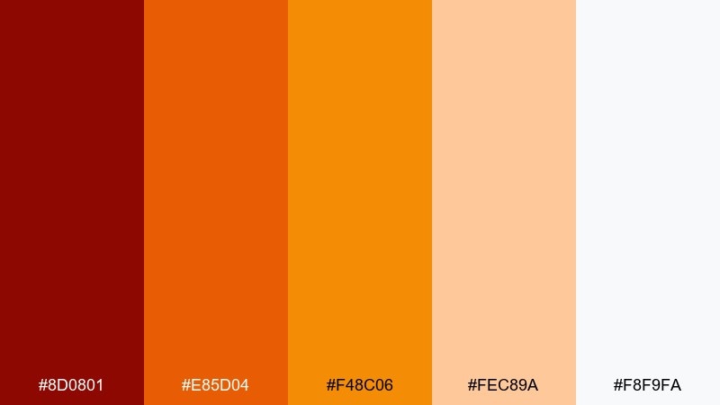
HEX: #8D0801 #E85D04 #F48C06 #FEC89A #F8F9FA
Mood: cozy, earthy, homey
Best for: interior design mood board
Cozy and earthy, it suggests brick walls, saffron textiles, and soft daylight on plaster. Use it for interior mood boards, cafe branding, and lifestyle posts that want warmth with an artisan vibe. Pair the pale neutrals as the base and let the deepest red appear in small, tactile accents like labels or trim. Usage tip: balance warm blocks with plenty of whitespace so the palette feels curated, not cramped.
Image example of saffron and brick generated using media.io
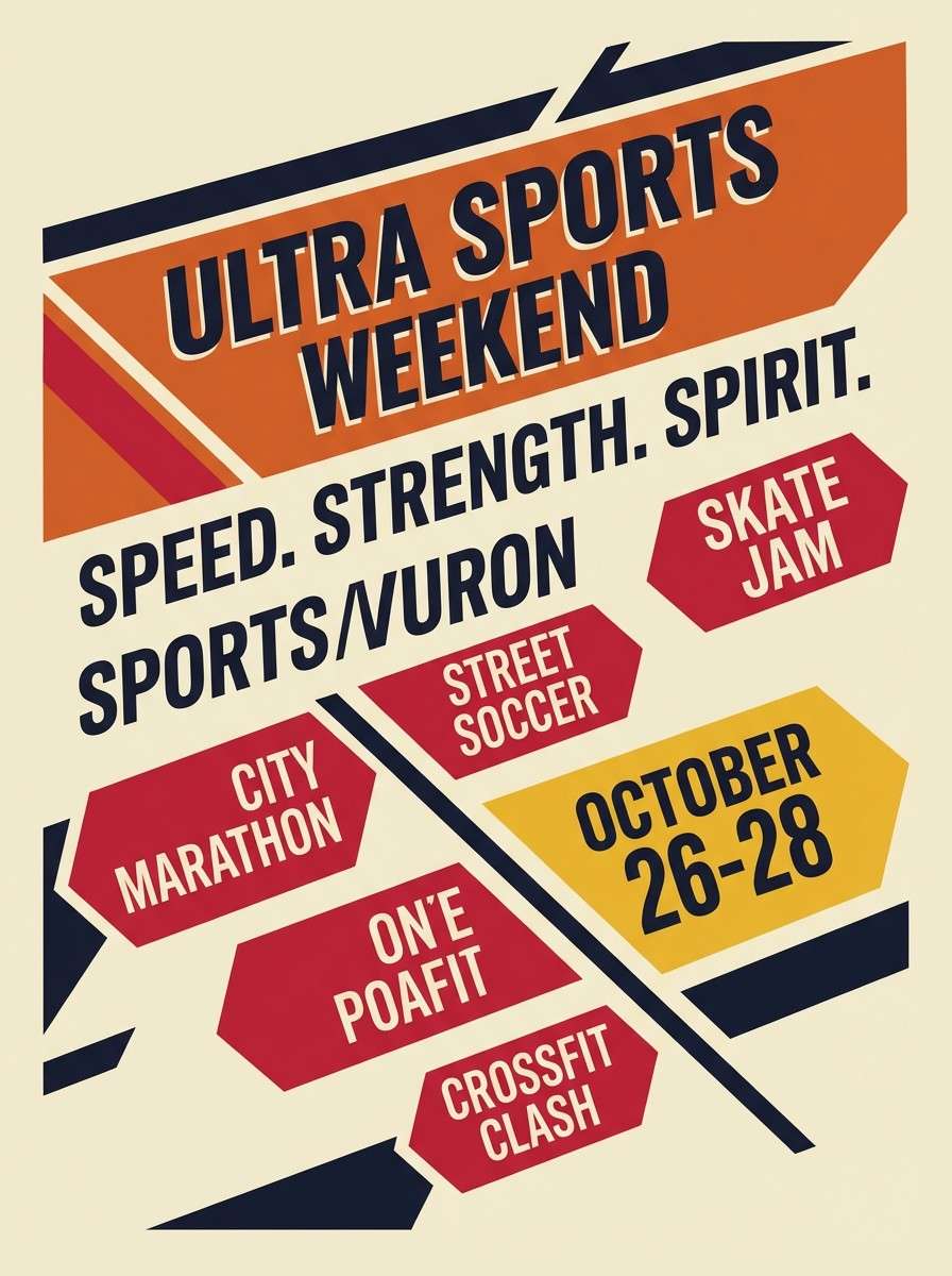
11) Tangerine Workout
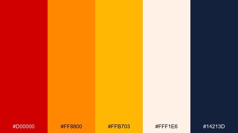
HEX: #D00000 #FF8800 #FFB703 #FFF1E6 #14213D
Mood: motivating, sporty, high-energy
Best for: sports event flyer
Motivating and sporty, it feels like a whistle blow and a burst of stadium light. These tones suit event flyers, training programs, and energetic announcements where urgency is part of the message. Pair the dark navy with the light cream for readable details and use orange as the dominant banner color. Usage tip: keep yellow for key numbers or dates so the information hierarchy stays clear.
Image example of tangerine workout generated using media.io
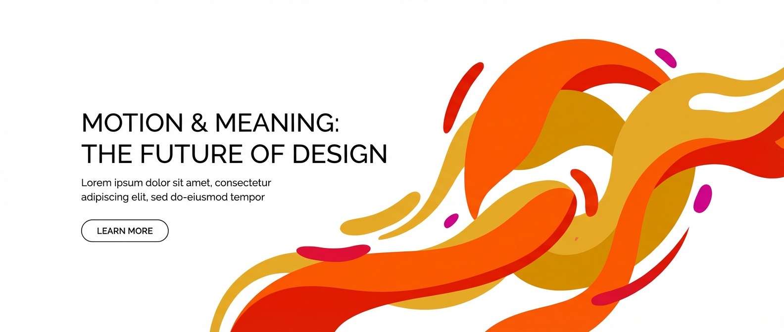
12) Kinetic Warmth
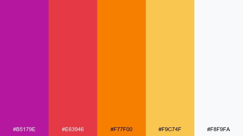
HEX: #B5179E #E63946 #F77F00 #F9C74F #F8F9FA
Mood: expressive, artsy, energetic
Best for: creative studio website hero
Expressive and artsy, it evokes motion graphics, paint swipes, and studio energy. If you want a red orange yellow color scheme with a slightly experimental twist, this mix adds a playful magenta to push it beyond the usual warm trio. Pair it with a clean near-white base and keep the brightest tones for hero shapes and buttons. Usage tip: use magenta as a rare accent so the warm core stays cohesive.
Image example of kinetic warmth generated using media.io
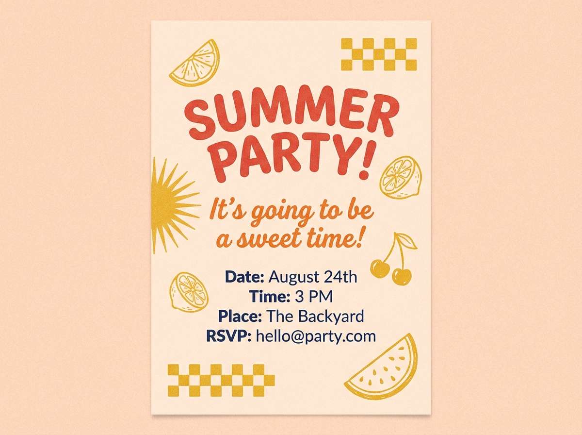
13) Paprika Picnic
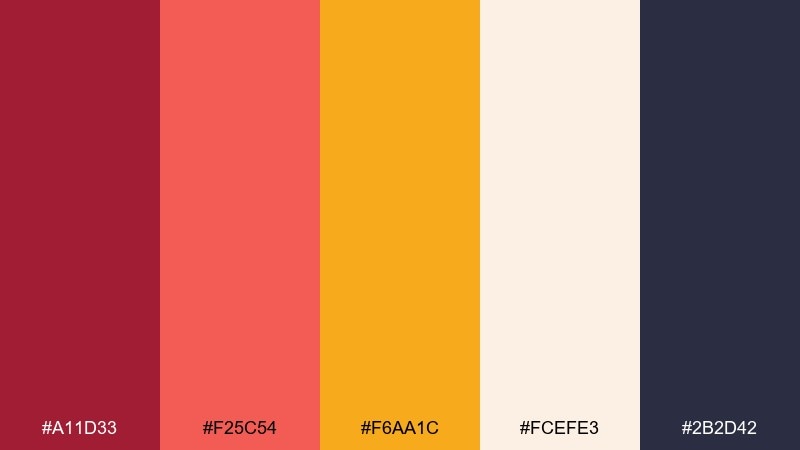
HEX: #A11D33 #F25C54 #F6AA1C #FCEFE3 #2B2D42
Mood: cheerful, casual, inviting
Best for: summer party invitation
Cheerful and casual, it feels like a picnic blanket with fresh fruit and sparkling drinks. Use it for invitations, RSVP pages, and party graphics that should look welcoming in both print and digital. Pair the cool deep tone for body text and let the peachy background keep everything soft. Usage tip: set the main headline in red for impact, then use orange for secondary details like location and time.
Image example of paprika picnic generated using media.io
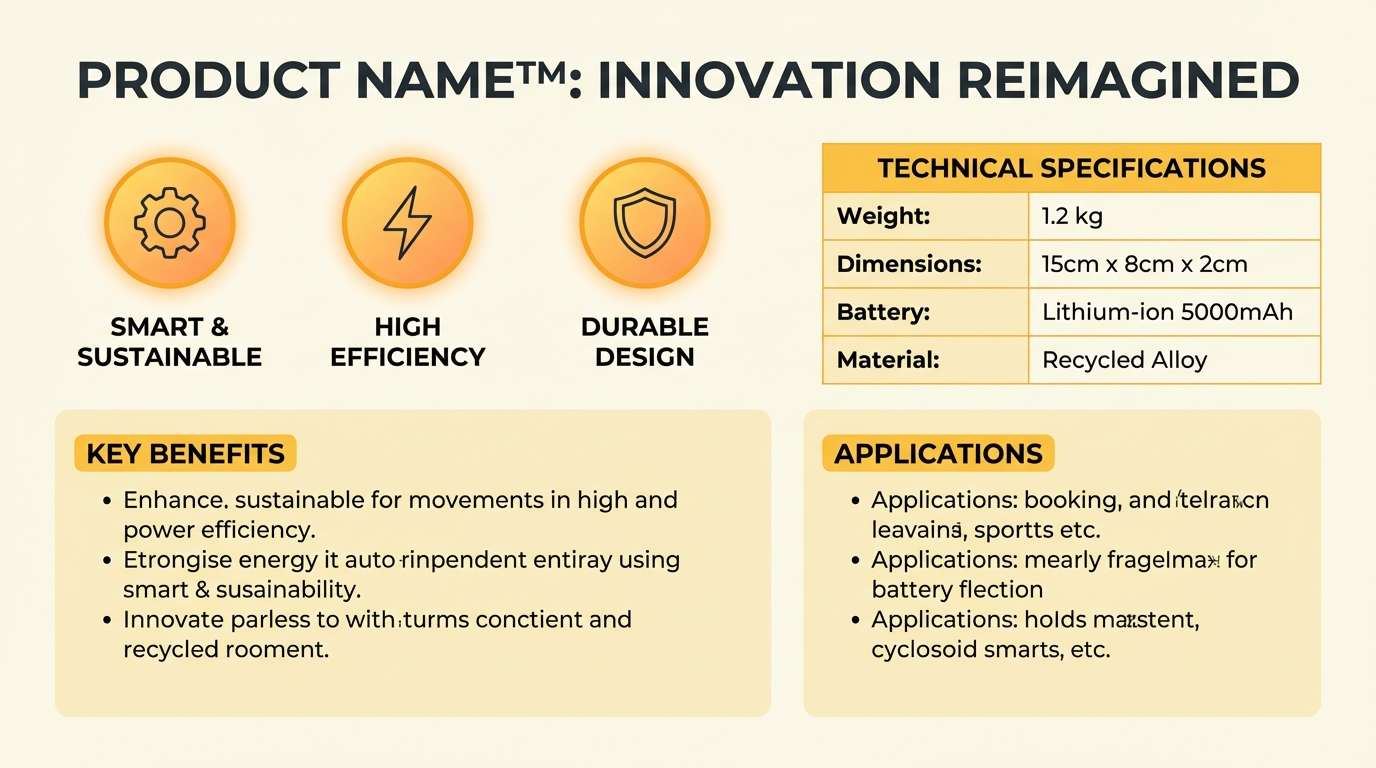
14) Marigold Studio
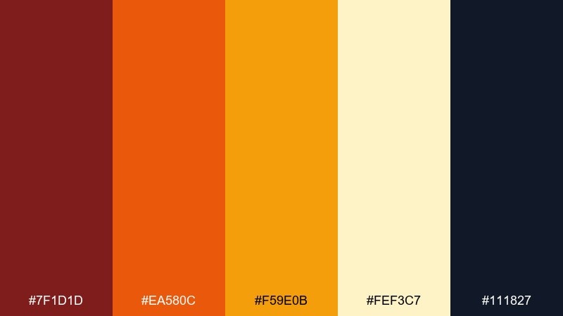
HEX: #7F1D1D #EA580C #F59E0B #FEF3C7 #111827
Mood: professional, warm, structured
Best for: product one-sheet and spec sheet
Professional and warm, it looks like marigold ink on textured paper with crisp dark headings. It is a strong fit for one-sheets, product specs, and pricing pages where structure matters. Pair the pale yellow as a section background and use the deep ink for tables and fine print. Usage tip: keep orange to charts and icons, so the page reads clean even when information-dense.
Image example of marigold studio generated using media.io
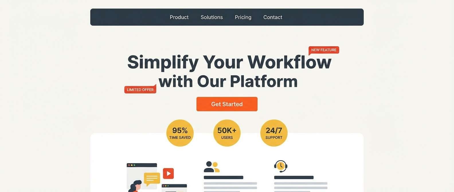
15) Firelight Landing
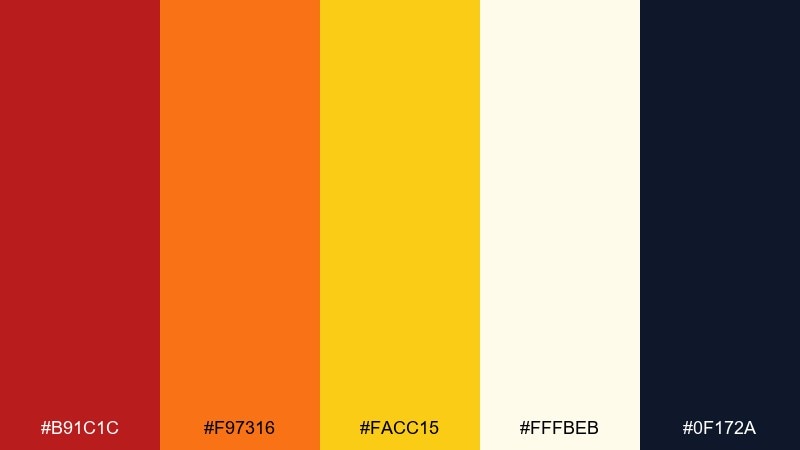
HEX: #B91C1C #F97316 #FACC15 #FFFBEB #0F172A
Mood: warm, persuasive, modern
Best for: saas landing page design
Warm and persuasive, it feels like firelight reflecting off a sleek screen. These red orange yellow color combinations shine on landing pages with clear CTAs, benefit cards, and pricing toggles. Pair the dark slate for navigation and body text, then keep yellow as a focused highlight for trust badges or key metrics. Usage tip: use one dominant warm color per section to avoid a rainbow effect across the page.
Image example of firelight landing generated using media.io
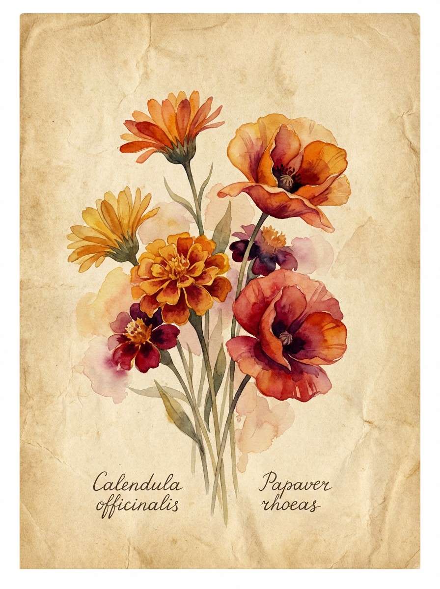
16) Golden Hour Botanicals
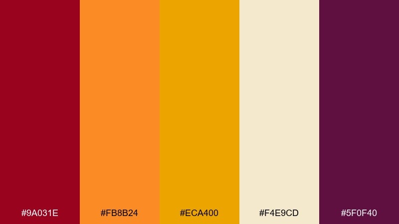
HEX: #9A031E #FB8B24 #ECA400 #F4E9CD #5F0F40
Mood: romantic, natural, sunlit
Best for: watercolor botanical illustration
Romantic and sunlit, it evokes marigolds, poppies, and late-day glow in a garden. Use it for botanical prints, stationery, and seasonal social graphics that should feel organic and hand-made. Pair the parchment tone as paper and let the deeper berry shade add depth in shadows and stems. Usage tip: keep edges soft and layered so the warm hues blend naturally instead of looking flat.
Image example of golden hour botanicals generated using media.io
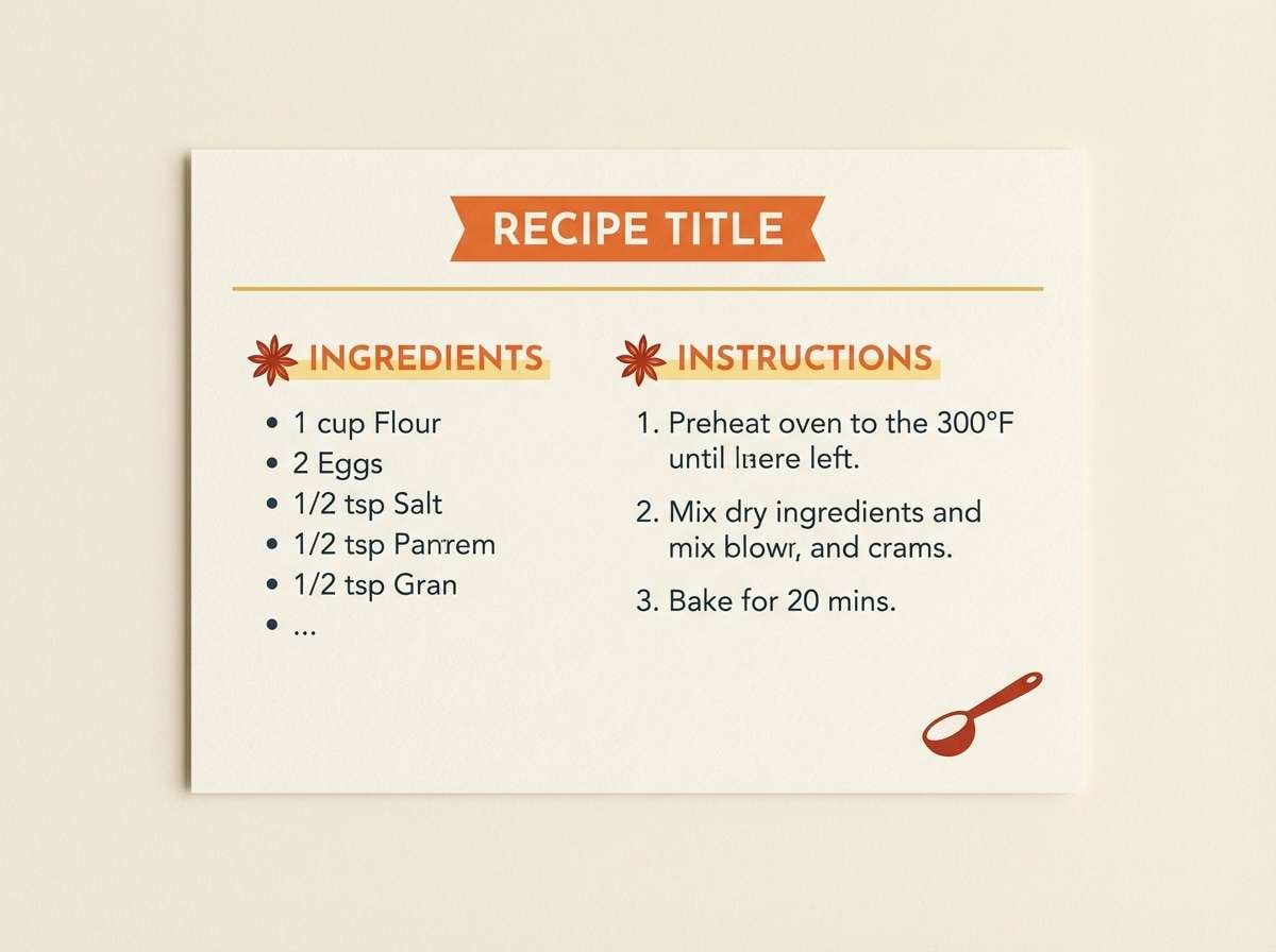
17) Chili and Butter
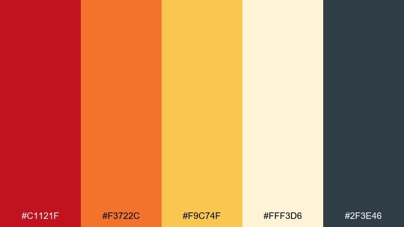
HEX: #C1121F #F3722C #F9C74F #FFF3D6 #2F3E46
Mood: comforting, tasty, friendly
Best for: recipe card template
Comforting and tasty, it recalls chili flakes sprinkled over buttery toast. It works well for recipe cards, cooking blog graphics, and meal prep labels that need warmth and readability. Pair the soft cream as the main background and use the cool dark tone for ingredient lists and step numbers. Usage tip: set orange as the primary accent, and keep red for spice level markers or small badges.
Image example of chili and butter generated using media.io
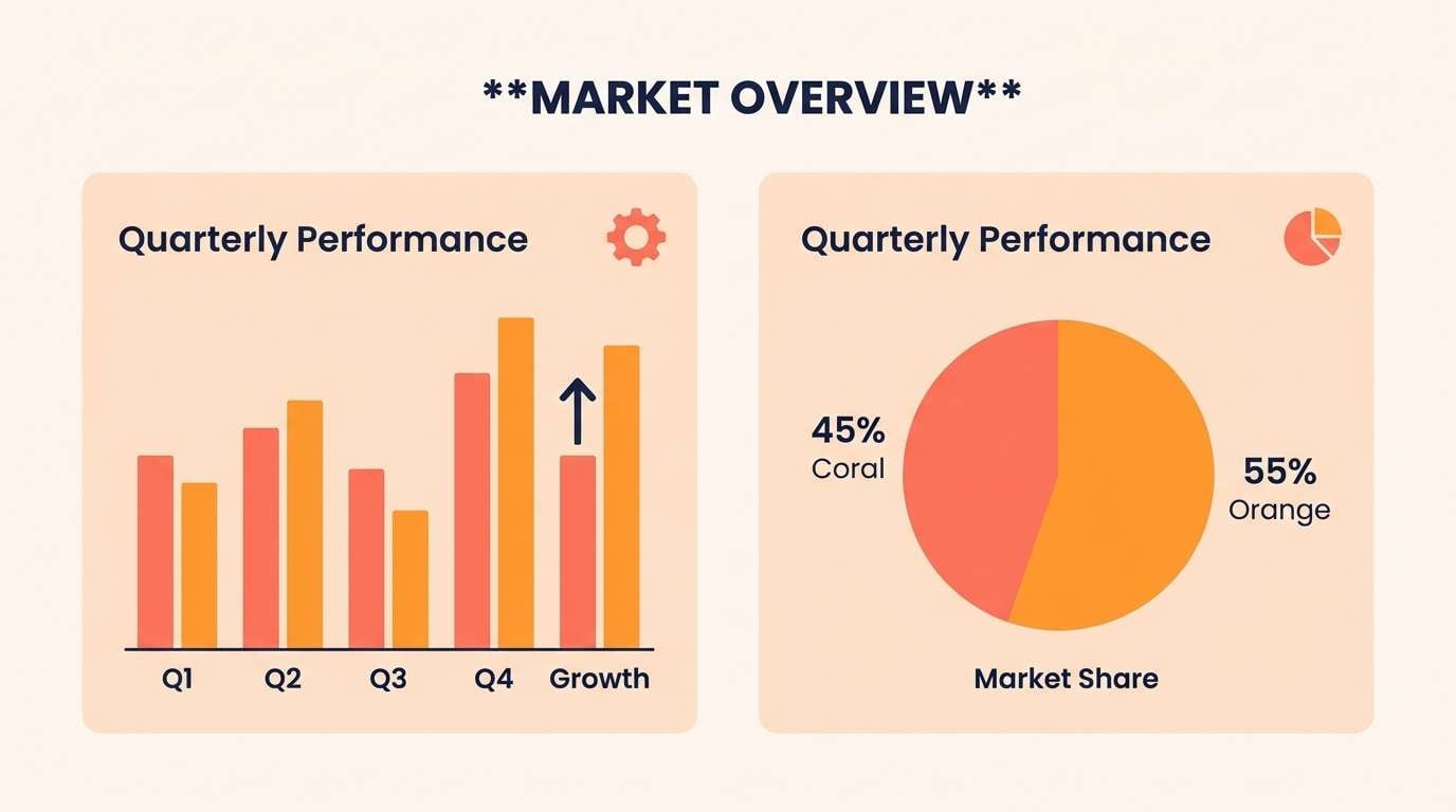
18) Sunrise Infographic
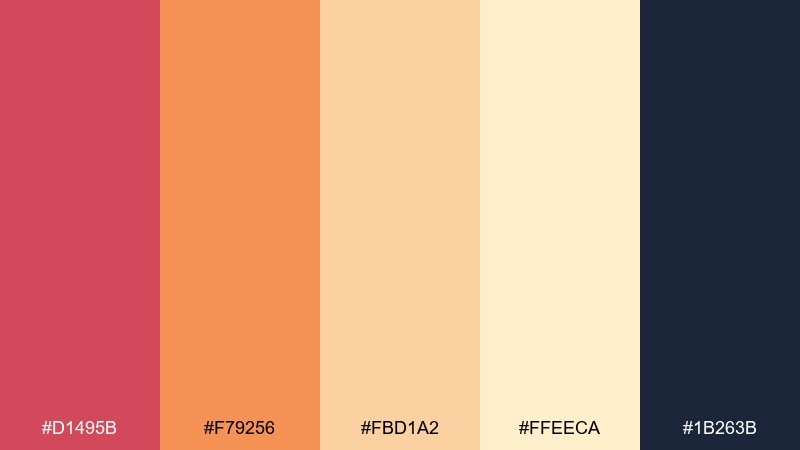
HEX: #D1495B #F79256 #FBD1A2 #FFEECA #1B263B
Mood: clear, optimistic, data-friendly
Best for: business infographic
Clear and optimistic, it looks like a soft sunrise fading into a calm horizon. Use it for business infographics, annual snapshots, and slide charts where warmth should feel approachable, not aggressive. Pair the dark blue for axes and labels, then use coral and orange for the main series colors. Usage tip: keep the lightest tones for backgrounds and callout panels so the data stays high contrast.
Image example of sunrise infographic generated using media.io
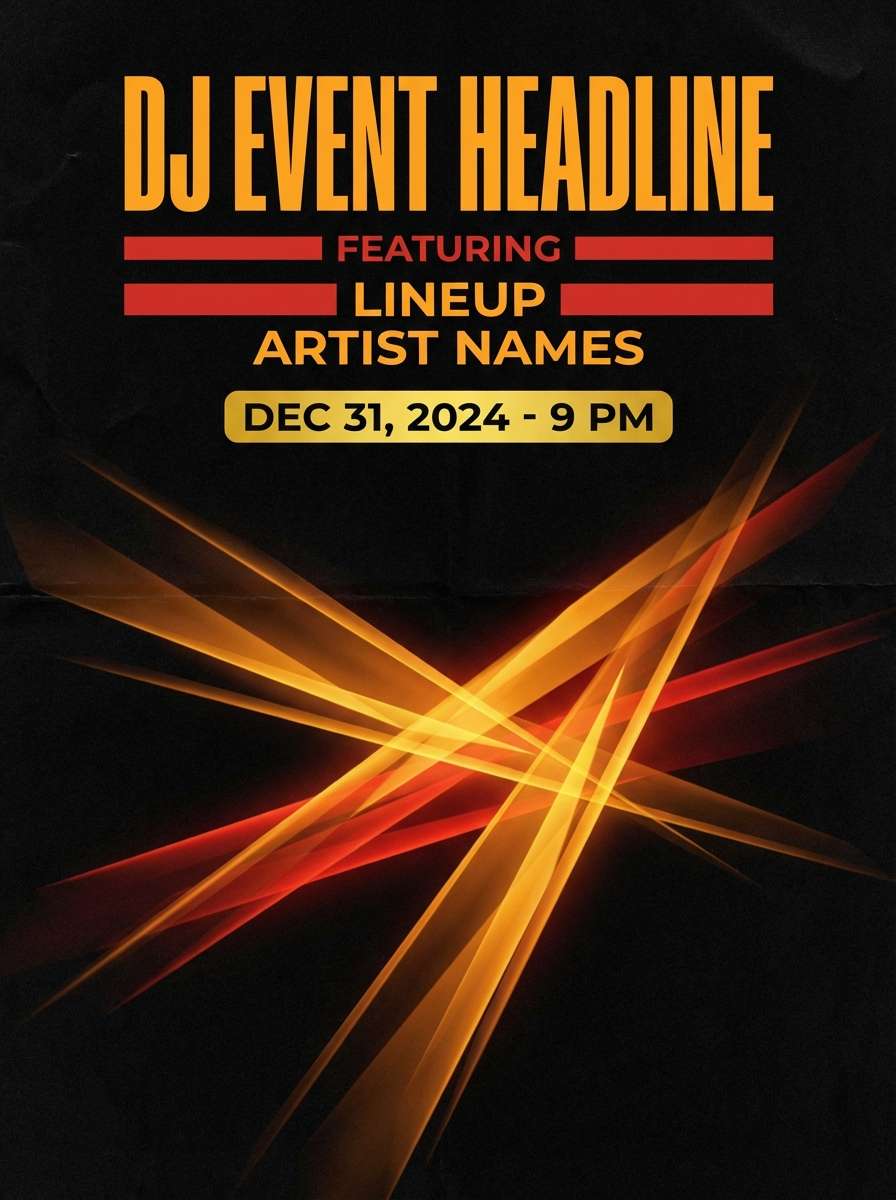
19) Amber Nightclub
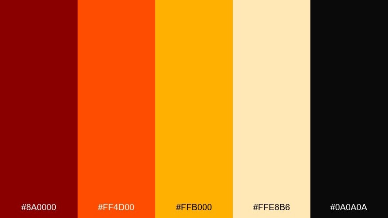
HEX: #8A0000 #FF4D00 #FFB000 #FFE8B6 #0A0A0A
Mood: dramatic, nightlife, high-contrast
Best for: dj event poster
Dramatic and nightlife-ready, it evokes amber spotlights cutting through a dark room. Use it for DJ posters, concert announcements, and bold typographic layouts that need instant energy from a distance. Pair black as the stage and let orange carry the main headline, with yellow reserved for date and venue. Usage tip: add a subtle glow effect to orange elements, but keep type edges sharp for legibility.
Image example of amber nightclub generated using media.io
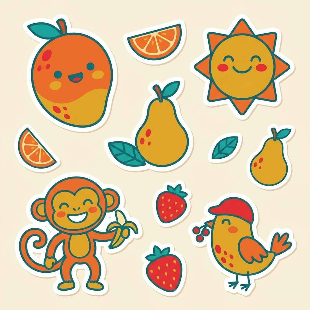
20) Mango Sorbet
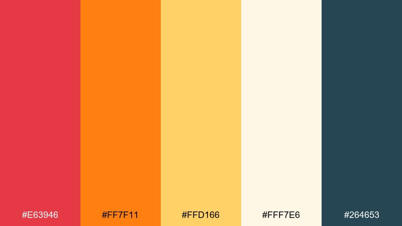
HEX: #E63946 #FF7F11 #FFD166 #FFF7E6 #264653
Mood: playful, sweet, kid-friendly
Best for: kids illustration and sticker set
Playful and sweet, it feels like mango sorbet melting in the sun. Use it for kids illustrations, sticker packs, and cheerful onboarding mascots where warmth should feel friendly and safe. Pair the soft cream as the base and use the teal for outlines so characters stay readable on bright fills. Usage tip: keep yellow to larger shapes rather than thin lines, since it can disappear against light backgrounds.
Image example of mango sorbet generated using media.io
What Colors Go Well with Red Orange Yellow?
To balance red, orange, and yellow, add a “weight” color for contrast—charcoal, black, deep navy, or dark slate are the most reliable. They keep warm palettes from feeling overly loud and make typography and icons more accessible.
Light neutrals such as cream, parchment, and warm off-white create the breathing room that warm hues need. These bases also make yellows look richer instead of washed out.
For a modern twist, introduce a cool counterpoint in small doses: teal, muted olive, or deep blue-green. Cool accents help separate sections and add depth without breaking the warm story.
How to Use a Red Orange Yellow Color Palette in Real Designs
Pick one dominant warm color per layout section, then use the other warm hues as support (badges, highlights, micro-graphics). This prevents the design from turning into an unstructured “rainbow” while keeping the palette energetic.
Protect readability by assigning roles: dark color for text and outlines, light neutral for backgrounds, and yellow mainly for highlights or large shapes. Yellows often need extra contrast—especially in UI labels and thin strokes.
Test across mediums. Warm palettes can shift between screens and print, and yellows are the first to lose clarity under warm lighting or projectors, so check contrast and export previews early.
Create Red Orange Yellow Palette Visuals with AI
If you want to see these warm tones “in action,” generate mockups and concept visuals directly from prompts. It’s a fast way to validate mood (modern vs. retro), contrast, and how much yellow you can safely use.
Start with a simple scene (poster, UI cards, packaging label), then specify where each hue goes (red for headline, orange for CTA, yellow for highlight, dark for text, cream for base). Iterate by adjusting only one color role at a time.
Red Orange Yellow Color Palette FAQs
-
What does a red orange yellow color palette communicate in branding?
It typically signals energy, warmth, optimism, and appetite. Brands often use it to feel bold and approachable, especially for food, sports, entertainment, and promotional campaigns. -
How do I keep red orange yellow from looking too loud?
Use a neutral base (cream/off-white) and a dark anchor (charcoal/navy) for structure. Then choose one dominant warm hue and keep the other two as accents for hierarchy. -
What text color works best on warm yellow backgrounds?
Deep charcoal, black, or dark navy usually performs best. Avoid light gray text on yellow, and test contrast because yellow can reduce legibility—especially for small fonts. -
Is red orange yellow good for UI design?
Yes, when used with restraint: orange for primary buttons, red for alerts, and yellow for highlights or states. Always pair with a dark text color and validate contrast for accessibility. -
What cool colors pair well with red orange yellow?
Teal, deep blue, blue-gray, and muted olive are strong complements. They add separation and depth while keeping the warm palette feeling modern rather than overly saturated. -
How can I use these palettes in posters without overwhelming viewers?
Limit full-saturation areas to focal points (headline, CTA, or key date). Use cream space generously, and reserve red for the highest-priority message so orange and yellow don’t compete. -
Can I generate design examples for these palettes quickly?
Yes—use an AI text-to-image tool to create quick poster, UI, or packaging concepts. Describe the layout, assign each color a role, and iterate until the contrast and mood match your project.


