

Pink flamingo is a modern pink family that can swing from soft blush to bold hot pink—perfect for branding, invites, and UI when you want warmth with personality.
Below are 20+ ready-to-use pink flamingo color palette ideas with HEX codes, plus quick guidance on pairing neutrals and choosing accents for readable, balanced designs.
In this article
- Why Pink Flamingo Palettes Work So Well
-
- tropical sorbet
- sunset float
- ballet bloom
- neon flamingo night
- rose quartz cream
- candy cabana
- coral champagne
- peony punch
- lagoon blush
- fuchsia velvet
- cotton candy cloud
- summer aperitivo
- modern bridal pink
- art deco flamingo
- minimal pink paper
- cherry blossom pop
- warm sand rose
- berry milkshake
- retro motel sign
- soft clay petal
- grapefruit glaze
- rosy tech gradient
- What Colors Go Well with Pink Flamingo?
- How to Use a Pink Flamingo Color Palette in Real Designs
- Create Pink Flamingo Palette Visuals with AI
Why Pink Flamingo Palettes Work So Well
Pink flamingo tones are expressive: they can feel playful and tropical in bright saturations, or elegant and editorial when softened with blush, cream, and muted neutrals.
They also pair easily with both warm and cool accents. Peach, champagne, and cocoa create a cozy warmth, while teal, aqua, and navy add crisp contrast that makes pink look more modern.
Most importantly, flamingo pink is flexible for hierarchy. Use it as a hero color for highlights and CTAs, then lean on off-white, taupe, or charcoal for readable surfaces and text.
20+ Pink Flamingo Color Palette Ideas (with HEX Codes)
1) Tropical Sorbet
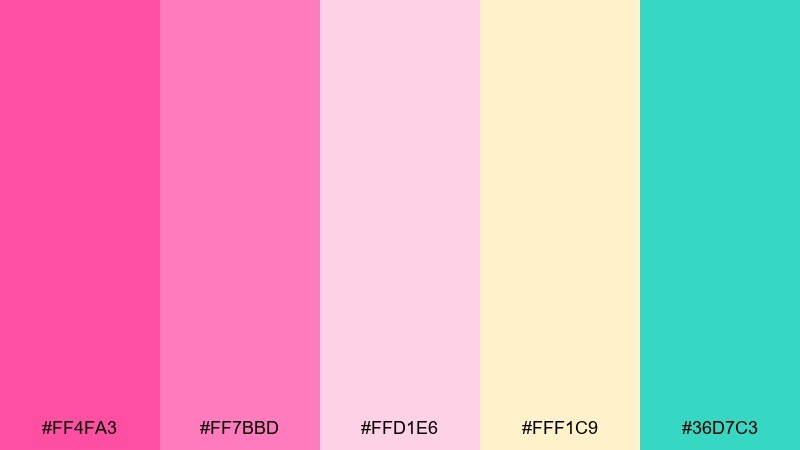
HEX: #ff4fa3 #ff7bbd #ffd1e6 #fff1c9 #36d7c3
Mood: playful, sunny, beachy
Best for: summer event flyer design
Playful and sun-soaked, it feels like fruit sorbet melting by the pool. These pink flamingo color combinations shine on flyers, social promos, and splashy headers when you keep the layout simple. Pair the bright pink with creamy yellow for warmth, then use the aqua as a clean accent for buttons or dates. Usage tip: reserve the teal for calls to action so the pink stays the star.
Image example of tropical sorbet generated using media.io

Media.io is an online AI studio for creating and editing video, image, and audio in your browser.

2) Sunset Float
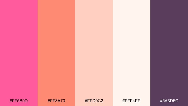
HEX: #ff5b9d #ff8a73 #ffd0c2 #fff4ee #5a3d5c
Mood: warm, romantic, sunset-glow
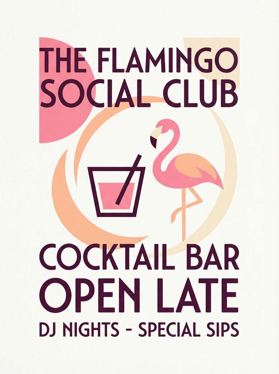
Best for: cocktail bar poster
Warm and dreamy, like a late sunset reflected in a fizzy drink. The peach and flamingo pink read inviting on posters, while the deep plum anchors headlines and pricing. Pair it with off-white negative space to keep everything breathable and upscale. Usage tip: set body copy in plum at 85 to 90 percent opacity for a softer editorial feel.
Image example of sunset float generated using media.io
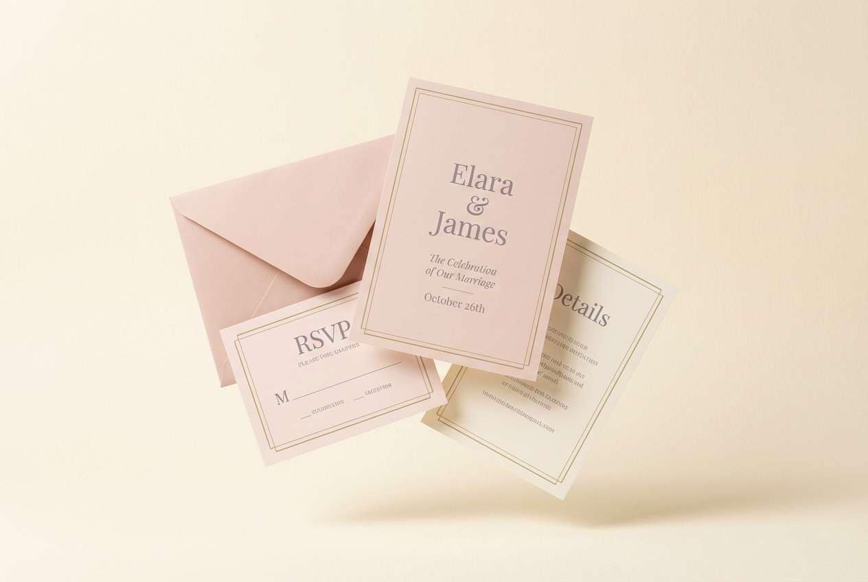
3) Ballet Bloom
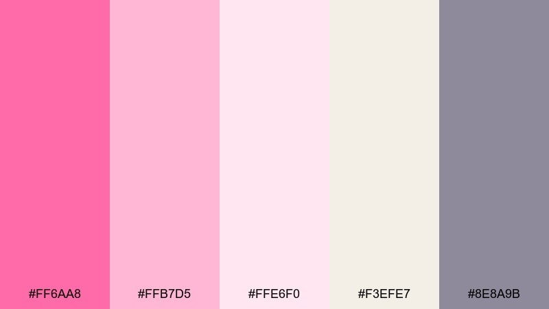
HEX: #ff6aa8 #ffb7d5 #ffe6f0 #f3efe7 #8e8a9b
Mood: soft, graceful, airy
Best for: wedding invitation suite
Soft and graceful, it evokes satin ribbons and fresh petals. The blush-to-cream range works beautifully for invitations, menus, and RSVP cards with a refined, minimal layout. Add the muted lavender-gray for typography and borders to avoid anything feeling too sweet. Usage tip: emboss the lightest pink as a background texture and keep text in the gray for crisp readability.
Image example of ballet bloom generated using media.io
4) Neon Flamingo Night
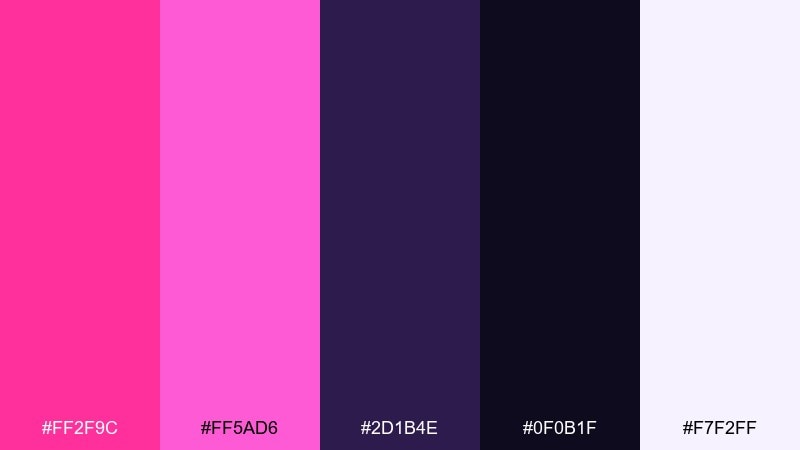
HEX: #ff2f9c #ff5ad6 #2d1b4e #0f0b1f #f7f2ff
Mood: electric, bold, nightlife
Best for: music festival poster
Electric and high-contrast, it feels like neon signage against a midnight sky. The hot pinks pop hardest on deep purple and near-black, making it ideal for festival posters and club announcements. Keep the layout punchy with oversized type and plenty of dark space to let the glow effect land. Usage tip: use the off-white only for key details like dates, venue, and QR code labels.
Image example of neon flamingo night generated using media.io

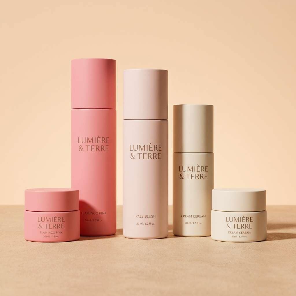
5) Rose Quartz Cream
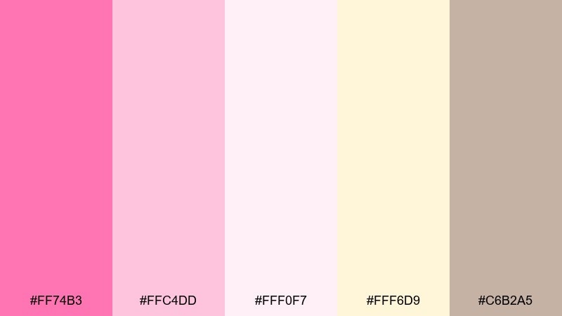
HEX: #ff74b3 #ffc4dd #fff0f7 #fff6d9 #c6b2a5
Mood: cozy, sweet, calming
Best for: skincare product packaging
Cozy and comforting, it brings to mind rosewater, whipped cream, and soft morning light. The gentle pinks and warm cream suit skincare packaging, labels, and product ads that need to feel clean but not clinical. Pair it with warm taupe for ingredient lists and subtle dividers. Usage tip: keep the label background near-white and use the mid pink only for brand marks and key callouts.
Image example of rose quartz cream generated using media.io
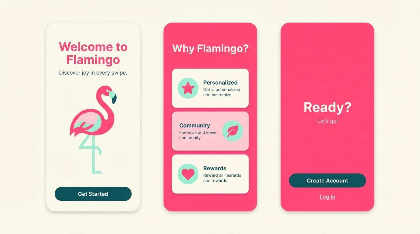
6) Candy Cabana
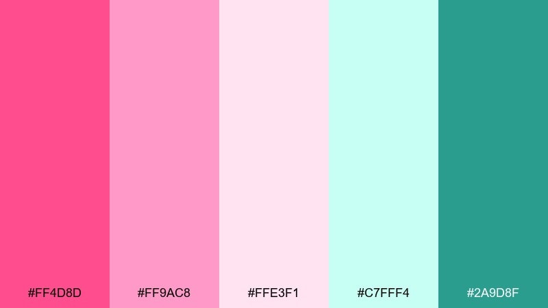
HEX: #ff4d8d #ff9ac8 #ffe3f1 #c7fff4 #2a9d8f
Mood: fresh, fun, resort-bright
Best for: travel app onboarding screens
Fresh and resort-bright, it suggests striped cabanas and sparkling water. The bright pink and minty aqua make onboarding screens feel energetic without turning chaotic. Balance the screen with plenty of pale blush panels and use the deep teal for primary buttons. Usage tip: keep icons in teal on blush cards for strong contrast and a tidy hierarchy.
Image example of candy cabana generated using media.io
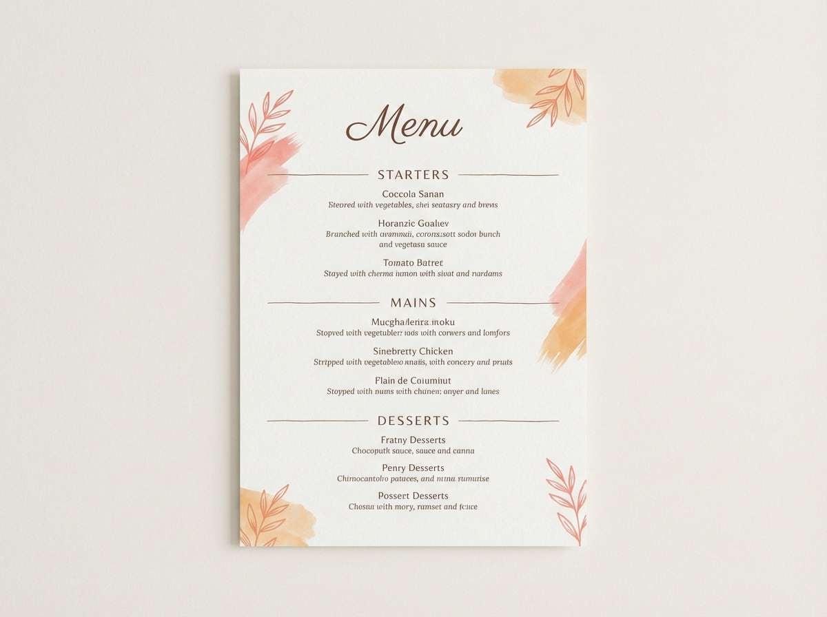
7) Coral Champagne
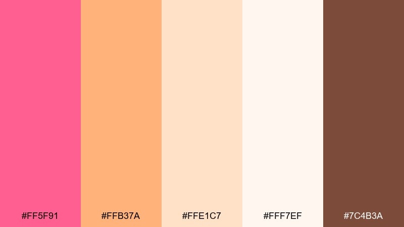
HEX: #ff5f91 #ffb37a #ffe1c7 #fff7ef #7c4b3a
Mood: toasty, celebratory, elegant
Best for: restaurant menu design
Toasty and celebratory, it feels like clinking glasses at golden hour. These pink flamingo color combinations work well for menus when you want warmth without heavy reds. Pair the coral-pink with champagne peach for section headers, then set body text in the cocoa brown for legibility. Usage tip: use the palest cream as the menu background to keep photos and prices looking premium.
Image example of coral champagne generated using media.io
8) Peony Punch
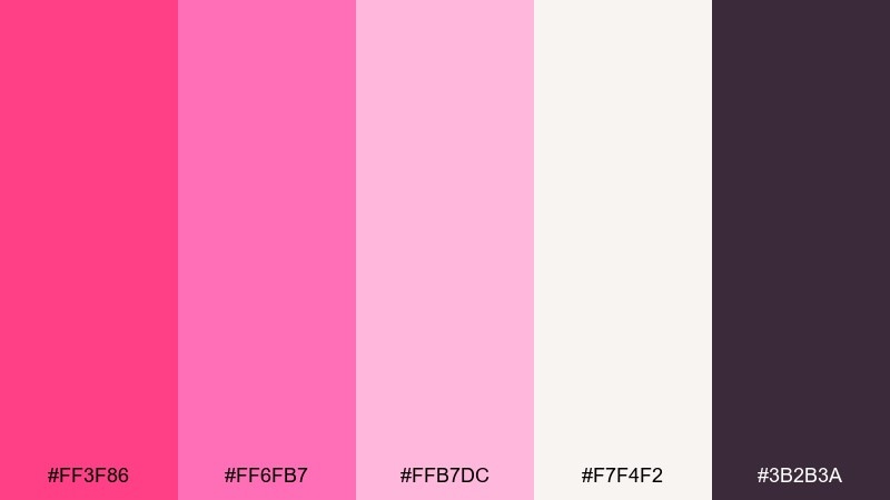
HEX: #ff3f86 #ff6fb7 #ffb7dc #f7f4f2 #3b2b3a
Mood: bold, feminine, high-impact
Best for: beauty brand social ad
Bold and punchy, it evokes peony petals with a glossy, editorial edge. Use the bright pink for product highlights and the charcoal-plum for headlines to keep contrast strong. The pale pinks are perfect for soft gradients and background blocks that still feel modern. Usage tip: keep one dominant pink per ad and let the darker neutral handle most of the text.
Image example of peony punch generated using media.io
9) Lagoon Blush
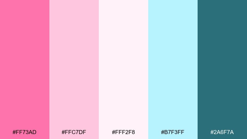
HEX: #ff73ad #ffc7df #fff2f8 #b7f3ff #2a6f7a
Mood: breezy, clean, spa-like
Best for: wellness blog header
Breezy and clean, it feels like a spa towel beside a clear lagoon. The airy blush tones keep layouts light, while the aqua adds a refreshing lift for icons or links. Pair it with the deeper teal for navigation and small typographic accents to maintain clarity. Usage tip: use aqua sparingly as a highlight color so the header stays calm and readable.
Image example of lagoon blush generated using media.io
10) Fuchsia Velvet
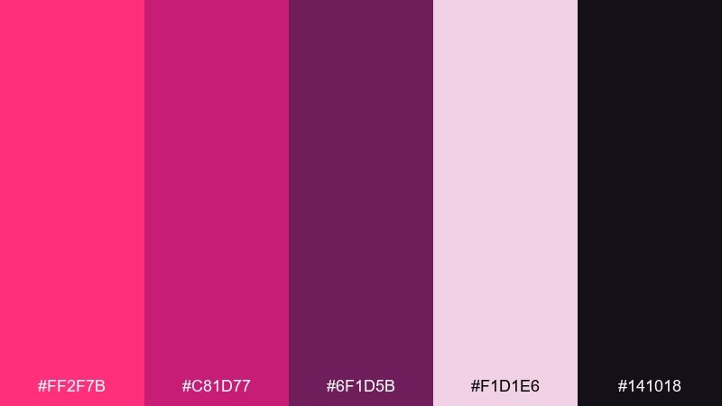
HEX: #ff2f7b #c81d77 #6f1d5b #f1d1e6 #141018
Mood: luxurious, moody, dramatic
Best for: fashion lookbook cover
Luxurious and moody, it recalls velvet fabric under spotlight. The deep berry and near-black build drama, while the pale mauve keeps the lookbook cover from feeling too heavy. Pair the brightest fuchsia with restrained typography for a high-fashion vibe. Usage tip: print large areas in the darker berry and reserve neon-bright pink for one focal element like the title or a thin rule.
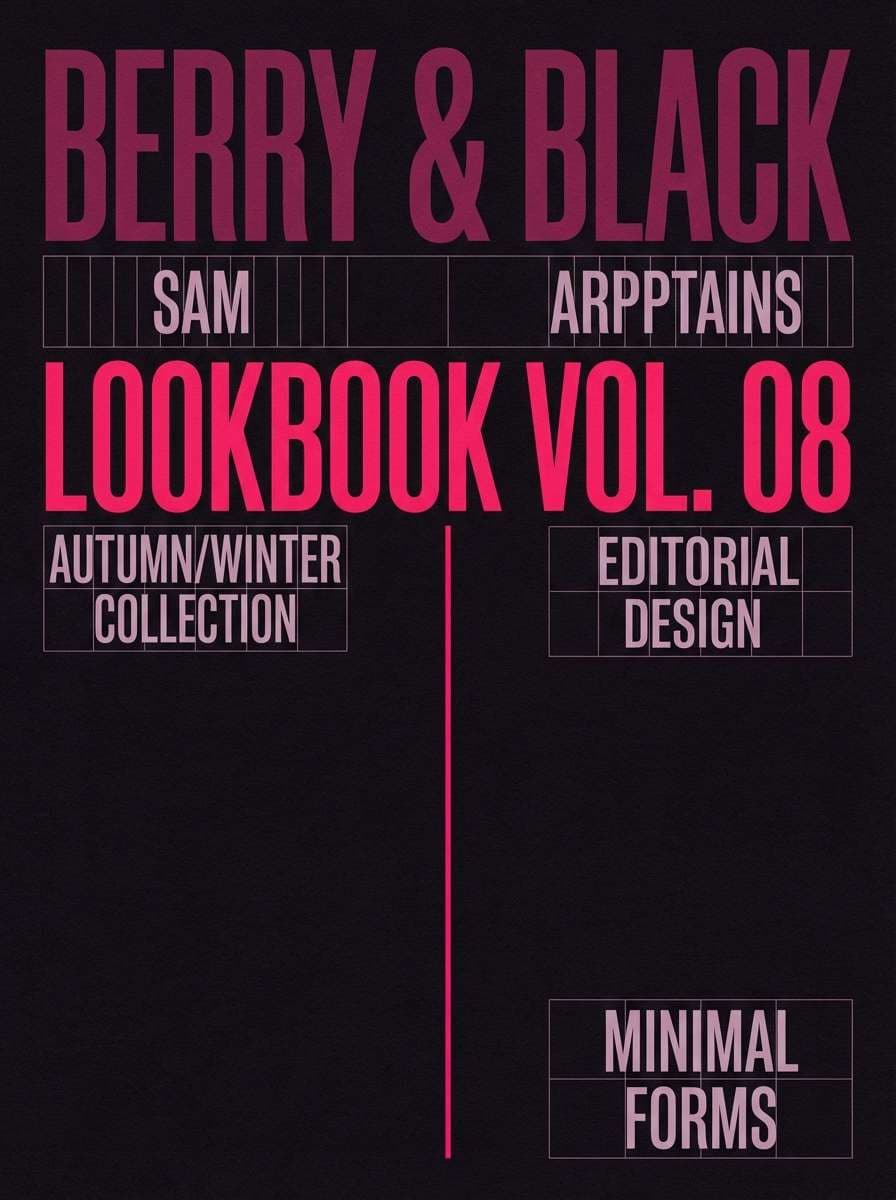
Image example of fuchsia velvet generated using media.io
11) Cotton Candy Cloud
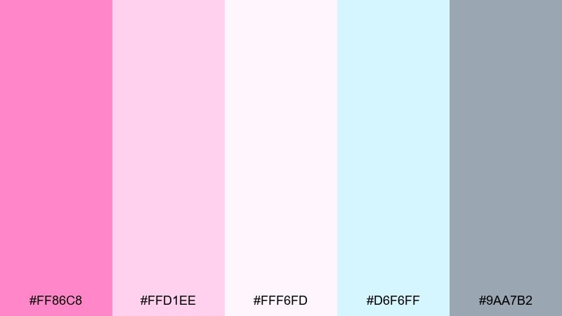
HEX: #ff86c8 #ffd1ee #fff6fd #d6f6ff #9aa7b2
Mood: dreamy, light, whimsical
Best for: kids birthday invitation
Dreamy and light, it looks like cotton candy drifting through a pale sky. The soft pinks make invitations feel sweet, while the airy blue keeps the design from turning overly sugary. Pair the cool gray-blue with simple rounded type for names and details. Usage tip: use the near-white as the main background and add pink only in borders, confetti dots, or a single illustration.
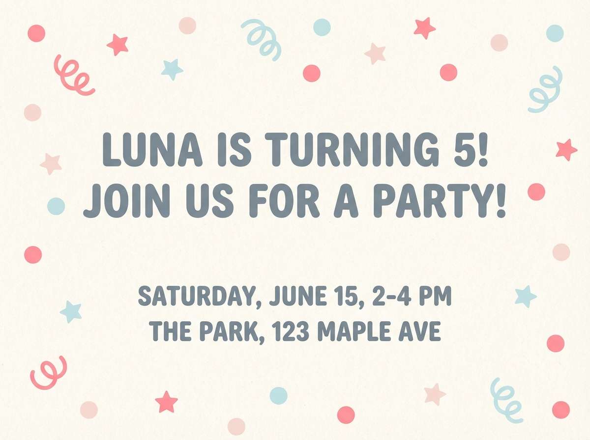
Image example of cotton candy cloud generated using media.io
12) Summer Aperitivo
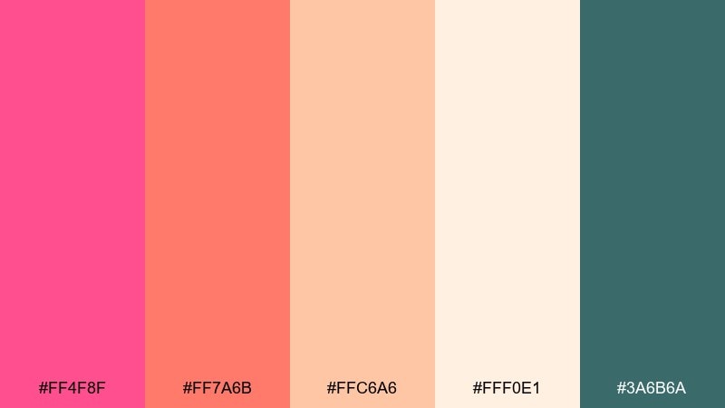
HEX: #ff4f8f #ff7a6b #ffc6a6 #fff0e1 #3a6b6a
Mood: sociable, warm, Mediterranean
Best for: cafe Instagram post
Sociable and warm, it evokes citrus slices, patio chatter, and a rosy spritz. The coral-pink and peach tones work best with bold, simple shapes for food posts and cafe promos. Add the muted teal for a grounded contrast in buttons, handles, or price tags. Usage tip: keep the background creamy and let one saturated pink block carry the headline.
Image example of summer aperitivo generated using media.io
13) Modern Bridal Pink
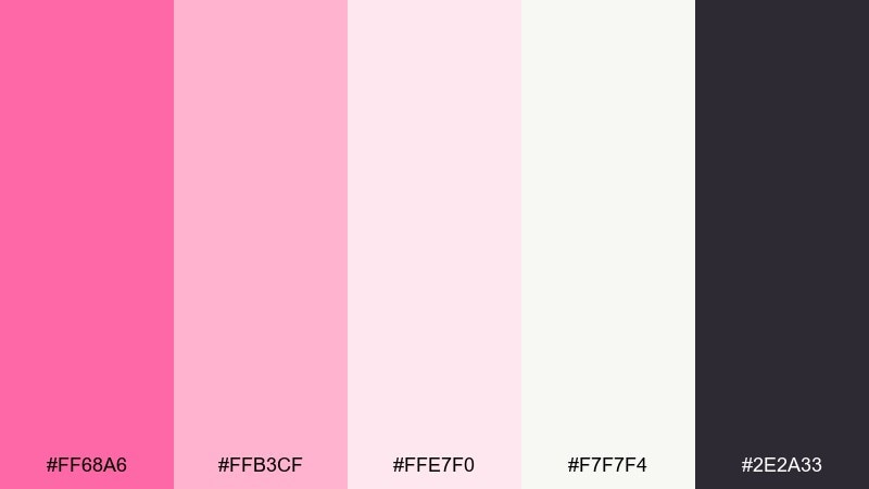
HEX: #ff68a6 #ffb3cf #ffe7f0 #f7f7f4 #2e2a33
Mood: polished, romantic, contemporary
Best for: bridal boutique website UI
Polished and romantic, it feels like silk, pearls, and clean studio light. As a pink flamingo color scheme, it suits boutique UI where you want softness without losing sharp structure. Use the near-white for large surfaces, the mid pink for badges and hover states, and the inky charcoal for text. Usage tip: avoid full-pink backgrounds on mobile and instead apply pink as a consistent accent on key actions.
Image example of modern bridal pink generated using media.io
14) Art Deco Flamingo
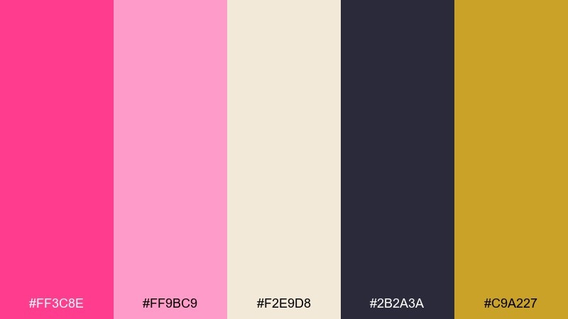
HEX: #ff3c8e #ff9bc9 #f2e9d8 #2b2a3a #c9a227
Mood: glam, geometric, vintage
Best for: gala invitation design
Glam and geometric, it calls up deco patterns, cocktail lounges, and gilded details. The flamingo pink feels sophisticated when paired with midnight charcoal and a restrained hit of gold. Use cream as the paper tone and keep line work crisp for that classic deco structure. Usage tip: apply gold only to borders or small icons so it reads like foil instead of noise.
Image example of art deco flamingo generated using media.io

15) Minimal Pink Paper
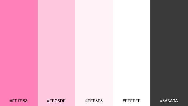
HEX: #ff7fb8 #ffc6df #fff3f8 #ffffff #3a3a3a
Mood: clean, minimal, airy
Best for: portfolio website UI
Clean and airy, it feels like premium stationery with a blush edge. The gentle pinks work as subtle section backgrounds while charcoal keeps typography crisp and readable. Use pure white as breathing room and let the mid pink highlight links, tags, or selection states. Usage tip: keep contrast ratios high by placing charcoal text on the very light blush or white only.
Image example of minimal pink paper generated using media.io
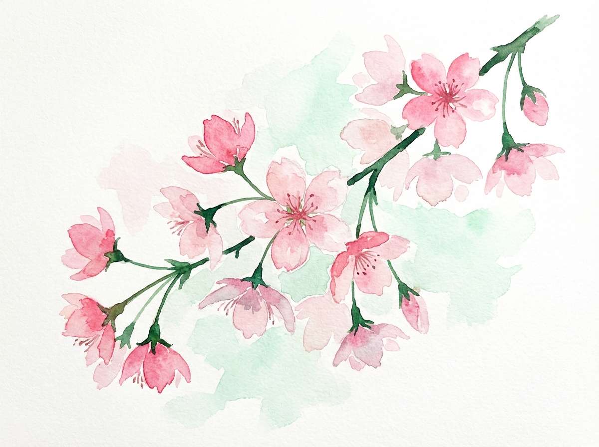
16) Cherry Blossom Pop
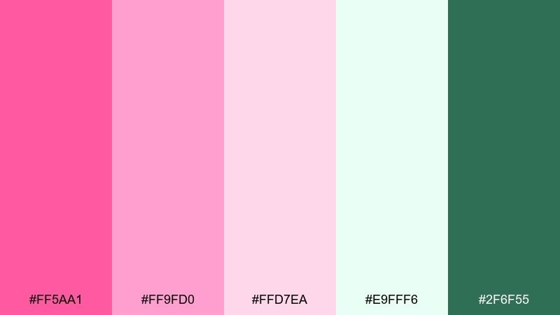
HEX: #ff5aa1 #ff9fd0 #ffd7ea #e9fff6 #2f6f55
Mood: springy, bright, optimistic
Best for: watercolor spring illustration
Springy and optimistic, it suggests petals drifting across fresh green air. The pink range feels lively in watercolor florals, while the cool mint keeps the composition crisp. Use the darker green as stems, leaf shadows, or small title lettering. Usage tip: let the palest pink wash cover larger areas and build saturation only at the petal centers.
Image example of cherry blossom pop generated using media.io
17) Warm Sand Rose
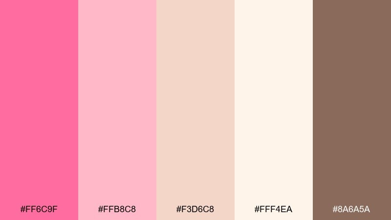
HEX: #ff6c9f #ffb8c8 #f3d6c8 #fff4ea #8a6a5a
Mood: earthy, warm, understated
Best for: interior decor moodboard
Earthy and warm, it looks like blush paint against sunlit sand and clay. These tones suit moodboards for interiors, lifestyle branding, and calm landing pages. Pair the dusty rose with creamy beige, then use the warm brown for captions and swatches. Usage tip: keep saturation low in backgrounds and introduce the brighter pink only in small accents like pillows, buttons, or icons.
Image example of warm sand rose generated using media.io
18) Berry Milkshake
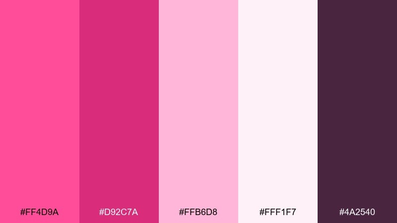
HEX: #ff4d9a #d92c7a #ffb6d8 #fff1f7 #4a2540
Mood: sweet, rich, retro-diner
Best for: dessert shop logo and packaging
Sweet and rich, it feels like a berry milkshake with a glossy cherry on top. The deeper berry shades add a retro diner edge, while the pale blush keeps packaging light and giftable. Pair the darkest plum for logo type and use the brightest pink as a seal or sticker color. Usage tip: print the lightest background with a subtle texture so the pinks look creamy instead of flat.
Image example of berry milkshake generated using media.io
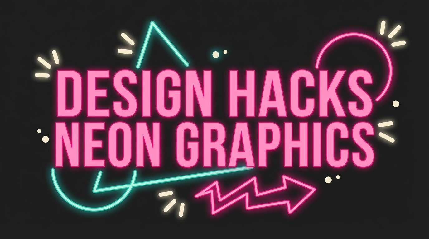
19) Retro Motel Sign
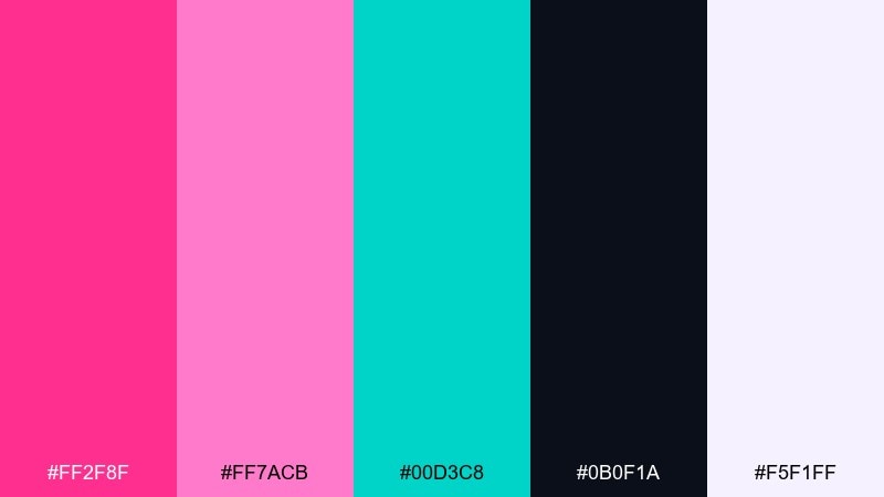
HEX: #ff2f8f #ff7acb #00d3c8 #0b0f1a #f5f1ff
Mood: retro, neon, energetic
Best for: YouTube thumbnail design
Retro and energetic, it brings back motel signs, late-night snacks, and glowing tubes of light. The hot pink and teal are made for high-contrast thumbnails where you need instant punch on small screens. Keep the background near-black and use the off-white for big, readable words. Usage tip: limit outlines and glows to one or two elements so the design stays sharp rather than fuzzy.
Image example of retro motel sign generated using media.io
20) Soft Clay Petal
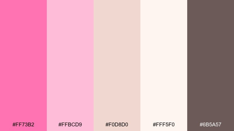
HEX: #ff73b2 #ffbcd9 #f0d8d0 #fff5f0 #6b5a57
Mood: handmade, gentle, artisan
Best for: ceramics brand product ad
Handmade and gentle, it suggests clay dust, petal blush, and a quiet studio shelf. The pink flamingo color palette feels especially natural when you blend it with warm clay and creamy white for artisan products. Use the deeper brown-gray for logo marks and small copy to keep the ad grounded. Usage tip: choose a matte finish and soft shadows so the colors look tactile rather than glossy.
Image example of soft clay petal generated using media.io

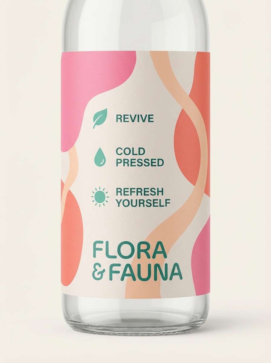
21) Grapefruit Glaze
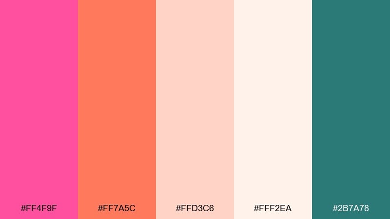
HEX: #ff4f9f #ff7a5c #ffd3c6 #fff2ea #2b7a78
Mood: zesty, bright, appetizing
Best for: juice bar product label
Zesty and bright, it feels like fresh grapefruit with a glossy glaze. Use the coral and flamingo tones to signal flavor fast, then let the pale peach soften the label background. The teal-green adds a crisp counterpoint for nutrition facts or a small emblem. Usage tip: reserve the most saturated pink for the flavor name so it reads instantly on shelves.
Image example of grapefruit glaze generated using media.io
22) Rosy Tech Gradient
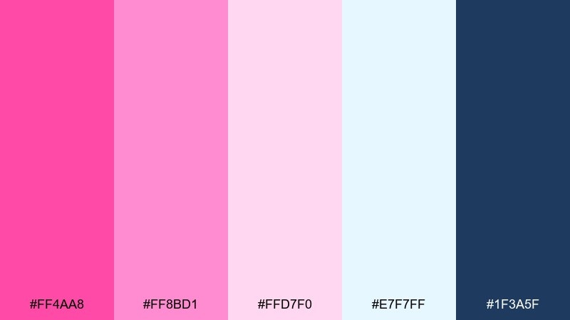
HEX: #ff4aa8 #ff8bd1 #ffd7f0 #e7f7ff #1f3a5f
Mood: sleek, modern, upbeat
Best for: SaaS landing page hero
Sleek and upbeat, it reads like a modern gradient glowing across glass. These pink flamingo color combinations are strong for SaaS heroes when you balance them with cool, airy blues and confident navy. Use the navy for headings and navigation, and keep the pinks in gradients, badges, or illustration highlights. Usage tip: apply a subtle pink-to-lilac gradient only in the hero area to guide focus toward the primary CTA.
Image example of rosy tech gradient generated using media.io

What Colors Go Well with Pink Flamingo?
Pink flamingo pairs beautifully with crisp cool tones like aqua, teal, and airy blues—these create contrast and keep the palette feeling fresh and modern rather than overly sweet.
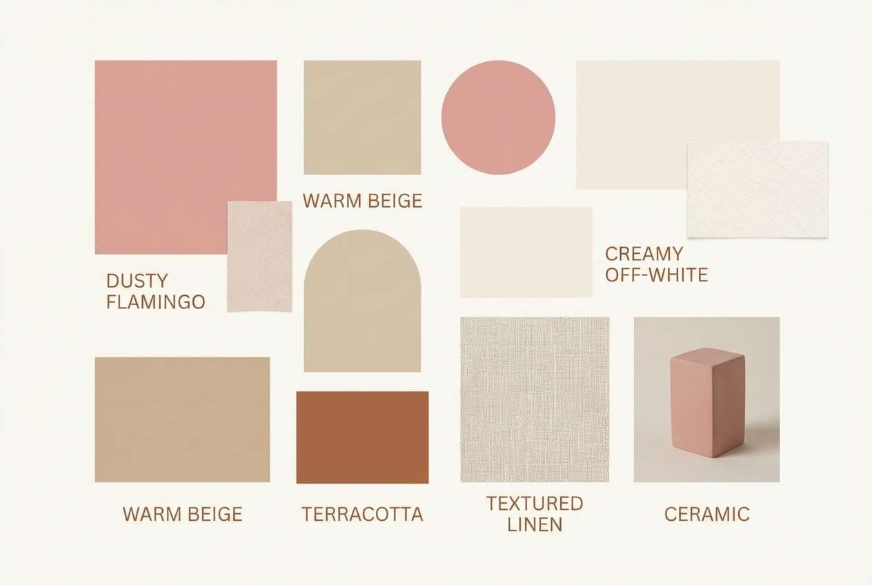
For a softer, premium look, combine flamingo pink with warm neutrals such as cream, champagne, sand, taupe, and cocoa brown. These tones reduce visual noise and make pink feel more “designed.”
If you want maximum drama, add deep anchors like plum, charcoal, near-black, or navy. Dark bases make hot pink pop while keeping type and key UI elements highly readable.
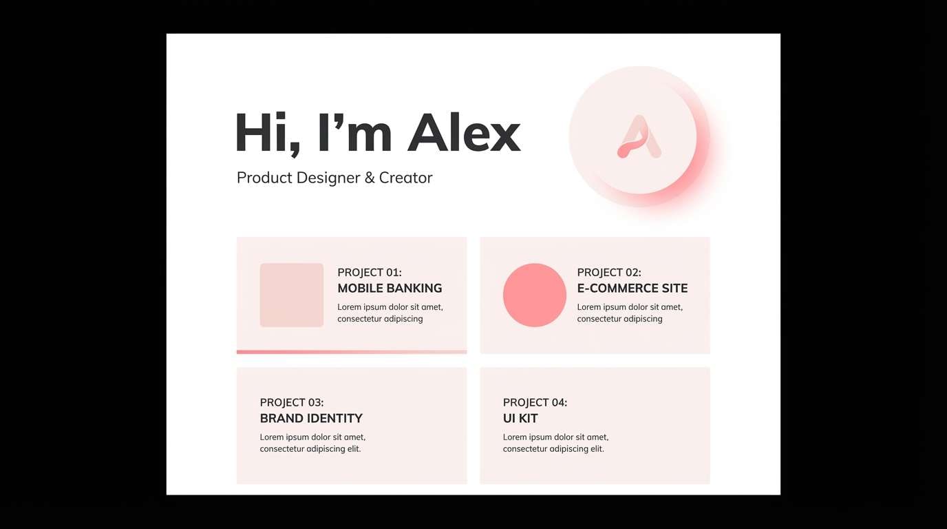
How to Use a Pink Flamingo Color Palette in Real Designs
Start with role-based color planning: pick 1 main flamingo pink for highlights, 1 light tint for backgrounds, and 1 dark neutral for text. This simple structure prevents “pink overload” and improves hierarchy.
In UI, keep large surfaces near-white or very pale blush, then use flamingo as an accent for CTAs, badges, and hover states. Pair with navy/charcoal type to maintain accessibility and clarity.
For print (menus, invites, packaging), use cream as a paper tone and limit the most saturated pink to focal points like names, section headers, seals, or small decorative rules.
Create Pink Flamingo Palette Visuals with AI
If you already have HEX codes, the fastest way to validate a palette is to see it in context—poster layouts, labels, UI cards, or brand covers—before you commit to production.
With Media.io, you can generate consistent pink flamingo visuals from a prompt, then iterate on composition, typography feel, and contrast until the design matches your brand mood.
Try generating a few variations per palette (minimal, bold, editorial) to quickly discover the most usable balance of pinks, neutrals, and accents.
Pink Flamingo Color Palette FAQs
-
What is a “pink flamingo” color in design?
Pink flamingo usually refers to a vivid, warm pink that sits between hot pink and coral-pink. In palettes, it’s often paired with blush tints, cream neutrals, and a cool contrast like teal or navy. -
Is flamingo pink the same as fuchsia?
Not exactly. Fuchsia tends to be cooler and more purple-leaning, while flamingo pink typically has a warmer, coral-leaning feel. Many modern palettes use both to create depth. -
What neutrals work best with pink flamingo?
Off-white, cream, warm beige, taupe, and charcoal are the easiest neutrals to balance flamingo pink. Choose warm neutrals for a cozy look and charcoal/near-black for a sharper, modern look. -
What accent colors make flamingo pink pop?
Teal, aqua, mint, and navy are top accents because they contrast pink without clashing. Gold also works well in small amounts for a luxe, invitation-style finish. -
How do I keep a pink flamingo palette from feeling too bright?
Use the most saturated pink as an accent (10–20% of the layout), rely on pale blush/near-white for large backgrounds, and keep most text in a dark neutral like plum, charcoal, or navy. -
Is pink flamingo suitable for professional branding?
Yes—when paired with strong typography and grounded neutrals. Many modern beauty, lifestyle, and tech brands use flamingo accents to feel energetic while still maintaining a clean, premium structure. -
Can I generate matching images for a pink flamingo palette?
Yes. Use Media.io Text-to-Image prompts to generate posters, UI mockups, packaging concepts, and social creatives, then refine until the palette balance and contrast match your intended mood.


