

Red, orange, and green is a high-impact trio: it mixes warmth (red/orange) with a natural, grounding counterweight (green). The result can feel rustic and earthy, bright and modern, or bold and competitive—depending on saturation and how you assign “dominant vs. accent” roles.
Below are 20+ red orange green color palette ideas with HEX codes, plus practical tips for balancing contrast, adding neutrals, and creating on-brand visuals for UI, packaging, posters, and more.
In this article
- Why Red Orange Green Palettes Work So Well
-
- harvest market
- citrus grove
- retro diner pop
- alpine picnic
- terra cotta garden
- festival lanterns
- dashboard heatmap
- craft coffee label
- spring herb watercolor
- holiday wreath shop
- athletic club crest
- classroom bulletin
- mediterranean market
- eco startup launch
- vintage rail poster
- minimal living accents
- artisan soap bar
- street food night
- orchard wedding suite
- trail map ui
- gourmet pantry labels
- autumn campus poster
- What Colors Go Well with Red Orange Green?
- How to Use a Red Orange Green Color Palette in Real Designs
- Create Red Orange Green Palette Visuals with AI
Why Red Orange Green Palettes Work So Well
Red and orange sit close on the color wheel, so they naturally feel cohesive and “warm.” Add green—typically the complementary counterpoint—and you get instant balance: energy plus stability.
This trio also maps well to real-world associations people recognize quickly: harvest/fall, food and freshness, outdoors and travel, or status indicators in UI (good/caution/bad). That familiarity makes the palette easy to read and remember.
The key is hierarchy. When you decide which color leads and which colors support (especially for CTAs, labels, and icons), red orange green combinations stay clear instead of chaotic.
20+ Red Orange Green Color Palette Ideas (with HEX Codes)
1) Harvest Market
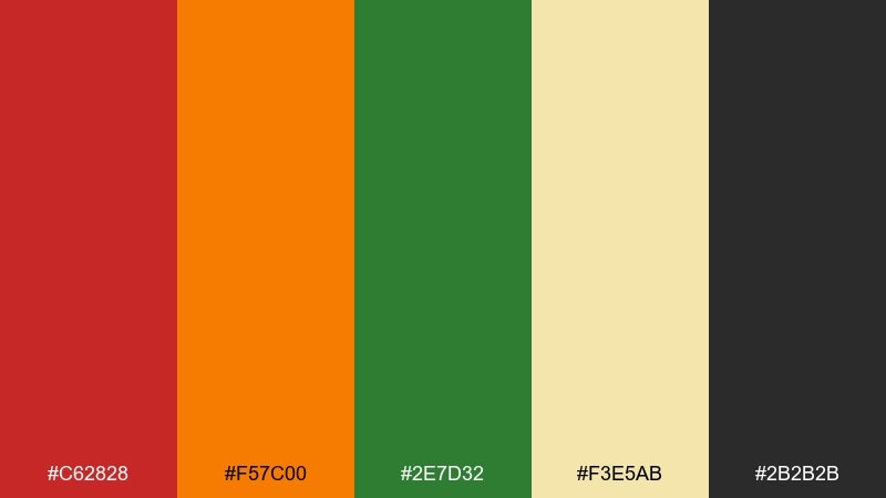
HEX: #C62828 #F57C00 #2E7D32 #F3E5AB #2B2B2B
Mood: rustic and abundant
Best for: farmers market poster
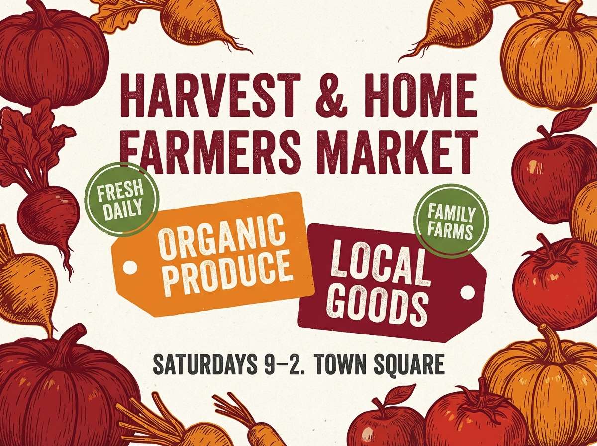
Rustic and abundant, like stacked crates of apples and pumpkins under warm afternoon light. The deep red and orange carry the headline, while the green works best for small badges and pricing callouts. Pair with kraft-paper textures, off-white space, and a condensed sans for a classic market feel. Usage tip: keep the charcoal for body text to maintain readability against the wheat-toned background.
Image example of harvest market generated using media.io
Media.io is an online AI studio for creating and editing video, image, and audio in your browser.

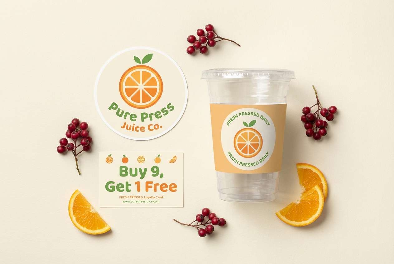
2) Citrus Grove
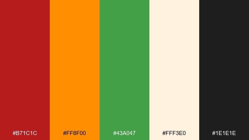
HEX: #B71C1C #FF8F00 #43A047 #FFF3E0 #1E1E1E
Mood: bright and juicy
Best for: juice bar branding kit
Bright and juicy, like citrus slices against glossy leaves. These red orange green color combinations feel energetic when the orange takes the lead and the green is reserved for freshness cues. Pair with creamy off-white, rounded typography, and simple icon shapes to keep it modern. Usage tip: use red sparingly for limited-time offers so it reads as urgency, not clutter.
Image example of citrus grove generated using media.io
3) Retro Diner Pop
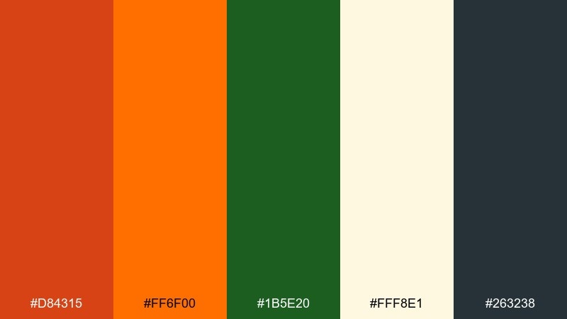
HEX: #D84315 #FF6F00 #1B5E20 #FFF8E1 #263238
Mood: playful and nostalgic
Best for: restaurant menu cover
Playful and nostalgic, like a neon diner sign glowing over checkered tiles. The red and orange create punchy headers, while the deep green keeps the look grounded and a bit retro. This red orange green color scheme works well with cream paper textures and thick outline icons. Usage tip: limit the orange to two key elements per page so the menu still feels organized.
Image example of retro diner pop generated using media.io
4) Alpine Picnic
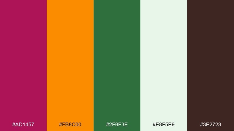
HEX: #AD1457 #FB8C00 #2F6F3E #E8F5E9 #3E2723
Mood: fresh and outdoorsy
Best for: travel blog hero banner
Fresh and outdoorsy, like a picnic blanket spread beside pine trees and late-summer wildflowers. Use the green as the dominant base, then bring in orange for highlights and buttons. The soft minty background keeps everything airy, especially for photography overlays. Usage tip: choose warm brown for text on pale areas to avoid harsh contrast while staying readable.
Image example of alpine picnic generated using media.io

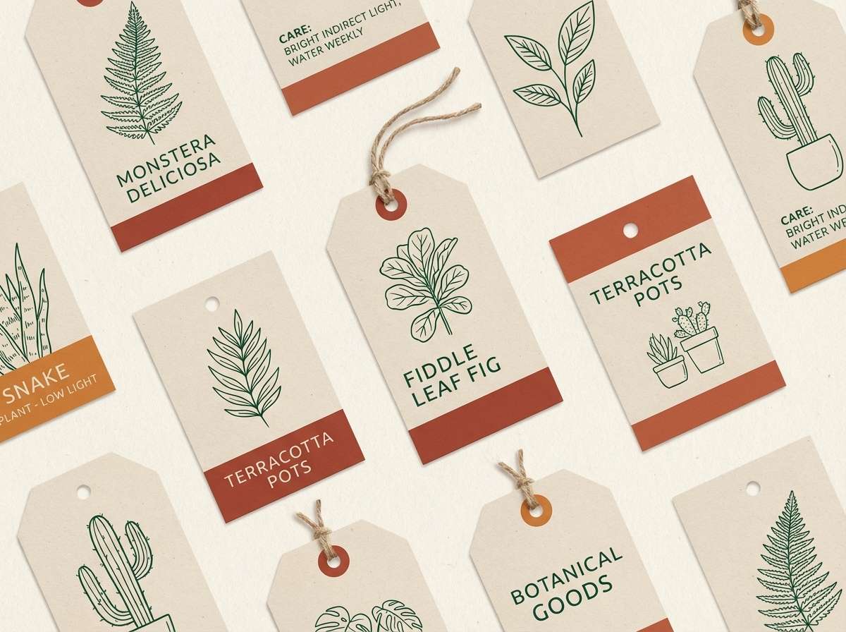
5) Terra Cotta Garden
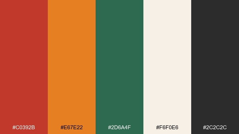
HEX: #C0392B #E67E22 #2D6A4F #F6F0E6 #2C2C2C
Mood: earthy and calm
Best for: plant shop product tags
Earthy and calm, like terracotta pots lined up on a greenhouse bench. The muted red and orange feel natural when paired with the deep botanical green, especially on cream stock. Add simple line drawings and plenty of whitespace for a boutique look. Usage tip: print green as the primary ink and use orange only for price or care-level highlights.
Image example of terra cotta garden generated using media.io
6) Festival Lanterns
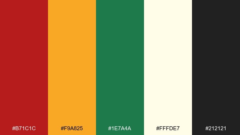
HEX: #B71C1C #F9A825 #1E7A4A #FFFDE7 #212121
Mood: warm and celebratory
Best for: community event flyer
Warm and celebratory, like lanterns and paper garlands swaying at dusk. Let the golden orange carry the main blocks, then use red for urgency and green for navigation cues such as dates and locations. Creamy off-white keeps the flyer friendly and accessible. Usage tip: use one dark text color consistently so the vibrant accents do not compete with the details.
Image example of festival lanterns generated using media.io

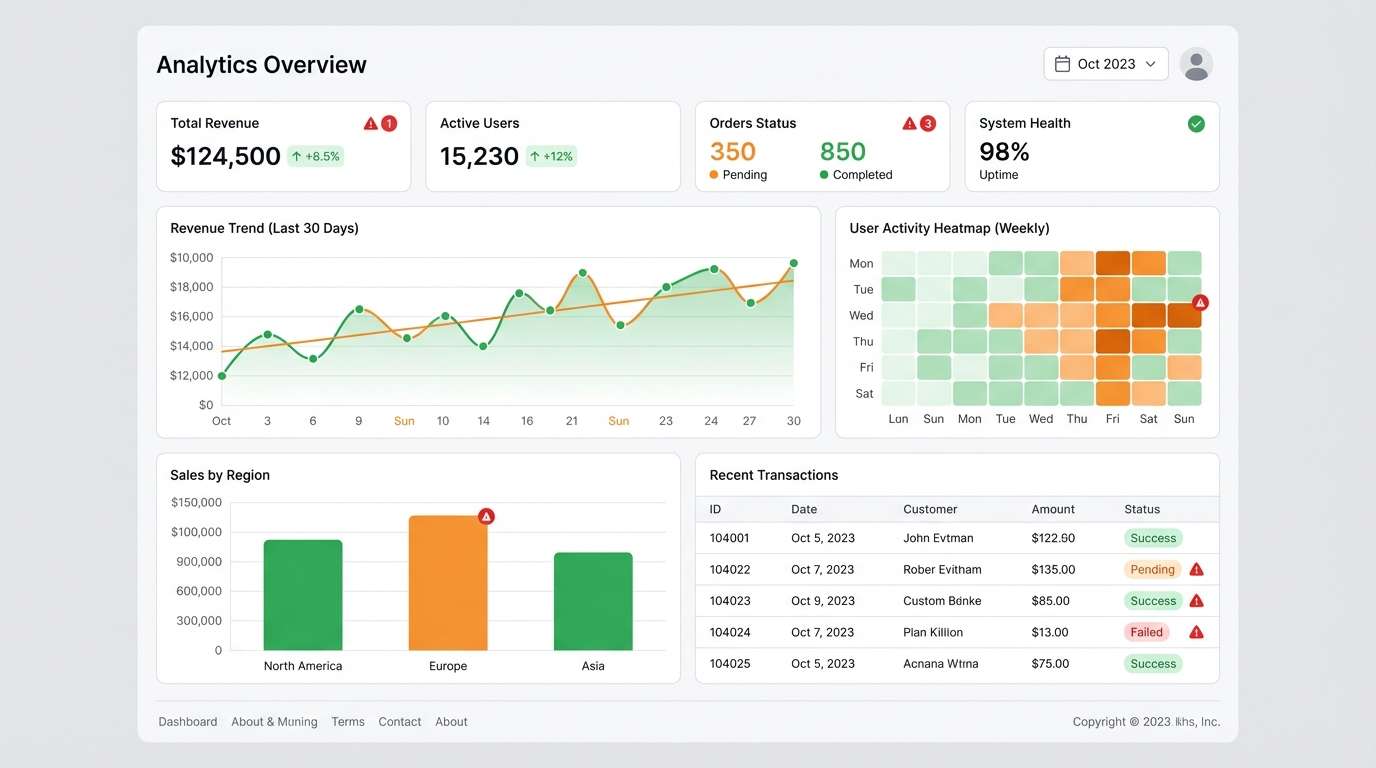
7) Dashboard Heatmap
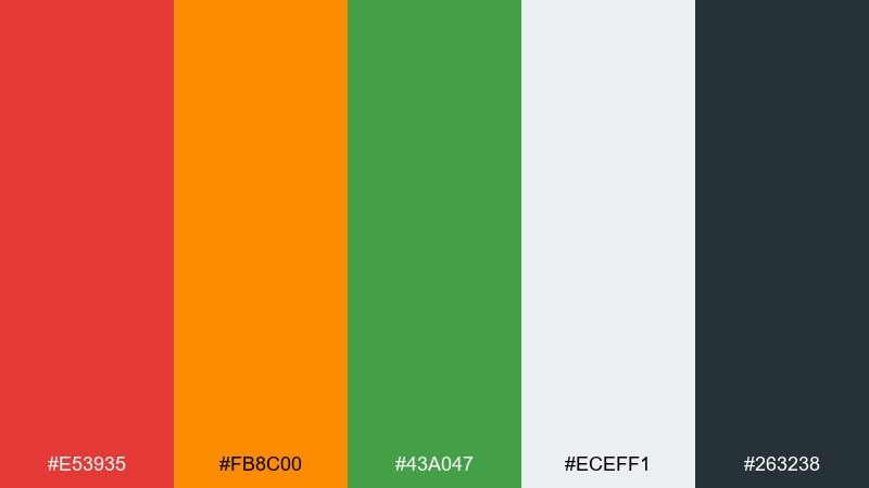
HEX: #E53935 #FB8C00 #43A047 #ECEFF1 #263238
Mood: clear and data-driven
Best for: analytics dashboard ui
Clear and data-driven, like a tidy control room where every metric has a purpose. In a red orange green color palette, reserve red for negative deltas, orange for warnings, and green for healthy states to avoid mixed signals. The cool gray background helps charts stand out without adding visual noise. Usage tip: keep saturation slightly lower for large chart areas and use the most vivid tones only for key alerts.
Image example of dashboard heatmap generated using media.io
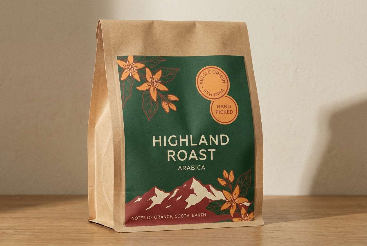
8) Craft Coffee Label
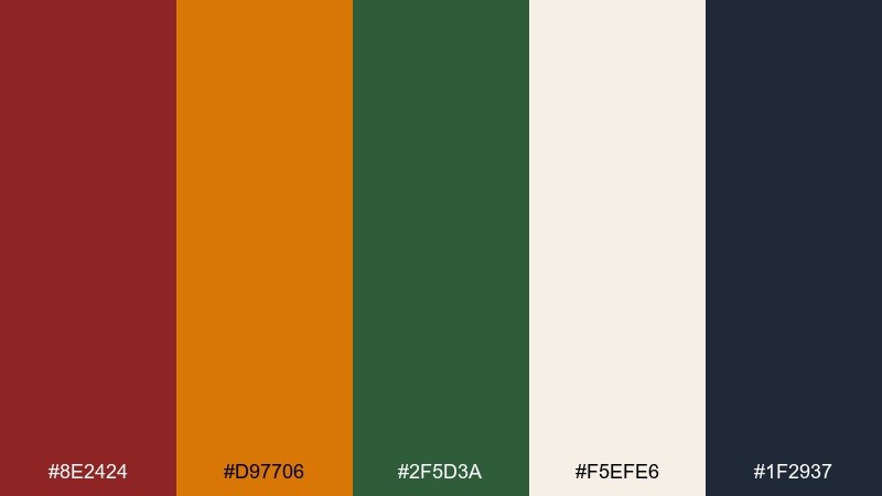
HEX: #8E2424 #D97706 #2F5D3A #F5EFE6 #1F2937
Mood: cozy and artisanal
Best for: coffee bag packaging
Cozy and artisanal, like a small-batch roast with handwritten tasting notes. Use the dark green as the core label color, then add orange for roast level markers and the muted red for origin highlights. Cream and deep gray give it a premium, paper-forward feel. Usage tip: emboss the orange elements or apply spot gloss so the accents feel intentional, not loud.
Image example of craft coffee label generated using media.io
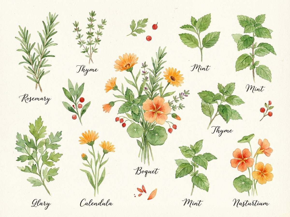
9) Spring Herb Watercolor
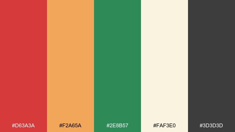
HEX: #D63A3A #F2A65A #2E8B57 #FAF3E0 #3D3D3D
Mood: light and botanical
Best for: botanical illustration set
Light and botanical, like watercolor herbs drying on a sunny windowsill. The peachy orange softens the red so the greens can feel lively rather than heavy. Pair with textured paper backgrounds and delicate brush lettering for a handmade look. Usage tip: keep the red to small berries or flower buds so the illustration stays fresh.
Image example of spring herb watercolor generated using media.io
10) Holiday Wreath Shop

HEX: #B91C1C #F97316 #166534 #FFF7ED #111827
Mood: festive and modern
Best for: ecommerce homepage banner
Festive and modern, like a minimalist wreath with bright ribbon and glossy leaves. The green should dominate for a seasonal anchor, while orange adds warmth that feels less traditional than gold. Use the soft cream background for product photography cutouts and clean type. Usage tip: place red only on the primary call to action to keep the banner focused.
Image example of holiday wreath shop generated using media.io
11) Athletic Club Crest
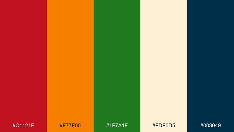
HEX: #C1121F #F77F00 #1F7A1F #FDF0D5 #003049
Mood: bold and competitive
Best for: sports team identity
Bold and competitive, like a stitched crest on a jersey under stadium lights. Balance the intensity by using navy for typography and outlines, then keep red and orange for energy zones and highlights. The cream tint can act as a retro base for patches and badges. Usage tip: test the green on fabric textures to ensure it stays distinct from the navy at a distance.
Image example of athletic club crest generated using media.io
12) Classroom Bulletin
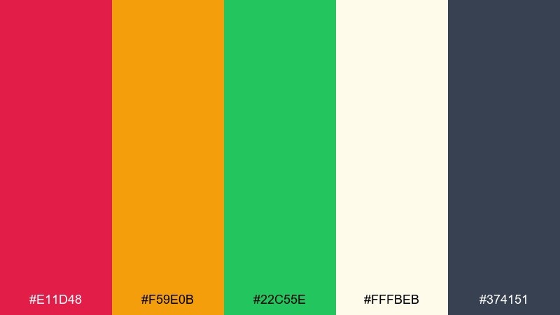
HEX: #E11D48 #F59E0B #22C55E #FFFBEB #374151
Mood: friendly and upbeat
Best for: educational infographic
Friendly and upbeat, like cut-paper shapes pinned to a classroom board. The bright green works well for positive steps, orange for highlights, and the rosy red for key warnings or reminders. Keep backgrounds warm and light so the layout stays kid-friendly without feeling neon. Usage tip: use thick icons and short labels so the colors do more of the teaching work.
Image example of classroom bulletin generated using media.io
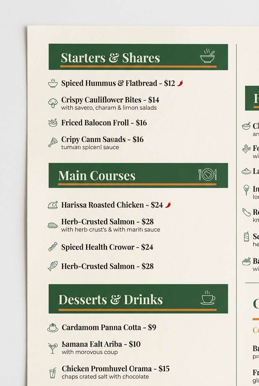
13) Mediterranean Market
HEX: #D1495B #EDAE49 #007F5F #F7F3E3 #2D3142
Mood: sunlit and flavorful
Best for: restaurant menu layout
Sunlit and flavorful, like olives, citrus, and roasted peppers on a stone counter. Use the teal-green as the main block color for sections, then bring in orange for dish highlights and red for spicy markers. The warm off-white reads like parchment and keeps it approachable. Usage tip: add thin dividers in the dark slate so multiple sections do not blur together.
Image example of mediterranean market generated using media.io
14) Eco Startup Launch
HEX: #DC2626 #F97316 #15803D #F1F5F9 #0F172A
Mood: confident and optimistic
Best for: startup pitch deck slides
Confident and optimistic, like a clean product reveal with a sustainability angle. Keep the slide canvas light and let green lead for trust, while orange signals momentum and red marks risks or blockers. Pair with dark navy text and simple charts for clarity. Usage tip: standardize status colors across every slide so the story feels consistent.
Image example of eco startup launch generated using media.io
15) Vintage Rail Poster
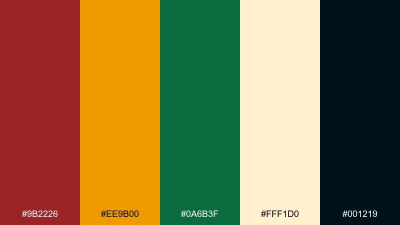
HEX: #9B2226 #EE9B00 #0A6B3F #FFF1D0 #001219
Mood: classic and adventurous
Best for: vintage travel poster
Classic and adventurous, like a printed rail poster advertising mountain routes and market towns. These red orange green color combinations feel authentic when you slightly mute the tones and lean on the creamy paper base. Add bold geometric shapes and a dark ink outline for that screen-printed look. Usage tip: keep gradients minimal and use flat color blocks to preserve the vintage vibe.
Image example of vintage rail poster generated using media.io

16) Minimal Living Accents
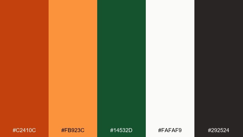
HEX: #C2410C #FB923C #14532D #FAFAF9 #292524
Mood: warm and minimalist
Best for: interior design moodboard
Warm and minimalist, like linen textiles with a single ceramic vase on a wood shelf. Use the off-white as the main field, then bring in orange as an accent and deep green as an anchoring tone. The dark neutral keeps captions and labels crisp without looking stark. Usage tip: apply orange only to one or two focal objects so the palette stays serene.
Image example of minimal living accents generated using media.io
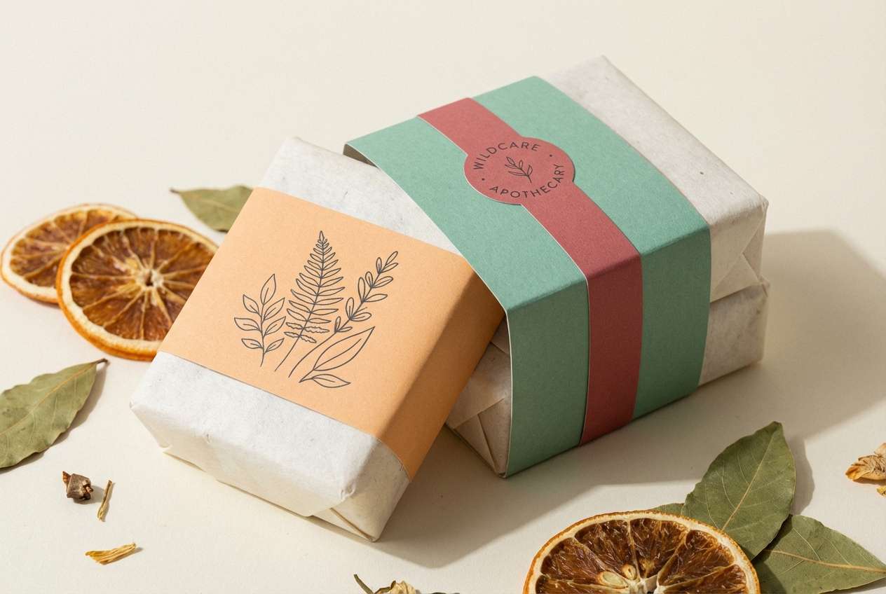
17) Artisan Soap Bar
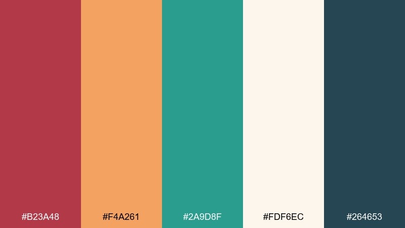
HEX: #B23A48 #F4A261 #2A9D8F #FDF6EC #264653
Mood: handcrafted and spa-like
Best for: soap packaging design
Handcrafted and spa-like, like a botanical soap cured on wooden racks. The soft orange and warm red feel gentle when paired with a cool green, giving the design a balanced natural edge. Use cream paper textures and minimal line art to elevate the handmade story. Usage tip: set the product name in the dark teal for a premium contrast that still feels calm.
Image example of artisan soap bar generated using media.io
18) Street Food Night
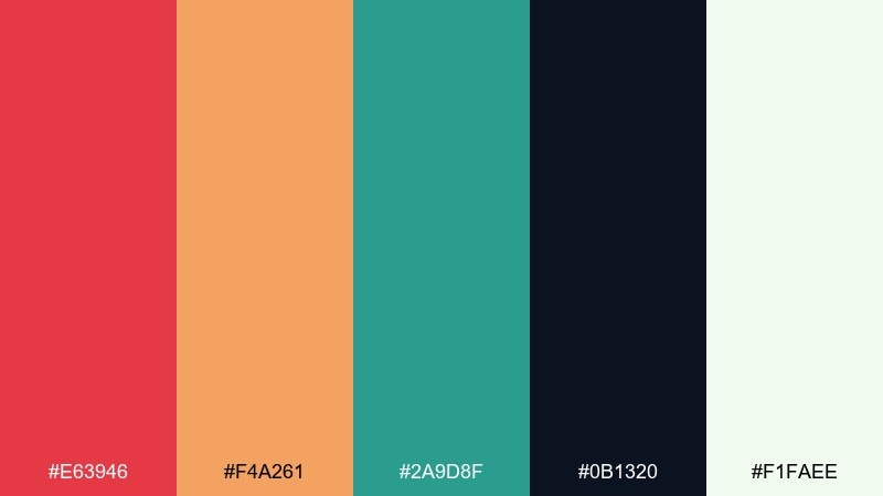
HEX: #E63946 #F4A261 #2A9D8F #0B1320 #F1FAEE
Mood: lively and urban
Best for: street food flyer
Lively and urban, like sizzling skewers and bright signage after dark. The midnight navy makes the warm hues pop, while the green keeps the palette from leaning too fiery. Use large type, simple icons, and strong blocks of color for quick scanning. Usage tip: reverse text in off-white on the navy panels for the cleanest contrast.
Image example of street food night generated using media.io
19) Orchard Wedding Suite
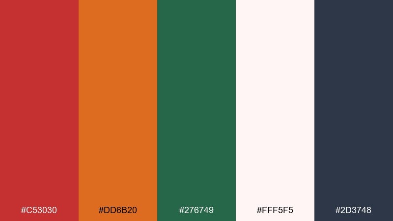
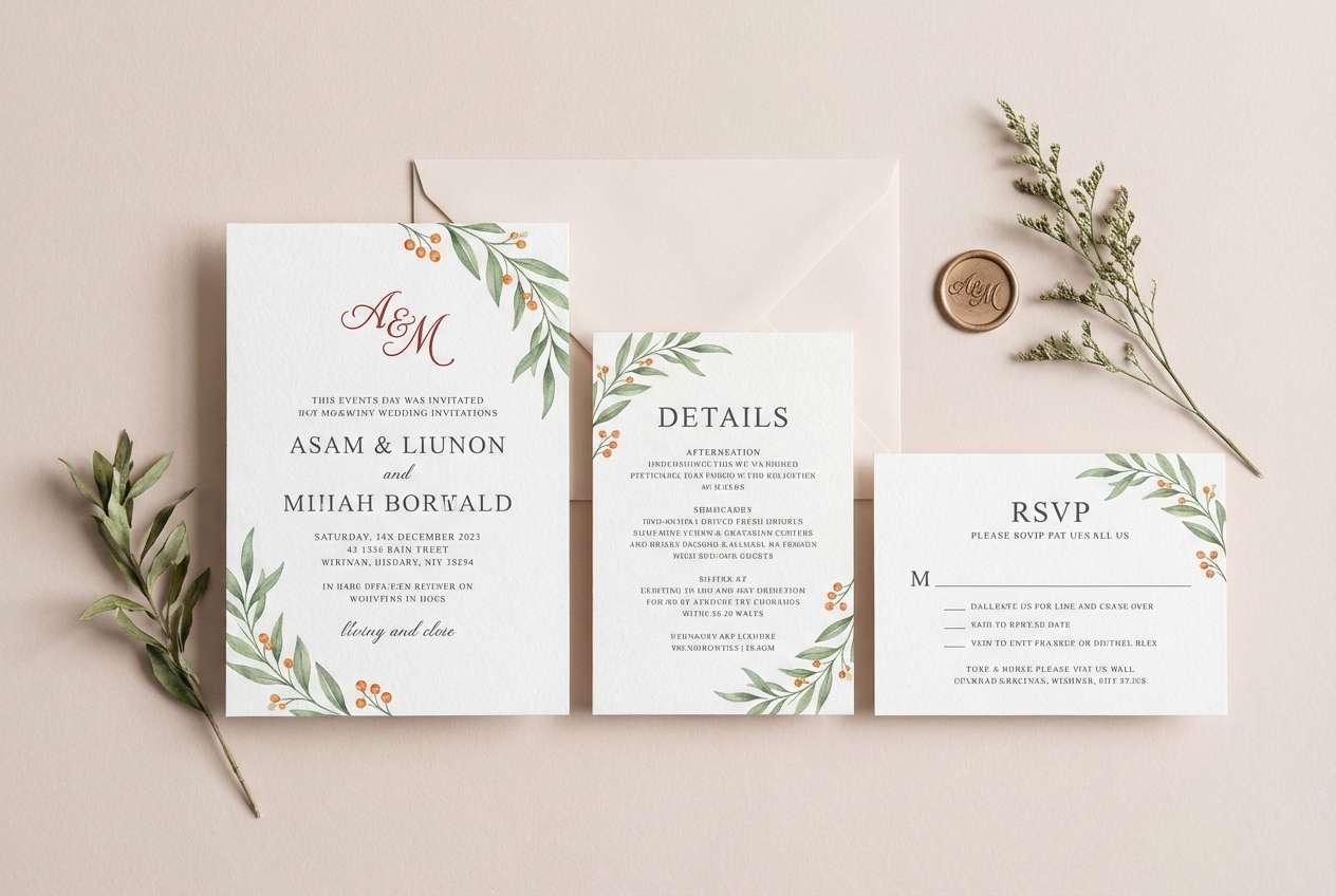
HEX: #C53030 #DD6B20 #276749 #FFF5F5 #2D3748
Mood: romantic and rustic
Best for: wedding invitation suite
Romantic and rustic, like vows under fruit trees with warm light filtering through leaves. Keep the blush background dominant, then use green for foliage motifs and orange for small highlights like divider dots. The red works best as a wax-seal accent or monogram mark rather than full text. Usage tip: print the main copy in slate to keep the suite elegant and legible.
Image example of orchard wedding suite generated using media.io
20) Trail Map UI
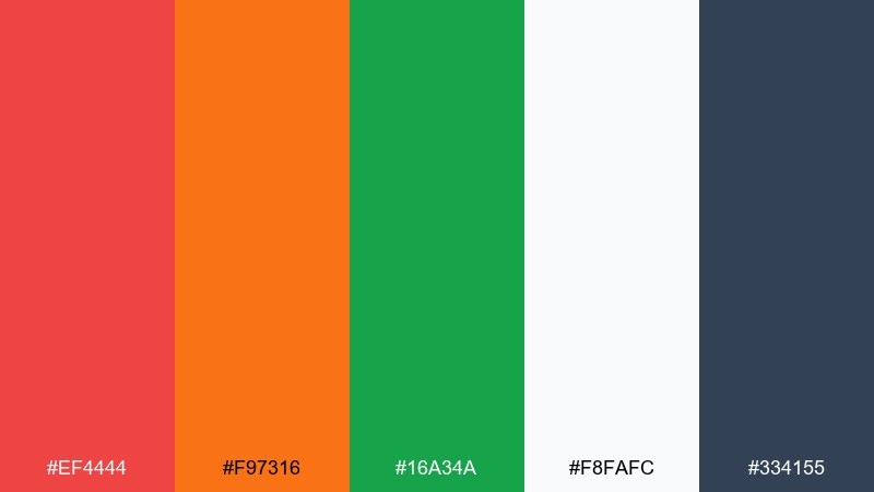
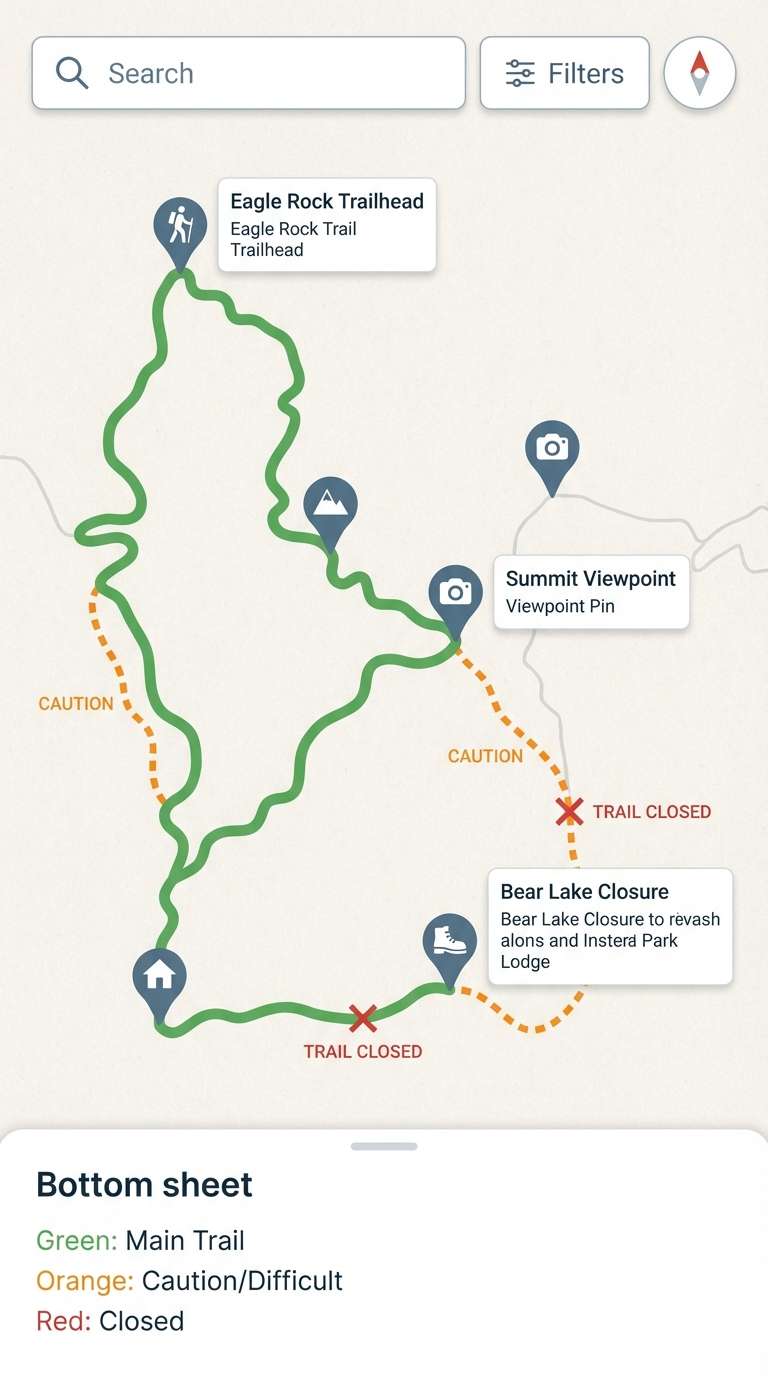
HEX: #EF4444 #F97316 #16A34A #F8FAFC #334155
Mood: practical and outdoors-ready
Best for: hiking app map ui
Practical and outdoors-ready, like a crisp trail guide you can trust in changing weather. Use green for open trails, orange for caution segments, and red for closures so the hierarchy stays obvious at a glance. The light background keeps pins and routes readable without heavy borders. Usage tip: add accessibility-safe icons alongside colors to support color-blind users.
Image example of trail map ui generated using media.io
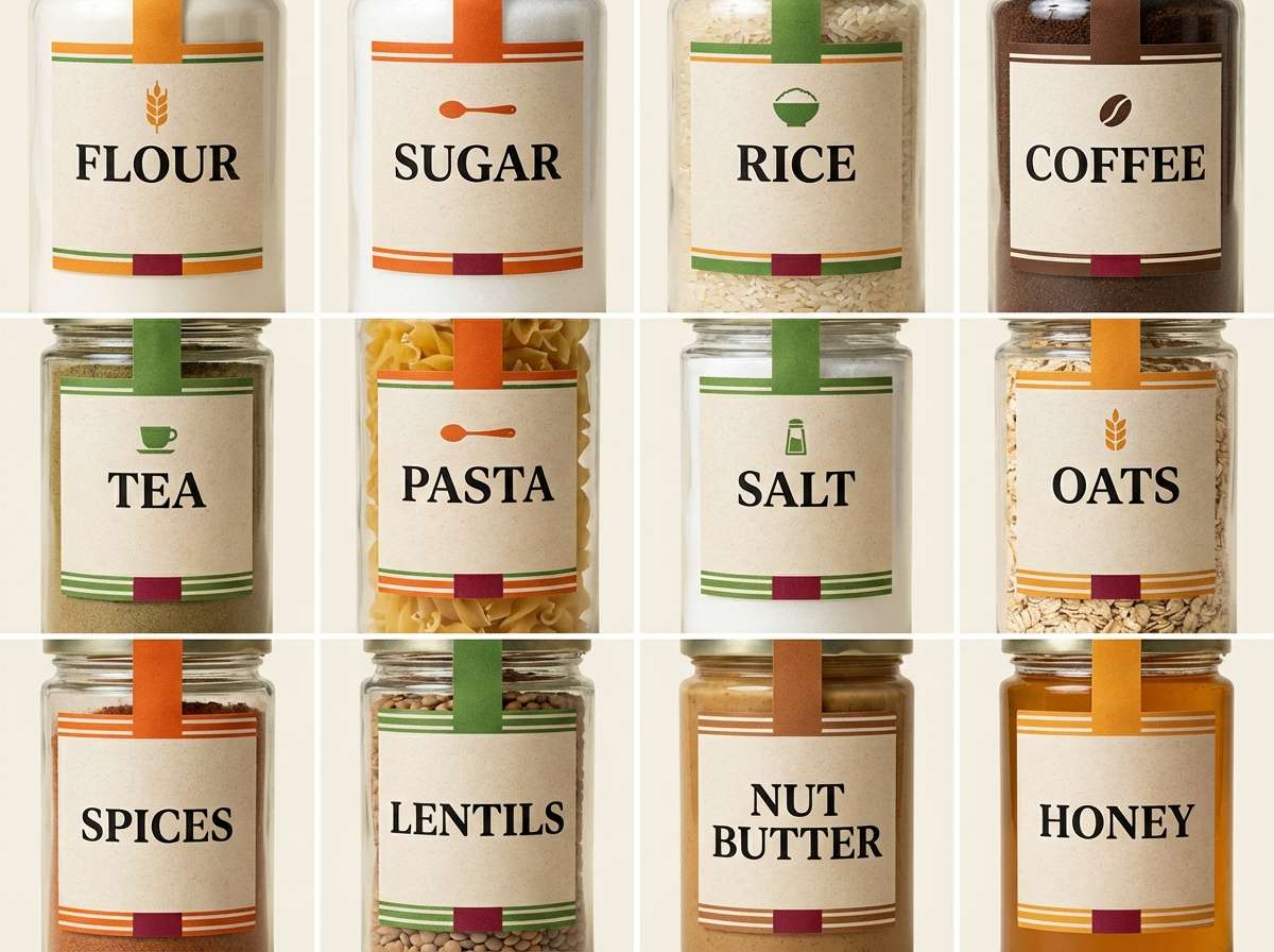
21) Gourmet Pantry Labels
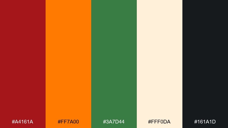
HEX: #A4161A #FF7A00 #3A7D44 #FFF0DA #161A1D
Mood: rich and gourmet
Best for: pantry jar label set
Rich and gourmet, like spice jars lined up in a well-stocked pantry. The orange is perfect for category stripes, while green adds a fresh counterpoint for herbs and blends. Use the creamy base to mimic uncoated paper, then keep the black for ingredient details. Usage tip: maintain one label grid system and swap only the accent stripe color for a cohesive collection.
Image example of gourmet pantry labels generated using media.io
22) Autumn Campus Poster
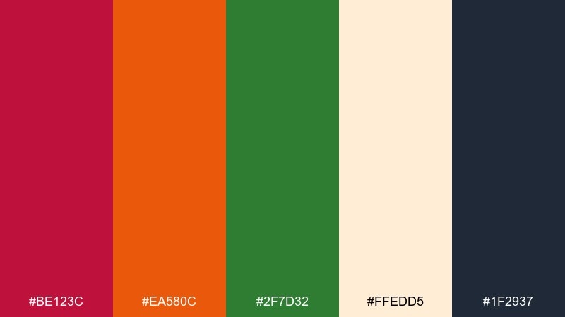
HEX: #BE123C #EA580C #2F7D32 #FFEDD5 #1F2937
Mood: academic and seasonal
Best for: university event poster
Academic and seasonal, like crisp leaves on campus paths and a packed lecture hall. The orange and red feel inviting for the headline, while the green supports secondary blocks like speaker names and session tracks. Use the pale peach background to soften the contrast and avoid an overly loud poster. Usage tip: keep one strong focal headline and let the rest of the information sit in neat, quiet columns.
Image example of autumn campus poster generated using media.io

What Colors Go Well with Red Orange Green?
Neutrals are your best stabilizers: warm off-whites, creams, wheat, and parchment tones soften the heat, while charcoal, slate, and deep navy add structure for typography and UI chrome. If you need a cleaner, tech feel, cool light grays work especially well.
For accents, consider muted browns (wood/leather vibes), gold-leaning yellows (festival warmth), or teal-leaning greens (a calmer, spa-like twist). When the palette feels too “holiday,” reduce saturation and let the neutral background take over.
If accessibility matters (especially in UI), pair color with icons or labels so red/orange/green status meaning remains clear for color-blind users.
How to Use a Red Orange Green Color Palette in Real Designs
Start with a role system: choose one dominant color (often green or a neutral background), one secondary (orange for highlights), and one “signal” color (red for urgency). This prevents the common issue where all three compete for attention.
Use contrast strategically. Keep body text on charcoal/slate rather than pure black when you’re working with warm creams, and reserve the most vivid reds/oranges for small surfaces like badges, CTA buttons, price tags, or alert chips.
For print and packaging, test on real substrates (kraft, uncoated paper, fabric) because warm hues can shift quickly. A slightly darker green or a deeper neutral outline can keep elements separated and legible.
Create Red Orange Green Palette Visuals with AI
If you want to preview how a red orange green color scheme looks in a real layout (poster, menu, dashboard, labels), generate quick mockups before committing to final design files. This is especially helpful for testing hierarchy—what happens when green dominates vs. when orange dominates.
With Media.io’s text-to-image tool, you can paste a prompt, specify your aspect ratio, and iterate fast on style variations (vintage, minimalist, watercolor, UI). Then refine the prompt until the palette feels on-brand.
Red Orange Green Color Palette FAQs
-
What does a red orange green color palette communicate?
It typically communicates warmth and energy (red/orange) balanced by nature, growth, or stability (green). Depending on tone choices, it can feel rustic/earthy, fresh/food-forward, festive, or sporty. -
How do I keep red, orange, and green from looking too “holiday”?
Lower saturation, lean into earthy versions (terracotta, amber, deep botanical green), and use a dominant neutral like cream, parchment, or cool light gray. Also avoid using all three at equal visual weight—assign clear roles. -
Which color should be dominant in a red orange green scheme?
Green often works best as the dominant anchor for backgrounds, sections, or large blocks. Orange is usually the most effective highlight color, while red is strongest as a limited “signal” for urgency, errors, or primary CTAs. -
What neutral colors pair best with red orange green palettes?
Warm off-white/cream, wheat, and parchment create an earthy, print-friendly feel. Charcoal, slate, and deep navy are great for text and structure; cool light gray is ideal for modern UI. -
Is red orange green a good UI status color system?
Yes—many dashboards use green for good, orange for warning, and red for critical. For accessibility, add icons, labels, or patterns so meaning isn’t conveyed by color alone. -
How can I generate palette-based mockups quickly?
Use an AI text-to-image generator to create fast concept visuals like posters, packaging, menus, or dashboards. Iterate on prompts and aspect ratios to test hierarchy and readability before final production. -
Can I use these HEX codes for print projects?
You can start with HEX for concepting, but for print you should convert to CMYK/Pantone and proof on your chosen paper stock. Warm reds and oranges can shift on uncoated or kraft materials, so testing is important.
Next: Pumpkin Color Palette


