

Pumpkin is more than a seasonal orange—it’s a flexible warm hue that can feel rustic, modern, playful, or luxe depending on what you pair it with.
Below are curated pumpkin color palette ideas with HEX codes, plus quick tips and AI prompts you can use to generate matching visuals.
In this article
- Why Pumpkin Palettes Work So Well
-
- harvest glow
- spiced latte
- autumn porch
- copper clay
- maple cream
- cider press
- rustic barn
- golden squash
- pumpkin patch
- ember dusk
- toasted almond
- sunset orchard
- terracotta linen
- saffron hearth
- mocha spice
- vintage carnival
- cozy knit
- modern farmstand
- halloween chic
- desert gourd
- baked spice
- amber minimal ui
- classic autumn mix
- warm contrast pairing
- What Colors Go Well with Pumpkin?
- How to Use a Pumpkin Color Palette in Real Designs
- Create Pumpkin Palette Visuals with AI
Why Pumpkin Palettes Work So Well
Pumpkin sits in the orange family, so it naturally communicates warmth, appetite, and friendliness—making it ideal for brands and visuals that need instant approachability.
It also plays well with both light neutrals (cream, linen, peach) and deep anchors (espresso, charcoal), so you can build contrast without losing that cozy tone.
From autumn campaigns to everyday earthy branding, pumpkin shades adapt easily: brighten them for playful energy or deepen them into terracotta for a more premium, grounded look.
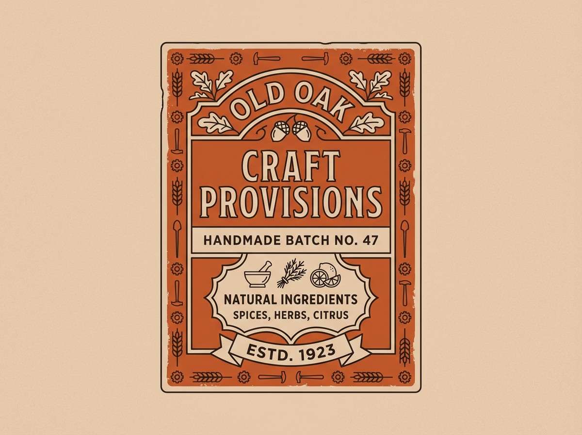
20+ Pumpkin Color Palette Ideas (with HEX Codes)
1) Harvest Glow
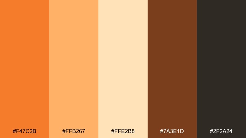
HEX: #F47C2B #FFB267 #FFE2B8 #7A3E1D #2F2A24
Mood: warm, welcoming, sunlit
Best for: brand hero banner
Warm, welcoming tones that feel like late-afternoon light on a farm stand. Use the bright orange as your headline color and let the cream soften large areas of space. Pair with deep brown for contrast in buttons, icons, or type. Tip: keep the black-brown for small accents so the palette stays airy.
Image example of harvest glow generated using media.io

Media.io is an online AI studio for creating and editing video, image, and audio in your browser.

2) Spiced Latte
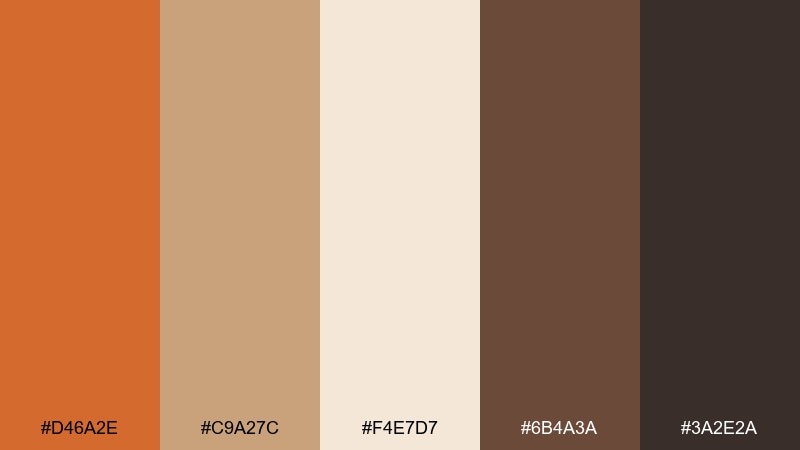
HEX: #D46A2E #C9A27C #F4E7D7 #6B4A3A #3A2E2A
Mood: cozy, creamy, grounded
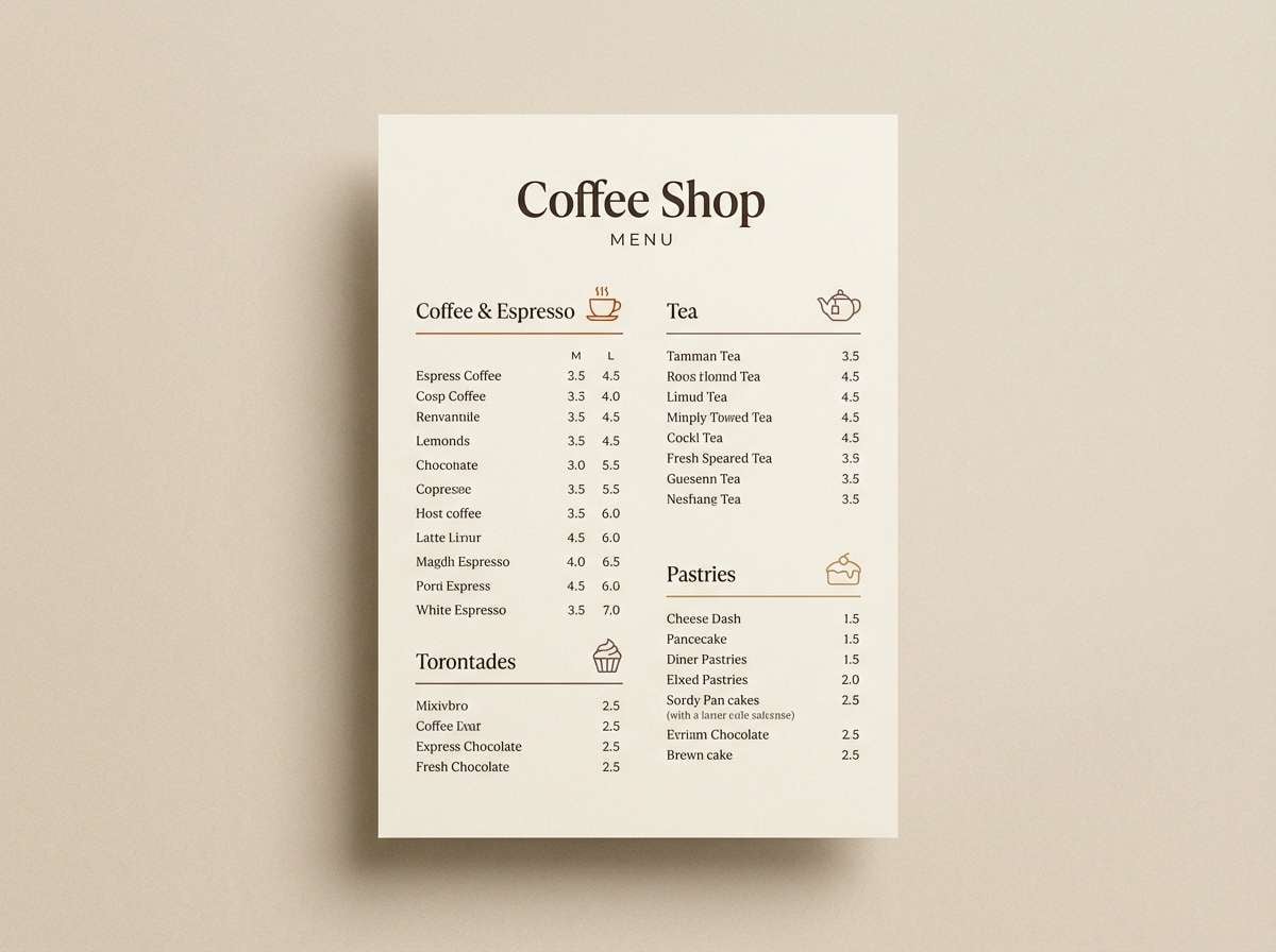
Best for: coffee shop menu
Cozy, creamy neutrals evoke cinnamon foam and toasted pastry. Let the latte beige carry the background while the pumpkin-orange tone highlights prices or section headers. Pair with espresso brown for legible body text and dividers. Tip: use the darkest shade only for typography to keep the menu soft, not heavy.
Image example of spiced latte generated using media.io
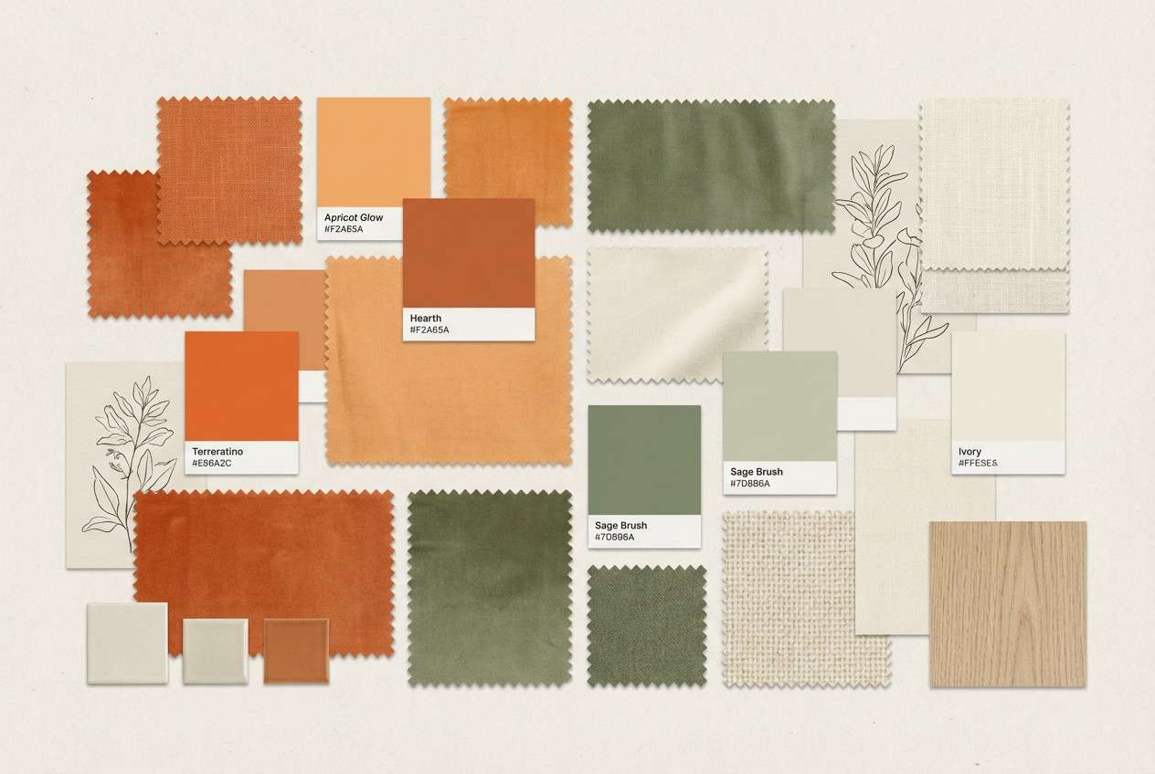
3) Autumn Porch
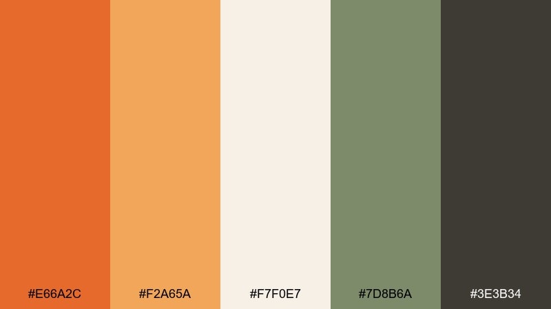
HEX: #E66A2C #F2A65A #F7F0E7 #7D8B6A #3E3B34
Mood: homey, calm, seasonal
Best for: home decor moodboard
Homey, calm tones bring to mind woven blankets, dried leaves, and a quiet porch swing. Use the sage green as a balancing accent against the warm oranges in pillows, rugs, and wall art picks. Pair with the soft off-white for a breathable base and the charcoal for framing. Tip: keep orange to one or two hero pieces so the room feels curated.
Image example of autumn porch generated using media.io
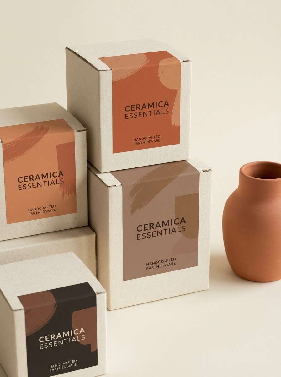
4) Copper Clay
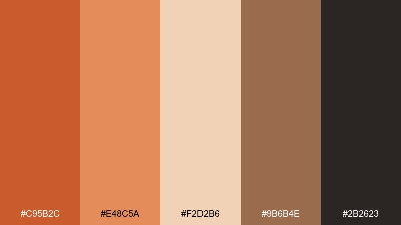
HEX: #C95B2C #E48C5A #F2D2B6 #9B6B4E #2B2623
Mood: earthy, artisanal, rich
Best for: ceramics product packaging
Earthy, artisanal hues feel like hand-thrown clay with a copper glaze. Use the deeper terracotta for the logo mark and the warm beige for the label field. Pair with near-black for ingredient text and fine linework. Tip: add the rosy midtone as a single band or seal to make the pack pop without looking loud.
Image example of copper clay generated using media.io
5) Maple Cream
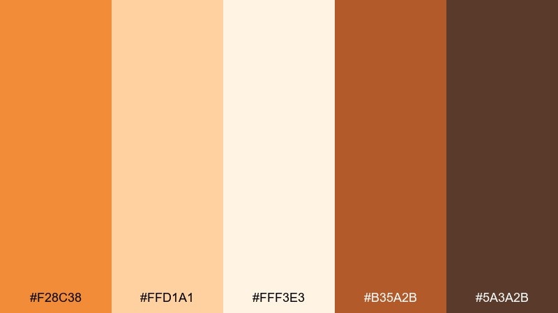
HEX: #F28C38 #FFD1A1 #FFF3E3 #B35A2B #5A3A2B
Mood: sweet, bright, comforting
Best for: bakery social post
Sweet, bright warmth reads like maple drizzle on fresh rolls. Make the pale cream your canvas, then add the vivid orange for stickers, callouts, and price badges. Pair with the deeper browns for captions so text stays readable on small screens. Tip: use one dominant highlight color per post to keep the grid consistent.
Image example of maple cream generated using media.io
6) Cider Press
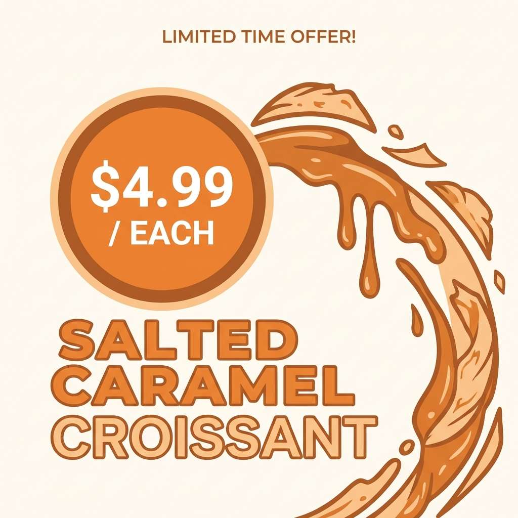
HEX: #D85E2C #FF9C5A #FDE2C8 #8D3C22 #2E1F1B
Mood: bold, rustic, energetic
Best for: seasonal event poster
Bold, rustic energy suggests fresh cider, wood crates, and a busy weekend market. Use the bright orange for the main headline and let the pale peach carry the background. Pair with the deep chestnut for date, time, and venue details so everything reads from a distance. Tip: reserve the darkest color for a single footer bar to anchor the layout.
Image example of cider press generated using media.io
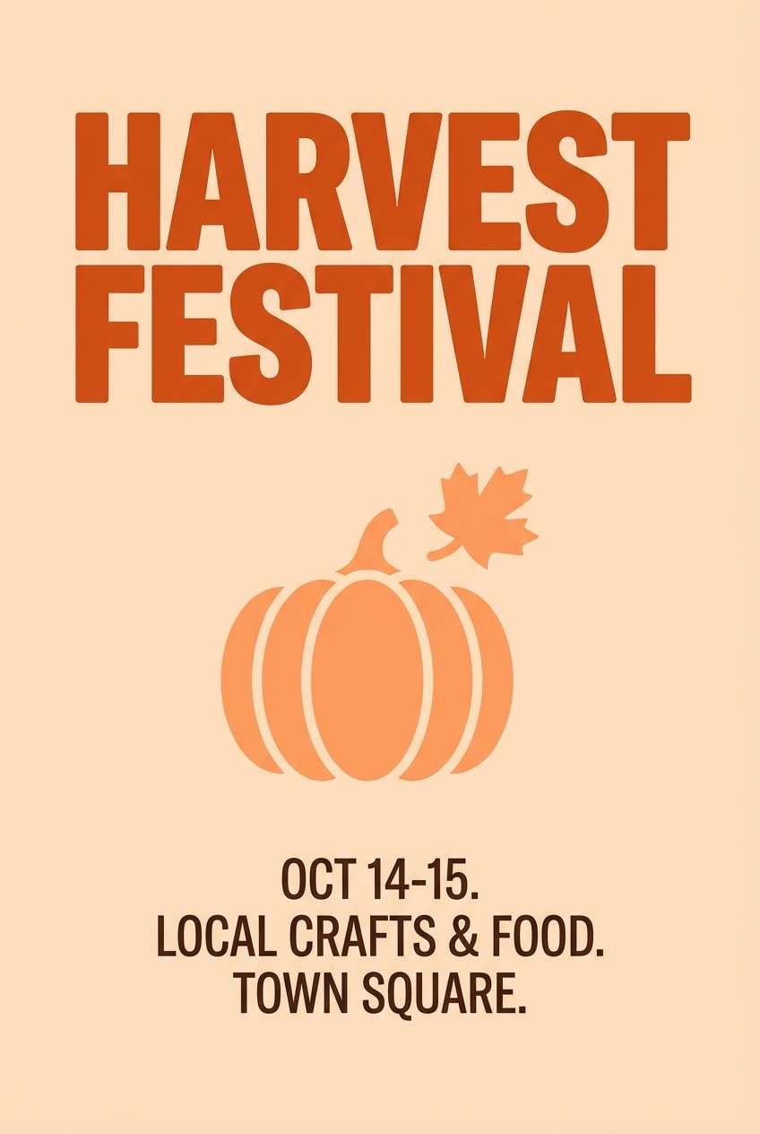
7) Rustic Barn
HEX: #B94E2A #E07B44 #EED6C4 #6E5A4A #2A2522
Mood: rugged, warm, traditional
Best for: craft label design
Rugged warmth feels like weathered wood, leather tags, and barn doors at sunset. Put the muted orange on brand marks and borders, then use the soft beige for label backgrounds. Pair with the dusty taupe for secondary text and icons. Tip: add subtle contrast by outlining key elements in the near-black shade instead of filling everything.
Image example of rustic barn generated using media.io
8) Golden Squash
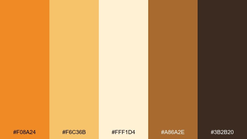
HEX: #F08A24 #F6C36B #FFF1D4 #A86A2E #3B2B20
Mood: golden, optimistic, lively
Best for: newsletter header
Golden, optimistic tones recall squash blossoms and sun-warmed fields. Use the buttery yellow as the primary background and keep the orange for small, high-impact highlights like links and badges. Pair with the brown for headings to prevent the design from feeling washed out. Tip: stick to two type weights so the warm colors stay the star.
Image example of golden squash generated using media.io

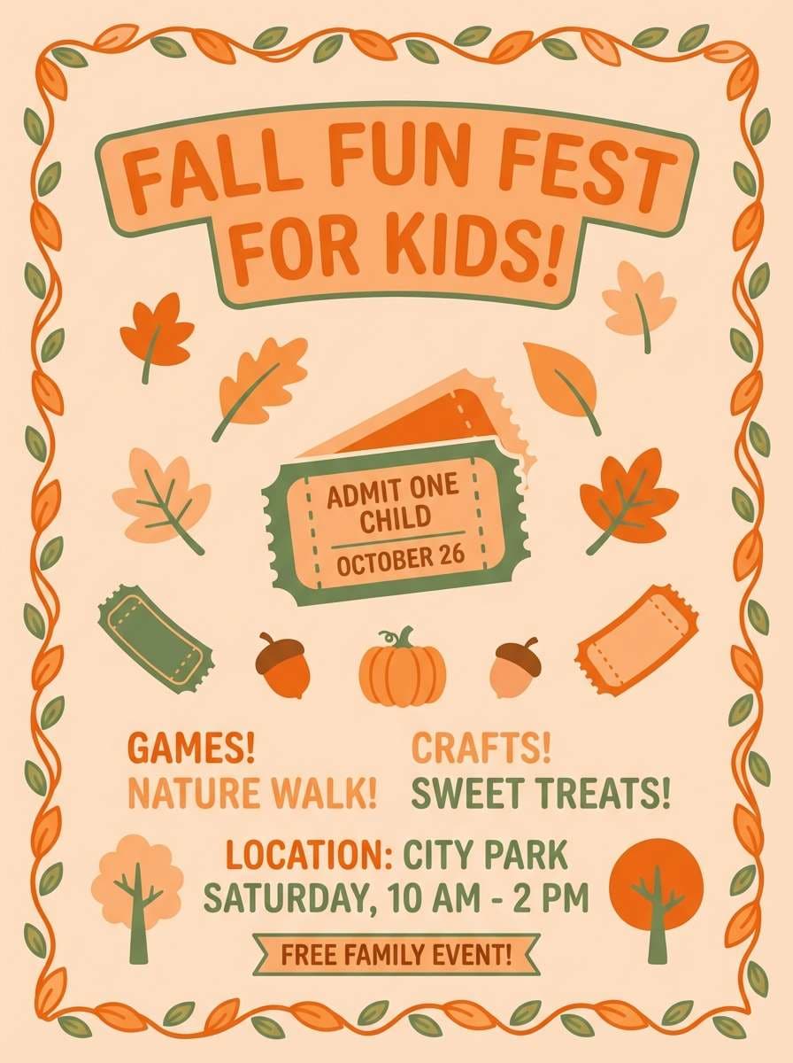
9) Pumpkin Patch
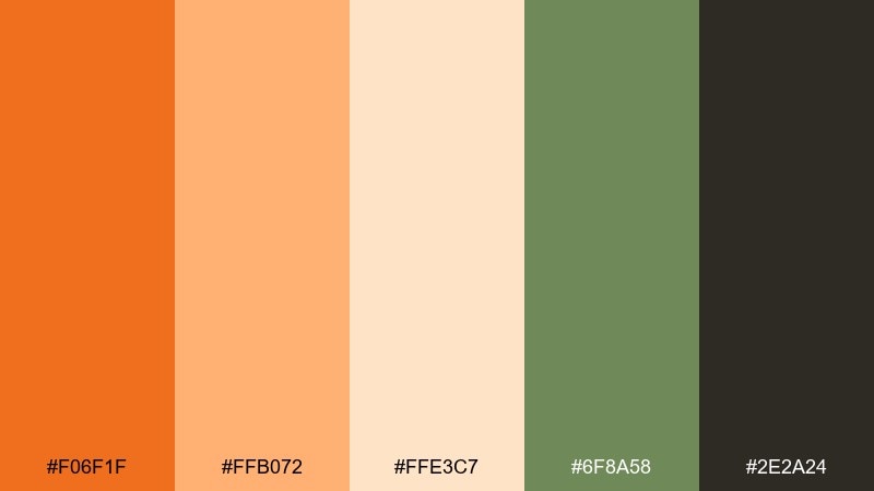
HEX: #F06F1F #FFB072 #FFE3C7 #6F8A58 #2E2A24
Mood: fresh, outdoorsy, playful
Best for: kids autumn flyer
Fresh, outdoorsy colors feel like a cheerful field trip with wagons and straw bales. Use the bright orange as the title color and the light peach for the main background to keep it kid-friendly. Pair the leafy green for icons, checkmarks, and small illustrations. Tip: round corners and use simple shapes so the design stays playful and clear.
Image example of pumpkin patch generated using media.io
10) Ember Dusk
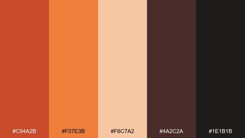
HEX: #C94A2B #F07E3B #F6C7A2 #4A2C2A #1E1B1B
Mood: moody, dramatic, upscale
Best for: restaurant promo ad
Moody, dramatic warmth brings ember glow against dark wood and candlelight. Use the near-black as a backdrop and let the vivid orange act as a spotlight for key offers. Pair with the soft peach for secondary text blocks and subtle gradients. Tip: keep highlights limited to one or two elements so the ad feels premium, not busy.
Image example of ember dusk generated using media.io

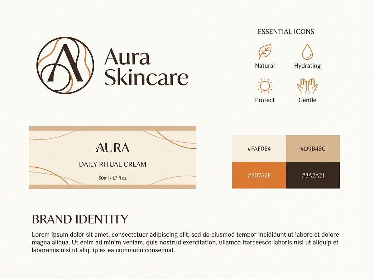
11) Toasted Almond

HEX: #E07A2F #D9B48C #FAF0E4 #8A5D3B #3A2A21
Mood: soft, natural, minimal
Best for: skincare brand identity
Soft, natural neutrals suggest warm skin tones and a clean, calming routine. Make the almond beige your main brand field and use the orange sparingly for seals or key claims. Pair with the cocoa brown for logotypes and ingredient lists to maintain clarity. Tip: print on matte stock to keep the gentle tones looking refined.
Image example of toasted almond generated using media.io
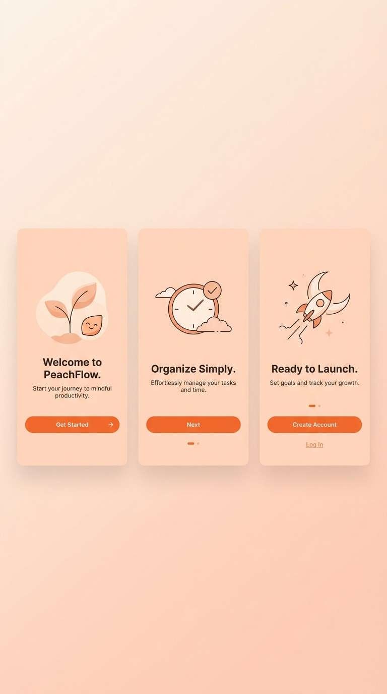
12) Sunset Orchard
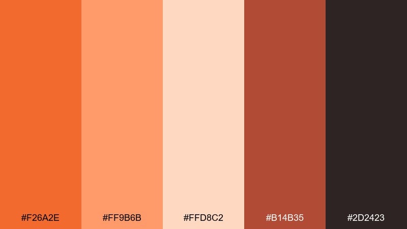
HEX: #F26A2E #FF9B6B #FFD8C2 #B14B35 #2D2423
Mood: rosy, lively, inviting
Best for: app onboarding screens
Rosy warmth feels like sunset over an orchard, with soft blush and glowing orange. Use the light peach as the screen background and reserve the brighter orange for primary buttons. Pair the deep brick tone for headings to keep hierarchy strong. Tip: maintain generous spacing so the warm tones do not crowd the UI.
Image example of sunset orchard generated using media.io
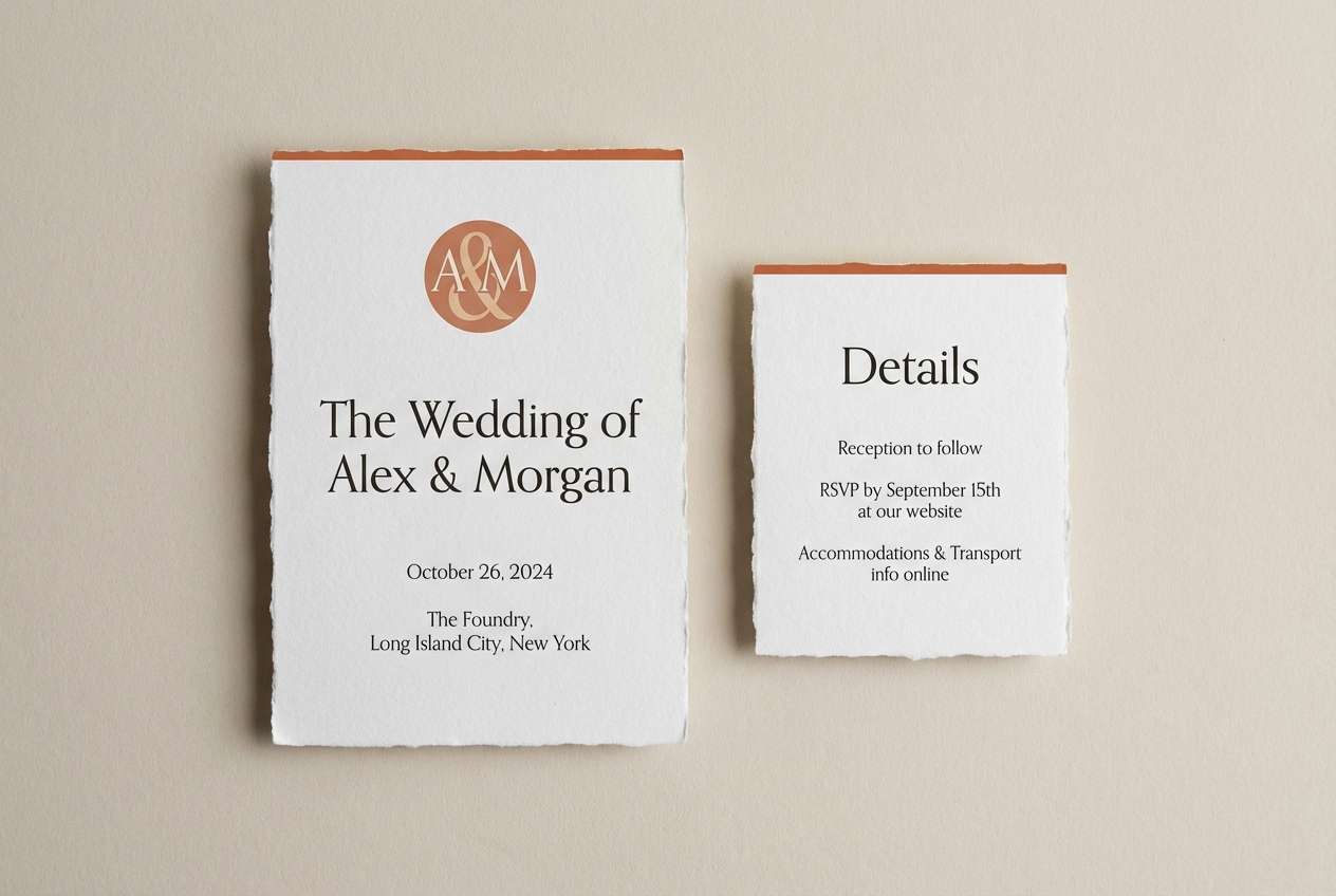
13) Terracotta Linen
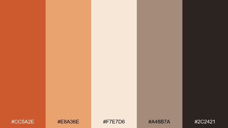
HEX: #CC5A2E #E8A36E #F7E7D6 #A48B7A #2C2421
Mood: muted, elegant, textural
Best for: wedding invitation set
Muted elegance brings to mind terracotta pottery and linen table settings. Use the pale linen tone for the paper field and set type in the deep charcoal for crisp readability. Pair the warm orange as a wax-seal accent, monogram, or border line. Tip: keep embellishments minimal and let spacing and typography do the luxury work.
Image example of terracotta linen generated using media.io
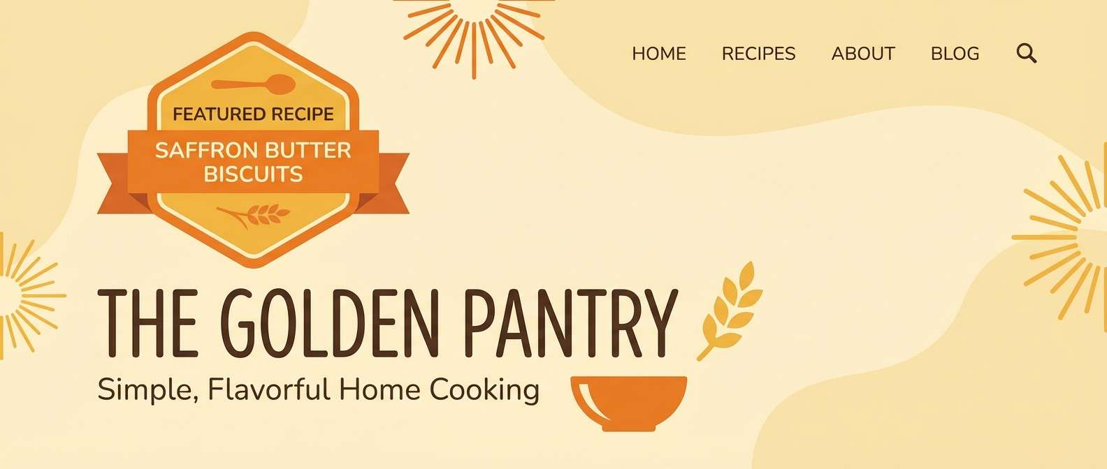
14) Saffron Hearth
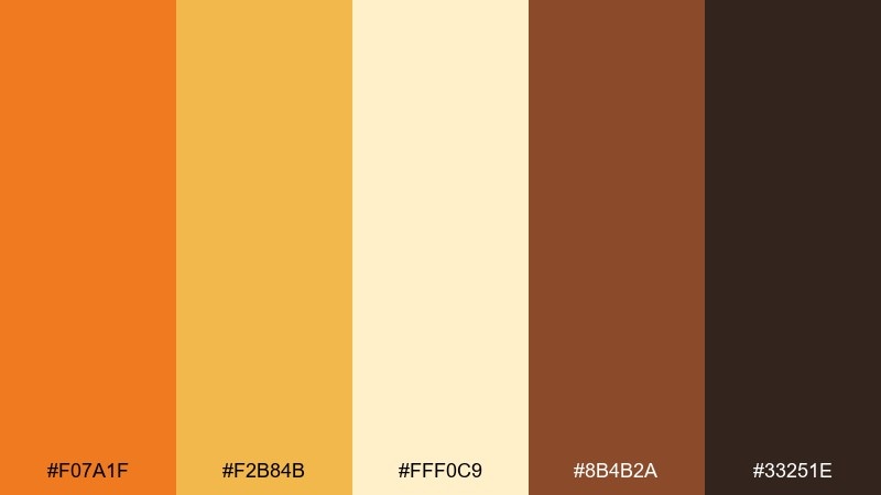
HEX: #F07A1F #F2B84B #FFF0C9 #8B4B2A #33251E
Mood: toasty, cheerful, classic
Best for: recipe blog header
Toasty cheer feels like a warm kitchen and a saffron-scented bake. Use the pale buttery tone for the header background and set the orange for category chips or featured recipe badges. Pair the chestnut brown for titles and navigation so it stays readable across devices. Tip: add small icon accents in saffron rather than more colors to keep the page cohesive.
Image example of saffron hearth generated using media.io
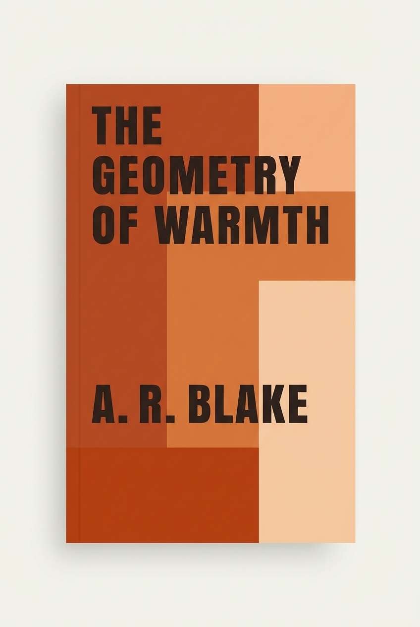
15) Mocha Spice
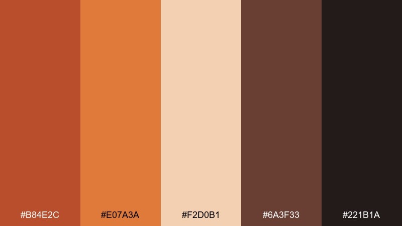
HEX: #B84E2C #E07A3A #F2D0B1 #6A3F33 #221B1A
Mood: deep, cozy, mature
Best for: book cover design
Deep, cozy tones suggest spiced mocha and worn leather-bound pages. Use the mid orange as the focal block behind the title, then balance it with warm peach as a secondary panel. Pair with the darkest shade for author name and small text to ensure crisp contrast. Tip: use a single bold typeface and let color blocks create the drama.
Image example of mocha spice generated using media.io
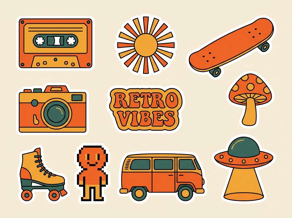
16) Vintage Carnival
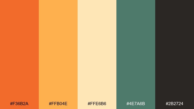
HEX: #F36B2A #FFB04E #FFE6B6 #4E7A6B #2B2724
Mood: fun, nostalgic, bold
Best for: retro sticker pack
Fun, nostalgic tones feel like vintage tickets, warm bulbs, and painted booths. Use the bright orange and golden yellow for the main sticker shapes, keeping the cream for breathing room. Pair the muted teal-green as a surprising accent for outlines and small badges. Tip: limit each sticker to two dominant colors so the set looks unified.
Image example of vintage carnival generated using media.io
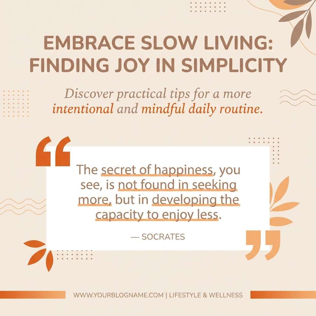
17) Cozy Knit
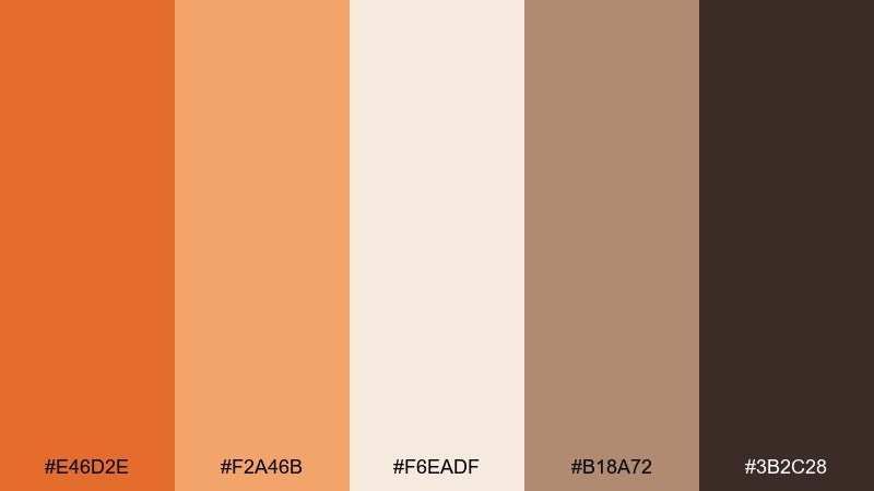
HEX: #E46D2E #F2A46B #F6EADF #B18A72 #3B2C28
Mood: soft, hygge, comforting
Best for: lifestyle blog post graphics
Soft hygge warmth evokes chunky knit sweaters and a steaming mug by the window. Use the creamy neutral as the base and apply the warm orange for headings or quote highlights. Pair with the muted taupe for dividers and subtle shapes that add structure without clutter. Tip: keep plenty of negative space so the design feels calm and breathable.
Image example of cozy knit generated using media.io
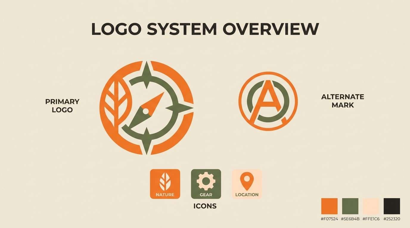
18) Modern Farmstand
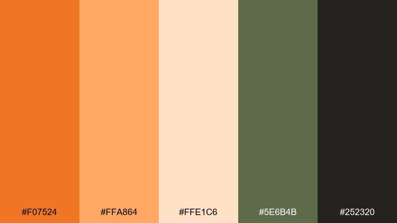
HEX: #F07524 #FFA864 #FFE1C6 #5E6B4B #252320
Mood: fresh, modern, organic
Best for: farmers market logo system
Fresh, modern warmth pairs well with organic greens and minimal shapes. Use the orange as the core mark color, then pull in the olive tone for secondary badges and signage variations. Pair with the pale peach for backgrounds on tote bags, stamps, and social templates. Tip: test the mark in one-color olive for eco-friendly printing runs.
Image example of modern farmstand generated using media.io
19) Halloween Chic
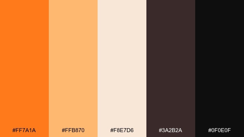
HEX: #FF7A1A #FFB870 #F8E7D6 #3A2B2A #0F0E0F
Mood: sleek, spooky, stylish
Best for: party invitation flyer
Sleek spooky warmth feels like candlelit velvet with a bright citrus punch. Use the near-black as the background and make the orange your main typography color for instant visibility. Pair with the creamy neutral for supporting details and small icons. Tip: keep the layout typographic and geometric for a modern, upscale vibe.
Image example of halloween chic generated using media.io

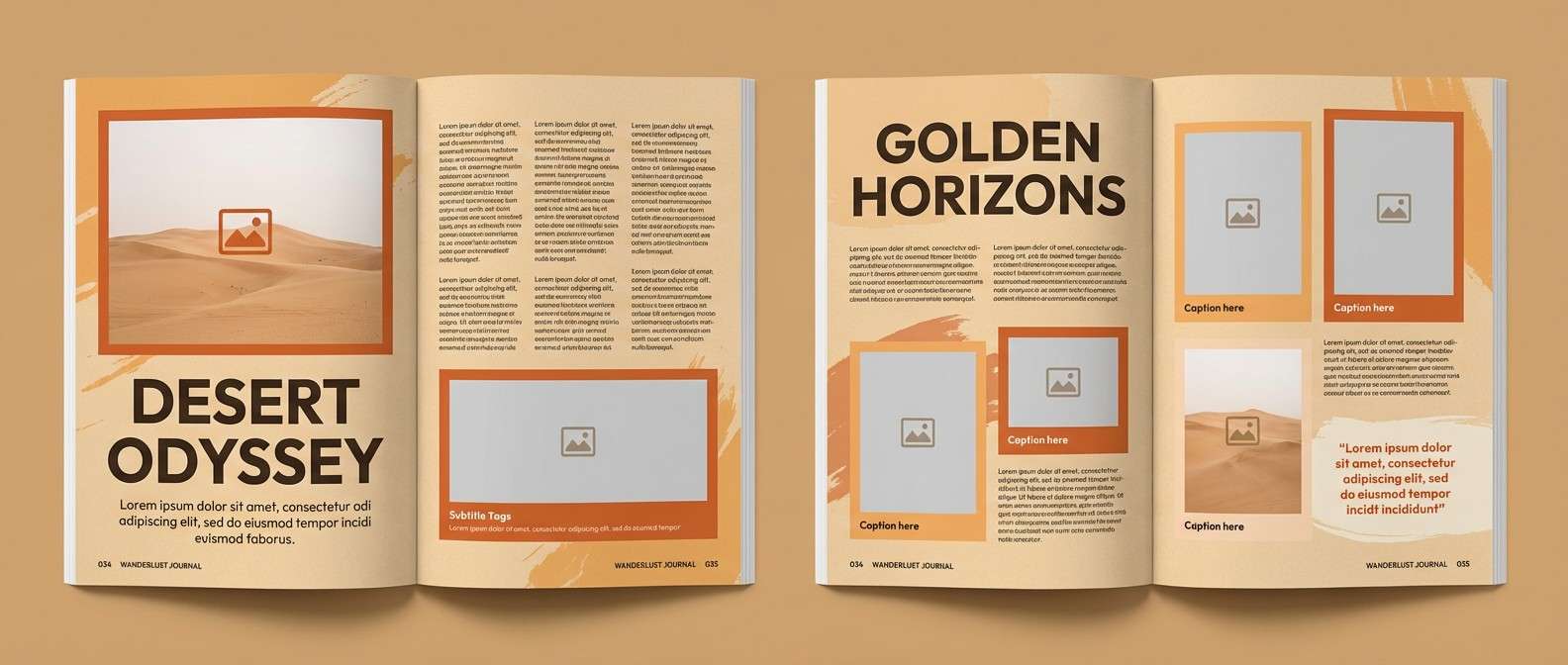
20) Desert Gourd
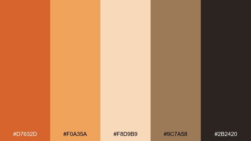
HEX: #D7632D #F0A35A #F8D9B9 #9C7A58 #2B2420
Mood: sun-baked, earthy, relaxed
Best for: travel editorial layout
Sun-baked earth tones feel like desert trails, clay walls, and golden-hour haze. Use the sandy peach for page backgrounds and let the orange anchor section headers and pull quotes. Pair with the muted stone brown for captions and grid lines. Tip: keep imagery warm and low-saturation so the palette reads cohesive across spreads.
Image example of desert gourd generated using media.io
21) Baked Spice
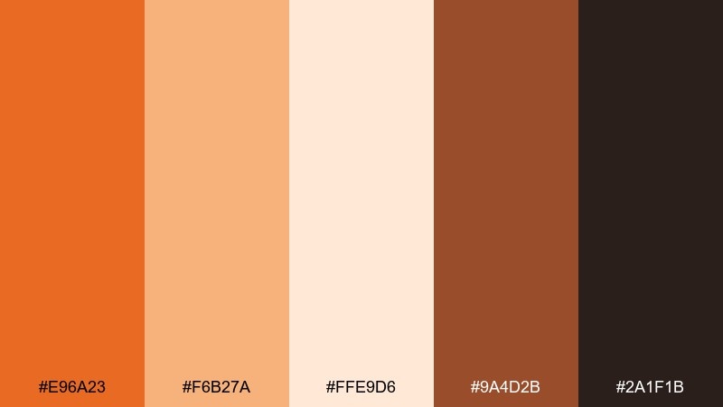
HEX: #E96A23 #F6B27A #FFE9D6 #9A4D2B #2A1F1B
Mood: appetizing, friendly, upbeat
Best for: recipe card template
Appetizing, friendly warmth evokes baked spice and a freshly written recipe card. These pumpkin color combinations work best with lots of white space and a single bold accent for section labels. Pair the deep brown with the pale cream for high-contrast text and clean lines. Tip: keep the orange for icons and headings so ingredients stay easy to scan.
Image example of baked spice generated using media.io
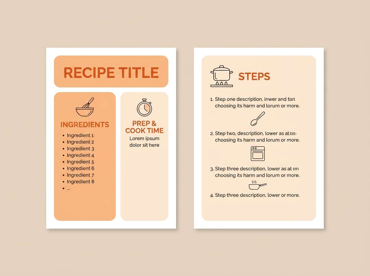
22) Amber Minimal UI
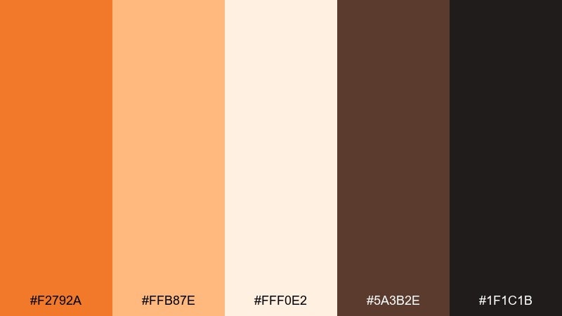
HEX: #F2792A #FFB87E #FFF0E2 #5A3B2E #1F1C1B
Mood: clean, modern, warm
Best for: dashboard UI kit
Clean modern warmth feels like amber glass against a tidy workspace. Use the light cream for surfaces and cards, then apply the orange as the primary action color for buttons and toggles. Pair with cocoa brown for headings and keep near-black for body text. Tip: define one accent level only, so alerts and CTAs do not compete.
Image example of amber minimal ui generated using media.io
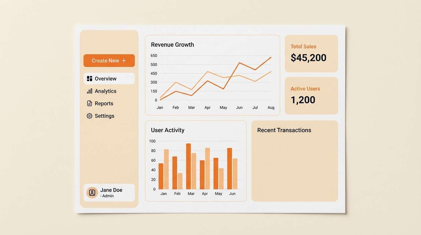
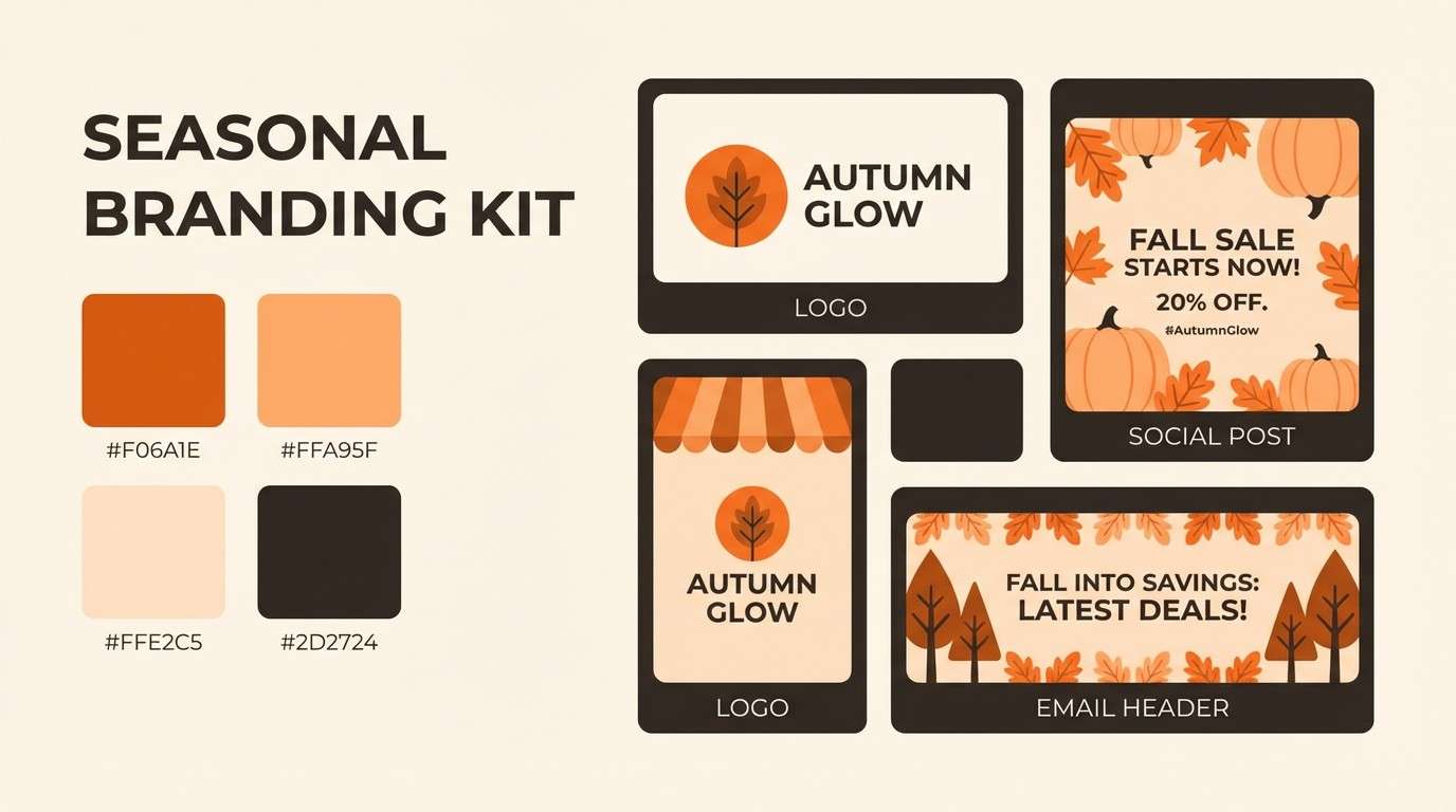
23) Classic Autumn Mix
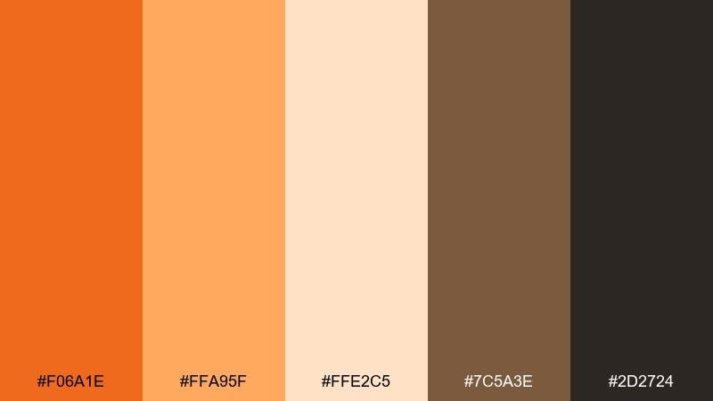
HEX: #F06A1E #FFA95F #FFE2C5 #7C5A3E #2D2724
Mood: classic, festive, dependable
Best for: seasonal branding kit
Classic festive warmth reads like leaf piles, harvest fairs, and crisp evenings. Use this pumpkin color palette for seasonal branding kits where you need instant warmth without losing readability. Pair the soft peach with the deep brown for brochures and email headers, and keep the brightest orange for CTAs. Tip: repeat the same orange in every touchpoint so the campaign feels consistent.
Image example of classic autumn mix generated using media.io
24) Warm Contrast Pairing
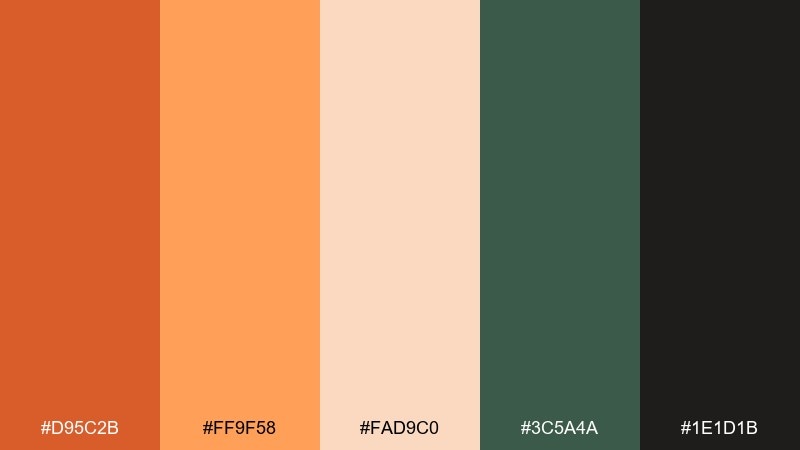
HEX: #D95C2B #FF9F58 #FAD9C0 #3C5A4A #1E1D1B
Mood: balanced, punchy, modern
Best for: landing page section
Balanced punchy warmth meets an earthy green that feels modern and grounded. This pumpkin color combination is strongest when green is used for secondary actions, tags, or trust elements. Pair the pale peach for background sections and let the near-black handle body text. Tip: avoid using orange and green at equal weight; choose one hero and one support.
Image example of warm contrast pairing generated using media.io

What Colors Go Well with Pumpkin?
Pumpkin pairs beautifully with creamy neutrals like ivory, linen, and warm beige—these keep layouts bright and let the orange feel intentional rather than overwhelming.
For contrast, add deep browns (espresso, chestnut) or near-black for type and UI elements. This combination is especially effective for branding, packaging, and editorial design where readability matters.
If you want a modern twist, introduce an earthy green (sage, olive, muted teal). Green tones balance pumpkin’s heat and create a grounded, outdoorsy feel.
How to Use a Pumpkin Color Palette in Real Designs
Choose one pumpkin shade as your hero (headline, CTA, logo mark), then build support with soft peaches/creams for backgrounds and one dark neutral for text. This keeps hierarchy clear.
In UI, keep pumpkin for primary actions only (buttons, toggles, active states) and rely on neutrals for surfaces. That prevents “always-on” warmth from turning into visual noise.
For print (menus, invitations, labels), test contrast in real size. Pumpkin is vibrant, but lighter peach tones can wash out—use deeper browns for small typography and fine lines.
Create Pumpkin Palette Visuals with AI
If you already have HEX codes, you can turn them into cohesive mockups fast by describing a layout (poster, packaging, UI, moodboard) and naming how each color should be used.
To get more consistent results, mention a clean background, minimal shapes, and specify which hue is the primary accent. Then iterate by swapping one color at a time.
Use Media.io to generate pumpkin-themed visuals for branding, social posts, invitations, and more—right in your browser.
Pumpkin Color Palette FAQs
-
What is a pumpkin color palette?
A pumpkin color palette is a set of coordinating warm shades built around pumpkin orange, usually paired with creams, peaches, browns, and sometimes greens to balance warmth and improve contrast. -
Is pumpkin more like orange or terracotta?
Pumpkin is typically a brighter, more saturated orange. Terracotta is usually deeper, dustier, and more muted—closer to clay and brick tones. -
What colors complement pumpkin orange?
Great complements include deep browns/charcoal for contrast, creamy off-whites for softness, and earthy greens (sage/olive/teal) for balance. -
How do I keep a pumpkin color scheme from looking too “Halloween”?
Avoid heavy black-and-orange dominance. Use cream/linen as the main background, choose muted pumpkin shades, and add browns or greens instead of pure black accents. -
What’s the best text color on a pumpkin background?
For readability, use very dark brown or near-black (#1E1B1B–#2D2423 range). For large headlines, warm cream can work, but always check contrast for accessibility. -
Can I use pumpkin palettes for modern UI design?
Yes. Keep pumpkin as the primary action color (buttons/active states), use light creams for surfaces, and reserve dark neutrals for text to maintain a clean, modern feel. -
How can I generate pumpkin palette images quickly?
Use an AI image generator and include your HEX codes, a clear layout description (poster, menu, UI, packaging), and instructions like “no photography” and “flat graphic design” for consistent outputs.


