

A red cream color palette blends the appetite appeal of warm reds with the comfort and clarity of creamy neutrals. It’s a reliable choice for brands that want to feel inviting, premium, and modern at the same time.
From bakery packaging to dashboard UI, red-and-cream tones create instant hierarchy: cream supports readability, while red directs attention to what matters most.
In this article
- Why Red Cream Palettes Work So Well
-
- strawberry chantilly
- rose milk latte
- vintage vanity
- cranberry linen
- cherry gelato
- rouge macaron
- brick and butter
- blush cabernet
- coral cashmere
- rose clay studio
- maraschino mist
- berry souffle
- spiced rosette
- ruby meringue
- terracotta cream tea
- rosewater paper
- garnet cream soda
- petal and pomegranate
- silk rosewood
- crimson cream grid
- paprika whip
- rosy clay minimal
- What Colors Go Well with Red Cream?
- How to Use a Red Cream Color Palette in Real Designs
- Create Red Cream Palette Visuals with AI
Why Red Cream Palettes Work So Well
Red brings emotion—warmth, appetite, romance, urgency—while cream adds softness and space. Together, they create a balanced look that feels energetic without becoming aggressive or noisy.
Because cream sits close to “paper” and “milk” tones, it supports readability and makes designs feel tactile and human. That’s why red cream palettes are popular for menus, packaging, and editorial layouts.
In UI, this pairing also builds clear hierarchy: cream can be your default surface color, and reds can be reserved for primary actions, highlights, and key states—making interfaces feel calm but confident.
20+ Red Cream Color Palette Ideas (with HEX Codes)
1) Strawberry Chantilly

HEX: #C73A4A #F3D6D0 #F8F0E7 #8C1F2C #D9A4A7
Mood: sweet, airy, romantic
Best for: bakery branding and dessert packaging
Sweet, airy warmth like whipped cream folded into ripe strawberries. The deep berry red anchors layouts while the blush and cream tones keep everything light and appetizing. Use the darkest shade for logos and headlines, then let the soft creams dominate backgrounds. Add the dusty rose as a unifying mid-tone for labels so the design stays cohesive.
Image example of strawberry chantilly generated using media.io
Media.io is an online AI studio for creating and editing video, image, and audio in your browser.

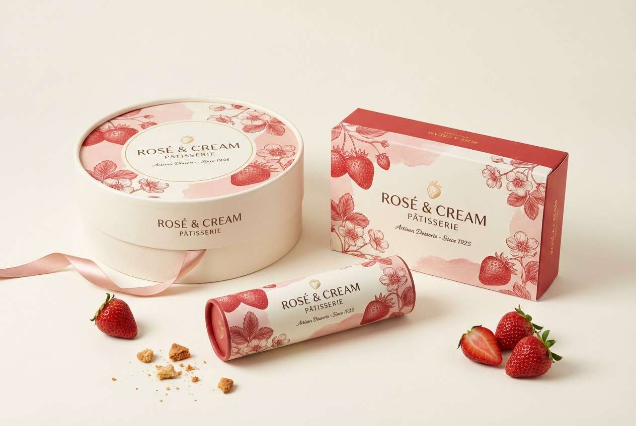
2) Rose Milk Latte
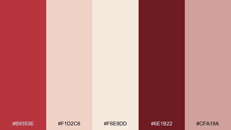
HEX: #B9353E #F1D2C6 #F6E9DD #6E1B22 #CFA19A
Mood: cozy, gentle, inviting
Best for: cafe menu design and tabletop signage
Cozy and gentle, like steamed milk tinted with rose syrup on a rainy afternoon. This red cream color scheme works beautifully for menus where readability matters, thanks to the creamy paper-like base. Pair the rich wine tone with lots of negative space for a modern cafe feel. Tip: keep body text in the deepest shade and reserve the brighter red for price highlights only.
Image example of rose milk latte generated using media.io
3) Vintage Vanity
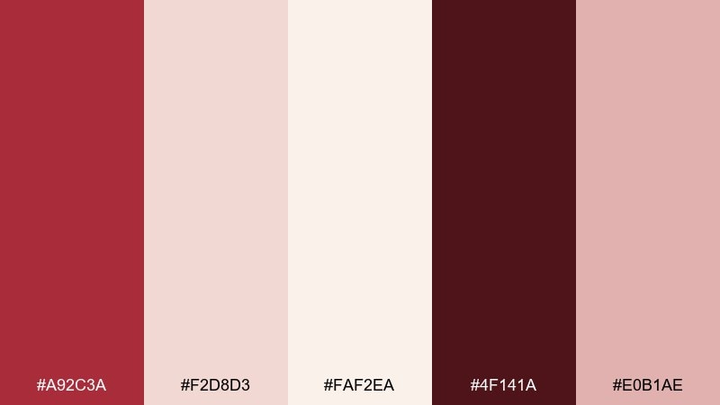
HEX: #A92C3A #F2D8D3 #FAF2EA #4F141A #E0B1AE
Mood: vintage, elegant, powdery
Best for: cosmetics branding and editorial ads
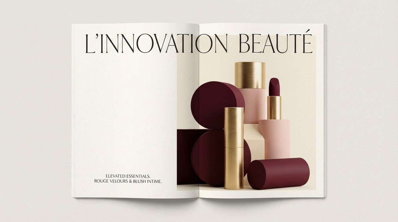
Vintage elegance with a powdery finish, like a satin lipstick next to a porcelain compact. The red cream color palette shines in beauty layouts where you want softness without losing luxury. Pair it with thin serif typography and plenty of cream space to keep the look upscale. For a crisp hierarchy, use the near-black burgundy for product names and the bright red only for callouts.
Image example of vintage vanity generated using media.io
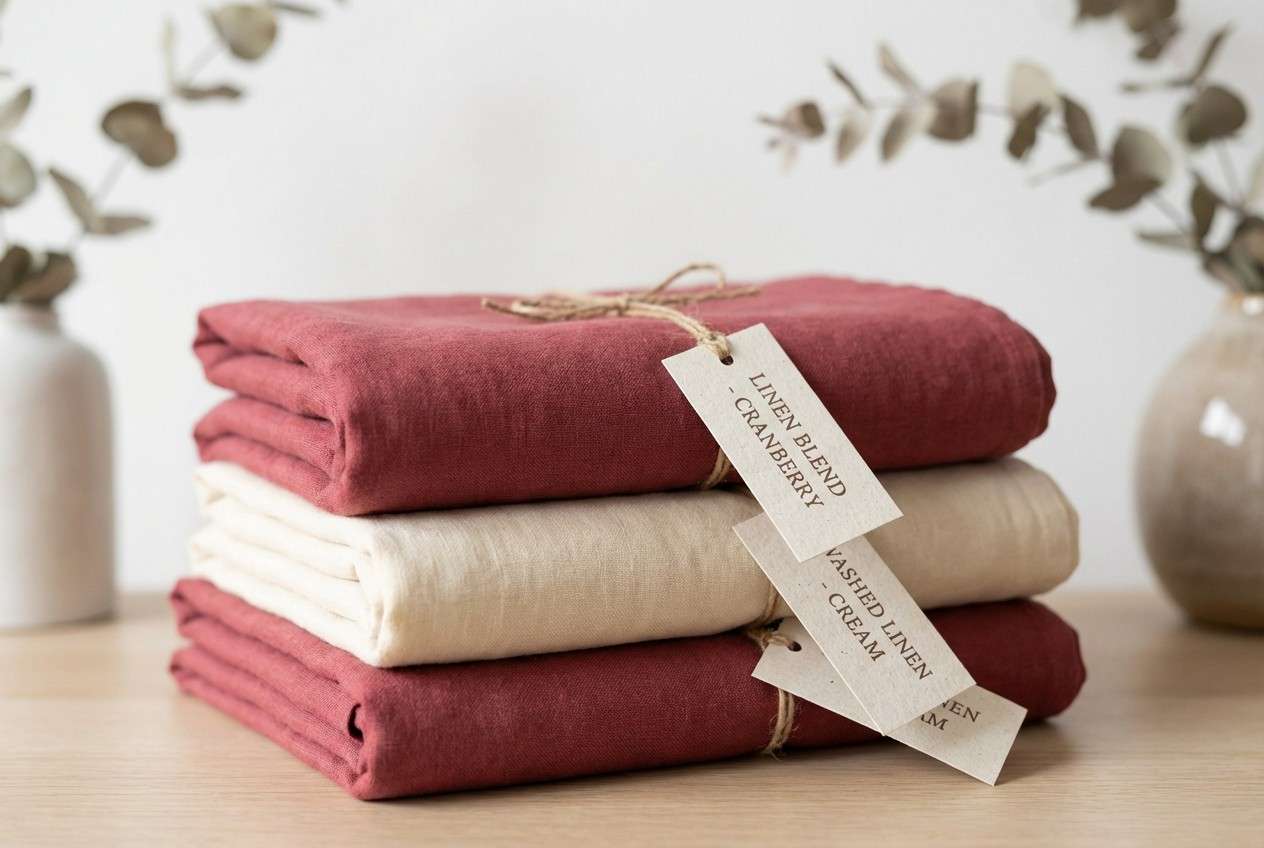
4) Cranberry Linen
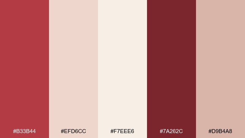
HEX: #B33B44 #EFD6CC #F7EEE6 #7A262C #D9B4A8
Mood: natural, grounded, calm
Best for: home textiles and lifestyle ecommerce
Natural and grounded, like cranberry jam on warm linen. The muted red reads earthy rather than loud, making it great for product pages and lifestyle brands. Let the linen-like creams carry most of the UI, then use the darker red for buttons and price tags. A soft taupe-rose accent helps product photos feel warmer without tinting skin tones too strongly.
Image example of cranberry linen generated using media.io
5) Cherry Gelato
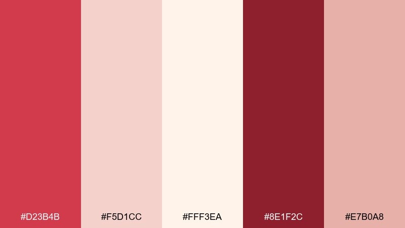
HEX: #D23B4B #F5D1CC #FFF3EA #8E1F2C #E7B0A8
Mood: playful, fresh, upbeat
Best for: summer social media templates
Playful and fresh, like cherry gelato melting into a waffle cone. The brighter red brings energy, while the pale cream keeps posts airy and scroll-stopping. Use the blush as a soft block behind text for better contrast on mobile. Tip: keep gradients subtle and stick to flat shapes to avoid the palette turning too candy-like.
Image example of cherry gelato generated using media.io
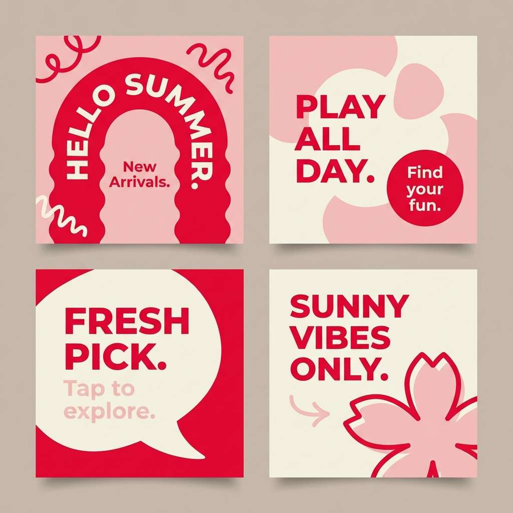
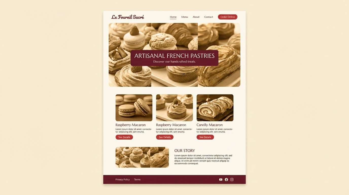
6) Rouge Macaron
HEX: #B02133 #F2C7BE #F9F0E6 #6B1220 #D7A099
Mood: chic, Parisian, sweet
Best for: patisserie website UI and hero banners
Chic and sweet, like a box of macarons tied with a satin ribbon. These red cream color combinations are ideal for a patisserie UI where you want romance without visual clutter. Build the page on the warm cream, then introduce the rouge shade in CTAs and navigation states. Usage tip: keep icons and dividers in the deep maroon so the brighter reds stay special.
Image example of rouge macaron generated using media.io
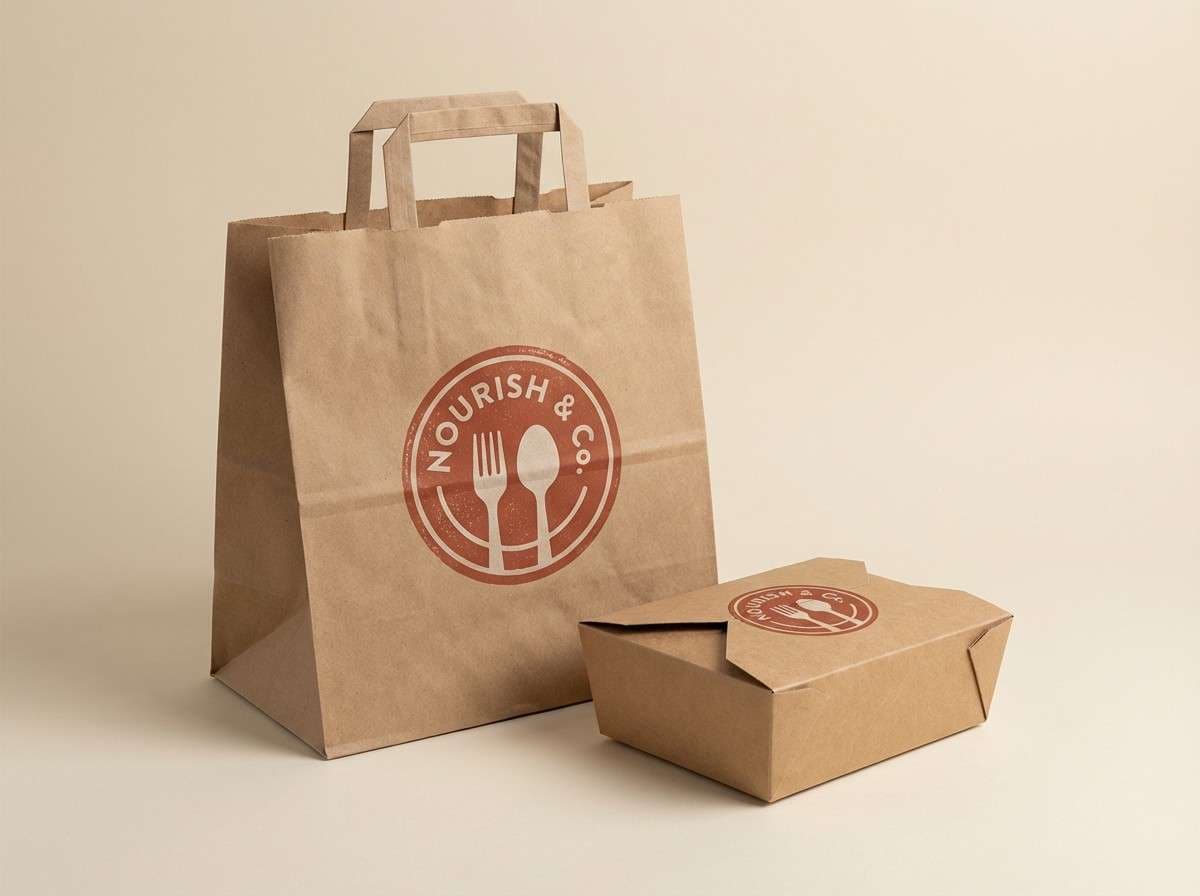
7) Brick and Butter
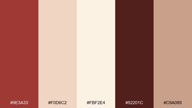
HEX: #9E3A33 #F0D6C2 #FBF2E4 #52201C #C9A089
Mood: rustic, warm, trustworthy
Best for: restaurant logo and takeaway packaging
Rustic warmth like brick ovens and melted butter on sourdough. The brown-red gives heritage character, while the buttercream tones keep the design friendly and contemporary. It fits logos, stamps, and kraft-style packaging especially well. Tip: add the darkest shade to borders and small type so printed materials stay crisp.
Image example of brick and butter generated using media.io
8) Blush Cabernet
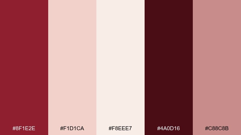
HEX: #8F1E2E #F1D1CA #F8EEE7 #4A0D16 #C88C8B
Mood: moody, refined, intimate
Best for: wine label design and tasting event posters
Moody and refined, like candlelight reflecting in a glass of cabernet. The deep red creates instant sophistication against soft blush and cream. Use it for labels and posters where you want a premium feel without going full black. Tip: keep the background warm cream and reserve the darkest shade for varietal names and key details.
Image example of blush cabernet generated using media.io

9) Coral Cashmere
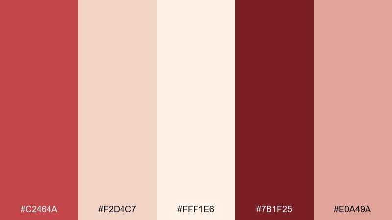
HEX: #C2464A #F2D4C7 #FFF1E6 #7B1F25 #E0A49A
Mood: soft, luxe, comforting
Best for: skincare product launch ads
Soft luxury like a cashmere wrap in warm coral light. The creamy base keeps product shots clean while the coral-red adds a healthy, glowing accent. Pair with minimal sans-serif type and plenty of breathing room for a modern skincare look. Tip: use the mid blush for secondary badges so the primary red can stay reserved for the main CTA.
Image example of coral cashmere generated using media.io
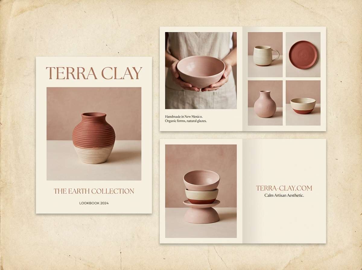
10) Rose Clay Studio
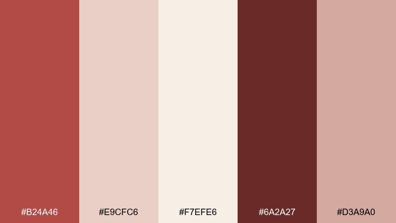
HEX: #B24A46 #E9CFC6 #F7EFE6 #6A2A27 #D3A9A0
Mood: artisan, earthy, serene
Best for: ceramics shop branding and lookbooks
Artisan and serene, like rose clay drying on a studio table. The muted red-brown feels handmade, while the creamy neutrals keep the brand polished. It works beautifully for lookbooks, tags, and simple monograms. Tip: print on uncoated paper to let the tones stay soft and tactile.
Image example of rose clay studio generated using media.io
11) Maraschino Mist
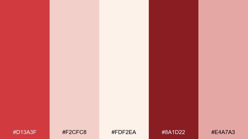
HEX: #D13A3F #F2CFC8 #FDF2EA #8A1D22 #E4A7A3
Mood: bright, lighthearted, modern
Best for: mobile app onboarding screens
Bright and lighthearted, like a maraschino cherry floating in vanilla cream soda. The contrast between the vivid red and pale cream makes onboarding steps feel clear and energetic. Use the cream as the main canvas, then apply the red for progress indicators and primary buttons. Tip: keep illustrations simple and blocky so the red stays crisp on small screens.
Image example of maraschino mist generated using media.io

12) Berry Souffle
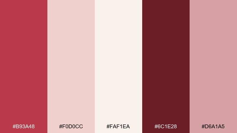
HEX: #B93A48 #F0D0CC #FAF1EA #6C1E28 #D6A1A5
Mood: delicate, charming, airy
Best for: wedding invitation suite
Delicate and charming, like berry souffle rising in a warm oven. The soft blush and cream feel romantic for stationery, while the deeper red keeps names and dates legible. Pair with fine line florals or subtle embossing for an elevated finish. Tip: avoid pure white and let the warm cream set the tone for a more intimate look.
Image example of berry souffle generated using media.io
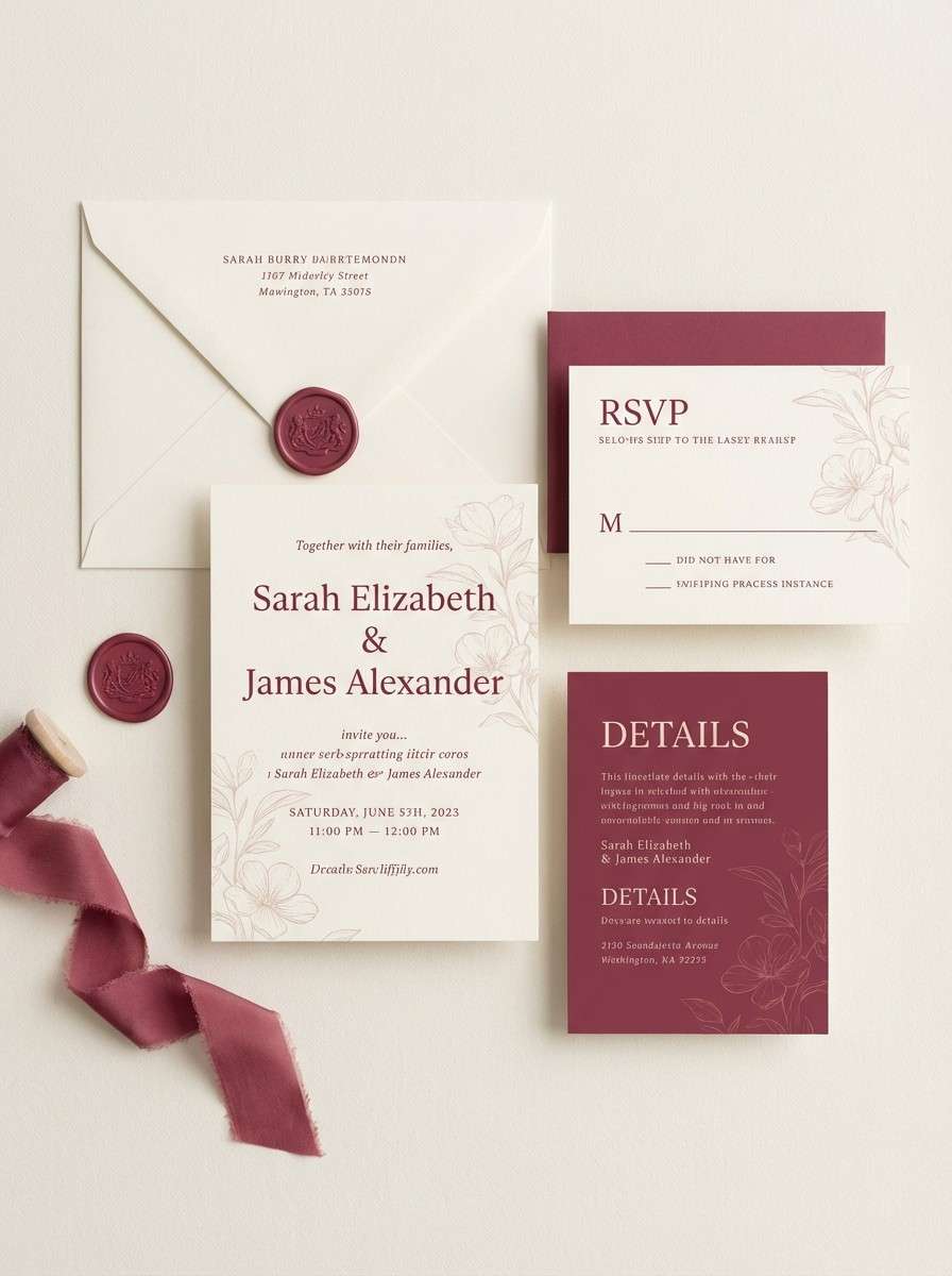
13) Spiced Rosette
HEX: #9F2E34 #F1D6C9 #F9F0E1 #5A161A #D2A090
Mood: spiced, elegant, warm
Best for: holiday email headers and promos
Spiced warmth like mulled berries and frosted shortbread. The darker red adds seasonal richness without relying on green, while the creamy tones keep the layout bright. Use it for promo banners, email headers, and small gift-card graphics. Tip: keep accent elements thin and let the red do the heavy lifting to avoid a cluttered holiday look.
Image example of spiced rosette generated using media.io

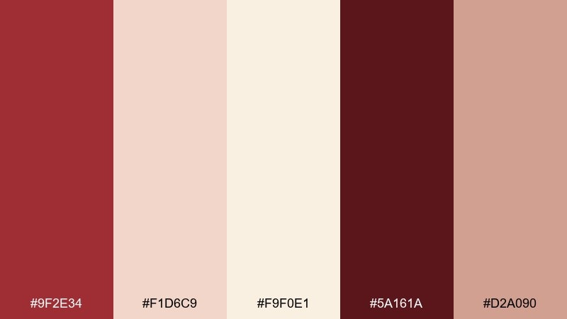
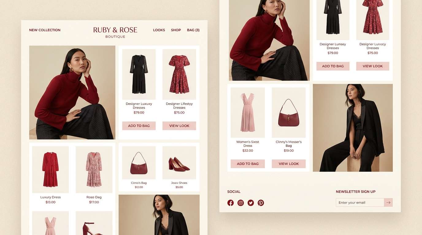
14) Ruby Meringue
HEX: #C12F40 #F4D2D0 #FFF1EA #7E1522 #E2A3A7
Mood: polished, feminine, uplifting
Best for: boutique fashion lookbook UI
Polished and uplifting, like ruby glaze over soft meringue. The creamy background keeps product grids clean, while the ruby red adds confident accents for price and navigation. It pairs well with thin black or deep burgundy text for a high-end boutique feel. Tip: use the blush tone for hover states and subtle section dividers to keep transitions smooth.
Image example of ruby meringue generated using media.io
15) Terracotta Cream Tea
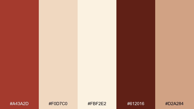
HEX: #A43A2D #F0D7C0 #FBF2E2 #612016 #D2A284
Mood: sunbaked, cozy, earthy
Best for: boho interior mood boards
Sunbaked coziness like terracotta pots beside a cup of creamy tea. The warm clay red gives structure, while the creamy neutrals create an easy backdrop for textures like rattan and linen. Use it in mood boards, room render palettes, and decor shop branding. Tip: introduce natural wood tones as materials, not colors, so the scheme stays clean.
Image example of terracotta cream tea generated using media.io
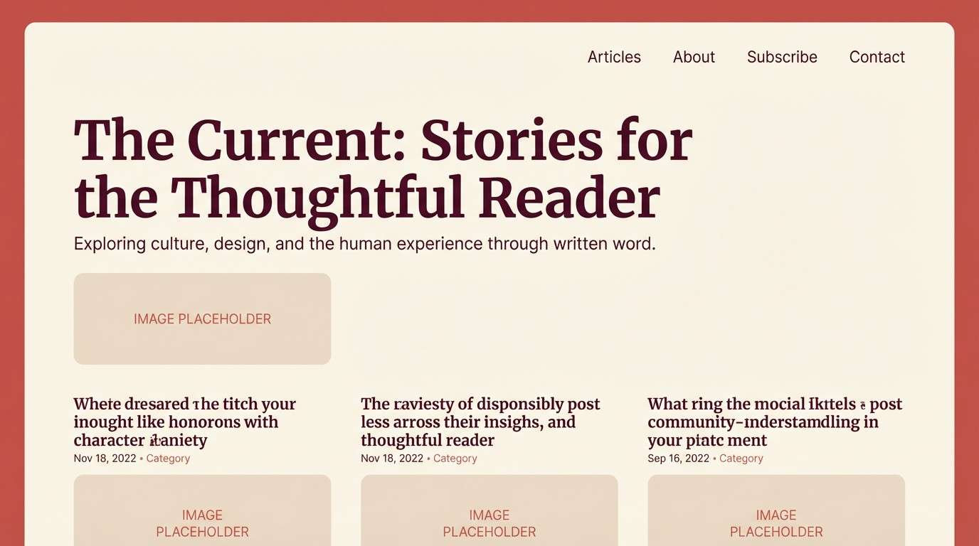
16) Rosewater Paper
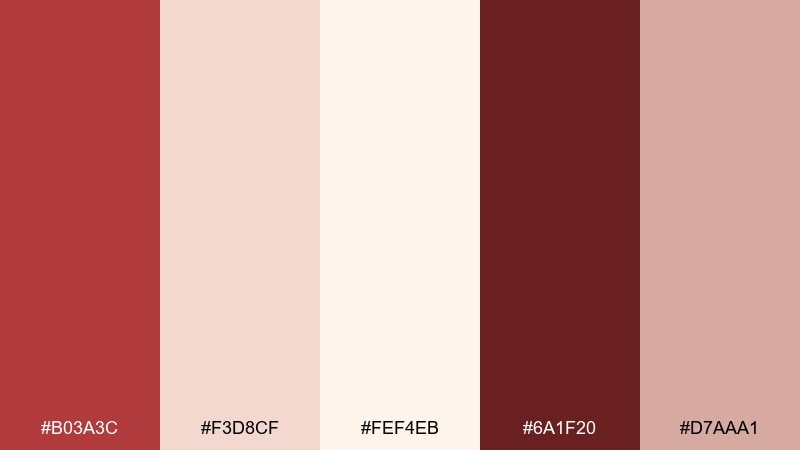
HEX: #B03A3C #F3D8CF #FEF4EB #6A1F20 #D7AAA1
Mood: clean, soft, editorial
Best for: minimal blog theme and typography
Clean softness like rosewater on handmade paper. The pale cream makes long reads comfortable, and the muted red adds a gentle brand signature. Use the deepest shade for headings and link states to maintain accessibility. Tip: keep imagery warm and low-contrast so the page feels cohesive from hero to footer.
Image example of rosewater paper generated using media.io
17) Garnet Cream Soda
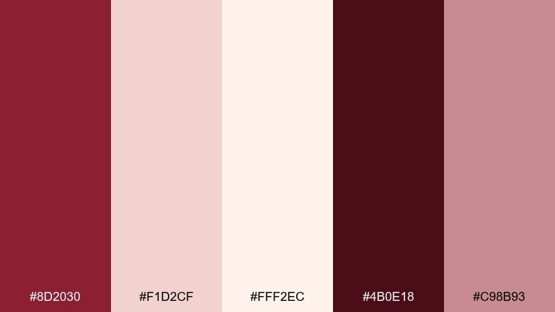
HEX: #8D2030 #F1D2CF #FFF2EC #4B0E18 #C98B93
Mood: bold, nostalgic, glamorous
Best for: cocktail bar poster series
Bold nostalgia with a glam edge, like garnet syrup swirling through cream soda. These red cream color combinations hold up well in poster series where you need impact from across the room. Use the darkest garnet for large type and the cream for breathing space around drink names. Tip: keep shapes geometric and avoid extra colors so the palette stays unmistakable.
Image example of garnet cream soda generated using media.io

18) Petal and Pomegranate
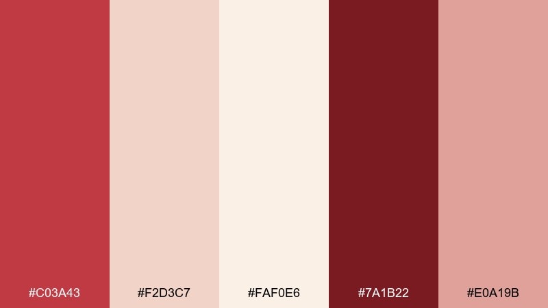
HEX: #C03A43 #F2D3C7 #FAF0E6 #7A1B22 #E0A19B
Mood: floral, fresh, romantic
Best for: spring botanical illustrations
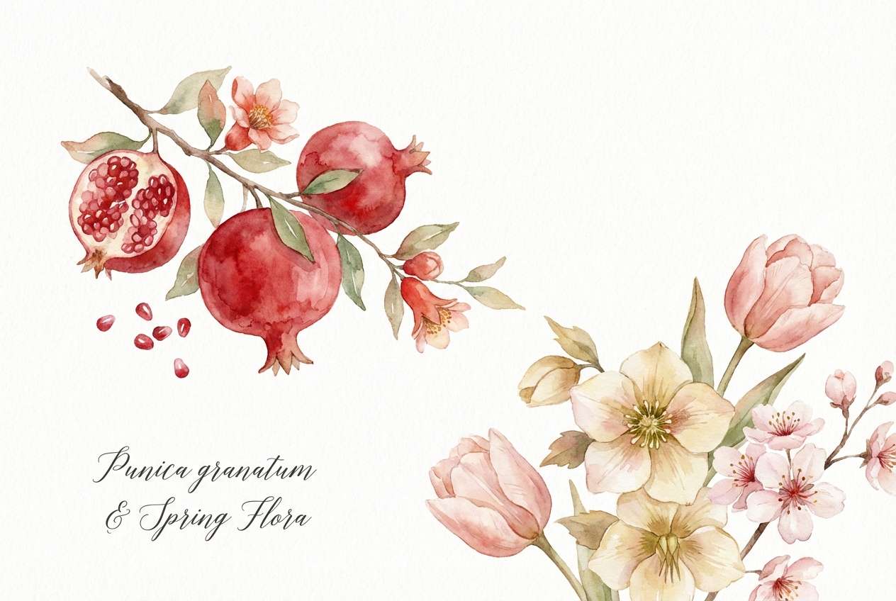
Floral freshness like pomegranate seeds scattered over soft petals. The warm cream keeps the composition light, while the red adds crisp focal points for blooms and berries. Use it in watercolor-style assets, packaging motifs, or seasonal headers. Tip: let the blush shade bridge between reds and creams so the illustration feels naturally layered.
Image example of petal and pomegranate generated using media.io
19) Silk Rosewood
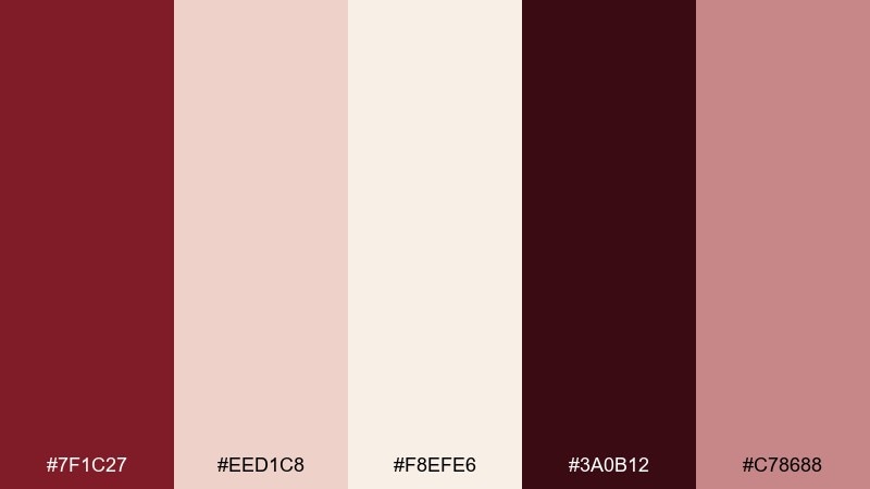
HEX: #7F1C27 #EED1C8 #F8EFE6 #3A0B12 #C78688
Mood: luxurious, dramatic, intimate
Best for: premium jewelry product ads
Luxurious and intimate, like rosewood silk under low gallery lights. The near-black burgundy gives dramatic contrast, while creamy tones keep the ad feeling refined rather than heavy. Pair with minimal copy and close-crop product shots for a premium look. Tip: use the blush tone as a soft shadow color to avoid harsh black drop-shadows.
Image example of silk rosewood generated using media.io

20) Crimson Cream Grid
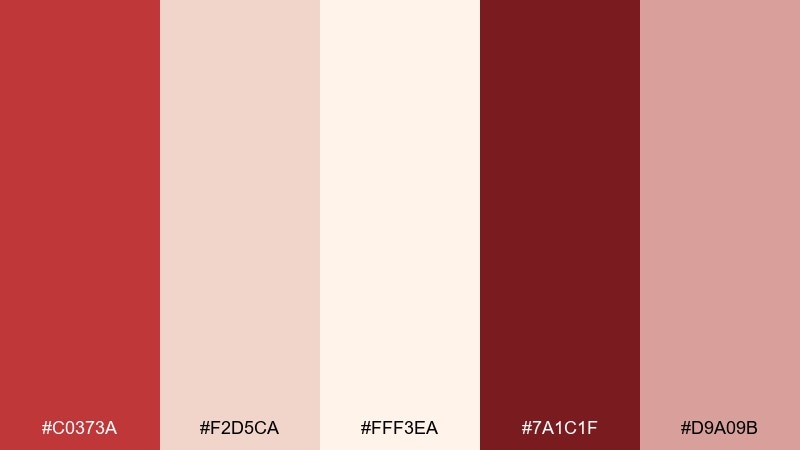
HEX: #C0373A #F2D5CA #FFF3EA #7A1C1F #D9A09B
Mood: structured, modern, confident
Best for: dashboard UI and data cards
Structured confidence like crimson ink on creamy stationery. The tones create a clear hierarchy for cards, charts, and alerts without feeling harsh. A red cream color palette like this works best when the cream is the default surface and the deeper reds are reserved for status and key metrics. Tip: keep chart fills muted and use the brighter red only for selected states.
Image example of crimson cream grid generated using media.io

21) Paprika Whip
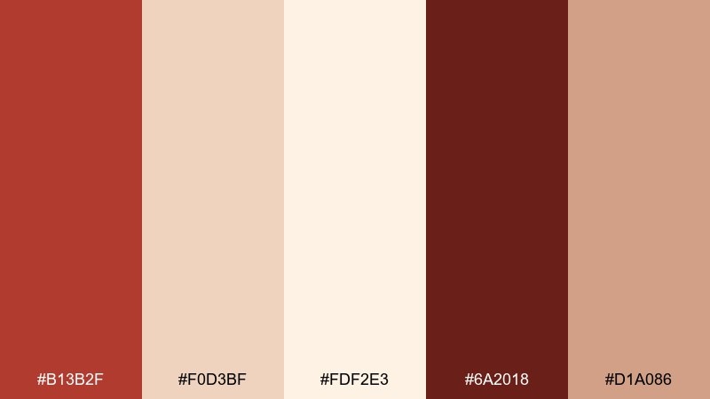
HEX: #B13B2F #F0D3BF #FDF2E3 #6A2018 #D1A086
Mood: zesty, warm, appetizing
Best for: recipe blog headers and thumbnails
Zesty warmth like paprika dusted over a swirl of whipped cream. The spicy red-brown stands out in thumbnails, while the creamy base keeps text readable. For consistent visuals, pair it with warm food photography and light grain textures. Tip: use the mid tan-rose for category tags so every header feels related without looking identical.
Image example of paprika whip generated using media.io
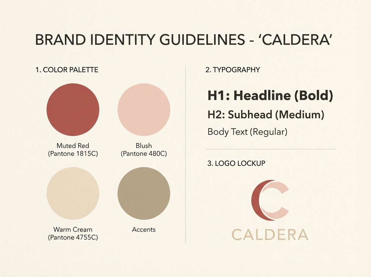
22) Rosy Clay Minimal
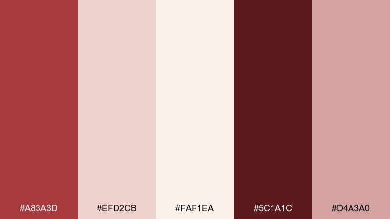
HEX: #A83A3D #EFD2CB #FAF1EA #5C1A1C #D4A3A0
Mood: minimal, warm, approachable
Best for: brand identity kit and guidelines
Minimal warmth with an approachable edge, like rosy clay against creamy parchment. This red cream color combination is easy to document in brand guidelines because it has clear roles for primary, secondary, and neutral tones. Use the deep shade for wordmarks, the mid red for accents, and the cream for whitespace. Tip: specify a maximum red usage percentage per page so designs never feel too saturated.
Image example of rosy clay minimal generated using media.io
What Colors Go Well with Red Cream?
Red cream pairs naturally with deep neutrals like espresso brown, charcoal, and near-black burgundy—these shades sharpen contrast for typography and premium branding without introducing a “cold” feel.
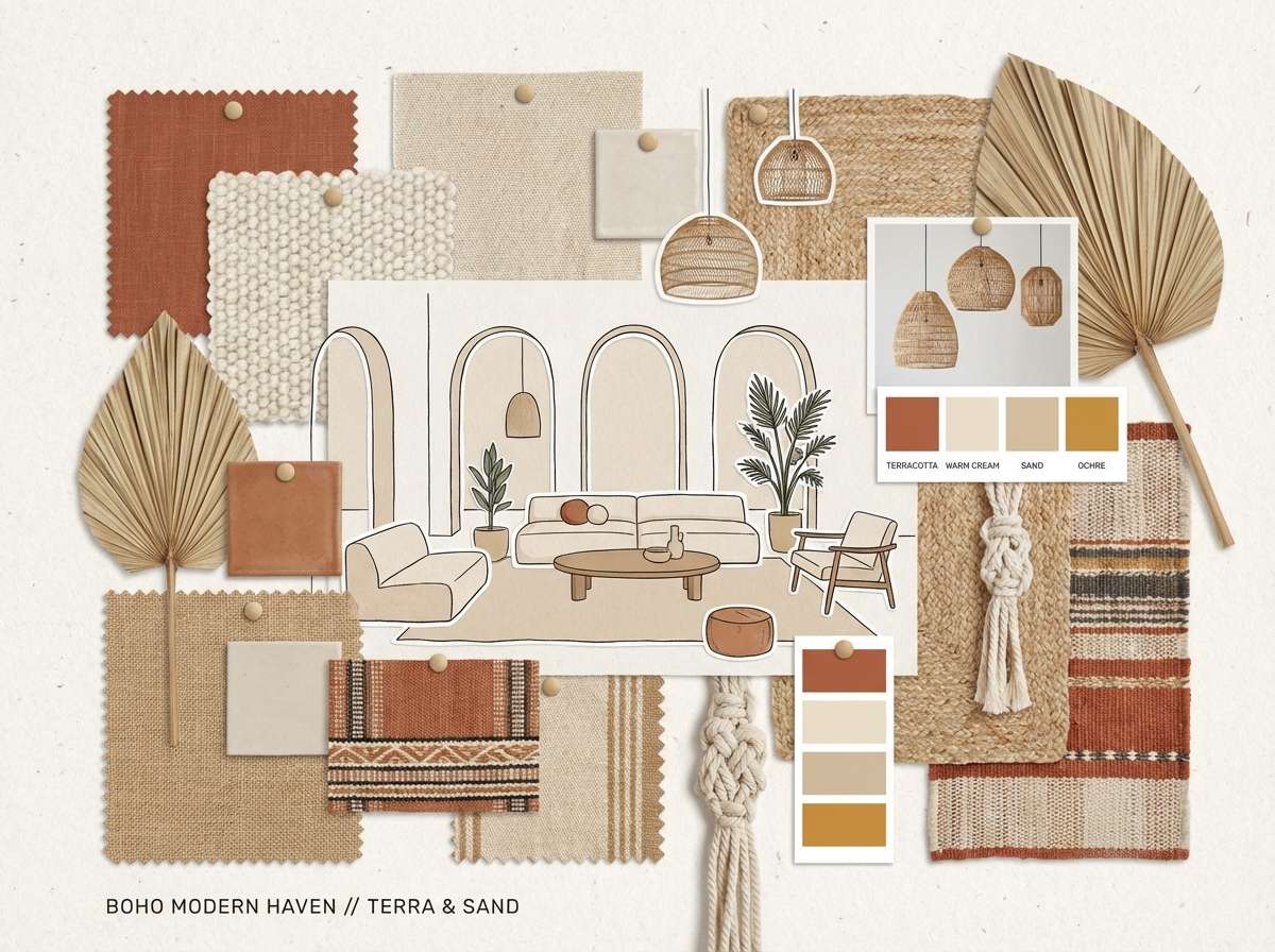
For a softer look, add warm naturals such as oat beige, sand, taupe, and muted terracotta. These keep the palette cohesive and work especially well in interiors, lifestyle ecommerce, and editorial templates.
If you want a fresher twist, try small accents of sage, dusty blue, or muted teal. Keep them minimal (icons, tags, small illustrations) so the red stays the main visual signature.
How to Use a Red Cream Color Palette in Real Designs
Start with cream as your primary background to create breathing room, then choose one “hero red” for CTAs, labels, or focal illustrations. Reserve the darkest red/burgundy for headlines and body text to maintain readability.
In print and packaging, test your reds on the actual material (uncoated paper, kraft, matte labels). Cream tones can shift warmer on real substrates, so using a slightly deeper red helps preserve the intended contrast.
For UI and branding systems, define roles: cream = surface, blush = secondary surface/hover, mid red = accent, dark burgundy = text, bright red = primary action. This prevents overuse and keeps the design feeling modern instead of overly sweet.
Create Red Cream Palette Visuals with AI
If you already have HEX codes, the fastest way to validate the vibe is to generate a few mock visuals: posters, packaging, menus, onboarding screens, or lookbook layouts. Seeing the palette in context makes it easier to pick the right “red intensity” and cream warmth.
With Media.io’s text-to-image tool, you can describe the design format, lighting, and style, then iterate quickly until the red cream balance feels right for your brand. Keep prompts specific (materials, mood, composition) to get consistent outputs.
Once you like the direction, generate a small set (hero, close-up, and wide layout) so you can test the palette across different scales and contrast needs.
Red Cream Color Palette FAQs
-
What does a red cream color palette communicate in branding?
It usually signals warmth, comfort, and approachability, while still feeling confident and premium. Cream softens the emotional intensity of red, making the overall brand tone more welcoming and “crafted.” -
Which red works best with cream: bright red or deep burgundy?
Deep burgundy is best for typography and luxury cues, while brighter reds work best as accents (CTAs, highlights, badges). Many successful red cream palettes include both so you can control hierarchy and energy. -
How do I keep a red and cream palette from looking too “Valentine”?
Use muted reds (brick, cranberry, paprika) and reduce saturation. Add a grounding neutral like charcoal, espresso, or warm taupe, and keep layouts minimal with plenty of cream negative space. -
Is cream a good background color for websites and apps?
Yes—cream reduces glare compared to pure white and can make interfaces feel more editorial. Just ensure accessible contrast by using a very dark burgundy/charcoal for text and reserving mid reds for accents. -
What’s the safest way to assign roles to these five colors?
Use cream as the primary background, the light blush as a secondary surface, the darkest burgundy for text, the mid red for accents, and the brightest red for primary actions or key highlights. -
Do red cream palettes print well on packaging?
They print well, especially on matte or uncoated stocks, but reds can shift depending on paper warmth. Always run a test print, and consider using the darker red for small text and fine lines to keep details crisp. -
Can I generate red cream palette mockups with AI using my own HEX codes?
Yes. Include your HEX codes in the prompt, specify the format (poster, label, UI), and describe materials/lighting to control warmth. Media.io makes it easy to iterate until the palette looks consistent across visuals.


