

A rainforest color palette blends deep canopy greens, misty teals, soft stone neutrals, and warm clay or saffron accents. It’s a nature-inspired way to make designs feel grounded, trustworthy, and fresh.
Below are 20 rainforest color palette ideas with HEX codes, plus practical use cases for branding, interiors, and UI—along with AI prompts you can reuse to generate matching visuals.
In this article
Why Rainforest Palettes Work So Well
Rainforest tones sit in a naturally harmonious range: layered greens, teal fogs, and softened neutrals that mimic what we see in leaves, bark, water, and stone. Because the combinations are “found in nature,” they tend to feel balanced even when you mix warm and cool shades.
They also scale beautifully across mediums. Deep jungle greens create authority for logos and headers, while misty off-whites and minty tints keep layouts readable for UI, packaging, and print.
Finally, rainforest palettes are flexible in mood. With the right accent—clay, blush, saffron, or citrus—you can steer the same green base toward rustic, premium, playful, or modern-tech.
20+ Rainforest Color Palette Ideas (with HEX Codes)
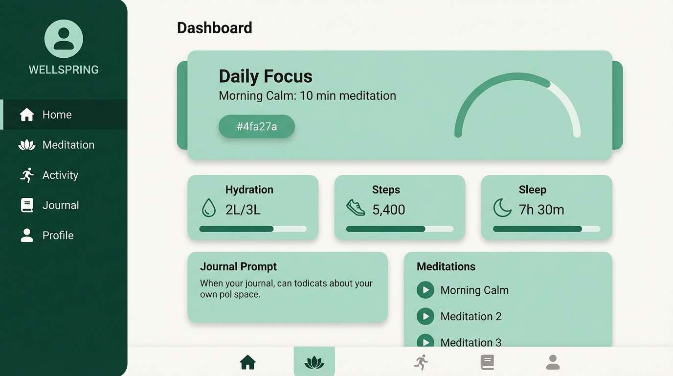
1) Canopy Mist
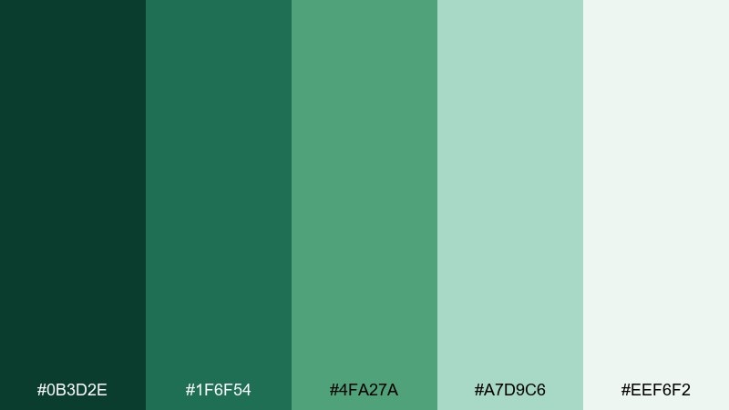
HEX: #0b3d2e #1f6f54 #4fa27a #a7d9c6 #eef6f2
Mood: calm, airy, refreshing
Best for: wellness app UI
Calm and airy, like early fog drifting through treetops after a night of rain. These greens feel clean without turning cold, thanks to the soft mint and near-white mist tone. Use it for wellness or lifestyle UI where readability matters, pairing the darkest green for headers and the pale mist for spacious backgrounds. Tip: keep accent buttons to the mid green so CTAs stand out without shouting.
Image example of canopy mist generated using media.io
Media.io is an online AI studio for creating and editing video, image, and audio in your browser.

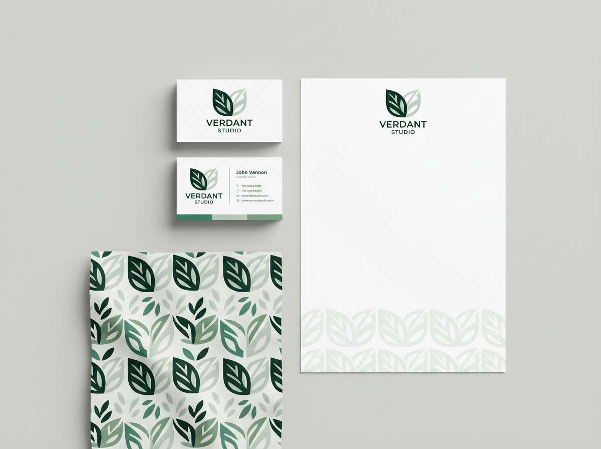
2) Fern Shadow
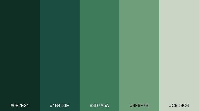
HEX: #0f2e24 #1b4d3e #3d7a5a #6f9f7b #c9d6c6
Mood: grounded, quiet, sophisticated
Best for: eco brand identity
Grounded and quiet, like ferns tucked under deep shade with soft light filtering in. The darker greens bring authority, while the muted sage keeps the look approachable and modern. For a rainforest color scheme in branding, use the deepest tone for wordmarks and the pale gray-green as breathing room on stationery. Tip: add subtle texture on paper stock to make the mid greens feel more organic.
Image example of fern shadow generated using media.io
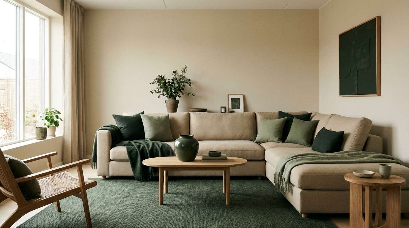
3) Mossy Stone
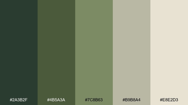
HEX: #2a3b2f #4b5a3a #7c8b63 #b9b8a4 #e8e2d3
Mood: earthy, natural, timeless
Best for: living room interior styling
Earthy and timeless, like moss creeping over river stones and sun-warmed bark. The olive-to-khaki range is subtle, making it easy to live with in larger areas. Use the deeper greens on textiles or cabinetry, then bring in the warm stone neutrals for walls, rugs, and ceramics. Tip: mix matte finishes with a little linen texture to keep the palette from feeling flat.
Image example of mossy stone generated using media.io
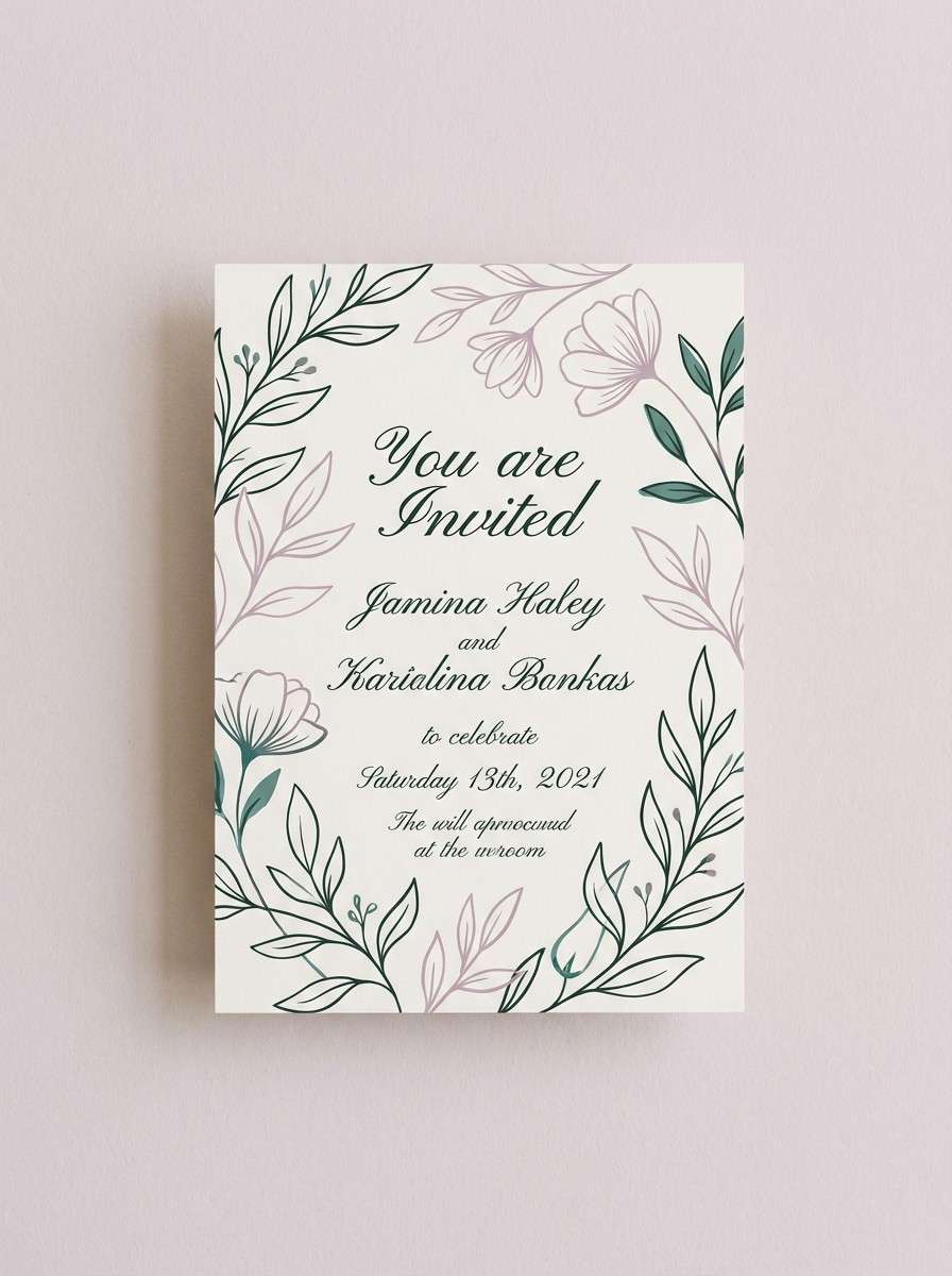
4) Orchid Understory
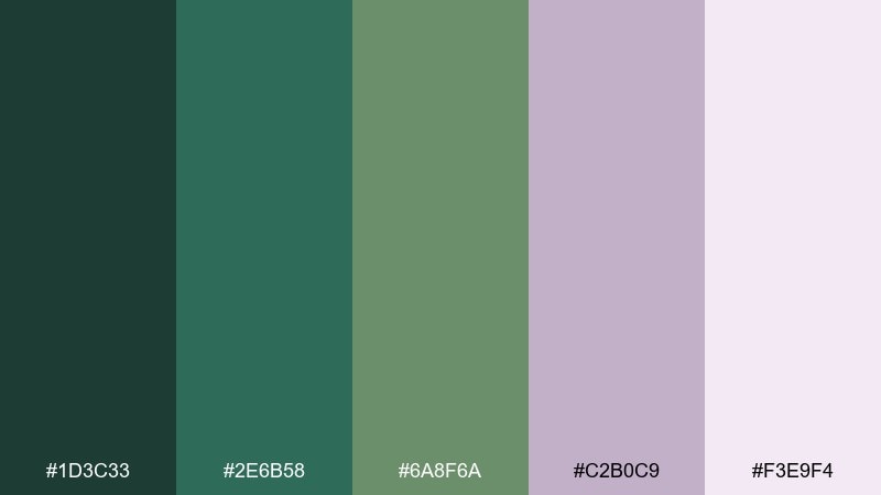
HEX: #1d3c33 #2e6b58 #6a8f6a #c2b0c9 #f3e9f4
Mood: lush, romantic, intriguing
Best for: botanical event invitation
Lush and romantic, like hidden orchids peeking through green understory. The soft lavender lifts the greens and adds a surprising, elegant twist without losing the natural vibe. This rainforest color palette works beautifully for invitations, spa promos, or boutique packaging when you want nature plus a hint of luxury. Tip: keep body text on the pale lilac and reserve the deep green for names and key details.
Image example of orchid understory generated using media.io
5) Riverbank Clay
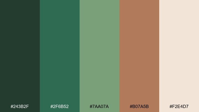
HEX: #243b2f #2f6b52 #7aa07a #b07a5b #f2e4d7
Mood: warm, rustic, balanced
Best for: coffee shop menu design
Warm and rustic, like damp leaves beside sun-baked clay on a riverbank. The terracotta-brown makes the greens feel friendlier and more food-forward. Use it for menus, café brands, or farm-to-table packaging, pairing cream backgrounds with green headers and clay callouts. Tip: print the clay tone as a spot accent for prices or seasonal highlights.
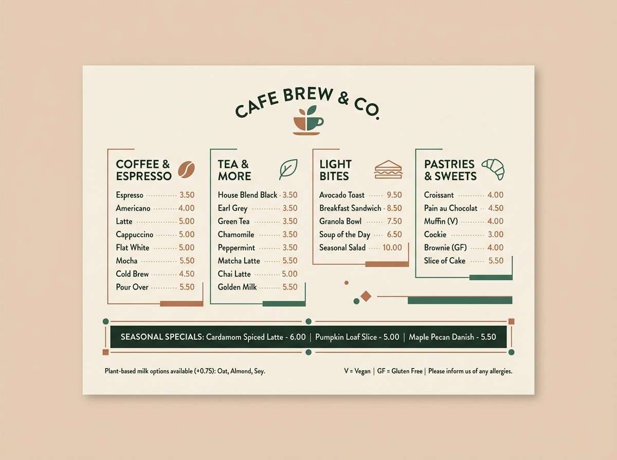
Image example of riverbank clay generated using media.io
6) Bamboo Dawn
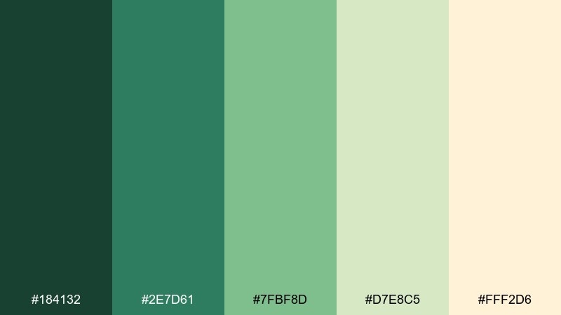
HEX: #184132 #2e7d61 #7fbf8d #d7e8c5 #fff2d6
Mood: fresh, optimistic, gentle
Best for: skincare packaging
Fresh and optimistic, like bamboo leaves catching first light with a soft golden haze. The pale butter tone adds warmth, preventing the greens from feeling overly cool or clinical. Use it on skincare packaging with the deepest green for labels and the creamy tint for the carton base. Tip: choose minimal typography and let the light green act as your main brand color.
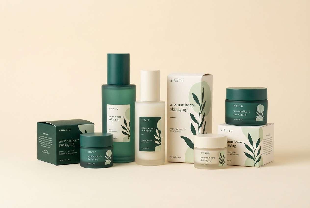
Image example of bamboo dawn generated using media.io
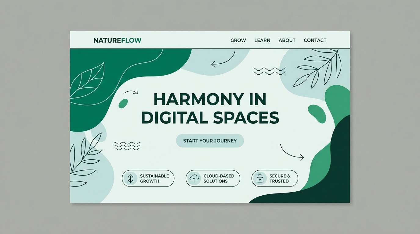
7) Emerald Lichen
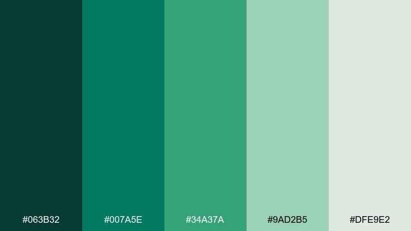
HEX: #063b32 #007a5e #34a37a #9ad2b5 #dfe9e2
Mood: vivid, clean, energizing
Best for: startup landing page
Vivid and clean, like bright lichen popping against wet stone after a storm. The saturated emerald brings energy, while the pale mint keeps the layout breathable and modern. If you want rainforest color combinations that feel tech-forward, use the emerald for primary buttons and the soft gray-green for sections and cards. Tip: reserve the brightest green for one action per screen to avoid visual noise.
Image example of emerald lichen generated using media.io
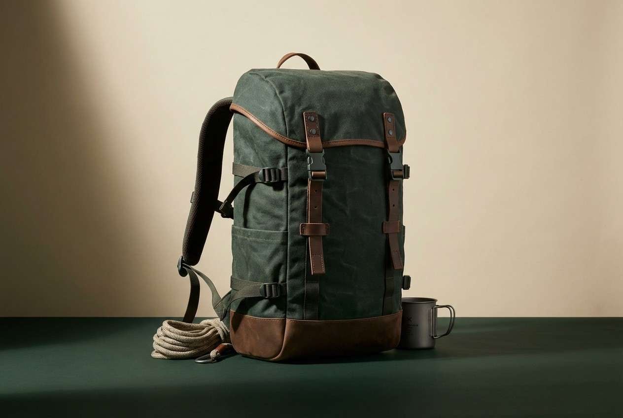
8) Wet Bark
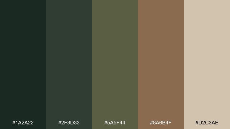
HEX: #1a2a22 #2f3d33 #5a5f44 #8a6b4f #d2c3ae
Mood: moody, rugged, authentic
Best for: outdoor gear product ad
Moody and rugged, like slick bark and packed earth after rainfall. The deep charcoal-green anchors the look, while the tan neutral keeps it wearable and practical. Use it for outdoor gear ads, labels, or rugged editorial headers, pairing the warm brown with product details and callouts. Tip: add generous contrast by using the tan for type blocks over the darkest shade.
Image example of wet bark generated using media.io
9) Sunbreak Leaves
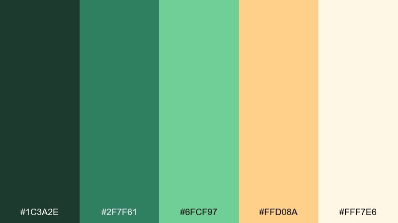
HEX: #1c3a2e #2f7f61 #6fcf97 #ffd08a #fff7e6
Mood: bright, playful, sunlit
Best for: summer promo poster
Bright and playful, like sunbeams breaking through leaves onto warm sand. The citrusy peach brings instant cheer, making the greens feel lighter and more approachable. Use it for seasonal promos, posters, or social graphics where you want a natural vibe with a friendly highlight color. Tip: keep the peach as a small accent on headlines or stickers so the greens still lead.
Image example of sunbreak leaves generated using media.io

10) Cloud Forest
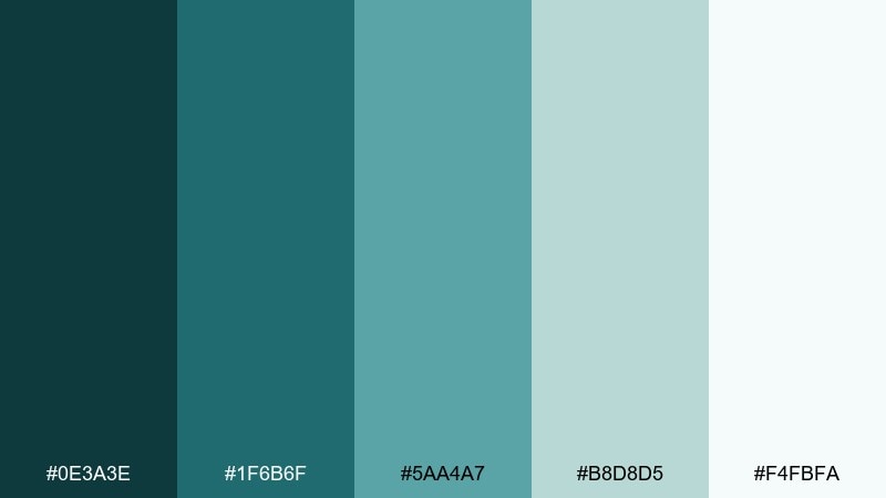
HEX: #0e3a3e #1f6b6f #5aa4a7 #b8d8d5 #f4fbfa
Mood: cool, misty, modern
Best for: SaaS analytics UI
Cool and misty, like a cloud forest where teal fog softens every edge. The darker teal reads professional for navigation, while the pale aqua keeps dashboards light and calm. Use it for SaaS analytics UI, pairing crisp charts with muted backgrounds to reduce fatigue during long sessions. Tip: use the mid teal for active states and reserve the deepest shade for key numbers.
Image example of cloud forest generated using media.io

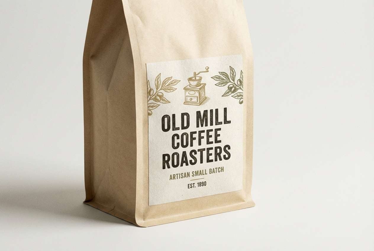
11) Tropical Soil
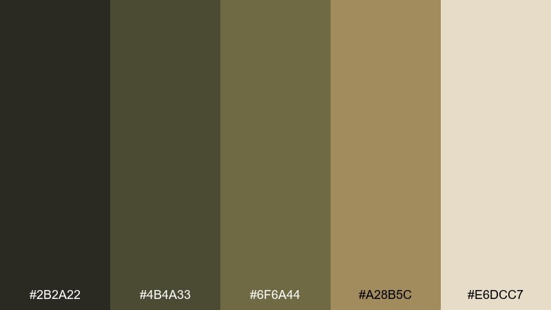
HEX: #2b2a22 #4b4a33 #6f6a44 #a28b5c #e6dcc7
Mood: organic, vintage, grounded
Best for: coffee packaging label
Organic and grounded, like rich soil, cacao husks, and dried leaves on a forest floor. The earthy olive-browns feel heritage-inspired, perfect for brands that lean artisanal. Use it on coffee or chocolate labels, pairing the cream tone with bold dark type for instant shelf readability. Tip: add a small metallic foil detail in a warm brass finish to elevate the rustic mood.
Image example of tropical soil generated using media.io
12) Parrot Feather
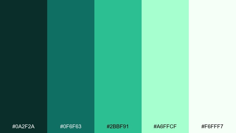
HEX: #0a2f2a #0f6f63 #2bbf91 #a6ffcf #f6fff7
Mood: bold, lively, youthful
Best for: music festival flyer
Bold and lively, like glossy feathers flashing in the canopy. The high-energy mint-green punch makes the palette feel youthful, while the deep teal keeps it from going neon. For rainforest color combinations in event graphics, use the bright mint for large shapes and the darkest shade for text and logos. Tip: keep backgrounds mostly pale so the saturated accents stay crisp in print.
Image example of parrot feather generated using media.io

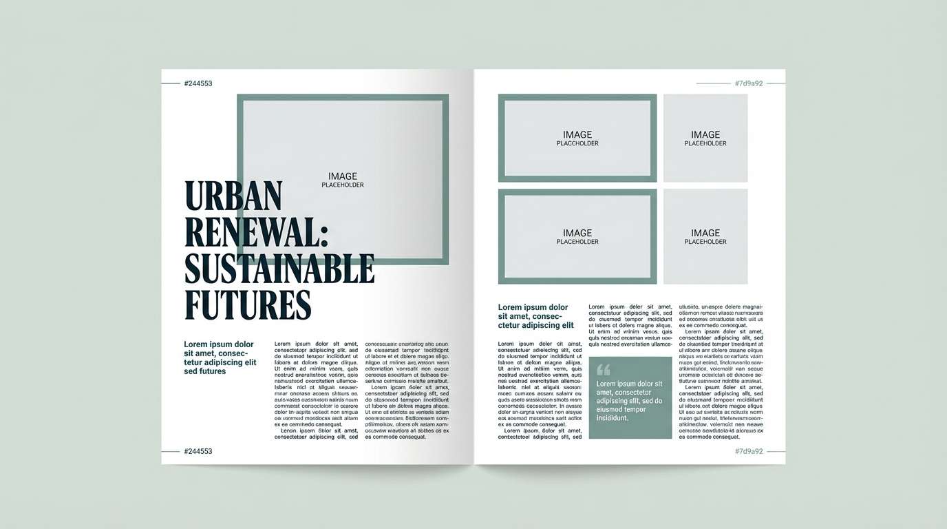
13) Monsoon Slate
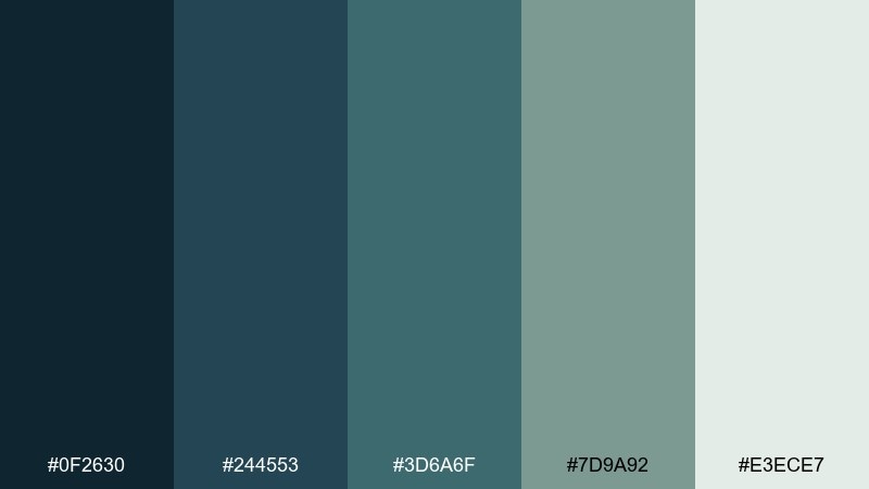
HEX: #0f2630 #244553 #3d6a6f #7d9a92 #e3ece7
Mood: stormy, refined, editorial
Best for: magazine feature layout
Stormy and refined, like slate rocks and raincloud shadows rolling through the hills. The blue-leaning greens feel mature and premium, especially when paired with lots of whitespace. Use it for editorial layouts, reports, or presentations where you want calm authority without looking corporate. Tip: set headlines in the deepest slate and use the muted sage for pull quotes and section dividers.
Image example of monsoon slate generated using media.io
14) Sapling Glow
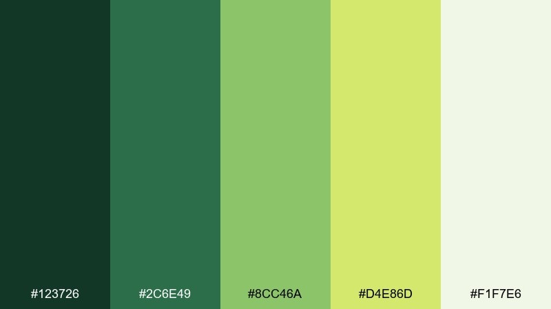
HEX: #123726 #2c6e49 #8cc46a #d4e86d #f1f7e6
Mood: uplifting, sunny, fresh
Best for: spring botanical illustration
Uplifting and sunny, like new saplings glowing when light hits fresh leaves. The yellow-green highlight adds brightness without feeling artificial, especially against the soft off-white. Use it for spring campaigns, botanical illustrations, or eco blogs, pairing the darker green with linework and the bright tones for petals and leaf fills. Tip: keep outlines subtle so the light greens stay the hero.
Image example of sapling glow generated using media.io
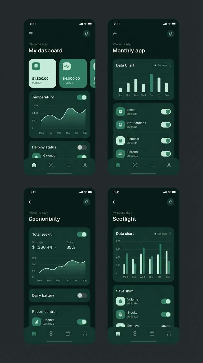
15) Jungle Night
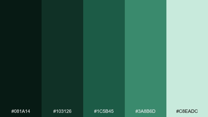
HEX: #081a14 #103126 #1c5b45 #3a8b6d #c8eadc
Mood: mysterious, sleek, cinematic
Best for: dark mode app UI
Mysterious and sleek, like a night walk where leaves catch tiny reflections. The near-black green is perfect for dark mode, while the minty highlight keeps controls readable and modern. Use it for finance, productivity, or media apps, pairing the mid green for active states and the pale mint for chips and badges. Tip: avoid pure white text and use the light mint for softer contrast.
Image example of jungle night generated using media.io
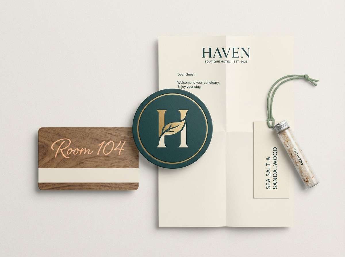
16) Canopy Bloom
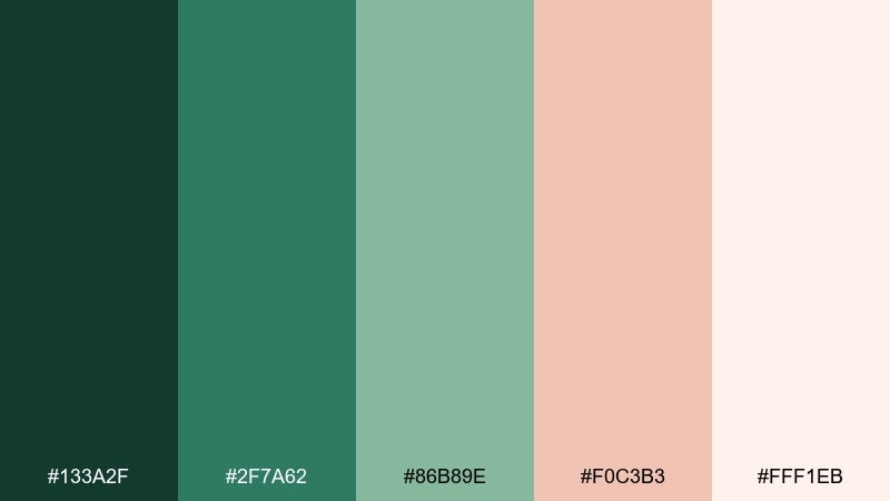
HEX: #133a2f #2f7a62 #86b89e #f0c3b3 #fff1eb
Mood: soft, modern, inviting
Best for: boutique hotel branding
Soft and inviting, like pale blossoms floating against layered greens. The blush accent brings warmth and hospitality, making the palette feel boutique rather than outdoorsy. This rainforest color palette fits hotel branding, menus, and welcome cards, pairing the blush for highlights with deep green typography for an upscale finish. Tip: use the blush sparingly on seals, icons, or a single signature stripe.
Image example of canopy bloom generated using media.io
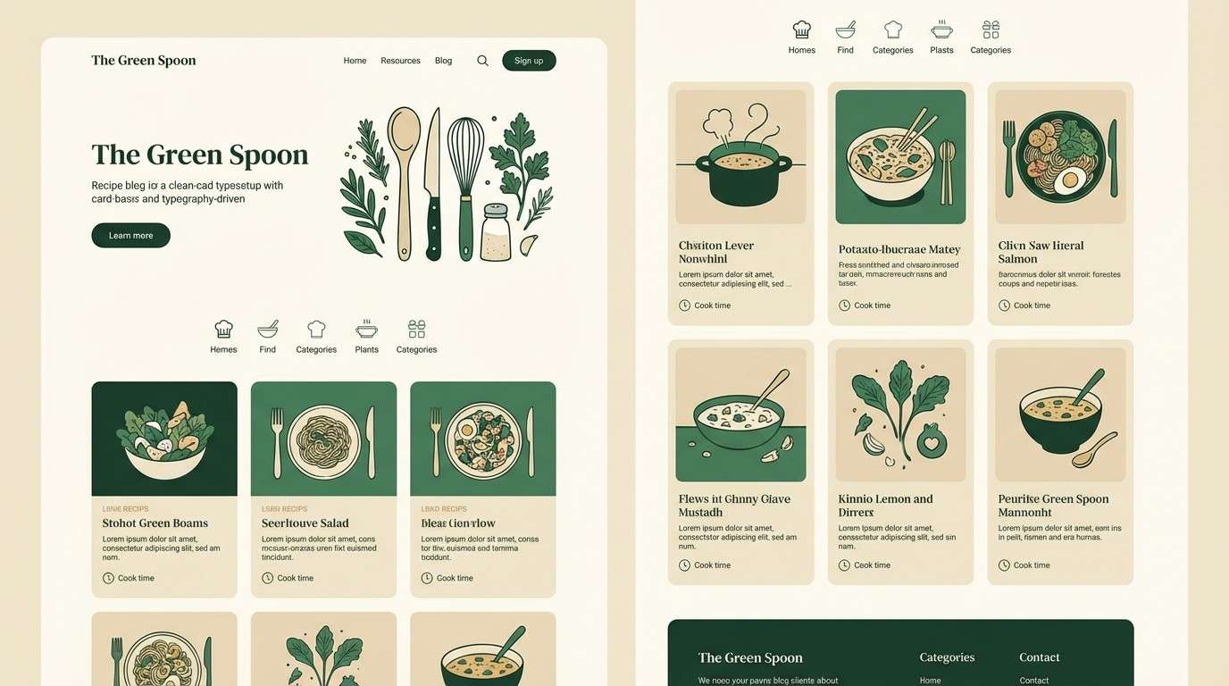
17) Vines and Vanilla
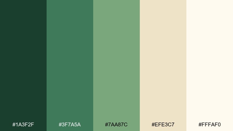
HEX: #1a3f2f #3f7a5a #7aa87c #efe3c7 #fffaf0
Mood: cozy, natural, understated
Best for: recipe blog theme
Cozy and understated, like winding vines against warm vanilla paper. The creamy neutrals make the greens feel softer, which is ideal for content-heavy pages. Use it for a recipe blog or newsletter template, pairing the darkest green for headings and the vanilla tones for background and cards. Tip: keep link colors to the medium green so they read clearly without overpowering photos.
Image example of vines and vanilla generated using media.io
18) Pebble Creek
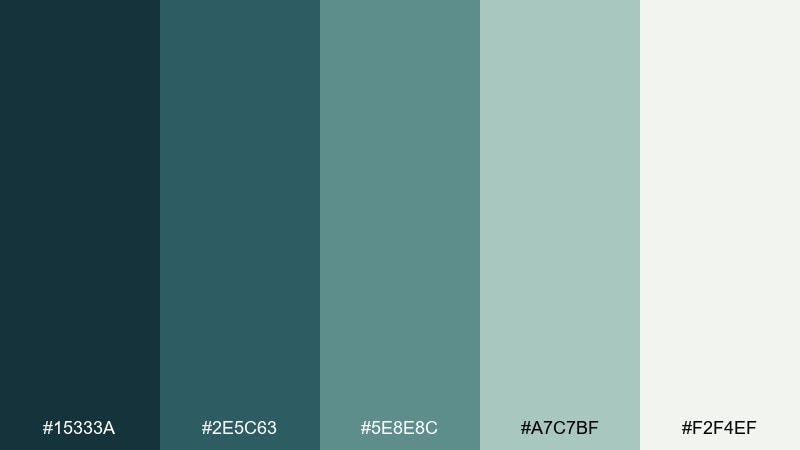
HEX: #15333a #2e5c63 #5e8e8c #a7c7bf #f2f4ef
Mood: clean, coastal-forest, balanced
Best for: presentation slide deck
Clean and balanced, like cool creek water running over smooth pebbles. The teal-leaning shades feel professional, but the pale gray-green keeps everything calm and open. Use it for slide decks, reports, or portfolios, pairing dark teal for titles with the light neutral for wide margins. Tip: set charts in two tones only to keep data legible and cohesive.
Image example of pebble creek generated using media.io

19) Highland Moss
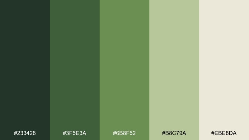
HEX: #233428 #3f5e3a #6b8f52 #b8c79a #ebe8da
Mood: heritage, outdoorsy, calm
Best for: hiking club poster
Heritage and outdoorsy, like mossy hills under soft overcast skies. The olive greens feel classic and dependable, while the pale sand keeps it approachable for community messaging. Use it for club posters, trail maps, or outdoor newsletters, pairing the darkest green for typography and the lighter tones for route blocks. Tip: add simple iconography and keep spacing generous for quick scanning.
Image example of highland moss generated using media.io

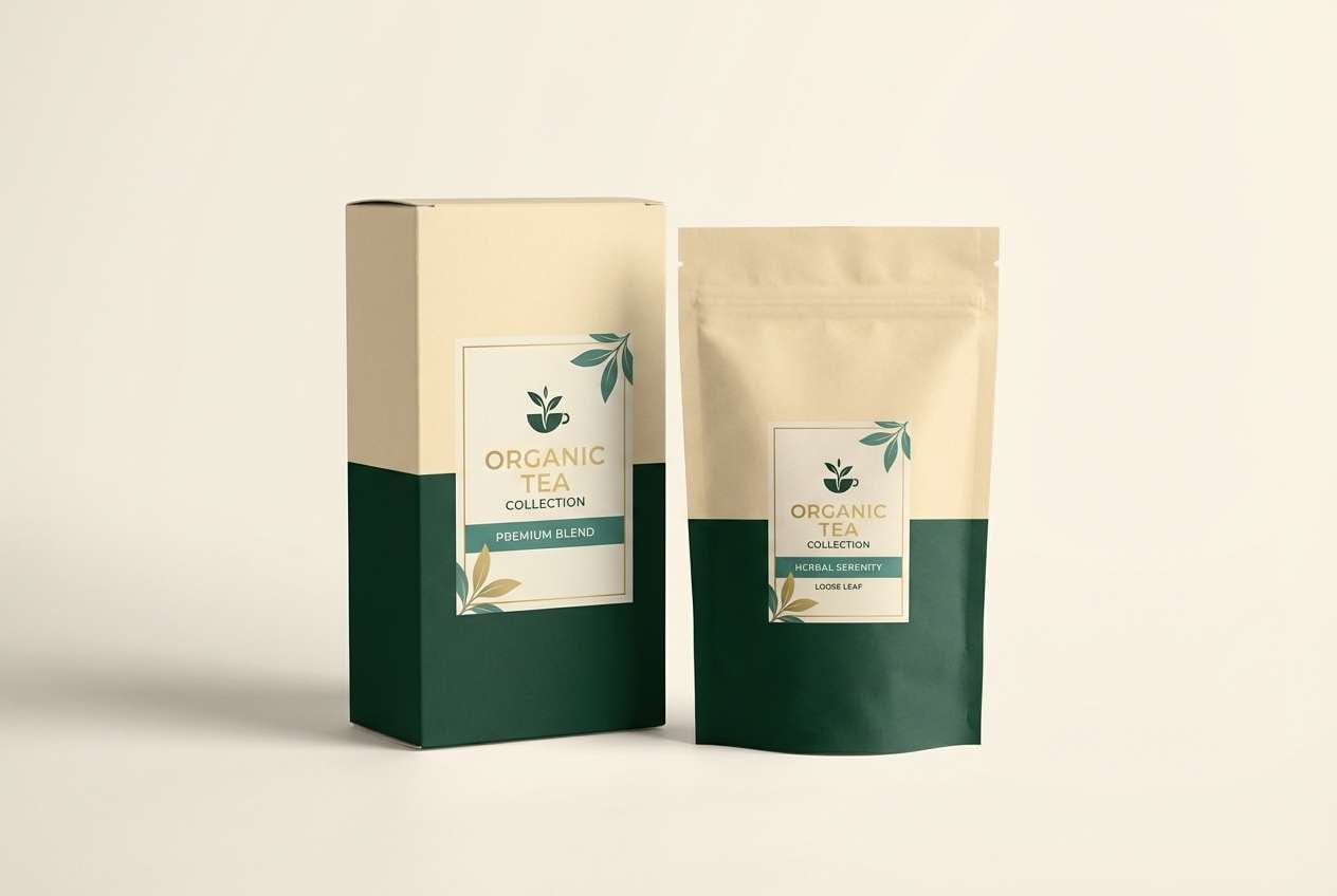
20) Saffron Rain
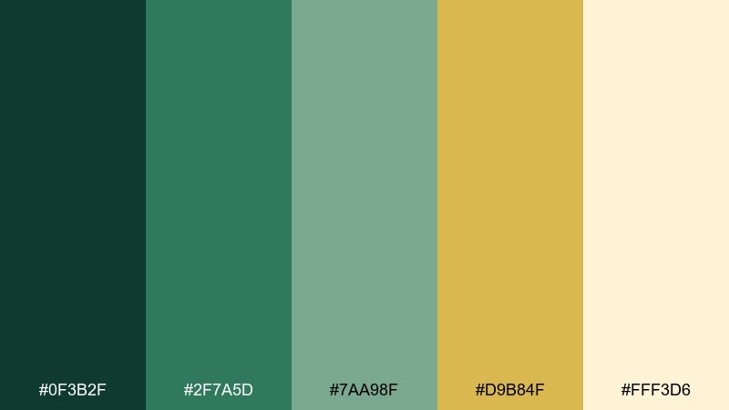
HEX: #0f3b2f #2f7a5d #7aa98f #d9b84f #fff3d6
Mood: vibrant, optimistic, nature-luxe
Best for: organic tea packaging
Vibrant and optimistic, like golden saffron threads catching light in a green rainforest after rain. The mustard accent feels premium and appetizing, perfect for food and beverage branding. Use it on tea packaging or product ads, pairing the creamy background with green label blocks and a saffron seal for emphasis. Tip: keep the yellow as a single focal point per panel to maintain a luxe look.
Image example of saffron rain generated using media.io
What Colors Go Well with Rainforest?
Rainforest greens pair naturally with soft neutrals like misty off-white, warm cream, sand, and stone. These lighter tones keep the palette breathable and make typography and UI components easier to read.
For contrast, add warm accents like terracotta clay, blush, saffron, or peach—small doses create instant focal points for labels, prices, badges, or CTA buttons. If you prefer cooler harmony, lean into teal, slate, and aqua for a cloud-forest feel.
To keep your rainforest tones cohesive, choose one “deep canopy” shade for structure (nav, headlines), one mid green for interactive elements, and one pale neutral for backgrounds.
How to Use a Rainforest Color Palette in Real Designs
In branding, start with a dark jungle green for the logo and key text, then introduce a muted sage or mint as your supporting brand color. Save warm accents (clay, saffron, blush) for seals, highlights, or product variants so they feel intentional.
For web and UI, prioritize accessibility: use pale mist/cream backgrounds, dark greens for text, and keep bright greens limited to primary actions. This reduces visual fatigue and prevents the interface from feeling overly saturated.
In interiors, treat deep greens like “anchors” (cabinetry, textiles, statement walls) and balance them with warm stone neutrals on larger surfaces. Natural textures—linen, matte paint, wood—help rainforest palettes feel organic instead of flat.
Create Rainforest Palette Visuals with AI
If you already have HEX codes, you can generate matching mockups—UI screens, packaging, posters, and brand sets—by feeding those colors into an AI prompt. This is a fast way to test how your rainforest color scheme reads in real layouts.
In Media.io, describe the design type, set dominant/background colors, and specify where accent colors should appear (buttons, seals, dividers). Keep prompts simple, then iterate by adjusting one color role at a time.
When your palette includes a bright accent (like saffron or mint), limit it to one focal element per scene so the rainforest greens remain the main identity.
Rainforest Color Palette FAQs
-
What is a rainforest color palette?
A rainforest color palette is a set of nature-inspired colors built around layered greens (canopy, fern, moss), often supported by misty neutrals and accented with warm tones like clay, saffron, or blush. -
Which rainforest colors are best for branding?
Start with a deep jungle green for authority and legibility, add a muted mid green for secondary elements, and use a light mist/cream neutral for whitespace. Add one warm accent (terracotta, saffron, blush) for memorable highlights. -
How do I keep rainforest palettes from looking too dark?
Increase the share of light neutrals (mist, cream, off-white) and reserve the darkest greens for navigation, headlines, or small areas. This keeps the mood grounded while maintaining contrast and readability. -
What accent colors work best with rainforest greens?
Warm accents like clay, peach, saffron, and soft blush add friendly contrast. Cooler accents like teal and aqua create a misty, modern look—great for dashboards and SaaS. -
Are rainforest color palettes good for UI and dark mode?
Yes. In light UI, pair dark greens with misty backgrounds for clean readability. In dark mode, use near-black green as the base and minty highlights for controls, avoiding pure white text for softer contrast. -
How many colors should I use from a rainforest palette?
Five colors is a practical set: one dark anchor, two mid tones, one accent, and one light background. In most designs you’ll actively use 3–4 and keep the fifth as an occasional support tone. -
Can I generate rainforest-themed mockups with the same HEX codes?
Yes—use the HEX codes directly in an AI prompt and assign roles (dominant, background, accents). Media.io Text-to-Image is ideal for quickly generating matching UI mockups, posters, packaging, and brand identity scenes.
Next: Dark Cyan Color Palette


