

Dark cyan sits in the sweet spot between teal and deep blue—calm enough for trust, but bold enough to feel modern. It’s a reliable choice for UI systems, branding, and interiors where you want depth without harshness.
Below are dark cyan color palette ideas with HEX codes, pairing tips, and AI prompts you can reuse to generate on-brand visuals fast.
In this article
- Why Dark Cyan Palettes Work So Well
-
- harbor depths
- botanical tide
- midnight aquarium
- copper current
- misty fjord
- neon circuit
- desert oasis
- slate and sea
- vintage tealprint
- arctic glass
- gallery minimal
- berry drift
- coral reef pop
- rainy window
- forest lagoon
- sandstone spa
- techno ink
- peacock velvet
- coastal clay
- stormlight modern
- seaside monochrome
- citrus harbor
- What Colors Go Well with Dark Cyan?
- How to Use a Dark Cyan Color Palette in Real Designs
- Create Dark Cyan Palette Visuals with AI
Why Dark Cyan Palettes Work So Well
Dark cyan feels stable and intelligent because it borrows the professionalism of navy and the freshness of green. That mix makes it a versatile “anchor color” for systems that need both trust and energy.
It also pairs cleanly with neutrals—from off-white to slate—so layouts stay readable while still feeling distinctive. In practice, dark cyan often works as navigation, headers, and primary buttons without overwhelming the page.
Finally, dark cyan transitions beautifully into gradients (toward teal, aqua, or deep blue). That gives you depth for charts, hero sections, and background panels while keeping a cohesive brand mood.
20+ Dark Cyan Color Palette Ideas (with HEX Codes)
1) Harbor Depths
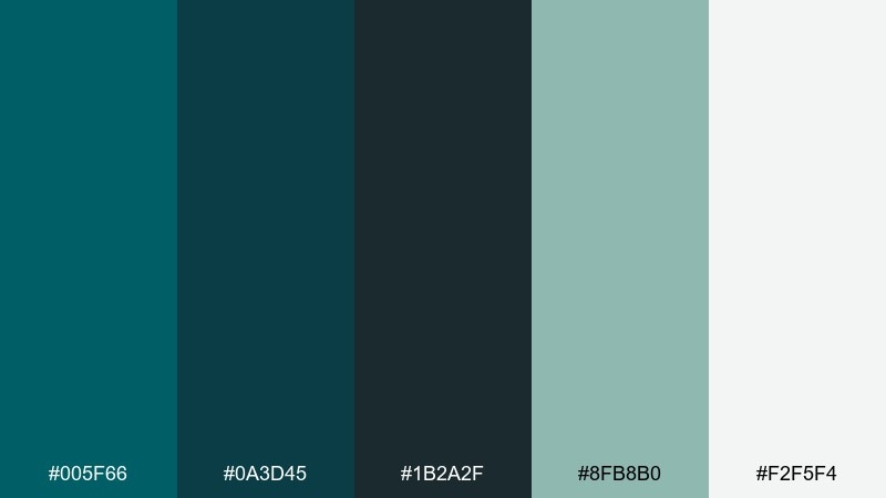
HEX: #005f66 #0a3d45 #1b2a2f #8fb8b0 #f2f5f4
Mood: moody, nautical, grounded
Best for: marine brand identity and service websites
Moody harbor water and weathered dock timber set the tone, with deep teal shadows and soft sea mist highlights. Use it for logos, hero headers, and trust-first service pages where you want calm authority. Pair the darker tones with clean off-white space and a muted mint for accessibility. Tip: reserve the near-black for type and icons so the cyan stays rich, not muddy.
Image example of harbor depths generated using media.io
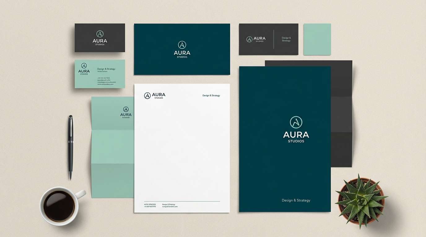
Media.io is an online AI studio for creating and editing video, image, and audio in your browser.

2) Botanical Tide
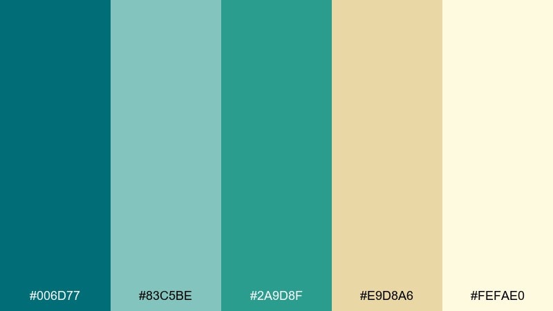
HEX: #006d77 #83c5be #2a9d8f #e9d8a6 #fefae0
Mood: fresh, organic, sunlit
Best for: botanical illustrations and eco product labels
Fresh sea glass greens and warm sand notes evoke a coastal garden after rain. It works beautifully on natural packaging, wellness labels, and illustrated patterns where you want friendly energy. Balance the stronger teal with creamy backgrounds to keep it airy. Tip: use the sandy yellow for small callouts or badge shapes to avoid overpowering the greens.
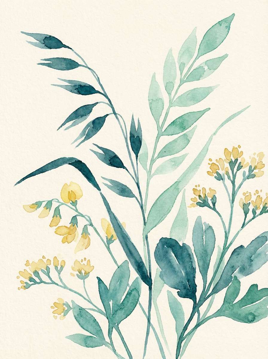
Image example of botanical tide generated using media.io
3) Midnight Aquarium
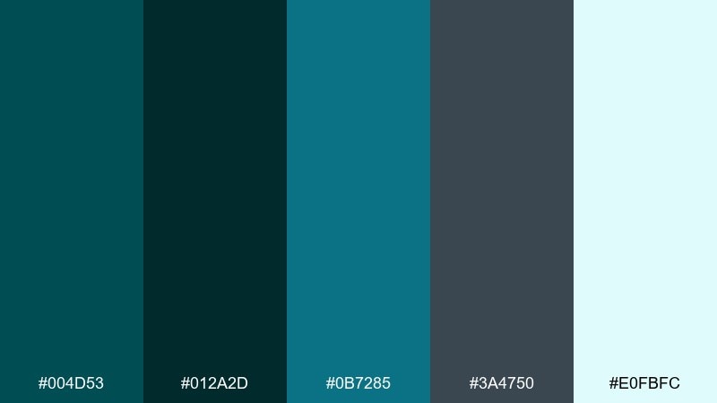
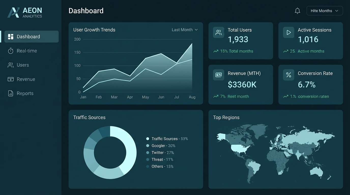
HEX: #004d53 #012a2d #0b7285 #3a4750 #e0fbfc
Mood: mysterious, sleek, nocturnal
Best for: analytics dashboards and dark mode UI
Mysterious aquarium glass and deep-water shadows create a sleek, nocturnal feel. This dark cyan color palette is ideal for dark mode dashboards, where contrast and clarity matter more than ornament. Pair the icy tint with restrained gradients for charts, then anchor navigation in the deepest teal. Tip: keep one accent color for states like active or hover to prevent visual noise.
Image example of midnight aquarium generated using media.io
4) Copper Current
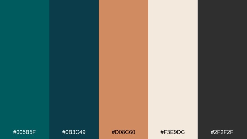
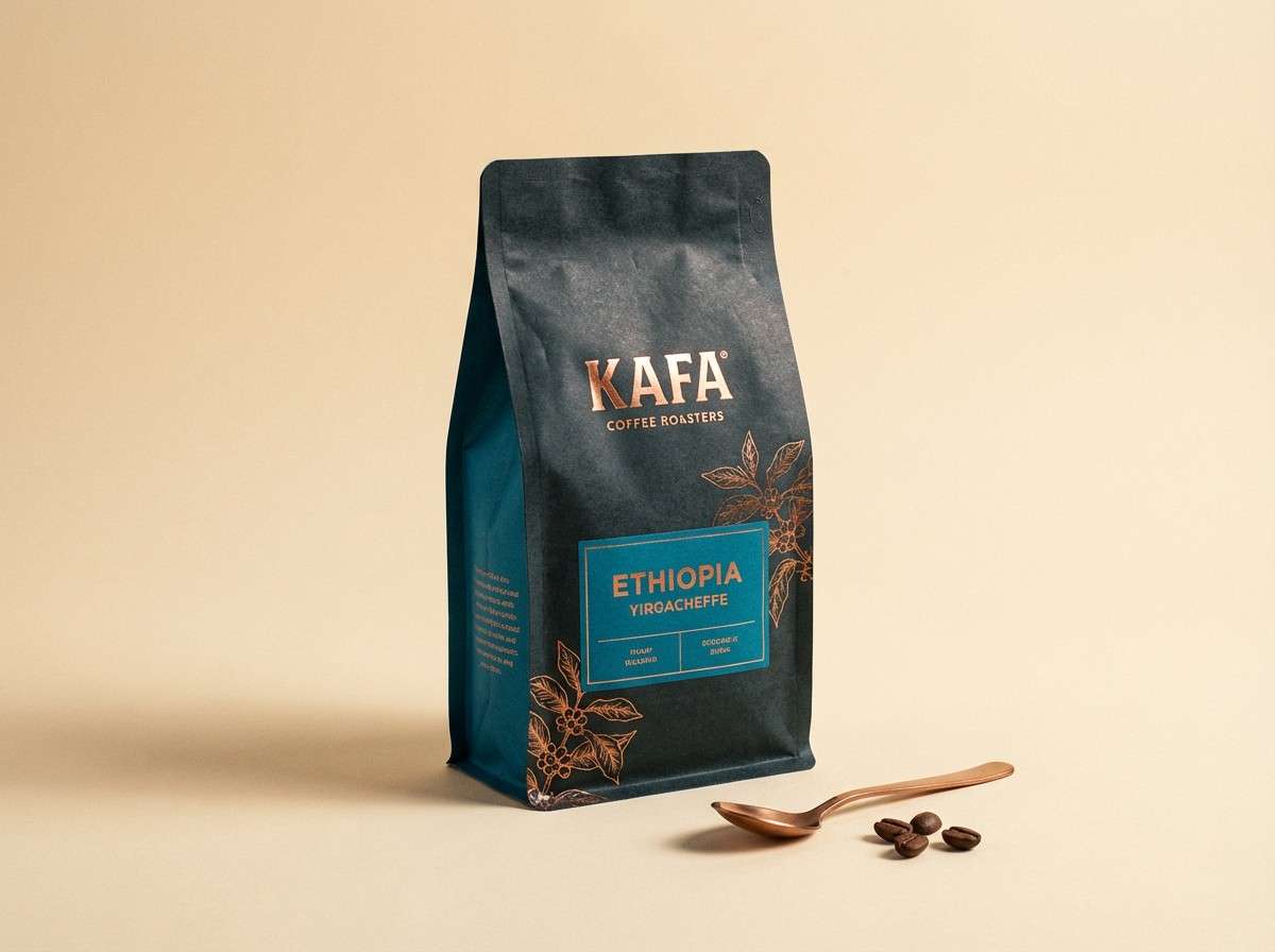
HEX: #005b5f #0b3c49 #d08c60 #f3e9dc #2f2f2f
Mood: artisan, warm, premium
Best for: coffee packaging and boutique product ads
Artisan warmth shows up like copper hardware against deep coastal teal. The mix feels premium on packaging, especially when you add matte textures and subtle shadows. Pair the copper tone with creamy paper hues to keep the palette inviting, not heavy. Tip: use copper sparingly on seals, foil stamps, or key headings for maximum impact.
Image example of copper current generated using media.io
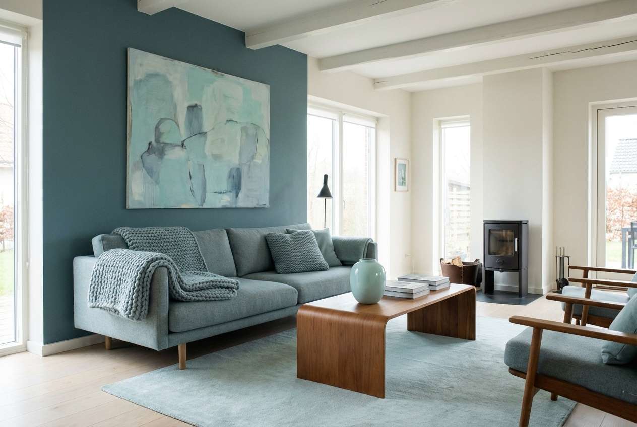
5) Misty Fjord
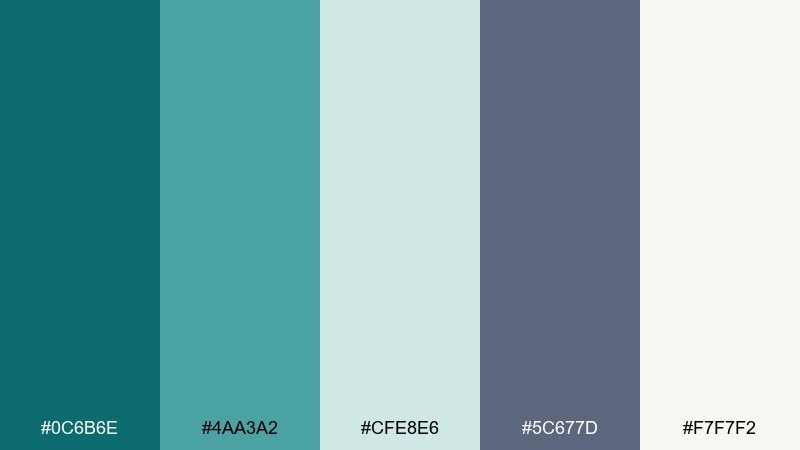
HEX: #0c6b6e #4aa3a2 #cfe8e6 #5c677d #f7f7f2
Mood: quiet, airy, Scandinavian
Best for: living room interiors and calm web sections
Quiet fjord fog and pale sky tones make this feel clean, soft, and modern. It suits interiors, landing pages, and wellness brands that need calm without going bland. Pair the slate tone with warm lighting or light wood textures to keep it cozy. Tip: let the pale aqua carry large areas like walls, panels, or section backgrounds.
Image example of misty fjord generated using media.io
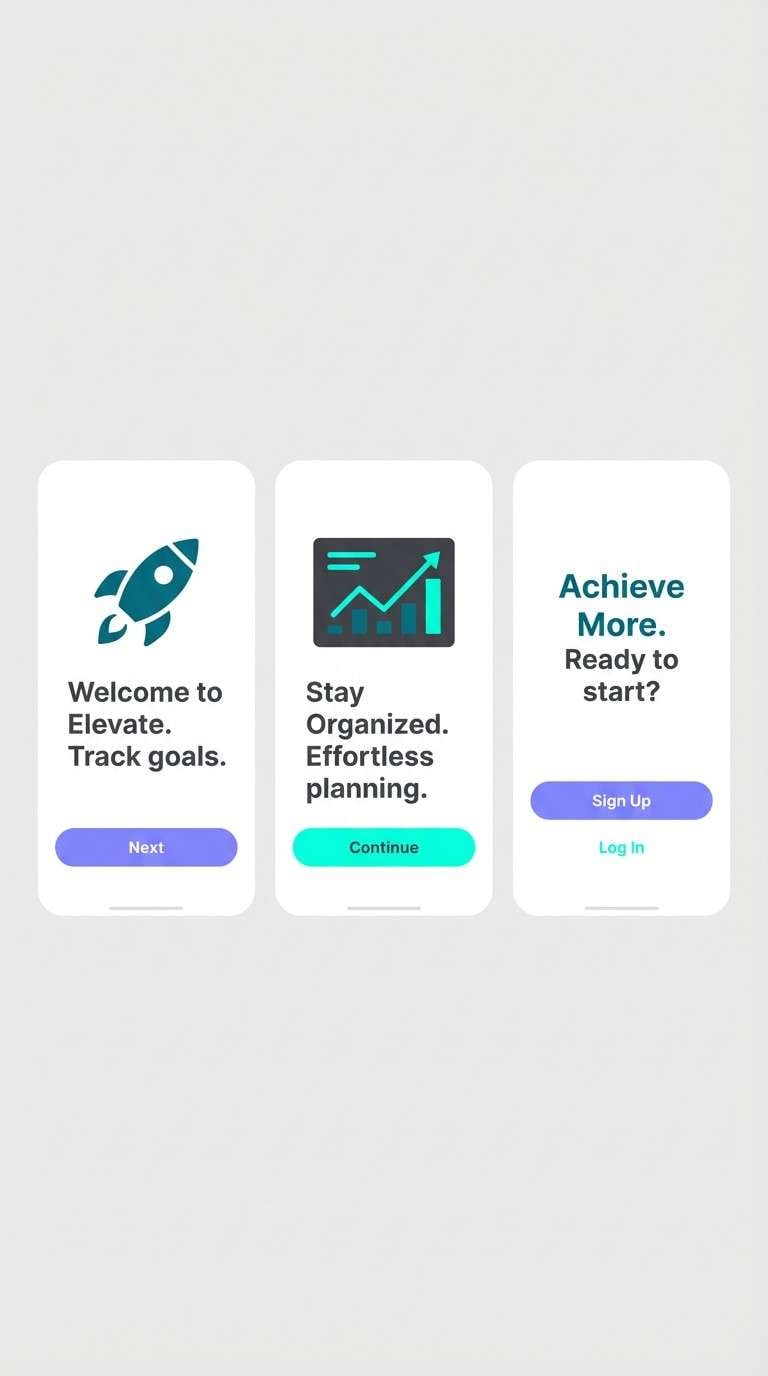
6) Neon Circuit
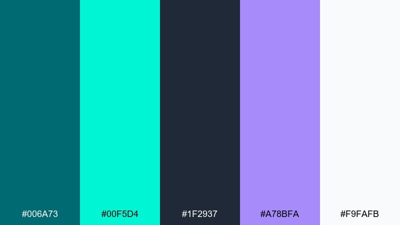
HEX: #006a73 #00f5d4 #1f2937 #a78bfa #f9fafb
Mood: futuristic, punchy, high contrast
Best for: startup app onboarding screens
Electric glow over dark graphite gives this set a futuristic, confident vibe. It works best for onboarding, feature highlights, and SaaS marketing where you want crisp hierarchy. Pair the neon aqua with lots of white space to keep it sharp, then use violet for secondary emphasis. Tip: avoid large neon blocks and keep the bright tones for buttons, toggles, and micro accents.
Image example of neon circuit generated using media.io
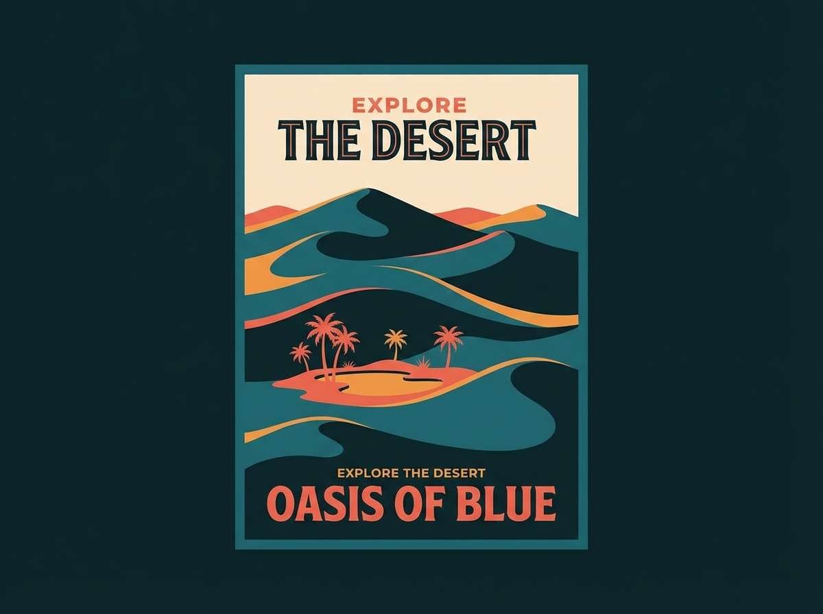
7) Desert Oasis
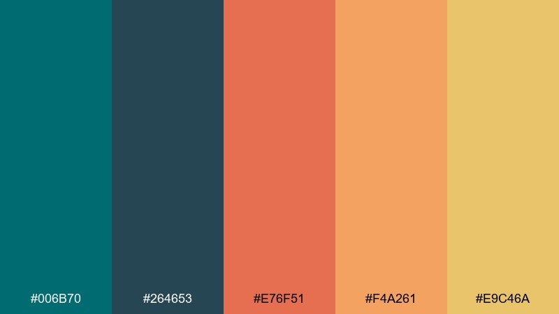
HEX: #006b70 #264653 #e76f51 #f4a261 #e9c46a
Mood: adventurous, warm, travel-ready
Best for: travel posters and tour promotions
Adventurous heat meets cool water, like an oasis at golden hour. These dark cyan color combinations shine in posters and social ads, where the warm oranges can frame the teal as a focal point. Pair the deepest blue-green with sandy yellow for headings that pop. Tip: keep warm tones on shapes or borders so the teal stays the hero.
Image example of desert oasis generated using media.io
8) Slate and Sea
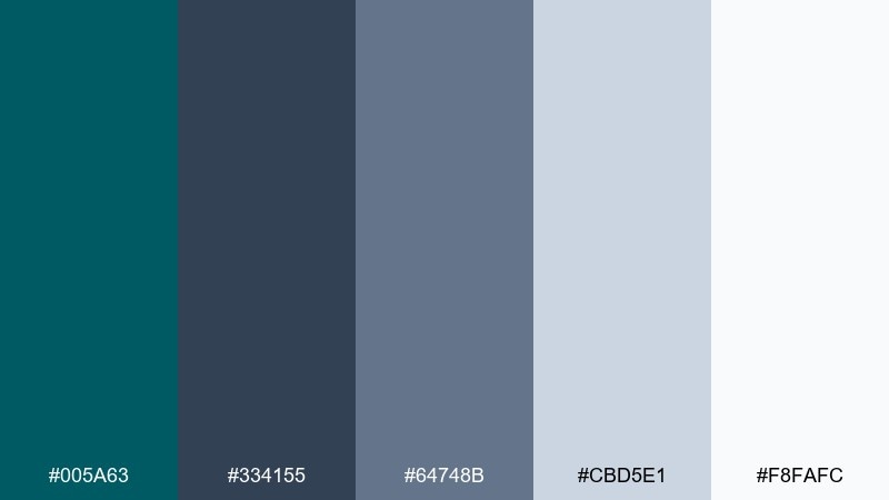
HEX: #005a63 #334155 #64748b #cbd5e1 #f8fafc
Mood: professional, cool, understated
Best for: B2B websites and pitch decks
Cool slate meets steady sea tones for a professional, low-drama look. Use it for B2B sites, reports, and decks where readability and trust are key. Pair the teal with soft grays for charts and tables, keeping typography crisp. Tip: apply the darkest slate for headings and let the teal signal links and key metrics.
Image example of slate and sea generated using media.io
9) Vintage Tealprint
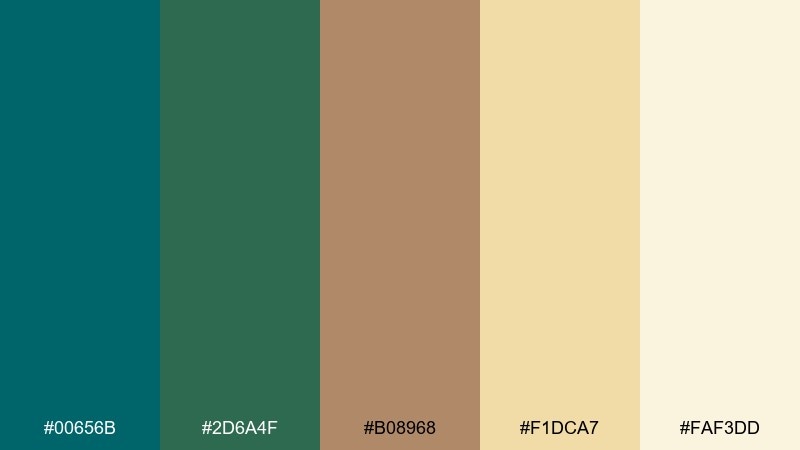
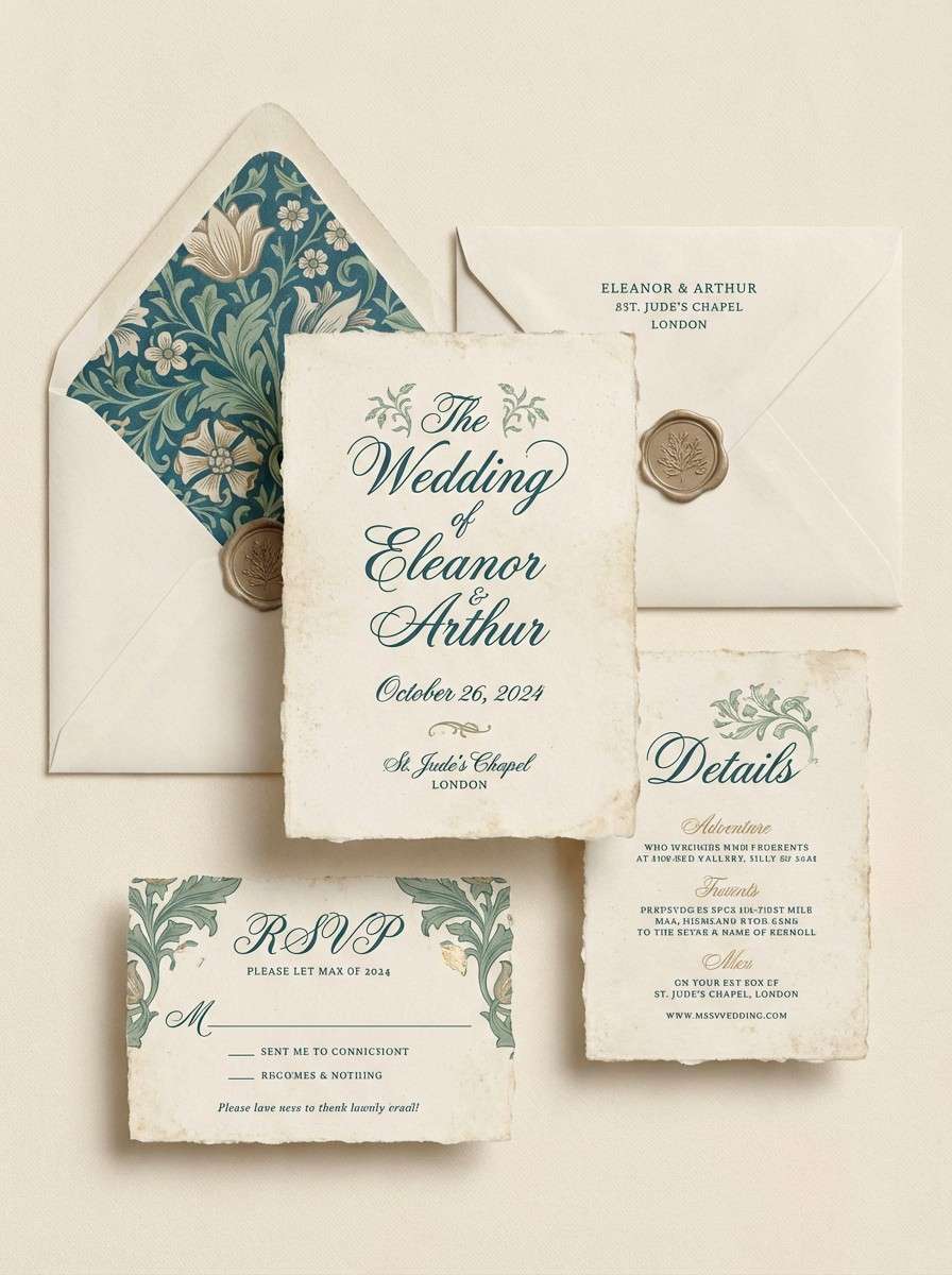
HEX: #00656b #2d6a4f #b08968 #f1dca7 #faf3dd
Mood: vintage, textured, storybook
Best for: wedding invitations and artisan stationery
Vintage ink and sun-aged paper give this mix a charming, handcrafted feel. It fits invitations, menus, and small-batch stationery that benefits from texture and warmth. Pair the teal with the tan-brown for a classic letterpress look, then soften with creamy backgrounds. Tip: add subtle grain or halftone patterns to lean into the print vibe.
Image example of vintage tealprint generated using media.io
10) Arctic Glass
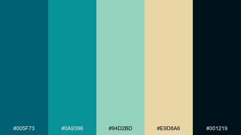
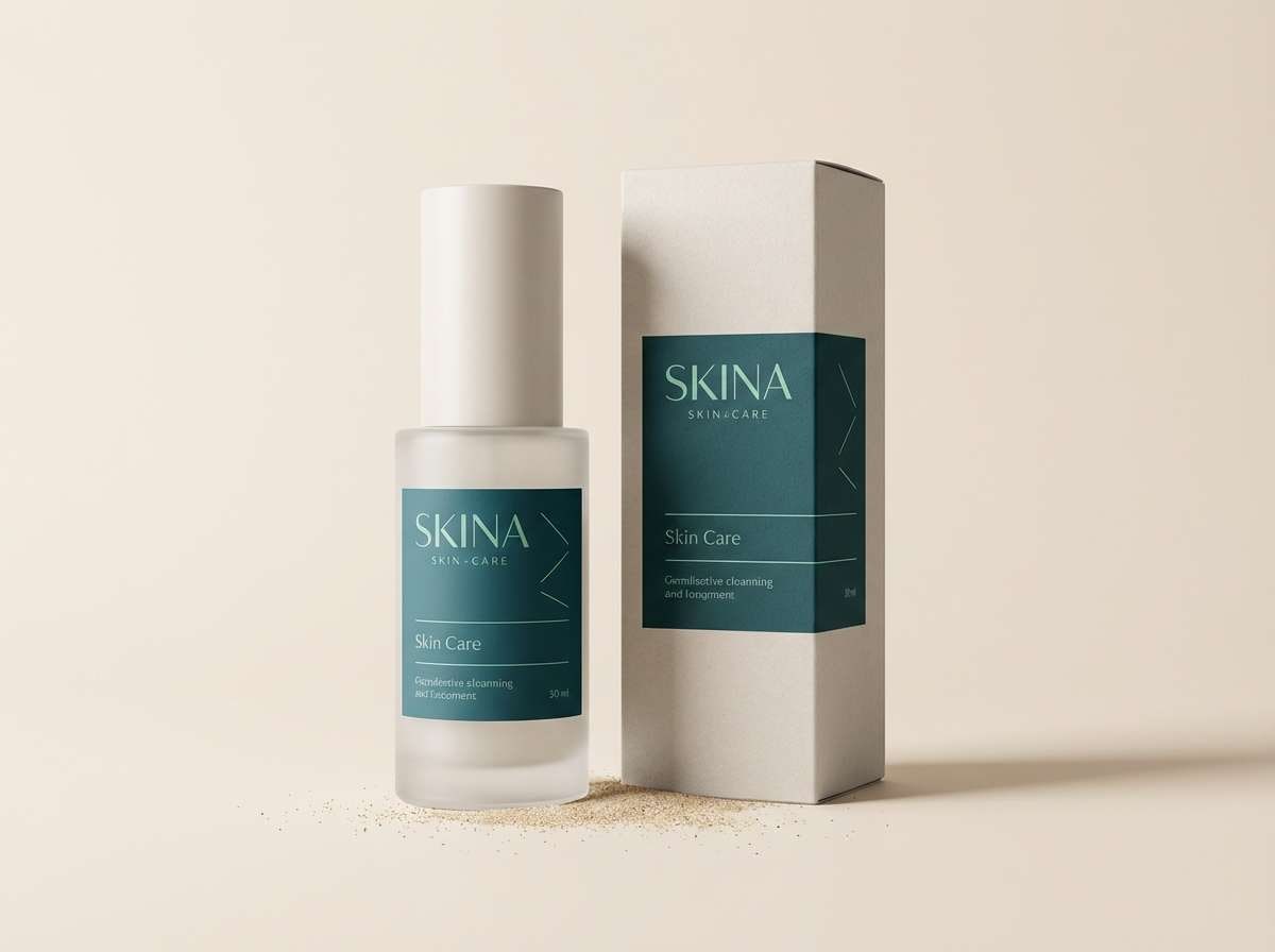
HEX: #005f73 #0a9396 #94d2bd #e9d8a6 #001219
Mood: crisp, modern, cold-to-warm
Best for: skincare product ads and clean packaging
Crisp arctic tones feel like frosted glass with a hint of warmth from pale sand. It is a strong fit for skincare, tech accessories, and minimalist packaging that needs freshness. Pair the near-black with airy mint for premium contrast, then add the sandy tint for gentle warmth. Tip: use the black only for small type and ingredient lists to keep the look light.
Image example of arctic glass generated using media.io
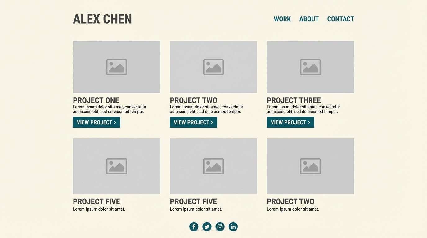
11) Gallery Minimal
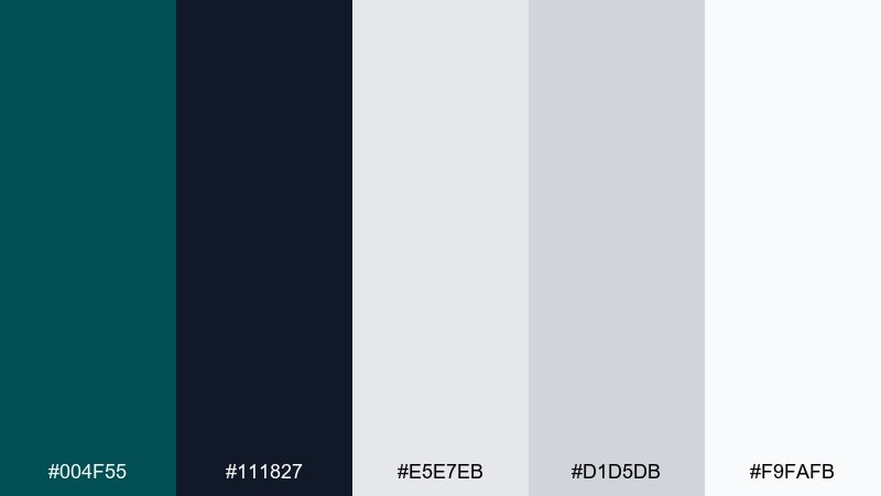
HEX: #004f55 #111827 #e5e7eb #d1d5db #f9fafb
Mood: minimal, refined, editorial
Best for: portfolio sites and modern UI systems
Minimal gallery walls and quiet lighting come to mind, with inky teal doing the heavy lifting. This dark cyan color palette works especially well for portfolios and UI kits that need elegant restraint. Pair the teal with cool grays to keep spacing and grids feeling intentional. Tip: limit teal to navigation, active states, and one signature component like buttons or tags.
Image example of gallery minimal generated using media.io
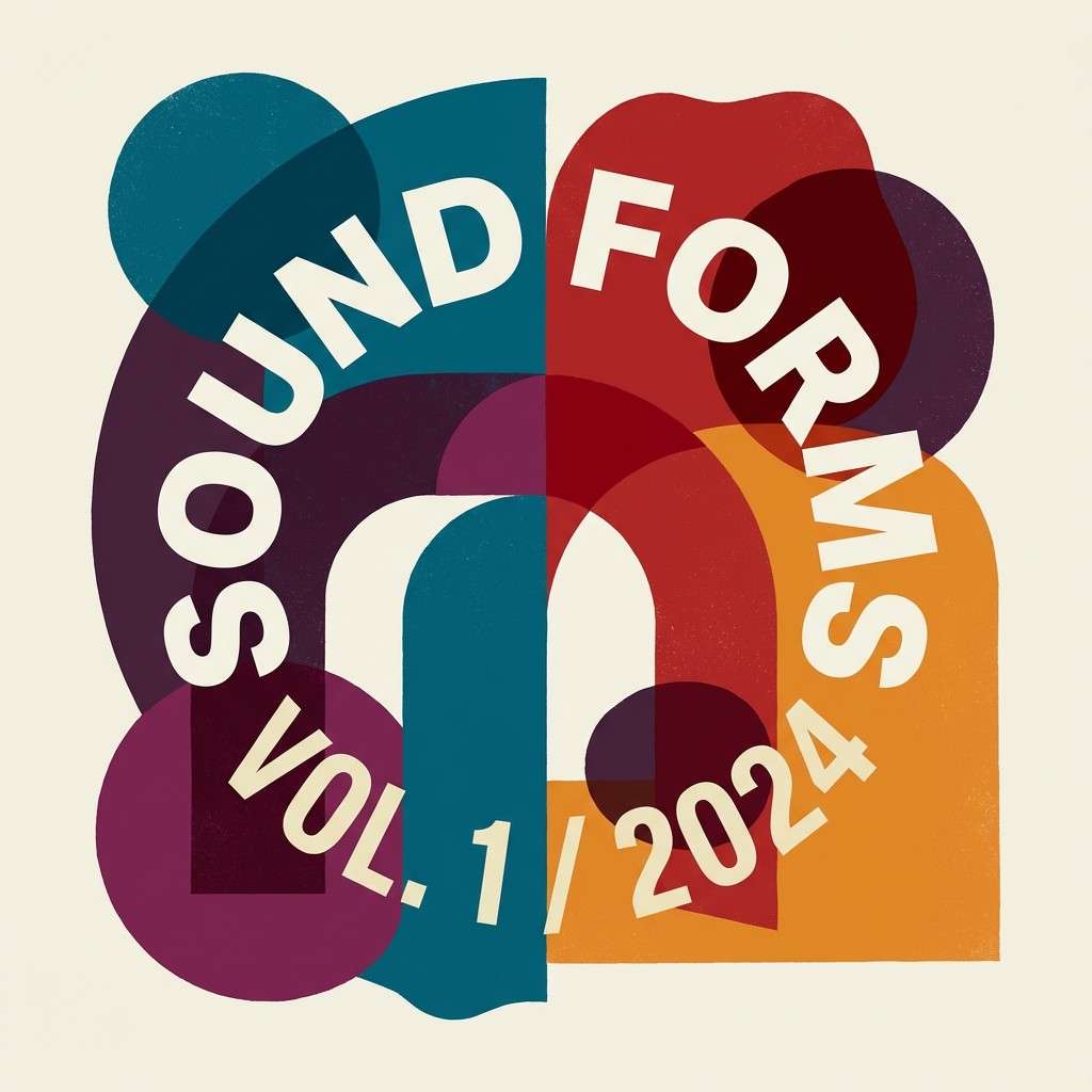
12) Berry Drift
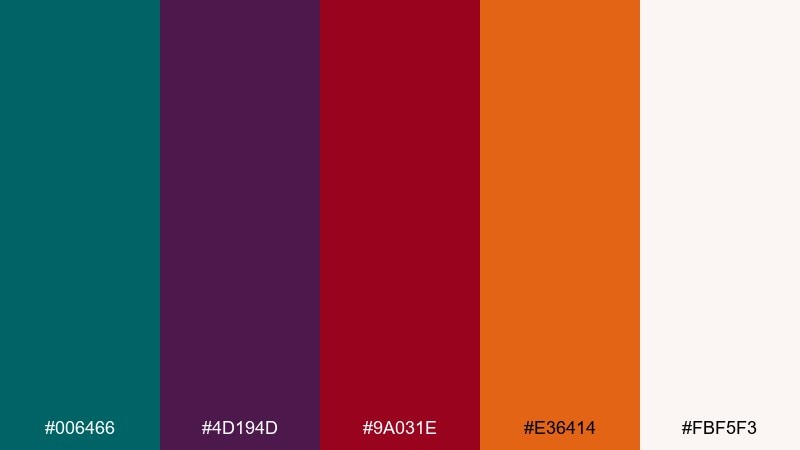
HEX: #006466 #4d194d #9a031e #e36414 #fbf5f3
Mood: bold, artistic, night market
Best for: album covers and event posters
Bold berry tones drifting through deep teal feel like a late-night market with neon signage. Use it when you want drama for posters, covers, or punchy campaign graphics. Pair the darkest teal with the creamy off-white for legible type, then let magenta and red act as spotlight accents. Tip: keep gradients simple and rely on big color blocks for impact.
Image example of berry drift generated using media.io
13) Coral Reef Pop
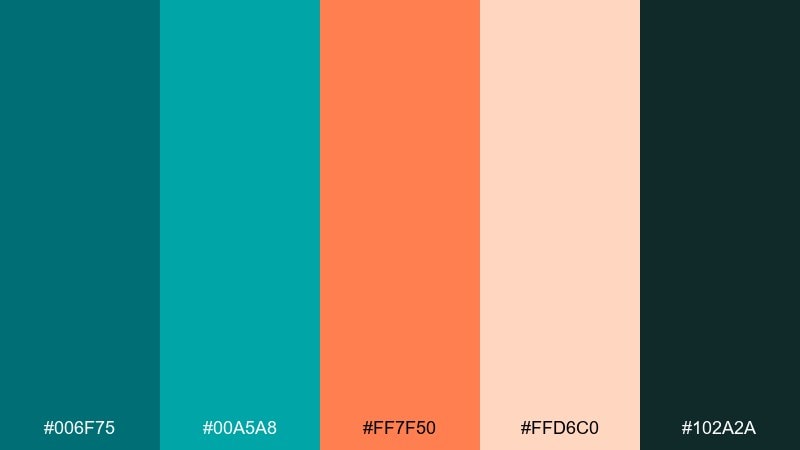
HEX: #006f75 #00a5a8 #ff7f50 #ffd6c0 #102a2a
Mood: playful, summery, energetic
Best for: restaurant menus and social promos
Playful reef colors pop like coral against clear tropical water. It is great for menus, food branding, and social templates where you want appetite appeal without going overly warm. Pair coral with the lighter blush for friendly highlights and keep the deepest green for text. Tip: use coral on price tags or CTAs to guide the eye fast.
Image example of coral reef pop generated using media.io
14) Rainy Window
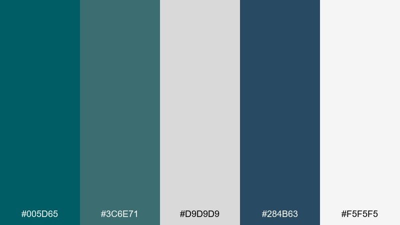
HEX: #005d65 #3c6e71 #d9d9d9 #284b63 #f5f5f5
Mood: calm, reflective, urban
Best for: blog headers and editorial landing pages
Calm rainy-day blues feel like looking through a window at a quiet street. The palette suits editorial pages, blog headers, and long-form reading where softness reduces fatigue. Pair the teal with gentle grays for backgrounds, then use the deeper blue for section dividers. Tip: keep contrast high for body text by leaning on the darkest tone for typography.
Image example of rainy window generated using media.io
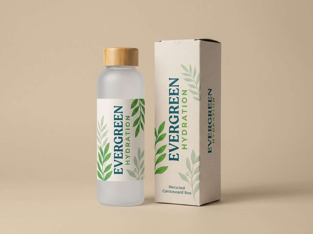
15) Forest Lagoon
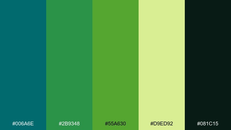
HEX: #006a6e #2b9348 #55a630 #d9ed92 #081c15
Mood: outdoorsy, lively, eco-forward
Best for: eco brands and outdoor gear packaging
Lush greens around a deep lagoon bring an outdoorsy, energized feel. It is a natural match for eco brands, trail products, and sustainability messaging. Pair the dark base with lime highlights for visibility, then keep the pale green as a soft backdrop. Tip: use the lightest green for secondary panels so the brighter greens stay readable.
Image example of forest lagoon generated using media.io
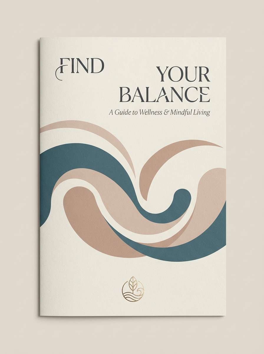
16) Sandstone Spa
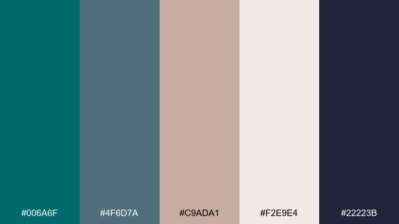
HEX: #006a6f #4f6d7a #c9ada1 #f2e9e4 #22223b
Mood: soothing, balanced, upscale
Best for: spa brochures and wellness websites
Soothing spa tones feel like warm towels and cool stone. Use it for wellness sites, brochures, and calming service menus where trust and comfort matter. Pair the muted rose-beige with dark teal for refined contrast, and keep backgrounds creamy for softness. Tip: choose one deep tone for headings and let the neutrals carry most of the page.
Image example of sandstone spa generated using media.io
17) Techno Ink
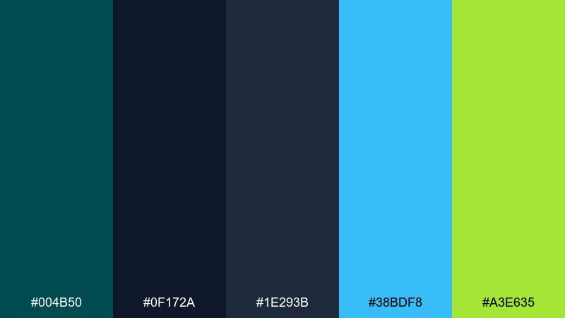
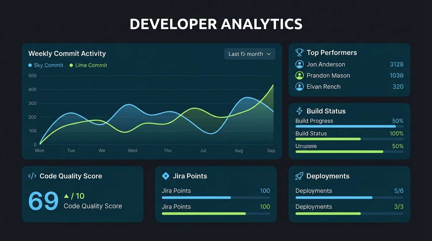
HEX: #004b50 #0f172a #1e293b #38bdf8 #a3e635
Mood: technical, bold, night mode
Best for: developer tools and SaaS dashboards
Technical night-mode ink with bright signals feels built for speed and precision. It works for developer tools, dashboards, and admin panels where status colors must stand out. Pair the lime and sky accents with plenty of dark negative space to avoid glare. Tip: map accents consistently to states like success, info, and highlight for instant scanning.
Image example of techno ink generated using media.io
18) Peacock Velvet
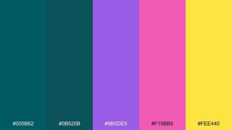
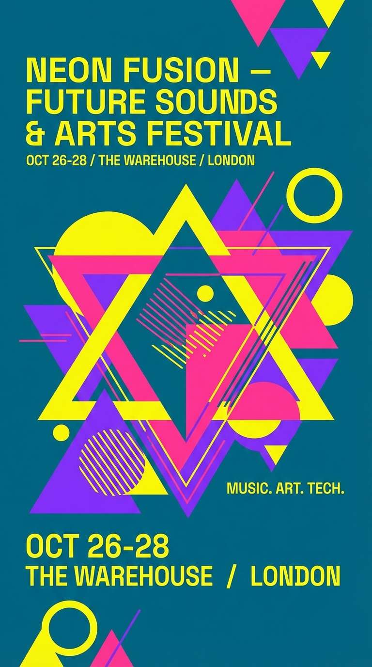
HEX: #005b62 #0b525b #9b5de5 #f15bb5 #fee440
Mood: expressive, fun, modern glam
Best for: festival flyers and bold social graphics
Expressive peacock velvet tones feel like stage lights and playful confidence. Use it for flyers, creator branding, or social campaigns that need high energy with a polished edge. Pair the dark teal with bright yellow for instant contrast, and keep pink and violet for supporting accents. Tip: use a single bright color per panel to keep layouts from getting chaotic.
Image example of peacock velvet generated using media.io
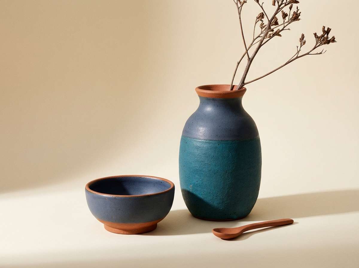
19) Coastal Clay
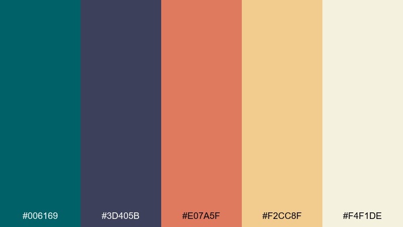
HEX: #006169 #3d405b #e07a5f #f2cc8f #f4f1de
Mood: warm coastal, handmade, inviting
Best for: home decor product ads and ceramics brands
Warm coastal clay and sea air blend into a friendly, handcrafted look. It is perfect for ceramics, home decor, and lifestyle ads that want an inviting, human touch. Pair the terracotta with the darkest teal for a balanced focal point, then soften with creamy neutrals. Tip: use the sand tone as a background to make product shapes feel warm and natural.
Image example of coastal clay generated using media.io
20) Stormlight Modern
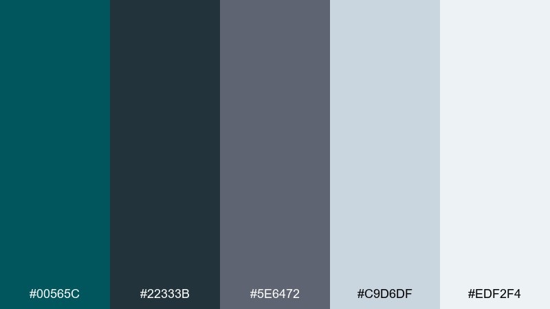
HEX: #00565c #22333b #5e6472 #c9d6df #edf2f4
Mood: cool, architectural, confident
Best for: architecture portfolios and magazine spreads
Cool stormlight tones evoke concrete, steel, and a clear, modern skyline. Use it for architecture portfolios, case studies, and print layouts where structure is the star. Pair the dark teal with pale gray-blue for elegant negative space and clean margins. Tip: let the darkest shade anchor headlines and captions while the lighter tones handle columns and grids.
Image example of stormlight modern generated using media.io
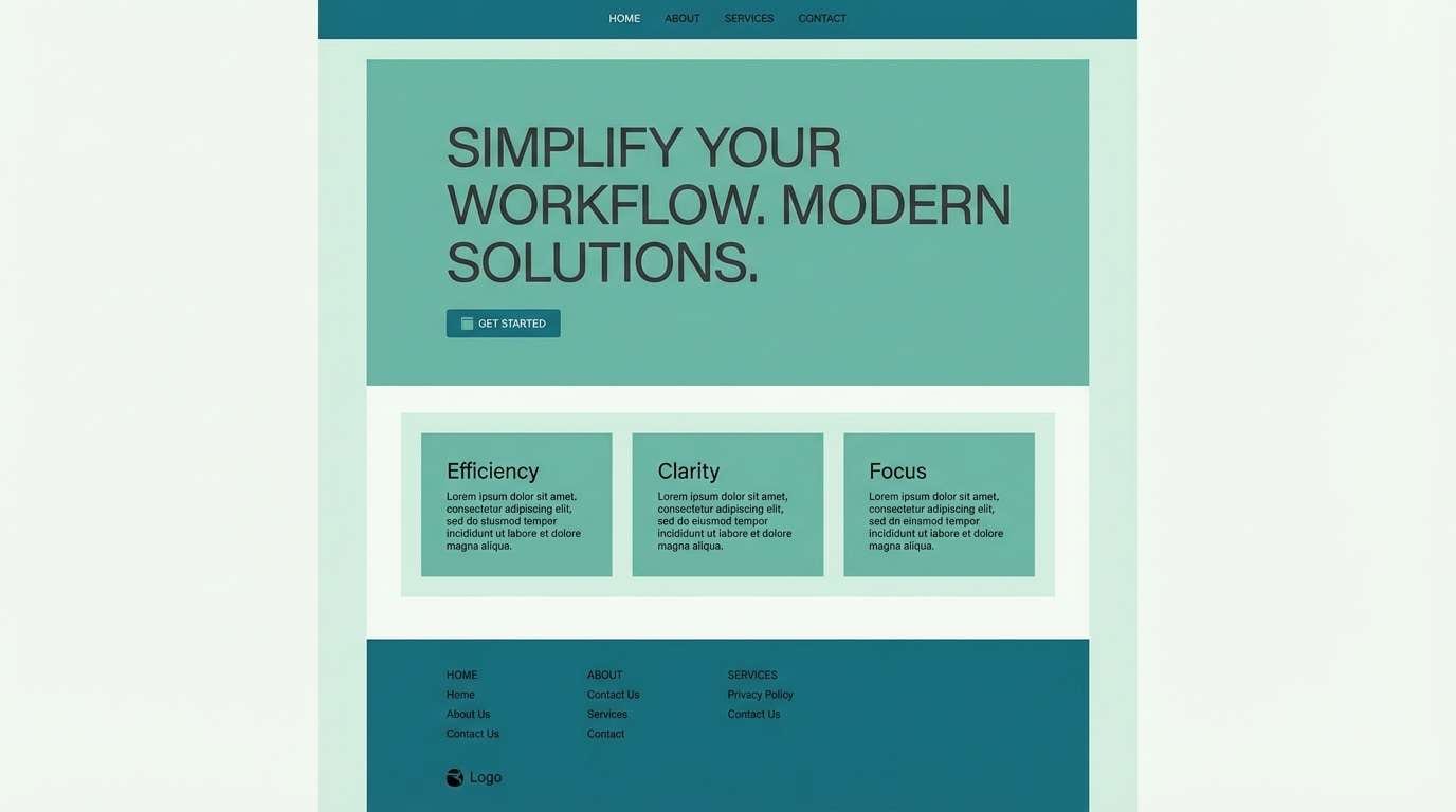
21) Seaside Monochrome
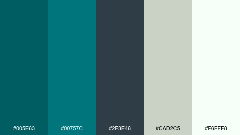
HEX: #005e63 #00757c #2f3e46 #cad2c5 #f6fff8
Mood: balanced, calm, minimalist
Best for: corporate refresh and clean landing pages
Balanced seaside tones feel minimal, steady, and quietly modern. The range of teals and soft neutrals makes it easy to build consistent sections and components. Pair the charcoal with pale minty whites for readable layouts and subtle depth. Tip: use the mid teal for cards and the darkest teal for primary CTAs to keep hierarchy clear.
Image example of seaside monochrome generated using media.io
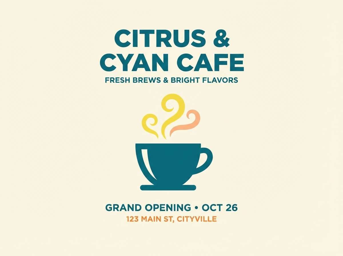
22) Citrus Harbor
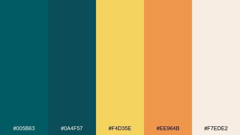
HEX: #005b63 #0a4f57 #f4d35e #ee964b #f7ede2
Mood: cheerful, zesty, approachable
Best for: cafe branding and seasonal promos
Cheerful citrus accents brighten deep harbor teal like sunlight on water. These dark cyan color combinations are great for cafes, summer promos, and friendly brands that want a crisp signature color. Pair the warm yellow with the cream for backgrounds, then use teal for logos and navigation. Tip: keep orange for small highlights so the palette stays fresh rather than loud.
Image example of citrus harbor generated using media.io
What Colors Go Well with Dark Cyan?
Neutrals are the easiest win: off-white, warm cream, light gray, slate, and charcoal help dark cyan read as intentional rather than heavy. For typography and icons, deep charcoal or near-black usually keeps contrast crisp.
Warm accents create the most attractive tension—think coral, terracotta, copper, sand, and amber. Use them as highlights (CTAs, badges, price tags, key data points) so the palette stays calm while still feeling lively.
For a cooler, modern look, pair dark cyan with mint, icy cyan, sky blue, and soft lavender. These combinations are especially strong in UI where you need clear hierarchy and comfortable backgrounds.
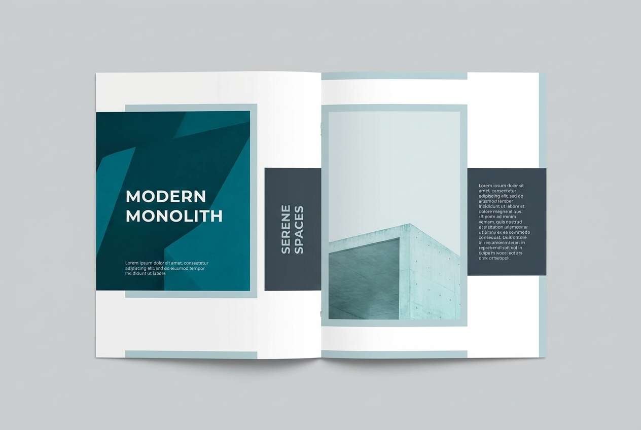
How to Use a Dark Cyan Color Palette in Real Designs
Start with roles, not just colors: pick one dark cyan as your brand anchor (navigation, primary buttons), one deep neutral for text, one light neutral for backgrounds, and one accent for emphasis. This keeps components consistent across pages and screens.
In UI, keep saturation under control and reserve the brightest tones for states (active, hover, success/info) to avoid visual noise. In print or packaging, dark cyan looks premium on matte stocks and textured materials, especially with warm metallic accents.
For interiors, dark cyan works best as an accent wall, cabinetry, or textiles, balanced with warm woods and creamy whites. Use lighter aqua tones on larger surfaces if you want the calm feel without making the space look smaller.
Create Dark Cyan Palette Visuals with AI
If you already have HEX codes, you can turn them into mood boards, UI mockups, posters, and product scenes in minutes. The fastest approach is to reuse a strong prompt and only swap the palette names or design context.
Keep your prompt specific (style, subject, lighting, layout) and let dark cyan be the “dominant” or “anchor” color. Then add one warm accent (coral/copper/amber) to guide the eye to focal points like CTAs or product labels.
Generate a few variations, pick the most on-brand composition, and then refine spacing and contrast for readability. This workflow is especially helpful when you need multiple creatives for campaigns or A/B tests.
Dark Cyan Color Palette FAQs
-
What HEX code is considered “dark cyan”?
Dark cyan usually falls around deep teal-blue values such as #005f66, #006d77, or #005f73. The exact “dark cyan” depends on whether you lean more green (teal) or more blue (cyan). -
Is dark cyan good for dark mode UI?
Yes. Dark cyan works well in dark mode because it adds color without the harshness of pure blue. Pair it with near-black backgrounds and use pale icy tints for text, icons, and chart highlights. -
What accent colors pair best with dark cyan?
Warm accents like coral, terracotta, copper, amber, and sand create strong contrast and feel inviting. For a cooler look, use mint, icy cyan, sky blue, or soft violet as secondary accents. -
How do I keep dark cyan from looking muddy?
Give it enough clean space (off-white or light gray), avoid stacking multiple deep tones together, and reserve the darkest near-black for typography. Also keep gradients subtle so the teal stays rich. -
Can dark cyan work for professional branding?
Absolutely. Dark cyan often reads as trustworthy and modern, especially when paired with slate/gray neutrals. It’s a strong option for B2B sites, service brands, and pitch decks. -
What’s a safe text color on dark cyan backgrounds?
For headings and UI labels, off-white (#f7f7f2, #f8fafc) is typically safe. For accessibility, always check contrast ratios—sometimes an even lighter near-white is needed for smaller text. -
How many colors should I use from a dark cyan palette?
For most designs, 3–5 is enough: one dark cyan anchor, one deep neutral for text, one light neutral for background, and 1–2 accents. This keeps hierarchy clear and makes layouts easier to scale.
Next: Pink Cream Color Palette


