

Greek mythology palettes blend stone, sea, and sun into a visual language that feels instantly timeless. Think marble temples, Aegean blues, olive groves, bronze armor, and torchlit shadows.
Below are 20 curated greek mythology color palette ideas with HEX codes, plus AI-ready prompts you can use to generate matching visuals for branding, UI, print, and more.
In this article
Why Greek Mythology Palettes Work So Well
Greek mythology color schemes feel “designed by history”: cool stone neutrals, sea-driven blues, olive greens, and sun-warmed terracotta have built-in harmony because they come from real materials and landscapes.
They also scale across moods. You can go bright and heroic (navy, crimson, gold), calm and classical (marble and teal), or dark and cinematic (obsidian and steel) without losing the mythic vibe.
Most importantly, these palettes support strong typography and simple shapes. That makes them perfect for modern branding, UI design, posters, editorial layouts, and packaging that needs to look premium and timeless.
20+ Greek Mythology Color Palette Ideas (with HEX Codes)
1) Aegean Marble
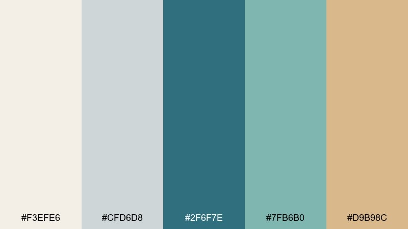
HEX: #f3efe6 #cfd6d8 #2f6f7e #7fb6b0 #d9b98c
Mood: calm, airy, classical
Best for: minimal brand identity and web headers
Calm and sunlit, this mix feels like marble steps above an Aegean harbor. Use the blue-green tones as your primary UI color and let the warm sand accent highlight buttons or icons. It works beautifully with clean serif type and lots of whitespace. Tip: keep the darkest teal for text or nav to preserve contrast without going harsh.
Image example of aegean marble generated using media.io
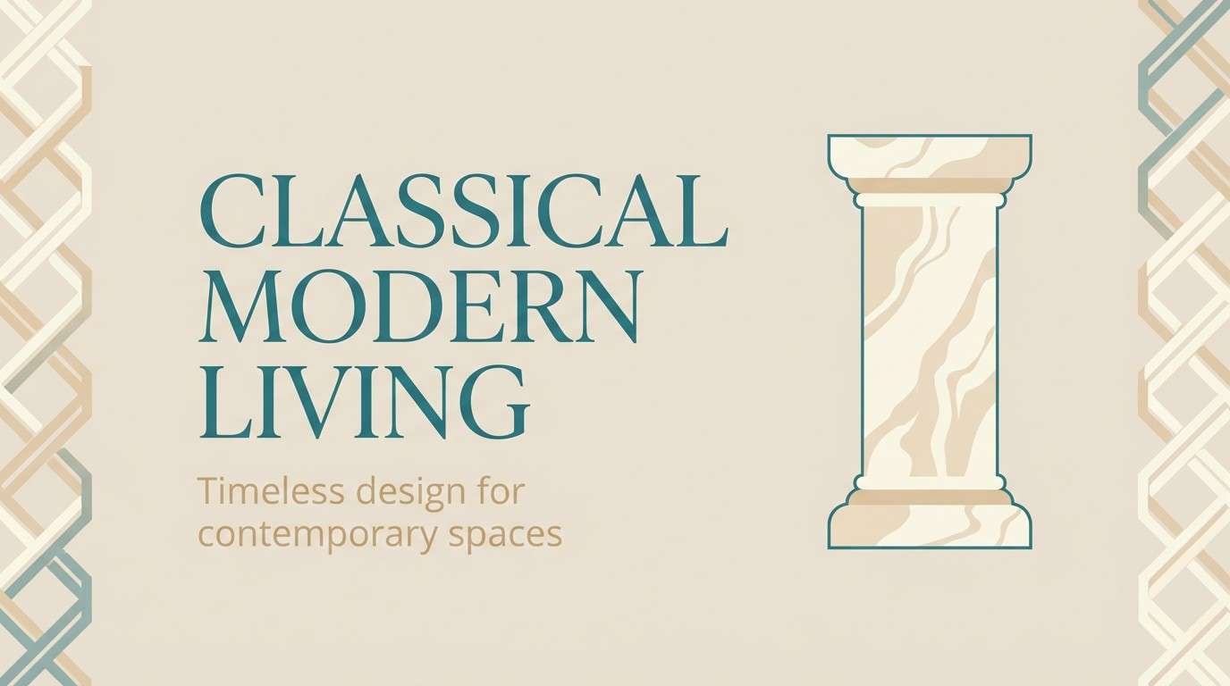
Media.io is an online AI studio for creating and editing video, image, and audio in your browser.

2) Olympian Gold
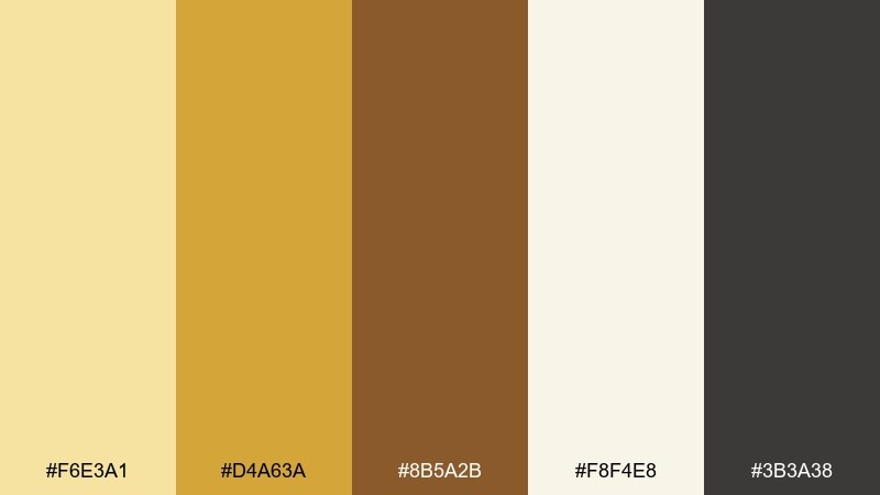
HEX: #f6e3a1 #d4a63a #8b5a2b #f8f4e8 #3b3a38
Mood: regal, warm, ceremonial
Best for: luxury packaging and premium product ads
Regal and ceremonial, these tones evoke gilded crowns, torchlight, and polished bronze. Make gold the hero for logos and seals, then ground it with deep charcoal for type and barcodes. The cream keeps the look expensive rather than loud. Tip: use metallic foil only as a small accent so the browns still feel rich and historical.
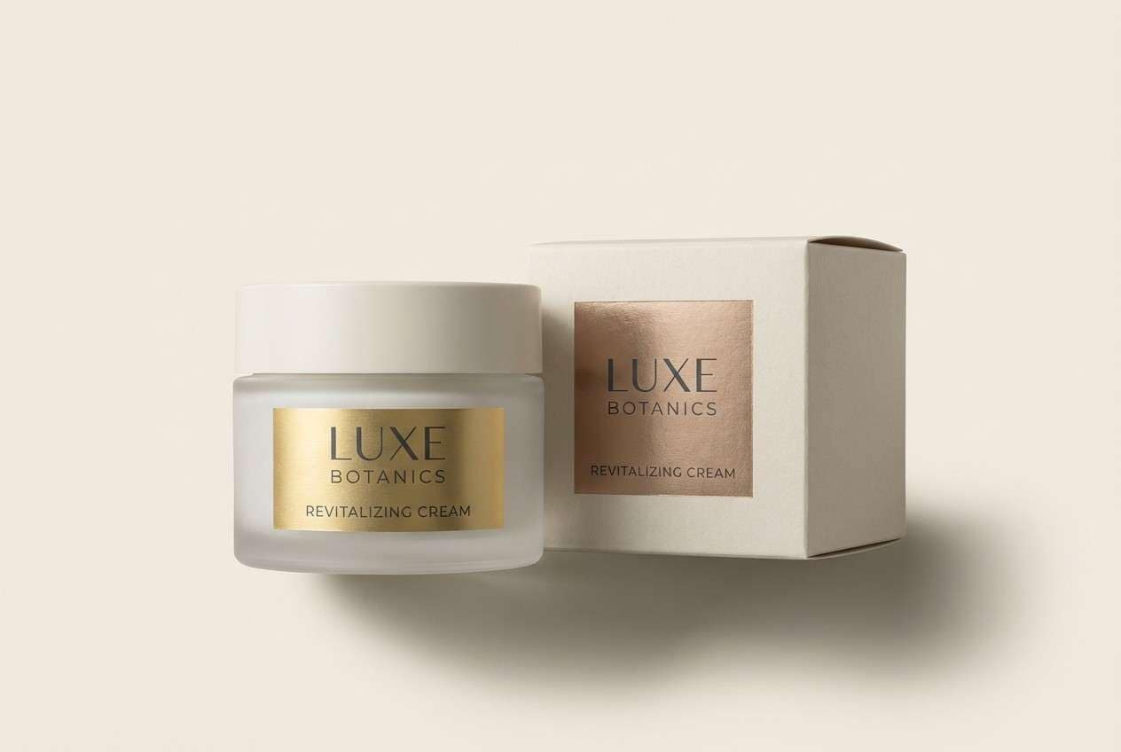
Image example of olympian gold generated using media.io
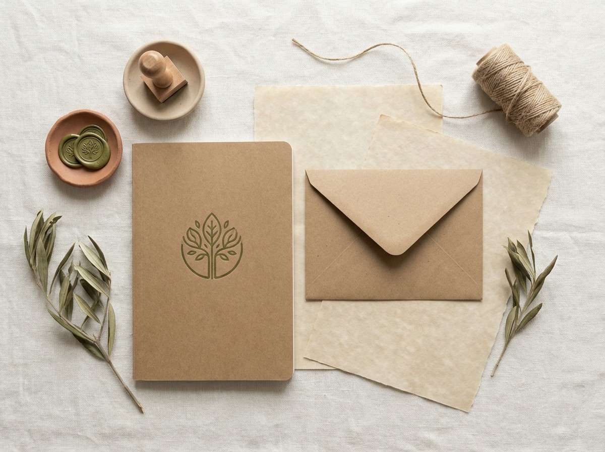
3) Athena Olive
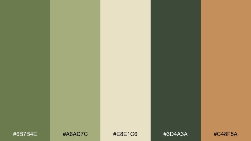
HEX: #6b7b4e #a6ad7c #e8e1c6 #3d4a3a #c48f5a
Mood: wise, earthy, grounded
Best for: eco brands, cafes, and stationery
Wise and grounded, this palette feels like olive groves, parchment, and sun-baked stone. Use the darker greens for headings and marks, and let the parchment beige carry backgrounds and packaging. A touch of clay warmth adds friendliness without breaking the natural vibe. Tip: pair with textured paper or subtle grain to amplify the handcrafted feel.
Image example of athena olive generated using media.io
4) Dionysus Wine
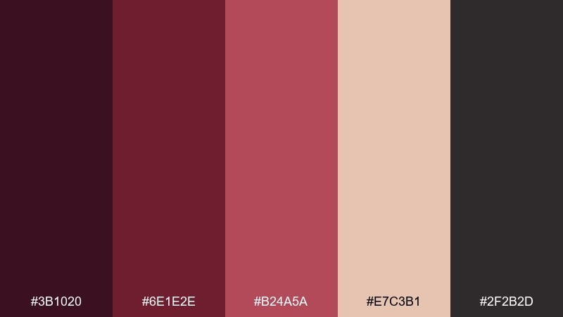
HEX: #3b1020 #6e1e2e #b24a5a #e7c3b1 #2f2b2d
Mood: dramatic, lush, nocturnal
Best for: event posters and nightlife branding
Dramatic and lush, these reds read like wine-dark velvet under candlelight. For a bolder greek mythology color palette, push the deep burgundy as your background and reserve blush for highlights and faces. Charcoal keeps the layout modern and stops the reds from feeling too sweet. Tip: use large blocks of dark color and minimal line art for instant impact.
Image example of dionysus wine generated using media.io

5) Poseidon Deep Sea
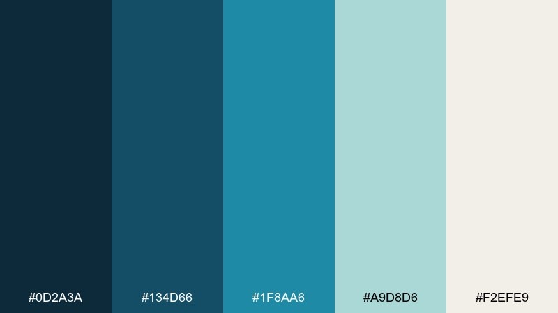
HEX: #0d2a3a #134d66 #1f8aa6 #a9d8d6 #f2efe9
Mood: powerful, cool, oceanic
Best for: travel sites and maritime app UI
Powerful and oceanic, these blues evoke deep water, sea spray, and carved stone docks. Use the darkest navy for navigation and accessibility, then layer the brighter cyan for calls to action. The pale aqua is perfect for cards, charts, and calm section breaks. Tip: keep gradients subtle so the palette stays crisp and nautical rather than neon.
Image example of poseidon deep sea generated using media.io
6) Artemis Moonlit Grove
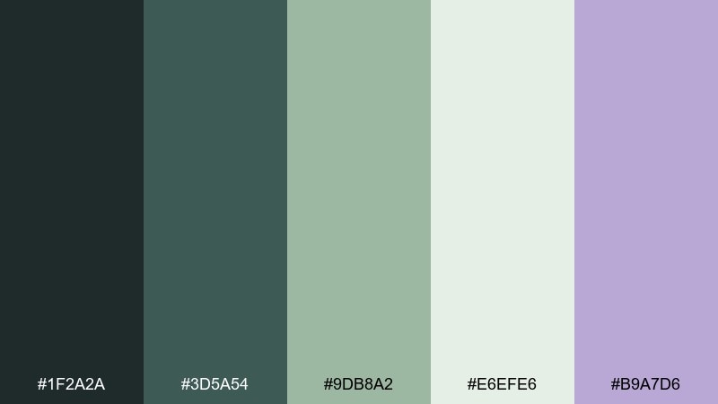
HEX: #1f2a2a #3d5a54 #9db8a2 #e6efe6 #b9a7d6
Mood: mystical, quiet, nocturne
Best for: wellness branding and meditation apps
Mystical and quiet, these hues feel like a moonlit grove with misty greens and a soft violet glow. Let the pale minty white open up screens, then use the forest tones for structure and legibility. The lavender is an elegant accent for badges, tabs, or highlights. Tip: pair with thin-line illustrations to keep the mood serene, not heavy.
Image example of artemis moonlit grove generated using media.io
7) Apollo Sunstone
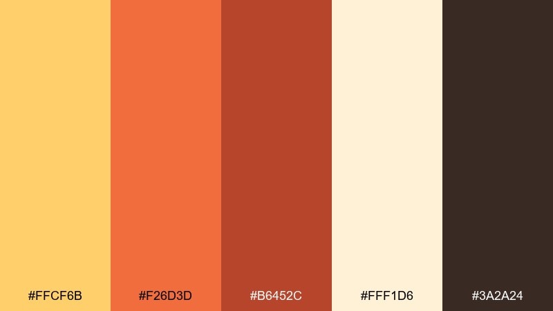
HEX: #ffcf6b #f26d3d #b6452c #fff1d6 #3a2a24
Mood: radiant, energetic, optimistic
Best for: summer campaigns and creator branding
Radiant and optimistic, these tones look like sunlight on terracotta and warm limestone. If you want greek mythology color combinations that feel modern, make the butter yellow your main field and use burnt orange for punchy headlines. The dark cocoa adds grounding for type and outlines. Tip: keep accents to one warm hue per layout to avoid visual noise.
Image example of apollo sunstone generated using media.io

8) Hades Obsidian
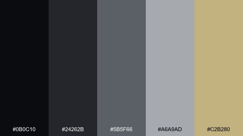
HEX: #0b0c10 #24262b #5b5f66 #a6a9ad #c2b280
Mood: shadowy, intense, cinematic
Best for: dark mode UI and thriller book covers
Shadowy and cinematic, these blacks and steels evoke volcanic glass and underground halls. Use the obsidian and graphite for dark mode surfaces, then reserve stone gray for typography and dividers. The muted gold-beige is a sharp accent for icons, ratings, or key calls to action. Tip: keep the accent under 10 percent so the interface stays sleek, not flashy.
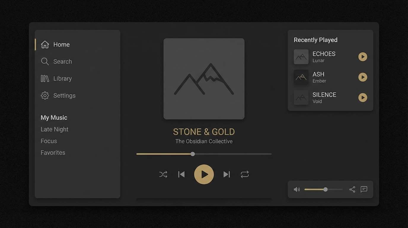
Image example of hades obsidian generated using media.io
9) Siren Coral
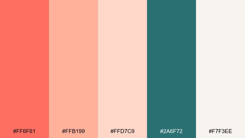
HEX: #ff6f61 #ffb199 #ffd7c9 #2a6f72 #f7f3ee
Mood: playful, coastal, inviting
Best for: beauty launches and lifestyle newsletters
Playful and coastal, coral and sea-teal create a breezy, siren-song contrast. Use coral for primary buttons and headlines, then calm it down with blush and warm off-white backgrounds. The teal is ideal for secondary actions and links, keeping the layout balanced. Tip: add plenty of breathing room so the coral reads fresh, not crowded.
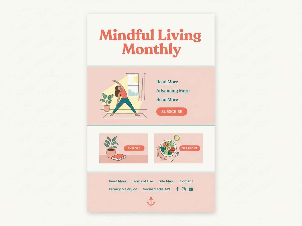
Image example of siren coral generated using media.io
10) Oracle Smoke
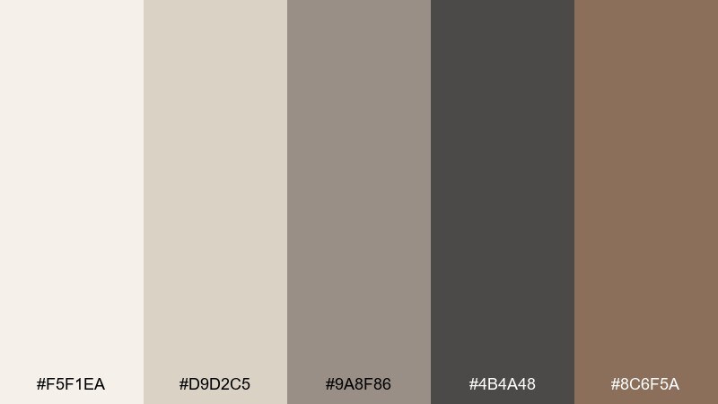
HEX: #f5f1ea #d9d2c5 #9a8f86 #4b4a48 #8c6f5a
Mood: mysterious, refined, timeless
Best for: editorial layouts and museum brochures
Mysterious and refined, these smoky neutrals feel like incense, stone walls, and aged scrolls. As a greek mythology color scheme, it shines in editorial grids where typography does the storytelling. Use charcoal for body text, warm taupe for captions, and parchment tones for generous margins. Tip: add one spot color in small doses, like an initial cap, to keep it quietly premium.
Image example of oracle smoke generated using media.io
11) Spartan Bronze
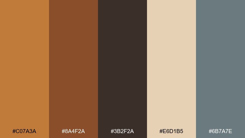
HEX: #c07a3a #8a4f2a #3b2f2a #e6d1b5 #6b7a7e
Mood: tough, disciplined, rugged
Best for: sports branding and heritage labels
Tough and disciplined, these bronzes and leathers evoke worn shields and training grounds. Use the deep brown for strong wordmarks and the bronze for highlights, badges, and borders. The pale tan can open up negative space without losing the rugged tone. Tip: pair with condensed type and simple geometry for a bold, athletic finish.
Image example of spartan bronze generated using media.io
12) Cycladic Whitewash
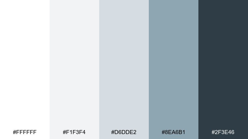
HEX: #ffffff #f1f3f4 #d6dde2 #8ea6b1 #2f3e46
Mood: crisp, modern, coastal
Best for: clean UI systems and architecture portfolios
Crisp and coastal, these whites and blue-grays feel like sun-bleached walls and distant sea haze. Use off-white and cool gray for backgrounds, then bring in slate for navigation and key text. The darkest blue-gray gives you reliable contrast for accessibility. Tip: add subtle shadows and thin dividers instead of heavy borders to keep it airy.
Image example of cycladic whitewash generated using media.io

13) Delphi Laurel
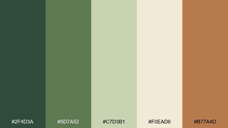
HEX: #2f4d3a #5d7a52 #c7d3b1 #f0ead6 #b77a4d
Mood: natural, honored, ceremonial
Best for: awards certificates and academic events
Natural and honored, laurel greens meet parchment and clay like a wreath laid on old stone. Use deep green for titles and borders, and keep the parchment as the main canvas for readability. The warm brown makes an elegant seal, stamp, or ribbon accent. Tip: introduce a laurel motif in a single corner so the design stays clean.
Image example of delphi laurel generated using media.io
14) Medusa Jade
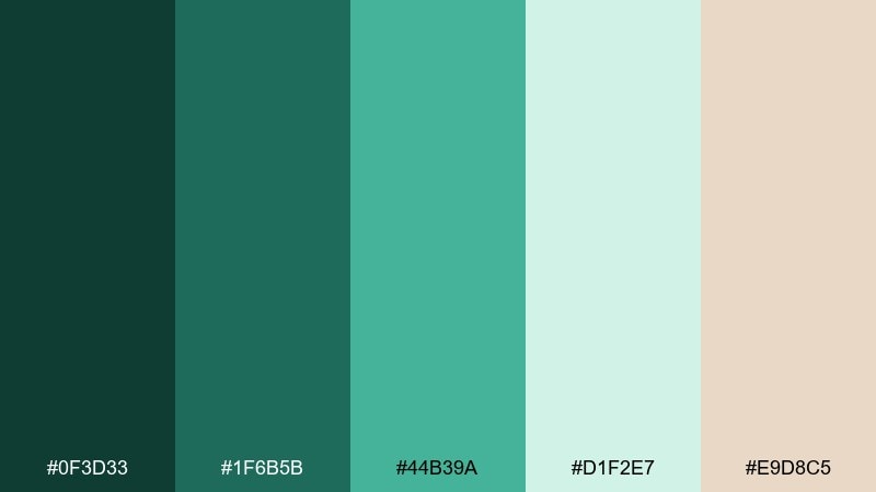
HEX: #0f3d33 #1f6b5b #44b39a #d1f2e7 #e9d8c5
Mood: bold, alluring, modern
Best for: beauty packaging and statement posters
Bold and alluring, jade and seafoam create a hypnotic, jewel-toned look. Use deep green as the foundation, then let the bright aqua-green pop for logos, product names, or hero shapes. The soft mint and warm nude keep the palette wearable and balanced. Tip: pair with high-contrast photography or sharp silhouettes to amplify the drama.
Image example of medusa jade generated using media.io
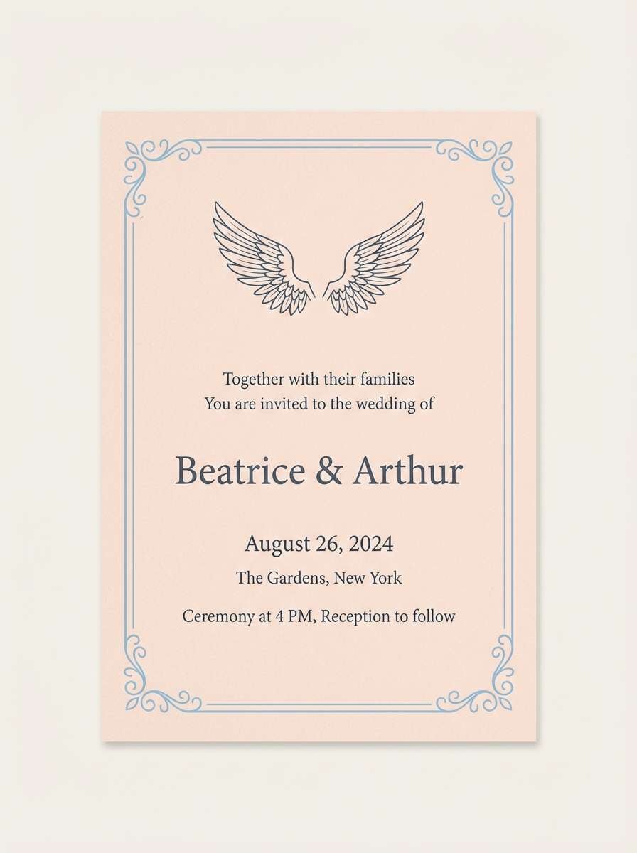
15) Pegasus Dawn
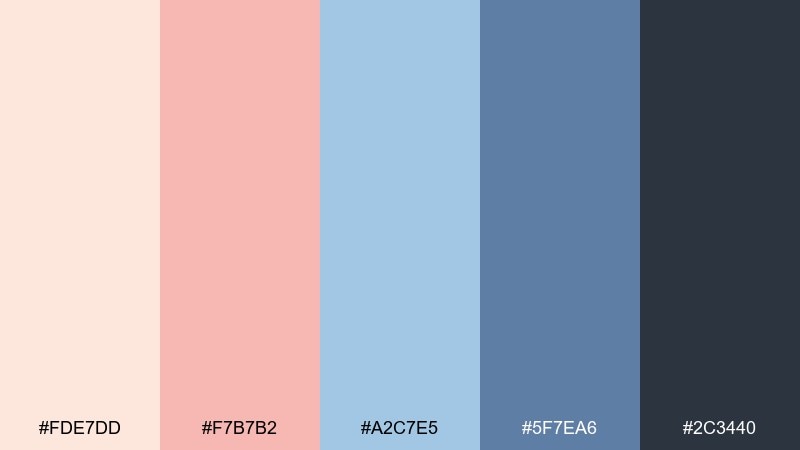
HEX: #fde7dd #f7b7b2 #a2c7e5 #5f7ea6 #2c3440
Mood: dreamy, hopeful, airy
Best for: wedding invitations and soft lifestyle brands
Dreamy and hopeful, blush sunrise meets cool sky blues for a light, uplifting feel. As a softer greek mythology color palette, it suits invitations, lookbooks, and gentle brand stories without feeling childish. Use navy-gray for typography, blush for accents, and pale peach as your paper-like base. Tip: add a single foil detail in muted silver to echo the sky tones.
Image example of pegasus dawn generated using media.io
16) Minotaur Labyrinth
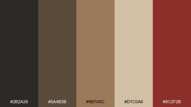
HEX: #2b2a28 #5a4b3b #9b7a5c #d1c0a6 #8c2f2b
Mood: ancient, gritty, suspenseful
Best for: game UI and fantasy book covers
Ancient and suspenseful, these earth and blood tones recall torchlit corridors and carved maze walls. Use charcoal and umber as the base for menus or cover backgrounds, then draw attention with the deep red as a signal color. The sandy tan helps highlight maps, cards, and UI panels. Tip: keep textures subtle so the palette stays readable at small sizes.
Image example of minotaur labyrinth generated using media.io
17) Titan Storm
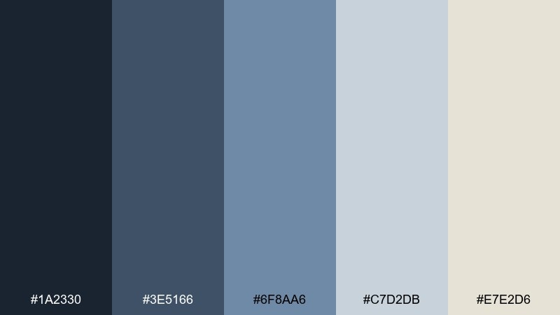
HEX: #1a2330 #3e5166 #6f8aa6 #c7d2db #e7e2d6
Mood: epic, cool, weathered
Best for: corporate decks and cinematic title cards
Epic and weathered, these stormy blues feel like carved cliffs under heavy clouds. Use the darkest blue for titles and section dividers, and the mid blues for charts and icons. The pale gray-blue and warm off-white keep slides bright and professional. Tip: limit gradients and stick to solid blocks for a confident, modern finish.
Image example of titan storm generated using media.io
18) Nymph Spring
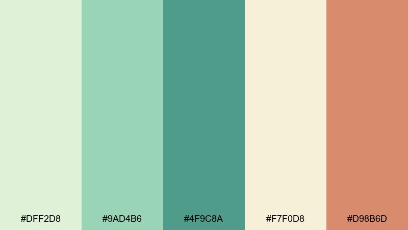
HEX: #dff2d8 #9ad4b6 #4f9c8a #f7f0d8 #d98b6d
Mood: fresh, gentle, botanical
Best for: botanical illustrations and spa promos
Fresh and gentle, these greens and soft peach feel like a hidden spring surrounded by herbs. For greek mythology color combinations that lean pastoral, use mint and soft green washes as your base and bring in coral-peach for small focal points. The creamy yellow keeps everything warm and friendly. Tip: watercolor textures work best here, especially for leaves and flowing shapes.
Image example of nymph spring generated using media.io
19) Heroic Banner
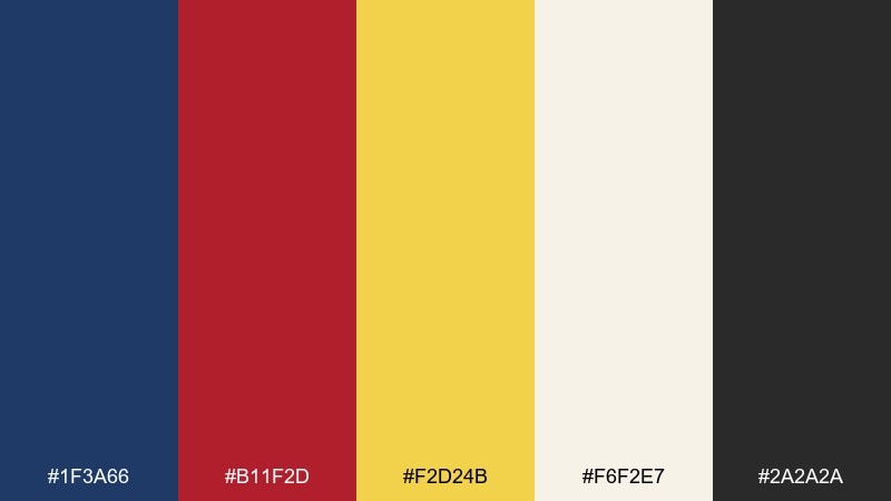
HEX: #1f3a66 #b11f2d #f2d24b #f6f2e7 #2a2a2a
Mood: bold, triumphant, graphic
Best for: sports posters and bold campaign graphics
Bold and triumphant, navy, crimson, and gold read like a parade banner snapping in the wind. Use navy as the anchor, then reserve crimson for key messages and gold for badges or calls to action. The warm off-white keeps the palette from feeling too heavy on print. Tip: use large typography and simple shapes so the colors do the shouting.
Image example of heroic banner generated using media.io

20) Temple Fresco
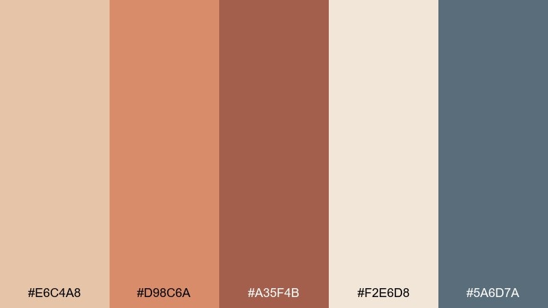
HEX: #e6c4a8 #d98c6a #a35f4b #f2e6d8 #5a6d7a
Mood: historic, warm, artisanal
Best for: restaurant menus and cultural flyers
Historic and artisanal, these terracotta and plaster tones feel like a weathered wall painting in late afternoon light. Use the creamy plaster as the menu base, terracotta for section headers, and the dusty blue-gray for small rules and details. It pairs well with hand-drawn icons and textured paper stocks. Tip: keep photos warm-toned so the palette stays cohesive across pages.
Image example of temple fresco generated using media.io
What Colors Go Well with Greek Mythology?
Greek mythology colors pair best when you balance “material” neutrals (marble whites, parchment beiges, stone grays) with one strong mythic accent (Aegean teal, laurel green, bronze gold, or wine red). This keeps designs grounded but memorable.
For cooler looks, combine navy and teal with soft off-whites—great for UI, travel, and editorial. For warmer looks, terracotta, clay, and gold feel instantly ancient and artisanal, especially on textured backgrounds.
If you want contrast that still feels classical, try charcoal or deep navy as your anchor color, then use a restrained metallic-like accent (muted gold-beige) for icons, badges, or highlights.
How to Use a Greek Mythology Color Palette in Real Designs
Start with a clear hierarchy: pick one base (marble/cream), one primary (navy/teal/olive), and one accent (gold/coral/crimson). This mirrors temple architecture—large calm surfaces with small, intentional ornament.
For branding, keep the accent color scarce so it reads like a seal, coin, or laurel mark. For UI, reserve your brightest hue for CTAs and keep text on reliable dark neutrals for accessibility.
For print pieces (menus, brochures, invitations), add subtle texture—paper grain, fresco wash, or stone speckle—so the palette feels tactile and historical instead of flat.
Create Greek Mythology Palette Visuals with AI
If you already have HEX codes, you can generate on-brand images by describing the subject (poster, packaging, UI, invitation) and the mood (ceremonial, oceanic, moonlit) while referencing your key colors (teal marble, bronze, parchment).
Media.io makes it easy to turn these palette prompts into consistent visuals for campaigns, mockups, and social content—without complex setup.
Use the prompts above as templates, then swap the product type, layout, and lighting to match your project.
Greek Mythology Color Palette FAQs
-
What are the best greek mythology colors for a modern brand?
Start with marble/off-white and stone gray as your foundation, then add one signature accent like Aegean teal (#2f6f7e) or muted gold-beige (#c2b280). This combination feels classical but still clean and modern. -
Which greek mythology color scheme works for dark mode UI?
Use Hades Obsidian: deep blacks (#0b0c10) and graphite (#24262b) for surfaces, with stone gray (#a6a9ad) for readable text and a small muted gold accent (#c2b280) for key actions. -
What colors look “ancient Greece” without feeling costume-like?
Lean into natural materials: parchment (#f5f1ea), olive greens (#6b7b4e), terracotta (#d98c6a), and bronze browns (#8a4f2a). Keep saturation moderate and rely on texture and typography for character. -
How do I choose a hero color from a greek mythology color palette?
Pick the color you want users to remember first (often teal, navy, laurel green, or gold). Then assign the light neutral as the background and keep the darkest tone for text/navigation to maintain contrast. -
What’s a strong greek mythology palette for posters and campaigns?
Heroic Banner is made for bold graphics: navy (#1f3a66), crimson (#b11f2d), and gold (#f2d24b) on warm off-white (#f6f2e7). Use big type and simple shapes so the colors carry the message. -
Which palette is best for editorial or museum-style layouts?
Oracle Smoke works beautifully for long-form typography: parchment (#f5f1ea) and warm neutrals (#d9d2c5, #9a8f86) with charcoal (#4b4a48) for text. Add the warm brown (#8c6f5a) as a subtle highlight. -
Can I generate matching images for my greek mythology color combinations?
Yes. Use Media.io’s text-to-image tool and include the intended design type (UI, poster, packaging) plus a short mood description (classical, moonlit, ceremonial). Then reference your dominant colors (e.g., marble cream, teal, sand) to keep outputs consistent.
Next: Urban Color Palette


