

Lava palettes sit in that sweet spot between smoky neutrals and high-heat accents—perfect when you want designs to feel bold without turning neon.
From basalt blacks and ash browns to ember oranges and peach highlights, these combinations translate well across branding, UI, packaging, and posters.
In this article
Why Lava Palettes Work So Well
Lava color schemes are naturally high-contrast: deep charcoals and wine reds create a strong base, while ember oranges deliver instant focus for CTAs, labels, and key information.
They also feel “premium” because the palette leans warm and muted—more basalt and ash than pure primary red—so the intensity reads cinematic instead of cartoonish.
Finally, lava palettes are flexible: you can dial them up for nightlife posters and sports graphics, or soften them with creams and warm neutrals for packaging and editorial layouts.
20+ Lava Color Palette Ideas (with HEX Codes)
1) Molten Core
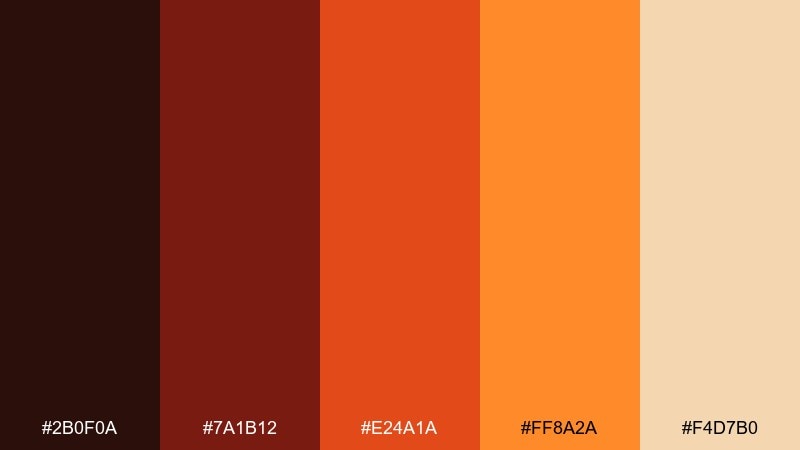
HEX: #2b0f0a #7a1b12 #e24a1a #ff8a2a #f4d7b0
Mood: intense and radiant
Best for: brand hero banners
Intense and radiant, it reads like a cracked crust glowing from within. This lava color palette works best when the darkest shade holds headlines and the bright orange becomes your call to action. Pair it with warm paper whites and keep gradients subtle so it stays premium, not noisy. Tip: reserve the pale sand tone for spacing and highlights to prevent the reds from feeling heavy.
Image example of molten core generated using media.io
Media.io is an online AI studio for creating and editing video, image, and audio in your browser.

2) Basalt Ember
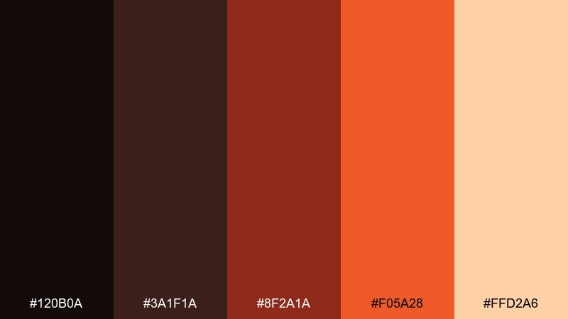
HEX: #120b0a #3a1f1a #8f2a1a #f05a28 #ffd2a6
Mood: grounded and bold
Best for: streetwear logo and labels
Grounded and bold, these tones feel like hot sparks against cooled basalt. Use the near-black for crisp wordmarks and let the orange carry small accents like stitches, tags, and icons. It pairs naturally with kraft textures or matte black substrates for an elevated look. Tip: keep the peach highlight minimal so the palette stays tough and modern.
Image example of basalt ember generated using media.io
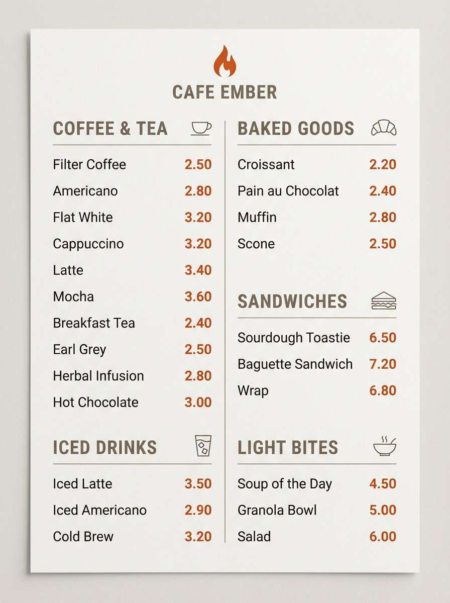
3) Ashen Glow
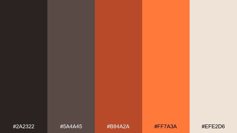
HEX: #2a2322 #5a4a45 #b84a2a #ff7a3a #efe2d6
Mood: smoky and inviting
Best for: coffee shop menus
Smoky and inviting, it resembles ember light through a haze of ash. The warm gray-browns make excellent text and section dividers, while the orange adds appetite and energy. Pair it with off-white paper and simple line icons for readability. Tip: use orange only for prices and key calls so the menu stays calm.
Image example of ashen glow generated using media.io
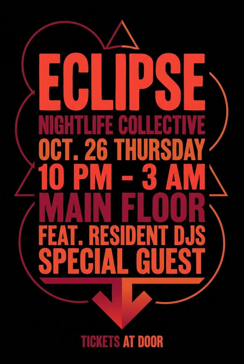
4) Obsidian Heat
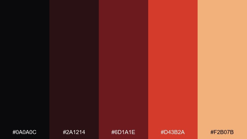
HEX: #0a0a0c #2a1214 #6d1a1e #d43b2a #f2b07b
Mood: dramatic and luxe
Best for: nightlife posters
Dramatic and luxe, it feels like a dark club lit by volcanic neon. Build contrast with the obsidian base and use the red-orange for typography that pops from a distance. Creamy peach works well for secondary details like dates and venue info. Tip: add plenty of negative space so the poster reads fast at street speed.
Image example of obsidian heat generated using media.io
5) Spice Crater
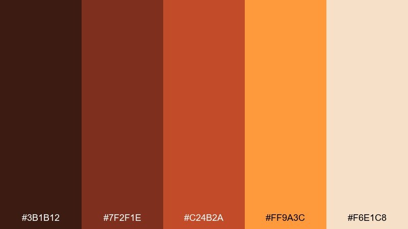
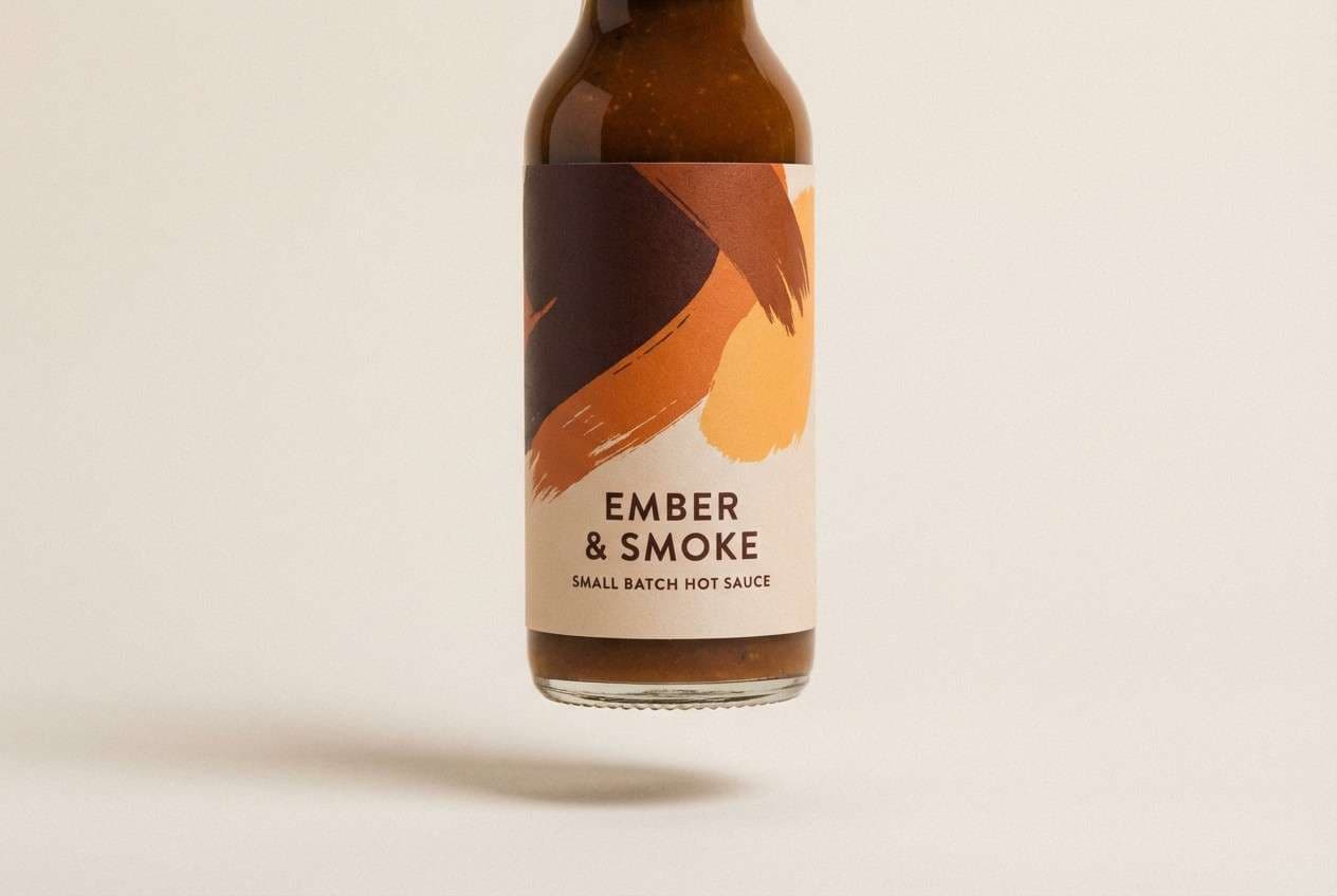
HEX: #3b1b12 #7f2f1e #c24b2a #ff9a3c #f6e1c8
Mood: warm and appetizing
Best for: sauce bottle packaging
Warm and appetizing, it looks like roasted spices swirling near a glowing crater. These lava color combinations are ideal for food packaging because the orange reads flavorful without going neon. Pair with cream labels and a deep brown for ingredient text to keep it legible. Tip: use the brightest orange only for flavor badges or heat-level markers.
Image example of spice crater generated using media.io
6) Cinder Rose
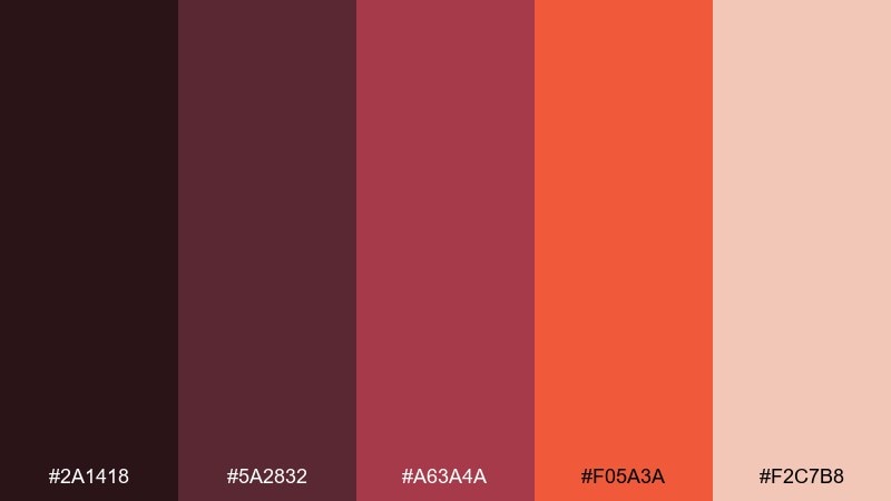
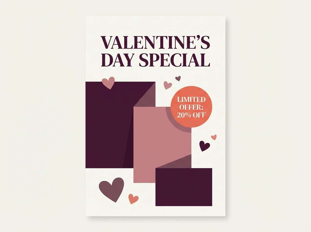
HEX: #2a1418 #5a2832 #a63a4a #f05a3a #f2c7b8
Mood: romantic and fiery
Best for: valentine promos
Romantic and fiery, it blends rosy smoke with a flash of heat. Use the darker plum tones for backgrounds and let the coral-orange drive buttons and discount bursts. It pairs nicely with soft cream paper and delicate serif type for a modern romantic feel. Tip: keep gradients gentle so the reds stay elegant, not loud.
Image example of cinder rose generated using media.io
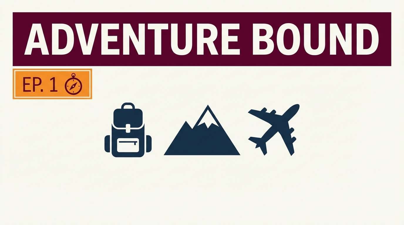
7) Sunset Magma
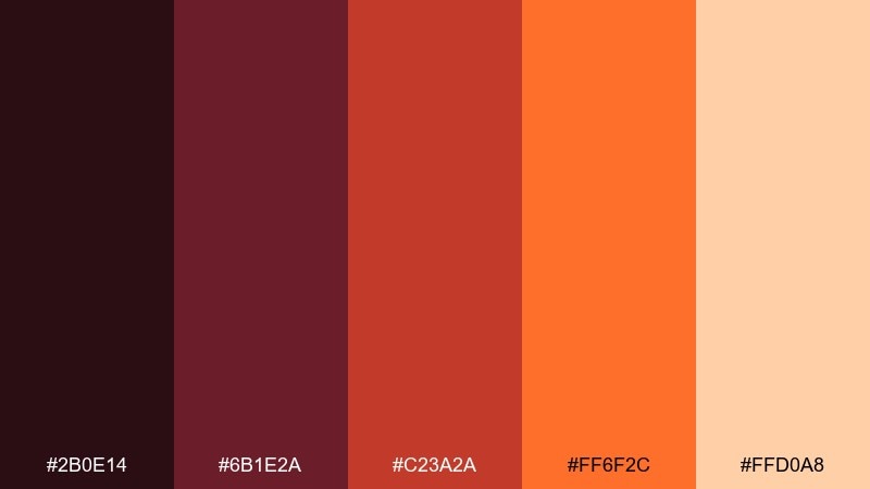
HEX: #2b0e14 #6b1e2a #c23a2a #ff6f2c #ffd0a8
Mood: energetic and cinematic
Best for: travel thumbnails
Energetic and cinematic, it recalls a horizon glowing over dark rock. The deep wine shade anchors title bars while the orange drives attention for badges and tags. Pair with clean white space and high-contrast typography to keep small thumbnails readable. Tip: use the light peach as a thin outline to separate elements on dark backgrounds.
Image example of sunset magma generated using media.io
8) Iron Furnace
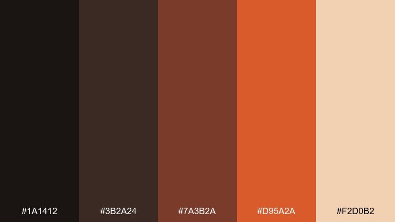
HEX: #1a1412 #3b2a24 #7a3b2a #d95a2a #f2d0b2
Mood: industrial and warm
Best for: workshop branding
Industrial and warm, it feels like forged metal catching a fresh spark. The charcoal browns provide sturdy foundations for logos and signage, while the orange reads energetic and hands-on. Pair with simple geometric icons and uncoated paper stock for a crafted look. Tip: keep the light beige for backgrounds so the darker tones stay readable.
Image example of iron furnace generated using media.io
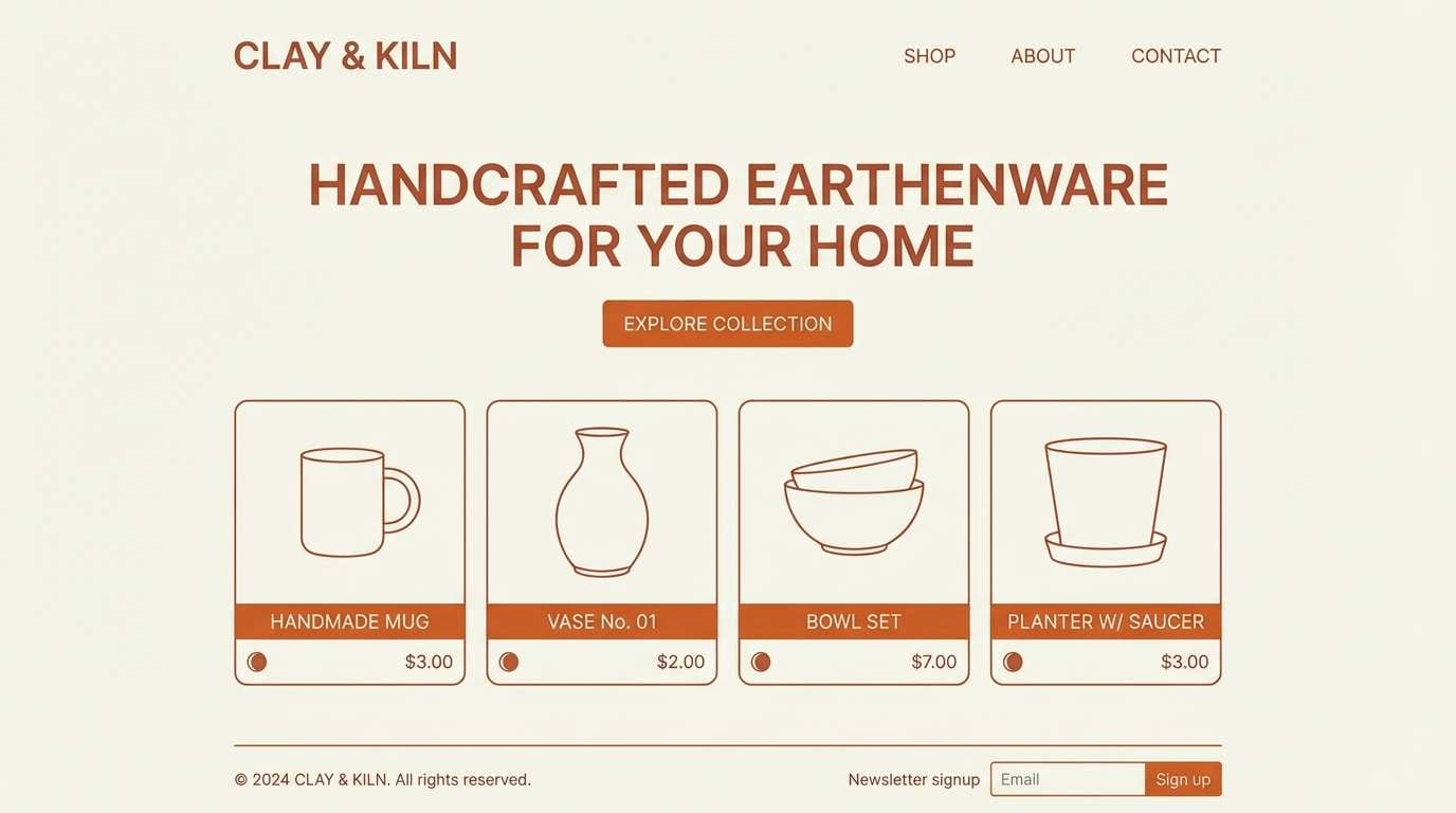
9) Ember Clay
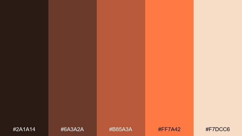
HEX: #2a1a14 #6a3a2a #b85a3a #ff7a42 #f7dcc6
Mood: earthy and artisan
Best for: ceramics shop website
Earthy and artisan, it evokes clay kilns and soft heat. These lava color combinations shine in web sections where you want warmth without overwhelming product photos. Pair the mid terracotta with off-white UI surfaces and keep the orange for hover states. Tip: choose a single accent shade for buttons and repeat it consistently across pages.
Image example of ember clay generated using media.io
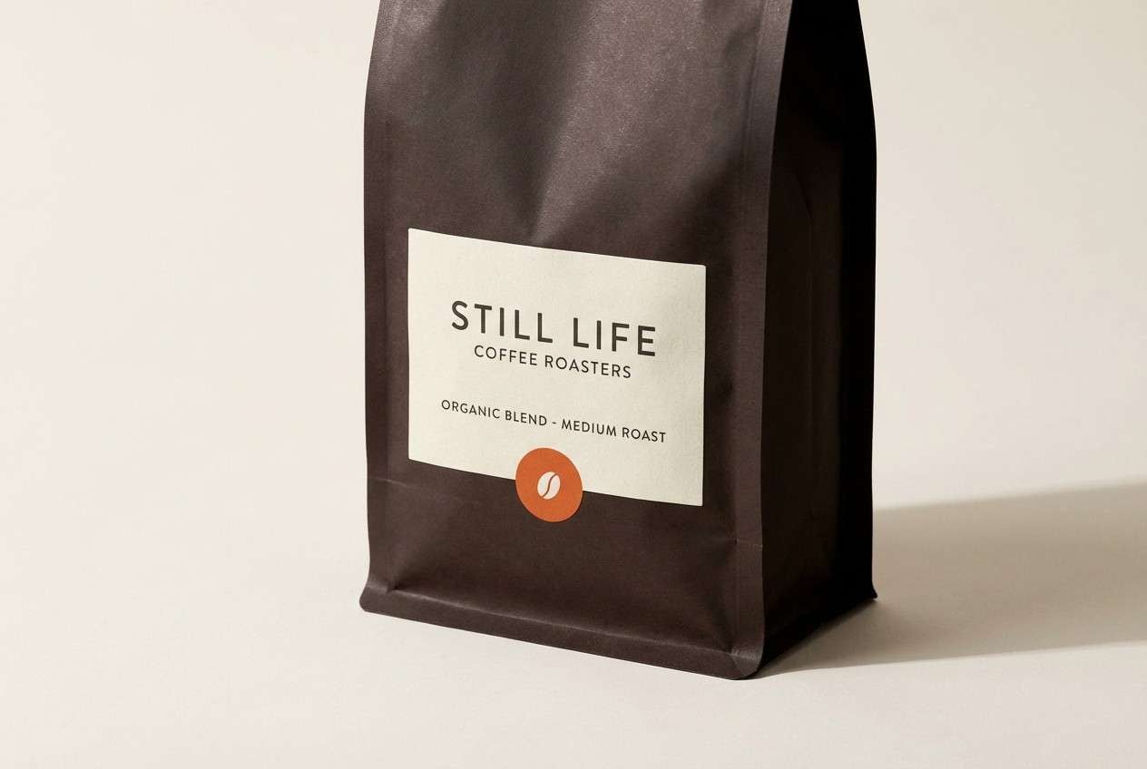
10) Volcanic Mocha
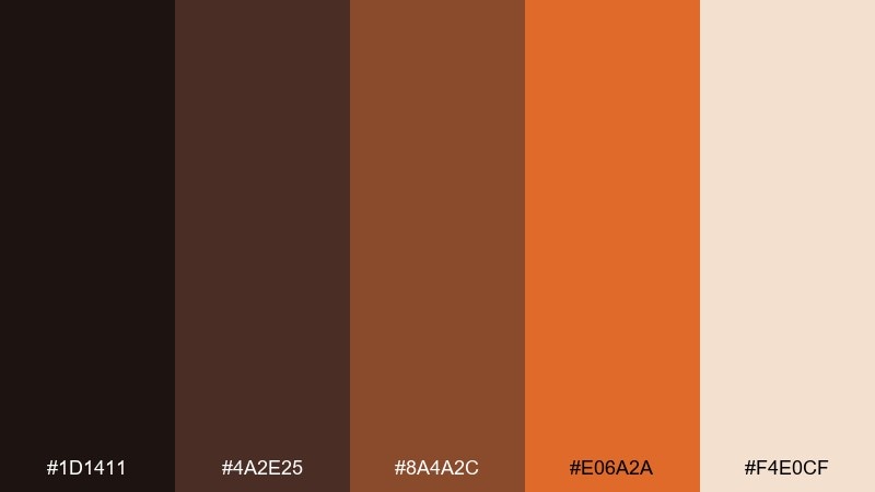
HEX: #1d1411 #4a2e25 #8a4a2c #e06a2a #f4e0cf
Mood: cozy and premium
Best for: coffee packaging
Cozy and premium, it reads like dark roast crema with a flicker of ember. Use the deep brown for the main pack and bring the orange in through small icons or roast-level marks. It pairs well with cream labels and a matte finish for a boutique feel. Tip: keep typography high-contrast and avoid overly thin fonts on dark areas.
Image example of volcanic mocha generated using media.io
11) Crimson Rift
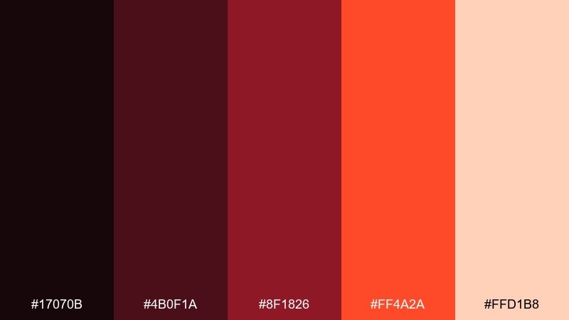
HEX: #17070b #4b0f1a #8f1826 #ff4a2a #ffd1b8
Mood: punchy and modern
Best for: app onboarding screens
Punchy and modern, it feels like a bright fissure cutting through dark stone. Use the near-black as the base, then layer crimson for illustrations and the hot coral for primary buttons. Keep the pale tint for friendly microcopy blocks and empty states. Tip: limit full-screen coral to one step so onboarding stays comfortable to view.
Image example of crimson rift generated using media.io
12) Magma Mist
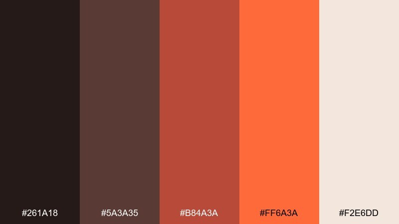
HEX: #261a18 #5a3a35 #b84a3a #ff6a3a #f2e6dd
Mood: soft and smoky
Best for: lifestyle blog headers
Soft and smoky, it resembles morning mist lit by distant glow. This lava color palette feels approachable when the warm off-white dominates and the orange is used sparingly for links and highlights. Pair with muted photography and a clean sans-serif for an airy, editorial vibe. Tip: apply the mid brown as a consistent divider color to keep layouts tidy.
Image example of magma mist generated using media.io
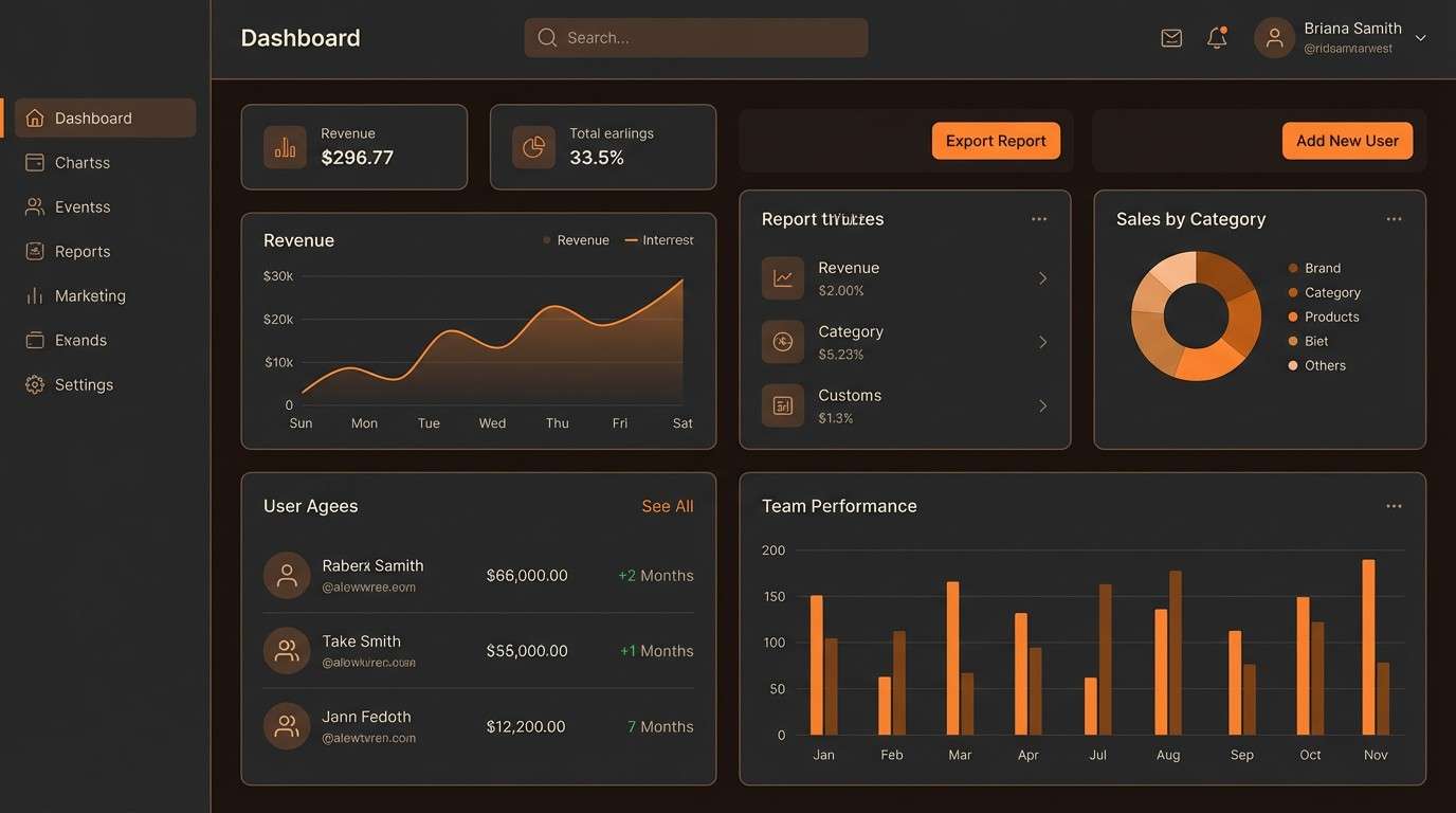
13) Charcoal Spark
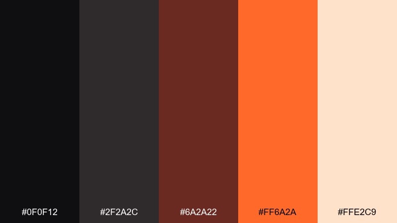
HEX: #0f0f12 #2f2a2c #6a2a22 #ff6a2a #ffe2c9
Mood: sleek and high-contrast
Best for: dashboard UI
Sleek and high-contrast, it looks like bright sparks on a charcoal workbench. Dark surfaces make charts and cards feel crisp, while the orange provides unmistakable focus for active states. Pair with warm whites for labels and keep secondary accents in muted browns. Tip: use the orange for one action type only, like primary buttons, to avoid visual competition.
Image example of charcoal spark generated using media.io
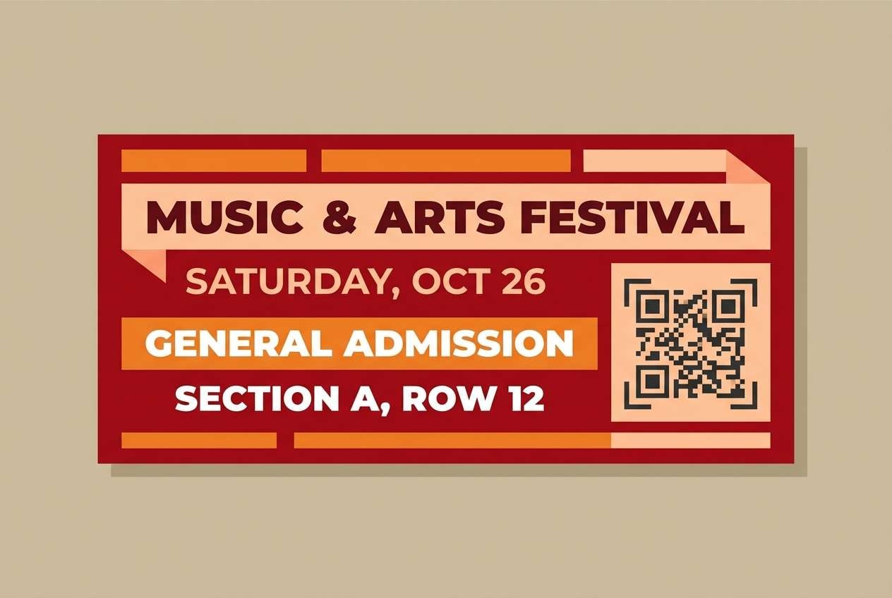
14) Kissed by Fire
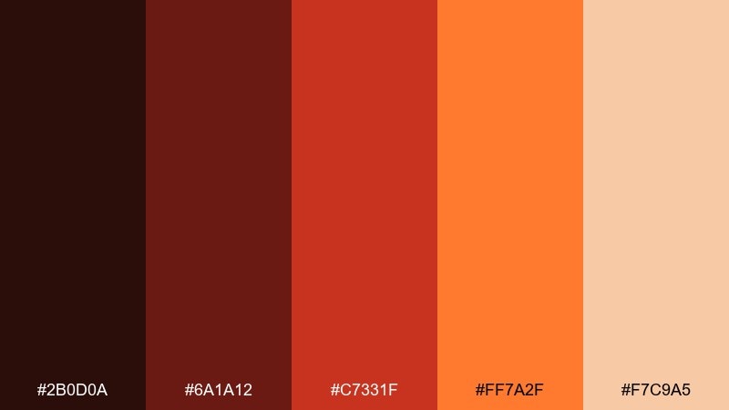
HEX: #2b0d0a #6a1a12 #c7331f #ff7a2f #f7c9a5
Mood: bold and celebratory
Best for: festival tickets
Bold and celebratory, it feels like firelight reflecting off night air. The deep reds create a strong base for ticket backgrounds, while orange and peach bring energy to QR areas and key info blocks. Pair with simple patterns and thick type for fast scanning. Tip: keep fine print in the palest tone to maintain readability on dark sections.
Image example of kissed by fire generated using media.io
15) Soot and Saffron
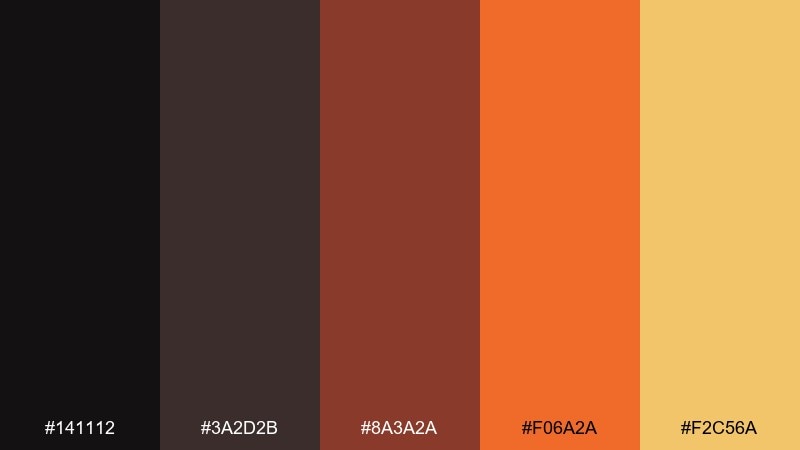
HEX: #141112 #3a2d2b #8a3a2a #f06a2a #f2c56a
Mood: moody and spicy
Best for: restaurant social posts
Moody and spicy, it brings soot-dark depth with a bright saffron kick. This lava color scheme is great for food content where you want warmth and contrast without relying on neon tones. Pair with cream backgrounds for captions and use the golden yellow as a small, consistent highlight. Tip: keep overlays semi-opaque so text stays readable over imagery.
Image example of soot and saffron generated using media.io

16) Lava Lantern
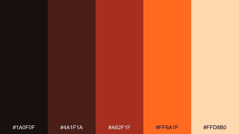
HEX: #1a0f0f #4a1f1a #a62f1f #ff6a1f #ffd8b0
Mood: festive and warm
Best for: holiday email headers
Festive and warm, it resembles lantern light in a dark street. The deep reds work well for header bands, with the bright orange guiding clicks on buttons. Pair with soft cream spacing and a touch of texture for a cozy, handcrafted feel. Tip: repeat the orange in one small icon set to unify the whole email.
Image example of lava lantern generated using media.io

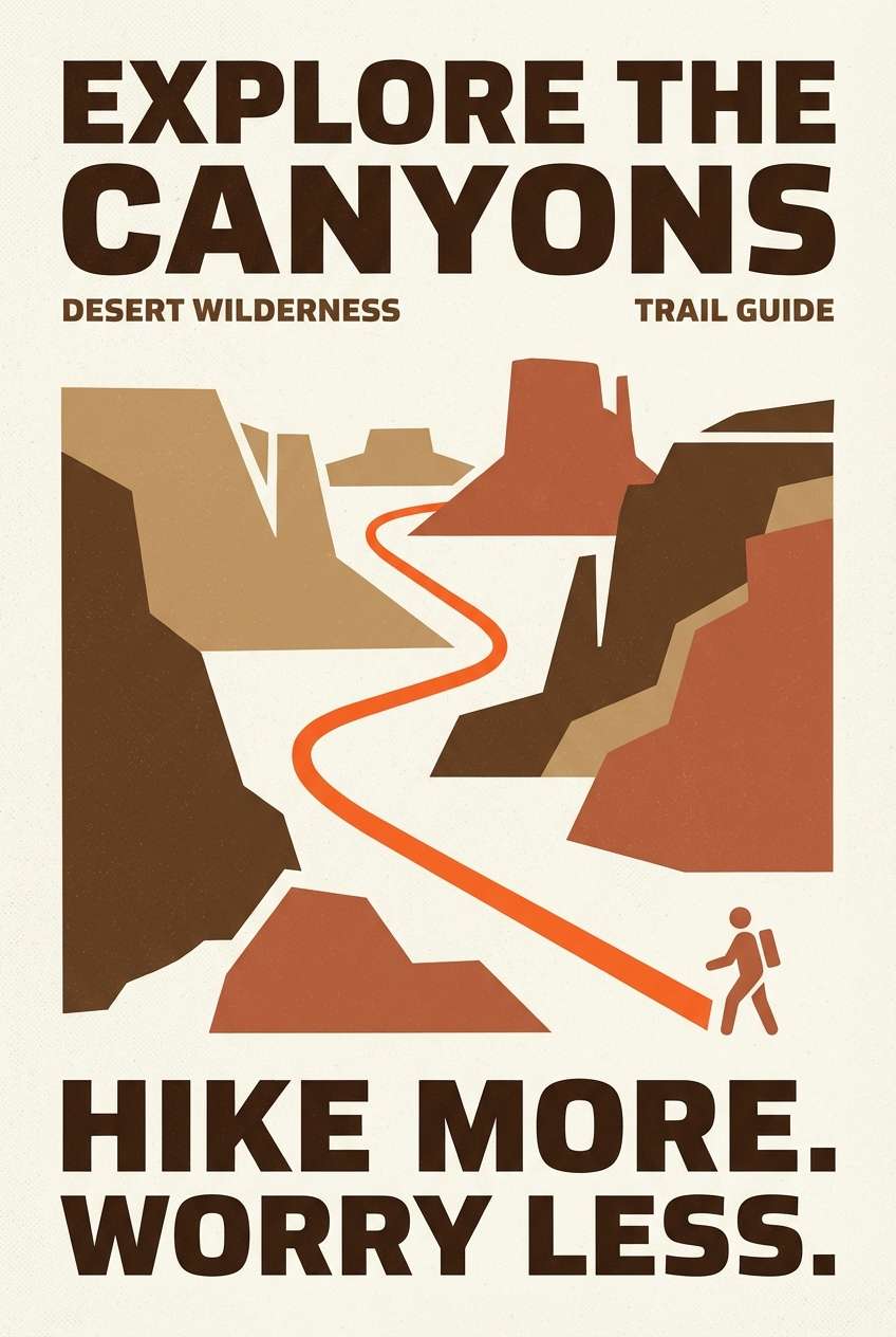
17) Scorched Canyon
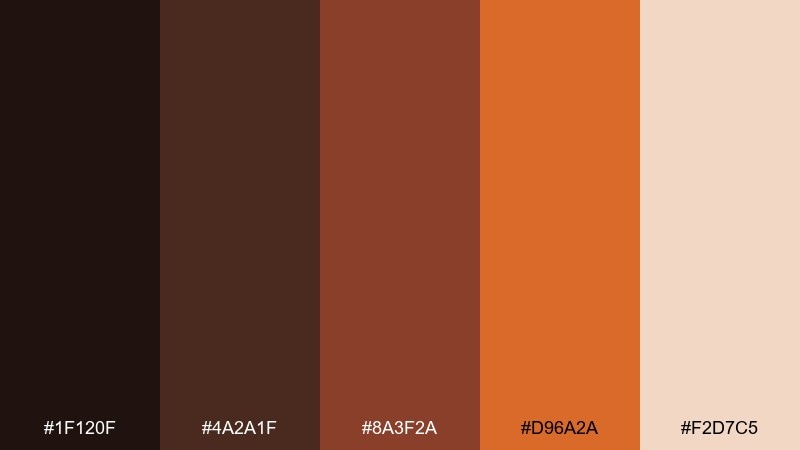
HEX: #1f120f #4a2a1f #8a3f2a #d96a2a #f2d7c5
Mood: rugged and outdoorsy
Best for: hiking poster series
Rugged and outdoorsy, it looks like sunlit canyon walls after a long day. Use the dark browns for bold titles and map-style lines, and keep the orange for trail highlights and difficulty badges. It pairs best with off-white backgrounds and simple illustration shapes. Tip: make the light tone the dominant field so the poster stays readable from afar.
Image example of scorched canyon generated using media.io
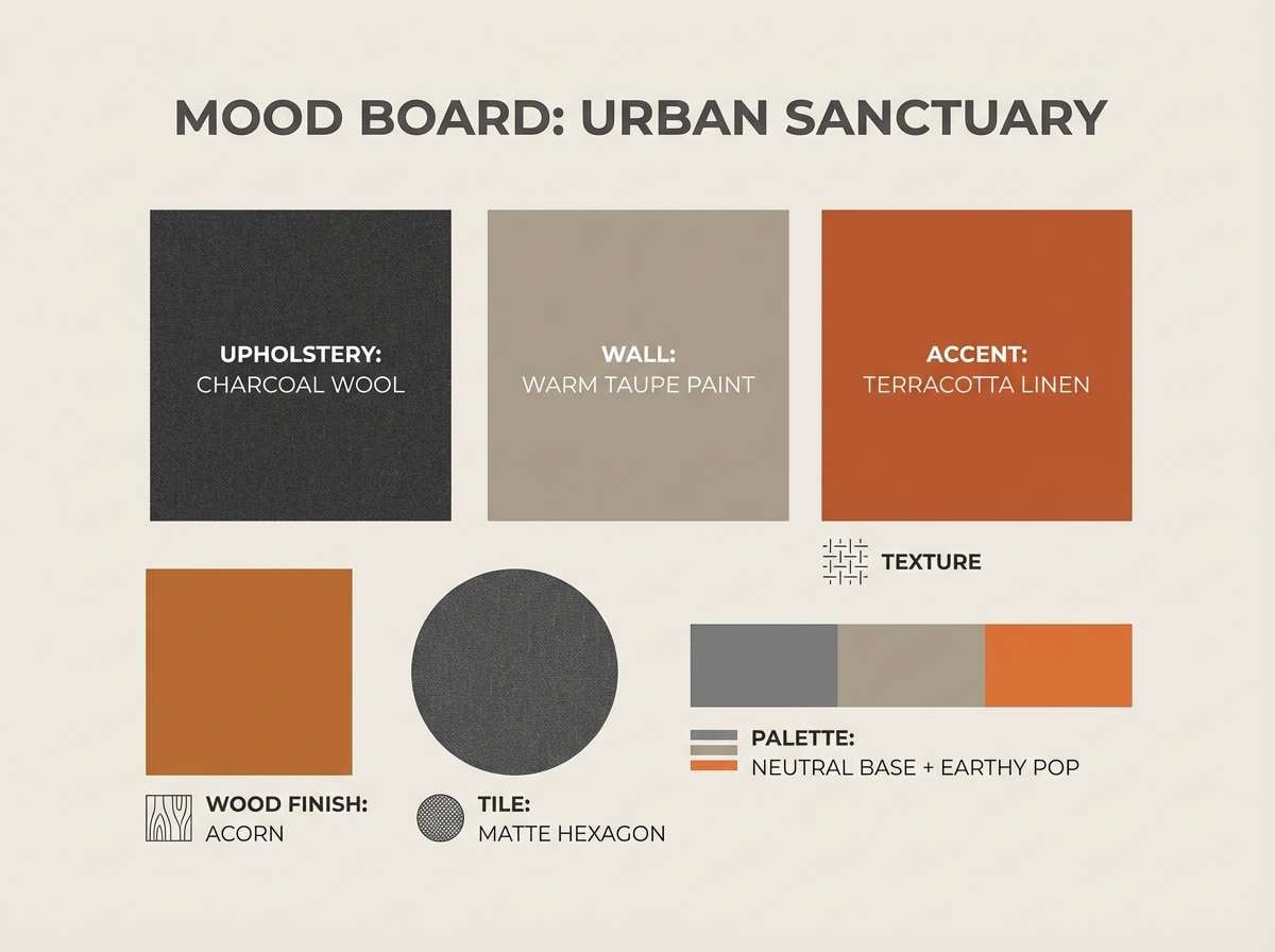
18) Pepper Ash
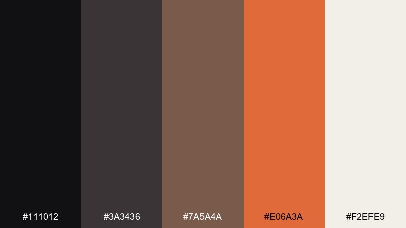
HEX: #111012 #3a3436 #7a5a4a #e06a3a #f2efe9
Mood: minimal and contemporary
Best for: interior mood boards
Minimal and contemporary, it feels like peppery charcoal softened with warm clay. Use the near-black and gray for typography and swatches, then add the orange as a confident accent tile. Pair with creamy whites and natural textures like linen or wood grain. Tip: keep accent usage under 10 percent to maintain the calm, gallery-like balance.
Image example of pepper ash generated using media.io
19) Forge Light
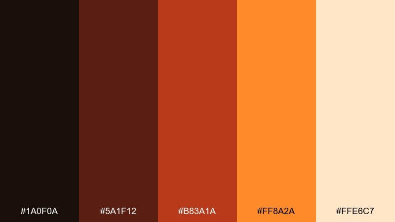
HEX: #1a0f0a #5a1f12 #b83a1a #ff8a2a #ffe6c7
Mood: hot and optimistic
Best for: product launch ads
Hot and optimistic, it captures the moment metal turns bright in the forge. These lava color combinations help launch creatives feel energetic, especially when orange leads and the dark shades frame the message. Pair with clean white space and a single bold type family for impact. Tip: use the pale cream for gradients behind the product so edges stay crisp.
Image example of forge light generated using media.io
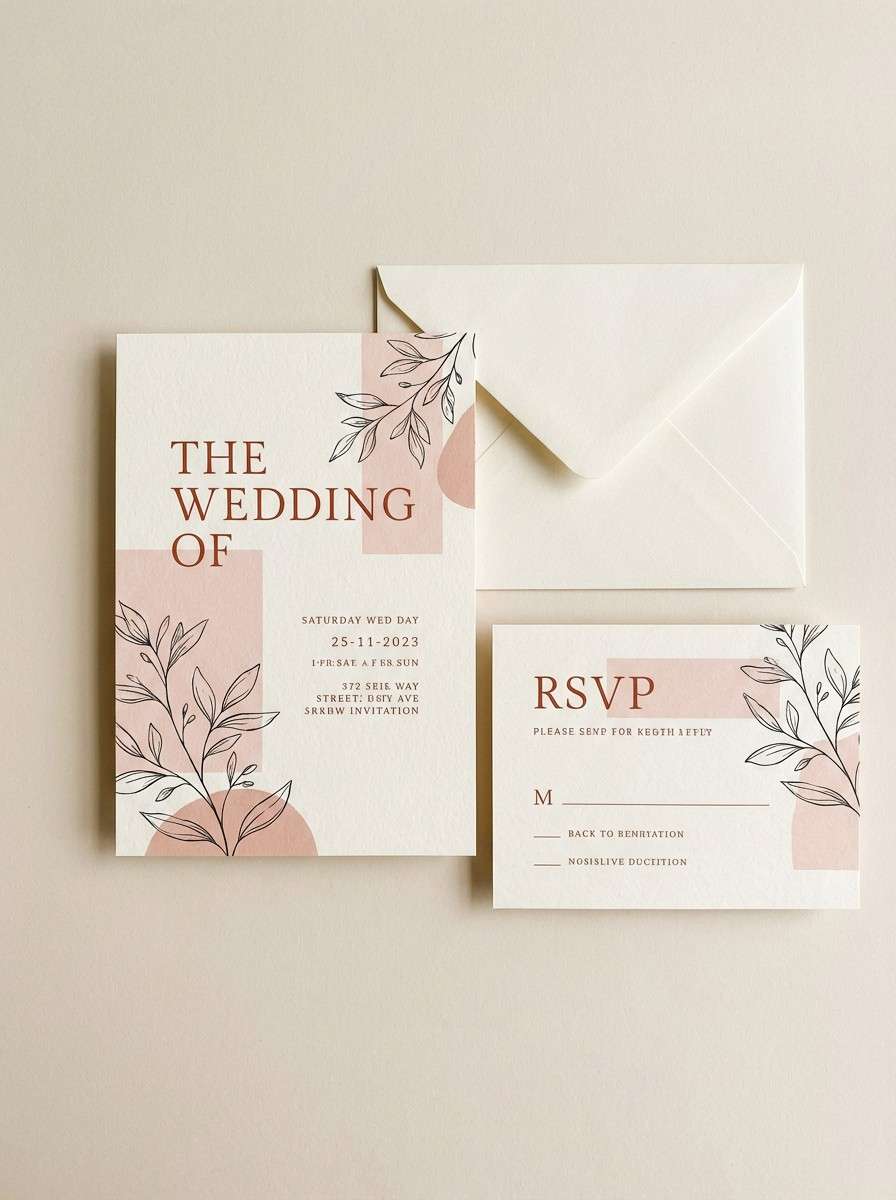
20) Rusted Bloom
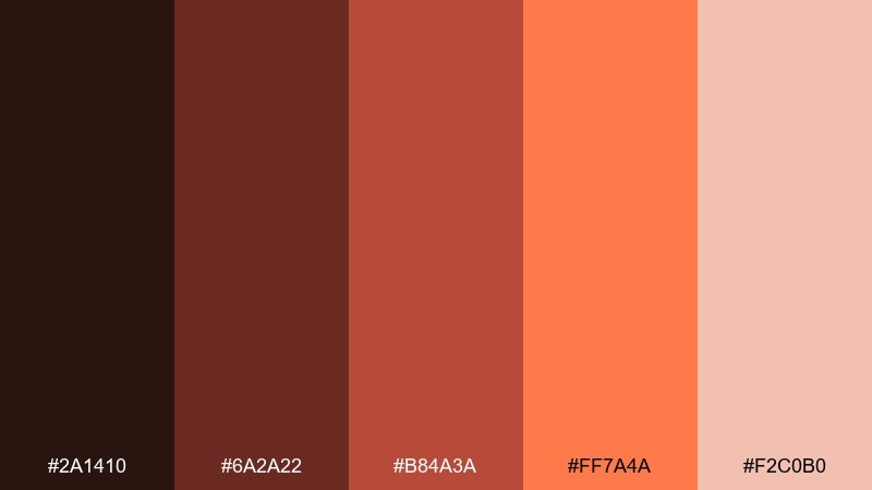
HEX: #2a1410 #6a2a22 #b84a3a #ff7a4a #f2c0b0
Mood: artful and nostalgic
Best for: wedding invites
Artful and nostalgic, it feels like dried florals warmed by late sunlight. A lava color combination like this is lovely for invitations when you let the blushy tint lead and use rust as typography. Pair with textured paper and a restrained serif for a timeless look. Tip: keep the brightest coral for a single detail, like the RSVP button or envelope liner.
Image example of rusted bloom generated using media.io
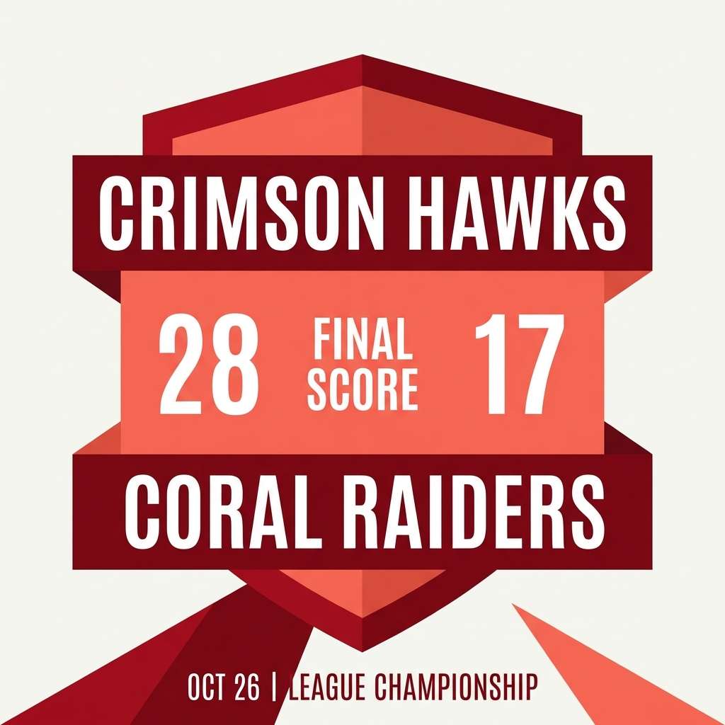
21) Inferno Punch
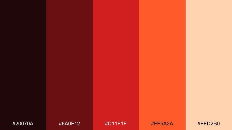
HEX: #20070a #6a0f12 #d11f1f #ff5a2a #ffd2b0
Mood: aggressive and high-energy
Best for: sports team graphics
Aggressive and high-energy, it hits like a roar of flame against a dark arena. Use the deep reds for backgrounds and the punchy coral for score highlights and key stats. Pair with strong condensed type and simple shapes to keep everything readable at a glance. Tip: avoid gradients in the brightest colors so they do not vibrate on screens.
Image example of inferno punch generated using media.io
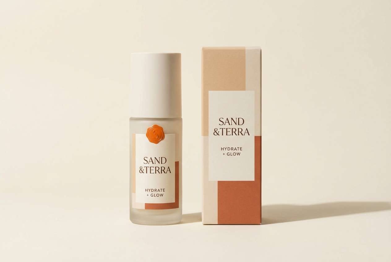
22) Desert Lava
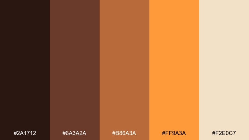
HEX: #2a1712 #6a3a2a #b86a3a #ff9a3a #f2e0c7
Mood: sunbaked and friendly
Best for: skincare packaging
Sunbaked and friendly, it evokes warm sand with a burst of glowing orange. These lava color combinations feel especially good on minimalist skincare because they read natural and approachable. Pair with soft black typography and plenty of cream space for a clean, apothecary vibe. Tip: use the bright orange only for one brand stamp or seal to keep it refined.
Image example of desert lava generated using media.io
What Colors Go Well with Lava?
Lava tones pair best with warm neutrals: paper whites, cream, sand, beige, and warm gray help the reds and oranges look intentional rather than overwhelming.
For contrast, add dark anchors like obsidian black, charcoal, espresso brown, or deep wine. These shades keep typography crisp and give bright ember accents a place to “land.”
If you want a twist, introduce a tiny amount of metallic gold or saffron-like yellow for highlights—just keep it consistent and minimal so it doesn’t compete with the orange.
How to Use a Lava Color Palette in Real Designs
Start with a dark base (basalt/charcoal) for headers, frames, or backgrounds, then choose one “heat” color (ember orange or coral) for primary actions like buttons, price tags, and badges.
Use mid-tones (terracotta, rust, warm browns) for secondary UI states, cards, and illustrations. Reserve the light tone (cream/peach) for spacing, surface backgrounds, and readable text blocks.
To keep the palette premium, avoid using all five colors at equal weight. A 70/20/10 balance (neutral/mid/bright) usually makes lava schemes feel controlled and modern.
Create Lava Palette Visuals with AI
If you already have HEX codes, you can turn them into poster concepts, packaging mockups, thumbnails, and UI screens in minutes—just describe the layout and mood, then iterate.
On Media.io, try prompts like “flat 2D hero banner,” “dark dashboard UI,” or “studio packaging shot,” and paste your lava colors into the description to guide consistency.
Once you like a direction, regenerate variations by changing only one variable (type style, layout density, or background tone) to keep the results cohesive.
Lava Color Palette FAQs
-
What is a lava color palette?
A lava color palette is a warm, high-contrast scheme built from deep charcoals, maroons, and browns paired with fiery reds, oranges, and soft peach or cream highlights. -
Which HEX colors are most common in lava palettes?
Common choices include near-black/charcoal bases, deep wine or maroon (#2b0f0a, #6a1a12), ember orange (#ff6a2a to #ff9a3a), and warm creams (#f2e0c7 to #ffe6c7). -
What colors go well with lava orange?
Lava orange pairs well with basalt black, charcoal gray, espresso brown, warm off-white/cream, and muted terracotta. These supporting colors prevent the orange from feeling too loud. -
How do I keep a lava palette from looking too aggressive?
Let creams and warm neutrals dominate the background, use the brightest orange only for key accents, and avoid large full-screen areas of saturated red/orange. -
Are lava palettes good for UI design?
Yes—especially for dark-mode dashboards or onboarding. Use charcoal as the surface color, warm off-white for text, and reserve ember orange for one primary action to maintain clarity. -
What’s a good “safe” accent percentage for lava palettes?
A practical rule is keeping the brightest ember/coral accent under 10–15% of the composition, using mid-tones for supporting elements, and neutrals for most surfaces. -
Can I generate lava palette mockups with AI?
Yes. With Media.io Text-to-Image, describe the design format (poster, packaging, UI) and include your lava HEX colors in the prompt to generate cohesive, on-brand variations quickly.
Next: Citrine Color Palette


