

Cerulean blue sits in that sweet spot between calm and confident—cool enough for clarity, bright enough for modern energy. It’s a go-to for brands that want trust, freshness, and a clean digital feel.
Below are 20+ cerulean blue color palette ideas (with HEX codes) you can use for UI, print, packaging, and branding—plus practical pairing tips and AI prompt examples.
In this article
- Why Cerulean Blue Color Combinations Work So Well
-
- ocean glass
- coastal linen
- electric harbor
- skyline minimal
- citrus splash
- nordic lake
- retro poolside
- denim workshop
- solar horizon
- cloudy pier
- minty marina
- night sail
- artist studio blue
- seafoam calm
- blueberry milk
- tech lagoon
- coral reef pop
- granite coast
- winter cerulean
- festival surf
- apricot harbor
- ink and ice
- peachy blueprint
- What Colors Go Well with Cerulean Blue?
- How to Use a Cerulean Blue Color Palette in Real Designs
- Create Cerulean Blue Palette Visuals with AI
Why Cerulean Blue Color Combinations Work So Well
Cerulean blue reads as clear, capable, and approachable—making it a strong anchor color for interfaces and brand systems. It’s bright enough to feel contemporary, while still sitting in the “trustworthy blue” family users intuitively associate with reliability.
Because cerulean has a noticeable cyan lean, it pairs easily with airy tints for whitespace-heavy layouts and with deep navies for high-contrast CTAs. That flexibility helps you build hierarchy without needing many extra hues.
In print and packaging, cerulean can look premium on uncoated stock and crisp on coated finishes. When balanced with warm accents or grounded neutrals, it avoids feeling overly sporty or cold.
20+ Cerulean Blue Color Palette Ideas (with HEX Codes)
1) Ocean Glass
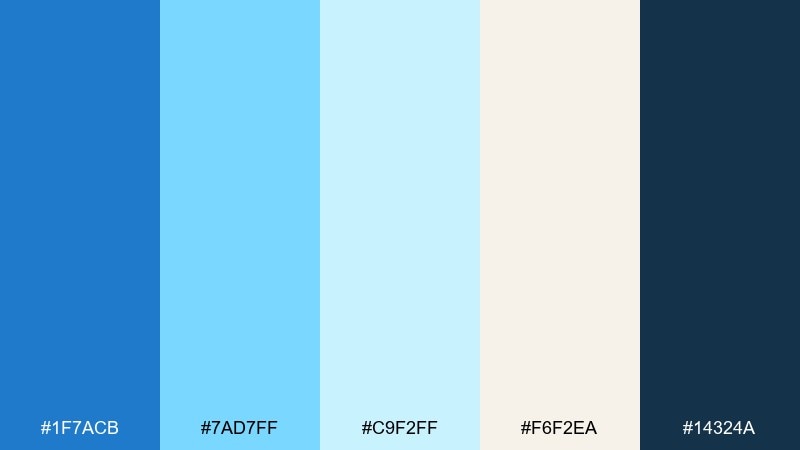
HEX: #1f7acb #7ad7ff #c9f2ff #f6f2ea #14324a
Mood: airy and refreshing
Best for: wellness landing pages and spa branding
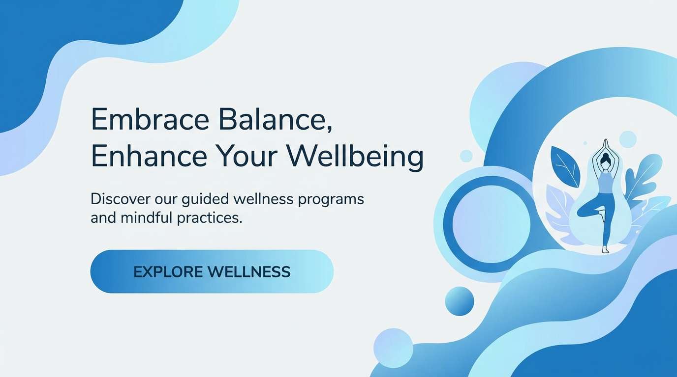
Airy and refreshing, it feels like sunlit seawater over pale sand. This cerulean blue color palette works best with generous whitespace and soft typography for a clean, calm tone. Pair the deep navy with the icy aqua for legible headers and buttons. Usage tip: reserve the darkest shade for text and CTAs to keep the light tones feeling weightless.
Image example of ocean glass generated using media.io
Media.io is an online AI studio for creating and editing video, image, and audio in your browser.

2) Coastal Linen
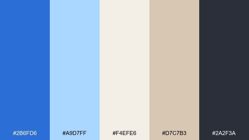
HEX: #2b6fd6 #a9d7ff #f4efe6 #d7c7b3 #2a2f3a
Mood: relaxed and sun-warmed
Best for: lifestyle packaging and boutique labels
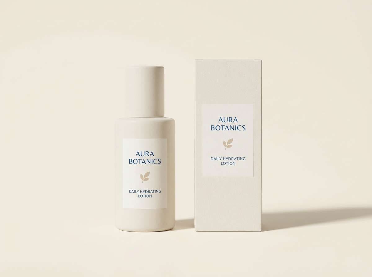
Relaxed and sun-warmed, this cerulean blue color mix evokes linen shirts, driftwood, and bright coastal skies. The sandy neutrals soften the blue so it feels premium rather than sporty. Pair the charcoal with the linen cream for readable ingredient panels and barcodes. Usage tip: print the main blue as a spot color on uncoated stock for a tactile, boutique finish.
Image example of coastal linen generated using media.io
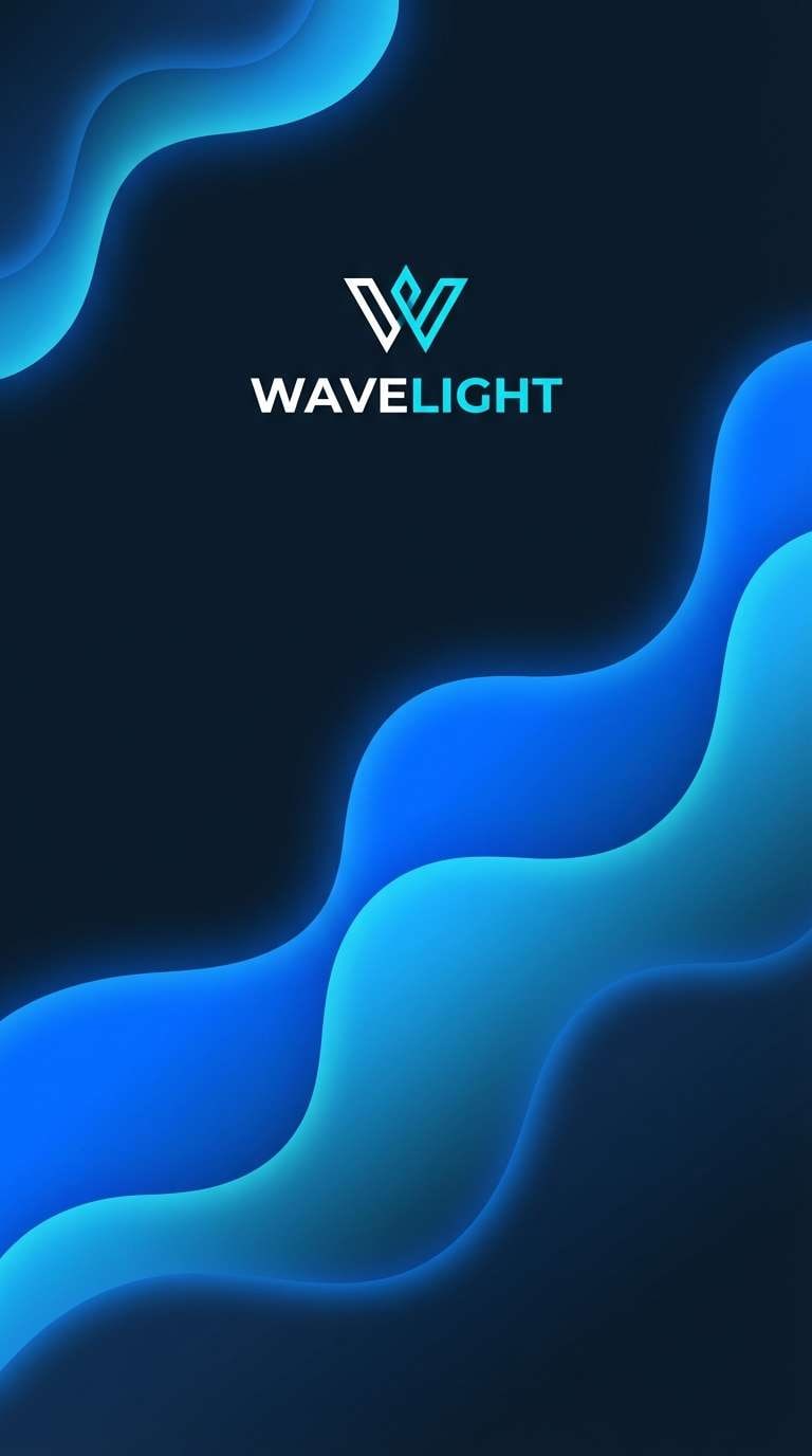
3) Electric Harbor
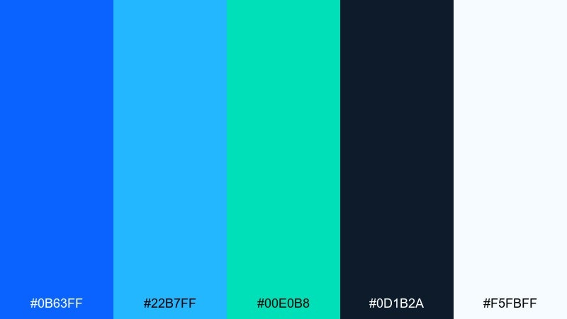
HEX: #0b63ff #22b7ff #00e0b8 #0d1b2a #f5fbff
Mood: energetic and high-contrast
Best for: startup branding and app splash screens
Energetic and high-contrast, the color combination with cerulean and blue feels like neon reflections on water at night. The bright blues pop hardest when the inky navy is used as the main canvas. Pair the aqua and teal as secondary accents for highlights, toggles, and micro-interactions. Usage tip: keep gradients subtle so the palette stays sharp instead of noisy.
Image example of electric harbor generated using media.io
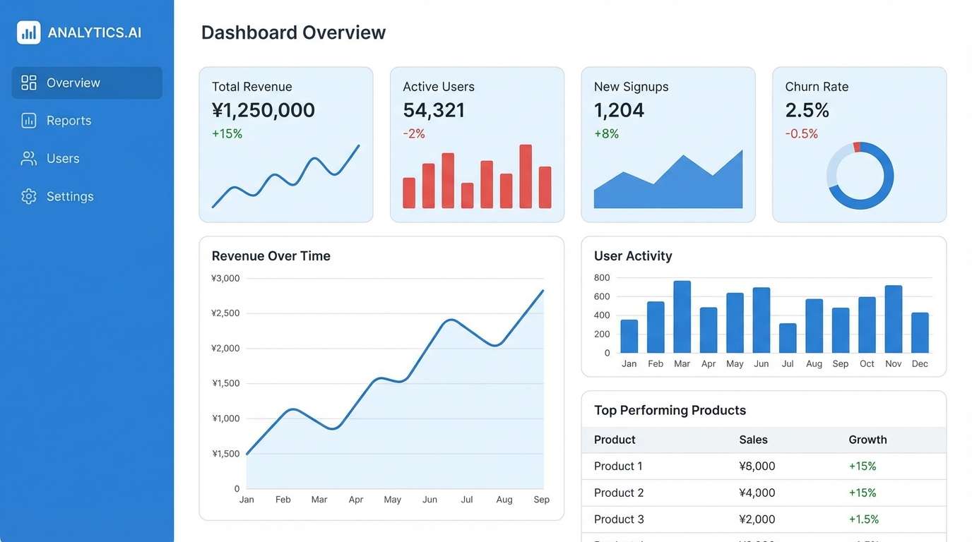
4) Skyline Minimal
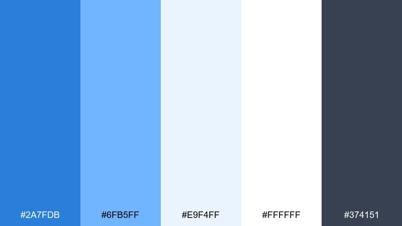
HEX: #2a7fdb #6fb5ff #e9f4ff #ffffff #374151
Mood: clean and contemporary
Best for: SaaS dashboards and data reports
Clean and contemporary, it reads like a crisp morning skyline under a clear blue sky. The soft tints keep charts and tables from feeling heavy while the slate gray anchors hierarchy. Pair the mid blue with the slate for primary actions and key metrics. Usage tip: use the palest blue behind cards to separate sections without adding borders.
Image example of skyline minimal generated using media.io
5) Citrus Splash
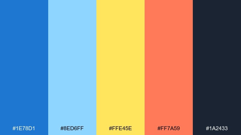
HEX: #1e78d1 #8ed6ff #ffe45e #ff7a59 #1a2433
Mood: playful and upbeat
Best for: event posters and social ads
Playful and upbeat, it feels like pool water splashed with lemon and grapefruit. These cerulean blue color combinations shine in bold layouts where warm accents can lead the eye. Pair the yellow for highlights and the coral for limited, punchy callouts. Usage tip: keep the dark ink for type so the bright accents stay readable at a glance.
Image example of citrus splash generated using media.io

6) Nordic Lake
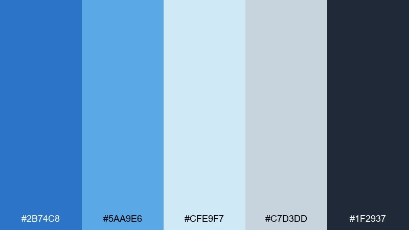
HEX: #2b74c8 #5aa9e6 #cfe9f7 #c7d3dd #1f2937
Mood: cool and understated
Best for: corporate presentations and annual reports
Cool and understated, this cerulean blue color palette resembles a quiet lake under overcast light. The desaturated midtones keep slides feeling professional and calm. Pair the deep gray with the main blue for headings, dividers, and icons. Usage tip: choose thin line charts and let the palette do the work instead of heavy fills.
Image example of nordic lake generated using media.io
7) Retro Poolside
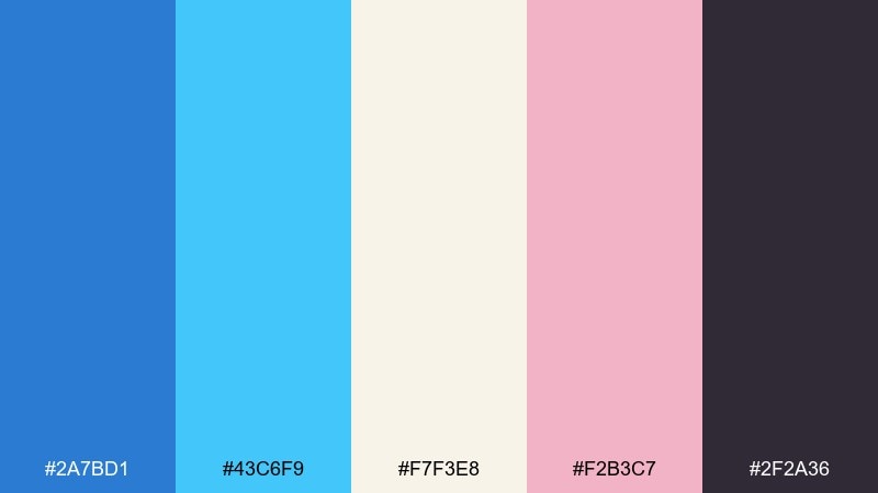
HEX: #2a7bd1 #43c6f9 #f7f3e8 #f2b3c7 #2f2a36
Mood: nostalgic and sunny
Best for: summer campaign graphics and merch
Nostalgic and sunny, the cerulean blue mix channels retro pool tiles, pastel towels, and late-afternoon light. The blush pink adds a playful twist that keeps the blues from feeling too corporate. Pair the cream as a base with dark plum for type and outlines. Usage tip: use halftone textures sparingly to keep the throwback vibe crisp.
Image example of retro poolside generated using media.io
8) Denim Workshop
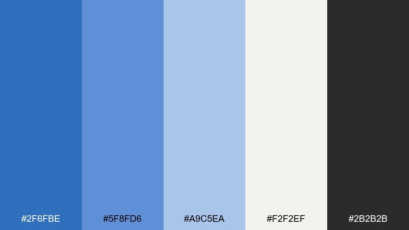
HEX: #2f6fbe #5f8fd6 #a9c5ea #f2f2ef #2b2b2b
Mood: practical and grounded
Best for: DIY blogs and maker brand identities
Practical and grounded, it feels like worn denim, clean tools, and a bright workbench. The stepped blues give you easy hierarchy for headers, buttons, and sidebars. Pair the off-white as the main background and use near-black for body text. Usage tip: keep icons in a single blue tone to avoid a cluttered interface.
Image example of denim workshop generated using media.io
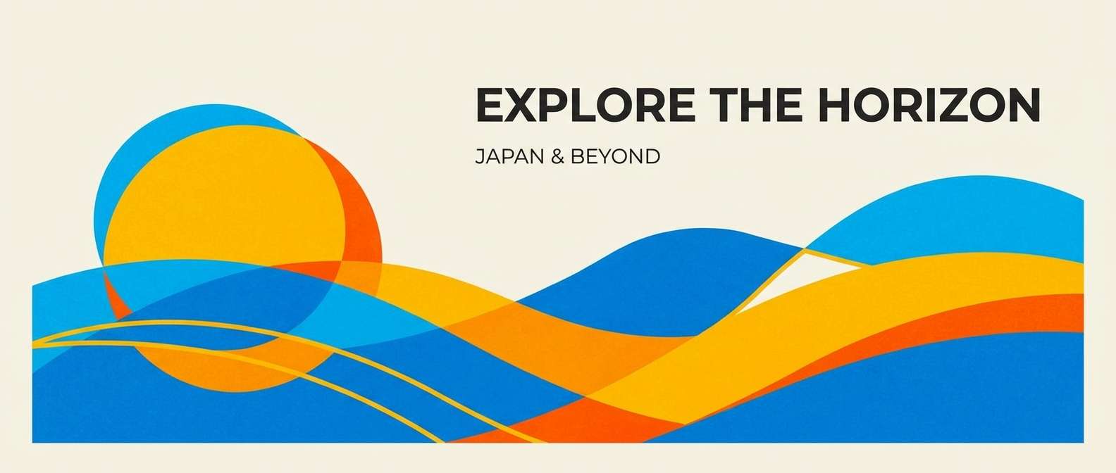
9) Solar Horizon
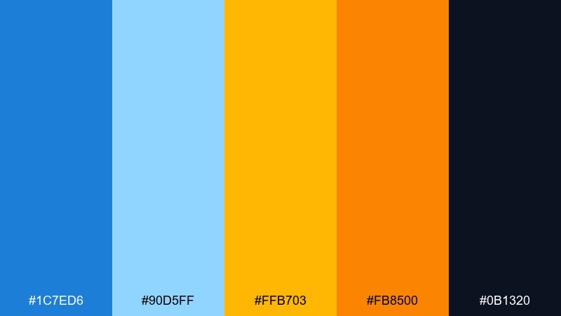
HEX: #1c7ed6 #90d5ff #ffb703 #fb8500 #0b1320
Mood: bold and optimistic
Best for: travel ads and tourism banners
Bold and optimistic, this cerulean blue color combination looks like a bright sky meeting a golden horizon. The warm oranges add instant energy without overpowering the blue foundation. Pair the deep midnight for type and let the yellow serve as a highlight color for prices or badges. Usage tip: limit orange to one or two elements per layout for a clean, premium feel.
Image example of solar horizon generated using media.io
10) Cloudy Pier
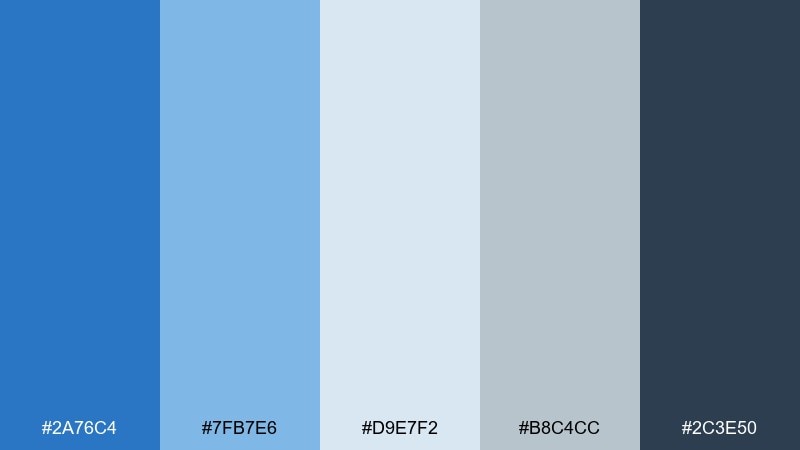
HEX: #2a76c4 #7fb7e6 #d9e7f2 #b8c4cc #2c3e50
Mood: quiet and reflective
Best for: editorial layouts and long-form blogs
Quiet and reflective, the cerulean blue mix suggests mist, weathered wood, and soft waves under gray clouds. The muted blues keep long pages easy on the eyes. Pair slate and deep blue for headings and pull quotes, with pale tints for section breaks. Usage tip: use a single accent blue for links so the reading flow stays consistent.
Image example of cloudy pier generated using media.io
11) Minty Marina
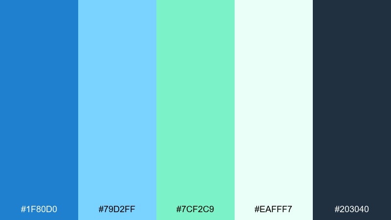
HEX: #1f80d0 #79d2ff #7cf2c9 #eafff7 #203040
Mood: fresh and modern
Best for: fintech apps and onboarding screens
Fresh and modern, it feels like clean marina air with a minty breeze. The green-teal accent adds a friendly signal color for success states and progress indicators. Pair the near-white as the backdrop and keep the deep blue for navigation and key labels. Usage tip: use the teal for confirmations only, so it stays meaningful.
Image example of minty marina generated using media.io
12) Night Sail
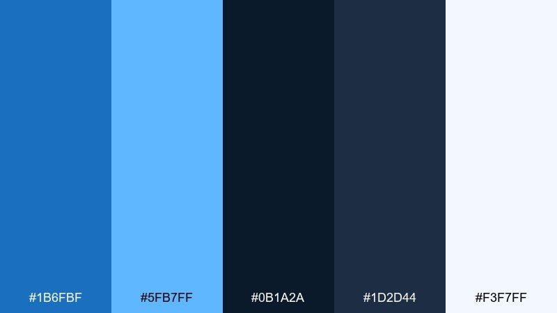
HEX: #1b6fbf #5fb7ff #0b1a2a #1d2d44 #f3f7ff
Mood: sleek and cinematic
Best for: luxury tech branding and hero sections
Sleek and cinematic, this cerulean blue color combination recalls a sailboat cutting through dark water with moonlit highlights. The near-black blues make the bright cerulean accents feel premium and controlled. Pair the lightest tint for subtle glows and separators rather than full backgrounds. Usage tip: keep gradients confined to hero areas so the rest of the site stays sharp.
Image example of night sail generated using media.io
13) Artist Studio Blue
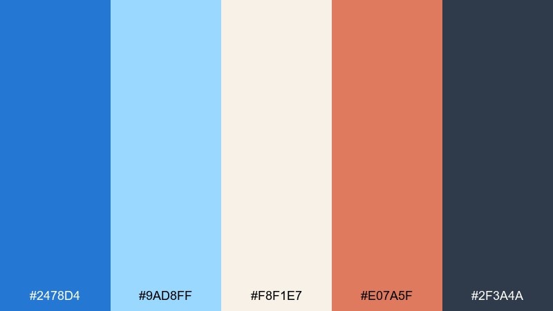
HEX: #2478d4 #9ad8ff #f8f1e7 #e07a5f #2f3a4a
Mood: creative and welcoming
Best for: portfolio sites and creative resumes
Creative and welcoming, it brings to mind paint water, warm clay, and paper textures. This cerulean blue color palette balances clarity with personality when you need both professionalism and charm. Pair the terracotta accent with the main blue for featured projects and buttons. Usage tip: keep the accent to small areas like tags to avoid competing focal points.
Image example of artist studio blue generated using media.io
14) Seafoam Calm
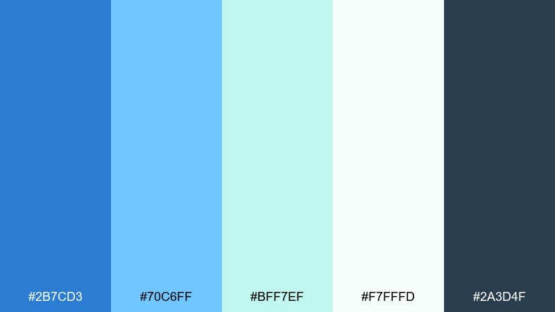
HEX: #2b7cd3 #70c6ff #bff7ef #f7fffd #2a3d4f
Mood: soothing and clean
Best for: healthcare UI and meditation apps
Soothing and clean, it resembles seafoam rolling over a quiet shoreline. The pale greens soften the blues and work well for gentle progress states and calming backgrounds. Pair the deep slate-blue with the bright cerulean for accessible contrast in navigation. Usage tip: use the lightest tint behind form fields to reduce visual stress.
Image example of seafoam calm generated using media.io
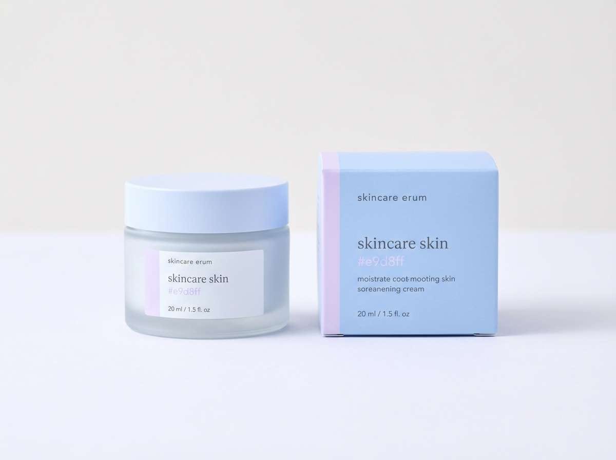
15) Blueberry Milk
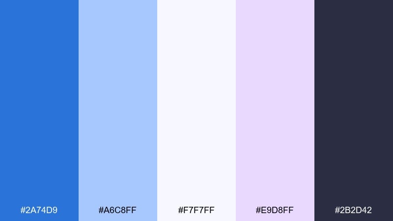
HEX: #2a74d9 #a6c8ff #f7f7ff #e9d8ff #2b2d42
Mood: soft and dreamy
Best for: beauty brands and skincare packaging
Soft and dreamy, it looks like blueberry milk with a lavender swirl. The pale violet adds a gentle twist that feels youthful and polished. Pair the deep ink for ingredient text and the mid blue for brand marks or seals. Usage tip: emboss the logo in the lightest tone for an elegant, tone-on-tone effect.
Image example of blueberry milk generated using media.io
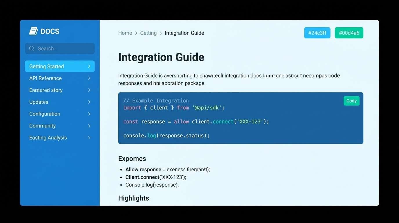
16) Tech Lagoon
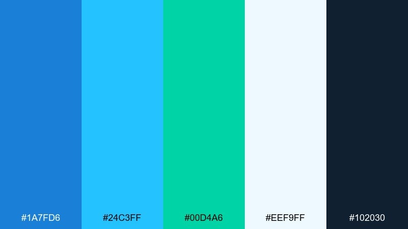
HEX: #1a7fd6 #24c3ff #00d4a6 #eef9ff #102030
Mood: futuristic and crisp
Best for: developer tools and documentation sites
Futuristic and crisp, these cerulean blue tones feel like a glowing lagoon under LED lights. The teal-green accent is perfect for success states, code highlights, and status badges. Pair the deep ink for navigation and keep the pale blue for content surfaces. Usage tip: use the brightest cyan sparingly as a highlight so it stays impactful.
Image example of tech lagoon generated using media.io
17) Coral Reef Pop
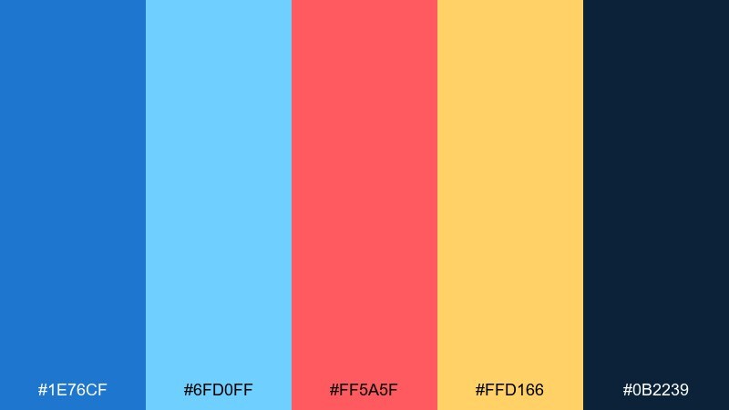
HEX: #1e76cf #6fd0ff #ff5a5f #ffd166 #0b2239
Mood: vibrant and youthful
Best for: product launches and promo banners
Vibrant and youthful, it brings coral reefs to mind with bright fish flashing through blue water. These cerulean blue color combinations are built for high visibility, especially in ads and launch pages. Pair coral for primary emphasis and yellow for secondary highlights like badges or timers. Usage tip: keep backgrounds dark or very light so the warm accents do not muddy.
Image example of coral reef pop generated using media.io
18) Granite Coast
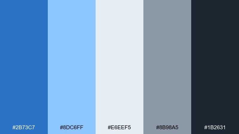
HEX: #2b73c7 #8dc6ff #e6eef5 #8b98a5 #1b2631
Mood: steady and dependable
Best for: insurance websites and B2B branding
Steady and dependable, the cerulean blue mix suggests granite cliffs, cool spray, and steel-gray skies. The grays make the blue feel trustworthy, which is ideal for service-driven brands. Pair the mid blue for CTAs and keep the darker slate for headings and navigation. Usage tip: use the light gray-blue for large content panels to keep the layout structured.
Image example of granite coast generated using media.io

19) Winter Cerulean
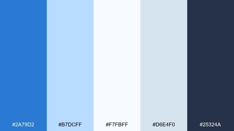
HEX: #2a79d2 #b7dcff #f7fbff #d6e4f0 #25324a
Mood: crisp and serene
Best for: holiday newsletters and winter campaigns
Crisp and serene, it looks like fresh snow under a bright, cold sky. The near-whites keep layouts airy while the deep blue adds structure for headers and buttons. Pair the icy midtone with charcoal-blue for readable text on light backgrounds. Usage tip: add subtle snow-like grain only in small areas to keep the design clean.
Image example of winter cerulean generated using media.io

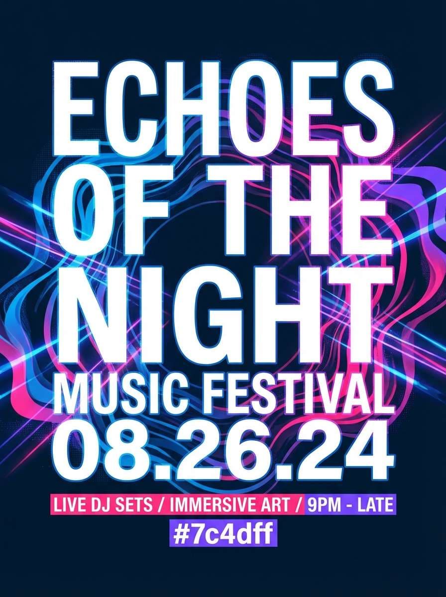
20) Festival Surf
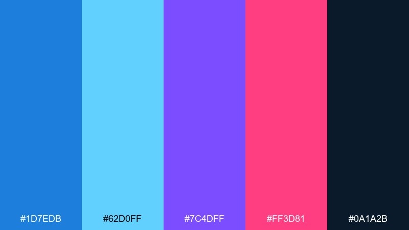
HEX: #1d7edb #62d0ff #7c4dff #ff3d81 #0a1a2b
Mood: bold and electric
Best for: music flyers and nightlife promos
Bold and electric, this cerulean blue color combination feels like stage lights bouncing off midnight waves. The violet and hot pink push the blues into a club-ready, high-energy mix. These cerulean blue color combinations work best with large type, strong contrast, and minimal detail. Usage tip: set the background to deep navy and let neon accents carry the hierarchy.
Image example of festival surf generated using media.io
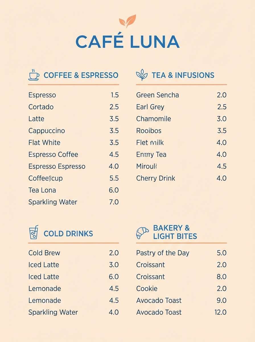
21) Apricot Harbor
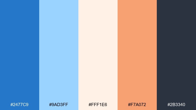
HEX: #2477c9 #9ad3ff #fff1e6 #f7a072 #2b3340
Mood: warm and inviting
Best for: cafe menus and food brand visuals
Warm and inviting, it evokes apricot pastries beside a bright window and a blue-painted seaside door. The soft cream makes the blues feel approachable, while the apricot accent adds appetite appeal. Pair the dark gray for type and use the orange for prices or featured items. Usage tip: keep photos neutral so the palette remains the main flavor.
Image example of apricot harbor generated using media.io
22) Ink and Ice
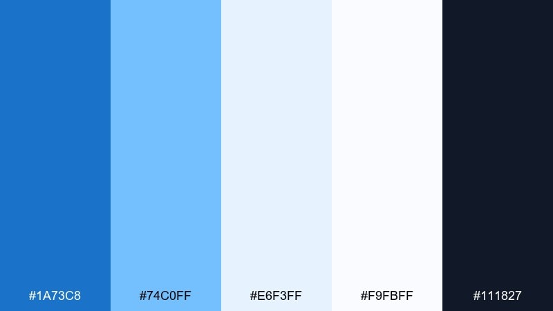
HEX: #1a73c8 #74c0ff #e6f3ff #f9fbff #111827
Mood: sharp and professional
Best for: legal services and finance sites
Sharp and professional, it feels like ink on crisp paper with a cool blue highlight. The restrained range keeps interfaces serious while still feeling modern. Pair the darkest ink for navigation and headings, and use the mid blue only for actionable elements. Usage tip: keep line icons in the mid blue to create a consistent visual rhythm.
Image example of ink and ice generated using media.io
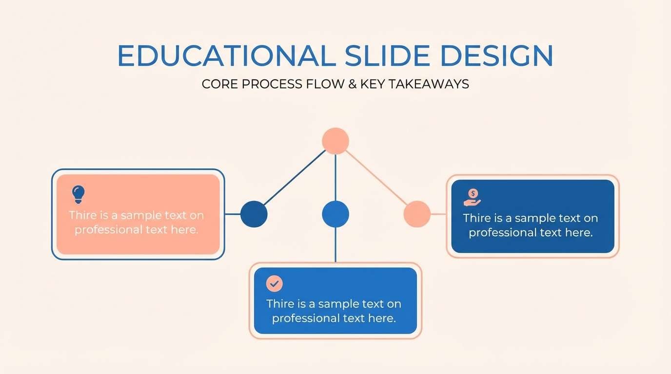
23) Peachy Blueprint
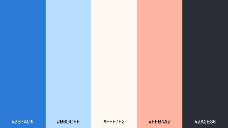
HEX: #2b7ad8 #b6dcff #fff7f2 #ffb4a2 #2a2e36
Mood: friendly and structured
Best for: course creators and educational slides
Friendly and structured, it suggests neat blueprint lines softened by a peachy note. The light tints keep content readable across long lessons and templates. Pair the main blue for diagrams and section headers, and use peach for callouts or key definitions. Usage tip: reserve the darkest shade for titles so each slide stays consistent.
Image example of peachy blueprint generated using media.io
What Colors Go Well with Cerulean Blue?
Cerulean blue pairs naturally with crisp neutrals like white, off-white, and cool grays when you want a clean, modern interface. For deeper contrast, charcoal and inky navy help cerulean accents look sharper and more premium.
To warm it up, use peach, apricot, coral, or golden yellow—these hues sit opposite cerulean’s cool temperature and create instant focal points for CTAs, badges, and highlights. Keep warm accents limited so the palette stays controlled.
For a fresh “tech” feel, add mint or teal as a secondary accent. This works especially well for status colors (success, progress) as long as you keep meaning consistent across the system.
How to Use a Cerulean Blue Color Palette in Real Designs
Start by assigning roles: pick one cerulean as your primary brand/action color, a dark ink for text/navigation, and a very light tint for surfaces. This prevents “too many blues” from flattening hierarchy.
For accessibility, reserve your darkest shade for body text and key UI controls, and test contrast on the lightest backgrounds. Cerulean’s brightness can look lighter than it measures, so verify button text and link states.
In print, avoid overusing saturated cerulean in large fills unless you’re sure about your substrate and finishing. Using cerulean as a spot highlight (logos, borders, key labels) often looks more refined and consistent.
Create Cerulean Blue Palette Visuals with AI
If you want to preview how cerulean blue color combinations look in real layouts, generate quick mockups from prompts—hero sections, packaging, dashboards, flyers, and more. This helps you validate contrast, mood, and accent balance before you design.
With Media.io’s text-to-image tools, you can iterate fast: try swapping one accent (coral vs. apricot), changing the base (white vs. navy), or adjusting the style (minimal vs. retro) while keeping the same HEX foundation.
Use the prompts included under each palette as a starting point, then customize the subject (your product, industry, layout type) to match your brand.
Cerulean Blue Color Palette FAQs
-
What does cerulean blue symbolize in branding?
Cerulean blue is commonly associated with clarity, trust, calm, and modernity. It’s popular in tech, wellness, and finance because it feels clean and reliable without being overly conservative. -
Is cerulean blue good for website UI and apps?
Yes—cerulean works well for primary actions, links, and highlights. Pair it with a dark ink (navy/charcoal) for text and use pale tints for backgrounds to maintain readable hierarchy. -
What are the best neutral pairings for cerulean blue?
White, off-white, light gray-blue, slate, and charcoal are the most dependable neutrals. They keep cerulean looking crisp and help prevent the palette from feeling overly bright. -
What warm accent colors work with cerulean blue?
Coral, apricot/peach, golden yellow, and soft terracotta pair especially well. Use warm accents sparingly for CTAs, badges, prices, or small callouts so they stay high-impact. -
How do I keep a cerulean palette from looking too “corporate”?
Add one personality accent (like blush pink, coral, or lavender) and use softer backgrounds (cream or near-white tints). Rounded shapes, airy spacing, and gentle gradients also shift the vibe toward lifestyle or creative. -
How many colors should a cerulean blue palette include?
Five is a practical starting point: one primary cerulean, one supporting mid-tone, one very light surface tint, one dark ink for text, and one accent (warm or teal). That’s enough for consistent UI states and print hierarchy. -
Can I use cerulean blue in print without color shifting?
You can, but test on your chosen paper and finish. Saturated blues may shift depending on stock and coating, so proofs help; using cerulean as a spot color or limiting large fills can improve consistency.


