

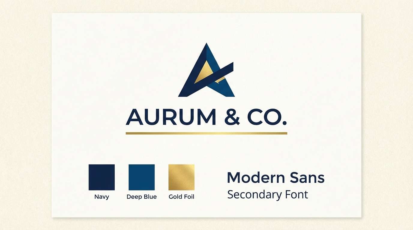
Gold and dark blue is a timeless, high-contrast pairing that instantly reads as premium. It blends authority (navy) with warmth and prestige (gold), making it a go-to for branding, events, and polished interfaces.
Below are 20 curated gold dark blue color palette ideas with HEX codes, plus practical tips for contrast, accents, and real-world usage across web, print, and interiors.
In this article
Why Gold Dark Blue Palettes Work So Well
Gold and dark blue palettes balance two powerful signals: deep blue communicates stability and professionalism, while gold brings warmth, celebration, and a “premium” finish. Together, they feel both trustworthy and elevated.
The contrast is naturally strong, which helps designs look crisp in everything from websites to posters. Dark blues create structure (headers, navigation, backgrounds), and gold works best as a controlled highlight that guides attention.
Because gold can shift from metallic to flat on screens, pairing it with creams and beiges keeps the system flexible. You can maintain a luxe vibe without relying on shiny effects that may reduce readability.
20+ Gold Dark Blue Color Palette Ideas (with HEX Codes)
1) Regal Harbor
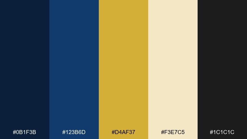
HEX: #0B1F3B #123B6D #D4AF37 #F3E7C5 #1C1C1C
Mood: regal, crisp, nautical
Best for: brand identity and logo systems
Regal and sea-breezy, these tones feel like a navy blazer with a gold crest button. Use the deep blues for primary blocks and typography, then let the gold carry badges, rules, and small highlights. Pair with warm cream for breathing room and keep black for ultra-sharp type. Tip: reserve gold for 5 to 10 percent of the layout so it reads premium, not flashy.
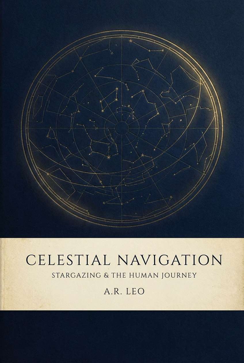
Image example of regal harbor generated using media.io
Media.io is an online AI studio for creating and editing video, image, and audio in your browser.

2) Midnight Gild
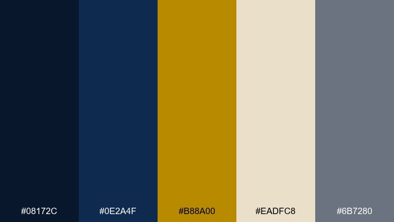
HEX: #08172C #0E2A4F #B88A00 #EADFC8 #6B7280
Mood: moody, luxe, cinematic
Best for: movie poster and event poster design
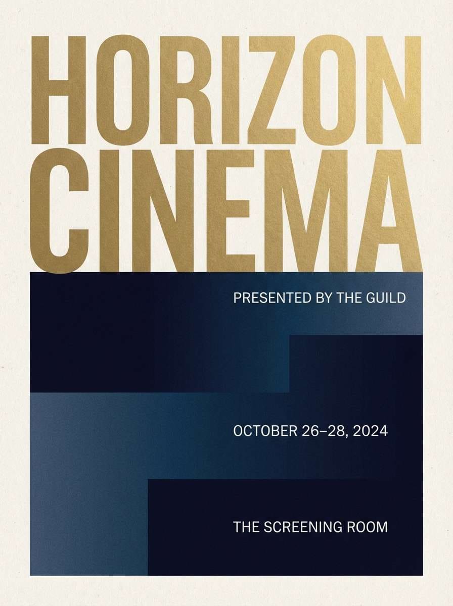
Moody and cinematic, it evokes a midnight skyline lit by gilded signage. These gold dark blue color combinations shine when you build big dark shapes first, then add gold as a punchy title or emblem. Warm beige keeps the drama from feeling cold, while gray supports secondary copy. Tip: add a subtle grain over the dark blues to prevent banding in large backgrounds.
Image example of midnight gild generated using media.io
3) Navy Champagne
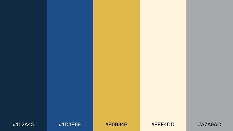
HEX: #102A43 #1D4E89 #E0B84B #FFF4DD #A7A9AC
Mood: celebratory, airy, refined
Best for: wedding invitations and stationery
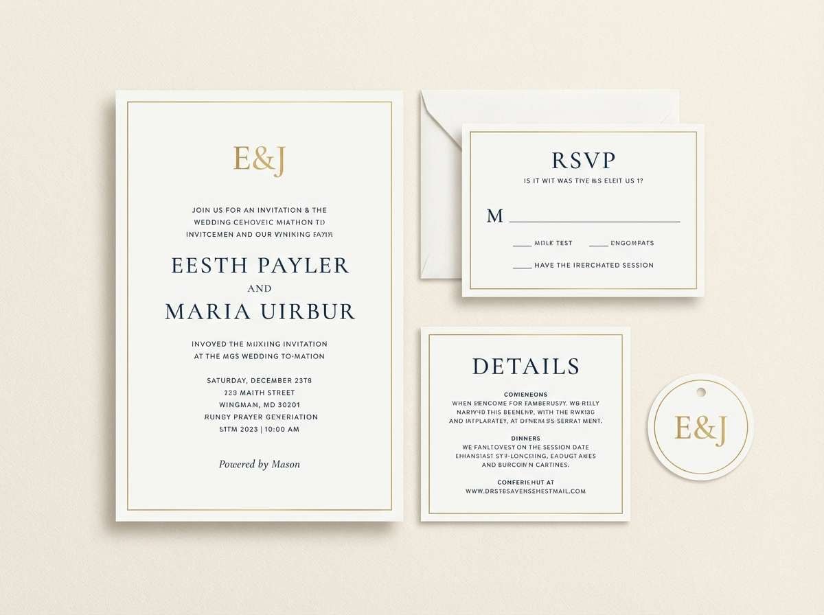
Light and celebratory, it feels like champagne bubbles against a night-blue dress. Use the ivory as the paper tone, then set navy for body text and borders for a timeless look. Save the gold for foil-like monograms, dividers, or RSVP highlights, and keep gray for small details. Tip: choose a slightly softer gold on screen to mimic printed foil without glare.
Image example of navy champagne generated using media.io
4) Art Deco Lobby
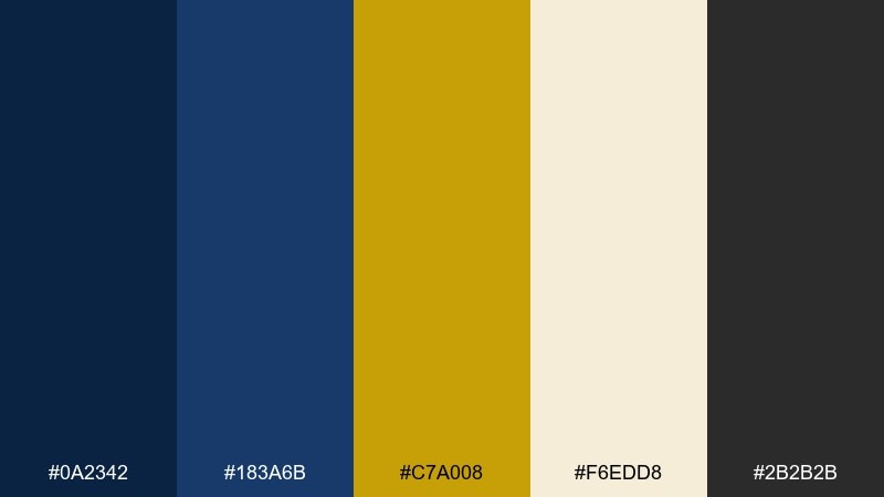
HEX: #0A2342 #183A6B #C7A008 #F6EDD8 #2B2B2B
Mood: glam, geometric, vintage-luxe
Best for: hotel brochures and lobby signage graphics
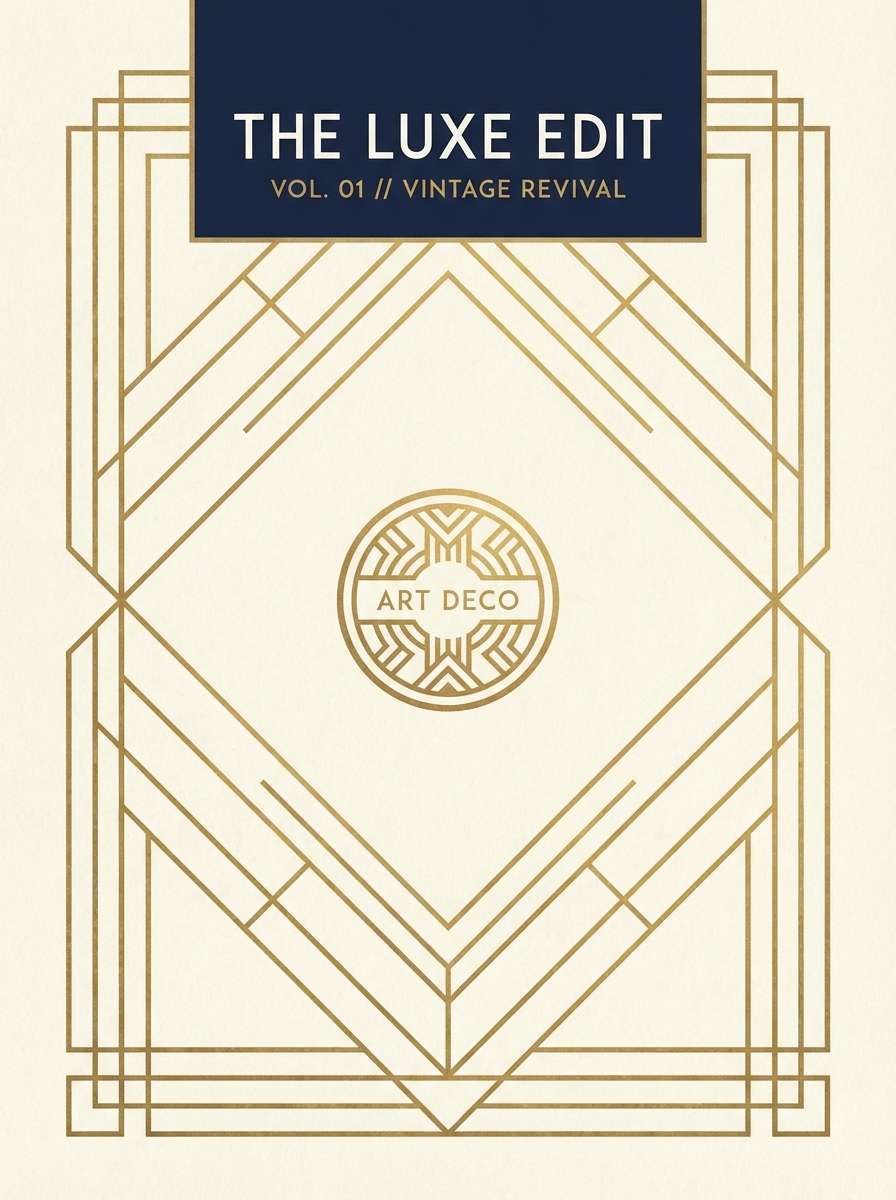
Glamorous and geometric, it recalls an art deco lobby with brass rails and dark lacquered walls. This gold dark blue color palette works best with strong symmetry, bold frames, and crisp type. Pair cream with generous margins so the darker blues stay elegant rather than heavy. Tip: repeat gold lines at consistent thickness to keep the design looking intentional and premium.
Image example of art deco lobby generated using media.io
5) Celestial Brass
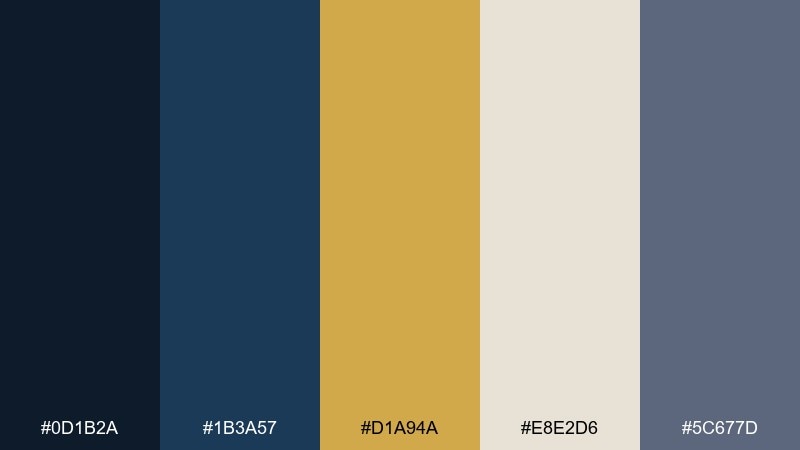
HEX: #0D1B2A #1B3A57 #D1A94A #E8E2D6 #5C677D
Mood: mystical, calm, scholarly
Best for: book covers and publishing design
Mystical and calm, it suggests constellations mapped in brass ink on midnight paper. Use the darkest blue for the cover field and bring in gold for star points, rules, and title emphasis. The soft parchment neutral supports subtitles and author names without competing. Tip: keep gold elements slightly textured to avoid a flat, sticker-like effect.
Image example of celestial brass generated using media.io
6) Museum Night
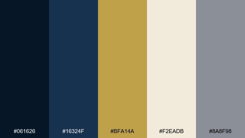
HEX: #061626 #16324F #BFA14A #F2EADB #8A8F98
Mood: quiet, cultured, dramatic
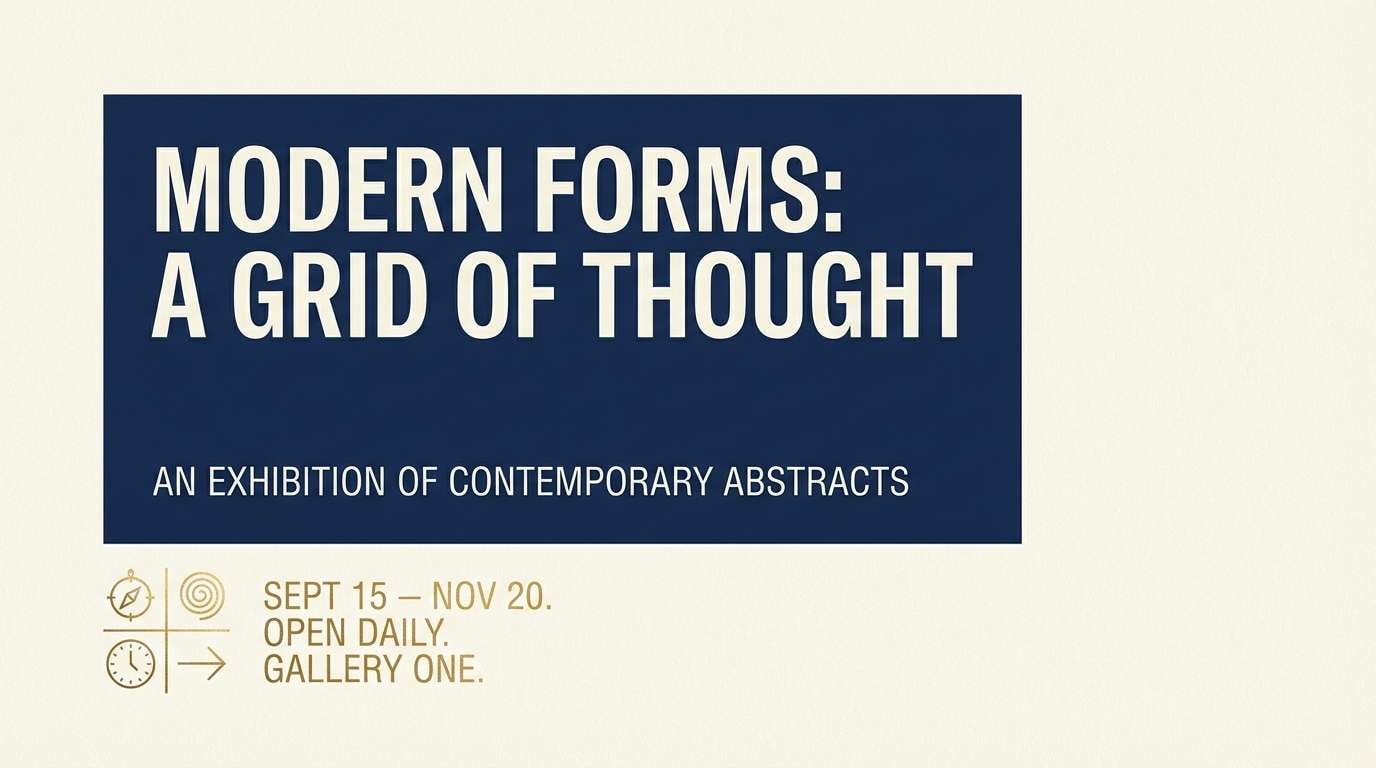
Best for: exhibition posters and gallery ads
Quiet and cultured, it feels like a museum after hours with spotlights on gilded frames. Build the layout with deep blues as negative space and let gold mark dates, venue details, and key icons. Cream creates a soft reading panel and gray handles fine print. Tip: keep contrast high for accessibility by using cream text on the darkest blue, not gold on blue for long copy.
Image example of museum night generated using media.io
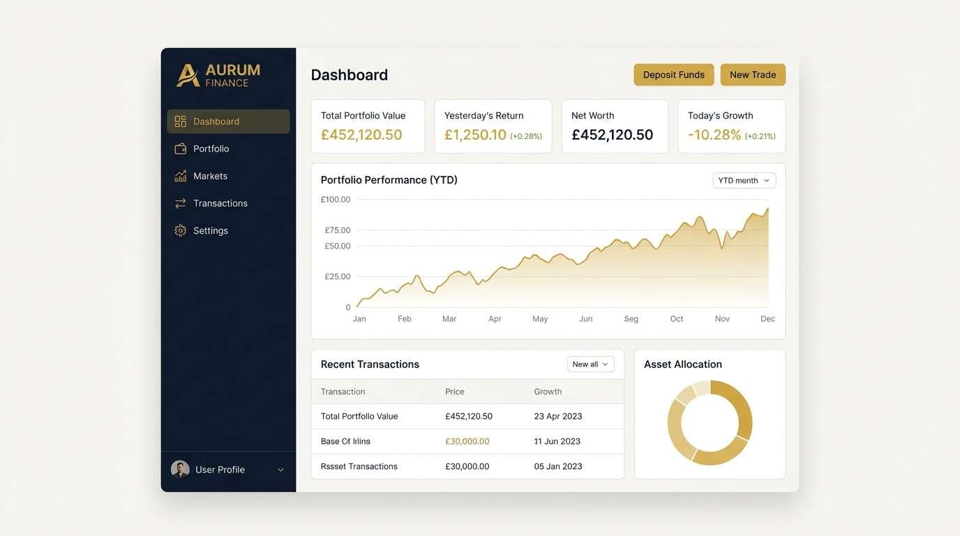
7) Royal Ledger
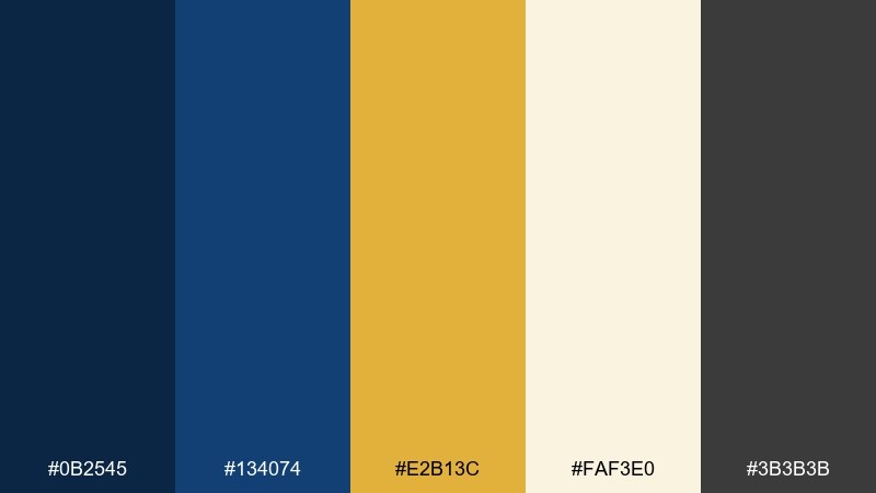
HEX: #0B2545 #134074 #E2B13C #FAF3E0 #3B3B3B
Mood: authoritative, clean, executive
Best for: finance dashboards and admin UI
Authoritative and clean, it reads like a leather-bound ledger with a gold-stamped spine. Use dark blue for navigation and headers, then apply the gold to calls to action and key metrics sparingly. Warm off-white keeps tables readable and reduces eye strain in dense screens. Tip: set gold buttons on off-white or very dark blue only, and avoid placing gold text on medium blue.
Image example of royal ledger generated using media.io
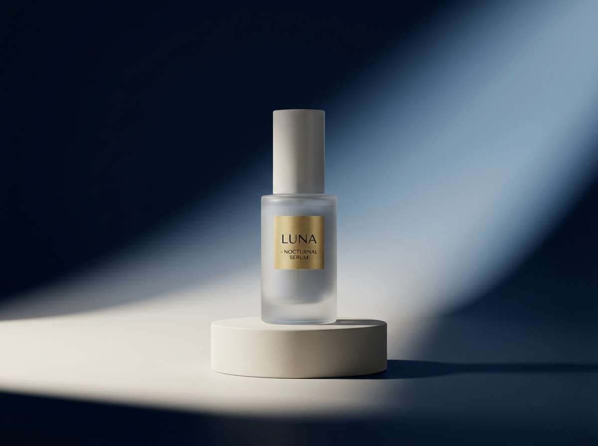
8) Blue Hour Luxe
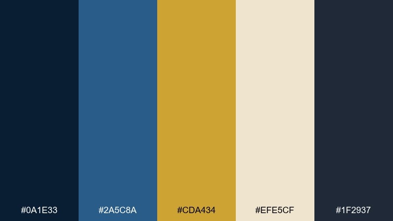
HEX: #0A1E33 #2A5C8A #CDA434 #EFE5CF #1F2937
Mood: modern, twilight, polished
Best for: premium skincare product ads
Polished and modern, it captures blue hour light hitting brushed metal. Make the deep navy your backdrop and bring in the brighter blue for secondary panels or gradient overlays. Gold sells the premium cue best when used as thin lines, caps, or a single hero badge. Tip: in ads, keep the gold close to the product name so the eye lands on your brand first.
Image example of blue hour luxe generated using media.io
9) Gilded Ink
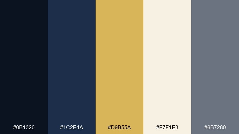
HEX: #0B1320 #1C2E4A #D9B55A #F7F1E3 #6B7280
Mood: literary, elegant, moody
Best for: blog headers and editorial thumbnails
Literary and elegant, it feels like ink on vellum with a gilded flourish. Use the darkest shade for headline bars and let the warm neutral carry the content area for a magazine-like balance. Gold works beautifully on small icons, separators, and category tags. Tip: for thumbnails, boost contrast by pairing gold with the deepest navy rather than the mid-blue.
Image example of gilded ink generated using media.io
10) Coastline Crest
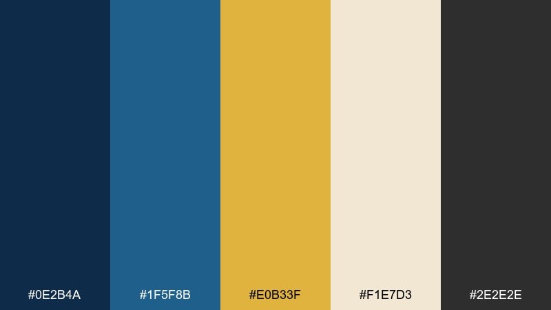
HEX: #0E2B4A #1F5F8B #E0B33F #F1E7D3 #2E2E2E
Mood: fresh, preppy, coastal
Best for: resort websites and travel brochures
Fresh and preppy, it brings to mind a coastal crest stitched on a deep-blue towel. Lean on navy for menus and section headers, then use the brighter blue for links and hover states. Gold adds a sunny accent for badges, ratings, or booking prompts, while cream keeps pages open and airy. Tip: use gold as an icon fill rather than body text to protect readability.
Image example of coastline crest generated using media.io

11) Observatory Gold
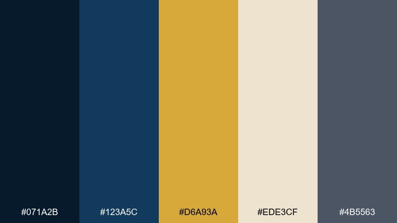
HEX: #071A2B #123A5C #D6A93A #EDE3CF #4B5563
Mood: scientific, dreamy, precise
Best for: science conference branding
Dreamy yet precise, it resembles an observatory dome with brass instruments catching light. These gold dark blue color combinations are ideal for diagrams, data callouts, and elegant section dividers. Use the cream as a stable canvas for schedules and speaker bios, and keep gray for captions and footnotes. Tip: pick one consistent gold hue for all charts so the visual system stays coherent.
Image example of observatory gold generated using media.io

12) Heritage Suit
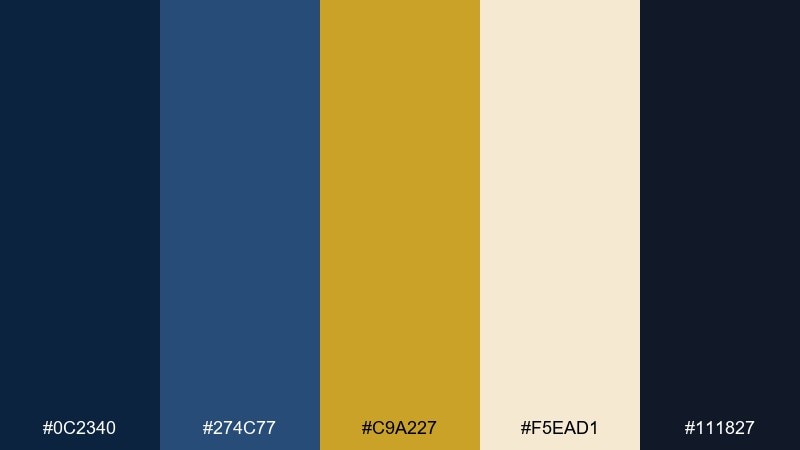
HEX: #0C2340 #274C77 #C9A227 #F5EAD1 #111827
Mood: classic, tailored, trustworthy
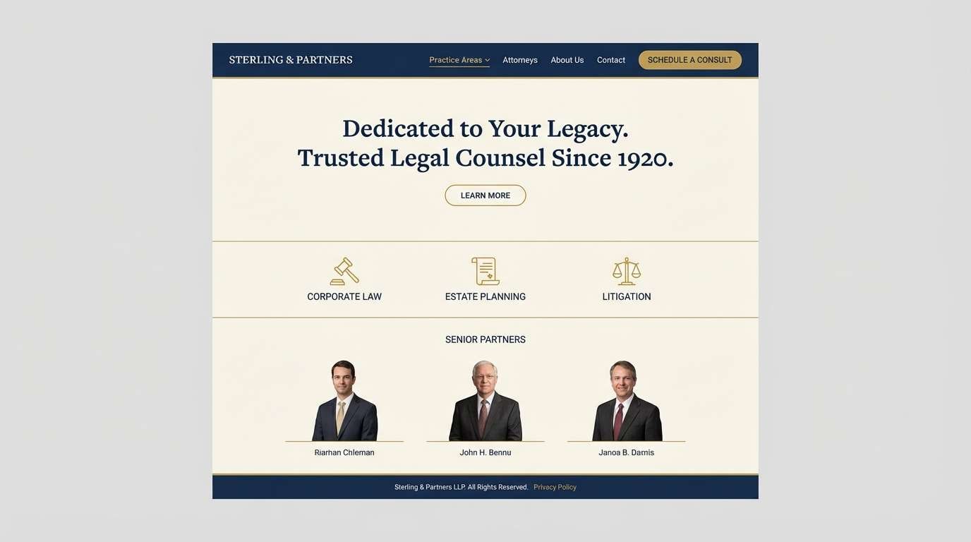
Best for: law firm websites and stationery
Classic and tailored, it feels like a well-cut suit with a subtle gold tie bar. Use navy for headers and navigation, then keep body areas light with warm cream for a traditional, trustworthy read. Gold is best as a restrained accent for seals, bullets, and section dividers. Tip: match gold accents with a serif headline font to reinforce the heritage tone.
Image example of heritage suit generated using media.io
13) Lantern on Navy
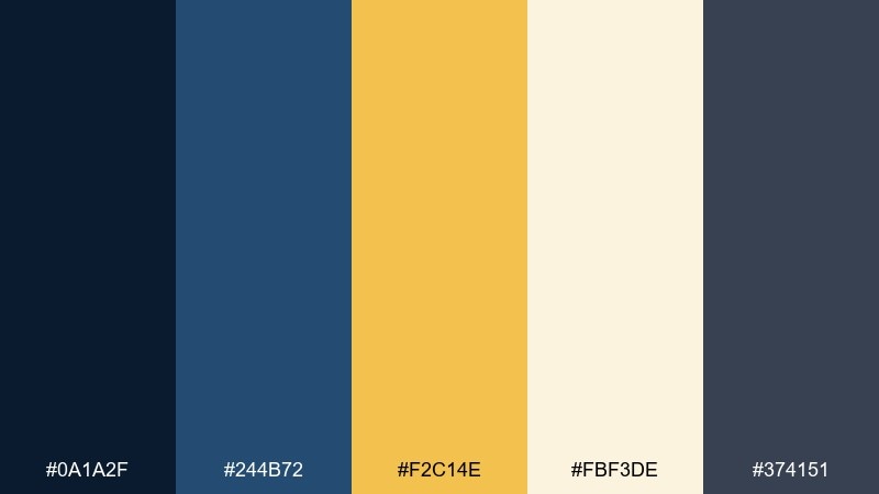
HEX: #0A1A2F #244B72 #F2C14E #FBF3DE #374151
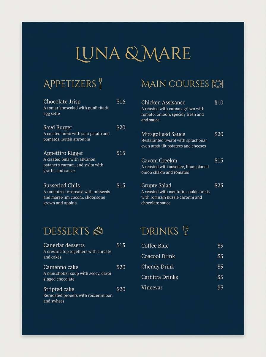
Mood: warm, welcoming, evening
Best for: restaurant menus and signage
Warm and welcoming, it evokes lantern light glowing against a night street. Use navy for the menu background and set headings in gold to signal specials and signature dishes. Cream improves readability for item descriptions, while gray keeps secondary notes quiet. Tip: if printing, test the navy swatch so it stays rich and not muddy under warm indoor lighting.
Image example of lantern on navy generated using media.io
14) Imperial Stationery
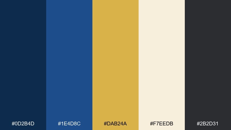
HEX: #0D2B4D #1E4D8C #DAB24A #F7EEDB #2B2D31
Mood: formal, crisp, ceremonial
Best for: certificates and award templates
Formal and ceremonial, it resembles an award certificate with a crisp border and metallic seal. Keep the background light and use navy for typography to maintain a dignified, official feel. Gold is perfect for seals, corner ornaments, and signature lines, while dark gray supports small legal text. Tip: avoid over-decorating with gold flourishes so the certificate still feels modern.
Image example of imperial stationery generated using media.io
15) Winter Gala
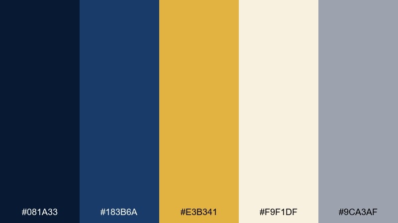
HEX: #081A33 #183B6A #E3B341 #F9F1DF #9CA3AF
Mood: festive, elegant, wintry
Best for: holiday party invitations
Festive and wintry, it looks like candlelight reflecting on a midnight-blue coat. The gold and cream together create a soft sparkle without leaning kitschy. Use navy for the main type and borders, then highlight the date and RSVP in gold for quick scanning. Tip: add a subtle snowflake or star pattern in a low-contrast blue so the layout stays sophisticated.
Image example of winter gala generated using media.io
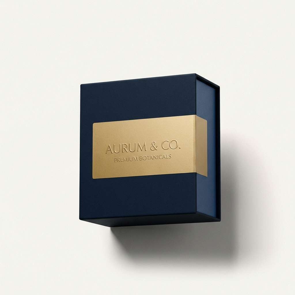
16) Studio Spotlight
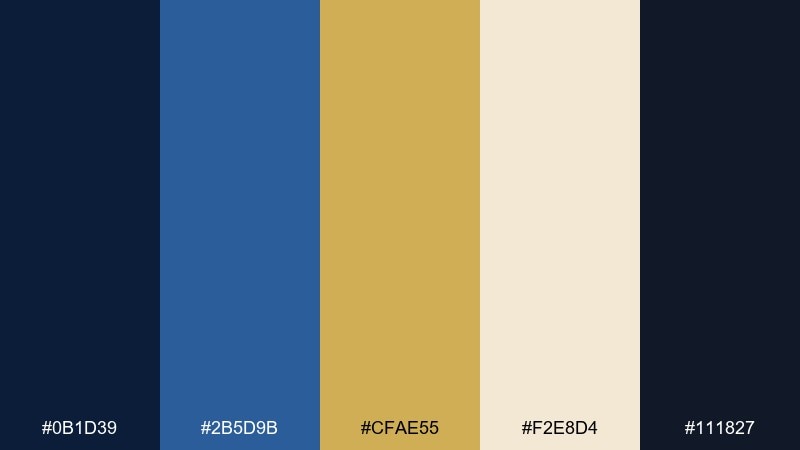
HEX: #0B1D39 #2B5D9B #CFAE55 #F2E8D4 #111827
Mood: confident, modern, high-contrast
Best for: product packaging and labels
Confident and high-contrast, it feels like a spotlight hitting a gold label on a dark shelf. Use the deepest blue for the package body, then let gold carry the brand mark and key claim. Cream works well for ingredient panels and compliance text, while the brighter blue can support secondary variants. Tip: keep gold matte rather than glossy in renders to avoid unwanted reflections.
Image example of studio spotlight generated using media.io
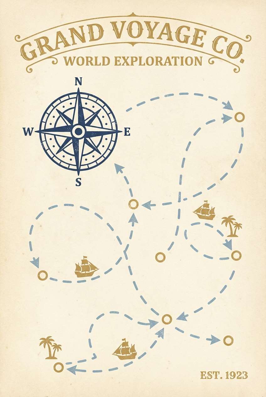
17) Vintage Compass
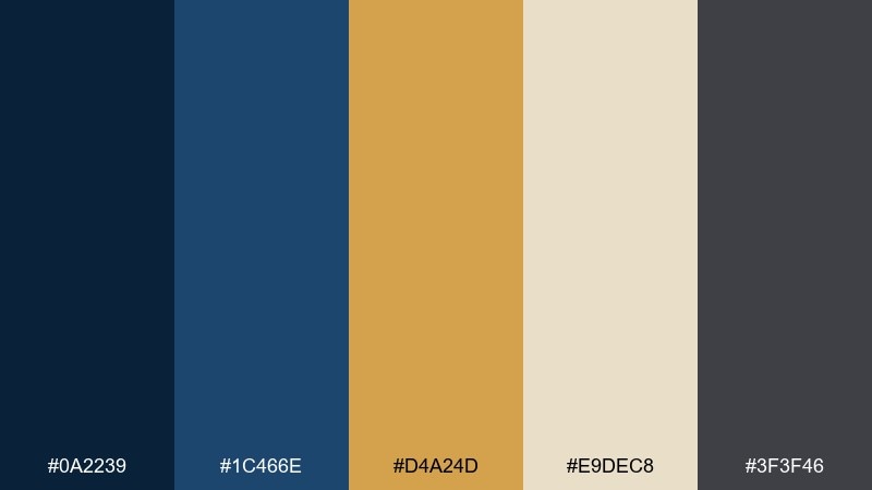
HEX: #0A2239 #1C466E #D4A24D #E9DEC8 #3F3F46
Mood: adventurous, nostalgic, curated
Best for: museum gift shop posters and prints
Adventurous and nostalgic, it recalls a vintage compass with worn brass and deep enamel. Use navy for large shapes and a brighter blue for map-like details or route lines. Gold works best in small, repeated marks such as coordinates, pins, or a title lockup. Tip: add light distressing to the cream background to enhance the vintage print feel.
Image example of vintage compass generated using media.io
18) Sapphire Mantle
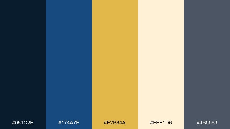
HEX: #081C2E #174A7E #E2B84A #FFF1D6 #4B5563
Mood: bold, jewel-toned, upscale
Best for: jewelry ecommerce banners
Bold and jewel-toned, it channels sapphire velvet with a warm gold clasp. Make the deep blue your hero backdrop so product photography and headlines feel instantly upscale. Use the lighter blue for secondary promos, then add gold to price badges or limited-time tags. Tip: for ecommerce, keep the CTA in gold on navy and limit other competing highlights.
Image example of sapphire mantle generated using media.io
19) Trophy Room
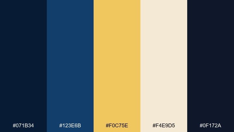
HEX: #071B34 #123E6B #F0C75E #F4E9D5 #0F172A
Mood: victorious, bold, sporty-luxe
Best for: sports award graphics and social posts
Victorious and bold, it feels like a trophy room lit by warm spotlights. A gold dark blue color combination works especially well for medals, rankings, and winner announcements because it reads instantly as premium. Use the darkest navy for backgrounds, then bring in bright gold for numbers and key stats. Tip: keep supporting text in cream to avoid vibrating contrast between gold and blue at small sizes.
Image example of trophy room generated using media.io

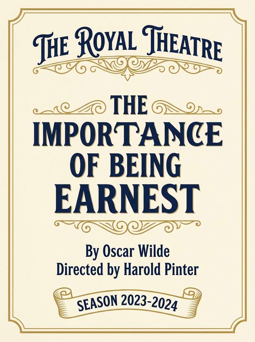
20) Grand Theater
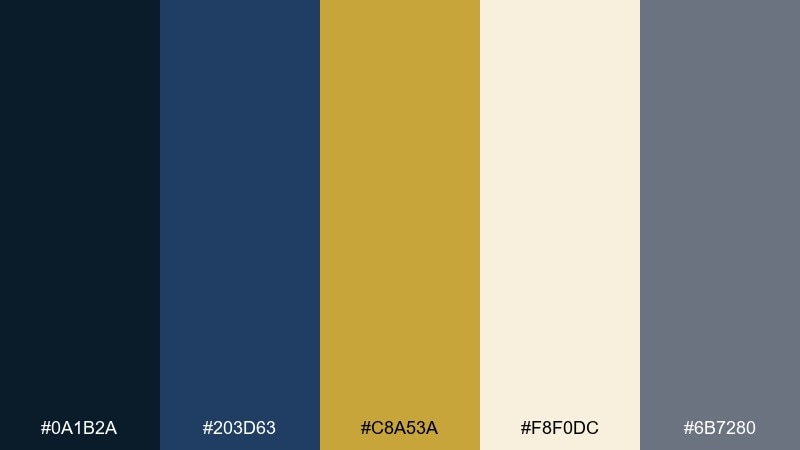
HEX: #0A1B2A #203D63 #C8A53A #F8F0DC #6B7280
Mood: dramatic, romantic, classic
Best for: theater playbills and tickets
Dramatic and classic, it evokes velvet curtains and a gold-edged marquee. Use navy for the main layout and let gold frame the title, cast list headings, and ticket details. The cream tone mimics paper stock and keeps dense information legible, while gray supports fine print. Tip: maintain a consistent gold border system so every page of the playbill feels cohesive.
Image example of grand theater generated using media.io
What Colors Go Well with Gold Dark Blue?
Warm neutrals like cream, ivory, parchment, and beige are the easiest companions for gold and dark blue. They soften the contrast, improve readability, and help gold feel intentional instead of overly bright.
For modern UIs, add cool grays and near-black for typography and secondary UI elements. This keeps the interface structured while letting gold remain a premium accent.
If you want more energy, introduce a controlled pop color (like a brighter blue for links or hover states). Keep it limited so it supports the system rather than competing with the gold.
How to Use a Gold Dark Blue Color Palette in Real Designs
Start by assigning roles: dark blue for backgrounds, navigation, and headline blocks; neutrals for content surfaces; gold for emphasis (CTAs, badges, dividers, key numbers). This hierarchy prevents “all-accent” designs that look busy.
For accessibility, avoid long paragraphs in gold on blue—gold is best for short labels, icons, and headlines. Use cream or off-white for body text on navy to keep contrast comfortable.
In print, test swatches under real lighting and consider a slightly muted gold to mimic metallic foil without glare. Consistent line thickness and spacing also help the palette feel more premium.
Create Gold Dark Blue Palette Visuals with AI
If you’re building a brand board, invitation suite, poster, or UI concept, AI can help you visualize gold dark blue combinations quickly. Generate multiple compositions, test mood shifts, and iterate on layout before committing to production.
Use prompts that specify “muted gold,” “deep navy,” and a clear style (minimal, art deco, cinematic, editorial) to keep results consistent. Add aspect ratio instructions to match your target format.
Gold Dark Blue Color Palette FAQs
-
Is navy and gold a good combination for branding?
Yes. Navy communicates trust and competence, while gold signals quality and distinction. Keep gold as an accent (often 5–10% of the design) so the brand feels premium rather than flashy. -
What background works best with gold dark blue palettes?
Deep navy or near-black backgrounds look luxurious, but for readability in long-form content, a warm off-white/cream surface is often better. Use navy for headers and structure, then gold for highlights. -
Can I use gold text on a dark blue background?
You can for short headlines or labels, but it’s not ideal for body copy because gold can appear low-contrast or “vibrate” at small sizes. For paragraphs, use cream/off-white text on navy instead. -
How do I make gold look like foil on screen?
Choose a slightly softer gold hue and add subtle texture or gradient sparingly. Pair it with cream and deep navy to suggest metallic depth without relying on extreme shine. -
Which neutral colors pair best with navy and gold?
Ivory, parchment, warm beige, and soft grays pair especially well. They act as breathing room, reduce harsh contrast, and help gold accents stand out cleanly. -
What’s the best way to use gold in UI design?
Use gold for CTAs, key metrics, badges, and small icon fills—not for dense text. Keep main surfaces neutral and use navy for navigation so the interface stays clear and accessible. -
Do gold dark blue palettes work for weddings and events?
Absolutely. Navy provides a formal base, while gold adds celebration. Use ivory paper tones (or digital equivalents) and reserve gold for monograms, borders, and key details like dates and RSVP cues.


