

Pink cream is one of those rare color families that can feel romantic, modern, or minimal depending on what you pair it with. It softens layouts instantly, but still leaves room for strong type, clean UI, and premium product photography.
Below are pink cream color palette ideas with HEX codes, mood notes, and practical pairing tips you can apply to branding, invitations, packaging, and web design.
In this article
- Why Pink Cream Palettes Work So Well
-
- rose chantilly
- strawberry milk
- peony shortcake
- ballet slipper neutral
- vintage vanity
- petal oat
- rosewater clay
- soft glam blush
- cafe cream pink
- cozy nursery
- sunset sorbet
- modern bridal
- minimal skincare
- floral stationery
- dusty rose concrete
- cherry blossom ui
- warm pink marble
- creamy coral pop
- blush charcoal edge
- pink cream sage calm
- What Colors Go Well with Pink Cream?
- How to Use a Pink Cream Color Palette in Real Designs
- Create Pink Cream Palette Visuals with AI
Why Pink Cream Palettes Work So Well
Pink cream sits in a sweet spot between warmth and softness: the cream keeps things light and breathable, while the pink adds personality without overpowering the layout. That balance makes it easy to scale from subtle backgrounds to bold accents.
These palettes also photograph beautifully. Cream backgrounds reduce harsh contrast, and blush-to-mauve ranges create gentle depth that looks premium in packaging, product shots, and lifestyle visuals.
From a usability standpoint, pink cream pairs well with dark neutrals (charcoal, cocoa, near-black), making it easier to maintain readable typography and clear hierarchy in modern UI and brand systems.
20+ Pink Cream Color Palette Ideas (with HEX Codes)
1) Rose Chantilly
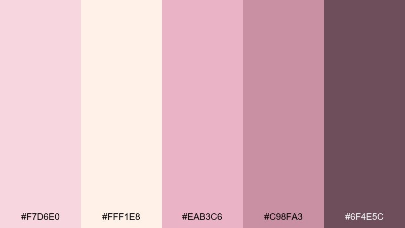
HEX: #F7D6E0 #FFF1E8 #EAB3C6 #C98FA3 #6F4E5C
Mood: airy, romantic, polished
Best for: beauty branding and hero banners
Airy and romantic, these tones feel like whipped cream frosting over soft rose petals. Use it for beauty brands, landing page heroes, and lifestyle ads where warmth matters. Pair with thin charcoal typography or a muted plum accent to keep it grown up. Tip: let the cream shade dominate the background and reserve the deeper mauve for buttons and price highlights.
Image example of rose chantilly generated using media.io
Media.io is an online AI studio for creating and editing video, image, and audio in your browser.

2) Strawberry Milk
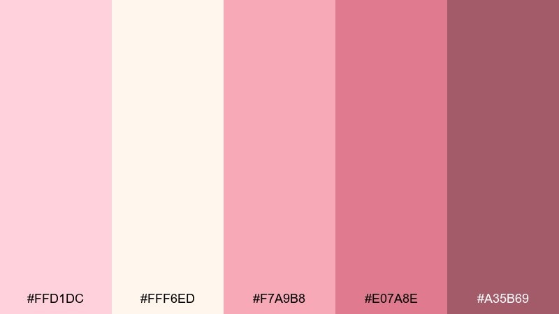
HEX: #FFD1DC #FFF6ED #F7A9B8 #E07A8E #A35B69
Mood: sweet, friendly, youthful
Best for: cafe menus and dessert promos
Sweet and friendly, the mix reads like strawberry milk beside a warm pastry case. It works beautifully for cafe menus, dessert promos, and social graphics that need a cheerful vibe. Balance the playful pinks with plenty of creamy negative space and a cocoa-toned headline. Tip: use the mid pink for callouts and the deeper rose for prices to improve readability.
Image example of strawberry milk generated using media.io
3) Peony Shortcake
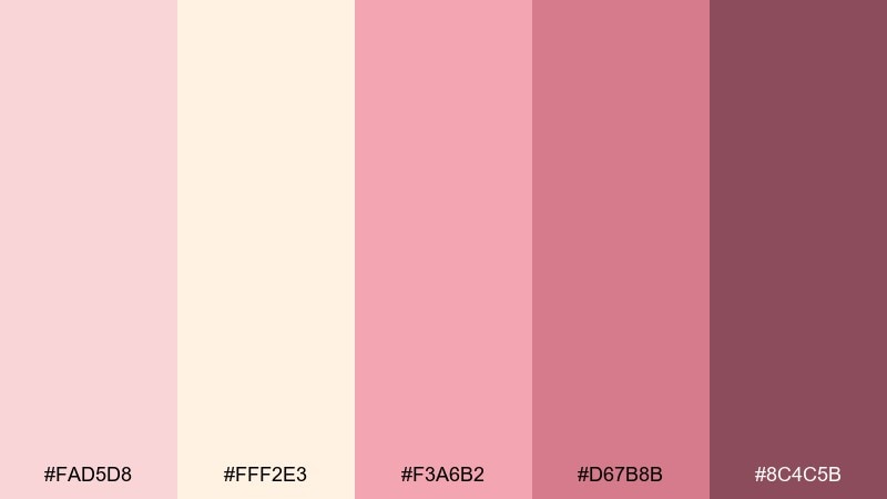
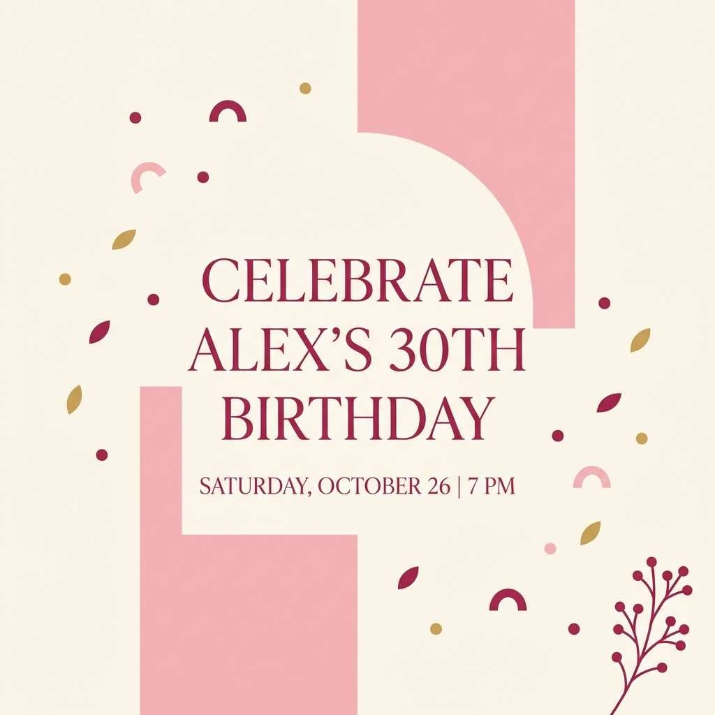
HEX: #FAD5D8 #FFF2E3 #F3A6B2 #D67B8B #8C4C5B
Mood: festive, cozy, nostalgic
Best for: birthday invitations and party flyers
Festive and cozy, these shades feel like peony petals tucked into a bakery box. They suit birthday invitations, party flyers, and small event graphics that need warmth without loud color. Add a touch of deep berry for structure and keep the cream as your main canvas. Tip: print designs look best when the lightest pink is used as a tint rather than a full-bleed block.
Image example of peony shortcake generated using media.io
4) Ballet Slipper Neutral
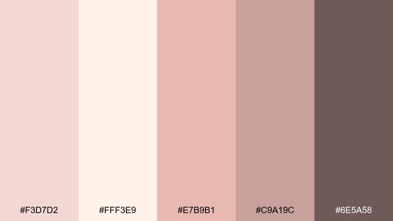
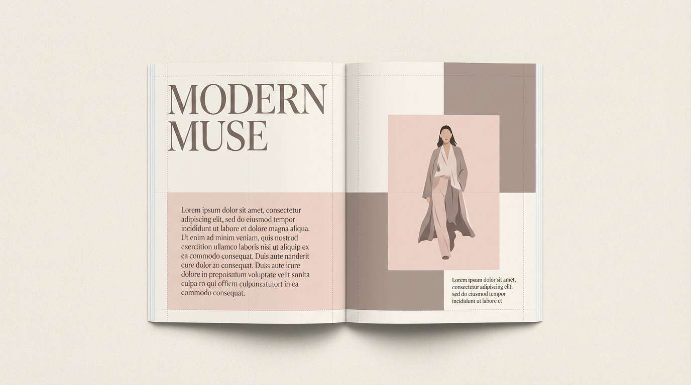
HEX: #F3D7D2 #FFF3E9 #E7B9B1 #C9A19C #6E5A58
Mood: calm, minimal, refined
Best for: editorial layouts and lookbooks
Calm and refined, the tones echo ballet slippers, satin ribbons, and warm studio light. Use them in lookbooks, editorial layouts, and brand stories where subtlety sells. Pair with off-black text and a little warm taupe for grids and rules. Tip: keep photos slightly warm so the palette feels intentional, not washed out.
Image example of ballet slipper neutral generated using media.io
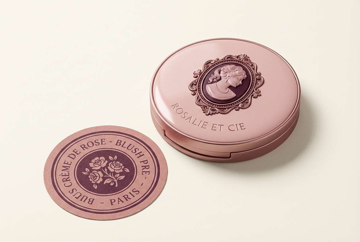
5) Vintage Vanity
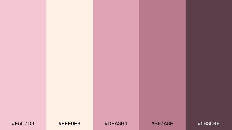
HEX: #F5C7D3 #FFF0E6 #DFA3B4 #B97A8E #5B3D49
Mood: vintage, feminine, dramatic
Best for: cosmetics packaging and boutique labels
Vintage and a little dramatic, this set brings to mind a powder compact on a vanity tray. The pink cream color palette works for boutique cosmetics, fragrance labels, and retro-inspired branding. Pair with gold foil details or a deep espresso outline for a premium finish. Tip: keep the darkest shade for small elements like borders and logos to avoid heavy blocks.
Image example of vintage vanity generated using media.io
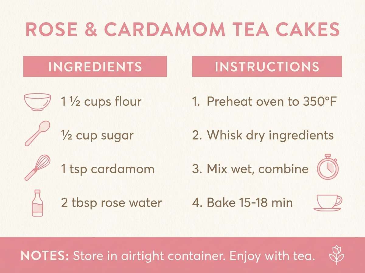
6) Petal Oat
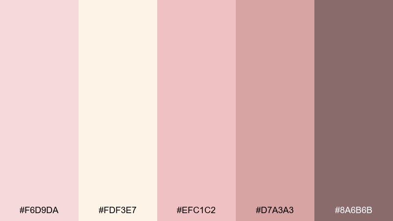
HEX: #F6D9DA #FDF3E7 #EFC1C2 #D7A3A3 #8A6B6B
Mood: soft, natural, comforting
Best for: wellness blogs and recipe cards
Soft and comforting, the colors feel like oat milk, rose petals, and morning light. They fit wellness blogs, recipe cards, and gentle lifestyle content where you want a calm scroll. Pair with warm gray typography and a minimal line icon set. Tip: use the muted rose for section headers to guide the eye without harsh contrast.
Image example of petal oat generated using media.io
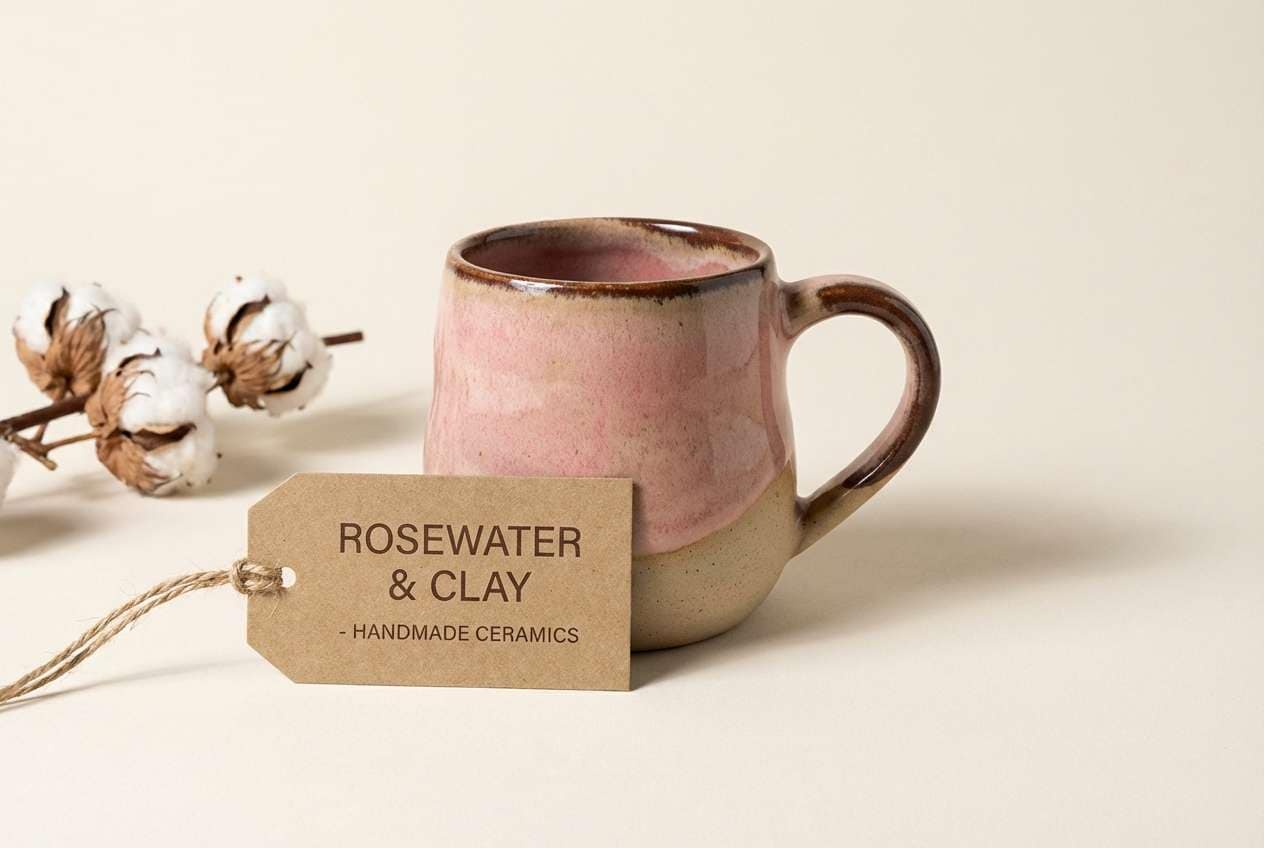
7) Rosewater Clay
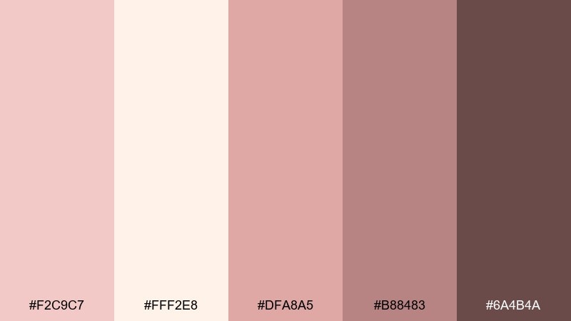
HEX: #F2C9C7 #FFF2E8 #DFA8A5 #B88483 #6A4B4A
Mood: earthy, warm, modern
Best for: ceramics shops and handmade branding
Earthy and modern, this mix looks like rosewater poured over sun-baked clay. It shines for handmade brands, ceramics shops, and artisan packaging where texture is part of the story. Pair with natural paper stocks and a dark cocoa ink for labels. Tip: introduce subtle grain or speckle overlays in the background to enhance the crafted feel.
Image example of rosewater clay generated using media.io
8) Soft Glam Blush
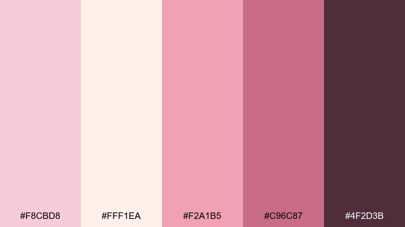
HEX: #F8CBD8 #FFF1EA #F2A1B5 #C96C87 #4F2D3B
Mood: glam, playful, high-contrast
Best for: makeup campaigns and promo banners
Glam and playful, the high-contrast rose and plum feel like lipstick against a bright vanity mirror. Use it for makeup campaigns, promo banners, and limited-edition drops that need a punchy focal point. Pair with clean cream backgrounds and tight typography for a modern finish. Tip: apply the darkest shade to CTA buttons and keep the brightest pink for highlights and tags.
Image example of soft glam blush generated using media.io
9) Cafe Cream Pink
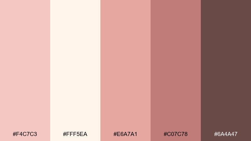
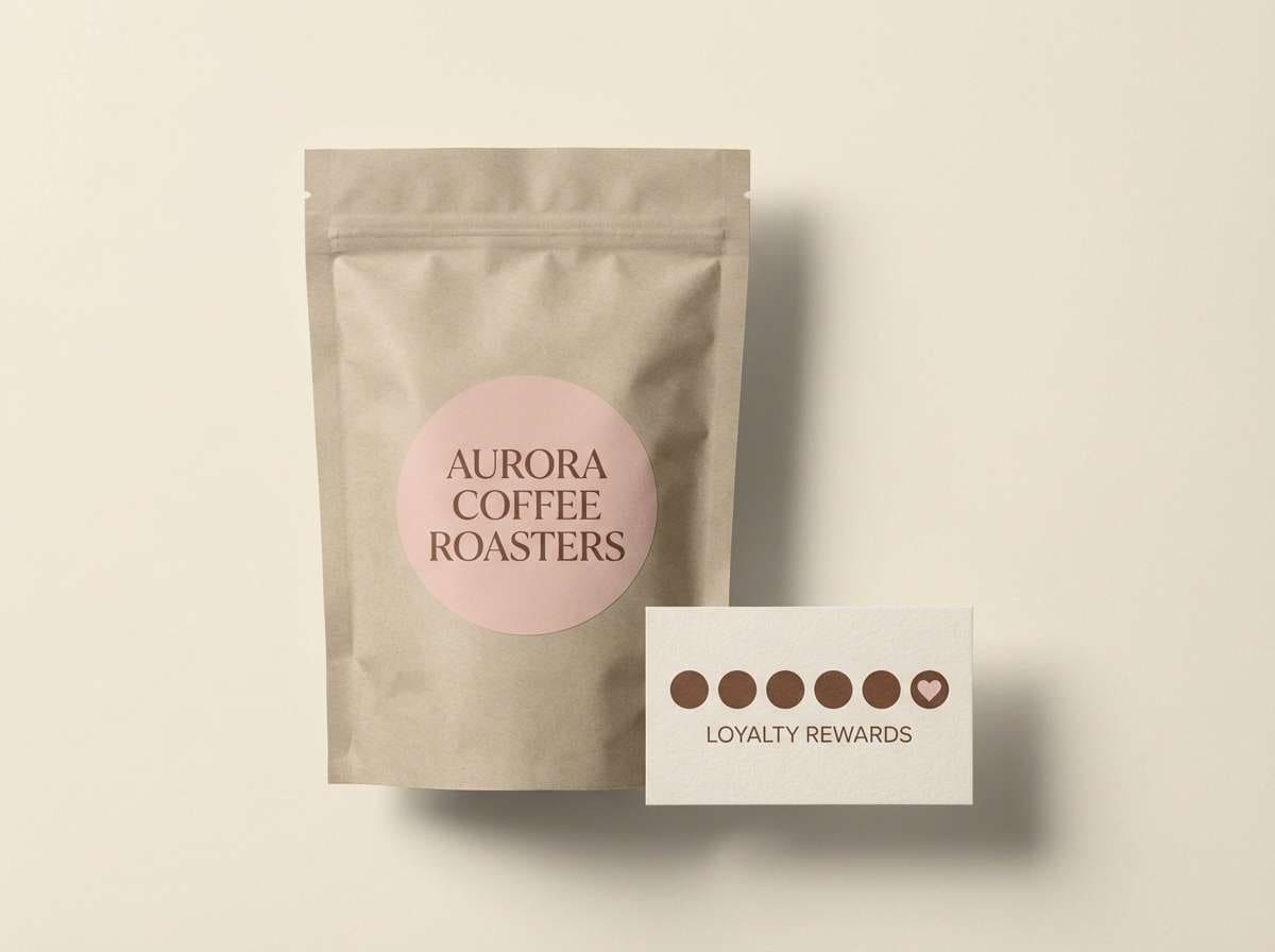
HEX: #F4C7C3 #FFF5EA #E6A7A1 #C07C78 #6A4A47
Mood: cozy, inviting, grounded
Best for: coffee packaging and loyalty cards
Cozy and grounded, these shades evoke a latte with a blush pastry on the side. They work well for coffee packaging, loyalty cards, and small retail touchpoints. Pair with kraft textures, warm browns, and simple iconography for a welcoming tone. Tip: keep the mid pink as a secondary block so the cream and brown do most of the heavy lifting.
Image example of cafe cream pink generated using media.io
10) Cozy Nursery
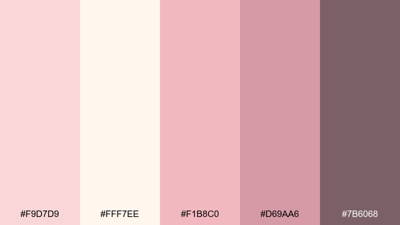
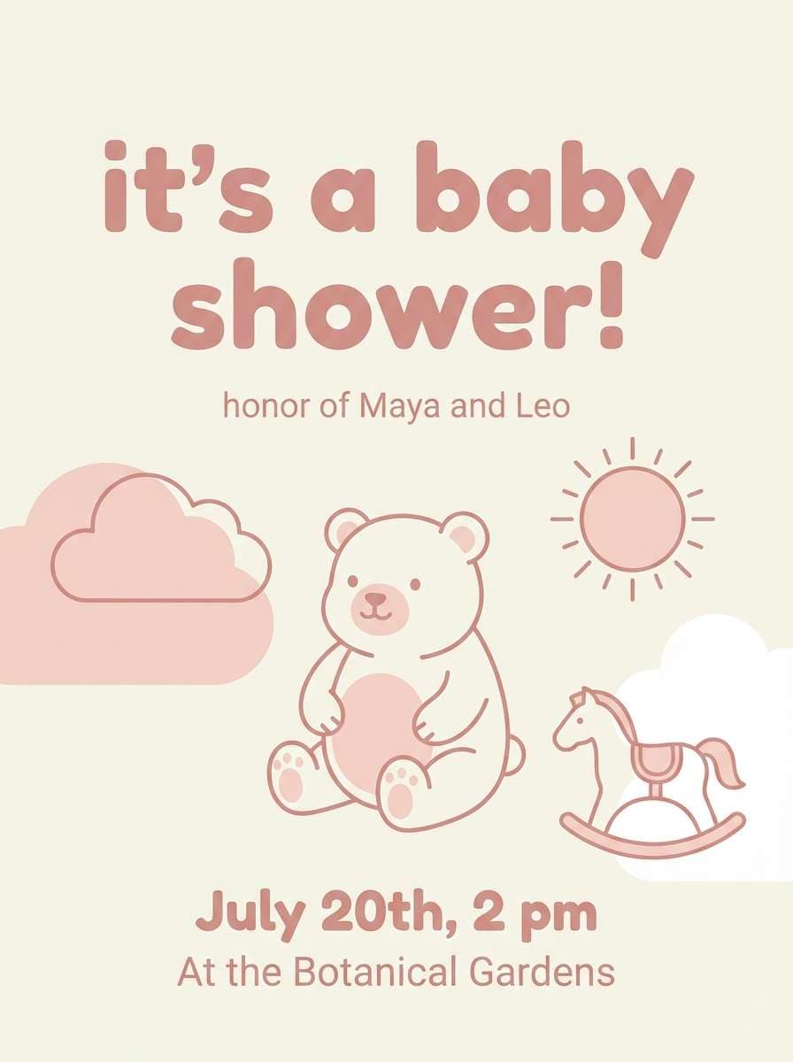
HEX: #F9D7D9 #FFF7EE #F1B8C0 #D69AA6 #7B6068
Mood: gentle, safe, soothing
Best for: baby shower invites and nursery decor
Gentle and soothing, this palette feels like a knitted blanket and soft bedtime light. It is ideal for baby shower invites, nursery decor prints, and parenting blog headers. Pair with rounded type and light line illustrations to keep everything tender and approachable. Tip: for print, choose a matte stock so the creams stay warm instead of glossy white.
Image example of cozy nursery generated using media.io
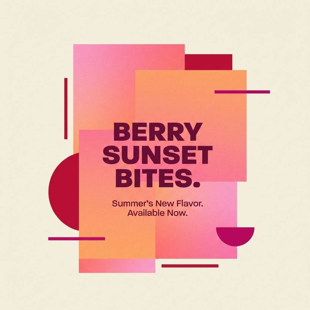
11) Sunset Sorbet
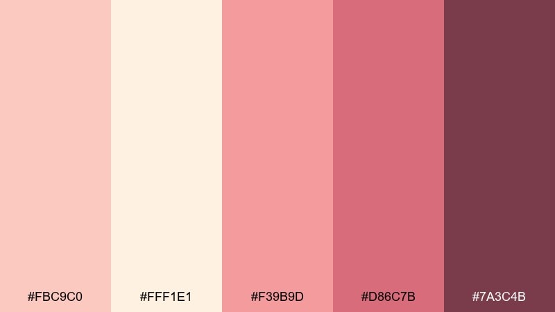
HEX: #FBC9C0 #FFF1E1 #F39B9D #D86C7B #7A3C4B
Mood: sunset, energetic, warm
Best for: social ads and seasonal launches
Warm and energetic, these colors look like sorbet melting at golden hour. Use them for social ads, seasonal launches, and upbeat web sections that need movement. Pair with crisp cream space and a darker berry for legible copy. Tip: use gradients between the two pinks for background panels, then anchor text on the cream.
Image example of sunset sorbet generated using media.io
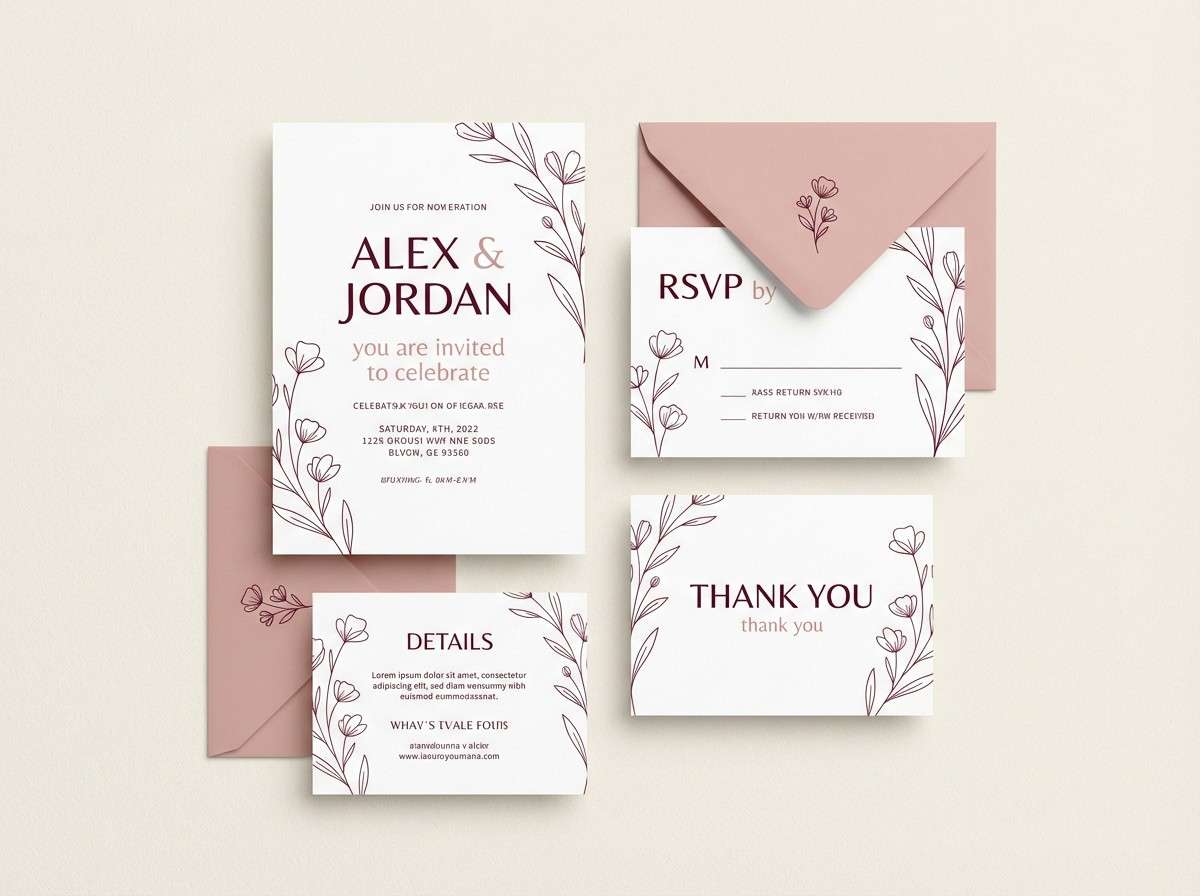
12) Modern Bridal

HEX: #F6D0D6 #FFF8F0 #E9A9B7 #C88396 #5E3E4B
Mood: elegant, airy, celebratory
Best for: wedding suites and venue brochures
Elegant and airy, the tones evoke silk ribbons, blush bouquets, and candlelit cream linens. These pink cream color combinations fit wedding suites, venue brochures, and RSVP pages that want romance without feeling sugary. Pair with a deep wine accent for names and headings, and keep body copy in soft charcoal. Tip: in invitations, use the mid pink as a thin border or monogram fill to avoid overpowering the paper.
Image example of modern bridal generated using media.io
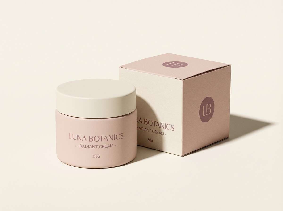
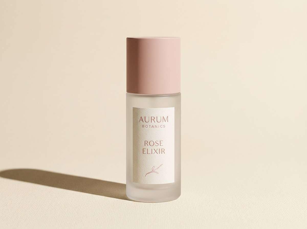
13) Minimal Skincare

HEX: #F2CDD6 #FFF4EC #E5A8B9 #B77A8F #3F2A32
Mood: clean, serene, premium
Best for: product pages and packaging mockups
Clean and serene, these shades feel like a quiet spa room with blush towels and warm cream walls. Use them for product pages, packaging mockups, and minimalist ads where clarity is key. Pair with ample whitespace, thin dividers, and one deep shade for hierarchy. Tip: keep photos neutral and warm so the pinks read sophisticated rather than neon.
Image example of minimal skincare generated using media.io
14) Floral Stationery
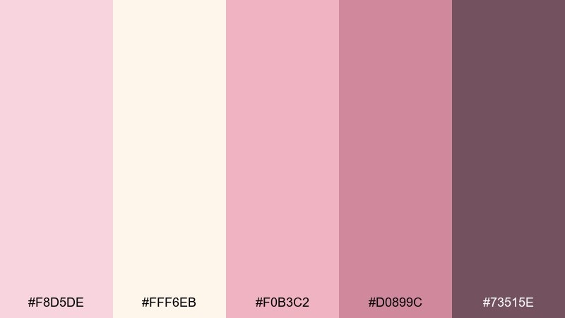
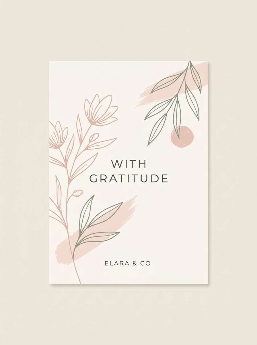
HEX: #F8D5DE #FFF6EB #F0B3C2 #D0899C #73515E
Mood: delicate, handcrafted, charming
Best for: thank you cards and stationery sets
Delicate and charming, the tones resemble pressed flowers on creamy paper. They are perfect for thank you cards, stationery sets, and small business inserts. Pair with subtle botanical line art and a warm gray ink to keep details crisp. Tip: use the lightest pink as a background tint, then reserve the deeper rose for borders and seals.
Image example of floral stationery generated using media.io
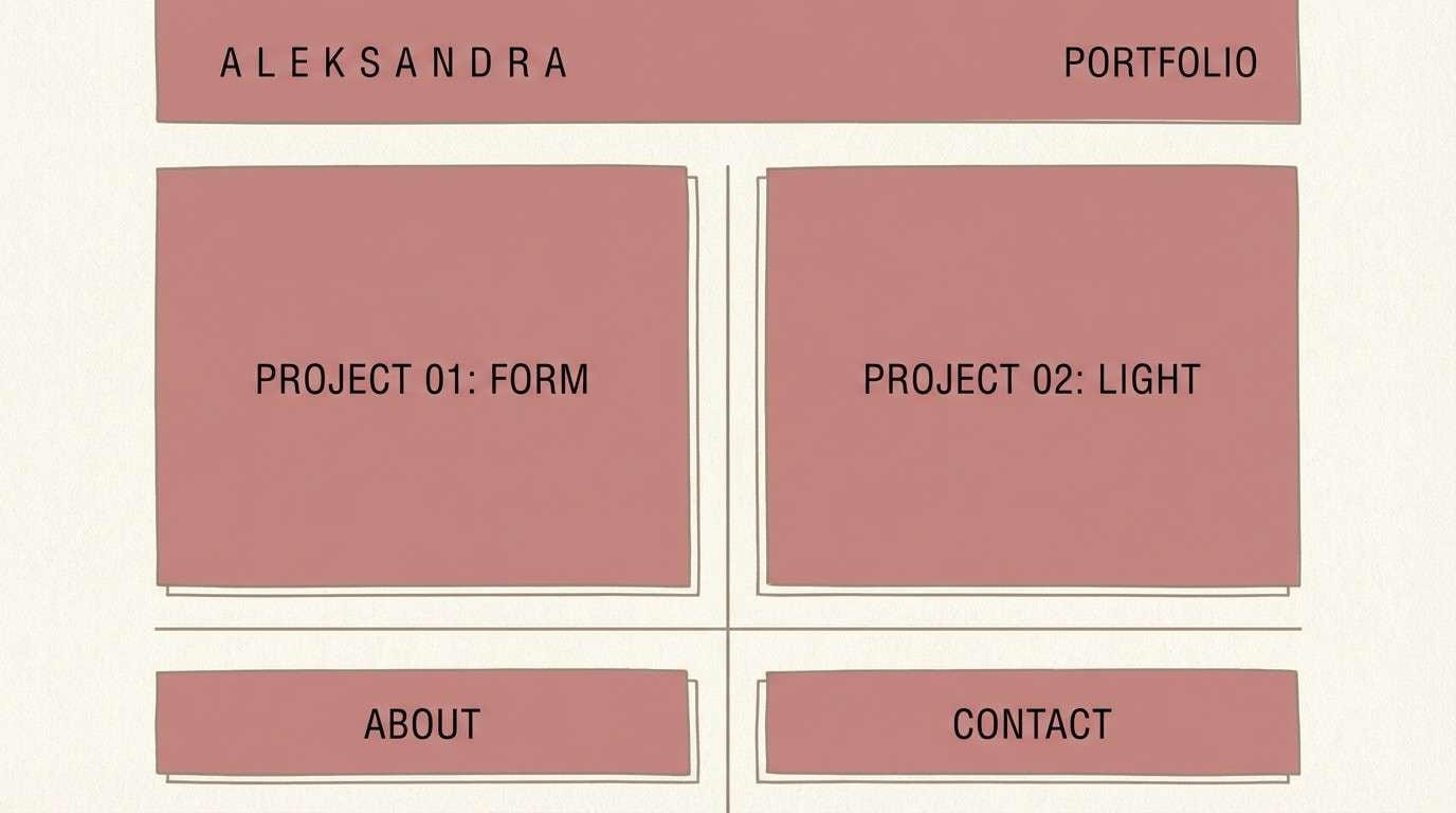
15) Dusty Rose Concrete
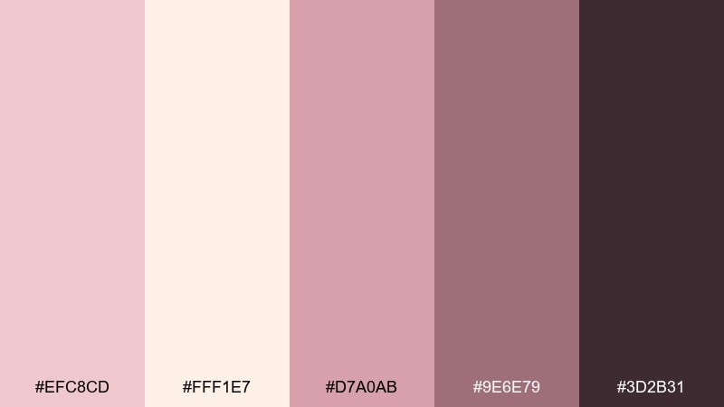
HEX: #EFC8CD #FFF1E7 #D7A0AB #9E6E79 #3D2B31
Mood: modern, muted, architectural
Best for: interior moodboards and portfolio sites
Muted and architectural, this set looks like dusty rose paint against creamy concrete. The pink cream color scheme is great for interior moodboards, portfolio sites, and modern brand decks that need softness with structure. Pair with cool grays, clean grids, and plenty of breathing room for a gallery feel. Tip: use the darkest shade for navigation and captions, and keep panels in the pale cream for contrast.
Image example of dusty rose concrete generated using media.io
16) Cherry Blossom UI
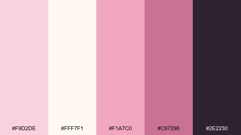
HEX: #F9D2DE #FFF7F1 #F1A7C0 #C97296 #2E2230
Mood: fresh, bright, tech-friendly
Best for: dashboard UI and app onboarding
Fresh and bright, these colors feel like cherry blossoms floating over a creamy sky. The pink cream color palette translates well to dashboards and onboarding screens when you keep contrast in mind. Pair with near-black text and use the mid pink for active states and badges. Tip: run accessibility checks and reserve the lightest pinks for backgrounds, not body text.
Image example of cherry blossom ui generated using media.io
17) Warm Pink Marble
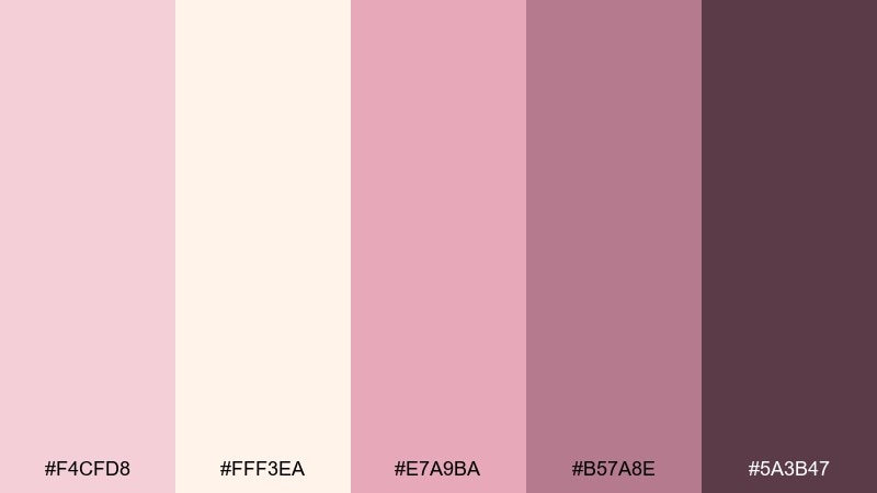
HEX: #F4CFD8 #FFF3EA #E7A9BA #B57A8E #5A3B47
Mood: luxurious, smooth, editorial
Best for: spa ads and premium social content
Luxurious and smooth, the tones recall warm pink marble veined through creamy stone. Use them for spa ads, premium social content, and upscale service pages. Pair with thin serif headlines and subtle shadows to keep it polished. Tip: if you use texture, keep it faint so the palette stays the star.
Image example of warm pink marble generated using media.io

18) Creamy Coral Pop
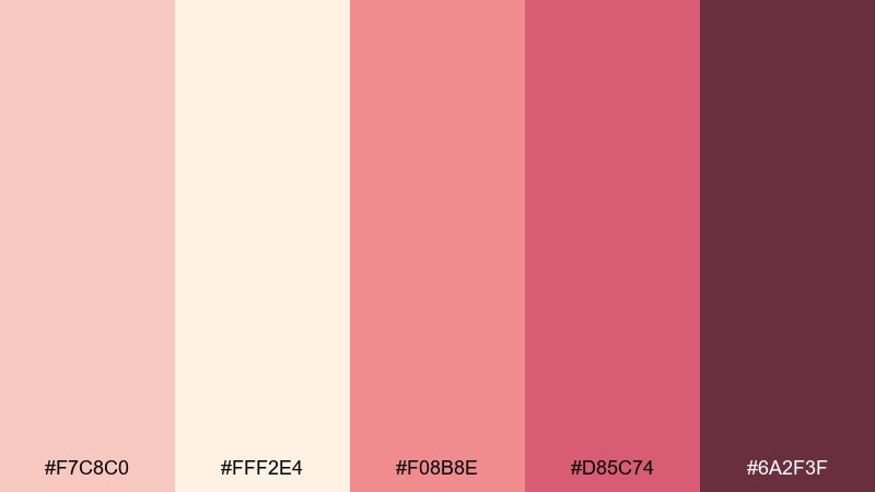
HEX: #F7C8C0 #FFF2E4 #F08B8E #D85C74 #6A2F3F
Mood: bold, fun, attention-grabbing
Best for: sales banners and product promos
Bold and fun, the coral-leaning pinks feel like a pop of lipstick on a creamy backdrop. These pink cream color combinations are ideal for sales banners, product promos, and launch emails where you need instant energy. Pair with clean cream space and deep berry for headlines and CTAs. Tip: keep saturation concentrated in one or two blocks so the design feels intentional, not loud everywhere.
Image example of creamy coral pop generated using media.io

19) Blush Charcoal Edge
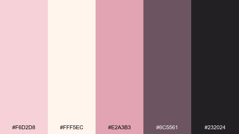
HEX: #F6D2D8 #FFF5EC #E2A3B3 #6C5561 #232024
Mood: modern, edgy, balanced
Best for: streetwear branding and posters
Modern and edgy, the blush tones soften a charcoal backbone for a confident look. Use it for streetwear branding, posters, and event graphics when you want contrast without harsh primaries. Pair with oversized type, tight spacing, and simple geometric shapes. Tip: keep charcoal as the primary text color and use pink as an accent to guide attention.
Image example of blush charcoal edge generated using media.io

20) Pink Cream Sage Calm
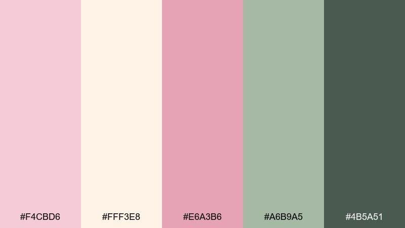
HEX: #F4CBD6 #FFF3E8 #E6A3B6 #A6B9A5 #4B5A51
Mood: fresh, calming, nature-inspired
Best for: botanical illustrations and spring campaigns
Fresh and calming, the blush and cream tones meet a soft sage like spring leaves against petals. It fits botanical illustrations, seasonal campaigns, and gentle eco branding with a modern twist. Pair with watercolor textures and keep the darkest green for small details and headings. Tip: let sage appear in limited areas so the overall feel stays light and airy.
Image example of pink cream sage calm generated using media.io
What Colors Go Well with Pink Cream?
Pink cream looks instantly more modern with deep neutrals like charcoal, espresso, and near-black. These darker anchors help headlines, navigation, and CTAs stay crisp while keeping the overall mood soft.
For a natural, calming direction, pair pink cream with muted greens (sage, olive-gray) and warm taupes. This creates an organic palette that works especially well for wellness, handmade, and lifestyle brands.
If you want more energy, add a saturated accent (berry, wine, coral) in small doses. Keep cream as the main background so the brighter hue reads intentional instead of overwhelming.
How to Use a Pink Cream Color Palette in Real Designs
Start with cream as the base layer (backgrounds, cards, negative space), then use light pinks for tints and panels. Reserve mid-to-deep mauves for hierarchy elements like buttons, badges, and key pricing text.
In print (invitations, labels, stationery), avoid full-bleed light pink blocks; they can look washed out on some stocks. Instead, use pink as borders, monograms, seals, or small pattern overlays so the cream paper stays warm.
For UI, prioritize contrast: keep body text in near-black or dark cocoa, and use pink for states (active, hover, highlights). A quick accessibility check ensures the soft palette still reads clearly on all screens.
Create Pink Cream Palette Visuals with AI
If you’re building a moodboard, product mockup, or campaign concept, generating visuals in the same pink cream tone range helps you present ideas faster and more consistently. Prompts that mention “cream background,” “blush accents,” and “premium lighting” tend to keep results cohesive.
Try producing a few variations (studio product shot, poster layout, UI mockup) using the same palette, then pick the best direction for your brand or project. This makes it easy to test soft, bold, and neutral mixes before you design in full.
Pink Cream Color Palette FAQs
-
What is a pink cream color palette?
A pink cream color palette combines soft blush-to-rose pinks with warm cream/off-white neutrals, often supported by a deeper mauve, plum, or cocoa shade for contrast. -
Is pink cream a warm or cool color scheme?
It’s typically warm because the “cream” base has a yellow-peach undertone. However, it can lean cooler if you choose dusty rose and add gray or charcoal accents. -
What text color works best on cream and blush backgrounds?
Use near-black, charcoal, or deep cocoa for body text and headings. Very light pinks should stay in backgrounds and accents rather than being used for readable text. -
What accent colors pair well with pink cream?
Charcoal and espresso create a modern premium look, sage adds a natural calm feel, and berry/wine provides a bold focal accent for CTAs, logos, or key highlights. -
Is pink cream suitable for professional branding?
Yes—when balanced with strong neutrals and clear typography. Many skincare, boutique, editorial, and modern lifestyle brands use pink cream to communicate warmth and polish. -
How do I keep a pink cream palette from looking “too sweet”?
Increase contrast with a deep neutral (charcoal/plum), use clean layout grids, limit saturated pink to small areas, and keep the cream tone dominant for a more grown-up finish. -
Can I use pink cream in UI design?
Absolutely. Use cream for surfaces, blush for highlights, and reserve dark neutrals for text and navigation. Run contrast/accessibility checks, especially for buttons and small labels.
Next: Gray Color Palette


