

Gray color palettes are the go-to choice when you want designs to feel calm, modern, and easy to read. From soft misty backgrounds to dramatic charcoal contrasts, gray works across UI, interiors, and branding.
Below are 20 curated gray color scheme ideas with HEX codes, mood notes, best-use cases, and AI-generated visual examples you can recreate in minutes.
In this article
- Why Gray Palettes Work So Well
-
- misty concrete
- graphite denim
- warm pebble
- silver screen
- charcoal espresso
- urban fog
- frosted lilac
- concrete and copper
- slate and seafoam
- minimal mono
- stormy harbor
- dusty rose ash
- olive shadow
- sandstone gray
- neon sign noir
- vintage newsprint
- alpine granite
- cyber silver
- chocolate marble
- midnight concrete
- What Colors Go Well with Gray?
- How to Use a Gray Color Palette in Real Designs
- Create Gray Palette Visuals with AI
Why Gray Palettes Work So Well
Gray is a neutral that naturally supports clarity. It reduces visual noise, lets typography and layout structure shine, and makes it easier to establish hierarchy with just a few steps from light to dark.
Because gray can lean warm (taupe, pebble, espresso) or cool (slate, steel, blue-silver), it adapts to almost any brand personality. You can keep it quiet and minimal—or push it cinematic with near-black charcoals.
Gray also pairs effortlessly with accent colors. A single teal, copper, blush, or olive note can become your signature while the neutrals keep the overall system cohesive.
20+ Gray Color Palette Ideas (with HEX Codes)
1) Misty Concrete
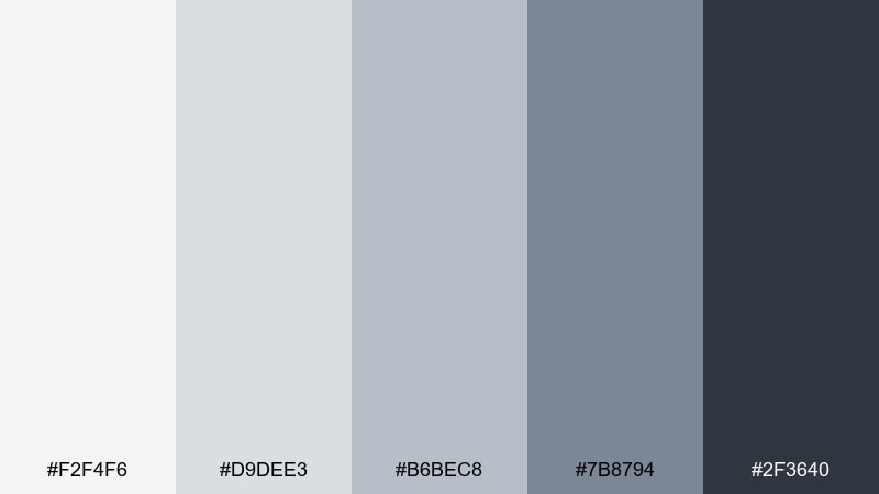
HEX: #F2F4F6 #D9DEE3 #B6BEC8 #7B8794 #2F3640
Mood: airy, modern, calm
Best for: minimal dashboard UI and SaaS websites
Airy, mist-like neutrals evoke polished concrete, soft daylight, and tidy workspaces. These tones work beautifully for dashboards where readability matters and visual noise needs to stay low. Pair the darker slate with thin dividers and let the near-white lead for spacious layouts. Usage tip: reserve the deepest shade for headings and key icons to keep contrast crisp without feeling harsh.
Image example of misty concrete generated using media.io
Media.io is an online AI studio for creating and editing video, image, and audio in your browser.

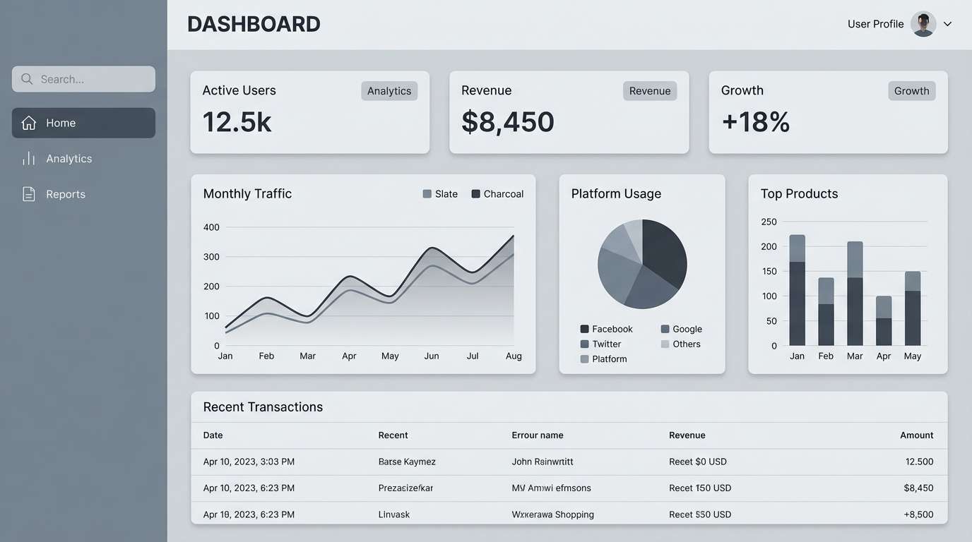
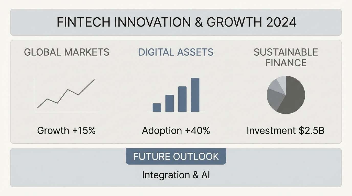
2) Graphite Denim
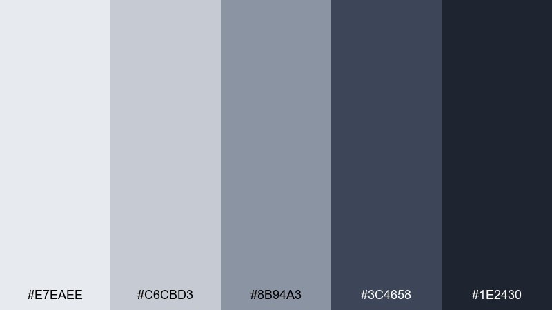
HEX: #E7EAEE #C6CBD3 #8B94A3 #3C4658 #1E2430
Mood: sleek, techy, confident
Best for: app UI, fintech branding, presentations
Sleek graphite tones with a denim-blue lean feel smart, structured, and quietly confident. The mid grays are strong enough for charts and tables while the deeper shades give titles a premium punch. Pair it with simple line icons and generous whitespace for a modern product feel. Usage tip: keep backgrounds in the two lightest tones to avoid a heavy, overcast screen.
Image example of graphite denim generated using media.io
3) Warm Pebble
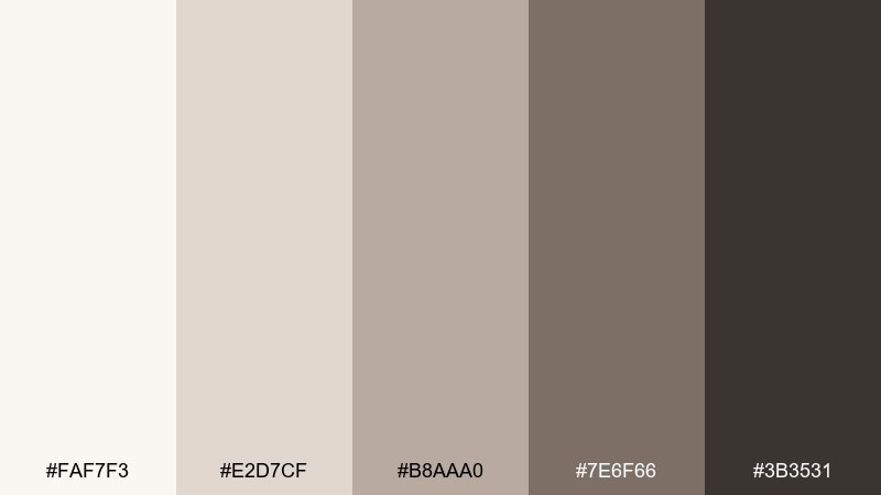
HEX: #FAF7F3 #E2D7CF #B8AAA0 #7E6F66 #3B3531
Mood: cozy, grounded, organic
Best for: living rooms, cafes, lifestyle brands
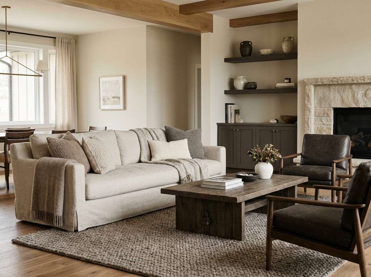
Cozy pebble neutrals bring to mind river stones, wool throws, and sun-warmed clay. The warm undertones make spaces feel welcoming, especially in wood-heavy interiors. Pair with natural textures like linen, oak, and matte ceramics to keep it tactile. Usage tip: use the deepest brown-gray sparingly as an accent on frames or hardware so the palette stays soft.
Image example of warm pebble generated using media.io
4) Silver Screen
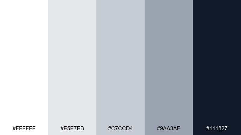
HEX: #FFFFFF #E5E7EB #C7CCD4 #9AA3AF #111827
Mood: clean, editorial, high-contrast
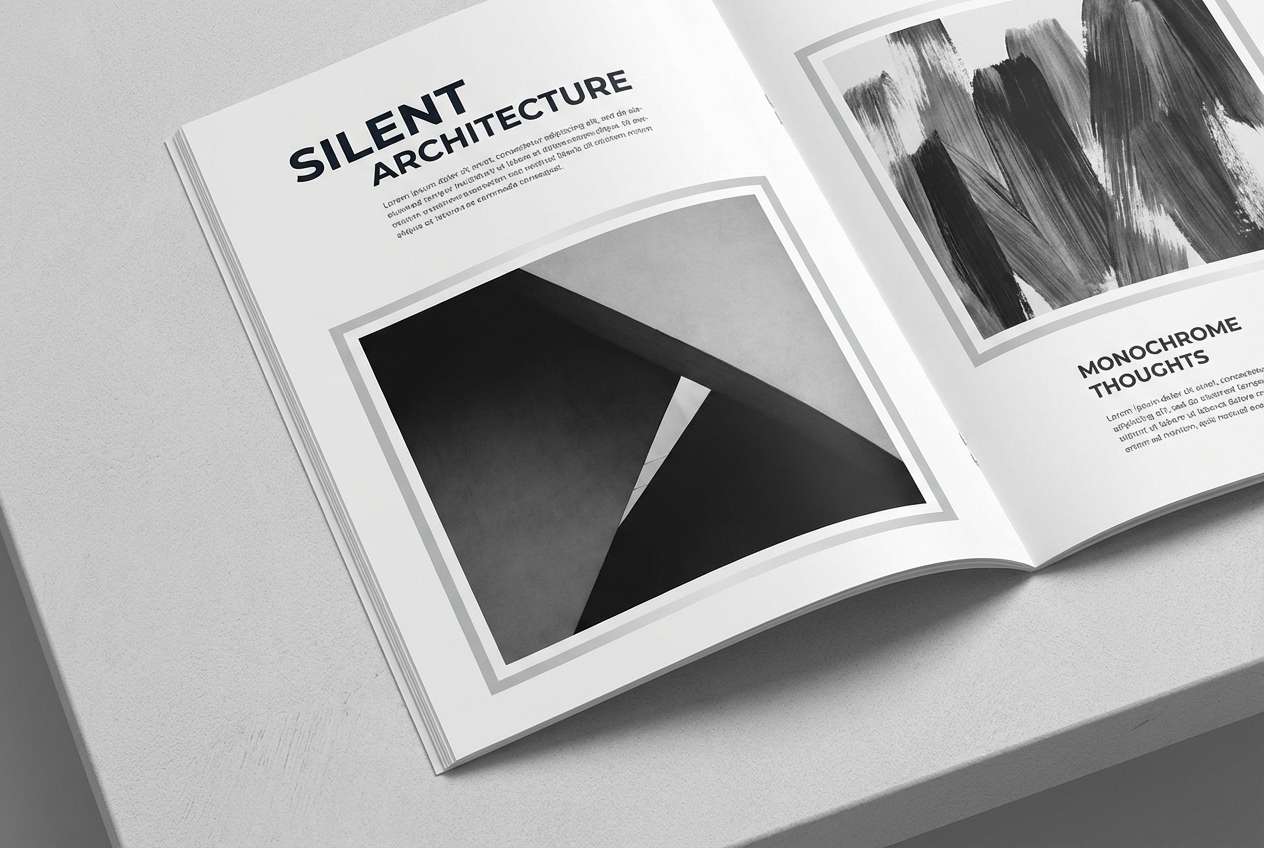
Best for: magazine layouts, portfolios, typography-led sites
Clean silver neutrals with inky contrast feel like fresh paper and sharp black type. This gray color scheme is ideal when you want photography and headlines to do the talking. Pair with bold sans-serif fonts and wide margins for a premium editorial rhythm. Usage tip: keep body text in the near-black and reserve mid grays for captions and UI labels.
Image example of silver screen generated using media.io
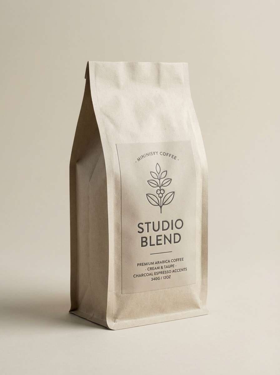
5) Charcoal Espresso
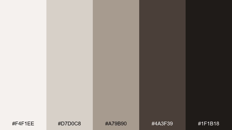
HEX: #F4F1EE #D7D0C8 #A79B90 #4A3F39 #1F1B18
Mood: rich, intimate, sophisticated
Best for: coffee packaging, boutique menus, premium labels
Rich charcoal-brown neutrals evoke espresso crema, leather, and candlelit evenings. The contrast feels luxurious without tipping into stark black-and-white. Pair with off-white paper stock and subtle embossing for a tactile premium look. Usage tip: let the creamy top tone dominate so the darker shades read as accents, not a heavy blanket.
Image example of charcoal espresso generated using media.io
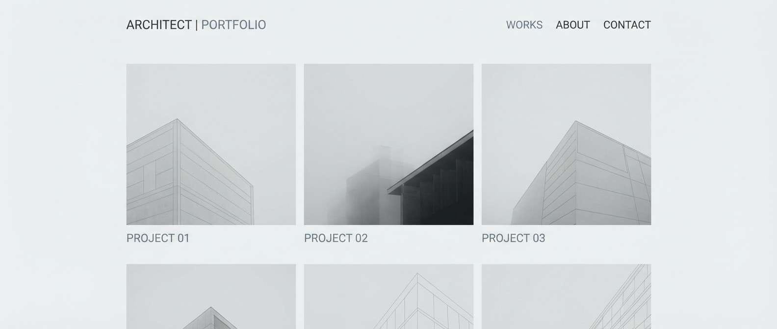
6) Urban Fog
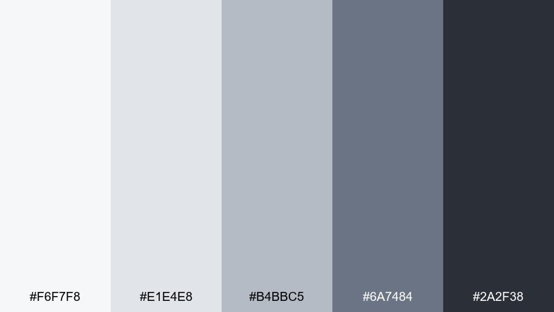
HEX: #F6F7F8 #E1E4E8 #B4BBC5 #6A7484 #2A2F38
Mood: moody, metropolitan, understated
Best for: architecture portfolios and corporate decks
Moody urban grays bring to mind foggy skylines, steel beams, and rainy sidewalks. The midtones give structure to layouts while the deep charcoal anchors titles and callouts. Pair with monochrome photography and thin grid lines to emphasize form and spacing. Usage tip: use the blue-gray mid shade for secondary buttons so actions stand out without shouting.
Image example of urban fog generated using media.io
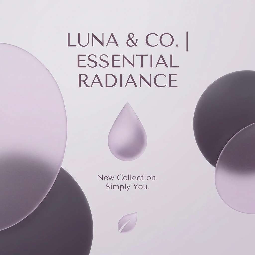
7) Frosted Lilac
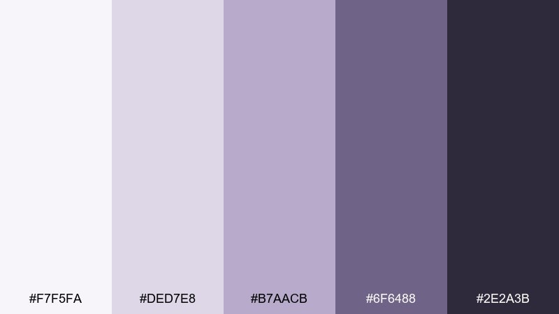
HEX: #F7F5FA #DED7E8 #B7AACB #6F6488 #2E2A3B
Mood: soft, dreamy, modern romantic
Best for: beauty branding, wellness posts, gentle UI themes
Soft lilac-tinted grays feel like frosted glass, lavender haze, and quiet self-care moments. The purple undertone adds personality while staying subtle enough for clean layouts. Pair with minimal line art and plenty of negative space to keep it airy. Usage tip: use the deep plum-gray for small highlights like icons and section dividers, not full backgrounds.
Image example of frosted lilac generated using media.io
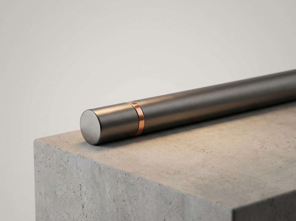
8) Concrete and Copper
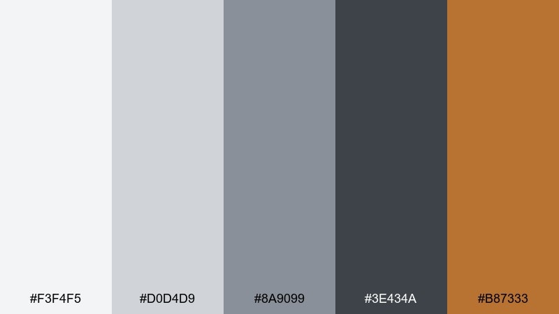
HEX: #F3F4F5 #D0D4D9 #8A9099 #3E434A #B87333
Mood: industrial, warm, design-forward
Best for: product ads, hardware brands, modern kitchens
Industrial concrete tones with a copper spark feel like loft lighting and brushed metal details. These gray color combinations shine in product ads where you want a neutral stage plus one confident accent. Pair copper with the darkest charcoal for premium contrast, and keep the background in the two palest grays. Usage tip: use copper only for one focal element per layout, like a button or product badge, to avoid visual clutter.
Image example of concrete and copper generated using media.io
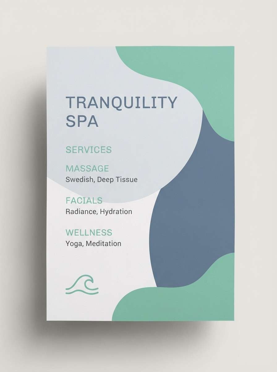
9) Slate and Seafoam
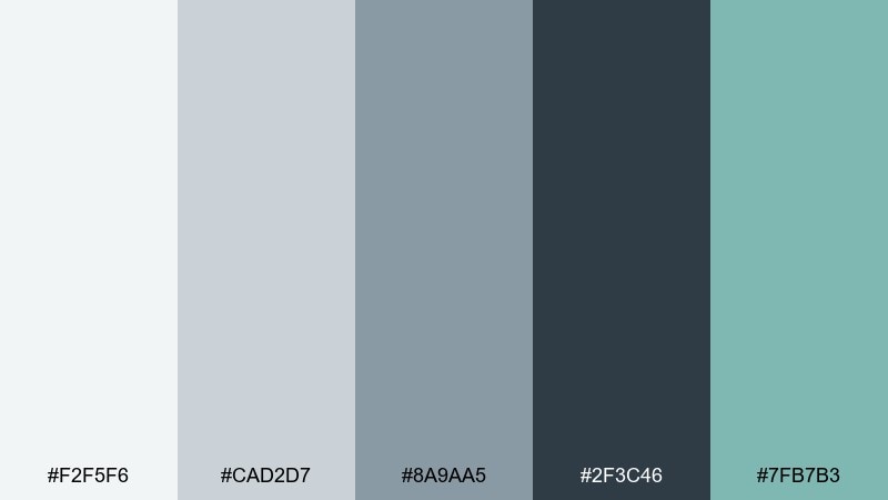
HEX: #F2F5F6 #CAD2D7 #8A9AA5 #2F3C46 #7FB7B3
Mood: fresh, coastal, balanced
Best for: health apps, spa flyers, travel branding
Fresh slate grays with a seafoam accent evoke coastal air and clean, modern wellness spaces. The teal note adds energy while the neutrals keep everything readable and calm. Pair with rounded UI components or airy poster layouts for a friendly, contemporary vibe. Usage tip: let seafoam act as the single action color for links and primary buttons.
Image example of slate and seafoam generated using media.io
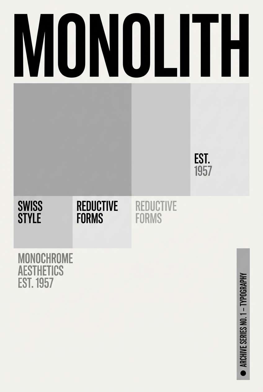
10) Minimal Mono
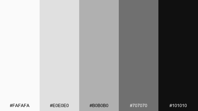
HEX: #FAFAFA #E0E0E0 #B0B0B0 #707070 #101010
Mood: minimal, timeless, sharp
Best for: logos, typography posters, UI dark mode accents
Minimal monochrome feels like gallery walls, crisp print, and perfectly aligned type. The steps between tones are clean, making hierarchy easy in both digital and print layouts. Pair with a single geometric font family and consistent spacing for a refined, modern system. Usage tip: keep the darkest tone for key anchors only, so the design stays light and breathable.
Image example of minimal mono generated using media.io
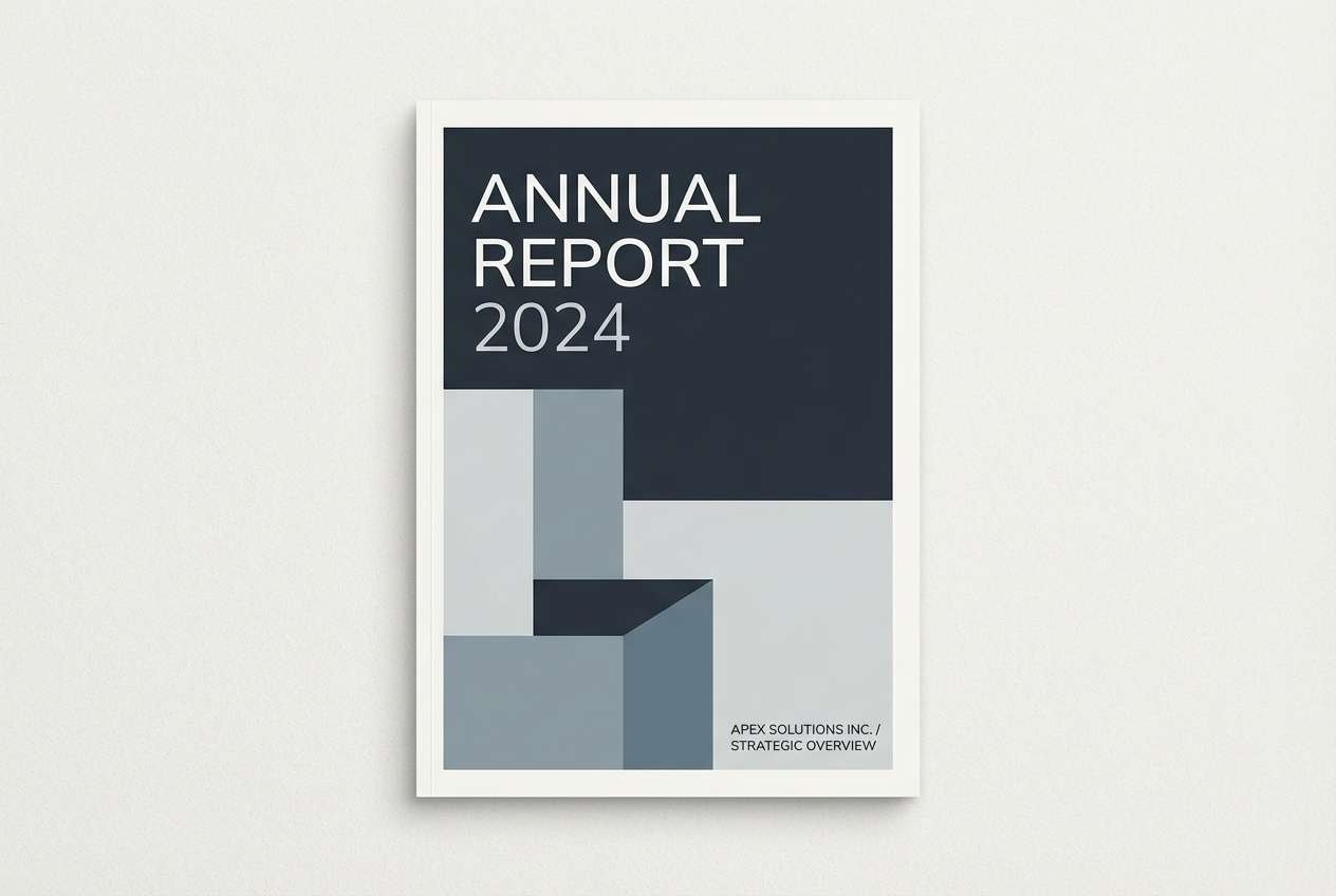
11) Stormy Harbor
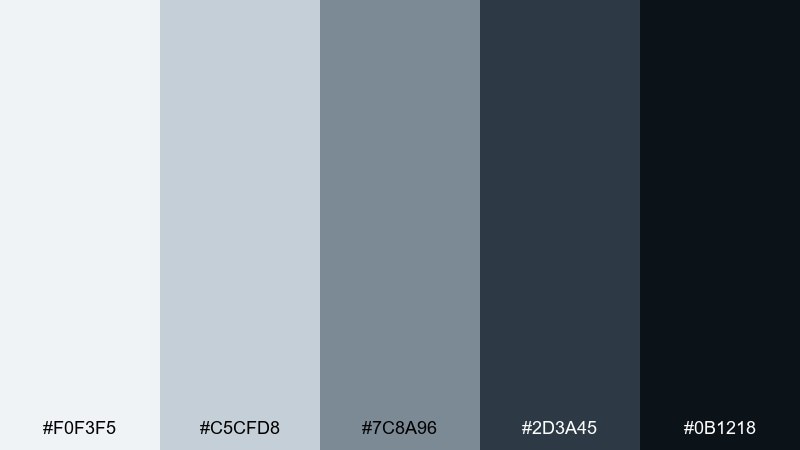
HEX: #F0F3F5 #C5CFD8 #7C8A96 #2D3A45 #0B1218
Mood: dramatic, nautical, serious
Best for: document covers, consulting decks, hero banners
Stormy, nautical grays bring to mind deep water, heavy clouds, and ships at dusk. The cool range feels professional and steady, perfect for content that needs authority. Pair with simple iconography and strong left-aligned typography to reinforce clarity. Usage tip: use the near-black for titles and keep large fills in lighter tones to avoid a gloomy wall of color.
Image example of stormy harbor generated using media.io
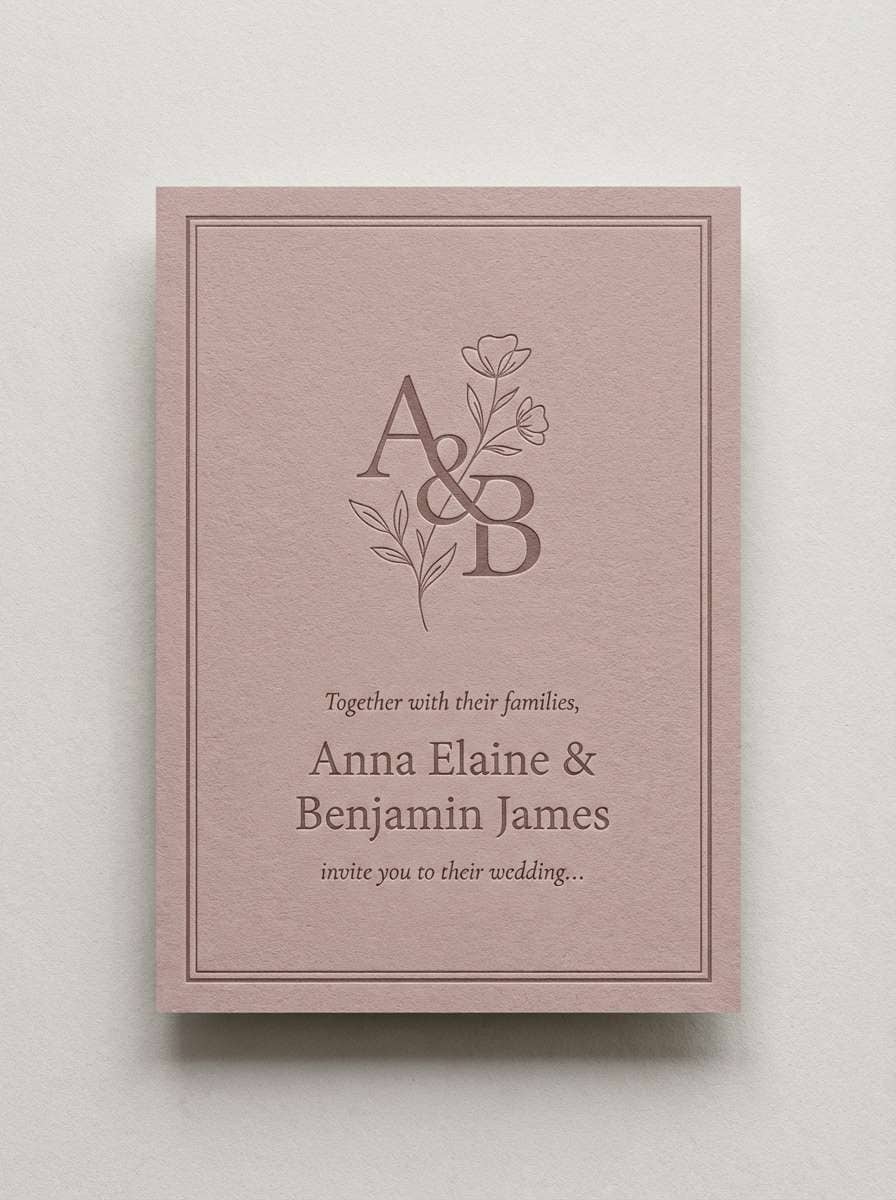
12) Dusty Rose Ash
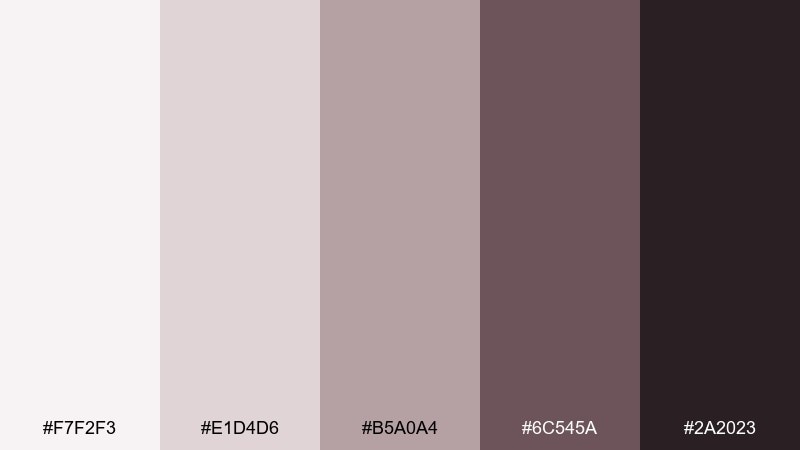
HEX: #F7F2F3 #E1D4D6 #B5A0A4 #6C545A #2A2023
Mood: soft, vintage, intimate
Best for: wedding invitations, candle labels, lifestyle posts
Soft rosy ash feels like dried petals, blush fabric, and vintage stationery. These gray color combinations are great when you want romance without going sugary or bright. Pair with serif typography and subtle paper grain for a handcrafted, elegant finish. Usage tip: keep the darkest wine-gray for small details like monograms, borders, or footer text.
Image example of dusty rose ash generated using media.io
13) Olive Shadow
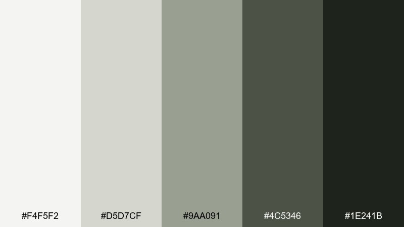
HEX: #F4F5F2 #D5D7CF #9AA091 #4C5346 #1E241B
Mood: earthy, muted, outdoorsy
Best for: outdoor brands, eco packaging, nature blogs
Muted olive-leaning grays evoke forest shadows, mossy stones, and weathered canvas. The palette feels grounded and sustainable, making it a strong fit for eco-minded branding. Pair with kraft textures, recycled paper, and simple stamp-style graphics for an authentic look. Usage tip: use the near-black green-gray for typography so the lighter tones can stay soft and natural.
Image example of olive shadow generated using media.io
14) Sandstone Gray
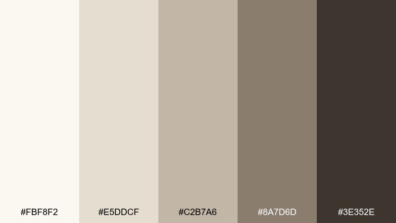
HEX: #FBF8F2 #E5DDCF #C2B7A6 #8A7D6D #3E352E
Mood: sunlit, natural, relaxed
Best for: interiors, hotel branding, travel brochures
Sunlit sandstone neutrals feel like desert trails, soft shadows, and warm plaster walls. The creamy highlights keep things bright while the deeper taupes add depth and structure. Pair with natural photography, rattan textures, and warm lighting for a calm, upscale mood. Usage tip: use the midtone as your main UI or print background to reduce glare while staying light.
Image example of sandstone gray generated using media.io
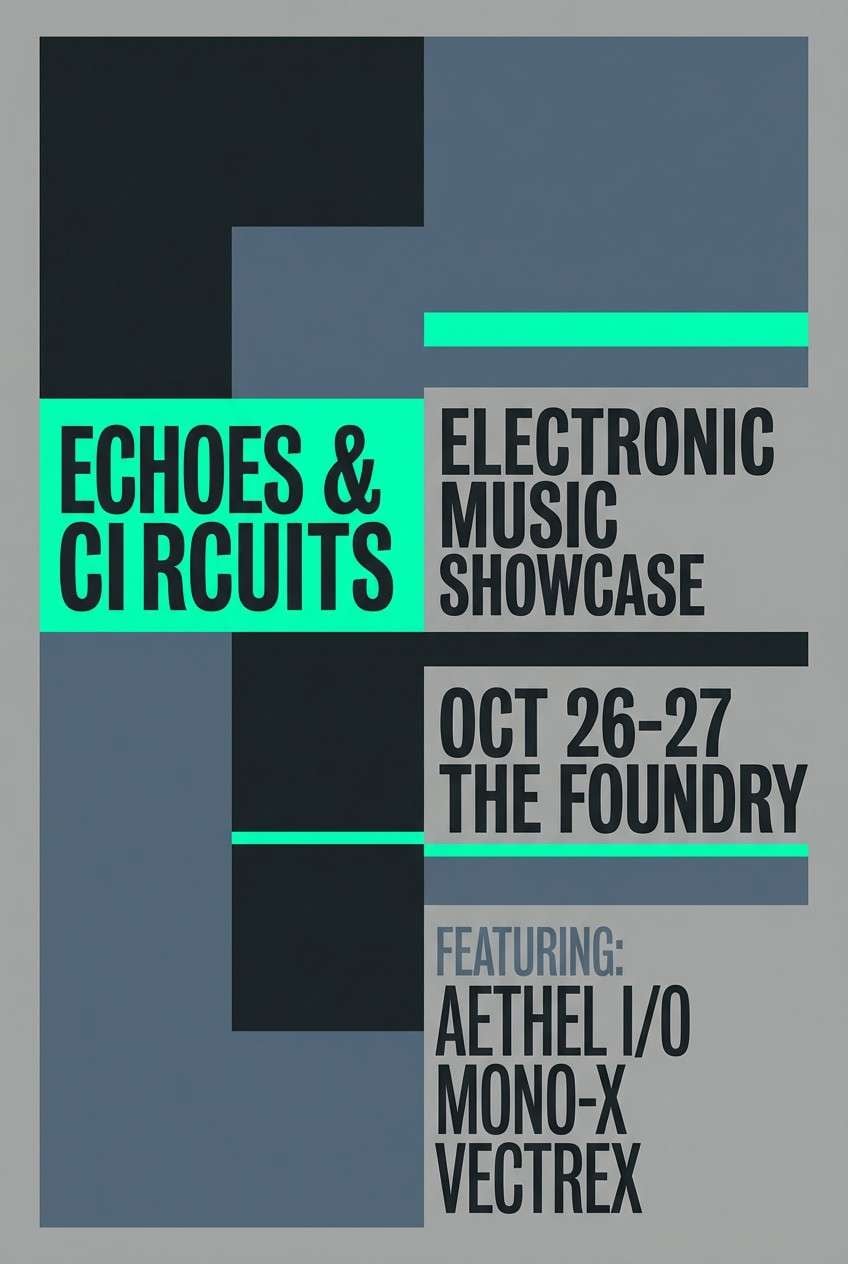
15) Neon Sign Noir
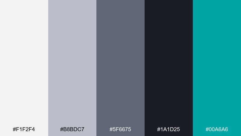
HEX: #F1F2F4 #B8BDC7 #5F6675 #1A1D25 #00A6A6
Mood: nightlife, bold, cinematic
Best for: music posters, tech launches, streamer branding
Cinematic dark grays with a neon teal hit evoke city nights, glossy signage, and after-hours energy. The palette supports dramatic contrast without relying on pure black everywhere. Pair with oversized type and simple geometric shapes to keep the neon accent feeling intentional. Usage tip: reserve teal for a single highlight element like a date, CTA, or underline.
Image example of neon sign noir generated using media.io
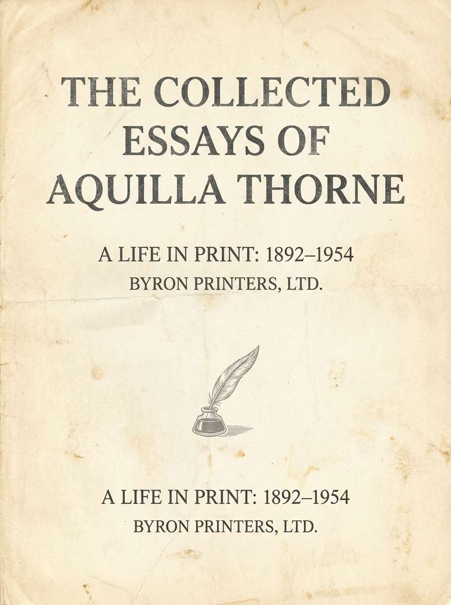
16) Vintage Newsprint
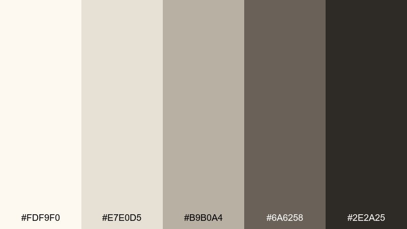
HEX: #FDF9F0 #E7E0D5 #B9B0A4 #6A6258 #2E2A25
Mood: heritage, cozy, editorial
Best for: book covers, journals, café menus
Heritage neutrals recall aged paper, ink washes, and well-loved book pages. The warm grays soften contrast, making long-form typography feel comfortable and classic. Pair with serif fonts, subtle rules, and off-white backgrounds for a timeless editorial tone. Usage tip: add texture lightly and keep spacing generous so it reads vintage, not cluttered.
Image example of vintage newsprint generated using media.io
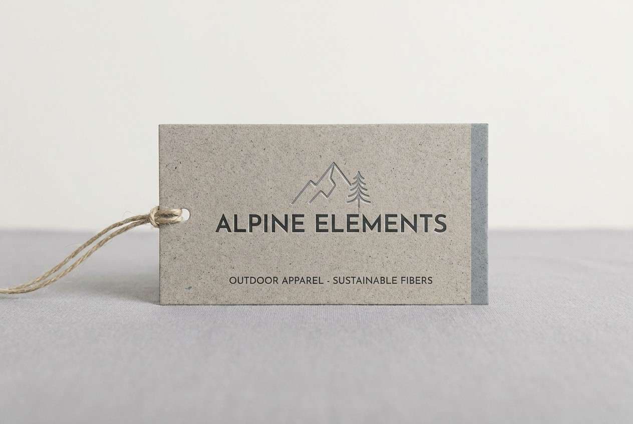
17) Alpine Granite
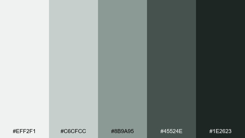
HEX: #EFF2F1 #C6CFCC #8B9A95 #45524E #1E2623
Mood: cool, outdoorsy, refined
Best for: hiking brands, outdoor apparel, minimalist packaging
Cool granite grays suggest alpine mornings, stone trails, and crisp evergreen air. The green-cast neutrals feel fresh without turning into a full color wash. Pair with clean sans-serif type and simple line illustrations for a modern outdoor look. Usage tip: keep backgrounds pale and use the darkest tone for badges, size marks, and key labels.
Image example of alpine granite generated using media.io
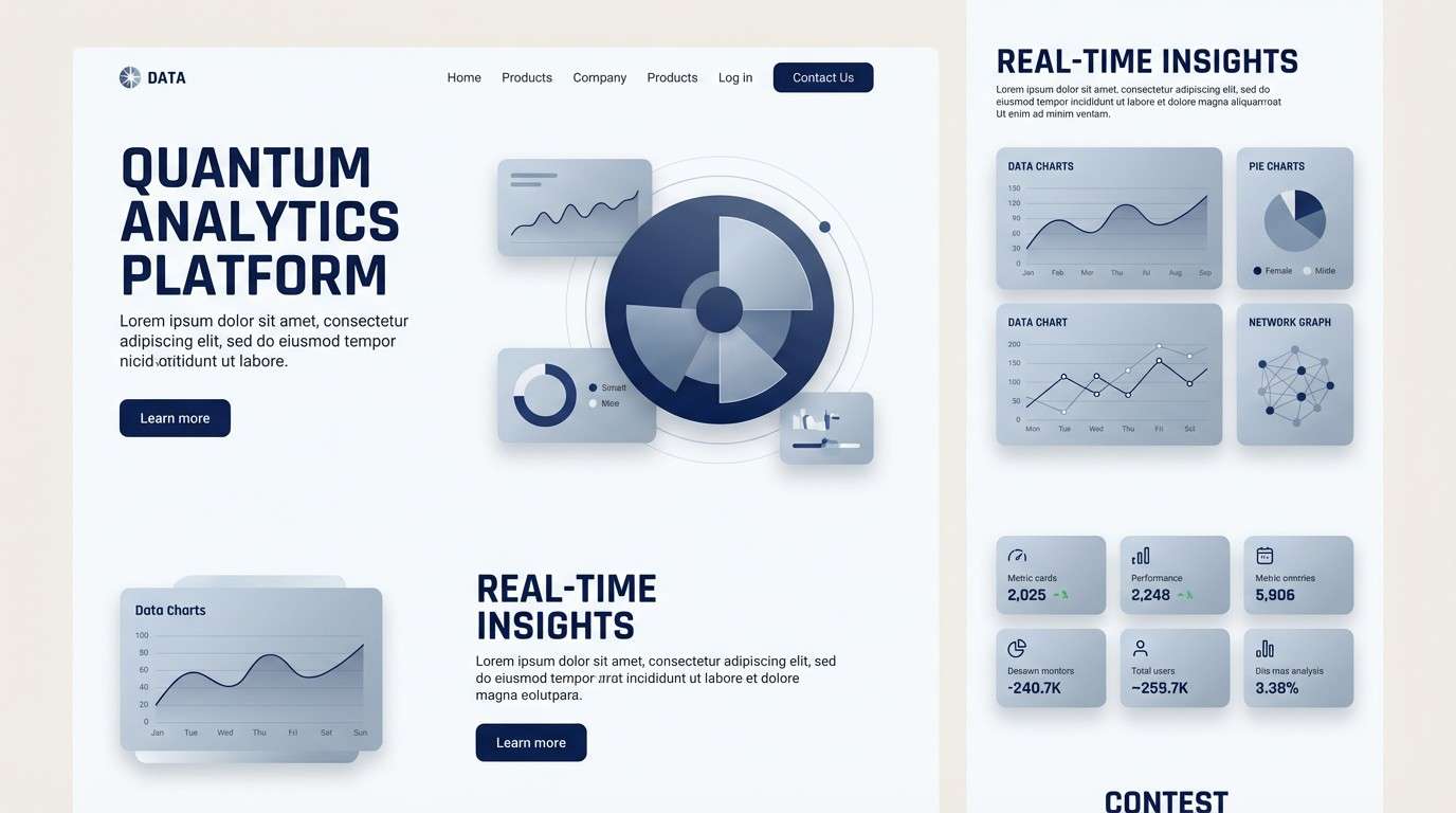
18) Cyber Silver
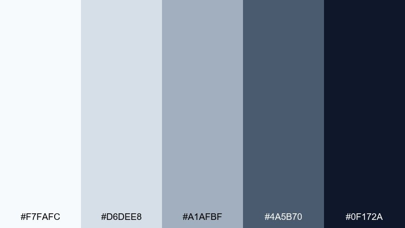
HEX: #F7FAFC #D6DEE8 #A1AFBF #4A5B70 #0F172A
Mood: futuristic, crisp, professional
Best for: B2B landing pages, data tools, pitch decks
Crisp blue-silver tones feel futuristic, like polished aluminum and clean interfaces. The range gives you natural depth for cards, navigation, and data-heavy sections. Pair with subtle gradients and thin outlines to emphasize structure and hierarchy. Usage tip: use the mid steel tone for inactive UI states so the darkest shade can highlight key actions.
Image example of cyber silver generated using media.io
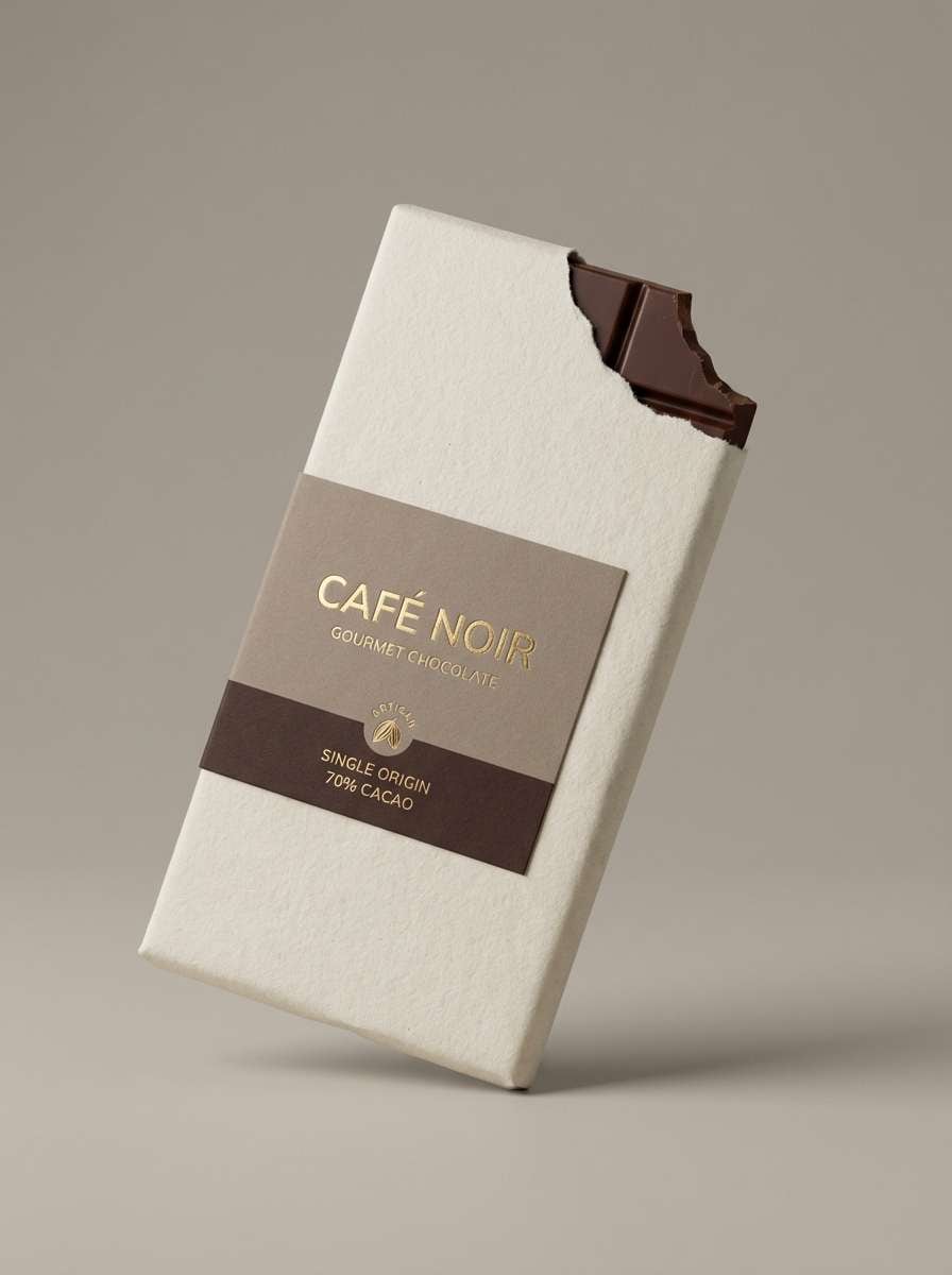
19) Chocolate Marble
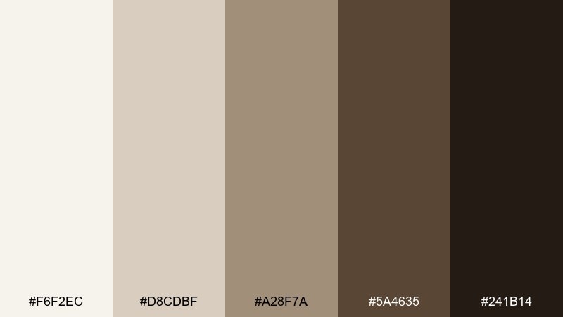
HEX: #F6F2EC #D8CDBF #A28F7A #5A4635 #241B14
Mood: luxury, warm, artisanal
Best for: chocolate packaging, gourmet ads, boutique branding
Warm marble-like neutrals evoke cocoa dust, stone counters, and artisanal craft. The gradient from cream to deep chocolate reads indulgent and premium in print. Pair with gold-leaning accents or a simple foil stamp for a high-end finish. Usage tip: keep the deepest brown for small typography and logos so the overall look stays rich, not heavy.
Image example of chocolate marble generated using media.io
20) Midnight Concrete
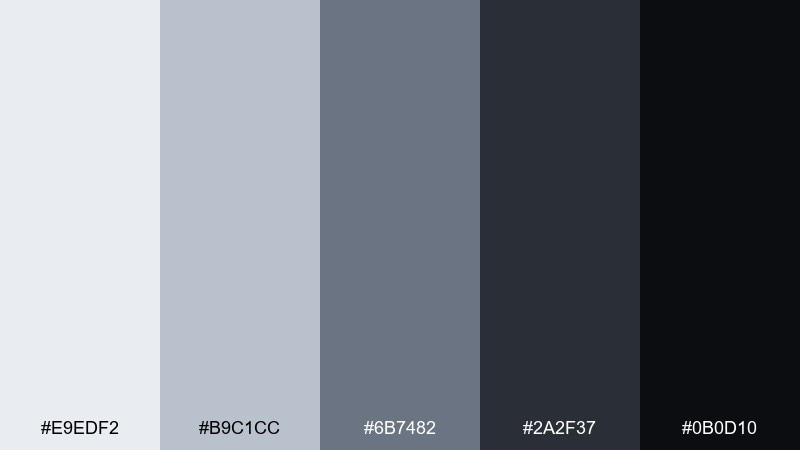
HEX: #E9EDF2 #B9C1CC #6B7482 #2A2F37 #0B0D10
Mood: bold, architectural, dramatic
Best for: studio branding, poster series, dark UI themes
Bold midnight grays feel like concrete at dusk, sharp silhouettes, and modern architecture. This gray color palette is a strong choice when you want drama while keeping the design neutral and flexible. Pair with oversized typography and minimal shapes for striking posters or hero sections. Usage tip: use the lightest tone for breathing room around text so the dark background never feels cramped.
Image example of midnight concrete generated using media.io

What Colors Go Well with Gray?
Gray pairs well with both warm and cool accents because it doesn’t compete for attention. For a clean, modern look, try teal, seafoam, cobalt, or icy blue against slate and silver grays.
If you want warmth and comfort, choose copper, terracotta, blush, camel, or cream—especially with pebble, taupe, or espresso-leaning grays. These combinations feel inviting while still neutral.
For high-impact contrast, use near-black charcoal with bright white, then add one accent color (like neon teal) for buttons, badges, or key highlights.
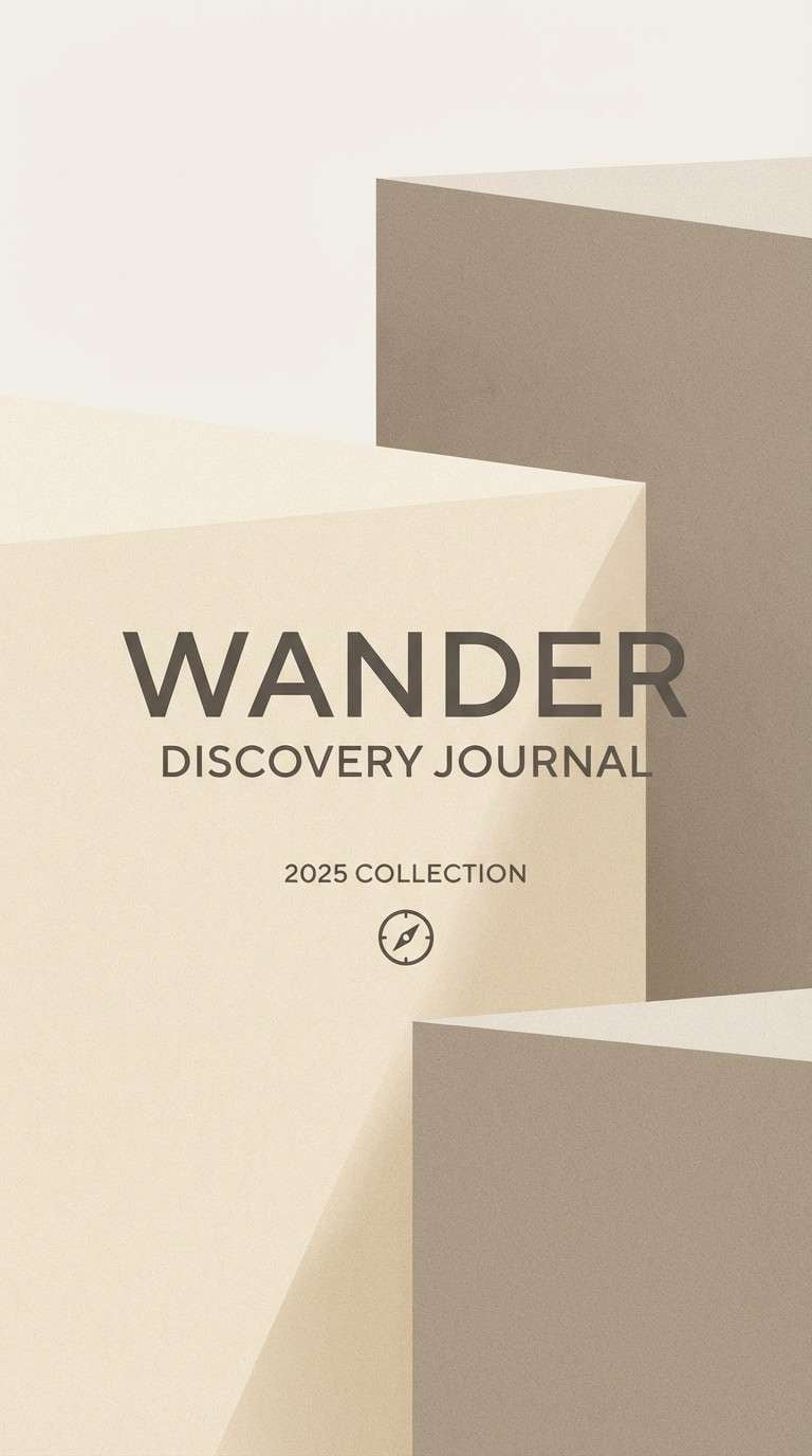
How to Use a Gray Color Palette in Real Designs
Start by assigning roles to each gray: lightest for backgrounds, mid tones for cards and borders, and darkest for headings and primary text. This keeps interfaces readable and consistent across pages.
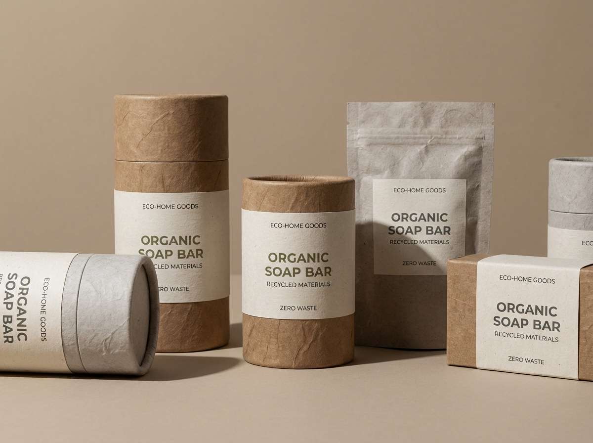
In interiors and branding, gray works best when you add texture: matte ceramics, linen, brushed metal, paper grain, or concrete. Texture prevents neutral schemes from feeling flat or overly “cold.”
Limit your accent color on purpose. One accent (copper, seafoam, lilac, or teal) applied consistently to CTAs and key details creates a polished system without visual clutter.
Create Gray Palette Visuals with AI
If you have HEX codes but need mockups fast, you can generate matching visuals with AI—poster layouts, landing pages, packaging concepts, and more—without starting from a blank canvas.
Use your palette name and mood keywords (like “urban fog” or “warm pebble”), then specify the design type (dashboard, invitation, brochure) for more accurate results. Keep prompts clear and mention your accent color if you have one.
Once you like a result, iterate by adjusting lighting, texture, and composition while keeping the same five core colors for consistency.
Gray Color Palette FAQs
-
What is a gray color palette?
A gray color palette is a set of coordinated neutral tones—often from near-white to charcoal—used to create clean hierarchy, balanced contrast, and a calm, modern look in UI, interiors, and branding. -
Is gray a warm or cool color?
Gray can be warm or cool depending on its undertone. Taupe, pebble, and espresso grays feel warm; slate, steel, and blue-silver grays feel cool. -
What accent color works best with gray?
It depends on the vibe: teal/seafoam for fresh and modern, copper for industrial warmth, blush/lilac for soft romantic styles, and olive for earthy or eco branding. -
How do I keep a gray UI from looking dull?
Use a clear light-to-dark scale for hierarchy, add one consistent accent color for CTAs, and include subtle depth (shadows, thin borders, or gentle gradients) to separate surfaces. -
What gray should I use for text for readability?
For body text, choose a near-black charcoal (not pure black) for comfortable contrast. Use mid grays for secondary labels and captions, and keep backgrounds in the lightest tones. -
Can gray palettes work for branding and packaging?
Yes. Gray reads premium and versatile, especially with tactile finishes (embossing, matte stock, brushed metal). Add one signature accent to make the brand recognizable. -
How can I generate gray palette images quickly?
Use an AI text-to-image tool and describe the design type plus your palette mood (for example, “minimal dashboard UI in misty concrete grays”). Iterate by refining texture, lighting, and layout while keeping the same HEX colors.


