

A picnic color palette captures the feeling of sunshine, fresh fruit, and easy outdoor fun—so it naturally fits invitations, menus, and summer branding.
Below are 20 ready-to-use picnic color schemes with HEX codes, plus practical tips and AI prompts to help you turn each palette into real visuals fast.
In this article
- Why Picnic Palettes Work So Well
-
- gingham strawberry
- lemonade lawn
- basket weave neutrals
- wildflower meadow
- seaside picnic
- cherry cola
- mint napkins
- sunset blanket
- orchard breeze
- honey mustard
- rosehip jam
- paper plate pastels
- cucumber cream
- campfire cocoa
- blueberry pie
- lavender spritz
- classic gingham
- citrus cooler
- garden tea party
- morning dew
- What Colors Go Well with Picnic?
- How to Use a Picnic Color Palette in Real Designs
- Create Picnic Palette Visuals with AI
Why Picnic Palettes Work So Well
Picnic colors instantly signal “outdoors” because they borrow from familiar summer cues: fruit reds, lemonade yellows, lawn greens, and breezy sky blues. That natural association makes designs feel friendly and approachable without extra illustration.
They’re also built for contrast. Many picnic palettes pair bright accents with a dependable dark (navy, charcoal, or deep green), which helps typography stay readable on invites, menus, posters, and social templates.
Finally, picnic color schemes are flexible: you can go nostalgic (gingham reds), coastal (sand + navy), or modern (high-contrast brights) while keeping the same warm, sunny theme.
20+ Picnic Color Palette Ideas (with HEX Codes)
1) Gingham Strawberry
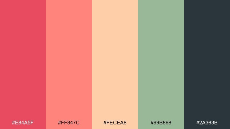
HEX: #e84a5f #ff847c #fecea8 #99b898 #2a363b
Mood: cheerful, nostalgic, sunny
Best for: summer picnic invitation design
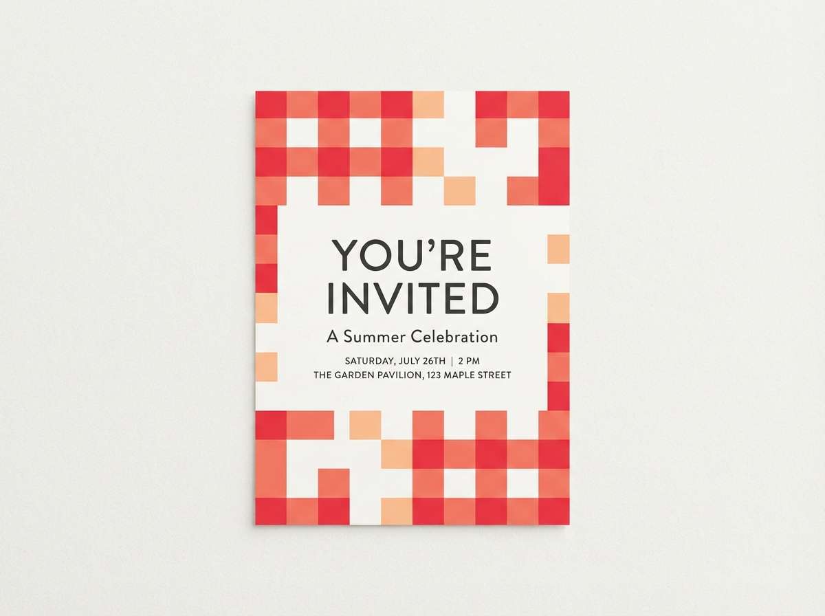
Cheerful gingham energy with ripe strawberry reds and a soft peach glow, like a checkered blanket in warm sun. Use it for invitations, menu cards, and event signage where you want instant friendliness. Pair with kraft paper textures or creamy off-white to keep it grounded. Tip: let the deep charcoal act as your type color so the brights stay clean and readable.
Image example of gingham strawberry generated using media.io
Media.io is an online AI studio for creating and editing video, image, and audio in your browser.

2) Lemonade Lawn
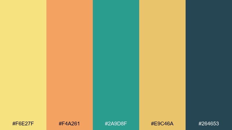
HEX: #f6e27f #f4a261 #2a9d8f #e9c46a #264653
Mood: zesty, upbeat, outdoorsy
Best for: community event poster and signage
Zesty lemonade yellows meet fresh lawn greens, bringing the feel of backyard games and citrus slices. It works especially well for posters, directional signs, and summer promos that need visibility from a distance. Balance the warmth with the deep blue-green for headings and icons. Tip: keep backgrounds light and reserve the darkest shade for high-contrast details.
Image example of lemonade lawn generated using media.io

3) Basket Weave Neutrals
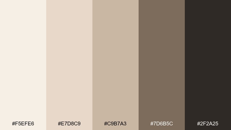
HEX: #f5efe6 #e7d8c9 #c9b7a3 #7d6b5c #2f2a25
Mood: cozy, rustic, minimal
Best for: artisan food packaging and labels
Cozy basket-weave neutrals evoke wicker, linen, and a packed lunch wrapped in parchment. These tones shine on artisanal labels, bakery packaging, and farm-stand branding where texture is the star. Pair with simple line illustrations and plenty of whitespace for a premium feel. Tip: print tests matter here, so check how the mid-tans shift on uncoated stock.
Image example of basket weave neutrals generated using media.io
4) Wildflower Meadow
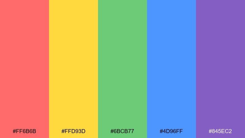
HEX: #ff6b6b #ffd93d #6bcb77 #4d96ff #845ec2
Mood: playful, botanical, lively
Best for: spring floral illustration set
Playful wildflower brights feel like petals scattered across grass after a breezy afternoon. Use this mix for seasonal illustrations, sticker packs, and cheerful social graphics. Keep the yellow as your highlight and let the violet serve as a punchy accent for depth. Tip: limit yourself to two dominant hues per layout to avoid visual noise.
Image example of wildflower meadow generated using media.io
5) Seaside Picnic
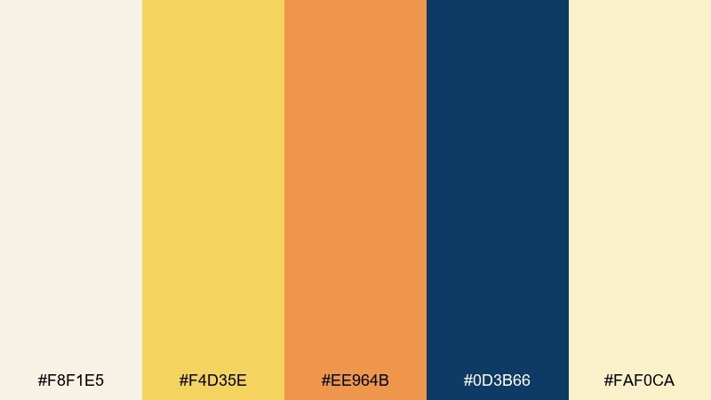
HEX: #f8f1e5 #f4d35e #ee964b #0d3b66 #faf0ca
Mood: breezy, coastal, relaxed
Best for: travel landing page UI mockup
Breezy coastal tones suggest sandy snacks, golden sun, and a deep ocean horizon. They are great for a travel or food landing page where you want warmth without losing structure. Pair the navy with the pale creams for crisp UI contrast, then use the amber as your primary call-to-action color. Tip: keep orange elements consistent in size so they read as intentional highlights.
Image example of seaside picnic generated using media.io
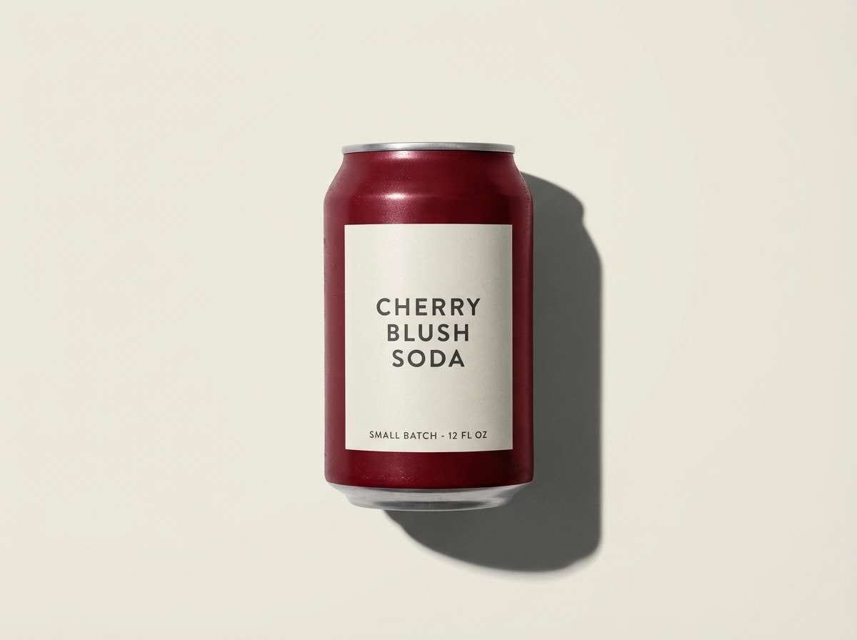
6) Cherry Cola
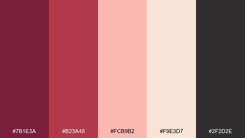
HEX: #7b1e3a #b23a48 #fcb9b2 #f9e3d7 #2f2d2e
Mood: bold, retro, indulgent
Best for: soda can product ad
Bold and retro like a cherry cola poured over ice, with deep berry shadows and creamy blush foam. This picnic color palette works beautifully for beverage branding, dessert packaging, and punchy ad creatives. Pair with vintage serif type or chunky sans to amplify the throwback mood. Tip: use the pale blush for negative space so the darker reds feel richer, not heavy.
Image example of cherry cola generated using media.io
7) Mint Napkins
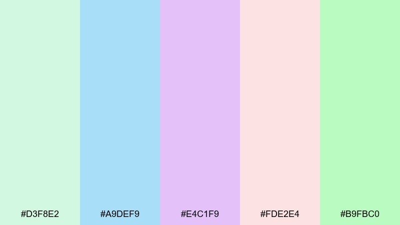
HEX: #d3f8e2 #a9def9 #e4c1f9 #fde2e4 #b9fbc0
Mood: airy, sweet, refreshing
Best for: pastel social media template set
Airy pastels feel like minty napkins, frosted cupcakes, and soft laughter in the shade. Use these tones for Instagram templates, story highlights, and wellness content where calm matters. Pair with thin line icons and rounded corners to keep the look gentle. Tip: choose one pastel as a repeating brand anchor and rotate the others as seasonal accents.
Image example of mint napkins generated using media.io
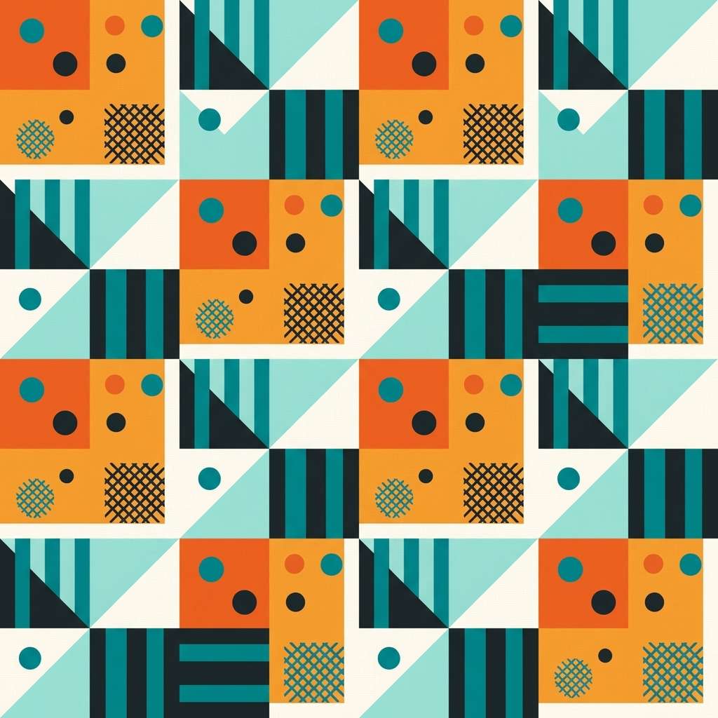
8) Sunset Blanket
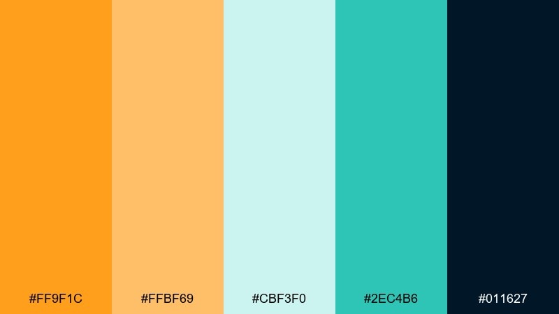
HEX: #ff9f1c #ffbf69 #cbf3f0 #2ec4b6 #011627
Mood: energetic, summery, bold
Best for: pattern design for a picnic blanket
Energetic sunset warmth meets cool aqua, like a bright blanket laid down at golden hour. This mix is ideal for pattern design, merch graphics, and playful brand moments. Pair the dark ink tone with the lighter aqua for strong outlines and crisp shapes. Tip: keep the orange as your dominant block color and use teal for smaller rhythm details.
Image example of sunset blanket generated using media.io
9) Orchard Breeze
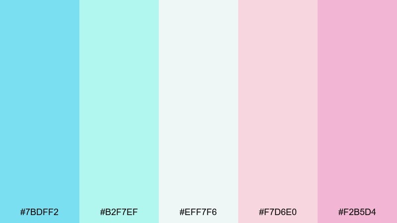
HEX: #7bdff2 #b2f7ef #eff7f6 #f7d6e0 #f2b5d4
Mood: light, fruity, airy
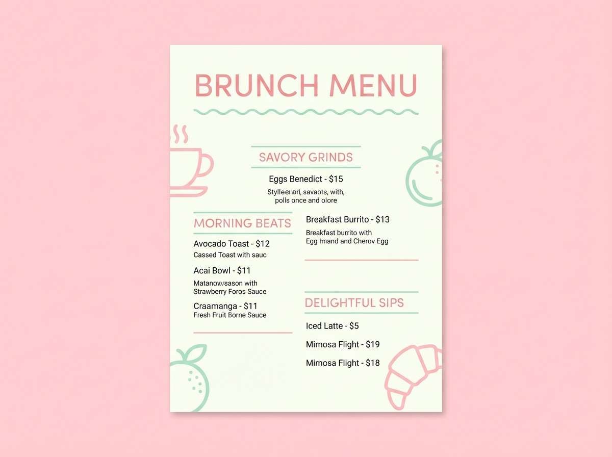
Best for: brunch menu flyer design
Light and airy like an orchard breeze, with cool mints and soft berry blossoms. These picnic color combinations are perfect for brunch menus, café flyers, and dessert announcements that should feel sweet but not sugary. Pair with elegant spacing and a restrained font palette to keep it grown-up. Tip: use the near-white tone as the page base and reserve the pinks for callouts and section headers.
Image example of orchard breeze generated using media.io
10) Honey Mustard
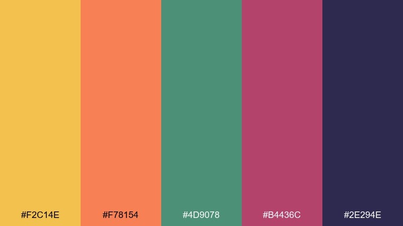
HEX: #f2c14e #f78154 #4d9078 #b4436c #2e294e
Mood: warm, quirky, confident
Best for: food truck brand kit sheet
Warm and quirky, like honey mustard drizzle with a surprising berry kick. It suits food truck branding, bold headers, and playful packaging where contrast is your friend. Pair with off-white space and simple shapes so the palette stays punchy, not chaotic. Tip: keep the deep indigo for logotypes and set the warm hues as supporting blocks and badges.
Image example of honey mustard generated using media.io
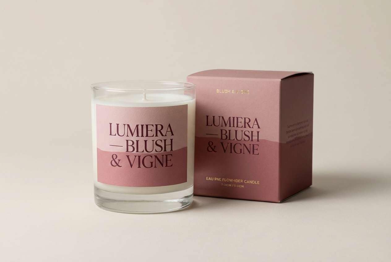
11) Rosehip Jam
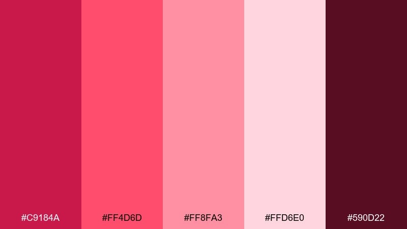
HEX: #c9184a #ff4d6d #ff8fa3 #ffd6e0 #590d22
Mood: romantic, rich, charming
Best for: candle label and box packaging
Romantic jam tones feel like berry preserves, ribbon, and a handwritten note tucked into the basket. Use them for candle labels, beauty packaging, and boutique gift tags that need a little drama. Pair with gold foil or warm cream paper for a luxe finish. Tip: keep the darkest wine shade for small text only, and let the mid-pinks carry the visual weight.
Image example of rosehip jam generated using media.io
12) Paper Plate Pastels
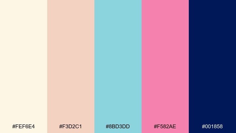
HEX: #fef6e4 #f3d2c1 #8bd3dd #f582ae #001858
Mood: friendly, playful, clean
Best for: kids party invitation flyer
Friendly pastels with a crisp navy feel like paper plates, confetti, and a tidy party setup. They work well for kids invitations, classroom flyers, and cheerful announcements that still need readability. Pair the navy with the cream base for strong type contrast, then sprinkle in pink as your highlight. Tip: keep shapes rounded and spacing generous to match the upbeat softness.
Image example of paper plate pastels generated using media.io

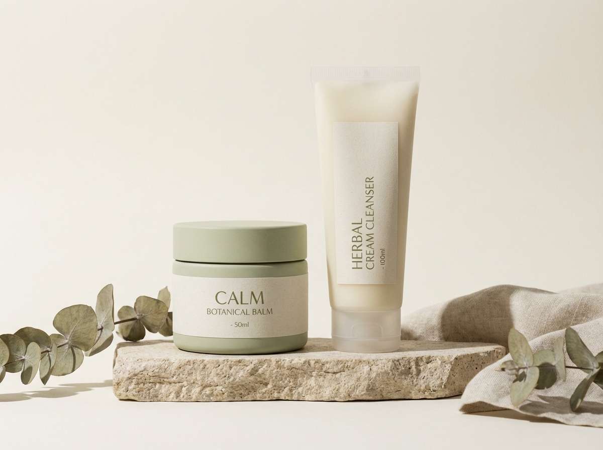
13) Cucumber Cream
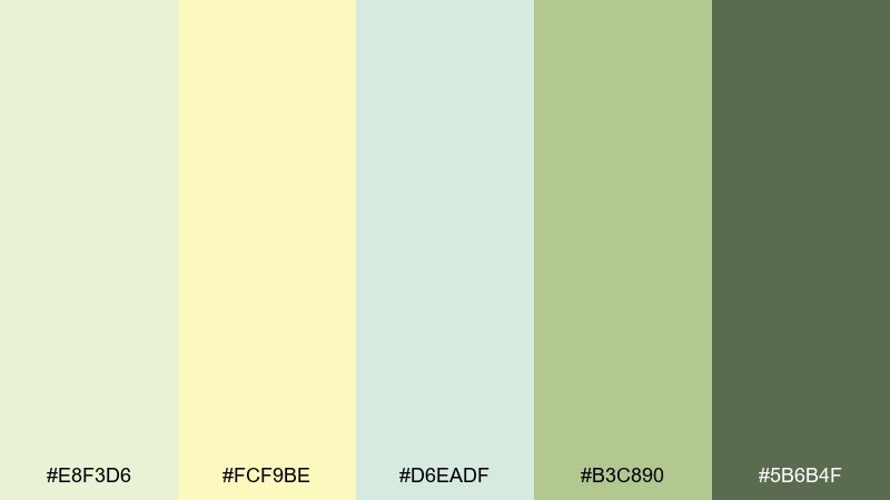
HEX: #e8f3d6 #fcf9be #d6eadf #b3c890 #5b6b4f
Mood: clean, fresh, soothing
Best for: skincare packaging and website accents
Clean greens and soft cream evoke cucumber slices, spa towels, and a cool drink on a hot day. Use this set for skincare packaging, wellness landing pages, and gentle product UI accents. Pair with minimal typography and subtle gradients to keep the look fresh. Tip: choose the darker olive for key icons and navigation so the pale tones stay airy.
Image example of cucumber cream generated using media.io
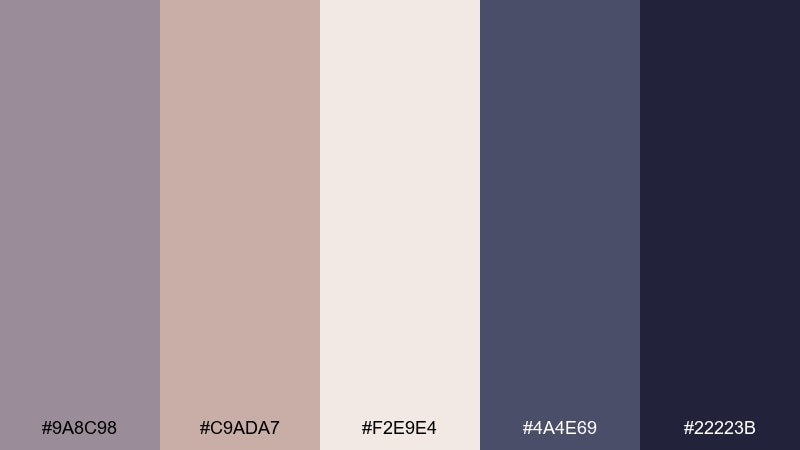
14) Campfire Cocoa
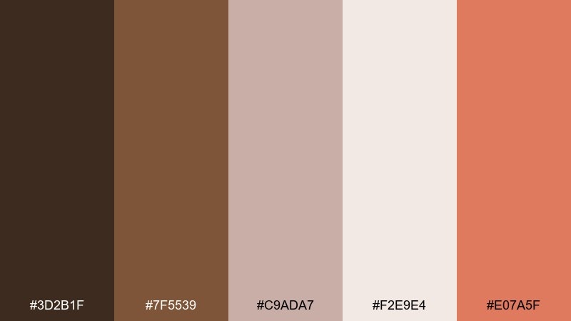
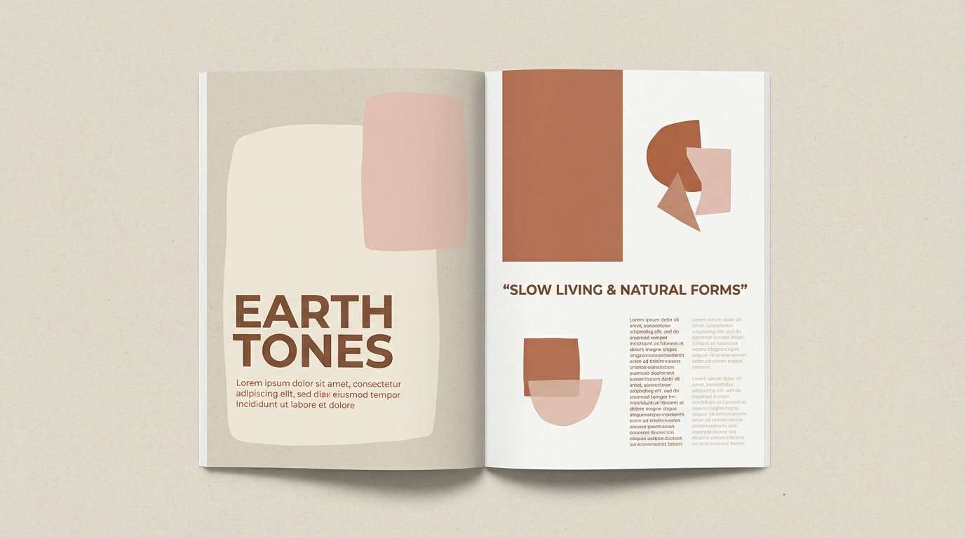
HEX: #3d2b1f #7f5539 #c9ada7 #f2e9e4 #e07a5f
Mood: grounded, cozy, earthy
Best for: autumn editorial layout
Grounded cocoa browns and warm clay blush feel like a late picnic that ends by a campfire. This picnic color palette is a strong choice for editorial spreads, seasonal lookbooks, and craft branding that leans earthy. Pair with textured paper backgrounds and simple serif headlines for warmth. Tip: keep the blush and cream as large background fields so the darker browns read refined, not heavy.
Image example of campfire cocoa generated using media.io
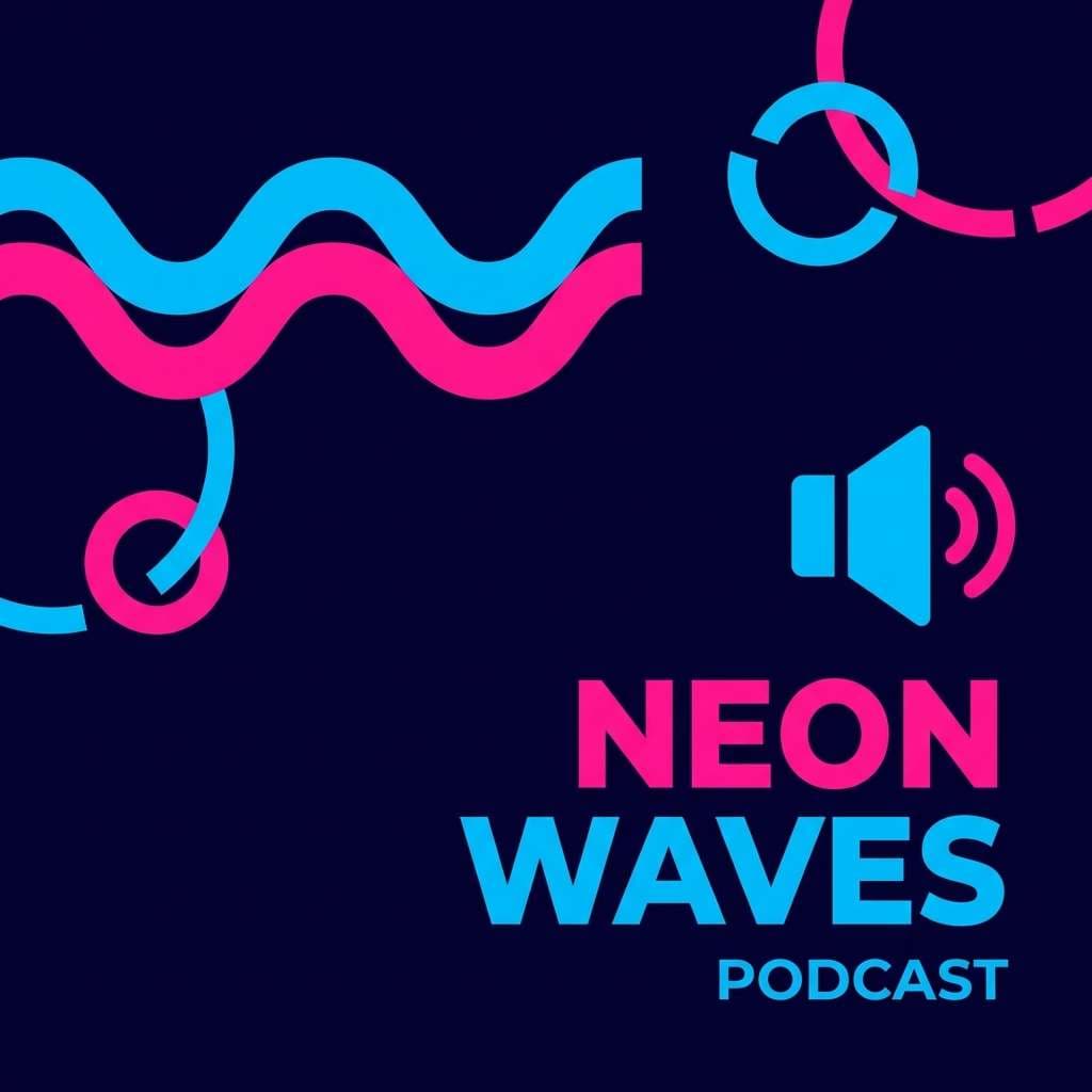
15) Blueberry Pie
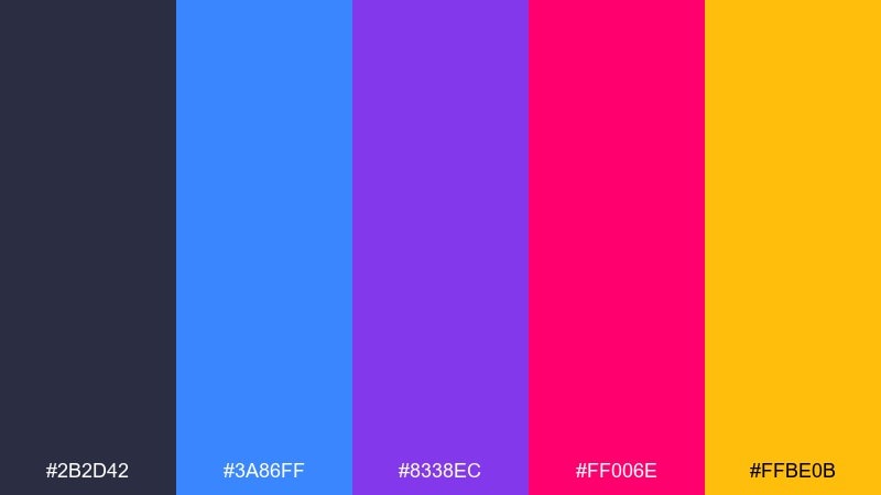
HEX: #2b2d42 #3a86ff #8338ec #ff006e #ffbe0b
Mood: punchy, modern, high-contrast
Best for: music or podcast cover art
Punchy jewel tones feel like blueberries, neon signage, and a pop playlist in the park. Use them for cover art, bold thumbnails, and campaign graphics that need instant energy. Pair with thick typography and simplified shapes so the contrast stays intentional. Tip: let the dark navy anchor the layout, then pick one bright accent per version to keep series branding consistent.
Image example of blueberry pie generated using media.io
16) Lavender Spritz
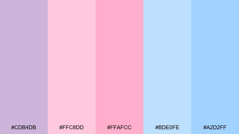
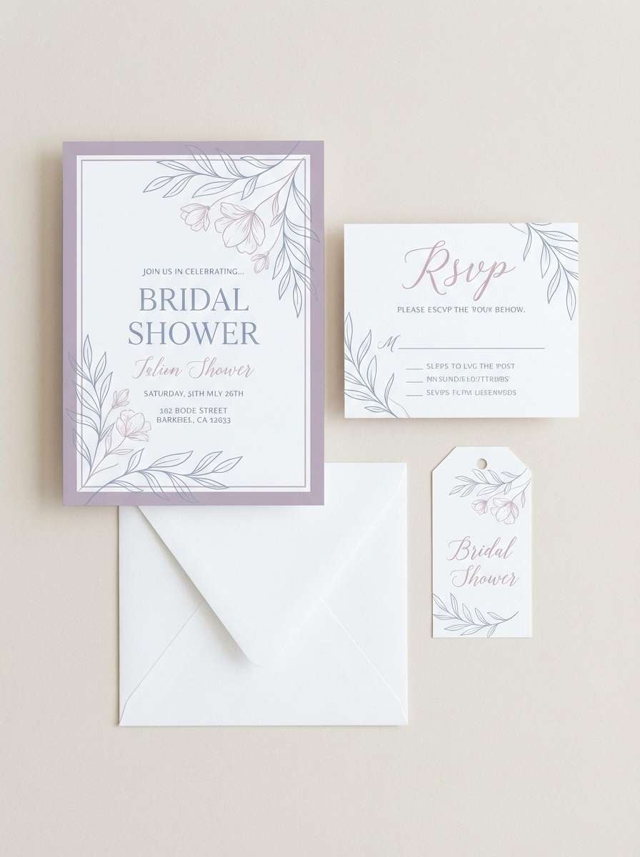
HEX: #cdb4db #ffc8dd #ffafcc #bde0fe #a2d2ff
Mood: dreamy, celebratory, soft
Best for: bridal shower invitation set
Dreamy lavender and airy blues evoke sparkling spritz drinks and soft afternoon light. These tones are ideal for bridal shower invitations, RSVP cards, and gentle event branding. Pair with delicate scripts or clean modern serif type for an elevated feel. Tip: keep the light blue as the main background and use pink for names, dates, and small highlights.
Image example of lavender spritz generated using media.io
17) Classic Gingham
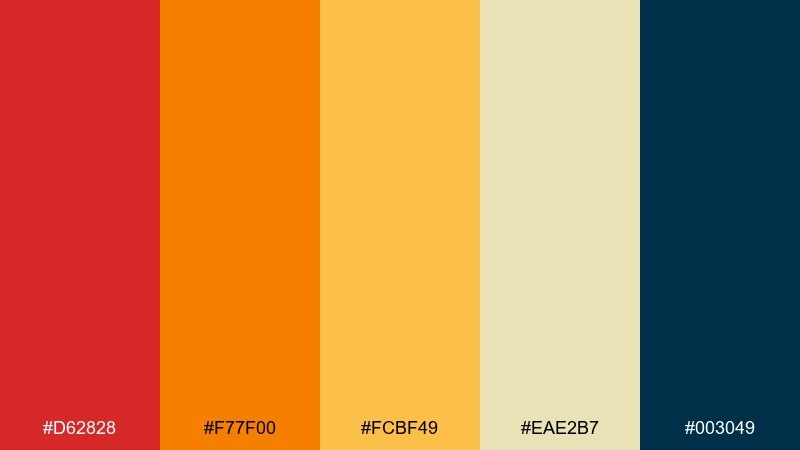
HEX: #d62828 #f77f00 #fcbf49 #eae2b7 #003049
Mood: timeless, bold, Americana
Best for: seasonal retail promo poster
Timeless gingham-inspired brights feel bold and familiar, like a classic summer fair. Use this set for retail promos, seasonal sales posters, and signage that needs a confident color story. Pair the navy with the pale wheat tone for legible type and clean borders. Tip: reserve the bright red for the primary callout so it stays special.
Image example of classic gingham generated using media.io

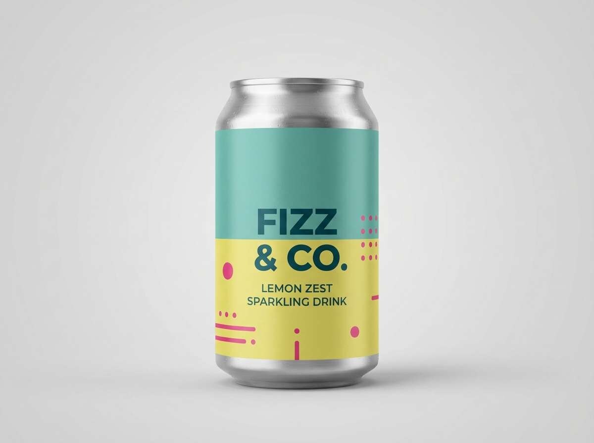
18) Citrus Cooler
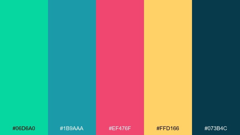
HEX: #06d6a0 #1b9aaa #ef476f #ffd166 #073b4c
Mood: vibrant, refreshing, playful
Best for: sparkling drink packaging
Vibrant citrus tones feel like ice clinking in a cooler and bright fruit wedges on top. These picnic color combinations are perfect for drink labels, limited-edition packaging, and high-impact product ads. Pair the deep teal with the lemon yellow for strong contrast and instant shelf clarity. Tip: keep the pink as a small accent stripe or icon so the design stays crisp and modern.
Image example of citrus cooler generated using media.io
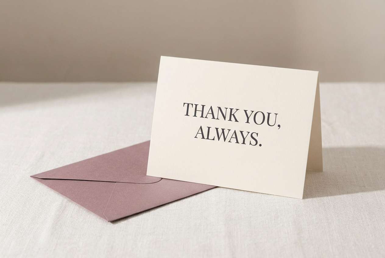
19) Garden Tea Party
HEX: #9a8c98 #c9ada7 #f2e9e4 #4a4e69 #22223b
Mood: elegant, muted, refined
Best for: stationery suite and thank-you cards
Muted mauves and inky charcoals evoke a quiet garden tea with linen napkins and vintage china. Use this palette for stationery suites, thank-you cards, and calm lifestyle branding. Pair with subtle paper grain and refined serif typography to lean into the classic mood. Tip: keep the lightest cream as the base and use the darkest shade sparingly for premium contrast.
Image example of garden tea party generated using media.io
20) Morning Dew
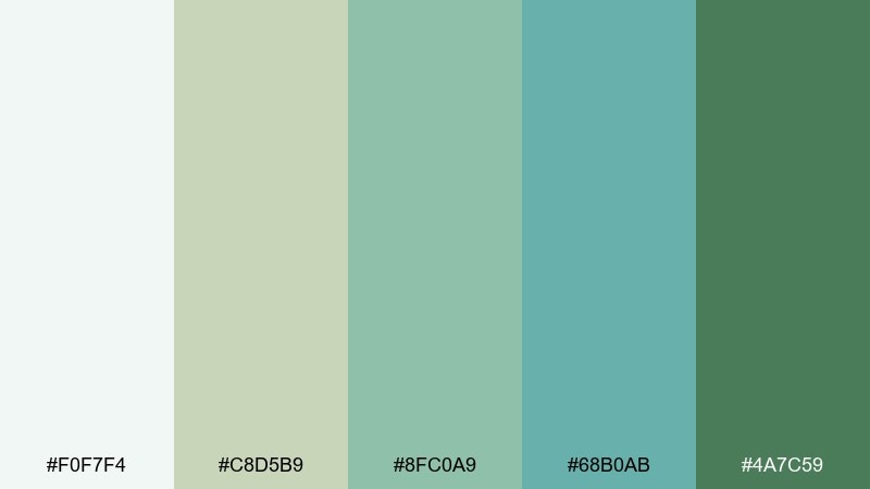
HEX: #f0f7f4 #c8d5b9 #8fc0a9 #68b0ab #4a7c59
Mood: calm, natural, balanced
Best for: app onboarding UI screens
Calm greens and soft misty whites feel like morning dew on leaves and a slow start to the day. They are great for onboarding screens, habit trackers, and wellness apps where clarity matters. Pair with simple icons and generous spacing to keep the interface breathable. Tip: use the deeper green only for primary buttons and progress indicators so users always know where to tap.
Image example of morning dew generated using media.io
What Colors Go Well with Picnic?
Classic picnic colors lean warm and edible: strawberry red, tomato, coral, butter yellow, and peach. They pair naturally with grounding neutrals like cream, kraft tan, and charcoal for readability.
For a fresher outdoor feel, add botanical greens (mint, sage, lawn) and airy sky tones (powder blue, seafoam). A deep navy or forest green works well as the “structure” color for text, icons, and borders.
If you want a more modern picnic palette, keep one bold accent (hot pink, teal, electric blue) and let the rest stay simple—light backgrounds plus one dark anchor keep things clean.
How to Use a Picnic Color Palette in Real Designs
Start with roles: choose 1 background (usually cream or near-white), 1 dark for type, 1 primary accent for headlines/CTAs, and 1–2 supporting colors for icons, badges, and illustrations. This prevents bright picnic colors from turning into visual clutter.
For invitations and menus, prioritize contrast and printing reality—soft pastels can wash out on uncoated paper. Test the mid-tones and keep small text in a deep charcoal or navy for legibility.
For branding and social templates, repeat one signature color across every layout (like strawberry red or teal) so the set feels cohesive, even when you rotate seasonal accents.
Create Picnic Palette Visuals with AI
If you have HEX codes but need finished designs, AI can help you generate posters, labels, invitation layouts, patterns, and UI mockups in the exact picnic mood you want.
Reuse the prompts under each palette as a starting point, then tweak details like “minimal,” “watercolor,” “vintage,” or “flat 2D” to match your project style and output ratio.
When your visual looks right, you can iterate quickly by keeping the same prompt structure and swapping only the subject (menu, label, landing page, etc.).
Picnic Color Palette FAQs
-
What are picnic colors?
Picnic colors are bright, friendly summer tones—often strawberry reds, lemonade yellows, lawn greens, and sky or sea blues—balanced with cream, kraft, navy, or charcoal for structure and readability. -
What is the best background color for a picnic theme design?
Soft neutrals like cream, off-white, or pale warm beige work best because they feel like paper, linen, or sand and let bold picnic accents (red, yellow, teal) stand out clearly. -
How do I make a picnic palette look modern (not too “retro”)?
Limit the palette to one dominant accent, one dark anchor, and lots of whitespace. Use clean typography and simple shapes, and keep patterns like gingham as small details instead of full backgrounds. -
Which picnic colors are best for readable text?
Use deep navy, charcoal, or dark olive for body text and small labels. Bright reds, corals, and yellows are better as accents, buttons, or headline blocks rather than long text. -
What picnic color palette works for food packaging?
Try Basket Weave Neutrals for artisan labels, Cherry Cola for beverages and desserts, or Citrus Cooler for sparkling drinks. These palettes give strong shelf contrast while still feeling outdoorsy. -
Can I use pastel picnic colors for branding?
Yes—palettes like Mint Napkins or Orchard Breeze work well for wellness, cafés, and lifestyle brands. Keep one pastel as the consistent brand anchor and use a darker supporting color for navigation and legibility. -
How can I generate picnic-themed visuals from these palettes?
Use the prompts under each palette in Media.io Text-to-Image, then adjust the subject (invitation, menu, poster, packaging) and ratio. Iterate by changing only one detail at a time to keep results consistent.


