

Peach yellow brings warmth, optimism, and a soft glow that feels friendly in both digital interfaces and print. It’s bright enough to guide attention, but gentle enough to keep layouts calm.
Below are 20 curated peach yellow color palette ideas with HEX codes, plus practical pairing tips and AI prompts you can reuse to generate matching visuals.
In this article
- Why Peach Yellow Palettes Work So Well
-
- apricot sunrise
- honeyed linen
- citrus cream
- peach sorbet pop
- marigold blush
- sunlit terracotta
- vanilla peach minimal
- golden hour studio
- buttercup bouquet
- retro peach diner
- soft sandstone
- mango peach splash
- coastal peach breeze
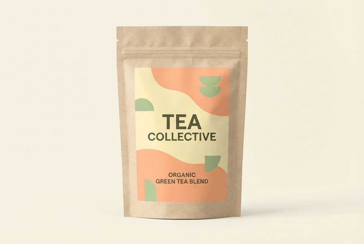
- peachy matcha
- warm pastel nursery
- luxe peach gold
- autumn orchard
- floral stationery
- modern web landing
- wedding brunch
- What Colors Go Well with Peach Yellow?
- How to Use a Peach Yellow Color Palette in Real Designs
- Create Peach Yellow Palette Visuals with AI
Why Peach Yellow Palettes Work So Well
Peach yellow sits in the sweet spot between sunny energy and soft warmth, which makes it easy to use for welcoming brands and “feel-good” UI. It adds brightness without the sharpness that pure yellow can bring.
Because peach yellow naturally pairs with peaches, creams, tans, and cocoa browns, you can build clear hierarchy: light bases, warm midtones, and grounded dark text. That balance often feels premium even with simple layouts.
It’s also highly flexible across seasons: push it toward coral and terracotta for autumn warmth, or keep it airy with ivory and blush for spring and wedding aesthetics.
20+ Peach Yellow Color Palette Ideas (with HEX Codes)
1) Apricot Sunrise
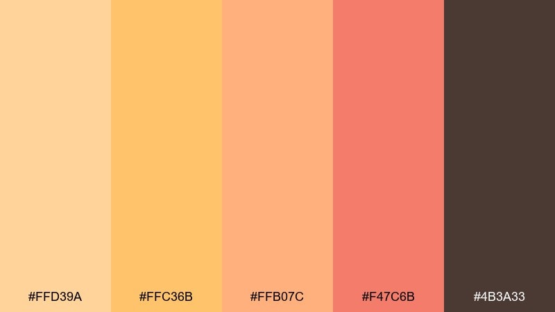
HEX: #FFD39A #FFC36B #FFB07C #F47C6B #4B3A33
Mood: bright, welcoming, uplifting
Best for: brand identity boards and lifestyle branding
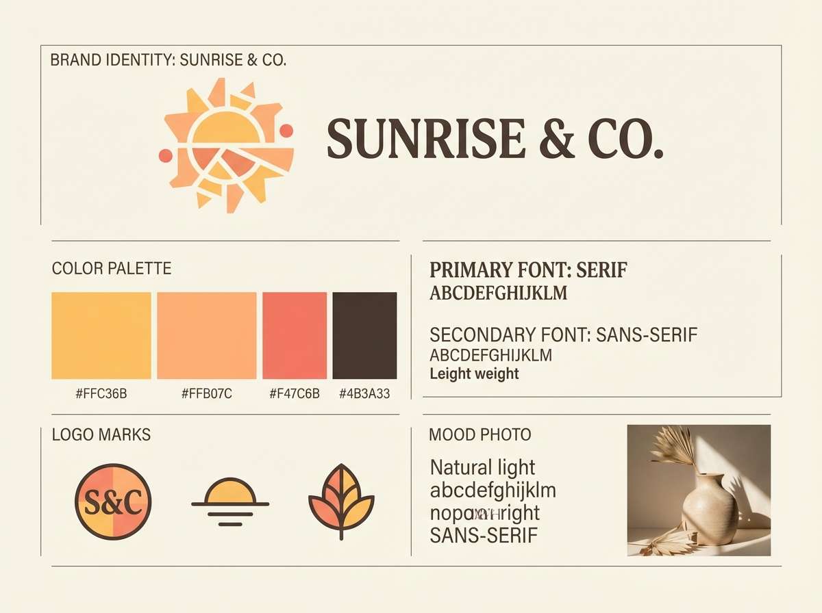
Bright and airy like sunrise over soft apricot clouds, these tones feel instantly friendly. Use the warm yellow as your headline color and let peach carry backgrounds and large blocks. Deep cocoa adds contrast for typography and icons without looking harsh. Pair with off-white paper textures and keep accents minimal so the warmth stays clean.
Image example of apricot sunrise generated using media.io
Media.io is an online AI studio for creating and editing video, image, and audio in your browser.

2) Honeyed Linen

HEX: #FFF1D6 #F6D27B #F2B88C #D9A57A #7A6655
Mood: cozy, natural, understated
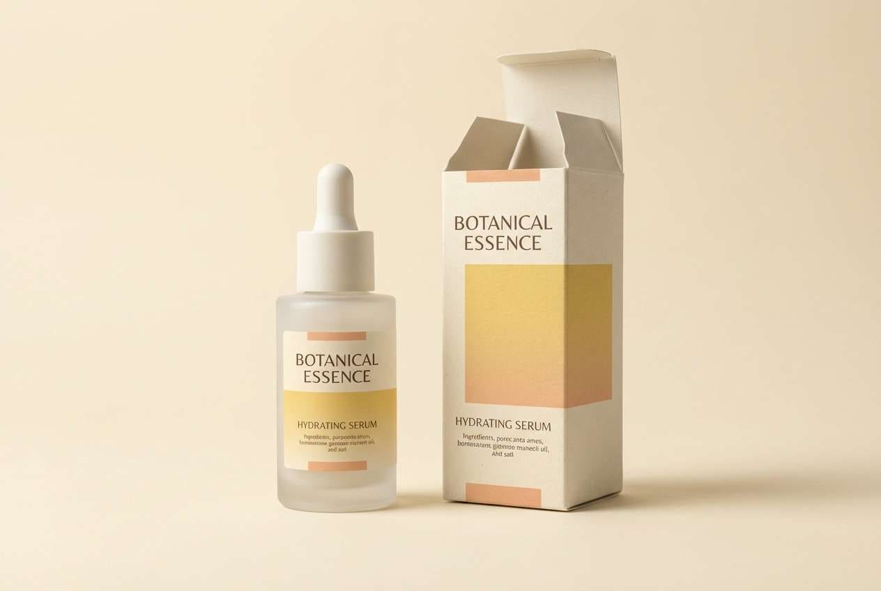
Best for: skincare packaging and wellness labels
Cozy and sun-warmed like linen left in a window, this mix reads calm and premium. Let the pale cream dominate the label area, then bring in honey yellow for seals and callouts. The muted tan and cocoa keep ingredients text legible and grounded. A good tip is to use matte finishes and subtle embossing to match the soft mood.
Image example of honeyed linen generated using media.io
3) Citrus Cream
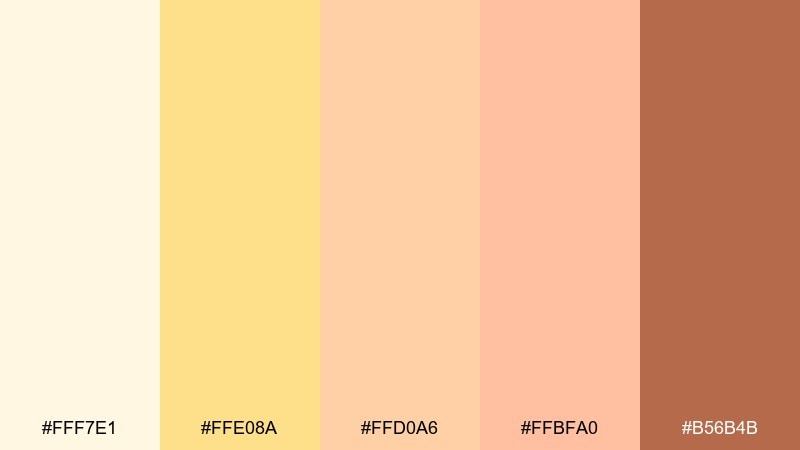
HEX: #FFF7E1 #FFE08A #FFD0A6 #FFBFA0 #B56B4B
Mood: fresh, sunny, soft
Best for: landing pages and newsletter layouts
Fresh and sunny like citrus whipped into cream, the palette feels light without turning childish. This peach yellow color palette works best with the pale ivory as the page base, then uses the buttery yellow for buttons and highlights. Warm caramel is your accessibility hero for nav text and form labels. Keep gradients subtle and reserve the brighter yellow for key actions only.
Image example of citrus cream generated using media.io
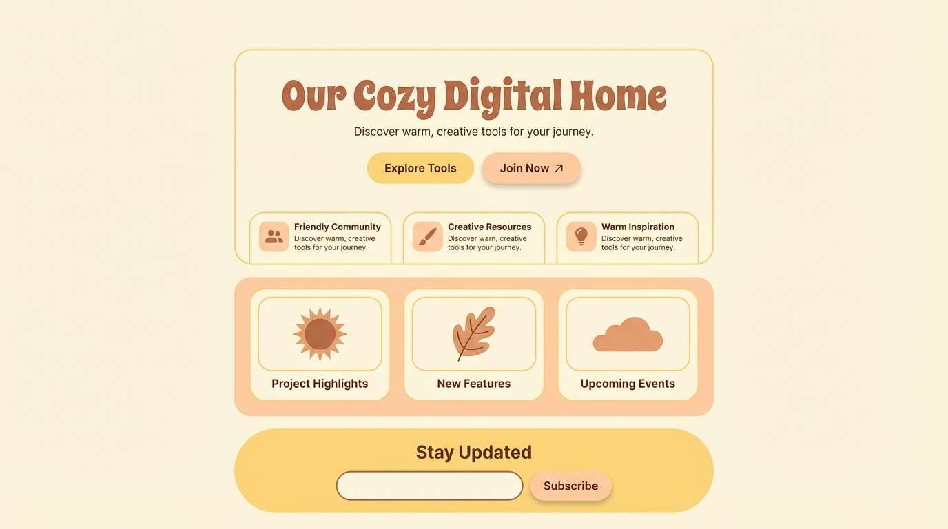
4) Peach Sorbet Pop
HEX: #FFE5B8 #FFD34F #FFB07A #FF7A6E #3B2B2A
Mood: playful, punchy, energetic
Best for: social media promo graphics and reels covers
Playful and punchy like sorbet on a hot day, these colors bring instant energy. Use the bright yellow for stickers, price tags, and key numbers, with peach as the main background fill. Coral is perfect for a single bold accent, especially on CTAs or limited-time badges. For readability, anchor the design with the deep espresso for headlines and small copy.
Image example of peach sorbet pop generated using media.io

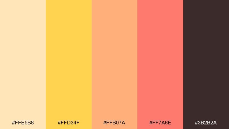
5) Marigold Blush
HEX: #FFF0C7 #FFD56A #F9B4A6 #E67F73 #5E4A4A
Mood: romantic, cheerful, warm
Best for: wedding invitations and RSVP sets
Romantic and cheerful like marigolds tucked into a blush bouquet, the contrast stays gentle. These peach yellow color combinations shine on invitations with creamy paper backgrounds and gold-leaning accents. Use the deeper rose for names and section dividers so the layout holds up in print. Tip: add a thin border in the cocoa tone to frame the piece and improve legibility.
Image example of marigold blush generated using media.io
6) Sunlit Terracotta
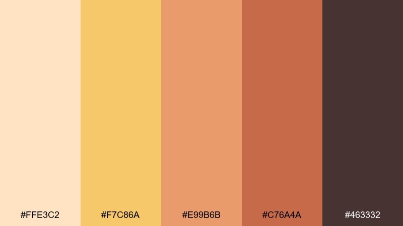
HEX: #FFE3C2 #F7C86A #E99B6B #C76A4A #463332
Mood: earthy, sunbaked, rustic
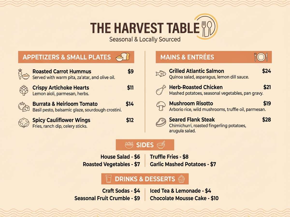
Best for: restaurant menus and cafe signage
Earthy and sunbaked like clay tiles in afternoon light, this set feels grounded and appetizing. Use the pale peach as the menu base, then bring in golden yellow for section headers and highlights. Terracotta and brick tones work well for illustrations of ingredients or simple icons. Keep the darkest brown for prices and body copy to avoid muddy contrast.
Image example of sunlit terracotta generated using media.io
7) Vanilla Peach Minimal
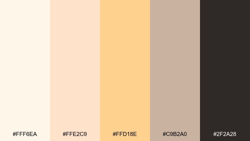
HEX: #FFF6EA #FFE2C9 #FFD18E #C9B2A0 #2F2A28
Mood: minimal, calm, refined
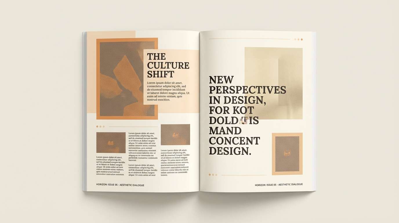
Best for: editorial layouts and lookbooks
Minimal and calm like vanilla cream with a hint of peach, these tones feel quietly refined. Build generous white space with the soft ivory and use the muted peach for image frames and pull quotes. The taupe adds structure for grids and captions without shouting. A practical tip is to keep photos warm-toned so the page feels cohesive from cover to spread.
Image example of vanilla peach minimal generated using media.io
8) Golden Hour Studio
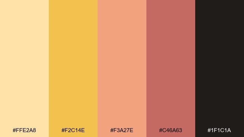
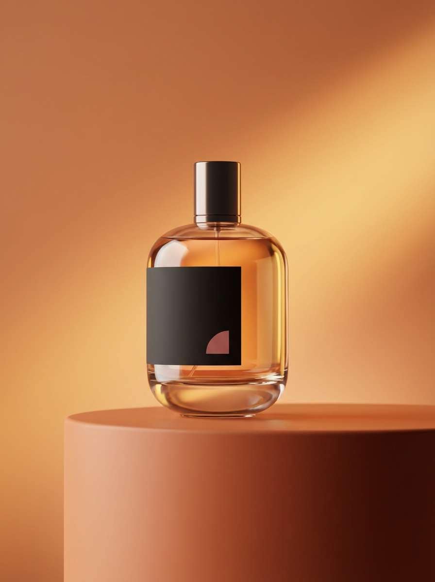
HEX: #FFE2A8 #F2C14E #F3A27E #C46A63 #1F1C1A
Mood: cinematic, bold, high-contrast
Best for: perfume ads and premium product launches
Cinematic and bold like golden hour light hitting glass, this palette adds drama without going neon. Let the rich yellow and peach lead the hero area, then use the deep near-black for luxe contrast. The wine-rose tone works best as a small accent on seals, ribbons, or a single line of copy. For a premium feel, keep shadows soft and highlights warm rather than stark.
Image example of golden hour studio generated using media.io
9) Buttercup Bouquet
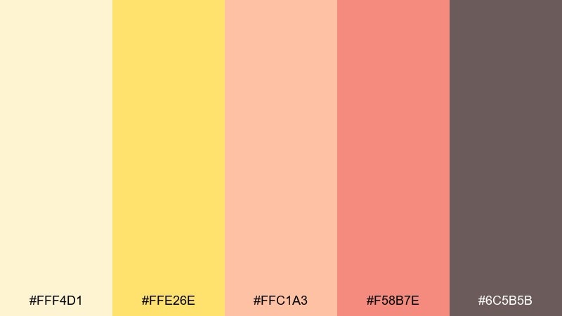
HEX: #FFF4D1 #FFE26E #FFC1A3 #F58B7E #6C5B5B
Mood: springy, sweet, optimistic
Best for: botanical illustrations and seasonal headers
Springy and sweet like buttercups and soft petals, these hues feel optimistic and light. Use the pale butter tone for background washes, then layer peach for petals and warm blush shadows. The deeper coral is best reserved for focal flowers so the composition stays airy. Add the muted brown for fine linework and text so details remain crisp.
Image example of buttercup bouquet generated using media.io
10) Retro Peach Diner
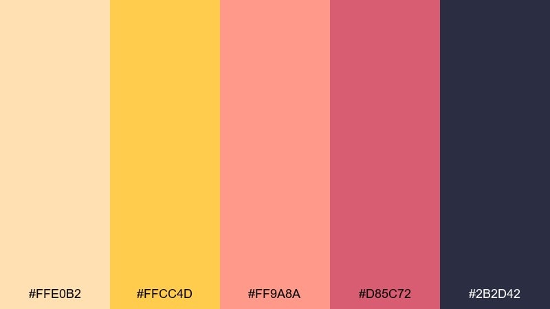
HEX: #FFE0B2 #FFCC4D #FF9A8A #D85C72 #2B2D42
Mood: retro, fun, confident
Best for: event posters and themed pop-up promos
Retro and fun like a classic diner sign at sunset, this mix has personality. The golden yellow pops for titles and starbursts, while peach and pink fill the main blocks. A deep indigo adds punchy contrast that reads great from a distance. Tip: lean into chunky typography and simple shapes so the palette does the talking.
Image example of retro peach diner generated using media.io

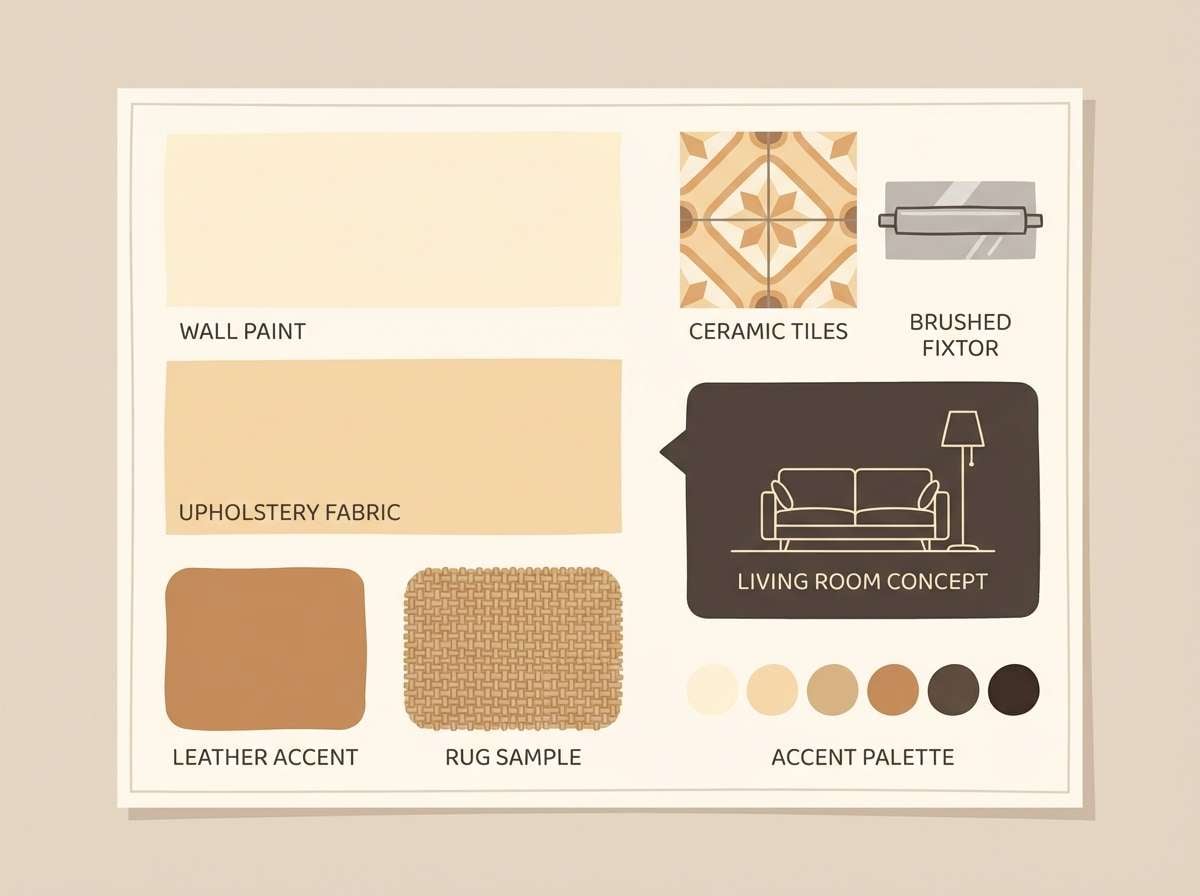
11) Soft Sandstone
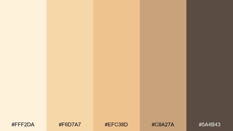
HEX: #FFF2DA #F6D7A7 #EFC38D #C8A27A #5A4B43
Mood: warm, neutral, timeless
Best for: interior mood boards and paint selections
Warm and timeless like sunlit sandstone, these neutrals are easy to live with. Use the light cream as the wall base and layer the sandy midtones for textiles and rugs. The deeper brown grounds the board for trim, hardware, or typography on spec sheets. Keep patterns subtle and let texture carry the interest instead of adding more colors.
Image example of soft sandstone generated using media.io
12) Mango Peach Splash
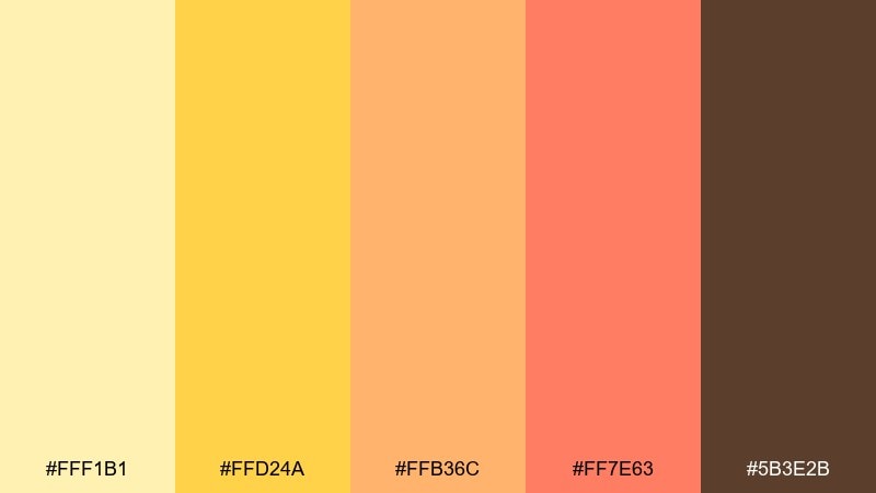
HEX: #FFF1B1 #FFD24A #FFB36C #FF7E63 #5B3E2B
Mood: juicy, vibrant, youthful
Best for: beverage packaging and summer campaigns
Juicy and vibrant like a mango-peach splash, the colors feel energetic and refreshing. This peach yellow color palette is ideal for drink labels where the bright yellow carries flavor cues and shelf impact. Use the coral-orange for a bold fruit graphic, then keep small text in the deep brown for clarity. Tip: add lots of negative space so the saturated tones do not overwhelm the pack.
Image example of mango peach splash generated using media.io
13) Coastal Peach Breeze
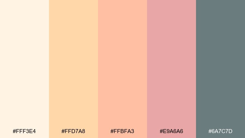
HEX: #FFF3E4 #FFD7A8 #FFBFA3 #E9A6A6 #6A7C7D
Mood: relaxed, airy, seaside
Best for: travel brochures and resort newsletters
Relaxed and airy like a coastal breeze at dusk, these tones feel soft and open. Use the creamy base for spacious layouts, then bring in peach for panels and image frames. The cool gray-green works beautifully for body text and subtle dividers, adding a calm counterpoint. Keep photography warm and lightly desaturated so the palette stays cohesive.
Image example of coastal peach breeze generated using media.io
14) Peachy Matcha
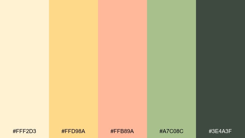
HEX: #FFF2D3 #FFD98A #FFB89A #A7C08C #3E4A3F
Mood: fresh, modern, balanced
Best for: tea packaging and cafe branding
Fresh and modern like matcha served with a peach pastry, this pairing balances warm and herbal notes. Let the creamy peach tones lead the label, then use the soft green for badges and flavor markers. The deep forest shade is perfect for logos and ingredient text to keep things crisp. A helpful tip is to repeat the green only in small doses so it feels intentional, not accidental.
Image example of peachy matcha generated using media.io
15) Warm Pastel Nursery
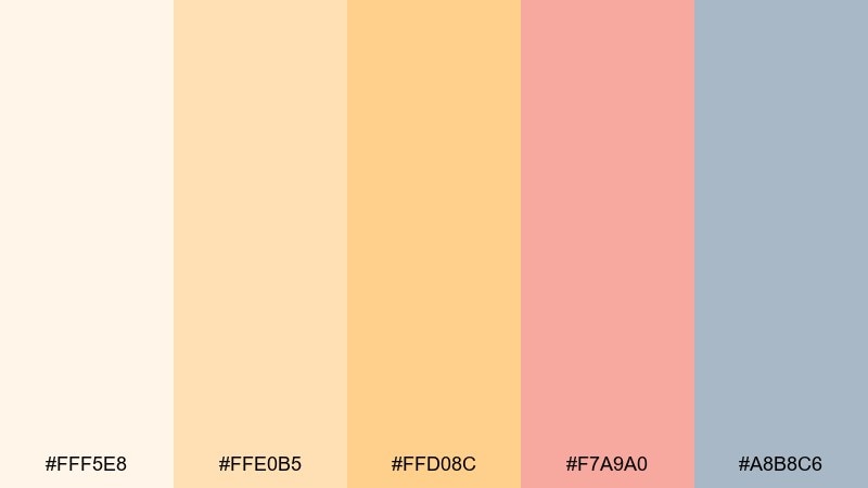
HEX: #FFF5E8 #FFE0B5 #FFD08C #F7A9A0 #A8B8C6
Mood: gentle, comforting, dreamy
Best for: nursery wall art and baby shower prints
Gentle and dreamy like soft blankets and morning light, this mix is comforting without being sugary. Use the creamy peach for backgrounds, then add the warm yellow for stars, suns, and small highlights. The blush tone brings a sweet focal point, while the blue-gray keeps the overall look balanced. Tip: stick to simple shapes and big margins so the pastels feel calm.
Image example of warm pastel nursery generated using media.io

16) Luxe Peach Gold
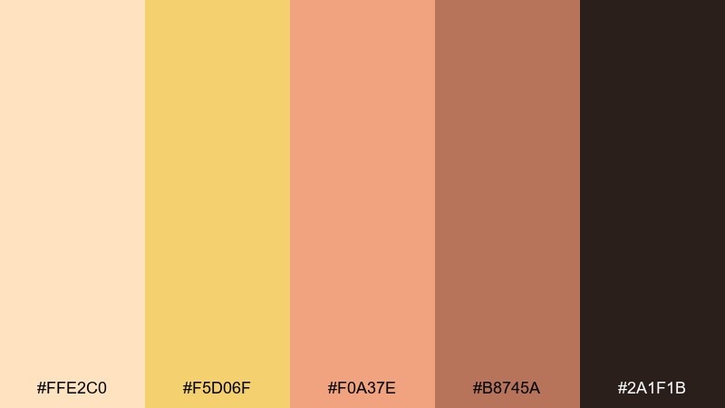
HEX: #FFE2C0 #F5D06F #F0A37E #B8745A #2A1F1B
Mood: luxurious, warm, elegant
Best for: jewelry ads and premium banners
Luxurious and warm like brushed gold against peach satin, this palette feels elevated and intentional. These peach yellow color combinations work well when the golden tone is used sparingly as a highlight rather than a full background. Build most of the canvas with soft peach and use the deep near-black for strong typographic contrast. Tip: add one metallic texture or foil effect to amplify the premium vibe in print or web.
Image example of luxe peach gold generated using media.io
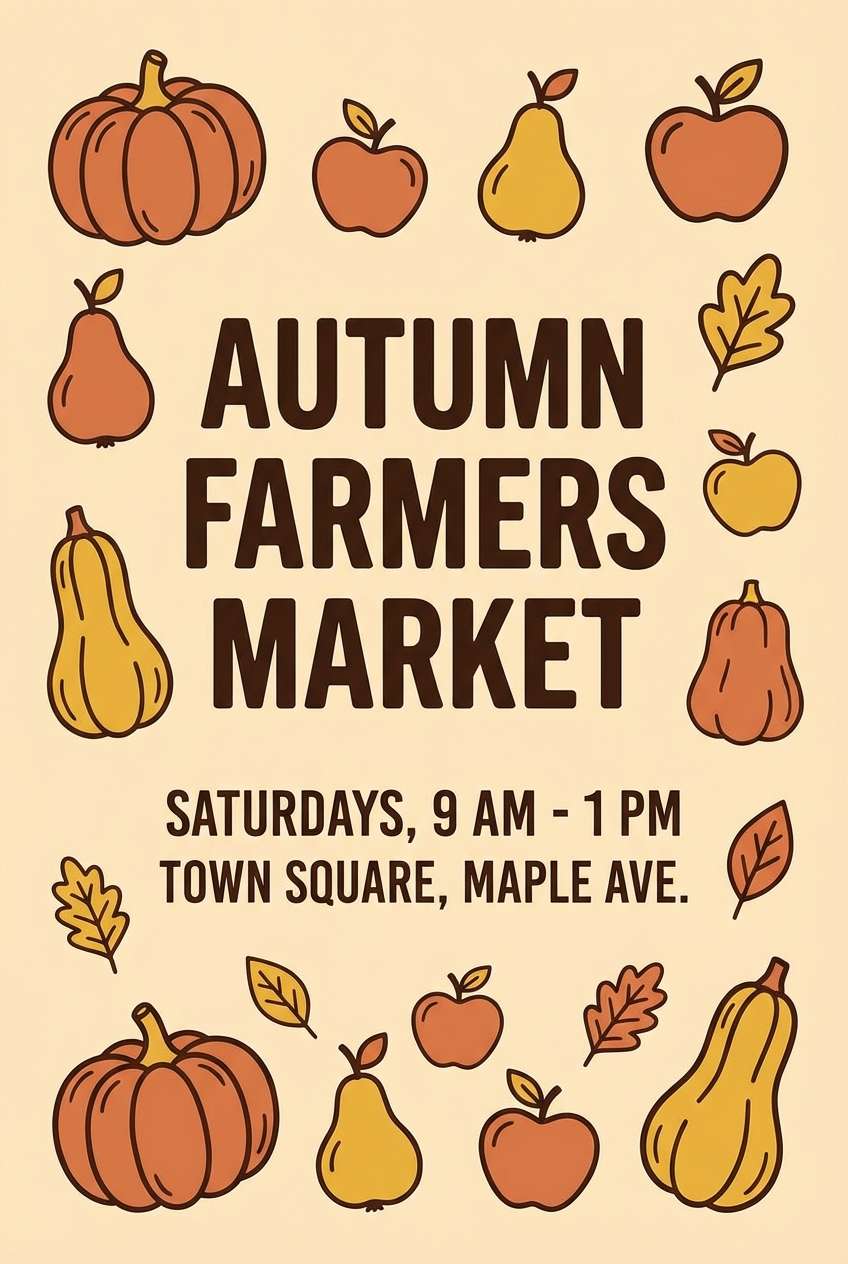
17) Autumn Orchard
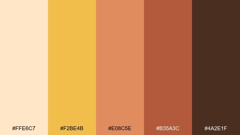
HEX: #FFE6C7 #F2BE4B #E08C5E #B35A3C #4A2E1F
Mood: harvest, cozy, nostalgic
Best for: farmers market flyers and seasonal promos
Cozy and nostalgic like an orchard stand in late afternoon, these hues feel harvest-ready. Use the soft peach as the flyer base and bring the golden yellow into headings and price tags. The richer rust tones add warmth for illustrations and supporting blocks. Keep the darkest brown for key details like dates and locations to ensure quick readability.
Image example of autumn orchard generated using media.io
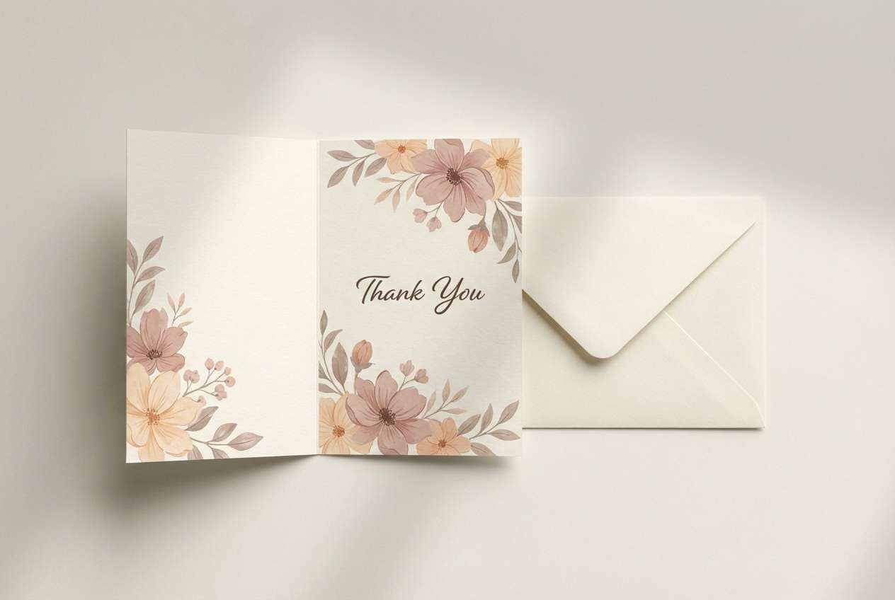
18) Floral Stationery
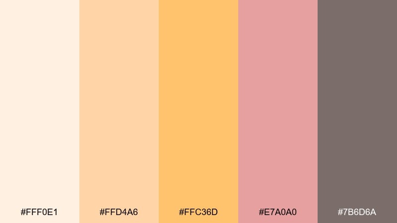
HEX: #FFF0E1 #FFD4A6 #FFC36D #E7A0A0 #7B6D6A
Mood: soft, polished, handmade
Best for: thank you cards and stationery sets
Soft and polished like hand-tinted stationery, these shades feel personal and put-together. Use the creamy base for card stock, then layer warm yellow for small motifs and borders. Blush and rose bring gentle contrast for monograms or tiny florals. Tip: print the gray-brown as the main ink color for a less harsh, more boutique look than pure black.
Image example of floral stationery generated using media.io
19) Modern Web Landing
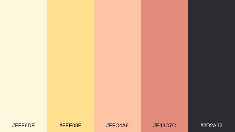
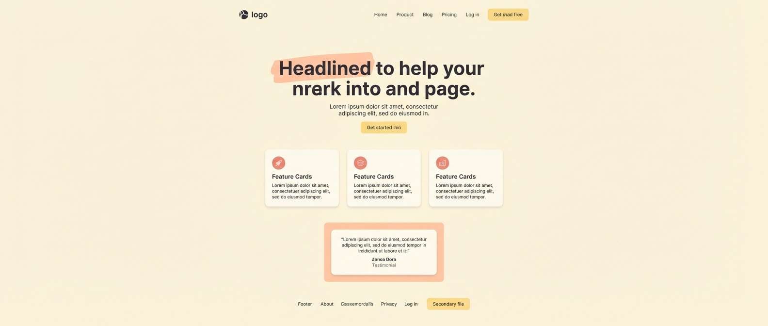
HEX: #FFF6DE #FFE08F #FFC4A6 #E48C7C #2D2A32
Mood: modern, friendly, conversion-focused
Best for: SaaS landing pages and UI kits
Modern and friendly like a warm welcome banner, this set is built for clear hierarchy. The peach yellow color scheme can carry hero sections beautifully when the light cream stays dominant and the yellow is reserved for CTAs. Use coral for status chips or small highlights, and keep the charcoal for text and nav for consistent contrast. Tip: test buttons at small sizes and avoid using yellow for body copy.
Image example of modern web landing generated using media.io
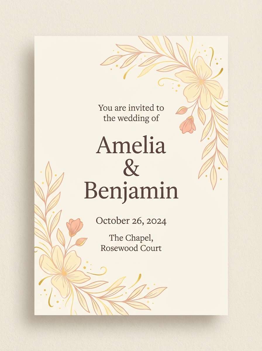
20) Wedding Brunch
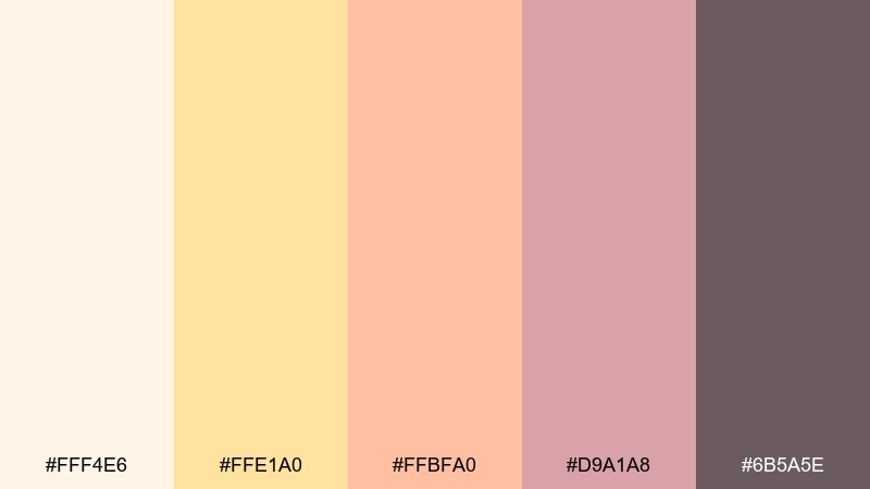
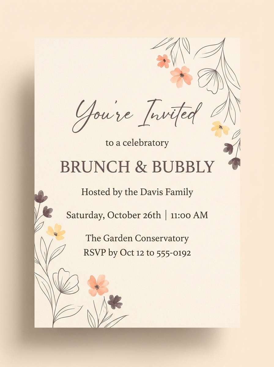
HEX: #FFF4E6 #FFE1A0 #FFBFA0 #D9A1A8 #6B5A5E
Mood: festive, airy, romantic
Best for: brunch invitations and day-of signage
Festive and airy like mimosas and soft pastries, these tones feel romantic but relaxed. Use the cream background for a light print feel, then add warm yellow for small icons and separators. Peach and mauve work well for names, table numbers, and subtle floral elements. Tip: keep contrast high by using the smoky plum for all essential text.
Image example of wedding brunch generated using media.io
What Colors Go Well with Peach Yellow?
Peach yellow pairs beautifully with creamy neutrals (ivory, linen, warm beige) because they keep the overall look airy while letting yellow act as the “sunlight” accent. For readable designs, add a grounded dark like cocoa, espresso, or charcoal.
For more personality, combine peach yellow with blush, coral, or terracotta to intensify warmth without clashing. If you want balance, a muted cool counterpoint—like gray-green or blue-gray—can calm the palette and make it feel more modern.
In practice, treat peach yellow as a highlight color: buttons, badges, headers, and small graphic elements. Let softer peaches and creams carry large background areas to avoid visual fatigue.
How to Use a Peach Yellow Color Palette in Real Designs
Start with role-based color assignment: pick one light base (for backgrounds), one mid peach (for surfaces/cards), one peach yellow (for emphasis), one accent (coral/rose/green), and one dark (for text and icons). This makes the palette consistent across components.
For accessibility, avoid using peach yellow for long body text, especially on light backgrounds. Instead, reserve it for UI highlights and pair it with a deep brown/charcoal for typography, borders, and form labels.
In branding and print, peach yellow looks best with subtle texture (paper grain, soft gradients, matte finishes). Keep contrast intentional so the warmth reads premium rather than overly sweet.
Create Peach Yellow Palette Visuals with AI
If you want on-brand images that match your peach yellow tones, generate palette-based visuals using text prompts (like the ones above). This is especially helpful for mockups, posters, product ads, and UI concept shots.
To keep results consistent, reuse the same HEX codes in your prompts and specify lighting and background (for example: “warm cream backdrop,” “soft diffused lighting,” or “clean minimal layout”). Small prompt changes can quickly produce variations for campaigns.
Peach Yellow Color Palette FAQs
-
What is the hex code for peach yellow?
Peach yellow doesn’t have one single universal HEX, but common peach-yellow tones include #FFC36B, #FFD34F, and #FFE08A. Pick the exact shade based on how muted (more creamy) or energetic (more saturated) you want the design to feel. -
Is peach yellow warm or cool?
Peach yellow is a warm color. It leans toward yellow-orange, which gives it a sunny, friendly feel and makes it a strong choice for welcoming branding and upbeat UI highlights. -
What colors pair best with peach yellow for text readability?
For readable text, pair peach yellow backgrounds with dark neutrals like espresso brown (#3B2B2A), cocoa (#4B3A33), or charcoal (#2D2A32). Avoid setting body copy in peach yellow itself, especially on light surfaces. -
What’s a good accent color to balance peach yellow?
Muted cool tones like gray-green (#6A7C7D) or blue-gray (#A8B8C6) balance peach yellow nicely. They reduce visual heat and can make the palette feel more modern and editorial. -
How do I keep a peach yellow UI from looking childish?
Use peach yellow mainly for CTAs and highlights, keep the base mostly cream/ivory, and choose a sophisticated dark (charcoal or deep brown) for typography. Limiting saturation and adding whitespace helps the palette feel premium. -
Can peach yellow work for luxury branding?
Yes—combine soft peach with restrained gold-like yellow accents and high-contrast near-black text (for example, the “Luxe Peach Gold” palette). Minimal layouts, warm lighting, and subtle texture also elevate the look. -
How can I generate images that match my peach yellow palette?
Use an AI text-to-image tool and include your exact HEX codes directly in the prompt, plus style notes like “clean minimal layout,” “soft diffused lighting,” and your target aspect ratio. This helps keep visuals consistent across a campaign.
Next: Rosewood Color Palette


