

Pastel red sits in that sweet spot between warm and calm—soft enough for clean, modern layouts, but still emotionally expressive. It’s a go-to for brands that want friendliness, romance, or comfort without the intensity of pure red.
Below are 20 curated pastel red color palette ideas with HEX codes, plus practical pairing tips and AI prompts you can use to generate matching visuals.
In this article
- Why Pastel Red Palettes Work So Well
-
- rosewater minimal
- strawberry milk
- clay blush
- coral dust
- peony and cream
- vintage candy
- blush and sage
- warm petal
- rose quartz graphite
- sunset sorbet
- dusty rosewood
- ballet slipper neutrals
- rosy citrus
- soft brick linen
- pink sandstone
- raspberry fog
- apricot blush
- desert rose
- mauve blush night
- cherry blossom retro
- What Colors Go Well with Pastel Red?
- How to Use a Pastel Red Color Palette in Real Designs
- Create Pastel Red Palette Visuals with AI
Why Pastel Red Palettes Work So Well
Pastel red brings the emotional warmth of red—care, excitement, appetite, romance—while lowering the visual “volume.” That makes it easier to use across backgrounds, cards, and large blocks without overpowering your typography.
Because these hues are softer and often slightly desaturated, they pair naturally with modern neutrals like warm white, taupe, greige, and charcoal. The result feels polished, readable, and brandable for both print and UI.
Pastel reds also photograph well: skin tones look gentle, product shots feel premium, and lifestyle visuals gain a cozy glow. That consistency is why you’ll see blush-to-coral used everywhere from invites to ecommerce.
20+ Pastel Red Color Palette Ideas (with HEX Codes)
1) Rosewater Minimal
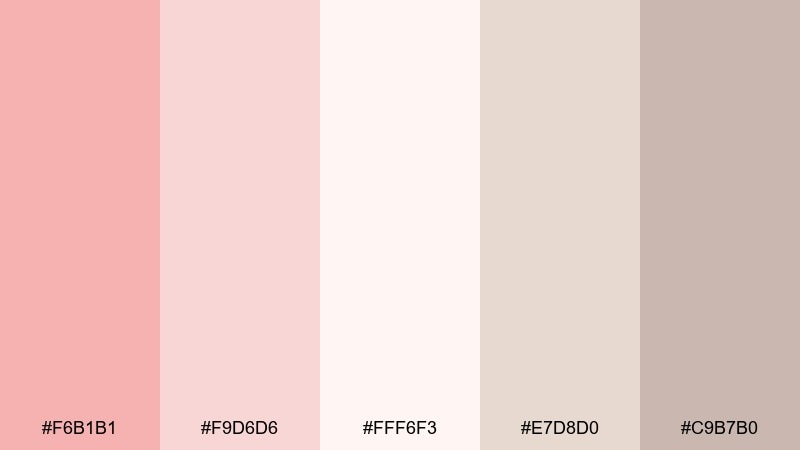
HEX: #F6B1B1 #F9D6D6 #FFF6F3 #E7D8D0 #C9B7B0
Mood: airy, clean, calming
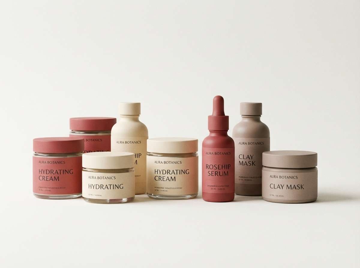
Best for: minimal skincare branding and product labels
Airy rosewater tones feel like soft light on clean porcelain, gentle and reassuring. This pastel red color palette shines on skincare labels, wellness brands, and minimalist packaging where readability matters. Pair it with warm whites, soft taupe neutrals, and a restrained sans serif to keep it modern. Usage tip: reserve the deepest neutral for small text and use the blush tones for large, quiet blocks of color.
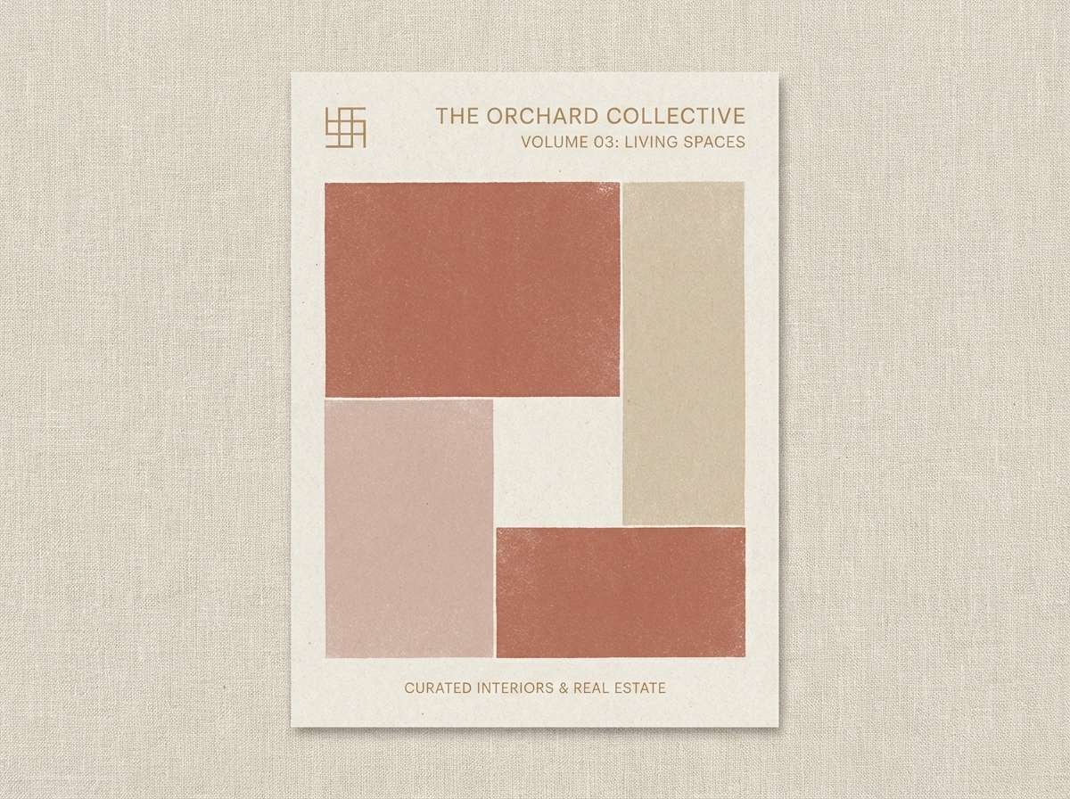
Image example of rosewater minimal generated using media.io
Media.io is an online AI studio for creating and editing video, image, and audio in your browser.

2) Strawberry Milk
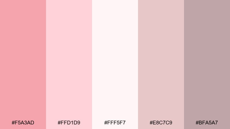
HEX: #F5A3AD #FFD1D9 #FFF5F7 #E8C7C9 #BFA5A7
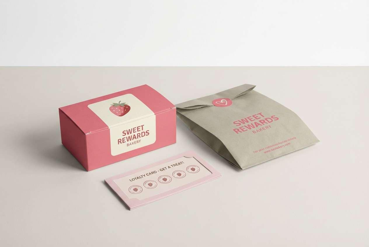
Mood: sweet, cozy, playful
Best for: bakery packaging and cafe loyalty cards
Sweet strawberry-milk tones evoke soft whipped frosting and a cozy neighborhood counter. They work beautifully for bakery packaging, cafe loyalty cards, and dessert socials where warmth beats intensity. Pair with creamy whites and gentle greige to keep the look grown-up, then add a single rounded display font for charm. Usage tip: keep backgrounds light and let the mid pink carry stamps, icons, or small illustrations.
Image example of strawberry milk generated using media.io
3) Clay Blush
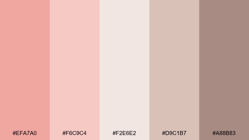
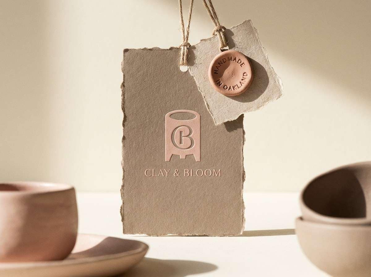
HEX: #EFA7A0 #F6C9C4 #F2E6E2 #D9C1B7 #A88B83
Mood: grounded, earthy, artisan
Best for: ceramics studio branding and craft store signage
Grounded clay-blush tones feel like hand-thrown pottery drying in warm sun. They fit ceramics studios, craft store signage, and maker brands that want an earthy softness. Pair with textured paper, matte finishes, and warm neutrals to lean into the handmade vibe. Usage tip: use the deeper brown-taupe for logo marks so the softer blushes can stay spacious and calm.
Image example of clay blush generated using media.io
4) Coral Dust
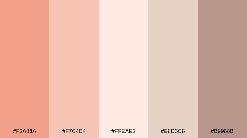
HEX: #F2A08A #F7C4B4 #FFEAE2 #E6D3C6 #B9968B
Mood: sun-warmed, inviting, modern
Best for: summer sale posters and social ads
Sun-warmed coral dust feels like late-afternoon light hitting stucco walls by the sea. These pastel red color combinations are great for summer sale posters, social ads, and seasonal landing pages that need energy without shouting. Pair with soft creams and sand tones, then add high-contrast type using the deeper neutral. Usage tip: keep gradients subtle and use coral as the call-to-action color to guide the eye.
Image example of coral dust generated using media.io

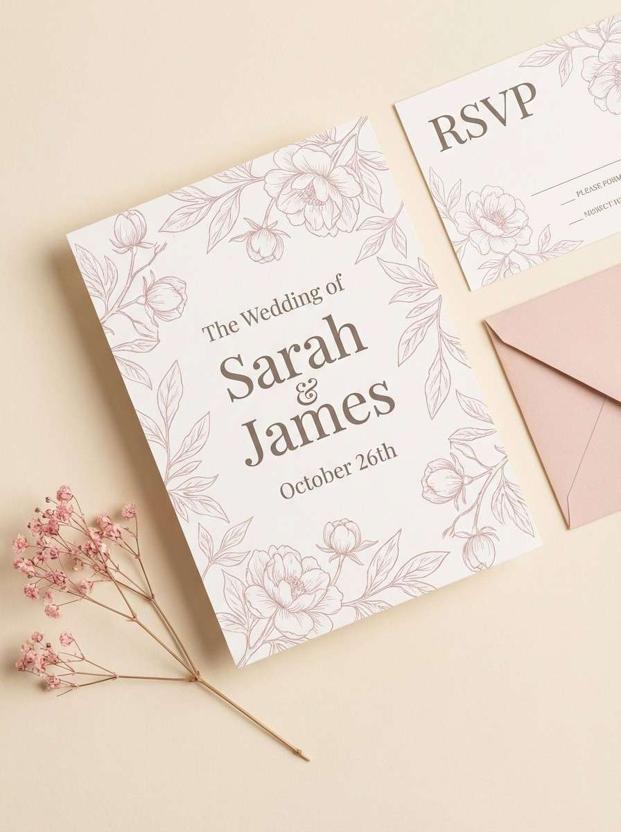
5) Peony and Cream
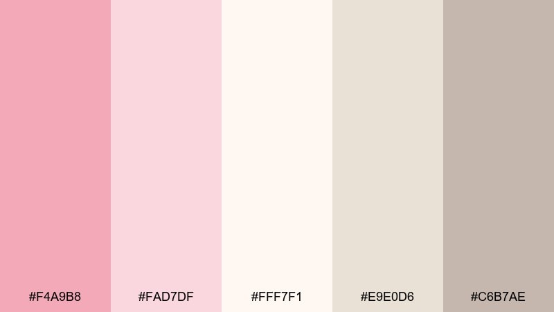
HEX: #F4A9B8 #FAD7DF #FFF7F1 #E9E0D6 #C6B7AE
Mood: romantic, gentle, elegant
Best for: wedding invitations and bridal shower stationery
Romantic peony tones with creamy lightness evoke petals pressed into fine paper. They suit wedding invitations, bridal shower stationery, and vow books where softness reads as luxury. Pair with warm cream backgrounds and muted taupe for typography, plus delicate line florals in the palest shade. Usage tip: keep foiling minimal and let negative space do most of the work.
Image example of peony and cream generated using media.io
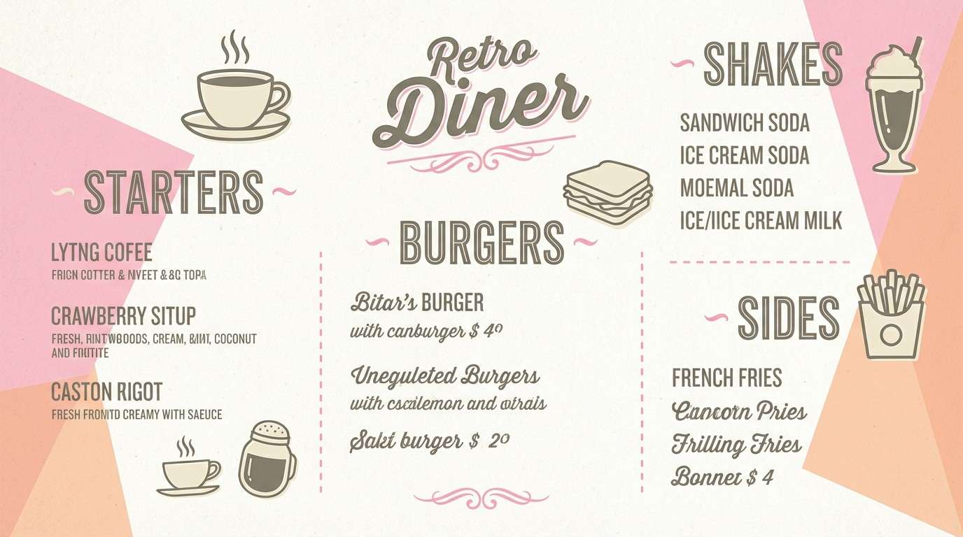
6) Vintage Candy
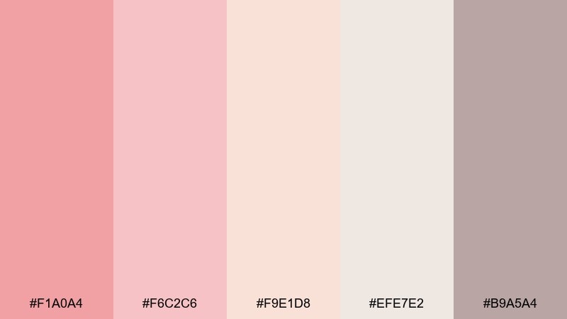
HEX: #F1A0A4 #F6C2C6 #F9E1D8 #EFE7E2 #B9A5A4
Mood: nostalgic, soft, cheerful
Best for: retro diner menus and sticker packs
Nostalgic candy tones bring to mind paper-wrapped sweets and retro diner booths. They work well for menus, sticker packs, and playful merch where a vintage hint feels friendly. Pair with off-white backgrounds and a slightly darker greige for headings to keep contrast readable. Usage tip: use the lightest peachy tint as a buffer around icons so everything feels printed, not digital.
Image example of vintage candy generated using media.io
7) Blush and Sage
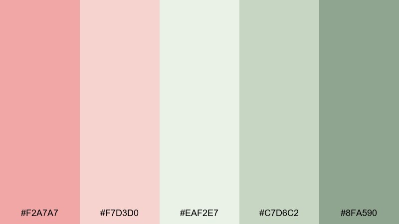
HEX: #F2A7A7 #F7D3D0 #EAF2E7 #C7D6C2 #8FA590
Mood: fresh, balanced, botanical
Best for: wellness app UI and habit trackers
Fresh blush paired with sage greens feels like a quiet morning routine and a windowsill herb garden. This pastel red color scheme works for wellness app UI, habit trackers, and calm dashboards that need gentle cues. Pair with plenty of white space and use sage for success states while blush handles highlights and friendly warnings. Usage tip: keep buttons in the mid blush and save the darkest green for small status indicators only.
Image example of blush and sage generated using media.io
8) Warm Petal
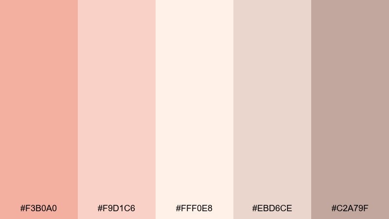
HEX: #F3B0A0 #F9D1C6 #FFF0E8 #EBD6CE #C2A79F
Mood: comforting, soft, approachable
Best for: newborn photography albums and nursery prints
Comforting warm-petal tones resemble soft blankets and the glow of a nightlight. They suit newborn photo albums, nursery prints, and gentle family branding where everything should feel safe and quiet. Pair with creamy whites and a muted taupe for captions, then add subtle texture like watercolor paper. Usage tip: avoid stark black and use the deepest neutral for text to keep the mood tender.
Image example of warm petal generated using media.io
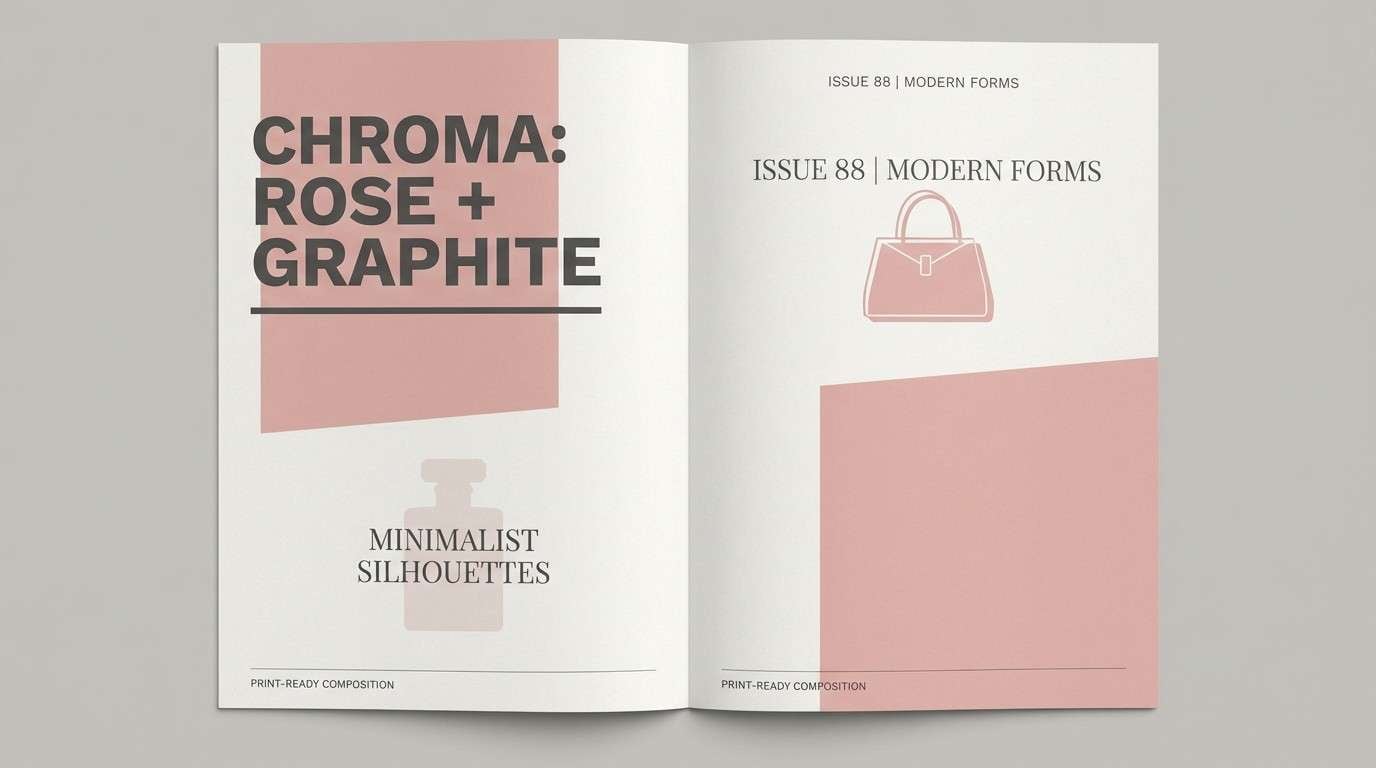
9) Rose Quartz Graphite
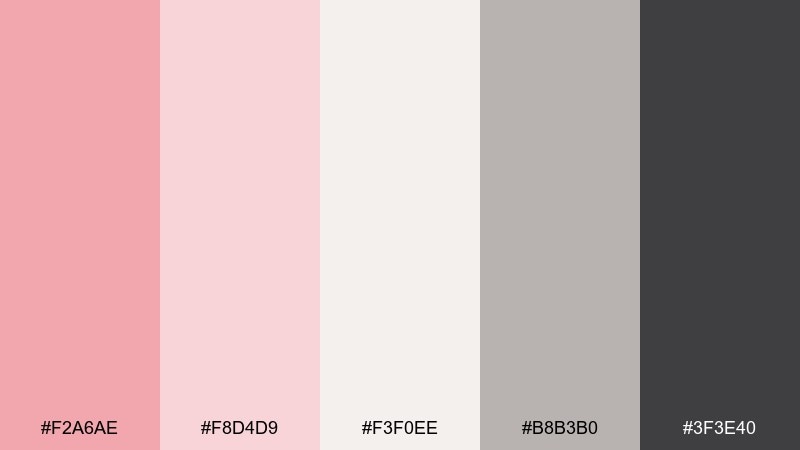
HEX: #F2A6AE #F8D4D9 #F3F0EE #B8B3B0 #3F3E40
Mood: sleek, editorial, confident
Best for: fashion lookbooks and premium branding
Sleek rose quartz against graphite feels like satin fabric beside dark stone. These pastel red color combinations are ideal for fashion lookbooks, premium branding, and modern packaging that needs a refined edge. Pair with lots of off-white and let graphite carry headlines for sharp contrast. Usage tip: keep the blush tones in large panels and reserve the darkest shade for thin rules and typography.
Image example of rose quartz graphite generated using media.io
10) Sunset Sorbet
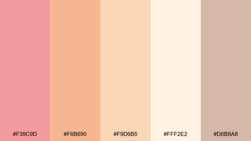
HEX: #F39C9D #F6B690 #F9D6B5 #FFF2E2 #D6B8A8
Mood: uplifting, sunny, friendly
Best for: travel blog headers and summer email banners
Uplifting sorbet shades feel like a sunset drink on a warm terrace. They fit travel blog headers, summer email banners, and cheerful hero sections that need a bright but soft glow. Pair with creamy backgrounds and a warm beige to prevent the peach tones from looking too sugary. Usage tip: use the mid coral as the primary accent and keep the lightest shade as spacious background fill.
Image example of sunset sorbet generated using media.io

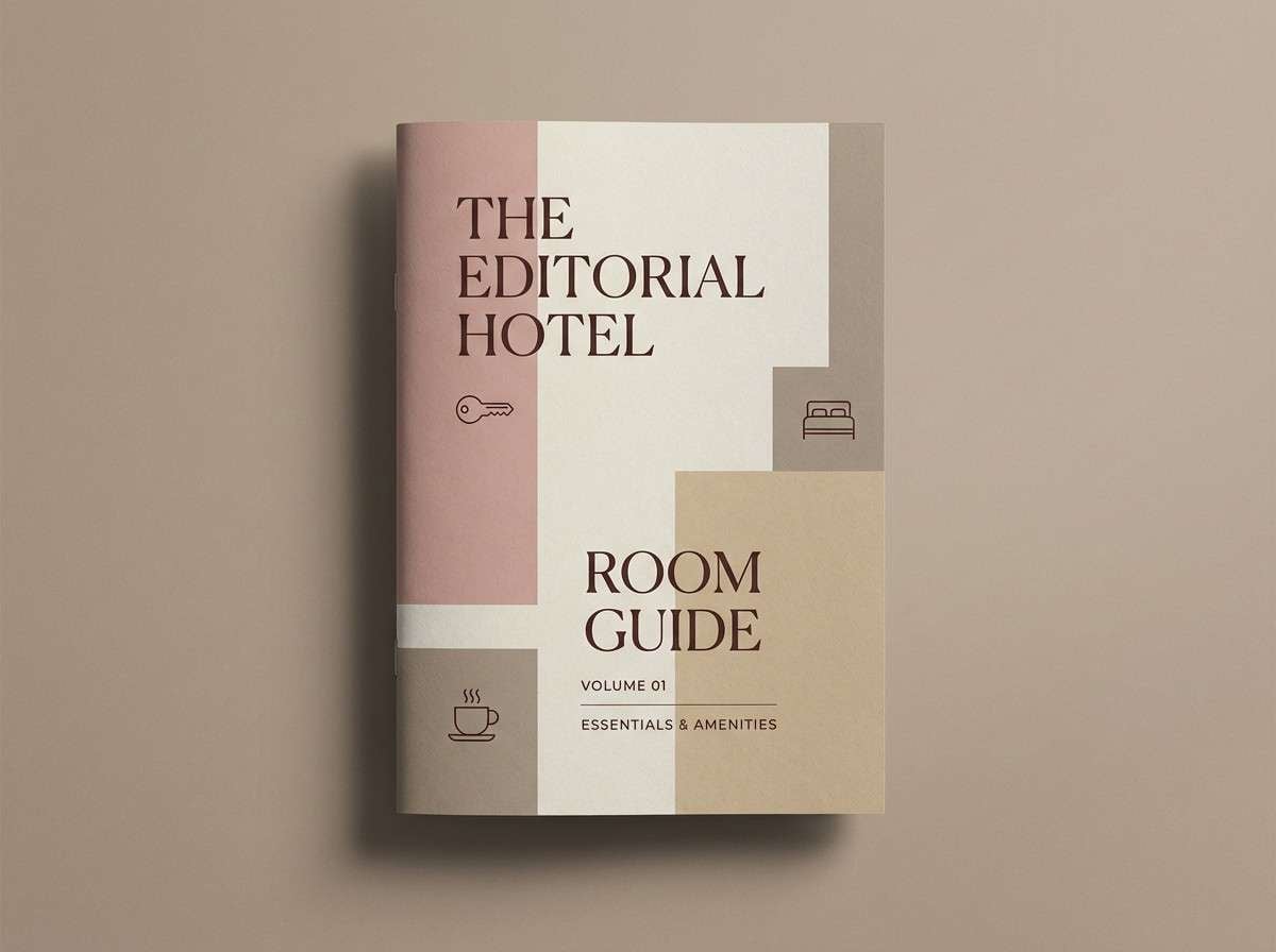
11) Dusty Rosewood

HEX: #E89A9A #F2C3C2 #E8D8D6 #BFAAA7 #6E5A57
Mood: mature, cozy, understated
Best for: boutique hotel branding and room guides
Mature dusty rosewood reads like vintage velvet, warm wood, and a quiet lobby at dusk. It works for boutique hotel branding, room guides, and hospitality print pieces that need comfort with polish. Pair with textured neutrals and use the deep brown for wayfinding elements and small icons. Usage tip: keep photography warm and slightly desaturated so the palette stays cohesive across print and web.
Image example of dusty rosewood generated using media.io
12) Ballet Slipper Neutrals
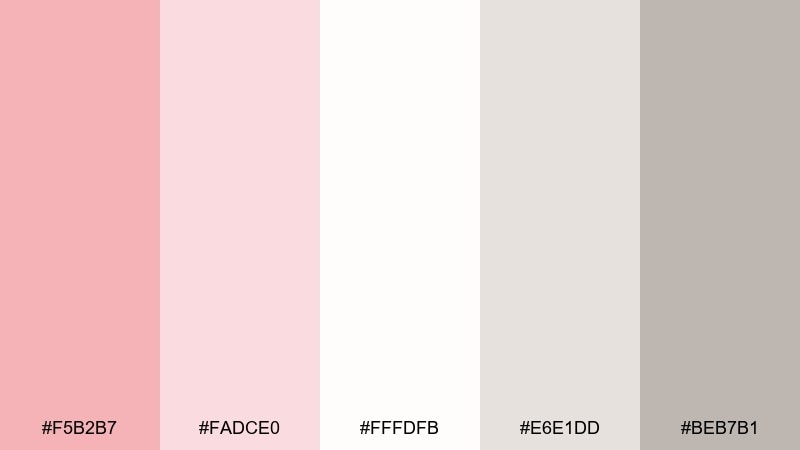
HEX: #F5B2B7 #FADCE0 #FFFDFB #E6E1DD #BEB7B1
Mood: soft, polished, minimalist
Best for: beauty ecommerce UI and checkout pages
Soft ballet slipper tones feel like brushed satin and a clean vanity mirror. This pastel red color palette is excellent for beauty ecommerce UI, checkout pages, and product grids where calm clarity boosts trust. Pair with near-white backgrounds and neutral grays to keep forms readable, then add a single blush accent for active states. Usage tip: keep error colors muted and rely on typography weight rather than loud color shifts.
Image example of ballet slipper neutrals generated using media.io
13) Rosy Citrus
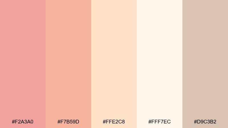
HEX: #F2A3A0 #F7B59D #FFE2C8 #FFF7EC #D9C3B2
Mood: zesty, bright, welcoming
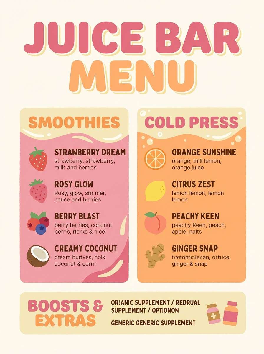
Best for: juice bar menus and smoothie brand ads
Zesty rosy citrus feels like grapefruit slices and a sunlit counter. It fits juice bar menus, smoothie brand ads, and upbeat food packaging that should look fresh, not loud. Pair with creamy off-white and warm beige so the peach tones stay appetizing. Usage tip: use the light citrus tint for background panels and the rosier shades for pricing and key callouts.
Image example of rosy citrus generated using media.io
14) Soft Brick Linen
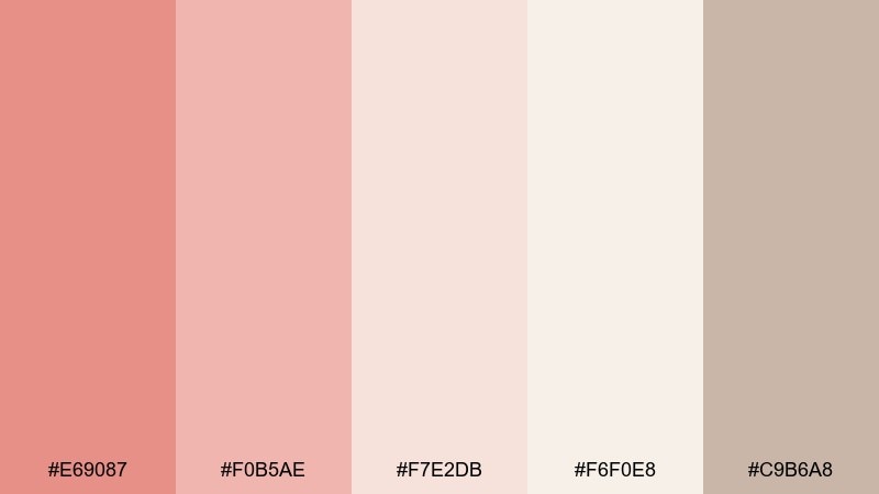
HEX: #E69087 #F0B5AE #F7E2DB #F6F0E8 #C9B6A8
Mood: warm, rustic, refined
Best for: interior design moodboards and realtor brochures
Warm soft-brick tones with linen neutrals evoke sunbaked walls and airy textiles. They work well for interior design moodboards and realtor brochures that need warmth without oversaturation. Pair with natural materials imagery and keep typography in the beige-taupe range for a cohesive, editorial feel. Usage tip: use the brick shade sparingly as a highlight, not a full background.
Image example of soft brick linen generated using media.io
15) Pink Sandstone
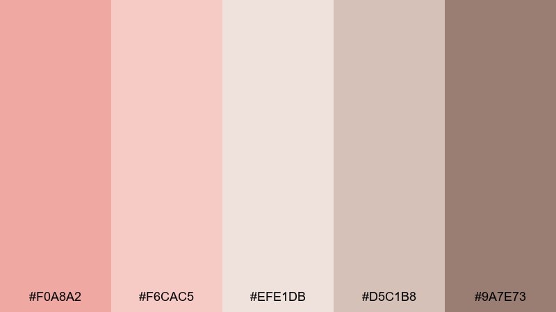
HEX: #F0A8A2 #F6CAC5 #EFE1DB #D5C1B8 #9A7E73
Mood: natural, calm, timeless
Best for: spa flyers and mindfulness workshop posters
Natural pink sandstone feels like desert rock softened by wind and time. It suits spa flyers and mindfulness workshop posters where calm, grounded warmth is the goal. Pair with creamy neutrals and a deeper brown for headlines, then add subtle line art or airy photography. Usage tip: keep contrast gentle and use the darkest shade only for key details like dates and locations.
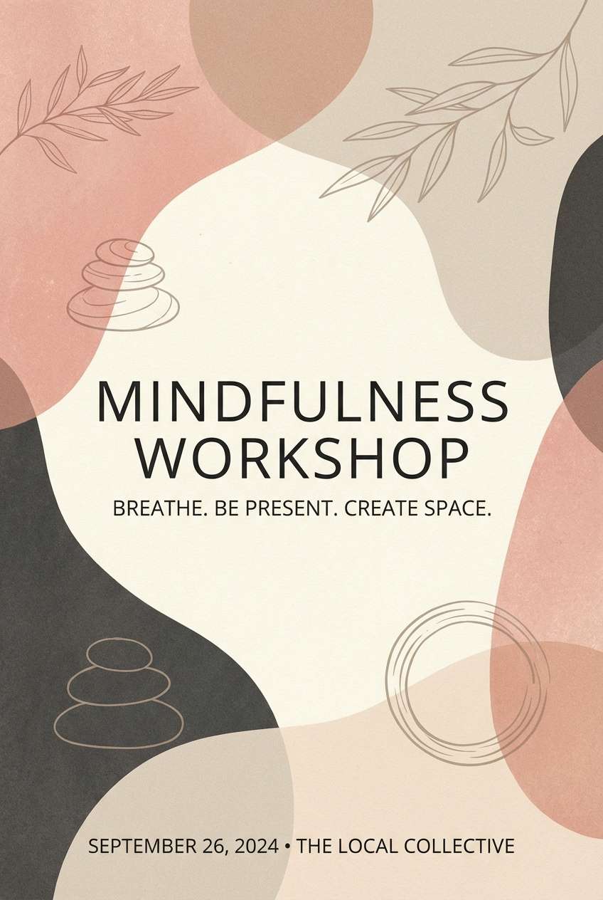
Image example of pink sandstone generated using media.io
16) Raspberry Fog
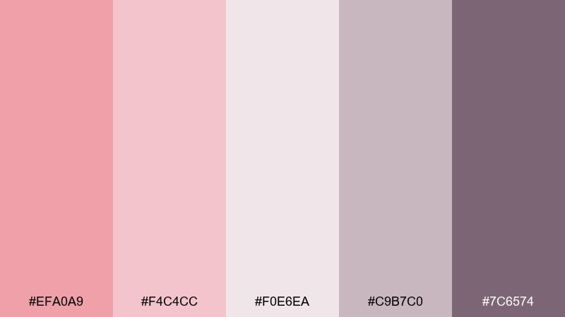
HEX: #EFA0A9 #F4C4CC #F0E6EA #C9B7C0 #7C6574
Mood: dreamy, moody, modern
Best for: podcast cover art and music promo graphics
Dreamy raspberry fog feels like dusk haze and soft neon behind misted glass. It works for podcast cover art and music promo graphics when you want mood without going full dark. Pair with pale lavender-gray for backgrounds and use the plum tone for strong, readable titles. Usage tip: add subtle grain and keep gradients smooth to avoid banding on social platforms.
Image example of raspberry fog generated using media.io

17) Apricot Blush
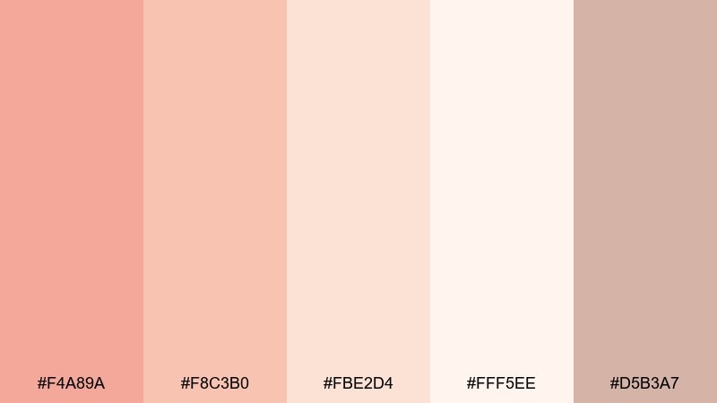
HEX: #F4A89A #F8C3B0 #FBE2D4 #FFF5EE #D5B3A7
Mood: light, friendly, optimistic
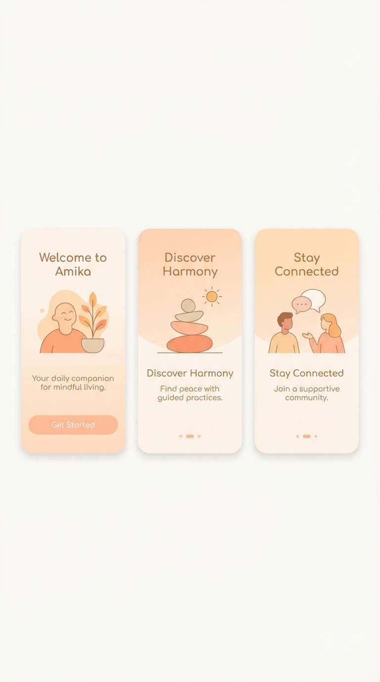
Best for: onboarding screens and welcome emails
Light apricot blush feels like a warm hello and a soft sunrise. These pastel red color combinations are perfect for onboarding screens and welcome emails where friendliness should come through instantly. Pair with lots of white space and use the mid apricot for primary buttons while keeping backgrounds near-cream. Usage tip: limit accents to one or two components per screen so the UI stays airy.
Image example of apricot blush generated using media.io
18) Desert Rose
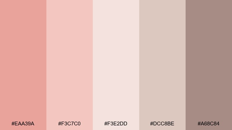
HEX: #EAA39A #F3C7C0 #F3E2DD #DCC8BE #A68C84
Mood: serene, sun-faded, organic
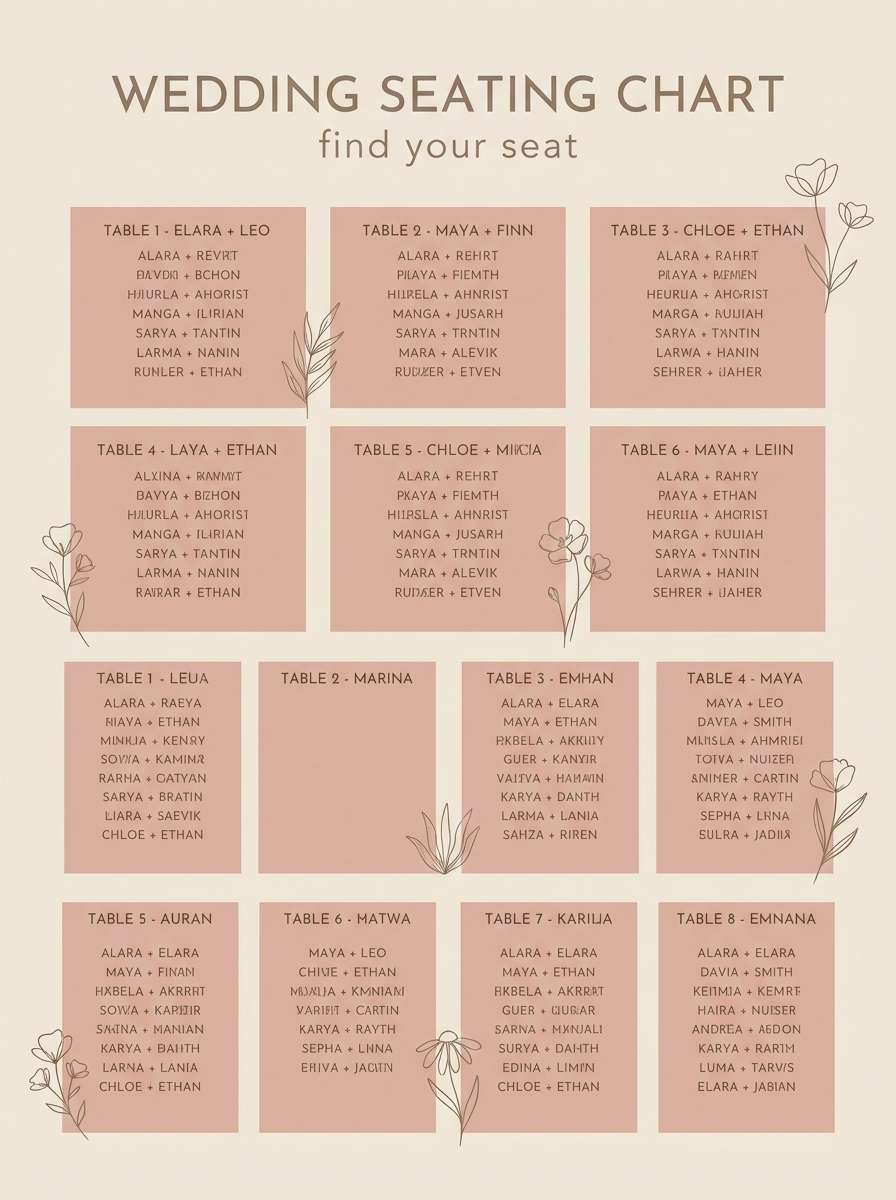
Best for: boho wedding signage and seating charts
Serene desert rose tones evoke sun-faded blooms and soft sand underfoot. They are a natural fit for boho wedding signage and seating charts, especially when printed on textured stock. Pair with warm neutrals and simple monoline florals to keep everything cohesive. Usage tip: choose one darker tone for names and keep decorative elements in the palest shades for legibility.
Image example of desert rose generated using media.io
19) Mauve Blush Night
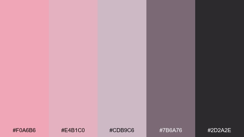
HEX: #F0A6B6 #E4B1C0 #CDB9C6 #7B6A76 #2D2A2E
Mood: dramatic, chic, nightlife
Best for: event flyers for lounges and gallery openings
Chic mauve-blush with inky depth feels like velvet curtains and low-lit galleries. It works for lounge event flyers and gallery openings when you want softness with a nightlife edge. Pair with off-white typography sparingly and let the charcoal carry backgrounds for high contrast. Usage tip: keep one large blush element as the focal point and avoid adding extra bright colors that break the mood.
Image example of mauve blush night generated using media.io

20) Cherry Blossom Retro
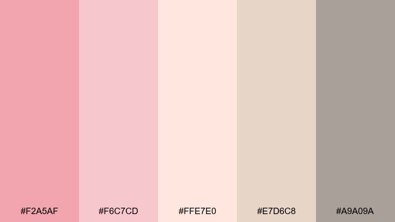
HEX: #F2A5AF #F6C7CD #FFE7E0 #E7D6C8 #A9A09A
Mood: bright, nostalgic, airy
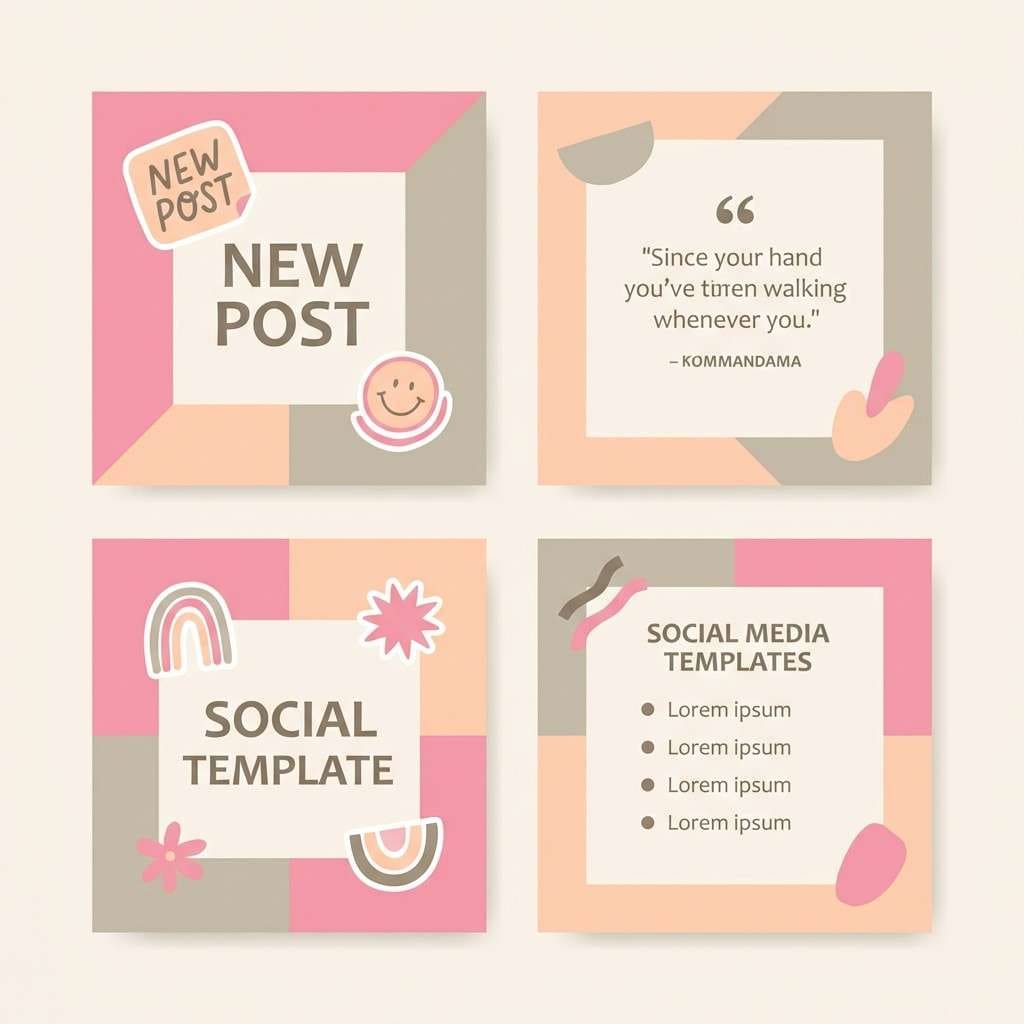
Best for: social media templates and lifestyle blogs
Bright cherry blossom tones feel like spring postcards and retro film prints. This pastel red color palette works for social media templates and lifestyle blog graphics that need a light, friendly identity. Pair with creamy peach highlights and warm greige text so posts stay readable across devices. Usage tip: build a reusable template with one blush header bar and swap only imagery and headlines week to week.
Image example of cherry blossom retro generated using media.io
What Colors Go Well with Pastel Red?
Neutrals are the easiest win: warm white, cream, sand, greige, and taupe keep pastel red looking modern and readable. For typography, charcoal or deep brown usually feels softer than pure black while still delivering strong contrast.
For fresh accents, try muted greens like sage or eucalyptus—great for wellness and UI states. If you want a more editorial edge, pair pastel reds with cool grays, graphite, or a restrained plum for depth.
When you need extra energy, lean into adjacent warms like peach, apricot, and soft coral. Keep saturation controlled so your palette stays “pastel,” and use one darker anchor shade for buttons, titles, or wayfinding.
How to Use a Pastel Red Color Palette in Real Designs
Start with a light background (warm white or near-cream), then assign one mid-tone pastel red as your primary accent for CTAs, highlights, or headers. Reserve the darkest neutral for text so everything stays legible and premium.
In UI, treat pastel reds as “emotion colors”: friendly nudges, light warnings, or selected states—while neutrals do most of the layout work. In print, let negative space and paper texture carry the luxury, and keep pastel red for frames, dividers, and small motifs.
To avoid a washed-out look, introduce contrast through type weight, spacing, and a single deep anchor (graphite, brown, or plum). This keeps the design crisp while preserving the soft mood.
Create Pastel Red Palette Visuals with AI
If you already have HEX codes but need matching images (mockups, posters, UI screens, or brand scenes), AI can turn a palette into consistent visuals fast. The key is to name your colors (blush, coral, taupe, cream) and describe the design context clearly.
Use the prompts above as templates: keep the scene minimal, specify lighting and style, and include the aspect ratio once. Then iterate by swapping the subject (packaging, UI, flyer) while keeping the same color language.
Pastel Red Color Palette FAQs
-
What is a pastel red color palette?
A pastel red color palette uses softened red hues (like blush, rose, and coral) that are lighter and less saturated than true red, usually paired with warm neutrals or gentle contrasting accents. -
Is pastel red more like pink or red?
It depends on saturation and undertone. Many pastel reds read like blush pinks, while coral-leaning options still feel distinctly red—just quieter and warmer. -
What neutral colors pair best with pastel red?
Warm white, cream, beige, sand, taupe, and greige are the most reliable. For text and structure, charcoal or deep brown often looks better than pure black. -
What accent colors work with pastel red in UI design?
Muted sage/green for success states, soft blue-gray for calm contrast, and plum/graphite for depth. Keep accents limited so pastel red remains the primary emotional cue. -
How do I keep pastel red designs from looking “too sweet”?
Add a darker anchor (graphite, deep taupe, or plum), use plenty of whitespace, and rely on clean typography. Reducing decorative elements helps the palette feel more modern. -
Are pastel red palettes good for print (invitations, packaging)?
Yes—pastel reds look especially refined on textured paper and matte finishes. Just ensure you have one darker tone for names, dates, or small text to maintain readability. -
Can I generate images that match my pastel red HEX codes?
Yes. Use an AI text-to-image tool and describe the scene plus your color names (blush, cream, taupe, graphite). Generate a few variations and keep the lighting/style consistent for a cohesive set.


