

Khaki beige is the kind of modern neutral that feels warm, grounded, and easy to pair with both earthy tones and fresher accents. It brings a natural “material” vibe to branding, UI, and interiors without looking flat.
Below are 20 ready-to-use khaki beige palette ideas with HEX codes, plus AI image prompts you can recreate in seconds for moodboards, mockups, and presentations.
In this article
Why Khaki Beige Palettes Work So Well
Khaki beige sits in the sweet spot between earthy and modern. It has enough warmth to feel welcoming, yet enough neutrality to support bold accents, typography, and product photography.
Because it reads like real-world materials (linen, paper, sand, clay), it adds credibility to brand systems and makes digital designs feel more tactile. That’s especially helpful for lifestyle, wellness, and premium “quiet luxury” looks.
It’s also flexible across lighting conditions and mediums. With the right dark anchor (espresso, charcoal, deep green, or slate), khaki beige can stay airy while still meeting contrast needs for UI and editorial layouts.
20+ Khaki Beige Color Palette Ideas (with HEX Codes)
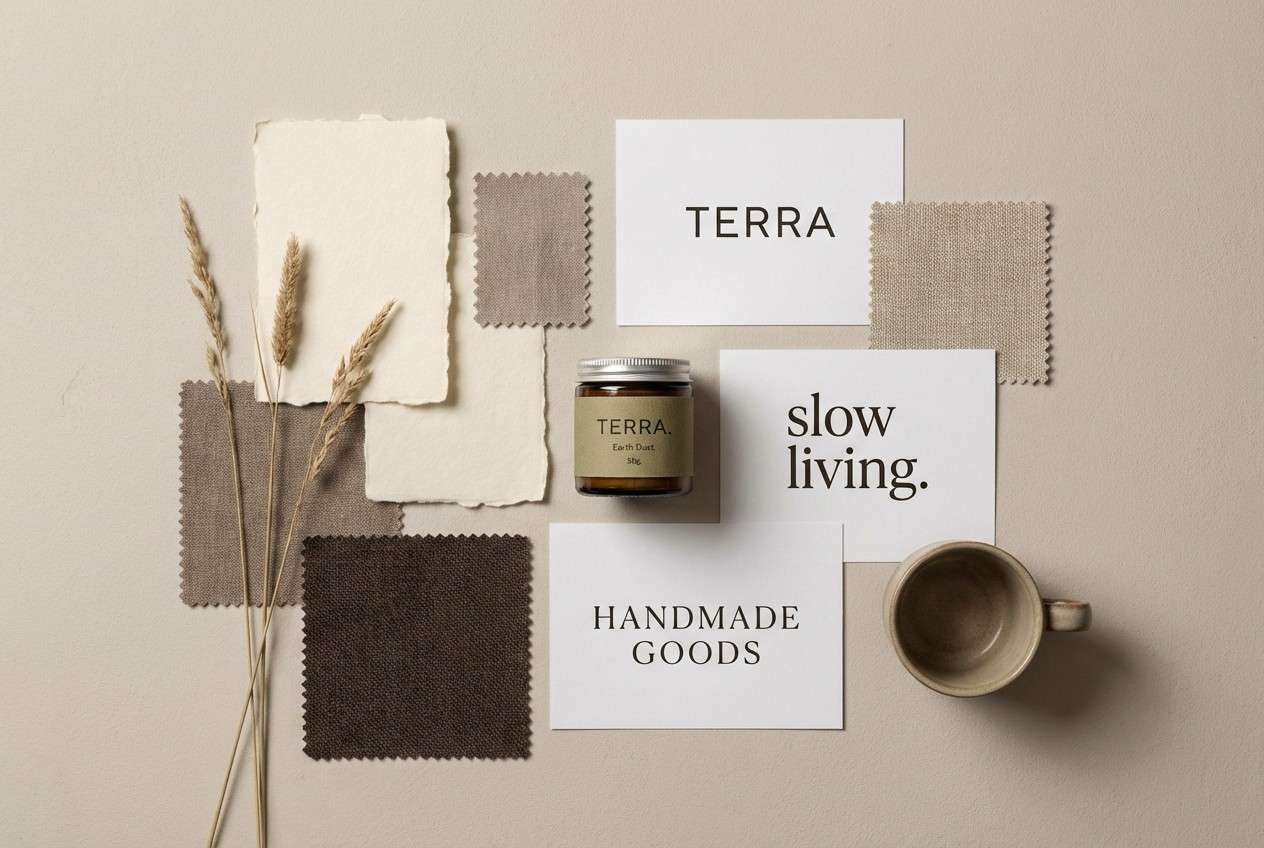
1) Sandstone Studio
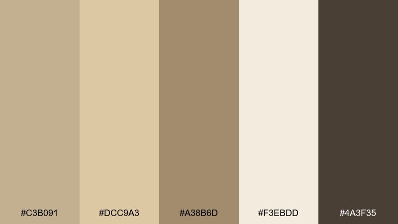
HEX: #C3B091 #DCC9A3 #A38B6D #F3EBDD #4A3F35
Mood: sun-warmed and grounded
Best for: brand identity moodboards
Sun-warmed and grounded, these tones feel like sandstone, linen, and a touch of espresso. Use it for lifestyle branding, packaging, and calm web sections where you want warmth without yellow. Pair the deep brown with the cream for high-contrast type, then let the khaki and taupe carry backgrounds. Tip: keep the darkest shade to 10 to 15 percent of the layout for a premium, airy look.
Image example of sandstone studio generated using media.io
Media.io is an online AI studio for creating and editing video, image, and audio in your browser.

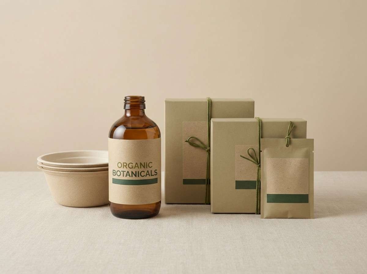
2) Olive Linen
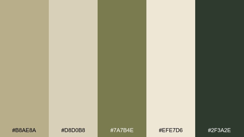
HEX: #B8AE8A #D8D0B8 #7A7B4E #EFE7D6 #2F3A2E
Mood: organic and understated
Best for: eco product packaging
Organic and understated, it evokes linen fabric, dried herbs, and recycled paper. It works beautifully for eco packaging, sustainable skincare, or café goods where a natural story matters. Use the olive as the hero accent for seals and callouts, while the light beige keeps labels readable. Tip: print the darkest green sparingly to avoid making the pack feel too military.
Image example of olive linen generated using media.io
3) Desert Clay
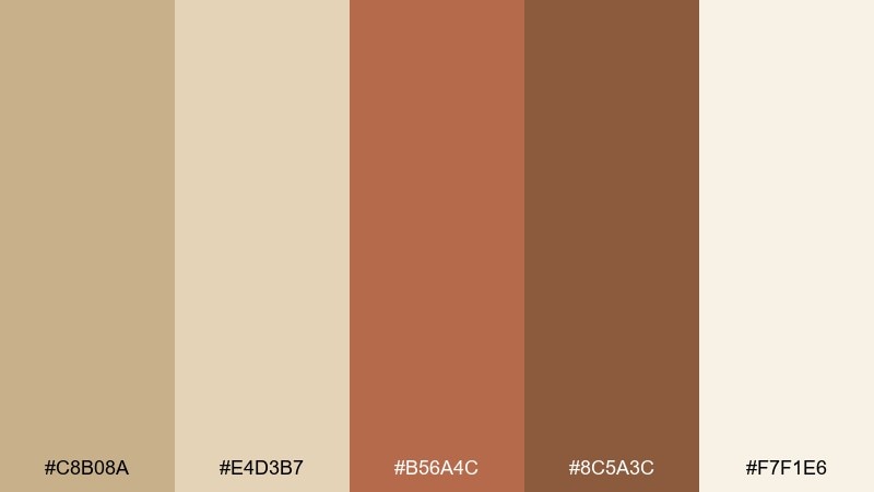
HEX: #C8B08A #E4D3B7 #B56A4C #8C5A3C #F7F1E6
Mood: handcrafted and sunbaked
Best for: ceramics shop branding
Handcrafted and sunbaked, this set brings to mind terracotta pots and dusty desert trails. It is ideal for artisan branding, maker markets, and warm editorial spreads. Let the clay tones carry buttons, stamps, and highlights, while the creamy off-white keeps the composition light. Tip: use the darker brown for headings to make the clay feel richer instead of orange.
Image example of desert clay generated using media.io
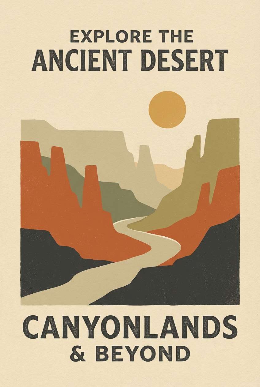
4) Vintage Safari
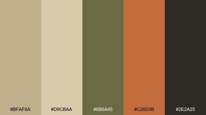
HEX: #BFAF8A #D9CBAA #6B6A45 #C26D3B #2E2A25
Mood: adventurous and retro
Best for: travel poster design
Adventurous and retro, it feels like worn leather, field journals, and late-afternoon heat. This khaki beige color palette suits travel posters, outdoor events, and heritage-inspired branding. Pair the burnt orange with the dark charcoal for bold titles, then keep the beige shades as open space. Tip: add subtle grain to backgrounds to amplify the vintage mood without muddying the colors.
Image example of vintage safari generated using media.io
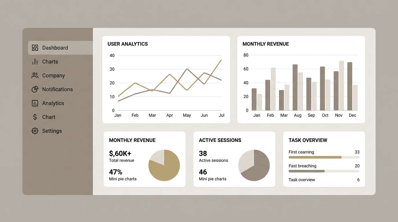
5) Minimal Warm UI
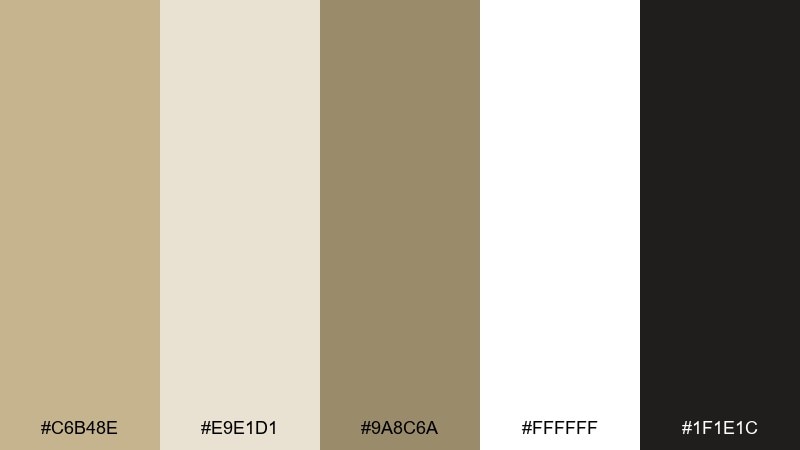
HEX: #C6B48E #E9E1D1 #9A8C6A #FFFFFF #1F1E1C
Mood: clean and welcoming
Best for: dashboard UI mockups
Clean and welcoming, these neutrals feel like a bright studio with natural wood nearby. They are great for dashboards and productivity tools that need to look calm, not cold. Use the near-black for text, the off-white for surfaces, and reserve the mid khaki for active states. Tip: keep borders ultra-light and rely on spacing, so the UI stays modern and breathable.
Image example of minimal warm ui generated using media.io
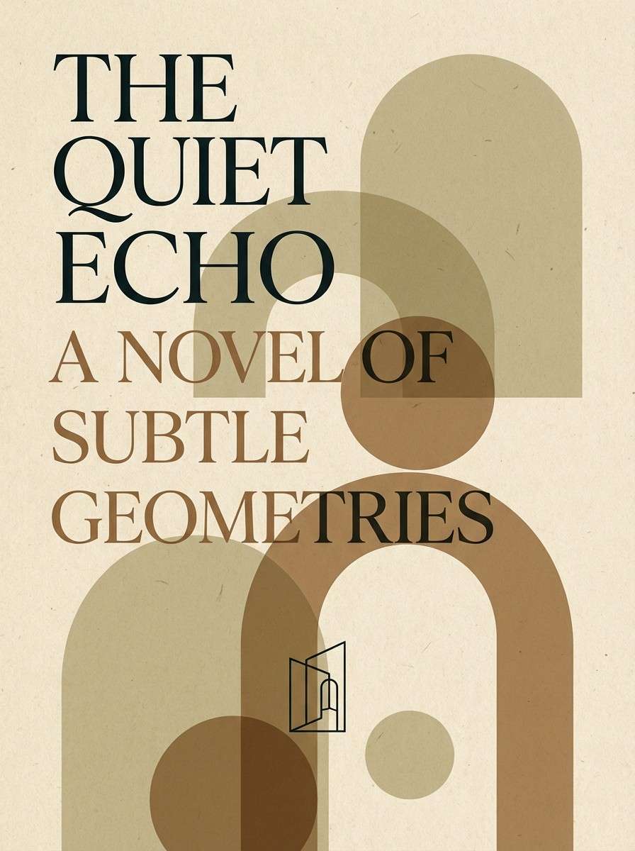
6) Quiet Library
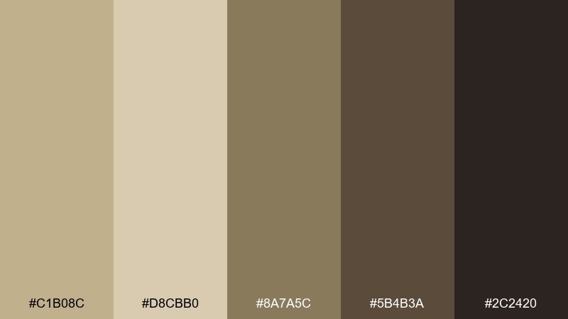
HEX: #C1B08C #D8CBB0 #8A7A5C #5B4B3A #2C2420
Mood: moody and intellectual
Best for: book cover design
Moody and intellectual, it recalls antique paper, leather bindings, and shadowy shelves. Use it for book covers, academic brands, or long-form blogs where readability matters. The mid browns make strong title blocks, while the light beige keeps margins and captions soft. Tip: add a small khaki highlight to bring focus to subtitles without breaking the calm.
Image example of quiet library generated using media.io
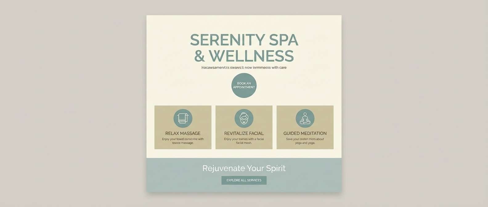
7) Coastal Dune
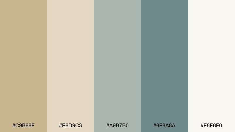
HEX: #C9B68F #E6D9C3 #A9B7B0 #6F8A8A #F8F6F0
Mood: airy and seaside
Best for: spa website design
Airy and seaside, it suggests pale dunes, misty mornings, and driftwood neutrals. It fits spa sites, wellness apps, and calm landing pages that need a soft, breathable feel. Let the sea-mist shades handle icons and gentle section dividers, and use the dune khaki for primary buttons. Tip: keep imagery bright so the muted teal does not turn gray.
Image example of coastal dune generated using media.io
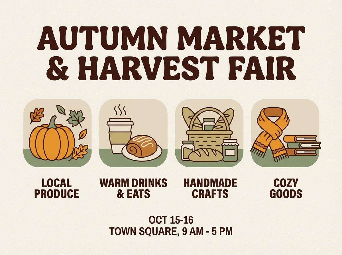
8) Autumn Market
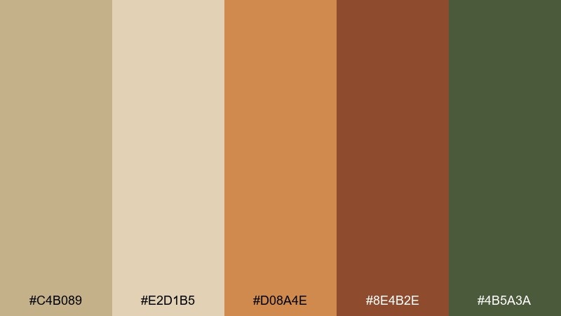
HEX: #C4B089 #E2D1B5 #D08A4E #8E4B2E #4B5A3A
Mood: harvest warm and lively
Best for: seasonal promo flyers
Harvest warm and lively, it feels like fresh bread, pumpkins, and woven baskets. These khaki beige color combinations shine in seasonal promos, farmers market flyers, and cozy social graphics. Use the amber for price tags and stickers, and balance it with plenty of pale beige so the layout stays inviting. Tip: keep the green as a small supporting accent to avoid competing with the orange.
Image example of autumn market generated using media.io
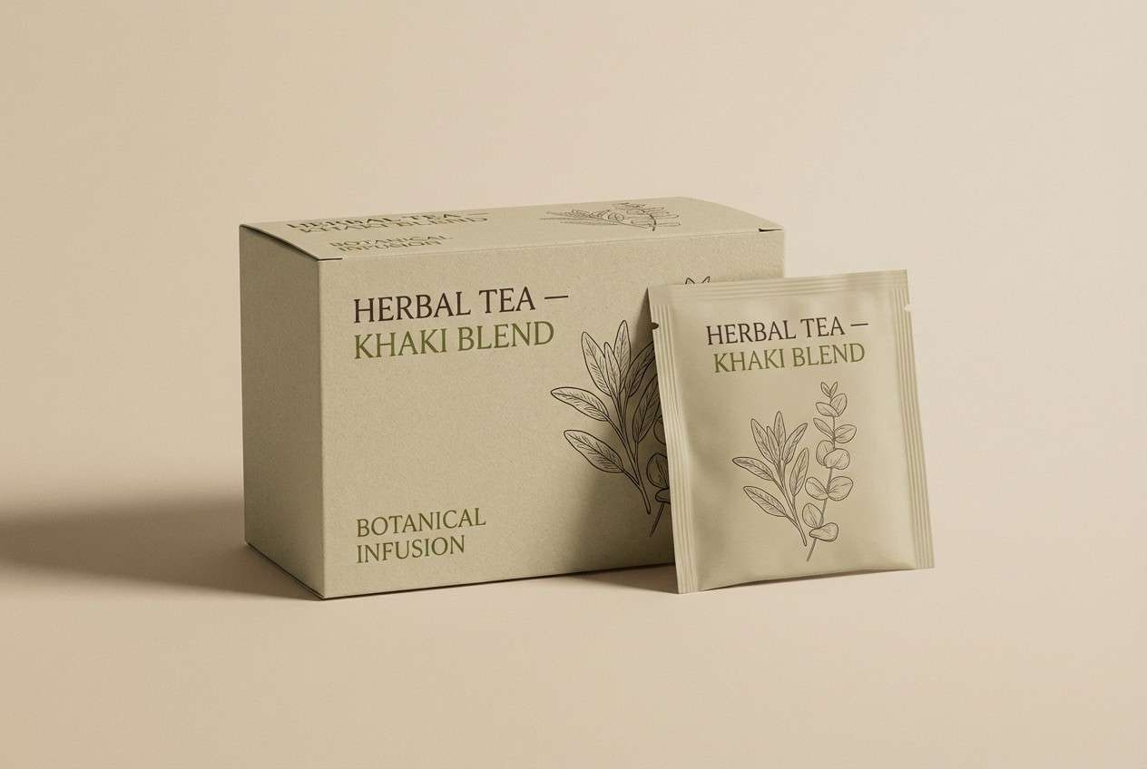
9) Botanical Press
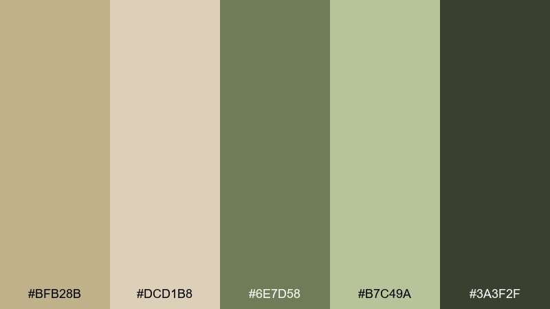
HEX: #BFB28B #DCD1B8 #6E7D58 #B7C49A #3A3F2F
Mood: fresh and botanical
Best for: herbal tea packaging
Fresh and botanical, these hues echo pressed leaves and soft paper stock. They work well for herbal tea, garden brands, and mindful stationery. Make the leafy green your main accent, then ground the design with the deeper olive for logos and ingredient lists. Tip: choose matte finishes so the greens stay natural against the warm beige base.
Image example of botanical press generated using media.io
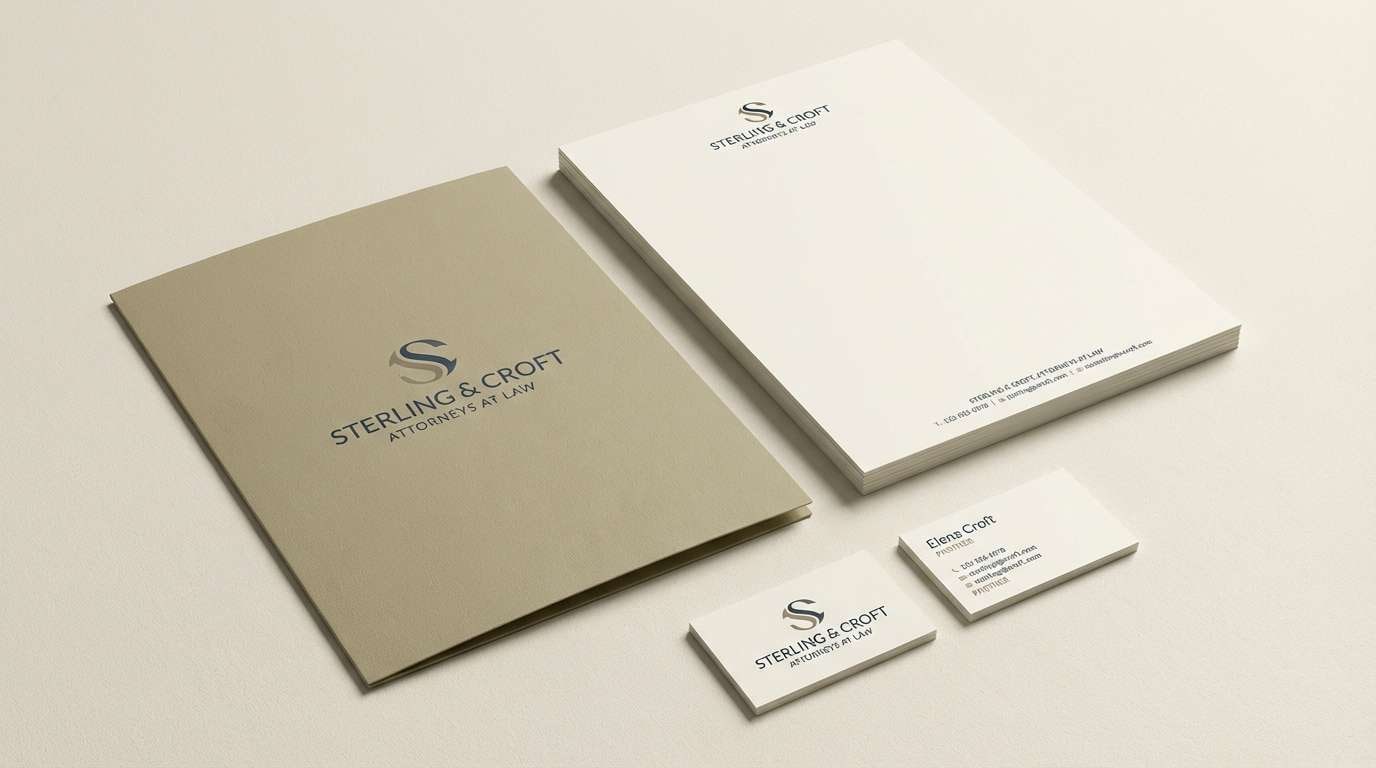
10) Modern Heritage
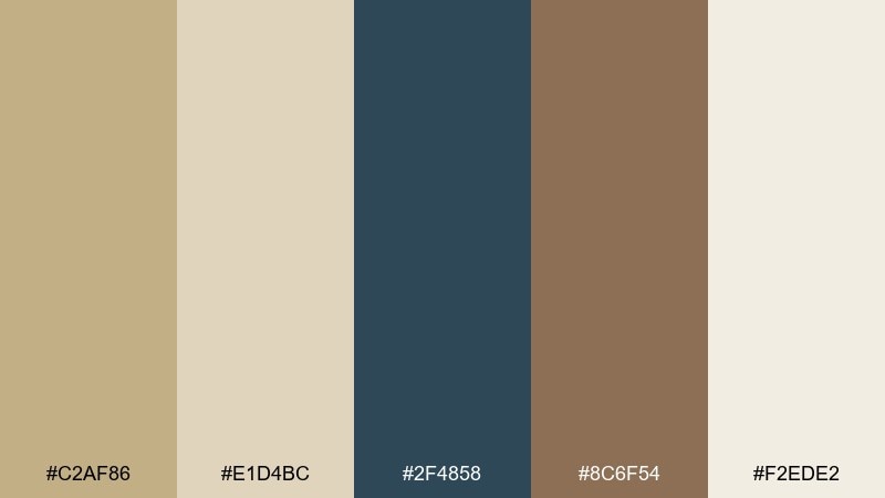
HEX: #C2AF86 #E1D4BC #2F4858 #8C6F54 #F2EDE2
Mood: classic with a modern edge
Best for: law firm branding
Classic with a modern edge, it mixes warm heritage neutrals with a crisp deep slate. It suits professional services, architecture studios, and premium proposals. Use the slate for headings and icons to bring authority, while the beige range keeps the brand approachable. Tip: add generous line spacing and let the warm off-white do most of the work for readability.
Image example of modern heritage generated using media.io
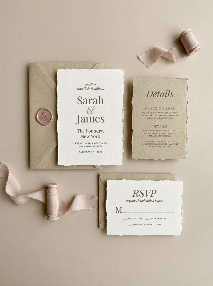
11) Soft Wedding Neutral
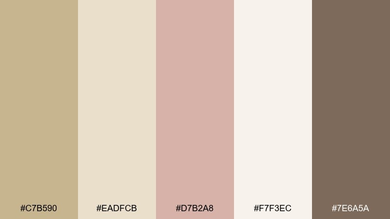
HEX: #C7B590 #EADFCB #D7B2A8 #F7F3EC #7E6A5A
Mood: romantic and delicate
Best for: wedding invitations
Romantic and delicate, it brings together soft parchment, blush petals, and warm shadows. This khaki beige color scheme is ideal for invitations, menus, and day-of signage that feels timeless rather than trendy. Use the blush for monograms or borders, and keep the darker taupe for small text to avoid harsh contrast. Tip: print on textured stock so the neutrals look intentional and tactile.
Image example of soft wedding neutral generated using media.io
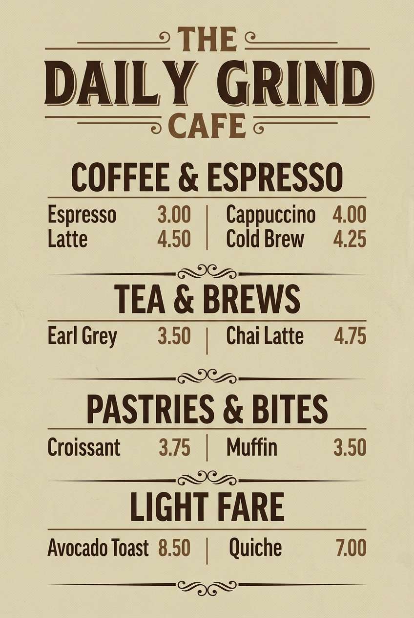
12) Café Menu
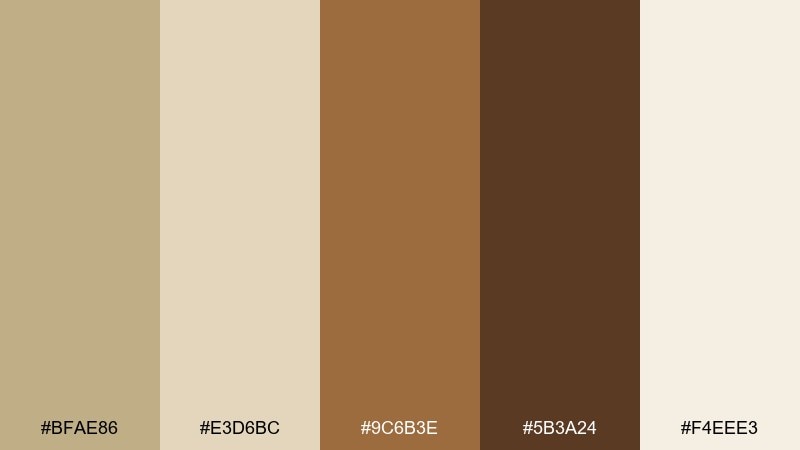
HEX: #BFAE86 #E3D6BC #9C6B3E #5B3A24 #F4EEE3
Mood: cozy and appetizing
Best for: restaurant menus
Cozy and appetizing, it feels like steamed milk, caramel, and roasted beans. Use it for café menus, bakery branding, and warm social posts. The coffee browns create strong hierarchy for headings and prices, while the pale beige keeps the page uncluttered. Tip: use the caramel tone as a highlight for specials so it reads instantly.
Image example of café menu generated using media.io
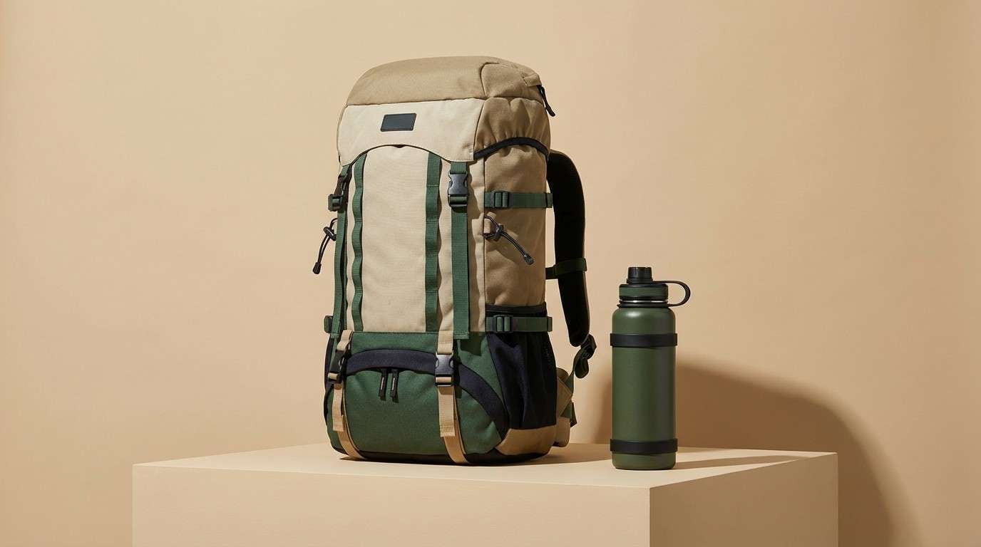
13) Outdoor Gear
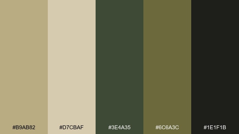
HEX: #B9AB82 #D7CBAF #3E4A35 #6C6A3C #1E1F1B
Mood: rugged and functional
Best for: product ads for hiking gear
Rugged and functional, these shades suggest canvas straps, trail dust, and pine shade. They work well for hiking gear ads, survival kits, and outdoor e-commerce. Use the deep near-black for bold type and the mossy greens for technical callouts, keeping beige as the main surface. Tip: add a single high-contrast badge using the lightest beige so it still feels natural.
Image example of outdoor gear generated using media.io
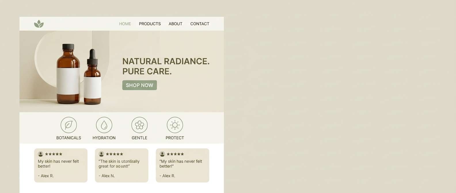
14) Clean Skincare
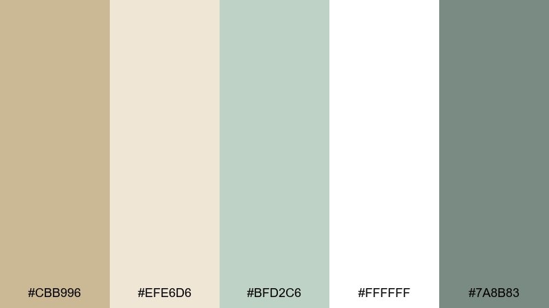
HEX: #CBB996 #EFE6D6 #BFD2C6 #FFFFFF #7A8B83
Mood: fresh and minimalist
Best for: skincare landing pages
Fresh and minimalist, it feels like clean tiles, gentle botanicals, and airy daylight. It is made for skincare landing pages and product education screens where trust and clarity are everything. Use the sage tint for highlights and icons, then anchor CTAs with the deeper gray-green so they stand out without shouting. Tip: keep photography desaturated to match the soft neutrals.
Image example of clean skincare generated using media.io
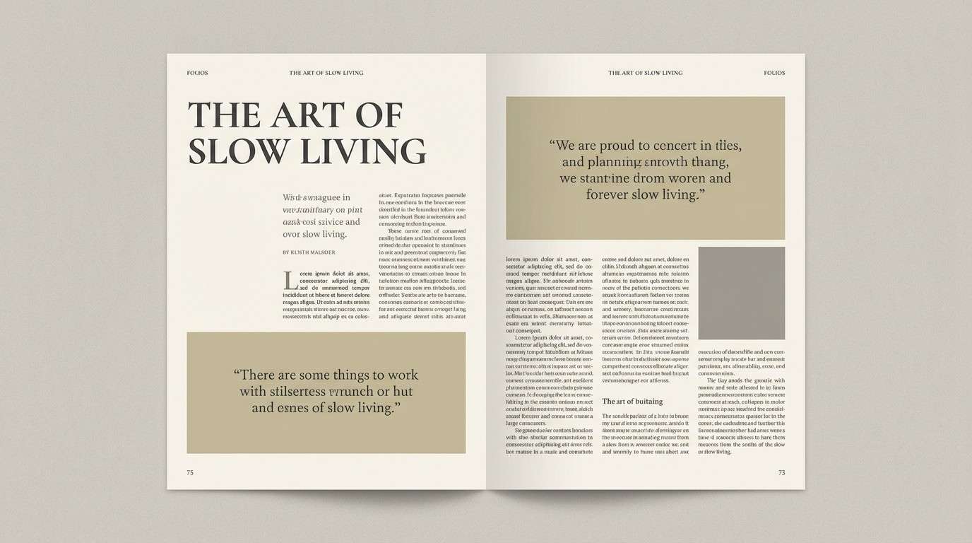
15) Editorial Beige
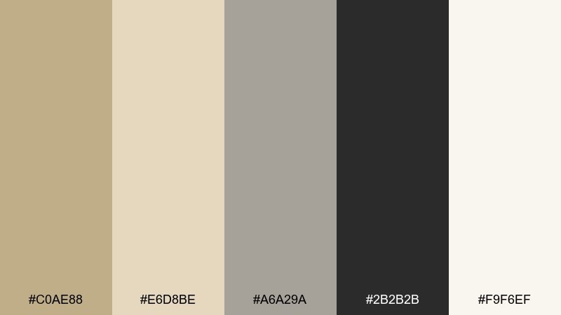
HEX: #C0AE88 #E6D8BE #A6A29A #2B2B2B #F9F6EF
Mood: polished and editorial
Best for: magazine layouts
Polished and editorial, it reads like warm paper stock with sharp ink. This khaki beige color palette is great for lookbooks, magazines, and portfolio pages that need structure and restraint. Use charcoal for body text and captions, and let the warm grays handle rules, grids, and subtle section labels. Tip: stick to one accent shade per spread to keep the layout high-end.
Image example of editorial beige generated using media.io
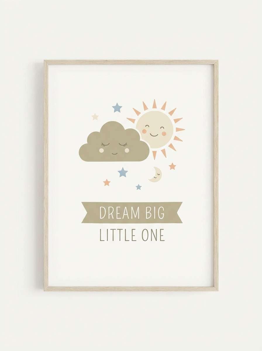
16) Kids Room Calm
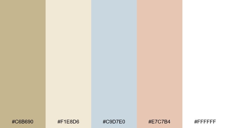
HEX: #C6B690 #F1E8D6 #C9D7E0 #E7C7B4 #FFFFFF
Mood: soft and comforting
Best for: nursery wall art
Soft and comforting, it feels like plush blankets, storybooks, and morning light. Use it for nursery wall art, baby shower stationery, or gentle family brands. Let the powder blue and peach share the spotlight, with khaki-beige keeping everything grounded. Tip: use simple shapes and lots of white space so the pastels stay calm instead of sugary.
Image example of kids room calm generated using media.io
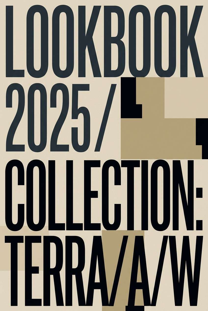
17) Nightfall Contrast
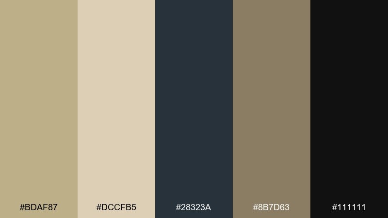
HEX: #BDAF87 #DCCFB5 #28323A #8B7D63 #111111
Mood: dramatic and modern
Best for: fashion lookbook covers
Dramatic and modern, it pairs dusk-like darks with warm sand for a sleek contrast. It works well for fashion lookbooks, premium drops, and striking hero sections. Use the near-black for typography and the deep slate for blocks, then soften the edges with beige panels. Tip: keep the khaki tones slightly textured to avoid banding on large areas.
Image example of nightfall contrast generated using media.io
18) Ceramic Workshop
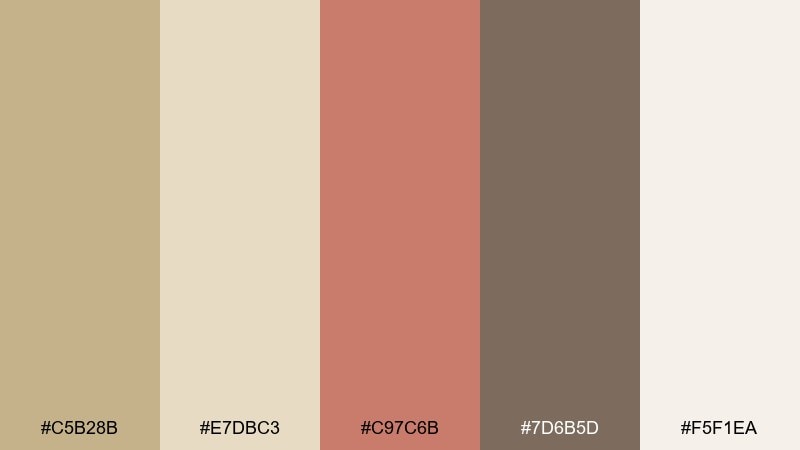
HEX: #C5B28B #E7DBC3 #C97C6B #7D6B5D #F5F1EA
Mood: artistic and approachable
Best for: workshop posters
Artistic and approachable, it brings to mind clay dust, glazed mugs, and warm studio walls. These khaki beige color combinations fit workshop posters, class schedules, and maker-community branding. Use the rose-clay shade for dates and CTAs, then keep the beige and cream as the main canvas. Tip: pair with hand-drawn icons so the palette feels truly crafted, not corporate.
Image example of ceramic workshop generated using media.io

19) Rustic Kitchen
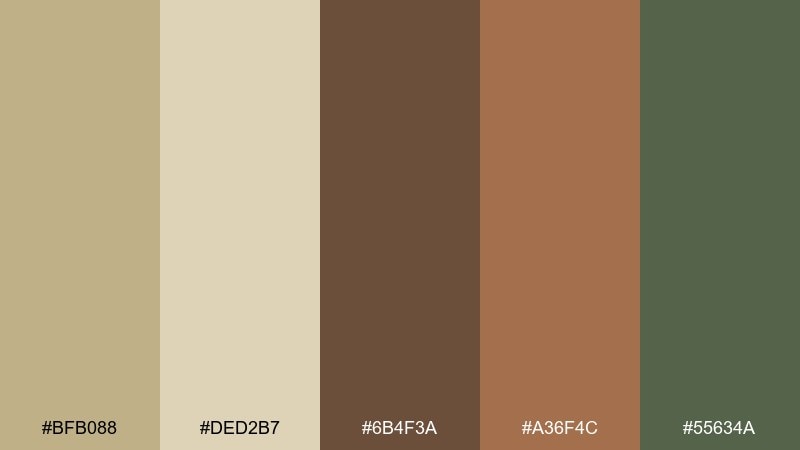
HEX: #BFB088 #DED2B7 #6B4F3A #A36F4C #55634A
Mood: homey and rustic
Best for: recipe blog themes
Homey and rustic, it feels like wooden countertops, dried spices, and olive branches. It is perfect for recipe blogs, cooking newsletters, and food labels that lean traditional. Use the darker wood brown for headings and nav, while the pale beige keeps long posts easy on the eyes. Tip: add the muted green only for category tags to keep the palette cohesive.
Image example of rustic kitchen generated using media.io
20) Gallery Wall
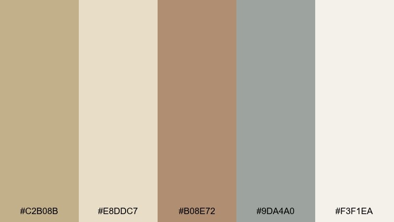
HEX: #C2B08B #E8DDC7 #B08E72 #9DA4A0 #F3F1EA
Mood: calm and curated
Best for: interior design presentations
Calm and curated, it resembles matte frames, linen canvases, and soft concrete. It suits interior design decks, client proposals, and minimalist portfolios. Use the warm taupe for section headers and the cool gray for diagrams, letting the beige family create a consistent backdrop. Tip: keep imagery warm-toned so the gray reads as sophisticated, not cold.
Image example of gallery wall generated using media.io
What Colors Go Well with Khaki Beige?
Khaki beige pairs naturally with deeper earth tones like espresso brown, warm taupe, terracotta, and olive or forest greens. These combinations feel grounded and premium, especially when you keep the darkest shade as an anchor for type and small UI elements.
For a fresher, lighter direction, add sea-mist gray, muted teal, or soft sage. These cool accents keep khaki beige from reading too “dusty” and work well in wellness, skincare, and calm landing pages.
If you want contrast without harshness, try charcoal, slate blue, or near-black instead of pure black. Those dark neutrals preserve the warm character of khaki beige while improving readability and hierarchy.
How to Use a Khaki Beige Color Palette in Real Designs
In branding, treat khaki beige as your “material base” (backgrounds, packaging stock, website sections), then choose one hero accent (olive, clay, slate, or blush) for recognizability. This keeps the system calm while still feeling distinct.
In UI design, use off-white for surfaces, near-black for text, and reserve khaki midtones for interactive states (active tabs, selected filters, primary buttons). That approach prevents the interface from becoming low-contrast or muddy.
In interiors and presentation decks, combine khaki beige with warm creams and one cooler supporting neutral (soft gray or sea-mist) to balance warmth. Use wood-brown or charcoal for headings and dividers to keep layouts crisp.
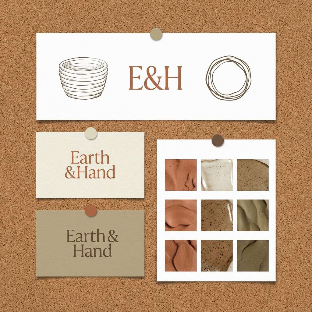
Create Khaki Beige Palette Visuals with AI
If you already have HEX codes, the fastest way to validate the “feel” is to generate mock visuals: moodboards, packaging scenes, UI screens, posters, or editorial spreads. Seeing the palette in context helps you fine-tune contrast and pick the right accent color.
Media.io Text to Image lets you turn a palette idea into clean design-style images using a single prompt. Reuse the prompts above, swap keywords (brand type, product, layout), and keep the same color direction for consistent results.
Once you like the output, save it as a reference for your design system, client approvals, or content templates.
Khaki Beige Color Palette FAQs
-
What is the best text color on khaki beige backgrounds?
Near-black, charcoal, espresso brown, or deep slate usually reads best on khaki beige. For accessible contrast in UI, avoid mid-taupes for body text and reserve them for secondary labels or dividers. -
Does khaki beige work with cool colors like blue or teal?
Yes. Muted teal, slate blue, and sea-mist gray add a clean, modern counterbalance to khaki beige’s warmth, especially for spa, wellness, and editorial layouts. -
How do I keep a khaki beige palette from looking “muddy”?
Use a brighter off-white for most large surfaces, add a strong dark anchor for typography, and limit medium-value browns/olives to smaller components. Also keep imagery bright and neutrals slightly textured rather than overly saturated. -
Is khaki beige a good choice for branding?
Khaki beige is excellent for lifestyle, sustainable, artisan, and premium service brands because it feels natural and tactile. Add one recognizable accent (olive, clay, blush, or slate) to make the identity more distinctive. -
What finishes work best with khaki beige in packaging or print?
Matte or soft-touch finishes keep khaki beige looking intentional and modern. Textured stocks (linen, recycled paper) enhance the “material” feel, while high gloss can make warm neutrals look uneven under light. -
Which accent color is the safest with khaki beige?
Olive/leafy greens and deep browns are the most universally compatible accents. They stay cohesive with khaki beige across web, print, and product photography without fighting the base tone. -
Can I generate khaki beige palette mockups with AI?
Yes. Use Media.io’s text-to-image tool and prompts like the examples in this article to generate moodboards, packaging scenes, and UI mockups that match a khaki beige direction.


