

Castle color palettes blend weathered neutrals with regal accents, creating designs that feel grounded, premium, and instantly recognizable. Think stone walls, ironwork, parchment, candlelight, and the occasional jewel-tone banner.
Whether you’re building a brand, decorating an interior, or designing a UI, a well-balanced castle color scheme gives you structure (neutrals) and story (accent tones) without looking costume-like.
In this article
- Why Castle Palettes Work So Well
-
- stone keep neutrals
- royal tapestry
- mossy rampart
- candlelit hall
- iron gate
- heraldic crimson
- parchment scroll
- moonlit battlements
- forest courtyard
- vintage armory
- chapel glass
- dusty moat
- squire's linen
- dragon banner
- quiet library
- cobblestone market
- winter castle
- rose garden terrace
- stormwatch tower
- sunlit citadel
- What Colors Go Well with Castle?
- How to Use a Castle Color Palette in Real Designs
- Create Castle Palette Visuals with AI
Why Castle Palettes Work So Well
Castle palettes are built on believable materials: stone, timber, iron, wax, parchment, and aged textiles. That material logic makes the colors feel “real,” which translates well to modern branding and interfaces.
They also naturally balance contrast. Deep charcoals and navies give structure, while creams and parchment tones create breathing room for typography, UI components, and product photography.
Finally, castle color combinations carry narrative. A hint of burgundy, antique gold, or moss green can instantly signal heritage, ceremony, or nature without requiring literal medieval visuals.
20+ Castle Color Palette Ideas (with HEX Codes)
1) Stone Keep Neutrals
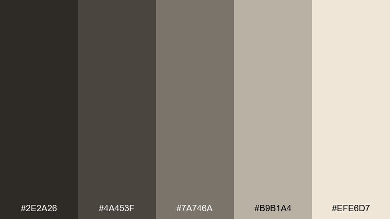
HEX: #2e2a26 #4a453f #7a746a #b9b1a4 #efe6d7
Mood: grounded, timeless, architectural
Best for: minimal brand identity and packaging
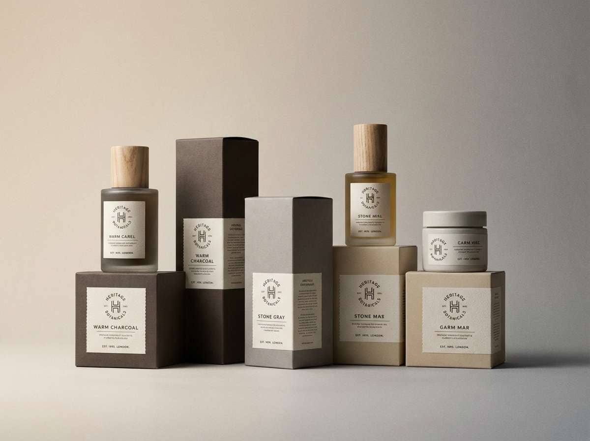
Grounded and architectural, these tones feel like weathered stone walls and sunlit mortar. They work beautifully for heritage branding, boutique packaging, and understated web layouts. Pair them with a warm metallic foil or a deep forest accent when you need a premium touch. Usage tip: keep the light parchment shade as your main background to maintain contrast and legibility.
Image example of stone keep neutrals generated using media.io
Media.io is an online AI studio for creating and editing video, image, and audio in your browser.

2) Royal Tapestry
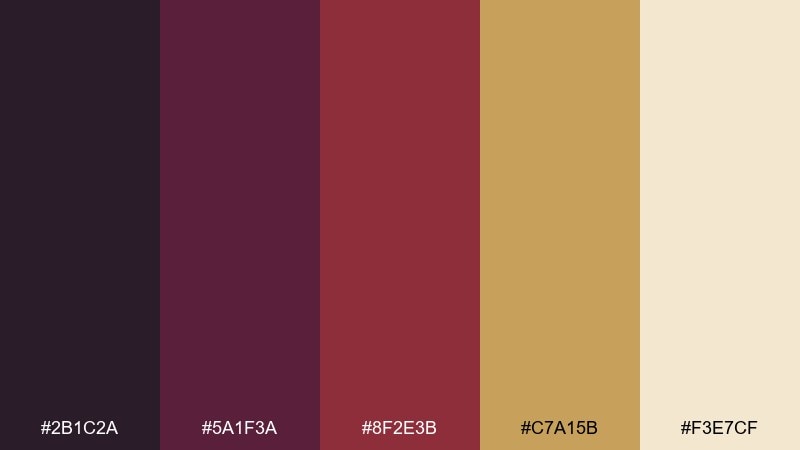
HEX: #2b1c2a #5a1f3a #8f2e3b #c7a15b #f3e7cf
Mood: opulent, dramatic, ceremonial
Best for: luxury branding and event collateral
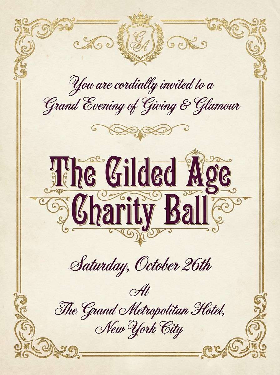
Opulent and ceremonial, it evokes velvet drapes, stitched crests, and gilded trim. These shades shine on invitations, wine labels, and premium stationery where contrast and richness matter. Balance the burgundy and plum with parchment space so the gold reads as an accent, not noise. Usage tip: reserve the deepest tone for typography to keep the look formal and sharp.
Image example of royal tapestry generated using media.io
3) Mossy Rampart
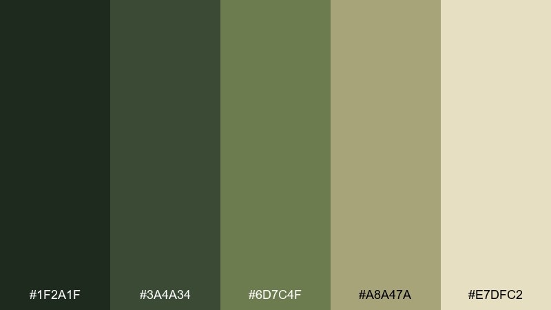
HEX: #1f2a1f #3a4a34 #6d7c4f #a8a47a #e7dfc2
Mood: earthy, calm, storybook
Best for: eco brands and outdoor editorial layouts
Earthy and calm, these hues bring to mind ramparts softened by moss and late-summer grasses. They suit eco-focused branding, nature-led editorials, and rustic menus without looking overly themed. Add a warm cream background and keep the darkest green for headings and icons. Usage tip: use the olive midtone for borders and dividers to create a gentle structure.
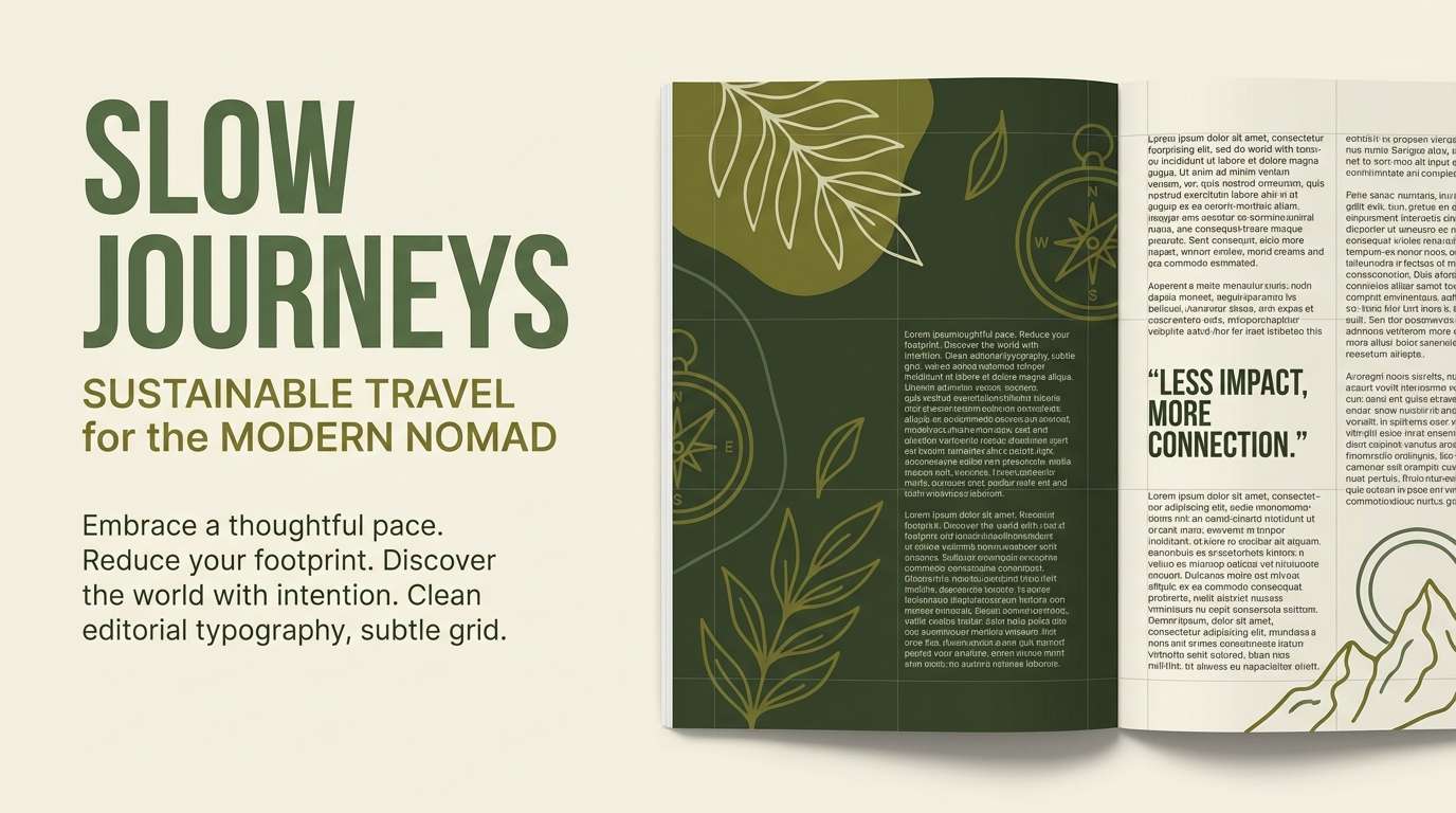
Image example of mossy rampart generated using media.io
4) Candlelit Hall
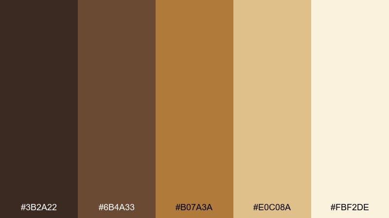
HEX: #3b2a22 #6b4a33 #b07a3a #e0c08a #fbf2de
Mood: warm, inviting, nostalgic
Best for: restaurant menus and cozy interior styling
Warm and nostalgic, it feels like a long hall lit by candles bouncing off carved wood. This castle color palette is ideal for menus, hospitality branding, and cozy landing pages that want instant comfort. Pair the amber tones with simple serif typography and plenty of cream space for readability. Usage tip: use the darkest brown for body text and the gold for callouts or price highlights.
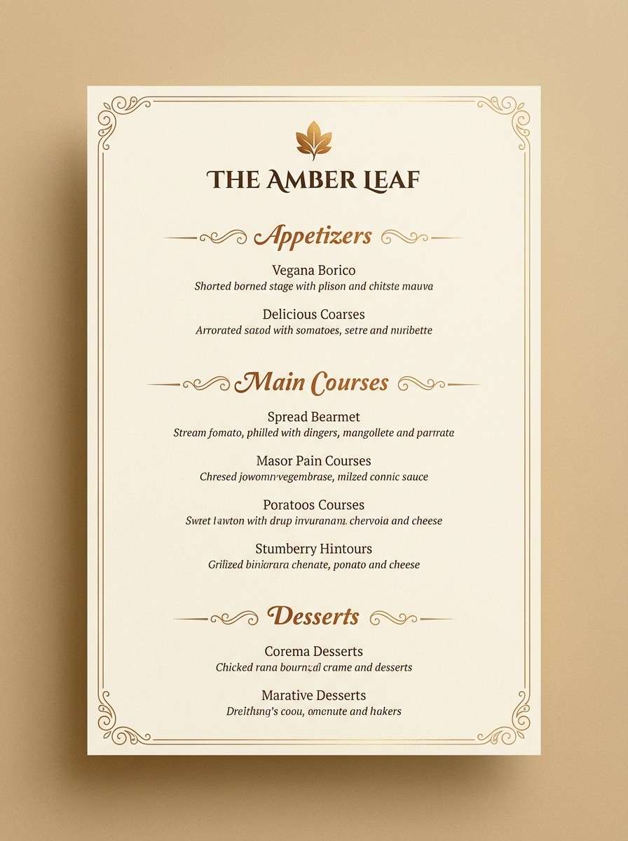
Image example of candlelit hall generated using media.io
5) Iron Gate
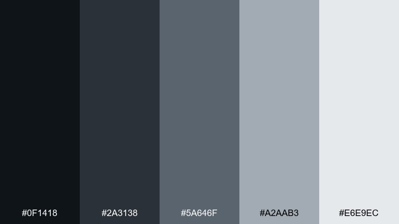
HEX: #0f1418 #2a3138 #5a646f #a2aab3 #e6e9ec
Mood: modern, restrained, industrial
Best for: dashboard UI and SaaS landing pages
Restrained and industrial, these shades resemble wrought iron, foggy stone, and polished metal. They fit product UI, analytics dashboards, and tech branding that needs seriousness without feeling cold. Bring in the light gray as a generous background and keep the near-black for navigation. Usage tip: make the mid-slate your primary button color to avoid harsh contrast while staying accessible.
Image example of iron gate generated using media.io

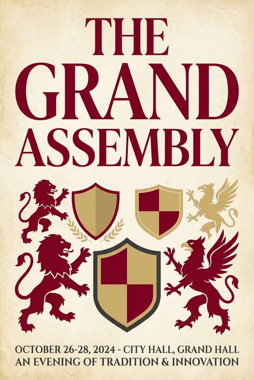
6) Heraldic Crimson
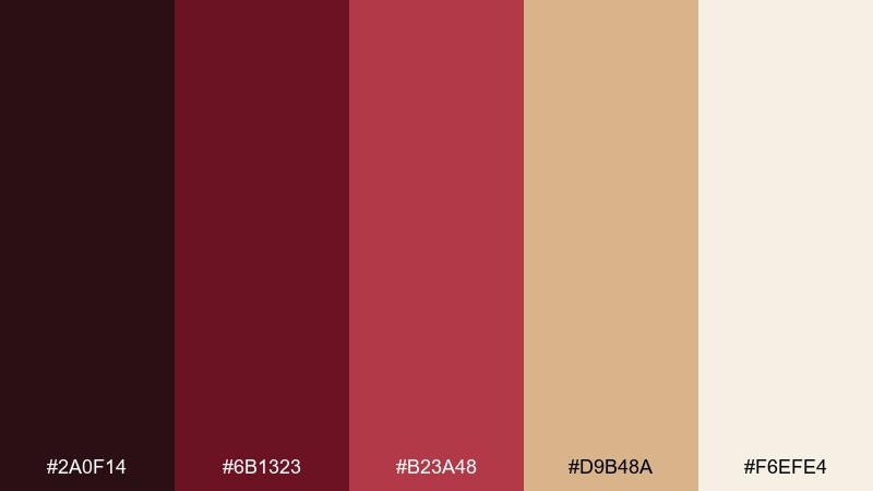
HEX: #2a0f14 #6b1323 #b23a48 #d9b48a #f6efe4
Mood: bold, ceremonial, confident
Best for: poster design and statement branding
Bold and ceremonial, it calls up banners snapping in the wind and painted shields. These castle color combinations work best when crimson leads and the parchment tone keeps the layout breathable. Add metallic gold only as a small accent line or seal to avoid overpowering the message. Usage tip: keep backgrounds light and let crimson carry the hierarchy through headings and buttons.
Image example of heraldic crimson generated using media.io
7) Parchment Scroll
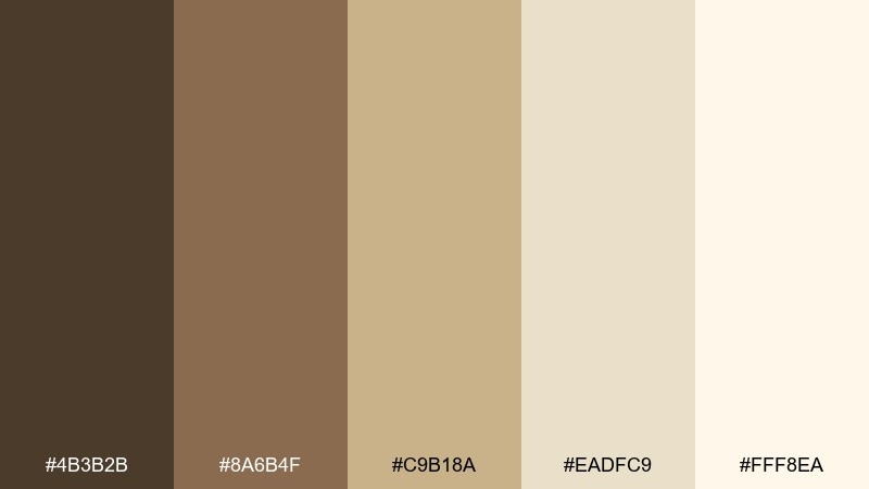
HEX: #4b3b2b #8a6b4f #c9b18a #eadfc9 #fff8ea
Mood: soft, antique, literary
Best for: book covers and long-form reading pages
Soft and antique, these tones feel like ink, leather bindings, and aged paper edges. They are a strong fit for book covers, blog layouts, and documentation pages where calm readability matters. Pair with a deep brown for headings and keep the lightest cream for page backgrounds. Usage tip: use the tan midtone for subtle section blocks to guide scanning without harsh lines.
Image example of parchment scroll generated using media.io
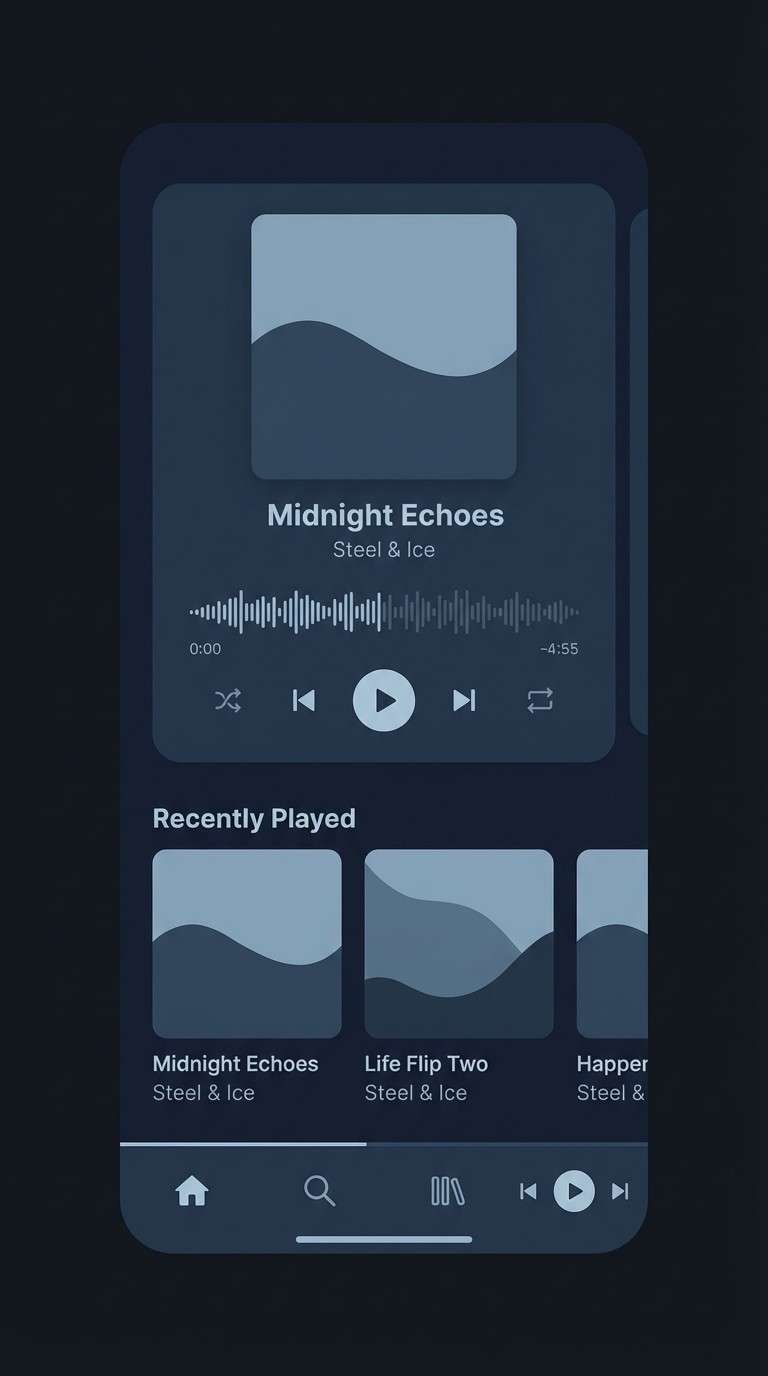
8) Moonlit Battlements
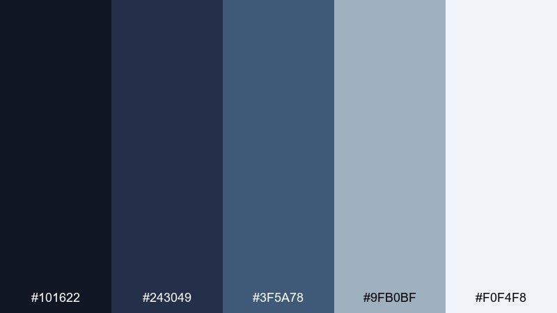
HEX: #101622 #243049 #3f5a78 #9fb0bf #f0f4f8
Mood: cool, quiet, cinematic
Best for: night-mode UI and atmospheric posters
Cool and cinematic, it suggests moonlight washing over stone and distant night skies. Use these blues and blue-grays for dark-mode interfaces, tech decks, or moody campaign visuals. Keep the palest ice tone for text and key highlights so everything stays crisp. Usage tip: avoid pure black; the deep navy gives a softer, more premium contrast.
Image example of moonlit battlements generated using media.io
9) Forest Courtyard
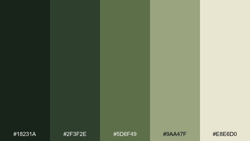
HEX: #18231a #2f3f2e #5d6f49 #9aa47f #e8e6d0
Mood: natural, balanced, restorative
Best for: wellness branding and artisan packaging
Natural and restorative, this mix feels like a shaded courtyard with vines climbing old stone. It works well for wellness brands, artisan goods, and calm web sections that need a grounded green base. Pair with off-white for breathing room and keep the darkest green for logos or stamps. Usage tip: use the sage tone for secondary buttons and subtle highlights.
Image example of forest courtyard generated using media.io
10) Vintage Armory
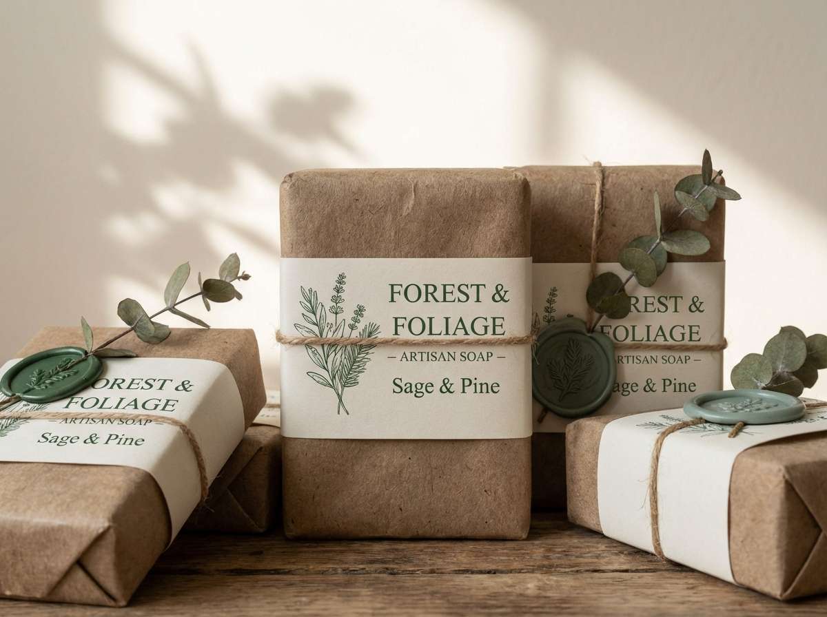
HEX: #1b1b1d #3a3030 #6a5b53 #a28c76 #e7d8c7
Mood: rugged, vintage, tactile
Best for: menswear labels and rugged product ads
Rugged and tactile, it recalls leather straps, dark steel, and worn wood handles. These shades fit menswear branding, outdoor gear ads, and product pages that need grit without harshness. Let the creamy beige carry negative space, then layer the browns for depth. Usage tip: use the taupe midtone as your main background for a softer, more editorial feel.
Image example of vintage armory generated using media.io
11) Chapel Glass
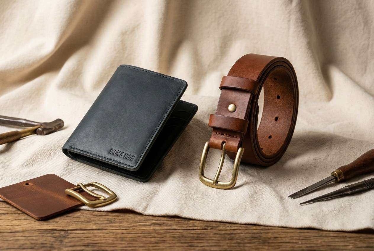
HEX: #1a2633 #2c5d6b #5d8f7c #caa65a #f2e8d2
Mood: elegant, artistic, luminous
Best for: boutique hotel branding and editorial headers
Elegant and luminous, it hints at stained glass catching light in a quiet chapel. The teal and sea-green tones feel refined when paired with muted gold and a creamy base. Use it for boutique hospitality, editorial headers, or premium service pages where you want subtle color complexity. Usage tip: keep gold limited to icons, rules, or small badges for a clean finish.
Image example of chapel glass generated using media.io
12) Dusty Moat
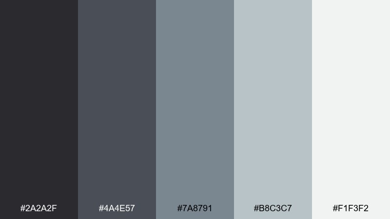
HEX: #2a2a2f #4a4e57 #7a8791 #b8c3c7 #f1f3f2
Mood: misty, modern, understated
Best for: presentations and corporate UI
Misty and understated, these cool grays evoke fog over still water and distant stone. They are reliable for decks, corporate UI, and neutral websites where content needs to lead. Add a single warm accent elsewhere if you want more energy, but keep this set mostly monochrome. Usage tip: use the lightest shade for backgrounds and the medium blue-gray for charts and dividers.
Image example of dusty moat generated using media.io

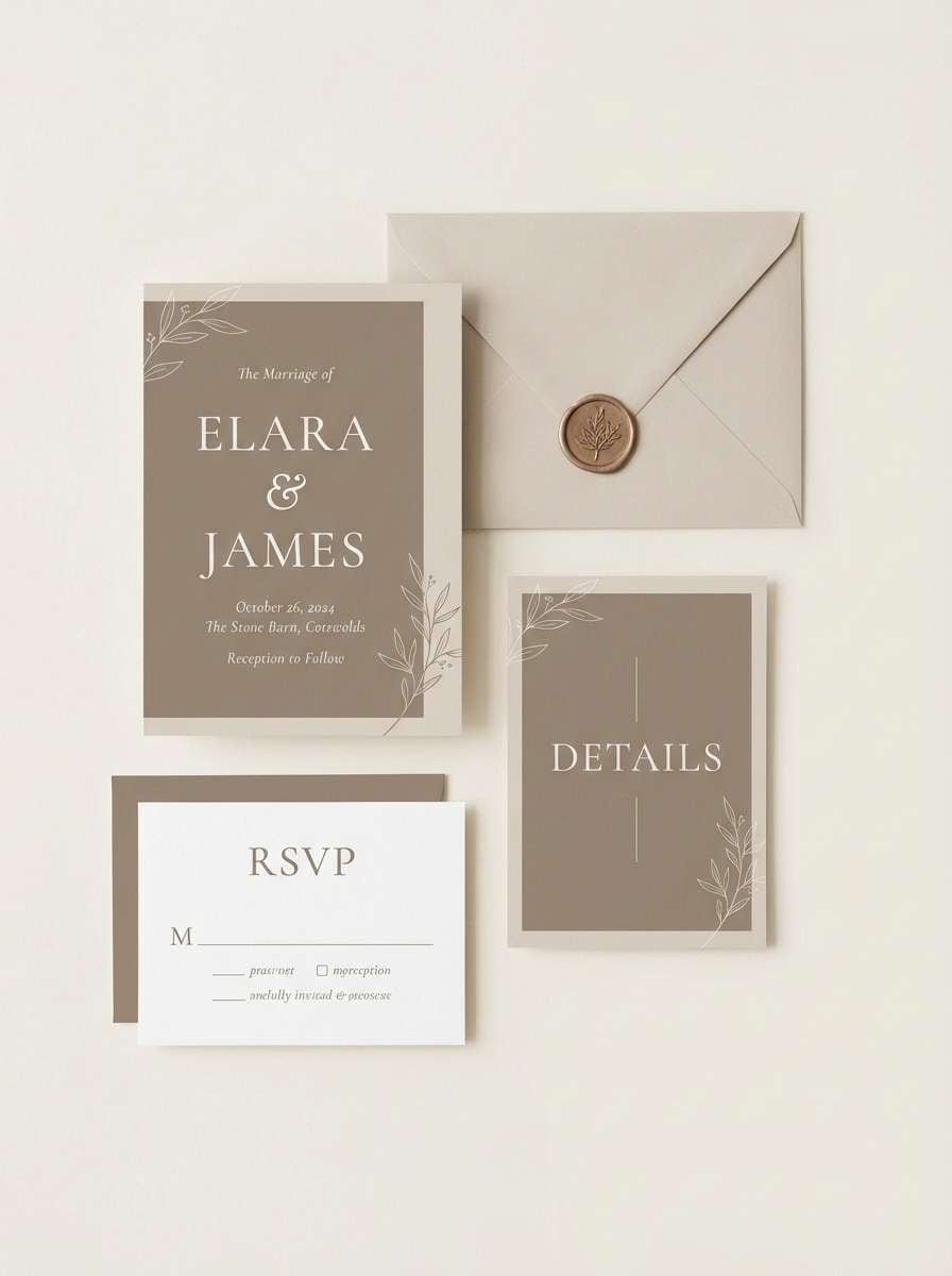
13) Squire's Linen
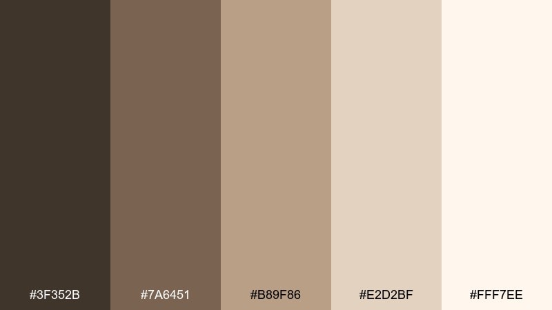
HEX: #3f352b #7a6451 #b89f86 #e2d2bf #fff7ee
Mood: soft, rustic, welcoming
Best for: wedding stationery and handmade goods
Soft and welcoming, it feels like linen banners, twine, and warm daylight on stone. The browns and creams are perfect for wedding stationery, handmade product tags, and cozy lifestyle brands. Pair with a simple monoline illustration style to keep it airy and modern. Usage tip: use the light cream as the paper base and keep the darkest brown for names and key details.
Image example of squire's linen generated using media.io
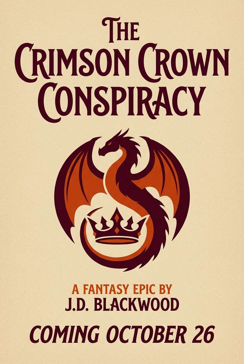
14) Dragon Banner
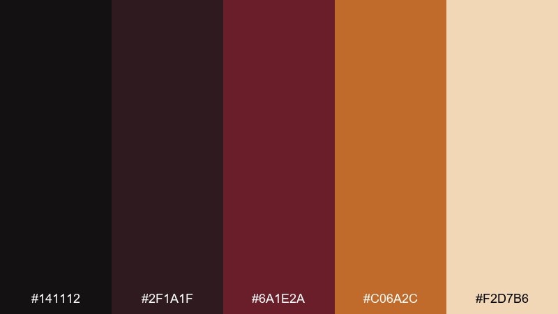
HEX: #141112 #2f1a1f #6a1e2a #c06a2c #f2d7b6
Mood: fiery, heroic, high-contrast
Best for: gaming promos and fantasy book marketing
Fiery and heroic, it brings to mind embers, dark leather, and a banner glowing under torchlight. These castle color combinations are strong for gaming promos, fantasy releases, and bold social ads where contrast needs to hit fast. Let the near-black and deep maroon hold the frame, then use the orange as a targeted accent for calls to action. Usage tip: keep the pale sand tone behind text blocks to prevent the palette from feeling too heavy.
Image example of dragon banner generated using media.io
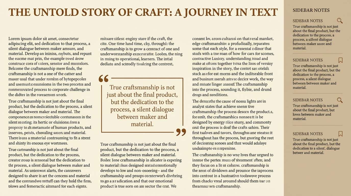
15) Quiet Library
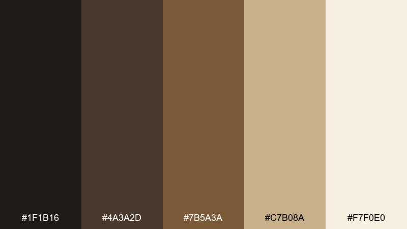
HEX: #1f1b16 #4a3a2d #7b5a3a #c7b08a #f7f0e0
Mood: scholarly, warm, intimate
Best for: long-read blogs and learning platforms
Scholarly and intimate, these tones feel like old shelves, leather spines, and soft lamplight. This castle color palette suits reading-heavy pages, course portals, and thoughtful brand storytelling. Pair with a classic serif for headings and a clean sans for body copy to keep it contemporary. Usage tip: use the light cream as your canvas and keep the darkest shade for navigation and footers.
Image example of quiet library generated using media.io
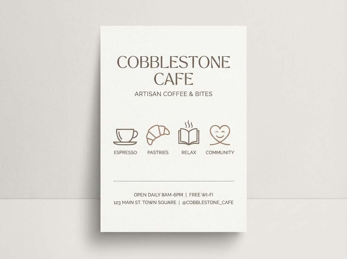
16) Cobblestone Market
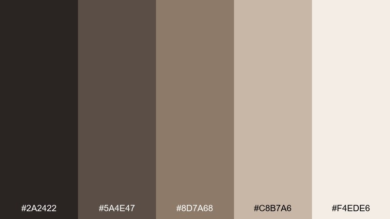
HEX: #2a2422 #5a4e47 #8d7a68 #c8b7a6 #f4ede6
Mood: earthy, friendly, lived-in
Best for: cafe branding and small business flyers
Friendly and lived-in, it suggests cobblestones, paper sacks, and the warm bustle of a market square. The muted browns make a dependable base for local brands, cafe menus, and neighborhood event flyers. Add a single bold accent color elsewhere if you need extra energy, but keep typography clean. Usage tip: use the sandy midtone for panels so your text stays readable on mobile.
Image example of cobblestone market generated using media.io
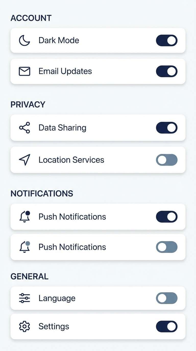
17) Winter Castle
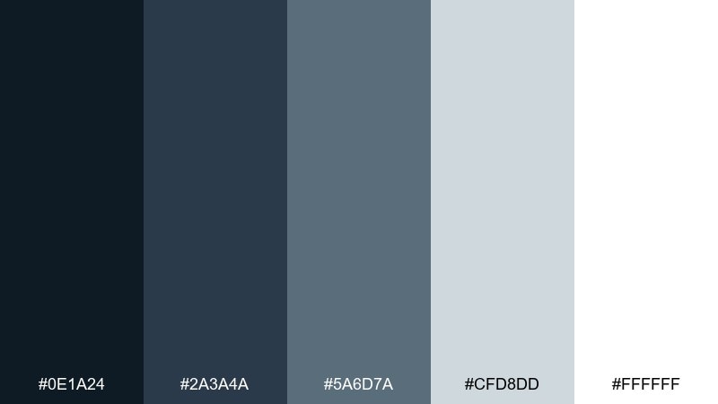
HEX: #0e1a24 #2a3a4a #5a6d7a #cfd8dd #ffffff
Mood: crisp, airy, modern
Best for: clean UI themes and tech branding
Crisp and airy, it feels like cold air, pale stone, and a clear winter sky. These cool blues are excellent for clean UI themes, tech brands, and documentation sites that need clarity. Use white and the light gray-blue for spacious backgrounds, and reserve navy for structure. Usage tip: keep shadows subtle so the palette stays icy rather than heavy.
Image example of winter castle generated using media.io
18) Rose Garden Terrace
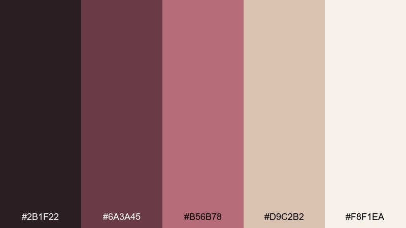
HEX: #2b1f22 #6a3a45 #b56b78 #d9c2b2 #f8f1ea
Mood: romantic, vintage, soft
Best for: beauty branding and romantic invitations
Romantic and vintage, it evokes climbing roses against stone and faded silk ribbons. The mauves and dusty pinks are ideal for beauty branding, bridal details, and elegant social templates. Pair with minimal black-brown typography and a warm cream base to keep it grown-up. Usage tip: use the blush tone for large areas and save the deeper wine shade for emphasis.
Image example of rose garden terrace generated using media.io
19) Stormwatch Tower
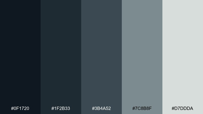
HEX: #0f1720 #1f2b33 #3b4a52 #7c8b8f #d7ddda
Mood: moody, strong, understated
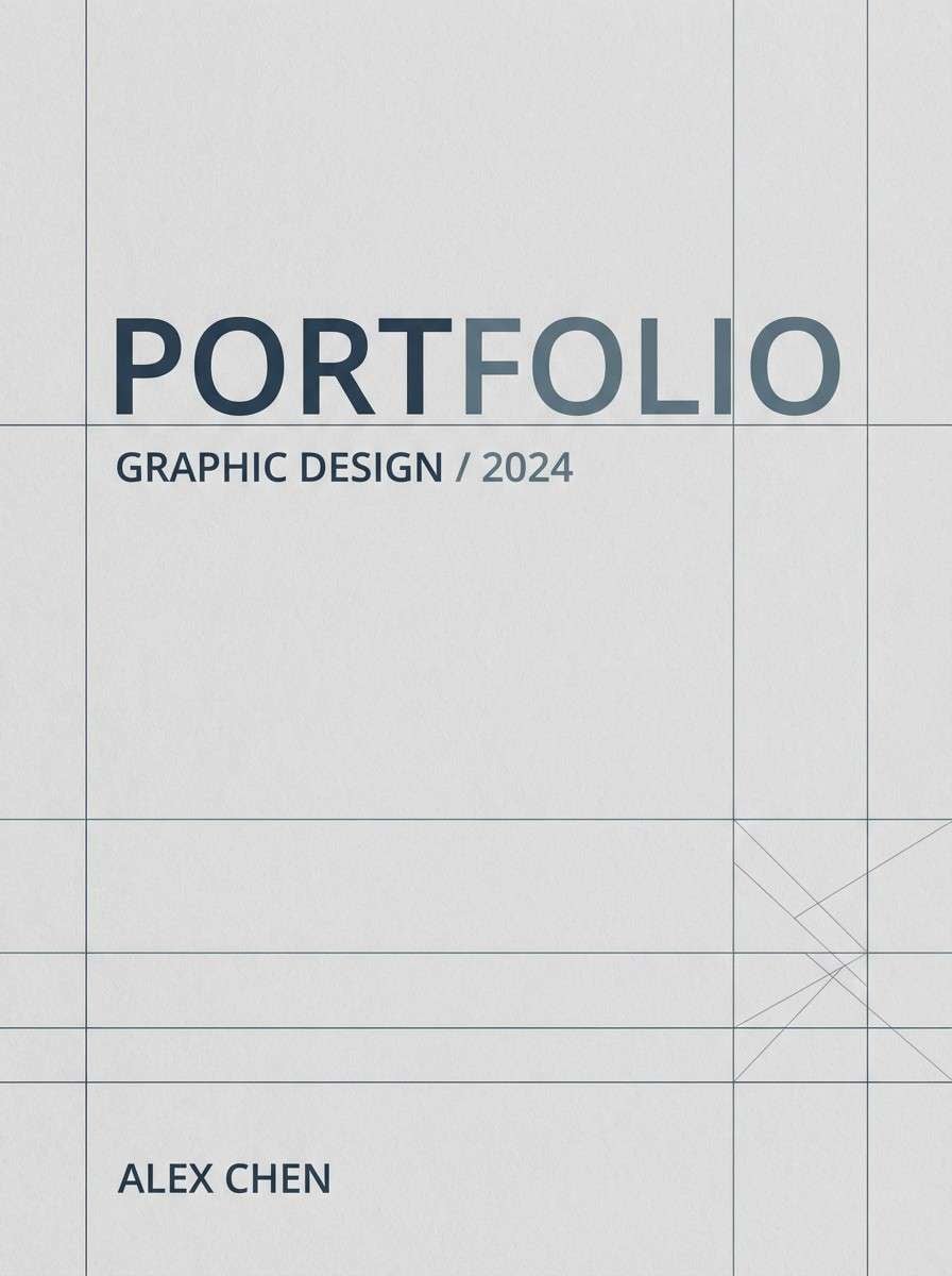
Best for: corporate branding and architectural portfolios
Moody and strong, it feels like storm clouds rolling past a watchtower. The blue-gray range is a smart choice for architecture portfolios, corporate branding, and serious pitch decks. Pair with crisp white margins and use the mid-gray for secondary text and captions. Usage tip: keep accent elements minimal so the palette reads confident rather than gloomy.
Image example of stormwatch tower generated using media.io
20) Sunlit Citadel
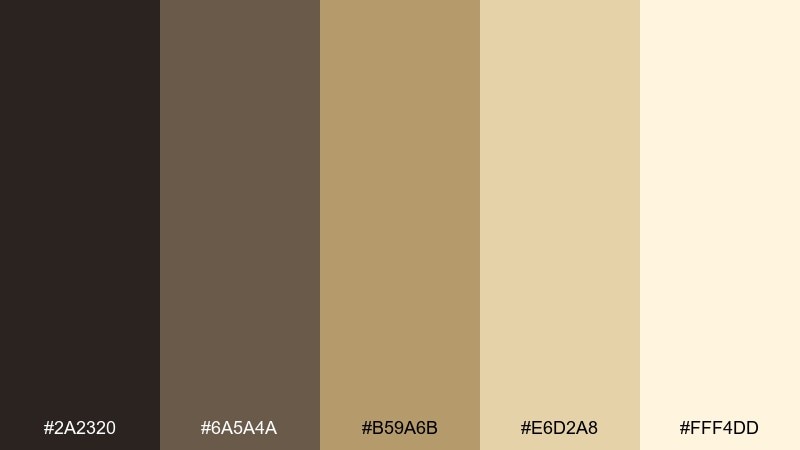
HEX: #2a2320 #6a5a4a #b59a6b #e6d2a8 #fff4dd
Mood: bright, welcoming, classic
Best for: interior design mockups and lifestyle brands
Bright and welcoming, it brings to mind sunlit courtyards, sandstone, and warm brass details. These tones are versatile for interior design boards, lifestyle branding, and packaging that wants a natural glow. Pair with clean whites and a charcoal type color if you need extra contrast. Usage tip: use the pale honey as a hero background and layer darker browns for depth in headings and frames.
Image example of sunlit citadel generated using media.io
What Colors Go Well with Castle?
Castle palettes pair best with material-inspired neutrals: stone gray, iron charcoal, parchment cream, and weathered brown. These shades keep your design believable and help accent colors look intentional rather than random.
For accents, choose one strong “heraldic” note like burgundy, deep plum, forest green, or muted gold. Using a single accent family keeps the scheme elegant and prevents it from drifting into fantasy costuming.
If you want a modern twist, add cool blue-grays (for a moonlit feel) or clean whites (for a winter-castle look). The key is to keep saturation controlled and let contrast come from value (light vs dark).
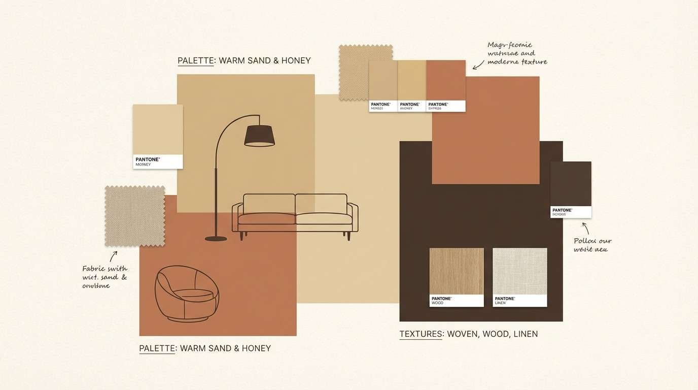
How to Use a Castle Color Palette in Real Designs
Start with a background base (parchment, cream, or light stone) and set your type and UI structure in a deep neutral (charcoal, espresso brown, or navy). This mirrors how castles read: light surfaces with dark iron and shadow.
Next, pick one midtone for layout scaffolding—cards, section blocks, dividers, and borders. Midtones like taupe, slate, or sage create hierarchy without heavy lines.
Finally, use accent colors sparingly for calls to action, badges, or key highlights. A small touch of antique gold, crimson, or ember orange can deliver “royal” energy without overwhelming legibility.
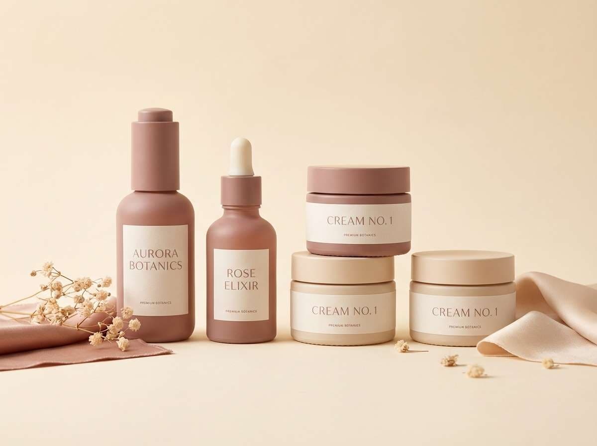
Create Castle Palette Visuals with AI
If you’re pitching a brand, planning a room, or designing a UI theme, visuals help you sell the concept faster than swatches alone. With AI, you can turn a castle color palette into packaging mockups, posters, menus, and interface previews in minutes.
Use your palette’s mood words (stone, iron, parchment, candlelight, tapestry) and specify layout type (menu, invitation, dashboard, moodboard). Then add lighting and background notes for a cleaner, more premium result.
Media.io makes it simple to generate consistent examples so your castle color scheme looks cohesive across different assets.
Castle Color Palette FAQs
-
What is a castle color palette?
A castle color palette is a set of colors inspired by castle materials and atmosphere—stone grays, iron charcoals, parchment creams, dark woods, and regal accents like burgundy or antique gold. -
Which castle colors are best for modern branding?
Stone-and-parchment neutrals with one accent (burgundy, forest green, or muted gold) look timeless and premium while still feeling modern on web and print. -
How do I keep a medieval color palette from looking like a costume theme?
Limit saturated colors, rely on natural neutrals for most of the layout, and use metallic/gilded tones only as small highlights (icons, rules, seals, or badges). -
What background color works best with castle palettes?
Parchment cream, warm off-white, or pale stone are the safest backgrounds. They preserve readability and make darker “iron” and “wood” tones feel intentional. -
Are castle palettes good for UI and dashboards?
Yes. Sets like Iron Gate, Dusty Moat, Moonlit Battlements, and Winter Castle create strong hierarchy with accessible contrast and a refined, architectural feel. -
What accent color should I add to a stone gray palette?
Muted gold for premium warmth, burgundy for ceremony, forest green for nature/heritage, or ember orange for bold CTAs—choose one and keep it consistent. -
Can I generate castle-themed visuals from HEX codes?
Yes. Use the HEX codes as a guide and include material cues (stone, iron, parchment, candlelight) in your prompt; Media.io can generate matching mockups for branding, posters, or UI.
Next: Ocean Wave Color Palette


