

Brass sits in that sweet spot between gold and brown—warm, grounded, and instantly “designed.” It can read vintage and handcrafted, or sleek and premium, depending on the neutrals and shadows you pair it with.
Below are 20 curated brass color palette ideas with HEX codes, plus practical tips for using brass tones in branding, UI, and print without overpowering your layout.
In this article
- Why Brass Palettes Work So Well
-
- antique workshop
- polished fixture
- desert brass dunes
- art deco glow
- olive patina
- midnight atelier
- sunlit gallery
- warm minimal home
- espresso brass
- coastal sandstone
- citrus brass pop
- vintage labeling
- contemporary dashboard
- soft wedding glow
- museum poster night
- clean tech accent
- botanical herbarium
- holiday brass ribbon
- film noir lounge
- kids science infographic
- What Colors Go Well with Brass?
- How to Use a Brass Color Palette in Real Designs
- Create Brass Palette Visuals with AI
Why Brass Palettes Work So Well
Brass tones feel premium without being as loud as pure gold. Because brass leans slightly brown, it naturally blends with paper-like creams, charcoals, and earthy neutrals—making it versatile across digital and print.
Design-wise, brass is excellent for hierarchy. A dark base (near-black, espresso, deep green) creates strong contrast, while brass highlights can guide attention to key UI states, logos, seals, borders, or dates.
Brass also carries emotional range: it can look handcrafted and vintage when paired with parchment and olive, or modern and architectural when paired with cool grays and crisp typography.
20+ Brass Color Palette Ideas (with HEX Codes)
1) Antique Workshop
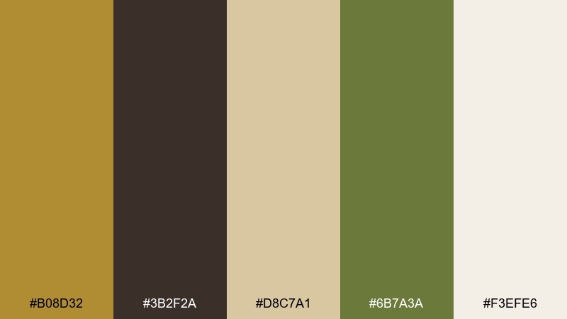
HEX: #B08D32 #3B2F2A #D8C7A1 #6B7A3A #F3EFE6
Mood: rugged, vintage, handcrafted
Best for: craft brand packaging
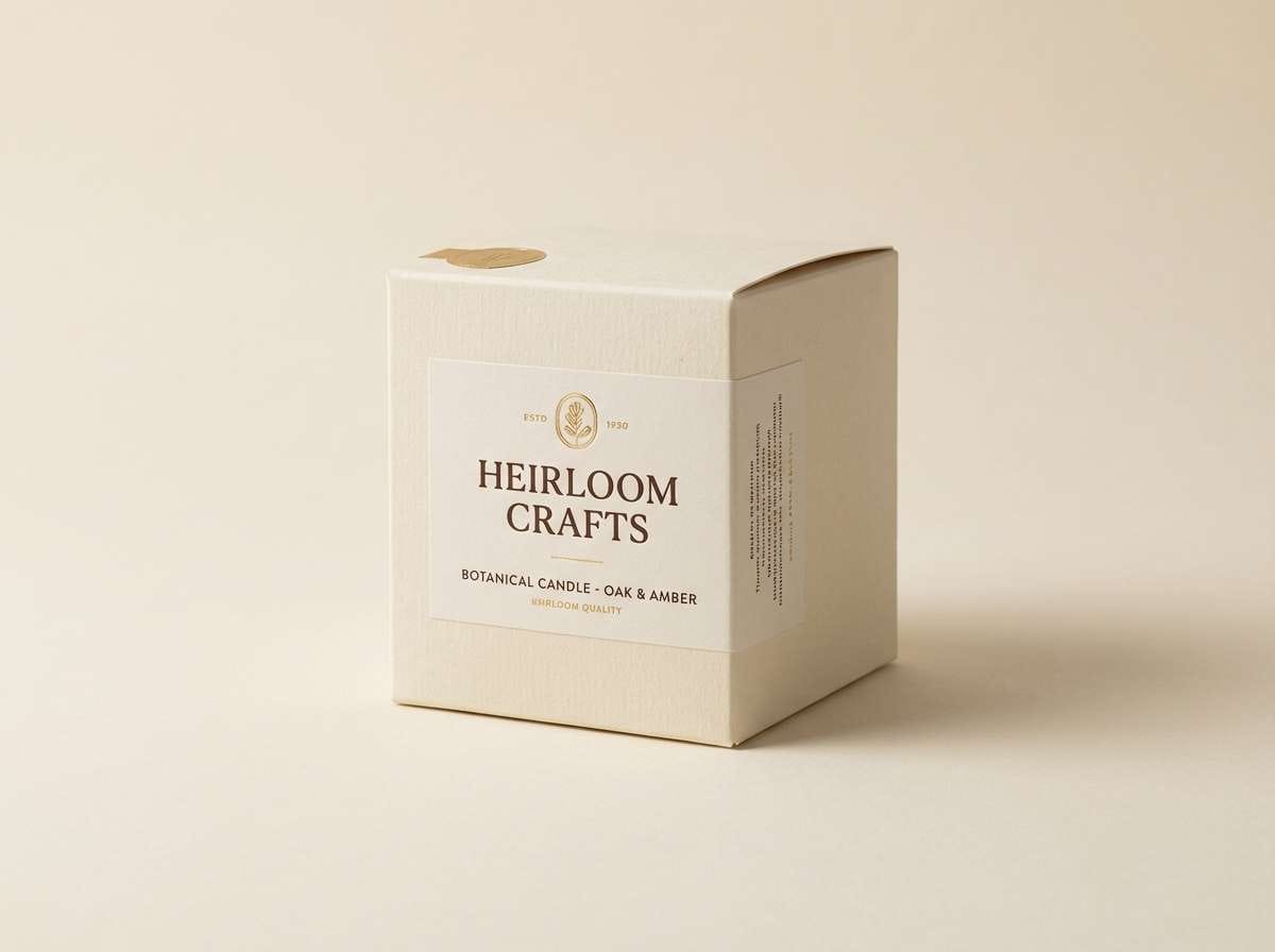
Rugged and warm like a well-loved toolbench, these tones feel honest and tactile. Use it on craft packaging, maker logos, and heritage product labels where you want trust and grit. Pair the deep brown with the creamy off-white for legibility, then let the muted green act as a subtle secondary accent. Tip: keep the brass-gold limited to stamps, borders, or small icons so it reads as premium, not loud.
Image example of antique workshop generated using media.io
Media.io is an online AI studio for creating and editing video, image, and audio in your browser.

2) Polished Fixture
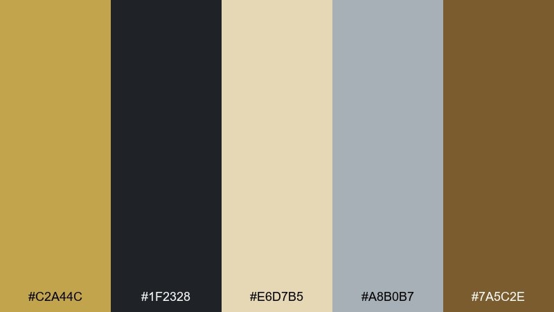
HEX: #C2A44C #1F2328 #E6D7B5 #A8B0B7 #7A5C2E
Mood: sleek, architectural, upscale
Best for: hotel branding and stationery
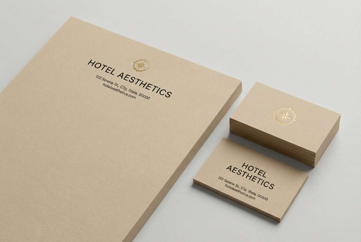
Sleek and architectural, it evokes polished hardware against stone and linen. It works beautifully for hotel branding, premium stationery, and minimal signage where contrast matters. Combine the near-black with the pale beige for crisp hierarchy, then use the cool gray to modernize the warmth. Tip: reserve the brightest gold for foil or a single brand mark to keep the look refined.
Image example of polished fixture generated using media.io
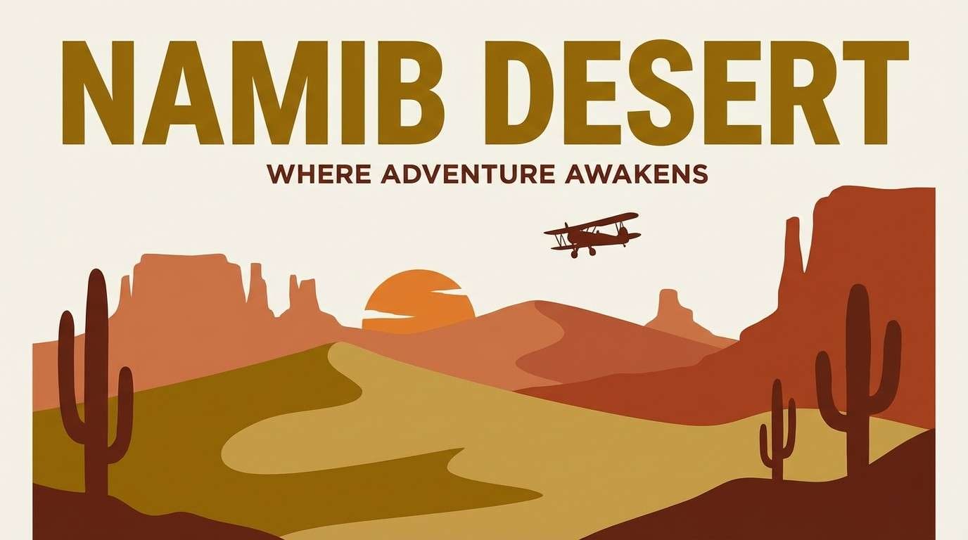
3) Desert Brass Dunes
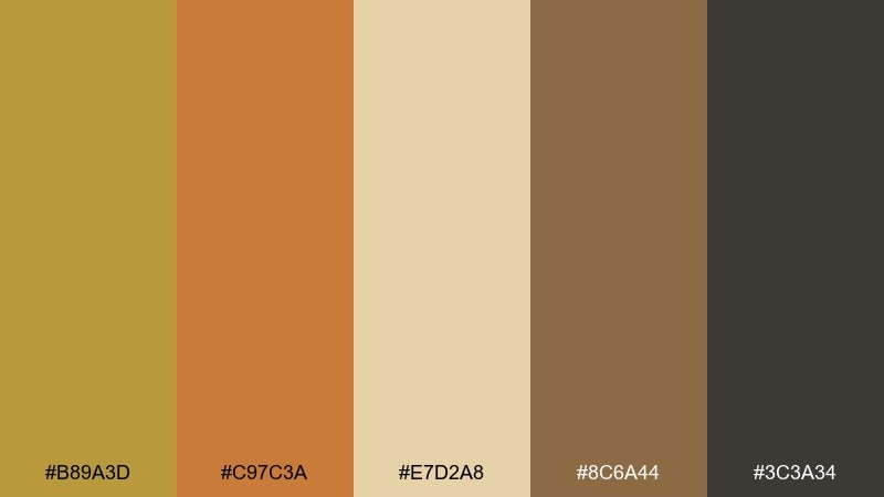
HEX: #B89A3D #C97C3A #E7D2A8 #8C6A44 #3C3A34
Mood: sunbaked, earthy, adventurous
Best for: outdoor lifestyle poster
Sunbaked and earthy, it feels like dunes at golden hour with a hint of canyon clay. These brass color combinations shine on outdoor posters, travel campaigns, and rugged lifestyle merch. Use the dark charcoal for headlines, then layer the sand and clay tones in blocks or gradients for depth. Tip: keep text areas on the light sand tone so the warmer accents stay punchy.
Image example of desert brass dunes generated using media.io
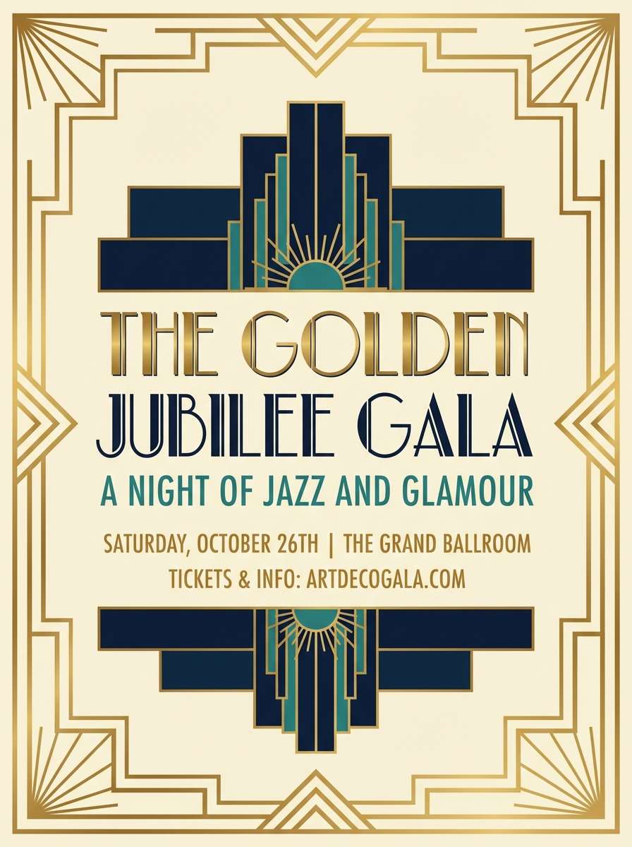
4) Art Deco Glow
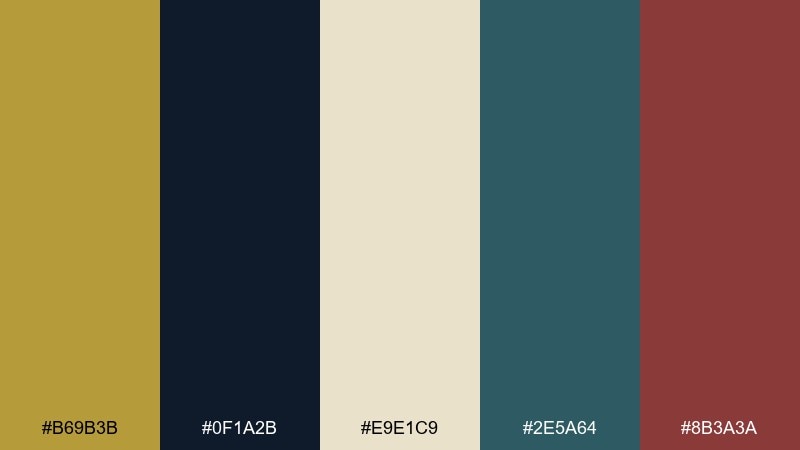
HEX: #B69B3B #0F1A2B #E9E1C9 #2E5A64 #8B3A3A
Mood: dramatic, glamorous, cinematic
Best for: event flyer design
Dramatic and glamorous, it recalls lounge lighting, velvet curtains, and geometric metalwork. It fits event flyers, cocktail menus, and theater promos where you want instant drama. Balance the navy base with cream panels for readability, then use teal and burgundy as controlled highlights. Tip: add thin linework in the golden tone to mimic classic deco frames without overcrowding the layout.
Image example of art deco glow generated using media.io
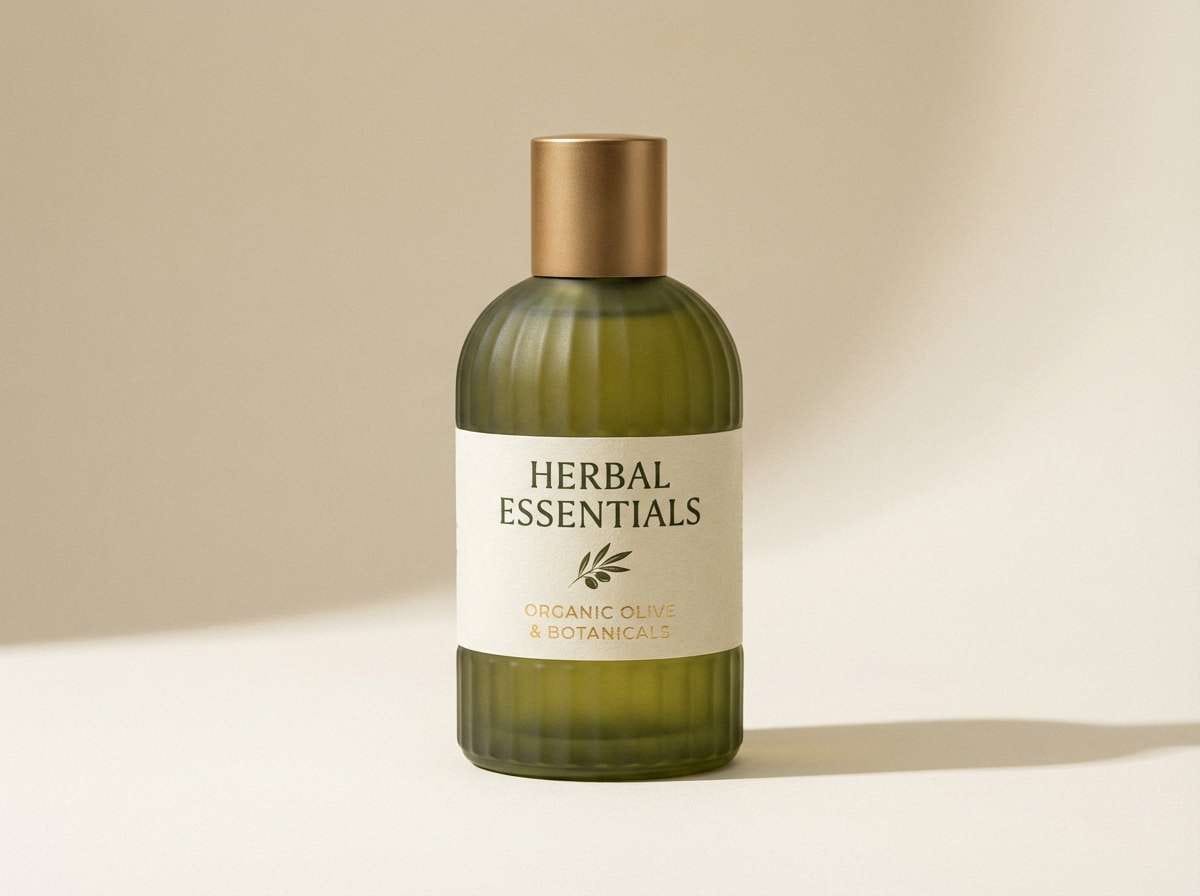
5) Olive Patina
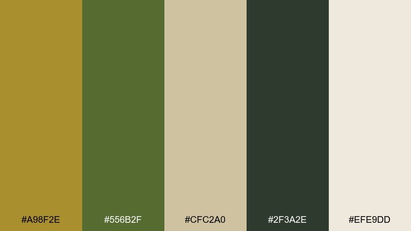
HEX: #A98F2E #556B2F #CFC2A0 #2F3A2E #EFE9DD
Mood: organic, grounded, calm
Best for: eco product label
Organic and grounded, these tones evoke patina, dried herbs, and recycled paper. Use them for eco labels, sustainable skincare, and farm-to-table packaging where natural trust is key. Pair the olive with the deep forest for a strong base, then let the soft creams keep the design airy. Tip: choose uncoated paper or a textured background so the muted gold feels authentic.
Image example of olive patina generated using media.io
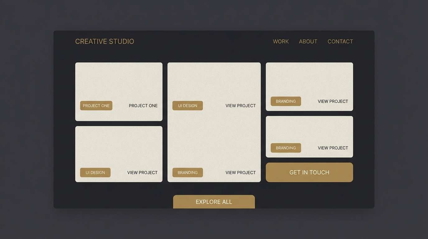
6) Midnight Atelier
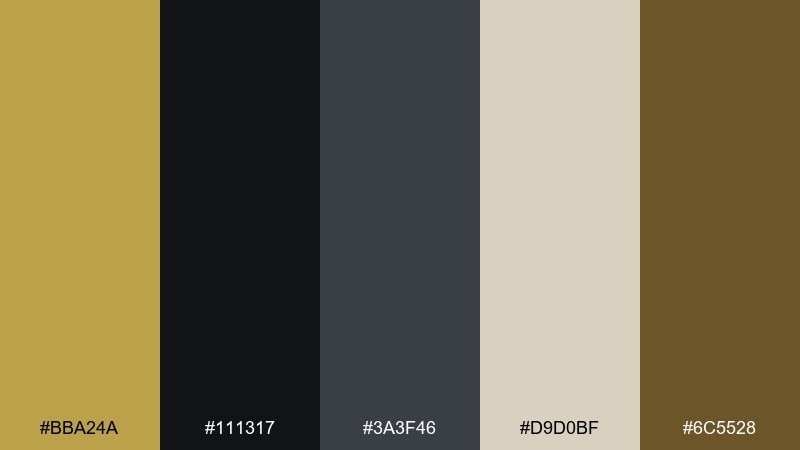
HEX: #BBA24A #111317 #3A3F46 #D9D0BF #6C5528
Mood: moody, modern, professional
Best for: portfolio website UI
Moody and modern, it feels like a studio lit by a single warm lamp. It suits portfolio sites and creative agency UI where you want sophistication without harsh contrast. Use the near-black as the canvas, bring in the pale beige for cards and text blocks, and save the gold for call-to-action states. Tip: keep hover and focus styles consistent by using one accent shade across the interface.
Image example of midnight atelier generated using media.io
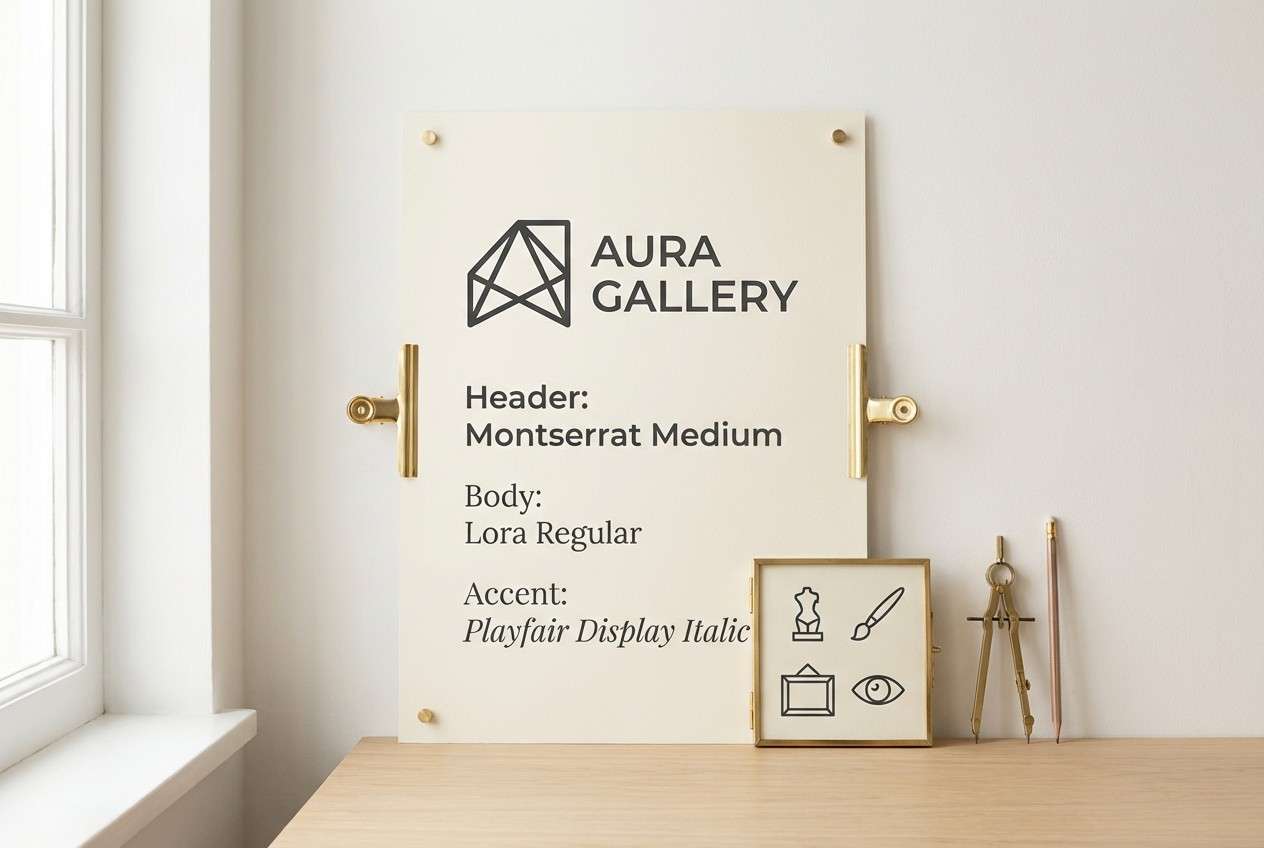
7) Sunlit Gallery
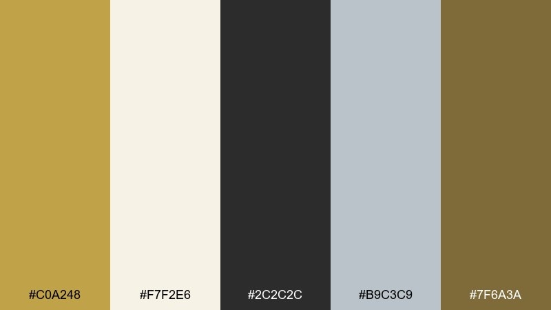
HEX: #C0A248 #F7F2E6 #2C2C2C #B9C3C9 #7F6A3A
Mood: bright, curated, contemporary
Best for: art gallery brand kit
Bright and curated, it brings to mind sunlit walls, quiet shadows, and polished frames. This brass color palette works for gallery brand kits, artist portfolios, and exhibition wayfinding that needs to feel modern yet warm. Set the cream as the primary field, anchor typography in charcoal, and use the gold and taupe for icons and separators. Tip: use the cool gray sparingly to keep the overall warmth consistent.
Image example of sunlit gallery generated using media.io
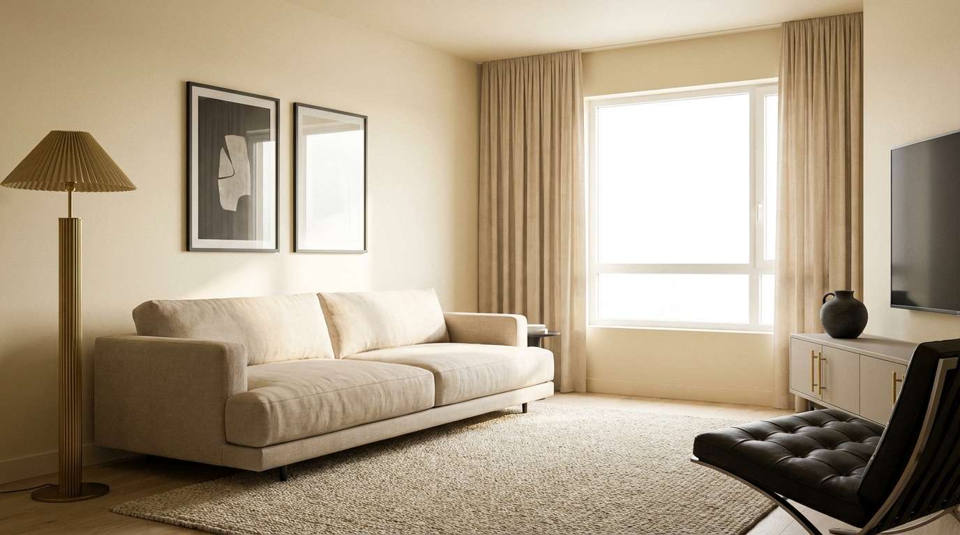
8) Warm Minimal Home
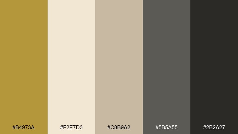
HEX: #B4973A #F2E7D3 #C8B9A2 #5B5A55 #2B2A27
Mood: cozy, minimal, timeless
Best for: interior design moodboard
Cozy and minimal, it suggests soft daylight on plaster walls with brushed metal details. Use it for interior moodboards, furniture lookbooks, and homeware catalogs where calm warmth sells the story. Pair the darkest tones for grounding and typography, then build large surfaces from the cream and sand shades. Tip: let the golden hue show up in small decor accents so the room still feels airy.
Image example of warm minimal home generated using media.io
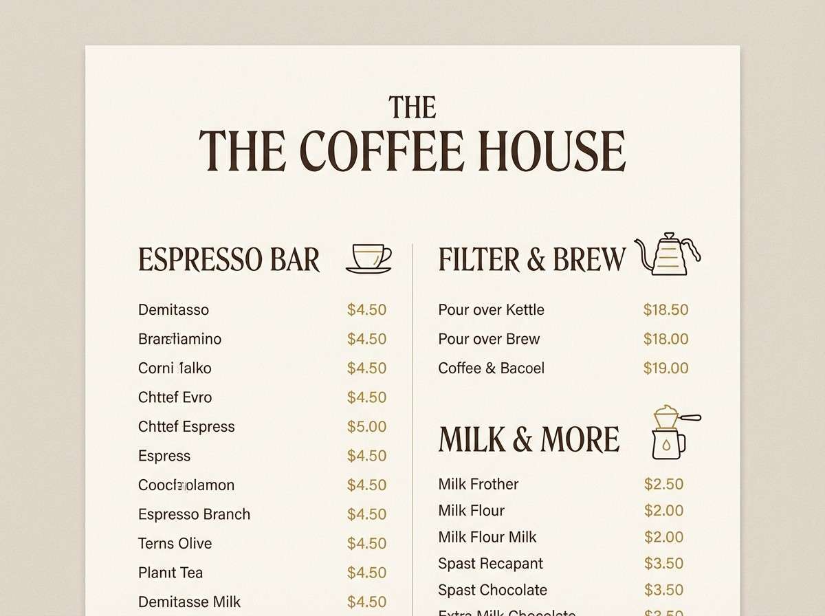
9) Espresso Brass
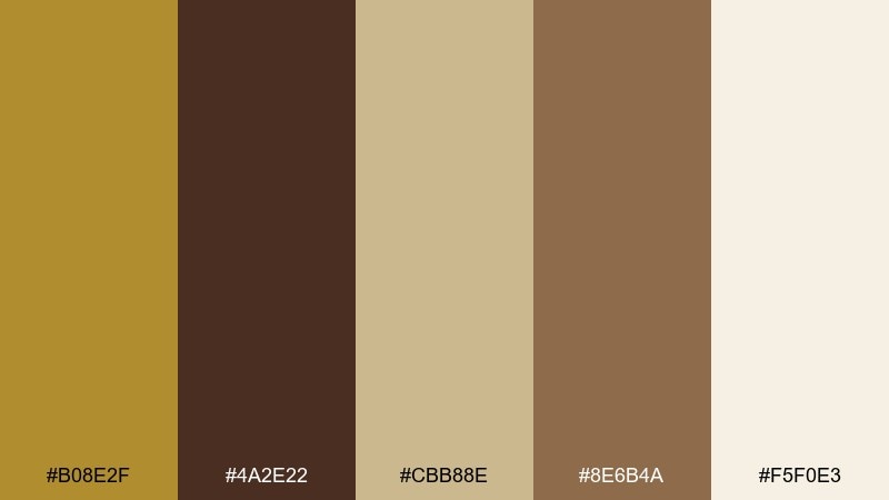
HEX: #B08E2F #4A2E22 #CBB88E #8E6B4A #F5F0E3
Mood: rich, inviting, boutique
Best for: coffee shop menu
Rich and inviting, it feels like espresso crema against warm wood. It is ideal for café menus, loyalty cards, and boutique food packaging where comfort matters. Use the cream for the main menu background, set headings in deep coffee brown, and highlight prices or specials with the gold tone. Tip: keep body text in the darkest shade to avoid the mid-browns looking washed out in print.
Image example of espresso brass generated using media.io
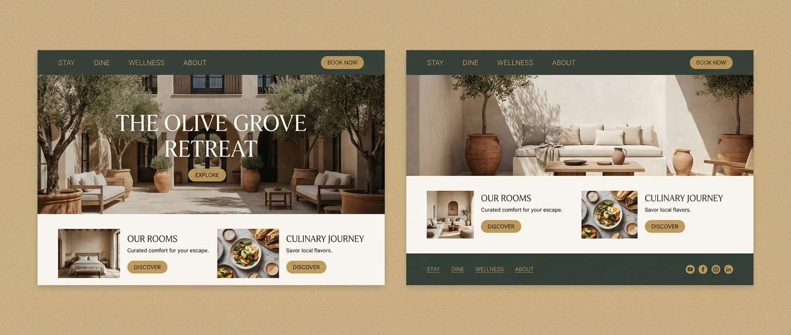
10) Coastal Sandstone
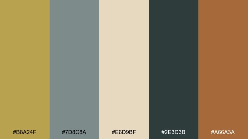
HEX: #B8A24F #7D8C8A #E6D9BF #2E3D3B #A66A3A
Mood: breezy, natural, refined
Best for: boutique hotel website
Breezy and refined, it hints at driftwood, sea-worn stone, and sun-faded textiles. Use it for boutique hotel sites or travel landing pages that need calm polish without feeling cold. Pair the deep green-gray with sandy beige for clean sections, then bring in the warm terracotta as a secondary accent. Tip: use the gold as a subtle icon or divider color so the layout keeps its coastal ease.
Image example of coastal sandstone generated using media.io
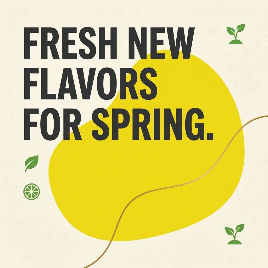
11) Citrus Brass Pop
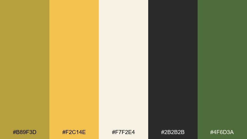
HEX: #B89F3D #F2C14E #F7F2E4 #2B2B2B #4F6D3A
Mood: playful, sunny, energetic
Best for: social media promo template
Playful and sunny, it brings the energy of citrus peel and market-fresh greens. It works great for social promo templates, food launches, and seasonal campaigns that need quick attention. Anchor text in charcoal on the soft cream, then use the bright yellow as the main highlight with green as a supporting accent. Tip: limit the bright tones to key shapes and buttons so the design stays readable on mobile.
Image example of citrus brass pop generated using media.io
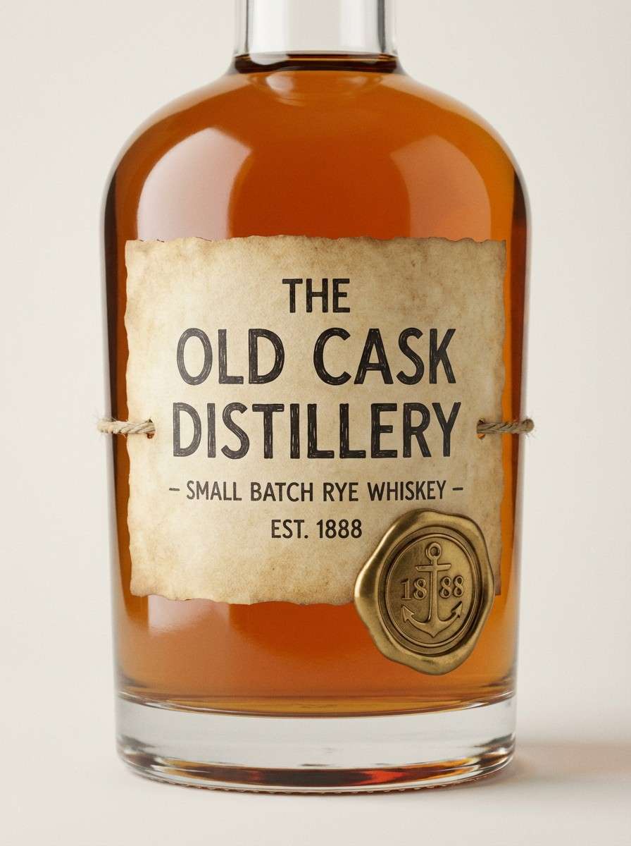
12) Vintage Labeling
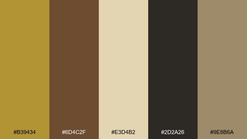
HEX: #B39434 #6D4C2F #E3D4B2 #2D2A26 #9E8B6A
Mood: heritage, warm, archival
Best for: spirits bottle label
Heritage and archival, it feels like aged paper, ink, and a well-kept cellar. This brass color combination is a strong fit for spirits labels, specialty foods, and vintage-inspired badges. Use the near-black for fine linework and typography, lean on the parchment tone for the label base, and keep the gold for emblems and seals. Tip: add subtle grain or engraving-style illustration so the palette looks intentional, not flat.
Image example of vintage labeling generated using media.io
13) Contemporary Dashboard
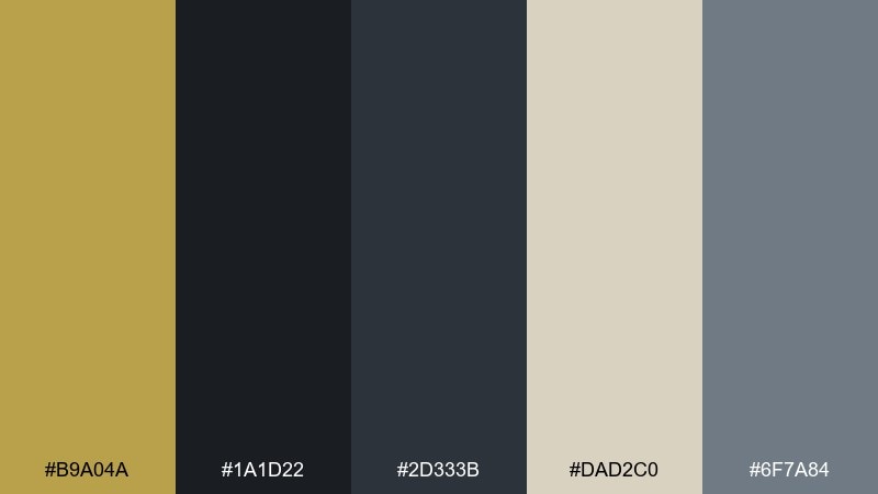
HEX: #B9A04A #1A1D22 #2D333B #DAD2C0 #6F7A84
Mood: confident, tech-forward, composed
Best for: analytics dashboard UI
Confident and composed, it reads like a control room with a warm premium accent. It is well suited for analytics dashboards, fintech tools, and admin panels that need clarity. Use the dark tones as the main UI base, apply the beige for cards and data tables, and reserve the gold for key metrics or active states. Tip: keep charts in neutral grays and use the accent only to highlight one primary series.
Image example of contemporary dashboard generated using media.io
14) Soft Wedding Glow
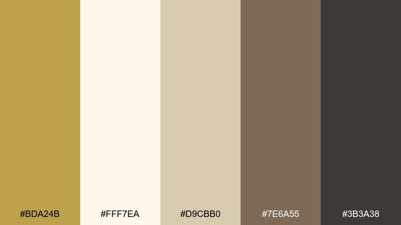
HEX: #BDA24B #FFF7EA #D9CBB0 #7E6A55 #3B3A38
Mood: romantic, gentle, elegant
Best for: wedding invitation suite
Romantic and gentle, it evokes candlelight on linen and soft champagne hues. These brass color combinations are perfect for wedding invitation suites, RSVP cards, and day-of signage with an elevated feel. Use the ivory as the main background, keep body text in the deep gray, and add gold to monograms or border rules. Tip: choose one decorative element to highlight in gold so the stationery stays airy and timeless.
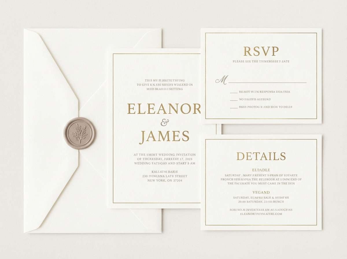
Image example of soft wedding glow generated using media.io
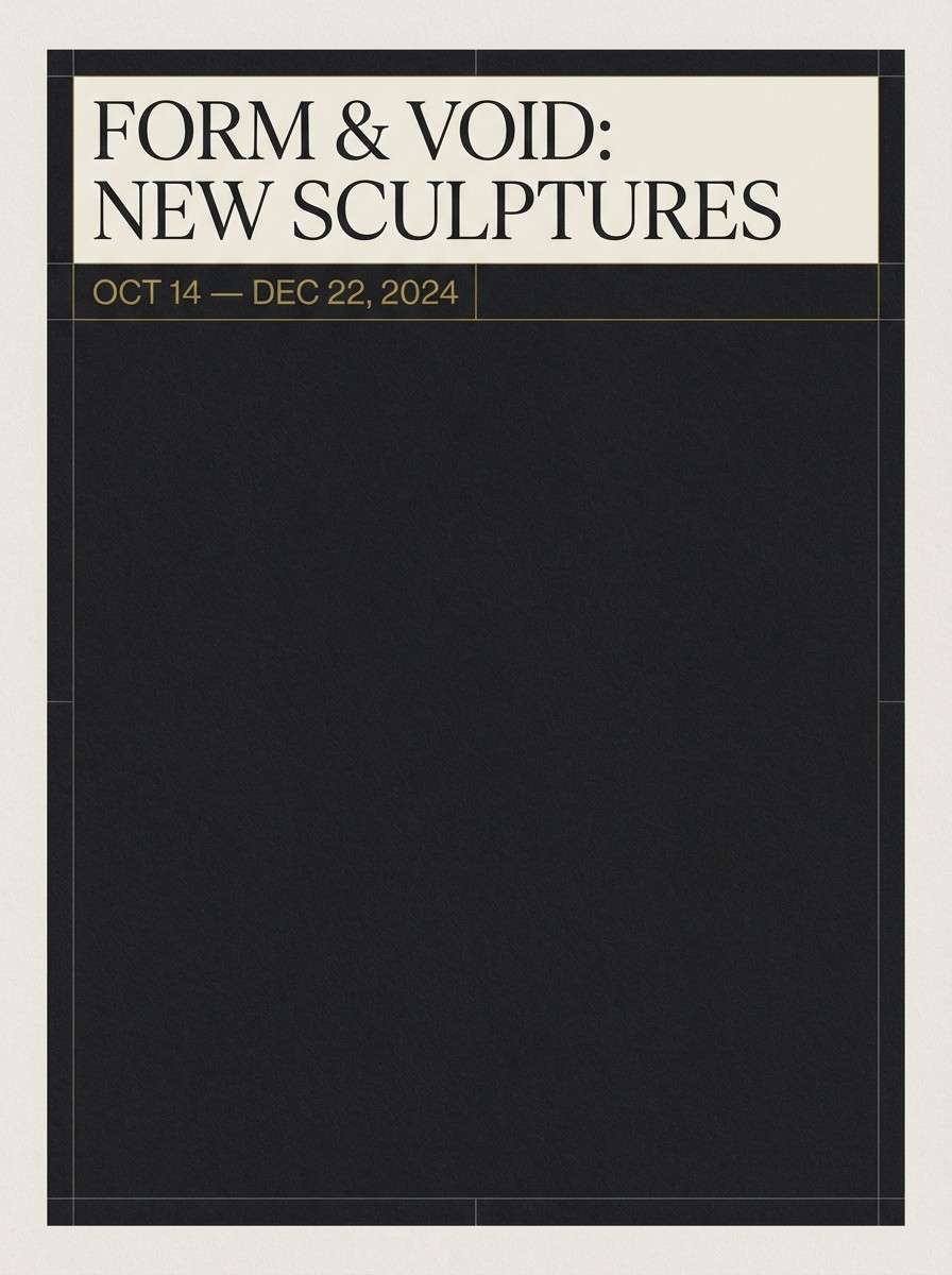
15) Museum Poster Night
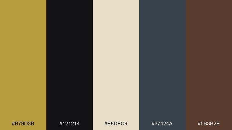
HEX: #B79D3B #121214 #E8DFC9 #37424A #5B3B2E
Mood: cultured, bold, dramatic
Best for: exhibition poster
Cultured and dramatic, it feels like a quiet museum hall with spotlighted frames. This brass color palette is ideal for exhibition posters and cultural events that need bold hierarchy. Use the near-black for large fields, the cream for title blocks, and the gold for a single focal rule or date line. Tip: keep spacing generous so the dark background reads premium rather than heavy.
Image example of museum poster night generated using media.io
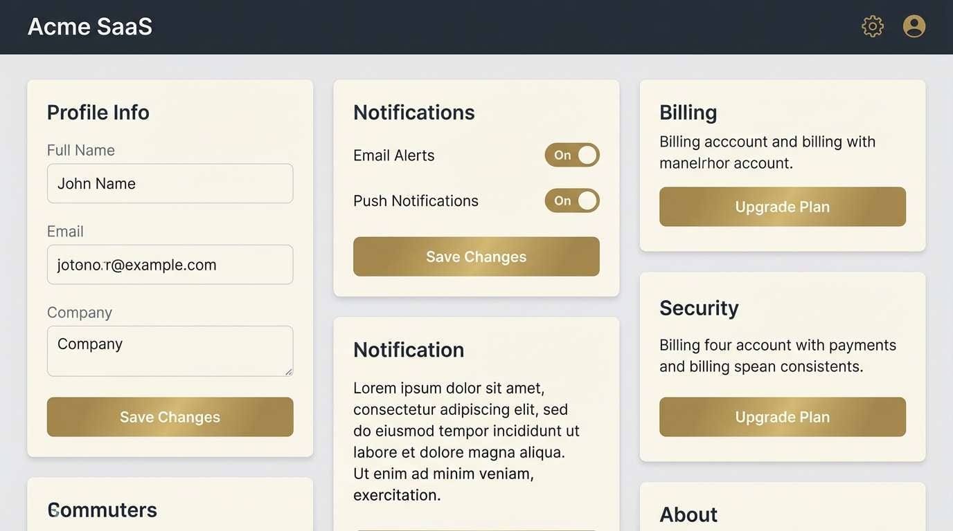
16) Clean Tech Accent
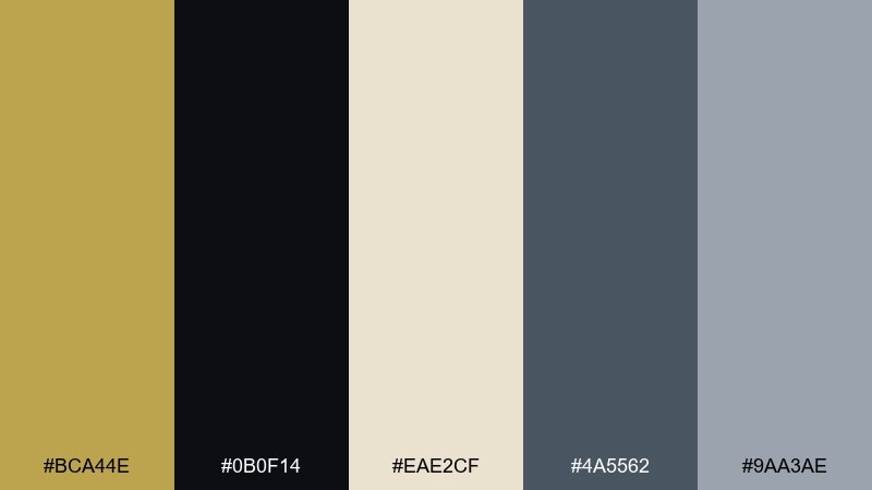
HEX: #BCA44E #0B0F14 #EAE2CF #4A5562 #9AA3AE
Mood: precise, clean, premium
Best for: SaaS UI design system
Precise and clean, it looks like brushed metal against a dark workspace. As a brass color scheme, it fits SaaS design systems, settings screens, and login flows where accessibility is non-negotiable. Use the cream for input fields and surfaces, keep typography in near-black, and apply the gold as a single primary action color. Tip: test the accent on small UI elements like toggles and focus rings to ensure consistent contrast.
Image example of clean tech accent generated using media.io
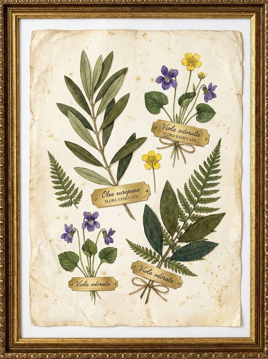
17) Botanical Herbarium
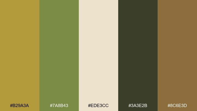
HEX: #B29A3A #7A8B43 #EDE3CC #3A3E2B #8C6E3D
Mood: botanical, earthy, nostalgic
Best for: botanical illustration print
Botanical and nostalgic, it suggests pressed leaves, dried stems, and aged book pages. Use it for herbarium prints, garden brand marks, and educational materials with a gentle vintage tone. The cream makes a beautiful paper base, while the olive and deep green add structure for stems and labels. Tip: keep outlines in the darkest green instead of black for a softer, more natural finish.
Image example of botanical herbarium generated using media.io
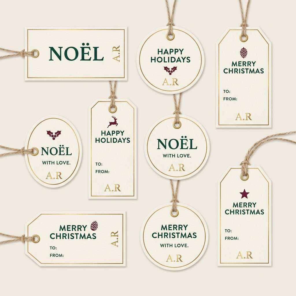
18) Holiday Brass Ribbon
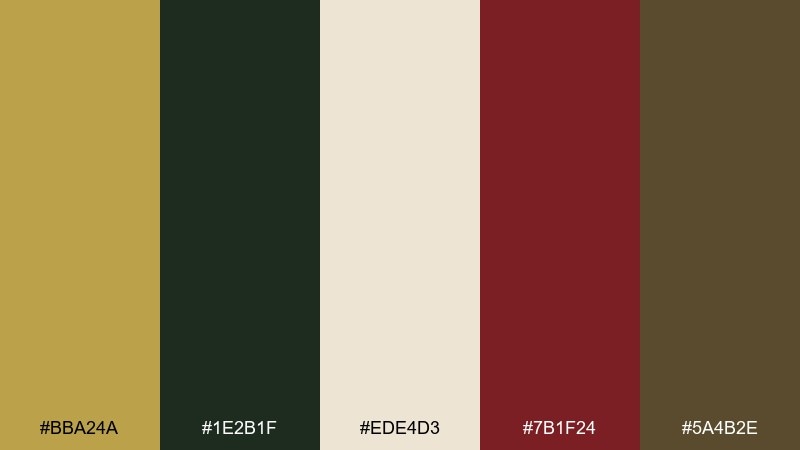
HEX: #BBA24A #1E2B1F #EDE4D3 #7B1F24 #5A4B2E
Mood: festive, classic, cozy
Best for: holiday gift tag set
Festive and classic, it feels like ribbon on evergreen with a warm glow. It is great for holiday gift tags, seasonal packaging, and winter event collateral that should feel traditional, not flashy. Use the cream as your main tag base, set type in the deep green, and add burgundy as a small accent for icons or borders. Tip: keep the gold to thin rules or a monogram stamp so it looks like real foil.
Image example of holiday brass ribbon generated using media.io
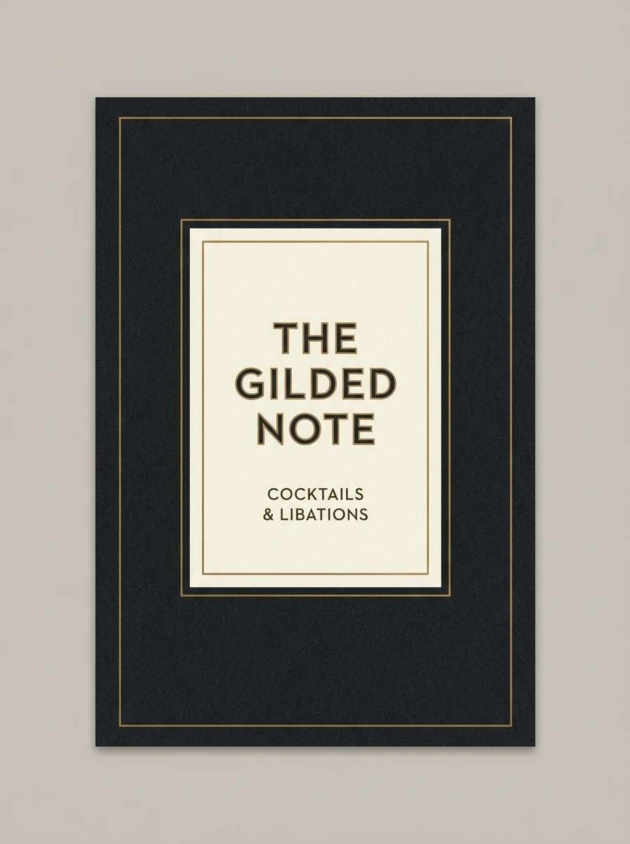
19) Film Noir Lounge
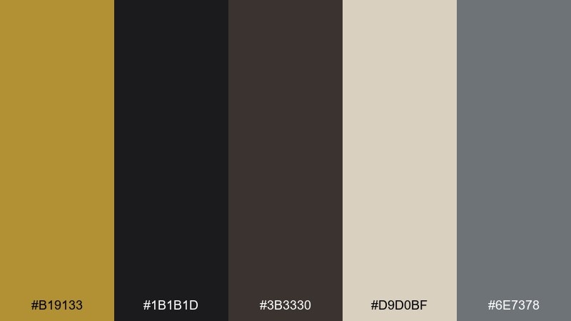
HEX: #B19133 #1B1B1D #3B3330 #D9D0BF #6E7378
Mood: noir, sophisticated, intimate
Best for: cocktail bar brand identity
Noir and intimate, it evokes dim rooms, smoky shadows, and a warm metallic glint. These brass color combinations suit cocktail bar identities, drink menus, and loyalty cards that should feel exclusive. Use the near-black and dark brown as the foundation, then introduce the cream for readable blocks and the gold for highlights like section headers. Tip: add a single muted gray element for balance, but avoid turning it into a cold palette.
Image example of film noir lounge generated using media.io
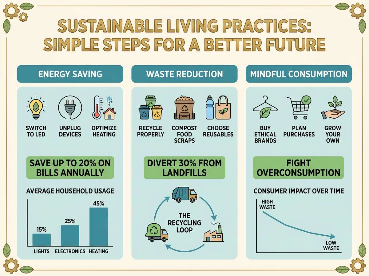
20) Kids Science Infographic
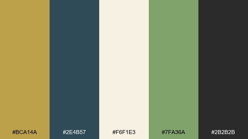
HEX: #BCA14A #2E4B57 #F6F1E3 #7FA36A #2B2B2B
Mood: curious, friendly, educational
Best for: classroom infographic
Curious and friendly, it feels like a classroom poster that is polished but not dull. Use it for infographics, worksheets, and simple slide decks that need approachable contrast. Let the cream be the main background, keep body text in charcoal, and use teal and green to separate sections. Tip: use the golden hue for headings and icons so the content feels guided and easy to scan.
Image example of kids science infographic generated using media.io
What Colors Go Well with Brass?
Brass pairs best with deep, quiet anchors like charcoal, near-black, espresso brown, and inky navy. These darker tones make brass accents feel intentional and premium, especially for typography and UI frames.
For lighter layouts, use warm neutrals like ivory, cream, parchment, and sand to keep brass soft and airy. If you want a modern edge, introduce cool grays sparingly to balance the warmth.
For bolder contrast, brass also plays well with muted greens (olive, forest) and rich reds (burgundy, oxblood). These pairings keep the “metal” vibe while adding personality.
How to Use a Brass Color Palette in Real Designs
Use brass like a highlight, not a background—think buttons, icons, borders, dividers, seals, or a single headline element. In print, brass works especially well as “foil-like” details against textured paper colors.
In UI, keep your base neutral (dark mode or cream surfaces), then choose one brass shade for consistent states such as active tabs, focus rings, and primary CTAs. This prevents the interface from looking busy or inconsistent.
If you’re building a brand system, define brass as an accent with clear rules: where it can appear, how large it can be, and which neutrals it must sit on. That’s how brass stays elegant instead of flashy.
Create Brass Palette Visuals with AI
If you want to preview how a brass palette looks on a poster, label, UI screen, or invitation, AI mockups are a fast way to explore options before committing to production.
With Media.io’s text-to-image tool, you can paste a prompt, describe the design style, and iterate quickly—perfect for testing multiple brass accents, paper tones, and lighting moods.
Start with one of the prompts above, then swap the subject (menu, dashboard, packaging) to match your project.
Brass Color Palette FAQs
-
What hex color is “brass”?
There isn’t one universal brass HEX, but common digital brass tones sit around warm golden-browns like #B08D32, #BCA44E, or #B89A3D depending on how bright or muted you want it. -
Is brass more like gold or bronze?
Brass typically sits between gold and bronze: warmer and less yellow than bright gold, but lighter and more golden than most bronzes. In palettes, it often reads as a “soft premium” accent. -
What background colors make brass look best?
Brass pops on dark anchors like near-black, charcoal, espresso, and navy, and it looks refined on warm neutrals like cream, parchment, and sand. Avoid overly saturated backgrounds that compete with the metallic feel. -
Can I use brass colors in modern UI design?
Yes—brass works well as an accent for CTAs, active states, and small UI details when paired with clean neutrals (dark grays, creams, cool grays). Keep contrast high for accessibility and consistency. -
How do I keep a brass palette from looking “too vintage”?
Use crisp typography, add cool grays, and keep layouts minimal with plenty of whitespace. Reserve brass for a single accent role rather than using multiple gold-like shades everywhere. -
Does brass print well?
Flat brass inks can print beautifully as warm golden-browns, especially on uncoated or textured stock. If you need true metallic shine, consider foil stamping or metallic inks while keeping the rest of the palette matte. -
What’s a good complementary accent to brass besides black?
Muted greens (olive, forest), deep teal, and burgundy are excellent accents with brass because they maintain a rich, premium feel while adding color contrast without becoming neon or harsh.
Next: Aquarium Color Palette


