

A pastel blue green palette sits right between cool calm and gentle freshness, making it a go-to for modern brands, clean UIs, and airy print layouts.
Below are 20 curated pastel blue green color combinations with HEX codes, plus quick tips to help you keep contrast readable and your designs feeling light—not washed out.
In this article
Why Pastel Blue Green Palettes Work So Well
Pastel blue green colors feel instantly calming because they borrow from nature: clean water, soft sky, and gentle greenery. That association makes them ideal when you want a design to feel safe, approachable, and low-friction.
They also “behave” well across digital and print. These hues can brighten layouts without the harshness of saturated cyan or neon mint, so your UI and typography can stay comfortable to read for longer sessions.
Finally, pastel blue green palettes are naturally versatile: they can skew coastal, clinical, botanical, or playful depending on what neutral and accent you pair them with (warm ivory, slate, navy, sand, or a peach-tint background).
20+ Pastel Blue Green Color Palette Ideas (with HEX Codes)
1) Sea Glass Morning
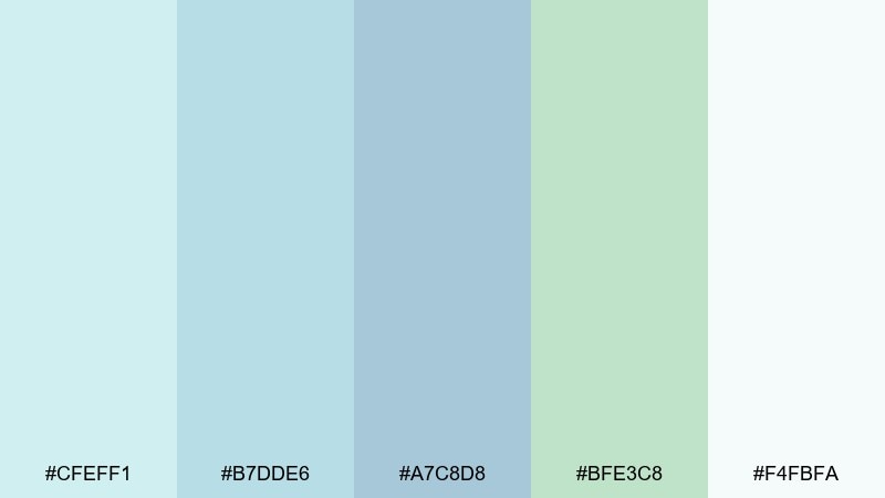
HEX: #cfeff1 #b7dde6 #a7c8d8 #bfe3c8 #f4fbfa
Mood: airy, spa-like, refreshing
Best for: wellness branding and landing pages
Airy and spa-like, it feels like sea glass catching early light. This pastel blue green color palette works beautifully for wellness brands, yoga studios, and calm landing pages where trust matters. Pair it with warm sand neutrals or soft charcoal type to keep contrast readable. Tip: use the deepest blue as your primary text or button color for accessibility.
Image example of sea glass morning generated using media.io
Media.io is an online AI studio for creating and editing video, image, and audio in your browser.

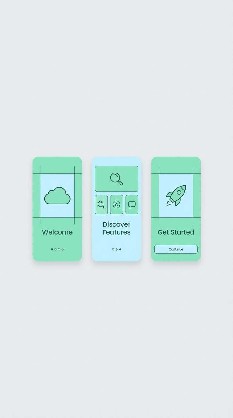
2) Minty Cloud
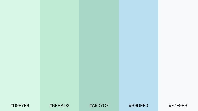
HEX: #d9f7e6 #bfead3 #a9d7c7 #b9dff0 #f7f9fb
Mood: soft, friendly, weightless
Best for: mobile app UI and onboarding
Soft and weightless, it reads like mint foam drifting under a pale sky. These tones are ideal for onboarding screens, habit trackers, and any UI that should feel kind and low-pressure. Ground the pastels with a cool gray nav bar and keep icons simple to avoid visual noise. Tip: reserve the lightest shade for backgrounds and use the mid mint for active states.
Image example of minty cloud generated using media.io
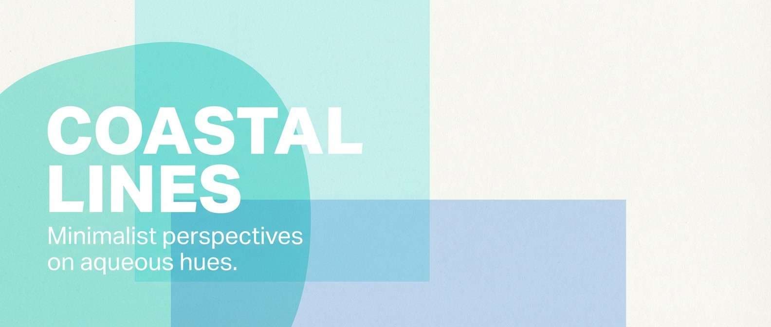
3) Lagoon Whisper
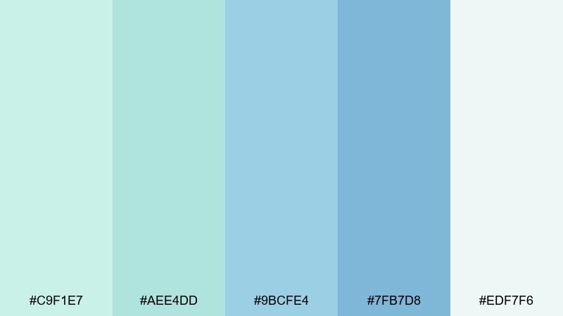
HEX: #c9f1e7 #aee4dd #9bcfe4 #7fb7d8 #edf7f6
Mood: tranquil, coastal, clean
Best for: travel blog headers and editorial banners
Tranquil and coastal, it brings to mind shallow lagoons and breezy boardwalks. Use it for travel editorials, blog headers, or resort-style promotions where you want a clean, open feel. Pair with crisp white margins and a single dark teal for headlines to keep hierarchy strong. Tip: let the deeper blue lead the gradient so images and text remain legible.
Image example of lagoon whisper generated using media.io
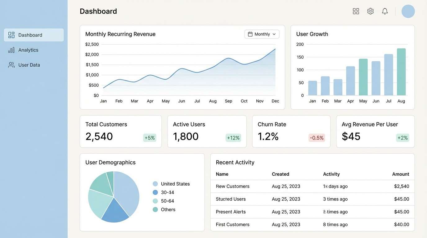
4) Powder Tide
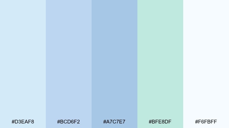
HEX: #d3eaf8 #bcd6f2 #a7c7e7 #bfe8df #f6fbff
Mood: polished, calm, modern
Best for: SaaS dashboards and analytics UI
Polished and calm, it feels like a cool breeze over a glassy shoreline. It suits SaaS dashboards, analytics cards, and settings pages where clarity beats flash. Pair with deep navy text and subtle 1px borders to define panels without harsh contrast. Tip: use the green tint for success states and the mid blue for primary actions to keep meanings consistent.
Image example of powder tide generated using media.io
5) Spring Aquarium
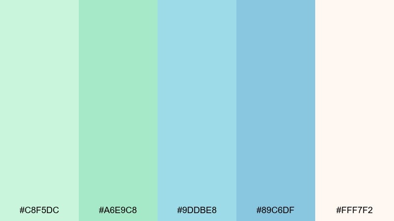
HEX: #c8f5dc #a6e9c8 #9ddbe8 #89c6df #fff7f2
Mood: playful, fresh, upbeat
Best for: kids learning posters and classroom printables
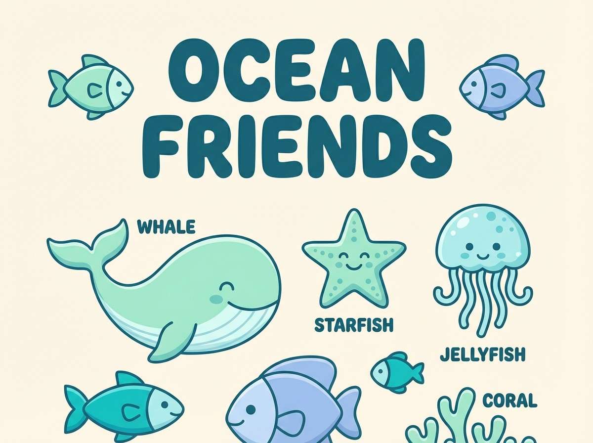
Playful and fresh, it looks like bubbles rising through a bright aquarium. These pastel blue green color combinations are perfect for kids learning posters, flashcards, and classroom printables that should feel upbeat but not loud. Pair with rounded sans fonts and plenty of breathing room so the colors stay gentle. Tip: keep the peachy off-white as the base to prevent the greens from overpowering smaller text.
Image example of spring aquarium generated using media.io
6) Eucalyptus Mist
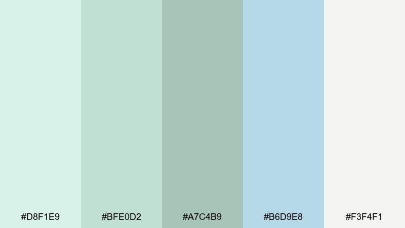
HEX: #d8f1e9 #bfe0d2 #a7c4b9 #b6d9e8 #f3f4f1
Mood: grounded, natural, soothing
Best for: skincare packaging and product ads
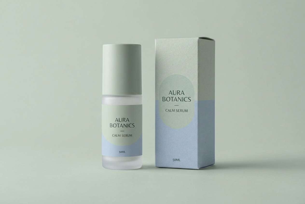
Grounded and natural, it evokes eucalyptus leaves in morning fog. It works especially well for skincare packaging, apothecary labels, and clean product ads that lean botanical. Pair with matte textures, minimal line art, and a darker green for ingredient lists. Tip: use the sage tone for secondary panels and keep the brightest tint for highlights on the bottle.
Image example of eucalyptus mist generated using media.io
7) Icy Matcha
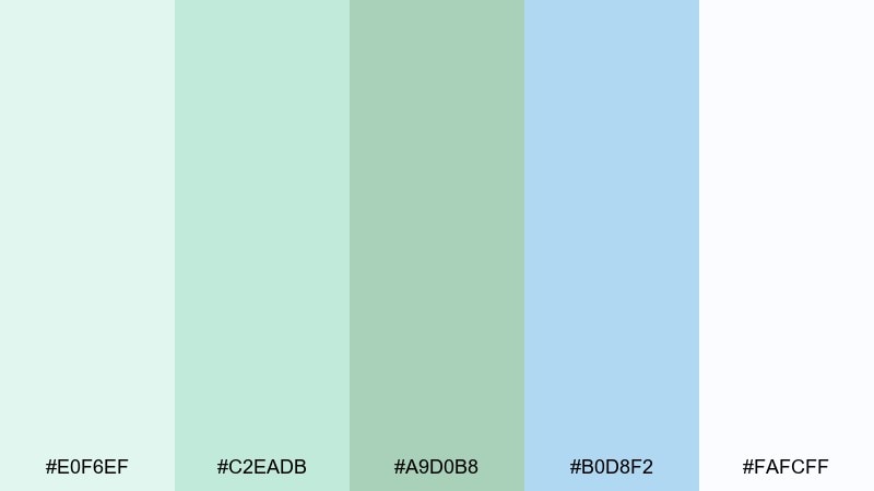
HEX: #e0f6ef #c2eadb #a9d0b8 #b0d8f2 #fafcff
Mood: clean, minimal, energizing
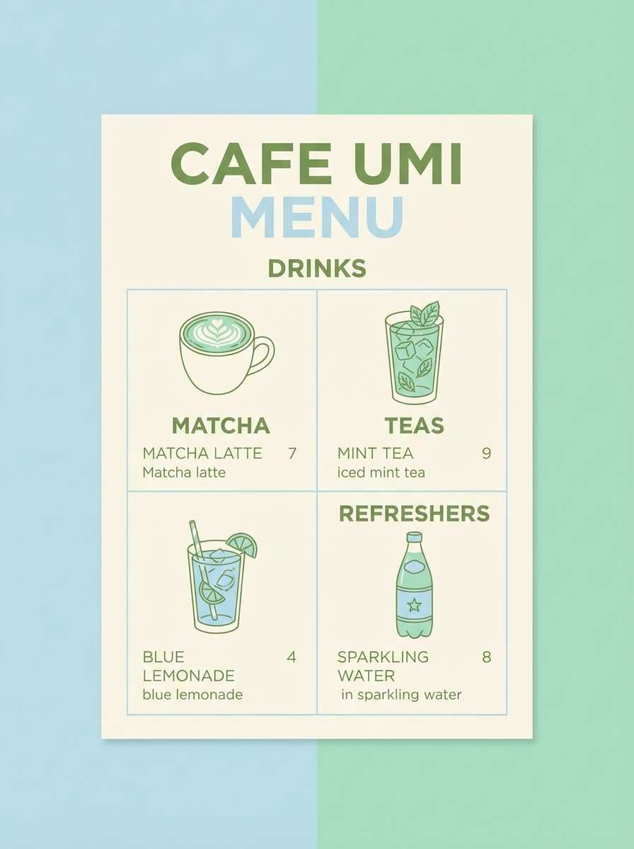
Best for: cafe menus and beverage promos
Clean and energizing, it suggests iced matcha beside a cool window. Use it for cafe menus, beverage promos, and loyalty cards where you want freshness without neon. Pair with warm cream paper stock or subtle grain to add depth to the pastels. Tip: set the menu body text in a deep gray and use the sky tint only for section headers.
Image example of icy matcha generated using media.io
8) Coastal Nursery
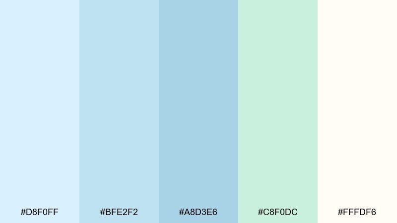
HEX: #d8f0ff #bfe2f2 #a8d3e6 #c8f0dc #fffdf6
Mood: gentle, cozy, reassuring
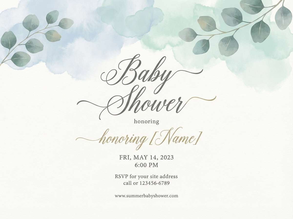
Best for: baby shower invitations and nursery decor
Gentle and cozy, it feels like a quiet nursery with sunlit curtains. For baby shower stationery or nursery wall art, this pastel blue green color palette keeps things sweet without becoming overly sugary. Pair with soft illustrations and a warm ivory base so the blues stay cuddly rather than cold. Tip: use the mint accent sparingly on borders and icons to keep the invitation elegant.
Image example of coastal nursery generated using media.io
9) Bubble Tea Aqua
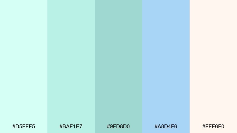
HEX: #d5fff5 #baf1e7 #9fd8d0 #a8d4f6 #fff6f0
Mood: cute, lighthearted, modern
Best for: social media templates and creator banners
Cute and lighthearted, it looks like fizzy bubbles and glossy ice. It fits social templates, creator banners, and highlight covers that need to feel modern and approachable. Pair with bold, rounded type and one dark anchor color for handles and timestamps. Tip: keep backgrounds mostly off-white and use the aqua shades as sticker-like accents.
Image example of bubble tea aqua generated using media.io

10) Botanical Breeze
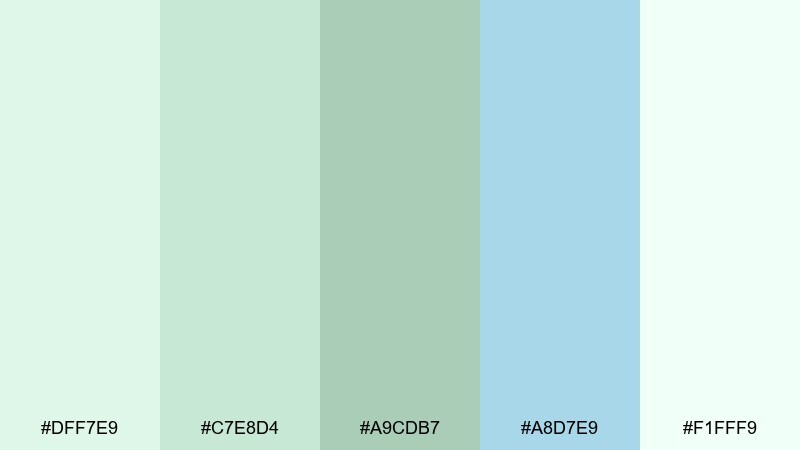
HEX: #dff7e9 #c7e8d4 #a9cdb7 #a8d7e9 #f1fff9
Mood: fresh, leafy, serene
Best for: watercolor botanical prints and stationery
Fresh and leafy, it brings up watercolor herbs swaying in a gentle breeze. Use it for botanical prints, journal covers, and nature-forward stationery where softness matters. Pair with fine line drawings and textured paper to make the palette feel handcrafted. Tip: let the pale mint lead, then add the blue tint as a shadow or background wash.
Image example of botanical breeze generated using media.io
11) Arctic Fern
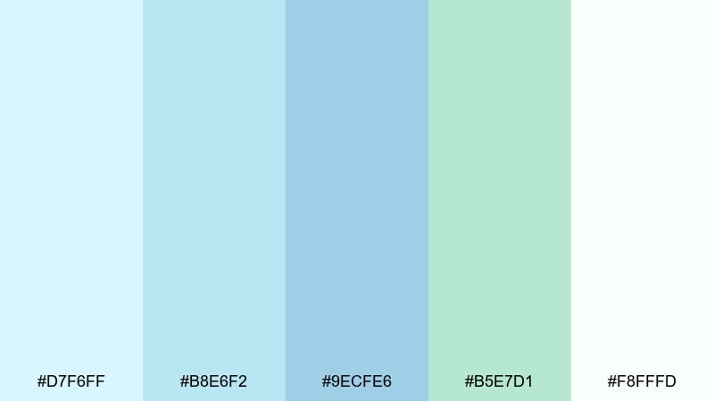
HEX: #d7f6ff #b8e6f2 #9ecfe6 #b5e7d1 #f8fffd
Mood: crisp, airy, tech-forward
Best for: health tech UI and data cards
Crisp and airy, it feels like fern fronds under bright winter light. It shines in health tech UI, data cards, and appointment flows where you want a clean clinical vibe without harsh whites. Pair with thin dividers and a dark slate for labels to keep information scannable. Tip: use the fern tint for progress indicators and reserve the blues for navigation.
Image example of arctic fern generated using media.io
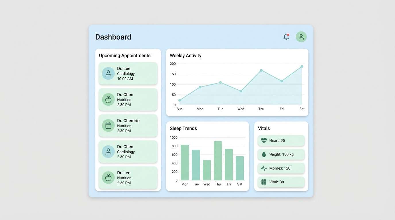
12) Soft Harbor
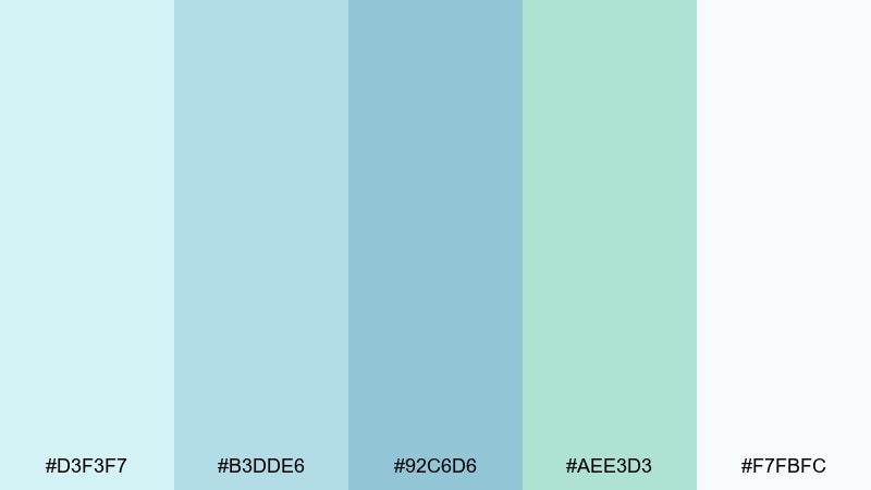
HEX: #d3f3f7 #b3dde6 #92c6d6 #aee3d3 #f7fbfc
Mood: quiet, dependable, breezy
Best for: corporate reports and pitch decks
Quiet and dependable, it resembles a harbor wrapped in morning haze. Use it in corporate decks, annual reports, and investor one-pagers when you want friendly professionalism. Pair with crisp grids and one strong accent color for callouts so slides do not look washed out. Tip: keep charts mostly in the mid blue, and use the green only to highlight wins.
Image example of soft harbor generated using media.io
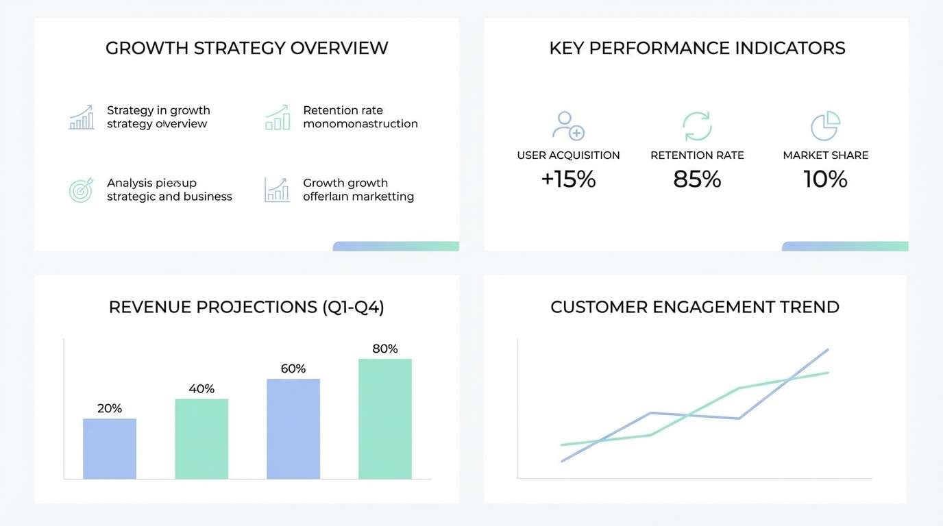
13) Rainwashed Patio
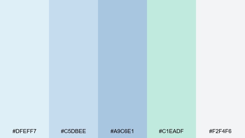
HEX: #dfeff7 #c5dbee #a9c6e1 #c1eadf #f2f4f6
Mood: peaceful, rainy-day, elegant
Best for: interior design blogs and moodboards
Peaceful and elegant, it feels like a patio after a light rain. It is a natural fit for interior design blogs, moodboards, and home styling guides that lean airy and modern. Pair with stone textures, light wood photography, and a deep blue-gray for headings. Tip: use the mint shade as a small accent on buttons or pull quotes to keep it refined.
Image example of rainwashed patio generated using media.io
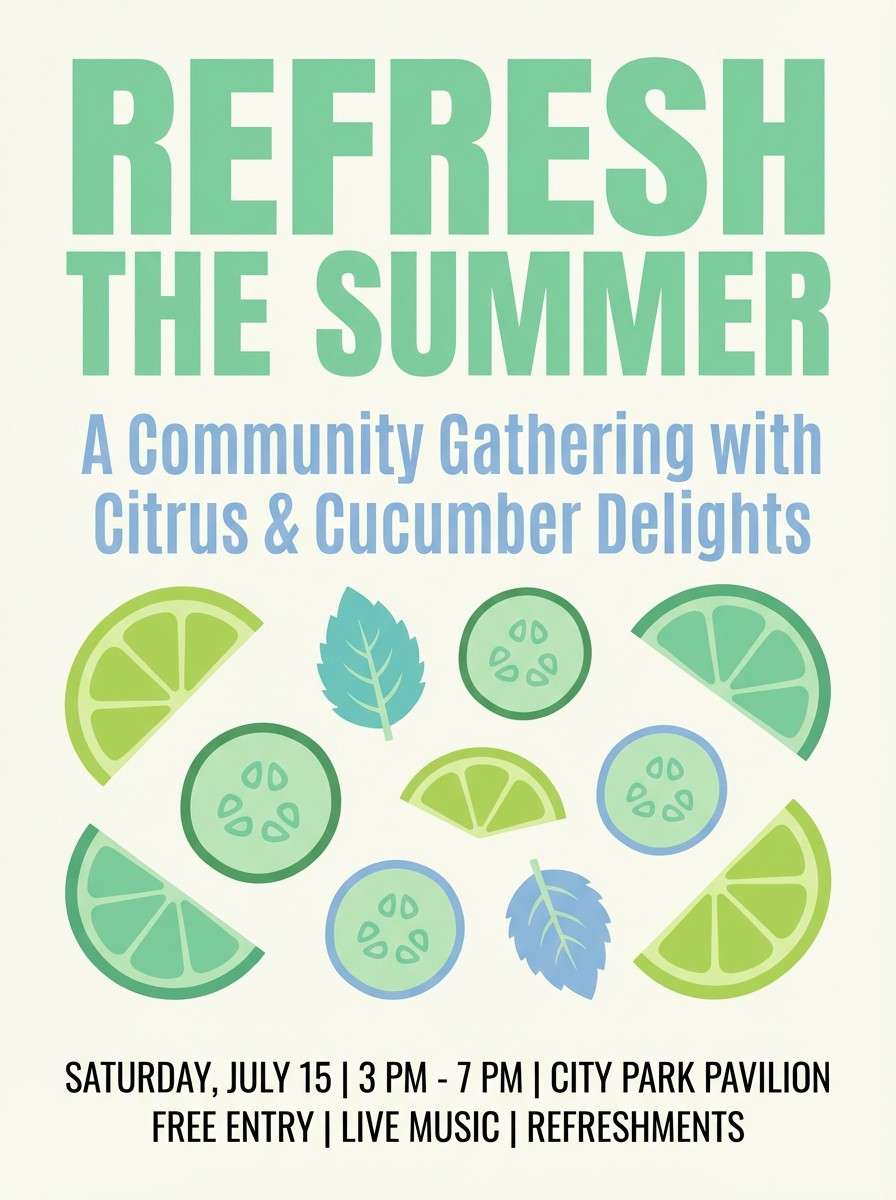
14) Cucumber Sorbet
HEX: #d6f8d8 #bfecc2 #a8d9b0 #b6e3f5 #fff9f5
Mood: zesty, clean, summery
Best for: summer event flyers and drink specials
Zesty and summery, it tastes like cucumber sorbet on a warm afternoon. These pastel blue green color combinations look great on event flyers, drink specials, and seasonal promos that need freshness without glare. Pair with bold sans-serif headlines and plenty of negative space to keep the layout crisp. Tip: let the mint drive the hero blocks and use the blue as a cooling counterbalance.
Image example of cucumber sorbet generated using media.io
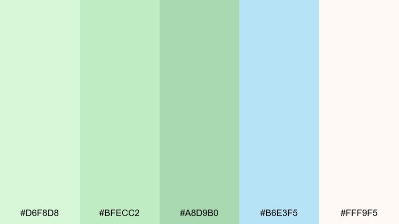
15) Skyline Succulent
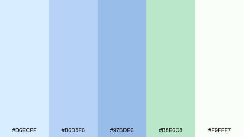
HEX: #d6ecff #b6d5f6 #97bde6 #b8e6c8 #f9fff7
Mood: optimistic, airy, contemporary
Best for: startup branding and icon sets
Optimistic and contemporary, it feels like a city skyline softened by spring air. It works well for startup branding, icon sets, and lightweight identity systems that need to look modern but approachable. Pair with geometric shapes and a strong dark blue for wordmarks to keep things sharp. Tip: keep the green as an accent color for badges or highlights rather than the primary base.
Image example of skyline succulent generated using media.io
16) Aloe Cotton
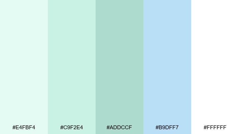
HEX: #e4fbf4 #c9f2e4 #addccf #b9dff7 #ffffff
Mood: ultra-soft, clean, minimal
Best for: ecommerce product pages
Ultra-soft and minimal, it resembles aloe gel on crisp cotton. Use it for ecommerce product pages where you want the photography to shine while the interface stays gentle. Pair with subtle shadows and a darker teal for pricing and CTA buttons to keep contrast strong. Tip: keep backgrounds nearly white and introduce mint only in UI states like hover or selected.
Image example of aloe cotton generated using media.io
17) Pebble Creek
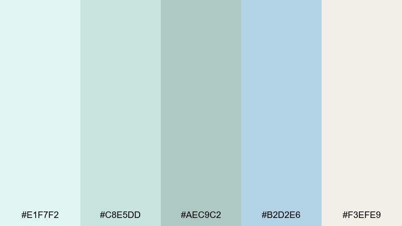
HEX: #e1f7f2 #c8e5dd #aec9c2 #b2d2e6 #f3efe9
Mood: earthy, calm, balanced
Best for: outdoor brands and eco labels
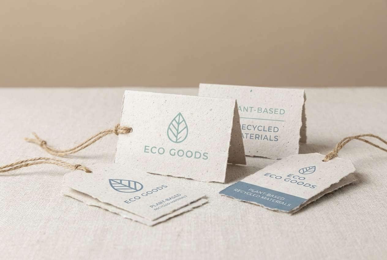
Earthy and balanced, it brings to mind creek stones under clear water. It suits eco labels, outdoor brands, and sustainability messaging that wants calm confidence rather than bright green clichés. Pair with recycled-paper textures and a deep forest tone for small-print details. Tip: use the warm pebble neutral as a background to keep the cool tones from feeling sterile.
Image example of pebble creek generated using media.io
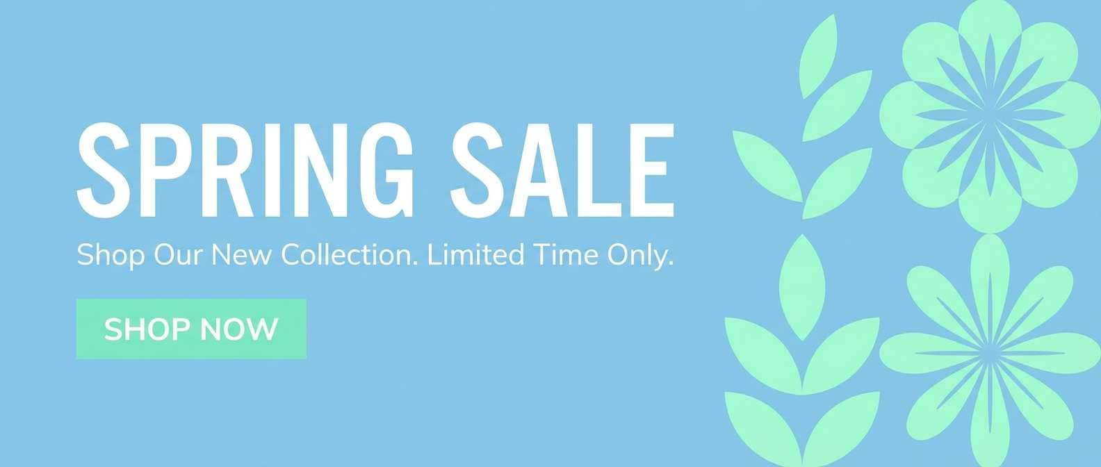
18) Robin Mint
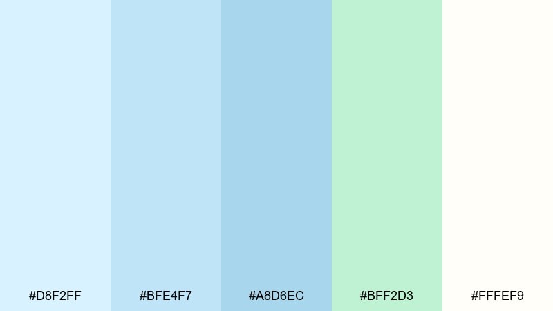
HEX: #d8f2ff #bfe4f7 #a8d6ec #bff2d3 #fffef9
Mood: bright, cheerful, soft
Best for: spring sale banners and email headers
Bright and cheerful, it feels like robin eggs and new leaves. It is great for spring sale banners, email headers, and lightweight promo graphics where you want energy without loud saturation. Pair with a single dark accent for pricing and keep background areas creamy to avoid a cold look. Tip: use the blue family for large blocks and the mint only for small callouts.
Image example of robin mint generated using media.io
19) Calm Carousel
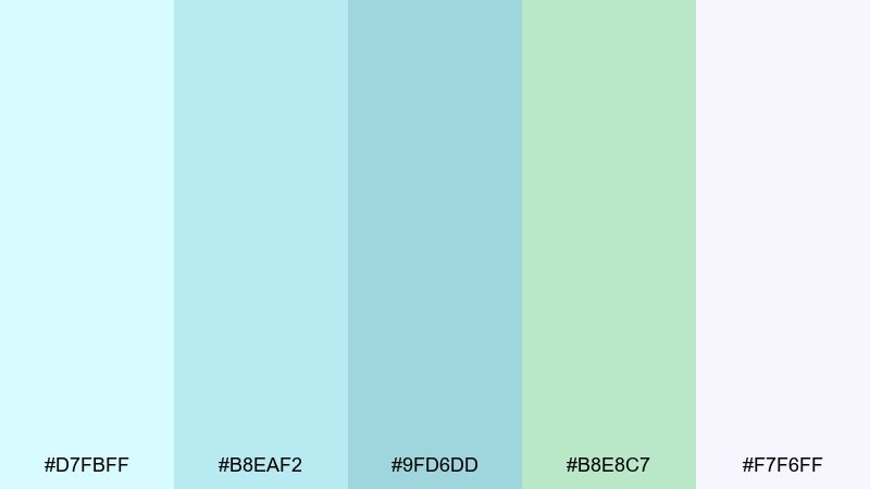
HEX: #d7fbff #b8eaf2 #9fd6dd #b8e8c7 #f7f6ff
Mood: dreamy, gentle, whimsical
Best for: wedding stationery and save the dates
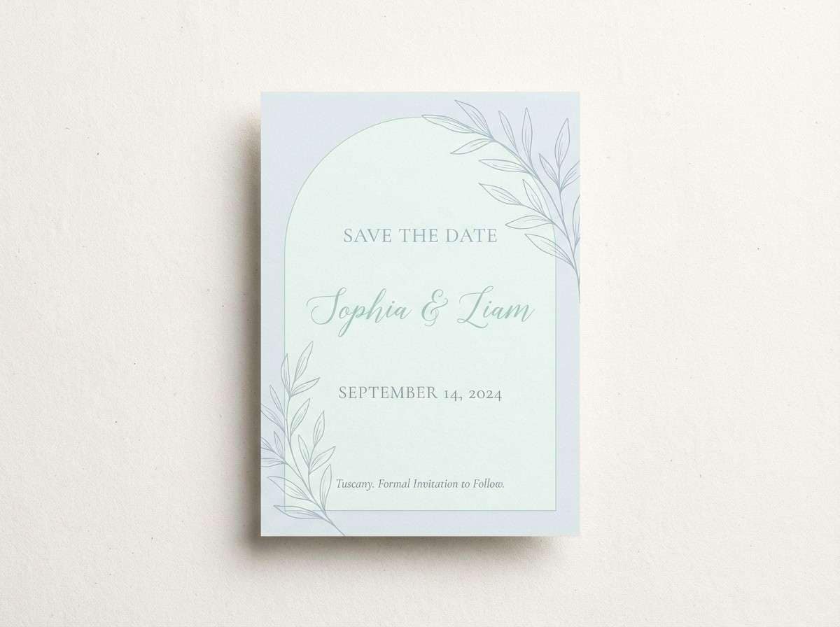
Dreamy and whimsical, it suggests a soft carousel glow at dusk. Use it for wedding stationery, save the dates, and RSVP pages where you want romance without heavy blush tones. Pair with delicate serif fonts and thin line borders for a refined finish. Tip: keep the mint as a small motif color and let the blues carry the background washes.
Image example of calm carousel generated using media.io
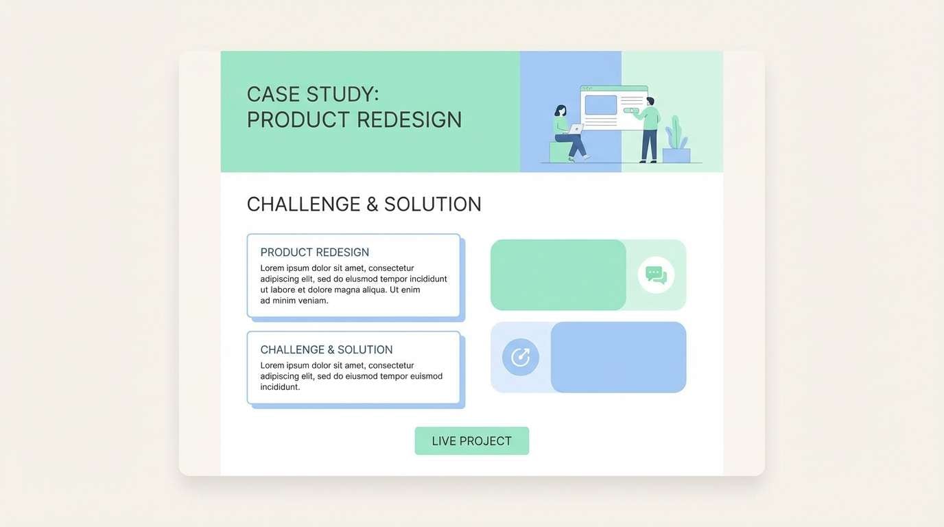
20) Dewy Studio
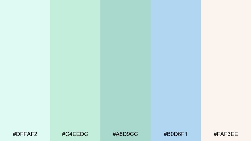
HEX: #dffaf2 #c4eedc #a8d9cc #b0d6f1 #faf3ee
Mood: fresh, creative, understated
Best for: portfolio sites and case study pages
Fresh and understated, it feels like a dewy studio desk in early daylight. It works well for portfolio sites and case studies where you want the work to be the loudest element. Pair with warm off-white sections and a single deep accent for links to avoid a pastel washout. Tip: use the mid teal for section dividers and keep headers in a darker neutral for clarity.
Image example of dewy studio generated using media.io
What Colors Go Well with Pastel Blue Green?
Pastel blue green pairs beautifully with warm, light neutrals like ivory, cream, and sand. These keep the palette from feeling too cold and help your layout feel more welcoming—especially in print or lifestyle branding.
For structure and readability, add a dark anchor such as slate, charcoal, deep teal, or navy. This gives you strong type contrast and clear UI hierarchy while letting the pastels stay soft in the background.
If you want a modern pop, try gentle accents like blush-peach, soft coral, or muted lavender. Use them sparingly (badges, highlights, small illustrations) so the design stays calm rather than candy-colored.
How to Use a Pastel Blue Green Color Palette in Real Designs
Start by assigning roles: one near-white tint for backgrounds, one mid-tone for surfaces/cards, and one deeper blue-green for CTAs or headings. Pastels look best when they are organized, not sprinkled randomly.
Keep contrast in mind for accessibility. Pastel buttons often need a darker label color (or a darker button shade) plus clear hover/focus states so interactions are obvious.
In print, use texture to add depth—matte stock, subtle grain, or light watercolor washes. In UI, use thin borders and soft shadows to separate sections without introducing harsh black lines.
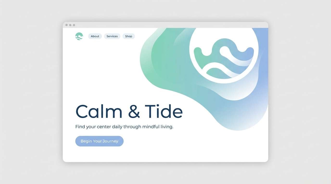
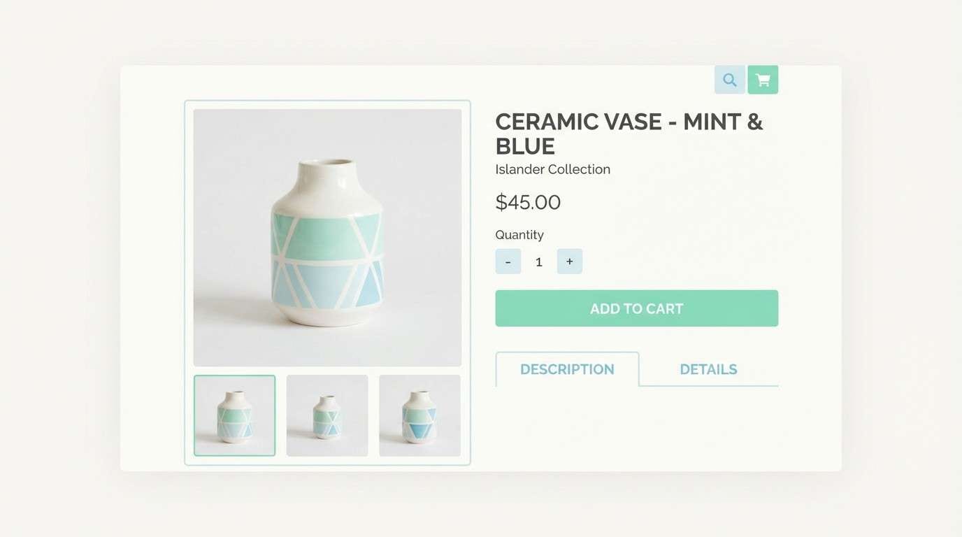
Create Pastel Blue Green Palette Visuals with AI
Want mockups that match your pastel blue green scheme instantly? With Media.io’s text-to-image generator, you can create landing page heroes, UI screens, packaging concepts, and social templates in the same calm color direction.
Use prompts that mention the mood (airy, spa-like, coastal, botanical) and specify your layout type (dashboard, poster, invitation). Then iterate by adjusting lighting, textures, and the balance between mint and blue.
Once you find a look you like, keep the prompt as a reusable template for consistent visuals across campaigns and pages.
Pastel Blue Green Color Palette FAQs
-
What is a pastel blue green color palette?
A pastel blue green palette is a set of light, low-saturation hues that sit between blue and green (often mint, seafoam, soft teal, and powder blue). It’s commonly used to create calm, clean, and airy visual styles. -
What colors pair best with pastel blue green?
Warm neutrals (ivory, cream, sand), cool neutrals (light gray), and dark anchors (navy, slate, charcoal) pair especially well. For small accents, muted coral or blush can add warmth without overpowering the pastels. -
Is pastel blue green good for UI design?
Yes—pastel blue green works well for onboarding, dashboards, and health/wellness apps because it feels friendly and low-stress. Just ensure accessibility by using darker text/CTA colors and clearly defined hover/focus states. -
How do I keep pastel palettes from looking washed out?
Use one deeper anchor color for headings and buttons, and add subtle structure with borders, shadows, or spacing. Also limit the number of pastel areas competing on the same screen—let one tint dominate and others support. -
What’s a good background color for pastel blue green schemes?
Near-white tints (off-white, ivory, pearl-like whites) are the safest backgrounds. They preserve the soft feel while improving readability and making pastel components look intentional rather than faded. -
Can I use pastel blue green for branding?
Absolutely. It’s popular for skincare, wellness, eco brands, and modern startups because it communicates trust and freshness. Pair it with a distinctive typography system and one signature dark color to maintain brand recognition. -
How can I generate pastel blue green visuals quickly?
Use an AI image generator and describe the design format (e.g., “dashboard UI mockup” or “packaging label”), the mood (calm, coastal, botanical), and the dominant colors (mint, seafoam, powder blue). Media.io can help you iterate fast and keep visuals consistent.
Next: Pearl Color Palette


