

Pale gold is a modern neutral that brings warmth, softness, and an elevated feel—without the loud shine of bright metallics. It’s especially useful when you want designs to feel premium, calm, and inviting.
Below are 20 curated pale gold color palette ideas with HEX codes, plus practical pairing tips for branding, invitations, UI, and more.
In this article
- Why Pale Gold Palettes Work So Well
-
- champagne linen
- honeyed pearl
- antique gild
- sandstone glow
- buttercream sage
- dawn blush gold
- minimal studio gold
- coastal drift
- nordic oat
- citrus mist
- vintage bookshop
- desert adobe
- art deco night
- wedding heirloom
- soft citrus clay
- botanical herb gold
- gallery warm gray
- sunset terracotta
- luxe navy gold
- orchid dust
- What Colors Go Well with Pale Gold?
- How to Use a Pale Gold Color Palette in Real Designs
- Create Pale Gold Palette Visuals with AI
Why Pale Gold Palettes Work So Well
Pale gold sits in the “warm neutral” zone, so it pairs easily with creams, taupes, soft grays, and deep browns. That flexibility makes it ideal for cohesive systems like brand identities and UI kits.
Compared with bright gold, pale gold feels more breathable and modern. It signals quality and warmth while staying subtle enough for backgrounds, borders, and small highlights.
It also plays well with contrast. Add charcoal, navy, deep green, or plum and pale gold instantly looks more intentional—especially for typography, buttons, and hierarchy in layouts.
20+ Pale Gold Color Palette Ideas (with HEX Codes)
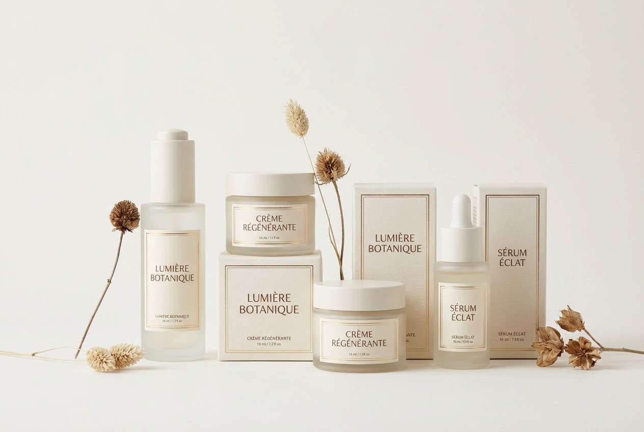
1) Champagne Linen
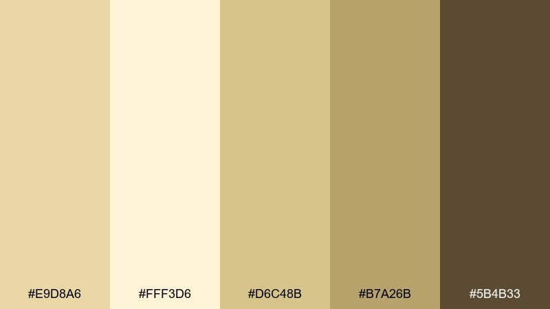
HEX: #E9D8A6 #FFF3D6 #D6C48B #B7A26B #5B4B33
Mood: airy, refined, welcoming
Best for: luxury skincare packaging
Airy champagne warmth feels like morning light on linen and brushed brass. Use it for premium packaging where you want softness without losing sophistication. Pair the pale gold with creamy highlights and a deep cocoa type color for contrast. Tip: keep the darkest tone for small text and seals so the label stays readable.
Image example of champagne linen generated using media.io
Media.io is an online AI studio for creating and editing video, image, and audio in your browser.

2) Honeyed Pearl
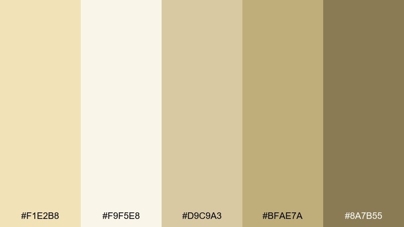
HEX: #F1E2B8 #F9F5E8 #D9C9A3 #BFAE7A #8A7B55
Mood: gentle, polished, calm
Best for: brand identity for wellness studios
Gentle pearly tones read clean and reassuring, like a quiet boutique with warm lighting. The creamy white and muted gold create a polished foundation for wellness branding and signage. Add the deeper olive-taupe for headlines to keep everything grounded. Tip: use the palest shade as negative space so the gold never feels heavy.
Image example of honeyed pearl generated using media.io
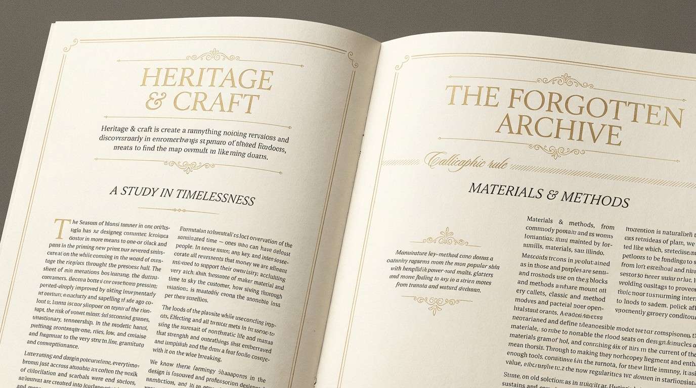
3) Antique Gild
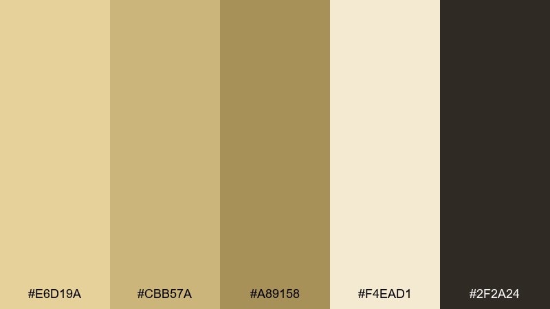
HEX: #E6D19A #CBB57A #A89158 #F4EAD1 #2F2A24
Mood: heritage, elegant, museum-like
Best for: editorial magazine spread
Heritage golds and inky shadows evoke antique frames, archival paper, and old-world glamour. This pale gold color palette shines in editorial layouts where you want a classic, collected feel. Pair it with warm paper tones and a near-black for crisp typography and grid structure. Tip: reserve the mid gold for pull quotes or section dividers to keep hierarchy clear.
Image example of antique gild generated using media.io
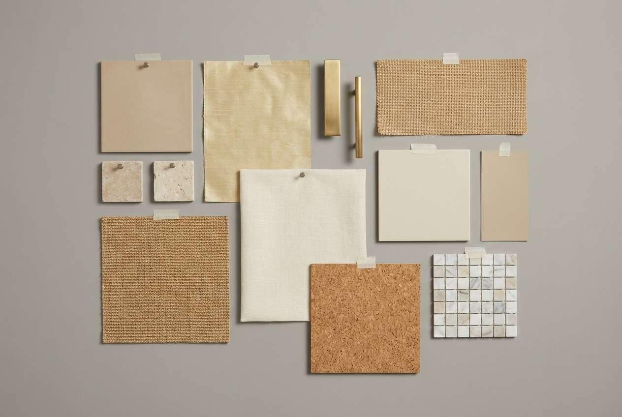
4) Sandstone Glow
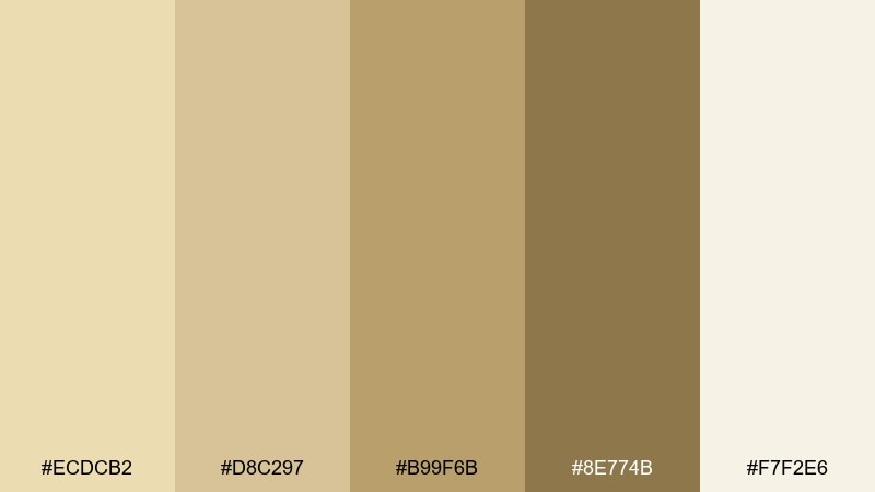
HEX: #ECDCB2 #D8C297 #B99F6B #8E774B #F7F2E6
Mood: sunbaked, natural, grounded
Best for: interior design mood board
Sunbaked neutrals feel like sandstone, clay, and sunlit plaster. These tones work beautifully for interiors, especially when you want warmth without going orange. Pair with matte black fixtures or dark walnut textures for modern contrast. Tip: repeat the light cream often to keep the palette feeling spacious.
Image example of sandstone glow generated using media.io
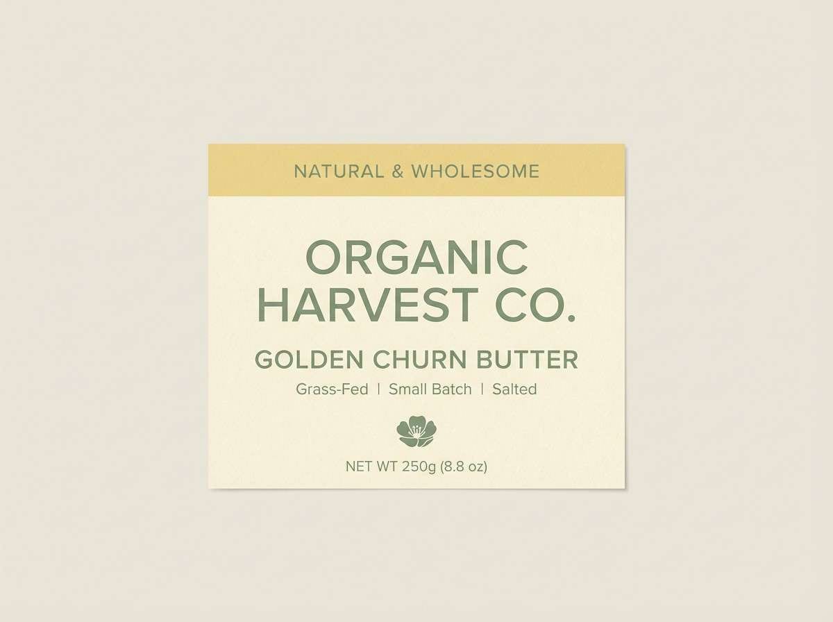
5) Buttercream Sage
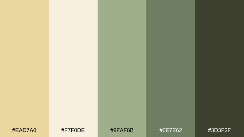
HEX: #EAD7A0 #F7F0DE #9FAF8B #6E7E62 #3D3F2F
Mood: fresh, organic, comforting
Best for: natural food label design
Comforting buttercream meets garden sage, giving a fresh-from-the-farm vibe. It suits natural food labels, cafe menus, and anything that leans organic. Pair the pale gold with soft cream for backgrounds and use deep herb green for ingredients and nutrition text. Tip: keep the sage as the dominant accent so the gold reads like warmth, not glitter.
Image example of buttercream sage generated using media.io
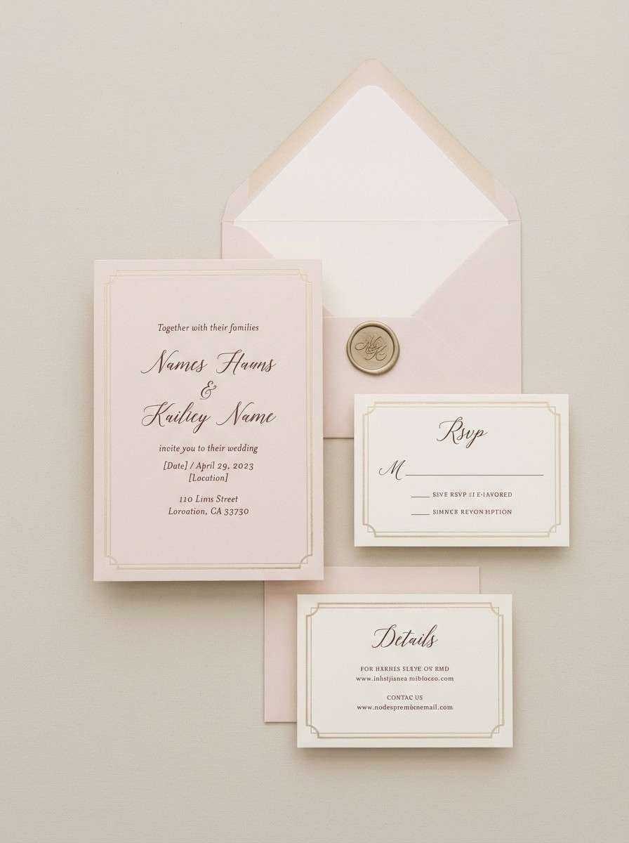
6) Dawn Blush Gold
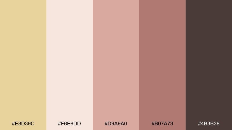
HEX: #E8D39C #F6E6DD #D9A9A0 #B07A73 #4B3B38
Mood: romantic, soft, intimate
Best for: wedding invitation suite
Romantic dawn tones feel like rose petals warmed by early sunlight. These pale gold color combinations are ideal for weddings that want elegance without harsh contrast. Pair the blush and cream with deep cocoa for names and details to maintain readability. Tip: use the gold as a thin border or monogram accent rather than a full background.
Image example of dawn blush gold generated using media.io
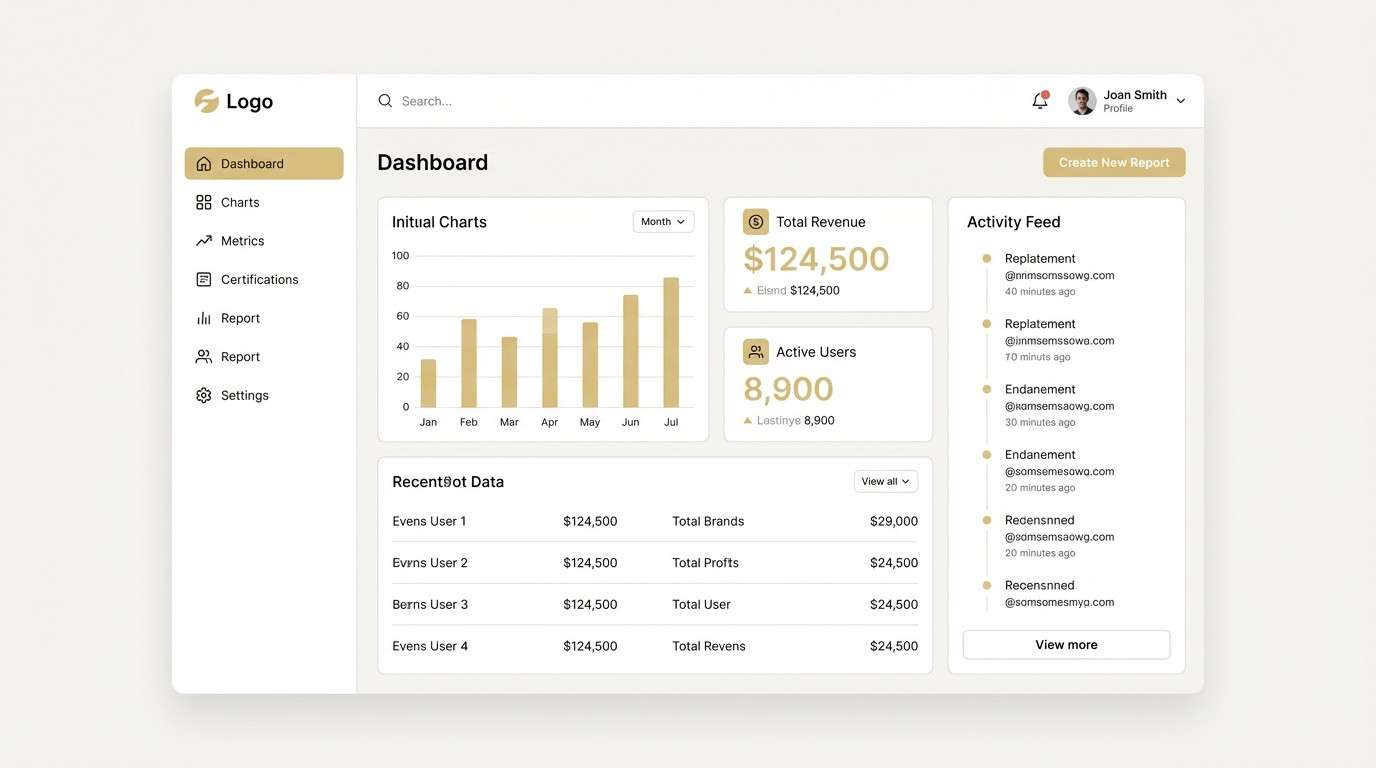
7) Minimal Studio Gold
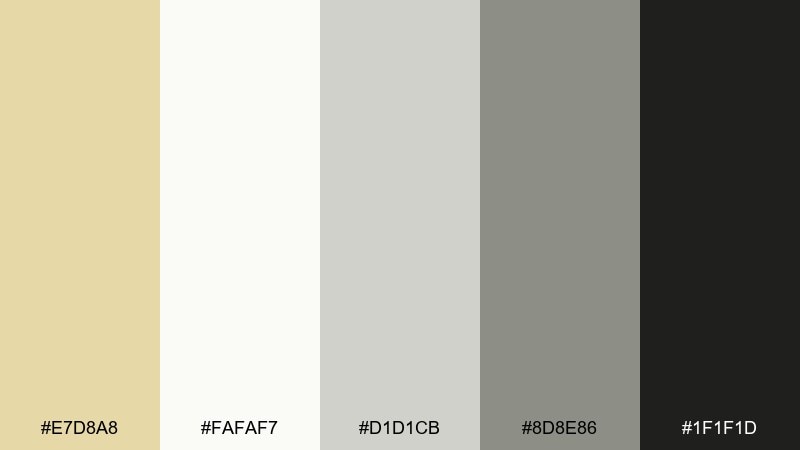
HEX: #E7D8A8 #FAFAF7 #D1D1CB #8D8E86 #1F1F1D
Mood: modern, clean, understated
Best for: 2D UI dashboard mockup
Understated studio neutrals give a clean, high-end product feel. The pale gold works best as a micro-accent for toggles, highlights, and key stats. Pair with soft grays to keep the interface calm, then add near-black for essential text. Tip: limit gold to one UI role, such as primary buttons, for consistent focus.
Image example of minimal studio gold generated using media.io
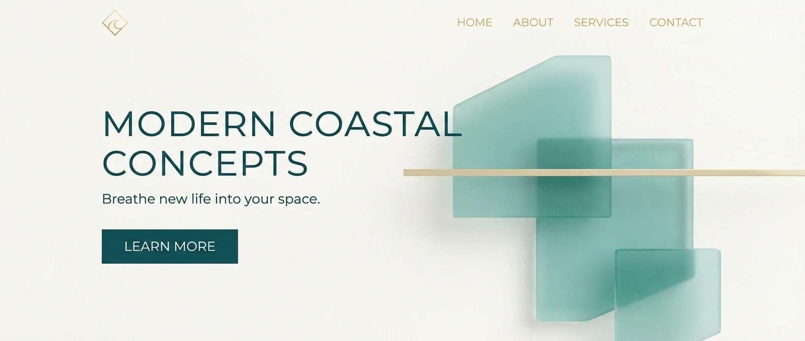
8) Coastal Drift
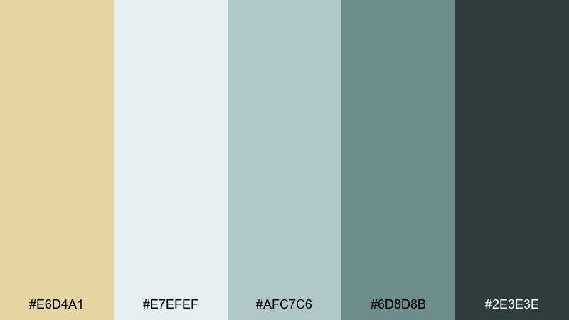
HEX: #E6D4A1 #E7EFEF #AFC7C6 #6D8D8B #2E3E3E
Mood: breezy, serene, coastal
Best for: travel landing page hero
Breezy sea-glass tones with a sunlit gold hint evoke quiet beaches and salt air. Use it for travel sites, wellness retreats, or relaxed lifestyle brands. Pair the pale gold with airy blue-grays and anchor the layout with deep teal for buttons. Tip: keep backgrounds light and let the teal carry interaction states.
Image example of coastal drift generated using media.io
9) Nordic Oat
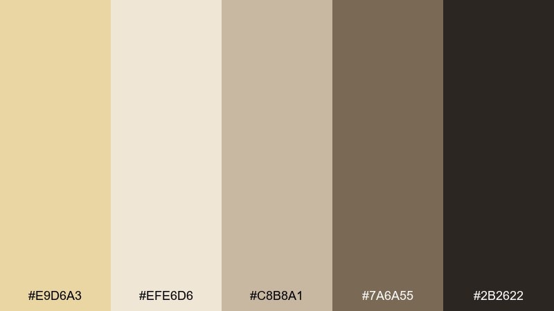
HEX: #E9D6A3 #EFE6D6 #C8B8A1 #7A6A55 #2B2622
Mood: cozy, minimal, timeless
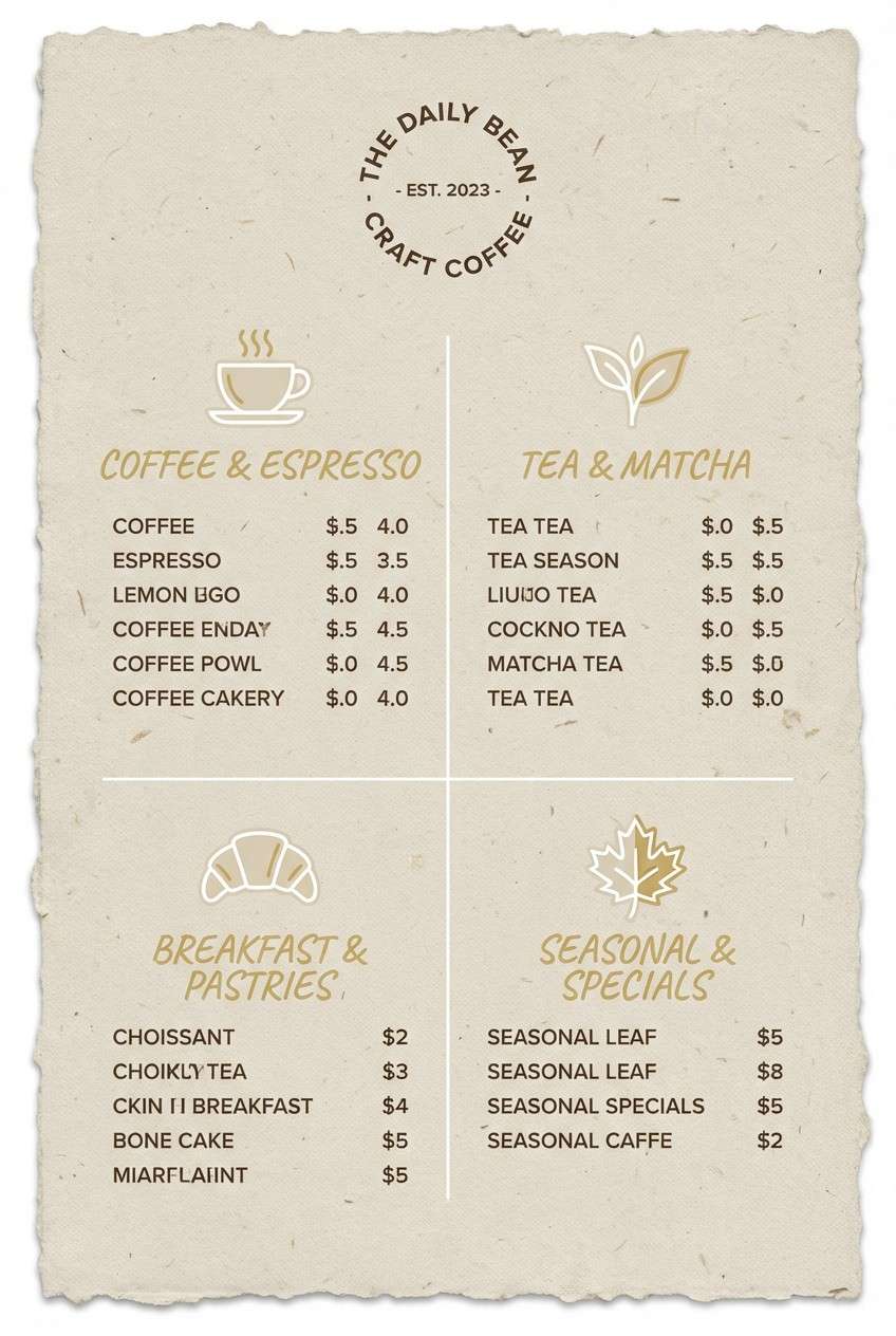
Best for: coffee shop menu design
Cozy oat and toasted wood tones feel minimal yet lived-in. This mix suits cafe menus and packaging where you want warmth that still reads modern. Pair the pale gold with oatmeal backgrounds and a deep espresso brown for type. Tip: use the mid taupe for secondary headings to create an easy reading rhythm.
Image example of nordic oat generated using media.io
10) Citrus Mist
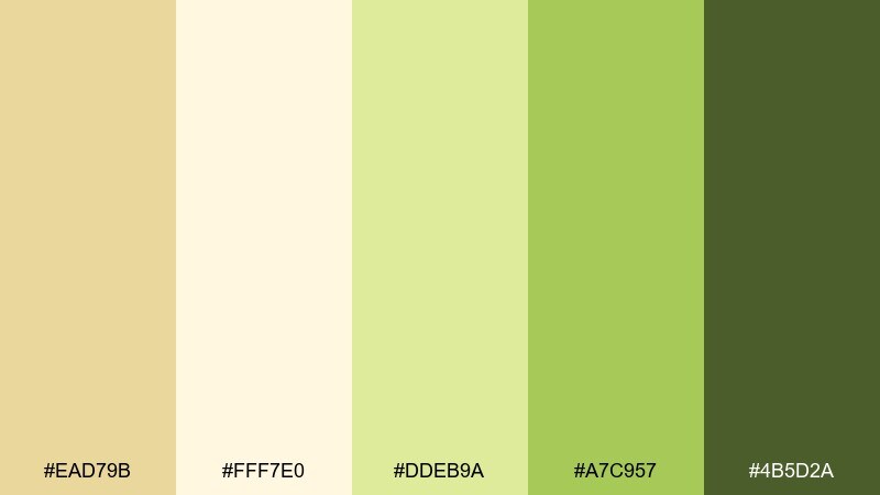
HEX: #EAD79B #FFF7E0 #DDEB9A #A7C957 #4B5D2A
Mood: optimistic, fresh, springy
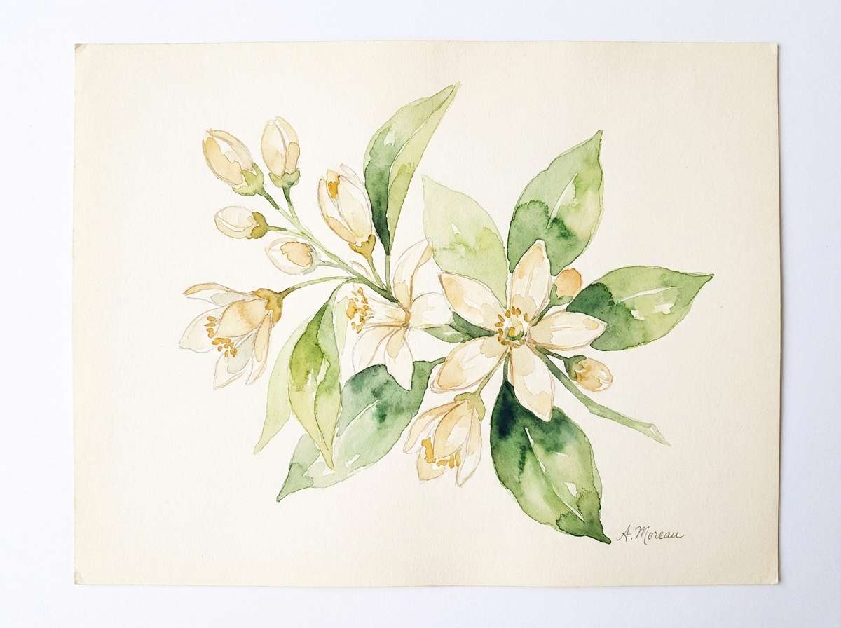
Best for: botanical watercolor illustration
Bright, springy notes feel like lemon zest, new leaves, and soft morning haze. It works well for seasonal campaigns, garden brands, and cheerful social graphics. Pair pale gold with misty cream for background washes, then let the greens carry focal elements. Tip: keep saturation in check by using the darkest green only for small details.
Image example of citrus mist generated using media.io
11) Vintage Bookshop
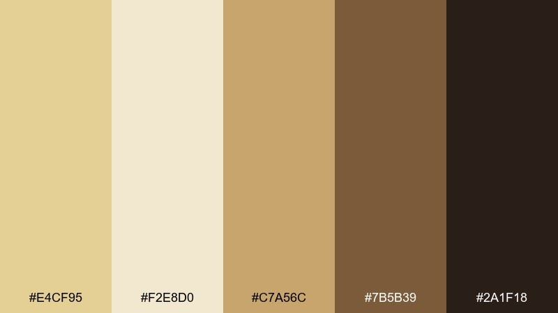
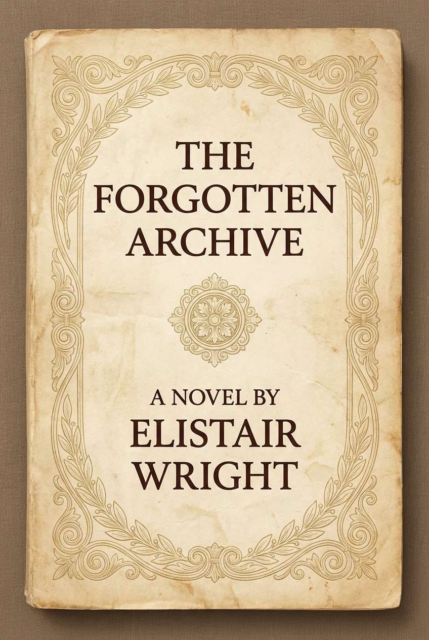
HEX: #E4CF95 #F2E8D0 #C7A56C #7B5B39 #2A1F18
Mood: nostalgic, warm, literary
Best for: book cover design
Nostalgic gold and leather browns recall worn book spines and dusty shelves. Use it for book covers, author branding, or stationery with a classic tone. Pair the pale gold with warm parchment and a deep brown for titles that pop. Tip: add subtle grain texture to the light tones to enhance the vintage feel.
Image example of vintage bookshop generated using media.io
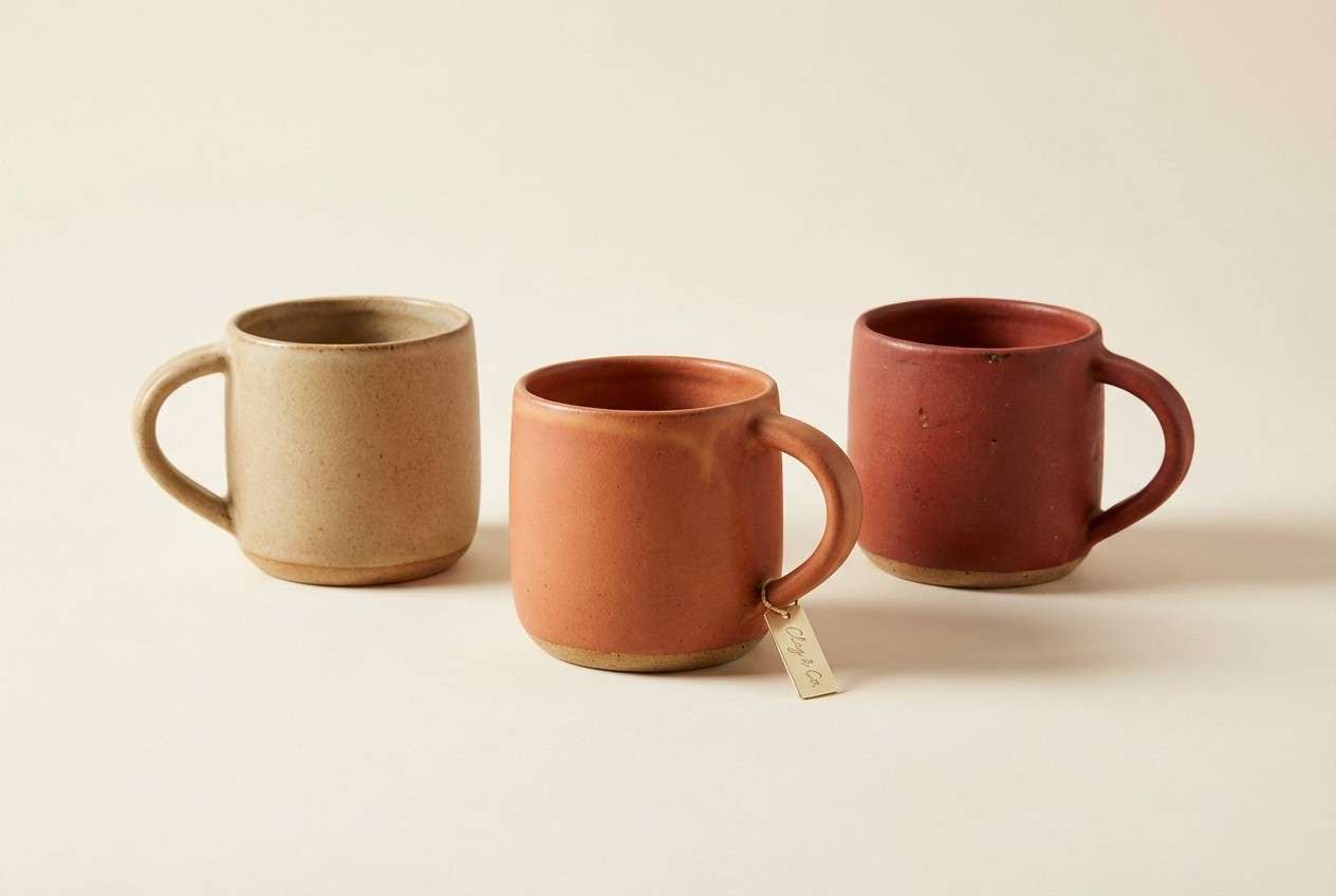
12) Desert Adobe
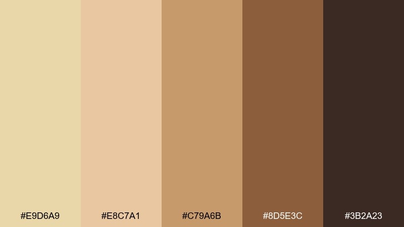
HEX: #E9D6A9 #E8C7A1 #C79A6B #8D5E3C #3B2A23
Mood: earthy, sun-warmed, artisanal
Best for: ceramic brand product ad
Sun-warmed adobe and clay browns bring an artisanal, handmade vibe. These hues are great for ceramics, home goods, and maker brands that lean earthy. Pair pale gold with sand and terracotta for product warmth, then use deep umber for logos. Tip: shoot products on a simple cream background so the clay tones stay rich.
Image example of desert adobe generated using media.io
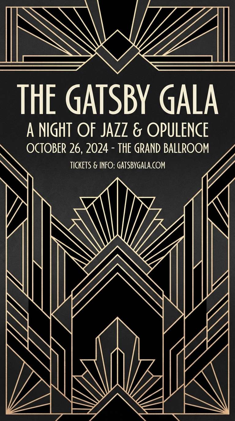
13) Art Deco Night
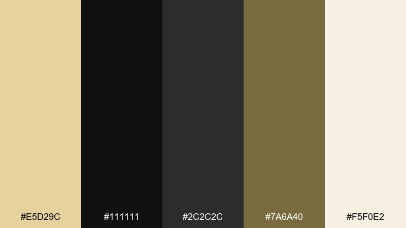
HEX: #E5D29C #111111 #2C2C2C #7A6A40 #F5F0E2
Mood: dramatic, sleek, glamorous
Best for: event poster design
Sleek contrast with a gilded edge feels like a late-night gala and geometric light. The dark base makes the gold accents read luxurious and confident. Pair with off-white for small supporting text and keep shapes crisp for an Art Deco vibe. Tip: use the olive-gold as a secondary accent so the main gold stays special.
Image example of art deco night generated using media.io
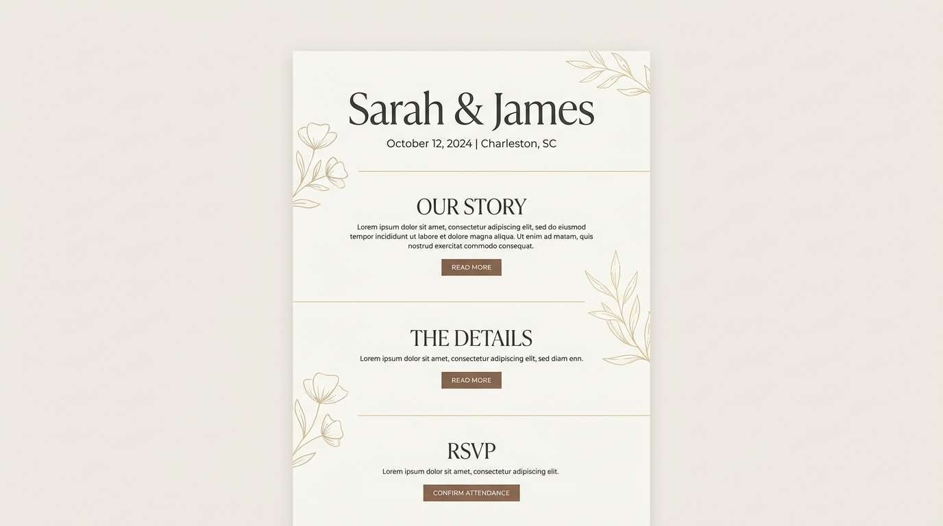
14) Wedding Heirloom
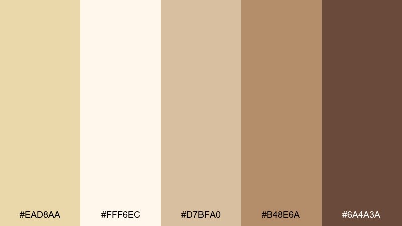
HEX: #EAD8AA #FFF6EC #D7BFA0 #B48E6A #6A4A3A
Mood: romantic, timeless, delicate
Best for: wedding website design
Delicate heirloom neutrals feel like lace, ivory paper, and soft candlelight. This pale gold color palette is perfect for wedding websites that want warmth and a refined finish. Pair the lightest cream with soft taupes, then use cocoa for navigation and button labels. Tip: keep gold to icons and dividers so pages load feeling airy.
Image example of wedding heirloom generated using media.io
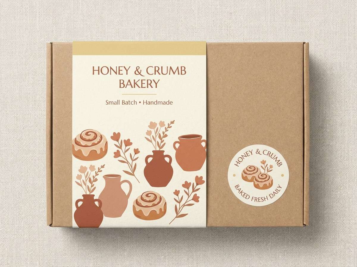
15) Soft Citrus Clay
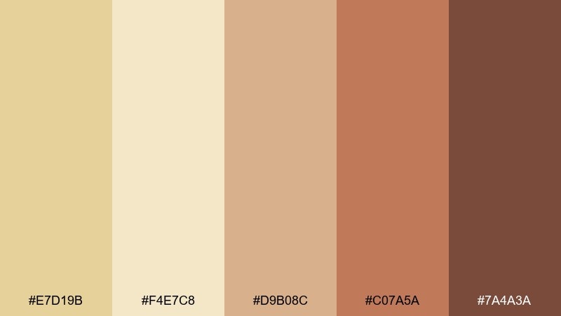
HEX: #E7D19B #F4E7C8 #D9B08C #C07A5A #7A4A3A
Mood: friendly, handmade, cozy
Best for: bakery packaging design
Cozy citrus-and-clay tones feel like fresh pastries, kraft paper, and warm ovens. Use this mix for bakery boxes, stickers, and menu cards that need a friendly handmade vibe. Pair pale gold with buttercream for the base, then bring in clay and cinnamon for illustrations and stamps. Tip: keep the darkest brown for small logos to avoid a heavy look.
Image example of soft citrus clay generated using media.io
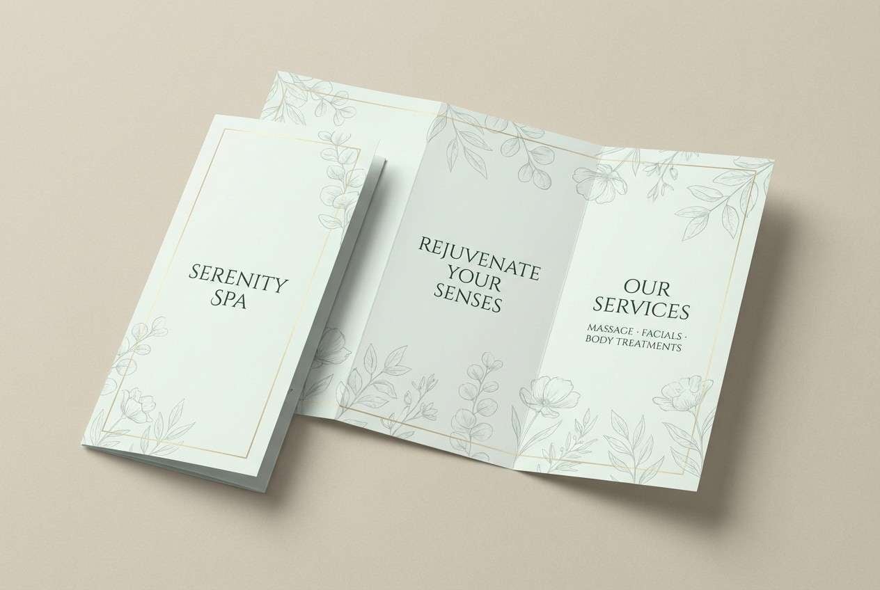
16) Botanical Herb Gold
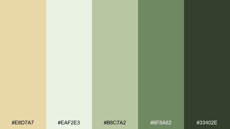
HEX: #E8D7A7 #EAF2E3 #B8C7A2 #6F8A62 #33402E
Mood: calming, herbal, restorative
Best for: spa brochure design
Calming herbal greens with a sunlit gold hint evoke quiet gardens and restorative rituals. It works well for spa brochures, apothecary products, and nature-forward brands. Pair pale gold accents with soft minty whites and use the darkest green for key headers. Tip: use botanical line art in the mid green to keep layouts delicate.
Image example of botanical herb gold generated using media.io
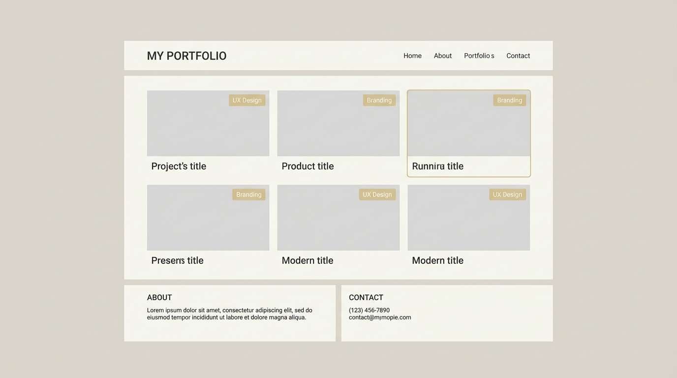
17) Gallery Warm Gray
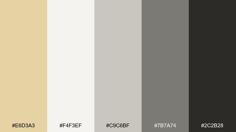
HEX: #E6D3A3 #F4F3EF #C9C6BF #7B7A74 #2C2B28
Mood: quiet, curated, contemporary
Best for: portfolio website UI
Quiet gallery grays with a muted golden glow feel curated and contemporary. Use it for portfolios where your work should stay center stage. Pair the pale gold with warm off-white surfaces and use charcoal for navigation and captions. Tip: apply gold only to hover states and small badges to keep the UI minimal.
Image example of gallery warm gray generated using media.io
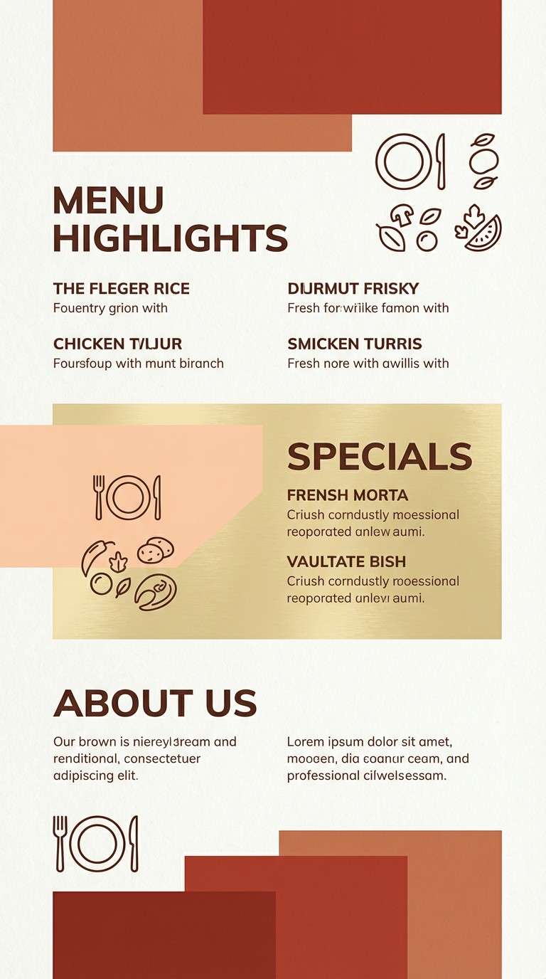
18) Sunset Terracotta
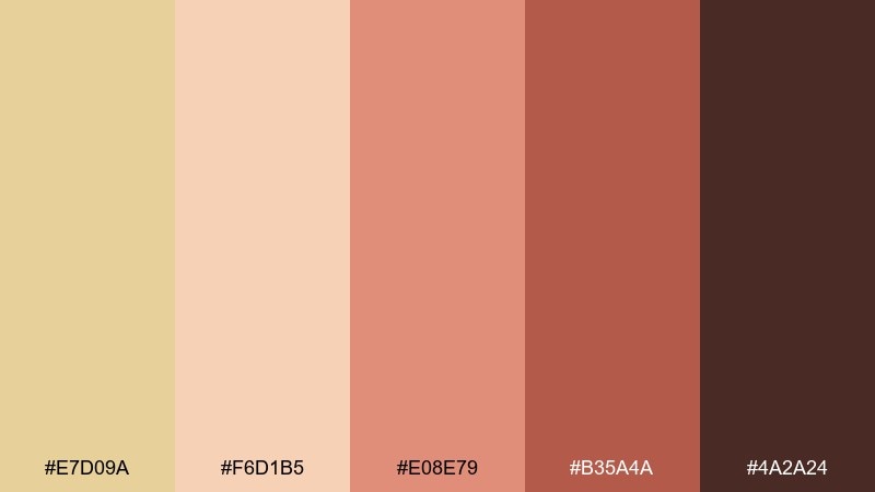
HEX: #E7D09A #F6D1B5 #E08E79 #B35A4A #4A2A24
Mood: sunset, lively, artisanal
Best for: restaurant flyer design
Lively sunset warmth feels like terracotta walls and glowing lantern light. It fits restaurants, pop-up events, and seasonal specials that need energy without neon. Pair pale gold with soft peach for background fields and use brick red for bold calls to action. Tip: set body text in the deep brown to keep long details readable.
Image example of sunset terracotta generated using media.io
19) Luxe Navy Gold
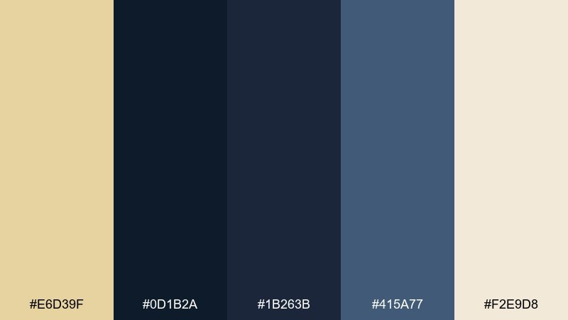
HEX: #E6D39F #0D1B2A #1B263B #415A77 #F2E9D8
Mood: confident, luxe, night-sky
Best for: premium fintech landing page
Night-sky navies with a pale golden spark feel confident and premium. Use it for fintech or SaaS brands that want trust with a touch of luxury. Pair the pale gold with soft cream for highlights and let navy dominate backgrounds and headers. Tip: use gold only for key numbers and primary buttons to guide attention.
Image example of luxe navy gold generated using media.io

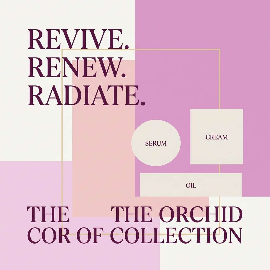
20) Orchid Dust
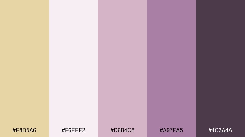
HEX: #E8D5A6 #F6EEF2 #D6B4C8 #A97FA5 #4C3A4A
Mood: dreamy, artistic, romantic
Best for: beauty social media ad
Dreamy orchid tones with pale gold feel like soft-focus makeup and powdery petals. These pale gold color combinations are great for beauty ads that need warmth with a modern, editorial edge. Pair the blushy mauves with creamy space for product callouts, and use the deep plum for headlines. Tip: keep gradients subtle so the gold accent stays crisp.
Image example of orchid dust generated using media.io
What Colors Go Well with Pale Gold?
Pale gold pairs beautifully with warm neutrals like ivory, cream, oatmeal, tan, and cocoa—perfect for minimal, premium, or wedding-friendly aesthetics. These combinations keep the gold feeling soft and airy rather than flashy.
For higher contrast, combine pale gold with deep tones like navy, charcoal, espresso brown, forest green, or plum. These darker anchors make gold accents feel intentional and help typography stay readable.
If you want a fresh, modern twist, add muted greens (sage, herb, olive) or cool blue-grays/teals. The warm-cool balance keeps layouts calm while still visually interesting.
How to Use a Pale Gold Color Palette in Real Designs
Use pale gold as an accent role first: borders, icons, separators, badges, and key highlights. This keeps the look refined and prevents the palette from turning “yellow” when used in large blocks.
In UI design, assign pale gold to one consistent interaction purpose (like primary buttons or KPI highlights). Pair it with off-white surfaces and near-black text for clean hierarchy and accessibility.
For print work (invitations, packaging, brochures), pale gold shines with paper-like creams and a dark type color (cocoa or charcoal). If you add texture (grain, linen, parchment), keep it subtle so the palette stays modern.
Create Pale Gold Palette Visuals with AI
Want to see these palettes on real design mockups—like skincare labels, wedding invites, posters, or website heroes? You can generate fast visuals from a simple text prompt and iterate until the mood feels right.
Start with your palette name and use-case (e.g., “pale gold + sage spa brochure”), then specify style (minimal, vintage, editorial) and lighting/scene (studio, flat lay, soft shadows). Keep prompts focused so the gold reads clean and consistent.
When the image looks right, reuse the same prompt structure to produce a whole set of matching assets for a brand system.
Pale Gold Color Palette FAQs
-
What is the HEX code for pale gold?
Pale gold doesn’t have one universal HEX code, but common pale-gold tones fall around warm, light yellow-beige values like #E9D8A6, #EAD7A0, or #E6D39F. Choose the exact shade based on how creamy or how yellow you want it to read. -
Is pale gold a warm or cool color?
Pale gold is typically a warm color because it carries yellow and beige undertones. It can feel slightly cooler when mixed with gray (a muted, “champagne” gold) or warmer when paired with cream and tan. -
What colors go best with pale gold for branding?
For branding, pale gold pairs well with ivory/cream for softness, charcoal for readability, and deep tones like navy, forest green, or plum for a premium contrast. Sage and warm gray are great modern pairings for wellness and lifestyle brands. -
How do I keep pale gold from looking yellow in web design?
Use pale gold mainly as an accent (buttons, icons, dividers) and balance it with off-whites and neutral grays. Add a strong dark text color (near-black, charcoal, or navy) and avoid covering large backgrounds with gold. -
Does pale gold work for wedding palettes?
Yes—pale gold is a popular wedding accent because it feels elegant without overpowering photos or typography. It works especially well with ivory, blush, taupe, cocoa brown, and soft greens like sage. -
What is the difference between pale gold and champagne gold?
Pale gold is a broad category of light gold tones. Champagne gold usually leans more muted and beige/pearl-like, with less saturated yellow—often reading softer and more “linen” than “metal.” -
Can I generate pale gold palette mockups with AI?
Yes. With a text-to-image tool, describe the design type (packaging, UI, invite), the palette vibe (pale gold + cream + cocoa), and the style (minimal, vintage, editorial). Then iterate by adjusting lighting, materials, and contrast to keep the gold subtle.


