

Gold yellow is the sweet spot between sunny optimism and premium “metallic” warmth. It reads as confident, friendly, and attention-grabbing without feeling harsh like neon yellow.
Below are modern gold yellow color palette combinations with HEX codes you can use for branding, UI, print, packaging, and social graphics.
In this article
- Why Gold Yellow Palettes Work So Well
-
- sunlit brass
- honeyed linen
- marigold market
- saffron studio
- antique gilt
- citrus clay
- golden hour neutrals
- champagne orchard
- amber concrete
- polished trophy
- mustard memoir
- harvest typography
- desert gold
- gilded mint
- sunflower denim
- buttercream minimal
- spiced chai
- golden tech ui
- art deco gold
- temple gold and stone
- What Colors Go Well with Gold Yellow?
- How to Use a Gold Yellow Color Palette in Real Designs
- Create Gold Yellow Palette Visuals with AI
Why Gold Yellow Palettes Work So Well
Gold yellow sits close to “sunlight” on the color spectrum, so it naturally signals warmth, energy, and positivity. In branding, that translates into approachable confidence—especially when balanced with grounded neutrals.
Unlike brighter lemon yellows, gold yellow has more orange/brown influence, which gives it a premium or crafted vibe. That’s why it shows up so often in packaging, hospitality, and editorial design.
It’s also an excellent accent color for interfaces: gold can highlight CTAs, badges, and status states clearly, while darker text colors keep readability strong.
20+ Gold Yellow Color Palette Ideas (with HEX Codes)
1) Sunlit Brass
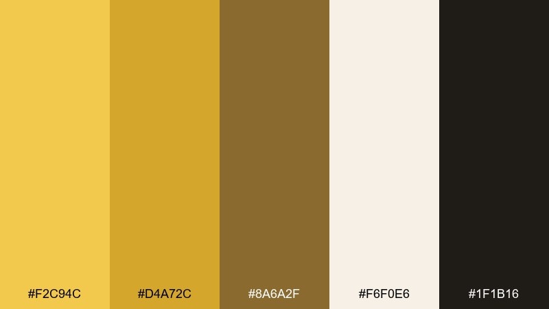
HEX: #F2C94C #D4A72C #8A6A2F #F6F0E6 #1F1B16
Mood: warm, confident, premium
Best for: product packaging and label design
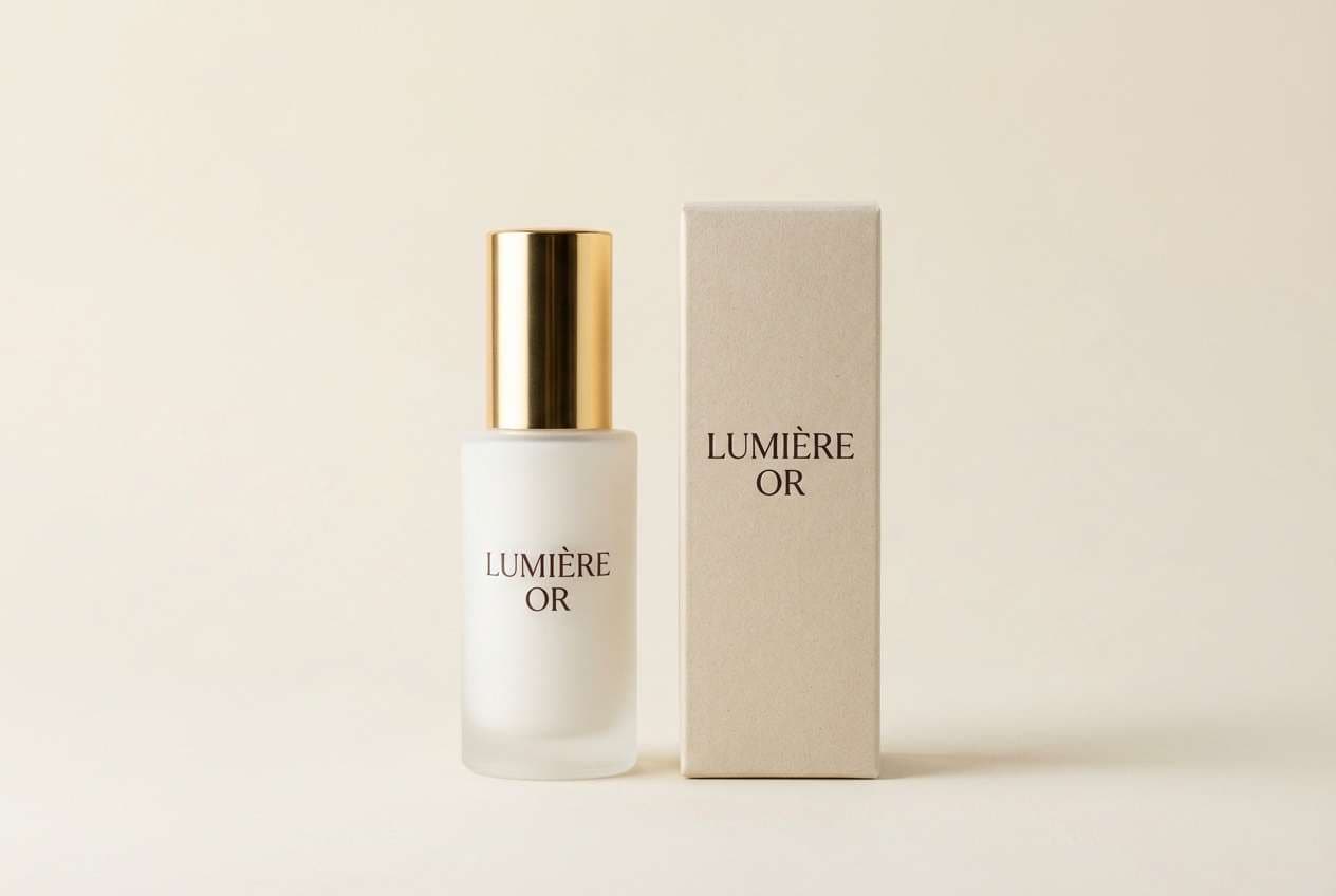
Warm brass glow and late-afternoon sunlight set a confident, premium tone. Use it for skincare, candles, coffee, or any product that needs a rich, trustworthy feel. Pair the gold with creamy off-white for readability and use the deep espresso as your main text color. Tip: keep the brightest yellow as a highlight on seals, icons, or a single hero band.
Image example of sunlit brass generated using media.io
Media.io is an online AI studio for creating and editing video, image, and audio in your browser.

2) Honeyed Linen
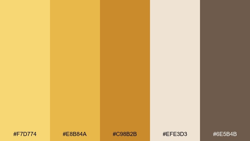
HEX: #F7D774 #E8B84A #C98B2B #EFE3D3 #6E5B4B
Mood: soft, cozy, natural
Best for: lifestyle branding and ecommerce banners
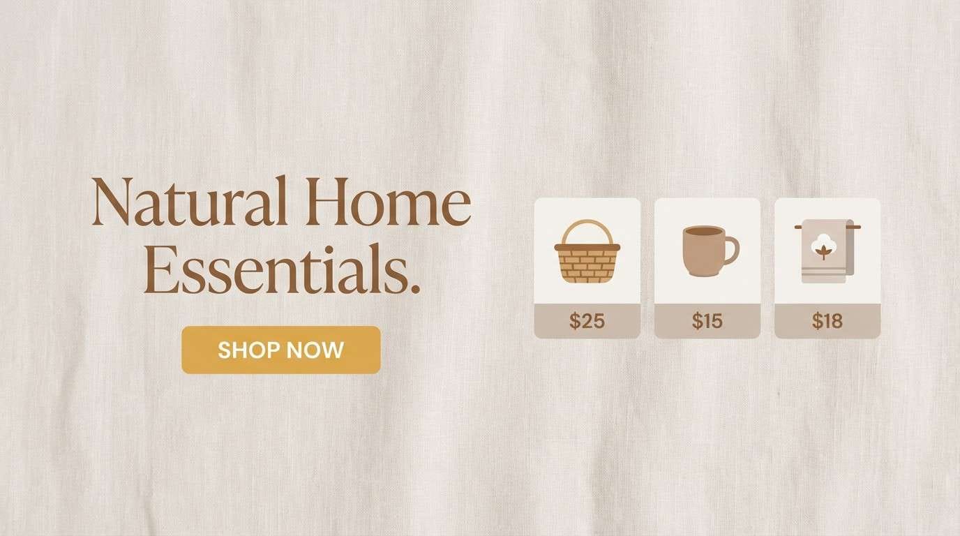
Soft honey tones over linen neutrals feel cozy, handmade, and welcoming. It fits boutiques, home goods, and calm ecommerce headers where warmth matters more than contrast. Pair the pale linen with warm brown for body text and use the honey yellow for buttons or price tags. Tip: add plenty of whitespace so the yellow reads as gentle, not loud.
Image example of honeyed linen generated using media.io
3) Marigold Market
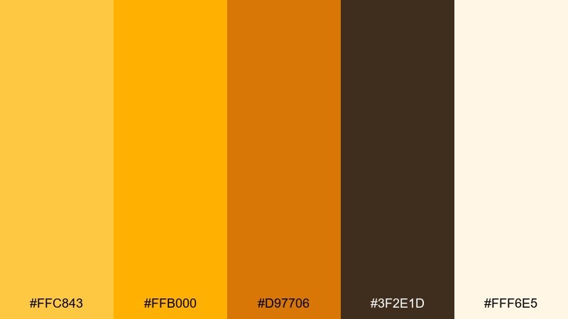
HEX: #FFC843 #FFB000 #D97706 #3F2E1D #FFF6E5
Mood: cheerful, bold, energetic
Best for: event posters and promo flyers
Cheerful marigold energy brings street-market vibes and upbeat momentum. These gold yellow color combinations work great for sales flyers, festival posters, and punchy social promos. Pair the bright yellow with deep cocoa for big, readable headlines, then use the soft cream as breathing room. Tip: limit orange-brown accents to small blocks or borders so the yellow stays the star.
Image example of marigold market generated using media.io

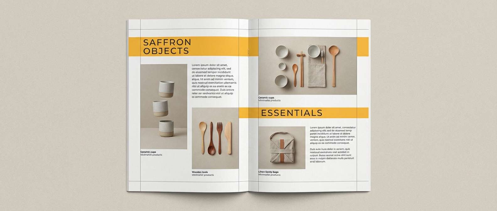
4) Saffron Studio
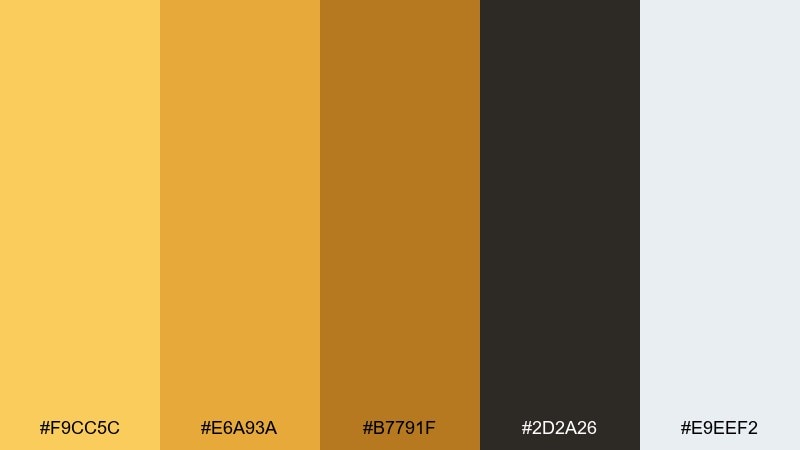
HEX: #F9CC5C #E6A93A #B7791F #2D2A26 #E9EEF2
Mood: modern, creative, editorial
Best for: magazine layouts and lookbooks
Saffron warmth against cool paper tones feels modern, creative, and slightly editorial. It suits lookbooks, catalog spreads, and brand stories that need energy without looking childish. Pair saffron blocks with charcoal typography and use the pale blue-gray as a clean page background. Tip: try full-bleed color bars for section breaks to guide reading flow.
Image example of saffron studio generated using media.io
5) Antique Gilt
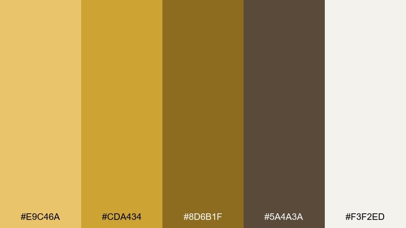
HEX: #E9C46A #CDA434 #8D6B1F #5A4A3A #F3F2ED
Mood: heritage, refined, classic
Best for: book covers and heritage branding
Antique gilt tones evoke old libraries, framed artwork, and timeless craft. It works beautifully for heritage brands, book covers, and premium stationery where you want restraint. Pair the muted gold with parchment off-white and rely on the deeper browns for titles and dividers. Tip: add subtle texture or grain to backgrounds to enhance the vintage feel without clutter.
Image example of antique gilt generated using media.io
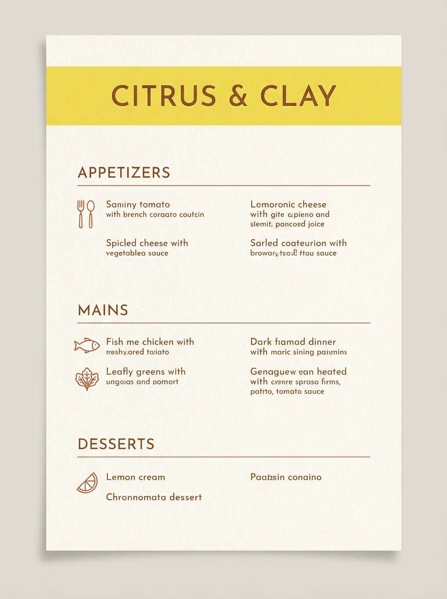
6) Citrus Clay
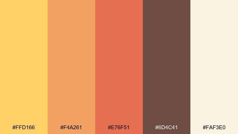
HEX: #FFD166 #F4A261 #E76F51 #6D4C41 #FAF3E0
Mood: sunny, earthy, inviting
Best for: restaurant menus and cafe branding
Sunny citrus over clay and terracotta feels inviting, handcrafted, and a little rustic. Use it for menus, cafe identity, or food packaging where warmth and appetite cues matter. Pair the bright yellow with the deeper brown for legible type, and use terracotta sparingly for callouts. Tip: keep background cream dominant so photography and icons stay clean.
Image example of citrus clay generated using media.io
7) Golden Hour Neutrals
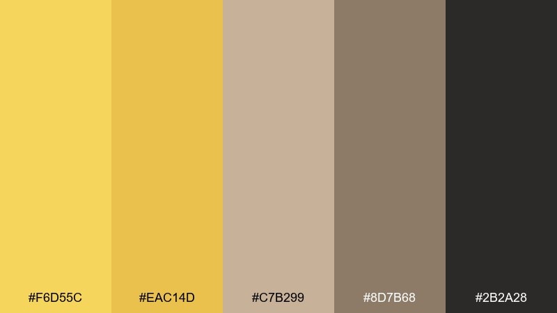
HEX: #F6D55C #EAC14D #C7B299 #8D7B68 #2B2A28
Mood: calm, balanced, sophisticated
Best for: interior design mood boards
Golden-hour warmth layered with taupe neutrals feels calm, balanced, and quietly sophisticated. It is ideal for interior mood boards, architectural presentations, and lifestyle decks. Pair the warm yellow with taupe fields and use near-black for labels and measurements. Tip: treat the brightest gold as a small accent swatch to avoid overpowering the neutrals.
Image example of golden hour neutrals generated using media.io
8) Champagne Orchard
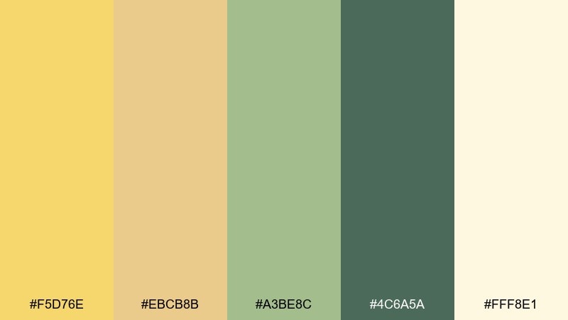
HEX: #F5D76E #EBCB8B #A3BE8C #4C6A5A #FFF8E1
Mood: fresh, light, celebratory
Best for: spring invitations and stationery
Champagne gold with orchard greens feels fresh, light, and celebratory. It is a great fit for spring invitations, brunch stationery, and garden-themed announcements. Pair the pale cream background with green typography for a natural look, then add gold as a border or monogram accent. Tip: use delicate line art to keep the palette airy and elegant.
Image example of champagne orchard generated using media.io
9) Amber Concrete
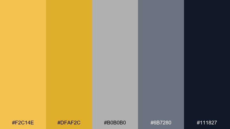
HEX: #F2C14E #DFAF2C #B0B0B0 #6B7280 #111827
Mood: industrial, sharp, modern
Best for: tech landing pages and dashboards
Amber against concrete grays feels industrial, sharp, and modern. It works well for tech landing pages and dashboards where you need a strong highlight color without going neon. Pair the amber with slate gray UI surfaces and reserve near-black for headers and navigation. Tip: use amber only for primary actions and status highlights to maintain a professional tone.
Image example of amber concrete generated using media.io
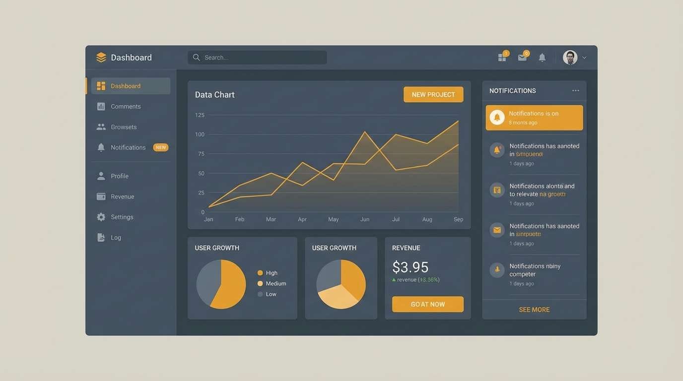
10) Polished Trophy
HEX: #FFD54A #F4C430 #A67C00 #0F172A #F8FAFC
Mood: high-contrast, sporty, triumphant
Best for: sports graphics and awards banners
High-contrast trophy gold with deep navy feels triumphant and performance-driven. Use it for sports graphics, awards banners, and bold announcement headers. Pair the clean off-white with navy for readable layouts, then let gold act like a medal highlight. Tip: add subtle gradients only to the gold elements to mimic metallic shine without distracting from text.
Image example of polished trophy generated using media.io
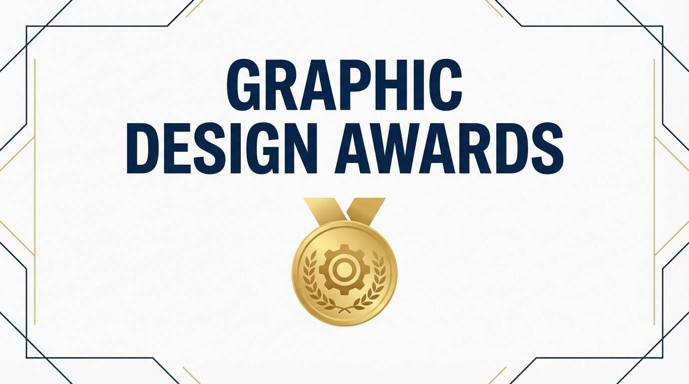
11) Mustard Memoir
HEX: #E3B23C #C99700 #9A7B4F #F0E7D8 #3A2E2A
Mood: nostalgic, warm, story-driven
Best for: blog headers and personal branding
Mustard memoir tones feel nostalgic, warm, and story-driven like sun-faded postcards. They are perfect for blog headers, author sites, and personal branding that leans human and approachable. Pair parchment backgrounds with deep brown text, and use mustard as a highlight behind key phrases. Tip: keep contrast strong for accessibility by avoiding mustard text on light backgrounds.
Image example of mustard memoir generated using media.io
12) Harvest Typography
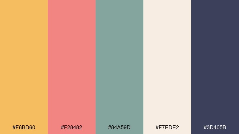
HEX: #F6BD60 #F28482 #84A59D #F7EDE2 #3D405B
Mood: playful, artsy, contemporary
Best for: poster typography and social quotes
Playful harvest warmth with soft coral and muted teal feels artsy and contemporary. It is great for typographic posters, quote graphics, and creator content that needs friendly energy. Pair the cream background with deep indigo text, then use the warm yellow as the hero block behind a key word. Tip: keep coral and teal as small supporting shapes so the composition stays cohesive.
Image example of harvest typography generated using media.io
13) Desert Gold
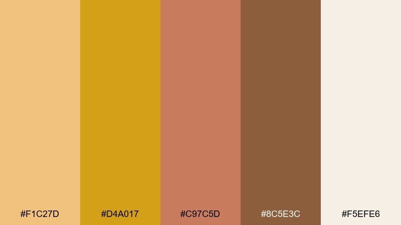
HEX: #F1C27D #D4A017 #C97C5D #8C5E3C #F5EFE6
Mood: sunbaked, earthy, adventurous
Best for: travel branding and postcards
Sunbaked desert gold with clay browns evokes road trips, canyon light, and dusty horizons. It works well for travel branding, postcard designs, and outdoor-inspired packaging. Pair the warm cream with deep brown for type, and use the richer gold for stamps or badges. Tip: try a subtle halftone texture to give the palette a vintage travel-print vibe.
Image example of desert gold generated using media.io

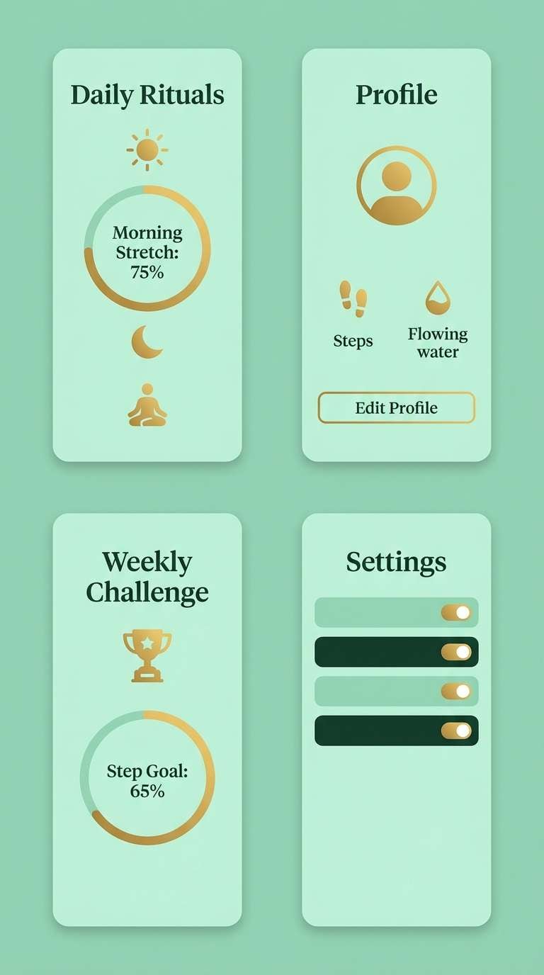
14) Gilded Mint
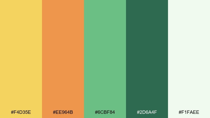
HEX: #F4D35E #EE964B #6CBF84 #2D6A4F #F1FAEE
Mood: fresh, optimistic, modern
Best for: wellness branding and app visuals
Gilded gold with mint greens feels fresh, optimistic, and clean. It is a strong choice for wellness brands and light, friendly app visuals where you want warmth without heaviness. Pair mint backgrounds with dark green text for calm clarity, then use gold as the accent for progress, badges, or highlights. Tip: keep gradients minimal so the greens stay crisp and soothing.
Image example of gilded mint generated using media.io
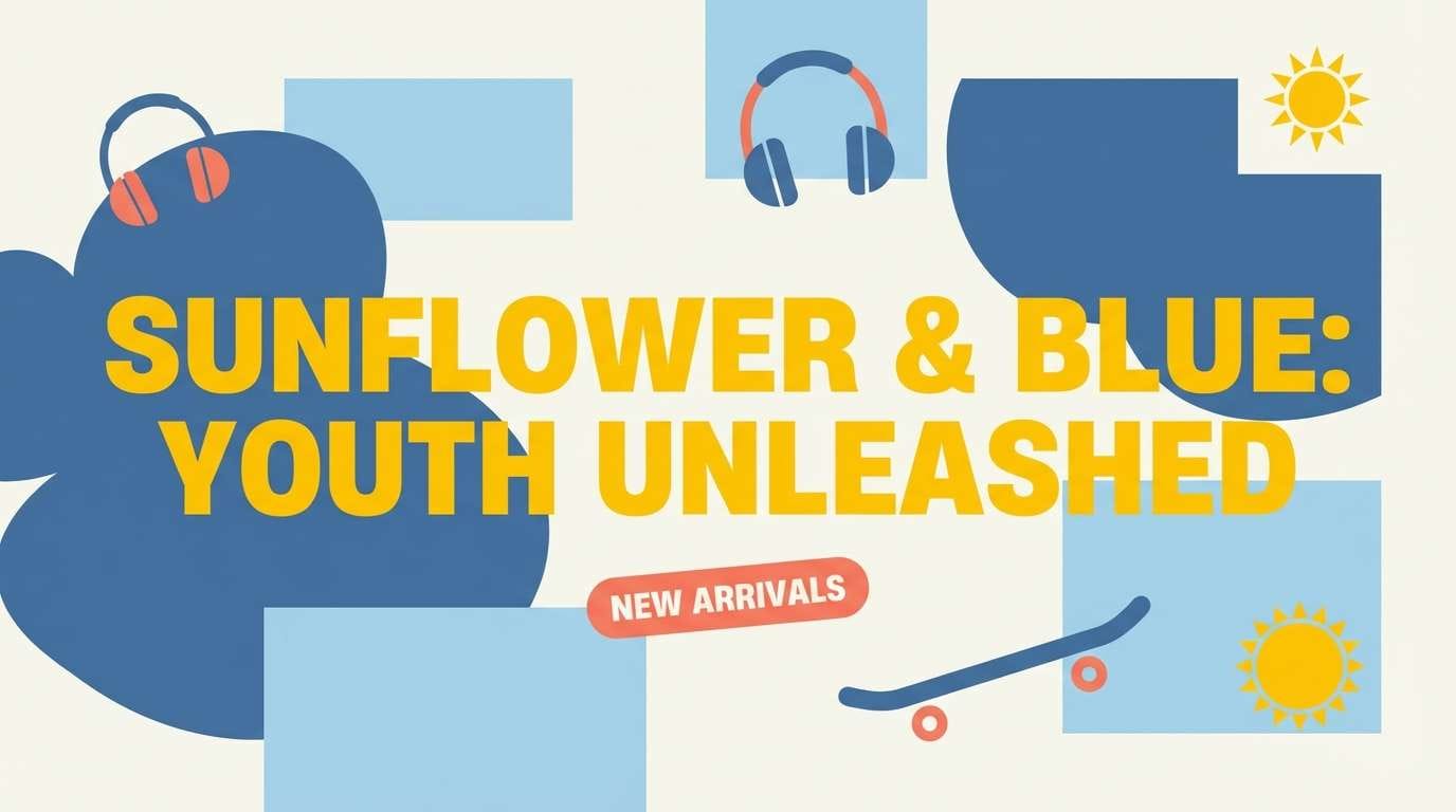
15) Sunflower Denim
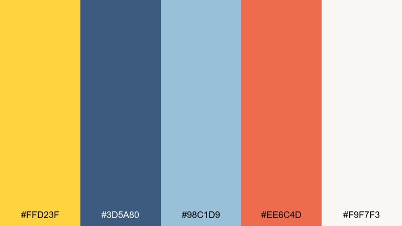
HEX: #FFD23F #3D5A80 #98C1D9 #EE6C4D #F9F7F3
Mood: bright, youthful, energetic
Best for: youth brand campaigns and web banners
Sunflower yellow with denim blues feels youthful, energetic, and ready for summer campaigns. Use it for web banners, youth brands, and bold announcement graphics that need instant pop. Pair the off-white background with navy for structure, then let the yellow carry the headline or key icon. Tip: keep the orange-coral as a tiny accent for contrast, not a competing hero color.
Image example of sunflower denim generated using media.io
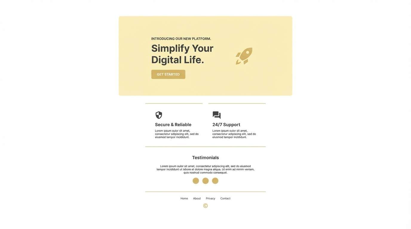
16) Buttercream Minimal
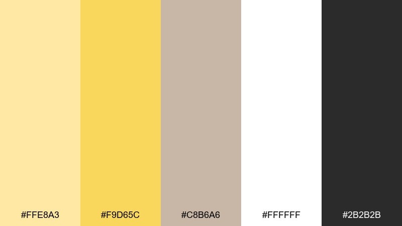
HEX: #FFE8A3 #F9D65C #C8B6A6 #FFFFFF #2B2B2B
Mood: minimal, airy, friendly
Best for: clean UI and landing pages
Airy buttercream and soft gold feel minimal, friendly, and easy to scan. As a gold yellow color scheme, it is ideal for clean landing pages and lightweight UI where you want warmth without heavy saturation. Pair white space with charcoal text for accessibility, then use the gold for primary buttons and subtle dividers. Tip: avoid large solid yellow backgrounds; keep it as an accent to maintain a premium look.
Image example of buttercream minimal generated using media.io
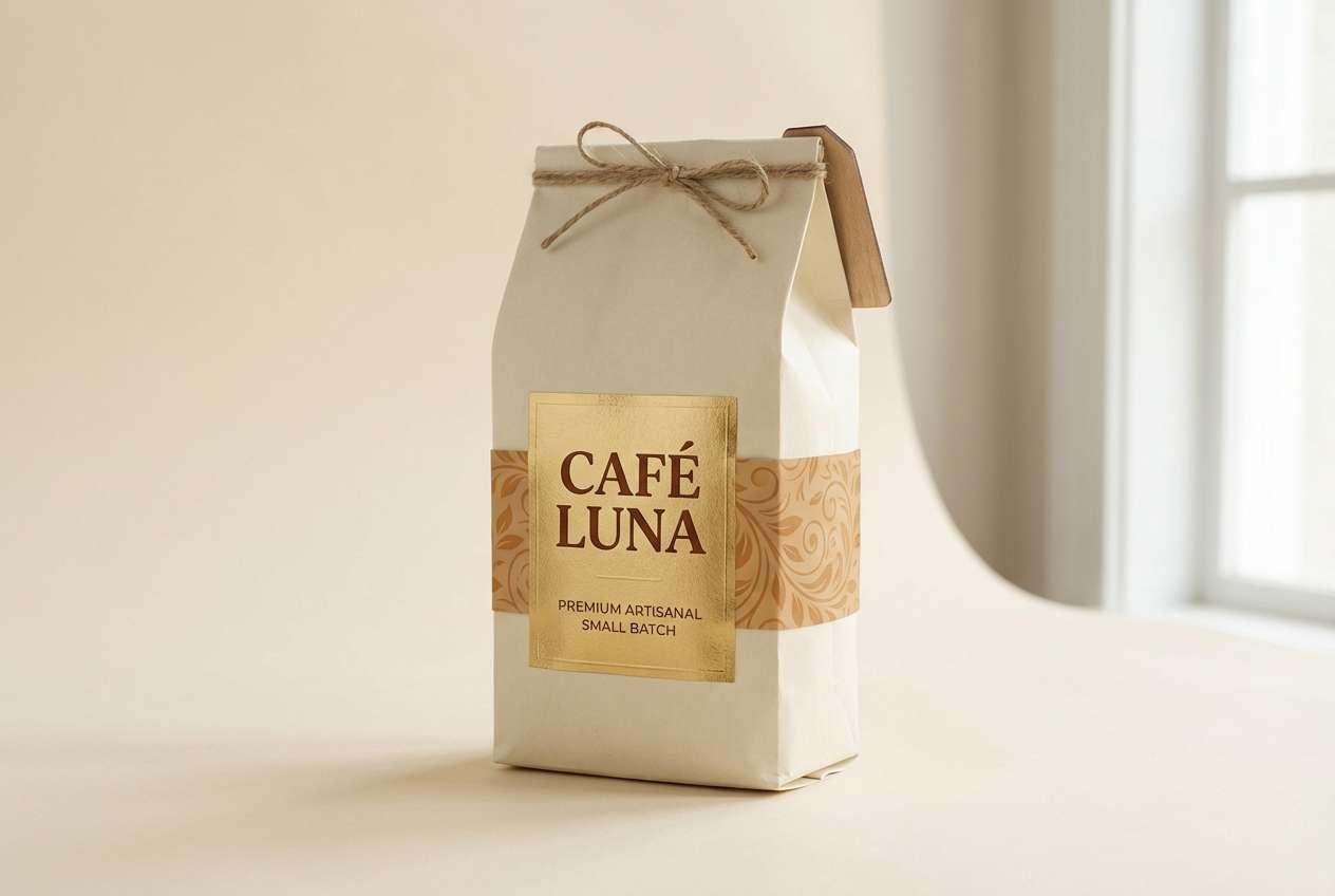
17) Spiced Chai
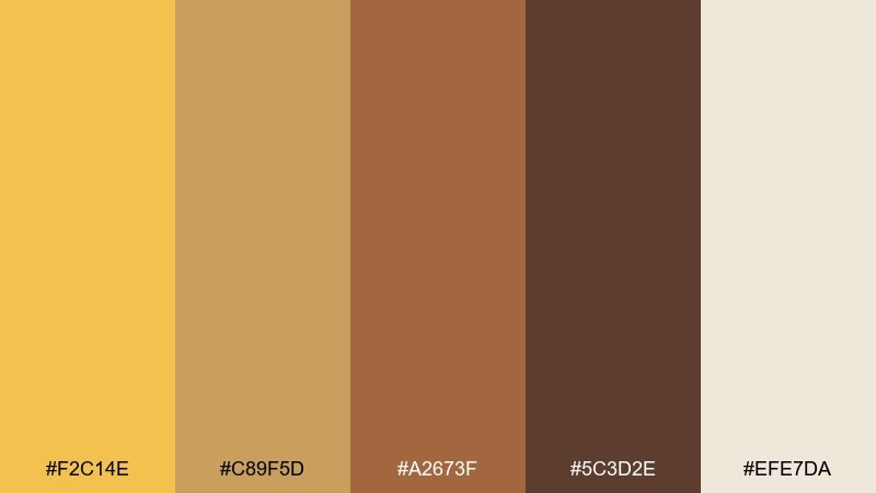
HEX: #F2C14E #C89F5D #A2673F #5C3D2E #EFE7DA
Mood: comforting, grounded, artisanal
Best for: coffee packaging and menu boards
Spiced chai warmth feels comforting and grounded, like a cozy cafe at golden hour. These gold yellow color combinations are perfect for coffee packaging, menu boards, and subscription box inserts. Pair the light cream with the darkest brown for clear text, then use the mid caramel tones to add depth in patterns. Tip: use the bright gold only for a logo mark or roast level badge to keep it sophisticated.
Image example of spiced chai generated using media.io
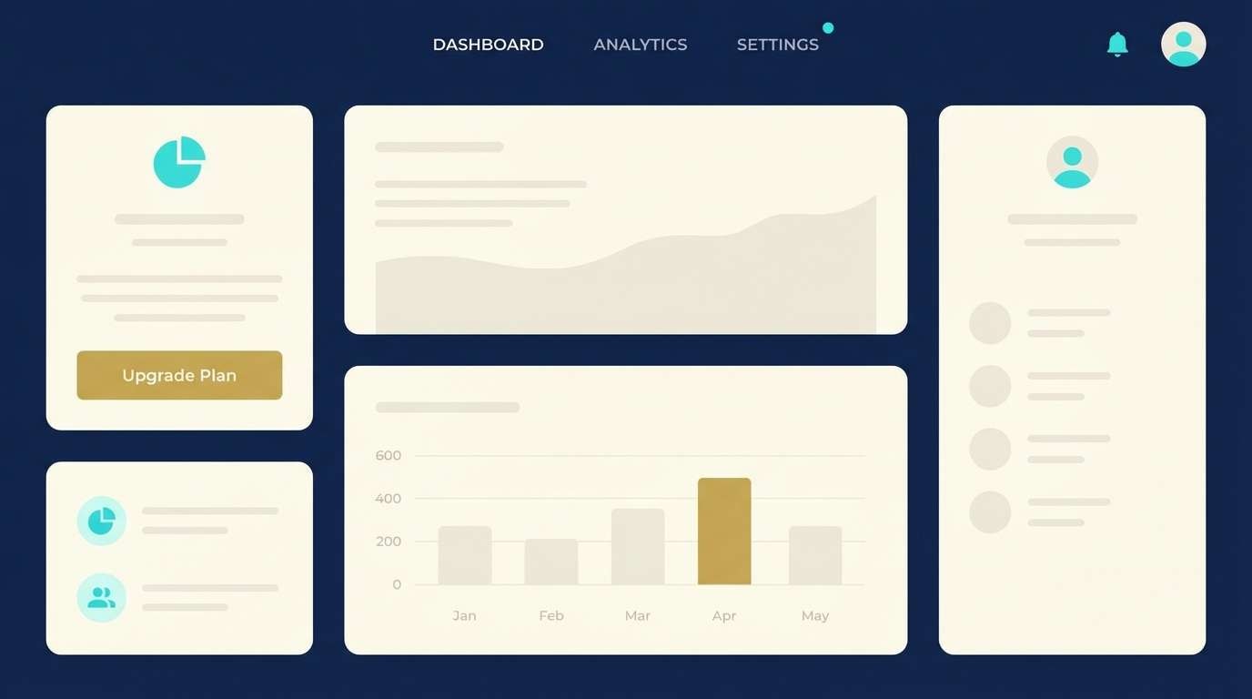
18) Golden Tech UI
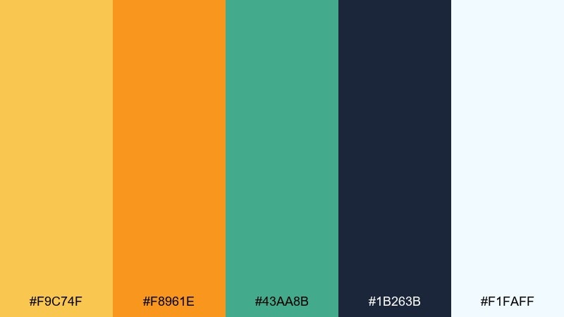
HEX: #F9C74F #F8961E #43AA8B #1B263B #F1FAFF
Mood: bold, innovative, high-contrast
Best for: SaaS UI and feature sections
Bold gold with deep navy and crisp aqua feels innovative and high-contrast. Use this gold yellow color palette for SaaS feature sections, pricing tables, and onboarding screens where you need clear hierarchy. Pair navy as the base surface, keep text on near-white, and use gold for primary actions while aqua supports secondary highlights. Tip: test contrast states for buttons so the gold stays readable across hover and disabled styles.
Image example of golden tech ui generated using media.io
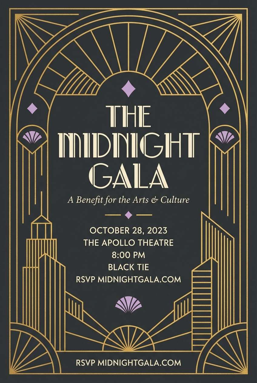
19) Art Deco Gold
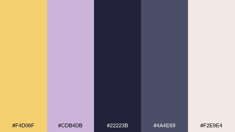
HEX: #F4D06F #CDB4DB #22223B #4A4E69 #F2E9E4
Mood: glam, dramatic, elegant
Best for: party invitations and glamorous posters
Glam deco gold with moody charcoal and a hint of lilac feels dramatic and elegant. Use this gold yellow color palette for party invitations, gala posters, and upscale nightlife branding. Pair charcoal as the main field, add gold as geometric lines, and keep the cream for readable details and RSVP info. Tip: lean on symmetry and thin strokes to capture an authentic art-deco mood.
Image example of art deco gold generated using media.io
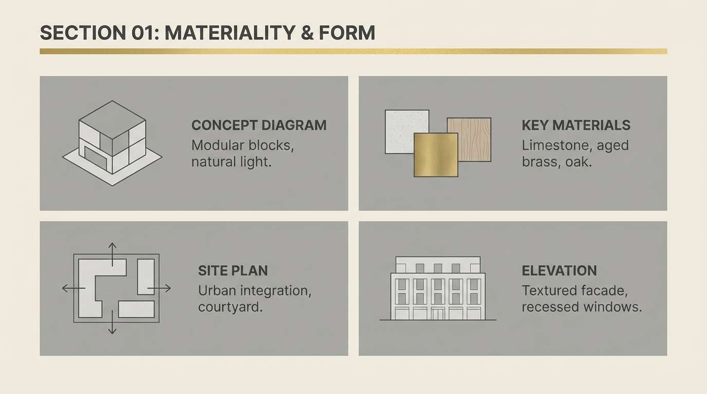
20) Temple Gold and Stone
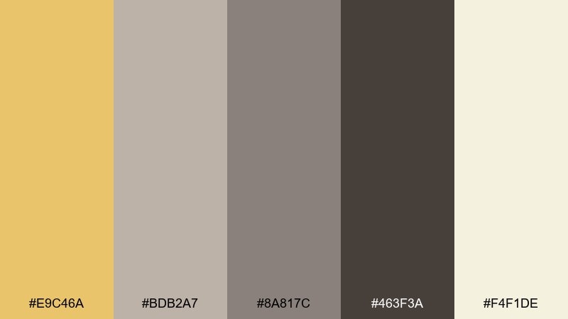
HEX: #E9C46A #BDB2A7 #8A817C #463F3A #F4F1DE
Mood: grounded, serene, architectural
Best for: architecture presentations and brochures
Temple gold with stone grays feels grounded, serene, and architectural. It suits studio brochures, proposal decks, and presentations that need warmth without distraction. Pair the pale background with graphite text for diagrams, and use gold sparingly to highlight key metrics or section titles. Tip: keep line weights consistent so the palette reads crisp and professional.
Image example of temple gold and stone generated using media.io
What Colors Go Well with Gold Yellow?
Gold yellow pairs especially well with deep neutrals like espresso brown, charcoal, and navy because they boost contrast and make gold feel more “premium” than playful. Cream and parchment tones soften the look and keep layouts readable.
For modern contrast, combine gold yellow with cool grays, slate blues, or muted teals to balance warmth with structure. If you want something more lively, coral accents can add energy—just keep them secondary so gold stays the hero.
For nature-forward palettes, add greens (sage, mint, olive) to give gold a fresh, organic context. This is a reliable direction for wellness, food, and lifestyle branding.
How to Use a Gold Yellow Color Palette in Real Designs
Use gold yellow as an accent, not a background default. In UI, it’s best reserved for primary buttons, active states, badges, and key highlights so it keeps its “value” and doesn’t overwhelm the screen.
In print and packaging, gold yellow works beautifully for seals, borders, and title bands—especially when anchored by dark typography. When using large blocks of yellow, break them up with cream space or subtle texture to avoid visual fatigue.
For accessibility, avoid setting long body text in gold on light backgrounds. Instead, use a dark neutral for text and let gold support hierarchy through underlines, chips, icons, or short highlight bars.
Create Gold Yellow Palette Visuals with AI
If you want to preview how a gold yellow color scheme will look on packaging, posters, UI screens, or invitations, generating quick mock visuals can help you validate contrast and mood before committing to a full design.
With Media.io’s text-to-image tool, you can paste a prompt, specify a layout ratio, and iterate styles fast—then reuse the best outputs as direction for brand assets, ads, and concept boards.
Gold Yellow Color Palette FAQs
-
What is the difference between gold yellow and bright yellow?
Gold yellow is warmer and slightly deeper (often with orange/brown influence), so it feels more premium and grounded. Bright yellow is lighter and more “electric,” which can read playful or cautionary in UI and signage. -
What background color works best with gold yellow?
Cream, off-white, parchment, charcoal, and deep navy are the safest backgrounds. Light neutrals make gold feel soft and natural, while dark backgrounds make it feel bold and metallic. -
What text color should I use on gold yellow?
Use very dark neutrals like espresso (#1F1B16), charcoal, or near-black for readable text. White text on gold yellow often fails contrast unless the gold is quite dark. -
Is gold yellow good for branding?
Yes—gold yellow communicates optimism, quality, and warmth, which suits packaging, hospitality, lifestyle brands, and premium products. It works best when balanced with strong neutrals and used consistently as an accent. -
What colors go well with gold yellow in modern UI design?
Slate gray, concrete gray, deep navy, and muted teal/aqua pair well because they add structure and keep the interface professional. Reserve gold yellow for key actions, highlights, and status indicators. -
How do I keep a gold yellow palette from looking too loud?
Use gold yellow sparingly, increase whitespace, and anchor layouts with neutrals (cream, taupe, charcoal). Limit extra saturated accents (like coral or orange) to small details so gold stays the focus. -
Can I use gold yellow for print packaging without metallic ink?
Absolutely—flat gold yellows can still feel premium when paired with deep browns or navy and clean typography. If you want a metallic illusion, add subtle gradients only to small gold elements and keep the rest of the design simple.


