

Orange and cyan are a high-impact pair: one brings heat and optimism, the other adds clarity and a modern, watery cool. Together, an orange cyan palette can feel beachy, techy, playful, or editorial depending on saturation and the neutrals you choose.
Below are 20+ orange cyan color palette ideas with HEX codes, plus practical tips for UI, branding, and print so you can use the contrast without losing readability.
In this article
- Why Orange Cyan Palettes Work So Well
-
- sunset pier
- tropical soda
- desert lagoon
- retro surf poster
- copper mint minimal
- coral reef night
- citrus blueprints
- market awning
- spa sunrise
- arcade glow
- terracotta tide
- seaside gelato
- canyon pool
- studio spotlight
- autumn aquarium
- craft coffee label
- coastal wedding invite
- neon workshop
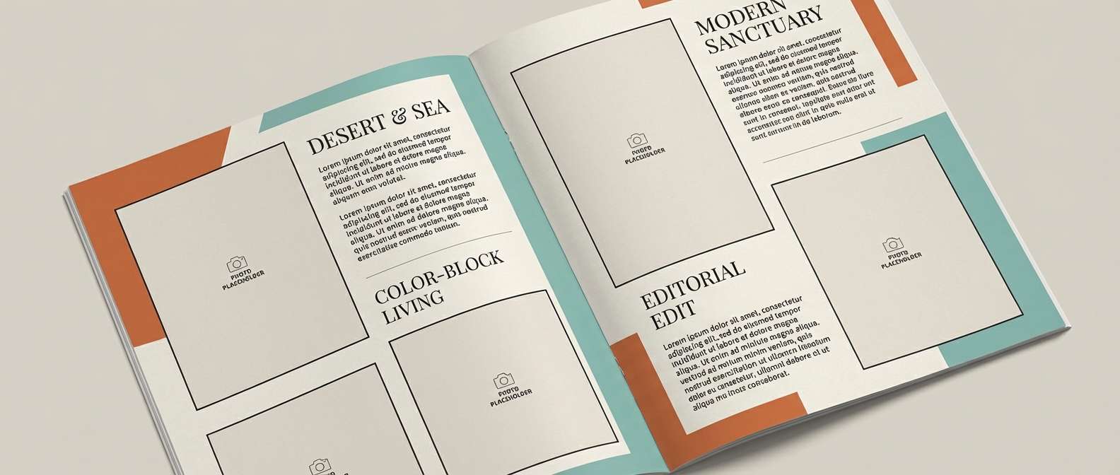
- modern editorial spread
- kids science fair
- sunset app dashboard
- What Colors Go Well with Orange Cyan?
- How to Use a Orange Cyan Color Palette in Real Designs
- Create Orange Cyan Palette Visuals with AI
Why Orange Cyan Palettes Work So Well
Orange and cyan sit on opposite sides of the color wheel family, so they naturally create strong visual separation. That contrast helps you build hierarchy fast: one color can lead (CTAs, highlights) while the other supports (navigation, links, data).
Emotionally, orange reads as energetic, friendly, and human, while cyan feels clean, fresh, and tech-forward. Combining them creates a balanced “warm + cool” system that works across digital products, packaging, and editorial layouts.
Because the pair is naturally vivid, neutrals matter: off-white, stone, cool gray, or deep navy can calm the palette and protect legibility. With the right neutrals, the scheme stays modern instead of looking neon.
20+ Orange Cyan Color Palette Ideas (with HEX Codes)
1) Sunset Pier
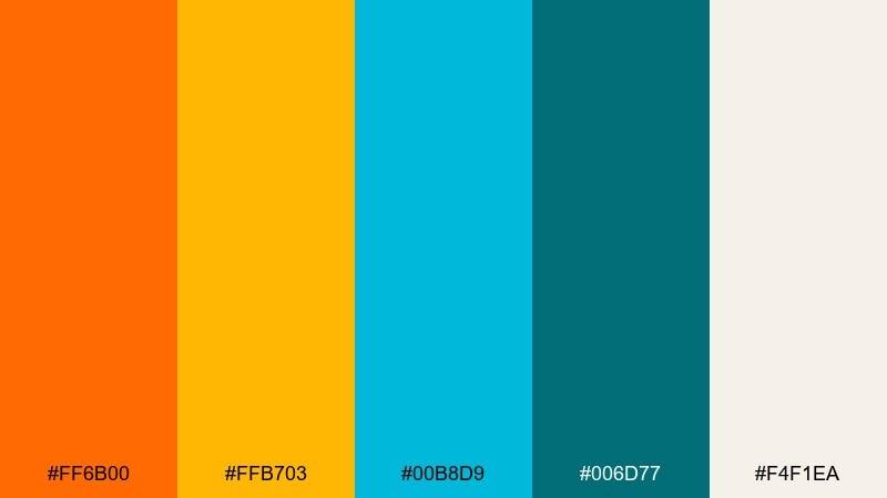
HEX: #FF6B00 #FFB703 #00B8D9 #006D77 #F4F1EA
Mood: warm, breezy, optimistic
Best for: travel branding and hero banners
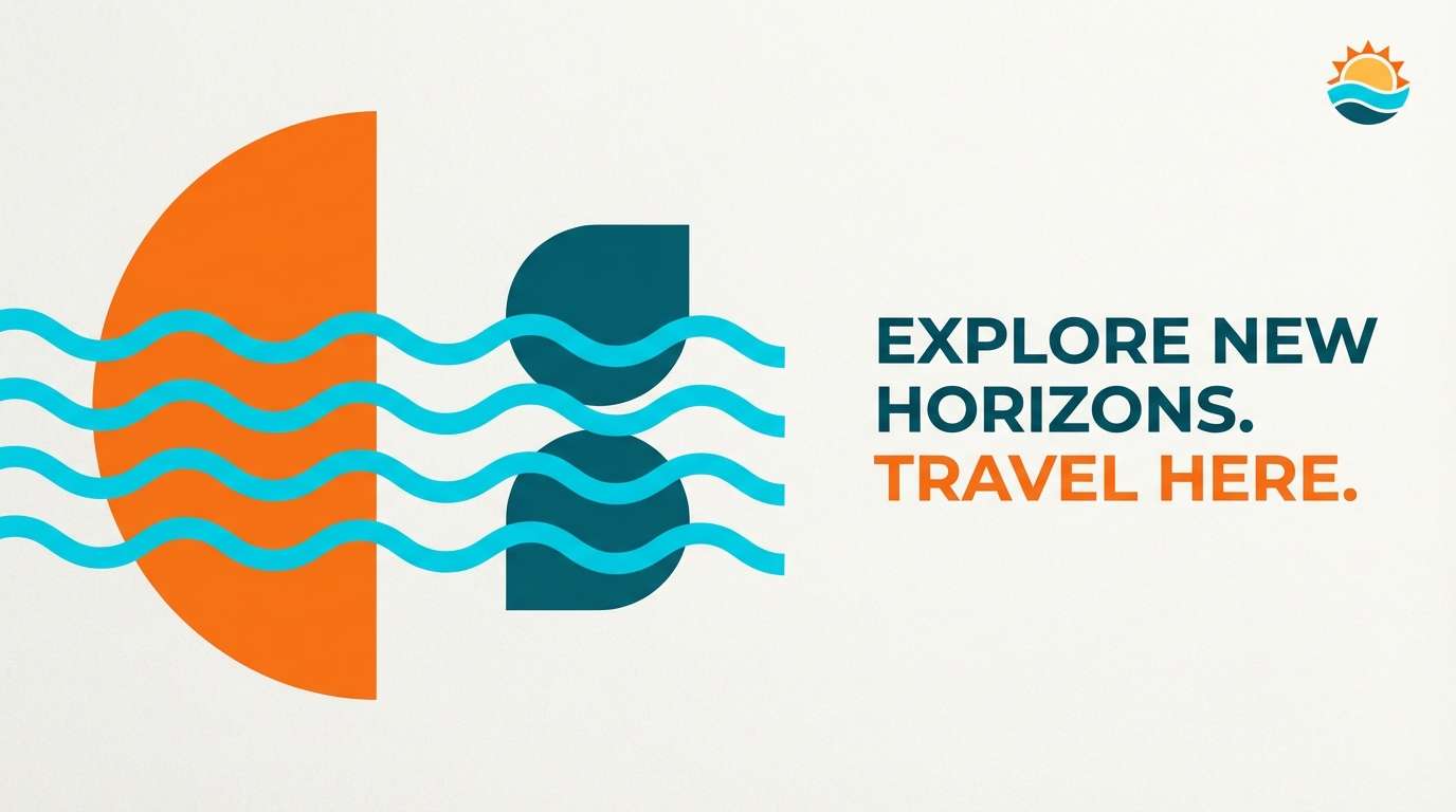
Warm sunset light and salty sea air come through in the bright orange and clean cyan. Use it for tourism landing pages, beach events, and outdoor brands where you want instant energy without feeling neon. Pair it with plenty of off white space and simple sans typography to keep the contrast readable. Tip: reserve the deepest teal for headlines and buttons so the orange stays an accent, not a block.
Image example of sunset pier generated using media.io
Media.io is an online AI studio for creating and editing video, image, and audio in your browser.

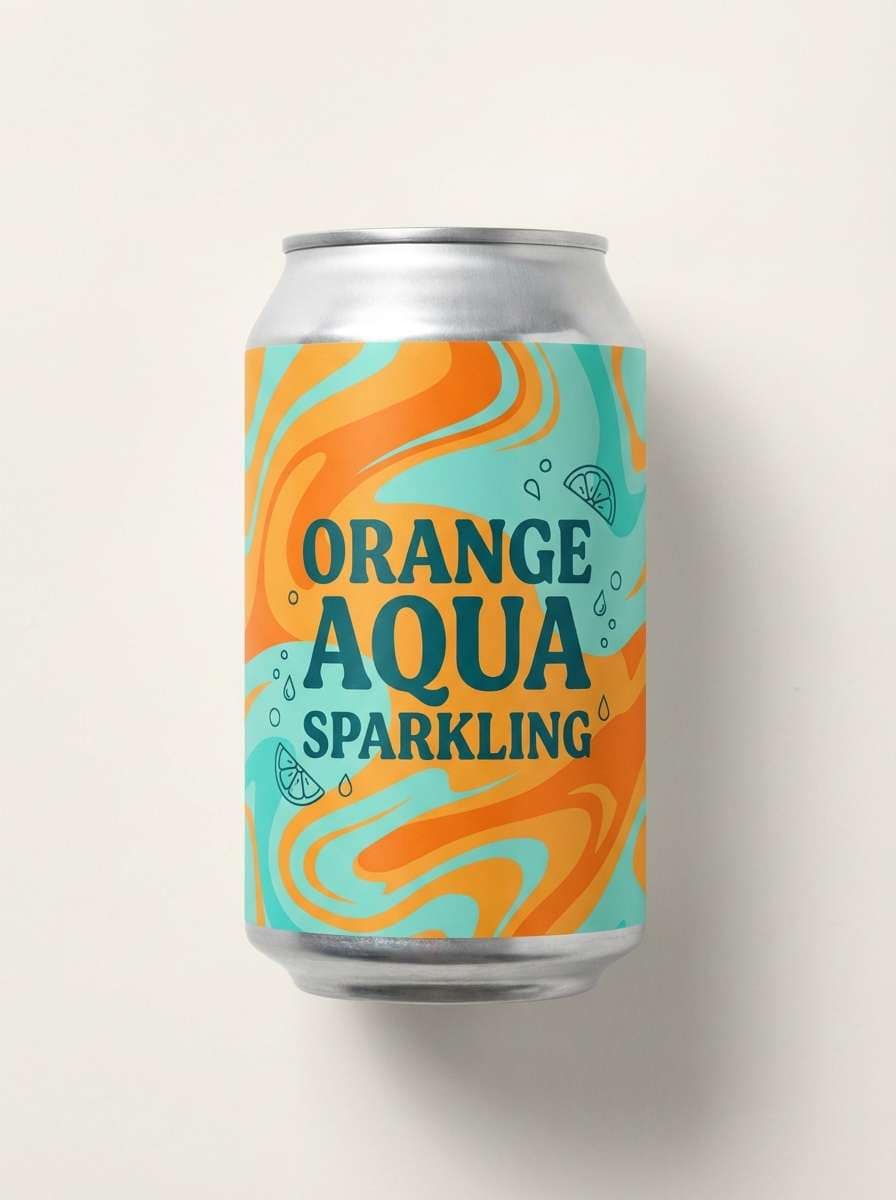
2) Tropical Soda
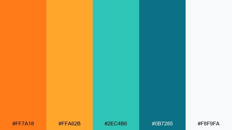
HEX: #FF7A18 #FFA62B #2EC4B6 #0B7285 #F8F9FA
Mood: playful, juicy, upbeat
Best for: drink labels and summer promos
Playful fizz and fruit-slice brightness make this mix feel like a cold soda on a hot day. It works especially well for beverage packaging, limited editions, and social ads that need quick shelf pop. Keep the label typography dark teal for legibility and let the lighter aqua sit behind illustrations. Tip: use the pale background tone for negative space so the orange looks more saturated and premium.
Image example of tropical soda generated using media.io
3) Desert Lagoon
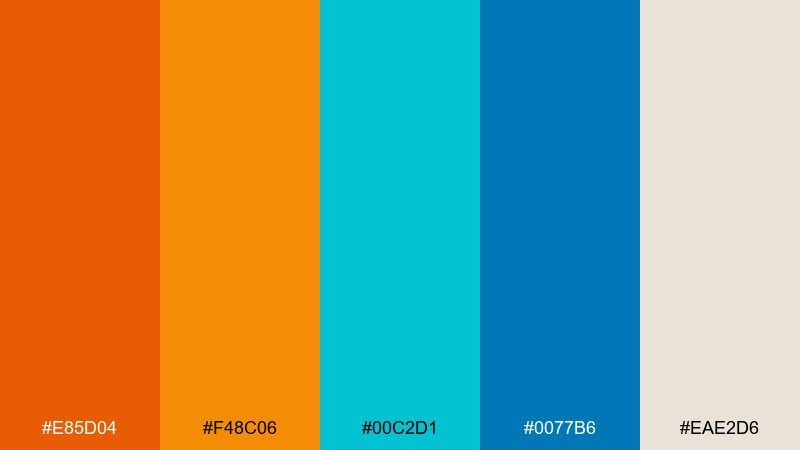
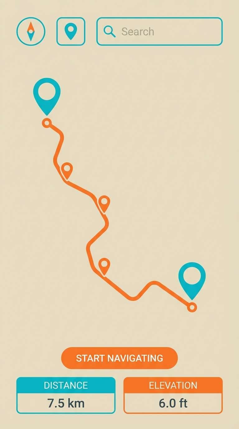
HEX: #E85D04 #F48C06 #00C2D1 #0077B6 #EAE2D6
Mood: adventurous, sunbaked, crisp
Best for: outdoor apps and waypoint maps
Adventurous and sunbaked, it feels like dunes meeting a cool lagoon at noon. The strong contrast makes an orange cyan color palette that reads fast on maps, dashboards, and navigation-heavy UI. Pair it with thin-line icons and a sandy neutral for panels to avoid visual fatigue. Tip: keep cyan for interactive states and use the deeper blue only for selected or active elements.
Image example of desert lagoon generated using media.io
4) Retro Surf Poster
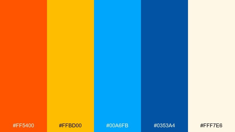
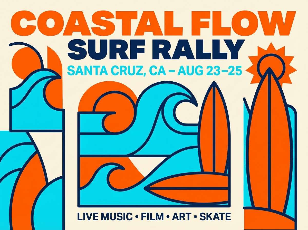
HEX: #FF5400 #FFBD00 #00A6FB #0353A4 #FFF7E6
Mood: retro, bold, sunlit
Best for: gig posters and event flyers
Retro and sunlit, these tones recall screen-printed surf posters and boardwalk signs. Use them for flyers, festival graphics, and merch where chunky shapes and big type are part of the vibe. Balance the saturated orange with cream as the base so the cyan stays crisp instead of harsh. Tip: apply the darker blue as a shadow or outline to make the bright elements pop without adding more colors.
Image example of retro surf poster generated using media.io
5) Copper Mint Minimal
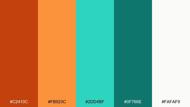
HEX: #C2410C #FB923C #2DD4BF #0F766E #FAFAF9
Mood: minimal, modern, grounded
Best for: SaaS branding and clean websites
Minimal and grounded, it feels like brushed copper paired with cool mint glass. It suits SaaS branding, landing pages, and modern portfolios that want warmth without losing clarity. Pair it with light stone backgrounds and simple grids for a calm, premium look. Tip: use the muted orange for highlights and save the brighter orange for one primary call to action per page.
Image example of copper mint minimal generated using media.io
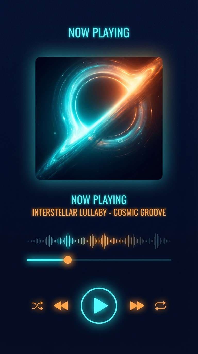
6) Coral Reef Night
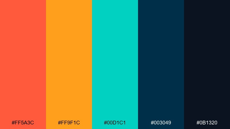
HEX: #FF5A3C #FF9F1C #00D1C1 #003049 #0B1320
Mood: dramatic, cinematic, high-contrast
Best for: music cover art and night-mode UI
Dramatic and cinematic, it evokes glowing coral against deep ocean water. The dark navy base makes the warm accents feel electric, ideal for album art, night-mode dashboards, and streaming visuals. Pair it with subtle gradients and soft shadows to keep the contrast smooth. Tip: limit bright orange to small highlights like badges or icons so it does not overpower the interface.
Image example of coral reef night generated using media.io
7) Citrus Blueprints
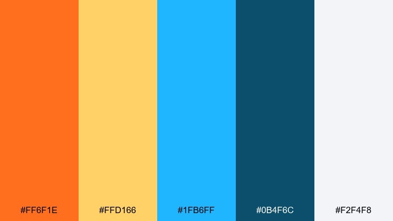
HEX: #FF6F1E #FFD166 #1FB6FF #0B4F6C #F2F4F8
Mood: clean, techy, energetic
Best for: startup pitch decks and infographics
Clean, techy energy meets citrus warmth, like a blueprint page with bright marker notes. These orange cyan color combinations are excellent for charts, callouts, and slide decks where structure matters. Pair them with cool grays and consistent line weights so the visuals stay professional. Tip: use cyan for data series and orange for annotations to guide the eye through complex information.
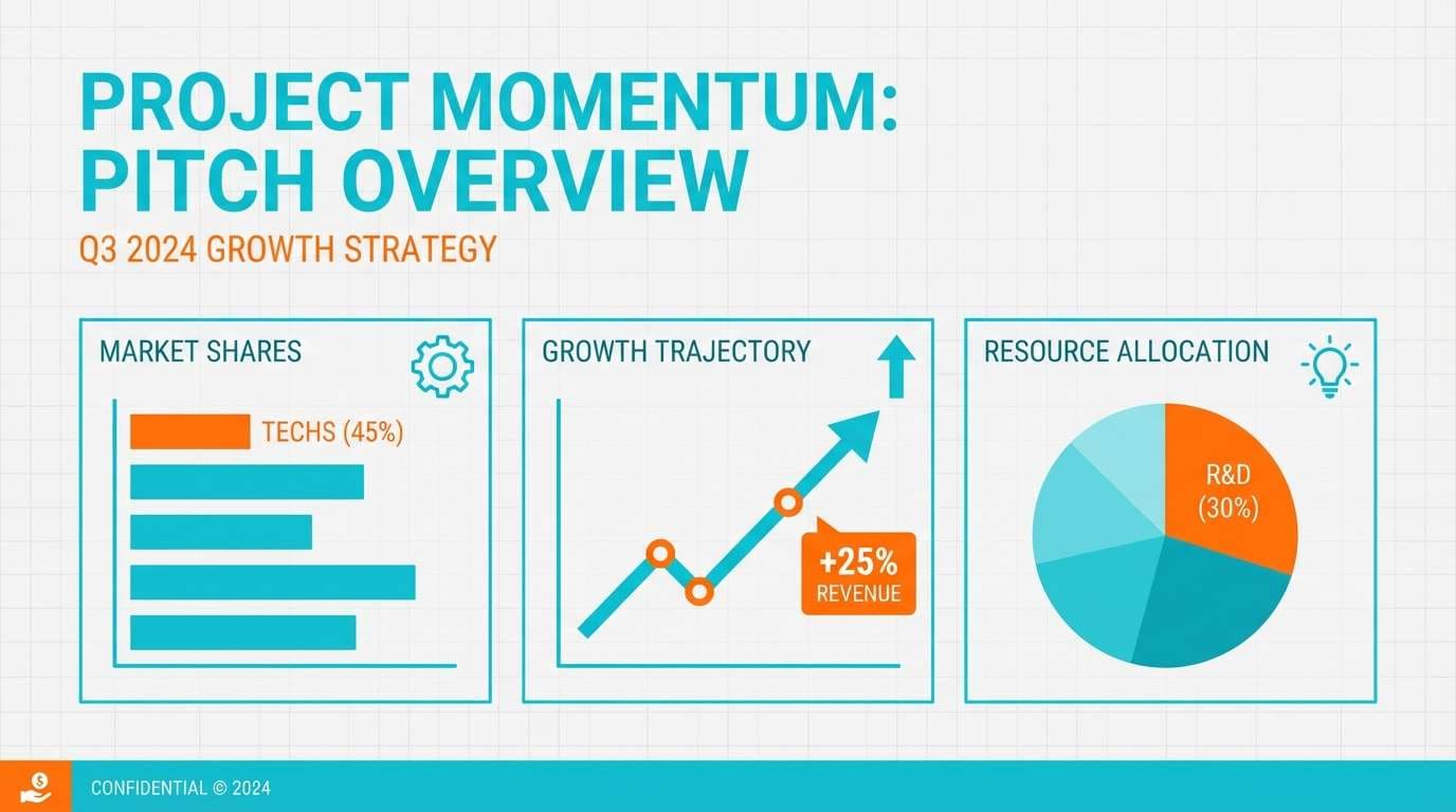
Image example of citrus blueprints generated using media.io
8) Market Awning

HEX: #F97316 #FDBA74 #06B6D4 #155E75 #FFF7ED
Mood: friendly, inviting, sunny
Best for: local shop branding and signage
Friendly and inviting, it feels like striped market awnings and fresh produce stands. Use it for cafe menus, small business signage, and community events where warmth matters. Pair it with hand-drawn icons or simple serif headings to add personality without clutter. Tip: keep the light orange as a background tint and reserve the brighter orange for prices or key highlights.
Image example of market awning generated using media.io
9) Spa Sunrise
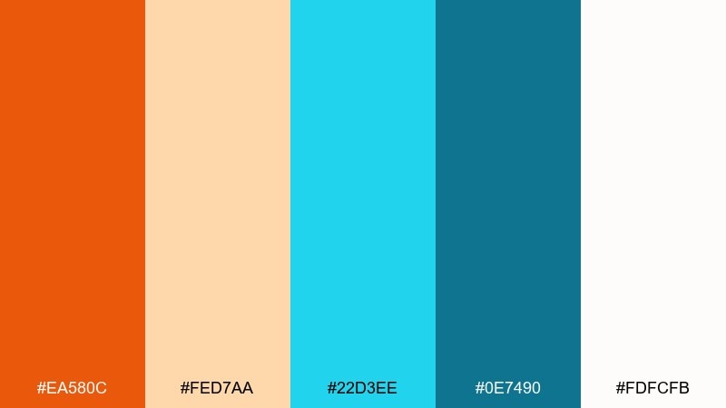
HEX: #EA580C #FED7AA #22D3EE #0E7490 #FDFCFB
Mood: calm, fresh, airy
Best for: wellness websites and skincare
Calm and airy, it suggests sunrise light over a quiet pool. It fits wellness landing pages, spa booking flows, and skincare branding where you want clean freshness with a hint of warmth. Pair it with soft photography and generous margins for a breathable layout. Tip: apply the pale peach as card backgrounds and keep cyan for interactive elements like toggles and links.
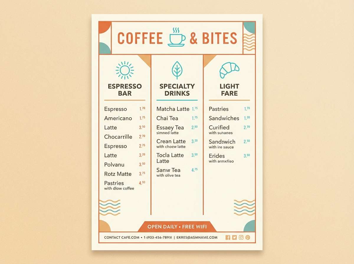
Image example of spa sunrise generated using media.io
10) Arcade Glow
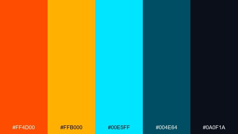
HEX: #FF4D00 #FFB000 #00E5FF #004E64 #0A0F1A
Mood: electric, fun, high-energy
Best for: gaming banners and stream overlays
Electric and fun, it feels like arcade lights bouncing off glossy plastic. The high contrast is made for gaming thumbnails, streaming overlays, and bold promo banners. Pair it with dark backgrounds and sharp geometric shapes to amplify the glow effect. Tip: keep text in near-white and use cyan for secondary buttons so orange stays the main punch.
Image example of arcade glow generated using media.io
11) Terracotta Tide
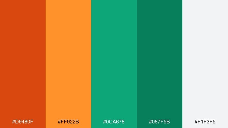
HEX: #D9480F #FF922B #0CA678 #087F5B #F1F3F5
Mood: earthy, balanced, modern
Best for: interior design lookbooks
Earthy and balanced, it brings terracotta pottery together with sea-glass greens. Use it for interior design lookbooks, home decor catalogs, and lifestyle brand grids. Pair it with warm neutrals and textured paper backgrounds to keep everything tactile. Tip: if you add photography, choose images with natural light so the terracotta stays true and not overly red.
Image example of terracotta tide generated using media.io
12) Seaside Gelato
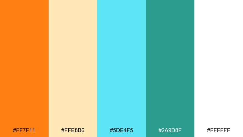
HEX: #FF7F11 #FFE8B6 #5DE4F5 #2A9D8F #FFFFFF
Mood: soft, sweet, summer
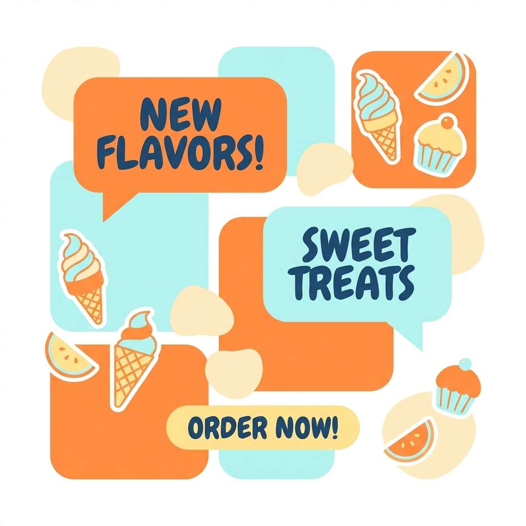
Best for: dessert shops and playful social posts
Soft and sweet, it looks like gelato scoops under a bright seaside sky. It is perfect for dessert brands, cheerful Instagram templates, and light promotional graphics. Pair it with rounded typefaces and simple stickers or doodles for a friendly feel. Tip: use the pale yellow as a buffer between orange and cyan so the layout feels creamy, not harsh.
Image example of seaside gelato generated using media.io
13) Canyon Pool
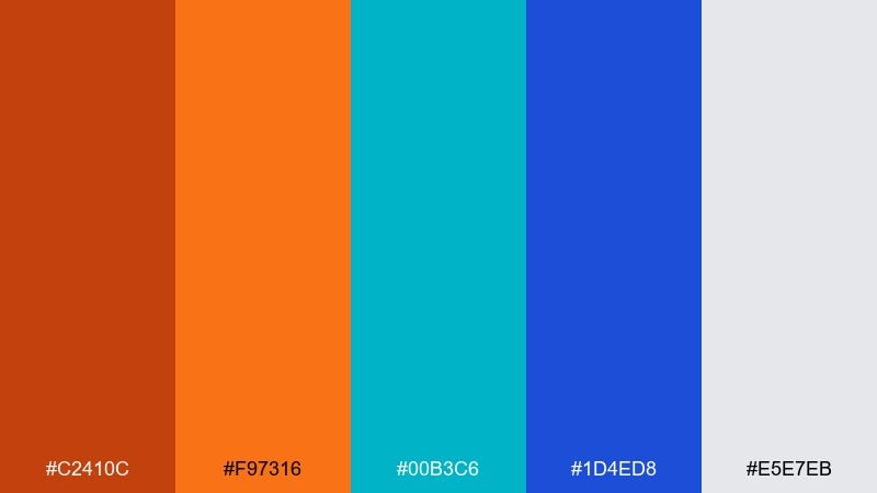
HEX: #C2410C #F97316 #00B3C6 #1D4ED8 #E5E7EB
Mood: adventurous, sporty, crisp
Best for: sports graphics and team socials
Sporty and crisp, it feels like a canyon hike ending at a cold swimming hole. Use it for athletic branding, scoreboard graphics, and energetic announcements. Pair it with bold condensed fonts and simple stripes for motion. Tip: keep the gray as the main canvas so the two saturated hues stay sharp and readable at a distance.
Image example of canyon pool generated using media.io
14) Studio Spotlight
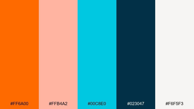
HEX: #FF6A00 #FFB4A2 #00C8E0 #023047 #F6F5F3
Mood: creative, polished, editorial
Best for: portfolio sites and case studies
Creative and polished, it feels like warm studio lights hitting a cool backdrop. For a portfolio or agency case study, this orange cyan color palette helps you separate headings, captions, and callouts without adding extra hues. Pair it with clean grids, generous whitespace, and one strong serif for contrast. Tip: use the soft coral as a background tint for quote blocks so the bright orange is saved for primary actions.
Image example of studio spotlight generated using media.io
15) Autumn Aquarium
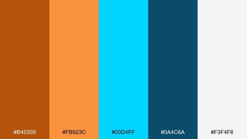
HEX: #B45309 #FB923C #00D4FF #0A4C6A #F3F4F6
Mood: cozy, vivid, slightly moody
Best for: museum promos and educational graphics
Cozy but vivid, it suggests autumn leaves outside an aquarium window. It works for museum posters, educational graphics, and kid-friendly exhibits that still need a refined look. Pair it with clear icon sets and plenty of spacing so information stays digestible. Tip: keep cyan for highlights and links, and use the brown-orange for section headers to add warmth.
Image example of autumn aquarium generated using media.io
16) Craft Coffee Label
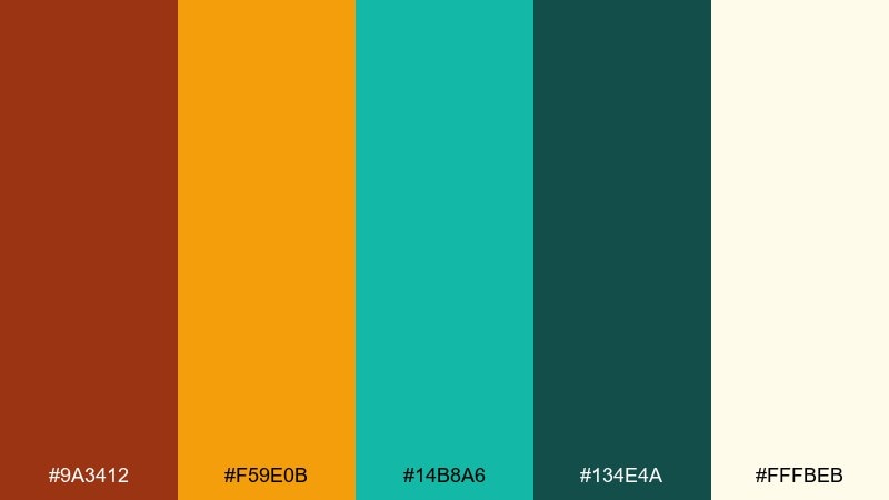
HEX: #9A3412 #F59E0B #14B8A6 #134E4A #FFFBEB
Mood: artisanal, warm, trustworthy
Best for: coffee packaging and roaster branding
Artisanal warmth meets a cool modern twist, like a cozy roastery with teal ceramic cups. It is great for coffee bag labels, stamp-style logos, and small batch packaging where you want craft plus clarity. Pair it with textured paper stocks and dark green-black ink for a premium finish. Tip: let teal carry the brand mark while orange supports origin notes and roast levels.
Image example of craft coffee label generated using media.io
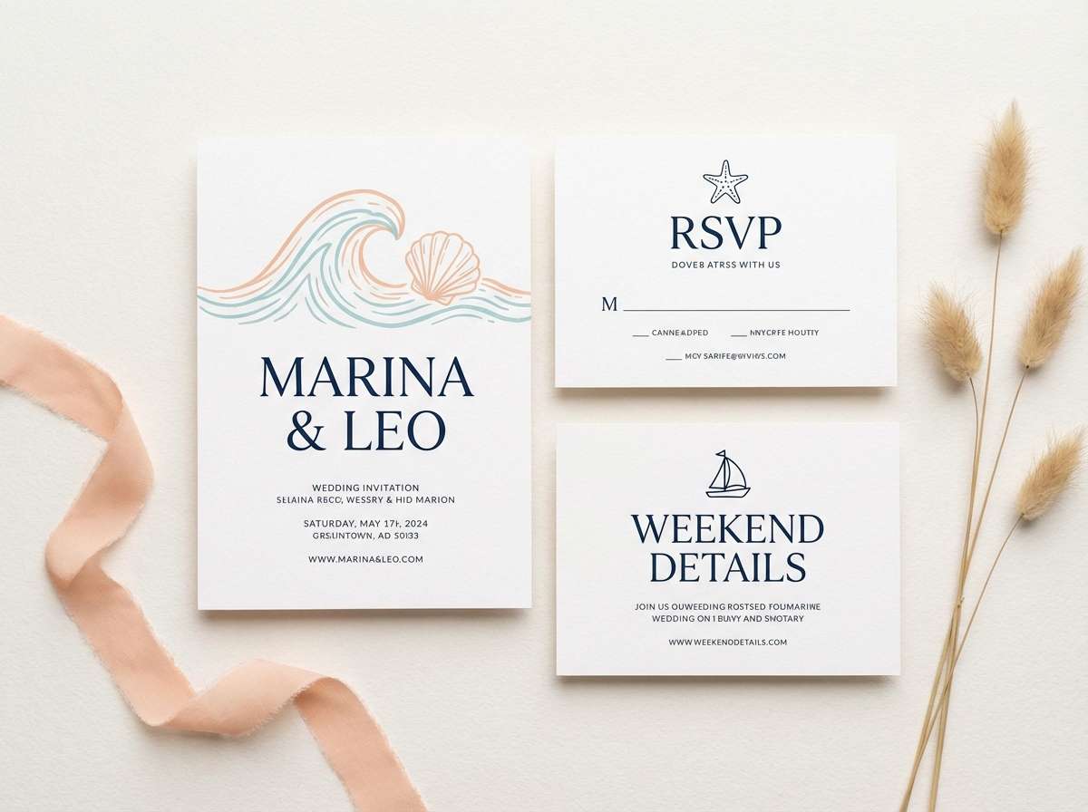
17) Coastal Wedding Invite
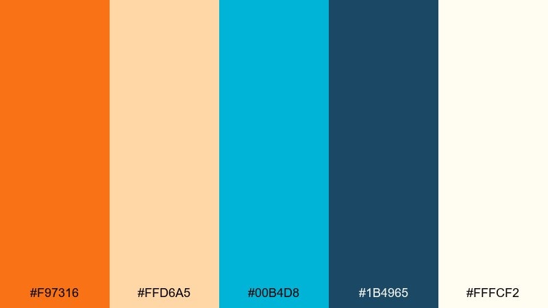
HEX: #F97316 #FFD6A5 #00B4D8 #1B4965 #FFFCF2
Mood: romantic, airy, coastal
Best for: wedding invitations and stationery
Romantic and airy, it feels like a coastal ceremony at golden hour. Use it for invitation suites, menus, and RSVP cards where you want warmth without losing freshness. Pair it with elegant serif type and thin dividers in deep blue for a refined finish. Tip: keep the brighter orange for small motifs like florals or monograms, not large backgrounds.
Image example of coastal wedding invite generated using media.io
18) Neon Workshop
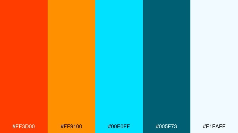
HEX: #FF3D00 #FF9100 #00E0FF #005F73 #F1FAFF
Mood: modern, punchy, maker-friendly
Best for: tech workshop posters
Modern and punchy, it feels like glowing sticky notes in a late-night maker space. These tones work well for workshop posters, meetup banners, and registration pages that need urgency. Pair them with simple icons and plenty of white so the message stays clear. Tip: use the deep teal for body text and let cyan handle highlights like dates and locations.
Image example of neon workshop generated using media.io

19) Modern Editorial Spread
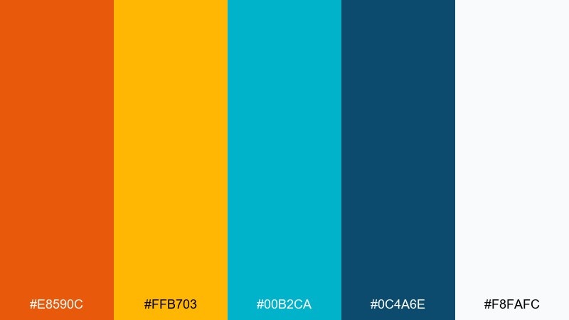
HEX: #E8590C #FFB703 #00B2CA #0C4A6E #F8FAFC
Mood: smart, contemporary, structured
Best for: magazine layouts and blog headers
Smart and structured, it reads like a contemporary magazine with bright pull quotes. Orange cyan color combinations shine in editorial grids because they separate sections fast without looking childish. Pair them with black or deep teal body text and use orange only for emphasis lines and numbers. Tip: keep cyan as the recurring accent across pages for consistency, and rotate orange as the feature color per article.
Image example of modern editorial spread generated using media.io
20) Kids Science Fair
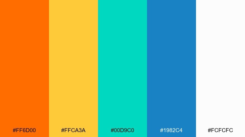
HEX: #FF6D00 #FFCA3A #00D9C0 #1982C4 #FCFCFC
Mood: bright, curious, friendly
Best for: school flyers and STEM visuals
Bright and curious, it feels like a classroom full of posters, magnets, and experiments. Use it for STEM club flyers, kid-focused infographics, and friendly app onboarding. Pair it with rounded icons and simple illustrations to keep the message approachable. Tip: let cyan handle backgrounds for diagrams while orange calls attention to titles and key steps.
Image example of kids science fair generated using media.io

21) Sunset App Dashboard
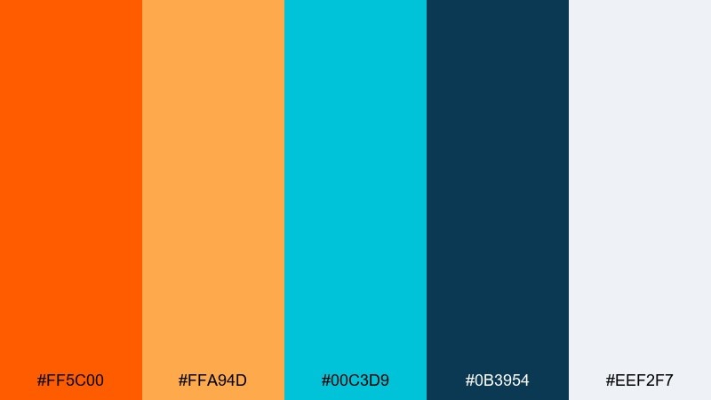
HEX: #FF5C00 #FFA94D #00C3D9 #0B3954 #EEF2F7
Mood: confident, modern, user-focused
Best for: analytics dashboards
Confident and modern, it brings sunset warmth into a crisp, data-friendly interface. An orange cyan color palette like this works well for dashboards where you need clear hierarchy between charts, filters, and alerts. Pair it with soft gray panels and consistent spacing so the UI feels calm even with strong accents. Tip: use orange for warnings and highlights, while cyan marks primary actions and positive trends.
Image example of sunset app dashboard generated using media.io
What Colors Go Well with Orange Cyan?
Neutrals are the easiest “third ingredient” for orange and cyan: warm off-white, sand, stone, and light gray keep the palette breathable and help both hues feel intentional rather than loud. For typography, deep teal, charcoal, or near-black typically reads cleaner than pure black.
If you want extra depth, add a dark anchor like navy or deep blue-green to control contrast and create a premium feel. For softer, lifestyle looks, introduce pale peach, butter yellow, or muted coral as transition tones between orange and cyan.
For data and UI systems, consider using cool grays for surfaces and reserving orange for alerts/attention while cyan signals interactive states. That separation keeps the interface consistent and reduces visual noise.
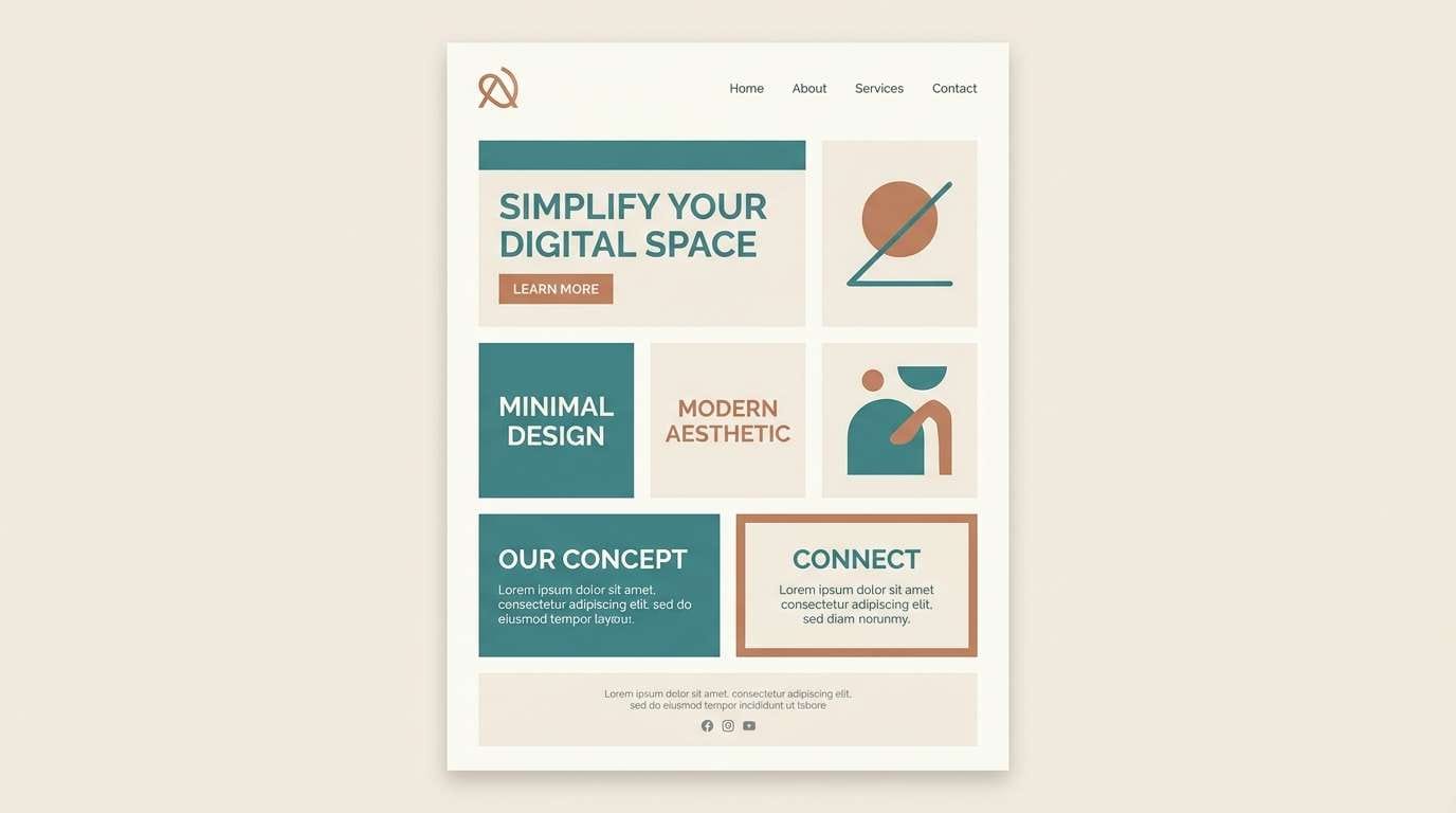
How to Use a Orange Cyan Color Palette in Real Designs
Start by assigning roles: pick one dominant color (often cyan for UI surfaces or orange for branding warmth), then keep the other as an accent for CTAs, highlights, badges, or key illustrations. The biggest mistake is giving both equal weight everywhere, which can feel chaotic.
Control saturation and area. Large blocks of bright orange can overpower, while large blocks of bright cyan can look cold; balancing them with off-white/gray panels or a deep teal text color improves comfort and legibility.
For print, test on the intended paper stock: warm creams can shift cyan greener and make orange feel richer. For digital, verify contrast for buttons and text states (default/hover/disabled) so the palette stays accessible.
Create Orange Cyan Palette Visuals with AI
If you already have HEX codes, you can turn them into on-brand visuals quickly by generating mockups like hero banners, posters, packaging, and UI screens. This helps you validate contrast, spacing, and typography before you commit to a full design system.
With Media.io text-to-image, describe your layout (banner, label, dashboard), set the aspect ratio, and call out “dominant orange and cyan with deep teal typography” to keep results consistent. You can iterate fast by swapping moods (minimal, retro, cinematic) while keeping the same palette.
Once you like a direction, reuse the same prompt structure for a full set of assets—social posts, ads, thumbnails, and landing visuals—so your orange cyan pairing stays cohesive across channels.
Orange Cyan Color Palette FAQs
-
Why do orange and cyan look so good together?
They create strong warm-vs-cool contrast, which makes layouts feel energetic but still clean. The separation is great for visual hierarchy in UI, branding, and posters. -
Are orange and cyan complementary colors?
They are near-opposites in common color-wheel use (orange vs blue/cyan family), so they behave like a complementary pair in practice, producing high contrast and strong emphasis. -
Which should be the primary color in an orange cyan palette?
For UI, cyan often works well as the primary (buttons, links, positive states) with orange as alerts or highlights. For lifestyle branding, orange can lead while cyan supports in backgrounds or secondary accents. -
How do I keep an orange cyan scheme from looking neon?
Lower saturation, add an off-white or warm neutral background, and introduce a dark anchor (deep teal or navy) for text. Also reduce the area of the brightest color to accents only. -
What text colors work best on orange or cyan backgrounds?
On orange, deep navy/teal or near-black usually reads best; on bright cyan, deep teal, navy, or charcoal is safer than pure black. Always check contrast for accessibility before finalizing. -
What are good supporting neutrals for orange and cyan?
Off-white, cream, stone, and cool gray keep the palette balanced. For darker themes, use deep navy or blue-black so orange and cyan highlights pop without glare. -
Can I use an orange cyan palette for print materials?
Yes—just proof on the intended paper. Cream stocks can warm cyan slightly, and bright oranges may print stronger than expected, so adjust saturation and ink coverage for readability.
Next: Minimalist Color Palette


