

A minimalist color palette keeps design quiet on purpose: fewer hues, softer contrast, and plenty of negative space. The result is a layout that feels modern, readable, and easy to scan.
Below are 20 clean minimalist palettes with HEX codes, plus AI prompt examples you can reuse for web, print, branding, and UI.
In this article
Why Minimalist Palettes Work So Well
Minimalist colors reduce visual noise, which makes typography, spacing, and hierarchy do the heavy lifting. That’s why minimalist design often looks “expensive” even when the layout is simple.
With fewer competing hues, contrast becomes easier to control. Buttons, headings, and key UI states stand out more clearly because you’re not asking the viewer to interpret too many color signals at once.
Minimal color combinations also translate well across mediums—from web to print to packaging—because neutrals and muted tones are less likely to clash with lighting, paper stock, or device calibration.
20+ Minimalist Color Palette Ideas (with HEX Codes)
1) Quiet Linen
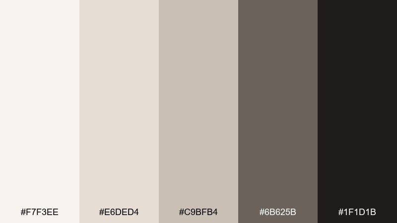
HEX: #F7F3EE #E6DED4 #C9BFB4 #6B625B #1F1D1B
Mood: calm, airy, understated
Best for: website hero sections and clean typography layouts
Calm linen whites and warm greige shadows feel like morning light on textured fabric. It works beautifully for editorial-style landing pages, portfolios, and any design that needs breathing room. Pair it with crisp sans-serif type and one bold photo to keep the layout from feeling flat. Usage tip: reserve the near-black for headings and key buttons to maintain a quiet hierarchy.
Image example of quiet linen generated using media.io
Media.io is an online AI studio for creating and editing video, image, and audio in your browser.

2) Graphite Milk
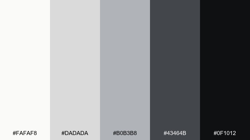
HEX: #FAFAF8 #DADADA #B0B3B8 #43464B #0F1012
Mood: sleek, modern, high-contrast
Best for: social graphics and monochrome brand posts
Sleek milky whites fade into graphite and ink, like a gallery wall under spotlights. The tones suit bold statements, minimal posters, and brand announcements where clarity matters most. Pair with one accent texture such as a thin grid or grain to avoid a sterile look. Usage tip: keep mid-grays for secondary text and dividers so the black feels intentional, not heavy.
Image example of graphite milk generated using media.io
3) Sage Concrete
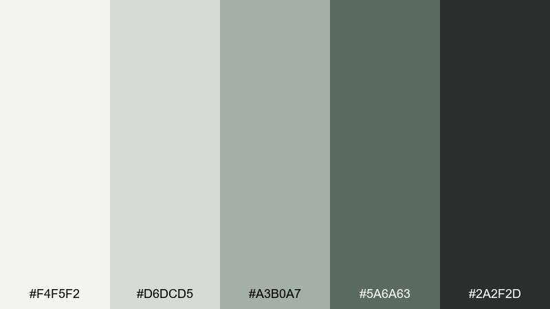
HEX: #F4F5F2 #D6DCD5 #A3B0A7 #5A6A63 #2A2F2D
Mood: grounded, fresh, architectural
Best for: studio interiors, architecture decks, and mood boards
Grounded sage and concrete grays evoke a quiet studio with plants by the window. It fits architecture presentations, sustainable brands, and calm interior mood boards that lean modern. Pair with natural materials in imagery like stone, linen, or brushed metal to reinforce the grounded feel. Usage tip: use the deepest green-gray for section headers to guide scanning without shouting.
Image example of sage concrete generated using media.io
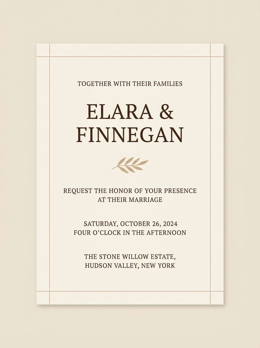
4) Sandstone Studio
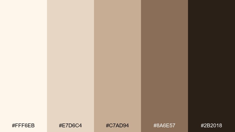
HEX: #FFF6EB #E7D6C4 #C7AD94 #8A6E57 #2B2018
Mood: sun-warmed, artisanal, calm
Best for: wedding invitations and minimalist stationery
Sun-warmed sandstone and toasted brown feel like handmade paper and studio ceramics. This minimalist color palette is ideal for invitations, menus, and stationery where warmth matters more than brightness. Pair with delicate line icons and generous margins, then add a subtle paper texture to keep it tactile. Usage tip: print the mid-tan as a background wash and save the dark brown for names and dates.
Image example of sandstone studio generated using media.io
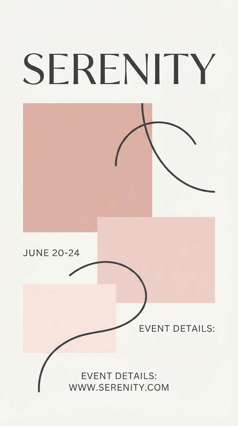
5) Charcoal Blush
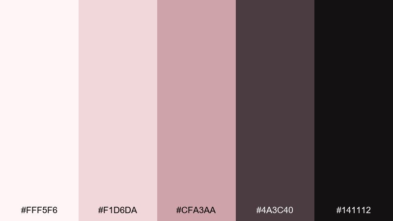
HEX: #FFF5F6 #F1D6DA #CFA3AA #4A3C40 #141112
Mood: soft, romantic, refined
Best for: beauty branding and elegant promo posters
Soft blush highlights against charcoal shadows suggest velvet petals in low light. The palette suits beauty launches, boutique promos, and refined packaging where you want gentle color without sweetness. Pair with crisp black type and a single curved shape to keep the composition modern. Usage tip: let blush live in large areas and use the darkest tones only for contrast and legibility.
Image example of charcoal blush generated using media.io
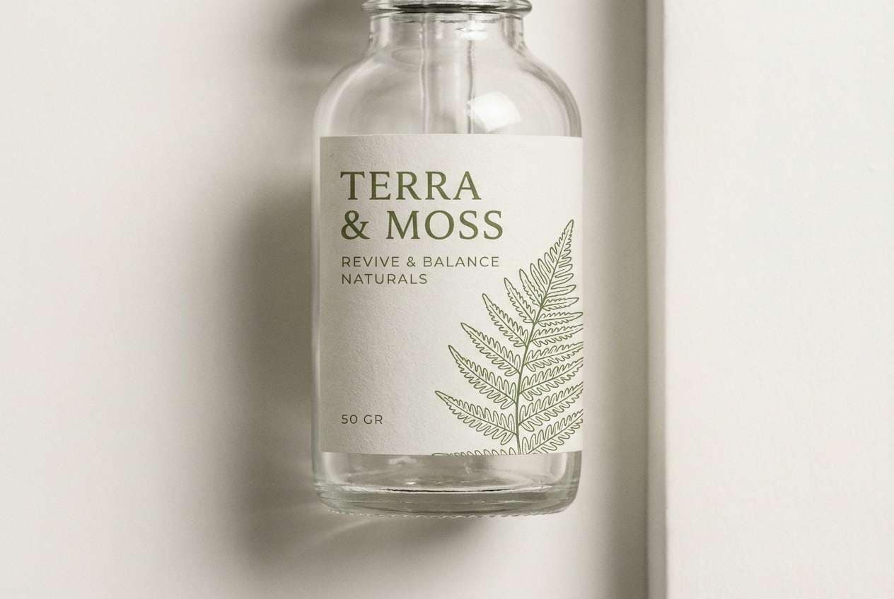
6) Moss and Mist
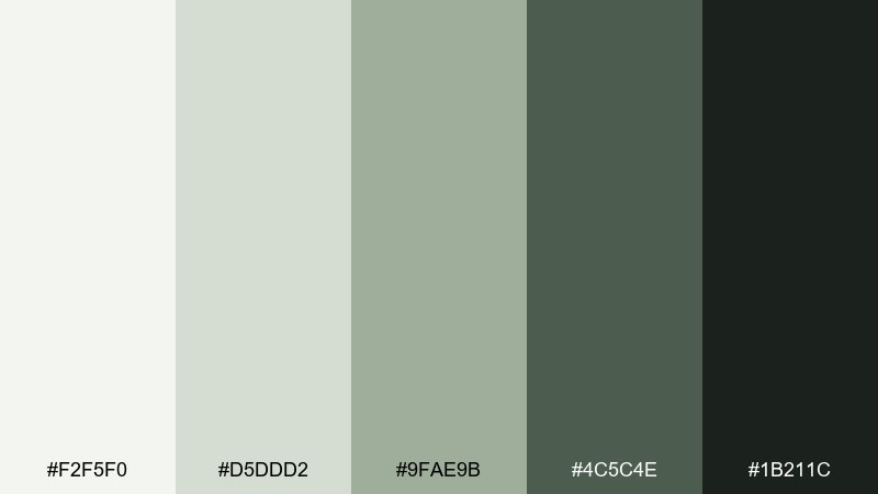
HEX: #F2F5F0 #D5DDD2 #9FAE9B #4C5C4E #1B211C
Mood: quiet, natural, restorative
Best for: eco product labels and sustainable packaging
Quiet misty greens feel like a shaded trail after rain. These tones are great for eco labels, refill packaging, and calm product storytelling. Pair with uncoated paper textures and simple icons to emphasize sustainability without clichés. Usage tip: keep the darkest green for certification badges and key claims so they stand out cleanly.
Image example of moss and mist generated using media.io
7) Warm Pebble
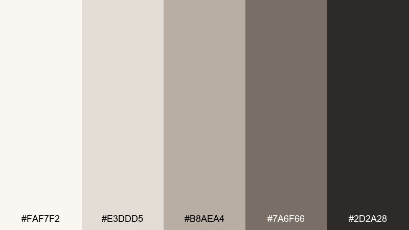
HEX: #FAF7F2 #E3DDD5 #B8AEA4 #7A6F66 #2D2A28
Mood: cozy, neutral, balanced
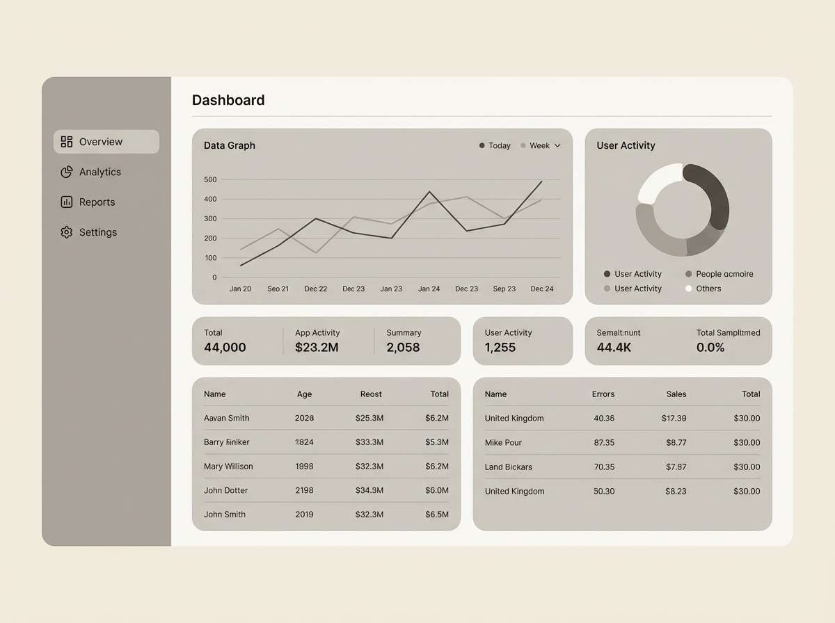
Best for: dashboard UI and data-heavy layouts
Cozy pebble neutrals read like smooth stones and soft wool. They keep dashboards approachable while still professional, especially for finance, analytics, or productivity tools. Pair with thin dividers and consistent spacing so the mid-tone grays do the organizational work. Usage tip: use the darkest brown-black only for primary numbers and active states to avoid visual fatigue.
Image example of warm pebble generated using media.io
8) Ivory Ink
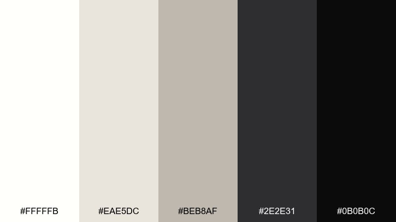
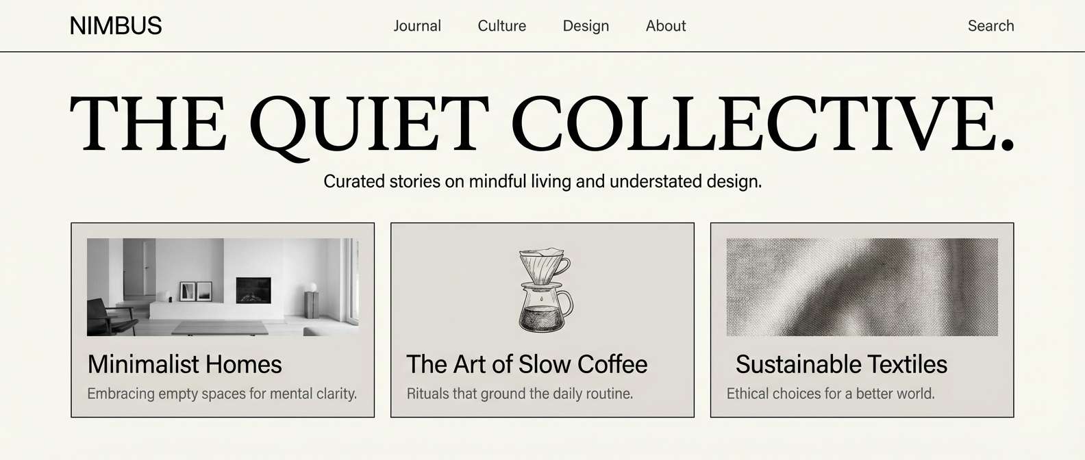
HEX: #FFFFFB #EAE5DC #BEB8AF #2E2E31 #0B0B0C
Mood: crisp, editorial, confident
Best for: wide headers and magazine-style web sections
Crisp ivory and deep ink evoke fresh pages and sharp headlines. This pairing is perfect for editorial websites, thought-leadership blogs, and minimalist portfolios where reading comfort is key. Pair with one strong image in grayscale or warm neutrals to keep the mood consistent. Usage tip: set body text in the charcoal, not pure black, to reduce harshness on bright backgrounds.
Image example of ivory ink generated using media.io
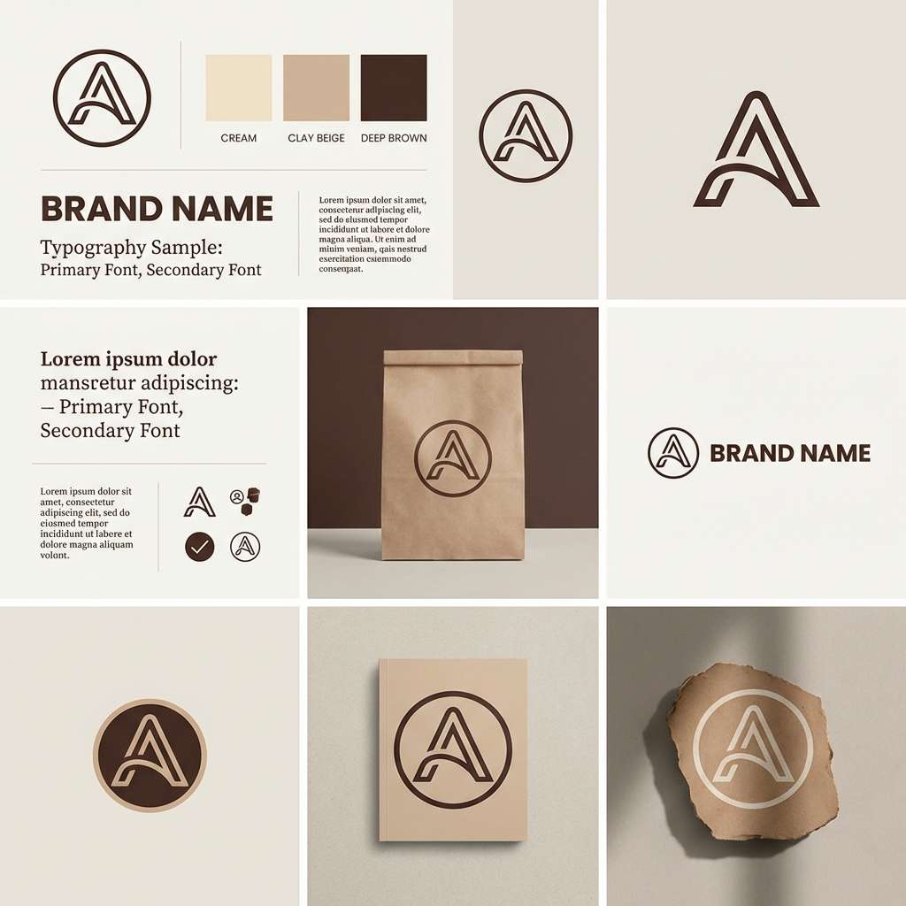
9) Clay Minimal
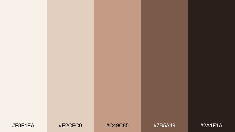
HEX: #F8F1EA #E2CFC0 #C49C85 #7B5A49 #2A1F1A
Mood: earthy, modern, handcrafted
Best for: branding boards and logo explorations
Earthy clay and roasted brown bring to mind pottery shelves and sunlit studios. These minimalist color combinations work especially well for makers, cafes, and lifestyle brands that want warmth without loud color. Pair with rounded typography or subtle arches for a contemporary craft feel. Usage tip: keep the clay mid-tone as your primary brand color and use the darkest brown for stamps and marks.
Image example of clay minimal generated using media.io
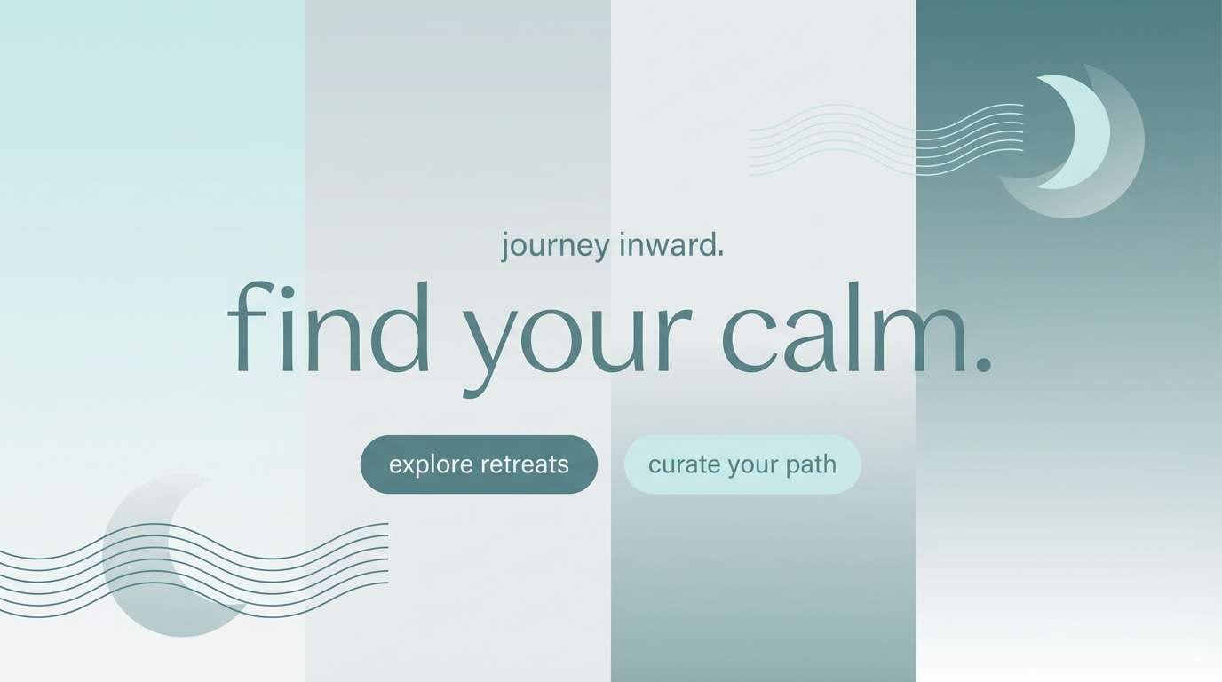
10) Ocean Fog
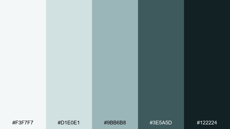
HEX: #F3F7F7 #D1E0E1 #9BB6B8 #3E5A5D #122224
Mood: cool, clean, calming
Best for: travel blogs and wellness landing pages
Cool sea-glass tones and foggy blue-grays feel like a quiet coastline. They fit wellness and travel pages where calm trust is more important than excitement. Pair with plenty of white space and soft photography to keep the palette airy. Usage tip: use the deep teal for links and icons so navigation stays clear against pale backgrounds.
Image example of ocean fog generated using media.io
11) Rosewood Neutral
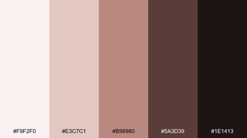
HEX: #F9F2F0 #E3C7C1 #B98980 #5A3D39 #1E1413
Mood: warm, intimate, premium
Best for: book covers and boutique editorial pieces
Warm rosewood and dusty blush suggest worn leather and soft candlelight. The tones suit literary covers, boutique editorials, and premium storytelling where emotion should feel subtle. Pair with a classic serif and thin rules to keep it polished rather than cute. Usage tip: place blush behind the title and keep the darkest brown only for author and small details.
Image example of rosewood neutral generated using media.io
12) Copper Ash
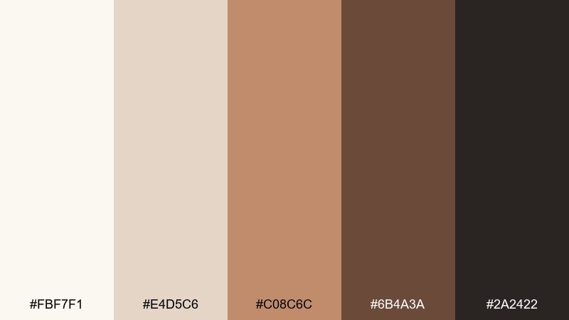
HEX: #FBF7F1 #E4D5C6 #C08C6C #6B4A3A #2A2422
Mood: toasty, grounded, boutique
Best for: candle ads and small-batch product photography
Toasty copper and ash browns feel like a warm kitchen and clean ceramic jars. They are strong for small-batch product ads, home fragrance, and artisan ecommerce where you want cozy premium cues. Pair with soft shadows and minimal props so the copper note does not turn overly rustic. Usage tip: keep the background creamy and let copper appear in one hero element for focus.
Image example of copper ash generated using media.io
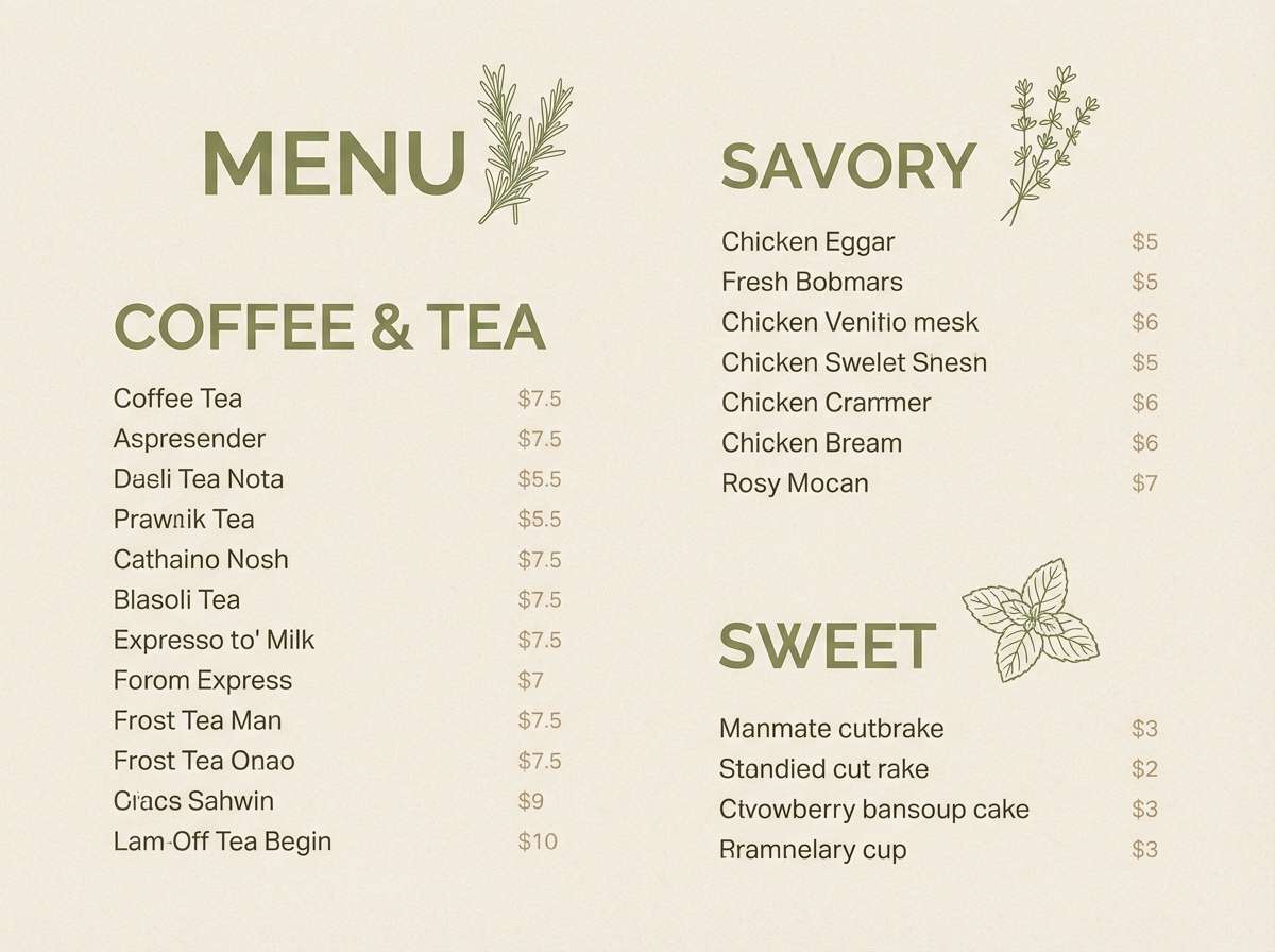
13) Olive Paper
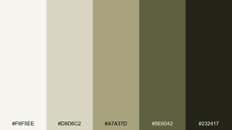
HEX: #F6F5EE #D8D6C2 #A7A37D #5E6042 #232417
Mood: organic, vintage-leaning, calm
Best for: cafe menus and food packaging design
Olive and paper-beige tones recall recipe cards, dried herbs, and sun-faded labels. They work well for cafe menus, deli packaging, and sustainable food brands that want a timeless feel. Pair with simple illustrations and plenty of spacing to keep it light, not military. Usage tip: use the mid-olive for category labels and reserve the dark olive for prices and key callouts.
Image example of olive paper generated using media.io
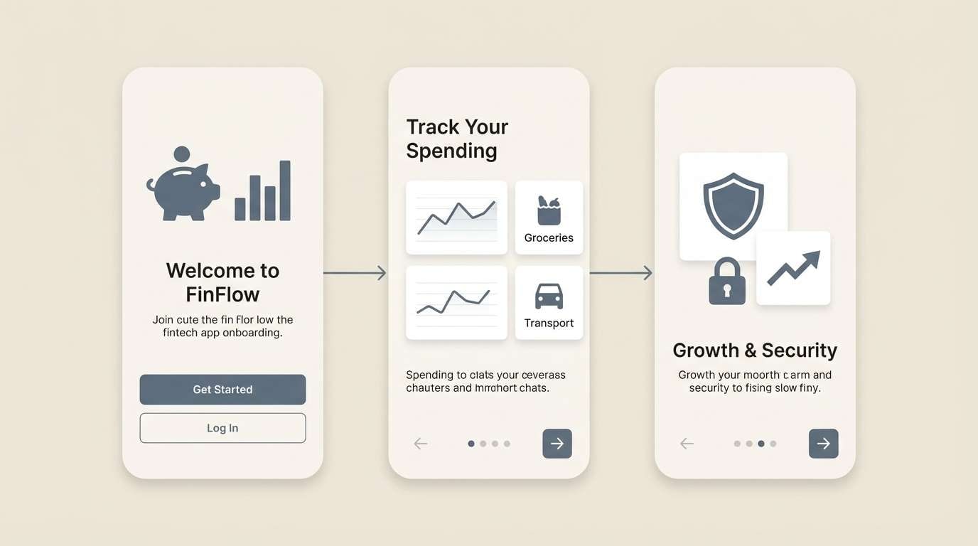
14) Slate Almond
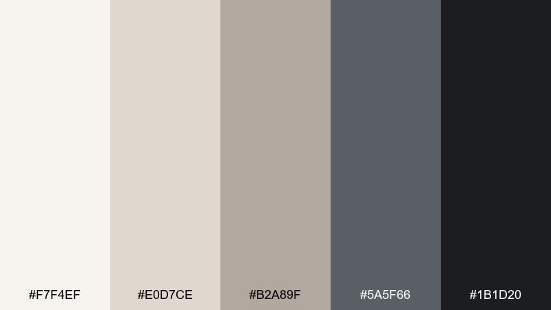
HEX: #F7F4EF #E0D7CE #B2A89F #5A5F66 #1B1D20
Mood: cool, professional, modern
Best for: fintech UI and product onboarding screens
Slate grays with almond neutrals feel like polished stone and clean paper. The balance is ideal for fintech, B2B software, and onboarding flows that need trust and clarity. Pair with thin line icons and consistent corner radii to keep everything cohesive. Usage tip: use slate for navigation and the almond tones for card surfaces to separate content without heavy borders.
Image example of slate almond generated using media.io
15) Dusty Lavender
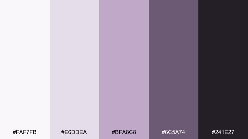
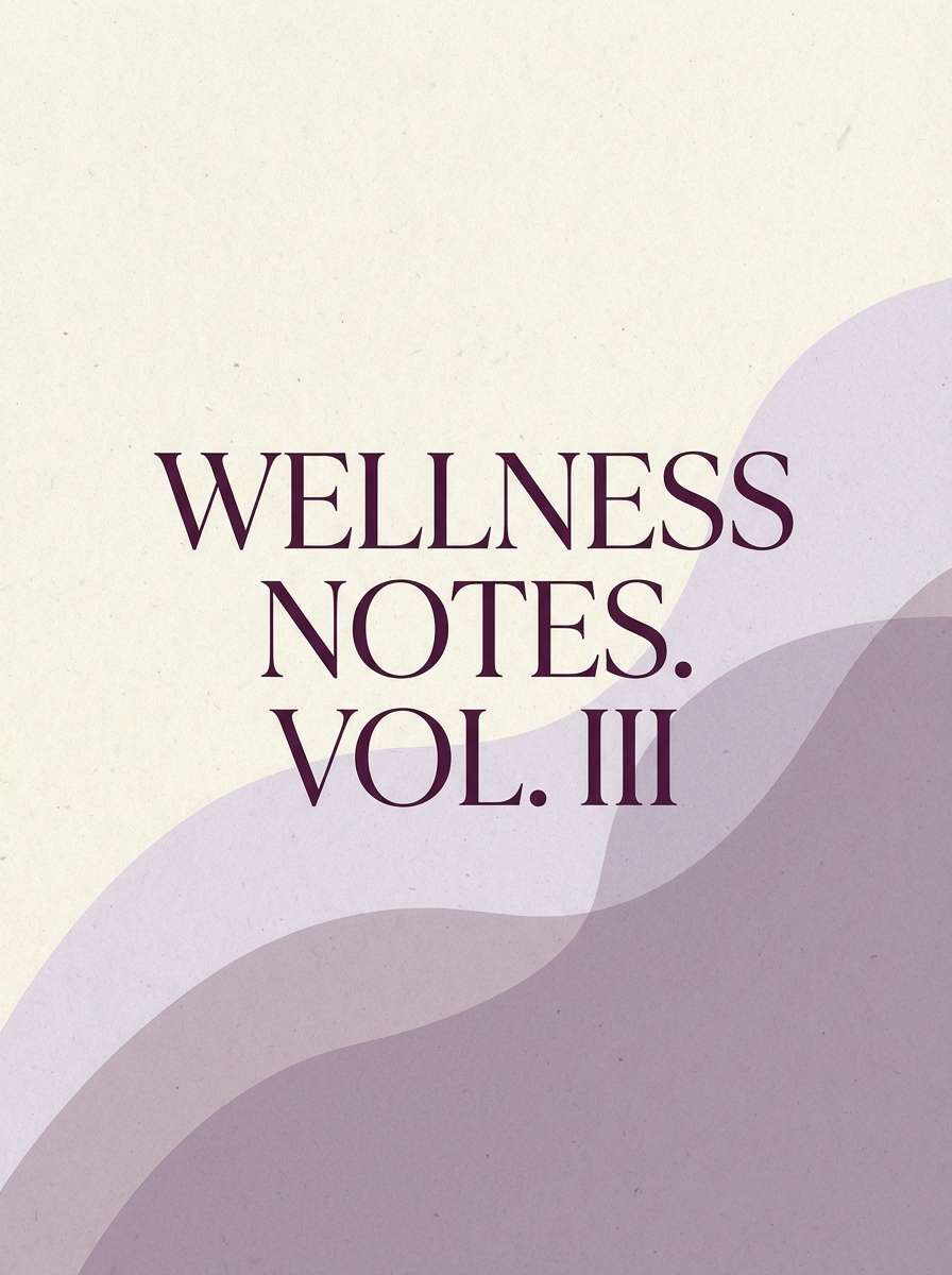
HEX: #FAF7FB #E6DDEA #BFA8C8 #6C5A74 #241E27
Mood: soft, mindful, modern-romantic
Best for: wellness journals and calming brand collateral
Dusty lavender and deep plum suggest twilight skies and soft knit blankets. This minimalist color palette fits mindfulness journals, yoga studios, and gentle self-care branding without turning sugary. Pair with lots of negative space and thin strokes so the purple stays airy. Usage tip: keep plum for headings only and let lavender carry the background for a calmer page.
Image example of dusty lavender generated using media.io
16) Terracotta Chalk
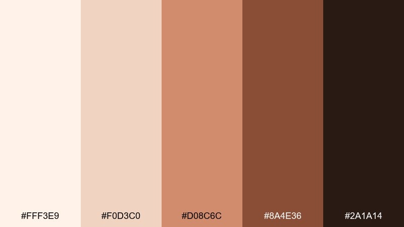
HEX: #FFF3E9 #F0D3C0 #D08C6C #8A4E36 #2A1A14
Mood: warm, earthy, energetic-but-soft
Best for: event flyers and workshop posters
Chalky peach and terracotta feel like sunbaked walls and hand-drawn posters. The tones are great for workshops, pop-up events, and community flyers that need warmth without neon. Pair with bold typography and one simple illustration for a friendly modern look. Usage tip: use terracotta for the date block and keep the dark brown only for small text to preserve softness.
Image example of terracotta chalk generated using media.io

17) Nightfall Beige
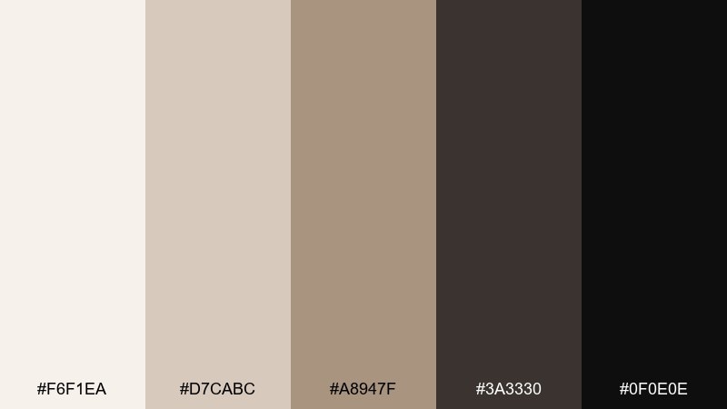
HEX: #F6F1EA #D7CABC #A8947F #3A3330 #0F0E0E
Mood: moody, cinematic, refined
Best for: luxury lookbooks and cinematic web headers
Moody night tones against soft beige read like a dim gallery with warm spotlights. It shines in luxury lookbooks, fashion microsites, and any design that wants drama while staying restrained. Pair with large typography and minimal ornament so the contrast does the storytelling. Usage tip: keep backgrounds beige and let the near-black appear in small, deliberate blocks for impact.
Image example of nightfall beige generated using media.io
18) Eucalyptus Cream
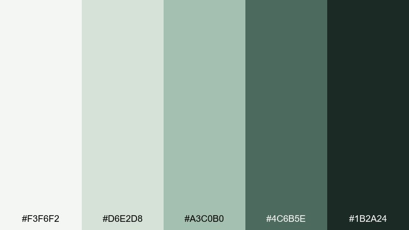
HEX: #F3F6F2 #D6E2D8 #A3C0B0 #4C6B5E #1B2A24
Mood: fresh, spa-like, natural
Best for: botanical illustrations and spring campaigns
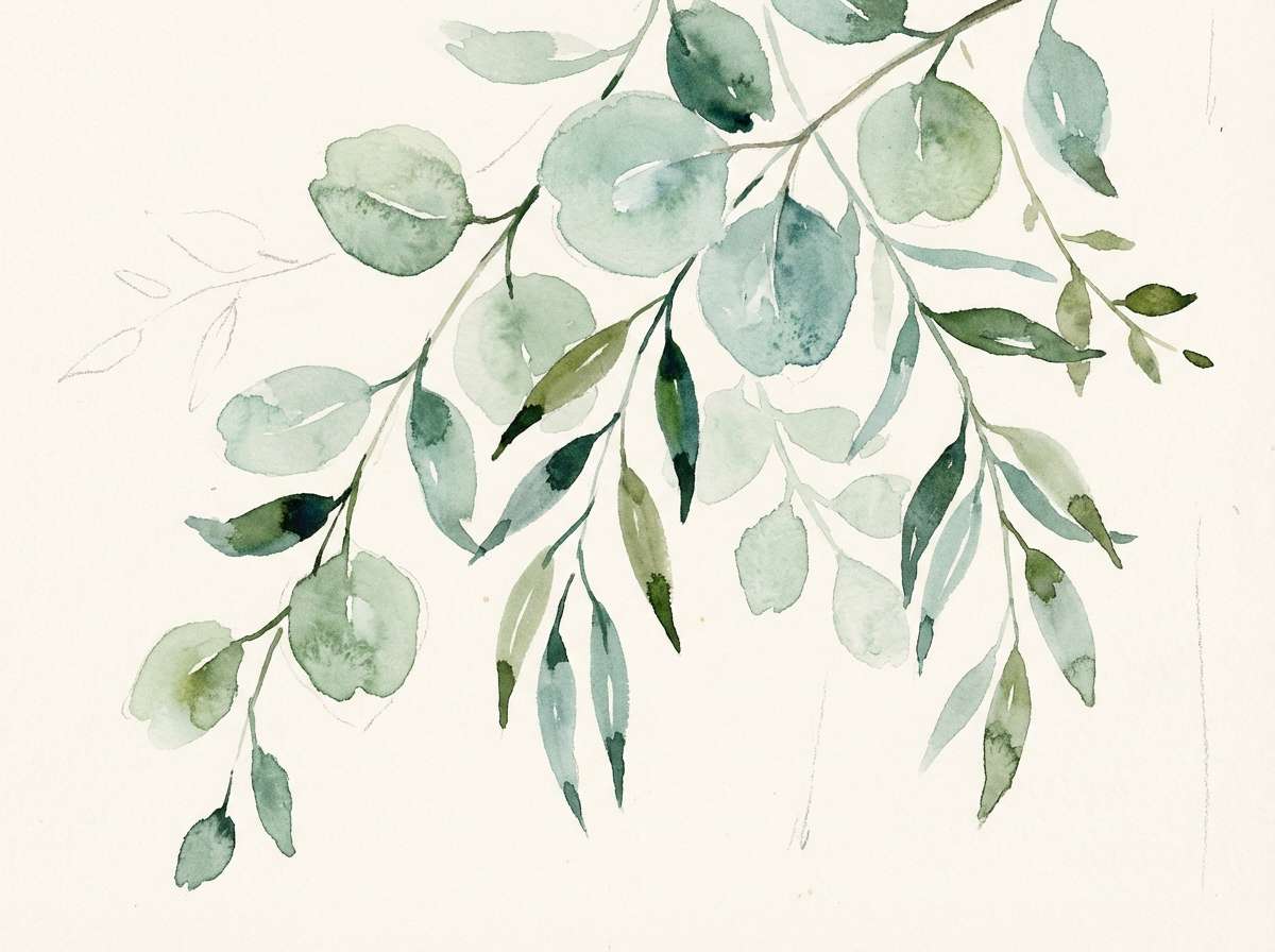
Fresh eucalyptus greens on creamy whites feel like a quiet spa towel and a leafy stem. These minimalist color combinations are a great fit for spring campaigns, botanical artwork, and wellness packaging. Pair with watercolor textures or soft gradients so the greens look organic rather than flat. Usage tip: let cream dominate the background and use deep green only for small focal points like logos.
Image example of eucalyptus cream generated using media.io
19) Steel Taupe
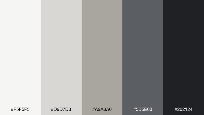
HEX: #F5F5F3 #D9D7D3 #A9A6A0 #5B5E63 #202124
Mood: neutral, technical, polished
Best for: pitch decks and presentation slides
Steel and taupe neutrals feel like brushed metal and clean stationery. They work well in slide decks and reports where charts, bullets, and structure must stay readable. Pair with one accent shape per slide and consistent spacing so information feels calm. Usage tip: set chart grids in the lightest gray and use the dark steel only for the data line you want highlighted.
Image example of steel taupe generated using media.io
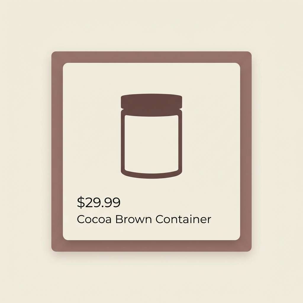
20) Cocoa Snow
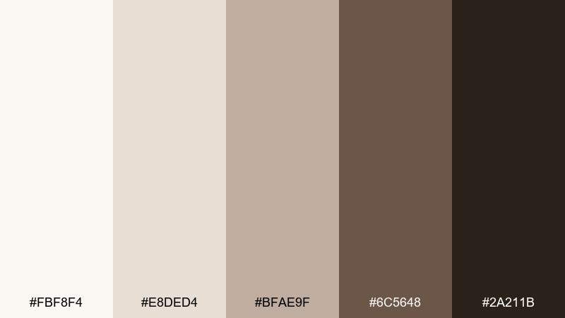
HEX: #FBF8F4 #E8DED4 #BFAE9F #6C5648 #2A211B
Mood: soft, cozy, premium-neutral
Best for: ecommerce product cards and storefront banners
Cocoa browns and snowy creams evoke a warm drink beside a clean marble counter. The tones are ideal for ecommerce cards, product grids, and storefront banners that need softness without losing contrast. Pair with simple product silhouettes and minimal copy so the browns feel premium, not muddy. Usage tip: keep buttons in cocoa and use the light cream for surrounding whitespace to improve scanability.
Image example of cocoa snow generated using media.io
What Colors Go Well with Minimalist?
Minimalist palettes pair best with neutrals (ivory, warm white, greige, taupe) plus one deep anchor (charcoal, ink black, deep green). This gives you clarity and enough contrast to create hierarchy.
If you want a hint of personality, choose one muted accent—like dusty lavender, sage, terracotta, or blush—then keep it consistent across buttons, icons, tags, or small illustrations.
For a more editorial look, lean into monochrome (white/gray/black) and use texture (grain, thin rules, subtle gradients) instead of extra colors.
How to Use a Minimalist Color Palette in Real Designs
Start with a background + surface system: one light base for the page, one slightly darker tone for cards/sections, and a deep tone for text. This alone creates structure without borders everywhere.
Assign roles to each color (background, surface, primary text, secondary text, accent/action) and avoid improvising. Minimalist color works when it’s predictable and repeated.
Finally, let spacing and type scale do the emphasis. When color is restrained, margin, line-height, and font weight become your most reliable tools for a clean, modern feel.
Create Minimalist Palette Visuals with AI
If you already have HEX codes, you can turn them into on-brand visuals by generating mockups (posters, UI screens, labels, covers) that stick to your palette and layout style.
Reuse the prompts above, swap in your product type (menu, app screen, packaging), and keep the ratio tag to match the output you need for web or print.
To generate minimalist palette examples quickly, use Media.io Text-to-Image and iterate with small prompt tweaks (typography, whitespace, lighting, texture) instead of changing colors.
Minimalist Color Palette FAQs
-
What is a minimalist color palette?
A minimalist color palette is a small, controlled set of colors—often neutrals plus one muted accent—designed to keep layouts calm, readable, and consistent across UI, print, and branding. -
How many colors should a minimalist palette include?
Most minimalist palettes work best with 3–5 colors: a light background, a surface tone, a mid neutral, a dark for text/contrast, and an optional accent for CTAs or highlights. -
Do minimalist palettes have to be black and white?
No. Many minimalist colors are warm (sand, clay, cocoa) or cool (sage, ocean fog, slate). The “minimalist” part is restraint and role-based usage, not lack of color. -
What are the best minimalist colors for websites and UI?
Soft off-white backgrounds with charcoal text are the safest foundation. Add a single deep accent (teal, olive, plum) for links and active states, and keep mid-grays for dividers and secondary labels. -
How do I keep a minimalist palette from looking boring?
Use hierarchy (type scale, weight), spacing, and subtle texture (grain, thin grids, soft shadows). Minimalism looks intentional when the layout system is strong. -
Which minimalist palette is best for print?
Warm neutrals like Sandstone Studio, Clay Minimal, or Cocoa Snow often print beautifully. Use the darkest tone for names, dates, and key information to preserve legibility on paper. -
Can I generate minimalist palette mockups with AI?
Yes—use a text-to-image tool, describe the layout and subject (poster, dashboard, label), and specify your minimalist mood (whitespace, clean typography, subtle shapes). Then refine by adjusting lighting, texture, and spacing rather than adding more colors.
Next: Scarlet Color Palette


