

Ochre is a timeless, earth-forward color that brings instant warmth to visuals without feeling overly bright. It sits between mustard and clay, making it flexible for both modern UI and tactile, handmade aesthetics.
Below are ready-to-use ochre color palette ideas with HEX codes, plus practical pairing and usage tips for branding, interiors, social graphics, and more.
In this article
Why Ochre Palettes Work So Well
Ochre palettes feel human and grounded because they borrow from natural materials—stone, clay, sand, leather, and aged paper. That organic association makes designs read as warmer, more trustworthy, and less sterile than pure grays or stark whites.
They’re also versatile in contrast: ochre can act as a soft “neutral-plus” when paired with creams and tans, or as a bold accent when set against deep espresso browns, charcoal, or blue-black shades.
Most importantly, ochre plays nicely with texture. Whether you’re styling lifestyle photography, building an editorial layout, or designing a UI system, ochre helps add depth without needing heavy effects or loud colors.
20+ Ochre Color Palette Ideas (with HEX Codes)
1) Desert Linen
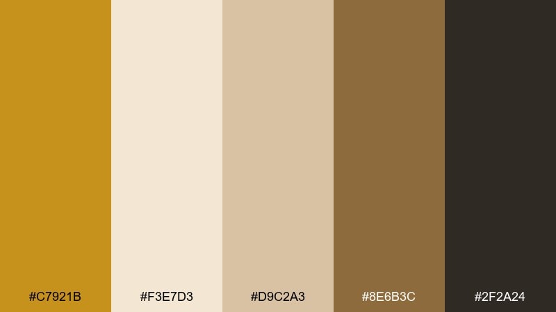
HEX: #C7921B #F3E7D3 #D9C2A3 #8E6B3C #2F2A24
Mood: calm, sunwashed, grounded
Best for: minimal branding and lifestyle photography styling
Calm and sunwashed, this mix feels like linen in warm desert light with soft shadows. It works beautifully for minimal brand systems, lookbooks, and product backdrops where warmth matters without shouting. Pair the deep espresso tone with the creamy neutrals for clean contrast, and use the golden note as a small highlight. Tip: keep typography in the dark brown and reserve the ochre for buttons, tags, or key callouts.
Image example of desert linen generated using media.io
Media.io is an online AI studio for creating and editing video, image, and audio in your browser.

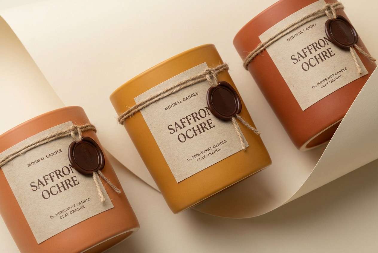
2) Saffron Clay
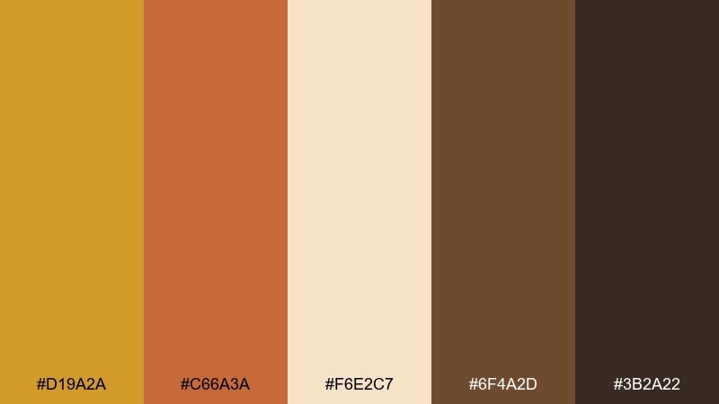
HEX: #D19A2A #C66A3A #F6E2C7 #6F4A2D #3B2A22
Mood: artisan, spicy, tactile
Best for: ceramic product packaging and handmade labels
Artisan and spicy, these tones evoke hand-thrown clay, saffron threads, and a warm kiln glow. They shine on packaging for soaps, candles, and small-batch goods where texture is part of the story. Pair the clay orange with the creamy paper tone for a friendly base, then add depth with the roasted browns. Tip: use the darkest shade for ingredient lists to keep small text crisp and readable.
Image example of saffron clay generated using media.io
3) Vintage Ledger
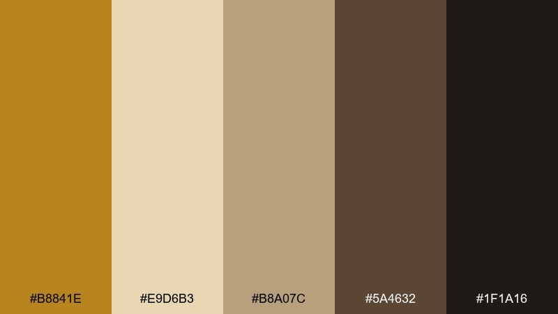
HEX: #B8841E #E9D6B3 #B8A07C #5A4632 #1F1A16
Mood: heritage, archival, refined
Best for: editorial layouts and book cover design
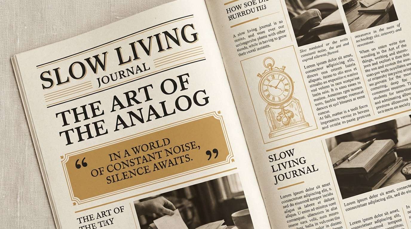
Heritage and archival, this palette feels like aged paper, worn leather, and ink-stained margins. It suits editorial spreads, historical features, and book covers that need credibility with warmth. Let the pale parchment tone dominate, then ground the layout with the near-black for headlines and rules. Tip: keep photo treatments slightly warm so images blend naturally with the paper-like neutrals.
Image example of vintage ledger generated using media.io
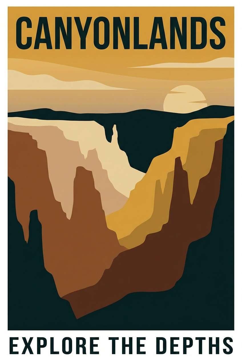
4) Canyon Dusk
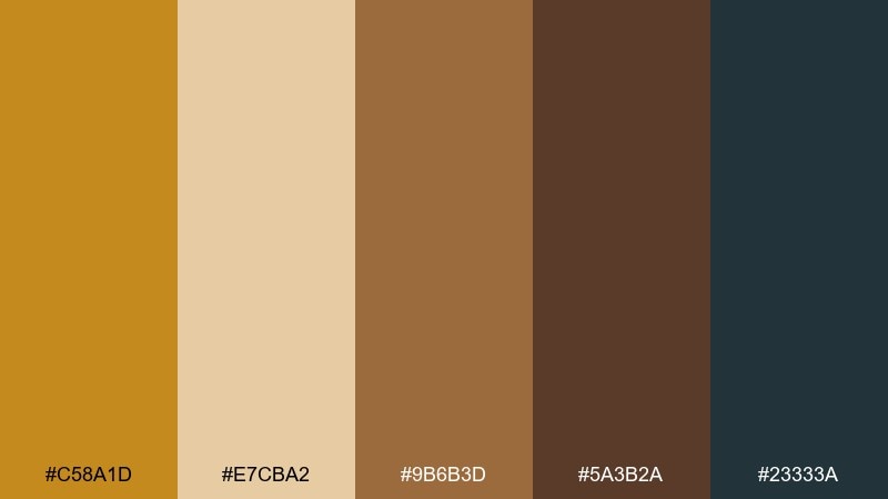
HEX: #C58A1D #E7CBA2 #9B6B3D #5A3B2A #23333A
Mood: adventurous, cinematic, moody
Best for: travel posters and outdoor campaign graphics
Adventurous and cinematic, these shades echo canyon walls at dusk with a cool, inky horizon. They are strong for travel posters, outdoor campaigns, and hero graphics that need depth without losing warmth. Balance the teal-black against the sandy midtones, and use the golden hue sparingly as a focal glow. Tip: apply a subtle grain texture to make flat shapes feel more natural and rugged.
Image example of canyon dusk generated using media.io
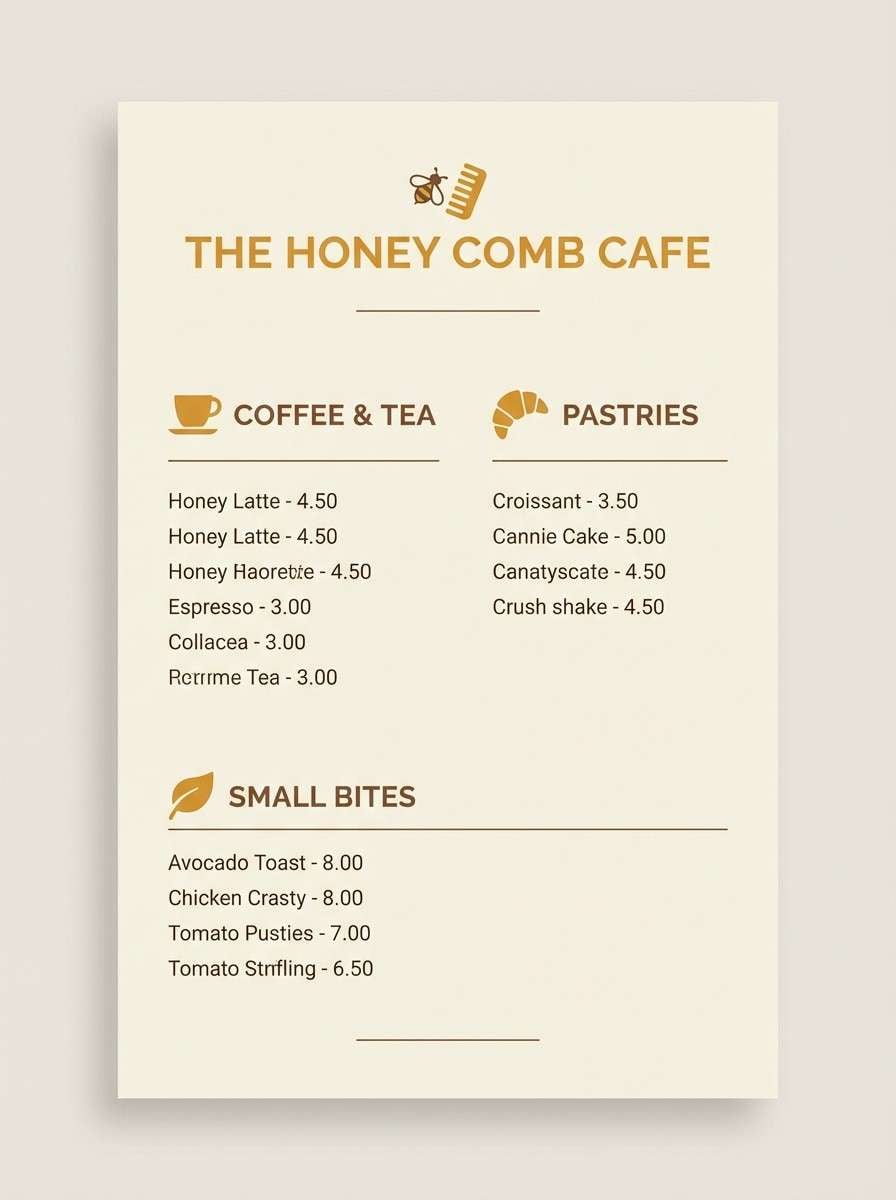
5) Honeyed Wood
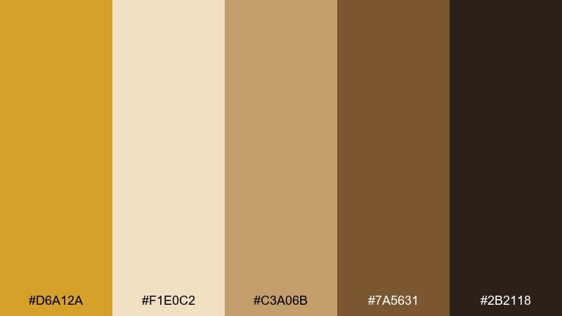
HEX: #D6A12A #F1E0C2 #C3A06B #7A5631 #2B2118
Mood: cozy, rustic, inviting
Best for: cafe menus and warm hospitality branding
Cozy and inviting, this mix brings to mind honey drizzles, oak shelves, and toasted crust. It fits cafe menus, bakery brands, and welcoming signage where warmth should feel edible. Use the creamy tone as your canvas, then build hierarchy with the rich browns for headings and separators. Tip: keep the honey color for price tags or specials so the eye finds key details fast.
Image example of honeyed wood generated using media.io
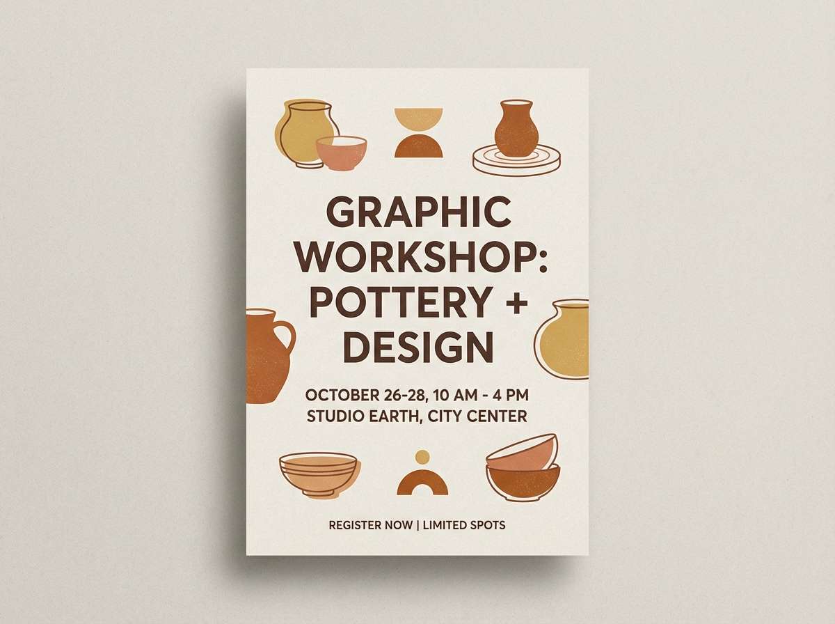
6) Autumn Ceramic
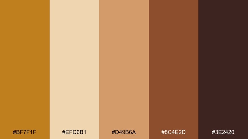
HEX: #BF7F1F #EFD6B1 #D49B6A #8C4E2D #3E2420
Mood: warm, handcrafted, seasonal
Best for: fall event flyers and workshop invitations
Warm and handcrafted, these tones feel like glazed pottery and dried leaves on a studio floor. They work especially well for fall workshops, maker markets, and invitation designs that need a friendly, tactile vibe. Pair the pale cream with the burnt sienna to keep layouts airy while still seasonal. Tip: use rounded shapes and thick rules to echo the softness of handmade forms.
Image example of autumn ceramic generated using media.io
7) Sunbaked Stucco
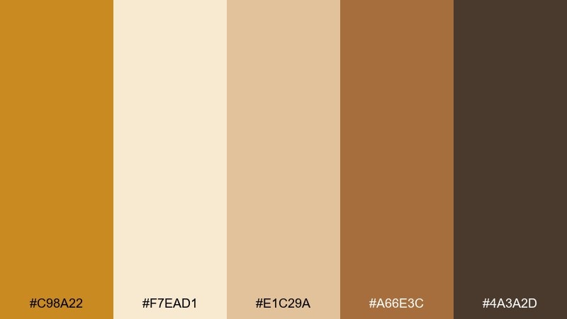
HEX: #C98A22 #F7EAD1 #E1C29A #A66E3C #4A3A2D
Mood: mediterranean, airy, relaxed
Best for: interior mood boards and real estate staging decks
Airy and relaxed, this set recalls sunbaked walls, pale stone, and warm wood trim. It is ideal for interior mood boards, staging decks, and hospitality spaces that want a Mediterranean softness. Keep the light cream and sand as the dominant surfaces, then bring in the ochre and amber browns through textiles and accents. Tip: add black only in tiny touches, like hardware or thin frame lines, to avoid overpowering the warmth.
Image example of sunbaked stucco generated using media.io
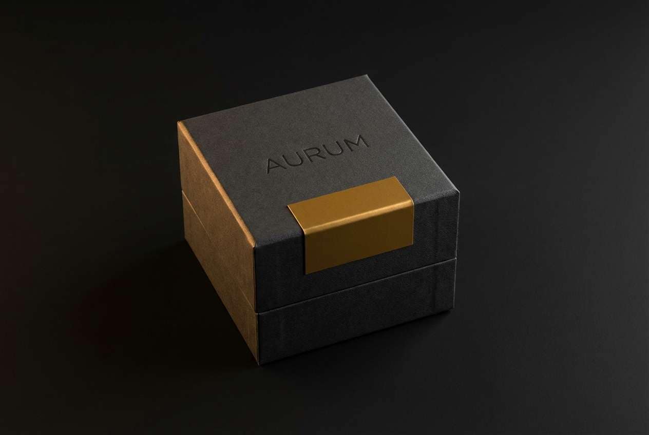
8) Brass and Ink
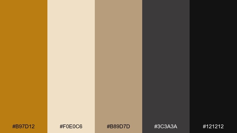
HEX: #B97D12 #F0E0C6 #B89D7D #3C3A3A #121212
Mood: sleek, dramatic, premium
Best for: luxury branding and logo systems
Sleek and dramatic, these tones suggest brushed brass under low light with crisp ink-black edges. They suit luxury branding, monograms, and packaging where restraint reads expensive. Let the near-black carry the structure, and bring in the brass tone for small highlights like rules, seals, or icons. Tip: avoid large brass blocks; thin strokes and foiled details will feel more premium.
Image example of brass and ink generated using media.io
9) Harvest Market
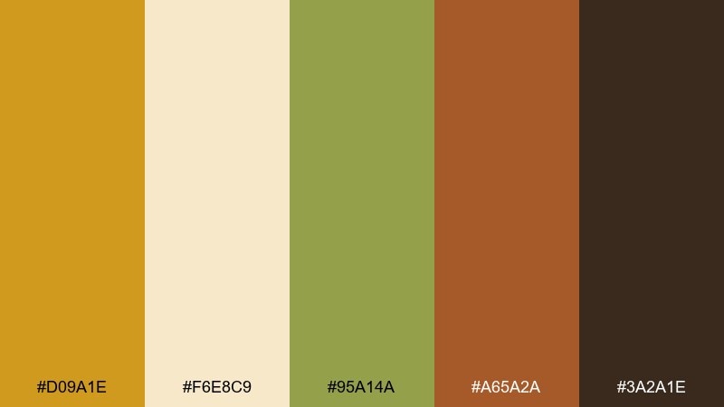
HEX: #D09A1E #F6E8C9 #95A14A #A65A2A #3A2A1E
Mood: wholesome, lively, earthy
Best for: farmers market banners and food brand social posts
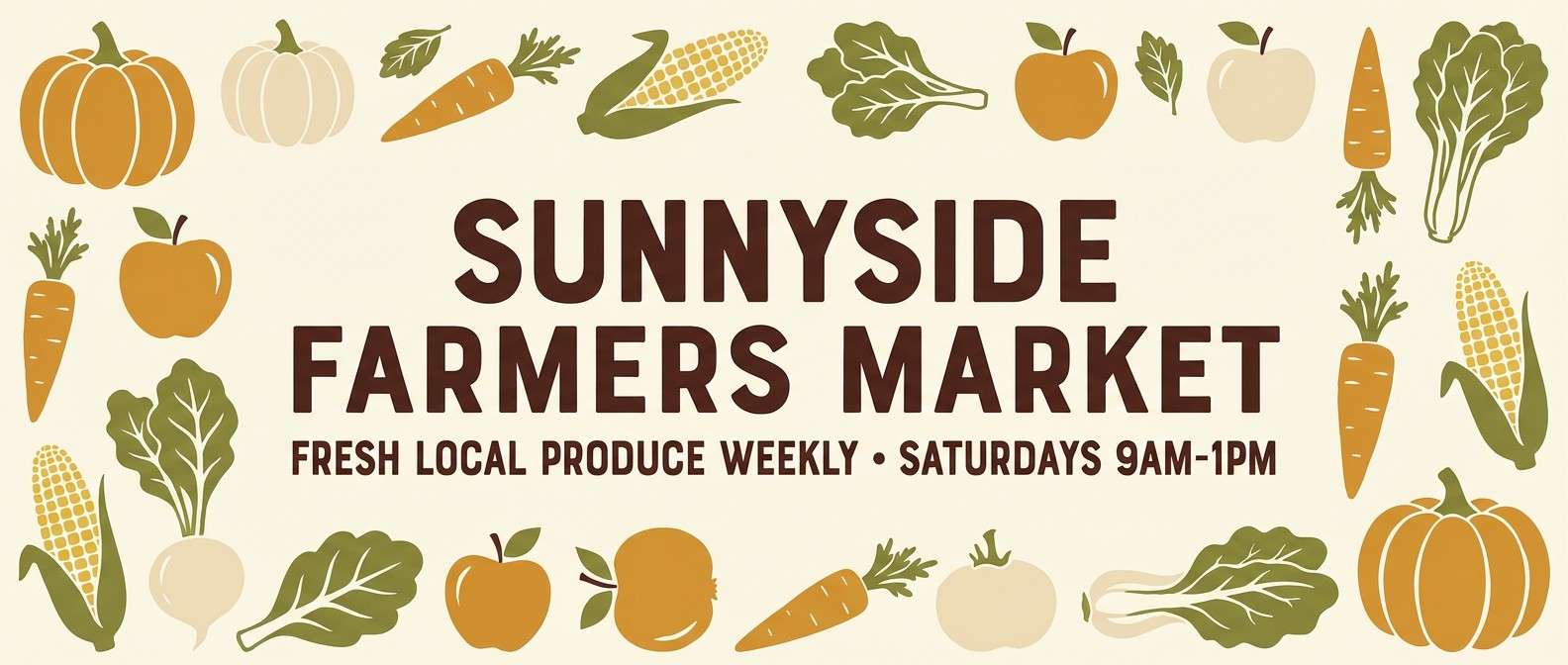
Wholesome and lively, this blend feels like piled gourds, olive leaves, and brown paper bags. It is great for farmers market signage, seasonal promos, and food brand posts that want a fresh, grounded energy. Use the green as a secondary accent to keep the warmth from feeling too monochrome. Tip: set headlines in the deep brown for readability and keep the orange-brown for small badges only.
Image example of harvest market generated using media.io
10) Nomad Rug
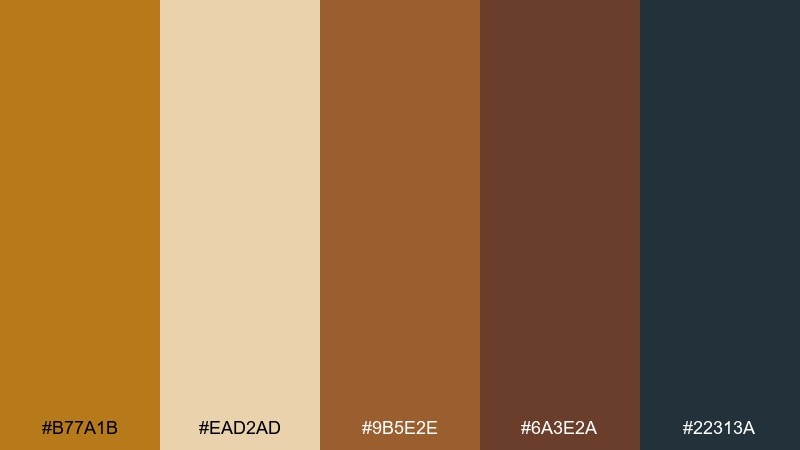
HEX: #B77A1B #EAD2AD #9B5E2E #6A3E2A #22313A
Mood: patterned, worldly, cozy
Best for: textile lookbooks and boho ecommerce collections
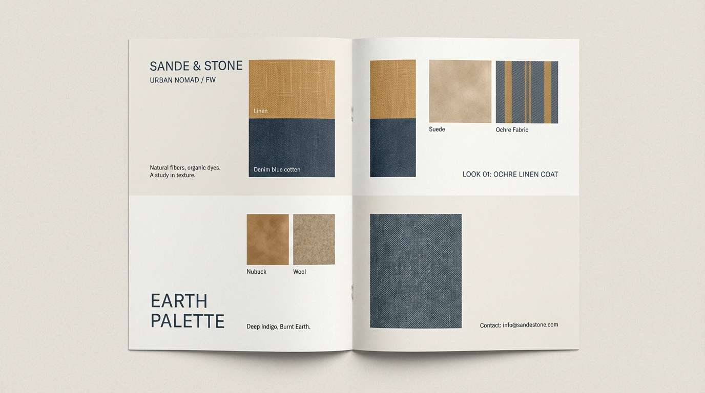
Patterned and worldly, these colors bring to mind woven rugs, leather straps, and twilight blue shadows. They work well for textile lookbooks, boho ecommerce collections, and craft-focused branding. Pair the sandy beige with the deep blue-gray to create a sophisticated contrast that still feels warm. Tip: repeat the ochre tone as a small motif color across icons and dividers to unify the layout.
Image example of nomad rug generated using media.io
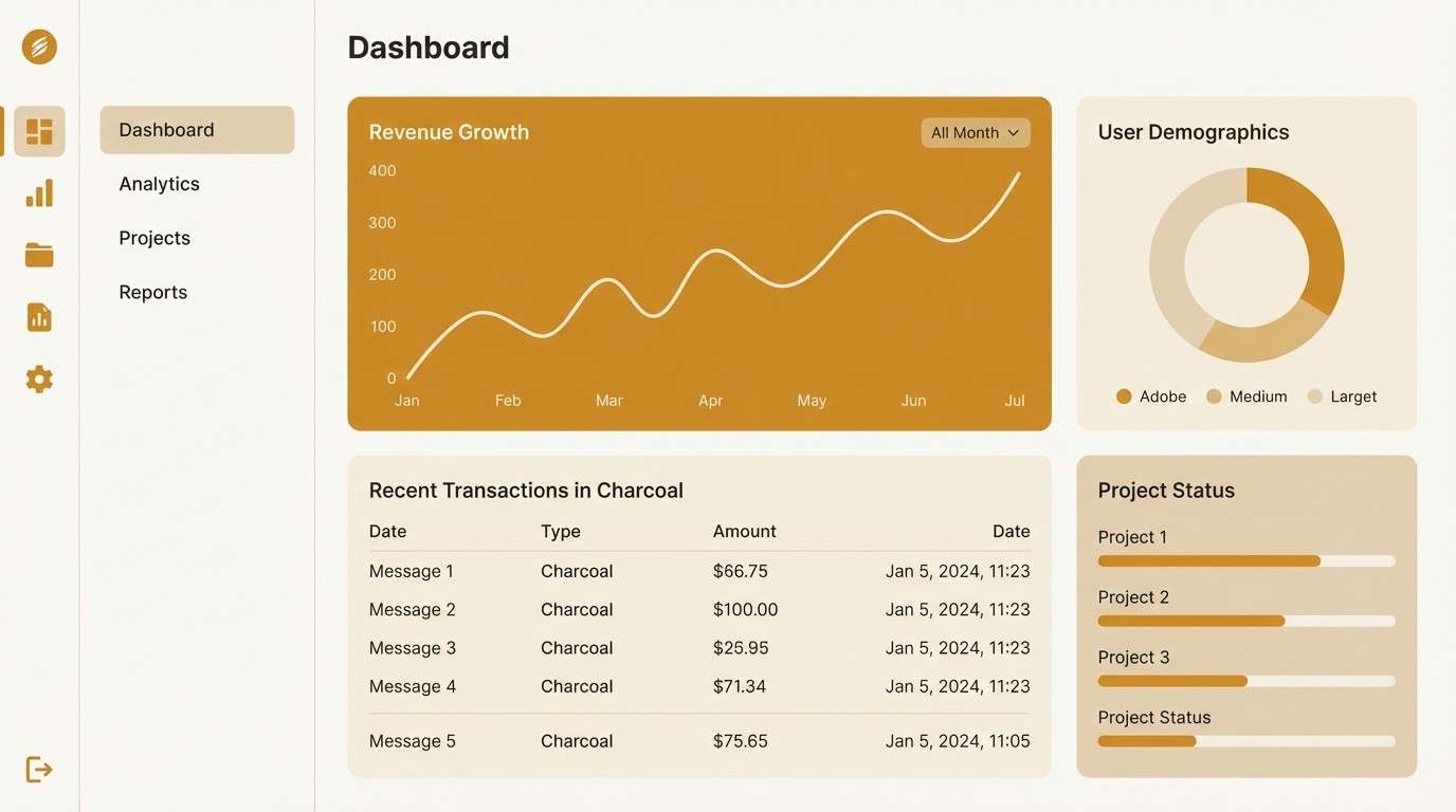
11) Warm Minimal UI
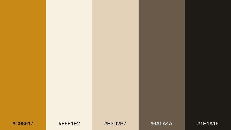
HEX: #C98917 #F8F1E2 #E3D2B7 #6A5A4A #1E1A16
Mood: clean, modern, approachable
Best for: dashboard UI and landing page design
Clean and approachable, this set feels like soft paper, warm sunlight, and sharp ink. It is a strong choice for dashboards and landing pages that want warmth without losing clarity. Use the off-white as the primary background, keep body text in charcoal, and reserve the golden accent for active states and key metrics. Tip: maintain generous spacing so the warm neutrals do not visually crowd components.
Image example of warm minimal ui generated using media.io
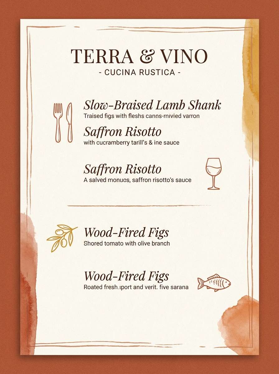
12) Terracotta Bistro
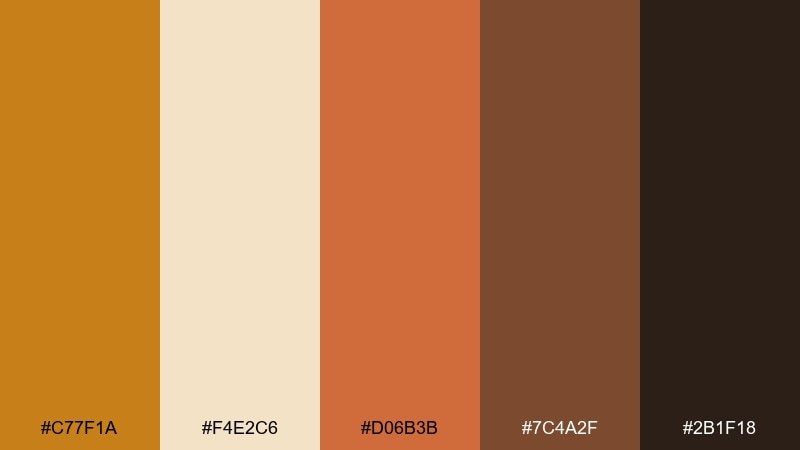
HEX: #C77F1A #F4E2C6 #D06B3B #7C4A2F #2B1F18
Mood: appetizing, intimate, warm
Best for: restaurant menus and food photography overlays
Appetizing and intimate, these hues suggest terracotta plates, candlelight, and rich espresso crema. They are ideal for bistro menus, tasting cards, and food overlays where the mood should feel cozy. Pair the light cream with the terracotta for a classic, approachable base, and bring in the darkest shade for body copy. Tip: keep accent icons in ochre so they pop without competing with dish photos.
Image example of terracotta bistro generated using media.io
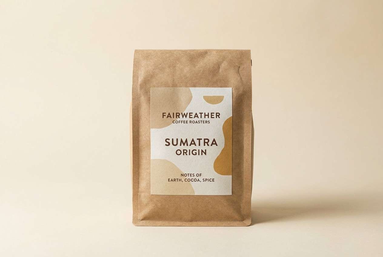
13) Artisan Label
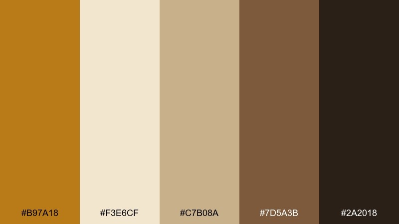
HEX: #B97A18 #F3E6CF #C7B08A #7D5A3B #2A2018
Mood: crafted, honest, earthy
Best for: coffee bag labels and craft food packaging
Crafted and honest, this mix reads like recycled paper, roasted beans, and hand-stamped ink. It fits coffee labels, granola packaging, and farmer-made goods where authenticity is the goal. Use the mid tan for label backgrounds, then layer the dark brown for strong typography and barcodes. Tip: add a small ochre stripe or seal to create a signature brand cue across SKUs.
Image example of artisan label generated using media.io
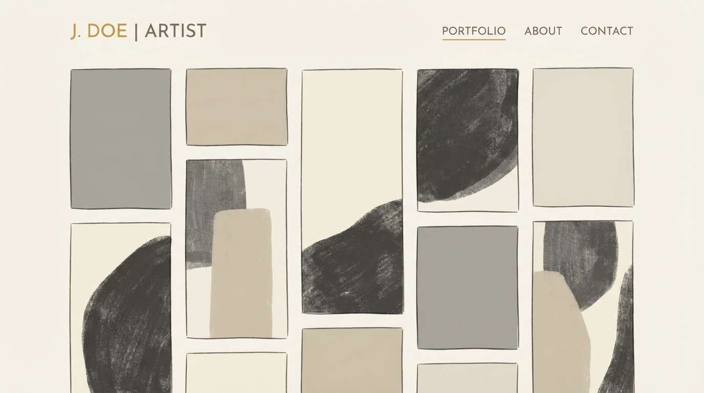
14) Gallery Wall
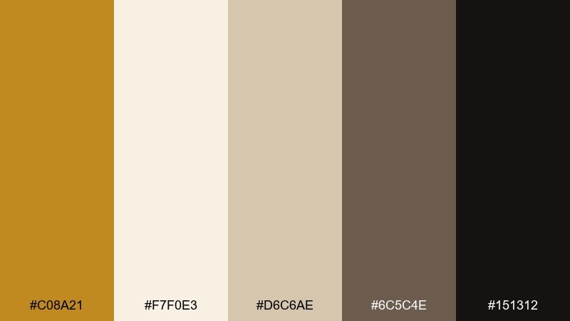
HEX: #C08A21 #F7F0E3 #D6C6AE #6C5C4E #151312
Mood: quiet, curated, sophisticated
Best for: portfolio websites and art exhibition collateral
Quiet and curated, these tones feel like a softly lit gallery with warm walls and dark frames. They are excellent for portfolios, exhibition collateral, and creative studios that want elegance without stark white. Keep backgrounds airy with the off-white, then use the warm gray-brown for navigation and captions. Tip: treat the golden shade as an accent for links and hover states to guide attention gently.
Image example of gallery wall generated using media.io
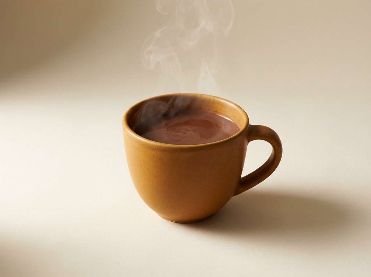
15) Spiced Cocoa
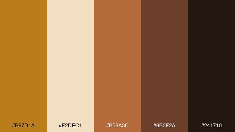
HEX: #B97D1A #F2DEC1 #B56A3C #6B3F2A #241710
Mood: rich, comforting, indulgent
Best for: winter promotions and beverage brand ads
Rich and comforting, this blend evokes cocoa dust, cinnamon sticks, and warm café air. It is well suited for winter promos, beverage branding, and social ads that want a cozy, indulgent mood. Combine the cream and ochre for the main canvas, then add depth with the chocolate browns in shadows and type. Tip: keep gradients subtle so the palette stays premium rather than syrupy.
Image example of spiced cocoa generated using media.io
16) Sandstone Spa
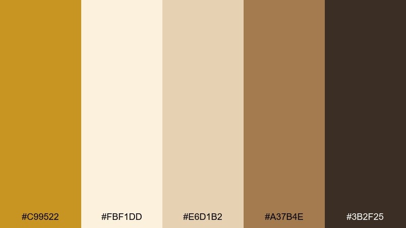
HEX: #C99522 #FBF1DD #E6D1B2 #A37B4E #3B2F25
Mood: soothing, clean, restorative
Best for: wellness branding and spa brochures
Soothing and restorative, these tones feel like warm stone, soft towels, and filtered sunlight. They are a natural fit for wellness branding, spa brochures, and skincare storytelling where calm is the product. Let the creamy background lead, then use the caramel brown for section headers and gentle dividers. Tip: keep imagery bright and low-contrast so the palette maintains its quiet, clean vibe.
Image example of sandstone spa generated using media.io
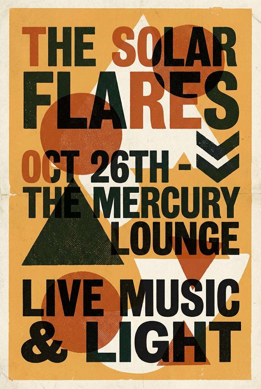
17) Retro Poster Print
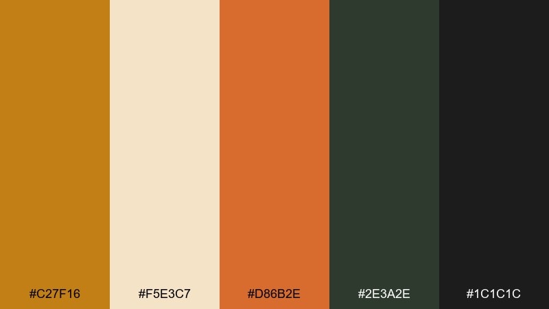
HEX: #C27F16 #F5E3C7 #D86B2E #2E3A2E #1C1C1C
Mood: retro, punchy, graphic
Best for: gig posters and vintage-style social graphics
Retro and punchy, these colors echo screen-printed posters with warm ink and slightly worn edges. They work well for gig posters, retro product drops, and social graphics that need bold contrast. Use the orange as a secondary pop, and let the green-black anchor the composition. Tip: limit your typefaces to one bold display and one simple sans to keep the print vibe believable.
Image example of retro poster print generated using media.io
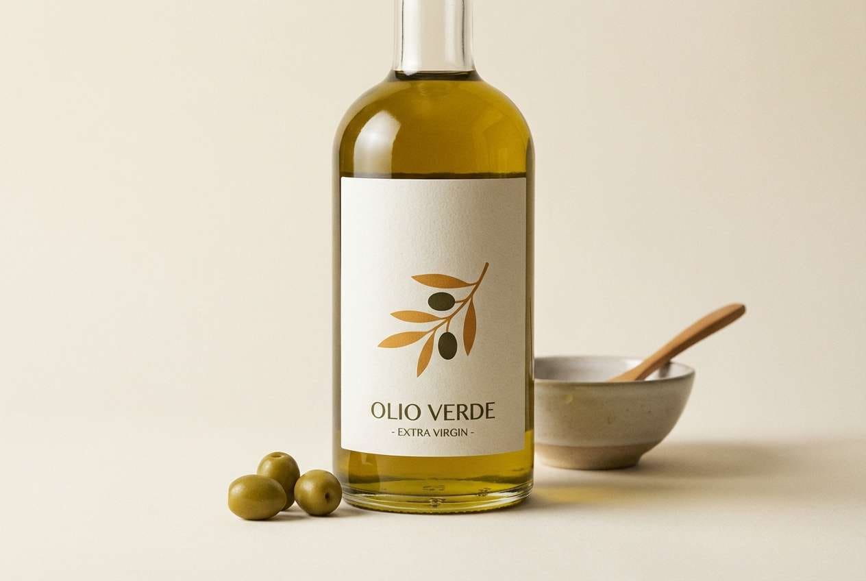
18) Olive Orchard
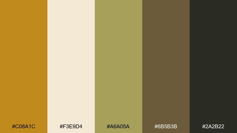
HEX: #C08A1C #F3E9D4 #A6A05A #6B5B3B #2A2B22
Mood: natural, fresh, grounded
Best for: botanical packaging and olive oil branding
Natural and grounded, this set feels like olive leaves, sunlit groves, and earthy labels. It is excellent for botanical packaging and food brands that want to look premium but approachable. Pair the olive green with the soft cream for a clean base, then use the dark olive-brown for type and seals. Tip: add line illustrations in the darkest shade to keep details crisp without introducing extra colors.
Image example of olive orchard generated using media.io
19) Evening Lanterns
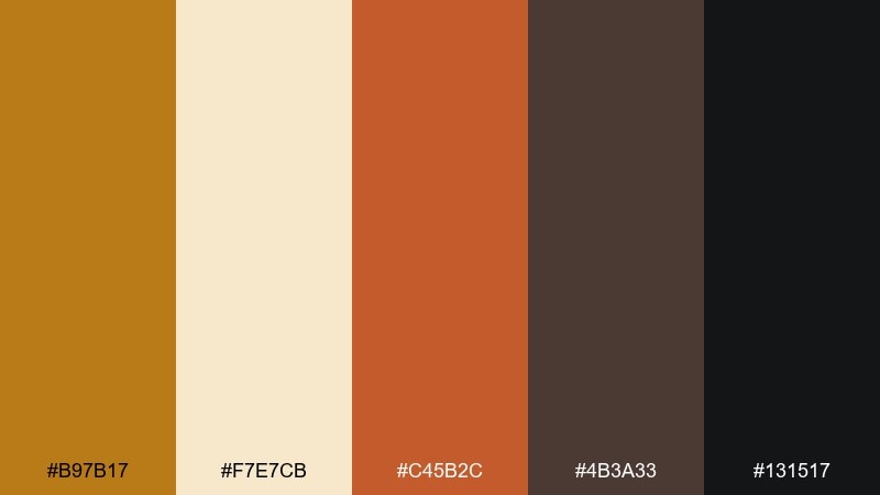
HEX: #B97B17 #F7E7CB #C45B2C #4B3A33 #131517
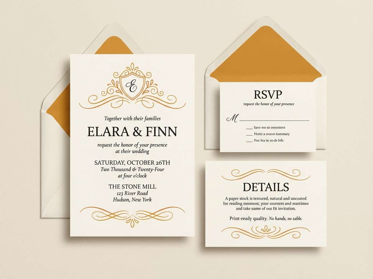
Mood: romantic, warm, atmospheric
Best for: wedding invitations and evening event programs
Romantic and atmospheric, these shades resemble lantern light on parchment with deep nightfall nearby. They are ideal for evening weddings, gala programs, and RSVP cards that should feel intimate and elegant. Keep the cream as your paper base, then bring in the warm orange for small flourishes like monograms or section dividers. Tip: use the near-black for body text to maintain readability under low-light event printing.
Image example of evening lanterns generated using media.io
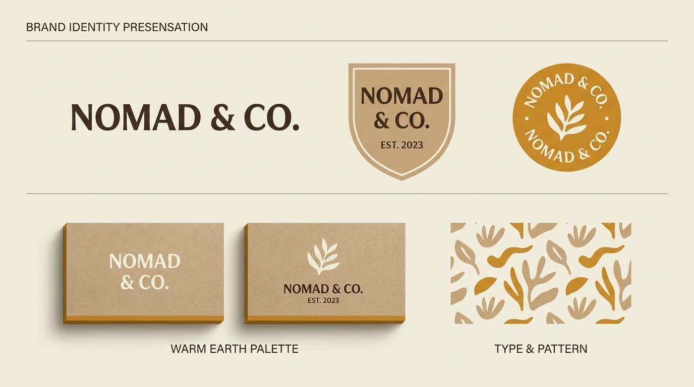
20) Modern Heritage
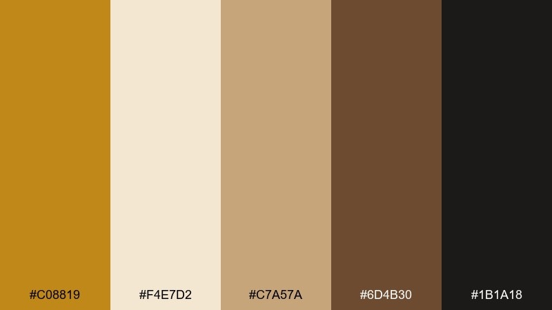
HEX: #C08819 #F4E7D2 #C7A57A #6D4B30 #1B1A18
Mood: timeless, confident, warm
Best for: brand identity systems for boutiques and studios
Timeless and confident, these tones bridge old-world warmth with a clean, modern finish. They are versatile for identity systems, boutique signage, and studio websites that need character without visual clutter. The best results come from treating the tan and cream as primary surfaces, then introducing the deeper brown for structure and hierarchy. Tip: if you are testing ochre color combinations, try keeping the golden shade under 10 percent of the layout for a refined look.
Image example of modern heritage generated using media.io
What Colors Go Well with Ochre?
Ochre pairs beautifully with warm neutrals like cream, sand, and tan because they keep the palette cohesive while letting ochre feel like “sunlight” rather than a loud highlight. This is a safe direction for branding systems, interiors, and editorial layouts.
For stronger contrast, combine ochre with deep espresso, charcoal, ink black, or blue-black. That darker anchor makes ochre feel more premium and structured—especially in logos, packaging, and navigation-heavy UI.
If you want a fresher, more natural vibe, add muted greens (olive, sage, or dried herb). Green breaks up monochrome warmth and creates an earthy, botanical balance that works well for food, wellness, and outdoorsy themes.
How to Use a Ochre Color Palette in Real Designs
Start with proportion: use light neutrals as the main surface (backgrounds, large blocks, paper tones), then apply ochre as the “attention color” for buttons, badges, icons, or small dividers. This keeps designs warm without turning yellow-heavy.
Build hierarchy with dark values. In most ochre palettes, deep brown or near-black should carry text, UI structure, and outlines, while mid tans and clays support secondary areas like cards, labels, or section backgrounds.
Keep imagery and textures consistent. Slightly warm photo grading, gentle grain, and natural materials (linen, paper, wood, ceramic) help ochre palettes feel intentional rather than accidental.
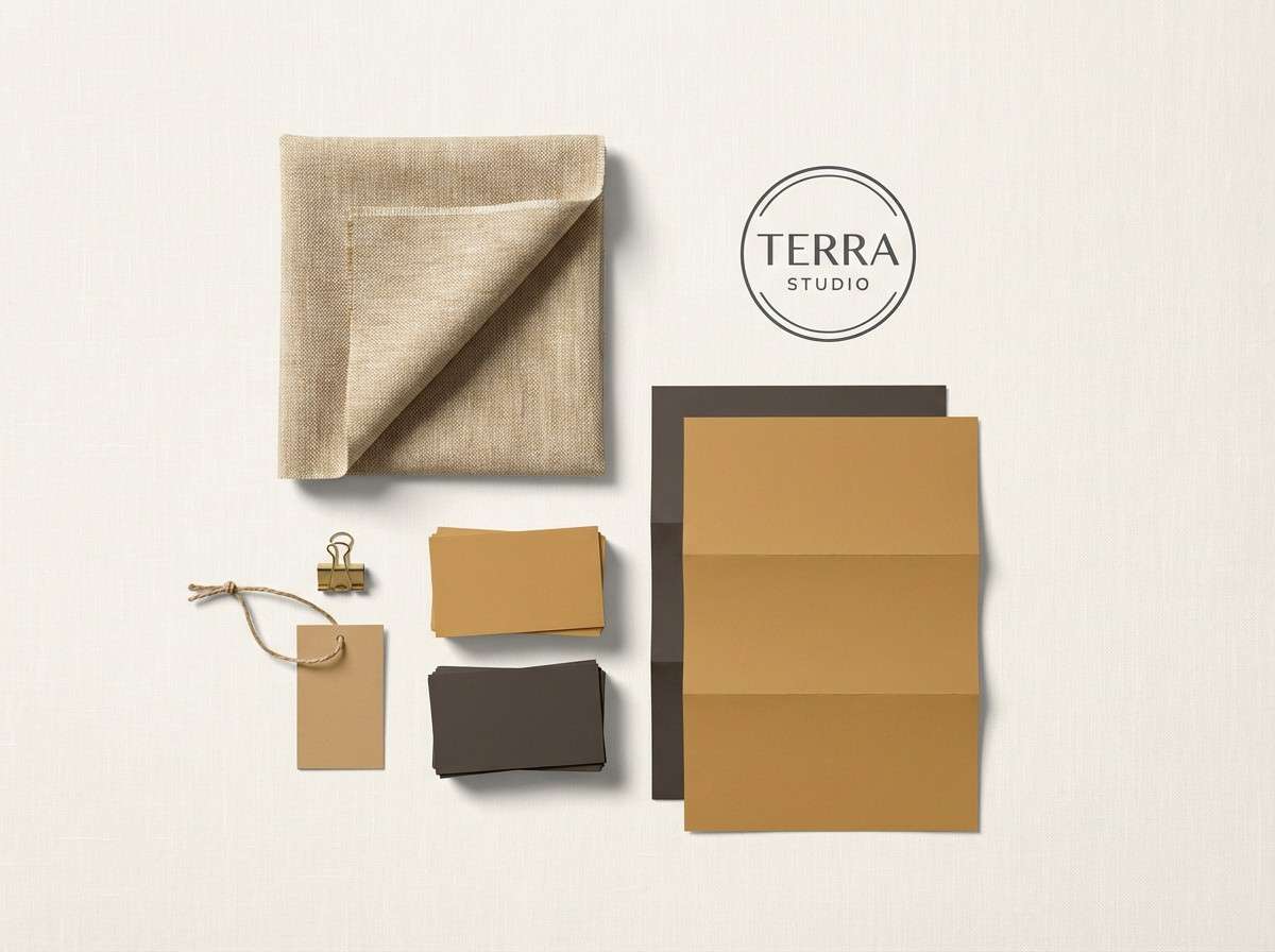
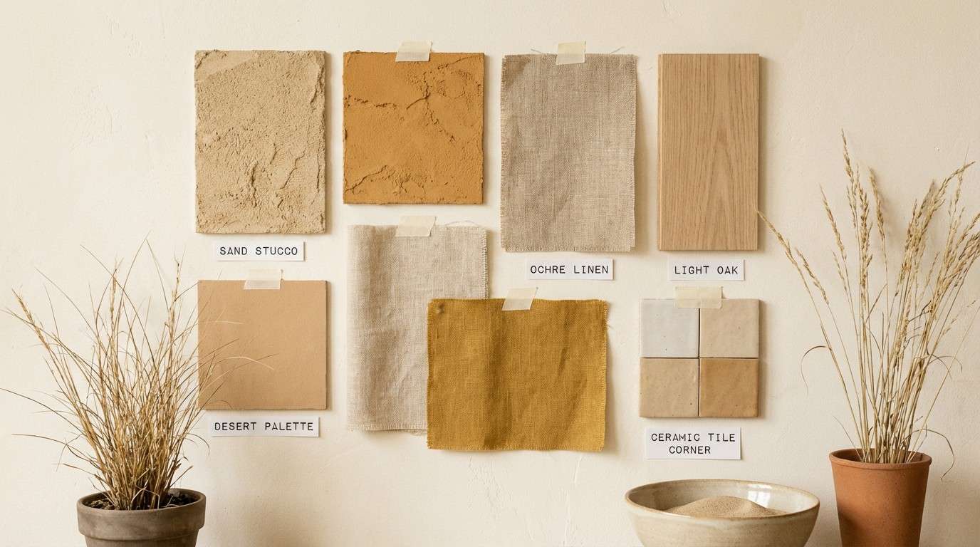
Create Ochre Palette Visuals with AI
If you already have HEX codes, you can quickly turn a palette into real mockups—menus, packaging, posters, mood boards, or UI screens—by generating visuals from a clear text prompt.
To get more reliable results, describe lighting and materials (paper, linen, stucco, brass), keep the composition simple, and call out the mood (cozy, premium, airy, archival). Then iterate by adjusting contrast and accent usage.
Media.io makes it easy to generate and refine ochre palette imagery in your browser—ideal for concepting before you commit to final design production.
Ochre Color Palette FAQs
-
What color is ochre, exactly?
Ochre is an earthy yellow with brown/orange undertones, often associated with natural pigments like yellow ochre. In design, it usually sits between mustard and clay, making it warm but more grounded than bright yellow. -
Is ochre the same as mustard?
Not quite. Mustard typically looks sharper and more saturated, while ochre tends to feel dustier, more mineral, and slightly browned down—closer to natural earth tones. -
What are the best neutral colors to pair with ochre?
Cream, off-white, sand, beige, and warm gray-browns are the easiest neutrals with ochre. They keep the look cohesive and let ochre act as a tasteful accent instead of overpowering the layout. -
What dark colors make ochre pop?
Espresso brown, charcoal, ink black, and blue-black create crisp contrast with ochre. This combo is especially effective for premium branding, editorial typography, and UI states like active tabs or buttons. -
Can I use ochre in a modern UI design?
Yes—use an off-white background, keep body text in charcoal/near-black, and reserve ochre for interactive elements (CTAs, toggles, highlights). Generous spacing helps warm neutrals feel clean and modern. -
How do I keep an ochre palette from looking “too yellow”?
Limit ochre to small areas (often under 10% of the layout), add deeper browns for structure, and include a balancing neutral like cream or parchment. If needed, introduce a muted green or blue-black to cool the overall temperature. -
What finishes work best with ochre in print and packaging?
Ochre looks great with tactile stocks (uncoated paper, recycled textures), warm foils (brass/gold), and subtle embossing. Avoid overly glossy, neon-like treatments if you want a natural, earthy feel.
Next: Black Rose Color Palette


