

Black rose sits at the intersection of near-black neutrals and deep rose-wine undertones, making it ideal for projects that need drama without looking heavy or flat.
Below are 20 black rose color palette ideas with HEX codes, plus realistic prompt examples you can recreate with Media.io for branding, UI, print, and social designs.
In this article
Why Black Rose Palettes Work So Well
Black rose palettes feel luxurious because they combine the authority of near-black with the emotional warmth of rose, wine, and mauve undertones. That mix creates depth that reads premium instead of harsh.
They also photograph and print well when you control contrast: dark bases make highlights feel intentional, while dusty pinks and pale mauves prevent the design from becoming a single heavy block.
Finally, black rose is flexible across styles—gothic, modern minimal, vintage, or editorial—because the palette naturally supports both dramatic headlines and soft supporting neutrals.
20+ Black Rose Color Palette Ideas (with HEX Codes)
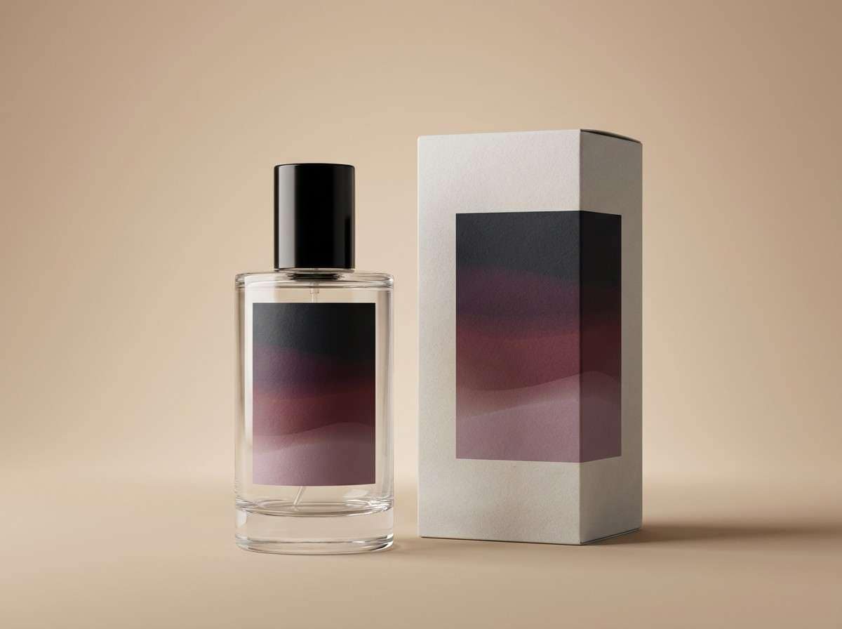
1) Midnight Petals
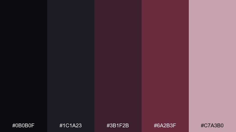
HEX: #0b0b0f #1c1a23 #3b1f2b #6a2b3f #c7a3b0
Mood: mysterious, luxe, romantic
Best for: perfume packaging and luxury labels
Mysterious and velvety like petals caught in moonlight, these tones feel rich without turning harsh. Use the near-black and charcoal as the base, then let the wine rose carry headlines or brand marks. Pair with warm cream paper or soft gray to keep the contrast elegant. Tip: reserve the pale mauve for small highlights so it reads like a glow, not a pastel wash.
Image example of midnight petals generated using media.io
Media.io is an online AI studio for creating and editing video, image, and audio in your browser.

2) Velvet Thorn
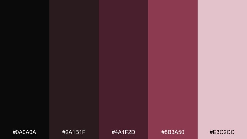
HEX: #0a0a0a #2a1b1f #4a1f2d #8b3a50 #e3c2cc
Mood: dramatic, seductive, bold
Best for: concert posters and nightlife flyers
Dramatic and seductive, it feels like velvet curtains and a single thorny stem. The contrast between true black and dusty pink makes type pop, especially with big sans-serif headlines. This black rose color combination works best when you keep the pink to small callouts and dates, letting the maroons do the heavy lifting. Tip: add subtle grain to backgrounds so the dark tones look intentional and print-friendly.
Image example of velvet thorn generated using media.io
3) Ashen Bloom
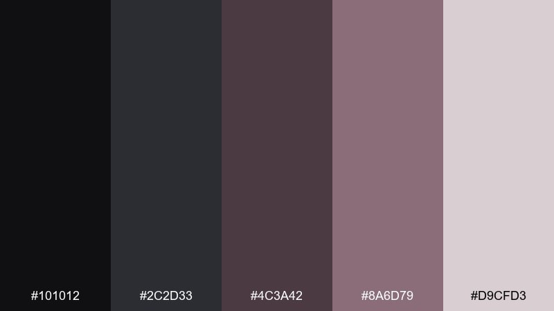
HEX: #101012 #2c2d33 #4c3a42 #8a6d79 #d9cfd3
Mood: soft, smoky, modern
Best for: editorial layouts and feature articles
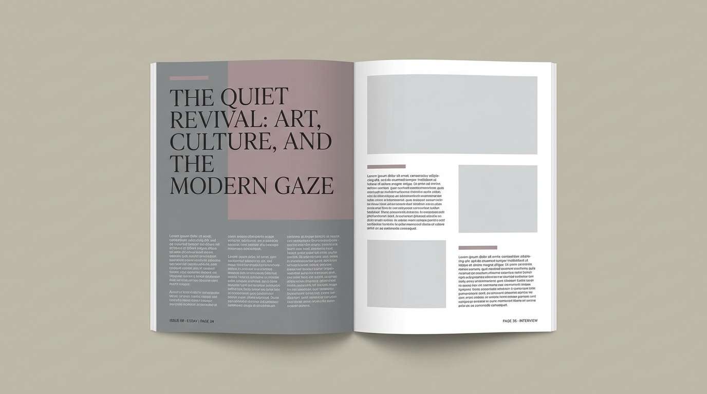
Soft and smoky, it reads like dried roses pressed in a book. Use the cool grays for body text and margins, then bring in the muted mauves for pull quotes and section dividers. Pair with lots of white space to keep the mood modern rather than gloomy. Tip: choose matte paper or a low-gloss screen finish so the subtle steps between tones stay visible.
Image example of ashen bloom generated using media.io
4) Noir Blush
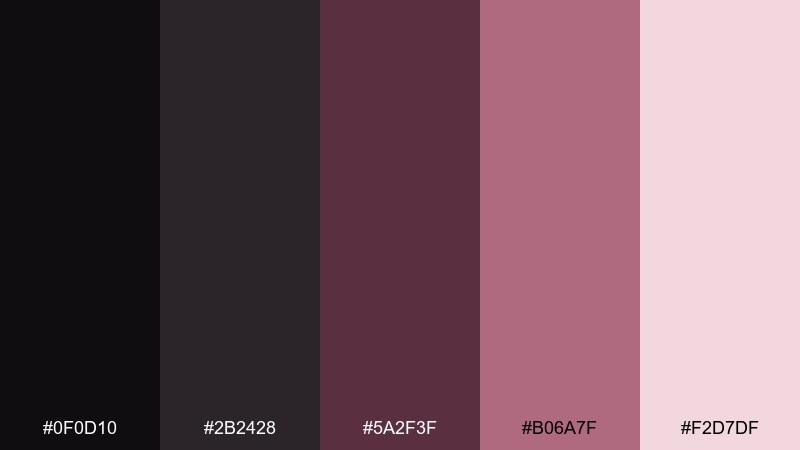
HEX: #0f0d10 #2b2428 #5a2f3f #b06a7f #f2d7df
Mood: romantic, sleek, high-contrast
Best for: beauty brand identity and social templates
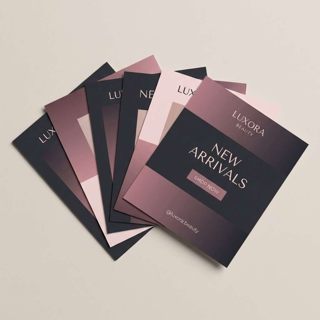
Romantic but sleek, it evokes black satin with a blush tint under soft studio lights. The deep neutrals make a strong base for logos, while the rosy mid-tones flatter skin-focused visuals and product shots. A black rose color palette like this shines when you keep backgrounds dark and let blush gradients handle depth. Tip: use the lightest tint only for spacing and micro-text so the design stays moody.
Image example of noir blush generated using media.io
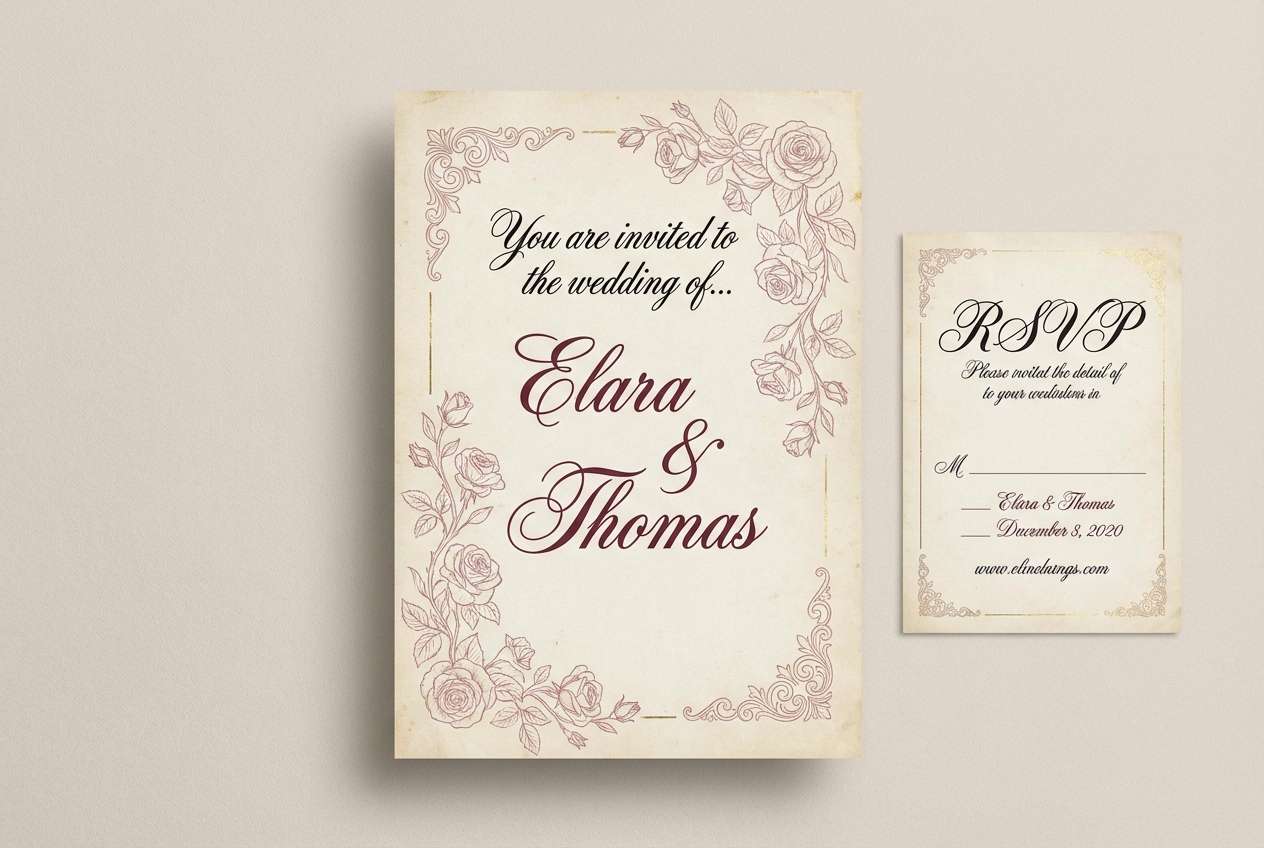
5) Gothic Bouquet
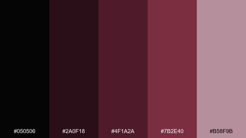
HEX: #050506 #2a0f18 #4f1a2a #7b2e40 #b58f9b
Mood: gothic, vintage, theatrical
Best for: wedding invitations and RSVP cards
Gothic and vintage, it feels like an old bouquet wrapped in velvet ribbon. The deep maroons look stunning with ornate serif type and delicate line art. Pair with ivory stock and a touch of metallic foil for a ceremonial feel. Tip: keep the darkest tone for borders and names, and use the dusty rose for flourishes so readability stays crisp.
Image example of gothic bouquet generated using media.io
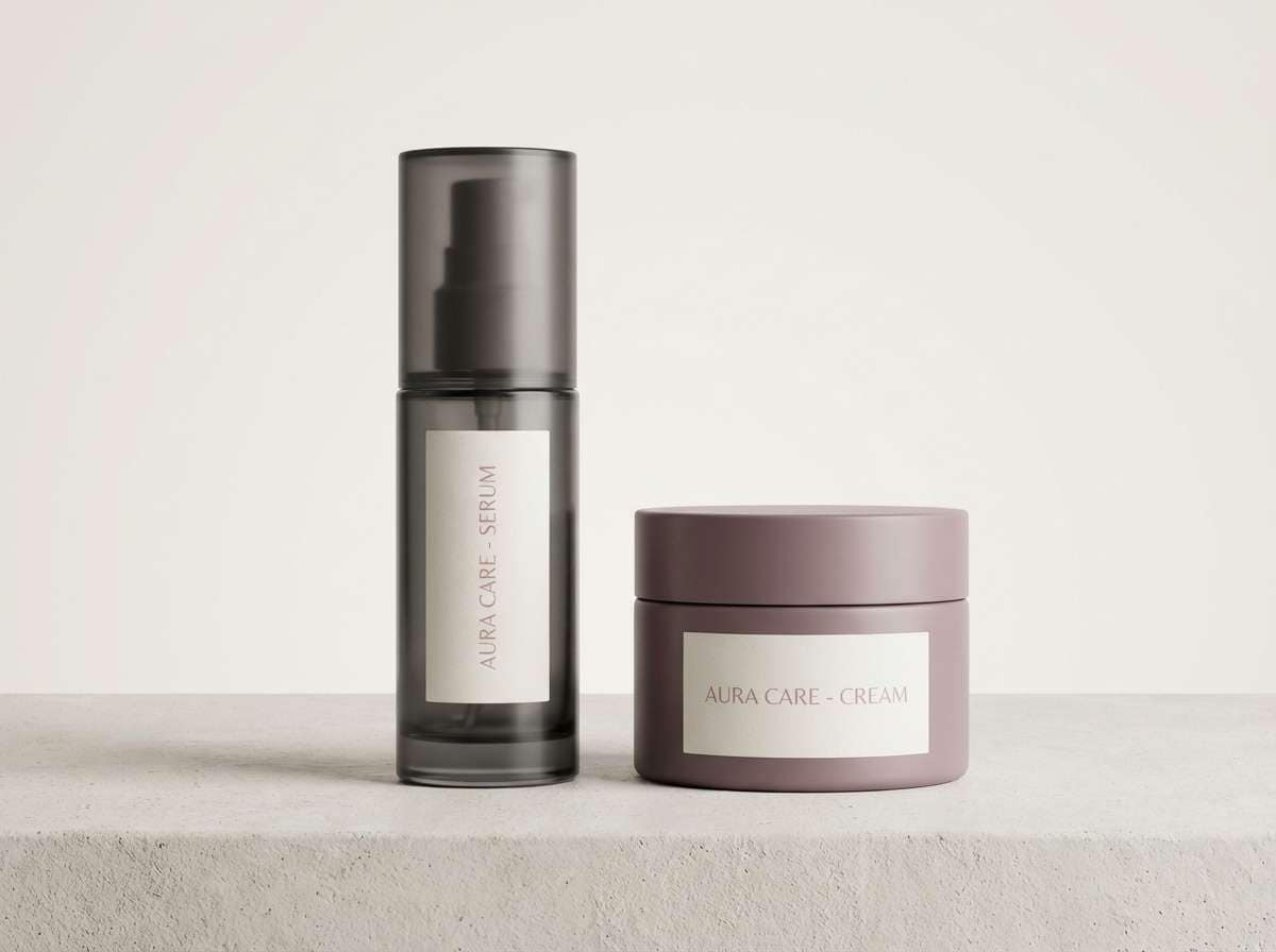
6) Smoked Rosewater
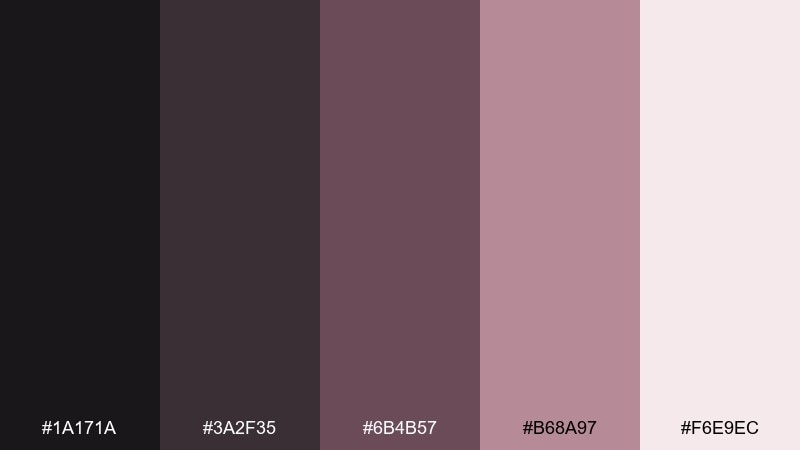
HEX: #1a171a #3a2f35 #6b4b57 #b68a97 #f6e9ec
Mood: calm, airy, romantic
Best for: skincare product ads and landing pages
Calm and airy, it brings to mind rosewater mist drifting through a dim room. Use the pale tint for backgrounds and the smoky mauves for soft sections and buttons. Pair with minimal photography and lots of breathing room to keep it clean, not dated. Tip: choose one strong accent color for CTAs and stick to it across the page for a soothing rhythm.
Image example of smoked rosewater generated using media.io
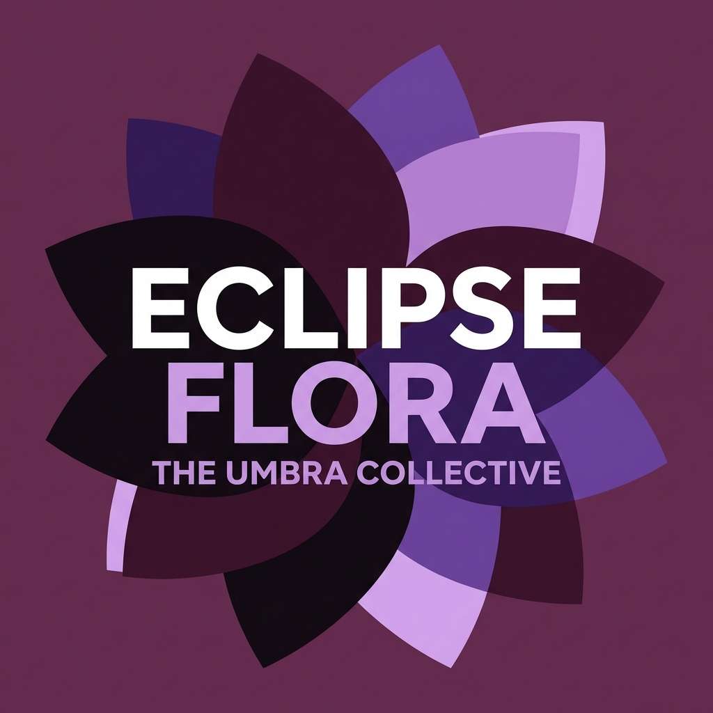
7) Plum Shadow
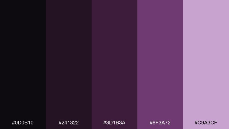
HEX: #0d0b10 #241322 #3d1b3a #6f3a72 #c9a3cf
Mood: enigmatic, creative, nocturnal
Best for: album covers and music artwork
Enigmatic and nocturnal, it feels like a purple haze over dark petals. The plum steps create depth fast, making it great for layered shapes and typographic titles. Pair with subtle texture or gradients to avoid flat blocks of darkness. Tip: keep the light lilac for a single focal element so the cover reads from a distance.
Image example of plum shadow generated using media.io
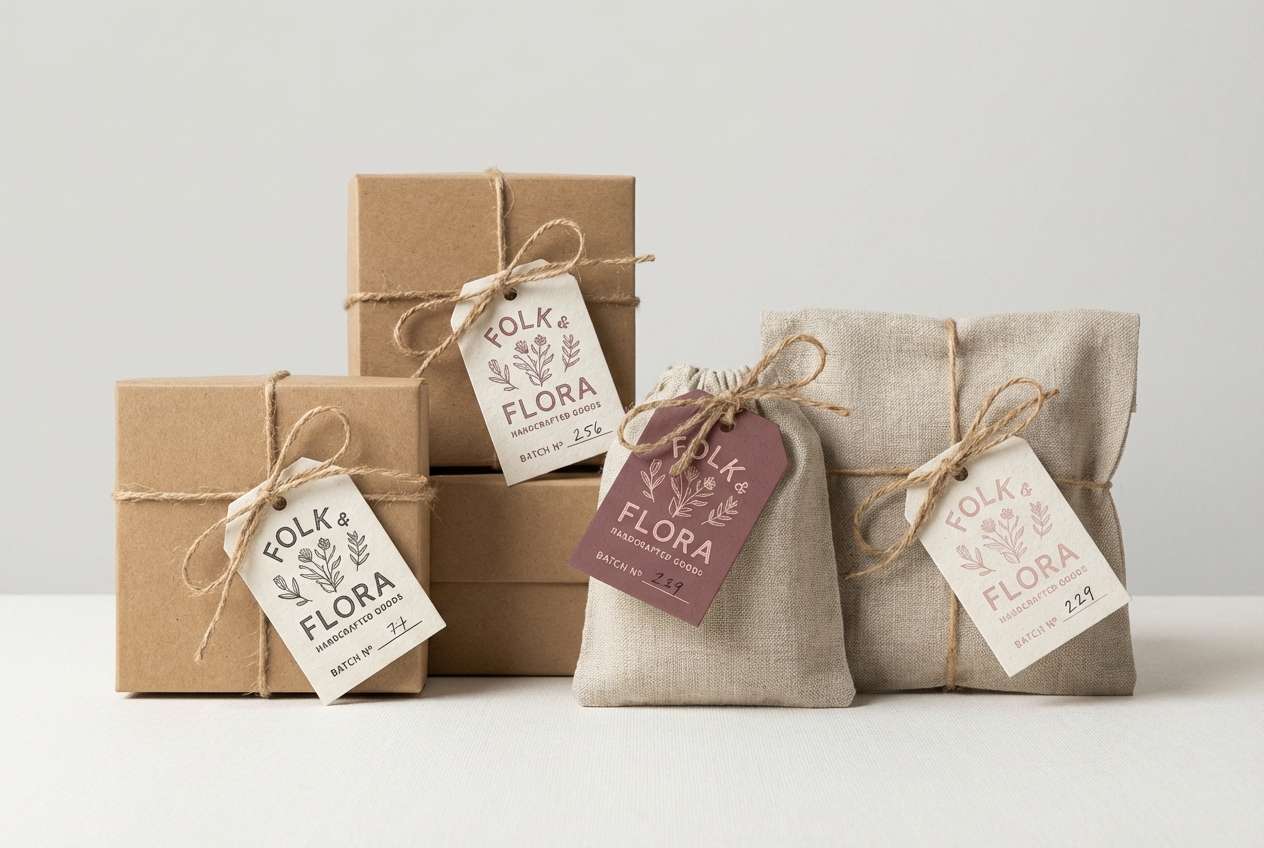
8) Antique Romance
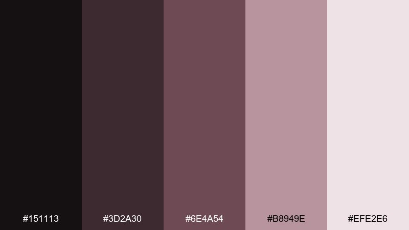
HEX: #151113 #3d2a30 #6e4a54 #b8949e #efe2e6
Mood: nostalgic, gentle, refined
Best for: handmade brand packaging and tags
Nostalgic and refined, it suggests antique lace and faded rose petals. The warm mid-tones work beautifully on kraft or cream packaging, while the deeper shades add structure to logos and barcodes. Pair with serif typography and thin rules for a crafted feel. Tip: use the lightest pink as negative space around marks to keep the design breathable.
Image example of antique romance generated using media.io
9) Charcoal Orchid
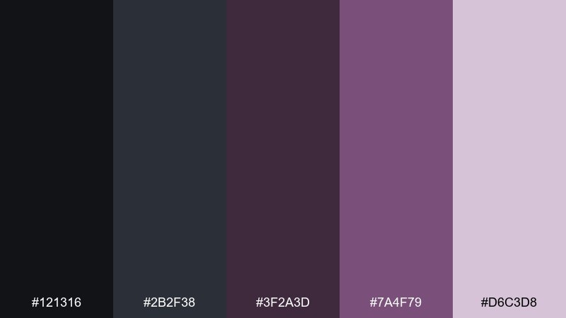
HEX: #121316 #2b2f38 #3f2a3d #7a4f79 #d6c3d8
Mood: cool, elegant, slightly futuristic
Best for: watercolor floral prints and stationery
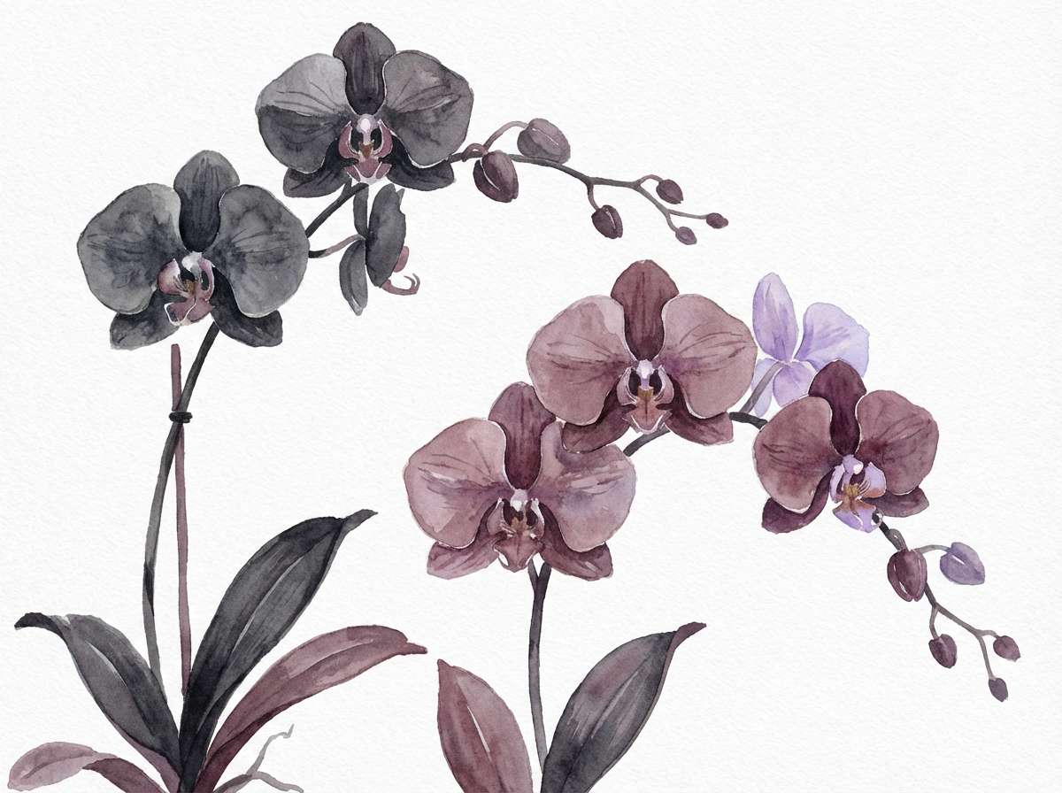
Cool and elegant, it looks like orchids painted in shadow. The charcoal-blue gray gives a modern backbone, while the mauve violet adds a quiet bloom. Pair with clean margins and simple linework so the florals do not feel busy. Tip: keep washes transparent so the darker tones stay crisp and do not muddy.
Image example of charcoal orchid generated using media.io
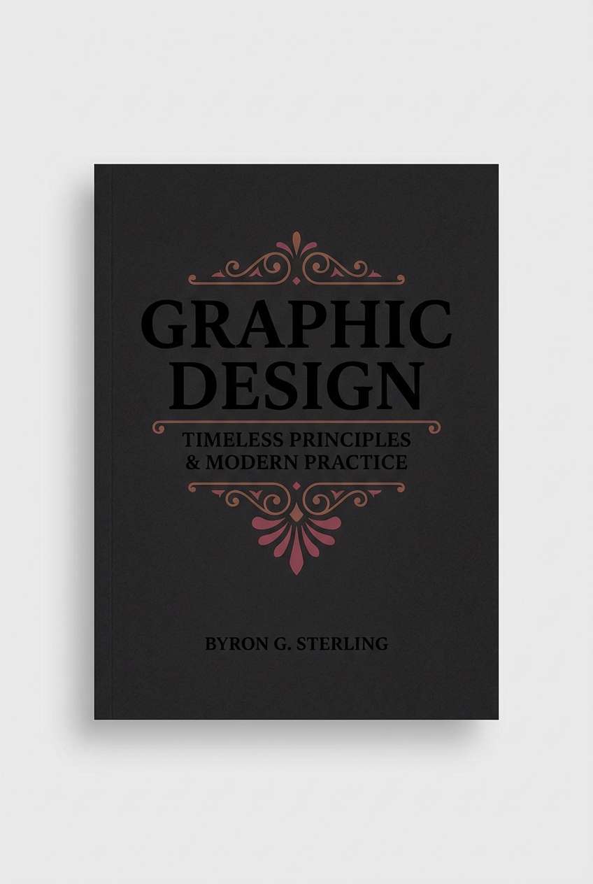
10) Rosewood Ink
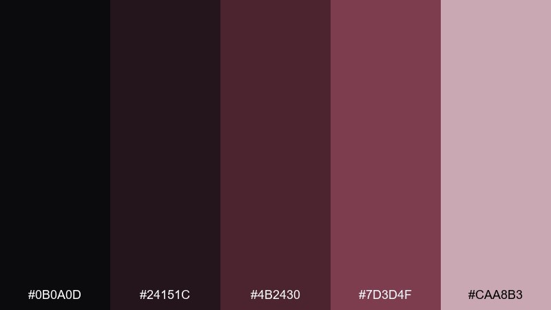
HEX: #0b0a0d #24151c #4b2430 #7d3d4f #caa8b3
Mood: literary, moody, classic
Best for: book covers and stationery sets
Literary and moody, it feels like ink blots on rosewood desks. The deep browns and wines create a grounded background for serif titles and delicate ornaments. Pair with cream paper and subtle embossing for a timeless look. Tip: keep the mid rose tone for small icons and rules so the cover stays legible at thumbnail size.
Image example of rosewood ink generated using media.io
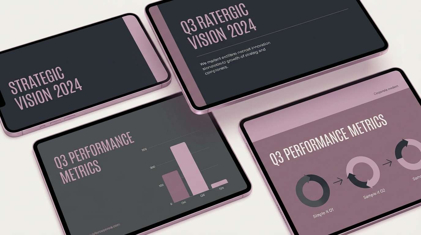
11) Dusty Mauve Night
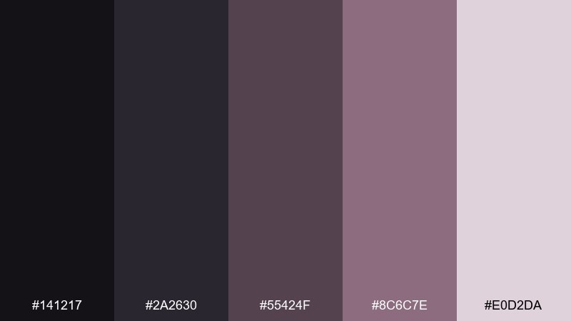
HEX: #141217 #2a2630 #55424f #8c6c7e #e0d2da
Mood: muted, professional, understated
Best for: brand guidelines and pitch decks
Muted and professional, it brings the quiet of evening with a hint of rose. A black rose color scheme like this works well for slides where you need authority without stark black-and-white. Pair with clean sans-serif type and consistent spacing to keep it polished. Tip: use the light mauve only for charts and key metrics so the deck scans quickly.
Image example of dusty mauve night generated using media.io
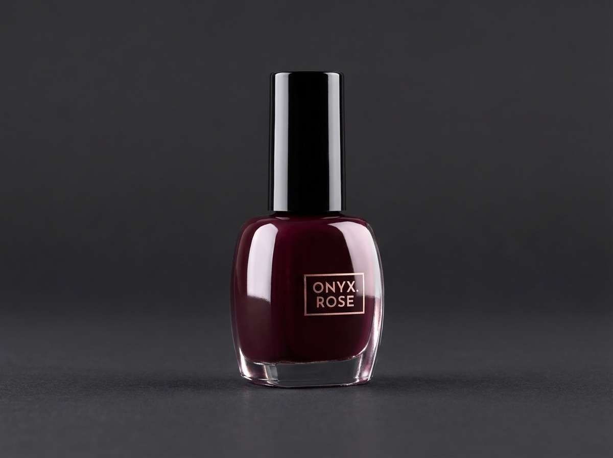
12) Onyx Peony
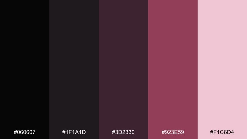
HEX: #060607 #1f1a1d #3d2330 #923e59 #f1c6d4
Mood: glam, punchy, high-impact
Best for: nail polish ads and product launches
Glam and punchy, it looks like peony petals against polished onyx. The hot rose shade makes an instant hero accent for buttons, badges, and limited-edition labels. Pair with clean black backgrounds and a single spotlight gradient to keep it premium. Tip: use the pale pink for reflections and shine effects rather than large areas.
Image example of onyx peony generated using media.io
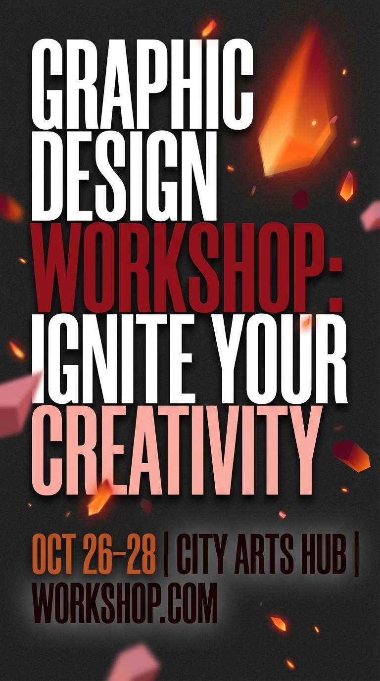
13) Crimson Cinders
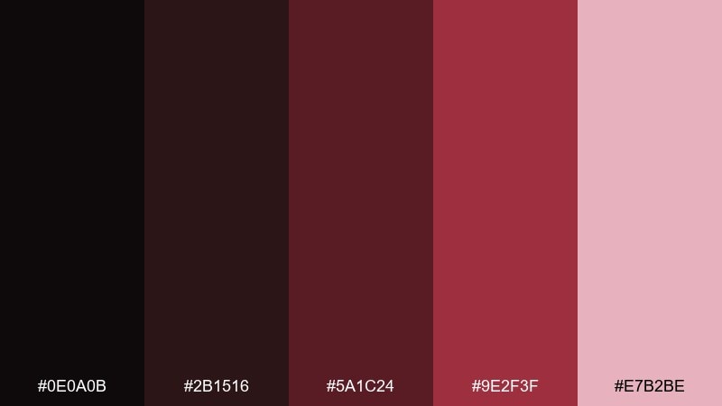
HEX: #0e0a0b #2b1516 #5a1c24 #9e2f3f #e7b2be
Mood: intense, fiery, rebellious
Best for: event flyers and seasonal promos
Intense and fiery, it feels like embers glowing under dark ash. Use the crimson as the attention hook, then anchor everything with the soot-black and deep brick tones. Pair with bold condensed type for urgency and impact. Tip: keep the pale pink for small overlays so the red stays the star.
Image example of crimson cinders generated using media.io
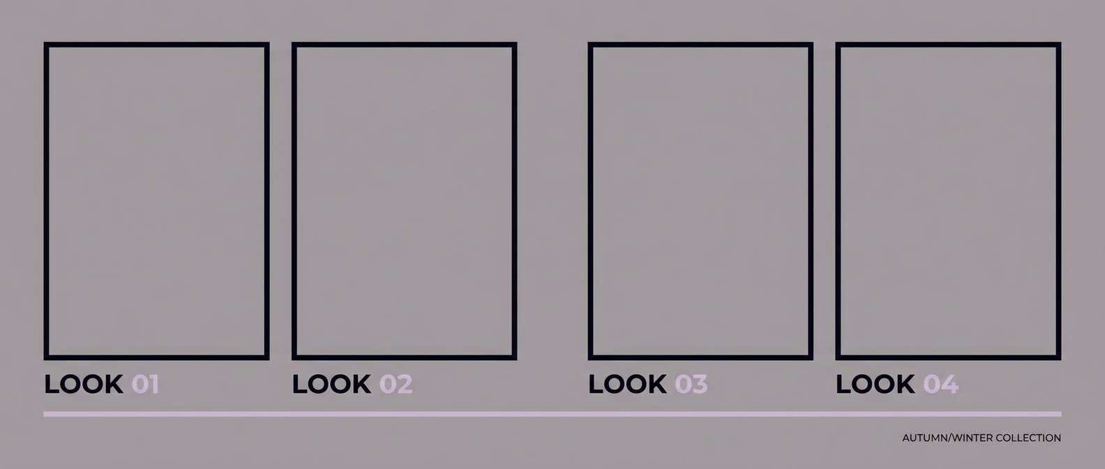
14) Sable Satin
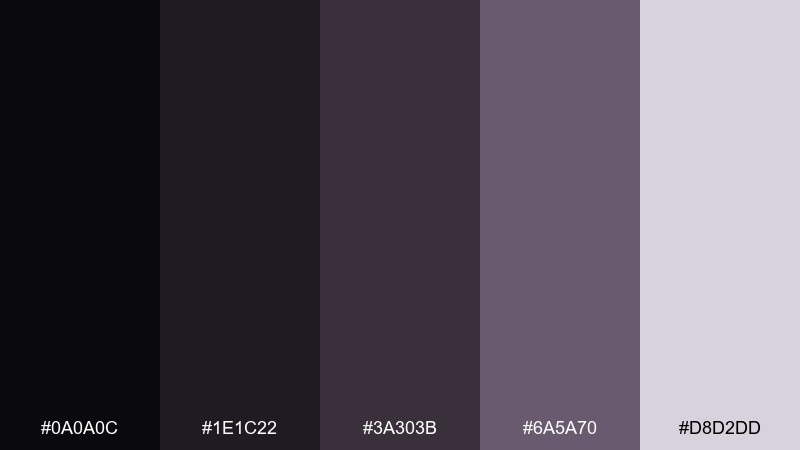
HEX: #0a0a0c #1e1c22 #3a303b #6a5a70 #d8d2dd
Mood: minimal, smooth, contemporary
Best for: fashion lookbooks and portfolios
Minimal and smooth, it recalls satin fabric shifting from black to mauve-gray. The middle tones are perfect for grids, captions, and subtle dividers that do not compete with imagery. Pair with large photos and restrained typography for a gallery-like feel. Tip: keep contrast moderate on body text to avoid the harshness that pure black can create in print.
Image example of sable satin generated using media.io
15) Twilight Garnet
HEX: #09080b #221019 #4c1626 #7d2340 #d7a7b8
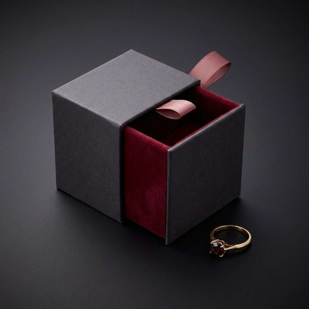
Mood: moody, refined, jewel-toned
Best for: jewelry ads and premium social posts
Moody and jewel-toned, it evokes garnets catching light in a dark room. Black rose color combinations like these make metal textures look richer, especially when you lean into deep wine shadows. Pair with simple typography and generous margins for a high-end cadence. Tip: use the dusty pink as a soft rim light or background card so the jewelry stays the focal point.
Image example of twilight garnet generated using media.io
16) Soft Terror
HEX: #111013 #2f232a #6a3a4b #b57a8e #f7eef1
Mood: spooky, playful, romantic
Best for: horror romance book covers
Spooky but soft, it feels like a haunted rose garden wrapped in fog. The palette balances readable darks with gentle pinks that keep the vibe romantic, not grim. Pair with elegant serif type and subtle illustrated motifs for a modern gothic look. Tip: keep the lightest tint for the title area so it stands out cleanly against the darker base.
Image example of soft terror generated using media.io
17) Museum Noir

HEX: #0c0c0e #242228 #4a3b42 #7f6670 #d3c7cc
Mood: curated, quiet, sophisticated
Best for: gallery posters and exhibit signage
Curated and quiet, it suggests museum walls and dried floral arrangements under low light. The gray-to-rose neutrals keep typography readable while still feeling atmospheric. Pair with lots of negative space, crisp alignment, and a single hero image. Tip: choose one accent tone for dates and wayfinding so visitors scan quickly.
Image example of museum noir generated using media.io
18) Minimal Rose UI
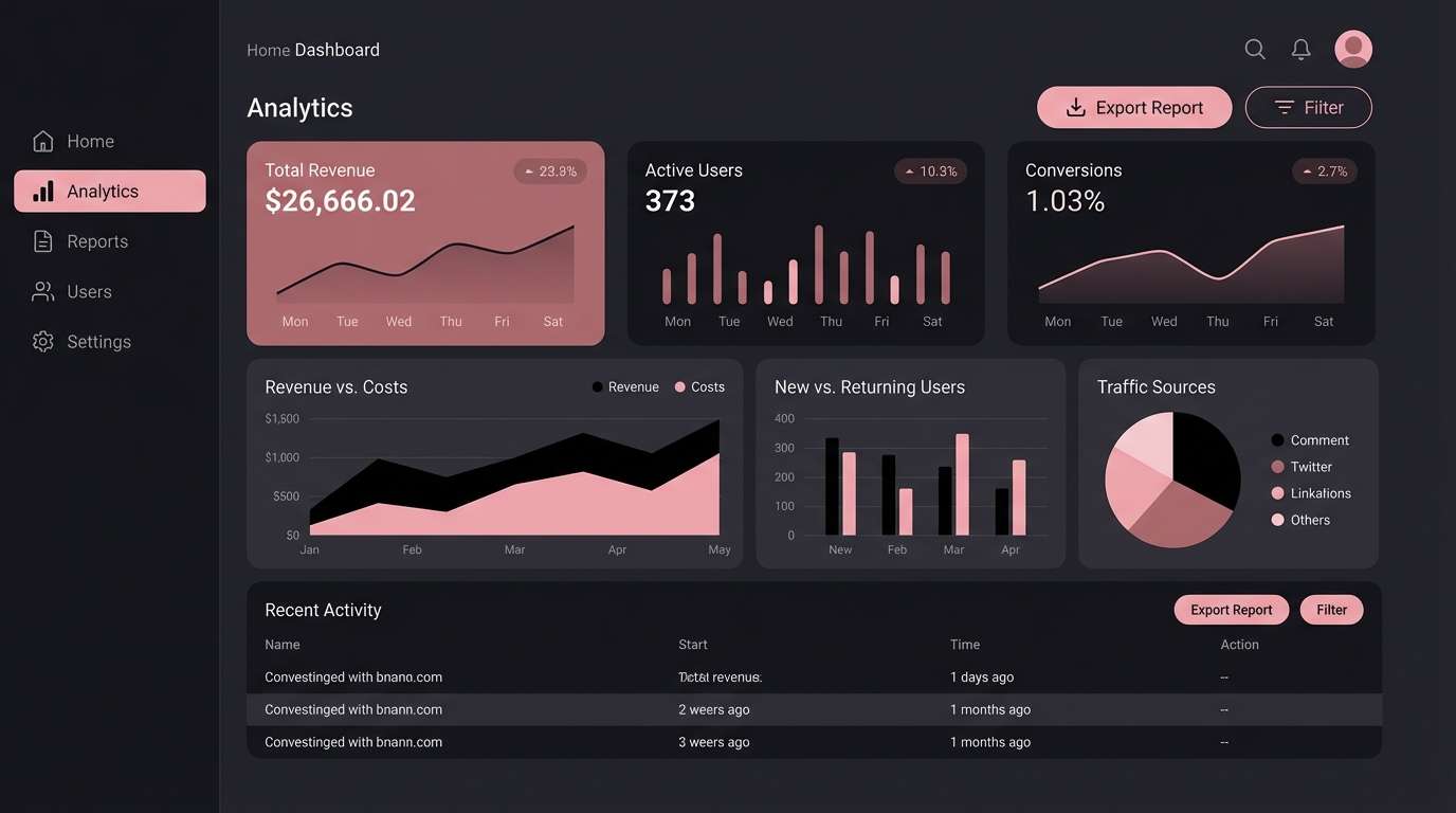
HEX: #0f0f12 #2a2a30 #4f3641 #9c6a7c #f3e3ea
Mood: modern, calm, premium
Best for: dashboard UI and mobile app themes
Modern and calm, it reads like dark mode softened by rose-tinted light. A black rose color palette is ideal for dashboards where you want depth without pure black glare. Pair the two darkest shades for surfaces, then use the dusty rose for active states and badges. Tip: keep the light pink for focus rings and charts so accessibility stays strong in dark mode.
Image example of minimal rose ui generated using media.io
19) Candlelit Roses

HEX: #120c0f #2b141a #5d2a33 #a04a5c #f0d0d8
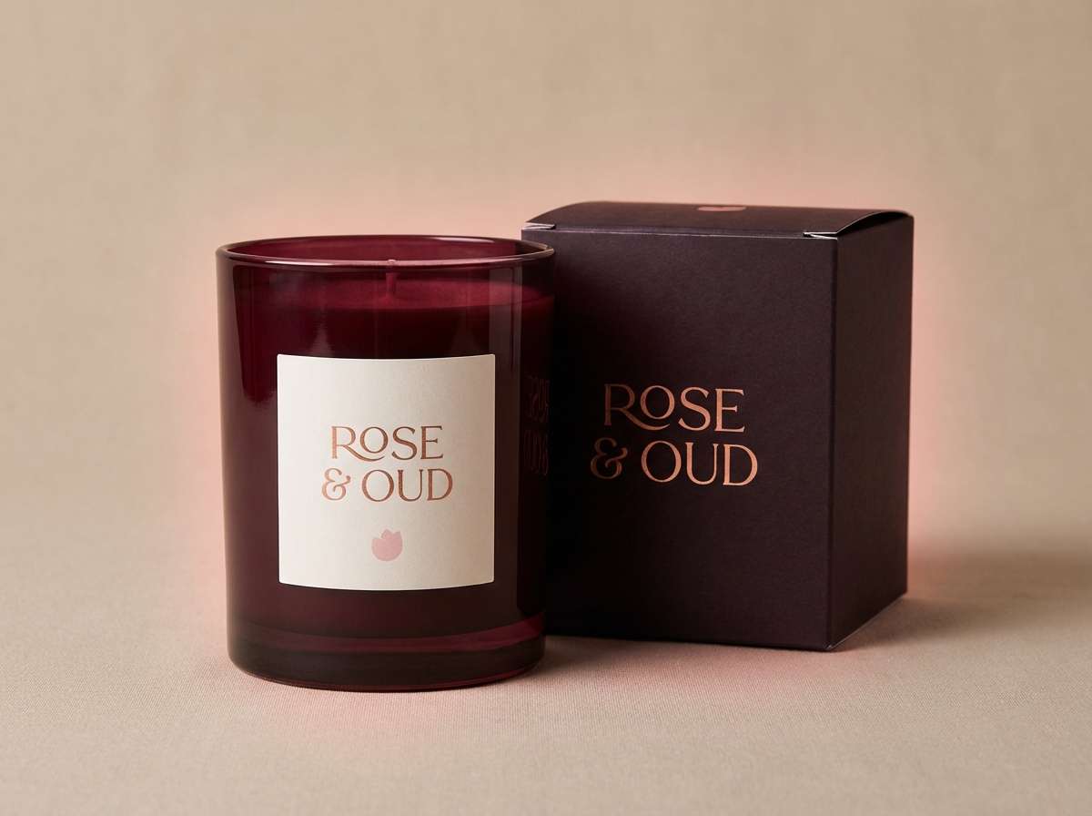
Mood: warm, intimate, romantic
Best for: candle labels and home fragrance packaging
Warm and intimate, it feels like candlelight flickering over deep rose petals. Use the dark wines for labels and typography, then bring in the soft pink for scent notes and small marks. Pair with textured paper and minimal icons for a cozy premium vibe. Tip: print tests matter here, so adjust the darkest shade slightly if it fills in on uncoated stock.
Image example of candlelit roses generated using media.io
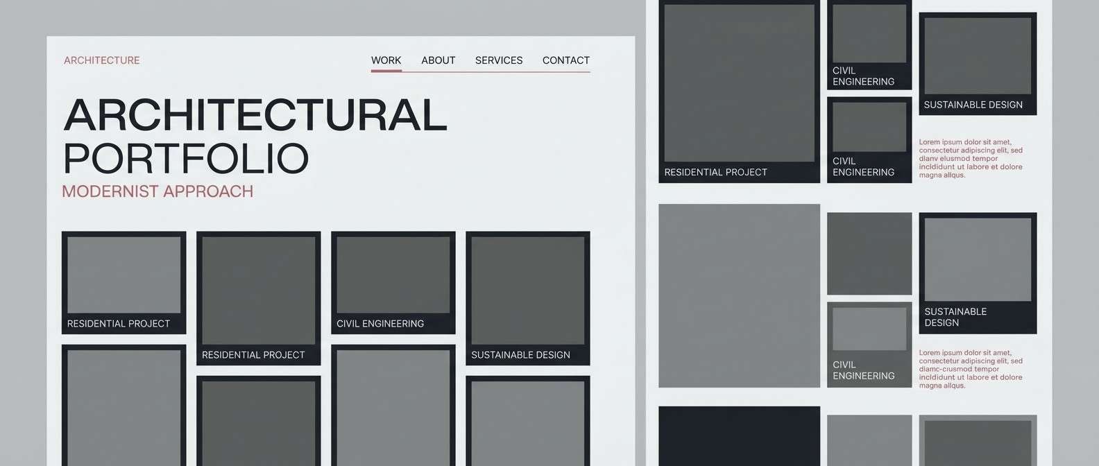
20) Urban Rose Concrete
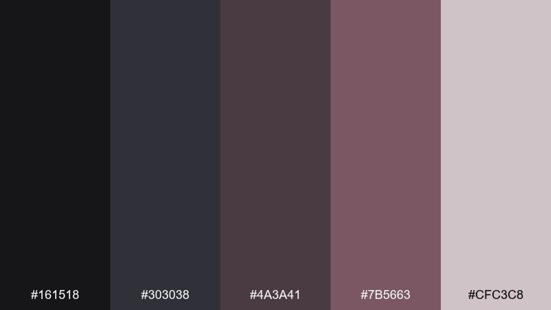
HEX: #161518 #303038 #4a3a41 #7b5663 #cfc3c8
Mood: industrial, grounded, contemporary
Best for: architecture portfolios and agency sites
Industrial and grounded, it looks like rose dust settling on concrete. The grays keep layouts structured, while the muted rose adds a human edge to an otherwise urban feel. Pair with sharp grids, thin lines, and monochrome photography for a contemporary portfolio. Tip: use the rosy mid-tone for links and hover states so interactions feel intentional but restrained.
Image example of urban rose concrete generated using media.io
What Colors Go Well with Black Rose?
Black rose pairs naturally with warm neutrals like ivory, cream, and soft greige—these lift the palette and keep dark compositions from feeling cramped, especially in print.
For richer contrast, add jewel tones such as garnet, plum, and oxblood, or keep it sleek with cool charcoals and blue-grays. Metallic accents (champagne gold, pewter) also amplify the “luxe” feel without needing bright color.
If you need a modern pop, use a single high-clarity accent sparingly—think crisp blush, vivid rose, or a muted lilac—so the palette stays moody while still guiding attention.
How to Use a Black Rose Color Palette in Real Designs
Start with a near-black base for backgrounds, hero panels, or packaging fields, then layer mid-tone rosewood or mauve for structure (cards, sections, frames). This prevents designs from reading as “just black” and creates dimensionality.
Reserve the lightest pink/mauve for micro-contrast: dividers, focus states, highlights, and small labels. Used this way, it acts like lighting—helping hierarchy—rather than turning the layout pastel.
When printing, test the darkest shade on your chosen stock; very deep values can fill in. Slightly lifting the black (toward charcoal) often preserves detail while keeping the same dramatic mood.
Create Black Rose Palette Visuals with AI
If you want to preview how a black rose palette looks on real deliverables—labels, posters, UI screens, or social cards—generate mock visuals first. It’s a fast way to validate contrast, mood, and readability.
Reuse the prompts above, then swap in your brand object (perfume bottle, dashboard, invitation) and keep the HEX list nearby so your final design stays consistent across assets.
Media.io makes it easy to iterate: create multiple variations (lighting, texture, layout) until the dark tones feel intentional and the rose accents land exactly where you want attention.
Black Rose Color Palette FAQs
-
What is a black rose color palette?
A black rose color palette is a set of near-black, charcoal, and deep rose-to-wine tones (often with a dusty pink or pale mauve highlight) designed to feel dramatic, romantic, and premium. -
Is black rose more burgundy or more purple?
It depends on the undertone: some black rose palettes lean burgundy/oxblood (warmer, more red-brown), while others lean plum/mauve (cooler, more purple). Choosing one undertone and staying consistent keeps the look cohesive. -
What background works best with black rose tones?
For a moody look, use charcoal or near-black backgrounds and let dusty rose serve as the accent. For a lighter, more editorial feel, use ivory or very light mauve backgrounds and apply the dark rose shades to typography and key elements. -
How do I keep a black rose palette from looking too dark?
Increase spacing and negative space, introduce one light tint (pale mauve/cream) for highlights, and avoid using pure black everywhere. Slightly lifted charcoals often preserve detail and feel more premium. -
Is a black rose palette good for UI and dark mode?
Yes—near-black surfaces with dusty rose states can reduce glare while maintaining hierarchy. Use the lightest tint for focus rings, chart lines, and small text areas to support accessibility. -
What typefaces pair well with black rose palettes?
Elegant serifs work well for romantic or vintage directions, while clean sans-serifs fit modern UI and branding. High-contrast display serifs can look striking, but keep body text simple for readability. -
Can I generate black rose mockups with AI?
Yes—use a text-to-image tool to create packaging, posters, or UI concepts with your chosen HEX tones as guidance. Start from a prompt similar to the examples above and iterate on lighting and texture for realistic depth.


