

An ocean wave color palette blends seafoam tints, teals, and deep navies to deliver calm, modern visuals that still feel energetic. It’s a reliable direction for coastal branding, UI themes, and print designs that need freshness without overwhelming contrast.
Below are 20 ocean wave palette ideas with HEX codes, plus practical notes on mood, best-use cases, and AI prompt examples you can reuse.
In this article
Why Ocean Wave Palettes Work So Well
Ocean wave colors sit in a sweet spot between “clean” and “expressive.” Light aquas and seafoam tones feel airy and open, while deeper teals and navies provide structure for typography, navigation, and key UI states.
They also translate well across mediums. On screens, blue-green palettes reduce the harshness you can get from pure white/black contrast; in print, they stay sophisticated with matte finishes and minimal texture.
Most importantly, ocean wave palettes are flexible: you can go spa-like and muted, bright and tropical, or dark and dramatic—without leaving the same coastal family of hues.
20+ Ocean Wave Color Palette Ideas (with HEX Codes)
1) Seafoam Crest
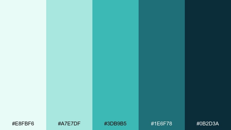
HEX: #E8FBF6 #A7E7DF #3DB9B5 #1E6F78 #0B2D3A
Mood: fresh, airy, coastal
Best for: wellness brand landing page UI
Fresh seafoam and deep teal evoke a clean shoreline breeze and glassy morning water. Use the pale mint as a spacious background and lean on the darker blue-green for headings and navigation. Pair with soft white and subtle line icons to keep the page feeling light, not clinical. Tip: reserve the brightest aqua for primary buttons so the hierarchy stays calm but clear.
Image example of seafoam crest generated using media.io
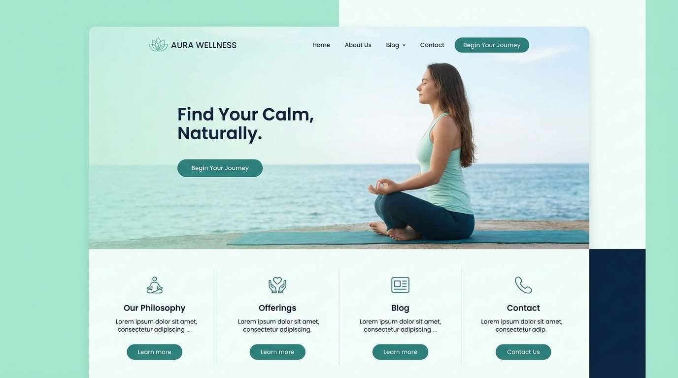
Media.io is an online AI studio for creating and editing video, image, and audio in your browser.

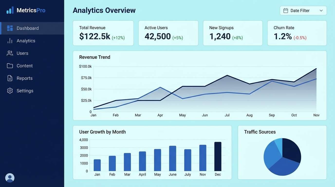
2) Deep Current
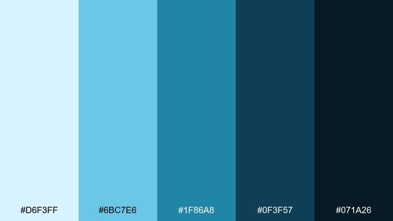
HEX: #D6F3FF #6BC7E6 #1F86A8 #0F3F57 #071A26
Mood: bold, focused, ocean-deep
Best for: SaaS analytics dashboard UI
Bold blues and inky navies feel like a dive below the surface where everything looks sharper. Use the darkest tone for the side nav, then layer the mid blue for charts and active states. Light sky blue works well for cards and data panels without glare. Tip: keep alerts to neutrals and rely on saturation shifts here for emphasis instead of introducing new hues.
Image example of deep current generated using media.io
3) Tidepool Glass
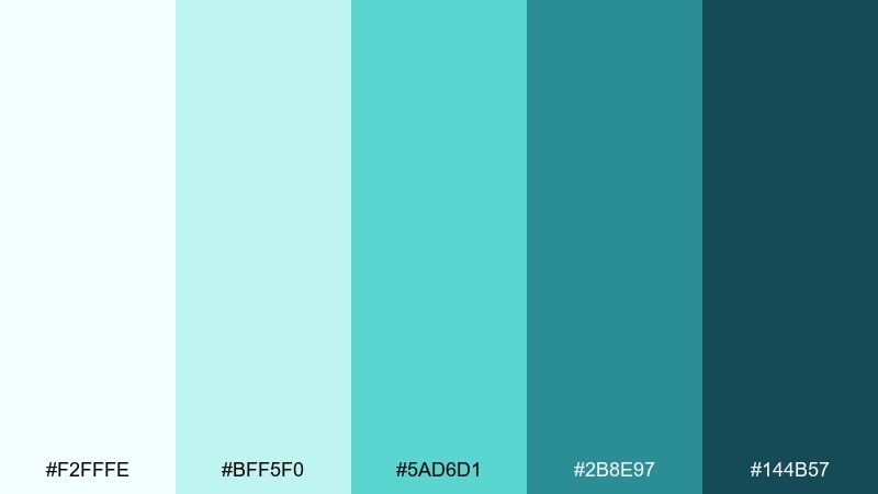
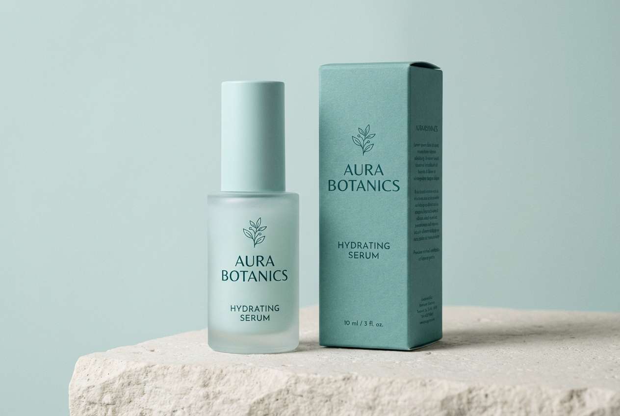
HEX: #F2FFFE #BFF5F0 #5AD6D1 #2B8E97 #144B57
Mood: clean, watery, modern
Best for: skincare packaging and product ad
Clean watery greens read like sunlight hitting a clear tidepool at noon. Let the near-white and pale aqua dominate labels, then use the darker teal for ingredient callouts and seals. Matte textures and minimal typography fit these tones best, especially with silver foiling as a neutral accent. Tip: keep gradients subtle so the palette stays premium rather than playful.
Image example of tidepool glass generated using media.io
4) Stormy Break
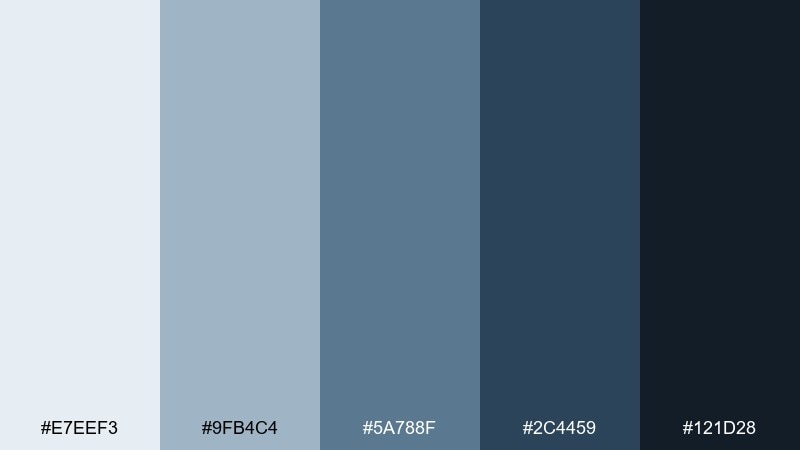
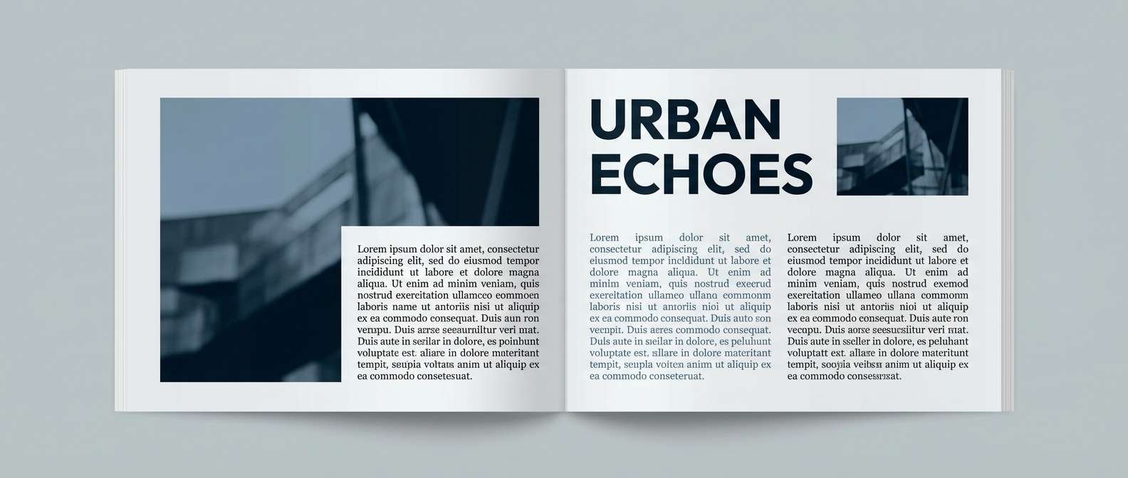
HEX: #E7EEF3 #9FB4C4 #5A788F #2C4459 #121D28
Mood: moody, refined, storm-coast
Best for: editorial magazine spread layout
Moody slate blues and steel grays bring to mind a storm line rolling in over rough water. This ocean wave color scheme shines in editorial layouts where contrast and calm spacing matter. Use the light gray-blue for margins and captions, then let the deep ink tone anchor headlines. Tip: add one warm neutral in photography only, and keep the typography strictly monochrome for sophistication.
Image example of stormy break generated using media.io
5) Coral Drift
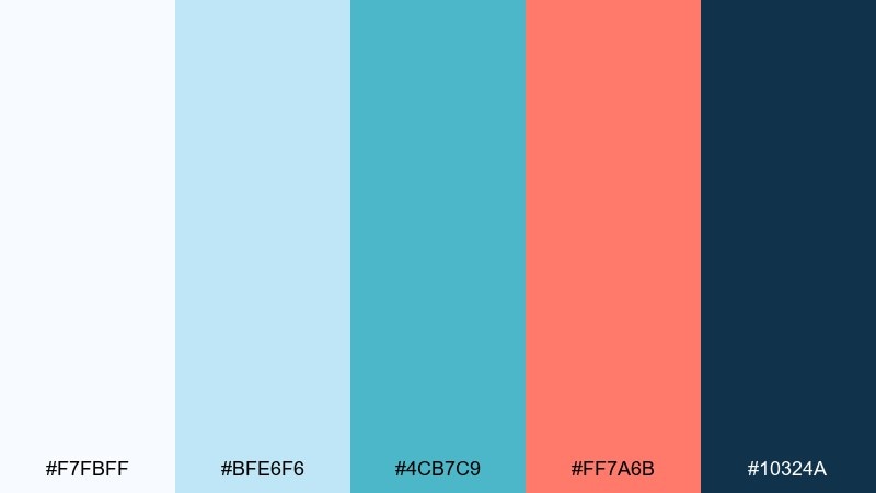
HEX: #F7FBFF #BFE6F6 #4CB7C9 #FF7A6B #10324A
Mood: bright, friendly, beachy
Best for: social media promo post template
Bright aqua with a coral pop feels like beach umbrellas against clear water. These ocean wave color combinations work best when coral is used sparingly for calls to action and highlights. Keep most text in the deep navy for readability and let the soft sky tint carry the background. Tip: limit coral to one element per post so the design stays modern instead of loud.
Image example of coral drift generated using media.io

6) Coastal Fog
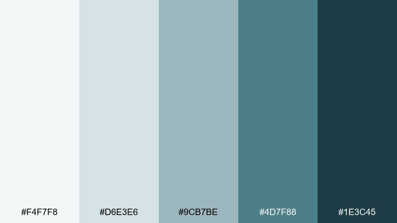
HEX: #F4F7F8 #D6E3E6 #9CB7BE #4D7F88 #1E3C45
Mood: soft, muted, calm morning
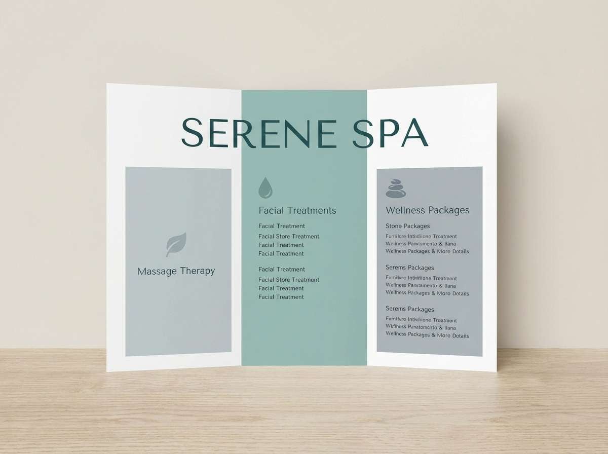
Best for: spa brochure and print collateral
Soft misty blue-greens evoke a quiet boardwalk morning with fog hanging low. Use the light grays for generous negative space, then introduce the mid tones in section dividers and icons. The dark teal is ideal for body text and fine rules without looking harsh. Tip: choose uncoated paper so these muted tones stay velvety instead of glossy.
Image example of coastal fog generated using media.io
7) Lagoon Mint
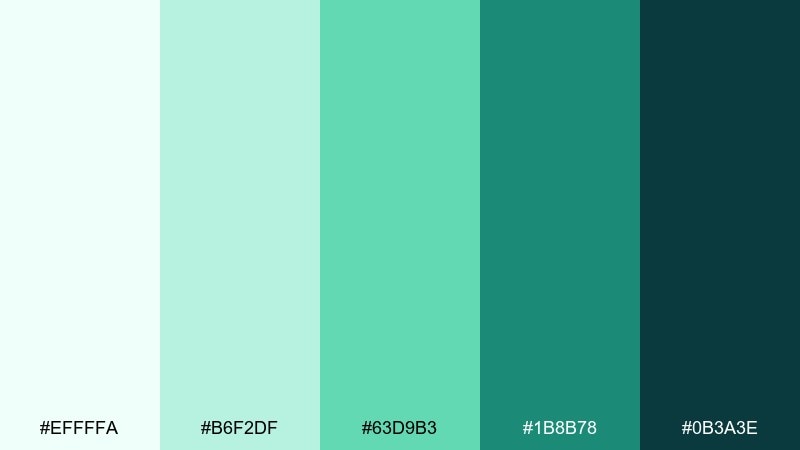
HEX: #EFFFFA #B6F2DF #63D9B3 #1B8B78 #0B3A3E
Mood: uplifting, tropical, crisp
Best for: eco startup brand kit
Uplifting mint and emerald tones feel like a shallow lagoon over sunlit sand. Use the brightest mint for background panels and the deeper green for logos and brand marks. Pair with simple geometric shapes and recycled-paper textures to reinforce the eco message. Tip: keep gradients minimal and let solid blocks of color do the work.
Image example of lagoon mint generated using media.io
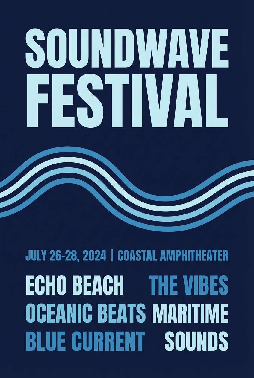
8) Midnight Swell
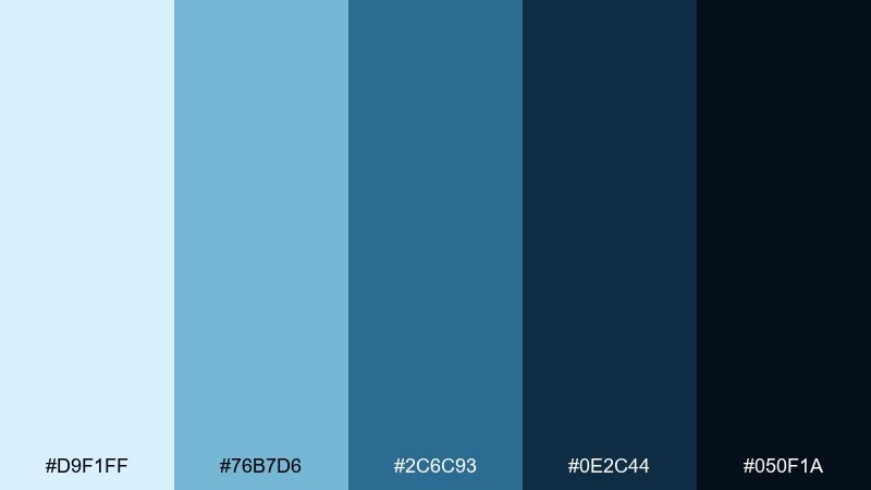
HEX: #D9F1FF #76B7D6 #2C6C93 #0E2C44 #050F1A
Mood: dramatic, sleek, nighttime ocean
Best for: music festival poster design
Dramatic blues and near-black navies suggest moonlight on rolling waves. Set your headline in the palest blue for strong contrast, then build supporting type in the mid tones. Use the deepest shade as the poster field color to make the lighter elements feel luminous. Tip: add subtle halftone texture in the background to avoid a flat, heavy block.
Image example of midnight swell generated using media.io
9) Shell Sand
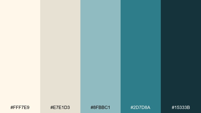
HEX: #FFF7E9 #E7E1D3 #8FBBC1 #2D7D8A #15333B
Mood: warm, balanced, coastal neutral
Best for: beach house interior paint guide
Warm sand and cool sea tones create a balanced coastal neutral that still feels inviting. Use the creamy shell color for walls or large surfaces, then bring in the blue-greens for cabinetry, textiles, or accent trim. The deep teal works well for hardware, frames, and small decor pieces. Tip: repeat the sand tone in natural materials like linen or oak to keep the room grounded.
Image example of shell sand generated using media.io
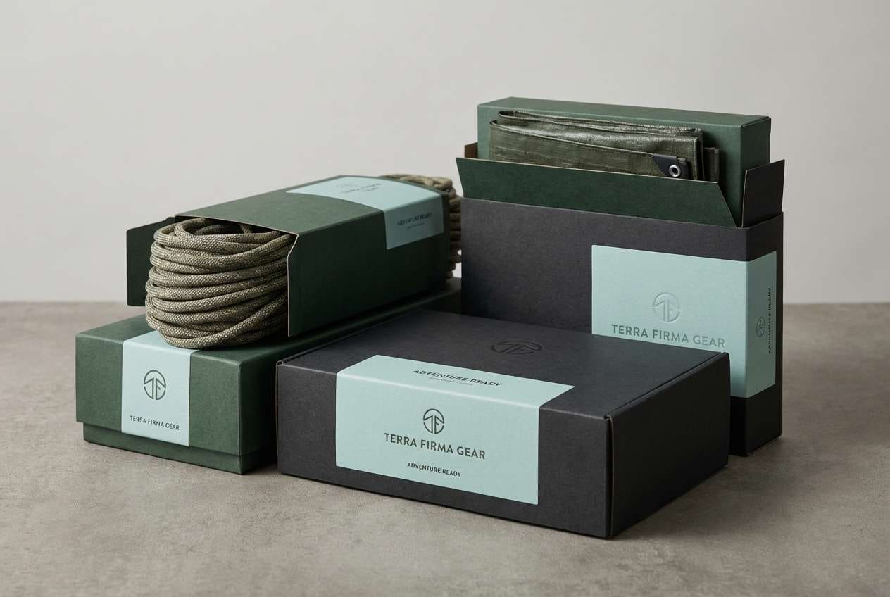
10) Kelp Shadow
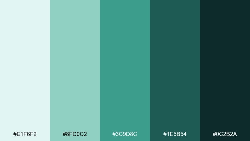
HEX: #E1F6F2 #8FD0C2 #3C9D8C #1E5B54 #0C2B2A
Mood: earthy, grounded, sea-forest
Best for: outdoor gear product packaging
Earthy sea-greens feel like kelp forests swaying under filtered light. Use the mid green for the primary pack color and reserve the pale aqua for labels and information panels. Dark green-black adds durability and works beautifully for bold typography and barcodes. Tip: pair with kraft textures or matte finishes to keep it rugged, not glossy.
Image example of kelp shadow generated using media.io
11) Sunlit Surf
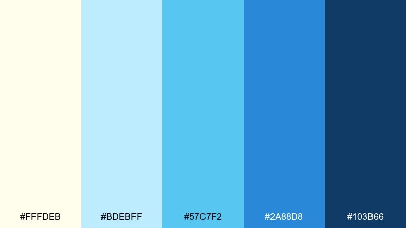
HEX: #FFFDEB #BDEBFF #57C7F2 #2A88D8 #103B66
Mood: sunny, optimistic, clean
Best for: travel website hero banner
Sunny highlights and clear blues capture that bright moment when a wave flashes under midday sun. Use the pale butter tone sparingly as a warmth booster for badges or small shapes. The stronger blues are ideal for CTAs, links, and headline gradients. Tip: keep photos lightly desaturated so the UI colors stay in control.
Image example of sunlit surf generated using media.io

12) Blue Mirage
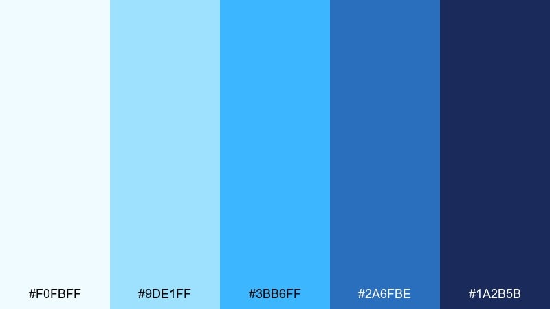
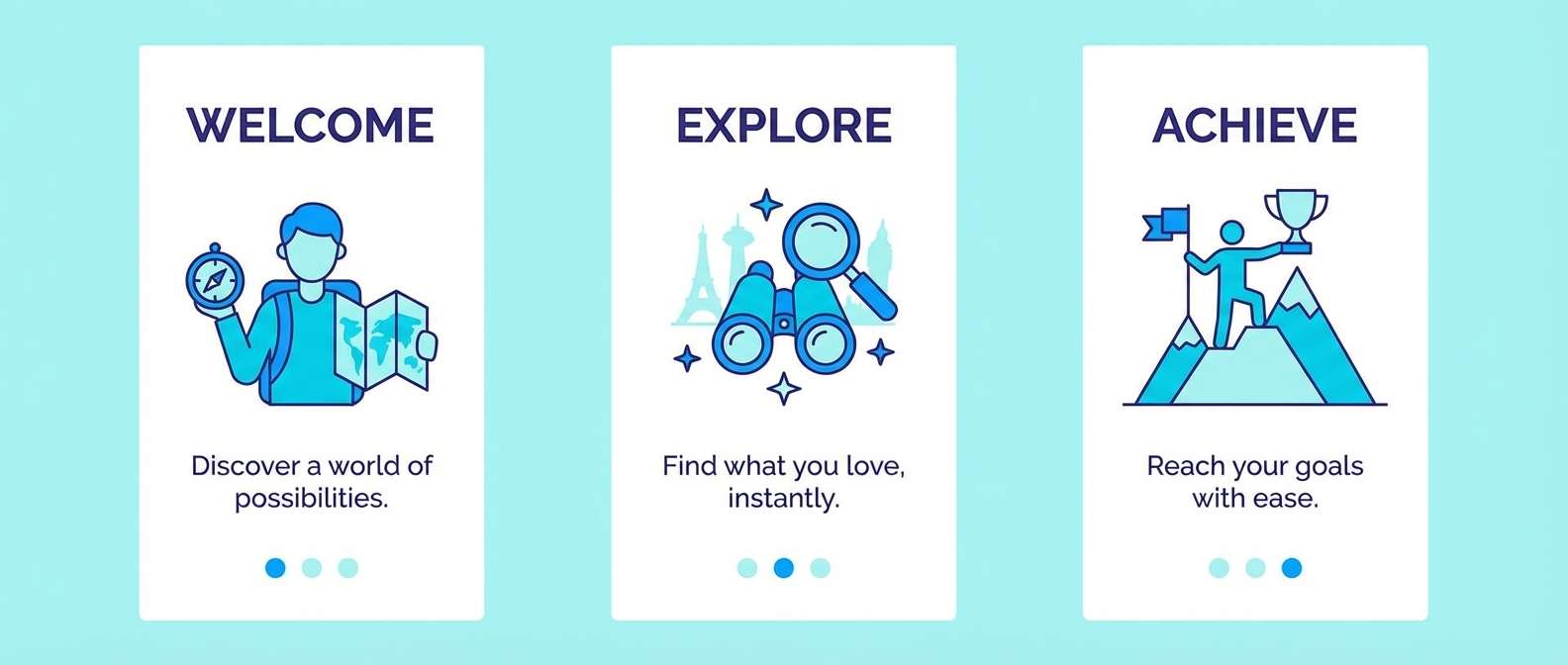
HEX: #F0FBFF #9DE1FF #3BB6FF #2A6FBE #1A2B5B
Mood: vibrant, airy, tech-forward
Best for: app onboarding screens
Vibrant sky-to-royal blues feel like shimmering water seen from above. These tones are great for onboarding because they read clean and energetic without turning neon. Use the light cyan for screen backgrounds and reserve the royal blue for progress indicators and key illustrations. Tip: keep body text in the deep indigo so accessibility stays strong on bright panels.
Image example of blue mirage generated using media.io
13) Harbor Slate
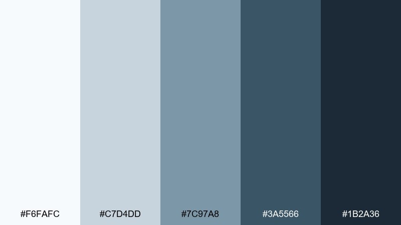
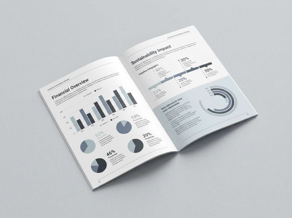
HEX: #F6FAFC #C7D4DD #7C97A8 #3A5566 #1B2A36
Mood: professional, steady, maritime
Best for: corporate annual report layout
Steady slates and maritime blues feel like a quiet harbor with boats tucked in for the night. Use the lightest tone for page backgrounds and tables, then bring in slate-blue for charts and section headers. The dark charcoal-blue grounds cover pages and pull quotes with a premium look. Tip: use one consistent accent weight for rules and dividers to keep the report disciplined.
Image example of harbor slate generated using media.io
14) Aqua Spark
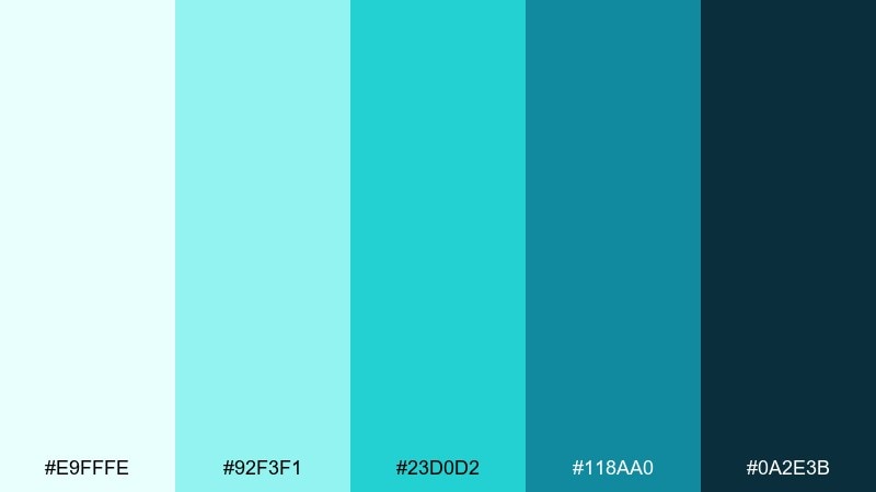
HEX: #E9FFFE #92F3F1 #23D0D2 #118AA0 #0A2E3B
Mood: playful, energetic, clean
Best for: fitness app promo banner
Energetic aqua and cyan feel like spray bursting off a fast-moving wave. Use the brightest tone for dynamic shapes and badges, then keep text anchored in the deep blue-black for clarity. The mid teal is perfect for secondary buttons and feature callouts. Tip: use angled blocks and plenty of breathing room so the palette stays sporty, not chaotic.
Image example of aqua spark generated using media.io

15) Pebble Shore
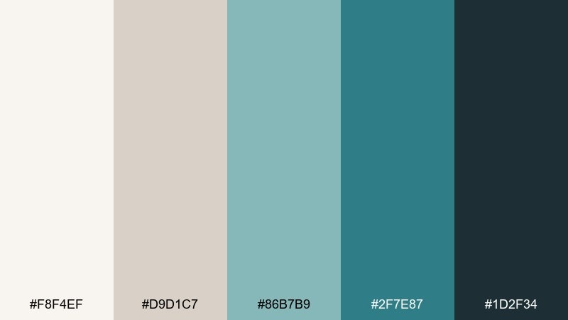
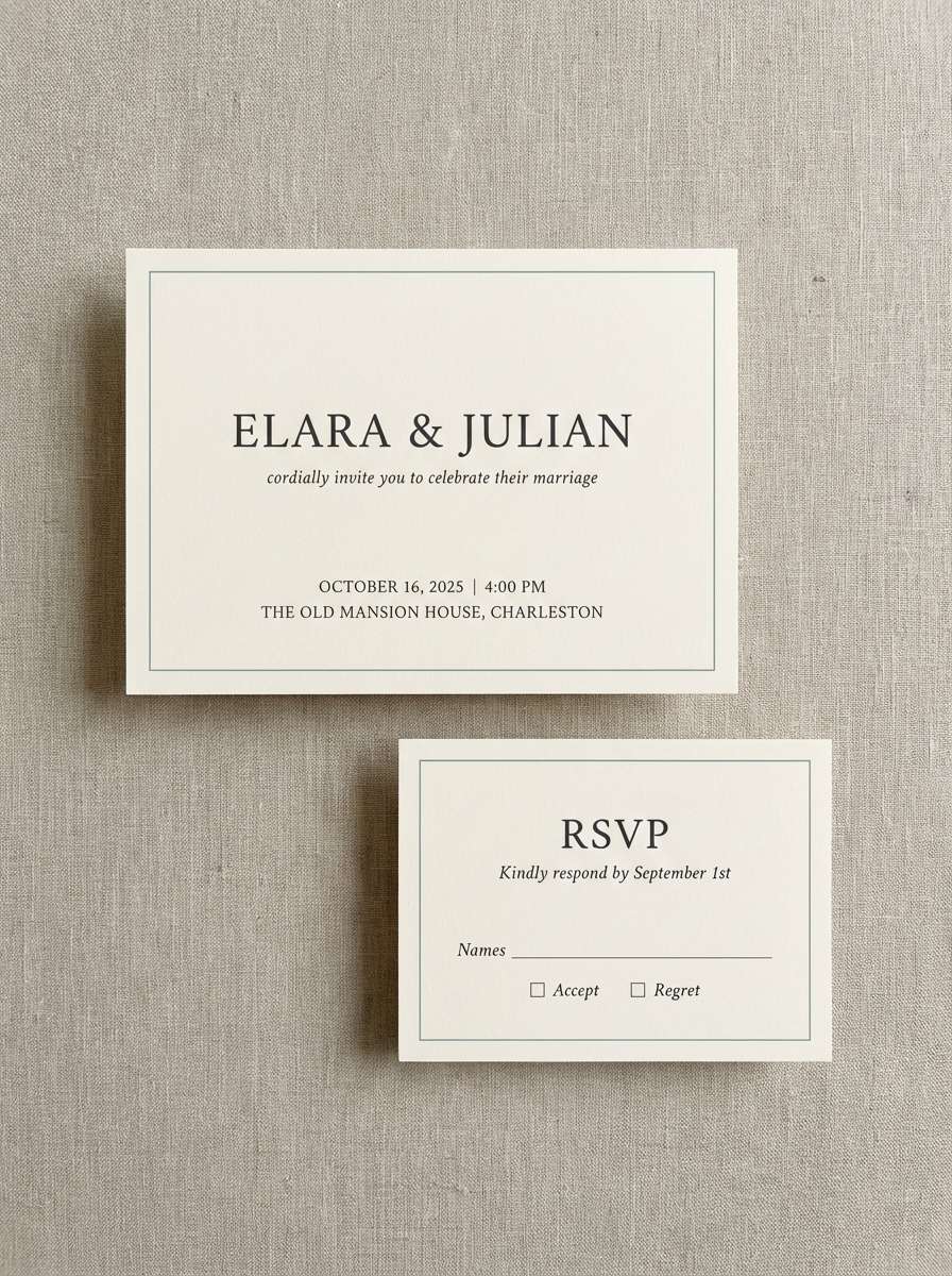
HEX: #F8F4EF #D9D1C7 #86B7B9 #2F7E87 #1D2F34
Mood: soft, natural, understated
Best for: minimal wedding invitation suite
Soft neutrals with a sea-glass teal bring to mind smooth pebbles and gentle surf. Keep the background in warm cream and use teal for names, borders, and tiny motifs. The dark charcoal is ideal for body copy and RSVP details. Tip: letterpress or textured stock elevates these quiet tones without needing extra decoration.
Image example of pebble shore generated using media.io
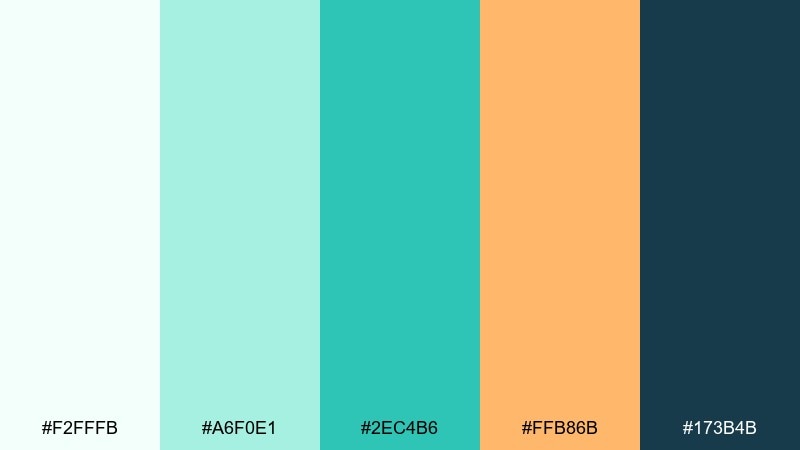
16) Whispering Wave
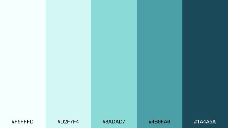
HEX: #F5FFFD #D2F7F4 #8ADAD7 #4B9FA6 #1A4A5A
Mood: gentle, soothing, spa-like
Best for: meditation app UI screens
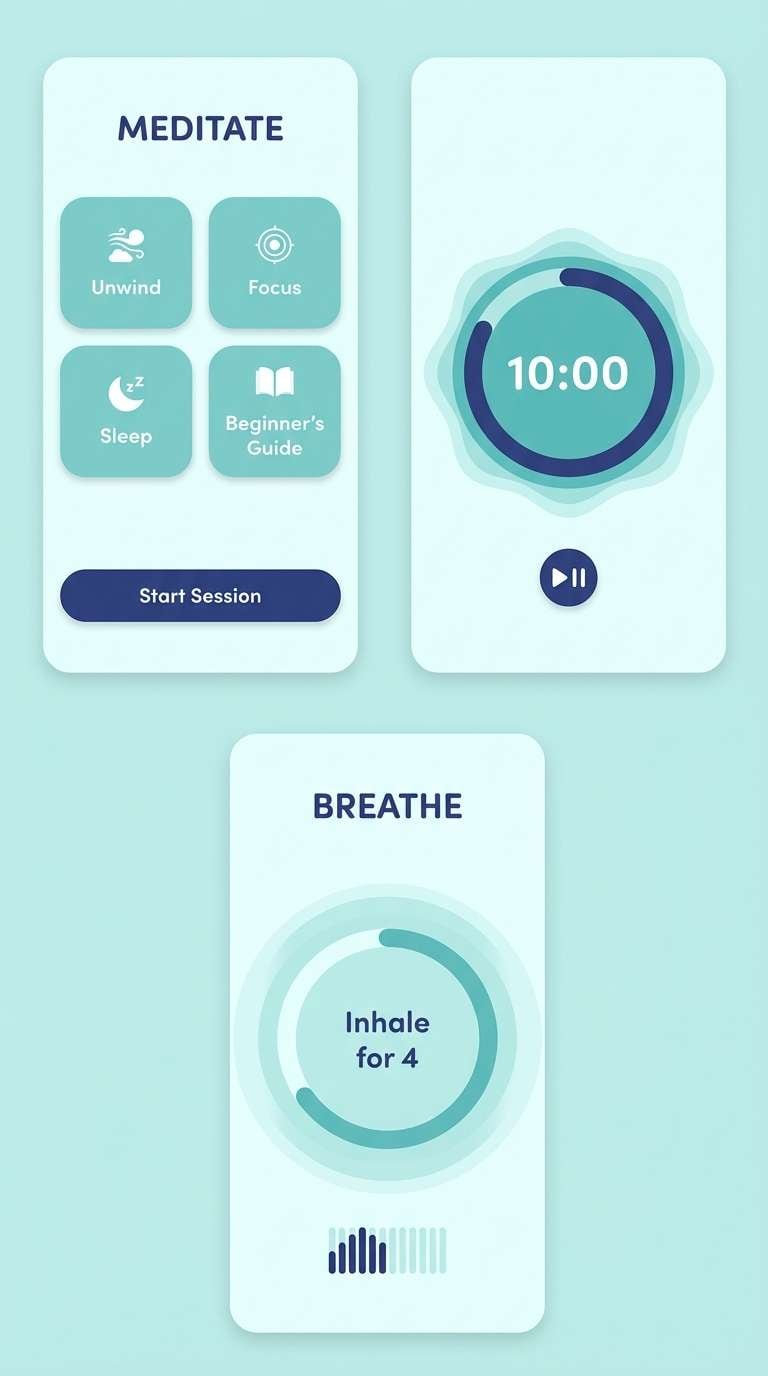
Gentle aquas and softened teals feel like a quiet wave line repeating on the shore. This ocean wave color palette is ideal for meditation screens where contrast needs to be present but never harsh. Use the palest tint for full-screen backgrounds and the mid teal for timers, toggles, and progress rings. Tip: keep animations slow and use rounded components to match the softness of the tones.
Image example of whispering wave generated using media.io
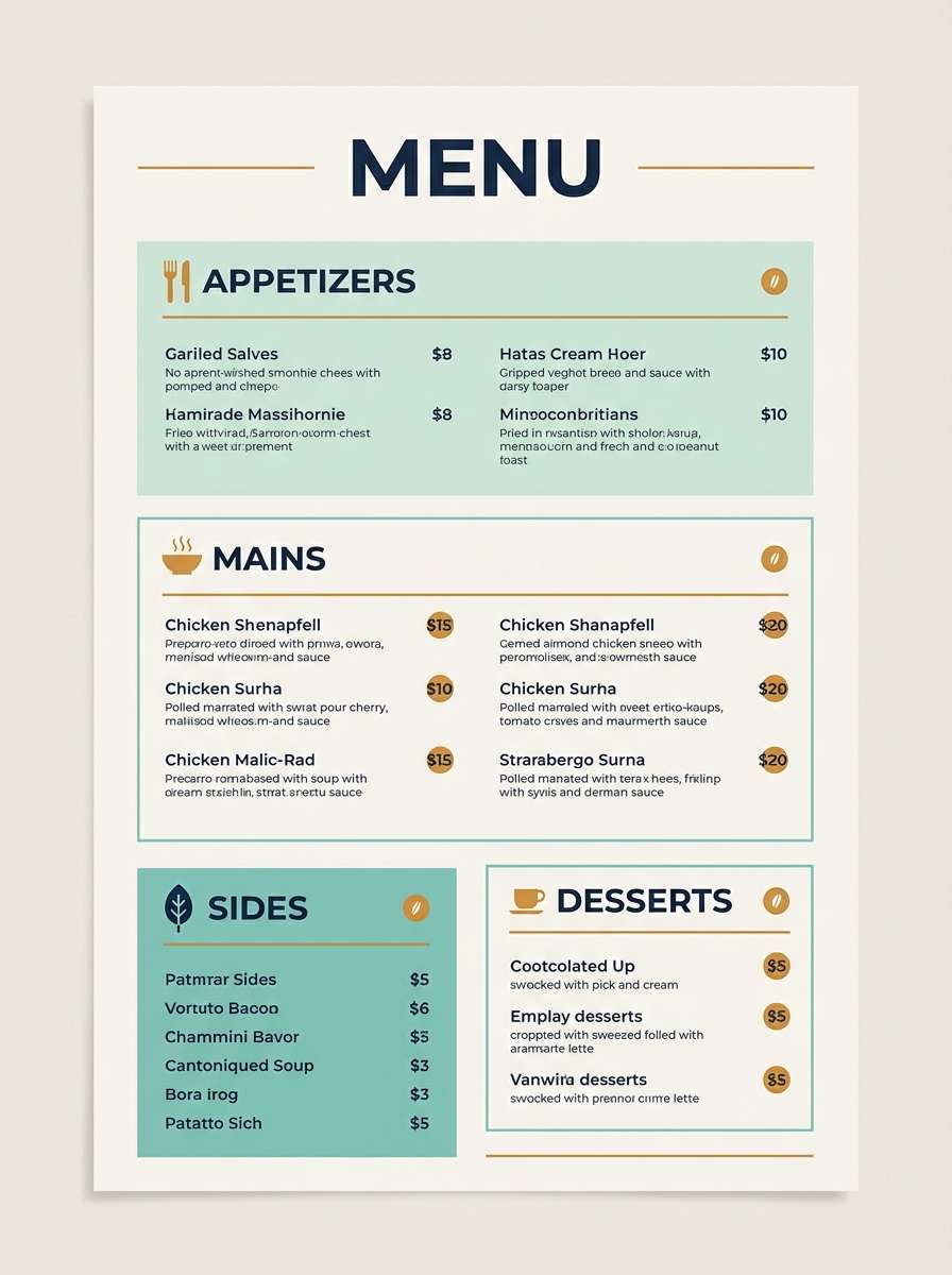
17) Reef Lantern
HEX: #F2FFFB #A6F0E1 #2EC4B6 #FFB86B #173B4B
Mood: lively, warm-accented, modern coastal
Best for: restaurant menu design
Lively teal with a warm amber accent feels like reef light glowing under sunset skies. Keep most of the menu clean with pale mint space, then use teal for section headers and icon markers. The amber works best for highlights like chef specials or price tags, not large blocks. Tip: set body text in the deep blue tone and avoid extra colors to maintain a crisp, modern feel.
Image example of reef lantern generated using media.io
18) Polar Tide
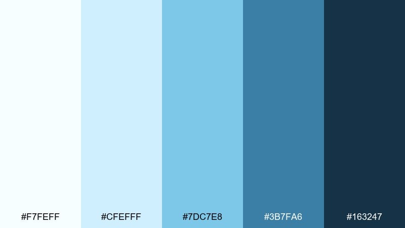
HEX: #F7FEFF #CFEFFF #7DC7E8 #3B7FA6 #163247
Mood: crisp, cool, airy
Best for: healthcare dashboard UI
Crisp icy blues feel clinical in the best way, like fresh air after rain. Use the near-white and pale blue for cards and charts so data stays easy on the eyes. The deeper blue makes a dependable accent for tabs, icons, and selected states. Tip: introduce spacing and thin dividers rather than heavy borders to keep the UI calm.
Image example of polar tide generated using media.io
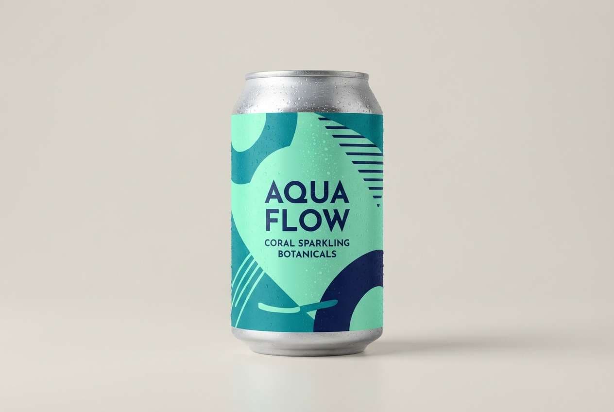
19) Tropical Rinse
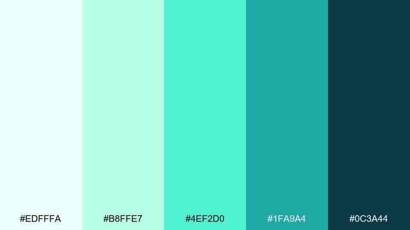
HEX: #EDFFFA #B8FFE7 #4EF2D0 #1FA9A4 #0C3A44
Mood: bright, tropical, refreshing
Best for: beverage can label concept
Bright tropical mints and teals evoke a refreshing splash and a cool rinse of seawater. Use the vivid green-aqua as the hero color on the can, then balance it with deep teal typography for legibility. Pale mint works well for ingredient bands and subtle patterning. Tip: keep the layout bold and simple so the saturation feels intentional, not noisy.
Image example of tropical rinse generated using media.io
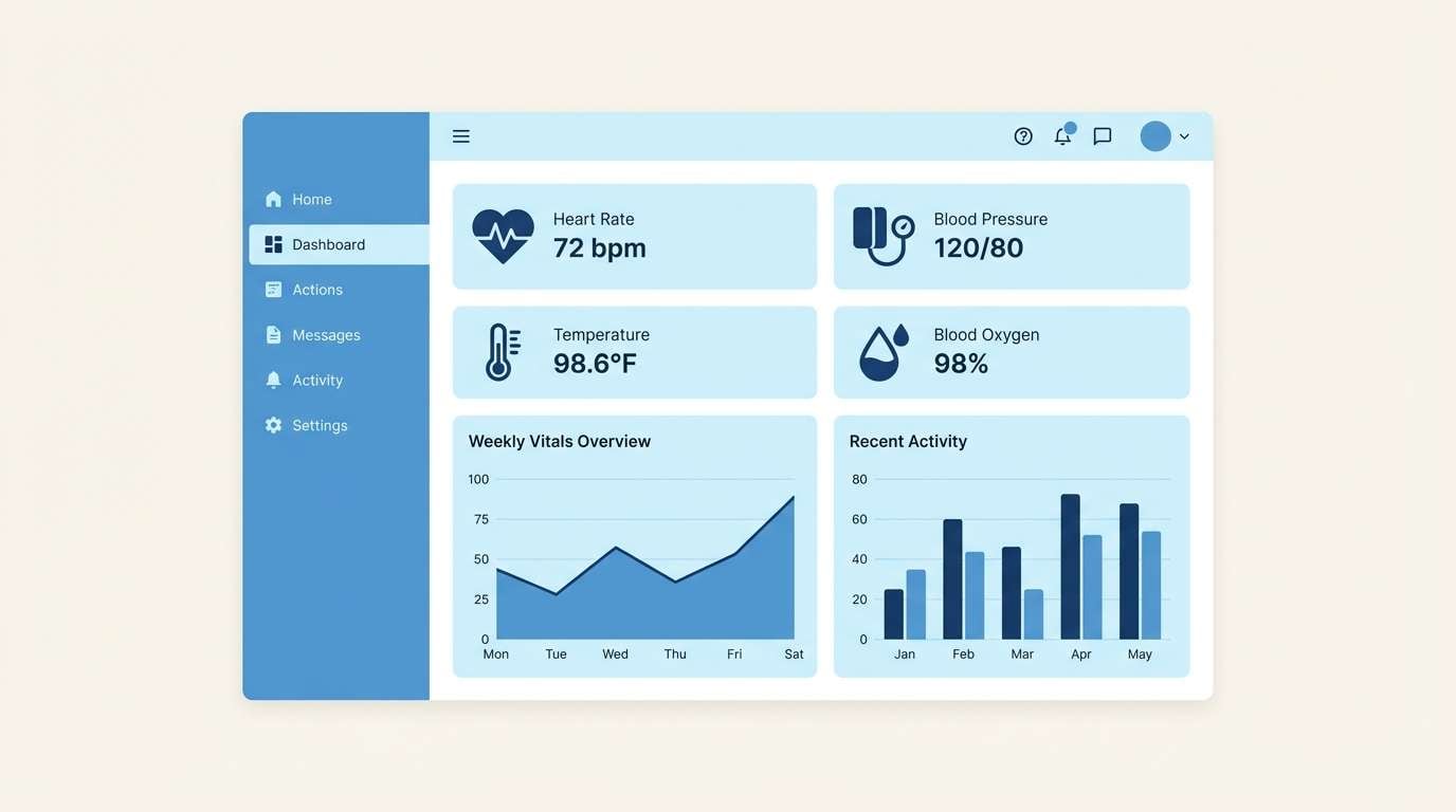
20) Nautical Calm
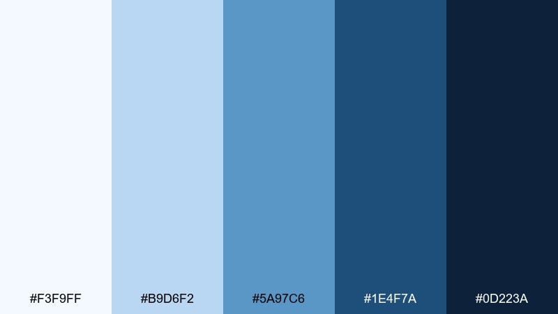
HEX: #F3F9FF #B9D6F2 #5A97C6 #1E4F7A #0D223A
Mood: classic, dependable, nautical
Best for: business presentation template
Classic nautical blues feel steady and confident, like a calm day with low swells. These ocean wave color combinations are strong for slides because they hold contrast without looking aggressive. Use the lightest tone for backgrounds, mid blue for charts, and reserve navy for titles and key numbers. Tip: keep one accent style for callouts, such as a solid bar or underline, to maintain a professional rhythm.
Image example of nautical calm generated using media.io

What Colors Go Well with Ocean Wave?
Ocean wave colors pair naturally with soft neutrals like warm sand, cream, and cool light gray—these help teals and aquas feel more premium and less “sports drink.” For a clean UI, try off-white backgrounds with slate-blue dividers and deep navy text.
If you want a more modern coastal contrast, add a small warm accent like coral, amber, or peach. Keep the warm color to highlights (badges, CTA buttons, price tags) so the palette stays calm.
For a darker, more dramatic direction, pair ocean teals with charcoal, ink navy, and muted steel blue. This is especially effective in dashboards, posters, and editorial layouts where hierarchy is key.
How to Use a Ocean Wave Color Palette in Real Designs
Start by assigning roles: a pale aqua for backgrounds, a mid teal for interactive states (links, toggles, chart highlights), and a deep navy for text and navigation. This keeps contrast predictable and makes your design system easier to scale.
In branding and packaging, let the lightest tones dominate the label area and reserve the darkest tone for typography and legal text. Ocean palettes often look best with matte finishes, minimal gradients, and restrained patterns.
In print layouts, use spacious margins and thin rules rather than heavy borders. Ocean wave colors reward subtlety—small shifts in saturation can separate sections without introducing extra hues.
Create Ocean Wave Palette Visuals with AI
If you need fast concept art, mockups, or campaign graphics, you can generate ocean wave palette visuals with AI and then refine them into production-ready designs. This is ideal for pitching variations (spa calm vs. tropical bright vs. stormy editorial) without rebuilding from scratch.
Reuse the prompts above to keep style consistent across a set, and swap only the subject (dashboard, brochure, menu, poster) to match your project. Then, map the HEX codes to your final brand or UI tokens.
Ocean Wave Color Palette FAQs
-
What is an ocean wave color palette?
An ocean wave palette is a set of blue-green colors (seafoam, aqua, teal, and navy) inspired by coastal water and surf, typically balanced with light neutrals for a clean, calming look. -
Which ocean wave colors are best for UI design?
Use pale aqua/near-white for backgrounds, a mid teal or blue for interactive states, and a deep navy for text and navigation. This structure keeps contrast readable and the interface feeling calm. -
How do I choose an accent color for teal and aqua palettes?
Pick one warm accent—coral or amber works well—and use it sparingly for CTAs and highlights. Limiting the accent to a few components keeps the design modern instead of noisy. -
Do ocean wave palettes work for professional brands?
Yes. More muted sets (slate, foggy teal, harbor blue) feel corporate and trustworthy, especially when paired with disciplined typography and consistent divider styles. -
What background color works best with ocean wave tones?
Off-white, very pale mint, and cool light gray are the safest backgrounds. They preserve the “watery” freshness and reduce glare compared to pure white. -
How can I keep ocean wave designs from looking too “beachy”?
Choose deeper navies and slates, reduce saturation, and avoid adding multiple warm accents. Minimal gradients, matte textures, and monochrome typography also help. -
Can I generate ocean wave palette mockups with AI?
Yes. Use a text-to-image tool like Media.io, paste a prompt similar to the examples above, and then apply your exact HEX codes in your final design files for consistency.
Next: Picnic Color Palette


